Stephen Cox: Atavistic Sculptures Adorn Houghton Hall Norfolk

Published in Artlyst

Art Criticism

Houghton Hall, in Norfolk, was commissioned by the first British Prime Minister, Sir Robert Walpole. The interiors of this Palladian house are sumptuous, with opulent ceilings designed by the architect William Kent. Although much of its art collection has been sold off for tax purposes, the state rooms still pack a punch with their lavish tapestries, chandeliers, four-poster beds and gilded furniture that formed the backdrop to many a political meeting and glittering royal reception, reflecting the power and prestige of the Walpole family.

It’s against this setting and in the magnificent parklands that we find Stephen Cox’s stone sculptures. Myth is the largest and most comprehensive group of work he has shown to date. It spans 40 years and includes pieces made and conceived in Italy, Egypt and the UK. Around 20 works have been placed within the landscape, while smaller ones sit strategically in the state rooms. The juxtaposition of these spare, beautiful and atavistic sculptures with their cultural and spiritual undercurrents, set against the extravagant 18th-century splendour, creates a subtle dialogue that is both surprising, yet inspired.

Cox is one of his generation’s most interesting sculptors, best known for his monolithic, often site-specific work. He is not afraid of grand themes. Early in his career, he was influenced by the grammar of American minimalism, artists such as Carl Andre and Sol LeWitt. This purity has stayed with him despite a long sojourn in Italy, where he kept a studio in the American Academy and was influenced by the great painters and sculptors of the Quattrocento. A love of Indian art was first fostered by a Phaidon book won as a school art prize. Then, in 1985, he was invited by the British Council to represent Britain at the Sixth Indian Triennale. This resulted in setting up a longstanding studio in the deep south, among the ancient Pallava and living sthapathy sculptors of Mamallapuram. Fundamental to Cox’s practice is a fascination with the mythologies of ancient religions, especially those of the Indian subcontinent and Egypt.

Stephen Cox, Houghton Hall

The first work encountered on entering the house is Maquette for Cycladic Gemini 2018, carved in pale Egyptian Alabaster. These stylised representations of human forms embody the history of art from ancient times to Picasso. A gold seam running through them conjures the golden joinery or ‘kintsugi’ used to mend Japanese porcelain; a symbol that imperfection can be found even within the beautiful. Placed in some of the alcoves of the grand rooms are a number of small bowls that include Gemini Bowls 2019. These modest ‘libation’ bowls made from Imperial Porphyry suggest a spiritual purity, even a ritual cleansing. Coming across them here is as surprising as glimpsing Gandhi in his loincloth walking the corridors of Buckingham Palace. Transitional objects between the everyday and the metaphysical act as reminders that art is born from material to become something transformative. Despite being made by a living artist, they might be centuries old, as could the sinuous bodily forms Thin 2008, fashioned in green Hammamat Breccia, and Hermaphrodite – Mappa Mundi 2002, made from Egyptian Porphyry. Displayed, here, on white marble console tops among 18th century busts and objects, these small ‘figures’ have the aura of devotional objects plundered from some ancient temple. There are also echoes of Freud’s collection of Egyptian and Greek artefacts on his desk in Maresfield Gardens, north London, reminders that both archaeological and psychological excavation is a process of transformation, as is the making of art.

Gouged, cut, honed and polished, a huge floor-bound monolith of Imperial Porphyry, Chrysalis 1989-91, lies on its side on the black and white marble floor of the Stone Hall. As the name implies, there’s a sense of something about to emerge from this hard, rough stone. Placed opposite another prone monolith, Dreadnought: Problems of History, the Search for Hidden Stone 2003, their presence disrupts the high artificiality of the 18th century architecture like a pair of dormant dinosaurs. The notion that stone comes to life through the hand of the carver echoes the ideas of the critic Adrian Stokes on the duality of carving and modelling. The belief that the ‘carver’ allows form to emerge through the medium of stone, whilst the ‘modeller’ sees the medium as so much ‘stuff’ on which to impose a preconceived idea.

Stephen Cox, Houghton Hall

A commission from the Cairo Opera House in 1989, not only saw Cox becoming immersed in the mythology and sculptural traditions of ancient Egypt, but also won him access to the source of the classical world’s rarest and prized stone, Imperial Porphyry. This can only be sourced from one quarry, Mons Porphyrius, deep in the desert. Rare and very hard, it was used in the Imperial Roman birthing chamber and for the great imperial sarcophagi. Cox was granted unique permission by the Egyptian Ministries of Culture and Geology to travel to the mine to procure it for his project.

Placed on the rolling lawns in the grounds are his ‘sarcophagi.’ Sitting directly opposite the house is Gilgamesh & Enkidu 2024, made from Black Aswan Granite. This monumental piece was born as much by chance as by Cox’s creative imagination. When the original boulder was split, the natural inclusions suggested a pair of x-rayed torsos, even ghostly faces similar to those found in the Turin Shroud. The mirroring image in the split stone reads like some sort of geological Rorschach ‘ink-blotch.’ They might also be seen as flayed and flattened hides, so that to think of Titian’s late Renaissance painting, the Flaying of Marsyas, doesn’t seem too far-fetched.

Interior Space: for Kephren, another huge sarcophagus, was also commissioned by the Egyptian government. This stood for several months in the desert on the axis of a pyramid, aligned with the rising sun on the plain of Giza. Sighted, now, outside Houghton Hall, it looks no less at home in the grounds of an English country house. From top to bottom there’s a perpendicular slit where the cut sliver of stone has been laid flat on the ground like a lowered door. There’s a strong urge to enter, as if the cold dark interior might be home to some ancient sibyl dispensing oracles.

Whilst most of Cox’s work is abstract, deeper in the grounds is a circle of Yoginis 200-10, carved in Charnockite (basalt) based on the life-sized images commissioned by a late Pallava ruler for a series of large figures for a circular temple dedicated to Yoginis. Slim-waisted, part voluptuous young woman, part bull or boar, these powerful divinities bridge the divide between ancient belief and the modernist artwork of Brancusi and Picasso.

Stephen Cox has said that stone is the beginning of everything. There is a relationship between this ancient material and cosmology, for, in its hewn and polished surfaces, we can glimpse the essence of stars, the universe in its making. Through its use Cox reaches out across millennia to touch the deep past and its civilisations: the Egyptians, the Minoans and the Roman Empire. to a time when the world was virgin and the great alluvial deposits being laid down would record the history of that past, for anyone with the imagination to look and read it.

Jeremy Deller Unveils Roman Style Mosaic At Scarborough Coastal Art Trail

Published in Artlyst

Art Criticism

Sue Hubbard went to Scarborough to see the completed coastal art and nature trail, featuring works by Jeremy Deller, Emma Smith, Ryan Gander, Shezad Dawood with Daisy Hildyard, Paul Morrison and Juneau Projects.

It was a glorious spring day, the sun glinting on Scarborough Bay, the grand Victorian hotels looking opulent against the vast blue sky. For those of us who inhabit the metropolis, it’s easy to become insular, thinking that good art is confined only to London or other major cities, such as Birmingham or Newcastle. But Invisible Dust, under their innovative Artistic Director, Alice Sharp, working alongside Yorkshire Wildlife Trust, has completely upended this prejudice. Commissioning top-rate artists such as Jeremy Deller, Ryan Gander, and Paul Morrison, the Wild Eye coastal art and nature trail in North Yorkshire raises awareness of the need to protect precious coastline and countryside in the face of climate change. ‘Art’, as Alice Sharp says, ‘doesn’t just belong to London. We want to bring quality art to people who don’t normally have access to it. Wild Eye’s mission is to foster a greater understanding of the incredibly diverse wildlife of North Yorkshire’.

Like many English seaside towns, Scarborough has struggled to reinvent itself after its heyday as a top-notch, pre-package tour resort. As a result, unemployment is high and cultural opportunities are low. The Wild Eye project aims to help turn this around by reaching into schools and the community to offer a wide range of art and nature-based experiences, from sculpture by Ryan Gander to watching marine life.

Shimmering against a cerulean sky is Paul Morrison’s Sea Oak. Crafted from water-jet cut, highly polished stainless steel, this large bladderwrack sculpture stands at the edge of Scarborough Harbour. Seaweed has the potential to fight climate change. It grows fast, sucks up carbon and oxygenates the water. This, though, is not simply a didactic work. It offers a meeting place for locals, a spot for romantic trysts and selfie opportunities. The phrase ‘meet me by the Sea Oak’ is likely to become common parlance in Scarborough.

Artist Shezad Dawood and writer Daisy Hildyard have woven together science, storytelling, myth and local knowledge in an Augmented Reality work accessed via an on-site QR code on Scarborough’s seafront, titled Ambiguous Machines. Developed in dialogue with various community groups, schools and scientists, it imagines a future where sea levels have risen and Scarborough is underwater. In this futuristic world, marine species and humans have evolved to become hybrids.  Digital characters, inspired by real-life local conservationists, become further imagined in a short fiction by Daisy Hildyard.

Ryan Gander We are only Human

High on a headland up by a ruined castle sits Ryan Gander’s lyrically named sculpture: We are only Human (Incomplete sculpture for Scarborough to be finished by snow). Created in the shape of a dolos – those anchor-like forms used as a defence to protect from coastal erosion – the work is only partially finished. The intention is for it to be completed by the time of the snowfall. The fact that it rarely snows heavily by the sea is perhaps a reminder of the Sisyphean task of dealing with ongoing climate change and is unlikely to be completed any time soon. Made of ultra-low carbon concrete incorporating limestone and the skeletons of prehistoric creatures, its unfinished, fragmentary form reminds us in this unstable postmodern world we inhabit that it is much easier to ask questions than to supply answers.

The Turner Prize-winning artist Jeremy Deller is most well well-known for his seminal work The Battle of Orgreave (2001), a historical re-enactment commissioned by Artangel of the 1984 Miners’ Strike and the confrontation that took place at the Orgreave Coking Plant in Yorkshire. (Written about on Artylst under the series Significant Works). Selected for his long-standing fascination with cultural history, Deller has, here, created Roman Mosaic c. 2005, a witty, playful piece sited on Marine Dive; one of the best spots on the English coastline for observing dolphins and porpoises. The Victorian wrought-iron seating area has been newly restored as a Seawatching Station to house his large-scale, Roman-style mosaic, made in collaboration with mosaic artist Coralie Turpin. Cavorting whales, a Roman sailing ship with a smiley face flag, a sinuous octopus and a water-spewing sea god form a piece that is both cheeky and serious. Developed in consultation with locals, it highlights the area’s Roman connections – there are Roman remains nearby.  Created in fragments, so it might have just been excavated, it asks questions about the stories we tell ourselves, about how we approach history and what fragments we, ourselves, will leave behind for posterity and what they will tell those who find them.

Moving away from the shoreline, we approach Emma Smith’s commission, Old Friends. Set along Scarborough’s Cinder Track, a historic railway line, now a popular cycle track and green corridor for wildlife. Her multi-sensory artworks suggest that people slow down. Whispering holes in the walls of an old viaduct invite passersby to stick their ears to the stones to listen to the soundtrack of Scably Beck or whisper their innermost secrets to bees, reviving an ancient rural custom. Sited along the track are beautiful sculptural seats and tables crafted from fossilised stone that link the track with the nearby marine area, which led us to moments of repose.

Far from the blue-chip galleries of London, Invisible Dust’s inspiring Wild Eye project shows that art made with mindful awareness of our fragile environment doesn’t have to be homespun; it can be both challenging and reflective. On this trail, set against a glorious coastline, it moves away from the narrow confines of the white cube, from the complacency and pessimism of the art world, into active engagement with the local environment and community. These thoughtful collaborations across science and art create numerous new and surprising connections that might, just might, shift how people think about the dangers to our planet.

Edvard Munch And His Inner Freudian Trauma

Published in Artlyst

Art Criticism

The German-Polish writer and anarchist Stanislaw Przybyszewski, one of the circle of mainly German and Scandinavian artists, writers and intellectuals that gathered in the Berlin tavern nicknamed Zum schwarzen Ferkel (the Black Piglet), described his friend, the artist Edvard Munch, as ‘a painter of the soul’ [who] ‘attempts to depict phenomena of the soul spontaneously through colour. He paints in a manner that only a naked individuality can do, and sees with eyes that have turned away from the world of reality towards an inner world’.

Edvard Munch, Stanislaw Przybyszewski, Lithograph of paper, 1895

Born in 1863, Munch was one of the first truly modern painters. One who didn’t simply portray the physical world from a different perspective  – as did the Impressionists – but who plunged deep beneath the social and psychological veneer of the everyday.  Many of his paintings don’t describe the world but convey in brush marks and paint, the inner darkness of the soul. The maelstrom of the psyche. His most famous painting The Scream – a common sight on the walls of undergraduate bedrooms in the ‘60s and ‘70s ¬  became a symbol for the underlying anxiety of the modern world. Like his near contemporary, Van Gogh – who was exactly a decade older – his paintings get beneath the skin of human existence.  Growing up in a family repeatedly struck by trauma, somewhat mirroring Van Gogh’s attempted suicide, Munch severely injured his hand in an accidental shooting during a lover’s quarrel. In 1908, he suffered a profound psychological collapse and sought treatment from Dr. Jacobsen and was prescribed electric shock therapy.

Within the intellectual circles of fin-de-siècle Europe, philosophies were changing. Nietzsche had declared God dead, and individuality, along with our deepest fears and anxieties, was thought to be what defined us. The French neurologist Jean-Martin Charcot and the Viennese psychoanalyst Sigmund Freud were exploring new maps of the human mind. Freud’s psychoanalytic method posited that human behaviour is influenced by unconscious thoughts, desires and memories and that the psyche is composed of the id, the ego and the superego, with defence mechanisms acting to protect the vulnerable ego. The psychiatrist Carl Gustav Jung was delving into the collective unconscious, whilst spiritualists and occultists such as the Swedish artists Ernest Josephson and Hilma Klint attempted to get in touch with spirits beyond the rational self. Outside Berlin, the French poets Charles Baudelaire and Stéphane Malarmé, were exploring Symbolism and the use of images to express emotions and states of mind. As the poet W B Yeats suggested, things were falling apart within European society. Old shibboleths no longer held, and seismic political changes were brewing. A growing interest in ‘primitive’ cultures and the dark side of the soul was seen as a route back to the authentic. Such art would soon be denounced as decadent by the Nazis.

Edvard Munch, Self-Portrait 1882-3

The exhibition at the NPG begins with a fairly conventional self-portrait painted when Munch was studying at the Royal School of Art and Design under the tutelage of the ‘naturalist’ painter, Christian Krohg, who was a major influence on the young bohemians of Kristiania (Oslo). The Munch we see here is confident. His eyes meet ours, though the mouth is soft and vulnerable. There is a superficial swagger, even a degree of haughtiness, nevertheless, this young man seems uncertain of his place in the world. There’s the suggestion of a struggle between inner and outer, no doubt influenced by the existential novels of the Russian writer Fyodor Dostoevsky, in which he explored faith and doubt, suffering and redemption, loneliness and alienation. Munch is dressed as a bourgeois, in a brown jacket and white shirt under (perhaps) a dark sweater. Yet, despite the slightly experimental short, textured brush marks that depart from a more hard-edged academic style and the soft-muted palette, this is still basically a conventional self-portrait.

His family appears a good deal in his early work, not just because they were a source of cheap models but because Munch seems to be trying to articulate his place within it. His somewhat Freudian portrait of his father, Dr. Christian Munch, a military doctor given to bouts of melancholia and nervousness, shows him smoking a pipe, refusing to meet his son’s gaze. There is little connection between Munch senior and Munch junior.  Mental ill health dogged Munch’s family. During her adolescence, his sister, Laura, developed what was likely to have been some sort of schizophrenia. In Evening, we see her gazing wistfully into the middle distance near a lake, brooding, isolated and alone. Soon after this was painted, she would be hospitalised for the rest of her life. Munch’s family portraits hint at something dark and chthonic just below the surface. In the next century, R.D. Laing and other psychiatrists would argue that familial dysfunction brought about internal tensions and unresolved conflicts.

Portraits of Jewish friends, such as Felix Auerbach, Associate Professor of Physics at the University of Jena, show a confident, sophisticated man, highly groomed and smoking a cigar. Yet it’s apparent that what’s being presented to the world is an acceptable public mask, the mask of attainment, that he is hiding in plain sight, covering his unacceptable sense of ‘otherness’. He and his wife would take their own lives shortly after Hitler was appointed Chancellor of Germany.

When the German troops invaded Norway in 1940, Munch refused all contact with the occupiers, retreating to his main residence at Ekely, where he lived to his death from pneumonia in 1944, becoming known as the ‘hermit of Ekley’. In the self-portrait painted there in 1942, he appears featureless and alone, walking in the arbour beyond his studio. Beside him, an empty garden seat and bench, the yellow shrubs and vista of a far fjord all emphasise his solitude. Compared to the early self-portrait, the paint is loose, put down, it seems, in a hurry. This is not a painting for the world. He is not transcribing what he sees, rather using paint as a language of psychological exploration. It’s as if he’s stripping himself back to explore the unconscious depths of a more unregulated self ¬ the id. Unlike the portrait that opens the exhibition, this is not a statement, but a process of discovery.

It is perhaps significant that Munch never married and found intimate relationships difficult. It is as if in the 1944 self-portrait, he is remembering, repeating and working though (as Freud described psychoanalysis) his complex emotional past with his family and lovers. Through the medium of paint, he appears to be trying to make the unconscious conscious and reorganise his very being. The mask, that camouflaging behaviour presented to the world, has been removed.  Rather than painting to keep past traumas at bay, the very movement and texture of paint, is being used to explore his deepest vulnerabilities and heal them.

Edvard Munch Portraits, 13 March – 15 June 2025, National Portrait Gallery

Goya to Impressionism: Masterpieces from the Oskar Reinhart Collection

Published in Artlyst

Art Criticism

Even if such works may legally be owned by an individual, in a higher sense they belong to everyone, their owner is only their custodian.” – Oskar Reinhart, 1939

Edgar Degas’ Two Dancers on a Stage, painted in 1874, sits in the middle of the two galleries that house this major new exhibition at the Courtauld,. It’s a work familiar from umpteen chocolate boxes and biscuit tins. A pair of young ballet dancers in ruffles of net and pink ballet shoes rose wreaths wound around their neat heads, are poised on the edge of a stage. For us, there’s a tendency to see this painting as simply charming and sentimental – so ubiquitous have Degas’ dancers become – rather than experiencing it as the innovative work it then was. The view is unconventional as if we are sitting up in a box watching the stage at an angle. There’s also the fact that to paint actors and dancers in the late 19th century, those who inhabited the demi-monde, instead of nymphs and shepherds or figures from history, was considered transgressive.

Impressionism has become so familiar to us and is such a warm bath of visual delights that we easily forget what a radical movement it was. That it was the strength of the artist’s sensation and not his (it was nearly always his) skill, that assured the ‘truth’ of representation. ‘Sincerity’ gave art its character, making it into an act of protest against the prevailing social order and painterly styles. There were depictions of life in all its complex, fragmented vitality. Arguably, the first modern art movement,  with its visible brushstrokes and unblended colour that emphasised the depiction of natural light, Impressionism was born out of modernism’s growing preoccupations with the self, individualism and subjectivity. Society was shifting away from the church as the prevailing institution, from fixed notions of God and traditional societal structures, to focus on personal responses to people and nature

The Oskar Reinhart Collection ‘Am Römerholz’ in Winterthur, Switzerland, is one of the most remarkable museums of its kind with a collection that ranges from old masters to Post-Impressionism. Assembled in the first half of the 20th century by Oskar Reinhart, whose family was associated with one of the world’s leading trading companies, Reinhart was a contemporary of Samuel Courtauld, with whom he shared similar tastes.

Francisco De Goya’s still life, Three Salmon Steaks

Lucidly capturing the power and radicalism of Impressionism, this show displays some of the highlights of his collection, and opens with Francisco De Goya’s still life, Three Salmon Steaks. Superficially this painting might seem to fit in to the tradition of still life painting, particularly loved by Dutch artists, but Goya painted this during the tumultuous Peninsular War of 1807-14 between Spain, Portugal and Great Britain against the occupying forces of Napolean. A way, perhaps, of avoiding censorship and speaking directly of war, the two pink lumps of raw fish have all the visceral intensity of flayed flesh, the dark central section of the salmon’s spine reading like a bullet hole or rapier wound.

We see a more compassionate, ‘modern attitude towards ‘madness’ than the stigmatising 19th century views that likened mental illness to demonic possession or moral deviance in Théodore Géricault’s powerfully poignant, A Man Suffering from Delusions of Military Rank. Painted between 1819-22, Géricault portrays his protagonist with dignity and sensitivity, dressed in a tasselled police cap, his hospital ward tag worn like a badge of honour.

Nature was a strong presence in early modernism. In Gustave Courbet’s 1870 The Wave, the artist captures the sea’s roaring power, crashing onto rocks under a stormy sky. The use of a palette knife, rather than a brush, gives the wave both weight and solidarity, linking Courbet with the tropes of the Romantic poets and painters such as Caspar David Friederich, with their awe of the natural world.  In contrast, Gustave Courbet’s The Hammock 1844, a painting of a young girl dreamily swinging in a canvas and rope bed slung between trees, is deliberately controversial. Lying in erotic rapture, the young woman wears modern dress, placing her in the contemporary world rather than safely in the past. Surrounded by fleshy pink roses that frame an inviting orifice of light, her bodice is casually unfastened to expose her breast, the breast of a modern girl, not a nymph. It’s not hard to connect this painting to the infamous depiction of the vulva of a naked woman, in Courbet’s The Origin of the World.

Left: Alfred Sisley’s Barges on the Saint-Martin Canal 1870

Daily workaday life was explored throughout Impressionism. In Alfred Sisley’s Barges on the Saint-Martin Canal 1870, we are presented with a scene of boats being unloaded at their moorings, opposite a laundry barge on the far bank. Elsewhere, Monet immerses his viewers in the blues and greys of a freezing winter’s day on the Seine, with its ice flows and bare poplars. The long, smeared almost abstract brush strokes merge with their reflections in the river to give a visceral sense of the cold.

While there is only one early Gauguin on show, (apparently Oskar Reinhart was unconvinced by his later style), there are several Cezanne’s. The Pilon du Roi, of 1887-88, depicts the rocky outcrops of the Étoile mountain range in the south of Aix-en-Provence, and is key to Cezanne’s attempt not to ‘imitate’ nature but to attain a ‘harmony parallel to nature’.  Oskar Reinhart, like Samuel Courtauld, shared a particular commitment to the work of Cézanne and Van Gogh, assembling some of the latter’s most poignant and autobiographical paintings: the inner courtyard garden of the hospital in which he was incarcerated in Arles, and the men’s ward where inmates huddle around a large iron stove, the unstable lines and vertiginous floor adding to the sense of instability.

This small exhibition put together from the masterworks from Reinhart’s collection, shows how the great entrepreneurs of earlier centuries were able to build important art collections. Oskar’s father, Theodor, who also collected art, amassed a fortune working in his wife’s family textile business that traded cotton from India, leaving his son free to travel and collect art. Like Dr. Barnes, in Philadelphia, who made his vast wealth in the pharmaceutical business and then built a considerable art collection, the Oskar Reinhart collection shows the benefits of the philanthropy of these extremely wealthy and powerful men, with their keen eyes and wit to buy what was new and not yet fashionable.

Jake Grewal: Under the Same Sky at Studio Voltaire

Published in Doris

Art Criticism

Jake Grewal, Under the Same Sky, 2025. Installation view at Studio Voltaire. Images courtesy of the artist and Studio Voltaire. Credit Sarah Rainer.

In Berlin in the 1800s the philosopher Schopenhauer constructed a metaphysical vision in which art was given a uniquely important position. Through art alone, he suggested, it was possible to achieve release from the endless cycle of desire and suffering inherent within the human condition. The artist was perceived as a genius, with an ability to reach beyond the daily grind. In France, Britain and America, Romanticism asserted itself to have far reaching artistic, social and political consequences. From the poetry of the Lakeland poets to compositions by Brahms, and the paintings of Caspar David Friedrich, even the French Revolution, the individual and ‘his’ emotions  were central. God was losing his grip on the human imagination and untamed nature provided an alternative experience of awe and ‘otherness.’ A reaction against the Enlightenment and the Industrial Revolution, Romanticism emphasised the importance of personal emotion. Goethe spoke of Beauty as ‘ a gentle and elevated harmony pervading everything which immediately pleases without requiring cognition or reflection.” This miasma of fuzzy feelings was to define mainstream ideas about beauty in western art until the beginning of the 20th century.

Fast forward through several economic depressions and two World Wars, during which civilisation went through a number of other ‘isms’: Futurism, Existentialism, Communism, Capitalism and Postmodernism, to name but a few – all responses to the shifting tectonic plates of political and social change. The death of God and the collapse of faith led to a state of edgy anxiety. From Modernism onwards, it felt as though society was built of shifting sands, that centres rarely hold. So, what are we to make of a young painter, Jake Grewal (born in 1994), who embraces the retro tropes and language of Romanticism, tinging it with a contemporary queer gaze?

Entering the gallery of this, his first institutional exhibition in London, we are confronted by an ambitious concave painted panorama. The effect is reminiscent of those 1960s Cineramas that projected images simultaneously from three projectors onto a huge, curved screen. The paint is luminous. We are presented with a prelapsarian world of blue skies tinged with pink clouds. Boyish figures clamber, naked,  over rocks in this nameless arcadian idyll where everything is bathed in the fuzzy golden glow of dawn. Here, Lord of the Flies and the landscapes of German painter Lovis Corinth meet contemporary gay imagery. Elsewhere, a single, male nude (his face a blur) stands on a beach of pink sand, washed by a ribbon of blue sea. This, surely, must be a nod to Picasso’s rose period painting of 1905, Boy Leading  a Horse. The isolated figure inhabits the same position on the canvas, his body similarly twisted to his right, only, this time, without a horse.

For the commission at Studio Voltaire, Grewal spent a long time in India traveling through southern Goa, Kerala; the northern cities of Varanasi, Amritsar and Delhi, and the mountainous area of Pradesh. Several of the landscapes shown here are devoid of figures. In the triptych Trustlands, we’re  presented with a rugged headland that looks across a bay to a pinnacle of rock lost in blanket of cloud. Without buildings, vegetation or people,  this might be the edge of the world, some far-flung shore untouched by human habitation or disruption. A pristine environment before the Fall?

A month in Porthmeor Studios, St. Ives, as a resident of Studio 5, following in the footsteps of the painters Ben Nicholson and Patrick Heron, lead to a number of new seascapes. Zennor, a small painting named after the village set in that area of outstanding natural beauty, where D.H. Lawrence lived with his German wife Frieda, shows rocks, just below the waves, washed by the luminous, translucent light of the Gulf Stream that gives this part of Cornwall its particular radiance. There’s something meditative about this little painting. You can almost hear the constant lap of the waves.

In several larger works, otherworldly figures recede into the rock formations so it’s not always clear whether Grewal is depicting individuals or ghostly afterimages that linger on the retina. Falling Rocket 2025, with its brooding sky and yellow light spilling in a honeyed pathway across the sea seems to connect its  lone figure with the heavens in this, his most ostensibly Romantic painting. Poised against the smudges and swirls of paint,  the figure’s back to the viewer, (a reference to Caspar David Friederich?)  he stands on one leg, as if about to plunge into the golden pool in front of him, lured by its shimmer and glow. It’s a powerfully mysterious painting. Radiant light, has through the history of western art, indicated the divine. Though, here, whether, that’s from some pagan or a Christian divinity, it’s impossible to say. What it does suggest, is an element of yearning; the emotion that sits centrally within Romanticism, colouring it with a sense of longing for some lost ineffable Eden.

Jake Grewal, Under the Same Sky, 2025. Installation view at Studio Voltaire. Images courtesy of the artist and Studio Voltaire. Credit Sarah Rainer.

Futurism and the Origins of Experimental Poetry Estorick Collection

Published in Artlyst

Art Criticism

The early 20th century was an era of dramatic social and political upheaval. Futurism, the art movement that began in Italy, embodied a love affair with speed and new technology that ‘aimed to liberate Italy from the weight of its past’.

Europe was on a war footing, and Italy was on a mission for imperial glory. The Italo-Turkish War of 1911 and Italy’s participation in World War One were the result. The car, the aeroplane, and the machinery of the industrial age were all seen to glorify modernity. Umberto Boccioni’s 1931 bronze sculpture of a figure dynamically powering through space entitled Unique Forms of Continuity in Space, and Giacomo Balla’s abstract painting, Landscape, evoking the sensation of a passing automobile, its crisscrossing lines of paint representing the sound of a racing car, are prime examples. The Futurists became involved in every medium of art, including painting, sculpture, ceramics, graphic and industrial design, theatre, film, fashion and music but it was a poet  – Filippo Tommaso Marinetti  – who founded the movement, claiming in his 1909 manifesto that ‘The world’s splendour has been enriched by a new beauty, the beauty of speed…A roaring automobile…that seems to run on shrapnel is more beautiful than the Victory of Samothrace.’

Breaking Lines: Futurism and the Origins of Experimental Poetry Estorick Collection

Common to all Futurists was the belief that traditional modes of expression were no longer adequate to describe the dynamism of the new industrial age. This hunger for modernity led to an uneasy alliance with Fascism that shared a similar credo. Both were nationalistic movements opposed to parliamentary democracy, both glorified strength and violence, and both were attracted to the power of modern mechanisation. Marinetti promoted Futurism as a proto-fascist movement in order to gain official commissions from the Fascist Party, and many Italian Futurists supported Fascism in the hope of modernising Italy. Yet, despite Futurism’s murky political bedfellow, this fascinating two-part exhibition focuses on the evolution of Futurist poetry that reflected the movement’s desire to ‘redouble the expressive force of words’. In later decades, it would influence artists such as the Scottish Ian Hamilton Findlay and the English ‘concrete’ poet Bob Cobbing.

Marinetti thought of poetry not as a space for considered rational reflection but as a spontaneous, lyrical expression. (It’s perhaps no coincidence that Freud had just published The Interpretation of Dreams, in which he proposed dreams are the means by which the unconscious mind expresses hidden desires and conflicts). It was during the movement’s initial phase in the literary salons of fin de siècle Paris that Marinetti honed his craft into the favoured technique of ‘free verse’ unconstrained by academic metres and rhyme schemes. Considered too rooted in the 19th century, he soon abandoned the flowing rhythms for violent linguistic fragmentations and a brutal dismembering of traditional grammar and syntax, along with the elimination of adjectives and punctuation. In the first gallery, we see how he harnessed typography and used multiple fonts to create visually expressive texts. There’s an anarchic, scatter gun feel to these black and white images that look as if a bomb has been placed in the midst of words and sentences and, then,  violently blown them open to leave shards and fragments of language. On display is a rare copy of the British Vorticist Wyndham Lewis’s – author of the Fascist-flavoured novel Tarr – manifesto BLAST, with its bellicose black and white cover decorated with jagged rifle butts, abstracted cannons and tall factory chimneys. Alongside this, the letters on the posters declaring Parole in Liberià – words in freedom –  make arcs, snaking chains, strange buildings and faces.

The second room is largely dedicated to the typewriter ‘drawings’ of the poet-priest, theologian and Benedictine monk Dom Sylvester Houédard – also known by the initials ‘dsh’ – who made his mark as an iconoclast in the swinging 60s writing on new approaches to art, spirituality and philosophy, in collaboration with artists such as Gustav Metzger, Yoko Ono and John Cage. Here, we see some of his beautiful, yet obsessive, ‘typestracts’ as he called his ‘drawings’ made with the use of blue, black and red typewriter ribbons on his Olivetti Lettera 22. Born in Jersey and educated in Rome and at Jesus College Oxford, it is no surprise looking at these meticulous lines of dashes and dots, painstakingly made by taping and retaping typewriter keys, to learn that before joining the community in Prinknash Abbey, Gloucestershire, in 1949 to become a Benedictine monk, he had been a military intelligence officer during the war.

Despite being made on a typewriter, the works are not there essentially to be read. There’s something Zen about the meditative repetition of dots, dashes and commas that suggest architectural drawings, spirals and ziggurats.  Though the possibility of a hermetic language remains, as it does in the mescaline-induced typographical poems of the French surrealist poet and artist Henri Michaux with which they have a certain affinity. Also included here are works by Ian  Hamilton Finlay, Edwin Morgan, and the sometime accountant turned concrete poet Bob Cobbing, whom I remember seeing perform in the early 80s when his highly expressive, disparate sounds were accompanied by his wife waving and swirling a sinuous chiffon scarf behind him,  à la Isadora Duncan. Houédard’s work, in comparison, is much more mediative. Perhaps a silent language born out of the long hours of contemplation being a monk?

It’s clear that the artists here believed in Ezra Pound’s famous modernist credo to ‘Make it New’ – a rallying cry that suggested words could be set free from syntax, music from traditional harmonies, colour and lines from a traditional perspective, in a renewal of style and form suitable for the landscape of a brave new 20th  century. Yet, looking back now, though much of it is beautiful, especially the meticulous works by Houédard, there seems to be a certain naivete in the belief that art can ever really be the vehicle to lead us into a Utopian age and a realisation that all ‘isms’ are fundamentally flawed, intrinsically planting the seeds of their own destruction.

Breaking Lines – Futurism and the Origins of Experimental Poetry, Dom Sylvester Houédard and Concrete Poetry in Post-war Britain, Estorick Collection, 15 January – 11 May 2025

Hew Locke: Thought Provoking Exploration Of Imperialism

Published in Artlyst

Art Criticism

Hew Locke visits the British Museum in preparation for his exhibition. Photographed on Wednesday 5th June 2024 by Richard Cannon.

The Guyanese-British artist Hew Locke worked for two years with staff across the British Museum to select objects with which to explore the cultural impact of British Imperialism.

Locke, most well-known for his celebratory installation, The Procession, shown in the Duveen Hall at Tate Britain –  a stunning spectacle of figures reflecting the ebb and flow of cultures, people, finance and power and its links with the sugar magnate, Henry Tate, said “I try to …mix ideas of attraction and ideas of discomfort”..” The same could be said of his more curatorial role at the British Museum, where the focus is on British interactions with Caribbean, African and Indian cultures.

Museums have, in recent decades, been forced to face up to questions of post‐colonialism, social inclusion and multiculturalism, to engage in the pressing debate as to who owns a culture and its artefacts. Whether they like it or not, institutions such as the British Museum have been thrust into the 21st century, where they can no longer be neutral about the messages encoded within their displays and the social values and beliefs traditionally espoused by the dominant culture. Slowly (too slowly for some), black minority ethnic groups are seeing their histories entwined with other narratives to constitute a broader picture of our ‘national heritage’. Museums now like to see themselves as providing a space to explore difficult contemporary issues, as places where they can offer a modicum of reconciliation for past wrongs. The museum’s role is no longer restricted to reflecting a monolithic, monocultural view of society. The history of slavery has long been the neglected ghost story in the national narrative of these islands. From the great stately homes of England to Tate Britain and the British Museum, our institutions have been built on the commercial exploitation of human trafficking and slavery.

In 1753, an Act of Parliament created the world’s first free, national, public museum.  The British Museum opened its doors to ‘all studious and curious persons’ in 1759. Initially, visitors had to apply for tickets to see the museum’s collections during limited visiting hours, which meant entry was restricted to well-connected visitors who were given personal tours by the museum’s Trustees and curators. From the 1830s onwards, regulations changed, and opening hours were extended. The 1753 Act purchased the museum for the public. Using global networks created by European imperial expansion, the museum could collect materials from far-flung corners of the globe financed with an income partly derived from the enslaved labour on Jamaican sugar plantations.

Parian marble busts of Princess Alexandra, Queen Victoria and Prince Albert Edward, photo Sue Hubbard ©Artlyst 2024

In a video interview at the beginning of the exhibition, Locke makes it clear that there is no set route through the galleries and that objects and displays echo and mirror each other. Power, coercion, wealth, vulnerability and collusion form a complex historical palimpsest. On entering the gallery, a display of white (a nice irony?) Parian marble busts, including that of Queen Victoria, Princess Alexandra and Prince Albert Edward, souvenirs of the Great Exhibitions of 1851 and 1862,  are dressed in exotic gold-coloured headdresses. These seem to be asking us to reconsider our imperial past, along with the untold narratives of exploitative power that weigh down British history. Closely researched, the exhibition unpicks the distorting and, often, mendacious stories we tell ourselves. Stories supported by generations of imperialist writers such as Rudyard Kipling.

Hew Locke, Armada Boat 6, 2018, Wood, fabric, metal, plastic, and mixed media

Boats are deeply significant in Locke’s work, not just as metaphors for life’s journey but as symbols of the cultural flow of goods and wealth that crisscrossed the Empire in a complex web. Miniature ships complete with sails and rigging show the vessels that set sail in search of bounty. Nearby, we come across a leather case of Murano and Bohemian glass beads. Beads were used in Africa as early as AD1000, but from the 1600s, European-made glass beads became part of the currency in the trade for ivory, palm oil and enslaved people.

Forgotten bits of history are winkled out in this exhibition. In 1660 Charles II, King of Scotland and Ireland, and his brother the Duke of York, along with City of London Merchants, founded the Company of Royal Adventurers into Africa. The term’ adventurers’ rather gives that game away. The ‘Dark Continent’ – to use the title of the explorer Henry M. Stanley’s book, ‘Through the Dark Continent and in Darkest Africa’ – was seen as a prelapsarian, ‘primitive’ continent ripe for European pickings.  The handwritten charter is chilling, revealing the formalised involvement of England in the profitable transatlantic trade of enslaved people. The popular view of Charles II is that of the stylish Restoration monarch, but as Locke says: ‘which history we remember depends on what’s been made visible to you’.

An old black and white photograph of Queen Mary and King Geroge V  shows them sitting on a platform in full regal regalia in India to honour their succession to the throne.  Proclaimed as Empress of India in 1877, Queen Victoria was the first British monarch to be honoured with a Durbar in Delhi, a lavish ceremony that drew on Mughal tradition. Such staged dramas were necessary demonstrations in the legitimisation of British rule, for as Locke says, ‘When you rule an empire, you’ve got to remind people constantly of your power’,

When slavery was abolished in the West Indies, it was not the slaves but the slave owners who were compensated. The graphic proof is presented in the handwritten document presented by the British government after emancipation in Essequibo, Guyana, in 1834. The categories, with their prices, are clearly delineated and include field labourers, head domestic servants, and inferior domestics.
Centre stage of this exhibition sits a replica of the Koh-I-Noor diamond. The world’s largest diamond had been held in the hands of a succession of rulers across South and Central Asia before it came via the East India Company to the British crown. “Any big gemstone”, Locke admits, “has its problems, “but this one has a world of problems. It’s been through lots of different empires, so it’s not as simple as saying ‘it should go back’, where should it go back to? As with lots of things in history, it’s complicated. I don’t think the diamond will, or for that matter should stay here forever; Empires fall”.

As more and more comes to light about our Imperial past, exhibitions such as this will have an important role in re-writing accepted historical narratives. Whilst highlighting the wrongs done by the British government over generations, the exhibition is subtle and imaginative and does not come up with trite solutions. The legacy of the British Empire is complex and endlessly debated, with some arguing that it spread technology and ideas of democracy, good governance and free speech, whilst others point to the suffering brought to millions in acts that violated fundamental human rights for profit. Hew Locke highlights this lattice of thorny questions in moving and thought-provoking ways. It is, after all, only when we ask the right questions that we will get anywhere near finding the right answers.

Hew Locke
What have we here?
British Museum 17 October 2024 – 9 February 2025

Van Gogh: Poets Lovers And Emotional Directness

Published in Artlyst

Art Criticism

National Gallery London: If there is one exhibition you should see in London this autumn, it has to be Van Gogh: Poets and Lovers at the National Gallery. A cornucopia of delights, it is the first major exhibition of the artist’s work put on by the gallery. It includes many of his most famous paintings, such as The Sunflowers and his little straw-seated yellow chair, but also stunning pen and ink drawings and works from private collections, including The Peasant (Portrait of Patience Escalier).

In 1888, Van Gogh went to live and work, first in Arles and then in Saint-Rémy-de-Provence in the South of France, where, for two years, he created some of the most innovative work within modern art. Despite all the mythology surrounding his life – the cut-off ear, the arguments with Gauguin, the prostitutes and brothels – he was a highly cultivated, deep-thinking and well-read man. Determined to focus on the emotional charge of a painting and its symbolism rather than on descriptive detail, he was desperate to find a unique painterly language concerned with expressiveness rather than veracity. Poetry seemed to be the key. When leaving Paris for the South, he was already well versed after his many conversations with fellow artists, including Pissarro, Paul Signac, Georges Seurat and his nemesis, Paul Gauguin, on the current debates surrounding poetry and painting. Of his The Trinquetaille Bridge, painted in 1888, the year he arrived in the south – with its giddy perspective, its roughly painted (almost Munch-like) figures and sky “the colour of absinthe”– he wrote that he was  “attempting something more heartbroken and therefore more heartbreaking”. As with the best poems, he wanted to get to the heart of the matter.

Starry Night 1889 Photo Artlyst 2024

Poetry appealed because of its emotional directness. It went hand in hand with intensity. In a letter to his brother Theo, he referred to it as terrible– the same word used by the German Poet Rainer Maria Rilke to describe the overwhelming sense of awe and wonder experienced in the face of beauty and the natural world. It is this quality of the sublime, this translation of the everyday and ordinary into something heightened, to which Van Gogh aspired. He read widely – Zola, Flaubert, Charles Dickens, George Elliot – and from a letter written to Theo when he was living in England, we know he was much moved by the raw feeling of the American Poet Longfellow. It was the idea of the Poet, along with his heightened sensibility and imagination, that appealed to him. One of the first portraits, painted to decorate the Yellow House that he rented with the idealistic hope that his artist friends from Paris would join him to work there, was of Eugène Boch, a young Belgian Impressionist. His angular face reminded Van Gogh of the Poet Dante. Though he didn’t think much about the young man’s work, he felt he’d ”painted him as something of a poet, his refined and nervous head standing out against a deep ultramarine background of the night sky, with the twinkling of stars.” Surrounded by gleaming points of light, the ‘poet’ appears to be the brightest star in the firmament.

The Yellow House 1888 Courtesy National Gallery London

Van Gogh also whimsically imagined Dante, along with other Renaissance poets, including Petrarch and Boccaccio, in a Poet’s Garden. His vision was based on the banal public park opposite the Yellow House, in which he imagined them strolling on the lawns and among the trees. His first Poet’s Garden was a verdant scene built of heavy impasto, the sky a sulphurous yellowish/green that casts a mysterious light on the foliage and speckling of pink oleanders. The empty park, in his hands, becomes an imagined Eden. In The Poet’s Garden (Public Garden at Arles, two faceless lovers walk hand in hand beneath shadows cast by the dense trees. As a disappointed lover and failed suitor, such romantic scenes amounted to little more than fanciful, wishful, and wistful thinking. Van Gogh’s love life was far from successful. Other gardens take over, namely that at the asylum to which he was to be admitted, the Hospital at Saint-Rémy, after a series of nervous crises. Here, the soaring corkscrew trees tower like vertical prison bars while solitary Lowry-like figures, rather than lovers, shuffle past the low yellow institution. Romance and the celestial meld in one of the most magical paintings in the exhibition, Starry Night over the Rhône. Beneath a dark blue velvet sky where the yellow/green stars explode like fireworks and are reflected on the dark skin of the water, he paints a pair of tiny imagined lovers in the bottom right-hand corner.

Alongside the archetypal Poet, the archetypal Lover is represented by the figure of Paul-Eugène Millet, a young soldier, dapper in his uniform: the flaming red kepi, the virile winged moustaches and penetrating eyes set against a deep turquoise backdrop. Perhaps Van Gogh was jealous, for he wrote, “he has all the women in Arles he wants.” It may be that not enough attention has been paid to the frustration and ensuing depression the romantic Van Gogh must have felt at not being able to sustain a loving and meaningful sexual relationship.

The asylum at Saint-Paul de Mausole in Saint-Rémy Photo: Artlyst 2024

Walking around the exhibition, you cannot help but be exhilarated and moved by his genius. The quiet of the asylum at Saint-Paul de Mausole in Saint-Rémy, the psychiatric hospital to which he moved voluntarily after having his hand forced by his neighbours in Arles who saw him as a potential threat to public safety, seemed to provide him with some much-needed tranquillity to paint. Something happens. A new fluidity. A new freedom. Although he painted mostly from models and en plein air, Van Gogh always wanted to work more from his imagination. In many ways, this was his chance, à la Voltaire’s Candide, to ‘cultivate his garden.’ Whole days were spent absorbed in portraying it from various angles and perspectives. There is something paradisal about the beautiful painting The Garden of the Asylum of Saint-Rémy. The tangle of trees and flowering shrubs with the little stone bench set beneath a bower of hanging branches appears to invite peaceful solitary contemplation.

More and more, Van Gogh seems to move towards the symbolism he craved. It is as if he physically inhabited his paint. The urgent swirls in The Ravine (les Peiroulets) 1899, the dancing olive trees that burst from the red soil in an atavistic explosion, where the very earth seems to move in The Olive Trees, and the swirls of drifting starlight in The Starry Night 1889. In his stunning Field of Poppies, it’s as if, through his patchwork grid of brush marks, he was trying to stabilise what he knows to be an unstable world. Over and over again, he paints with his whole being, every nerve, every synapse, encapsulating what that great language-busting priest-poet Gerard Manley Hopkins called ‘inscape,’ the very essence of the inanimate that for him contained God, and for Van Gogh, the life force.

In many ways, it is not surprising that Van Gogh shot himself, not because he was ‘mad’ but because it must have been so draining to live within the whirling vortex of his imagination. Along with Picasso, he was the most original and important modernist painter, the one who changed how we see the world and how we relate to art. Look at the paintings. Read his diaries and letters. “Glory be to God for dappled things”, wrote Gerard Manley Hopkins in his poem Pied Beauty. It’s a poem full of love and wonder, just like the love, wonder, and awe to be found in Van Gogh’ stunning paintings.

Van Gogh: Poets and Lovers 14 September 2024 ‒ 19 January 2025
The National Gallery Rooms 1‒8, Admission charge

Sisters, Saints, Sinners

Published in Doris

Art Criticism

Nan Goldin, Sisters, Saints, Sibyls, 2024, Installation view. Artwork: © Nan Goldin. Photo: Lucy Dawkins. Courtesy Gagosian

Barbara Goldin died by suicide in 1965, at the age of eighteen. She was two years older than me. I recognise her life and that of her younger sister, the artist, Nan. Although they lived in America and I in England, the description of growing up in “the banality and deadening grip of suburbia,” the stultifying, proper and prosperous atmosphere chronicled by the novelist of Revolutionary Road, Richard Yates as “a kind of blind desperate clinging to safety and security at any price,” is something to which I can relate. 50’s America was not a place for women. After their brief excursion during World War II as truck drivers and Rosie the Riveters working in factories and shipyards, women were returned to the kitchen and childrearing. For clever girls, for rebellious girls, this was a straightjacket. Subversion meant necking in the backseat of a smoke-filled cinema with unsuitable boys, jiving to the hot sticky Rock n’ Roll of Elvis and Jerry Lee Lewis. Sex was illicit, dirty and only for those who were married and, without question, only between men and women. Being respectable, being modest, not attracting unwelcome attention were what was expected. As the poet Sylvia Plath wrote “….everybody [was] either married or busy and happy and thinking and being creative and you felt scared, sick, lethargic…. You saw visions of yourself in a straightjacket, … a drain on the family, murdering your mother….”

Nan Goldin’s parents were Jewish. Aspirational. Perhaps frightened of not fitting in with their WASP neighbours. Sisters, Saints, Sinners (2004-22), Nan’s film – shown in a dark 19th century Welsh Chapel in Charring Cross Road – is arranged as a triptych (the painterly form traditionally used for altar pieces). It starts with the story of St. Barbara who, reputedly, was locked away to preserve her virginity, converting to Christianity in defiance of her pagan parents, only to be tortured and executed for her troubles. Nan Goldin’s images of her sister’s namesake are used to explore her troubled life. The slides, shown like an art history lecture, are followed by grainy black and white stills that chronical the Goldin sisters’ adolescence; a seemingly idyllic suburban life. There’s a neat bungalow with carefully tended lawn, parties and proms, beds decorated with bright occasional cushions and a teenage scrapbook on the floor titled ‘Joyful Memories.’ But all this is subverted by the soundtrack in which we hear someone sobbing and Barbara’s ‘mother’ hysterically hurling insults like slut and whore. Immediately we are wrong footed. Asked to question what constitutes the truth.

Trouble between mother and daughter began in 1958 when Barbara was twelve. Her defiance soon led to her being labelled mad and bad and sent to a psychiatric detention centre. She was accused of “Acting out, open defiance, sexually provocative behaviour, association with undesirable friends, loud and coarse speech.” Her confused sexual identity didn’t help, nor her association with an older black man. There are echoes of Plath’s autobiographical, The Bell Jar, with its distant father and hysterical perfectionist mother. Appearances had to be kept up but a voice-over to the film adds another doctor’s report: “There is much evidence that it is not Miss Goldin who should be in hospital, it’s Mrs. Goldin.” Plath, Diane Arbus, Anne Sexton. There’s a roll call of women who similarly suffered and whose lives ended in suicide.

Barbara was eighteen when she threw herself – like that famous literary heroine, Anna Karenina, – under a train. There are shots of the tracks, of a fast moving Amtrack train and of an unknown figure walking through trees. Is that supposed to be Barbara or Nan reliving, remembering, retelling?

Barbara’s suicide was the pivotal moment in Nan’s Goldin’s life that prompted her own rebellion. She ran away to find her own tribe; “I wanna be evil, I wanna spit tacks.” Everyone has long bushy hair, is hanging out, sometimes being creative, sometimes smoking spliffs. Bob Dylan and Johnny Cash form the musical backdrop. But Nan suffered too – addiction, self- inflicted wounds – we see her arm covered with cigarette burns, the bars on the windows at her rehab centre, it was, it seems, art that saved her. We watch her age, change physically, become more confident of who she is. She grows into her life in a way that Barbara was never able to do. Without actually saying so, the film is about endurance, about transformation, about the choice of choosing creativity over death. It does not shy away from catastrophe and melodrama but shows that there can be a way out for the brave, for those who fight against the psychological odds and somehow prevail over despair. Implicitly, art is shown as the salvation; something bigger beyond the self.

Sisters, Saints, Sinners seen in the dark ecclesiastical space of 83 Charing Cross Road is an intense, raw experience. Like Sylvia Plath and other sensitive and creative women of her generation Nan Goldin had to negotiate a narcissistic, controlling mother who thought she knew best. The alternatives for such a child are binary. To aim to be the perfect, self-sacrificing daughter until her identity and autonomy disappear or to be a rebel. Daughters of narcissistic mothers are projections and extensions of their mother’s self-involved psyche. Barbara and Nan found themselves trapped within such a manipulative relationship. Perhaps as the elder of the two Barbara had to fight all the harder. Maybe her sacrifice paved the way for her younger sister Nan to turn, as Freud says, ‘misery into common unhappiness’, to become a successful artist.This film is Nan Goldin’s powerful homage to her.

Nan Goldin in her Brooklyn, New York apartment, 2023. Photo: Jason Schmidt. Courtesy the artist and Gagosian

Judy Chicago: Feminist Trailblazer

Published in Artlyst

Art Criticism

Judy Chicago Revelations, Serpentine North Gallery 23 May 2024 – 01 September 2024: It was in 1948 that the scholar and poet, Robert Graves, published The White Goddess, an unorthodox work, part invention, part research into pre-Classical cults and religions that reframed mythology from a feminist premise. According to Graves, The White Goddess was the pinnacle of a matriarchal order disposed by the later patriarchal gods of classicism. She combined not only the powers of love and destruction but was also the muse of poetic inspiration. In the 60s and 70s, feminists adopted the image of the goddess in reaction against the Abrahamic, male-dominated religions. This identification with and veneration for the divine feminine allowed women to explore gender and what it meant to be female in new ways. It was a trope taken up by poets like Sylvia Plath, Marge Piercy and Judith Kazantzis, as well as artists such as Judy Chicago. Goddess feminism became the metaphor for the collective confrontation of the patriarchy and the ecological injustices and suffering it causes.

I first saw Judy Chicago’s The Dinner Party 1979 in a rundown warehouse in Islington. It was 1985, and I had only just started writing about art. I was a young poet, a single mother and had no degree in art history but was bowled over. I’d never seen anything like it, a bold, brave visual embodiment of the female experience. It seemed to speak to me directly. Arranged on a triangular banqueting table there were a total of thirty-nine place settings commemorating iconic women. Each hand-painted porcelain plate decorated with a central motif, part butterfly, part vulva. There were embroidered runners and gold chalices with the names of 999 other significant women. It remains the acme of Chicago’s work and, rightfully, has a permanent home in the Centre for Feminist Art at the Brooklyn Museum.

Now, some fifty years later, she has a major retrospective at Serpentine North entitled Revelations. The name of the exhibition is taken from an illuminated manuscript Chicago created in the early 1970s whilst simultaneously working on The Dinner Party.. For this show, the manuscript has been updated with new drawings published for the first time that draw on research into goddess worship and the retelling of creation myths from a feminist perspective. Organised thematically around five chapters, the exhibition focuses on drawing – the central practice in Chicago’s oeuvre – and moves clockwise around the gallery, tracing the artist’s career with previously unseen work that addresses birth and creation, masculinity, power and environmental extinction.

Judy Chicago, Creation of the World 1984, silkscreen and embroidery over drawing on fabric

It is a strange experience to revisit this thinking. It’s not as if the issues she touches on are not still relevant – especially her concern with environmentalism – but that, in many ways, the imagery and language belong to another more innocent and committed century. Walking into the gallery, the viewer is confronted with a vast drawing, In the Beginning. It’s presented as a manifesto of sorts in its attempt to dismantle patriarchal structures by melding female forms of birthing with the earthly and the cosmic. Its luminous rainbow colours and fluid forms swirl across the wall like some enormous birth canal, spawning snails, newts and turtles among its fronds. In 1999, the critic Lucy Lippard noted in the Florida State University Art Museum’s exhibition catalogue that “Drawing is about beginnings…. about the layers of the creative process.” In the Beginning integrates texts in Chicago’s looping American script that say things like “Then from the chaos there emerged a sigh/ and the sigh became a moan/and this moan became a wail/ and this wail became a scream of birth.”  Part One of the manuscript that gives form to the exhibition is entitled Revelations of the Goddess, a long exegesis of the creation myth from a feminist perspective. And yet? So very powerful at its inception some fifty years ago, in these more postmodernism, cynical times, it seems to smack of essentialism: woman as nature, woman as earth mother, as the great I AM. The very thing that women were attempting to escape.

The minimalist and abstract drawings from early in her career, such as Grey Fan #4 1970, are structured by a system of gradient-coloured boxes that fan out from a central slit that makes them appear to pulsate, to open and close. While works such as the Great Ladies Series 1973 use biomorphic forms to suggest and symbolise female sexuality (a nod to Georgia O’ Keeffe?). where vulvae become mandalas, mandalas vulvae.

In the section The Yearning, Chicago explores the male-dominated field of pyrotechnics with a series of site-specific performances known as Atmospheres. Smoke was used to ‘transcend conventional artistic boundaries’ and create ‘expansive’ drawings in a ‘gesture of liberation.’ Plumes of coloured smoke merge with the landscape, ‘mixing it with the wind, the air and the sky’ in response to the ‘male-dominated’ Land Art Movement. In Northwest Coast Atmospheres 1970-75 and Women and Smoke 1971-72, staged in the Californian desert, the pigment–covered naked bodies of the female performers suggest shamanic rituals with the use of fire that can be read as alchemical and transformative.

Born in 1939 to a Jewish family (her name was originally Cohen), Judy Chicago was an undergraduate at UCLA in the late 50s, the era in which the poet Plath also grew up torn between being the dutiful daughter, the good wife who baked cookies and a fierce poet. Chicago was led to believe, whilst a student, by one well-known professor, that women had made no contributions whatever to European art history. Her early work, along with other feminist artists of her generation, was a protest against this invisibility. More recently, she made a series of banners for Dior’s spring-summer haute couture collection 2020 that posed the question, What If Women Ruled the World? made in collaboration with the Pussy Riot founding member, Nadya Tolokonnikova. The exhibition at the Serpentine culminates in And God Created Life 2023, the most recent work that proposes a concept of God that is neither male nor female.

There is no doubt that Judy Chicago was a trailblazer of feminist art, a voice that demanded that women’s lives, bodies, and art were put centre stage after centuries of invisibility. In many ways, it might be argued that she’s done her job, but, looking back, the language of goddesses, birth and fire appear to belong to another, more innocent age when things were more binary and calling that out was seen as a big part of the solution. Nowadays the world seems an infinitely more complicated place.

Now You See Us: Women Artists in Britain 1520-1920

Published in Artlyst

Art Criticism

The title of this show of British women artists from 1520-1920 at Tate Britain is highly apt. ‘Now You See Us’ contains just the right amount of ironic sang-froid that it has taken the best part of half a millennium for women to become visible as professional artists, having been sidelined or judged inferior for most of that time.

At best, women were considered ‘gifted amateurs’ whose work was of less substance and significance than their male peers. Art history has primarily been written by men who sought to underline sexual differences and emphasise that women belonged to the domestic rather than the professional realm. The Royal Academy – that pinnacle of the artistic establishment ‘studiously ignored the existence of women artists, leaving them to work in the cold shade ‘ according to Ellen Creathorne Clayton in her two-volume work, English Female Artists, published in 1876. Women were excluded from art institutions from life classes and had to teach themselves the best they could by copying. ‘Imitation’ is what they were supposed to aspire to. Even then, only certain genres were considered suitable for the ‘lady’ artist: miniatures, flower paintings, watercolours and pastels. History paintings, battles and portraits of men were deemed inappropriate. Joshua Reynolds, the onetime president of the RA, saw pastels as a dilettante, ‘just what ladies do when they paint for their own amusement. In 1770, the Academy banned ‘Needlework, artificial flowers, cut Paper, Shell-work, or any such baubles’ from its exhibitions, but these ‘lower’ arts were the very ones by which women could most easily make their living. The Society for the Encouragement of Arts, Manufactures and Commerce, founded in 1754, offered cash prizes and medals for these ‘polite arts’.

Of course, as this exhibition shows in its chronological arrangement, women artists were there all along. Serious, committed, fighting double the odds of their male counterparts to make their way. The names of a few broke through – Artemesia Gentileschi (known as much for the prurient details of her rape as her art) and Angelica Kauffman, but many others remain barely known. Often, the women who ‘made’ it were brought up in artistic households with brothers or fathers who were artists. Maria Verelst may have been the daughter of the Netherlandish artist Herman Verelst, while Mary Moser, daughter of George Micheal Moser a founding member of the Royal Academy was, along with Angelica Kauffman, one of only two women among the thirty-six original members of the RA. It would be another 150 years  after its inception until a woman would again be elected. Like other eighteenth-century women artists, Maria Spilsbury also came from an artistic family and was taught by her engraver father, Johnathan Spilsbury. At the same time, Frances Reynolds was the sister of Joshua. The exhibition starts with one of four allegorical roundels representing the ‘Elements of Art’ that Kauffman was commissioned to paint for the RA’s Council Chamber; an unheard of honour. Here, ‘Invention’ is radically presented as a woman. Italian by birth, Artemesia Gentileschi arrived in London in 1638 – the daughter of a successful painter – already with a significant reputation, having been invited by Charles 1 and Queen Henrietta Maria.

In the seventeenth century, women writers, poets, and artists such as Mary Beale and Joan Carlile began to question their secondary status, arguing that it was lack of education and not ‘weak minds’ that limited their opportunities. Mary Beale mostly painted private portraits of family and friends, often at social occasions that included dinner. Her intimate informality can be seen in her charming 1660 Sketch of the Artist’s son Bartholomew Beale, in profile.

Rebecca Solomon

The Victorian age was one of spectacle, big exhibitions and World Fairs. New venues such as the Grosvenor Gallery were posing competition to the conservative RA, membership of which remained out of reach for women. This meant that the committees were made up of men and women were denied automatic exhibiting rights, But, bit by bit, they were achieving greater commercial recognition. The Romantic movement placed a premium on emotions like love, grief and pity. ‘Sentiment,’ played out in the Victorian poetry of Keats and Tennyson, became the mainstay of the visual arts. Mawkish pathos was considered a suitable arena for women. Sarah Setchell (1813-1840), who had hoped for a career as a classical history painter, was persuaded by her father to follow the road of ‘sentiment’, making her name with The Momentous Question, exhibited in 1842. The subject, taken from the poet George Crabbe’s popular Tales of the Hall 1819, depicts the melodrama of a poacher asking his sweetheart to save his life by marrying his brother.

Rebecca Solomon, the sister of two artist brothers, was the first Jewish woman to forge a career as a professional artist. It is up for dispute whether her scene of two middle-class white children reading with their India ayah and the young maid delivering a glass of sherry on a silver tray to her master mirror or critique middle-class Victorian life. Nonetheless, her domestic settings found favour with the English Women’s Journal, which approved of the ‘genre scenes of home interest, and domestic care, delineations of refined feelings and subtle touches of tender emotions.’

Modern industrial life began to make its inroads into paintings. The expansion of the railways in the later part of the nineteenth century allowed artists to work further from home in bohemian communities such as St. Ives, Cornwall. In Marianne Stokes impressive painting The Passing Train 1890, she captures the power of a steam locomotive, combining rural naturalism with the changes brought by modern technology.

The exhibition contains a section of photography that marked a significant shift in the art world from 1839. Although women could be members of the New Photographic Society of London, few attended meetings, as they were mainly in the evenings and required a chaperone. However, there are some beautiful Pre-raphaelite inspired photographs by Julia Margaret Cameron and Emma Barton exist. While Olive Edis’ photographic autochrome images and Kate Smith’s A Beautiful Weed 1910 seem to create wormholes of luminous light into the past.

From 1768 to the end of the 19th century, the RA schools were the principal and most prestigious place to study and the gate to ‘academic’ success, but they did not admit women. This left them to find alternative routes, such as The Government Schools of Design in South Kensington and other private academies such as Heatherley’s. From its inception in 1871, the Slade offered progressive training based on the French academy system, with women admitted on equal terms to men.

Laura Knight

Easier travel allowed for the increasing freedom of expression by artists such as Laura Knight. In her plein air paintings such as The Bathing Pool, painted after her move to Cornwall in 1907 with her husband Harold, she depicts naked and scantily clad women freely and unselfconsciously enjoying the sunlight, rocks and water.

However, the First World War truly broke down the barriers for women in so many different realms. Women became printers and nurses, as shown by the paintings of Sylvia Gosse, while Anna Airy, the UK’s first official War Artist, painted some of the most powerful depictions of munition factories in her five seven-by-six-foot canvases. Women began to demand influence in all walks of life and the campaign for women’s suffrage became more militant. The artists’ groups founded from 1900-20 asked the question of what should women’s rights be and what sort of art should they paint. Vanessa Bell, Nina Hamnett and Dolores Courtney were all untied in a desire to make art that engaged with the ordinary and the everyday. Influenced by art on the continent, they re-envisioned the domestic in still lives, placing them at the forefront of the avant-garde.

Dame Ethel Walker was among the few female artists who achieved professional recognition in their lifetime. The exhibition ends with her classically inspired Decoration: The Excursion of Nausicaa 1920, a utopian scenario where nude women dance and lie around in a paradisal garden, bathing, feeding and nurturing each other. It is an idealised image, one greatly in contrast to the later 20th-century dystopian vision of female lives created by Margaret Attwood’s Handmaiden’s Tale. A parable set in a patriarchal, totalitarian, theonomic state known as the Republic of Gilead. Through this comprehensive exhibition, it is implied that there is an ongoing freedom for women. Attwood’s parable and the real overturn of Roe v. Wade in the United States sadly demonstrate that the fight isn’t over yet.

Yinka Shonibare CBE: Suspended States And Decolonialised Structures

Published in Artlyst

Art Criticism

Yinka Shonibare, Suspended States, Serpentine Galleries: When I was a small child – many millennia ago – much of the world map was pink. At school, we were encouraged to believe these far-flung countries were lucky to benefit from our guiding colonial hand. At the end of the Christmas panto, we were expected to stand for the national anthem while our class made collections for Africa’s ‘poor’ children. Slowly, as the iconoclastic irreverence of the swinging 60s and the retro grunge of the 70s spread, it would begin to undermine the class and race hierarchies that, until then, had been the norm in British society, but it was slow going.

A century earlier, Africa had been seen as the unknown continent of Joseph Conrad’s Heart of Darkness. A mysterious, ‘primitive’ land ‘discovered’ by explorers such as David Livingstone and Henry Morton Stanley, Africa provided a psychological counterbalance to the European psyche, creating a notion of a subordinate ‘them’ in relation to the superior ‘us’. We saw ourselves as the bulwark between the ‘civilised’ and the ‘savage’. Museums in Paris, Brussels and London displayed the artifacts of these far-flung societies, displaying what had been plundered but needed a true understanding of their socio-political or religious significance. Many of these objects had a profound effect on modernism and artists such as Picasso. The African mask in Les Demoiselles d’Avignon stood as a trope for all that was chthonic and sexually unfettered, a pictorial embodiment of Freud’s id.

Yinka Shonibare CBE, Suspended States, Serpentine Galleries Photo © Artlyst 2024

Move on to the 2020s, and the 18-foot bronze statue of Edward Colston, the Bristol-born merchant, philanthropist and trans-Atlantic slave trader, was toppled from its plinth by supporters of Black Lives Matter and flung into Bristol’s harbour. The statue had long divided the city. This, of course, was one way to protest against the injustice and cruelty meted out to those thousands of people trafficked for profit. Still, Yinka Shonibare has, arguably, found a more nuanced, creative and thoughtful way of showcasing these historical injustices

Born in London in 1962, Shonibare moved to Lagos, Nigeria, at the age of three before returning to study at Byam School of Art and then Goldsmiths. For over 30 years, he has used Western art history and literature to explore contemporary culture and national identities through painting, sculpture, and photography. In 2024, he was nominated for the Turner Prize, and in 2010, his Nelson’s Ship in a Bottle was displayed as part of the series of Fourth Plinth Commissions in Trafalgar Square.

This exhibition, Suspended States at the Serpentine, is his first solo show in 20 years. His subject has not changed, but he has found new ways of interrogating how power systems proliferate and how the legacy and impact of colonialism and imperialism impinge on the contemporary world.

Yinka Shonibare CBE, Suspended States, Serpentine Galleries Photo © Artlyst 2024

Decolonialised Structures 2022-2023 is an ironic take on the Colston debacle. With wit, panache and originality, Shonibare employs his signature use of Dutch wax print to highlight the complex relationship between European and African cultures. Assembled in the gallery are small-scale replicas of London’s public sculptures. They are so ubiquitous to the city that we probably pass them regularly without noticing them—the general on his horse. Clive of India holding a sword. All are painted in patterns of brightly coloured fabric inspired by Indonesian batik designs, which were mass-produced by the Dutch and then sold to British colonies in West Africa. These well-known figures, including Queen Victoria, Herbert Kitchener and Winston Churchill –built to valorise British colonial power – have been appropriated and ‘decommissioned’ by being submerged under these swirling African patterns.

The darkened central gallery of the Serpentine contains a series of architect’s models, replicas of both historic and contemporary buildings that have universally been seen as places of sanctuary for those fleeing persecution, From Greek and Roman buildings which gave protection to fugitives and enslaved people, to the great European cathedrals, these dark buildings of Sanctuary City are seductively lit from within to reveal brightly patterned walls. Shonibare has explained how he is interested in the way that we ‘think about the sanctuary in relation to homelessness, shelter for women and refugees’, a poignantly topical subject.

One whole gallery has been given over to a work called the War Library. The 5270 books lining the walls are all bound with Dutch wax print cotton. With titles such as the 1989-1992 Afghan Civil War, Romanian Revolution, Suez Crisis and Third Anglo-Maratha War engraved along the spines in gold lettering, they name conflicts and ensuing peace treaties resulting from imperial wars and conflicts. Other books appear with alternative names and in different languages, suggesting how conflict and peace are seen subjectively from very different viewpoints. Some of the spines have deliberately been left blank to suggest that, inevitably, there will be more to come. None of the powerful works in this show speaks so eloquently of the ongoing world conflicts in Gaza and Ukraine with their competing standpoints and narratives.

There are very few artists making political art today, and few who do so with the seductive intelligence of Shonibare. Never didactic, never aggressive, he poses a series of uncomfortable questions about ‘human memory and amnesia’, luring the viewer into a honeyed flytrap of gorgeous pattern and colour only for them to find themselves caught in a complex web of history and morality at a moment in time when xenophobia and nationalism are again on the rise.

Juliet Margaret Cameron and Francesca Woodman: Photographic Storytelling

Published in Artlyst

Art Criticism

As much seems to divide the photographers Juliet Margaret Cameron and Francesca Woodman as unites them. The former was a well-bred Victorian English woman from a privileged colonial background; the other American, born some hundred years later, lived through the height of feminist debates around women’s role in art and society. What unites them is their pioneering photographic work executed in short but highly productive periods. Each woman encompassed a singular female vision that used archetypes and myths to explore not only the worlds in which they lived but also something deeper and, on occasion, darker.

Cameron (1815-79) was self-taught. Using a wooden sliding camera box placed on a tripod, she made albumen prints employing the wet collodion method. She was given her first camera when she was 48, a gift from her daughter and son-in-law, so the bulk of her work was created within fifteen years. The medium of photography was still very new and largely dominated by men, pioneers such as Louis Daguerre and William Fox Talbot. Although the principle of the camera had been known from ancient times and artists from the Renaissance onwards had made use of the camera obscura, the chemistry needed to secure an actual image wasn’t available until the 19th century. From the daguerreotypes of the 1830s with their radically reduced exposure times to the development in the 1880s of George Eastman’s dry gelatine roll film, photographic techniques were continually being updated and improved even though photography was rarely dignified with the term ‘art’.

Woodman (1958-79) came from an arty family. Her mother was a ceramicist and her father a painter and photographer who gave her her first camera. She attended art school, displaying a precocious interest in photography when, at 13, whilst at boarding school, she produced her first self-portrait. Her body of work spans a mere nine years as, tragically, she took her own life at 22 (as did that other female photographer, Diane Arbus).

Victorian ideas collapsed women’s art into the realm of nature and the chthonic. According to Griselda Pollack’s Old Mistresses, women were “present as an image, but with the specific connotations of body and nature, that is passive, available, possessive, powerless.” To a degree, this exhibition shows the push/pull these two artists displayed towards and away from such essentialist ideas. Structured thematically under the headings of Picture Making, Nature and Femininity, Models and Muses, The Dream Space, Doubling, Angels and Other Worldly beings, we find both of them encapsulating and rejecting these tropes.

Woodman Cameron, National Portrait Gallery. Photo © Artlyst 2024

In various cultural histories, angels have been seen as able to move between spiritual and earthly realms, the conscious and the unconscious. From the Virgin Mary to Rilke’s terrifying angel, angels have been symbols of something otherworldly, often appearing in dreams. Juliet Margaret Cameron was a Christian believer, whilst Woodman encapsulates something of that vague spirituality which dominated the 1960s and 70s. Both women explored the image of angels as a symbol of transformation and, less overtly, as a sublimated image of eroticism. Cameron’s models share many characteristics of the Pre-Raphaelite women painted by Dante Gabriel Rossetti and Burne Jones: the flowing hair and the aloof virginal beauty. For the Pre-Raphaelites, women were often seen as sensual temptresses who challenged the viewer with their direct gaze. In many of Cameron’s photographs, eroticism and innocence are fused. A naked child wears a pair of feathery wings. Two little girls, all luxurious curls and white dresses cascading to reveal bare shoulders, kiss each other on the mouth. Cameron may have seen these as the epitome of unsullied childhood. Still, they are every bit as erotically charged as Sally Mann’s controversial 1990s images of her children photographed without clothing. Cameron claimed she was showing the ‘souls of her sitters’: cherubic children, sensitive melancholy female models, but to the modern eye, many of her images can be seen in a different, post-Freudian light.

There is also something of a charged eroticism about Woodman’s angels. In a bedroom full of shadows, a naked woman bathed in a stream of white light throws back her head, her mouth open as if in orgasm. It is reminiscent of the mouths of Francis Bacon’s subjects or that of the nurse in Battleship Potemkin. Underneath this image, Woodman has written in pencil: Angels. Haunting and ambiguous, this image conjures the well-worn tropes of women as hysterics, as carnal and primitive, held by nineteenth-century neurologists such as Jean-Martin Charcot.

Both artists are storytellers; Cameron favours the 19th-century taste for medievalism and borrows from Arthurian legends such as Viven and Merlin, while Woodman’s stories are more opaque. What is going on in the sexually ambiguous photograph of Charlie the Model, naked and kneeling, clutching his genitals beside a fuzzy female form? Or in the images of Benjamin Moore, who, for a number of years, was Woodman’s boyfriend and with whom she explored various creative concepts? Elsewhere, she flirts with (or turns on its head, depending on your interpretation) the essentialist trope of a woman being synonymous with nature by frequently locating her female subjects within the natural world.

If for no other reason, this exhibition is well worth a visit because of the sheer beauty of many of the photographs, though, at times, the links between the two women feel a bit tenuous and forced. Cameron’s images have the psychological certainty that befits a woman of her time, class, and Christian beliefs. Her gorgeous tableaux and allegorical images from Greek and Arthurian myths reflect the Romantic, bohemian 19th-century sensibility in Keats’ and Swinbourne, John Everett Millais, and William Holman Hunt. Woodman’s work is altogether more ambiguous and more edgy. The 1970s were when old certainties about women’s roles were breaking down. Often, there feels a sense of dissolution, of things dissolving and coming apart, the world not holding and old conventions dying. That her life ended in suicide is, perhaps, not surprising.

Francesca Woodman and Julia Margaret Cameron: Portraits to Dream
National Portrait Gallery until 16th June 2024

Tatiana Wolska: Leisure as Resistance

Published in Doris

Art Criticism

Born in Poland, Tatiana Wolska arrived in France in 2000 to find everybody talking about ecology. Under communism everything that could be was repurposed. In those harsh childhood times nothing was wasted. Inspired by the barter systems she’d witnessed, the transformation of material lies at the heart of her creative practice. The scarcity of goods experienced as a child and the recycling of today’s discarded, polluting materials – old plastic bottles, rusty nails and salvaged timber – merge in her work.

Leisure as Resistance, her show at MAC (Midlands Art Centre) features several new commissions, including sculptures constructed of scrap wood, alongside a sensual biomorphic form made from fused red plastic water bottles that hangs from the gallery ceiling like a giant scarlet appendix. There are also large scale drawings and a site-specific mural. Describing herself as a ‘junk collector’ Wolska fuses her concerns about ecology with the appropriation of recycled materials in a contemporary form of arte povera. Something of a magpie, she collects whatever takes her fancy from street garbage cans, while friends bring all sorts of detritus to her studio. In her abracadabra art, the discards of our wasteful global consumerism are conjured into new aesthetic forms highlighting our constant lip service to ecological preservation – the fact that we know that plastic bags, cotton swabs and non-biodegradable plastics take 500 years to decompose – she repurposes her found materials in a silent visual protest to highlight both our wastefulness and the creative potential of these abandoned objects.

Immersing herself in the material’s possibilities her work, particularly her drawings, evolve intuitively. Rising at 6.30 each day to draw, she follows, in this almost meditative practice, shapes and colours, letting them lead the way. A pink may suggest a certain shape. Then a shape will prompt the use of a grey pencil which, in turn, might lead her to painting. One of her favourite materials is biro. These drawings are soft and fleshy. Some resemble organs or internal body parts. Others biomorphic forms such as pods and flowers that give a nod towards Georgia O’Keeffe. Floating in the middle of their white paper sheets they’re reminiscent of 19th century botanical or medical drawings. She refers to them as her ‘lazy drawings,’ meaning that she doesn’t start out with any preconceived intellectual of aesthetic notions but simply follows where her hand and heart leads. She describes the process as completely freeing, almost therapeutic. It’s through the act of drawing that her ideas emerge. In a society where everything is controlled, regimented and categorised, she sees this process as a form of liberty.

mac, Tatiana Wolska, Lesuire as Resistance. Photographer, Tegen Kimbley

A key component of this exhibition is a makeshift shelter made from higgledy-piggledy wooden offcuts purchased from the Woodshack in Sutton Coalfield. Part Phyllida Barlow, part Mario Merz’s 1968 Giap’s Igloo, this temporarily constructed space is a refuge where people can relax and make a cup of camomile tea or lie on the bunk-like bed reading one of the available books on sustainability or ecology. This idea is adapted from a project done in the municipal gallery in Nice, which took the form of a ‘utopian vision of nomad, democratic and relational architecture.’ Birmingham is a city that lacks communal spaces, so she felt it important to create one where people could meet and relax and let their children play. A space that was welcoming to those who might not normally visit galleries. There’s an exchange library and a rack of pre-loved clothes that form part of a swap system. You bring in a work shirt and leave with a pair of sequin trousers. There’s also a seed bank where visitors can help themselves in order to propagate their window boxes and gardens. This cosy structure evokes memories of childhood hideaways and tree houses where play was paramount. There’s also a suggestion à la Thoreau (American naturalist and essayist), that we might all lead a more connected, simpler existence, that none of us need so much ‘stuff,’ that we’d all be better off connected not only to nature but to the wider community.

According to the American writer and critic Suzi Gablick ‘in Has Modernism Failed? the overarching principle of modernism [and one might add postmodernism] has been autonomy. It’s touchstone is individual freedom, not social authority.’ Tatiana Wolska’s work reaffirms art as a social activity rather than one which is ego-driven or a Romantic quest for self-hood. Capitalist society has separated us from one another and art and museums tend to be the provenance of the well-healed and the elite. To coincide with Leisure as Resistance exhibition MAC will be hosting a number of interconnected workshops run under the Public Programme. There’ll be a  Grafting Workshop by Fruit and Nut Village where participants can learn to graft fruit trees and take a cutting back home. There is a Composting Surgery and a Knit Social – an afternoon of stitching and chatting inspired by the exhibition – and a Repair Café where you can learn to fix household electrical appliances and textiles instead of throwing them away. It all sounds rather quaint but Tatiana Wolska attempts to reestablish the communal and the collective that has largely been erased by the overconsumption of late capitalist excess. It may be wistfully utopian, but there’s nothing wrong with that.

Tatiana Wolska: Leisure as Resistance MAC Birmingham, UK until Sunday June 2nd

Women In Revolt at Tate Britain

Published in Artlyst

Art Criticism

The women in Chandon Fraser’s black and white photograph of the Women’s Liberation Conference at Ruskin College, Oxford, in 1970, look familiar. With their earnest faces, hand-knitted jumpers and unkempt hair, they are my generation seen through the grainy-grey lens of 50 years.

“Talkin ‘bout my generation” – The Who

I wasn’t at that first meeting because I was, at the time, an archetypal earth mother living in the country, looking after babies and a flock of hens. But their ideas were beginning to filter through even to my hippy rural idyll. There was a heady list of injustices faced by women at the time (particularly married women). Apart from not receiving equal pay, we could be dismissed from our jobs when pregnant, did not receive statutory maternity pay, nor were we protected by sex-discrimination law so that jobs could be advertised just for men. Classed as the legal dependents of our husbands, we were not entitled to claim benefits in our own names nor secure a mortgage or bank loan without the signature of a husband or father. The law did not protect us from rape or sex on demand within marriage, and there were no rape crisis centres or women’s refuges. A court order could not be obtained against violent husbands. Domestic abuse was considered a private matter. Divorce – with all its implications – was the only way out. For women of colour, the situation was even worse. The first Race Relations legislation passed in 1965 had no teeth.

Margaret Harrison, Greenham Common (Common Reflections) 1989-2013

Some of Fraser’s photographs show meetings and marches that include the occasional male sympathiser, all cigarettes, long, unruly hair and sideburns. But they’re rare. What she does capture is the camaraderie. Women sitting around in discussion groups. We see Sue Crockford with her perm, bouncing her baby in its homemade bonnet on her knee while laughing with Juliet Mitchell.

The Nursery Campaign, Hackney on Mother’s Day 1976, photographed by Christine Vogue, pictures a group of women holding homemade placards. They stand amid striped baby buggies, demanding the right to nurseries and childcare that offered them a road to economic independence. It was in this landscape of nascent change that the infamous 1970 Miss World contest took place, and the comedian Bob Hope wisecracked: “It’s quite a cattle market. I’ve been back there checking the calves. I don’t want you to think I’m a dirty old man because I never give women a second thought. My first thought covers everything.” For his pains, he was pelted with flour.

Jill Poesner

Brilliantly curated and one of the largest shows mounted by Tate Britain, Women in Revolt is a complete archive of the period. It begins in 1970 and, for me, is like dipping a madeleine into lime tea. It brings it all back: the anger, the pain, the optimism. The belief that, through protest, things could be better. Much of the work in the exhibition has little commercial value, but its historic worth is priceless. There are films, posters and magazines. Old copies of Spare Rib and Shrew, one with an ironic take on the infamous Allen Jones sculpture of a crouching woman dressed in leather, designed as a coffee table. Much of it feels ephemeral and makeshift, having been cobbled together on kitchen tables. It’s photocopied, collaged and stapled together. This is very much a pre-internet, do-it-yourself world. There are leaflets for handing out in the street and flyers for sticking on walls put out by the National Abortion Campaign, the Birmingham Women’s Liberation and the International Marxist Group.

The 70s was a colourless era. Several of the winters were freezing, while rubbish piled up in the streets as a result of the three-day week. Often, the lights went out. Capitalism was being challenged on every front, including the miners’ strike, which we see being supported by Hackney Greenham Women, photographed by Maffei Murray. The most high-profile women’s group was the Greenham Common Women’s peace camp, occupied from 1981 to 2000. Visiting on several occasions with my young children, I saw how the women there were incorporating DIY methods of art into their protests by weaving spiderwebs of wool and objects into the fence. Embrace the Base, 1982 by Brenda Prince, shows a group carrying a placard to the then Prime Minister that reads: “Dear Margaret, Here’s your Christmas cheque. Don’t spend it on bombs for the children. Love Mother xxx.”

As the exhibition moves through the 70s to the 80s, it incorporates more than the white middle-class women who were most visible at the first WLM meeting. Queer women and women of colour begin to demand visibility. In 1979, the first National Black Women’s Conference was set up by the Organisation of Women of African and Asian Descent (OWAAD). The front of one of their magazines boldly states in green letters: Black Women in Britain Speak Out. The female body was throwing off its pinnies and duffle coast to become more sexualised. In 1976, Cosey Fanni Tutti performed her Women’s Roll naked at the AIR Gallery. In it, she explored the sexual body, particularly within the context of the sex industry. Leaning on pop art, Margaret Harrison, a member of the Women’s Workshop of the Artists’ Union, made a series of drawings that challenged the portrayal of women in popular culture. Suggesting that society reduces women to domestic sites of erotic consumption, she presents, in Little Women at Home 1971, a warrior woman dressed in a breastplate with pointy pink nipples. Wearing stockings held up by barbed wire, the heel of her silver stiletto boot is crushing a box of Brillo pads.

Protest and politics elide in this exhibition. The London Women’s film group depicts women demonstrating outside their workplace for Fair Pay, while FOWAAD, the newsletter of OWAAD, asks: BLACK KIDS….who cares. Alexis Hunter’s The Marxist Wife (still does the housework) packs a punch even now, ironically depicting a female hand continuously wiping away the face of Karl Marx. The late Susan Hiller’s work, Ten Months 1977, is particularly potent. As befits this highly intelligent artist who once trained as an anthropologist, she maps and documents the mound of her expanding stomach during pregnancy in ten frames containing twenty-eight individual photographs. The anarchic influence of punk is seen in the nudity and painted bodies of The Neo Naturists, a performance art group formed by Christine and Jennifer Binnie, with Wilma Johnson, that was linked to various subcultures. Formed to counter the effects of Thatcherism, they performed in nightclubs, as well as galleries, to broaden their audience. Elsewhere, butch gays make out in a uniform of vests and Doc Marten’s on Hampstead Heath in work by the Californian photographer Del Lagrace Volcano, who wanted to “display a solidarity with gay male subculture…..and reclaim their sexuality from the patriarchal gaze.” There are also strong paintings by Lesley Sanderson, a Chinese-Malaysian British artist who challenges the eroticised stereotype of the ‘oriental’ women, and a fearsome version of the goddess Kali waving a machete and wearing a garland of severed white male heads (an inverse reference to Conrad’s The Heart of Darkness?) entitled Housewives with Steak Knives 1985 by Sutapa Biswas that undercuts narratives of colonialism and imperialism.

Time is needed to look at all this expansive exhibition has to offer. What seems to be clear, looking back to the early 1970s, is that while there were huge restrictions on women’s lives, there was also an optimism that things could and should get better, A belief that by making the personal political things would change. In these hardened and more cynical times, there’s still plenty to do be done to create opportunities for all women. Yet, somehow, the belief that change can be achieved through will and protest seems less certain, the progress made over 50 years more fragile in our own dystopian times.

Frieze London And Frieze Masters 2023 – The Best And Some Of The Worst

Published in Artlyst

Art Criticism

Frieze London arrived in Regent’s Park two decades ago. In the ‘noughties’, it hit the London art scene running, bringing a new razzmatazz to the selling of art. On the opening night, anyone who was anyone was there. Even Anish Kapoor had to stand in the rain for an hour waiting to get in. London was buzzing with talent, and now that talent had a platform.

So what of Frieze, now, 20 years on? Well, it feels rather tired, a bit past its sell-by date, like a partygoer who doesn’t quite know that it’s time to go home. The opening day was packed, but everyone seemed to be on the lookout for other people rather than looking at the art. It’s still a hot ticket – Princess Beatrice was there in one of the many eateries having a late lunch with a group of friends – but the mood seems out of step with the times. In the early 2000s, Blair was still in power. The Iraq war and 9/11 hadn’t yet happened. Irony was still cool. Art was a mirror of aspiration and social change. But, now, walking around the hundreds of booths, it feels like being in a bubble, a parallel universe where art is piled high, money often speaks louder than talent, and you might never guess that Ukraine was at war with Russia, that there was a cost of living crisis and a conflagration in the Middle East.

Damien Hirst Gagosian

The fair opens with Gagosian’s booth, replete with huge floral Damien Hirsts. It’s fashionable to say that Hirst is a rotten painter, but they aren’t bad. Still, then again, they aren’t really that good either, pastiches of numerous better painters and all rather safe from the artist who once stuffed sharks and preserved cows in formaldehyde. Altogether, too big, the fair takes time to find one’s way around and discover stuff worth looking at. Though if you’re prepared to look, it’s still there.

Over at Sadie Coles, there’s a lovely series of works in pastel, ink and watercolour by the Italian artist Isabella Ducrot that borrows imagery from folklore, textiles and weaving.

Blindspot Gallery Hong Kong

At the Blindspot Gallery in Hong Kong, Angela Su, who represented Hong Kong at the 59th Venice Biennale, is showing her embroidery works—drawings created with a single line of hair. ‘Sewing together my split mind’ (2019-21) represents the sewing together of body parts as a gesture in protest at the suppression of free speech.weaving.

Chantal Joffe at Victoria Miro

Over at Victoria Miro, they’ve hung a Paula Rego next to a Chantal Joffe, showing the influence of the former on Joffe’s powerful painting. Some of the most interesting work is the quietest.

Barbara Chase-Riboud, for example, at Hauser & Wirth

Barbara Chase-Riboud, for example, at Hauser & Wirth, is an American visual artist, sculptor, best-selling novelist and award-winning poet who creates different formations by using white silk thread to pierce and sew white paper. These spare and barely there artefacts suggest automatic writing and hieroglyphics. Born in 1939, she has almost certainly been influenced by the French cultural theory, l’Écriture Féminine of Hélène Cixous and Luce Irigaray’s, which aspired to create a genre of literary writing that deviated from the masculine norm, to examine the relationship between the female body and language and text.

At Edel, Asanti Julianknxx is showing Black Room 2023, that merges film, poetry, performance, and music to explore Western society’s dependence on the unseen labour of Black communities. There’s also a witty series by Marina Abromović.

Marina Abromović (Detail)

Marina Abromović of digital pigment prints at the Viennese Krinzinger Gallery. Wearing a big pointy red Energy Hat (like a dunce’s cap), she’s seen in the garden doing the ironing in her dressing gown. In contrast, at Edinburgh’s Ingleby Gallery, there’s a lovely minimalist series (perhaps, by Frieze standards, rather old fashioned) of rondels by the Glasgow artist Katie Paterson, created with pigment made from the ash of 10,000 tree species, sand from deserts across the Earth, and salts collected from evaporated oceans.

Sophie von Hellermann

But the most immersive booth must surely be Pilar Corria’s showing of the Margate-based German artist Sophie von Hellermann’s painted diorama, Dreamland. Inspired by Margate’s funfair of the same name, it’s a dreamscape of whirling Ferris wheels and carousel rides that spill across the floor.

El Anatsui (Detail) Jack Shainman Gallery

The hot Ghanaian sculptor El Anatsui is showing a large shimmery bright shield of recycled and repurposed metal, Silver and Gold Have I Not at the Jack Shainman Gallery, while Alvaro Barrington’s exhibition at Sadie Coles HQ is full of vibrant colour that celebrates the artist’s early memories of growing up in Granada.

Fontana 1965 with punched holes on an aluminium sheet at the Mazzoleni

Cross the park to Frieze Masters, and there’s a very different atmosphere. There’s more light and space, it’s quiet, and people look at the work. This ranges from a beautiful miniature Italian book of the Hours from c1500 at Les Enluminures to a fabulous 1965 Fontana with punched holes on an aluminium sheet at the Mazzoleni booth. Over at Annely Juda, there’s a stylish solo presentation of the 1950s pleated fabric sculptures by the Japanese artist Katsuhiro Yamaguchi.

Basically, Frieze is now whatever you want to make it. For many, it’s an annual corporate knees-up that attracts those with money to burn (who are not necessarily the same punters as the art lovers). Once an exciting event, it’s not much more than a supermarket for the super-rich. If you’re really interested in art, as opposed to being spotted in your designer togs and sipping the warm prosecco offered by a few galleries to those who count, then go and enjoy the quiet elegance of Frieze Masters. There is some beautiful work there.

Three More That Artlyst Liked:

Deborah Anzinger Nicola Vassell Gallery
Eddie Marinez Timothy Taylor Gallery
Gillian Wearing At Maureen Paley

Philip Guston Tate Modern – worth the wait

Published in Artlyst

Art Criticism

If you see only one show in London this autumn, then go to see the much-postponed Philip Guston at Tate Modern. After the George Floyd murder in 2020, many art institutions in the US got cold feet about his depiction of Ku Klux Klansmen, perhaps fearing that many Americans are unable to recognise irony and would see them as an advertisement for the Klan rather than as a savage critique. But this powerful exhibition shows that his hood paintings, even when tinged with humour, are a ferocious attack on white supremacy and all things fascist. Klansmen ride in goofy cars, holding cigarettes in their fat, pink sausage fingers- both figures of fun and fear. Though painted in the middle of the last century, they could not be more relevant to our dystopian times.

Guston challenges us to ask difficult questions: why are we here? What’s our point and purpose, what constitutes morality, and what makes us human?

It has been said that what is overwhelming and unnameable is often handed down over the generations, what we cannot bear, bequeathed to those who follow us. Philip Guston liked to tell people that his family came from Odessa. In fact, his parents probably came from Poland. But Odessa may have stood in his mind for all those lesser-known parts of Eastern Europe where Jews were being persecuted at the beginning of the last century. Almost penniless, his father, Leib, set sail in steerage for Montreal in 1905, followed by his mother with their four children. The family settled in an impoverished Jewish quarter of the city. Philip Goldstein, their seventh child, was born in 1913. It would not be until 1937 that he’d use the name Guston. In Montreal, his mother, Rachel, kept kosher and sent the children to religious school, but his remote and depressed father objected to this religious education. In 1922, the family moved to Los Angeles. In Canada, Leib had worked as a boilermaker for the Canadian Pacific Railway, but now, in Los Angeles, he was reduced to being a ragpicker. Devitalised and angry, he would, in 1923, hang himself when Philip was only ten. Rachel claimed to have discovered him hanging from a rope on the porch. Though, later, her son would profess to have found him. Whatever the truth, the trauma, along with the family’s escape from the dangers of those Eastern European pogroms, would sear themselves deep into the psyche of the young Philip to re-emerge as some of the most potent paintings of the late 20th century.

Philip Guston, Painting, Smoking, Eating, 1973

In 1935, he travelled to Mexico and met the great Mexican muralists, Diego Rivera and David Siqueiros, going on to paint his own tondo of Guernica. Despite being a keen cartoonist at school, the surrealist-inspired early paintings from the 1930s show a prodigious painterly talent. But such work was not in tune with the post-war times, unsympathetic to figuration. Subsequent experiments with abstraction won him a place in the New York school of the 1950s, alongside Rothko and his old school buddy Jackson Pollock. Pulsars of thick paint throb in the middle of his canvases as if about to explode with energy. But in the ‘60s, he came to feel that “there is something ridiculous and miserly in the myth we inherit from abstract art. That painting is autonomous, pure and for itself.”

So, going against the aesthetic shibboleths that made others heroes of American abstraction, he returned to figuration after more than a decade. His lexicon of cartoonish images would remain with him for the rest of his life. Perhaps he simply felt that what he had to say was too urgent, too raw and too painful for the inherent aesthetic purity of abstraction. Wracked with existential doubt, his imagination filled with the suffering of the death camps, his powerful paintings are entirely unlike any others of the period. Both an angry roar and a desperate whimper. It’s as if Giacometti and Sam Beckett had joined forces with Disney’s Goofy. Appropriating objects from the world around him – what he called crapola – trashcans, ashtrays, cigarettes – all become signifiers of angst and self-doubt in his hands. Over and over again, he asks: what would it be like to be evil? What separates me/us from those hooded Klansmen who ride around in their flash cars smoking big cigars, killing and terrorising? It’s as if humour and the cartoon allowed him to say what was unsayable so that the observer wouldn’t run away. Much affected by the Vietnam War of the 1960s, he endlessly worried: ”What kind of man am I, sitting at home…going into frustrated fury about everything then going into my studio to adjust a red to a blue?”.

Elbows, watches, and ashtrays litter his paintings. His props are the objects of everyday life. Though it’s impossible not to see his stubby ladders as a bid for freedom or the piles of discarded hobnail boots as a reference to the mountains of shoes abandoned by those destined for the gas chambers or the tangle of red legs as the twisted limbs of the corpses piled high at Auschwitz.

But it’s the last room at Tate Modern that makes the heart skip a beat. There, lying in bed on his side, his knees drawn up under him, one eye visible, its spider-like lashes splayed out on the red cover, his top lid appears to be sewn shut with a row of black stitches as if the world is just too unbearable to look at directly. In Couple in Bed, he’s curled up next to his wife, the poet Musa McKim, who has just suffered three debilitating strokes. His bony red shoulder pokes pathetically above the bedclothes as he clutches a bouquet of paintbrushes in one hand whilst desperately clinging to her with the other. It’s as if he is saying, in this poignant, tender painting, this is all I have: my wife and painting. Without them, I am nothing. Over and over, as you walk around the exhibition, he challenges us to ask difficult questions: why are we here? What’s our point and purpose, what constitutes morality, and what makes us human? In front of his unflinching images, he dares us to stand and look, not to blink and turn away.

Philip Guston, Tate Modern 5 October 2023 – 25 February 2024, £20, free for members

Visit here

Read more

Dora Maar at Paul Stolper Gallery

Published in Doris

Art Criticism

Being one of Picasso’s women was a double edged sword. It ensured you a place in the pantheon of art history but always as the role of helpmeet to the great man rather than as an independently talented woman. Such has, mostly, been the fate of Henriette Theodora Markovitch, the only daughter of a Croatian architect. In 1910 her father left for Buenos Aires where he received a number of commissions before the family moved to Paris in 1926. There, under her chosen pseudonym of Dora Maar, Henriette took courses at the Central Union of Decorative Arts and the School of Photography, also enrolling in the École des Beaux Arts and the Académie Julian, which gave the same instruction to women as to men. Not the norm at the time.

It was at the École des Beaux-Arts that she met the surrealist Jaqueline Lamba and became associated with André Breton and the surrealists who hung out at the Café de la Place Blanche.
Later, Maar left Paris alone to visit Barcelona and London, where she photographed the economic knock-on effects of the 1929 Wall Street Crash. On her return to Paris she opened, with the help of her father, a workshop in the 8th arrondissement. It was there that she first met Picasso. She was to become his lover and muse. A role that has overshadowed her own singular achievements. One of these was running a workshop that produced commercial photography for fashion magazines and advertisements, reflecting the influence of surrealism in the use of mirrors and heavy shadow. She also had an affair with the filmmaker Louis Chavance and attended meetings with the October Group that revolved, after his break with the surrealists, around the poet Jacques Prévert. And she held her first solo exhibition at the Galerie Vanderberg.

Aligning herself with the political left, she demonstrated against Fascism and signed the Appeal to Struggle, supported by the likes of Simone Weil and Georges Bataille.  This, then, is the exceptional woman who, now, is mostly known to us as the Picasso’s Weeping Woman. Picasso liked to see her as the embodiment of suffering, emblematic of the war-torn Spanish people. But Dora Maar, who photographed and documented the successive stages of Guernica, insisted that “all portraits of me are lies. They’re Picassos. Not one is Dora Maar”.

But Maar was enthralled by Picasso.  The writer Jean-Paul Crespelle described the, now, legendary scenario that took place at the Café des Deux Magots. There, in front of Picasso, the pale faced young woman “kept driving a small painted penknife between her fingers into the wood of the table. Sometimes she missed and a drop of blood appeared between the roses embroidered on her black gloves”. Intrigued by this seductive, yet masochistic behaviour, Picasso asked her to give him the gloves as a memento. But during the nine years they were together, he never ended his relationship with Marie-Thérèse Walter, the mother of their daughter Maya. He also physically abused Maar, forcing her to fight with Marie-Therese for his affections. When her relationship with him finally ended, he bought her a house in Ménerbes where she lived alone turning, like that other talented woman spurned by a more powerful male artist/lover, Gwen John, to the comfort of the Catholic church. A later friendship with Jacques Lacan led her into years of psychoanalysis after she suffered a breakdown. Much of her photographic work was only found posthumously.

INÈS SASSIER IN AN OLIVE TREE TRUNK ARMCHAIR – HÔTEL VASTE HORIZON MOUGINS (INÈS SASSIER DANS UN FAUTEUIL EN TRONC D’OLIVIER – HÔTEL VASTE HORIZON MOUGINS) SUMMER 1937, 2022, silver gelatin print on Baryta paper, 40 × 30 cm sheet, 26 × 26 cm image

Paul Stolper has chosen to ignore this biography in his current exhibition that is showing a number of Maar’s silver gelatin contacts and posthumous silver gelatin prints taken during her most productive decade, the 1930s.  His argument is that he wants to show her in her own right and it’s hard to argue with the integrity of this decision but it does leave out something of the dramatic backdrop. The exhibition opens with stunning black and white silver gelatin prints of Inés Sassier – Picasso’s beautiful young housekeeper  – seated on an olive trunk arm chair. Her dark curly hair and black dress are sharply delineated, casting shadows against the tree trunk and ground. Another image of her seated in the same chair holding a cat, as it stares out at us with its big saucer eyes, has much of the disturbing drama of a Picasso painting. There’s also a fascinating photograph, La Zone, Paris, taken in about 1935 that depicts the vanished outskirts of the city: a couple of broken-down wooden huts, a picket fence and washing line and lots of mud, the sort of living conditions we now associate with the most deprived parts of eastern Europe. Beside the fence is a pile of discarded rubbish, including the disembodied head of a male manikin, which emphasises her eye for the uncanny and surreal. There are other photographs of her and Picasso’s dogs and melancholic pictures of the Jardin des Tuileries at twilight, circa 1935, as well as the prow of a Viking ship that could be seen either as large tear drop or an onion.

INÈS SASSIER IN AN OLIVE TREE TRUNK ARMCHAIR – HÔTEL VASTE HORIZON MOUGINS (INÈS SASSIER DANS UN FAUTEUIL EN TRONC D’OLIVIER – HÔTEL VASTE HORIZON MOUGINS) SUMMER 1937, 2022, silver gelatin print on Baryta paper, 40 × 30 cm sheet, 26 × 26 cm image

But of all the works in the exhibition the most revelatory is her one of Picasso. He is leaning, odalisque-style on a bed that has a heavily patterned cover and matching pillows. His dog lies curled beside him but he appears terribly ill at ease in his heavy tweed suit. It is still uncomfortably buttoned as if he didn’t mean to stay for long, the tweed rucked into ungainly angles. Beneath the half open jacket is a heavy watch chain and in the breast pocket, a folded handkerchief, so that instead of looking like the Spanish stud of modern art, this might be the picture of a little Spanish farmer in town for the day visiting his mistress. It was probably not meant as such, but this photograph might be Dora Maar’s posthumous revenge.

PABLO PICASSO AND HIS DOG, KAZBEK, AT DORA MAAR’S APARTMENT, 6 RUE DE SAVOIE, PARIS (PABLO PICASSO ET SON CHIEN, KAZBEK, CHEZ DORA MAAR, 6 RUE DE SAVOIE, PARIS) C. 1942, 2022, silver gelatin print on Baryta paper, 40 × 30 cm sheet, 26 × 26 cm image

www.paulstolper.com

Ryan Gander: A Principled Humanist

Published in Artlyst

Art Criticism

The one thing I know about Ryan Gander before we meet to look at his new show at the Lisson Gallery is that he doesn’t want to be seen as a disabled artist. He just can’t walk. That, he says from his wheelchair, doesn’t define who he is. What does interest him are ideas.

“Language is his subject, and art is simply the medium he uses to discuss it.”

In his baseball cap and cool black garb, he’s unashamedly intellectual. A conceptual artist who asks big questions about the modern world, about how we cope in societies driven by the need for constant economic growth and consumption. How we value our time when there are so many competing demands set against the continuous noise of the internet and social media. As we chat in the gallery surrounded by his work, I wonder if he’d have been just as happy being a philosopher as an artist. It’s not the making of artwork, per se, that captivates him, he says, but how he uses it to explore the nature of the self and how language plays a part in defining who we are.

Language is his subject, and art is simply the medium he uses to discuss it. He wants his work to be unexpected, to take people out of their comfort zones. He’s critical of the blue-chip nature of the art world and doesn’t want to make art just for the cognoscenti. To be elitist. I point out that he’s showing in one of London’s most prestigious galleries, but he assures me that he’s also about to show work on a boat and in a tattoo parlour.

Ryan Gander, Something that ‘is’ versus something that ‘occurs’, 2023 Acrylic lockers with different contents inside, bags, umbrella, items of clothing © Ryan Gander, courtesy Lisson Gallery

On entering the gallery, it might not, at first, be clear what his concerns actually are. A wall of Donald Judd-style Perspex lockers, all packed with umbrellas and other personal effects like office lockers, are the first thing you see. Each is identically arranged, reminding those old enough of Pete Seeger’s ’60s song: little boxes made of ticky tacky. Little boxes on the hillside. Little boxes all the same. A social satire on the conformity and aspiration of middle-class life. On one wall is a strange clock that merges two displays to create a sense of double vision. While across the room sits an unexceptional metal office desk and fan. Disconcertingly, there’s a distinct odour of damp and urine in that corner of the room. Hidden under the desk is a life-size, animatronic female gorilla – she’s called Brenda, apparently. With her moving head and darting eyes, she’s so engaging that I have to keep reminding myself she’s not real as she appears to be trying to communicate, using her fingers to count or figure something out. What that may be is not at all clear. The question posed here seems to be whether our closest, non-verbal relatives are able to understand language or count? Is an ability to do so the thing that defines us as human? Very touchingly, Ryan Gander tells me he has a four-year-old non-verbal autistic son. It’s quite clear that his child ‘understands’ what is being said to him even though he does not speak, forcing us to question and re-evaluate our understanding of language and communication.

Hung throughout the gallery are a series of steel plates that bear Gander’s poetic and typographic compositions. (I’m a terrible poet, he admits, on learning that I’m a published poet.) But ‘poetry’ is not really the point. You’re my best machine (Ee Ouw Arh 2003) presents the first sounds made by humans around 50,000 years ago, whilst a stainless steel door depicts different genres of language from official signage to graffiti.

It is linguistics rather than poetic imagery that attracts Gander.In one of the side galleries is a series made this year: Know not your place in the world. Here, two life-size bronzes of Gander’s eldest and middle children are dressed up in a collection of clothes and props. Their gaze is fixed on a couple of theatrical-looking masks painted in matt and gloss colours that have been strategically placed on the floor at their feet. This explores Gander’s interest in make-believe and play – those important devices in any artist’s toolbox –suggesting that if we don a mask, it allows us to present different versions of ourselves.

Among the most engaging pieces in the show is the re-worked documentary Only a Matter of Time. By wearing different hand-drawn masks inspired by Picasso – a reference to the 2017 exhibition at Remai Modern, Saskatoon, Faces of Picasso: The Collection Selected by Ryan Gander – Ryan Gander never has to reveal his true self. Like the heteronyms of the famous Portuguese poet, Fernando Pessoa, who wrote poetry in the guise of different poets, these masks allow Gander to be invisible and be whoever he chooses whilst conducting his interviews. He has, during his career, made work as eight other artists, including Aston Ernest and Santo Stern (an acronym). Some of these artists, he tells me, are more talented than he is. Others enjoy making deliberately trashy work. During the film, he explores the concept of the self/selves through that most contemporary of phenomena, the selfie. Narcissistic and always curated, the selfie encourages a discrepancy between who we say we are online and who we really are.

During the course of the film, he visits an Instagram influencer, and David Baddiel, who has a huge following on Twitter (now X), a man who cryogenically freezes the dead and another who is into trans-humanism and bionic body parts. He also visits Freud’s house in Maresfield Gardens to discuss the splitting of the self into the id, ego and super-ego. There is also a pilgrimage to a modern-day female hermit living in complete isolation in a hut in a Welsh wood. There, beyond the reaches of the technological world, she talks of connecting with the earth and blocking out the negative noise of contemporary society.Being enigmatic has long been part of the contemporary art game. It is, perhaps, what propelled Andy Warhol to fame. Ryan Gander is an exception among conceptual artists in that for him; there’s no disguising his moral alarm at the idea of being cryogenically resurrected like some Iceland Lazarus or his distaste at the endless narcissism of social media influencers being played out in this repetitive world of the present tense. In his film, he makes no bones that his empathy lies with the woman in her Welsh woods, cooking on an open fire and living close to nature. Despite the apparently playful, postmodern aesthetic of his work, Ryan Gander’s values, it turns out, are those of an old-fashioned, principled humanist.

Ryan Gander PUNTO!, Lisson Gallery, 27 Bell Street, London NW1 5BY,  Until 28 October 2023
Visit here

Lead image: Ryan Gander Only a matter of time, 2020, Video Still, video dimensions variable © Ryan Gander, Courtesy Lisson Gallery

Vermeer: Stillness and Light Rijksmuseum Amsterdam

Published in Artlyst

Art Criticism

Delft was Vermeer’s city. Stand in front of his small painting, The Little Street of 1658 and you will see cobbles and a gabled brick house with leaded windows, just as you still see all around you in the city today.

Unlike his contemporaries Vermeer was not interested in movement but in stillness – SH

A woman is sitting in a darkened doorway, sewing. Another stands in an alleyway, bent over a broom. In the foreground, a girl appears to be playing a game with a young boy on the pavement. Ordinary people going about their lives in the stillness of a Delft morning. There is a sense of order, of quiet domesticity in the red-bricked architecture and ordered rows of cobbles. Cleanliness appears, here, to be very close to Protestant godliness. The palette is constrained, our eye drawn to the central dark doorway by the white blob of the seated woman’s crisp bonnet and shawl. This is a whole world. Not the world found in Blake’s grain of sand, but in a morning of Dutch domesticity.

The Little Street 1659 Rijksmuseum

Not much is known about Vermeer’s life other than he lived most of it in Delft and that his father was some sort of art dealer. After his death, Vermeer married Catherina Bolnes, a young woman from a well-to-do, cultured Catholic family with whom he had fourteen or fifteen children, not all of whom survived. His output was comparatively small – he died in his early 40s – but he is one of those artists whose paintings, such as The Girl with a Pearl Earring, Women in Blue Reading a Letter or the Lacemaker, are almost more well-known than the artist himself. This wonderful exhibition, the first retrospective of Johannes Vermeer in the history of the Rijksmuseum, is not big. There are 28 paintings, (out of 36 in total) all beautifully hung in the darkly dramatic galleries.

Unlike his contemporaries Vermeer was not interested in movement but in stillness. Intense moments of revelation and quiet. A young woman in a dark room, lit only by the outside light spilling in from the window, fixes a row of pearls around her neck whilst she stares out into the larger world beyond. Inside and outside is a recurring theme. In the history of art, windows have a special significance as the painting itself is often seen as a ‘window’. In Young Woman with a Lute, a girl sits at a table tuning her instrument. Scattered in front of her are sheets of music. Others lie on the tiled floor next to a viola da gamba. Behind her is a large map of Europe showing the Netherlands’ place as a modern country interested in expansion and cartography. The young woman is dressed in a yellow silk jacket trimmed with ermine and is wearing a large pearl earring. (Though the fur may only be rabbit and the pearl, glass). The foreground of the painting is darkened, so in contrast, the girl’s face is highlighted. Her wide-eyed expression indicates that she is distracted by something going on outside that is much more interesting than tuning her lute. Elsewhere women write letters, sometimes watched over by a maidservant who, presumably, has greater access to the outside world and will be the person who will deliver the letter.

The Milkmaid 1659 Rijksmuseum

In another of Vermeer’s most celebrated paintings, The Milkmaid (or Kitchen maid), the slow stream of white milk being poured from her earthenware jug into a bowl, along with the highlights of her white bonnet and the reflected light on her bare, working girl’s forearm –again from a high window– give the painting its quiet spirituality. This is a libation. Her blue skirt and the blue tablecloth suggest the heavenly blue of more obviously religious paintings. You might almost be looking at an altarpiece by Pierro della Francesca.

There is the belief that Vermeer documented the domestic world of his time, but his is an invented pictorial world, an illusion of reality. Middle-class Dutch homes would not have had black and white tiled floors as in Woman Writing a Letter, with her Maid. His genius lies not only in the sensitivity of his compositions but in his ability to master perspective and to create optical effects with the sharpness and blurring of paint to reproduce different plays of light. Objects are created through colour and tonal values rather than graphically. Vermeer was the master of light. Yet however close you get to a painting, it’s hard to see the brush marks to discern how he did it. Lawrence Gowing described him as ‘all eye and nothing else….a walking retina drilled like a machine’.

Girl With A Pearl Earring 1667

Compared to our modern world, Vermeer’s would have been very quiet apart from the bark of dogs, the cry of playing children or a baby, the shouts of those selling goods in the market. You only have to look at Vermeer’s glorious View of Delft, painted between 1660-61, to see how empty and probably quiet the city was. A clutch of people stand by a boat; two women chat on the edge of the canal. The only sounds would have been their voices in the wind, the lapping water and the creaking of the wooden boats, broken hourly by a peel of church bells visible on the other side of the canal. But that comparative quiet would have been broken from time to time by music. Not only does Vermeer give us the girl with a lute, but we see the same girl playing a guitar. Elsewhere a woman stands at a virginal, while two other paintings show the young women seated at theirs. They look straight out at the viewer as if appealing directly to us and the world outside. These have been brought together for the first time in many a long year. One of these works comes from the National Gallery, London, the other from the Leiden Collection, New York.

So what is the huge appeal to us now of Vermeer? Why is he so popular? Perhaps it is because his work seems so modern. His subjects are not saints or heroes but family and close neighbours. His spare, minimal interiors are peopled by those with whom we can identify, ordinary people going about their daily lives, cooking, sewing, writing letters (love letters perhaps?), playing music, chatting, and being bored. Those in whom we can readily see something of ourselves and our own lives. And then, of course, there is the paint—Luminous, shimmering, almost otherworldly, applied by the hand of a master.

Words: Sue Hubbard
Photos: P C Robinson
© Artlyst 2023

Vermeer: Rijksmuseum Amsterdam 10 February – 4 June 2023 Daily 9 to 18h

Women Making Modernism A Revisionist History – Royal Academy

Published in Artlyst

Art Criticism

The title ‘Making Modernism’ implies that the artists included in this Royal Academy exhibition were at the forefront of the avant-garde. That they were an essential component in breaking the boundaries of 19th-century academic art for new freedoms. They would probably be very surprised to find themselves seen thus. It has taken more than a century for their importance to be re-evaluated and appreciated. Why? Because they were women.

By focusing on ‘analytical’ self-portraits…. these women explored new relationships to the making of art.

At the beginning of the 20th century, for a woman to be a serious painter (not just an accomplished ‘lady’ who painted flower arrangements and pretty views) was a near impossibility. Art schools and academies were closed to them. No dealers were interested. Those on show here did not form a coherent artistic movement. Some were friends or acquaintances. Others did not know each other. But what they did have in common was a new way of thinking about how to be both a woman and an artist. Subjects rather than objects in charge of their own artistic and emotional destinies. The exhibition focuses on the work of Paula Modersohn-Becker, Käthe Kollwitz, Gabriele Münter and Marianne Werefkin, along with works by other German women in their milieu and for whom Expressionism – as this new art was to become known – allowed for an exploration of the self. By focusing on ‘analytical’ self-portraits, where their bodies were used as maps into their psychological identities rather than as objects for the sexualised male gaze, on children, landscapes and still lives, these women explored new relationships to the making of art. In so doing, they were beginning – consciously or not – to investigate what it felt like to be alive during a time of entrenched sexual, social and colonial hierarchies, yet a time when everything was also on the brink of change.

In 1888 the conservative Kaiser Wilhelm II acceded to the Imperial throne and reigned until 1888. As a relatively new nation, he was keen that Germany should have a coherent, well-defined view of itself and that German art should remain ‘free of so-called modern directions and influences’. By this, he meant the pull of Paris and its inescapable aura of modernity. For many of these artists, the French capital was a mecca of intellectual, artistic and emotional freedom — a place where they could break free from the constrictions of bourgeois German life. The term Expressionism was one coined by the artist and President of the Berlin Secession, Lovis Corinth, to describe an exhibition of Fauvist art held in Berlin in 1911 and artists such as Gauguin and Cézanne, who had broken with Impressionism. Central to many creatives – from Stravinsky’s Rite of Spring to Picasso’s appropriation of the African mask – was a rising interest in ‘primitivism’. The belief that the child, the peasant and those from ‘far-flung’ cultures were more connected to what was ‘authentic’ and ‘real’ to their true visceral and sexual natures. The new ethnological museums in Paris, Dresden and Berlin gave access to objects that were the bounty of recent colonial plunder. Attracted by the simplicity of line and chthonic quality, most western artists were unaware that these stolen artefacts were being shown largely divorced from their spiritual or ritualistic contexts. It was in this cultural flux that Kollwitz, Modersohn-Becker, Münter and Werefkin were working. Though ‘privileged white women,’ nonetheless, they were enormously disadvantaged by their gender. Identification with the ‘otherness’ of the ‘primitive’ gave them a language that allowed for an exploration, outside the strictures of middle-class femininity, of alternative representations of both themselves and others. It’s no accident that this was the era of Freud and the nascent ‘science’ of psychoanalysis and the first rumblings of women’s rights.

Käthe Kollwitz, Mother Pressing Her Baby to Her Face 1925

Käthe Kollwitz is the most overtly political of the artists in the show. Growing up in a vehemently socialist family, they viewed her future as a history painter (an exclusively male domain at the time). After five years of private education, she moved to Berlin, where she participated in the city’s vibrant café culture and intellectual life. In 1890 she made the decision to reject painting and embrace the graphic arts, believing that they could better carry her social and political message. At the age of 17 she met the radical young doctor Karl Kollwitz and witnessed the harsh conditions of the urban proletariat. Her two sons and members of her family acted as models for her lithographs and etchings that expressed her socialist sensibilities and led her to make print cycles such as Peasants’ War (1901-08). The results were tender, sensitive pencil drawings such as Head of a Child in Its Mother’s Hands, 1900, and the emotionally potent, black and white etching, Woman with Dead Child, 1903, in which she used herself as subject cradling her son, Peter. Peter was to die in action in 1914, and Kollwitz, haunted by the support she gave him to enlist, became a pacifist. Her visceral pencil and charcoal drawings inform her prints and sculptures; while stripped bare of ornamentation, her woodcuts combine romanticism with social realism. In a stark black-and-white self-portrait from 1924, she might be posing as the model for Bertold Brecht’s Mother Courage.

Gabriele Münter is perhaps best known – as so many women of that period were – for her relationship with a man. In this case, Kandinsky. Born to German parents in the USA, where she lived during her early years, her family later returned to Germany. The premature death of her father left her independently wealthy, a position unfamiliar to many other of these female artists, such as Modersohn-Becker. After a summer spent working alongside Kandinsky, Marianne Werefkin and Alexei Jawlensky Kollwitz, Münter wrote: ‘All at once it ‘clicked’ and I felt liberated.’ Heavy impasto, applied with short brush strokes, gave way to fluid, swiftly applied paint that created bolder, flatter compositions. Colour was used to reflect her inner world. Her paintings of Kandinsky sitting at a table and Paul Klee in an armchair abandon graphic ‘likeness’ for atmosphere and mood.

Born into an aristocratic family in Moscow, Marianne Werefkin studied realist painting at the Moscow School of Painting, Sculpture and Architecture. A move, with her father, after her mother’s death, to St. Petersburg, where the academies were closed to women, led her to take private lessons and make connections with the city’s intelligentsia. During an unconventional relationship with the young painter Alexei Jawlensky, whose career she promoted, her own work took a back seat for a number of years. In her diary, she wrote, ‘I am not a man, I am not a woman, I am myself…. Being an artist does not mean possessing a faculty of combing lines and paints…but having a world inside oneself and individual forms to express it’. A meeting with the dancer Alexander Sacharoff led to a portrait, in 1909, of sweeping, stylised lines that reflected the current Japanese influence. With its simplified tonalities and mask-like face turned away like a geisha’s from a clutched flower, there’s more than an echo, here of Puccini’s Madame Butterfly, which premiered at La Scala in 1904.

Paula Modersohn-Becker, Seated Girl, Her Legs Pulled Up c1904

But it’s Paula Modersohn-Becker who declares herself as the most avant-garde and innovatory of the painters in this exhibition. During the research for my novel, Girl in White – based on her life – I went to Worpswede on the north German moors to visit what had been the artists’ community to which she had attached herself. There she met the poet Rilke and Otto Modersohn, an academic painter ten years older than her, who would become her husband. It would be there, too, that she would find her soul, even if it were one that was constantly pulled towards the modernity of Paris. Unlike other artists in this group, Paula had no independent means and struggled to make a way for herself, breaking many of the social codes expected of a young bourgeois German woman at the time. Her approach was daring, determined and brave when, after marrying Otto Modersohn and feeling emotionally and artistically smothered, she left without funds to live and study in Paris. In her diary, she wrote, ‘To strive for the greatest simplicity by means of the most intimate observation. This is greatness.’ This show includes some wonderful paintings such as Seated Nude Girl, Her Legs Pulled Up, 1904 and Portrait of an Italian Girl, 1906. Here, the children are not romanticised but painted in their vulnerable essence, so unlike later clichés of round-eyed, tearful urchins sold to tourists by street artists in Montmartre. Other of her paintings are visceral, tactile, closely cropped compositions. One focuses on a small child in a red dress fiercely clutching a struggling cat. (We do not see the girl’s face, everything is said in the force of her clenched arm), another zooms in on a baby’s head suckling at its mother’s breast, taken from Paula’s daily observations of Worpswede peasants. Influenced by the progressive ideas on education by the French philosopher Jean-Jacques Rousseau, this was the era of the child. With their matt surfaces, their textured paint and tonal compositions, Modersohn-Becker’s paintings are exercises not only in innovative ways to handle her medium but in empathy, compassion and new ways of seeing. Dead at the age of 32 from an embolism, six weeks after the birth of her daughter, one cannot help but wonder what she might have become had she lived for another 30 years.

Among the works of artists that make up the main focus of this show are those by artists such as Erma Bossi and a beautiful, intense (and, for the time, daring) study of a young girl, Beta Naked, by Otilie Reylaender, who also spent time in Worpswede. It has taken more than a century to acknowledge what these women brought to Modernism. To accept how the masculinised gaze of Gauguin and Picasso was given an alternative focus in these radical self-portraits and nudes that explore intimacy and self-hood from the inside out. Despite the many personal difficulties faced – grief, poverty and rejection – this exhibition re-evaluates (and not before time) the role of these female artists to create a (necessarily) revisionist history of Modernism.

Making Modernism: Paula Modersohn-Becker, Käthe Kollwitz, Gabriele Münter and Marianne Werefkin – Royal Academy of Arts 12 November 2022 – 12 February 2023

Brain Forest Quipu, Cecilia Vicuña, Tate Modern, Turbine Hall

Published in Doris

Art Criticism

Tate Modern’s Turbine Hall is a notoriously difficult place to fill. Sponsored first by Unilever and since 2015 by Hyundai, there have been some stunning commissions. Ai Weiwei’s Sunflower Seeds made of individually sculpted and painted seed husks. The Danish artist Olafur Eliasson’s Weather Project that had people lying on their backs to experience a huge sun rising out of a mist as if in a South London Nordic winter. Other commissions have been less successful. Rachel Whiteread’s sugar-cube Arctic installation, for instance, that made me think of Iceland packaging and Tino Sehgal’s pretentious choreographed encounters. This year the commission has gone to the Chilean artist, poet and activist Cecilia Vicuña. The simplicity of her Brain Forest Quipu is both moving and strangely beautiful.

Hanging at each end of the Turbine hall are two mobile cascades of knotted rope, mesh and plant fibres that stir softly in the air currents like strips of discarded bark. Interspersed with these are bits of bleached bone and river-worn glass collected from along the banks of the Thames by women from local Latin American communities. This mud larking extends Vicuña’s practice of using found, non-art materials, which she refers to as precarios or precious objects. Like the thick fronds or vines of some great jungle or rain forest, the trailing floor-to-ceiling ribbons are interspersed with natural sounds: water and birdsong, guitars and human voices, including that of the artist. These ghost-like apparitions create a threnody, a torrent of tears to the damage being done to our natural habitat that leaves coral reefs bleached and the bark of trees white with the ash of deliberate forest fires. The sonic element, directed by the Columbian composer Ricardo Galio, weaves the indigenous music of several regions together with a series of deliberate silences. The soft sounds drift through the cathedral vault of the Turbine Hall as you move through the space, creating moments of stillness, haikus of contemplation amongst the busy chatter. There is something shamanic about the work. It’s rather like listening to the lament of the world, to the voices of the rainforests that we’re busy destroying and to the animals and indigenous people who inhabit them.

Traditionally the people of the Andes didn’t write but wove meaning into their textiles and knotted cords to be read, one imagines, almost like braille. Five thousand years ago they created conceptual poems with their quipu or knots that reflected both the measurements of the body and the spirit of the cosmos. These physical song lines were banished by the Spanish conquerors, along with the ceque – sightlines that connected all the communities in the Andes. Like ghostly spirits risen from the dead Vicuña’s forms create eulogies not only to the destruction of our natural world but to the variety of cultures that inhabit it.

Now 74, since the late 1960s she has created poems, paintings and sculptures that explore alternative systems of knowledge, using the wealth of tradition to be found in her indigenous heritage. At 18 her poetry was published in Mexico’s El Corno Emplumando and at 23 she had two exhibitions at the National Museum of Fine Arts in Santiago. From the Escuela de Bellas Artes, Universidad de Chile, she found her way, with the aid of a British scholarship, to the Slade School of Art. After the right wing military coup against Salvador Allende in 1973 she became a founding member of Arts for Democracy whilst living in exile in London and working in a cold studio in Stephney. Now she divides her time between Chile and New York and was, at the 59th Venice Biennale, awarded the Golden Lion for Lifetime Achievement.

Of these heart rending works she has written: ‘the Earth is a brain forest and the quipu embraces all its interconnections.’ Using her poetic sensibilities of silence and sound and her visual acuity as an artist she has created sculptures that seem to sing of depletion and bereavement. At once both fragile and monumental each knot in these quipu installations speaks of blood and grief. Her original quipu sculpture was created in 2006, the year that Michelle Bachelet became the first female president of Chile.

Never didactic, her work lacks self-importance and hubris, gently mirroring all that has been lost and all that might further be lost if we fail to pay attention to this fragile web that is our world. Beautiful, ghostly and melancholy her work shows us that we can choose to be a part of the warp and weft of things, spinners and weavers rather than destroyers. In these sculptures Vicuña not only references the work of indigenous people but also of women with their traditional skills of weaving, knitting and sewing. There is also a nod to the netted and pendulous structures of the late Eva Hesse. Vicuña’s fragile materials echo our ephemeral existence and the vulnerability of our ecosystems. In a world dominated by technology and global greed she gives voice to the beleaguered Earth, to its flora, fauna and people.

Ai Weiwei Receives Praemium Imperiale 2022 Award From Lord Patten

Published in Artlyst

Art Criticism

Yesterday I battled through the streets of London thronged with the Queen’s mourners to make my way to Asia House, where Lord Patten of Barnes was announcing the recipients of the Praemium Imperiale Awards. Asia House stepped into the breach when it became apparent it was not possible to hold it, as planned, at the ICA due to the vast crowds gathering in the Mall. The prize worth £500,000 has been awarded annually since 1989 to honour those working in the categories of Painting, Sculpture, Architecture, Music and Theatre/Film, fields of achievement not recognised by the Nobel Prize.

The list is selected by six International Advisors. This year they included Hilary Rodham Clinton, Lamberto Dini (former Prime Minister of Italy), Klaus-Dieter Lehmann, one-time President of the Prussian Cultural Heritage Foundation, Christopher Patten, the last British governor to Hong Kong, and Jean-Pierre Raffin, one-time Prime Minister of France, and founder of the centre-right party UM. Past Laureates have included painters such as Cy Twombly and Anslem Kiefer, sculptors like Anthony Caro, Rebecca Horn and Christo & Jeanne-Claude. While the architects have included Renzo Piano, Richard Rogers, and Zaha Hadid, music has thrown up such names as Pierre Boulez and Leonard Bernstein. Among those nominated for theatre and film have been Athol Fugard, Martin Scorsese and Judi Dench. There is also a grant for young and up-and-coming artists. This year it has been awarded to the Kronberg Academy Foundation – a cultural organisation offering advanced training to exceptionally gifted young musicians.

Those nominated for this year’s individual awards include the Italian painter Giulio Paolini who has lived most of his life in Turin. In his work composed of a range of media, including painting, photography, and sculpture, he creates poetic, introspective spaces, often turning his hand to playful and through-provoking theatre and opera sets.

The Japanese partnership of Kazuyo Sejima & Ryue Nishizawa (SANAA) is this year’s nominee for architecture. Fluid lyrical buildings full of light and movement, such as the 21st Century Museum of Contemporary Art in Kanazawa (2004), are their hallmark.

Renowned for combining expressive originality with a clarity and precision, the Polish-born Krystian Zimerman has been nominated for music, in recognition of the new heights to which he has taken piano performances. Combining innate talent with bravura technical skills he unlocks new meaning in the works of the great composers.

Wim Wenders has long been considered one of the most important post-war cinematographers. A director, producer, photographer and writer, his films such as Paris Texas and Wings of Desire defined the mood of the age. While his documentaries, including his Oscar-nominated Buena Vista Social Club, have taken him to a wider audience.

Most of the nominees were not able to attend the ceremony, but the activist, artist and filmmaker Ai Weiwei, winner of the award for sculpture, was in conversation with Lord Pattern discussing migration and freedom of expression. The son of a renowned dissident poet Ai Qing, denounced by the Communist regime, the Chinese artist’s early years were marked by hardship. Now one of the world’s most prominent advocates of human rights, he was detained in 2011 and held in secret detention for 81 days after gathering the names of more than 5,000 children who had died after the collapse of corrupt and faulty building work, which he then integrated into a powerful series of artworks.

The Japan Art Association, under the honorary patronage of His Imperial Highness Prince Hitachi, younger brother of the Emperor Emeritus of Japan, is Japan’s oldest cultural foundation. Previously known as Ryuchikai, it was founded in 1879, just as Japan, which had largely been closed to the outside world, was beginning to open its doors to western cultural influence. The Praemium Imperiale Awards remain unique in their recognition of five of the major arts, while its list of past Laureates reads like a Who’s Who in the arts of the 20th and early 21st centuries.

Words and photos Sue Hubbard ©Artlyst 2022

Carolee Schneemann – Breaking Artistic Boundaries At The Barbican

Published in Artlyst

Art Criticism

The so-called swinging 60s didn’t really get going until the Summer of Love in 1967, when thousands of young people in an eclectic mix of hippie gear converged on San Francisco’s Haight-Ashbury to enjoy hallucinogenic drugs, sex and music against a background of anti-Vietnam War rhetoric. Until then, America and Britain, both recovering from the effects of war, were largely conservative, hidebound and patriarchal societies. This makes the work of the American artist Carolee Schneemann (1939-2019), now on show at the Barbican in the first major survey and the first show since her death, all the more remarkable. For before Feminism was even a thing, she was breaking artistic and social boundaries.

Before Feminism was even a thing, she was breaking artistic and social boundaries.

Born to a doctor and his wife in rural Pennsylvania in the 1930s, she had a conventional upbringing. Her parents wanted her to become a typist. But being able to draw ‘before I could speak,’ in 1952 she gained a full scholarship to Bard College in Upstate New York, only to be expelled two years later for ‘moral turpitude’. The college had no life models, so she made bold paintings of her own naked body. In 1954 she attended Columbia University and the New School for Social Research at a time when New York was a bubbling cauldron of new ideas. Work from this period shows the influence of both French post-Impressionism and American Abstract Expressionism (that mainly male movement of high modernism). Hovering between figuration and abstraction paintings such as Aria Duetto (Cantata No.78): Yellow Ladies c 1960-1 disrupt the surface of the canvas with rich gestural brush marks, displaying a visual panache that has all the confidence of de Kooning. Despite her later performative work, Schneemann always referred to herself as a painter.

As a child, she came across the term ‘gestalt’ in an art class. It was to become a ’60s’ buzzword, loosely referring to a unified whole that was more than the sum of its parts. Along with ‘happening’ – first introduced by the artist Allan Kaprow in 1959 to describe the theatricality of visual experiences that invited the viewer to be a participant as much as a viewer – it became a hallmark of the time. In 1962 to mark her emergence into New York City society, Schneemann hosted a ‘debutante party’ in her 21 Street loft. Later, she recalled ‘we celebrated anything/everything’ with ‘100 sweating rocking streaming rapturous stamping flying artists’ flitting between ‘rambling lofts’. Claes Oldenburg, Robert Rauschenberg and Andy Warhol were all friends, and their influence can be seen in the introduction of kinetic elements, the incorporation of found objects and the performative elements in her work.

Cartesian philosophy had long taken (the very male) view that there was a split between mind and body. Long before the phrase was taken up as a feminist mantra, the personal became, for Schneemann, the political. Using her own body, she challenged the binary view of reason versus instinct, the Apollonian versus the Dionysian. Just to look at the titles of her books displayed at the Barbican: Jung, Virginia Woolf, Adrienne Rich, Wilhelm Reich and The Gods and Goddesses of Old Europe, is to be presented with a reading list of a sexual warrior from the ’60s. For Schneemann, engagement with the body linked to global politics, to female exploitation and the environment, and challenged how the lives and bodies of women were perceived. Her understanding that painting was a dynamic and physical act lead her to question whether she could be both image and image maker? As early as 1962 (a year before sexual intercourse was invented according to the poet Philip Larkin), she staged a performance in her studio among works in progress. Painting on her body, she became an element in her paintings. It was to be a turning point. Although conforming to the American stereotype of being young, thin, white and beautiful, she challenged the conventionally ascribed role of wife and muse, realigning herself as a point of action and knowledge—an active maker rather than a passive subject. A 1963 gelatin silver print from Eye Body shows her lying naked on the studio floor as two snakes slither over her. She might be a Minoan goddess.

Carolee Schneemann, Still from Interior Scroll Peformance, 1975-77

Being a founder member of the Judson Dance Theatre – a group of choreographers, dancers, visual artists and musicians – allowed her to meld different art forms. Improvised and collaborative works were performed to experimental soundtracks in immersive, multi-media events. 1964 saw the debut Meat Joy in Paris. Untrained dancers, clad in feather and fur-trimmed underwear, tangled together in heaps of twisted limbs. As they rolled semi-naked around the stage, torn paper, raw fish, chickens, and hot dogs rained down, and buckets of paint spilt beneath them in a Bacchanalian orgy of movement and material. Yves Klein also used the female body, dragged across a flat canvas, to produce an image. But, here, for the first time, was challenging visual and physical theatre being created by a woman. Described by Schneemann as an ‘erotic rite,’ Meat Joy seems to hark back to an age of innocence before AIDS, when young people were throwing off the repressive shackles of an earlier generation in favour of free sexual expression.

Growing to artistic maturity during the era of Abstract Expressionism that promoted the myth of the male genius, Schneeman was one of the first to claim the female body as central to the painter’s process. No longer passive but carnal and erotic, it was shown as orgasmic, angry and sometimes broken. Long before such debates were common currency, her work challenged what it means to inhabit a gendered body and claim sexual freedom of expression, reminding us of what a pivotal era the 1960s were. Many other artists are echoed in her work – Eva Hesse, de Kooning, Warhol, and Yves Klein. But well ahead of the game, Schneemann’s groundbreaking practices paved the way for later female artists such as Mary Kelly, Tracy Emin and Sarah Lucas, who would focus on the female body and what living within that body means to be alive.

Carolee Schneemann: Body Politics, Barbican Art Gallery 8 September 2022 – 8 January 2023

Milton Avery, American Colourist

Published in Doris

Art Criticism

After years of painting romantic landscapes, the American painter Milton Avery produced, in 1945, Swimmers and Sunbathers. Divided into four horizontal areas, this small painting is a masterpiece of poetic nuance. In the distance, subtle olive green marks suggest a wood. In front of this is a strip, made up of pinky-grey shapes, that indicates the rocky edge of a lake. An intense black-blue stripe dominates the centre of the work, while the foreground consists of an area of Germolene pink. Here, the outlines of two female swimmers sit on the grey and beige pools of their towels, their backs to the viewer, looking out across the navy lake. The whole painting is jolted into life by a couple of vibrant red strokes set against the dark blue water. These appear to be abstract marks but a closer look suggests they are the limbs of a swimmer. All the zones are flattened, except for a few scratched marks in the trees. It is colour that gives form and emotion to the whole.

Or take a painting made the following year of two figures lying on a beach. Two elongated female forms (think Matisse cut-outs) recline on the mud-coloured sand. Each is propped up on her elbow facing a different direction. The further figure looks away from the viewer, the one in front towards us. Their jutted hips are like hills in the landscape and the palette limited to a few shades of earth colours. The far woman is blonde and painted in cool creamy tones. The near figure is dark and executed in hotter terracotta colours. So much is suggested – the languid ambience of the beach, the women’s stylish swimwear – by the bravura line of the drawing and blocks of flat colour. Imbued with gentle humour, the painting is a witty social observation.

Milton Avery, Two Figures on Beach. Milton Avery, oil on canvas, 30 by 40 inches, (76.2 by 101.6 cm)

Milton Avery is not much known in this country. His entry into the art world did not follow a conventional trajectory. Born in 1885 in Altmar, New York, his family settled in Hartford Connecticut, where he would leave school at sixteen for a blue-collar job in a factory. In order to improve his earning potential he enrolled in an evening class to learn commercial lettering but soon switched to drawing. After his father’s early death he became the financial mainstay of his family, only able to attend art school in the evenings. As a result, he was late to the table of American art, not painting full time until he was 40. Whenever he could, he and his wife, Sally, – ten years younger and his greatest fan who supported him through her work as an illustrator for the New York Times – would take vacations in various rural locations. He liked to work outside, using what he’d done as notes for paintings to be worked up later in the studio.

The first group at the RA, made between 1910 and 1945, consists of lyrical landscapes. There are deep wooded valleys, clear rivers overhung with leafy trees, tiny, dotted cows and sheep – depicted with no more than a flick of the brush – set in the Connecticut landscape that he loved. Looking at these early paintings one would not automatically predict the flattening, thinning and simplification of colour to come. They are romantic in feel, their dominant influence the work of American Impressionists such as John Henry Twachtman and Ernest Lawson. From the 1930s there is a shift from naturalism to something more daring: flat planes of arbitrary, pared-down colour and greater distortions of reality. It’s not surprising, therefore, that Avery is seen by many as the bridge between American Impressionism and Abstract Expressionism. A movement over which he had a huge influence. Yet, although he counted Mark Rothko, Adolph Gottlieb and Barnett Newman among his close friends, he was never affiliated to any particular artistic group but followed his own aesthetic inclination to find innovative ways to simplify nature through the balance of colour and form.

What is evident is that before he found his mature style he looked at a great deal of art. By 1926 he was living in New York and working full time as an artist. There are echoes in his theatre paintings of Degas, and of Henri de Toulouse-Lautrec in his 1933 Chariot Race, circus painting. It was while living in the city that he began to paint crowd scenes at the beach such as Seaside and Coney Island. (1931). A man of few words, he was an observer rather than a participant, sitting quietly on the edge of things sketching scenes and people that would later be worked into paintings in his studio.

Milton Avery, March in Babushka, 1944. Oil on canvas, 34 x 26 inches. Private collection. © 2021 Milton Avery Trust / Artists Rights Society (ARS), New York

But it is his portraits that are his truly innovative work. Paintings such as Husband and Wife (1945) and his daughter, March in Babushka, (1944). Here all sentimentality is stripped away. Features are minimal, the paint thin. Form and colour express everything. It was this breakthrough that was to establish him as a leading American colourist. One who was significantly to influence the next generation of painters to understand how colour could be used to create a sense of the sublime. In his late paintings, many of them executed during summers in Cape Cod in the company of Rothko and Gottleib, the work becomes larger and more abstract. Black Sea, (1959), painted on the diagonal, consists of just three colours. A triangle of black sea in the top left hand corner, frilled by a ribbon of flat white surf, then a completely flat area of sand. In its pared simplicity it combines something of both Rothko and Barnett Newman’s sensibility, leading the art critic of the day, Clement Greenberg to describe these paintings as ‘a late flowering.’ Yet, despite this move from representation to greater abstraction, these late works predominantly fulfil Milton Avery’s lifelong, personal quest to capture what he described as ‘the essence of nature.’

Milton Avery, Husband and Wife, 1945. Oil on canvas, 85.7 x 111.8 cm. Wadsworth Atheneum Museum of Art, Hartford, Connecticut. Gift of Mr and Mrs Roy R. Neuberger, Photo: Allen Phillips/Wadsworth Atheneum, © 2022 Milton Avery Trust / Artists Rights Society (ARS), New York and DACS, London 2022
Milton Avery, Black Sea, 1959. Oil on canvas, 127 x 172.1 cm. The Phillips Collection, Washington, DC. © 2022 Milton Avery Trust / Artists Rights Society (ARS), New York and DACS, London 2022

Walter Sickert at Tate Britain

Published in Doris

Art Criticism

Who was Walter Sickert? Go to Tate Britain and you will find numerous self-portraits of this one-time actor turned painter in their current retrospective. In Juvenile Lead, painted in 1907,  he wears a bowler hat, wing collar and owl glasses. Elsewhere he poses as different biblical figures, including Abraham. In the Front at Hove, he is an elderly paramour seated on a bench chatting to a seemingly disinterested young woman in a little cloche hat. The surtitle Turpe Senex Miles Turpe Senilis Amour translates from the Latin as ‘An old soldier is a wretched thing, so also is senile love.’ This may have an autobiographical resonance but, on the whole, none of these images really tell us about the man. They simply offer multiple masks and personae that bring to mind the great Portuguese poet, Fernando Pessoa’s numerous ‘heteronyms’ adopted to explore  his response to the world, whilst offering emotional distance. As his first biographer rather despairingly asked when writing on Sickert: ‘Is there…no fixed point, no common denominator, that we may take hold of and say, “this is the real man”?

Turpe Senex Miles Turpe Senilis Amour, 1930, Oil on canvas, 63.5 × 76.2 cm

Sickert continues to remain unknowable, despite his self-portraits and the investigations of the American crime writer, Patricia Cornwell, who was convinced, on the ‘evidence’ of his Camden Town paintings of men and nudes in impoverished north London rooms, that Sickert was Jack-the-Ripper. To this effect she spent £2m buying up 31 of his paintings, a number of letters and his writing desk, even destroying one of his paintings in a desperate hunt for ‘clues.’ But the real Sickert has continued to remain as elusive as ever. Regarded by many as the finest British painter between Turner and Bacon, Sickert certainly had a fascination with the notorious murders. But Cornwell seems (remarkably for a writer) to have lacked the imagination to consider that what Sickert was most likely interested in was how paintings could tell stories and suggest multiple narratives. He was a man who refused to be pigeonholed, regularly changing his sartorial appearance as well as his accommodation. In 1893 he gave up a luxurious live-in studio in Glebe Place, Chelsea, to take a small room at 12 Cheyne Walk, one of six artisans’ dwellings in Milton Chambers. This deliberate life-style choice would continue for the rest of his life as he sought out similar modest studios.

As a young man, Sickert’s original aim was to be an actor (a profession of dissembling and disguise.) Never progressing beyond small parts, he took himself off to the Slade. He didn’t stay there long, becoming studio assistant to James Whistler, an artist who was to have a considerable impact on his style. Though the influence of the theatre, with its layers of artifice and fantasy,  would continue to loom large in his work. It was probably due to his meeting with Degas – a great ballet lover –  that he developed an interest in the music hall and popular entertainment. Tiring, also, of what he regarded as the limitations of Whistler’s alla primer (wet-on-wet) approach – where the pigments are laid down in one sitting – his meeting with Degas lead him into new painterly experimentations. The Laundry Shop, one of a number of small, dark intense paintings executed in France, uses of a grid-like composition that delineates individual components, unlike Whistler’s flatter style. Deciding, in 1898, that he couldn’t stand another winter in London – it was ‘too dark’ –  Sickert decamped to Dieppe. There he became au fait with the latest French movements of the Impressionists and the Fauves, along with artists such as Camille Pissarro.  Historic continental destinations were ideal settings for his internationalism, and his theatrical and symbolist leanings. In Venice, he painted the looming façade of St. Marks at sunset as if it were a stage set.

The Laundry Shop, Dieppe, France, 1885, oil on canvas, 50.2 x 39.4 cm

But it was the music hall that provided Sickert with his most distinctive vocabulary with which to observe modern urban life. At the turn of the twentieth century there were more than 300 hundred such venues in London. Sickert visited Collin’s Music Hall in Islington, The Bedford in Camden, the Oxford in Oxford Street, and the Middlesex in Dury Lane on a regular basis to watch popular female performers such as Marie Lloyd and Minnie Cunningham strutting their stuff and singing songs full of innuendo and double entendres. No doubt the music hall appealed because it provided a space where entrenched Victorian concepts of class were, to some extent, eroded. Though with their predominantly male and working class punters, the ‘respectable’ middle-classes largely considered them to be places of immorality, vice and prostitution. But for Sickert, all the world was a stage. Along with the female turns, he painted the musicians in the orchestra pit and the bowler hatted beaux in their boxes. In Noctes Ambroisianae, a bunch of working class, cloth-capped lads can be seen gawping and, no doubt, cat-calling up in the gods. Sickert loved the complex rococo architecture of the music hall and the relationship created between audience and performer. Mirrors placed at different angles allowed him to catch the complex perspectives, making visible what might not have been seen with the naked eye. There is something very modern about these paintings that ask who is doing the looking and who the watching? Ostensibly they privilege the male gaze, but often the viewpoint is more ambiguous, suggesting multiple scenarios and alternative narratives.

But it is, without doubt, his nudes and Camden Town paintings that have kept Sickert in the limelight. He wasn’t interested in painting ‘Summer Exhibition’ style nudes  – ‘vacuous images’ as he called them – but naked, mostly working women. Women with imperfect bodies and pubic hair, often forced by poverty to make their living through sex work. Their sickly, post-coital bodies, lie on brass beds in seedy rooms, exhausted among the crumpled sheets. In The Shoe with the Rose, the outline of the slumped figure is barely discernible except for a foot and a flung arm. Beneath the bed, centre stage, is a single high-heeled shoe with a cross bar. Has this been flung off in a fit of passion or violently removed? It’s hard to know. The lining is a deep rose pink, so it’s impossible not to read it as a gash or a wound, or the fleshy contours of an available female vulva. A number of these interior paintings set up scenarios and conversations. The Camden Town Murder or What Shall We Do for Rent, 1908 is full or Lawrentian tribulation and angst. Is the seated man on the bed next to a naked woman a punter, a desperate husband pimping his wife for a few shillings or a serial killer? Perhaps, Sickert is saying. It doesn’t matter. That for those in this social class with few financial choices, prostitution is its own form of murder.

The Rose Shoe, c.1904, oil on canvas, 38 x 46 cm
The Camden Town Murder or What Shall We Do about the Rent?, c.1908,
oil on canvas, 25.6 × 35.6 cm

In his final years Sickert continued to be attracted to the theatre, painting Peggy Ashcroft and Gwen Ffrangcon-Davies as Queen Isabella in Edward II, along with the high-kicking Tiller Girls. He also drew on the cinema, film and photography, as can be seen in the painting taken from the poster of the gangster film Bullets or Ballots, starring Edward G. Robinson and Joan Blondell, where Sickert’s Edward G. bears an uncanny resemblance to George Galloway.

Sickert lived in a time of great change and social turmoil. As a painter he is a bridge between numerous worlds – between the social constraints of the 19th century and the technological changes and comparative social freedoms of the 20th, between covert sexuality and apparent public morality and the strictures of English painting and French Impressionism, between the simulacrum and reality. His identification with Jack the Ripper has never completely gone away and will continue to fascinate. He lived in two of the houses where he claimed the Ripper had lived and it’s been suggested that some of the Ripper’s letters, especially the one where the phrase ‘catch me if you can’ is written in pencil and washed over with a brush stroke of red ink, is the work of a painter’s hand. But there is no proof and we may never know the truth.  What we can deduce from the paintings he left is that this was a man who liked to tell stories and use paint to create potent, often ambiguous scenarios of early 20th century life. A painter who not only broke new ground but who, it seems to me, had great empathy for the plight of the poor, especially women.

Theaster Gates – Black Chapel Serpentine Pavilion

Published in Artlyst

Art Criticism

The latest Serpentine Pavilion hunkers within the grounds of the Serpentine in Kensington Gardens like a dark grain silo transported from the prairies of the USA. But walk inside, and the eye is naturally drawn up to a circle of light. The open central dome frames the blue sky and scudding white clouds like a section of a Renaissance painting. It also brings to mind the Pantheon in Rome, a temple built by Hadrian, then turned into a Roman Catholic church dedicated to St. Mary and the Martyrs, where the light spilling from the central oculus invites us to contemplate the heavenly and the spiritual.

A sacred space for the 21st century

Built by the Chicago-based artist Theaster Gates, a one-time urban planner turned artist, in collaboration with the award-winning British architect Sir David Adjaye OBE, Black Chapel sits somewhere between sculpture and architecture. A sacred space for the 21st century, it encourages multiple meanings, uses and interpretations. Though the initial catalyst, Gates claims, was deeply personal, for the building is a homage to his late father – a skilled roofer – and draws on memories of the years spent attending church as a young boy. ‘ I wouldn’t,’ he said, ‘make a chapel unless I liked chapels.’

Theaster Gates © Sue Hubbard

Spare and minimal, with a severe beauty, it provides a space where in contrast to the isolation experienced during the recent pandemic, people can come together as they have always done in village squares and churches. Drawing inspiration from numerous architectural sources, from the Rothko Chapel in Houston, Texas, to the Musgum mud huts of the Cameroon and Kasubi Tombs of Kampala, Uganda, from the industrial kilns of Stoke-on-Trent to the onion domes of Russian and Greek Orthodox churches, its circularity echoes the rituals of voodoo and of Roda de capoeira, a circular formation used in a number of Afro-Brazilian dance forms. Outside, the sonorous tones of a bronze bell salvaged from St. Laurence, a landmark Catholic Cathedral that once stood in Chicago’s South Side, calls audiences to performances and events.

During their recent talk at the Serpentine, Sir David Adjaye suggested that it takes thousands of years to build a city and that later buildings interweave themselves with the palimpsest of that past history. Both he and Gates wanted Black Chapel to create the experience of being emerged in a space without the constraint of the language of structural engineering, for each believes that architecture is more than the sum of its technicalities and ideas, that it can have a profound effect on how we experience the world. We all yearn, Gates suggested, for meaning and ritual, which despite the loss of confidence in organised religion, is contained deep within our DNA.

Taking a cue from the Rothko Chapel that houses fourteen of Mark Rothko’s paintings, Gates created seven new tar paintings for the space in celebration of his father’s roofing skills, using tar and a blow torch to create black seams in the shimmering silvery tabla rasa. Success, he suggested half-jokingly, would be if you could stand beneath them and they didn’t let in the rain.

Black Chapel forms part of The Question of Clay, a multi-institution project that has included exhibitions at the Whitechapel, White Cube and the V&A. Since its inception in 2000, the Serpentine Pavilion Commission has produced some extraordinarily innovative works from the inaugural design by Dame Zaha Hadid to those created by Janya Ishigami and Olafur Eliasson. These dreamlike structures have, over the last 20 years, become as much part of London’s summer season as Wimbledon, allowing innovative structures to be enjoyed and experienced by the many rather than just the few in the art world.

London Art Fair 2022: A New Seriousness

Published in Artlyst

Art Criticism

The pandemic has wreaked havoc on the art world. Fairs have been cancelled, galleries closed and artists confined to their studios. The London Art Fair, which was supposed to have taken place in January, finally opened its doors on the 20th of April. The private view was not as crowded as in previous years (perhaps because it has oddly coincided with the Venice Biennale), but there was a sense of relief that it was finally happening at all. Whether it is actually a slimmed-down version of previous fairs, I’m not sure. But there seems to be a new seriousness. More beauty and less frivolity with the lower floor mainly catering to British Modernism – and contemporary work that sits happily beside it – and the upstairs showcasing younger, newer galleries.

There seems to be a new seriousness. More beauty and less frivolity.

On entering the fair, I was delighted to see that this year’s Museum Partner is the wonderful Women’s Art Collection, Europe’s largest collection of art by women that is normally housed in the Brut modernist Murray Edwards College (previously New Hall) in Cambridge. The collection contains some 550 works by such iconic artists as Barbara Hepworth, Cindy Sherman and Faith Ringgold. On display at the fair is a rather strange Maggie Hambling, Hebe and her Serpent, 1979, a vibrant Eileen Cooper of two flagrant dancing women, Perpetual Spring, 2016 and an interesting early Tracey Emin (interesting because she is not the subject), a coloured lithograph from 1986, entitled Sixty A Day Woman based on a character met in Margate who reputedly smoked 6o cigarettes a day.

At Purdy Hicks, I discovered a couple of floral archival pigment prints by Kathrin Linkersdorff. The transparent Les Fleurs du Mal beauty has a sense of entropy about it. At Rebecca Hossack, best known for showing aboriginal art, there’s an abstract version of the Thames – part map, part abstract painting – by Barbara McFalane, London Cobalt, Teal and Emerald that, despite her Scottish name, shows the influence of aboriginal art in its mark-making. The Zuleika Gallery has a whole stand dedicated to the elegant minimal works on paper and sculptures by Nigel Hall, while Advanced Graphics has a delightful little Craigie Aitchison print, Crucifixion with Dog 2003, created in his bold colours and naïve style. There are Winifred Nicholsons, Sickerts and Prunella Cloughs to be had, and some real delights among the plethora of the mediocre. One gem was an early painting by my late friend Gillian Ayres. An uncharacteristically small work dated 1957, painted in ripolin on a small vertical strip of board in her early tachist style.

Tiffanie Delune, Ed Cross Fine Art

But it’s the upper floor that gives the fair its pizzazz. Now in its 17th year, Art Projects brings together international ventures – curated solo shows and group exhibitions. Domobaal has a fascinating series of unique photographic transfers on lime logs by Alice Wilson depicting woods, paths through forests, anonymous sheds and warehouses, alongside some equally enigmatic oil on wood works by Fiona Finnegan, including When the Levee Breaks, 2020, a black feathery eruption set against what might be a rosy sunset. Over at Ed Cross Fine Art, Tiffanie Delune uses warm colours to create exotic, playful images that depict her roots and family memories, while MADEINBRITALY artists have been fashioning their own ‘Hortus Conclusus,’ ‘an enclosed garden’ that functions as a space in which to ferment new ideas. At IMT Gallery, collaboration is the name of the game. Works by Paola Ciarska, Frankie Robers and Orphan Drift (Ranu Mukerjee and Maggie Roberts) are housed within a scaffolding structure that functions as a physical metaphor for the collaboration required to stage an exhibition.

Topical issues, especially Brexit, followed by the Covid pandemic, along with the global climate emergency, have informed Rodrigo Orrantia’s curatorship of Photo50. The first work encountered is that of a small sailboat with dark sails, which appears to be heading to the shores of some utopian paradise. This forms part of a powerful installation, Journey, by Esther Teichmann and is set alongside Alexander Mourant’s mesmeric A Vertio Like Self, made, originally, as a Super 8 film of a silent voyage by sea out to an island.

The second aspect of the exhibition, following on from the theme of water as a liminal space, focuses on Borders. These can be interpreted as both geographical limits and the space between the flat world of photography and the three-dimensionality of the sculptural object.

In its fourth edition, Platform, curated by Candida Stevens, presents 10 galleries whose artists have created new work that explores the intersection between the visual and music. There’s work, here, that makes reference to the improvisations of jazz, with its destabilised, off-kilter imagery, along with that by figurative artists who represent the process of composition, both in musical and visual forms.

Alongside all these different elements, the fair is presenting a series of talks that range from Artistate: Art, Death & Legacy: Managing Artist Estates in the 21st Century, to what promises to be an interesting panel discussion on The Women’s Art Collection at Murray Edwards College – A ‘Feminist’ Curatorial Model’.

The London Art Fair may not have quite the international fizz of, say, Frieze, but it has, over the years, settled into its own format. One displaying works by well-known names, alongside a healthy display of new and experimental work.

London Art Fair 2022, Business Design Centre, Islington London N1, 21-24 April 2022

The Mechanics of Memory

Published in The London Magazine

Art Criticism

Hughie O’Donoghue: Deep Water and the Architecture of Memory, Marlborough Gallery, London (10 November 2021 – 15 January 2022) and Hughie O’Donoghue: Original Sins, National Gallery of Ireland (12 March – 19 June 2022)

History painting was traditionally regarded as the highest form of Western painting in the hierarchy of genres that included portraits, scenes of everyday life, landscape, animal painting and still life. This hierarchy was based on the differences between art that ‘render[ed] visible the universal essence of things’ (imitare) and that which was mere ‘mechanical copying of particular appearances’ (ritrarre). In his De Pictura (About Painting) 1441, Alberti argued that (multi-figured) history painting was the highest of the genres because it required the most mastery. In the seventeenth and eighteenth centuries allegorical painting that took on religious, mythical, historical and allegorical subjects was valued above other forms of history painting. By the nineteenth century these categories had begun, with the new movements of Romanticism, Impressionism, Fauvism and Surrealism, to breakdown. For most of the twenntieth century and the current, history painting has barely existed within British art which has favoured the domestic and the familiar, the playful and the pop. Seriousness has long been de trop. Irony and iconoclasm the name of the game.

But towards the end of the twentieth century history painting took on a new lease of life, not in this country, but within German art with artists such as Georg Baselitz and Anslem Kiefer. In his powerful works Kiefer confronted German history and national identity, including the legacy of the Holocaust. His symbolic motifs and elemental landscapes use myth and archetype to provoke complex emotional and psychological effects. In this country the only artist working with similar gravitas is the painter Hughie O’Donoghue for whom history and cultural memory form the backdrop to his body of work. In an interview in 1989 – when I first met him – with Michael Phillipson for his show ‘Fires’ at Fabian Carlsson Gallery, he said: ‘We can’t escape history. Almost as soon as you pick up a paintbrush you place yourself in some kind of dialogue with tradition. It is important to understand the context in which one works…in many ways great paintings or great works of art have crystalised certain universal sensations of what it means to be human.’ After his first encounter with Georg Baselitz’s Model for a Sculpture at the Whitechapel Art Gallery in 1980, he remarked that: ‘To remain ignorant of the past is to remain always a child.’ Like Kiefer, O’Donoghue intermingles the mythic and the real, mixing events from history with a sense of personal guest.

Although younger than the German painter he, too, has dug deep into the cataclysmic imagery of the two World Wars in order to explore time and memory, travelling through the ravaged war-torn zones of Europe with the retreating forces during the Fall of France in 1940 and the crossing of the Rapido in the 1944 Battle of Monte Cassino, following the wanderings of his soldier father, Daniel O’Donoghue. His trajectory has been different to many other contemporary artists, moving back from abstraction to figuration. His paintings grow in slow accretions, organically, like the alluvial layers left by a repeatedly flooding river. Whilst the paintings in his most recent exhibition ‘Deep Water and the Architecture of Memory’ do not directly refer to the great conflicts of the twentieth century; they do, through their lingering photographic traces and painterly accretions, emphasise the mechanics of memory and the passing of time. Painted in lockdown, that strange, discombobulated hiatus gave him the opportunity to plunge deeper into the recesses of memory, to draw on childhood recollections. One such image is that of the MV Plassy, a vessel wrecked in a storm off the Irish coast near Inisheer in 1960 that has been a recurring motif in his work for the past twenty years. Rising like some portentous Leviathan from the deep on a huge tarpaulin, rather than canvas, in Wake II, it seems to act as tragic witness to its own demise, its rusting hulk glowing phosphorescent with shades of yellow and red, worn away by time and the onslaught of the ocean.

Whilst O’Donoghue claims that it has no allegorical function and that the ‘ship is just a ship’ and not, as in previous work, a reference to the Little Ships of Dunkirk, it’s hard not to read the battered vessel as standing for some sort of grounded Ship of Fools or a reminder of those barely seaworthy craft that set sail across the Atlantic for the New World filled with impoverished Irish migrants. His use of silver Verdigris reflects the light, emphasising the god-like, tomb-like nature of the vessel. Corroded, decayed and skeletal, it conjures both the plague ship that haunts Nosfertau in the film by the German director F. W. Murnau, and the steamship hauled in Werner Herzog’s Fitzcarraldo over a steep hill though the rubber-rich Peruvian rain forest in an act that’s both gloriously idealistic and hubristic.

Hughie O’Donoghue, Wake II, mixed media on prepared tarpaulin 48,1-2 x 90,1-2in., 123 x 230 cm
Hughie O’Donoghue, Cargo I, 2021, mixed media on prepared sackcloth 39,3-4 x 28.5-8in., 101 x 73 cm
Hughie O’Donoghue, Creek (I), 2021, mixed media on prepared sandbags 77 x 74,1-2 x 6in., 193 x 189 x 15 cm
Hughie O’Donoghue, Prow, 2019, mixed media on prepared tarpaulin 96,3-4 x 118,3-4in, 245 x 302cm

As a graduate of Goldsmiths, O’Donoghue’s work has always been ‘knowing’, conscious of the debates around the death of painting, irony and populism. Whilst, in the past, his handling of paint has been influenced by the masters, especially Titian, Velasquez and El Greco, with its dark tonalities, its blacks and greys juxtaposed with dramatic flashes of primary colours, in this new body of work he has moved away from the immediate sensuality of paint and bravura impasto to work with a complex process of superimposed photographic images built up with layers of resin, acrylic and oil paint on surfaces such as sackcloth and sandbags, reminiscent of a map grid or those plaques of jade found covering certain ancient oriental figures.

Deptford Creek pulsates with history. Once the Royal Dockyard created by Henry VIII, it is where Queen Elizabeth I knighted Francis Drake on the Golden Hind after his return from circumnavigating the globe in 1580. It is also situated between Hughie O’Donoghue’s Greenwich studio and a studio a fifteen-minute walk away that he commuted to daily during lockdown. The Creek triptych is the most urban of his recent paintings. Made on sandbags stuffed with newspapers printed during lockdown to form a time capsule, it depicts a scene at low tide, ‘like a cross section of the earth,’ full of stones, shards and flotsam, surrounded by a cityscape of old wharfs, industrial buildings and new tower blocks. It’s grid-like structure, similar to the staked sections of an archaeological dig, emphasise the historic palimpsest of the city, and we’re reminded of the great English literature set on the Thames from Bleak House, to Joseph Conrad’s Heart of Darkness and T.S. Eliot’s The Waste Land. Archaeology here, of course, is not simply a plumbing of the city depths but a psychoanalytic metaphor for exploring the dark recesses of our shared histories. The sack, too, reaches back into O’Donoghue’s own personal history, His grandfather was a railwayman who shouldered such loads at the Oldham Road goods depot in Manchester for a living, the city where O’Donoghue grew up. The paint here is minimal, a resin glue that holds the sacks together in a technique reminiscent of Japanese kintisugi that uses gold to mend broken ceramics.

Much of O’Donoghue’s life, certainly before the pandemic, has been split between his home in Co. Mayo and Greenwich. Painted on individual sacks the ‘Cargo’ series create vistas of grey ocean that suggest journeys across the Irish sea, which during this period of confinement could only be imagined. There’s also a connection, here, to the sublime, to a sense of immersion and yearning, that oneness that Freud describes as an oceanic feeling.

To call O’Donoghue a modern history painter would not be quite accurate, even though history, memory, archaeology and the past all inform his work. It is not so much the recording of a particular event that interests him, as the metaphorical resonances: how history and a sense of place can tell us who we are and connect us to our collective unconscious. Through his powerful works he grapples not only with the use of new materials but how he can employ them to explore what it means to be human in this complex world.

Francis Bacon: Birth Copulation And Death – Royal Academy

Published in Artlyst

Art Criticism

If there is one image that Bacon made his own above any other, it is the mouth contorted in a scream or grimace. It is not Munch’s shrill scream of terror. Bacon’s mouth is cavernous, the lips curled in a snarl to reveal rows of potentially castrating teeth. Sometimes it is a gaping black hole, at other times a fleshy orifice. It is always sexual and often animalistic and dangerous.

“Birth, Copulation and Death. That’s all the facts when you come down to brass tacks. Birth, copulation and death.” T.S. Eliot Sweeney Agonistes

In this exhibition at the Royal Academy, brilliantly curated by the art historian Michael Peppiatt, the first image the viewer encounters is Bacon’s monochromatic head I painted in 1948 in oil and tempera on board. Thin white perspectival lines suggest an enclosed space. A dock? A prison? A figure dominates, its thick white neck poking from a torn garment. The top of its head is missing. Its face seems to have been torn off and is hanging, flapping almost, like a ripped mask, the mouth open to reveal an array of teeth. But these are not human teeth – there is a huge, bared incisor on display – and yet the shape of the figure is human. The pink lips appear smeared with froth or saliva. It’s a terrifying, ambiguous image. Who or what is this? Man or beast?

Francis Bacon Head I 1948 Photo © Artlyst 2022

Born in 1909 to English parents in Dublin, the second of five children, Francis Bacon not only suffered asthma as a child but was beaten and abused by his sadistic, racehorse trainer father for whom he came to have inappropriate feelings. He also lived through some of the most turbulent events in history. The Irish Easter Rising. The First World War with its millions of dead in the mud of the trenches. The rise of Fascism and subsequent death camps. These were the backdrop that turned this one-time interior designer into a prophet of existential doom. As a young man, Hitler and Mussolini barked their speeches into microphones, their mouths contorted with hatred. While in 1925, the film director Sergei Eisenstein made an iconic film, the Battleship Potemkin, about the Russian Revolution where, in one of the most famous cinematographic scenes of all time, a screaming nanny, the glass of her Penz-Nez shattered into her bleeding eye emits, what Bacon described, as ‘a human cry’ from the black cavern of her mouth. The mouth, fringed with teeth, returns again in numerous other images throughout this exhibition – in the centre of a ghostly hybrid/human owl in Fragment of a Crucifixion, 1950, and the contorted and distorted figure of a ‘Fury,’ 1944 arched in an orgasmic scream gushing red roses from its throat, or in the studies of caged Baboons and Chimpanzees rattling their cages.
francis-bacon-man kneeling-artlyst

Francis Bacon Man Kneeling In The Grass 1952 Francis Bacon Head I 1948 Photo © Artlyst 2022

As a young gay man in London, when homosexuality was illegal, Bacon, conditioned to the sexual masochism instilled by his brutal father, explored the gay haunts of Soho. Rough sex was to his taste. Bodies were disposable. Muscles, flesh and available orifices were all that mattered. After leaving Ireland, he’d spent time in Paris and seen the meat markets and abattoirs, also discovering the visceral, fleshy paintings of Soutine. Like the French philosopher and theoretician Georges Bataille, Bacon came to explore the duality within man’s nature between the ‘irrational’ sacred and the ‘rational’ profane, that dichotomy of terror and awe within the human psyche. For Bataille, the ‘scared’ encapsulated ‘inner experience’ that disrupted order and incited both disgust and veneration. Nowhere is this more clearly demonstrated than in Bacon’s 1960 painting Pope and Chimpanzee, where the gesticulating animal morphs into a pontiff with an ape-like face. Here, the normally subsumed animal nature of man hidden beneath the niceties of a red clerical gown is made visible. Bacon had been fascinated by seeing wild animals hunting since visiting, in 1951, his mother and sisters who had moved to South Africa. He haunted the streets of Soho like a predictor, the low-life drinking dens, the gambling salons, the queer pubs. Man Kneeling in Grass, 1952, a nude male, buttocks raised in an inviting sodomistic pose, takes on the quality of prey camouflaged by the zebra patterns of the savannah scrub and recalls William Blake’s mad and defeated Nebuchadnezzar crawling naked on his hands and knees, his wild beard dragging along the ground.

Myth played a central role in Bacon’s iconography. He incorporated echoes of the art and literature of the ancient world into his allusive imagery, such as his Triptych Inspired by the Oresteia of Aeschylus, 1981 with its blood-soaked reverberations, and the Second Version of Triptych, 1944. He once admitted that ‘The Furies’ often visited him. These vengeful goddesses seemed to function as harbingers of guilt, malevolence and destruction in his godless world. But Bacon never really explained his use of imagery and, like the great Egyptian art he so admired, held precise meanings close with the enigma of the sphinx.

Francis Bacon Triptych 1987 Francis Bacon Head I 1948 Photo © Artlyst 2022

Movement was another thing that fascinated him. Dogs, men having sex and the stark image of a Paralytic Child Walking on all Fours, 1961 were taken from Human and Animal Locomotion, the photographic studies made by Eadweard Muybridge in the 19th century. In Bacon’s hands, Muybridge’s wrestlers become men copulating, underlining Bacon’s penchant for violent sex. By the 1960s, his preoccupation with the body in motion had led to increasing distortions in the figures that he painted, including his few female studies of Henrietta Moraes. Among the most disturbing is the portrait of his lover George Dyer Crouching – he died of an overdose on the toilet two days before the opening of Bacon’s triumphant and career-making retrospective at the Grand Palais – standing on what looks like a diving board, enclosed in some strange circular pit like an animal waiting to be fed.

Towards the end of his life, Bacon became fascinated – like his hero Picasso had been – with the bullfight. In his late 1987 Triptych, he shows the wounded and bandaged legs of a nude matador, the wounds raw as sexual orifices, the bull’s horns a final brutal phallic symbol. The bull was to be the subject of his final painting. Unusually painted in monochrome, with dust added from the studio floor, the animal seems to be dissolving into the dark, merging with the void behind the white walls as it, finally, loses its power.

Words: Sue Hubbard Top Photo: RA Installation P C Robinson © Artlyst 2022

Francis Bacon: Man and Beast Royal Academy 29 January 2022 – 17 April 2022

Study of a Dog – After Francis Bacon – Sue Hubbard From Ghost Station (Salt) 2004

Beyond the date palm
and ribbon of hot sand,
the electric zip of blue sea
and strip of burning highway
where cars black as ants
flow liquid in the heat,
and petrol fumes catch
in the throat like rags,
the midday sun bleaches
colour from the concrete boulevard,
and a patch of back-street dirt
a brindled dog,
sinews taut, elastic,
turns and turns
in its own shadow,
red-prick tongue hanging
from frilled chops,
chasing its own tail.
Flea ridden, the stink of gutter
clotted in its fetid fur.
It is, behind its black snout,
and milk-filmed eye,
behind its helmet of bone
and knowledge of the human,
returning to what is
vicious, taboo, feral,
to what is dangerous.

Lubaina Himid: So Many Competing Ideas Tate Modern

Published in Artlyst

Art Criticism

She’s the oldest artist to have won the Turner Prize (she is now 67). Born in Zanzibar, Lubaina Himid returned with her Lancastrian, textile-designer mother to Maida Vale when little, after her African father died from malaria. They moved in with her aunt, a music teacher, who made sure that her niece could read by the time she was four, while her mother took her on trips to the V&A. Fast forward to Wimbledon School of Art, where she studied theatre design, only to realise that, in those days, ballet and opera were largely dominated by white men.

The exhibition as whole is rather baggy and lacks focus – SH

By the age of 36, she’d moved to Preston to what is now the University of Central Lancashire and eventually became a professor of contemporary art. Part of a generation of emigres who, for a variety of reasons, came to this country and wove their differently lived experiences into the warp and weft of post-war Britain, enlivening it with new music, food and ways of seeing, it was a shock to discover that the streets and institutions were blighted with racism. Art, for Himid, became political. Along with other young black British artists in the 80s, she used her platform to highlight these concerns. Unlike her contemporaries – the YBAs, primed by the 80s zeitgeist of Goldsmiths to learn how to appeal to the uber-collector of the day, Saatchi – these young black artists – many from the provinces – tackled subjects such as institutional racism and the lack of opportunities offered to talented black youth.

Lubaina Himid Tate Modern

Now Tate Modern is presenting her largest solo show to date, giving her the chance to demonstrate that all the world’s a stage and meld her interests in theatre, opera, architecture and painting in the bunker-like spaces of the Blavatnik building. At the gallery, entrance are a series of banners designed to look like East African Kanga fabric, inscribed with phrases and homilies. Overall, they are entitled How Do You Spell Change? Painted in a frieze around the top of the wall in sugary pink are the words Our Kisses are Petals, Our Tongues Caress the Bloom. This, presumably, is to set the tone for the exhibition within. Credited with being one of the most powerful political voices in British contemporary art, my hopes were set high. Himid has woven a series of questions throughout the exhibition in which she asks us to consider how history and the built environment shape our lives. A form of visual Socratic questioning, the aim is to encourage viewers to engage with alternative discourses and challenge long-held prejudices and mindsets. It’s an interesting idea, but let down by the blunt lack of subtlety of the questions – as if there’s an easy, black and white answer to these complex issues.

As we enter the first space, we encounter Metal Handkerchiefs, a series of nine vibrantly painted metal sheets which appropriate the ubiquitous language of health and safety that so often dictates how we use architectural spaces.

Moving further into the exhibition, Jelly Mould Pavilions for Liverpool is an imagined competition to design public monuments for the city in order to celebrate the contribution of its African diaspora to the city’s history and wealth. Using Victorian jelly moulds as architectural models, she wittily reflects in her imagined cityscape the entangled web between the consumption of sugar, the slave trade and Liverpool’s prosperity. It’s a clever, engaging piece but not shown to its best advantage in the vast gallery. It demands a more intimate space.

Lubaina Himid Tate Modern

And that’s much of the problem. The exhibition is simply too large and overblown -with paintings, installations and sound pieces – and, as a result, feels unfocused. In her sound pieces, Reduce the Time Spent Holding, Himid recites from health and safety manuals to the rhythm of tools and machines, while in Blue Grid Test, patterns from around the world are woven with memories of the colour blue, spoken in three languages. Then there’s the sound of the sea and creaking wood – presumably to remind us of slave ships – juxtaposed with a wave-like sculpture. But so many competing ideas simply dilute the whole. One wonders whether this is a bad curatorial decision or Himid’s choice. Many of the individual works are powerful, but less would have amounted to more.

Among her most striking works is A Fashionable Marriage, first shown in 1986, a cardboard-cut-out installation that revisits Hogarth’s Marriage A-la-Mode: The Toilette – a biting satire on the moral corruption of the elite and wealthy in the 1700s. In her witty reconstruction, one half focuses on the art world – the castrato becomes critic, the flautist, the dealer, while random other figures are artists, including the de rigueur feminist. The other half of the work includes political figures of the day: Thatcher and Regan, along with the National Front. On the floor is a little girl – who, like the boy in the story of the Emperor with no clothes, blurts out the truth that he’s naked. The little girl is saying to the artist: ‘Stop negotiating and being polite. We have to fight. We are part of a big political battle’. This is one of the works where Himid’s political message and the artwork potently meld to significant effect.

I wanted to love this exhibition. After all, who could possibly fault an artist of colour for wanting to point out what she and her generation have been up against it and that they had to battle to have any degree of visibility or a voice? But ethical sympathy isn’t enough. Yes, there are some potent works here, but the exhibition as whole is rather baggy and lacks focus. Everything has been thrown in, including the kitchen sink. Whether this is the Tate’s fault or Himid’s, I’ve no idea. It’s a pity because a tightly focused exhibition of her best work would have been a very potent thing, indeed.

Lubaina Himid Tate Modern Until July 2022

Living on the Margins – Joan Eardley at the Scottish Gallery

Published in The London Magazine

Art Criticism

Joan Eardley Centenary, The Scottish Gallery
30 July – 28 August 2021

Lonely people are drawn to the sea. Not for this artist the surge and glitter of salons

‘Flood Tide’, Joan Eardley

She has often been described as a forgotten Scottish painter. Neither of those things are quite accurate. Joan Eardley, who died in 1963 at the age of forty-two, has always been admired by the cognoscenti for her soulful portraits of Glaswegian children and her fluid, expressionistic landscapes. She was not Scottish but English, only moving to Scotland by chance. But what is undoubtedly true is that for a socially awkward, young gay woman, the male-dominated 1950s artworld, and Glasgow in particular, was a difficult place in which to make a mark.

Born in 1921 in Sussex, on a diary farm run by her father, she was five when her mother took her and her sister to live with her grandmother and aunt in Blackheath. It’s not completely clear what happened but it seems the farm failed and was sold. Three years later in 1929, her father, who had been gassed in the Great War, committed suicide. War was, again, to colour her life when, in late 1939 at the outbreak of the Second World War, she, her mother, grandmother and sister all relocated to Bearsden, a comfortable middle-class suburb just north-west of Glasgow.

In London, Eardley had briefly attended Goldsmiths College of Art and from Bearsden she, now, began to commute into the city to attend classes at the Glasgow School of Art. It was to became her creative hub for a decade, providing her with evening classes and, eventually, a travelling scholarship that enabled her, in 1949, to visit France and Italy to broaden her art historical knowledge. As an adult, she could have moved back south and become part of the Soho art scene – drunk with Francis Bacon and the two ubiquitous Roberts, Colquhoun and MacBryde – but Glasgow suited this cripplingly shy young woman who seemed to feel she didn’t quite belong anywhere. During her time at Glasgow Art School, she began to make frequent visits to the studio of the Polish artist Josef Herman, who happened to be living in the city. His political images of Welsh miners and loose brushwork were to become influential to her future work, perhaps giving her permission to broaden the scope of both her style and subject matter.

Girl with a Poke of Chips, Joan Eardley, oil on canvas with newspaper, 68 x 50 cm
© Estate of Joan Eardley. Provided courtesy of The Scottish Gallery
The Striped Cardigan, Joan Eardley, 1962, pastel on glass paper, 26 x 24 cm
© Estate of Joan Eardley. Provided courtesy of The Scottish Gallery
Grey Beach and Sky, Joan Eardley, 1962, oil on board, 56 x 107.5 cm
© Estate of Joan Eardley. Provided courtesy of The Scottish Gallery
Catterline Landscape, Joan Eardley, c.1962, oil on board, 94 x 104 cm
© Estate of Joan Eardley. Provided courtesy of The Scottish Gallery

By temperament she was drawn to the marginal and the liminal and felt at home among the condemned tenements of the Gorbals. An outsider, she was attracted to those on the wrong side of the tracks, to a fast disappearing Glasgow, to the gypsy camp at Bearsden, the cranes and bomb damage of Clydebank, to the city’s tight family clans and street life, seeing the place as a rich, vibrant entity. Setting up her studio in Townhead – by any stretch of the imagination a soot-blasted slum – close to George Square and the City Chambers, she befriended the Samson children. With their raw cheeks and snot encrusted noses, they epitomised a warmth and authenticity she seemed to crave. She was, by all accounts, ‘a lovely, lovely person’, though quite ‘mannish looking’ who used to give the ‘wee sketches’ she tacked to her studio wall to the children who posed for her, often to be used by their mothers, later, as kindling.

Like that other perennial artist outsider, Van Gogh, Eardley had natural empathy for the dispossessed. She felt at home among those who were too busy surviving to make judgements about her, simply accepting her for who she was. She loved the vibrancy of the Samsons. ‘They are full of what’s gone on today,’ she said in a taped interview:

– who has broken into what shop and who has flung a pie in whose face – it goes on and on. They just let out their life and energy… I do try to think about them in painterly terms…all the bits of red and bits of colour and they wear each other’s clothes – never the same things twice running – they are Glasgow… as long as Glasgow has this I’ll always want to paint.

These relationships, without the need for social niceties, suited her down to the ground.

An aura of poverty clung to the children she painted, The Girl with a Poke of Chips (1960-63), with her dirty snagged hair and rosy cheeks, the eczema-raw lipped little girl with the pudding basin hair cut in The Stripped Cardigan (1962). Eardley made thousands of quick sketches of these rag-tag-and-bob-tail children who’d only oblige her by staying still for so long. Many of the drawings were made in pastel on sandpaper to catch as many pigments as possible. Her hasty dark drawings share something of the raw immediacy and compassion of Van Gogh’s Potato Eaters that depicts the harsh life of those in the coal mining district of the Borinage, Belgium. Other paintings, such as the dominantly blue Girl and Chalked Wall, (c. 1959-62), where a small girl is subsumed into the pattern of graffiti on the wall behind her, elide a sense of place with the people of that poverty-hardened community, in much the same way as Paula Modersohn-Becker did with the peasant children she met in the village of Worpswede on the north German moors. At her best, these are moving, insightful portraits but, at times, perhaps due to the sheer number she did, they slip into a mawkish sentimentality that smacks of the Montmartre pavement artist’s wide-eyed urchins.

Eardley’s first paintings of Catterline date from the 1950s. Catterline was a fishing village with a population of around eighty: ‘just vast waste, and vast seas, vast areas of cliff.’ Eardley visited the village for ten years, staying with her friend Annette Stephen (née Soper) who offered her the free use of her property, before renting a cottage and eventually buying her own in 1959. It was in Catterline that she found her real subject in the wide fields and shoreline, the panoramic views from the cliffs. Although mostly domestic in scale, these paintings have the immersive drama of larger works. The gnarled trees blasted by spray and wind, the land honed by centuries of agriculture and the pounding rhythms of the sea give the viewer the sense of being immersed in the landscape, as one might be in the rich language of a Gerard Manley Hopkin’s poem. There’s a visceral immediacy here that verges on the spiritual, an attempt to represent what cannot be said in words. As René Girard wrote in Violence and the Sacred, (1984) ‘Violence is the heart and soul of the sacred’.

Like Turner, who allegedly lashed himself to the mast of steamship for four hours during a nocturnal storm in order to recall it with greater accuracy, Eardley strode out into snowstorms and gale force winds in her RAF flying suit and boots, her Sybil-Thorndike-Joan-of-Arc haircut soaked against her broad face, to paint in all weathers, her easel held in place with rocks and rope to stop it blowing away. The result was a set of extraordinary elemental paintings where the expressive handling of paint lead not only to an intense drama but animated the pent up maelstrom within her, the depression, the outsider status at her ‘inappropriate’ female loves.

Yet Eardley became a valued part of the village community, finding a place for herself on this edge of the land and sea. She worked tirelessly, walking around the untamed windblown countryside with a sketchbook. With its dirty light and dark cloud-laden sky that threaten the salt blown tree in the left of the canvas, Catterline Landscape (1962), is a work of great sensibility. While Grey Beach and Sky (1962) has all the painterly and emotional spectacle of Constable’s Rainstorm over the Sea (1824-28), with its thunderous black clouds and torrential downpour that captures, as does Eardley’s own painting, the atmosphere in a few hasty sweeps of the brush. The sea’s turbulent movement is achieved by the pulled white paint sweeping in a wave of spume up the dark beach to the small white cottage. It was, as she describes it: ‘A big sea – with lovely light – greyness and blowing swirling mists – and latterly a strong wind blowing from the south, blowing up great froths of whiteness of the sea, like soap suds into the field behind out wee house.’ Yet a male critic criticised her for not being able to free herself from representation and embrace pure abstraction, comparing her unfavourably to the Cornish Peter Lanyon. But this was to misunderstand her work and the equivalent of complaining that Emile Nolde wasn’t Picasso.

If Joan Eardley hadn’t been a shy gay woman, who hid herself away in the depths of Scotland, but had been part of the bohemian Soho set – and more conveniently for the times – a man, she would have, undoubtedly, been better known. But because she was a woman, her fate, like that of her contemporary, the artist Sheila Fell, who painted the Cumberland landscape, was not to be taken seriously. Despite her outsider status, she was a natural painter with the equivalent of perfect pitch. Paint was her language, one in which she could give voice to her quelled passions and love of nature for, as Van Gogh once wrote: ‘Art is to console those who are broken by life.’

Published in The London Magazine

Turner Prize 2021: A Collective Experience

Published in Artlyst

Art Criticism

For reasons lost in the mists of time, the city of Coventry is where you’re purportedly sent when socially ostracised, as well as where the first British car was built by Daimler in 1897.

It’s also the city forever linked with the original Peeping Tom who, in the eleventh century as Lady Godiva reportedly rode on horseback naked through the streets in protest against her husband’s repressive tax demands, peeked while the other townsfolk turned away. In World War II, the city – it manufactured cars, bicycles, aeroplane engines and munitions – was decimated by German bombing. The 14th of November 1940 saw the single most concentrated attack on a British city in the Second World War. Hitler’s retaliation, it was said, for an RAF attack on Munich. The city lost its central library, market hall, hundreds of shops and the 16th century Palace Yard, where James II once held court. The fire at the city’s huge Daimler works was one of the biggest of the war in Britain. But, most devastatingly, the city lost its medieval cathedral.

The times reflect a national moment of togetherness, empathy and collectivism

In 1940 Sir Basel Spence’s great modernist replacement rose like a phoenix beside the ruins. It’s a glory of post-war art and architecture with its huge tapestry by Graham Sutherland, its dazzling Baptistry window designed by John Piper and constructed by Patrick Reyntens, a lectern in the form of an eagle by Elizabeth Frink and the huge candlesticks by the potter Hans Coper. This year Coventry has been voted the UK City of Culture and is host to the Turner Prize, now one of the world’s most celebrated contemporary art prizes established in 1984 to promote public debate around new developments in art. It has a lot to live up to in this city.

In a year dominated by the pandemic, it was decided not to award the prize to an individual but to a collective. Those chosen include the Belfast-based Array Collective that makes work around ideas of national culture, myth and folklore. B.O.S.S. who organise events focused on a collectively built sound system that brings together “queer, trans and non-binary black people and people of colour”, Cooking Sections, a London-based duo whose films and installations explore the ethical issues surrounding ecology and the mass production of food. Gentle/Radical, centred on Cardiff’s Riverside neighbourhood, that shares experiences of ‘culture’ in its broadest sense and Project Art Works, a Hastings-based enterprise that helps ‘neurodivergent’ artists develop their creative practices. All, we are told, “share a belief in art’s capacity to replenish our reservoirs of hope”.

This seems a tall order and one that the great thinker, George Steiner, disavowed when he suggested that intelligent Germans had been quite happy listening to Schubert in the evening whilst gassing Jews by day and that culture and art actually change nothing. But we live in different times. The Cultural Director of the Herbert Art Gallery – this year’s host to the prize – suggested that the times reflect “a national moment of togetherness, empathy and collectivism.” But is that really the case? Of course, the work takes us back to that hoary old chestnut, the question: ‘but is it art? Is political and social activism the same thing? It can certainly be creative and artistic but isn’t it, well, different? There’s a danger that art made by a collective rather than an individual undercuts the essential existential quest that’s a fundamental characteristic of most lasting art.

Gentle/Radical Photo: Sue Hubbard

Gentle/Radical was established in 2017. A collaboration of activists, faith ministers and youth workers etc.., they have filmed monologues and conversations in which they discuss issues such as how to raise children beyond the nuclear family and they come together to sing Welsh Gorsedd bardic prayers, written in the 18th and lost to the colonising English culture. There’s no doubt it’s all very worthy, very heartfelt, but it seems rather the stuff of the documentary film, closer to Old Mass Observation projects than to art.

Array Collective Photo: Sue Hubbard

Array Collective is slicker. An imagined síbín (a pub without permission) has been installed in the Herbet. It’s wonderfully atmospheric with fags stubbed out in the ashtrays and packets of crisps on the round tables, along with all the nick-nacks associated with an Irish pub. Whilst sitting there, we’re invited to witness the Druthaib’s Ball – “a celebration of life and death, a wake for the centenary of Ireland’s partition”. There’s some evocative and melancholy traditional singing by a woman in floaty robes with a rather good voice and lots of storytelling, fiddle playing and dancing. Everyone seems to be having a great time. That Northern Ireland and the Republic have been scared by sectarian division is beyond doubt, but, again, the film feels like a documentary and there’s the sense that the viewer is an outsider, simply watching other people have fun.

lack Obsidian Sound System (B.O.S.S) Photo: Sue Hubbard

The weakest offering in the show is Black Obsidian Sound System (B.O.S.S). Bringing together queer, trans and non-binary black people and people of colour, the exhibition features two distinct but connected spaces. The inner space is a reconfiguration of The only Good System is a Sound System, an immersive environment of film, light and sound, already shown at FACT for the Liverpool Biennial. The work claims to reflect “ways in which marginalised groups have developed methods of coming together against a background of repression and discrimination.” No one could deny that this is an admirable aim and of value to those involved in setting it up, but does such a ‘woke’ agenda produce good art or simply political or social activism? It’s a coldly techno piece, considering it’s about something with which so many feel passionately engaged. By making everything ‘art’, aren’t we in danger of making nothing art, of taking away art’s philosophical and existential core?

Cooking Sections Salmon: Traces of Escapees. Cooking Sections, 2021 (film still)

Perhaps the most slickly professional work is that produced by Cooking Sections made up of duo Daniel Fernandez Pascual and Alon Schwabe, who use food as a lens with which to explore the impact that commercial food practices have on both humanity and the environment. Beautifully presented in a darkened gallery space, an audio and film installation explores the environmental impact of salmon farms in Scotland. A series of round open-net pens are projected in big blue circles on the gallery floor. Excrement, drugs, synthetic colours and parasites billow out into the surrounding sea waters. CLIMAVORE is a long term project that questions how humans change the environment and the pair have been successful in persuading many restaurants to take farmed salmon off the menu. This would have been an important outcome in its own right, but the piece goes beyond activism. The words and images suggest allegories of human behaviour. These may be salmon they are talking about, but the work metamorphoses into an exploration of contemporary existence becoming more than its subject matter.

Project Art Works, Hastings Photo: Sue Hubbard

Project Art Works, based in Hastings, collaborates with people who have complex emotional and physical needs, challenging paradigms of inclusion whilst working towards a greater understanding of neurodiversity. A film showing a group of users in a bothy in Scotland is extremely moving as we watch them respond to the beauty of the wilderness despite their individual challenges. A number of their drawings and paintings are on display. By any standards, many are highly accomplished; in a Turner Prize built on notions of the collective, these unique voices, born out of individual struggle and a desire for expression, emphasise the fact that, in the end, art is a solitary act, not something made by a collective or a committee. As Gaston Bachelard suggests, it’s an process of daydreaming. Truth is a constellation of ideas, not a didactic statement, A way of discovering what we don’t know about the world and ourselves. An exploration. A journey. Not a political manifesto.

Words/Photos: Sue Hubbard © Artlyst 2021

Published in Artlyst

Hannah Collins, El Tiempo del Fuego at Maureen Paley

Published in Doris

Art Criticism

HANNAH COLLINS Salt (5), 1996 silver gelatin print mounted on canvas 220 x 263 cm
© Hannah Collins, courtesy Maureen Paley, London

Photography is a kind of language that has its own vocabulary. It might be black and white or colour. A modest holiday snap or a snatched press photo. By its nature black and white photography is an abstraction of reality that allows for the dramatic modification of tonal contrasts and densities, a distilling of the world. In today’s culture it announces itself as serious, in contrast to the gaudy razmataz of coloured imagery that shouts out from every advertising hoarding, every video game.

Born in 1956 Hannah Collins came to prominence in 1993 with a Turner prize nomination. Collective memory and the spaces that mark our social and cultural history are the hallmarks of her work, as is history, transformation and loss. Her photographs have a rare authenticity in a world dominated by indifference or irony. Ten years ago she discovered that she had cancer. Lying in hospital, hooked up to machines, she longed for the healing properties of nature. A year later she found herself in the Columbian Amazon where she worked with a small group from the Cofan tribe, learning about the plants used to sustain their lives. During the dark days of lockdown, she revisited the images of the forest that had offered healing and transformation.

One evening, whilst walking through the jungle with a local shaman, he’d cut a groove in a copal tree and lit a small, flickering flame that gave light but didn’t burn the tree. As they walked he continued to cut and light trees to illuminate a path back after their night-time excursion. In Collin’s silver gelatine print, Small Flame Copal Tree 1, 2001, the flickering flame stands as a beacon in the psychic dark of illness. Whilst Flaming Forest 2001, a large pigment print on paper suggests, with its heightened black and white contrasts, the uncanny, the chthonic and the dark forest of the Freudian unconscious. What the viewer experiences is a world of heightened senses where the mysteries of existence might be revealed.

To take photographs is to name what we don’t always understand and cannot articulate. As Susan Sontag suggested. “Photography [is] one of the principal devices for experiencing something, for giving an appearance of participation.” Fire, for Hannah Collins, is a metaphor for transformation that emphasises the fleeting fragility and interdependence of all life and stands for the flame that burns within the human imagination, even in our darkest of times.

Ash, charcoal and salt. It’s as if Hannah Collins is creating her own alchemical lexicon of base elements. A cone of salt, Salt (5) 1996, stands like Lot’s wife, white against a deep black ground. Made in Barcelona, when she lived 30 years ago, ‘ before globalization when trade and commerce were visible through accumulation rather than packaging’, the naturally dried salt from the Mediterranean took many months to crystalise before being photographed. After the shot it was returned to the sea from whence it came, thus emphasising our cycles of interdependence with the natural world.

Displayed throughout the exhibition is a series of wax candles in vitrines, each carved with leaves and exotic Amazonian flowers. All have charred wicks. Not listed as art works, they sit like votive offerings protecting what feels to have been turned into a sacred space. Throughout, ashes and fissures suggest entry points into other dimensions, other realms. In the Mexican State of Michoacan, a farmer experienced the eruption of a volcano that was initially gushing smoke and flames from a small fissure in the earth. In her silver gelatine print Paricutin 2021, Collin’s shows the classical tower that emerged to stand like an altar piece or a sacrificial table.

The alchemical properties of fire are further explored in a very different geographical location. In the Course of time (12) Small Fire 1966, documents a redundant industrial setting in Silesia, Poland, created during the old Soviet regime. With the fall of the Berlin wall and the end of the Cold War, coal dependent factories fell into disrepair. Many were abandoned, left to a lone caretaker to oversee, who’d burn bits of these huge ghost buildings to stay warm. Bricks were stolen and used for other purposes. Once the power houses of the Soviet regime, like Shelley’s Ozymandias, these buildings decay so eventually nothing will remain. Kings, political regimes, and industrial might, all fall away to become so much ash in a constant cycle of metamorphosis.

In the silver gelatine print, 120 Years Ago Today, 2019-20, extra-terrestrial bodies flash across the heavens over the Atacama Desert, the driest place on earth. These pathways of starlight connect us to time past and time future, to eternity and nothingness. As Roland Barthes noted in his seminal Camera Lucida, all photography is an agent of death. ‘Death’, he observes ‘must be somewhere in a society, if it is no longer (or less intensely) in religion, it must be elsewhere, perhaps in this image which produces Death while trying to preserve life. Contemporary with the withdrawal of rites, Photography may correspond to the intrusion, in our modern society, of an asymoblic Death, outside of religion, outside of ritual, a kind of abrupt dive into literal Death. Life/Death: the paradigm is reduced to a simple click, the one separating the initial pose from the final print.’

Hannah Collin’s photographs function like dreams, like shamanic devises with which to explore other states of consciousness. To use Barthes description, they are similar to haikus, for the haiku, is ‘undevelopable: everything is given, without provoking the desire for or even the possibility of rhetorical expansion.’ The photograph is trapped in the past, without a future, it is a sort of embalming, a sort of death. It’s this mournful poetry that Hannah Collins illustrates in these sparks and flames, the shooting stars and pillar of salt.

HANNAH COLLINS 120 years ago today, 2021 silver gelatin printframe: 61.8 x 49.8 x 3 cm
© Hannah Collins, courtesy Maureen Paley, London

Published in Doris

Brash Is Beautiful – Yinka Saves The Day At Royal Academy Summer Show

Published in Artlyst

Art Criticism

When the Royal Academy was founded in 1768, one of its key aims was to establish an annual exhibition open to all artists ‘of merit’ (as long, one might add, that they were white, male and mostly middle class). Held every year since the Summer Exhibition is the world’s oldest submission exhibition with works selected and hung by Academicians. Originally all work was figurative. Paintings were hung from dado to cornice, abutted and tipped towards the viewer and arranged symmetrically. History painting dominated, along with vanity portraits by artists of the day. Celebrity painters such as Joshua Reynolds got the best spaces, whilst the work of the lesser-known was hung almost at ceiling height. It was, also, coincidentally a period when Britain’s involvement with the slave trade was at its height.

The exhibition starts with a bang – SH

Since then, the exhibition has been a marker in the establishment’s social calendar, along with events such as Henley and Wimbledon. A favourite of ladies who lunch and those up for the day from the shires. For years it was the zenith for Sunday painters who’d religiously send in their cat paintings and flower arrangements. But, in the topsy turvy world of Covid, this year’s exhibition had to be delayed. This may not signify very much, other than that we’ve been in the midst of a pandemic, but with this shift, there’s been a further breaking of old moulds. The exhibition starts with a bang, mirroring the changes within contemporary society and the role played by those from diverse ethnic backgrounds.

This year’s show has been coordinated by Yinka Shonibare RA, who has stamped it with his mark, the explorations pursued in his own work into colonialism and post-colonialism, race, class and cultural identity. Marginalised voices have been restored, and many artists are showing here for the first time. There’s a strong visceral feel to the show, which includes quilting, knitting and sculpture made from non-art materials, as well as more traditional painting, and the parameters have been expanded to include sound works. There’s a sense of things finding their rightful place, of the marginalised finally being included and brought into the fold.

Lecture Room, RA Summer Exhibition 2021

This year’s theme, ‘Reclaiming Magic’, not only celebrates the joy of making art but also its transformative potential, marginalised practices and ritual powers. The journey begins with the work of Bill Taylor, an African American artist born into slavery in 1854, who didn’t start making art until he was 85. Self-taught, his work inspired the idea of looking beyond the conventional boundaries of western art history. Shonibare has invited a number of international black artists to exhibit, including Michael Armitage and Betye Saar. Ellen Gallagher’s Elephantine, a map of Africa, has an elephant’s head embedded in the colours of the Belgium flag, while Kudzania Chuira’s single-channel film, We live in Silence (Chapters 1-7), is a cross between The Last Supper and a Bacchanalian orgy with militaristic overtones. One of the most disquieting works is an offset print by the black American artist Faith Ringgold, The United States of Attica. A red and green map of the United States, it is dedicated to the men who died in 1971 at the Attica prison for demonstrating against deplorable conditions. Written across each state are descriptions of various unspeakable acts – witch hunts and lynchings – that took place. At the bottom of the work is a direct appeal to viewers to update the poster.

RA Summer Exhibition 2021

This year’s curators include Humphrey Ocean and Bob and Roberta Smith, Vanessa Jackson and Eva Rothchild, and the energy remains high octane throughout with a shiny lipstick red painting by Gary Hume and a vast red and white floor-seated pineapple by Rose Wylie that has all the wacky playfulness of the outsider artist. There’s a great work by Frank Bowling made from what can only be called rubbish and strong paintings by British academicians such as Basil Beattie, Tony Bevan and Mali Morris, with some lovely little figures by David Remfry. But it is the energy of those artists who would have never got a look in during Joshua Reynold’s day, who’d have been serving the drinks to their bewigged ‘masters’, that gives this summer exhibition its freshness and vitality. Finally, it is they who get to go to Varnishing Day and the RA dinner – it’s almost grounds for optimism.

Photos: PC Robinson © Artlyst 2021

Published in Artlyst

Shape Chroma: Katrina Blannin, Caroline List, Laurence Noga At Tension Fine Art

Published in Artlyst

Art Criticism

Shape Chroma: Tension Fine Art London: Newton and Goethe famously disagreed on the genesis of colour. Most commentary assumes Goethe was wrong. But this is true only if you accept that colour can simply be described by physics and that psychological and conceptual components have no influence on the way that we see.

The highest goal a man can achieve is amazement – Johan Wolfgang von Goethe

Goethe was a philosopher who understood the drift of thought in 19th century Europe. He was a romantic who’d grasped an important flaw in empiricism: the impossibility of objectivity. In the 19th century, the art historian Charles Blanc explored the laws of ‘simultaneous contrast’, drawing from the theories of Michel Eugène Chevreul and Eugène Delacroix, to suggest that optical mixing would produce more vibrant colour than the traditional process of mixing pigments. Science, psychology and, particularly, contemporary technology have moved on since then, but the fundamental dichotomy remains. How do we see and respond to shape and colour? As Jules Olitski wrote in Artforum in 1967, “the development of colour structure ultimately determines its expansion or compression – its outer edge. I think…of colour as being seen in and throughout, not solely on, the surface”.

Laurence Noga, construction / assemblage, collage, paint, mixed-media – 2020

Shape Chroma is a ‘trialogue’ curated by the artist Caroline List between three painters: herself, Laurence Noga and Katrina Blannin, who bring these questions into the realm of contemporary aesthetics with different explorations into colour, shape and spatial illusion. No single issue has been more fundamental to modernist painting than the acknowledgement of flatness or two-dimensionality, but the power of the mark to suggest illusion and depth belongs not so much to painting as to the eye.

Exploring chromatic interactions, constructed and illusionistic space, each artist has created new painterly conversations in the light of Modernist abstraction and contemporary digital influences, highlighting the Goethe/Newton dichotomy between reason and the poetic.

Katrina Blannin’s meticulously layered geometric forms focus on complex systems of repetition and mathematics. Palindromic and isochromatic structures are used to produce paintings full of logical clarity that re-examine the history of colour theory and early Renaissance painting, which she explores within the context of 20th-century constructivism. Working with acrylic on a medium-textured linen, she generates fresh debates around the possibilities for the painted surface.

Nostalgia collides with a synthetic colour palette in the work of Laurence Noga, combining an industrial aesthetic with pure geometry. Layering collage, colour and mixed media, he plunders memorabilia from his father’s garage – tools, packets and washers – to evoke Proustian memories. An interest in the Bauhaus influences his choice of colour, setting up unpredictable surfaces and depths of field that draw the viewer into his discombobulating world.

Working on linen, board, paper and aluminium Caroline List creates luminous paintings full of sensuous hues that explore the spatial qualities of colour in relationship to form and ground, defined by their differing absorbances. Drawing on early 20th-century abstraction and virtual screen photography, her work implicitly refers to landscapes, organic shapes and atmospheric light. Using high key pigments and fluorescents full of transparency and opacity, her works, despite their sophisticated geometry, create links to the saturated colour fields of Rothko and the spiritual, otherworldly light of Caspar David Friedrich.

Katrina Blannin, ‘Piero Sequence #5 (P)’ 2019, acrylic on linen, diptych 2 x 40cm x 40cm

Colour is not ‘out there’ in the world – painted onto roses and snowdrops – but formed in our eye, mind and, even our hearts. Our perceptual apparatus creates colour filtered through our emotional state and cultural biases. An ambitious, visually intelligent show, Shape Chroma revisits art history to revivify what’s gone before in order to construct a new 21st-century grammar in which to re-examine these questions of colour theory and form. So whilst knowing physics is, undoubtedly, technically useful, it’s on the other side of perception that meaning and artistry reside, as is articulately illustrated by these three.


Shape Chroma: Katrina Blannin – Caroline List – Laurence Noga – Tension Fine Art – 17th September-16th October 135 Maple Road London SE20 8LP

Top Image: Caroline List, Oil & black gesso on linen, ‘Chroma Shape’ series (2020)

Tension Fine Art is a gallery dedicated to showcasing the work and raising the profiles of emerging and mid-career local, national and international artists. They show a mixture of contemporary & experimental art that questions what art is and what art could be.

Published in Artlyst

Imagining Landscapes – Paintings by Helen Frankenthaler, 1952-1976

Published in Doris

Art Criticism

‘A really good picture looks as if it’s happened at once.’
Helen Frankenthaler

The history of modern painting is that of a form which spent much of its energy on detaching itself from illusion in order to acquire its own frame of reference. As that guru of Modernism, Clement Greenberg, wrote: “The essence of Modernism lies… in the use of the characteristic methods of a discipline to criticise the discipline itself…” Art was to be rendered ‘pure’ in its independence and self-definition, freed from the painterly dissembling of Old Masters with their illusionistic tendencies. As Greenberg insisted, “Where Old Masters created an illusion of space into which one could imagine oneself walking, the illusion created by a Modernist is one into which one can only look, can travel through only with the eye.”

Revisiting Helen Frankenthaler’s saturated paintings at Gagosian, Grosvenor Hill, it seems that Greenberg was only partly right. The human mind makes associations, sees shapes and colours in terms of memories: objects and places, landscapes and wide skies. In his bid for purity, his desire to decouple painting from any possible narrative that might not be implicit within the medium itself, Greenberg’s strictures forgot the power of poetic metaphor that was to be explored in the 1960s in the phenomenological writings on perception of Maurice Merleau-Ponty.

Helen Frankenthaler’s art career was launched in 1952 with the exhibition Mountains and Sea. During the 50s her works tended to centre around pictorial incidents that took place in the middle of the picture space, where the edges were of little consequence. Slowly she began to experiment with more linear and organic shapes, eventually using single stains and blots of solid colour against plain white grounds, moving in 1963, to work in acrylic paint that allowed for a greater opacity.

Whilst intellectually acutely aware of the risks of placing a mark on a blank canvas, the influence of Jackson Pollock encouraged her away from her formal art training towards a fluid spontaneity. This allowed shapes and forms to develop on her canvas, to flow so that unconsciously they transformed into an image. Despite her awareness of spatial possibilities, of the pushed and pulled effects of the thinned pigments, the adjustment and blurring of her edges, it’s the emotional quality of these flooded works that give them their power. They are not simply intellectual exercises but felt, sentient works. Shapes open and close, coalesce and dissolve. Light is vibrant, then dematerialises, as in the luminous Sea Goddess, 1963 or Narcissus of the same year, suggesting the sense of being in the work, in a landscape or a sunset rather than describing a landscape or sunset of itself.

Sea Goddess, 1963, Oil on unsized, unprimed canvas, 70 x 94 in, 177.8 x 238.8 cm © 2021 Helen Frankenthaler Foundation, Inc. / Artists Rights Society (ARS), New York / DACS, London, Photo: Robert McKeever, Courtesy Gagosian

It was in the 1960s that the term Colour Field painting was used to describe Frankenthaler’s large areas of saturated colour. By the 70s, the soak and stain technique had given way to a thicker, brighter, almost Fauvist use of colour. The physical act of painting – as for Pollack – was an emotional one as she knelt on the floor, pouring and soaking her unsized duck cotton – manipulating the paint in her own personal choreography. Like Pollack, her paintings express her bodily relationship with the canvas – the stretch of an arm, the heft of her shoulder. Her soak-stained technique doesn’t portray the world in any graphic or photographic sense – though at times they do read like aerial views and it’s hard not to see a figure or landscape emerging from the pools of colour – but make demands on the viewers’ perception. Nothing feels quiet complete. There’s an invitation for the mind and the eye to take the image further, to run with it towards an, as yet, undefined totality. Frankenthaler’s art is one of incompleteness. Its signature is openness. It is not proscriptive, rather it’s a process, a reaching towards. There are the echoes of Rothko and Barnett Newman, of that Jewish mystical sensibility which permeated so much post-war American Abstract Expressionism. As in Rothko, there’s a sense of otherworldliness that goes beyond simply formal concerns. Though in Frankenthaler these states tend towards the joyful and the lyrical rather than dark introspection. As for many other modernists, accident played a big part in her process. A photograph in her studio on West End Avenue, New York, in 1957, shows her crouched over her canvas on the floor, a tube of paint in one hand, applying it with the fingers of the other. It’s a lyrical image. A beautiful young woman completely absorbed in the making of her art.

Born in 1928 to a wealthy, cultured and progressive Jewish family – her father was a New York State Supreme Court judge – unusually, for the period, Franthenthaler was encouraged to have a professional career and studied at the Dalton School under the muralist Rufino Tamayo and at Bennington College in Vermont. Pollock, Cubism and Ashile Gorky were all influences of her early mark-making. A five year romantic relationship with Clement Greenberg, then marriage to Robert Motherwell – they were known as the ‘golden couple’ – assured her a place at the high table of modernism in an era when American abstraction was largely seen as a male affair. This allowed her to develop a language of her own, with its liquid forms and dissolving edges, its challenging spatial and perceptual innovations that extended the boundaries of painting for future generations of women artists, allowing them the space to create a multiplicity of visual possibilities.

Imagining Landscapes: Paintings by Helen Frankenthaler, 1952–1976 , installation view 2021 © 2021 Helen Frankenthaler Foundation, Inc. / Artists Rights Society (ARS), New York / DACS, London Photo: Lucy Dawkins, Courtesy Gagosian

Published in Doris

Cacophony: Four Iranian Artists AB-ANBAR Cromwell Place

Published in Artlyst

Art Criticism

Few in the West will have been to Tehran. We are either likely to think of an exotic Persia full of sultans and hareems – the sort of orientalism debunked by Edward Said in his celebrated essay – or a modern-day Iran, a strict theocracy run by repressive Ayatollahs not too keen on our western ways. In fact, during the last century, few societies have experienced such a period of rapid modernisation as Iran. This is demonstrated by the rich flow of artistic ideas from within and without the country.

AB-ANBAR serves as a conduit between Iran and a broader global culture

In 2014 AB-ANBAR was set up in Tehran to create a platform for emerging cutting-edge artists and serve as a conduit between Iran and a broader global culture. The aim was not just to give voice to these artists but to create a dialogue with their occidental counterparts. In Tehran, the gallery’s primary audience consists of local artists and collectors, so the aim here is to introduce contemporary Iranian art to a wider world.

Situated at 4 Cromwell Place, AB-ANBAR’s current exhibition Cacophony is a showcase for four contemporary and modern Iranian artists, Sonia Balassanian, Majid, Fathizadeh, Mohsen Vaziri Moghaddam and Timo Nasseri. The underlying concept is the inherent chaos and turmoil embedded within contemporary societies—the white noise of conflicting values and points of view. The wide range of work, from the chaotic painterly scenes of Fathizadeh to the experimental films of Balassanian and the modernist compositions of Timo and Vaziri, emphasise this diversity.

Majid Fathizadeh

Sonia Balassanian is a multimedia artist living and working between New York and Armenia whose practice took a dramatic turn after the 1979 events in Iran, turning an abstract painter into a political activist whose work has evolved to address issues of identity, gender and cultural contradiction. Here, her work consists of two diametrically opposed forms: video and abstract paintings made up of layers of acrylic paint or mixed media marks on photographic paper that contain echoes of Agnes Martin. But whereas Martin or Balassanian ’s compatriot, the painter Shirazeh Houshiary explore the spiritual sublime and the ineffable, there’s a sense that Sonia Balassanian ’s marks are more an act of erasure, a cancellation of something much darker. A deliberate deletion or form of emotional redaction of what is unsayable. The stanza structure of her lines references her practice as a poet, implying both rhythm and metre. Alongside these are three powerful videos: Chain, 1995 that emphasises her interest in ritual with a tough black and white close up of a Shia adherent engaged in the repetitive act of flagellation; 1555, 2009 a cacophony of three intoning voices that speak of the Armenian genocide in Farsi, Armenian and English and Haghpat 2, 1999, a stark, grainy video of naked bodies emerging from deep ceramic pots buried in the ground that seems to imply disappearance and re-emergence.

The modernist works of Mohsen Vaziri Moghaddam stand in stark contrast to this psychodynamic output. The large aluminium, wood and painted wall construct, Untitled 1968-2015, conjures the fenders of shiny American Cadillacs and speaks of the ubiquitous optimism of modernity during that period. It evokes a world of shiny skyscrapers, American diners and jukeboxes, of new buildings and new possibilities. In contrast, his aluminium and yellow-painted wall sculpture, with its Fontana-like slashes, castes subtle ribbons of shadow in the negative spaces, playing with notions of inside and out to create a severe minimal beauty.

Born in Berlin in 1972, the son of a German mother and an Iranian father, Timo Nasseri grew up between two radically different cultures. Living and working in Berlin, drawing lies at the heart of his practice. He uses the influence of Islamic art, mathematics and geometry to explore systems of patterning and the architectural structures within infinity and chaos. A series of small black magnetic cut-outs – the silhouettes of frogs, axe heads and bats – displayed in a group on a white wall have something of the ethnographic museum about them. Entitled The Order of Everything, it suggests some sort of arcane hieroglyphic language which, if only the code could be cracked, might reveal the mysteries of the universe. Repetition is a strong aesthetic stimulus in Nasseri’s work reflected in his steel towers held together only by magnets, one of which is suitably entitled Babel #3. While his ‘totemic’ paintings in flat blacks, blues and reds take their inspiration from the ‘dazzle’ camouflage used for warships in World War I.

Majid Fathizadeh is based in Iran and employs the language of European Old Masters to explore not only the disasters of war but of the destruction of the biosphere. Pool Table 2021 is a painting full of dark sepia tones and tenebrous shadows. At once, absurdist and bleak, his cast of Goyaesque characters crawl around upturned, broken pool tables wearing strange masks and what appears to be a dunce’s cap. While Tendon shows a rabble of figures – refugees or outlaws, it’s hard to say – huddled on a hilltop overlooking a benighted landscape that appears to be the city of Tehran. A highly skilful painter and draughtsman, he encapsulates the diversity and reaches of contemporary Iranian art.

Cacophony AB-ANBAR June 2, 2021 – June 13, 2021 An exhibition featuring the work of four contemporary and modern artists from their gallery programme; Sonia Balassanian, Majid Fathizadeh, Mohsen Vaziri Moghaddam, and Timo Nasseri. Founded in 2014, AB-ANBAR is one of the leading independent galleries in Tehran.

Published in Artlyst

Eileen Agar:
A Surrealist Trailblazer

Published in Artlyst

Art Criticism

As a new young arts writer, I once went to Eileen Agar’s flat in Kensington. I honestly didn’t know who she was at that time. The flat was quite conventional, except for a few collages on the walls and her famous Bouillabaisse hat – constructed of cork and decorated with a large orange plastic flower, a blue plastic star, assorted shells, glass beads and starfish – sitting on a stand. Sadly, this was before the digital age and I’ve lost what I wrote about her. So, it was with real curiosity that I went along to the Whitechapel to see Angel of Anarchy and realised not only what an interesting artist she was, but how underrated she’s been.

Eileen Agar was one of the most adventurous of her generation.

Surrealism was not kind to women. Despite the creativity of the likes of Dorothea Tanning and Leonora Carrington, the work and even the names of many female surrealists are either lost or unknown. Surrealism was a man’s world despite its ‘high priest’, André Breton writing in 1944 that “it is high time for women’s ideas to prevail over man’s, whose bankruptcy is clear enough in the tumult of today.” Many talented female artists had to battle against their role as muses: Meret Oppenheim standing nude next to a printing press in a Man Ray photograph, the artist Unica Zürn depicted as a tied-up doll by Hans Bellmer. But women were fighting back, beginning to explore their own imaginations and psyches, refusing simply to be repositories for the male gaze and male desire.

Eileen Agar was one of the most adventurous of her generation. Born in Buenos Aires into a privileged family, a rebellious child, she was sent off at the achingly young age of six to board at Heathfield school in England. It was there that her teacher, Lucy Kemp-Welch RA, persuaded her to ‘always have something to do with art’. The rift with her parents grew and she took up a place at the Slade that was, at the time, the acme of traditional, figurative English painting. In 1929 she travelled to Paris, ripe for the conversion to Surrealism, and met André Breton and Paul Éluard, embracing the movement’s sensuality and irrationality, its explorations into the subconscious and the imaginative freedom it gave to explode existing norms.

The show at the Whitechapel opens with a series of stunning works on paper and board in watercolour and pencil, including Self Portrait 1927 and the previously unseen painting of her partner, Joseph Sleeping 1929, that show the influence of her art school education at the Slade. It was in Paris that she learnt the principles of Cubism which, along with Surrealism, were to become the hallmarks not just of modernism but of her future work. These influences can be seen in early works such as Autobiography of an Embryo 1933-4 and Quadriga 1935.

Collage and its sculptural twin, assemblage, were the two techniques that allowed her to collide unconnected images in ways that were witty, beautiful and at times insightfully disturbing. She became a magpie, rummaging in flea markets, and the collector of natural forms – shells, bones, leaves and fossils – that she used alongside cut-outs and drawn elements. “I surround myself”, she said, “with fantastic bric-à-brac in order to trigger my imagination. For it is a certain kind of sensitive chaos that is creative, and not sterile order”.

Fascinated with the natural world, she used this ‘sensitive chaos’ to juxtapose the manmade with the natural world to create provocative collages such as Erotic Landscape 1942. It is hard, now, to see just how radical some of her images would have seemed at the time. Attracted to the coastal rock formations “sculpted by the sea” when she travelled to France, these infiltrated her work in the manner of her contemporary Barbara Hepworth. A Rolleiflex square-format camera became her constant companion. This passion for photography led to some wonderfully intimate photographs of her relaxing on the beach with her surrealist friends, including Roland Penrose and a virile looking Picasso.

Ceremonial Hat for Eating Bouillabaisse, 1936

In 1936 Agar achieved overnight success when she took part in the first International Surrealist Exhibition in London at New Burlington Gardens, though the war was to interrupt her artistic output. A pacifist, she enlisted for war work in a canteen in Saville Row and as a Fire Watcher but “felt it impossible to concentrate on painting when you could turn to look out of the window and see a Messerschmitt flying low over the treetops.” After the war, she was ‘exhausted’ and visited both Cornwall and the Lake District in an attempt to replenish her artistic imagination. One of her most eccentric and charming works was her Ceremonial Hat for Eating Bouillabaisse. A black and white 1948 Pathé Newsreel shows her wearing it as she strides through Soho, past giggling delivery boys leaning on bicycles and gawping women with tight post-war perms and even tighter lips who can’t quite believe their eyes, all accompanied by a chirpy voiceover in BBC Alvar Lidell tones.

For the rest of her life, Agar went on experimenting, travelling in the ‘50s to Tenerife, a trip that was to become a watershed in her life. Later, she moved to a much larger studio that allowed her to paint on a scale she’d not been able to before and to work in acrylic. Although many of these later works show the characteristic Agar motifs -shells, fossils and silhouetted forms – they’re more deliberate and lack the verve and playfulness of her early work. Prolific until her death, she was a trailblazer with her experiments in Surrealist fashion design, modelling for Issey Miyake at the age of 87.

Surrealism both infantilised and empowered women. Male Surrealists often portrayed the female form as an object of violent erotic imaginings whilst idealising women as beautiful, mysterious muses. Eileen Agar was able to find her own way through this male terrain, relying less on the Freudian themes beloved by other female artists such as Meret Oppenheim and Leonora Carrington but rather on the opportunities that Surrealism gave her for playful and innovative visual juxtapositions. Long overdue, this retrospective at the Whitechapel will rightly secure her reputation, bringing her to a new generation of viewers.

Eileen Agar: Angel of Anarchy, Whitechapel Gallery until 29 August 2021

Published in Artlyst

Matthew Barney at Hayward Gallery

Published in Doris

Art Criticism

Redoubt

At around 2 hours and 15 minutes it’s virtually as long as a modern production of King Lear but without the breaks. At the beginning of the press view a cluster of other socially distanced critics in masks gathered in the Hayward’s dark space to watch Matthew Barney’s new film Redoubt but by the end I was, so to speak, the last person standing, the rest having slowly peeled away. During this marathon I went through a variety of emotions. Struck by the sheer beauty of Idaho’s Sawtooth Mountain range and the stunning photography I was, at first, captivated by the silence of the snow, the clusters of pristine pines like something from a Freudian dream or a German Romantic painting and the wildlife – wolves, pumas, eagles in their natural habitat – but, as time dragged on, I simply couldn’t decide whether this was a masterwork or a giant exercise in extended hubris. Why did it need to be so long?

The seed for Redoubt (a military term for a form of defensive fortification often improvised in natural areas to which an army can retreat) was first planted in the 1980s. As a teenager Barney grew up in Boise, Idaho and witnessed the debate between re-wilders and local farmers about the reintroduction of wolves into this remote area. The debate ran along political fault lines. Wolves had been hunted to extinction in the United States as early as 1926. In the 1980s and 1990s a federal wolf recovery team began their reintroduction to the anger of local farmers who feared for their livestock. More recently ‘American Redoubt’ has become the term favoured by American survivalists in the north western US, including Idaho, that has among the most relaxed gun laws in the country.

The film opens with drone shots of a snowy wilderness where eagles soar in an empty sky and the mountains are speckled with dark pines like a Peter Doig painting. It’s so beautiful, so ‘pure’ its takes the breath away. The stary night skies and soaring white peaks evoke the American sublime, painters such as Thomas Cole and Frederic Edwin Church who explored the awe and terror experienced in the untamed American outback and the spiritual quiet found there where a modern soul could come face to face with themselves, as all true Romantics must.

But this is no David Attenborough eco-fest but a film that uses myth, dance and art interwoven with the ‘story’ of six hunts to say something about creativity versus nature, destruction versus regeneration and transformation. Whether you think it succeeds is in the end, I suppose, a matter of taste. Barney draws on cosmology, Greek myth (the three Graces) and American First Nation traditions. At the centre of the film is the (loose) story of the Greek goddess, Diana, deity of hunting and overseer of innocence and purity and Acteon, the hunter who invades her privacy and is punished for his pains. Charting the movements of six characters the film creates a web of overlaps and intersections. Diana, in Barney’s version, is a sexy sharp-shooter dressed in figure hugging camouflage attended by her acolytes the Calling Virgin (often seen making chthonic wolf cries) and the Tracking Virgin. We find them first sleeping in their camp site. The two ‘virgins’ hung high in a hammock amid the trees wearing just white vests and long johns curled in a variety of semi-erotic poses. Interwoven with their actions – preparing ammunition, making fires and tracking the wolves on horseback through the snow – is the role of the Engraver (played by Barney himself) who also appears to be a Ranger, driving around in a US service pickup truck to strap a night vision camera on the trunk of a tree. Later we see him in a remote trailer, the apparent home of the sixth character (and dancer) the Electroplater. Here the two, in a rudimentary laboratory of acid baths, wire pulleys and books on electroplating work together, wordlessly, on a series of copper plate etchings that seem to suggest transformation and alchemy. Copper, used in the making of bullets has been found throughout the Rocky Mountains and was once mined in central Idaho where the film is shot. The theme of cosmology is touched on when the Electroplater builds a model of the Lupus constellation identified by Ptolemy in the 2nd century AD. Her role seems to be to act as a transforming conduit between the constellations and earth.

Over the course of the film we follow the Engraver as he sets up his stand in the snow to etch the copper plates that he takes back to the trailer. Meanwhile Diana and her Virgins continue their antics, at one point the pair bathe erotically in a stream, their white long johns and vests becoming fashion-shoot, nipple-revealingly transparent, while Diana sits on a rock watching. Elsewhere there are sequences of them doing Martha Graham style movements in the snow, falling down mimicking the kill of a hunt and the skinning of prey, rather hammering home the point that ‘culture’ and ‘nature’ often stand in opposition. Dance and movement are the emotionally expressive language, here, that hold this silent film together. The one time it shifts away from the wilderness is when the Engraver goes to a bar in the grim settler town and we see a Hoop Dance performed by Sandra Lamouche (Bigstone Cree Nation) inside the gloomy American Legion building. Flapping her red hoops like an eagle’s broken wings the dance, performed in this soulless civic space, seems to imply something of the sad diminishment of indigenous American culture. But it is the wolf that is the real hero of the work. Towards the end a pack goes on the rampage in the trailer, pulling everything apart. Nature reeking revenge perhaps?

Throughout the rest of the Hayward there are the ‘spin off’ artifacts from the film. Engravings on copper in charred pine frames, the artworks created by the voyeuristic Engraver who we saw engraving his plates on a tripod shooting bench out in the deep snow. Barney made five unique ‘states’ of electroplated copper plates, adjusting the electroplating variables of current, temperature and duration. Elsewhere a huge sculpture based on a charred pine dominates the space. The core of the tree was removed and spiralled channels carved into its surface. Encased in a mould, it was then burned away to create a hollow form in copper and brass. The resulting vast sculpture lies on the floor, its roots like coppery veins, part felled tree, part giant rifle, part in-yer-face phallus.

There’s no doubt that the ambition and reach of this show is immense and at times, it’s certainly beautiful, but the film seems overlong and rather full of its own self-importance, and does the world really need so many huge copper sculptures? The smell of commercialism, it seems, is never far away. As I left, I couldn’t help thinking of William Blake’s famous lines:

To see a World in a Grain of Sand
And Heaven in a Wild Flower
Hold infinity in the palm of your hand
And Eternity for an hour

Published in Doris

Woman with Her Throat Cut – Alberto Giacometti, 1932

Published in Doris

Art Criticism

‘A fetish is a story masquerading as an object’
Robert Stoller

This morning I heard on the radio that the body of Sarah Everard, a young woman missing for a week, has been found in undergrowth and that a member of the Metropolitan police has been arrested. We may never know the disturbing back story to this murder but, yet again, a woman’s life has been cut short by a man. A man full of anger and hate. Yet again women will feel unsafe walking home from a night out with friends, just as they so often feel unsafe in the workplace among those who use their sexuality as a form of control or, too often, particularly during lockdown, in their own homes with an abusive partner. Despite the MeToo movement nothing has really changed. It’s 50 years since the campaign to Reclaim the Night, yet women remain in danger.

In 1932 Alberto Giacometti made an enigmatic and perplexing sculpture, Woman with Her Throat Cut. At the time he was living in Paris, a part of the Surrealist group. The shocking image reflects Surrealism’s fixation with the irrational, with sexual duality and archetypes. Juxtaposition and aggression were a part of the Surrealist language used to mine the new(ish) interest in the hinterlands of the psyche and the chthonic depths of the unconscious. As de Sade wrote: “there is no better way to know death than to link it with some licentious image”.

Led by André Breton and Max Ernst, the largely male group were well versed in the writings of Freud. Art allowed them to give voice to long submerged desires, to explore the connection between death and sexual excitement. At the beginning of the 20th century the ‘primitive’ held a fascination for intellectuals and artists expressed as an interest in African art and in the ‘dark’ urges uncovered by psychoanalysis. These instinctual drives were perceived to stand in contrast to the mundane behaviour displayed by the bourgeois world; to be the cross-roads between ‘civilization’ and the ‘savage’. Freud’s map of the psyche placed the ego (the Ich, the I) at a point between the civilizing super-ego and the primitive libidinous id. Surrealism provided a visual language with which to break through the niceties of daily existence to explore feelings that were more ‘authentic’ than those encountered in polite society.

“The domain of eroticism”, wrote Bataille, “is the domain of violence, of violation… the most violent thing of all for us is death which jerks us out of a tenacious obsession with the lastingness of the discontinuous being.” Death reminds us that we are alive. For Bataille, it was a state of dissolution that mirrored the transition from what was ‘normal’ to what was erotic. In these encounters the female was the essentially passive partner transformed into a deviant sexual object of male desire.. “The whole business of eroticism is to destroy the self-contained character of the participators as they are in normal life,” wrote Bataille. Such detached thinking allowed men to act out their inner fantasies and explore repressed taboos.

Woman with Her Throat Cut is an emotionally highly charged work. The first of six bronze casts acquired by Peggy Guggenheim from the artist in 1940. Approximately three feet long and nine inches high it loosely depicts a woman lying on her back. Her throat appears to have been slashed and there are signs of rape, even of attempted murder. Yet she still seems to be alive, moving and sexually available. A spidery arm reaches out. Her legs are spread open. Her long neck arches backwards in what could either be agony or ecstasy. A reminder that the French phrase for orgasm is ‘le petit mort’. Full of ambiguity and contradiction the work is violent and cruel, yet playful and ironic. The jagged neck suggests not only the marks of a razor blade but the frets of a violin. This woman is a musical instrument on which the male can play his misogynistic tunes. It may be a coincidence, but in 1932 the aristocratic Donna Madina Gonzaga visited Giacometti in his studio prompting feelings of embarrassment and shame at his humble surroundings. Afterwards he became obsessed with her long, elegant neck.

Part animal trap, part vagina dentata, Woman with Her Throat Cut conjures a strange nightmarish mutation reminiscent of Gregor Samsa’s beetle in Kafka’s Metamorphosis. Or a praying mantis – the female of the species consumes the male after sexual congress – favoured, Michael Berison suggests, by the Surrealists to illustrate the dangers of female sexuality. Stretched and elongated the figure appears to be in her death throes, breathing her last, dying alone.

Like Picasso, Giacometti came from a society that held very conservative views about women. Born in the mountain hamlet of Borgonovo in Eastern Switzerland in 1901, he enrolled in 1915 at the Evangelical School in the town of Schiers. It would be surprising, therefore, that this early upbringing, which presented women in stark contrast to those he’d meet later in the sophisticated artistic circles of Paris, didn’t have some effect on his conditioning and create numerous contradictions about his attitudes to women.

Yet beyond the imagery of gender politics, the jagged points evoke the barbed wire of the First World War trenches and are a painful reminder of a conflict that devastated the psyche of a generation, and of the young men slaughtered in their thousands on the battlefields of northern France. Perhaps it’s not too great a leap to consider that the hard metal surface depicts something of the feel and smell of heavy artillery, for the mechanisation of warfare made the 1914-18 conflict the most destructive the world had seen to date.

Along with other of Giacometti’s uncanny sculptures such as Suspended Ball (1930-31) a phallic form trapped in a metal cage; Woman with Her Throat Cut belongs to a period of distinctly Surreal work. Yet just as Giacometti was finding fame as a Surrealist he turned his back on that thread of Modernism to return to the tradition of the human figure. As a result he was excommunicated from the movement by André Breton. Knowing and clever, surrealistic sculpture was dependent on the juxtapositions and absurdities thrown up by dreams but Giacometti felt the need to abandon this theatricality to investigate the alienated feelings of the human subject experienced in the depression of the post-war years. Along with Beckett, Giacometti was to become one of the great exponents of existentialism, exploring notions of social isolation and anxiety, creating figures that Sartre described as “always mediating between nothingness and being.”

Asked by Genet why he approached male and females differently, Giacometti admitted that it was because he didn’t understand women, that they seemed more remote. As an adolescent he’d suffered badly from mumps, which had left him infertile as well as, partly, impotent. A state most easily cured by detached sex with prostitutes. Looking at Women with Her Throat Cut a century after it’s making – particularly in the light of the tragic murder of Sarah Everard – it still has the power to shock. Men of Giacometti’s generation were brought up to believe that women were either Madonna’s or whores. But the real outrage is the realisation that little has changed. ‘Give us a smile’, ‘you know you want to’, ‘don’t you have a sense of humour?’ men still quip as if by divine right, while women continue to be perceived as sexual objects. Objects of male fantasy, desire and hate that, even now, can be the catalysts to unspeakable murder.

Alberto Giacometti
Woman with Her Throat Cut
1932 (cast 1940)
Bronze
23.2 x 89.1 x 60 cm
The Solomon R. Guggenheim Foundation, Peggy Guggenheim Collection, Venice, 1976

Published in Doris

Mary Wollstonecraft: A Lumpen Statue By Maggie Hambling

Published in Artlyst

Art Criticism

It’s been quite a year for statues. Normally no more than street furniture that no one bothers to look at – old white men standing on plinths in all weathers extolling some arcane ‘victory’ of the Empire – statues have, recently, taken centre stage. First Edward Colston was toppled and thrown into the Bristol docks. Now Maggie Hambling’s homage to Mary Wollstonecraft is creating a furore on north London’s Newington Green.

A lumpen statue that is neither thought-provoking nor well-executed

Yesterday her breasts and pudenda were covered with gaffer tape by outraged feminists. Over 90% of London’s memorials celebrate men, so this addition is significant. The Wollstonecraft Society’s stated aims were: ‘to promote the recognition of Mary Wollstonecraft’s contribution to equality, diversity and human rights and promote equality and diversity in education and stimulate aspiration and thoughtful reflection’.

Public sculpture is always a problem. It has to do many things for many people and is generally art commissioned and approved of by committee, rather than the free expression of a single artist’s imagination. In this case, Jude Kelly, the one-time director of the South Bank, and Shami Chakrabati are patrons, among many other well-known supporters from the arts. Unfortunately, there seem to be several briefs going on at once and none of them is really being fulfilled. On a recent Newsnight, Emma Barnett – no art critic – seemed to get a schoolgirl thrill from repeatedly talking about ‘tits’ on prime time TV while, at no point, discussing the work within a serious context of other contemporary artworks or even art history.

Mary Wollstonecraft was born into a family of straitened means. Her violent father made her acutely aware of the vulnerability of women. She would receive only a scanty education when formal education for women was not considered a right, yet would go on to write extensively about education for girls, establishing a boarding school on Newington Green.

Her writing career consisted of translations, reviews and books for children, whilst her travel writing influenced a number of early Romantic writers. But it was A Vindication of the Rights of Women(1792) that was her most crucial work; the first significant feminist tract. During her life, she had two important relationships. The first with the American adventurer and spy Gilbert Imlay, with whom she had a daughter during the French Revolution, and the anarchist and thinker, William Godwin, who fathered her second child who would become Mary Shelley, the author of Frankenstein and the wife of the poet. Mary Wollstonecraft counted among her friends the likes of Benjamin Franklin and Thomas Paine who came to Newington Green when in London to attend the Unitarian Church. She was, without doubt, a heavyweight in the feminist pantheon.

Mary Wollstonecraft – Maggie Hambling

If nothing else, Maggie Hambling has succeeded in raising the visibility of Wollstonecraft among those who perhaps did not previously know of her existence. Speaking on Woman’s Hour today, she gave an articulate explanation of her work. But art is not a question of persuasive argument or language but of visual, emotional and intellectual impact. It has failed if it has to be justified in words. Language can only expand an artwork. In this case, the work needed to contain a sense of homage to its subject AND be a fresh and innovative artwork. It doesn’t really do either.

Today I went to Newington Green to see it for myself. It was a beautiful autumn day and I really wanted to like it ‘in the flesh’, so to speak, but it was worse than I expected. The problem is, not as many feminists seem to be objecting, that it incorporates nudity but that it is conceptually lazy, piling on cliché on well-worked cliché. A lumpen piece that is neither thought-provoking nor well-executed. If nudity is used, it needs to be the expressive language that carries the narrative weight of its subject. Think of the emotional charge of an edgy Klimt nude that no amount of linguistic explanation can replicate. It’s not the nudity that’s disrespectful to Wollstonecraft but that she’s been commemorated by the second rate.

From a distance, the oddly glitzy silver surface looks like one of those mascots that used to decorate the bonnets of posh cars or a chunk of amalgam recently extracted from a painful tooth. The sense of scale is off balance. The amorphous flow of ‘feminine energy’ leading to the tiny Barbie-doll figure standing on top like a sort of female Jack-in-a-box, crude. The simplified/idealised form with its gym abs and pert breasts carries no expressive resonance or historic charge. It’s not Everywoman, more Everyman’s wet dream. There is no sense of metaphor. No sense of history. Coming across it by chance it would offer up little of its point and purpose.

In his seminal text, Ways of Seeing, the late John Berger deconstructed the way that women were traditionally seen in art, suggesting that they were largely there to satisfy the male gaze. Revolutionary at the time, this insight meant that we could never go back to looking at a nude again without asking who it is for and what it is trying to say? That Maggie Hambling – who is really not a sculptor but a painter – should produce something so old fashioned and so ill-considered is a missed opportunity to put an iconic woman on the map. She might have chosen to make an abstract piece or a book on the lines of one of Anslem Kiefer’s great lead books or a realistic sculpture such as Gillian Wearing’s powerful commemoration of the Suffragette, Millicent Fawcett, in Parliament Square. Many have argued that the piece is being criticised simply because it’s new’ and that that is the fate of all ‘modern’ art. But that’s really not the case. It fails because it’s ill-executed because it doesn’t catch the spirit of Wollstonecraft and doesn’t employ the grammar and language of sculpture with originality, imagination or panache with the result that it looks rather more like something that’s just escaped from an up-market garden centre than a longed-for commemoration of a great historic heroine – and that’s a real pity.

Published in Artlyst

Zanele Muholi Explores A Black Queer And Trans South Africa

Published in Artlyst

Art Criticism

“I am re-writing a Black Queer and Trans visual history of South Africa for the world to know of our existence, resistance and persistence” – Zanele Muholi

Before you get too excited, this exhibition was set to open at Tate Modern 5th November but due to COVID19 restrictions will be postponed until a future date has been decided.

As a white, middle-aged, middle-class, heterosexual woman I am, perhaps, setting myself up to write about the South African artist Zanele Muholi. Yet, when I first encountered their (preferred pronoun) work, I was, without knowing anything of their sexual orientation or political activism, simply bowled over by their powerful, strong and beautiful images. That is how it should be.

Zanele Muholi

Good art speaks beyond its target audience and touches something universal. Muholi’s black and white portraits of women emphasise the richness of their ebony skin highlighted by chalky lips, white lace mantillas and hair-combs, presenting them like great Kaberion goddesses (a site located several miles outside the Greek city of Thebes), where the African features of Hera, Minerva and Aphrodite regularly appeared on ancient Greek skyphos, a large ceramic cup used by ancient Greeks for the consumption of copious quantities of wine. For the Greeks, these faces were considered ‘exotic’. But, unlike the patronising otherness associated with this term within contemporary culture, they saw the exotic in nature as having great power, especially to ward off evil. The depiction of Olympian goddesses as African was a ‘positive’ form of the ‘radicalised other’. A view borne out by the pioneering scholar, Frank Snowden, [1] who claims that racial prejudice didn’t exist in ancient times but evolved only with the advent of slavery in the early modern period. Muholi’s formidable, self-decorated subjects stare out confronting the viewer with their white eyes set in jet black skin. Serpent’ ruffs’, bejewelled hairpieces and large beaded or raffia necklaces are worn like regal accessories. These individuals fill the picture space with all the presence of a Cleopatra or Queen of Sheba, undermining both the dominant male view and the colonial white gaze.

Zanele Muholi

Zanele Muholi uses their photographs to create a Black History of Now. Often much of this everyday reality has gone unseen by the rest of the world. The emphasis on Black LGBTQIA+ culture, not as some fictional past but as lives lived and visible in the here and now, is a challenge to any latent complacency. South Africans (no doubt aided by the history of apartheid) have traditionally seen ‘black queer bodies as threatening, un-sacred and tragic’. Muholi documents these people and their stories to reconfigure ideas of history/normality/acceptability. In so doing, they not only challenge how the mainstream views’ alternative’ sexualities, but how this mirrors how we read and interpret the past, what is made visible and by whom, and what is given agency to be brought centre stage.

Not only a highly gifted photographer but a long time queer activist, Muholi asks in their images how far we are prepared/ able to go to detach Black (and queer) representations from the historic voyeuristic repository of the western gaze. They seem to be creating a new grammar outside the binaries of black/white, heterosexual/homosexual that more accurately depict the experience of individual lives. An emphasis on exteriority gives voice to hidden interiorities.

Not all the subjects are regal. Muholi depicts young women binding their breasts with bandages and having sex, naked bodies lying lovingly entwined on tousled beds and Black queer individuals – both trans men and trans women – taking pride in beauty pageants and photo shoots. A particular influence on Muholi’s work was that of Joan E. Biren, a photographer associated with the second-wave of feminism and gay liberation in the 1970s. Biren’s credo was ‘collaboration, not domination,’ an approach that defines Muholi’s own photographic position. There’s an insistence on ‘participant’ rather than viewing the other as a ‘subject’, of giving voice and agency to the lesbians, gender non-conformists and trans men who appear in these photographs. In this work, Muholi continues the slow repositioning of black women within the art arena championed by artists such as Maud Sulter and Lubaina Himid.

Christian missionaries implanted the belief that homosexuality was un-African. Research has shown that binary notions of gender and sexual relationships were, to some degree, enforced by colonial powers. For Muholi’s participants, seeing themselves portrayed has often been both healing and transformative, bringing lives that may have been lived unwillingly in the shadows into the light. Muholi’s unflinching eye challenges the dominant views that surround not only transphobia and racism but the lives of all those disenfranchised and pushed to the margins. In so doing this remarkable body of nuanced, strong and compassionate work re-writes the visual history of South Africa, as well as challenging how we look at art.

Zanele Muholi
5 November 2020 – 7 March 2021
Tate Modern, London

Before Color Prejudice: The Ancient View of Blacks Harvard University Press.

Published in Artlyst

London Art Fair

Published in Artlyst

Art Criticism

London Art Fair’s Positive Spin On A Diverse Range Of Work

Being asked to write about an art fair is a bit like being commissioned to write about Waitrose and compare tins of baked beans with sardines or chocolate biscuits. These items have little in common, except they are all food and sold in the same venue. Pretty much the same can be said of the modern art fair if you substitute art for food. The variety is enormous from the good, the bad, to the merely ugly. Occasionally, if you’re lucky, you may come across something outstanding.

The 2020 London Art Fair Museum Partner is the Southampton City Art Gallery

For many years the London Art Fair, once the big hitter in town, seemed to suffer an identity crisis after the arrival of that parvenue Frieze. But over the last few years under the direction of Sarah Monk it has settled into a valuable role promoting Modern British Art, whilst also cultivating an interesting Art Project space on the upper floor – now in its 16th year and featuring 18 galleries from 5 countries – where younger artists and innovative dealers can exhibit.

There’s a diverse range of work this year. At the Eagle Gallery/EMH Arts, the painter on show is not young. Natalie Dower is in her 80s, but her work is worth looking at because it’s fresh and intelligent, embracing the vocabulary of Thirties Vorticism, along with colour theory and geometry. These have been hung in conversation with a range of younger artists that includes an abstract paperwork by Andrew Bick. At the other end of the visual spectrum, Standpoint is showing sculptures by Anna Reading. At once both familiar and odd, they sit somewhere between architecture and biomorphic forms. While in the Arts Project Screening Room the exhibition, Playtime, topically asks how we assess and commodify contemporary ideas of leisure.

This year Alister Hicks has guest-curated Dialogues, which pairs international contemporary galleries in conversation around the theme Talk! Talk! Talk! that focuses on the battle between text and image. Domobaal has included Christopher Hanlon. an interesting painter trained at the Royal College, who paints everyday objects, including stones and aspidistra. These have an uncanny feel. Rooted in the tradition of painting, they engage the viewer in a conversation that subverts the very genre in which they have been fabricated. In contrast, on Division of Labour’s stand, Rosie McGinn’s inflated figures bop up and down like demented, hipsters, challenging you to either love or hate them. The second edition of Platform, Threading Forms curated by Candida Steven, demonstrates the variety of fine art textiles with work that includes the hand-stitched and the machine-made, tapestry, deconstructed fabrics and collage. While Photo50, inspired by Gaston Bachelard’s Poetics of Space, focuses on three main issues: how women occupy space, the psychological effects of space, and how time affects space.

Charlie Smith London Painting
Left Geraldine Swayne Middle Hugh Mendes

The 2020 London Art Fair Museum Partner is the Southampton City Art Gallery. Anyone interested in Modern British art is in for a treat. The works selected reveal the depth and variety of the collection, which has been ‘designated’ by the Arts Council of England as having ‘pre-eminent national significance’. It includes paintings from the Camden Town Group and St. Ives, through to works by Turner prize nominees and winners. Some of the gems on show here are Mark Gertler’s poignant The Rabbi and His Grandchild, 1913, C. W. Nevinson’s tautly modernist Loading Timber Southampton Docks 1917, and a gloriously ebullient Roger Hilton, Figure 61. In the commercial galleries, there are still a number of fine Modern British paintings for sale such as Ivon Hitchens’ Yellow Autumn from a Terrace 1948 at Osborne Samuel.

Other works that caught my eye as I wandered through the many booths were the fine seascapes by Irish artist Donald Teskey at Art First, and the exquisitely detailed pigment prints of trees by Santeri Tuori at Purdy Hicks. While at Giles-Baker Smith there were some rather beautiful tondos of imagined landscapes and cloudy moonlit nights, inspired by photography and English Romanticism, by Gill Rocca.

This is an art fair where, if you are a novice collector, you can still find things worth buying for under a thousand pounds. While for those of you feeling flush there are some very good examples of British Modernism to be had for your walls.

Published in Artlyst

Charlotte Salomon at Jewish Museum London

Published in The London Magazine

Art Criticism

And Still the Flowers Grow
Life? Or Theatre?

Charlotte Salomon, Jewish Museum London
8 November 2019 – 1 March 2020

Although the scientific jury is still out on the matter, there is evidence that trauma can leave a chemical mark on a person’s genes, and then be passed down through subsequent generations. There is no measurable mutation. Instead the mark appears to alter the mechanism by which the gene is converted into functioning proteins. The change is epigenetic rather than genetic. This might go some way to explain the life and work of the German artist Charlotte Salomon (1917-43). For she was, to use the art historian Griselda Pollock’s words, ‘a transgenerational carrier of encrypted trauma, of undisclosed secrets.’

So, who was Charlotte Salomon and why should we remember her work? Well, the first part of the question is easier to answer than the second. Born in Berlin, her family was Jewish, well-to-do and assimilated. Her father, Albert Salomon, fought for Germany in the First World War, later becoming a surgeon. The household was musical, cultured and enjoyed a comfortable life. They celebrated Christmas and went skating. But at the age of eight tragedy hit. Charlotte’s mother died, apparently from influenza, and her father re-married a well-known opera singer, Paula Lindberg. For a while Charlotte attended art school in Berlin, one of a tiny number of Jewish students admitted due to her father’s status as a war veteran. There she won a prestigious prize with her work Death and a Maiden. Though, as a Jew, she was unable to claim it and left soon after.

A shy, introverted girl she was sent, after Kristallnacht, to stay with her grandparents in Villefanche, in Pétain’s France, not yet annexed by the Nazis. In 1940 she and her grandfather were interned in a concentration camp. On their release they went into hiding, helped by a generous American, Ottilie Moore. It was during this period that Charlotte produced her huge, enigmatic and multi-layered artwork Life? or Theatre? She also married the Romanian Jew, Alexander Nagler, before being re-arrested and sent to Auschwitz. Such are the bare bones of her biography. But what is Life? or Theatre?

Put simply it is one of the most original art works of the mid-twentieth century (though it only came to light in the 1970s) and one of the hardest to classify. A visual autobiography where the authorial voice functions like a Greek chorus, the work was created from hundreds of numbered gouache paintings with textual overlays, conceived to be accompanied by musical interludes. A memoir of becoming akin to a self-conducted Freudian analysis, it is an Orphic journey into an underworld of trauma and a fight for psychic survival against the dark forces of a family’s history.

But Life? or Theatre? is no naïve outsider artwork. Rather it is a project of extraordinary ambition and complexity. For all its idiosyncrasy and refusal to be pinned down by fixed meanings, it is firmly rooted in the work of Modernist painters such as Kirchner, Nolde, Käthe Kollwitz, Munch and Van Gogh, as well as the silent Expressionist cinema of German filmmakers such as Fritz Lang. Filmic in its unfolding, it employs the narrative tension of a Greek drama or Bildungsroman. Yet, it is steeped in the tradition of German satirical musical theatre – Singspiele – such as Brecht and Kurt Weill, it can be read as a theatrical ‘happening’, a visual anthem to memory and a mission to find meaning in life through the making of art; all created under the shadow of the Holocaust.

Charlotte Salomon’s family carried many secrets. Her mother, Franziska Grünwald, did not in fact die of influenza, as her eight-year old daughter was led to believe, but by suicide. One of eight female and two male relatives to die by their own hand at a time when suicide was regarded as a sign of degeneration that could infect whole families. Other relatives included Charlotte’s aunt and grandmother (who, like her mother, threw herself out of a window, in an event witnessed by Charlotte). Remembered by those who knew her as a shy, taciturn girl, it was her friendship with the penniless singing teacher, Alfred Wolfsohn, who gave singing lessons to her stepmother, that provided her with a philosophical and artistic road-map out of the slough of despond that she inhabited, of which she wrote: ‘If I can’t enjoy life and work, I will kill myself….’

Wolfsohn had served at the front during the First World War and had been traumatised with shell-shock. To cure himself he developed a mechanism that utilised the voice as a restorative vehicle, suggesting that there was a connection between death, the human soul and artistic expression. It was he who taught Charlotte to look death and trauma in the eye, in order to become free of fear. As a result, she fell deeply in love with him. A love which, despite some evidence of a physical relationship between them, was largely unrequited. Although Wolfsohn played stepmother and stepdaughter against each other, he believed in Charlotte’s artistic ability and gave her the emotional courage to embark on a cathartic journey that led to her death-denying, life-affirming creation Life? or Theatre?

It was in the South of France during the summer of 1940, that she found, with the support of Ottilie Moore, the space to delve deep into her psyche to produce over a thousand images. Divided into three parts: ‘Prelude’, ‘Main Section’ and ‘Epilogue’, not unlike the acts of a play, the ‘actors’ in Life? or Theatre? are types whose naming serves an ironic purpose. They list her dramatis personae, painted in capital letters of red, blue and yellow gouache, approximate to those who peopled her life. In the transparent overlay for The Monster, a blue and red skeleton with huge hands fills the sheet of paper, looming above a row of Lilliputian figures drawn in red. The accompanying text reads in the third person: ‘And whenever she has to walk along the endless wide high dark passage in her grandparents’ home, she imagines something terrible, with skeleton’s limbs that have something to do with her mother. Then she is filled with panic and begins to run- run-run….’ This skeleton is the quintessence of a child’s night terrors. It is Nosferatu, or the German bone man, Knochenmann, a bogeyman that stands in contrast to the daytime images of children playing with hoops in the park or building snow men.

It is only when we are drawn further into the drama, into the image of a copulating couple in The Night Struggle, or the anxious Munchian painting of Charlotte Kann in the bathroom, or the red painting where her alter ego the artist Charlotte Salomon (who signs herself CS) has written, in urgent capital letters, ‘Dear God please let me not go mad’ that we begin to suspect that death, desire and lust are closely interlinked in the destabilisation of this family. Though mythic and elusive, we start to see a history of dysfunction in these texts and images that runs through the generations centred, for Charlotte, on her grandfather.

The young Charlotte Kann kneeling on her bed, dreaming of love. Charlotte Salomon, gouache on paper
The young Charlotte Kann is shown waiting for the angel of her mother to arrive. Charlotte Salomon, 1941–42, gouache on paper
Nazis in the street, Hitler is named chancel- lor of Germany, 30 Jan 1933. Charlotte Salomon, 1941– 42, gouache on paper
‘And from that came: Life or theatre?’ Charlotte Salomon, 1941–42, gouache on paper

At the start of the ‘Prologue’ the paintings are whimsical and full of period detail – a cross between Chagall and the illustrator Edward Ardizzone. But as the work progresses, they become looser, more immediate, more frantic and expressionistic, as if the artist knows that she is running out of time. In several images from the ‘Main Section’, rows of bodies lie inert or half-sleeping, unconsciously prophesying the piles of dead later to be discovered in Auschwitz.

The manuscript of Life? or Theatre? was found safely in the hands of Ottlie Moore. She presented it to Charlotte Salomon’s father and stepmother who had managed to survive the Holocaust in Amsterdam. Not knowing what to do with it, they took advice from Anne Frank’s father, and presented it to the city’s Jewish Museum. It was not, though, until 2012, when Franz Weisz made his film Charlotte, that the ‘Postscript’ pages, written in energetic painted block capitals, which had not formed part of the original donation, were brought to light. In them was the, apparent, shocking confession that Charlotte Salomon had poisoned her grandfather with an omelette laced with the barbiturate Veronal. The case, made by Griselda Pollock, in her enormous Yale Study on the artist, is that we cannot be certain whether this was true or if Charlotte was acting out of a repressed psychic desire. What, perhaps, we can be more sure of in this complex palimpsest, a monumental Modernist artwork that witnessed the rise of fascism, is the familial sexual abuse and domestic incest, which contributed to the many suicides within this family.

The great irony is that the final painting of Life? Or Theatre? shows a young female sitting in a bathing costume painting and looking out towards the blue Mediterranean (a hopeful future?). Inked directly on her back, like a tattoo, are the words Leben oder Theater – minus the question marks. The poignancy of the image is that it suggests, against the odds, that Charlotte Salomon had found a way to confront her traumatic memories through her body of work. That she chose life – only to be sent to Drancy internment camp and then, on the 7 October 1943, to Auschwitz, where on the 10 October, at around four months pregnant at the age of 26, she was gassed – is all the more tragic. Its complex richness Life? or Theatre? remains open to multiple readings. At one and the same time it is a theatre of memory, a confession, a study of gender roles and Jewish subjectivity. A fantasia. But most of all, it is the history of the struggle of one young woman to find, through the practice of painting, a continued reason to live.

Charlotte Salomon painting in the garden of L’Hermitage, c.1939
Collection Jewish Historical Museum, Amsterdam, © Charlotte Salomon Foundation, Charlotte Sa- lomon®.

Published in The London Magazine

Dora Maar: Shedding The Muse Label

Published in Artlyst

Art Criticism

In 1998 the first sales of the Dora Maar collection were put on sale in Paris. They revealed a life dedicated to photography, painting and poetry, executed in the city’s avant-garde milieu of the 1930s.

Like many female artists, she is best known for her biography as helpmeet to a more famous male artist

Pablo Picasso The Conversation 1937

Maar’s friends included the poet Paul Eluard and the painter Balthus. At the time, the international art market was buzzing with excitement about the Picassos up for auction that season. In comparison, Maar’s work met with relative indifference. For most, her chief claim to fame was – with her dramatic dark hair and smouldering eyes – as a surrealist icon and the ‘muse’ to Picasso’s eternally lachrymose ‘weeping woman’. Like many female artists, she is best known for her biography as helpmeet to a more famous male artist and for her psychological and emotional difficulties. As a result, her artistic output has been overshadowed by Picasso’s giant oeuvre and personality.

This autumn Tate Modern redresses this art-historical redaction with the first UK retrospective of Maar’s surreal photographs, provocative photomontages, and paintings. Her incisive eye spanned six-decades of commercial commissions, social documentary and street photography, moving from Picasso influenced paintings through to abstraction.

Born Henriette Théodora Markovitch in 1907, she preferred to be called Dora. – Her father was an architect and her mother ran a fashion boutique. Raised between Argentina and Paris she had a cosmopolitan childhood, attending one of Paris’s most progressive art schools. In her 20s she turned to commercial photography, as it gave greater security than painting, sharing a darkroom with the photographer Brassai. Young and ambitious, her first photographic commission in 1931 was for a book by the art historian Germain Bazin, followed by publications in a range of magazines from the literary to the commercial. In 1932 she set up a studio with the respected set designer Pierre Kéfer, under the name Kéfer-Dora Maar.

Female photographers were rare between the wars. Maar was described as a ‘brunette huntress of images’. Such language classified women photographers as explorers traversing the boundaries of a society where their autonomy was still largely restricted. Beginning to compete for jobs in fashion, traditionally the domain of men, they were also breaking taboos to work in nude photography and erotica. When Maar entered the workplace, photography was replacing hand drawings in advertisements to promote shampoo and cosmetics such as Ambre Solaire, used for the newly fashionable pastime of sunbathing,

In these interwar years, the idea of the liberated modern women was promoted by advertisers and magazine editors. Maar liked to subvert the idea of a woman’s conventional role by slipping in imagery that was considered daringly modern, such as women wearing trousers or smoking. In two photographs taken for L’Art vivant, she uses photomontage and the insertion of a female model to destabilise the scale of the object advertised – a car – that most modern women could neither afford to own nor were able to drive. Her pictures were created by combining layered negatives to produce a single image that, according to the critic, Rosalind Krauss, ‘ensures that a photograph will be seen as surrealist…and always constructed’. Shots, such as those of Jane Loris, (Prévert) in a bathing suit doing callisthenics, or the erotic experimentations with the model Assia Granatouroff – the model who exemplified the 1930s nude – highlighted the growing interest in health and fitness that had been gaining popularity since the First World War.

Dora Maar Nusch Éluard

The 1930s in Europe saw the worst economic depression in modern times. It was in this climate that photographers used their new art form to document the social deprivation they were witnessing. Some of Maar’s most affecting images were taken in Barcelona and London. Committed to left-wing politics, she not only showed compassion for a lot of those she photographed but had a keen eye for irony. This can be seen in her image, a city businessman down on his luck and looking for work while selling matches. Dressed fastidiously in cravat and pince-nez, holding a bowler hat, he might be off to his Mayfair club.

It was in the winter of 1935-6 that Dora Maar met Pablo Picasso who was emerging from the breakdown of his relationship with Marie-Thérèse Walter, with whom he had a child. He and Maar collaborated together in the darkroom, she teaching him specialised photographic techniques that enabled him to explore the possibilities of cliché verre, (painting combined with photography), while he encouraged her to paint. Her painting, The Conversation 1937, in brown and rust tones, addresses her relationship with Picasso’s former lover. The two women sit at a table. The blonde Marie-Thérèse, with whom Picasso remained close, facing the viewer, the brunette Dora Maar her back turned to them.

After learning of the attack on Guernica, Picasso began making preparatory sketches for his most famous painting, which Maar documented as a commission for Cahiers d’art. In contrast to her photography, her painting is much less known. In the dark war years, during which her father disappeared to Argentina, her mother died and her relationship with Picasso began to break down, she returned to painting, creating melancholy landscapes and still lives of jugs and pears, painted in grey and brown tones that mirrored the dreariness of her solitary life under the Occupation.

Dora Maar and Pablo Picasso

In 1945 Maar began to divide her time between Paris and a new home in the South of France. This saw a period of looser mark making and gestural impressions of nature made in ink, oil and watercolour. Though photography still interested her, the social documentation of the world outside her studio did not. She became more involved in seeing what she could create in the darkroom by laying household objects on photo-sensitive paper or tracing light across the surface. These works were only revealed after her death. In 1946, on the verge of making her name, she had stopped exhibiting. The psychic distress following her breakup with Picasso led to a decade long silence when she did not show her work, though she did continue to create in the privacy of her studio.

And how should we rate her now? While her painting is always in danger of being compared with the great talent of her lover Picasso, it is her witty, stylish and compassionate photographs that caught the zeitgeist of the times in which she lived, that are likely to be her true legacy.

Top Photo Dora Maar (detail) “The years lie in wait for you” (c. 1935). (Portrait of Nusch Eluard). Photograph, gelatin silver print on paper

Published in Artlyst

Rembrandt-Velázquez and de Hooch: Two Major Autumn Exhibitions

Published in Artlyst

Art Criticism

If you are planning an imminent trip to the Netherlands, there are two must-see exhibitions on at the moment. Pieter de Hooch in Delft: From the Shadow of Vermeer at the Museum Prinsenhof, Delft and Rembrandt-Velázquez: Dutch & Spanish Masters at the Rijksmuseum, Amsterdam.

Known as the Golden Age of painting, the 17th century was artistically an enormously fruitful time

By 1650 the bustling, prosperous city of Delft had emerged as one of the country’s leading artistic centres. Among its residents were painters such as Johannes Vermeer, Carel Fabritius and Hendrick van Vliet. It was then that Pieter de Hooch, the son of a bricklayer from Rotterdam, moved to the city of his mother’s birth to begin a radically new tradition of painting. At the start of his career, he painted primarily soldiers. Guardroom scenes of drinking and card games in a muted palette, often with a serving girl in attendance. In these genre works, he paid little attention to defining the surrounding space and architectural elements – something that would later become his hallmark. Domestic interiors were often crudely depicted in brown and grey brush strokes, in contrast to the bright colours and details of the figures. In A Seated Soldier with a Standing Serving Woman, for example, the bright red of the woman’s dress and the reflections on the metal of the soldier’s cuirass, stand out against the indistinct dark background, demonstrating De Hooch’s growing skill of capturing the effects of light.

Pieter de Hooch Card Players in a Sunlit Room 1658

However, it was after 1655 that he began to portray the domestic life behind the facades of Delft houses. This was an innovation. He was 29 years old and producing stunning works of courtyards and interiors full of warmth and saturated light. What is so pioneering about these paintings is not, simply, the exact rendering of detail – the brick walls and tiled floors painted with separate brushstrokes as if to make his bricklayer father proud or the experimental perspectives and radiant light beaming into these spare, tranquil domestic settings through open doors – but the prominence of the feminine. Over and over again, De Hooch produces scenes of great tenderness where women and children are the central protagonists. A woman in a white bonnet holds the hand of a small girl. Their gaze is both sensitive and mutual — one of caring familiarity. A bucket and broom caste on the brick floor of the courtyard suggests ongoing domestic chores. The woman may have been a maid. In the left-hand of the painting is another woman – possibly the lady of the house – with her back to the viewer. She is standing in an archway that leads through to another courtyard flooded with light. On loan from the National Gallery of London, this painting is one of six dated 1658 and is, rightly, among De Hooch’s most famous works.

Along with The Mother, that depicts a woman unlacing her red bustier to feed an infant lying in a crib on the floor beside her, and A Mother Delousing her Child’s Hair, known as ‘A Mother’s Duty’, it shows an astonishing empathy with the lives of women. De Hooch presents 17th century Delft as a place where one would have liked to live. Life, here, is comfortable, bourgeois, unhurried and orderly. Dogs wander in an out. Men and women chat companionably. In A Mother’s Duty, the fur of the small mutt sitting on the brick floor staring out into the garden is illuminated by the light from the open door. He is both a doggy dog and a symbol of fidelity. It is, perhaps, not too far-fetched to say that in these mother and children scenes De Hooch presents a secular vision of Madonna and Child. Later, he was to move to Amsterdam and paint a more affluent clientele, in more opulent interiors. However, it is the paintings executed in Delft that created his reputation. The aim of this one-off exhibition is to bring him out from beneath the shadow of the more famous Vermeer, to restore his affectionate, beautifully observed paintings of light and perspective to their rightful place within the canon of 17th-century Dutch art.
Rembrandt Self Portrait

Rembrandt Self Portrait as the Apostle Paul 1661

Over in Amsterdam, there is a special collaboration between the Rijksmuseum and the Museo Nacional del Prado in Madrid to mark the Year of Rembrandt, 2019 and the 200th anniversary of the Prado. The exhibition presents an outstanding selection of paintings by 17th century Dutch and Spanish masters including Rembrandt, Velázquez, Murillo, Hals, Zubarán and Vermeer. Known as the Golden Age of painting, the 17th century was artistically an enormously fruitful time for both the Netherlands and Spain. Although there was no direct contact between south and north, it is fascinating to see the stylistic and intellectual synchronicity between the different artists. Paintings of these masters have been displayed in pairs. This extenuates both similarities and divergences. Themes range through religion and faith, wealth and love, to the use of light and shadow.

Nothing tells us more about the personalities and differences of Rembrandt and Velázquez than their self-portraits. Velázquez with his handsome head of dark hair, waxed mustache and courtly white ruff sits beside Rembrandt with his beefy pug nose, in a black velvet beret and jerkin. Though they inhabited very different social milieus, their bravura artistic skill, along with their understanding of human nature, renders them supreme among artists of their time. Though, for my money, it will always be Rembrandt, with his existential gaze, which turns the emotional screws the tightest to bring tears to the eyes.

Catholic Spain and the Protestant north are exemplified by Zubarán’s symbol of Christ’s suffering, the ‘Mystic Lamb’, which is shown alongside a spare and sparsely decorated Protestant Church by Sendredam. Here iconoclasm is banished as the Word of God resounds from the pulpit. One highly imaginative paring is that of Zubarán’s St. Serapion, 1628 set beside the Threatened Swan 1650 by Jan Asselijn. The former shows the saint, his arms raised and bound in flowing white sleeves, sacrificing himself for his faith while the fluttering white wings of the swan become a symbol for Johan de Witt, who was assassinated in 1672 for his political beliefs.
Velázquez

Velázquez The Buffoon El Primo 1644

Two outdoor scenes by Velázquez and Vermeer, View of the Gardens of the Villa Medici in Rome circa 1650 and Vermeer’s View of Houses of Delft circa 1658, illustrate their interest in the use of horizontal and vertical effects within the picture plane. However, if this was a competition, the Vermeer wins hand down for atmosphere and intimacy. Meditation and religious reveries are explored in a pairing of Murillo and Rembrandt. While Murillo shows Christ before his crucifixion as a Man of Sorrows, Rembrandt paints his own son Titus as a Franciscan monk bringing secular love into the work.

During this period Spain and the Netherlands were very different, though yoked together by war for much of these artists lives. Spain was a long-established Catholic world power, while the Netherlands was a nascent small Protestant republic, with an emerging middle-class. Nevertheless, for both these countries, the 17th century proved to be a Golden Age for art.

Top Photo: King Willem-Alexander of the Netherlands and King Felipe VI of Spain officially opened the Rembrandt-Velázquez exhibition. Photo courtesy Rijksmuseum, Amsterdam Inset photos 2-4 by Sue Hubbard ©

Rembrandt-Velázquez: Dutch & Spanish Masters 11 October 2019 – 19 January 2020 Rijksmuseum, Amsterdam – Pieter de Hooch: From the Shadow of Vermeer Museum Prinsenhof, Delft October 11, 2019 through February 16, 2020

Published in Artlyst

Susan Hiller
An Appreciation

Published in Artlyst

Art Criticism

On my way to Tate Modern in the rain, last night, I smiled, thinking just how much Susan Hiller would have liked that there was to be an evening there in her honour. Susan could be famously grumpy and the last time we had lunch together she spent much of it complaining that the Tate didn’t support her or women artists. She was, justifiably, cross, too, that she’d never been made an RA’ ‘Some of my students have, but I don’t fit. I’m not part of the establishment.’ But this grumpy aspect was but a small part of her complex, generous personality. Erudite, eclectic, well-read and curious she was one of the most original minds I’ve had the privilege of knowing.

Her brilliance was both critical and aesthetic

I first met her in 1999 when I and the artist/critic Simon Morley invited her to be part of an ambitious touring show, Chora, which had the paradoxical goal of representing the unrepresentable and naming the unnameable, grounded in the Platonic concept of the chora as explored by Julia Kristeva. This notion sought to name a ‘receptacle of becoming’ or a ‘placeless place’ that was central to chart – using psychoanalytic methodology – a level of consciousness that lay beyond the ‘prison-house of language’.

Susan Hiller & Robin Klassnik, ‘Running on Empty’, 2017. Stills from single channel video on monitor with sound. Courtesy of the estate of Susan Hiller and Matt’s Gallery, London

Susan was immediately interested in the idea and offered us Study for Alphabets I, 1989. C-Type photograph on Agfa lustre. These luminous ‘graphisms’ (as Barthes called such ‘words’ in his writing on Cy Twombly) looked like delicate Chinese ideograms. Automatism was, for Hiller, a means of escaping the hierarchies of a male language system into a more ‘feminine’ ‘fruitful incoherence’. She was, to her core, a feminist and champion of the female voice. Language, gender and desire were the terrain of her work. Going where few artists of her generation and even fewer of the current generation dared go, she stretched boundaries between disciplines, ideas and concepts. The marginalised, the ephemeral and the everyday, were represented in ways that were strange, surprising and uncanny.

Her brilliance was both critical and aesthetic. An American by birth she studied at Smith College and did graduate work in anthropology. Having completed her PhD, she became disillusioned by academia and, during a lecture on African art, according to her friend the writer Lucy Lippard, began taking notes in pictures rather than words, an experience she called ‘an exquisite sensation’. Thus, began her exploration of the dialectics of inside and outside, her pursuit of both ‘analysis and ecstasy’ sought in the space between the ‘rational’ and ‘irrational.’ Inhabiting the ground between the spiritual and the mundane, she was continuously searching for a new language outside that of the dominant culture.

Dream and psychoanalytic investigations were of huge importance. From her Dream Mapping (1974) to her stunningly original installation From the Freud Museum 1992-94, (commissioned by the Freud Museum and later shown at the Tate). The Sisters of Menon, originally shown in 1973, was a received ‘dictation’ that arrived in a dream. Menon being an anagram for both ‘no men’ and ‘nomen’ or ‘name’.

Susan’s cultural interests were enormous, as was the range of materials with which she chose to make her work from photographs, films, videos, books and ashes. She played with the dynamics of a Punch and Judy show, investigated science fiction and UFOs. In Belshazzar’s Feast, the 1983 video installation acquired by the Tate, she explored through her tongues of flame – that in themselves resemble a form of automatic writing – the rehabilitation of a dormant collective imagination, whilst managing to evoke images of home and hearth and the holocaust.

Susan Hiller: Ghost / TV
25 September – 27 October
Matt’s Gallery London

Published in Artlyst

Tate frames William Blake

Published in The Art Newspaper

Art Criticism

Nearly two centuries after his death, the visionary artist’s work has a new relevance in a fractured and febrile Britain

LONDON. Major exhibitions are a long time in the making but Tate Britain’s survey of William Blake’s (1757-1827) work, the largest in the UK for a generation, could not be more prescient. The British poet and painter’s exploration of the narratives of Albion—the ancient, mythological name for Britain—point to a central question for our times: what does it mean to be British?

Living in London’s Soho and Lambeth in the late 1790s, he was well aware of the atmosphere of febrile radicalism. The outbreak of the French Revolution in 1789 gave a political urgency to his views, while new radical groups were emerging in the British capital, demanding political change. Blake was employed as an engraver by the Unitarian bookseller Joseph Johnson, which became a centre for prominent radicals including Thomas Paine and Mary Wollstonecraft.

Out of this intellectual ferment, Blake created some of the most emblematic images in the history of British art and has been an inspiration to numerous artists and writers.

Tate Britain will bring together more than 300 of the artist’s rarely seen works and re-imagine his output as he intended it to be experienced. Vast frescos that were never fully realised, such as The Spiritual Form of Nelson Guiding Leviathan (around 1805-09), will be brought to life by being digitally enlarged and projected onto the gallery walls.

Vast frescoes that were never realised will be brought to life by being projected onto the gallery walls in a new light


Blake’s colour engraving Albion Rose (around 1793) is loosely based on Leonardo’s Vitruvian Man

The exhibition will include a recreation of Blake’s ill-fated 1809 exhibition in a room above his family hosiery shop, the artist’s only significant attempt to enter the public arena as a painter, and will open with Albion Rose (around 1793), a nude male figure loosely based on Leonardo da Vinci’s Vitruvian Man, that explores the founding myth of Britain. This ideal is set against the prevalence of what Blake saw as the evils of populism and austerity that have their parallels in our own current politics. This extraordinary seer, who foreshadowed Surrealism and Expressionism, has found a fresh relevance in our moment of national crisis nearly two centuries after his death.

The exhibition is supported by Tate Patrons and Members.
William Blake, Tate Britain, London, 11 September- 2 February 2020

Published in The Art Newspaper

Review of 58th Venice Biennale

Published in 3 Quarks Daily

Art Criticism

Venice, that city of dreams and the inspiration for artists and writers from Turner to Italo Calvino, sees its 58th art biennale. As thousands flock to the event the gorgeous palazzi sink ever further into the lagoon, damaged by the huge commercial cruise ships that daily disgorge yet more tourists into the fragile infrastructure. A fitting image of our propensity for self-destruction in these dystopian times.

Arriving in the Giardini I found clouds of vapour enveloping the main pavilion, courtesy of the Italian artist Lara Favaretto. It’s an appropriate metaphor for this year’s event, in which narratives seem to dissolve in a white mist of nebulous noise. Curated by Ralph Rugoff of London’s Hayward Gallery, May You Live in Interesting Times sees degradation and dissonance played out around every corner. Ice caps melt, oceans are polluted, bombs are thrown and the emotions expressed frequently turn out to be those from ersatz non-humans. And if it all that gets too much there’s always dance or a touch of shamanism to take your mind off things. As the world collapses we can bop along in the Swiss Pavilion with five performers whose backwards motions generate ‘new, alternative forms of resistance and action’ or we can read the runes with a Korean female medium. If there’s nothing left to believe in we can always grasp at straws.

The long queues for Laure Provost’s installation in the French pavilion show that there’s an appetite for doom-laden imagery. Entering through an underground dug-out of piled earth, we’re invited to climb the metal staircase onto a sea-green resin floor littered with detritus and interspersed with sea-creatures made from local Murano glass. This turns out to be the prelude to a perplexing but vibrant video that starts in the banlieues of Paris and ends in Venice. A postmodern Odyssey in which migrants look longingly out to sea and sing. Dancers and acrobats do their stuff and a slithering squid climbs the steps to the pavilion.

Next door, in the British pavilion, Turner prize nominee Cathy Wilkes’ offering looks superficially similar. There’s more debris. A wooden frame covered with stretched muslin is strewn with dried flowers. A twist of silver paper, a two pence coin, an empty toilet roll and a grubby hairband – the sort of stuff found at the back of the kitchen drawer – sit around the edge. Wilkes’ work isn’t about the impending political or global disaster but evokes the Proustian echoes of her suburban childhood. Standing around the gallery, like a watchful chorus, are a collection of small, bald-headed ET figures, each with a stuck-on pregnant belly. Elsewhere disembodied arms poke from a white washing-up bowl. A reminder, no doubt, of women’s work and the Sisyphean task of endless domesticity. Yet for all the apparent feminism and poeticism of Wilkes’ installation, it never quite gets to grips with the space.

Move next door to Canada and you’ll come across a fascinating but lengthy video – videos dominate this year’s biennale and there’s simply not enough time to sit and watch them all, this is not, after all, a film festival – set in a wasteland of ice. Isuma means to contemplate in the Innuit language and is the name of the first Innuit art collective that comes together to breath new life into stories and traditions that hover on the edge of extinction. In Finland there’s yet more ice. MWC’s collective film The Killing of Čáhcerávga poses questions, among lonely snowy plains, about itinerancy, movement and borders. When you’ve had enough of the frozen north you can always wander to sunnier climes, to Brazil, where a two-channel video, Swinguerra (swing and war – oh do keep up!), pulses with the energy of a transgender, non-binary dance group clad in lycra and mini-shorts. Started as a grassroots movement, there are some excellent dancers here, but it’s more of a documentary feature than an artwork.

Over in the Korean pavilion, we’re asked to consider who writes history and decides what should be remembered through the work of three women artists – Siren Eun Young Jung, Hwayeon Ban and Jane Jin Kaisen. Jung, the winner of the Korea Art Prize 2018, shows film footage of Lee Dueng-woo who performed mainly male parts in a 1950s all-women theatre troupe, while Kaisen explores ancient female shamanistic rituals handed down through the generations. In the Danish pavilion, you’ll find one of the most affecting works (for my money) in the Giardini by the Palestinian artist Larissa Sansour. Heirloom is a stark rumination on memory, history and identity. Her two-channel, science-fiction black and white film, In Vitro, is staged in Bethlehem decades after an eco-disaster, where the dying founder of a subterranean orchard speaks with her young successor who was born underground and has never seen the city. Beautifully weaving myth and reality, Sansour explores themes of inherited trauma, exile and collective memory.

In contrast to all this time based-work, the American pavilion is a haven of calm. African-American sculptor Martin Puryear has created elegant forms that play with notions of American identity. Outside the pavilion, Swallowed Sun (Monstrance and Volute) consists of two parts. A perforated pale-wood mesh screen, like something from a cathedral, stands in front of a vast black serpentine tube inspired by the detail of a Greek column, suggesting the play between dark and light. American history and liberty are explored in A Column for Sally Hemmings with its references to the horrors of slavery. Meticulously crafted in pine and steel, Puryear’s work carries the sense of the artist’s hand that’s largely absent elsewhere.

48 War Movies by Christian Marclay

This year the number of artists in the biennale has shrunk. Those taking part each have two works, one in the Giardini and another in the Arsenale. Over in the cavernous Arsenale (Venice’s former naval yard), the dystopian vision continues. Ed Atkins installation – rows of theatrical costumes hung alongside CGI videos with a caste of emoting waxy-faced characters – is uncanny and disturbing. Though quite how this links with his gouache works of hands, feet and tarantulas in the Giardini is not immediately obvious. Elsewhere, Christian Marclay of The Clock fame has produced an uncomfortable work 48 War Movies (2019) in which war films that both assault and weary, sit one inside another in a tingling nest of rectangles.

I Have Child’s Feet by Mari Katayama

Move on to the work of the Japanese artist Mari Katayama who, born with a rare congenital disorder has had her legs amputated at the age of nine, and there’s a degree of uncomfortable ambiguity. In I Have Child’s Feet, she poses in seductive lacy underwear in a boudoir crammed with home-made cushions and fabrics, along with her small outgrown prosthetic legs (suggesting the Japanese tradition of foot binding). This might either be read as a peon to overcoming physical adversity or as a sexualised fetishization of the amputee in the manner of J. G. Ballard’s Crash. Take your pick.

For, In Your Tongue I Cannot Fit by Shilpa Gupta

Much of the work in this biennale feels glazed with a coating of political posturing but, in the Arsenale, one work (for me at least) stood out; For, In your tongue I cannot fit by Mumbai artist Shilpa Gupta’s. In a darkened space, a thicket of 100 microphones hangs above a 100 metal spikes, each of which pierces a white page of printed poetry written by a jailed poet. A single microphone plays these verses, echoed by the other 99, to create a haunting recital of loss and repression based on a poem by the 14th-century Azerbaijani poet, Nesimi. It’s an affecting, spare and quietly powerful work.

But the talk of the biennale has been the Lithuanian pavilion, which won the Golden Lion for an international presentation. On the day I went, it was pouring with rain and there was a two hour wait to get in. People were getting very angry as others tried to jump the queue in the downpour. We even managed to get the pavilion shut down for several hours when accosted by a man with an Eastern European accent who kept cursing us ‘Europeans’ and appeared to have some sort of device in his pocket. So was the wait worth it when we finally did get in? Well, the opera Sun & Sea (Marina) with its cast of 20 presented by Rugilė Barzdžuikaitė, Viava Grainytė and Lina Lapelytė, set on an artificial beach, is certainly engaging. From a high balcony of an old Venetia warehouse, viewers look down on performers of all ages and sizes who loll around on the sand, eat pasta salad from Tupperware boxes, scroll through their phones and sing about climate change as seagulls screech and ice cream vans sound in the distance. The suggestion is that the end of the world may not come to end with a bang but a whimper while we’re lazing around and looking the other way. It’s an arresting piece that melds opera, theatre and installation but reading through the libretto it seemed rather weak, albeit a translation.

Perhaps the piece that best sums up the ambiguities of this year’s proceedings is not even an artwork but the rusted and torn hull of a fishing boat stationed outside the Arsenale. This was the boat that sank in the Mediterranean in April 2015 on its way from Tripoli with its migrant crew of 800. All but 27 of those on board died. The artist Christoph Büchel has installed it, without labels or comment, as a project named Barca Nostra’ (Our boat). Viewing it is an extremely uncomfortable experience. It’s hard not to imagine the panic, the cries of despair and terror of those on board as the boat went down. Placed outside one of the Arsenale cafes where people sip Aperol spritz and espresso, it illustrates not only the prevailing concerns of the art world but something of the detached insouciance and ersatz engagement posing as concern that seems to dominate this year’s biennale.

Frank Bowling
In The Presence Of A Significant Painter

Published in 3 Quarks Daily

Art Criticism

It’s rare to walk into an exhibition and be bowled over (forgive the pun). To encounter work that touches the heart as well as the mind in these insouciant times. Frank Bowling’s exhibition at Tate Britain is one such rare show, reminding us of what painting can do. We can only wonder why it has taken six decades for him to have this sort of recognition. That he is black, that his primary influences came first from Francis Bacon and then from America abstract expressionism, at a time when the art world was shunning depth and existential exploration in favour of surface and irony, must have something to do with it. His acceptance at the Royal College of Art in 1959, a year after the Notting Hill race riots, is not only a testament to his talent but a reminder of the tone of the times in which he found himself an art student.

Abstract Expression has had a bad press for the last few decades. It’s been seen as the art of white males busy climbing on pedestals.

From the moment you walk into the Tate show, you know you are in the presence of a significant painter. Born in 1934 in Bartica, British Guiana (now Guyana) Frank Bowling grew up in New Amsterdam where his mother ran a successful store. At the age of 19, he moved to London to become a poet. A period in the Royal Air Force as a regular serviceman was to have a big impact. It was there he met the artist Keith Critchlow who introduced him to the London art scene. After studying at Regent Street Polytechnic and Chelsea School of Art, he was awarded a scholarship to the Royal College where he studied alongside David Hockney, Patrick Caufield and Pauline Boty. Initially rejected because he didn’t have a background in life drawing, he was rescued and funded by the head of painting, Carel Weight. But where Bowling’s contemporaries turned to Pop art, he embraced the poetry of abstract expressionism. A move to New York in 1966 was seminal. His influences became Rothko and Barnet Newman, his concerns history and the exploration of space and time, rather than the iconography and irony of the everyday.

Frank Bowling: Installation Tate Britain, Level 2 Gallery

Bowling has said he dislikes the fact the Tate show is chronological but for those who are not that familiar with his output it makes sense. Bowling’s early work is filled with figurative elements. In Birthday 1962, a contorted figure lies on a bed, framed by an open window. The raw isolation, the movement of paint and muscular tension all suggest the influence of Francis Bacon. In Big Bird 1964, we can see the push-pull between the gestural and the abstract. The grid-like background, suggestive of Piet Mondrian on whom he wrote his graduation thesis, creates a formal tension with the violent Bacon-like movement of the wounded birds.
Move to Middle Passage and this large painting, with its melting sunset reds and yellows overlaying bilious greens – the colours of Guyana’s flag – is a reminder of the tragic journeys Europeans forced millions of enslaved Africans to take across the Atlantic. The repeated screen prints of his mother and children are virtually submerged by the fiery colours, suggesting JMW Turner’s 1840 Slave Ship, originally titled Slavers Throwing Overboard the Dead and Dying- Typhoon Coming On. The veils of paint and use abstraction provide a way to speak of the unspeakable. In 1971 he produced the extraordinary Polish Rebecca, one of six paintings presented at the Witney Museum of American Art show that year, which refers to the Polish heritage of Ad Reinhardt’s wife. With its loose representation of the continental shapes of Africa and Europe, it makes poignant reference to both Jewish and African diasporas.

Around 1973 Bowling started to pour paint onto his canvases as a response to Clement Greenberg’s stance on formalism. This spilling resulted in works such as Tony’s Anvil 1975, dedicated to the late sculptor Tony Caro and the lush Ziff of 1974. Joyful and less angsty than Pollock, they’re a celebration of the texture, sensuality and possibilities of paint. His use of colour is quite simply gorgeous, perhaps almost too gorgeous for modern tastes. The pinks and purples of Devil’s Sole 1980 and Bartica Bressary are like Rothko’s Seagram murals upped a notch to let in more light, life and pleasure. Yet an interest in the existential, infinity and space are there too, especially in the muted surface of Vitacress 1981, with its suggestion of galaxies, distant planets and dark voids.

Frank Bowling: Installation Tate Britain, Level 2 Gallery

In Great Thames IV 1988-9 the canvas is covered in gloopy acrylic gel, paint and foam that shimmers like the accumulated debris gathered on the surface the great river. Found objects – lighters, bottle tops, bits of his grandson’s girlfriend’s dress – litter these light-filled paintings that pay homage not only to Gainsborough and John Constable but also to Turner and Monet. This magpie approach implies generosity and inclusivity. Everything, Bowling seems to be saying, as if he were the Walt Whitman [1] of paint, is of value if only we can see it.

Abstract Expression has had a bad press for the last few decades. It’s been seen as the art of white males busy climbing on pedestals. Bowling has rescued it from their clutches, bringing to it his unique voice, melding debates on modernist practice with the vibrancy and freshness of his Guyanan background. Thus turning it from an essentially European movement into a global one.

At 85 he is increasingly frail. He orchestrates his bevy of helpers, including his grandson, from a chair in the middle of the room like a conductor, directing the action with his keen eye and his laser pointer. In a world obsessed with youth, too many significant artists tend to be overlooked in their middle years. Some continue in obscurity, but for others, advanced age gives a fresh chance for visibility. When she was in her 90s, a callow young journalist asked Louise Bourgeois what it was like to become famous so late in life. ‘I have’, she answered acerbically, ‘been here all along’.

Frank Bowling has also ‘been here all along’, painting his gorgeous, intelligent light-filled paintings. It‘s just we have been too blind, to distracted by irony and kitsch until now, to give them their due. Luckily recognition has come in his lifetime. It is justly deserved.

Words: Sue Hubbard © Artlyst 2019 Photos Courtesy Tate Britain
Frank Bowling Tate Britain 31 May – 26 August 2019

Cathy Wilkes
Resurrecting The Forgotten British Pavilion
Venice Biennale

Published in 3 Quarks Daily

Art Criticism

May you live in interesting times is the overarching theme of this year’s Biennale. Dystopia and dissonance are everywhere played out in the themes of climate change and post-human CGI that take us to some dark places. This 2019 Biennale could well be the last when Great Britain (as we are still called in the Biennale catalogue) is a part of Europe. So the choice for this year’s Pavilion being a Northern Irish artist, who lives in Scotland, is interesting. Working across the media of sculpture, painting and installation Cathy Wilkes was nominated for the Turner Prize in 2008, won the inaugural Maria Lassnig Prize in 2017 and has already represented Scotland at the Venice Biennale in 2005.

At her best Wilkes brings a nostalgic resonance to the ephemera she appropriates from daily life.

Cathy Wilkes – British Pavilion Venice

In contrast to the big political statements of many of the other pavilions, she has stuck with determinedly autobiographical themes. There is no mention of Brexit, of global warming or the rise of the far right. Instead, using the most fragile of materials, she returns to that creative well-spring, which has fed artists and writers from Louise Bourgeois to Proust, childhood. Her uncanny installations evoke places of loss transformed through the prism of memory. Often they are occupied by beings of unspecified age or gender.

Constructed with ‘non-art’ materials, in the tradition of arte povera, her sculptures are distinctive and personal. In the first gallery, the viewer is confronted by a wooden frame covered in thin white muslin. Placed on and around this are tiny objects: a dried grasshopper, a twist of silver paper, a two pence coin, an empty toilet roll, and a grubby hair band. This is the sort of detritus found when cleaning out the kitchen drawer. The discards of the domestic, the things we forget. Strewn over the muslin are sprigs of dried flowers and grasses that conjure Ophelia’s offerings of rue and daisies to Hamlet, “withered all when my father died.” Small tokens of memento mori not, here, for a lost father but for a past self. Also surrounding this empty muslin tomb are several enigmatic figures who, with their bald-baby ET heads and clip-on pregnant stomachs, appear like a chorus of detached, yet observant witnesses.

Cathy Wilkes – British Pavilion Venice

Elsewhere a pair of amputated arms clutch a dirty white towel. They might be mopping up a muddy kitchen floor after a stream of children, or the dog has just marched in from the rain. Another arm pokes from a cheap washing up bowl. In its hand is a well-used Brillo pad. This mirrors the daily ritual and oppression of women’s work, creating a reflection of the unsung actions that make up domestic life. A vintage green dress sits on a tailor’s dummy in the centre of the gallery covered in small photos. They show a child in a handmade knitted hat sipping soup. The same image appears on the wall opposite, a homage perhaps, to the relentless nurturing of the feminine.

Throughout the pavilion, the props and ephemera of suburban life: cheap crystal jugs and bowls, flowered crockery and grubby net curtains, a broken sheet of glass reminiscent of the kind to be found in many a modest suburban front door, have been decontextualised and used to invoke the melancholy of nostalgia. The past, this work seems to imply is, indeed, another country where they do things differently.

Wilkes own statements concerning her practice are somewhat gnomic. She’s said that “I solemnise and dignify the ghosts of interference which proceed from their origin and whip themselves up before me. I observe, they nucleate and propagate. If I could disappear, how fluid, how graceful and unending, how undisturbed and unpredictable would be the changing patterns thereabout.”

Cathy Wilkes – British Pavilion Venice

I’d very much hoped to interview her as her subject matter is close to my own heart as a poet, but she does not give interviews. This is a pity. For exploring the thought processes of an artist through mutual dialogue can often provide a deeper understanding of their practice. I did, however, manage to catch up with Emma Dexter, Director of Visual Arts at British Council for a quick word in a quiet spot behind the pavilion. Did she, I wondered, feel that the sense of personal loss implicit in Wilkes’ work could be read as a wider metaphor for the national losses of Brexit? In response, she insisted, the British Council’s role was not political and that Wilkes was chosen by a team of curators solely for ‘the urgency of the work’. Her elected mutism could, she suggested, be considered as an extension of her ‘non-hierarchical’ practice, in which she is concerned with ‘the erasure of information’. ‘There is,’ she added’, a certain musical quality in the different registers of her found objects’.

At her best Wilkes brings a nostalgic resonance to the ephemera she appropriates from daily life, giving voice to what has been discarded and ignored. In her hands, the Brillo pad becomes a madeleine that resurrects the forgotten, and half-remembered. In contrast, the paintings included here seem unnecessary and a bit laboured. This is a mixed show. There are, indeed, some quiet, reflective, poetic moments but they would probably be more suited to the intimacy of a smaller space. Over six rooms, the whole is spread too thin and never quite gets to grip with the architectural scale of the pavilion.

Words: Sue Hubbard © Artlyst 2019
Top Photo: Cathy Wilkes by Martin Brown ©
All Other Photos P C Robinson © Artlyst

Chantal Joffe
Her Own Sense Of Being

Published in 3 Quarks Daily

Art Criticism

Chantal Joffe Victoria Miro London: In his seminal 1972 book Ways of Seeing, the late John Berger claimed that: ‘A woman must continually watch herself…From earliest childhood, she has been taught and persuaded to survey herself…She has to survey everything she is and everything she does because of how she appears to men, is of crucial importance for what is normally thought of as the success of her life. Her own sense of being in herself is supplanted by a sense of being appreciated as herself by another…One might simplify this by saying: men act and women appear. Men look at women. Women watch themselves being looked at…Thus she turns herself into an object — and most particularly an object of vision: a sight.’

Joffe asserts her right to be herself, someone who inhabits her unique presence, her own skin not for another, least of all for a man.

Berger argued that the ongoing connection between post-Renaissance European painting of women and contemporary sexualised posters and images in girly magazines determined our understanding of femininity. The contemporary woman portrait painter, therefore, has to deal not only with the mechanistic and aesthetic problems of paint and picture surface but with the weight of this legacy. She has to ask who and what she is painting and who that painting is for.

The artist Chantal Joffe takes this conundrum by the painterly horns in her two new Victoria Miro exhibitions, held across both galleries, in Mayfair and Islington. The Front of My Face in the West End presents a series of self-portraits in all their unflattering, existential angst. Looking at them reminded me of Martin Luther’s proclamation at the 1521 Diet of Worms: ‘Here I stand, I can do no other’. Whilst Luther was asserting his Christian faith, Joffe a 21st-century woman painter, asserts her right to be herself, someone who inhabits her unique presence, her own skin, not for another, least of all for a man. She is simply there. Being. Thinking. Feeling. Even for a male painter such as Freud, in his defiant Painter Working 1993, where he stands with his old man’s body, naked in a pair of unlaced boots, artist’s palette in hand, such candidness is rare.

Chantal Joffe documents her face and its changing moods. She lurks behind the sculptural slabs of paint, the eyes both sad and watchful, confrontational yet fearful. The mouth is downturned. The lips sealed as if in a refusal to give anything away. She appears to be collapsing under the weight of herself. Her flesh sags. There are deep grooves around her nose, imperfections and bags beneath her eyes. At times, as in Self-Portrait V January, she seems to transmogrify into a man. This is not some gender-bending exercise but a refusal to conform to perceived notions of prettiness and femininity. She presents us with uncensored versions of how she feels on any particular day: sad, wistful, fearful, anxious, ugly, defiant. Each of her paintings is a meditation of sorts, her face a barometer of fleeting and ever-changing moods. There’s also a defiant humour as she presents herself against the grain of the ubiquitous self-enhancing selfie that always attempts to show its subject in the most flattering light. There’s a refusal to glamorise, titillate or flatter.

Having interviewed her in the past, I know that we share a common interest in the work of the early 20th-century German Expressionist artist, Paula Modersohn-Becker, about whom I wrote a novel. Modersohn-Becker, both in her self-portraits and depictions of peasants from the north German moors, sought truth over conventional beauty, psychological insight and empathy over aestheticism. Her influence on Chantal Joffe, who has many postcards of her paintings around her studio, has been considerable. As has the work of the American painter, Alice Neel, not only in the way Neel loosely applies paint but in how she empathises and identifies with her subject.

Over in Wharf Road, Joffe presents a series of large-scale paintings of teenagers that document their mixture of vulnerability and insouciant, ‘whatever’ cool. The gaze of these young women is not so uncompromising as those of the self-portraits. They glance sideways or look at the floor from beneath heavy-lidded almond eyes. In a full-length portrait of a girl (her daughter) in a white shirt and grey mini-skirt, her arms hang awkwardly by her sides as though she’d much prefer to be elsewhere. The large horizontal portrait with plaits, lying on a dark grey sofa, chunky legs exposed beneath a checked green mini-dress, presents her as part sexualised odalisque and part vulnerable bolshie teenager. It’s in the portrait on the beach, hands on hips, dressed in a checked skirt like the grid from a Modernist painting, carrying a black handbag and wearing a little round, rather 1950s hat, that we sense her defiance. Ironically, the most vulnerable portrait is the single painting of a young man. With his hairless baby-pink chest and brown nipples, he looks uncomfortably at the floor with a sidelong stare.

The subject of Joffe’s painting is always life, which she gives us warts, anxiety and all. She charts the process of living and ageing, tracing the difficulties, disappointments and small victories it throws up like a series of maps on the landscape of the faces she paints. Few do so with such disarming honesty.

Chantal Joffe Victoria Miro 14 George Street, London W1S 1FE and 16 Wharf Road, London N1 7RW Until 18th May 2019

Diane Arbus
Street Of Secrets

Published in Artlyst

Art Criticism

My favourite thing is to go where I’ve never been’ wrote the photographer Diane Arbus, the poor little rich Jewish girl who walked on the wild side. Though the journeys she took were not just physical adventures along the boardwalks of Coney Island or to gender-bending night clubs but those in which she explored the rocky terrain of self-definition. From the start of her career she saw the street as a place full of secrets and reflected her subjects – whether children, the rich or poor, it didn’t matter – as isolated and adrift, remote from society and the world around them, caught up in their own reveries and physical space.  Her caste of characters appear like metaphors for themselves; each striving to make him or herself the starring role in their own private psychodrama.

Arbus was one of the first to give equal weight and value to all her subjects

Born Diane Nemerov to a Jewish couple who lived in New York City and owned Russek’s, a famous Fifth Avenue department store, she was insulated during the 1930s Depression by their wealth. Raised by maids and governesses, with a mother who suffered from depression, while her father was mostly absent with work, her early years coloured her emotional landscape. At the age of 18, in 1941, she received her first camera from her husband, Allan Arbus, and started making photographs, which she continued to do sporadically for well over a decade. During the early years the couple were engaged in a moderately successful career in fashion photography—she as the art director/stylist, he as the photographer/technician—using the credit line “Diane & Allan Arbus.” In 1956, she left the business partnership and committed herself full-time to her own work.

When she first took to the streets her photographic landscapes, which included Time Square, Coney Island and the street fairs of Little Italy, were similar to those of her predecessors and contemporaries such as Paul Strand and Lee Friedlander. But her photographs, snatched through doorways and shop windows, display a dispassionate voyeurism, rendering her something of an urban anthropologist who objectively observed the strange customs and happenings that she stumbled upon. Through her eyes, the mundane became edgy, whether she was photographing an ample naked woman in a white bathing hat showering on the beach at Coney Island or, what looks like, one of Sweeny Todd’s potential victims through an ordinary barbershop window in 1957 New York. It’s as though she was on a permanent lookout for the odd and the transgressive. As she wrote to a friend in 1960, “I don’t press the shutter. The image does. And it’s like being gently clobbered.”

For much of her working life she kept notebooks in which she recorded ideas and incidents gleaned from books and newspapers, tabloids and the telephone directory, incidentals that caught her imagination and could be used as potential subjects: morgue; freak at home; jewel box revue; roller derby women; dressing rm; women’s prison; weird women; paddy wagon; meat slaughterhouse; tattoo parlor; taxi dance hall-before hrs; lonelyhearts club; Happiness Exch.; lady wrestling; beggars-blind; place-waterfr. hotel; ladies room-coney-subway; daughters of Jacob dying. crime; despair; sin; madness; death; fame; wealth; innocence.

Alongside these jottings were extracted from a wide range of ancient and modern sources: Plato, Zen literature, Bram Stoker, Jean Cocteau (on Pablo Picasso), Fyodor Dostoyevsky, as well as Allen Ginsberg.

Her early chance encounters, which resulted in photographs such as Woman in a mink stole and bow shoes, N.Y.C 1960, and the image of a hirsute man in pork pie hat, boxer shorts and black shoes and socks standing on the beach in Coney Island, gave way to photographs such as Jack Dracula at a bar, New London Conn, 1961 in which the heavily tattooed young man sits in front of his glass of beer staring confidently at the viewer. From the ghoulish curiosity shown in a pair of Siamese twins preserved in a glass jar in a New Jersey carnival tent, Arbus’s role as a curious observer changed to one of privileged insider. She claimed: “I have learned to get past the door from the outside to the inside. One milieu leads to another.” There’s the sense that in The Human Pincushion, Ronald C. Harrion N.J. 1961 – where a middle-aged white man stands pierced with hatpins like some downtown secular Saint Sebastian – or the moustachioed Mexican dwarf striped to the waist beneath his little trilby in his N.Y.C hotel, are complicit in the making of the image. That Arbus’s half of the bargain was to make them visible and feel singled out from the crowd. There’s a strong sense running through all these images – particularly those of the many ‘female impersonators’ – that self-worth comes from being seen and recorded – even if harshly. But it often feels, despite her unerring eye, as though there is not much compassion in these photos. As she said: Freaks was a thing I photographed a lot…There’s a quality of legend about freaks….. You see someone on the street and essentially what you notice about them is the flaw’.

Today we’re used to public debates around gender, difference, race and sexual identity, used to the play between surface and depth, artifice and reality but Arbus was one of the first to give equal weight and value to all her subjects whether transsexuals, elderly matrons dressed in white furs, twins or Jewish giants. As early as the age of 16 she wrote that she had glimpsed ‘the divineness in ordinary things’. But, in truth, it is not ‘divineness’ that comes across but a transgressive solidarity with those that she saw as marginalised and reflected something of her own damaged psyche.

And her legacy? Arbus took us through keyholes to show the soft, vulnerable underbelly of other lives. She exposes the abject and the strange, the dull and the sad and, in so doing, finds fleeting moments of something akin to beauty.

Published in Artlyst

All the Rembrandts
Rijksmuseum

Published in Artlyst

Art Criticism

With his Bob Dylan mop of curls and pug nose, he looks every inch the rebellious teenager that he was. The second youngest of ten children, three of whom died in infancy, Rembrandt was the son of a Protestant miller and a Catholic mother. Despite being sent to the Latin School in Leiden during his early years, he was soon chomping at the bit against formal education and was, at the age of 15 apprenticed, in 1621, to Van Swanenburg from whom he received intensive artistic training. Rembrandt would go on to become an innovator and a provocateur who’d turn the Dutch Golden Age of art upside down.

With a few scribbles and scrawls, he caught the tiny dramas of everyday life

History painting was considered the highest form of art. The French theorist, André Félibien, claimed that the human form occupied the pinnacle of artistic endeavour because the painter reproduced ‘the most perfect work of God on earth and thus is God’s follower’. To capture the ‘passions of the soul’ was a painter’s greatest achievement. To this end, self-portraits were practised in front of mirrors. With his eighty or so works – drawings, etchings and paintings – Rembrandt held the title of the artist with the most self-portraits well into the 19th century.

This wonderful exhibition at the Rijksmuseum, held to mark the 350th anniversary of Rembrandt’s death, is part of a yearlong celebration. For the first time, they are showing all 22 paintings, 60 drawings and more than 300 of the finest examples of the Rembrandt’s prints in their collection. It explores different aspects of Rembrandt’s life and works through a variety of themes. The first section is predominantly made up of self-portraits. The second focuses on his surroundings and the people in his life: his mother, his wife Saskia as she lies ill and pregnant in bed, as well as beggars, buskers and vagrants that illustrate Rembrandt had an ability to depict poses and emotional states with great empathy. The last section demonstrates his gifts as a storyteller. Old Testament tales inspired paintings such as the exquisite Isaac and Rebecca, more commonly known as The Jewish Bridge c 1665-1669, a work of such consummate skill in its handling of paint and one imbued with such deep tenderness that it takes the breath away, even after countless viewings.

Walking into the first room of this exhibition, it’s easy to see why Rembrandt holds such appeal across the centuries. His acute observation is evident in the tiny etchings that depict him dressed in a fury cap holding down his rebellious curls, bending forward, shouting, frowning, and with a ‘broad nose’. By turns, he looks startled, wide-eyed and surprised. He seems to have possessed a substantial collection of headgear – caps, berets and even oriental headdresses – that he variously used as props. But these are no social portraits. Here is an artist who shows us what it means to be an individual. What it is that constitutes the idea of ‘self’. A self that was, during the Renaissance, being newly defined as uniquely human rather than the result of divine creation. And he made detailed drawings of animals. A lion, and a pig, possibly seen in an Amsterdam market, also show their unique individuality as sentient beings.

Above all Rembrandt was interested in people. Not stereotypes or ideas but real living flesh and blood characters. Salacious depictions were hardly unknown in the 17th century, but his etchings of a man and a woman pissing go beyond mere voyeurism into a form of social realism. His wife Saskia is shown in numerous poses. His fluid lines suggest that often he drew directly onto the copper etching plates. He’d cover the plate with a mixture of resin and beeswax, then draw through that surface with a needle to expose the metal. The plate would then be immersed in acid, inked and put through a printing press. One of the most touching is a small etching of his young son, Titus as a 15-year-old, executed in a bare minimum of lines. Titus’s shock of hair and pensive gaze are particularly compelling. Etchings rarely came into being in a single session. In the early years, when still gaining experience, he might begin with the head, move onto the torso and finally add the background. A master of light and dark, he used contrasts to add emotional depth and range.


Poem by Sue Hubbard
From the beginning of his career, Rembrandt took on pupils for a fee. An essential part of their training was drawing lessons. Students drew from plaster casts and live models. Rembrandt often participated in these sessions and many of the drawings and etchings on show here originated this way and give a unique glimpse into the daily practices of his workshop.

The big draw of the Rijksmuseum is, of course, the Night Watch. Painted in 1642 it portrays, in almost cinemascope detail, Amsterdam’s ‘militiamen’, the city’s civic guard, which was commissioned for their guild headquarters, the Kloveniersdoelen. That he depicts the crowd in action was exceptional. Until then the subjects of group portraits were either shown standing or stiffly sitting side by side. Again, we see that Rembrandt is the master of light and shadow, which he uses to emphasise the captain’s hand gesture. Light also floods onto the small girl in a white dress standing, with a chicken hanging from her belt, in the central part of the painting. This was added, no doubt, as was the drummer on the right and the running boy on the left to convey immediacy, tension and drama.

To look at Rembrandt now, nearly 400 years after his death, is to be reminded of his keen observations, his vitality and realism. With a few scribbles and scrawls, he caught the tiny dramas of everyday life: a street woman making pancakes, a mother lifting the tunic of her small child so that he can pee in the canal. Technically astonishing in the way he conveys lace and cloth or portrays a landscape, his greatness lies not simply in these bravura skills but in the compassion, humour and truth that he shines on our frailties and vulnerabilities that show us, with deep tenderness, what it is to be human.

Published in Artlyst

Jock McFadyen
Interview

Published in Artlyst

Art Criticism

Jock McFadyen is late for our meeting in the Academicians Room at the RA. Very late. He was stuck on a bus. I’ve known him for more than 20 years and figure that if we don’t have time to talk now we can always meet up in his home in Bethnal Green where, for ages, a group of us met to watch films on a Friday night.

We’re here to discuss his selection as the overall coordinator of the 251st  RA Summer Exhibition. It’s an honour. A mark of having arrived in the hierarchy of the art world. But Jock is a maverick. Charming, mercurial, opinionated, witty, well read and a highly accomplished, original painter. A true Glaswegian, he has a wild streak. The RA may be in for a surprise. In Jock’s company sometimes you just have to hang in there for the ride.

“So, what’s going to be your theme”?

“Well, I want to show art that describes the world”. He mentions our mutual friend Trevor Sutton. “He paints very beautiful abstract paintings but they’re based on landscapes in Ireland. That’s what I mean. They’re engaged but absolutely concerned with paint. I hope to include John Davies’ piece that was shown at the Turner Contemporary and work by Kenny Hunter. I can’t name all the artists yet as they haven’t confirmed. But I’m interested in texture and form. People think I’m a figurative artist but I see myself as an abstract painter, someone concerned first and foremost with paint.”
Jock McFadyen RA with Sue Hubbard January 2019

Jock McFadyen RA with Sue Hubbard January 2019

And what does he want the Summer Exhibition to look like? After all Michael Craig-Martin painted the walls pink. “Well I’m going to have a menagerie. There’s a tradition of animal painting from Stubbs to the more amateur cat paintings traditionally submitted to the RA summer show. Our interest in depicting animals goes back to our first image-making in caves. But the truth is that you don’t know what is going to be submitted and it’s a committee decision. This year’s committee is made up of: Stephen Chambers, Anne Desmet, Hughie O’Donoghue, Spencer de Grey, Timothy Hyman, Barbra Rae, Bob and Roberta Smith, the Wilson twins and Richard Wilson, so it’s quite a cross section.”

I ask about the popular appeal of the Summer Exhibition. “Well,” he says controversially, “I don’t believe in art that reaches out, that talks down or that it’s the artist’s job to make art accessible. I think it’s our job to do what we do and seduce viewers into being interested. Back in Turner’s day it was all professional artists. It’s a difficult concept isn’t it? I don’t like amateur art. Being an artist is a job. You don’t have amateur architects or brain surgeons. Art is, as I think Clement Greenberg suggested, essentially a metropolitan activity. You need to be connected to the debates and the arguments if you are serious.”

“But”, I ask, “what about exceptions such as Alfred Wallis?”  “Well Wallis is wonderful. I suppose that’s what we are hoping for. The exceptions.”

Born in Paisely in 1950. His trajectory to Royal Academician was not a straight path. He was a bad boy, fearless and contrary. His grandfather, who was a boat builder, drew cartoons in his spare time. His father was a draughtsman in the Clyde shipyards and taught him to draw”. Both a Glaswegian edge and a visual curiousity are intrinsic to who he is both as a man and an artist.

He was rebellious at school. In those days art schools offered pre-foundation courses which you could start when you were 16. “Listen, if you say to a teenager – would you rather go to school in uniform or to art school with long hair, Cuban heels and motorbikes? – well it’s not much of a contest is it?”

When he was 15 his father got a job with the Michelin tyre factory in Stoke-on-Trent. Art school in Newcastle-under-Lyme was followed by a motor cycle accident. When he got better the course had changed to typography and graphic design. He wasn’t interested. “I wanted to make life drawings. So I made an effigy of the principal and set it on fire and was thrown out. I had a black mark on my file for ages that counted against me when I tried to apply for other courses. And my Dad went ballistic. He thought it was rubbish that I was doing art anyway: ‘All you do is sit around painting women’s tits.’ ‘All you do is make tyres, I replied.’” He also managed to fit in a youthful marriage, have a son and work as a dustman, before finally making it to Chelsea Art School where he rubbed shoulders with the likes of Anish Kapoor, Helen Chadwick, Shirazeh Houshiary and Christopher Le Brun.

But even being at Chelsea was not straight forward. He was living in a north London squat with his first wife. “It was really vile. Counterculture turned bad – Hells Angels, junkies, people riding motorcycles in an out. And at art school then, to be a painter meant you had to be an abstract painter. Figurative painting was an embarrassment.” But in 1978, after he’d finished, things started to go well. He had his first show – jointly with Peter Smith – at the Acme Gallery, then the following year got a dealer, Blond Fine Art.

It was when he had his solo show in 1991 at the Imperial War Museum, in response to the collapse of that Berlin wall, that I first met him. Already known for his portraits of the sad, the mad and the bad of East London he was the unanimous choice of the Artistic Records Committee to record that historic moment. The gritty images of the crippled accordion player, the woman in the puppet booth, the apparently three-legged prostitute in Savignyplatz took my breath away with their hard-hitting poignancy. Though I remember him saying with a typical forthrightness that he wasn’t interested in “wanky, sentimental, political-prisoner kind of art.” And he was, I realised, a wonderfully original sculptor. The rag-bag of human destitution that made up his cast of characters in Procession were put together from his old clothes and those found in East End markets, which he’d covered in wax and plaster. Slightly smaller than life-size this trail of somnambulant dwarfs might have escaped straight from Brecht’s Mother Courage.


Jock McFadyen  Kill Matthew Barney 2007-2008

He’s also a strong landscape painter – if landscapes you can call them. There is nothing of the pastural tradition about them. He paints what’s around him and has become known as a painter of the East End. But he dislikes being labelled a social commentator – he’s too much of a contrarian for that. Rather, like his friend the writer Ian Sinclair, he’s a chronicler of the down-and-out, the skinhead, as well as the Hawksmoor church and stray urban dog. He also paints remote Scottish islands, motorways and bits of road near his house in northern France. What he chooses is never the picturesque but rather the incidental, the marginal, the thing that until he paints it most people won’t even have noticed. In 2010 he started his After Sickert series: small erotic scenes charged with some of the shock of Sickert’s original paintings. He also designed sets and costumes for Sir Kenneth MacMillan’s last ballet The Judas Tree at The Royal Opera House.

It’s obvious that he’s enjoying his well-earned success but he’s critical of the commercialisation of the art world. Not that he is a purist. He needs to sell but, as he says, for his generation of art students what counted was critical rigour not ‘are we going to sell to Saatchi?’ I suggest that this commercialisation of art is dangerous, that it skews what is made. That it can stifle originality. He agrees there’s a hazard that art becomes of ‘no consequence’, that there’s a move to make it all too crowd-pleasing and curator-friendly. He expresses worries about the singularity of the art market and how it pushes artists to make signature works that sell.

Jock McFadyen is an artist who is not easy to pigeon hole. His work is eclectic, singular and raw. It reflects both the edginess of ‘real’ life and his intellectual concerns about the possibilities and fluidity of paint. He’s a rebel yet a conservative. A detail highlighted by the fact that he’s shown work in his East End Acme studio and at Wapping Project, as well as The National Gallery, Agnews and the Fine Art Society. He is that rare thing in the modern art world – an original. His vision is unique, idiosyncratic and muscular and reveals a detached humanity that throws light on the liminal and marginal aspects of the world we inhabit, which so many of us miss. As his friend Ian Sinclair says: ”the world is always static in the sense that you’re a mass observer and you can’t afford to care whether people are busy or not. You are a witness.”

This year’s Summer Exhibition is lucky to have Jock McFadyen to act as singular and fearless witness. It promises to be an interesting show.

A monograph on Jock McFadyen is due from the RA in May 2019.

Published in Artlyst

George Shaw

Published in Elephant Magazine

Art Criticism

The English painter has long taken inspiration from the Midlands estate where he grew up, conjuring visions of comfort, nostalgia and, more recently, right-wing rumblings. Shaw talks to Sue Hubbard about his father, life at the Royal College in the early nineties, and the place he will always know as home.


Scenes from The Passion: The Black Prince, 1999. Courtesy Anthony Wilkinson Gallery

I last saw George Shaw in the small, crowded upstairs room of a Soho pub where he was singing the Morecambe and Wise signature tune, Bring Me Sunshine, while his friend accompanied him on the ukulele. We were there for the Yale University Press book launch of A Corner of a Foreign Field, a big and learned tome on Shaw’s work. The title comes from Rupert Brooke’s famous poem The Soldier. Although Brooke never actually saw active service in the First World War, his lines: “If I should die, think only this of me/ That there’s some corner of a foreign field/ That is for ever England” are the patriotic outburst of a young man contemplating the slaughter of tens of thousands in a cruel and pointless war. Since then, his words have acquired a more flag-waving, UKIP-esque resonance. It’s these complex shifts in English life that Shaw mirrors with a forensic clarity, tinged with tender romanticism, in his meticulous paintings.


Mum’s, 2018

Today, we’re meeting in Soho House and he’s dressed more like a prosperous young farmer from the West Country where he lives—in a smart tweed jacket and waistcoat—than a cutting-edge artist. Sitting by the real wood fire we both mention that the newly decorated room retains something of the old Soho. History, nostalgia and authenticity are important to Shaw. For more than twenty years he’s walked round the same small corner of the Tile Hill council estate in the Midlands where he grew up, taking photographs to create an encyclopaedic reference library that he uses for his paintings.

For Proust it was a madeleine dipped in lime tea. For Shaw it’s Tile Hill Estate’s run down terraced houses with their sagging net curtains, the playing fields and lock-up garages where bored youngsters hang out to kick footballs, sniff glue and look at girlie magazines that bring his childhood gushing back. But his is not a bleak dystopian vision, rather it’s a nostalgic, elegiac image of an all but vanished England, “a dream of Britain, an island I have come to know as a landscape of ghosts and haunted houses, of fair to middling weather and stony prehistory but also a backdrop for injustice, criminality, humour, suspicion and sparse grace.”


The Old Religons, 2017

It is, he says, “a homely and unsettling vision”. This contradiction between the homely, what Freud called (heimlich) and the uncanny (unheimlich) is central to Shaw’s paintings. Although he left Tile Hill at eighteen (his mother still lives there) to study art, the estate remains the emotional core and catalyst at the centre of his work.

“As an artist you can’t just rely on style. You have to rely on intention but it’s hard. As Beckett knew there’s a lot of potential for failure but you just have to keep going”

What, I ask, did it feel like to grow up there during the Thatcher years that badly disrupted the cohesion of such communities? His dad, he tells me, worked in a storeroom of the Standard-Triumph Motor Company in Cranley Coventry, which was swallowed up by British Leyland in 1968 and then closed in 1980. After that he never worked again. But far from giving up, he took the opportunity to educate himself.

“My dad read Pinter and Beckett. We watched TV together on our little black-and-white telly, discussed the kitchen sink dramas, and endless repeats of Hammer horror films. He was a clever man, my dad, aspirational, but he had few opportunities. His motto was ‘question everything’. Mum was Irish and worked in the local pub and saw education as a way out. My sister learned Latin and somehow Dad bought us a piano. He saved money in a box file. Put away £5 a week for Christmas. He’d start doing that the previous year. We always had presents.”


Ash Wednesday: 8.00am, 2004/5

And school? “Well I suppose I was a bit weird but I was never ostracized. There was a lot of violence around then with skinheads and racism around Coventry. But I was mostly up in my bedroom reading. It was a bit of a disappointment, then, when I eventually got to the Royal College expecting this rich cultural life to find that no one much read. My dissertation was on the body in Joyce’s Portrait of the Artist As a Young Man. Before that—in 86 to 89—I was doing my BA in Sheffield. I’d been painting in my room since I was ten, life drawing since I was eleven. After my degree I got a job as a medical illustrator at Charing Cross and Westminster Medical School, because I could use a video camera. Then I moved back to Sheffield, worked as a secondary school teacher, teaching children with learning difficulties and had a small studio. Loads of the people there were applying for the Royal College. So I thought, I’ll have a go. I can do that. Though the work I was doing then was closer to Rauschenberg than anything I do now.”


The Man Who Would Be King, 2017

From an early age Shaw had a natural talent for drawing (his uncle was a gifted self-taught artist). At the time the Royal College of Art was a bastion of painting under Paul Huxley, but he didn’t want to offer Shaw a place, saying he’d be depriving kids of a good special needs teacher. Shaw’s response was to demand “a fucking place”. He got in. This allowed him, even as the 1997 Sensation opened at the Royal Academy showcasing the slightly older YBAs, to follow his own trajectory. It was at the Royal College that he embraced Tile Hill as his core subject. At first he’d treat the graffiti he found on a garage door, say, in a gestural way. Then someone suggested he just paint the door instead of pretending to be an expressionist.

The result has been an extraordinary body of work famously created with Hombrol paints—enamel paints traditionally used for painting model airplanes—which has become a love song to the suburbs. An acute observer of the shades of English life, he’s made poetry from the council estate and odes from playgrounds and wasteland. This is a world where the slow erasure of the pastural dream has gone almost unnoticed, as woods become liminal spaces between suburb and country, between then and now. His sylvan scenes from the Passion series resonate with the romanticism of Caspar David Friederich. While others from the same series, such as The Blossomiest Blossom, reflect the spirituality of his lapsed Catholicism. His rows of modest houses also speak of loss. Of a post-war utopianism, expressed through architecture, that believed in social change and a fairer society.

“There’s a way that this place is always home. I had a happy childhood there. I remember watching the play A Voyage Round My Father with my dad in our living room”

There is a strong desire to create narratives from Shaw’s work. Yet the most recent story, suggested by the Cross of Saint George flag sagging in one of the windows of the estate, is a tougher and more despairing one than the warmth expressed in his earlier more wistful paintings. This is the tale of the hubris and xenophobia that is Brexit. Entitled The Man Who Would Be King, the painting resonates with a sense of collapse and spiritual dilapidation.


Scenes from the Passion: The Blossomiest Blossom, 2001

“When I went back to the estate,” he says, “I wondered what I was doing there. I thought I had nothing more to say. I resisted doing the flag paintings for a year. I worried I might seem condescending or even right-wing. Might be criticized for living in a nice house on Dartmoor and painting a shithole. But there’s a way that this place is always home. I had a happy childhood there. I remember watching the play A Voyage Round My Father with my dad in our living room. It’s a strong memory. I suppose we’re all continually looking for our home, even though we know ‘the past is another country’. Still, we try and find the unfamiliar though the familiar. As an artist you can’t just rely on style. You have to rely on intention but it’s hard. As Beckett knew there’s a lot of potential for failure but you just have to keep going. I think it was Novalis who said, ‘Philosophy is really home sickness: the urge to be at home everywhere.’” The same might be said of George Shaw’s paintings.

Published in Elephant Magazine

Deep in the Woods with
Cathy de Monchaux

Published in Elephant Magazine

Art Criticism

“Art is never about just one thing. Good art can be read on many levels.” Sue Hubbard visits Cathy de Monchaux in her studio again after twenty years—and discovers a change in the British artist’s practice from the “profane and pagan” to her latest series of twisted woodland works.


Studio portrait by Anthony Lycett

The last time I visited the sculptor Cathy de Monchaux she was holed up in her huge Peckham studio. “Was it really twenty years ago that you came to see me there?” she asks. “The commute was doing my head in, so I left,” she says bringing me her brand new spotty Bengal kitten to admire, which immediately starts attacking my shoe laces.  She works, now, in her home in Hoxton Street and as the kitten does battle with my shoes, her assistant sits twisting bunches of copper fuse-wire into tree-like shapes at the kitchen table. Downstairs in her studio, where the walls are covered with large charcoal drawings and sculptural maquettes, is a big double bed covered with rich velvet drapes. “I love sleeping down here. If I’m worrying about a piece of work I can get up in the middle of the night and deal with it.”

It was soon after we met that her 1997 one person show at the Whitechapel led to a nomination for the Turner Prize. Although at Goldsmith’s during the 1980s, the same time as Damien Hirst, she was never really part of the YBA gang. Leather straps, brass and red velvet were bolted, riveted and lashed together into uncanny, erotically charged objects that borrowed their imagery equally from fairytales and the Marquis de Sade. With their spikes and festoons of black ribbons they tapped into feminist debates, at the time, around female eroticism. Embracing the burlesque they equally suggested a sense of saint-like  religious rapture, with a nod to Georges Bataille’s view that: “Of all problems eroticism is the most mysterious.” Both a celebration of female sexuality, and a mirror of repressed and guilty female desire, her sculpture was profane and pagan, Gothic and theatrical, and touched on what Kristeva called the abject. Or to use the words of the poet WB Yeats, there was “a terrible beauty” about her work.


Raft, 2016

Now, as we sit and munch on our Pret sandwiches, I ask if there’s been a change in her practice, whether she’s left behind feminist debates about the body. “Well,” she replies, “as human beings and artists we change and move on. My imperatives at fifty-eight are different to those of twenty years ago. When I was younger it was an optimistic time. As women artists we thought we had an open space to do whatever we wanted. That it would all be fine. I was like, ‘Bring it on’. But twenty/thirty years later it just doesn’t feel good enough. We haven’t really arrived. Look at the #MeToo campaign. In many ways to be a feminist now is to be marginalized and side lined. And galleries have changed. I’m not represented by anyone now. I work mostly for commissions. When you’re young you’re establishing a reputation. There’s a commercial imperative to keep making work but some of my pieces take years. I’m happier now that I can work at my own pace, supported by some wonderful collectors. In many ways it gives me greater creative freedom. It’s a choice I’ve made. It’s harder and harder to be true to the work.”

“When I was younger it was an optimistic time. As women artists we thought we had an open space to do whatever we wanted”

Did she feel, I ask, that having become a mother to her son had affected her career? She thinks for a long time before answering. “I think it probably did,” she says. “It’s complicated all that juggling between work and picking up from school. I had an abortion at thirty-two, which affected me much more deeply than I could have imagined. When I got pregnant again, accidentally at thirty-nine, I knew there was no question about having the child. As to my work? Well I think the process, the rhythm, has become slower. It’s not about chasing shows any more, of producing one piece after another for a gallery.”

Looking around the studio I detect a shift from the sexualized body of her early sculptures to an exploration of the unconscious imagination. Forests abound and its not hard to see in her sculptural panoramas references to Paola Uccello’s The Hunt in the Forest, and to Shakespeare’s forest of Arden.


Migration, 2016

It’s no accident that traditionally so many fairytale characters found themselves lost in forests. At one time Europe was covered by dense woodland that presented all sorts of unknown dangers. In more modern times the forest has provided symbolism to the likes of Jung, Freud and Bruno Bettelheim to explore what lies lurking in the unconscious. Cathy de Monchaux’s forests of painted copper wire, twisted into gnarled and knotted trees, are full of half-hidden unicorns. Each is handmade and placed within these dense trees. They allude to the dreams we aspire to and can’t reach, the chivalry of mediaeval hunts and tapestries, even My Little Pony. “Art is never about just one thing,” she insists. “Good art can be read on many levels.” She also makes the point that these are threatening places that people have to cross. This very night, she reminds me, there’ll be people in Europe waiting on the edge of a forest somewhere, trying to cross a border, running for their lives, running from hunters and dogs. All these people must have their own dreams of unicorns.

The copper wire she uses for her scenarios is so thin and flexible that it’s almost like drawing in 3D. It allows her to arrange the trees however she wants and for them to stay put. Her work inhabits a territory that’s hard to define, somewhere between sculpture, drawing, painting and even needlework. In earlier scenarios she was using small female figures instead of unicorns. With their lack of features and rotund bellies they stand in rows like a female army, chthonic goddess rooted to the earth through their fecundity.


Photo by Sue Hubbard

More recently she’s been embroiled with the Guardian about headline that described her new work Beyond Thinking (the title is taken from Virginia Woolf’s landmark essay “A Room of One’s Own”), commissioned for Newham College to celebrate the seventieth anniversary of the first degree ceremony for women graduates, as a “two-storey vulva”, a description which she and the college strenuously deny. “It so lacks insight and sensitivity. The college is a place of learning for women from all sort of backgrounds and faiths and it’s just an inappropriate and lazy description,” she says angrily. This towering artwork that runs up the side of the new college extension resembles, if it resembles any body part at all, a spine or back-bone, a much more apposite image for the struggles of women attempting to achieve equality through education.

“Art is never about just one thing. Good art can be read on many levels”

Cast in bronze it’s made of individual sections that reach up the side of the building. Far from being a series of vulvae, they show tiny female figures emerging from a thicket of branches laid across the pages of a book. It’s as if these tiny women are coming into being, emerging into visibility through language and learning. Forests are symbols of transformation. Boundaries between what is human and animal, plants and trees, the physical and the metaphorical world. As Duke Senior says at the beginning of Act II in As You Like It, “Our life, exempt from public haunt, finds tongues in trees, books in the running brooks, sermons in stones, and good in everything.”

Looking back over the development of De Monchaux’s work these twenty years or so, what I see is an artist who has continued to expand her vocabulary from the young woman concerned with the aesthetic resonances and politics of female sexuality, to one who is discovering new ways of being, delving deeper into the creative unconscious to explore the ongoing processes of birth, creativity, life and death.

Published in Elephant Magazine

Christian Marclay
The Clock at Tate Modern

Published in The London Magazine

Art Criticism

“Time present and time past”, as T.S. Eliot famously claimed in Burnt Norton, are “both perhaps present in time future, and time future contained in time past.” So, “If all time is eternally present”, he suggests “All time is irredeemable.” These celebrated lines from The Four Quartets might well describe The Clock by the American Swiss artist, Christian Marclay, a work that is both a cinematic feat and a philosophical conundrum. A 24 hour montage, The Clock is made up of thousands of carefully researched moments of cinematic and television history spliced together to depict the passage of time. Functioning as a real timepiece, it marks the actual flow of time over a 24 hour period and is synchronised to function in whatever time-zone it’s shown.

Marclay, originally, developed the idea whilst working on his 2005 piece Screen Play. With the support of the London-based White Cub gallery he assembled a team to engage in the herculean task of finding relevant footage, which he edited over the course of three years. Six people watched DVDs and searched for scenes that contained clocks or watches. Marclay, himself, was often unfamiliar with the source works so Google spreadsheets were used to record the copious clips. Originally, he wanted to include more outlandish episodes but began to worry that it would be too exhausting to watch over a long period. Instead he chose to focus on incidental moments. His head assistant, Paul Anton Smith, has said that Marclay wanted scenes that were “banal and plain but visually interesting.” One assistant who focused too much on violent scenes was fired, while those remaining began to specialise in particular film genres. The final version contains around 12,000 films clips.

First shown at White Cube’s London gallery in 2010, The Clock won the Golden Lion at the 2011 Venice biennale. In his acceptance speech Marclay ironically invoked Andy Warhol, thanking the judges for “giving The Clock its 15 minutes”. It’s six editions have been purchased by major museums and attracted a widespread following. It’s now being shown at Tate Modern, in the Blavatnick Building extension. Marclay declined to show it in the Turbine Hall because of poor acoustics. This space is equipped with comfortable soft sofas so that viewers are able come and go. Marclay didn’t want conventional cinema seating where those getting up and leaving would disturb other members of the audience. An inherent element of the work is the decision made by individual viewers as to how long he or she will stay. Once there, it’s certainly addictive. Though made of fragments that have no apparent narrative relationship, there’s a sense of tension and an irrational desire to find out what ‘happens next’.
Christian Ernest Maracly, to give him his full name, was born in San Rafael in California in 1955 but grew up in Switzerland where he attend the École Supérieure d’Art Visuel in Geneva. (It’s perhaps not fanciful to suggest a youth spent in the country that Orson Wells famously proclaimed had produced nothing but the cuckoo clock during five hundred years of democracy, might have had some influence on his subject matter). After Geneva, Marcaly continued his education at the Massachusetts College of Art and Cooper Union in New York, where he spent his student years exploring noise music, influenced by the neo-Dadaist movement and artists such as Joseph Beuys and Yoko Ono. He also listened – if that’s the right word – to John Cage, borrowing his philosophy “that if you listen, and keep listening, eventually you find something interesting.” A pioneer of the use of turntables and gramophone records – often found in junk and thrift shops –  as musical instruments to create sound collages, Marclay was described by the critic Thom Jurek as the “unwitting inventor of turntabalism.”

These anarchic works allowed Marclay to explore human perception and what it means to experience sensory data. Starting out, as so many artists have done, as a musician, in the band Mon Ton Son, he would often play records starting from the middle, breaking them and gluing them back together to disrupt harmonies and create a stream of noise that dissolved into disorder. Melding different technical media – sound, photography, film and video – as well as a range of artistic references, he created rich fusions that synthesised into more than the sum of their separate parts.  In the spirit of those more utopian times, Marcaly’s interest was in ‘pure art’ that had no obvious commercial value. In The Clock he explores – just as Eliot did in the Four Quartets (in a different medium and a different century) –  how time is experienced by the human mind. What it feels like to be caught in its relentless, irredeemable stream. Time is shown to be both an abstract construct, yet also integral to our diurnal and nocturnal rhythms, to our biology and sense of what means to grow older.

The research is brilliant and one wonders how his team managed to find so many clips that show exactly the right time. Though drawn mostly from mainstream cinema, there’s an obvious influence of experimental filmmakers of the 60s and 70s who played around with structure and found footage. A great deal of the pleasure to be had in watching The Clock is to be found in ticking off a list of familiar films. Great for cinema buffs. There’s also the enjoyment of recognising actors, especially in their youthful incarnations. The young Robert Redford, Tom Courtney, Jack Nicholson and Sidney Poitier, for instance. And it was particularly poignant to see the late Robin Williams but impossible not to see Bill Crosby through the lens of recent sexual allegations. There are also some really funny moments. Peter Sellers waking in a hotel room in a bright red eye mask and hair net, is a gem. As is what, I assume, to be a Buster Keaton clip of some slapstick goings on on a vertiginous clock tower.

There are iconic clocks everywhere. Big Ben and the Waterloo station clock, as well as an array of period wristwatches, early digital models, grandfather clocks and pocket watches. The passing of time is also experienced though forgotten period details. Things seen through a glass darkly: a 50s watchstrap or a Blackberry. Who uses those short-lived status symbols now? And throughout there’s the ubiquitous cigarette smoke, along with ashtrays full of stubs. Another aspect of time and memory is that we forget old habits.

I went to see The Clock at 2.pm and was surprised at how many people were in bed. Between 4.pm and 5.pm characters appear to be travelling on planes, trains and in cars. Then, as the evening sets in, they eat dinner, become involved in shootouts and attend parties. Mid-evening they go to the theatre and shows. Although I wasn’t watching at midnight, I gather Orson Welles is impaled on a clock tower in The Stranger, and Big Ben explodes in V for Vendetta.  After that people begin to drift into bars to drink and search for intimacy. Others are annoyed at being woken up by the phone. In the small hours, unsurprisingly, many are sleeping. While between 3 am. and 5 am there are a number of dream sequences. Then around 7 am. people begin to wake up and from 9 am. to midday eat breakfast and have morning sex. As noon approaches, the bells ring out in High Noon.

As I sat in the dark I found myself constantly checking my watch to see if it was in sync with what was happening on the screen. I was also aware that it’s only been in the last 100 years – since the beginning of cinema – that we are able to look back and see life as it actually was; taking place in real time. Before the invention of film people had to rely on memories and stories. Now we can experience the past in all its incidental details, just as it was before we existed.

The Clock is an epic feat that both reveals and hides the mysteries of time. Watching it felt like being on a train and staring out of the window as the world flashes by and you catch segments and incidents of unknown lives, fleeting glimpses of small mini-dramas without ever knowing how they end. It is a masterful work that reminds us that life is not a linear narrative but a series of broken fragments. Not everything has a beginning, a middle and a clear end.

Published in The London Magazine

Liliane Lijn’s
Seductive Psychic Drama

Published in Elephant Magazine

Art Criticism

“My feelings about science—in particular the physics of light and matter—are that they are pure poetry.” American artist Liliane Lijn discusses the intersection of language, science and art with Sue Hubbard.


Liliane Lijn, Striped Koans, 1995-7 © the artist

In the beginning God created the heaven and the earth. And the earth was without form, and void: and darkness was upon the face of the deep. And the Spirit of God moved upon the face of the waters. And God said, let there be light and there was light.

No, I haven’t gone all religious. But as a metaphor for knowledge over dark ignorance, for intellectual enlightenment over a lack of curiosity, for the development of language out of silence, you can’t beat this old quote from Genesis. It also symbolizes the spirit of Liliane Lijn’s eclectic work which, for more than forty years, has explored our phenomenological relationship with the world we inhabit and our sense of being and becoming. From the microcosmic to the macrocosmic, from the human body to the physical properties of light, she investigates, through her far-reaching visual language, what it means to be sentient and alive.


Liliane Lijn, Get Rid of Government Time, 1962 © the artist

I first came across her work more than twenty years ago when I was writing for Time Out and discovered her kinetic Poem Machines (1962-8) that pioneered the use of rotating poetic texts, initially cut from newspapers and Letraset. I can’t remember, now, where I first saw them. Simply the sense of excitement that I felt as a young female poet discovering a woman artist working at the intersection of the visual arts and language, myth and philosophy and the hitherto largely male world of technology and science. Since then I’ve got to know her and her diverse body of work. The early expressive paintings and explorations of the body, the kinetic sculptures and projects that involve complex physics, often undertaken in collaboration with top scientists.


Liliane Lijn, Am I Who, 2010, © the artist

Today I’ve come to her large elegant studio in north London. It’s a lovely space. Full of books and sculptures and, this afternoon, flooded with balmy late September light. Her assistant works away quietly in a far corner, filing and doing essential paperwork, while we talk. Well-read and with a wide-ranging intellect, Liliane Lijn was born in the US in 1939, four months after her mother and grandmother, of Russian Jewish descent, arrived from Antwerp.
“My feelings about science—in particular the physics of light and matter—are that they are pure poetry”

Her parents’ early divorce lead to school in Switzerland where she became fluent in both French and Italian, leading her to study archaeology at the Sorbonne and art history at the École du Louvre. But these academic subjects were soon given up in order to pursue the life of an artist. In Paris she met André Breton, the French poet and surrealist, and later, back in early sixties New York, she moved in the same hip circles as beat poets such as William Burroughs and Gregory Corso.

She has, she says, always been interested in language and writing but that changing languages from English to Italian interrupted the flow somewhat. This, she suggests, might be why she chose to express herself primarily visually. Though she sees the disciplines of writing, visual art and science as permeable. Moving between them creates a dialogue, a way of asking questions and investigating the world. “My feelings about science—in particular the physics of light and matter—are that they are pure poetry,” she tells me.


Lilian Lijn, Mars Koan, 2008 © the artist, photo Richard Wilding 2015

As we sit in the autumn sun at a glass table held up by legs made from her multi-coloured cones, she describes her work as “a constant dialogue between opposites. My sculptures use light and motion to transform themselves from solid to void, opaque to transparent, formal to organic.”  She’s just come back from Athens, she tells me, where she’s been installing Cosmic Dramas at Rodeo Gallery. It’s an interesting and timely revisiting of her early work. The bold choreography of the Conjunctions of the Opposites: The Woman of War (1985) and The Lady of Wild Things (1983)—two looming kinetic “figures” that stand more than three meters high and use LED light, smoke, lasers and brushes—touch on ancient ideas of the female goddess, though constructed with modern industrial materials. Although made at different times, she doesn’t think of them as set in opposition.


Liliane Lijn, Woman of War, 1986 © the artist

They are, she explains, neither male nor female, but cosmogenic gods. Hermaphrodites that are bisexual in nature and through whom we experience the strongest and most striking opposites. When set side by side they create a seductive psychic drama. “They’re spiritual archetypes. Powerful, angry sexual pieces. The Woman of War sings a bold, audacious song. A song, that when I wrote it, seemed to come into my mouth straight from the earth. The idea came to me when I was a young student in Paris and living on the sixth floor in an empty apartment which I was using as a studio. Standing on the balcony one evening I had a vision. The sky was lit by an extraordinary sunset and I saw the image of a goddess in the clouds. Woman of War grew from an attempt to reconstruct that experience.”


Liliane Lijn, Lady of the Wild Things, 1983 © the artist

I ask if she thinks feminism has changed since the works were made, at a time when women were looking for new narrative models to describe their lives. Did she think that they could be easily understood by the #MeToo generation? Populism, she says, concerns her. There’s a sense of dumbing down. A need to jump on bandwagons. She feels people are afraid of complexity and ambiguity. But, she adds, it was interesting that so many of those who came to the opening in Athens were young. “They were excited. They seemed to get it. And it wasn’t just young women but also men.”

Anyway, she insists, she was never a typical feminist. What interested her was the intellectual pursuit of subjects seen as predominantly male. Her work in the late 1970s to the 1990s was largely based around the body and feminine archetypes: The Wife, The Medusa, The Lady as Bird, The Darkness. But then there was a pivotal moment when she decided to stop making art that was autobiographical and expressive, to move outside and dematerialize the body. That’s when she began working with light. Her approach to the use of light is, she suggests, less architectural, less mechanistic than that of many male artists. For her light is liquid and has an almost anthropomorphic quality.


Liliane Lijn, Heavenly Fragments, 2008 © the artist

This summer she’s been busy working on Sunstar, a large-scale daytime “spectroheliostat” art installation sited on the top of the historic 150-Foot Solar Tower on Mount Wilson in Pasadena. The work is a collaboration with the astrophysicist John Vallerga. A beam of diffracted sunlight is projected onto the Los Angeles landscape, making the solar spectrum visible at specific locations.  “The spectrum is broken down. It creates a single incredibly bright point of light. It’s very small, very brilliant like a star or a jewel that can be seen in the day.
“What interests me is scientific discovery. What it means to be alive, to live in this world”

Normally we can’t really look at the sun. But this allows us to look at a tiny fragment of it. Would she have liked to study physics? “No, I don’t think so. I like what I am. I have a lot of freedom. But I’ve read up about it over the years. You can only get to the kernel of things through physics and chemistry.” They help her, she continues, explore the issues that really interest her such as: what is essence, what is something’s essential character. “I’m not really interested in finance or politics. That’s all such a mess, anyway, and there’s little as individuals that we can do to influence them. What interests me is scientific discovery. What it means to be alive, to live in this world.”


Converse Column, new public art commission, University of Leeds, autumn 2018

Recently she was commissioned by Leeds University to create a nine-metre high revolving drum of transforming words, Converse Column, which will be sited next to the university’s new design centre, Nexus, that opens this autumn. Words and phrases were suggested by students around the concepts of knowledge and interconnection. These were then cut up so that the text and light used becomes fluid in these spinning drums. The aim is to create a work that provokes questions and encourages debate. She was inspired by the concept of Nexus. “So much of my work is about just that: connections relation, conjunction, invention and research.”

As we talk I can detect no signs that Liliane Lijn is slowing down in her eighth decade. There’s a youthful, restless intellectual hunger about her that continues to spur her on to make original eclectic work—work that challenges the very paradigms of what constitutes art.

Published in Elephant Magazine

What Is the point of the Turner Prize?

Published in Elephant Magazine

Art Criticism

It’s that time of year again. As the Turner Prize exhibition opens at Tate Britain with four film works, Sue Hubbard asks “Is there any validity in awarding a prize for art?”

Charlotte Prodger, BRIDGIT, 2016. All images courtesy of the artist, Koppe Astner, Glasgow and Hollybush Gardens, London

It’s that time of year again. Our summer suntans are fading, the nights are drawing in and the leaves are turning. The children have gone back to school and the art world has that beginning of term feel. There’s the jamboree that is Frieze art fair, as well as the opening of the Turner Prize exhibition. Two events that have become as synonymous with autumn as bonfire night. But what exactly is the Turner Prize for? And is there any validity in awarding a prize for art? Imagine a year when Picasso, Braque and Modigliani were all competing. Who would you give the prize to then? How can a prize evaluate unique creative voices, one above the other?
“In a world of the social media we seem to crave shock and awe and soundbites”

But prizes have become a ubiquitous feature of modern cultural life, from the Man Booker Prize and the National Poetry Competition to the John Moores Painting Prize. But art isn’t an Olympic sport where timed performances or superior physical prowess will give you a clear winner. In many ways these prizes distort the cultural landscape, simply promoting flavour of the month by curators who, themselves, are trying to find a place in the limelight. In a world of social media we seem to crave shock and awe and soundbites.

Charlotte Prodger. Portrait, 2017. Photography © Emile Holba 2018

First awarded in 1985, the prize, named after the English painter JMW Turner was founded by a group called the Patrons of New Art under the directorship of Alan Bowness. Their aim was to encourage a wider interest in contemporary art and assist Tate in the acquisition of new works. Between 1991 and 2016 only artists under fifty were eligible, but this flirtation with youth was removed in 2017. Usually held at Tate Britain, the prize has tried to counter criticisms of metropolitanism by being staged in other UK cities, but this year it’s back in London.

From the start it needed commercial sponsors. These have included Drexel Burnham Lambert, Channel 4 and Gordon’s Gin. And where there’s money involved, those who invest want value and visibility for that money. And visibility in the art world usually means “controversy”. The artists are chosen based upon an exhibition in which they have shown during the previous year. Nominations from the public are invited but this is largely cosmetic, as the journalist Lynn Barber confirmed when she was a judge in 2006. The process is arcane. The prize is not actually awarded based on the accompanying Tate show, but on the original exhibition for which the artist was selected, and the real power lies with the panel of judges, which includes fashionable curators and critics.

Naeem Mohaiemen, Tripoli Cancelled, 2017. Single channel film. Commissioned by Documenta14. Co-commissioned by Sharjah Art Foundation and Art Jameel. Additional support by Locus Athens, Hellinikon AE and Experimenter.

In 1985, although the conceptual group Art and Language was nominated, painting was still considered central enough that the prize was awarded to Howard Hodgkin. This year any pretence that painting is at the forefront of contemporary art has been abandoned. All four artists work with either video or film. Much of my criticism of previous Turner prize shortlists has been the tired reliance on postmodern irony but, finally, this year—a year when we face Brexit, a migration crisis, the rise of the right wing across Europe and a very real threat to our democracy—the art does appear to engage with current events and cock something of a snoop at the financial trillions of international art dealers and collectors. But is it any good? Well, yes and no.

Luke Willis Thompson, Autoportrait, 2017. Installation view, Chisenhale Gallery. Commissioned by Chisenhale Gallery and produced in partnership with Create. Courtesy of the artist. Photo by Andy Keate.

That the work is worthy is not in doubt. But good art also needs to engage the viewer. Charlotte Prodger’s statement that her “installations and performances look at what happens to speech and other representation of the self as they metamorphose via time and space and various technological systems…” made my heart sink. Mainly about sexual identity and queer politics, her rather disconnected ramblings lack any narrative cohesion though she tries to ally them with the Neolithic stone circles and ancient cult of the mother goddess found in her native Aberdeenshire. Whilst there are some lovely painterly shots of rust and purple Scottish landscapes, and her cat, the whole feels like the filmed version of a rather over-complicated dissertation.

Luke Willis Thompson, _Human, 2018, depicting the artwork of Donald Rodney My Mother, My Father, My Sister, My Brother, 1997. Commissioned and produced by Kunsthalle Basel. Courtesy of the artist, Hopkinson Mossman, Auckland/Wellington; and Galerie Nagel Draxler, Cologne/Berlin

The same could be said of Luke Willis Thompson’s 35mm Kodak Double-X black-and-white film, that gives a whole new meaning to the word slow. At thirty, he is the youngest nominee. His Autoportrait was based on the shooting of Diamond Reynolds’ partner Philando Castile by a police officer during a traffic stop in Minnesota. Also showing is his filmed study of Donald Rodney, entitled _Human (1997). Rodney was undergoing treatment at King’s College Hospital for sickle cell anaemia and, before he died, made a small architectural model of a house from his own skin held together with dressmakers pins. This can be seen at the beginning of series of the ten-minute films—we see it from every angle. Then Willis Thompson hones in on the silent faces of his protagonists who seem, in some way, to be bearing witness. Their gazes are intense as painted portraits. But the whole is arcane and lacking in narrative connections that might grab the viewer.

Forensic Architecture, Killing in Umm al-Hiran, 18 January 2017 (still). Annotations by Forensic Architecture on Israeli police footage

The other two works are more direct. Forensic Architecture is a fifteen-member collective of architects, investigative journalists, software developers, scientists and filmmakers based at Goldsmiths in South London. Their aim is to use technology and art to uncover various human rights abuses around the world. Here, together with the collective Activestills, they’ve attempted to unravel official statements about the events of 18 January 2017 when a nighttime raid by the Israeli police on a Bedouin village in the Negev/Al-Naqab desert resulted in the death of two people. It’s a powerful and shocking piece but I question how elastic the definitions of art should become and whether this would have been more suited to a documentary film award.

Naeem Mohaiemen, Two Meetings and a Funeral, 2017. Three-channel installation, Hessisches. Landesmuseum, Kassel, Documenta 14. Commissioned by Documenta 14. Co-commissioned by Sharjah Art Foundation and Ford Foundation/Just Films. Supported by Arts Council, Bengal Foundation, Tensta Konsthall. Additional support by Experimenter and Tate Films. Photo by Michael Nast

For me, the work by the British-Bangladeshi artist Naeem Mohaiemen is the most satisfying. His first fiction film, Tripoli Cancelled, follows the daily routine of a man who lived alone in an abandoned airport for a decade. Wandering among the detritus of this empty building in a crisp tan suit and white shirt is like watching someone lost amid the shards of the twenty-first century. Picking up a phone in a smashed phone booth in an attempt to call his wife, he is unable to get through and tells the operator that he’ll try again the following week. Then sitting on the steps of a frozen escalator he quietly sings Never on a Sunday as a tear rolls down his cheek and he lights up a cigarette. With poetic sensibility Mohamiemen suggests a sense of dislocation and the plight of refugees trapped in stateless limbos. Call me sentimental, but I had a lump in my throat.

Published in Elephant Magazine

Life, Death and Reincarnation
with Boo Saville

Published in Elephant Magazine

Art Criticism

“Before I was always wary of the idea of beauty.” Boo Saville talks to Sue Hubbard about finding solace in her colour field paintings, following her mother’s death.

Boo Saville at True Colours, Newport Street Gallery

Boo Saville is a rarity among painters in that she’s both a figurative and an abstract artist. She has, in the past, been labelled as new gothic because her work has long dealt with death. As we sit down to lunch in the Newport Street Gallery in London, where she’s part of the group show True Colours with two other artists, Sadie Laska and Helen Beard, I ask how she developed such a mawkish interest.

Like many children, she tells me, she thought about death a lot. It might have been something as simple as a pet dying that stimulated her young imagination. She can’t quite remember. It’s not that she came from a religious household or believed in heaven and hell. It’s just that at an early age, she realized that at some point we’re all going to die. At art school she made a secret painting of a mass grave, like those in Auschwitz, that released something in her. Skulls, ghosts and decay became recurring symbols.

She used to go to museums to draw and just take a biro, working in layers to build up the surface like an old master painting. Butter Skunk, for example, featured biro recreations of photographs of mummified bodies found in Danish bogs the 1950s. But, more recently, something’s changed. She’s making large colour field paintings like those in True Colours that, for the viewer, create a kind of sublime immersion. In 2014 her mum died, and she was poleaxed by grief. Something changed, she says, in her vision. The way she saw the world went through a transformation.

Installation view, True Colours

“As I walked around it was a bit like being on ecstasy, as though all the love and emotion I felt for my mum was somehow being reabsorbed. It was really important when planning her funeral that everything was beautiful. This experience stimulated a new relationship with colour. Before I was always wary of the idea of beauty, somehow skirting around it.”

“If I’m making an 11-foot painting up on a scissor lift, I have to really believe in it”

I ask where she gets her ideas. If she’s influenced by what she reads, but she admits that she hardly reads at all, except for books on mental health or people like Fred West. “Though I do spend a great deal of time online and when I’m working I listen to playlists. I like movie soundtracks. Stuff that’s varied and emotional. I don’t have a telly. I work all the time. If I’m not working I don’t get out of bed for days. It takes it out of me. If I’m making an 11-foot painting up on a scissor lift, I have to really believe in it. It’s a big commitment. I listen to music on my earphones and paint to the soundtrack. There’s a performative element to it. I can’t hide behind anything. It’s so uncool, so uncontemporary to work like this but I just want to connect with people, to create works that bring people together and make them feel.” She likes, she says, the idea of her audience reflecting on her paintings, projecting their own thoughts and feelings onto them, filling them in with their lives.

Boo Saville, Ain (Eye of the Bull), 2018. Photo Prudence Cuming Associates

And while working, a word, a completely extraneous word, may just float into her head such as “tiptoe” that will trigger all sort of associations and images. “It’s like drawing a map in one’s own brain.” The big paintings, though, are essentially intuitive. “I might think this time I’d like a dark one, but the process is very fluid. The paintings themselves dictate the directions that they take. But they’re hard work. I want them to look as though they’ve just appeared, not that they’ve been worked on.” She talks of them as if they were cheeses. Some, she says, are young. Others more mature.

I ask about her life. She tells me that she and her husband Adam, who’s doing a PhD, used to live in one room in a shared house. Then, after her parents died, they moved to a one bedroom flat in Margate near where she has her studio. “It’s on an industrial estate behind B&Q, between a roofer and a sign maker. Not at all trendy,” she says. She’s the only woman in the place and the only artist and has to share a communal loo. When she first moved in she found a note saying: “A lady’s moved in. Put the seat down and mind your language boys.”

“Making this work is a mix of intuition and rigorous technique”

But she loves Margate and hasn’t looked back since she left London. She starts her working day at about 8am with coffee, puts on music, checks her brushes are dry enough to work with and selects which ones she’s going to use. “I love mixing paint and I’m very obsessional about my brush-cleaning habits because they have to be super-soft and not leave any brush marks, as each layer needs to be completely smooth. Between each one the canvas is sanded and washed. So, making this work is a mix of intuition and rigorous technique”.

Installation view, True Colours

She doesn’t work with an assistant and does everything herself. “I don’t want another person in the room with me. I’m completely at home when making work. I’m never lonely when painting. I was on my own a lot as a child”. Has she ever wanted children? I ask. Well, it’s just not happened, she says, and work has just taken over, become more important.

And how does she see the future? “Well, I dream of being in my seventies and at the top of my game like Phyllida Barlow. I love the sense of freedom in her work but I’m still too anxious to be that free.”

Installation view, True Colours

So, did she know she always wanted to be an artist? “Yes, I told my mum aged six that’s what I was going to be. I had a little plastic glow worm toy—mine was an artist one—so I’ve been on that path ever since. You could say I’ve had tunnel vision. Mum was a primary school teacher and my dad did a PhD in education. We had a little primary school at home where we could draw on the walls. I put so much of what I do down to my mum. The truth is that she’s completely there in these new colour field paintings.”

So, I ask, are they a form of reincarnation, a secular form of life after death? “Yes”, she says, “They wouldn’t exist if I hadn’t lost her. I cried when I saw the show. It was like losing her and finding her all over again.”

Credits:
All images courtesy Newport Street Gallery

Published in Elephant Magazine

A Drama of Ideas
with Christo

Published in Elephant Magazine

Art Criticism

“I love the heat and air, wet and cold. I’m not very interested in the clinical space of the gallery.”

Christo discusses his literally monumental practice with Sue Hubbard, as his latest work of art is unveiled at the Serpentine Lake in Hyde Park.

It’s a beautiful chmmer morning as I make my way past the lakes and fountains, towards the Serpentine Sackler Gallery, where I’m to meet Christo, one of the few contemporary artists to be known only by one name. The wild heron balanced on top of the lakeside Henry Moore seems propitious. A collision between art and nature in an urban setting; a theme that runs deep through Christo’s work. The day before our meeting marked the opening of The London Mastaba, his temporary sculpture of 7,506 horizontally stacked blue and red painted barrels set on a floating platform in the Serpentine Lake, like a great pyramid.

I have my questions carefully prepared. What was the effect of his communist upbringing? Does he consider himself a land artist? How does he see his legacy? But, before I can get out the first question, he’s off—his sentences running as fast as a greyhound out of the starting box. This isn’t so much an interview as a private lecture by one of contemporary art’s most genuinely original artists.

“I owe everything to my parents,” he tells me. “My father was half Czechoslovakian, half Bulgarian. My mother, Macedonian. From the age of seven they encouraged me. I had private art lessons, real painting, real sculpture, real architecture. It was not so much that I escaped Communist Bulgaria in 1956,” he says, “rather that I went to live with relations in Prague. The world was chaotic. There was a lot of violence. Austria was divided. We feared WWIII. I’d done four years at the academy and the curriculum was very nineteenth century. We studied the decorative arts and even did two semesters of anatomy.

“I belonged nowhere. I was young and had never seen any real contemporary art so headed for Paris”

The course was eight years, but I left after four. I became a stateless person. I had no means, nothing at all. I had a “white passport”, a Nansen passport issued by The League of Nations. I belonged nowhere. I was young and had never seen any real contemporary art so headed for Paris where I did all sorts of odd jobs. It was in Paris that I met my late wife and life-long collaborator, Jeanne-Claude.”


I ask if he believes his comprehensive art education was of value. After all, his beautifully drawn plans have the precision of an architect’s project. “Well, the first critic who wrote of the wrapped Reichstag was an architectural critic. Space is such an important element in this work.”

“It’s an adventure, a drama of ideas but also very physical. I used to have huge arguments with Jeanne-Claude”

Where does he get his ideas from? They’re quite unlike anyone else’s. “I’m interested,” he says, “in the things we don’t know how to do, that engineers don’t yet know how to make. I work with a pool of people in the small hub of my nineteenth-century building. It’s an adventure, a drama of ideas but also very physical. I used to have huge arguments with Jeanne-Claude. We’d argue all the time. That’s how we developed our ideas. I’m not interested in modern technology. I can’t drive. I don’t use a computer. There is no elevator in my block. I spend six or seven hours a day standing in the studio. I like what’s real. I love the heat and air, wet and cold. I’m not very interested in the clinical space of the gallery. We call the thinking time the “software period”.

Educated as a Marxist, he set up a corporation to fund his projects largely from the proceeds of his drawings and other permanent artworks. He’s never had public funding and feels this gives him total aesthetic freedom. “Anyway,” he says, “in the early days no one was interested in our work.” He develops several projects simultaneously and emphasizes that he makes the work entirely himself and has no assistants. But he does need teams to help with the complex logistical planning and installation. It’s very expensive. The London Mastaba will have cost around £3,000,000. And it’s hard to get permissions. Twenty-three projects have been successfully made; forty-seven never happened.

“We work with the urban and the rural but in places touched by human habitation… Everything is based in the real”

Does he know what a work will look like when it’s finished? “Oh, yes. We find places to make them in secret, test the materials. For the Pont Neuf piece, we went to a small French village where the mayor owned a Monet and asked to wrap up his bridge.”

Does he feel connected to the tradition of land artists, such as Robert Smithson and his Spiral Jetty? “No. We work with the urban and the rural but in places touched by human habitation. We need the lamppost or church to give comparative scale. Everything is based in the real”.

How does a work evolve? “Well, in the places where people or collectors support us.” In the 1980s Miami was a place of race riots, refugees and violent crime. He and Jeanne-Claude arrived in town attracted by the flatness of the landscape, intending to dress the islands, built from piles of trash in Biscayne Bay, with hot-pink skirts. The result was lyrical and visually stunning. The idea was Jeanne-Claude’s, he reminds me, and it’s evident that he still misses her.

On 9 October 1991, their 1,880 workers began to simultaneously open some 3,100 yellow and blue umbrellas in Ibaraki, Japan and California. Why umbrellas? “Ah,” he says, “the work is like a diptych based in two of the richest countries in the world, but that have huge cultural differences. There’s a comparison in the space. Japan would virtually fit into California, which is much less densely populated. California is essentially flat, Japan mountainous. We started with the idea of shelters, but that was too difficult. Then tents.

We wanted to incorporate the idea of the nomadic. In the end it became umbrellas: roofs without walls. Yellow for California where the grass becomes burnt. Blue for Japan where there are rivers. We placed them near churches and gas stations. Real places. The umbrellas had bases where people sat. Families picnicked there. But in Japan, they took off their shoes. That’s a cultural difference. People think umbrellas were invented in Japan, but it was in Mesopotamia. Our umbrellas were eight meters wide and nine meters high. The size of an average two-storey Japanese house.”

Next, I ask about a typical Christo day. “I like to start the morning hungry. I might take a little yoghurt with garlic, a banana and some coffee. I need to feel edgy and alert, so I eat in the evening. The day is for creativity, the evening for classifying and ordering.” He doesn’t read anymore. “Because I’m running out of time,” he says. “The only thing that matters, now, is my art.”

And his legacy? Well, the work is all temporary, fragile. Like people striking a camp in the desert. It’s there one minute, then taken down. “In the end, what do we know about ourselves? What remains are ruins and memories. We can make a sort of archaeology, but reconstruction isn’t real. The computer chip is the most reliable way of recording what’s real. These will give the only true records of the present in the future. But I don’t like nostalgia. I love life too much. I’m not interested in retrospectives. I have too many new projects in mind.”

Published in Elephant Magazine

Chantal Joffe

Published in The London Magazine

Art Criticism

I have long been interested in the work of Chantal Joffe and have written about her on several occasions. Her figurative paintings of family and friends are routed in a gritty, observed reality which makes her unusual in an art world full of insouciant irony. She’s interested in people, their inner landscapes and what makes them tick. She’s also interested in the materiality and language of paint which she uses with verve and vitality. She’s obsessed with what paint can be made to do and what it can tell us.

There are many influences to her work. The American artist Alice Neel. Renaissance portraits of the Madonna and child. But there’s one influence that connects us directly, as writer and artist – the little-known German painter, Paula Modershon-Becker (1876-1907). There is a self-portrait of Paula in the Courtauld but you’d be hard pressed to see any more of her work in this country. Most of it is in Germany. Joffe’s new exhibition at The Lowry, which uses a quote from Modersohn-Becker as its title is, in many ways, a homage.

“Paula is a bubble between two centuries”, Joffe tells me.

In 2012, I wrote Girl in White, a novel based on Modersohn-Becker’s relationships with those she met when she settled in Worspwede, a remote artists’ colony on the North German moors. There, she mixed with others who wanted to live a life dedicated to art outside the strictures of 19th century German bourgeois society. These people included the older painter Otto Modersohn, who was to become her husband, the poet Rainer Maria Rilke, with whom she had a passionate friendship, and the sculptor Clara Westhoff, who, disastrously, became Rilke’s wife.

The Worpswede colony was very much part of the mood-music among late 19th century European artists who wanted to ‘return’ to nature. Essentially a Romantic movement, this nostalgia for a prelapsarian existence was precipitated by the growth of industrialisation and the effects of urban modernisation. Many believed these were destroying their relationship with the landscape and their folk traditions. When Paula arrived in Worpswede she too initially painted landscape but, as she grew intellectually, emotionally and artistically, she developed a different agenda. Her subject became people. She painted the old in the local poorhouse, breast-feeding women and the children of peasants with an empathy close to that of Van Gogh’s. It’s hard for us to realise just how radical such a decision was, especially by a young middle-class girl. Paula sought out the raw, the authentic and the marginalised in a way that was completely modern. There wasn’t a smack of the drawing-room sentiment anywhere to be seen.

Talking to Chantal in her studio, on the battered sofa among postcards of Paula’s work and her own half-finished paintings, it becomes more and more evident that our interests overlap. We’re both mothers and creative women who, like many others including Paula, have struggled to find a balance between home, art, motherhood and career and, for whom, the intimacy of everyday life is central to our work. Though separated by more than 100 years, Paula’s intensity of vision and her commitment to the fullness of life, as an artist and a woman, reverberates throughout Joffe’s work. Like Freud, Joffe paints those from within a tight circle of family and friends. She not so much produces portraits, in the sense of a photographic likeness, but investigations – a sense of what it is like to inhabit the subject’s skin.

“I was”,  she says, “hesitant, mindful of the danger of placing myself alongside such a strong painter. I was worried it’d be seen as a form of self-aggrandisement, but I’m interested in the intimacy Paula creates. Personal feeling is always the main thing. That’s why I love her. There’s never anything unnecessary, nothing extra or extraneous. Only what is needed. The work’s so strong, so modern, so ahead of its time. My decision to go ahead was helped by the fact that she’s poorly known here and that maybe, through this exhibition, her work will become more celebrated. She’s just so good.”

I ask why she chose Paula and she says that she was attracted to a painter she’ d never seen before – a woman who was both tough and romantic, vulnerable yet determined. She loves the works of Picasso and Bonnard but here was a painter she could relate to directly and in a very personal way. She wanted to explore what they shared. Her paintings, like Paula’s, are intimate and domestic. She’s painted fellow artists, such as Ishbel Myerscough, and charted the passage of her daughter Esme from new-born infant to adolescent, with many of the blips along the way. These works map the passing of time, the minute changes that occur day to day within emotional connections and bonds.

As we sit talking, with our tea and biscuits, about our mutual concerns – just as Paula did with her friend Clara in her Worpswede studio – it strikes me how similar Joffe looks like Modersohn-Becker. She has the same broad intelligent face, pulled-back hair and snub nose. I tell her my thoughts and she blushes. Of course, she has seen this herself, though she does not admit it. It’s there in her Self-Portrait as Paula II where she looks inscrutably over her shoulder with her back naked to the viewer. Self-Portrait at 21, with its Matisse-style patterned robe, echoes something of the background of Paula’s Self-Portrait on the Sixth Wedding Day.

Paula Modersohn-Becker had an uncanny sense that she was going to die young. Her quest, at the century’s turn, was ‘to become something.’ Her whole life was a struggle between the binaries of domesticity and artistic fulfilment, duty and self-determination, the security of home and the stimulation of adventure and new experience. She longed for a child. She would paint herself holding her stomach as if she were in a phantom pregnancy. She would then claim that she was actually pregnant with art. Despite Modersohn-Becker’s bourgeois upbringing, she had a restless sensuality which is mirrored in Joffe’s work. You can see it in her unsparing nude self-portraits that show her, for example, sitting naked on a striped chaise lounge. There’s nothing romantic about the dark circles under her eyes, her sagging breasts and stomach and the unflattering long black socks – the only things she wears. And, there is nothing flattering about the ¾ Length Self-Portrait where she stands against a barren, leafless tree like some menopausal Eve. There are also a number of paintings of pregnant women and women with children, and there’s an especial poignancy to those of her daughter, Esme, when we know that Paula died tragically at the age of 32 from an embolism – only weeks after giving birth to her own daughter, Mathilde.

Paula Modersohn- Becker’s life was brilliant but sadly her career cut short. Her passionate female nudes and portraits of prepubescent girls, which sought for ever-more simplification, are extraordinary, considering that convention demanded she was a wife first and a painter second. Spirited, brave, tender and fierce, Paula understood that ‘personal feeling’ is always the main thing. Fashions in art come and go but there’ll always be a place for what is authentic, for what is true.

It’s as if Joffe, with her broad strokes of expressive and nervy paint, has picked up Paula’s baton and is running with it into the middle of the 21st century.

Chantal Joffe’s artwork exhibition ‘Personal Feeling is the Main Thing’ is running at The Lowry Art Gallery until the 2nd September. You can find out more about the artist here.

Published in The London Magazine

Gillian Ayres
My Fiercely independent Friend

Published in Artlyst

Art Criticism

Yesterday the art world not only lost one of its finest and most loved abstract painters, but I lost a great friend. There will be plenty of well-deserved plaudits and obituaries for Gillian Ayres, who died yesterday at the age of 88, after a bout of illness. But I want to add something more personal.

I first met her in 1984 when, as a young arts journalist, I was sent to interview her in her Three Bears cottage in a remote glade of a Cornish valley. It was a long way to go, and I was invited to stay. Warm and chaotic, the place was full of animals, cigarette smoke and, I believe, followed the Quentin Crisp approach to housekeeping, which was that after four years the dust never got any worse. I found it amazing that Gillian was able to produce such an array of stunning, jewel-like canvases from her small studio. We hit it off right away. Feisty, opinionated, fiercely intelligent and well read, we discussed everything from art, to Shakespeare and religion, which she hated. And she cooked delicious meals.

Independent and feisty Gillian was, actually, very shy and hated to talk in any public capacity about her work

Born in 1930, she grew up in Barnes, then still semi-rural with its wooded common and market gardens where, many years later I, myself, was to live. It was a comfortable middle-class existence. She attended St. Paul’s Girls school where her best friend was the future politician Shirley Williams. She once sent me a photograph of them sitting on a haystack. With her long golden locks, she was a stunning teenage. But it was on a day in 1943, she told me, as she was going up to the school art room, that she discovered some illustrated monographs on van Gogh, Gauguin and Monet. Already well versed in poetry and music, she had excelled at drawing and painting since she’d been a small child, but this was the moment she knew she wanted to be an artist.

Gillian Ayres ‘Untitled’ Oil on Canvas – Private Collection – Photo: Courtesy Sue Hubbard

At St. Paul’s a social conscience was encouraged. Many of her teachers had been suffragettes. Just before D-Day, when she was 14, the brother of a friend who’d been serving in the army arrived ‘out of the desert’ and took them both for a treat to a Knightsbridge hotel. Previously Head Boy at Winchester, he was, as Gillian put it with characteristic understatement, ‘bumped off’. She remembered then, in the midst of war, thinking that art was all that we human beings leave behind.

Fiercely independent she determined, in 1946, to leave school early and go to art school, despite her head mistress’s portentous warning to her mother about the sort of men her daughter would meet there. Too young at 16 for the Slade, she gained a place at Camberwell—though her kindly parents would have preferred her to marry a respectable doctor. Having no grant and, though she received 30 shillings a week from her family, her need of money to fund her voracious smoking habit led her to model (nude) for the Camera Club. She never told her parents. She was, she said, pretty bloody-minded when young.

It was at Camberwell that she rejected what she referred to as the prevailing Euston Road ‘measuring thing’ and found her tutor, William Coldstream, dictatorial— ‘it was dot and dash and measure.’ So she began to attend Victor Pasmore’s Saturday morning classes where he talked of ‘feelings’ and embraced abstraction. In 1950, two months before her finals she walked out of Camberwell— ‘What should one have taken it for and for whom?’—and caught a train to Penzance where she spent the summer working as a chambermaid. Back in London she turned down an allowance from her father and an offer to go to Paris and did a series of uninspiring jobs. An opportunity to work at the AIA gallery gave her the chance to meet some of the most original artists of her day. It was there that she began to find her own creative vision.

It’s hard, now, in these artistically eclectic times, when anything goes, to understand just how hostile then the general public was to abstract art and how dominated art schools were by an academic approach. As Herbert Read said of abstraction, it was ‘met with almost universal resistance in England’. But the 1956 Tate exhibition Modern Art of Abstract Expressionism was a creative watershed. Gillian revelled in the freedom and energy of the Pollocks, the de Koonings and Klines and determined that from then on, she’d leave the traces of her painterly actions on the canvas and allow the paint to speak for itself. After this, she began to paint on the floor. It was at her last show at Alan Cristea, which even in her 80s, was a triumph of originality and invention, that she said to me: ‘I love obscurity in modern art. I don’t want a story. There are no rules about anything. I just go on doing what I do. I want to do nothing else.’


Gillian Ayres  ‘Untitled’ – Private Collection – Photo: Courtesy Sue Hubbard

I have so many Gillian stories. There’s the time I was staying at Tall Trees, and one of her dear (and I have to say very smelly dogs) died in the night from kidney failure. In the morning I came downstairs to find it lying stiff on its back in the wheelbarrow covered by the beautiful Persian rug it had peed on during the night before – and a very distraught Gillian. I remember, too, the wonderful week I spent at the British School of Rome as her guest and companion, much of it also in the company of her son Sam Mundy. We looked at art, we ate wonderful meals, saw friends in a remote farmhouse in the hills. She was always enormously generous, and I left Rome carrying a painting fresh from the studio which, in those days before security checks, I carried onto the plane still wet. When I got it home, I realised I’d pressed my thumb into a layer of thick turquoise paint. I rang Gillian appalled. Oh, don’t worry, she said, in that unpretentious way of hers, just squash it over. I did, and in so doing, went down to the next layer of pink paint. Of course, these many years later it has dried. My thumbprint now a part of its history. Then there was the time when my own mother died, and I received, through the post, two beautiful artist prints rolled up in a tube. I was overwhelmed. When I phoned to thank her, we joked that she could now be my surrogate mother.

Gillian worked enormously hard. She more or less supported her two sons when they were growing up through teaching at St. Martins, where she was appointed Head of Painting in 1978, the first woman in this country to hold such a post, and teaching at Winchester. Always one to live by her own rules, with no regular income, she ended up living in a rambling 18th rectory in Wales in a complicated ménage a trois with her husband Henry Mundy and lover, the Welsh painter, Gareth Williams.

In 2004 she rang me to say that there’d been a fire at the Momart warehouse and that much of her middle period work, along with that by painters such as Patrick Heron and Barry Flanigan, had gone up in flames. Not only was this a huge financial loss but it left a big hole in the narrative of her life’s work. But with characteristic fortitude Gillian made very little of it. She was never one for self-pity.

Independent and feisty she was, actually, very shy and hated to talk in any public capacity about her work. Yet her life-affirming paintings, with their references to Shakespeare, music and Egyptian art, continued to push against their own limits to speak, not only of a passion for paint, but of the light, lyricism and sensuality of the natural world. ‘The act of painting,’ she once said to me with total conviction, ‘is an act of belief.’

Through my friendship with her, I had a vision of a fast disappearing bohemian world. One where one did what one did because of passion and love and not career choices, where what other people thought just didn’t matter. Gillian Ayres changed the face of British painting, and I shall miss her greatly. It was a privilege to know her.

Published in Artlyst

Hughie O’Donoghue on
Van Gogh and
Terrible Beauty

Published in Elephant Magazine

Art Criticism

“You must give yourself up to the process. Subjects emerge slowly, like archaeology.”Hughie O’Donoghue’s hazy works are viscerally dreamy, rich in colour and texture. Sue Hubba rd speaks with the painter about the sacrifices of Van Gogh and the dangers of irony.

I first came across Hughie O’Donoghue’s work as a young critic when, in 1989, I went to review his solo show, Fires, at Fabian Carlsson. I can still remember the profound effect his intense semi-abstract paintings, with their old master blacks and fiery oranges, had on me. The late eighties were the high point of irony. Goldsmiths, where O’Donoghue did his masters, was the driving force behind this knowing, often conceptual approach to art. But these works were different. They hit you in the solar plexus. Clutched you around the heart in a way that completely eschewed fashion. Here was someone who cared about painting. Not only the substance and materiality but also the emotional, poetic and philosophical depths that paint could explore. In an age of the too-clever-by-half, here were works that, unapologetically, looked back to art history, pitting themselves against the greats. Edgy, authentic, visceral, they reverberated with that sense of “terrible beauty” referred to by WB Yeats in his poem, Easter 1916.

Since then I’ve got to know O’Donoghue and his wife, Clare, well. I’ve written about him on several occasions, talked to him for hours about his work in his different studios, always impressed by his deep knowledge of and commitment to painting.

“The conceptual context in which I grew up killed painting. Van Gogh talked of himself as a painter, not an artist. You can’t make a conceptual painting, it’s a contradiction”

Today we are speaking about his new show at Marlborough Fine Art in London, Scorched Earth, which takes as its starting point Van Gogh’s lost painting—The Painter on the Road to Tarascon—which O’Donoghue believes was destroyed in a fire during the Second World War. The exhibition is a tribute to Van Gogh, to the idea of Van Gogh and his passionate, idiosyncratic commitment to painting.

“It’s the last two years of his life that were so significant,” O’Donoghue says. “If he’d died before the final paintings we may well not have known who he was. Those last paintings are truly revolutionary.” Van Gogh is, for him, the painter who stands in contradiction to so much in the contemporary art world: the commercialization, the razzmatazz, the conceptual theory. “Van Gogh painted without fear,” he says. “The conceptual context in which I grew up killed painting. Van Gogh talked of himself as a painter, not an artist. You can’t make a conceptual painting, it’s a contradiction. You must give yourself up to the process. Subjects emerge slowly, like archaeology. Van Gogh felt that he sacrificed his sanity for his painting. He had a brilliant intellect but was plagued by mental health issues. He might have been bipolar or suffering from the effects of syphilis, but he still managed to peruse his painterly vision. Painting provided solace, but it was also visceral, felt, direct. Conceptual art developed with Marcel Duchamp as a response to the slaughter in WWI. It grew out of a loss of certainty, a loss of faith. It represented the end of an era.”

The figure of Van Gogh, walking alone on a hot day is, for him, that of the everyman. He makes no real attempt to paint a portrait or capture an exact likeness but rather attempts to distil or capture Van Gogh’s essence. “The lonely figure striding out down the road represents the individual journey that we all make, particularly the artist, through life.” In his large tarpaulin painting, Hammering the Earth, the model is O’Donoghue’s son Vinnie. He wears his father’s suit and is carrying his great-grandfather’s cardboard case and his grandfather’s cane as he makes his way along the road outside the studio in County Mayo, Ireland. There are layers of meaning here: the solitary quest of the artist, the image of migration from rural Ireland. O’Donoghue’s own grandfather left Kerry to work on the railways in Manchester in 1911. From the hot orange of the painting Lavender Field, the image of what might be a soldier emerges. The figure is that of a French Poilu, an infantryman, a farm worker from the fields—the nickname means hairy one—which mirrors his own father’s wanderings through wartime France. Thus son, father and grandfather form a web of connection between O’Donoghue and Van Gogh.

Among the most powerful works at the Marlborough are the series of heads. Bald, wild-eyed or covered in a bandage, these expressionistic paintings show what it might have been like to inhabit the mind of the disturbed genius. I mention Dostoyevsky’s Idiot. “Yes”, says O’Donoghue, “there’s something of the innocent savant about them.”

For O’Donoghue, being a painter is a serious business. The subject is important as it acts as a trigger, an anchor point. Van Gogh is a valid subject because he’s an example of what is purest in art. “He always called himself a painter, not an artist. When I was at art school irony was the only show in town, but painting establishes meaning differently to conceptual art. It’s visceral and physical. There’s a quote by George Bernard Shaw that’s relevant here: ‘Revolutions have never lightened the burden of tyranny, they have only shifted it to another shoulder.’”

It was as a teenager that O’Donoghue first saw Van Gogh at Manchester Art Gallery. “They happened to have on loan one of the first pictures he made in Arles.” A tree in blossom in the snow. Then, at twenty, he made a pilgrimage to Arles. Since then Van Gogh has been his barometer. “A touchstone, a real painter, with a sense of the material: the mud that is paint. What’s so important is that he invented new genres. The painting of his chair, for example, is a portrait. No one had done anything like that before. These aren’t conceptual paintings. They deal with memory, the resonance of ordinary things. Van Gogh imaginatively reconstructed the world and defined what it is to be a modern painter.”

Photography © Anthony Hobbs

Published in Elephant Magazine

Tacita Dean
Triple Header

Published in Artlyst

Art Criticism

Film is Tacita Dean’s medium. Not that catch-all of so many contemporary artits, video, but analogue film with all its implicit nostalgia and history. Although Tacita Dean emerged in the 90s, at the height of conceptualism, she’s always been essentially a Romantic. She’s the daughter of a circuit judge and granddaughter of Basil Dean, the theatre and film director and producer who founded the first sound studio in Britain in Ealing in 1931. Landscape has always been central. Her beautiful anamorphic film, Disappearance at Sea, 1996, measures time by the regular clank of the revolving lighthouse lamp at St. Abb’s Head, in Berwickshire. It’s a mediation of sorts, slow, rhythmic and primal. She doesn’t do slick. She doesn’t do fast. There’s a ritualised magic about such works where the film frames are composed like paintings. A branch of a tree lifts in the wind; the sun slowly turns orange on a far horizon. Now she’s been offered what few artists have achieved, unprecedented simultaneous exhibitions at the National Portrait Gallery, The National Gallery and, later in May, The Royal Academy. This has given her the opportunity to explore the different genres of portraiture, still life and landscape. It’s a big ask.

These two exhibitions, despite some engaging moments, feel drawn too thin

Walking into the National Portrait gallery, you enter a small claustrophobic space where there’s a film of David Hockney smoking. Smoking is intrinsic to his creative practice, and he’s often been a grumpy and staunch defender of his right to continue the practice. In the sixteen-minute film taken in his Los Angeles studio, surrounded by a series of portraits he did for his 2016 exhibition at the RA, he puffs away on five cigarettes as he thinks about painting. Occasionally he laughs a little uncomfortably as the camera lingers over his face. This is accompanied by the rackety sound of the film reel that made me think of being a child, sitting in the dark and watching those jerky family holiday ciné films when the picture would suddenly run out, and only a whir in the blackness would remain.
Tacita Dean

There are also ‘portraits’ of Cy Twombly, Mario Merz, Claes Oldenburg, Merce Cunningham and the poet and translator, Michael Hamburger. Stillness and quietness run through these works. In the film about Hamburger, he barely appears at all. We mostly see his gnarled hands turning his collection of apples from his apple orchard in fractured English autumn light, as a poet might turn over single words. You can almost smell the withered musty skins.

The multi-screen piece of Merce Cunningham is even stiller. In six films of six different ‘performances’ he hardly moves, while elsewhere Claes Oldenburg is shown organising and fiddling with objects and artefacts in Manhattan Mouse Museum. Upstairs, in the Stuart room, among the sublime Nicholas Hilliard and Isaac Oliver miniatures, Dean has placed a tiny film diptych. The title is taken from a line of Shakespeare’s Hamlet, His Picture in Little. It depicts three actors of different generations, David Warner, Stephen Dillane and Ben Wishaw, all who have played the Danish prince. The miniature anamorphic film pays homage to the new ideas of the Renaissance. Through the use of special stencils, slipped into the camera’s aperture that exposed different parts of the film frame, Tacita Dean was able to invite the actors to sit side-by-side without them having to meet. It is the most successful piece in the show. Less successful, for my money, is the display of still photographs GAETA, fifty photographs plus one, 2015 taken in Cy Twombly’s studio. It is the distilled presence of Cy Twombly that gives them power, rather than anything intrinsic in the images.

Over at the National Gallery, Dean is primarily a curator. In STILL LIFE she has organised work ranging from 17th-paintings to recently completed pieces in a variety of media by contemporary artists. Among the Gwen John bird cage and Roni Horn’s Dead Owl, she has placed, high on the gallery wall, Ear on a Worm, her film of a small bird flickering in a square of painterly blue sky as it sits chirping on an overhead wire.
Tacita Dean

She has said that she is interested in objects in the landscape and has included some wonderful paintings of 1814 by Thomas Robert Guest of Bronze Age and Saxon Grave Goods, excavated from a Bell Barrow in Wiltshire.. Her own passion for the painter Paul Nash is underlined by the inclusion of his Event on the Downs of 1934, with its gnarled tree stump and mysterious tennis ball, which has been set between her diptych Ideas for a Sculpture in a Setting, inspired by one of the many flints collected by Henry Moore and kept in his studio. Shot is black and white the object becomes part vertebrae, part talisman, echoing the rock formations and stone henges to be found in this part of the countryside.

LANDSCASPE, which opens later in the spring at the RA will be the first exhibition to be held in the new Gabrielle Jungels-Winkler Galleries since the redevelopment of the gallery and will explore landscape in its broadest sense, from botany to cosmography. With an eye on the traditions established by landscape artists such as Constable, Gainsborough and Turner, who championed the genre, Tacita Deane has created works for these new spaces, including a large-scale photogravure, Forty Days, a series of cloud chalk-spray drawings on slate and a monumental blackboard drawing, The Montafon Letter. The exhibition culminates in an ambitious new 35mm Cinemascope film, Antigone.

And does the work really justify all this space in three public institutions simultaneously? Well, yes and no. Dean is an interesting artist. At her best quietly poetic, as in the painterly The Green Ray, 2001 where we can glimpse, if we are patient, the brief refractive green flash caused by the sun setting over the sea. Here she captures something atavistic, in real time, something sublime that could not be caught on anything other than film. Though her use of light she touches on the history of painting, on the primal and creates a sort of truth.

But these two exhibitions at the National Portrait Gallery and The National Gallery, despite some engaging moments, feel drawn too thin. One intense exhibition would have been enough, though it will be interesting to see the third show at the RA. Still, you have to be very big to carry the weight of these three august institutions and good as she is, she is, after all, not the only show in town.

Tacita Dean Landscape, Portrait, Still Life The National Gallery, National Portrait Gallery, And Opening In May At The Royal Academy

Published in Artlyst

The Many Sides of
Eileen Cooper

Published in Elephant Magazine

Art Criticism

Artist, mother and now first female Keeper of the Royal Academy Schools, Eileen Cooper reflects on the challenges and triumphs of her remarkable career.

As I sit with Eileen Cooper on the roof terrace of the NED hotel looking over the London skyline, large snowflakes swirl outside the plate glass window and we calculate that the first time we sat down together to discuss her work was thirty-three years ago. The circumstances were rather different then. I was a young art critic and poet, a single mother new to London, writing for Time Out. Eileen was an “emerging” artist. She had a gallery in the West End and was getting noticed. Her work was much favoured by women writers for their book covers. I, myself, used a powerful charcoal drawing Carefully (1993) on the front of my first poetry collection, Everything Begins with the Skin. At that first meeting we sat huddled in a bedroom of her south London home that was then being used as a kitchen, while the downstairs was slowly being converted. We talked about art and the struggle to be both mothers of small children and creative women. It’s a long time ago now. But those times shaped who we are. The lives of women, relationships, fertility and sexuality have long been the enduring themes of Eileen Cooper’s very human work.

Breathing Space, 2016

As I sit with Eileen Cooper on the roof terrace of the NED hotel looking over the London skyline, large snowflakes swirl outside the plate glass window and we calculate that the first time we sat down together to discuss her work was thirty-three years ago. The circumstances were rather different then. I was a young art critic and poet, a single mother new to London, writing for Time Out. Eileen was an “emerging” artist. She had a gallery in the West End and was getting noticed. Her work was much favoured by women writers for their book covers. I, myself, used a powerful charcoal drawing Carefully (1993) on the front of my first poetry collection, Everything Begins with the Skin. At that first meeting we sat huddled in a bedroom of her south London home that was then being used as a kitchen, while the downstairs was slowly being converted. We talked about art and the struggle to be both mothers of small children and creative women. It’s a long time ago now. But those times shaped who we are. The lives of women, relationships, fertility and sexuality have long been the enduring themes of Eileen Cooper’s very human work.

Interval, 2016

Born in the Peak District, Derbyshire in 1953, she went, as she says, to an ordinary comprehensive. It was a long journey from there to become the first female Keeper of the Royal Academy Schools since the RA began in 1768. Drawing has always been the basis of her practice. She’s an organic, intuitive artist who discovers things through the process of making, through experimentation in the studio. Her drawings, prints and paintings are peopled with strong, independent women. Often, they are the main nurturers among a cast of men, boys and animals that range from cats to tigers. Monumental and assured, many of her women are nude. Some dance. She’s not interested in the naturalistic but in symbols and implied narratives.

Totemic and wild, her women are closely allied with nature. Halfway between humans and goddesses. In The Two Gardeners (1989) a pair of naked females, painted in bright vermillion, swing from a scroll of vines above their gardening fork and spade, while in Enchantress (2000) a woman covers her face with a mask of leaves like some sort of ecological dance of the Seven Veils. There’s an ecstatic, chthonic quality to her movement, as though she’s just escaped from the Stravinsky’s Rite of Spring. Primitive, shamanic and atavistic, T.S. Eliot’s clodhopping dancers come to mind: “Leaping though the flames, or joined in circles, /Rustically solemn or in rustic laughter/Lifting heavy feet in clumsy shoes,/ Earth feet, loam feet lifted in country mirth….”

Her figures pulse with energy, part of the matrix of life in which we all find ourselves entwined. They are living, breathing, sensing bodies that draw their sustenance from the soil, from plants and animals. Of late she’s been making sculptures but says she’s happiest working in two dimensions. Her influences are Indian miniatures and mediaeval painting. The German expressionists from Nolde to Kirchner. Picasso and the Fauvists. Like these artists she is a powerful colourist.

Pussy Willow, 2017

Has she always been a feminist? Yes, she answers. But it’s only now, when she looks back on her time as a student in the early 70s at Goldsmiths, that she realises how often she was excluded from core activities. Then she hardly noticed. She just got her head down and worked. She only had male tutors. Though some, like Basil Beattie and Bert Irvin, were supportive of women. When she started teaching she was unusual: both a woman and a figurative painter.
“Networking is so important to success as an artist. But a gap opens up for young women with families.”

Is her work autobiographical? “Not directly”, she answers. But it does “draw from my experience. It’s about movement and balance. About juggling. The figures are contained within a rectangle. I think of it like theatre where I explore issues of creativity, work and family relationships. Networking is so important to success as an artist. But a gap opens up for young women with families. Going to private views is out because that’s children’s tea-time. It’s hard to keep going.”

Hear the Wind Cry I, 2017

I ask what she thinks about the current #MeToo campaign and, like many women of our generation, she is ambivalent, feeling that the slogan is too simplistic. “I tend,” she says, “to put the past behind me and live in the present. Class was, in fact, as much an issue for me as being a woman. I didn’t come from a background where people went to art school.” She feels it’s important to help students find their way through a system that’s always favoured the privileged and the male. Even now, she claims, there are far fewer women in major collections than men. “And that,” she says, “is in modern collections, not just historic ones” But, she passionately believes in the value of a liberal arts education, whether or not students go on to be artists, and feels that it’s in danger of being cannibalised. “Education is a thing in itself. It’s not just about qualifications.”
“I try not to take myself too seriously. There’s so much pomposity in the art world.”

And now that she’s handed on the baton of Keeper, I ask, what does she plan to do? She’s lucky, she says. She has the time to take her practice in new directions. As a process-based artist, she likes to work outside her comfort zone, experimenting with new materials and ideas. “I try,” she says, “not to take myself too seriously. There’s so much pomposity in the art world. Of course, in the studio, I’m deadly serious, but I like to take a step back, to help young artists. Education changed my life. I’m proud of my time at the Academy Schools. It’s a centre of excellence.”

Body Talk 3, 2017

Centre Stage 2, 2017

And now there’s a new development. She has a gallery in Beirut, Lebanon. Going there has given her fresh ideas. She’s fascinated by the ancient mosaics she’s discovered, experimenting with how she can incorporate them into her work. She likes how, when we walk on them, they connect us to the past, give us a direct route back through time to older civilizations. She’s always trying to improve as an artist but admits there’s probably only so much work inside her. Now, for the first time, she can take things a bit easy. She might take longer on an individual work or spend more time preparing. If she’s working on paper she often draws flat on the table, beginning with a charcoal outline. Other times she’ll work on an easel, changing and experimenting as she goes along, rubbing out with tissue paper and rag, then transforming and rebuilding. Drawing will always be central, but she is working on three new big canvases. And she loves printmaking. The co-operation, the sociability. Working in a team.

Like Paula Rego, who is a decade and a half older, Eileen Cooper shows us the world, after centuries of seeing it through the male gaze, through female eyes. She creates narratives of the collective female experience in a universe peopled by women, their partners and children. Her work is intimate and accessible, concerned above all with how we make sense of our lives as mothers, wives and friends. But it’s also knowing, informed and packed full of influences from Giotto to Matisse, and as much about the process of being an artist—the use of materials, the medium etc—as it is about exploring the experiences and adventures of being a modern woman.

Pause, 2017

Published in Elephant Magazine

Rose Wylie
Duck, Duck, Goose

Published in Elephant Magazine

Art Criticism

“What you remember is what was special and significant for you as a child.”
War, football and family homes are threaded through the latest exhibition of work by celebrated British painter, Rose Wylie.

All images: Installation view, Quack Quack at Serpentine Sackler Gallery, London © 2017 Mike Din

“I see you like dark lipstick too. It’s great, isn’t it? Not really like lipstick at all, more like paint,” Rose Wylie remarks as we settle down in an ante-room of the Serpentine for a chat about her new exhibition, Quack-Quack. “It’s nice to meet you. I feel as though I’ve known you for a long time from your writing.”

“The paintings remain fresh, curious and playful. Age is just a number. Imagination and curiosity are all.”

Born in 1934, Rose dresses like an art student. Grey hair cut into a bob that flops over her round Harry Potter specs. A baggy tweed jacket worn with a short skirt over tights and trainers. And, of course, the dark red lipstick. She is very friendly, very unaffected and tells me she’s enjoying her new-found fame. I remind her of Louise Bourgeois’s acerbic comment to a journalist on becoming a celebrity in her nineties that she’d been “‘ere all along”. Rose Wylie laughs. Yes, she’s been here all along, too, busily painting away. Though, as a second child, she says, she’s used to being put in her place. “So, when something finally happens that’s funny and surreal, it’s really rather nice.”

She’s been accused by detractors of making “childish” images. But that is completely to miss the point of her work. It takes a good deal of insight and self-awareness to paint this freely. Unlike a child there’s a sophisticated editing process. Decisions have to be made as to what to use and what to discard based on an instinctive sense of aesthetic “rightness”. An endless evaluation of what works and what doesn’t. The past, for her, is not so much another country but one that is continually alive and present in her work. She does not “depict” things “as they are” but rather creates memory-maps. Rosemount (Coloured), 1999, reframes some of her early childhood memories. A central black house sits surrounded by a front lawn and privet hedge, allotments and chicken run, all signposted in her loopy handwritten script. She had difficulty, she says, remembering which side of the house the chimney went. So first she had to remember which door she’d used, where the fireplace was, where the cat sat and the chickens lived. Only then, by going through all these things in her mind’s eye, could she be sure to which side of the house the chimney belonged. “What you remember,” she says, “is what was special and significant for you as a child.”

Park, Dogs and Air Raid, 2017 grew from memories of living for a short period, when she was five, close to Kensington Gardens during the Second World War. Dogs, ducks and lakes, along with the present-day Serpentine Gallery, are all thrown pell-mell into the mix, as Messerschmitts and Spitfires lour overhead in the Blitz. The Quack-Quack of the exhibition title onomatopoeically mixes the memories of ducks in the park with the more sinister sound of “ack-ack” fire. There’s an extraordinary physicality and fluidity to her paintings that remind me in their delightful irreverence of early Paula Rego or Philip Guston’s loose cartoonish shapes. I mention Cy Twombly’s use of text and she pulls a face. “Too highfalutin, too erudite,” she says.

Usually, she tells me, she paints what she sees. A work often starts with a drawing, a close observation. Though the scale may change and she may fiddle with the rules of gravity. Repetition is also important. Going at things from different perspectives and angles. It’s as if she’s grappling not to describe how things actually are, but rather what they feel like. As though the physical act of painting becomes a mechanism for remembering.

“Her use of language is anarchic and wayward. Sometimes words are misspelt or slip over the edge of a painting to remind us that they’re really a form of painterly mark-making.”

There’s a strong sense of place in her work and the text helps to detonate and to fix memories. She’s a fan of the poetry of JH Prynne, the Cambridge poet, also in his eighties, known for his powerful, dense and experimental poetry. Her use of language is anarchic and wayward. Sometimes words are misspelt or slip over the edge of a painting to remind us that they’re really a form of painterly mark-making. Her sentences are not captions but an intrinsic part of the visual whole. They may look as though they have been written by a first-year infant, but there’s a knowing physicality to them. She labels the parts of a horse in Irreverent Anatomy Drawing, 2017 in the way a child at school may label them in a biology lesson: sternum, femur, tibia, etc. Her paintings are scruffy and messy as though the one element of childhood that hasn’t abandoned her in her eighties is the ability to play.

Football—Yellow Strip, 2006, with its Eadweard Muybridge sense of sequential movement—and film are also important influences. Many of her paintings can be read like cinematic storyboards. Kill Bill (Film Notes), 2017 explores one scene from the Tarantino film from slightly different points of view. While NK (Syracuse Line Up), 2014 evokes a freeze from antiquity, Knossos, say, or an ancient wall painting from Pompeii, as well as the frames of a film. Her love of cinema is also alluded to in ER & ET, 2011, in which a generic Liz Taylor lies languidly in skimpy swimwear, surrounded by a plethora of eyes and ears. These were appropriated from the decoration on a cloak belonging to Elizabeth I and suggest that we all become voyeurs and spies when we gawp at the famous and their personal lives become public. The two parts of Pink Table Cloth (Close-Up) (Film Notes), 2013, inspired by the 2005 film Syriana directed by Stephen Gaghan, are based on a panoramic long shot and a close-up of a meeting in the desert that takes place at a table draped, rather surreally, in a pink table-cloth. As in this work, Wylie often adds sections to her paintings, another panel, say, to run along the bottom, building them into almost sculptural forms.

There’s a wonderful anarchy to her work that seems to reach back to make connections with early cave paintings—the desire for human beings to chart and explain the world—while also embracing popular culture.  Above all Rose Wylie is a testament to “doing one’s own thing”. To the integrity of individual vision rather than the slavish following of fashion. She may be in her eighties but the paintings remain fresh, curious and playful. Age is just a number. Imagination and curiosity are all. And, no doubt, she will still be sporting the dark red lipstick when she is in her nineties.

Published in Elephant Magazine

On Pagham Beach
Photographs and Collages
from the 1930s

Published in The London Magazine

Art Criticism

It is hard for those brought up in a world of gender fluidity, with debates about who has the right to use which bathroom, to imagine the veil of secrecy and repression that prevailed during the first half of the twentieth century around sexual encounters between men. The Sexual Offences Act that decriminalised homosexual acts in private between two men over the age of 21 did not become law until 1967. A full 13 years after the Conservative government had asked a committee, chaired by John Wolfenden, to look at legislation that related to homosexuality and prostitution. It had taken more than 80 years for the notorious Criminal Law Amendment Act of 1885, introduced by Henry Labouchère, in response to largely beefed-up tabloid ‘scandals’, to be repealed. Section 11 had prescribed 2 years hard labour ‘for gross indecency between males in public or in private.’ Oscar Wilde and the brilliant Enigma code mathematician Alan Turing were both tragic victims.

For the artist Keith Vaughan, as for most ‘ordinary’ homosexuals during much of the twentieth century, life was lived between two worlds–the closet and that of fleeting, furtive, sexual encounters. Vaughan learnt early ‘the fear, tension and repression that surrounded everything to do with sex’. For a high-society set it was somewhat different. The ‘eccentric’ behaviour of those who were ‘artistic’–the photographer Cecil Beaton and his circle, which included the actor John Gielgud and the composer Lord Berners, and the left-leaning group of poets and musicians who gathered around Auden, Isherwood, Spender and Britten–was largely tolerated. A love of the ballet was shared by many homosexual men, allowing a safe milieu for the contemplation of beautiful male bodies. ‘Is he musical?’ became something of a code for assessing someone’s sexuality. Vaughan, an accomplished pianist, developed his love of ballet after seeing Diaghilev’s Ballet Russes production of Prokofiev’s Le Fils Prodigue at Covent Garden and becoming close friends with several prima ballerinas. Yet he never quite fitted into these homosexual elites, remaining something of a loner and an outsider.

Abandoned by his father at the age of eight and left with his convent educated mother and timid younger brother Dick, he was bullied and miserable during his time at Christ’s Hospital School. Later he would become openly attracted to younger working-class men with a rough edge (echoing Francis Bacon’s sexual preferences). Those such as Len and his brother Stan, the grocer’s boy Percy Farrant, and the small-time criminal and boxer Johnny Walsh, would become his photographic models.

After leaving school Vaughan joined Lintas (Lever International Advertising Services) the advertising department of Unilver which, during the depressed 1930s, attracted a number of talented artists, including Graham Sutherland, John Piper, and John Banting. Vaughan had already started to take photographs while at school with a medium-format reflex camera and by 1932 had set up his own dark room in the family home. As a trainee layout artist, he was persuaded by another member of the team, Reg Jenkins, to buy a Leica camera. It’s this he used over the years to shoot ‘hundreds of feet of camera roll’ of both the ballet and Pagham beach. It was his affair with Harold Colebrook, whose aunt had a converted railway carriage at Pagham, that led to this piece of West Sussex becoming his own prelapsarian playground.

Just before the outbreak of war, at the age of 27, Vaughan decided to keep a journal, which he did until his suicide some 40 years later. Edited by his close friend the painter Prunella Clough and the one-time editor of The London Magazine, Alan Ross, who published an edition of Vaughan’s Journals and Drawings in 1966, it gives insights into many of his concerns, though the diaries sadly postdate the period of the 1930s covered by this exhibition.


Boy in Fishing Net,
1939. Printed on postcard paper, 8.7 x 13.8cm

A Male Figure in Silhouette Holding Wet Cloth, 1939.
Printed on postcard paper, with pencil marking, 8.7 x 13.8cm.

Two Male Figures on a Beach, c. 1938-9.
Gouache and photography on card, 30 x 25.5cm

Dick (Solarised), 1930s. Photographic print on Agfa Brovira paper, 30.2 x 25cm

But what we do have in the Austin/Desmond exhibition is the photographs. Full of silver grey tonalities they exude a utopian sense of optimism and freedom. Often only of postcard size, they tap into a nostalgic sensibility that has all but been lost in our modern world; a mixture of childlike innocence and homo-eroticism. The boy standing on a rock with his back to the camera holding a shrimping net might, almost, be Christopher Robin. Reminding us of the complexity of J.M Barrie’s own relationship with the Llewelyn Davies boys and the idealised, often repressed relationships between many other men of that era for whom the most ‘real’ relationships – in a world of public schools and the armed forces – were those with their own sex.

Of course, these photographs of boys wrapped in fishing nets, sprawling naked, except for ‘posing pouches’, on the shingle, doing acrobatics on folding deckchairs or standing godlike beneath the rusting hulks of ships were not taken in naïve isolation. Vaughan displays an obvious awareness of current contemporary social and artistic movements. During the 1930s nude photographs were often published in ‘respectable’ body building or naturist magazines such as Health and Strength and Health and Fitness. This interest in nakedness–as an expression and symbol of freedom from bourgeois social constraints–was not simply a homosexual obsession. It was just as much a cult among Rupert Brooke’s mostly heterosexual Neo- Pagan’s who saw nude swimming and sunbathing as a way of asserting their bohemian credentials. While in Germany naked gymnastics held in the open air was considered to be beneficial in alleviating the effects of urban poverty on children and young people. In1929 Adolf Koch organised the Congress of Nudity and Education. Though his work would soon be banned by Hitler, the cult of the body beautiful still infiltrated Third Reich ideology through the lens of Leni Riefenstahl and an obsession with the perfect Aryan Olympic athlete. Naturism had long been valued during the nineteenth century as part of traditional male bonding, a philosophy that was revisited by the Wandervogel–a back to nature movement–which exalted in the cult of body-building and mass displays of gymnastics. Without any sense of irony, the approval of these ‘homoerotic’ events, in which the male body was on public display, sat alongside more punitive views about degeneracy and sexual ‘inversion’ to create a complex binary tension.

It’s not possible to be sure whether Vaughan took these photographs simply for his own enjoyment or as part of his studio practice, as aides-memoire for future paintings. A standing nude posed as Michelangelo’s David, and the shot of a bather throwing a ball in which the angle creates a dynamic heroic image, suggest that Vaughan must have been aware of the photographic propaganda from the new USSR and the work of photographers such as El Lissitzky and Rodchenko. His use of collage, as well as his tendency to draw directly onto his photographs to create surreal spatial and perspectival contradictions, indicates an interest in the possibilities of the medium in its own right. What is clear is that his artist’s eye led him to experiment with different photographic genres: the close-up, the body in movement (which surely must have been influenced by looking at Eadweard Muybridge), the action shot, along with the occasional still life. But, above all, what the camera seems to have given Vaughan, the young man who found ‘fear’ ‘tension’ and ‘repression’ in ‘everything to do with sex’, was the chance to look, to be a voyeur. As a natural outsider the camera gave him protection, gave him permission to be an observer. As Prunella Clough commented: ‘when Keith had a camera fixed to his eye, it legitimized his gazing at another unclothed human being’.

What Vaughan presents in these photos is a kind of nostalgia. One that records the ‘pagan’ pleasures of sun-worship and nudity, the hedonistic delights of young men at play. They are extremely British. Nothing is really outrageous. Nothing is there to shock. Of Len, Vaughan would later reminisce:

I could only touch his body through the lens of my camera…he liked to know the importance of his body and sunbathed for this reason…Len stripped and moved about with his copper-varnished limbs. I followed with my camera obsessed with the colour and the intangible beauty of the scene.

In these interwar years photographic portraiture was still largely portrayed in terms of class and status. The subjects of Cecil Beaton stood in obvious contrast to the working-class subjects of Brandt or Bert Hardy. But Vaughan’s youthful subjects, near naked and stripped of any identifying social accoutrements, offer something more classless and democratic. What they encapsulate is youth, desire and the freedom to be oneself; qualities that as the twentieth century progressed would become the hallmarks of a more liberally permissive society.

Published in The London Magazine

Sean Scully: Facing East

Published in Elephant Magazine

Art Criticism

Sean Scully finds a suitable setting for his work at Multimedia Art Moscow, where he draws welcome parallels with the great Russian works of Kandinsky and Malevich.


Wall of Light Blue Black Sea
, 2009, oil on aluminium

All human life is defined by boundaries—from the garden fence to the border between states. Boundaries tell us who we are. Me and not you or them. They divide the physical from the metaphysical, one side of the river from the other. Sometimes they involve choice. Other times war. Sometimes they are permeable. On other occasions rigid. We create them for our physical safety and, occasionally, we are brave enough to let them dissolve when we want to get close to others either personally or politically.

“Where does he belong except to the language and landscape of paint?”

Moscow, then, could not be a more pertinent city for Sean Scully to show his work in Facing East, this first major exhibition at Multimedia Art Moscow. Not quite Europe, not quite Asia, the fault line for so long between the so-called free world and communism, the city provides, with its backdrop of extraordinary art—from the Kremlin frescoes to the stunning Impressionists in the Pushkin Museum—the perfect mise en scène for Scully’s work. The notion of borders also reflects something more personal, Scully’s comparative statelessness. An artist of Irish origin, he grew up largely in London and went to English art schools, though he has lived and worked much of his life in Barcelona, Germany and New York. How, then should such a peripatetic artist define himself? Where does he belong except to the language and landscape of paint?

Backs and Fronts, 1981, oil on linen

Scully is a painter who divides artists and critics. There are those who see him simply as painting grids in the modernist tradition, or as a Romantic whose beautiful brush marks continue to seduce the viewer in an age of hard-edged conceptualism. But that, I believe, is to misunderstand the timeless metaphysics of these paintings. The struggle, the journey. Like a Russian Orthodox monk who sings the limited repertoire of notes of a Gregorian chant over and over, or a Japanese haiku master who constantly returns to the same poetic form of 5/7/5, Scully uses the constraints of the grid to go deeper and further into the terrain of the metaphysical. In the early twentieth century, Alexander Rodchenko tried to uncover the very foundations of painting and explore its molecular and atomic components in line and colour. Kandinsky saw music “as the ultimate teacher” of the painter, ideas that he explored when writing about his Christian eschatology in Concerning the Spiritual in Art. Whilst Scully’s work, by comparison, is secular art for a secular age, he is still compelled by what Kandinsky called “an internal necessity”, where one boundary presses up against another with a sense of purpose or dissolves and shrinks away from its adjacent companion.

The thirty paintings, watercolours, mixed-media compositions and pastels featured in Moscow chronicle Scully’s rise to artistic heights. As the art critic and cultural philosopher Arthur Danto insisted, he “belongs on the shortest of shortlists of the major painters of our time.” As we move through the exhibition, from the sole figurative study undertaken in 1967 to the comparative sparseness of the Landlines created half a century later, we travel with the artist as he develops his thinking and approach. The cartography of these deceptively simple latitudinal and longitudinal stripes, refined over a period of fifty years, transcend the materiality of paint to become coordinates that map inner landscapes. To appropriate John Berger’s famous phrase, they provide the viewer—if the viewer is willing or able to engage with an open mind—new “ways of seeing”. For as Kazimir Malevich remarked: “Reality can never be attained or perceived.”

Installation view, Facing East, 2017 at Multimedia Art Museum, Moscow

The Moscow space heralds the visitor with Scully’s large wall of tight horizontal and vertical stripes, Backs and Fronts from 1981. This painting, comprising eleven separate panels of different dimensions and proportions of stripes, started out as four musicians in a homage to Scully’s friend Pablo Picasso, who painted three musicians. But three were not enough for Scully, so he made it four. Slowly other panels were added like performers joining a band. Finally, as it evolved over time, the painting acquired its new name, suggestive of the buildings in New York where Scully has lived for much of his life. Like Grey, 1973, with its strict diagonal logic and Black Composite, 1974, Backs and Fronts denotes a more rigorous formal period of Scully’s work, which is tighter and more constrained than the humane fluidity of his later work. In Moscow, Passenger Red White (1999) has been hung high up alongside Backs and Fronts in acknowledgement of Malevich.

“They display the confidence of one who has developed a fluency in his own chosen language that allows the viewer to conjure imagined horizons and landscapes.”

By 1991, Facing East shows a greater relational association between the lines and rectangular forms than is in evidence in the complex layered grid of, say, Backcloth, 1970. In Facing East, there’s a binary tension between dark and light, between what is disclosed and kept hidden. The central ochre rectangle in the left half of the painting and the black bars that cut across the lighter yellowish tone emitted from the central rectangle in the dark right-hand section imply, as in a Rothko, a place beyond the flatness of the surface. As viewers we are invited into other dimensions, into perspectival depths. While in Red Chamber, 2012 the Guston-like pinks and reds take on an altogether hotter, more sensual tone. One that suggests flesh and speaks obliquely of the body and human connections.

Installation view, Facing East, 2017 at Multimedia Art Museum, Moscow

When we come to the Landline paintings these show the thinking of a mature artist who no longer worries about debates around formalism or the battle between pure abstraction and figuration. They display the confidence of one who has developed a fluency in his own chosen language that allows the viewer to conjure imagined horizons and landscapes. Here we see the blue-blacks of darkening evening abutted by the shadowy green horizontals of the land where the light is fading. Flickers of yellow break through this dimming veil like the last moments of the dying day. While in Four Days, each period is defined by the almost synaesthesiac colours that express the mood of individual days to remind us that vision is, in fact, a complex sense, one that relies on memories of smell, atmosphere, touch and even hearing, as well as what we absorb with our eyes.

Facing East, 1991, oil on linen and steel

In Arles-Abend-Vincent 2 we become witnesses to the struggle of each rectangle and colour to hold its own, to speak in its distinct voice beside that of its neighbour. There is the insistence of separate blocks both to their unique and separate individuality, as well as the need for connection. Although entirely abstract, these slabs of colour and the negative spaces between them speak as much about human relationships as Morandi’s delicate anthropomorphic bottles.

That Scully, like Kandinsky, wants his art to aspire to “something like the condition of music” is hardly a surprise.  He rarely works without listening to music, for music is at one and the same time the most abstract and inchoate of the art forms, the most sinuous and fluid, yet also the one that can most directly pierce the psyche. This piercing is what Roland Barthes calls a punctum, that sudden stab of recognition sharp as a wound that comes with all good art. For Scully it is apparent that paint allows something of the same freedom as music to explore philosophical and poetic ideas, emotions and experiences, without ever having to express or name them directly. It is this depth of emotion that Sean Scully—a big, laconic, physically forbidding man who was once a judo black belt—reaches towards with such delicacy and sensibility.

Red Chamber, 2012, oil on linen

Facing East
Until 10 December at Multimedia Art Museum, Moscow
mamm-mdf.ru
All artwork images courtesy the artist © Sean Scully

Published in Elephant Magazine

Stephen Chambers
The Court of Redonda

Published in Elephant Magazine

Art Criticism

As I do battle with the delays on the District Line to arrive flustered at the Academicians’ Room in the Royal Academy to meet Stephen Chambers and discuss his forthcoming exhibition, he is already comfortably ensconced. Snuggled into a big woolly jumper, he’s working on his iPad, having beaten the rush-hour traffic by travelling into central London on his ubiquitous scooter. Although for many years Chambers has been a near neighbour, this is the first time we’ve sat down to have a serious discussion on art. He asks me what I’d like to drink. “I don’t normally drink whe n I’m doing interviews, ”I tell him.“ Well, it is cocktail time,” he says. “I’m going to have a mojito.” So I join him.

Elected an Academician in 2005, Chambers’s trajectory to Burlington House and his show The Court of Redonda, curated by the Eagle Gallery’s Emma Hill as a collateral event to this year’sVeniceBiennale,wasfarfromcertain.His mother was a book illustrator and his father a building surveyor, and Chambers was brought up in what he calls “the privileged bohemian west London of the sixties”. He went to school with Tony Benn’s son. Holland Park Comprehensive was much favoured by sixties intellectuals. “But I left with no exams. Just Art ‘O’ level, and not a very good grade at that,” he tells me as our drinks arrive. “I was a posh fat boy at the local comp and just fell behind.When my parents split up I was sent to a grammar school in Hampshire but felt out of my depth academically. I did, though, learn German.”

Was he brought up with art? “Well,therewere reproductions of Bruegel, Degas and Dufy on the walls.The usual stuff.” But it was a founda- tion course at Winchester that, eventually, led to an ma from the Chelsea School of Art and a clutch of scholarships and awards, including a Rome Scholarship, the Mark Rothko Memorial Trust Travelling Award, and, in 1998–99, the post of Cambridge Fellow at Kettle’sYard and Downing College. Throughout his career Chambers has paddled his own idiosyncratic canoe, eschewing fashion to remain a resolutely figurative and decorative artist, whose immediately recognizable works create esoteric myths and narratives.

So how, I ask, did he get the idea for The Court of Redonda? “Well,” he says, “I decided to step outside the commercial gallery system. I’m not really a club person, despite the fact that we are sitting in the RA. I began to find making paintings for exhibitions less and less interesting. I wanted to explore bigger themes. My only regret is that I didn’t do it years ago. I like to work in different places and in 2014 had a studio in Brooklyn. Just down the road there was a very interest- ing bookshop. I was on my own so hung out there two or three times a week and did a lot of reading. I discovered the Spanish novelist Javier Marías, whose best-known work in this country is A Heart So White.” Marías also wrote a novel, Todas las almas (All Souls), which includes a por- trayal of the poet John Gawsworth, the third king of Redonda.

Redonda is, in fact, a tiny, uninhabited island in the eastern West Indies. “A round lump of rock,” according to Chambers, “that’s good for nothing.” Discovered by Christopher Columbus in 1493, who claimed it for the Spanish Crown, it was named Santa María de la Redonda. In 1865, it came into the possession of a merchant trader, Matthew Dody Shiell, who claimed it as his own personal fiefdom and later crowned his fifteen-year-old son, Matthew Phipps Shiell (1865– 1947), as monarch. The latter subsequently moved to England, where he had some success as a science-fiction writer, popularizing the legend of his royalty to the level of an “alternative fact”. Before his death in 1947, Shiell decided that the crown should not be hereditary but passed down through a literary line, and appointed the English poet John Gawsworth as his succes- sor. He assumed the title of Juan I Gawsworth. “Nobody else wanted the place,” Chambers says. “It has no history of substance, no independent raison d’être.” Permanently impecunious, John Gawsworth discovered that selling Redondan knighthoods in a variety of London pubs was a good little money-spinner. He bestowed honours on numerous literary friends to create an eso- teric court of writers, poets and ne’er-do-wells.

Although the fate of the Redondan monarchy was contested after the death of Gawsworth, the “reigning” king, Jon Wynne-Tyson, abdicated and passed the crown to Marías in 1997; a title he held until 2012.These events were chronicled in his “false novel”, Dark Back of Time, inspired by the reception of Todas las almas. Many claimed —  falsely, according to Marías — that they were the source for characters in the book. “A pub in Southampton,” Chambers says, “even tried to get round the smoking ban by declaring themselves to be the Redondan Embassy in Britain, insisting that people could smoke on ‘foreign soil’. They took their case to court but lost.”

He became, he explains, intrigued by the idea of creating a court of Redonda.To date he has painted around a hundred portraits on wooden panels of 48 x 39 cm—“a convenient size to pack in a suitcase”. Painted in oil on wood, they hark back to the archaic panel-painting techniques of the sixteenth century. “There is,” he continues, “a degree of narrative within each paint- ing. Some people have hands and hold hats or pens. Others are more truncated. I wanted them to be visually seductive but not too well-bred or elegant.” The narratives are largely oblique. I suggest that they conjure up the alternative narratives and fantastical stories of writers such as Italo Calvino, Jorge Luis Borges and Jeanette Winterson, that they don’t quite feel modern. “Well,” he replies, “I remember a conversation with Paula Rego, when she said that if you set something now it’s out of date tomorrow. I took that on board.These paintings exist in some recent fantasy past.”

He envisages them as a single work, an invitation to the viewer to speculate not only on the various relationships of those portrayed but a chance to create a silent communication between individual subject and viewer. Never didactic, Chambers wants them to act as cata- lysts for the fabrication of possible narratives. Executed in his hallmark style, they pay tribute, in their formal construction, to the flattened perspective of il Sassetta and the naturalistic expression of Masaccio, and reflect his many visits to Italy. Although he could, he says, have sold individual “portraits” many times over he has always refused. He’s chosen, he says, to show them behind glass in order to give them a certain gravitas. He enjoys that the glazed sur- faces induce a slight reflection of the viewer so he or she becomes a part of the work. Roughly lifesize, his cast of characters invite immediate eyeball-to-eyeball communion between viewer and viewed.

He starts by using charcoal on a coloured ground when the images are, to use his words, “quite raw”. He’s keen that they should not be too generic. “I’m not a portrait painter but I want them to have their own character,” he says. “The job of artists is to be curious and take risks, to make decisions. I don’t want the images to look too finished or contrived. I just do the best I can, with all the inherent awkwardness that entails. I want the work to have a not-quite- good-enough quality, otherwise it’s simply craft. Virtuoso painting is boring.”

The installation in Venice will be arranged in the shape of the island on the walls of the piano nobile of a seventeenth-century palazzo, Ca’ Dandolo, in order to reflect the kingdom of Redonda.The “court” is counterpointed with three large canvases entitled The State of the Nation, which, with their tumbling rider, hint at the precarious state of contemporary poli- tics. “The first painting,” he explains, “is about Brexit, the second takes place during the campaign and the third reflects the result.”

I suggest that Venice and its associations with travel and crossroads, with literature and art, is an interesting environment for this exhibition. He agrees. “The umbrella theme is migration and Venice is the perfect location. A port, a hub, the starting point for adventures. These works are the ignition point of unresolved narratives, a web of fact and fiction, a meeting of East and West.” Drawing on a range of narrative influences Chambers has created an extraordinary parallel universe filled with his imaginary courtiers — a world where past and present intersect; where myths and fiction hold up a mirror to a labyrinth of infinite creative possibilities.

“The Court of Redonda” continues at Ca’ Dandolo,Venice, until November.

Published in Elephant Magazine

Matisse Studio RA

Published in Artlyst

Art Criticism

The artist’s studio is both a practical workshop and the workshop of the mind, a place of reflection and play, of doubt and hard work. At first a modest collector of modest means, Matisse filled his studio with objects collected on his travels to create a stage-set of languid sensuality, returning to the same paintings, prints, sculptures and textiles for inspiration over and over again like old friends, each time finding new points of stimulation. It was in 1917 when he moved to Nice that he began to feel frustrated with the lack of sensuality in his work. Nice provided the perfect backdrop for a reappraisal. His purpose became “to render my emotion. This state of soul is created by the objects that surround me and that react in me: from the horizon to myself, myself included…I express as naturally the space and the objects that are situated there as if I had only the sea and the sky in front of me; that is to say the simplest thing in the world.”

The objects Matisse collected from Asia, Africa and the Middle East emphasise Modernism’s global reach

There’s an alchemy created by the objects he collected. The Roman torso, the African masks, and Chinese porcelain were the props he used to explore the theatre of his creative imagination.  Walking around this wonderful exhibition at the RA I was reminded of another famous room full of oriental and African antiquities, Freud’s study. Freud too had a passion for collecting, seeing archaeology as a metaphor for psychoanalysis. For Matisse, the ‘primitive’ art of Africa and the Orient gave him a means of escaping the strictures and academicism of Western culture. The practice that dominated in the École des Beaux-Arts, at the time was dominated by copying and an illusionistic realism. African art seemed to offer spontaneity and sensuality, hedonism and authenticity. The objects Matisse collected from Asia, Africa and the Middle East emphasise Modernism’s global reach. Without colonialism, there may well have been a very different form of Modernism. For despite the gorgeous abstract patterning and sensuality of colour, so essential to our narrative about western modern art, Matisse (and Picasso) really understood very little about the cultures from which they were appropriating objects, about the lives and traditions of the faceless makers of these artefacts. For Matisse tended, as did other western ‘Moderns’, to homogenise non-Western cultures in ways that now seem both essentialist and politically incorrect. Often the relationship between pornography and the ‘primitive’ was uncomfortably close. Yet African and Oriental art was to provide energy, vitality and new ways of seeing that changed the face of western art.  His nudes bristle with languid sensuality and sexual energy. What he created were works not only of delicious colour and abstract design but ones that perhaps, inadvertently, emphasised racial, sexual and cultural difference.

Matisse believed African art offered access to hidden realms of human individuality, that it somehow tapped into a “deep gravity.” The African masks he collected thus had a profound effect on his own portraits, where he simplified and peeled away layers to get to, as in the case of Marguerite 1906-7, or the 1913 Portrait of Madame Matisse with its empty mask-like eye sockets, to the subject’s ‘true’ self. While the richly patterned textiles he collected allowed him to create theatrical mise-en-scène, full of chromatic intensities and kaleidoscopes of decorative patterning in which perspectival space dissolves around his Odalisques.

In Vase of Flowers, 1924, which includes as its centrepiece the green Andalusian glass vase purchased in Granada in the winter of 1910-11, also included in this exhibition, we find a number of Matisse’s favourite motifs: the open window, the sea and sky, a vase of flowers, patterned wallpaper, a striped cloth, and a net curtain flapping like a translucent veil emphasising the boundary between inside and out. The vase not only functions as a ‘souvenir’ of his travels but underpins memories of the Islamic interiors that had so impressed him on his visit to the Alhambra on the same trip. This sublime painting, full of Mediterranean warmth, air, and light, captures the prelapsarian mood created within his studio with its tapestries and paintings, flowers and furniture, such as his favourite Venetian chair that he painted on numerous occasions.  But his studio was not only a sort of lost Eden but ‘a working library’ of objects that had an almost anthropomorphic relationship one with the other. “To copy the objects in a still-life is nothing; one must render the emotion they awaken…” he said. The object became an ‘actor’, so that his much-loved silver chocolate pot is alive to its neighbouring objects whose reflections are caught shimmering in its rotund belly. Based on dialogue and connection these objects cannot be seen in isolation but reflect an almost human sympathy one with another. The ‘reality’ is no longer a purely visual one, arrived at by copying. The object has become an emotional vector. As for Freud, Matisse’s objects reflect an inner mental and emotional reality.

From 1906 still life became the focus of interest in Matisse’s decorative painting, which played with a concept of ‘democratic’ all-over space as in his Interior with Young Girl Reading 1905-6. This approach was influenced by his interest in Islamic art and Oriental aesthetics. This is immediately evident in the blue arabesques of Still Life with Blue Tablecloth, 1909. “It’s the relationships that interest me – me, my model, this or that object”, he wrote, “they all form little worlds that have to be in tune.” Yet unable to find a satisfactory solution to bring together diverse objects in a single composition, he cut out coloured shapes, which he moved around and held with pins.

During the mid-1930s Matisse’s art underwent a radical transformation, in which drawing played a crucial role. Here the energy seems to flow so that people and things appear to float within abstract space, rendering everything of equal weight and value. This dynamic freedom was further explored within the suggested rectangular grid cut-outs such as Panel with Mask, 1947. As he said in 1951 the cut-out became, “the simplest and most direct way to express myself.” With these flat, bright forms he created a series of signs, dependent not on the recognition of an object but on the emotional charge created through shape and colour.

The beauty of this exhibition is that it can be enjoyed simply as a box of sensual delights in which we can wallow in these wonderful paintings full of light, pattern and colour, or we can begin to unpack some of the debates around the origins of ‘modern’ western art. However we choose to look at it there is a greedy hunger in Matisse for the sensory, for the life affirming. It’s this appetite, this passion that he had till the end that makes him so irresistible.

Photos P C Robinson © Artlyst 2017

Published in Artlyst

Windows to the Future

Published in Elephant Magazine

Art Criticism

“It might well depend on your age as to whether you experience this exhibition as an exciting vision of a tech-utopia or some sort of nightmarish dystopian hell.” Sue Hubbard visits ARS17 at Museum of Contemporary Art Kiasma; a show that explores the digital present and a potentially terrifying future.

Recently I was in Finland to take part in the LIWRE international literary festival as a poet. At this time of year, Finland is a land of midnight sun. With a few days to spare in Helsinki, I decided to check out the contemporary scene. As an art critic, as well as a poet, I’m like a homing pigeon when it comes to new cities. Find my way to a gallery and I feel instantly in familiar territory. So I headed for the Museum of Contemporary Art Kiasma where, by chance, they were hosting ARS17 Hello World! Windows to the Future, which celebrates the hundredth anniversary of Finnish independence (Finland, a small nation of some five million people, has been part of both Sweden and Russia). The ARS exhibitions are a series of international contemporary art shows that have taken place in Finland since 1961. ARS17 is the ninth in the series and the fourth to be held at the Museum of Contemporary Art Kiasma. The building itself is striking. The result of an architectural design competition held in 1992 and won by the American Steven Holl.

Dedicated to exploring the digital present, the exhibition also looks to the future with an exploration of state-of-the-art technology, images from the internet, and digital games. There are artists from thirteen different countries and three generations, from the children of the sixties to millennials born in the eighties who, unlike their older counterparts, have grown up in a burgeoning digital world and for whom the physical and virtual seem to merge quite naturally into a single reality. As I belong to the first age group, I experienced a good deal of what was on show with a sense of angst, as if I was seeing through a porthole into a post-human world. It might well depend on your age as to whether you experience this exhibition as an exciting vision of a techn-utopia or some sort of nightmarish dystopian hell.

We live in an age permeated by the digital. Just how much so we are made aware when we walk into this exhibition. In our Western consumer society the digital revolution has infiltrated and shaped our relationships on social media, as well as the way we buy and consume, find sexual partners, or learn about politics. Many individuals even develop identities that are entirely technology driven. What this exhibition does then, whether we like it or not, is capture the mood and cultural practices of the early twenty-first century by emphasising how the digital is embedded, in ways to which we’re often oblivious, in the objects, images, and structures that we encounter on a daily basis. In his 2013 book PRESENT SHOCK: When Everything Happens Now, Douglas Rushkoff argues that we no longer have a sense of a future, of goals, or a direction because we seem to be living in a constant now. Life is but one click away. This is underlined by Nina Canell’s sculptures and installations where the cut wires of internet circuitry are displayed like archaeological fragments on traditional white plinths, reminding us that today’s technology becomes tomorrow’s obsolescence. These surprisingly beautiful aborted bits of technology seem to suggest a departure from the word, from logos, from the forms of communication that have hitherto been associated with human interaction.

Elsewhere the artist Julia Varela litters the gallery floor with broken, bent, and distorted plasma screens, which she describes as “an act or resistance”, a “hijacking”. Lying contorted and twisted they seem to evoke the end of something, as Joseph Beuys’s iconic work once signalled the End of the 20th Century. This detritus, only very recently used to do something–transmit information, news, and entertainment–is now presented as redundant, a collection of mediaeval relics as technology moves on its inexorable course.

Cécile B Evans, Jacolby Satterwhite and Hito Steyerl’s visual language graphically encapsulates the atmosphere of today’s digital ubiquity. Satterwhite’s works that fuse video, 3D animation, drawing, and performance explore the history and the future of the relationships between different media. While Cécile B Evans’s avatars, dancing in server farms where memories have become detached from human individuals, create a spine-chilling dystopian vision. In Factory of the Sun (2015) and The Tower (2015), Hito Steyerl fuses documentary footage with video games and speculative fictions to expose the aesthetics and politics of digital capitalisation. Ryan Trecartin’s video Temple Time (2016)—the artist likes to refer to his works as “movies”–has characters who explore an eerie empty building, talking about what they see rather than what they feel, to create flat one-dimensional identities, more comic-strip video construct than human.

Art has always posed questions and forced us to face uncomfortable verities, challenged the status quo, and smashed existing categories to question who and what we are. This new digital art explores the intersections between the personal and the corporate, along with ideas that surround personal identity as it exists within both actual and virtual physical space.

Among the four floors of images there is one that has stayed with me, one that made me feel truly uncomfortable: Charles Richardson’s Headbone (2015). In front of a homely floral sofa floating on the screen is a 3D photo-scanned image of two hyperreal male figures twirling in space. One is seated on the sofa dressed in a woman’s sundress. The other, a legless torso, slowly spins to reflect the male figure cradling both a pregnant belly and a mobile phone. His arms and stomach appear completely realistic, the skin white and covered with fine hairs. His head and upper body are wrapped in African fabrics and taped with a strange array of detritus, from gardening gloves to Elastoplast and felt-tip pens. Dangling down his naked back is a cheap 1950s diamond paste necklace. But what is so uncanny is that as the figure turns and pivots we can see right through its centre into an empty void. It’s completely hollow despite its admittedly bizarre lifelike appearance. This apparently “real” gender-bending figure not only subverts received notions of masculinity but seems to question whether an actual sentient individual will, in future, be the source of procreation, whether such a thing as a flesh and blood human will even exist. This might be exciting if you’re under twenty-five. But I found it terrifying.

Please stop the world. I want to get off.

Published in Elephant Magazine

Howard Hodgkin
India My Somewhere Else

Published in Artlyst

Art Criticism

Everyone has a “somewhere else” in their lives Howard Hodgkin said in 1992. “My somewhere else is India”. Howard Hodgkin was 32 when he first visited that vast country. At Eton, he’d been shown a 17th-century Mughal painting by a teacher and in his 20s had become, despite modest means, something of a collector of Indian art. A meeting with Robert Skelton, then the Deputy Keeper of Indian Art at the V&A, led to his first visit in 1964. India was the place he continued to go back to until his recent death, a place that fed his visual imagination and become an increasingly important part of his painterly vocabulary.

One of this country’s great colourists Hodgkin has not always been flavour of the month, being too decorative, too gorgeous and too painterly for many postmodern tastes. His are greedy paintings. They’re greedy for life, for colour, for sound, sense, touch, and smell. For the tactile experience of being alive. There’s a profound eroticism in the movement of his paint and the sensuality of his colour. At The Hepworth Wakefield, where the work is displayed in chronological order – the first gallery being dedicated to some of his collection of Indian art so that we can see the development of his visual thinking –  it is shown to full effect against the white walls of the Chipperfield building. The sandy browns and oranges set against the sage green, the undulating chestnut haze that seems to shimmer in the heat, bleeds into the saffron yellow horizontal of Bombay Sunset (1972-73) so, as viewers, we become totally immersed in the experience.  In 1987, Hodgkin said “I think the striped ocean and the dotted sky… is simply part of the language that I was trying to evolve for myself, using very simplistic means…A sunset in Bombay really does – curiously enough – look like that… It’s the only thing I can think of in any of my pictures which has a specific likeness to an Indian miniature”

In another painting from the same decade, In a Hotel Garden (1974) we can virtually feel the fierce midday sun pulsing beyond the suggested window frame, the patches of cool air circulating beneath the abstracted blue and white stripped awning, the filtered shadows penetrating the arched leaves of the palm tree. But Hodgkin isn’t a realistic painter. He doesn’t describe. He immerses himself in a particular time and place to recapture it later in the studio, like Wordsworth recollecting his emotions in tranquillity. In 1967, after several days spent in Delhi with the British Council representative and his wife, he painted Mrs. Acton Delhi (1967-71), possibly his most figurative painting. The odalisque-style figure of Mrs Acton, made up of spheres and curves, reclines languidly on the left hand side of picture space. It was during this period that Hodgkin decided to move from painting on canvas to wood, saying, “I want to be able to attack again and again and again, and the trouble with canvas is that if you attack it more than once or twice, there’s nothing left.”

By the 1980s he had travelled to India more than a dozen times. His friend the travel writer Bruce Chatwin noted that “India became an emotional lifeline.  Each winter he travelled all over the subcontinent, sopping up impressions – of empty hotel rooms, the view from a railways carriage, the colour of cowdust in the evening, or the sight of an orange sari against a concrete balustrade…” Slowly the paintings of this decade became much less what he described as ‘voyeuristic’ paintings’ and more reflective. Intangible feelings, emotions, and sensations are conjured to become metaphors for his state of being. Equivalences of emotional moods. In the Studio of Jamini Roy (1976-79) the ‘pointillism’ of the sand-coloured dots set against the black ground achieves an apparent harmony that once arrived at seems as if it could never have been any other way. The brushstrokes become increasingly gestural. This immediacy was facilitated by the adaptation of Liquin, a quick drying medium which allows multiple layers to be applied in quick succession and permitted him to create glazes, adding a sense of transparency. Sweeps of colour evoke times of day and atmospheric conditions.  Some of the fiery intensity of Turner pulsates in the small painting Nightfall 1995-96. Here the deep furnace-red that spreads right over the picture frame appears to be slowly obliterated by the descending blackness of night. Only a thin sliver of green remains along the inner edge of the picture frame. While in Afternoon, 1998-99 there’s the sense of entering through a proscenium arch into the deep perspective of gathering heat.

As Hodgkin grew older and painting became more physically demanding much of the thinking took place primarily in his mind. Even so, he managed to produce some emotionally powerful paintings where the mood is suggested in a just a couple of judicious strokes. What we are presented with is the artist’s mind turning over and processing thoughts, feelings, and moods. These works are aimed beyond what we see in the everyday world. They transform experience into something that transcends knowing and feeling to some intangible awareness that is the catalyst behind so much important art. The monochrome immediacy and the lack of decoration of Night Thoughts (2014-15) suggests the bleak existential despair of a sleepless night, and the process of aging.  While Over to You (2015-17) recalls Stevie Smith’s ironic poem Mr. Over:

    Mr Over is dead
    He died fighting and true
    And on his tombstone they wrote
    Over to You.

In an essay I wrote about Hodgkin some years ago, I mentioned Edward Said’s essays, On Late Style and considered how they “examined the idea that late artistic works are not always serene and transcendent but, on the contrary, often unresolved and contradictory. Not so much a pipe and slippers summing up, but a ‘raging against the dying of the light’”. Looking at these final paintings in Wakefield this seems even truer, now, after Hodgkin’s recent death. There’s a savage ‘raging’, a refusal to put down the brush, a determination to go on thinking and recording the human condition, his human condition, to the very end through his chosen medium, paint.

Credits

The artist and Hepworth Wakefield © 2017
Top: Howard Hodgkin In the garden of the Bombay Museum, 1978–1982
Middle: Summer Rain 2002 – 2013

Published in Artlyst

Confessions of a Biennale Virgin

Published in Elephant Magazine

Art Criticism

Although I’ve been an art critic for more than twenty years, I admit to being a biennale virgin. I’ve been to Venice before but never to the biennale, which is almost as phantasmagoric as the sinking, labyrinthine city itself. Chaotic, glitzy and impossible to manoeuvre, it nonetheless yields up, among the dross, some wonderful surprises.

The 57th Venice Biennale, entitled Viva Arte Viva and curated by Christine Macel, opened to the public on 13 May. Marcel has called it an exhibition “designed with artists, and for artists”. In a world shaken by terrorism, economic crisis and right-wing populism she believes strongly in art for art’s sake. A single theme was thought to be too limiting so she worked closely with artists putting their practices centre stage. Viva Arte Viva is divided into nine “Trans-pavilions” including the Pavilion of Earth and the Pavillion of Shamans.

My first full day was spent in the Giardini trying to make sense of so much creativity. In the Central Pavilion and Pavilion of Artists and Books, Macel seems to be saying that in this frenetic contemporary world we need time to think. There are wall-mounted book assemblages by John Latham and beautiful, quiet book-works by Liu Ye, as well as 30 years of small notebooks by Abdullah Al Saadi packed into sardine cans and cigarette packets.

In the British Pavilion, Phyllida Barlow has produced a massive, complex installation. There’s an apocalyptic feel to this monumental work that evokes something of Joseph Beuys’s The End of the 20th Century. A sense of things collapsing and falling apart. When I caught up with her she said she’d been working on it throughout the Brexit debate, which had deeply depressed her. From there it is a quick hop to the German Pavilion where Anne Imhof brings together in a spare, brutal space, a choreographed performance that confronts the “rapid and fundamental political, social, economic pharmaceutical and technological changes that we are currently facing” with her brand of “hard” realism. While in the US Pavilion, Mark Bradford’s pertinent contribution feeds on his understanding of the crisis in US social and political life. In April he opened a shop in the Frari district of Venice where prisoners make and sell products alongside a local co-operative that has coloured his abstract and collage-based works.

Questions about displacement, “them and us”, colonialization and the refugee crisis abound. In the Australian Pavilion, Tracey Moffatt’s work exists somewhere between fiction and history. Using photography, video and film Moffatt constructs theatrical scenarios and has created two new photographic series—Body Remembers and Passage—and two videos—Vigil and The White Ghosts Sailed In under the collective title Horizon. Evocative and poetic they deal with loss, longing and a desire for a sense of home.

The Romanian Pavilion has produced a strong show of both old and new work by the 91-year-old Geta Brătescu—much of it unseen outside her native Romania. Full of colour and invention this is a wide-ranging survey of her multimedia work that deals with issues such as memory and femininity. In complete contrast, Xavier Veilhan, assisted by the Swiss-American artist Christian Marclay, is hosting in the French Pavilion around 70 invited musicians who perform in a plywood studio, inspired by Kurt Schwitters’s lost Merzbau. With no delineation between performer and visitor, there’s a continuing sense of risk about the ongoing process of creativity. The Russian Pavilion presents Theatrum Orbis featuring artist Grisha Bruskin, Recycle Group and Sasha Pirogova, alongside contemporary Russian composers, in a powerful interlinked theatrical installation that includes sculpture and video.

Though the Swiss Pavilion was built by Alberto Giacometti’s brother, Bruno, Switzerland’s most famous artist flatly refused to show his work at the biennale. His absence is felt in the mesmeric The Women of Venice by the Swiss-American duo Teresa Hubbard/Alexander Birchler. An evocative, double-sided film/video installation, Flora is based on their discoveries about the tragic life of the largely forgotten American artist who, for a time, was Giacometti’s lover and muse. Presented through the voice of her 81-year-old son this potent, painful work asks multiple questions about the male artist and female muse, about talent, sacrifice, personal relationships and art.

Over at the labyrinthine Arsenale, you have to have stamina not to be overwhelmed by the amount of art on offer. Of the numerous pavilions, it was the Pavilion of the Shamans that stood out. Following on from the legacy of Joseph Beuys, it presents the idea of the artist as visionary. The Brazilian artist, Ernesto Neto, journeyed to meet the Huni Kuin people in the Amazon jungle and has created work around their rituals. As I lay with an aching back in their shamanic tent, two native Brazilian women sat beside me doing traditional face painting, while small children drummed and played the maracas.

One of the most potent works in the Arsenale is by the Chilean artist Enrique Ramírez, Un Hombre que Camina—a symphony of sea and open sky filmed in the salt pans of the sacred landscape of Chile. Dressed in a shamanic mask a man pulls behind him, through briny ankle-deep water, a raft of floating suits towards the distant sun, followed by a traditional South American brass band. Mesmeric and powerful this work illustrates how ritual and art can both give meaning to life and death.

Another poetically charged work in the Arsenale is the Georgian contribution Living Dog Among the Dead Lions by Chachkhiani. In an abandoned house purchased from the mining town of Chiatura, water pours continually through the roof soaking the rotting floorboards and faded blue paint of the porch. In this modest interior, which shows signs of having been recently abandoned, the continual sound of the rain dripping onto the floor, the bed and into a tin bowl suggests lives attacked from the outside by social historical circumstances and is a potent metaphor for death.

Ireland at Venice is presenting a powerful work grounded in history and myth by Jesse Jones. Entitled Tremble Tremble it’s inspired by the 1970s Italian wages for housework movement, during which women chanted “Tremate, tremeate, le streghe sono tornate!” (Tremble, tremble, the witches have returned!) Jones’s atavistic work emerges from the rising social movement in Ireland that calls for a transformation of the historic relationship between church and state.

Supported by the Arts Council of Britain and opened by Sir Nicholas Serota, the Diaspora Pavilion, outside the main event at the Palazzo Pisani at Santa Marina, showcases the work of eleven emerging UK-based artists from racially and culturally diverse backgrounds, along with ten leading artists from similar backgrounds who have acted as their mentors. Artists, among others, include Sokari Douglas Camp and Isaac Julien, whose video installation is set in the landscape of Visconti’s masterpiece, The Leopard, juxtaposed with images of the deadly journeys made by migrants. There’s also a superb piece by Yinka Shonibare, The British Library, made of books covered in his hallmark Dutch wax-printed cotton batik that display the names of immigrants who have made a significant contribution to British life.

Also outside the main event at Il Capricorno, San Marco 1994 30124 is Victoria Miro’s Poolside Magic where Chris Ofili is showing a suite of watercolours in which a man in tails serves a naked woman beside a swimming pool. These dream-like images that might have been spawned by a meeting between Francesco Clemente and William Blake touch on sexuality, mutability and the occult.

Staying with narrative themes I moved to the collateral event curated by Emma Hill of the Eagle Gallery, London at Ca’ Dandolo Grand Canal, where Stephen Chambers, RA is showing his The Court of Redonda. Chambers has produced a series of fantasy portraits hung on the walls of a beautiful private palazzo that depict a cast of 101 characters from a legendary tale based on the fate of the tiny uninhabited West Indian island of Redonda. In 1865 the rock was claimed by a merchant-trader Matthew Dowdy Shiell, who elected himself monarch. Perfect for this dreamy mercantile city Chambers has woven a wonderful “collision between fact and fiction” worthy of Italo Calvino.

But, for me, the highlight of the biennale was the exhibition of Philip Guston and The Poets at the Galleries dell’Accademia that illustrates the relationship between the humanistic themes of writers including D. H. Lawrence and Wallace Stevens and the imagery and philosophical reflections of Guston. It is an exhibition that demands time. More time than I had.

After three footsore days, there was still much I hadn’t seen. But the queues were growing and my energy waning. I didn’t see the epic Hirst, for example, preferring to spend the final morning away from the razzmatazz of the biennale in the quiet of the stunning Galleria Giorgio Franchetti, with its spectacular mosaic floors covered with watery shadows from the sunlight outside and superb exhibition of rugs and carpets that are a reminder of Venice’s role as a crossroads between east and west.

Installation view, folly, Phyllida Barlow, British Pavilion, Venice, 2017.
Photo: Ruth Clark © British Council. Courtesy the artist and Hauser & Wirth

Installation view, folly, Phyllida Barlow, British Pavilion, Venice, 2017.
Photo: Ruth Clark © British Council. Courtesy the artist and Hauser & Wirth

Teresa Hubbard / Alexander Birchler, Flora 2017, Synchronized double-sided film installation with sound, 30 mins, loop, Installation view: Swiss Pavilion, Venice Biennale 2017
Courtesy the artists, Tanya Bonakdar Gallery, New York and Lora Reynolds Gallery, Austin
Photo credit: Ugo Carmeni

Vajiko Chachkhiani, Pavilion of Georgia, 57th Venice Biennale install.
Photo: Maria Nitulescu. Courtesy: The Pavilion of Georgia / Vajiko Chachkhiani

Vajiko Chachkhiani, Pavilion of Georgia, 57th Venice Biennale install.
Photo: Maria Nitulescu. Courtesy: The Pavilion of Georgia / Vajiko Chachkhiani

Xavier Veilhan, Installation view French Pavilion, Biennale di Venezia
Photo © Giacomo Cosua © Veilhan / ADAGP, Paris, 2017

Xavier Veilhan, Installation view French Pavilion, Biennale di Venezia
Photo © Giacomo Cosua © Veilhan / ADAGP, Paris, 2017

Published in Elephant Magazine

Mat Collishaw
Forms Of Illusion And Truth

Published in Artlyst

Art Criticism

Desire is at the basis of most human behaviour from sex and procreation to the pursuit of beauty and death. According to Freud our psyches see-saw between the two conflicting points of Eros and Thanatos. Mat Collishaw has always been interested in origins and in what goes on behind the veil of social givens and norms. He understands that what enchants also ensnares, that the sublime is bedfellows with the abject. Whether taking on subjects like an inmate’s last meal on death row or crushed butterflies, there’s always a formal Gothic beauty to his haunting work, even when dealing with the most profane of subjects.

In 2011 his installation, Shooting Stars, appropriated found images of Victorian child prostitutes in vulnerable, yet alluring poses, projected onto the gallery walls. Fired onto phosphorescent paint they flared briefly before fading from view, suggesting fragile lives cut short by violence and disease. Not only did the installation underline his interest in history and the complex truths behind its public facade, but it also signalled his interest in photography.

This spring he has turned his attention, once again, to photography with a new exhibition, Thresholds, at Somerset House from 18th May- 11th June, which will celebrate the work of the early photographic pioneer, William Henry Fox Talbot. Although a member of the YBA generation Mat Collishaw has never favoured easy irony or the sassy one-liner. His work is informed by research, an interest in the past and a search for existential meaning.  Using cutting-edge VR technology he’s created a virtual reality portal back into 1839, when Fox Talbot, the British photographic pioneer, first presented his innovative photographic prints to the public at the King Edward’s School in Birmingham, a high Victorian edifice designed by Charles Barry and Augustus Pugin.

Visiting Mat’s Collishaw’s south London studio, housed in an old pub, to see the installation, I donned headset and goggles to be immediately transported not only to a different city and century but, to experience in full sensual detail the architectural features of the original room in King Edward’s School. There were the vitrines containing Fox Talbot’s light-faded prints, the glass cases full of scientific instruments, even the heat and sound of a coal fire burning in the grate. Infrared sensors tracked the movements of others in the room. These ghostly avatars not only stopped people bumping into one another but also enhanced the feeling of travelling back through time, conjuring the countless dead who have inhabited the space.

Staged by the British Association for the Advancement of Science, the aim of the original 19th exhibition was to promote technological innovation. This was met by riots from Chartist protestors in Birmingham’s Bullring. Frightened, angry and discombobulated by the rise in these new-fangled technologies, the Luddite riots reflected the uneasy economic split that was beginning to occur between old crafts and new industry.  As I looked out of the ‘window’ of the virtual room into the virtual streets, policemen in white trousers were marching back and forth as Chartists with swords, pikes and flaming torches gathered and shouted, throwing eggs at the window. It was hard, during this immersion, to escape the parallels with today’s politics, where increasing unemployment is being generated by new technologies that render numerous jobs obsolescent. That many, today, blame ‘experts’ and the ‘intellectual elite’, seems little different to the emotions motivating the crowd hurling insults at Fox Talbot and his scientific friends ensconced in King Edward’s School.

The atmosphere in the virtual room was palpable. Moths flew towards the light of the chandeliers, a reference to the presence of moths in Collinshaw’s previous work, as well as a metaphor, perhaps, for the self-destructive behaviour of the Chartists. The virtual vitrines, full of new-fangled technological instruments, such as magic lanterns and microscopes, only served as a reminder of the inevitability of technological advance. Within this informed and innovative work, Collishaw has created layers of reality. A historic palimpsest where those outside watch those inside, as they, in turn, look back into the past at a painting of King Edward as a child.

Until the 27th May, Mat Collishaw is also showing work at Blain Southern. In The Centrifugal Soul, he draws, yet again, on forms of illusion and truth. Working with the evolutionary psychologist, Geoffrey Miller – who believes that the origins of art stem from natural instincts of courtship and reproduction – he has created a zoetrope with stroboscopic light that animates the mating rituals of bowerbirds and birds of paradise and emphasises our insatiable appetite for exotic visual stimulation.

On the walls of the gallery are 12 trompe l’oeil paintings of British garden birds –blue tits, bullfinches, sparrows, and a robin – all tethered by small golden chains to their perches in the manner of Carel Fabritius’ The Goldfish (1654) – also the subject of Donna Tartt’s prize-winning novel of the same name. Set against the graffiti-tagged walls the birds struggle to differentiate themselves from the manmade decoration that seems to confuse their sexual signalling.

Central to the show is a mythical new installation: Albion that takes as its subject the Major Oak in Sherwood Forest, Nottingham. With its hollow core, the centuries-old tree has, since the Victorian era, had its spreading branches supported by a system of scaffolding and been voted Britain’s most loved tree. Legend has it that was here that Robin Hood took shelter with his band of Merry Men. Weighing some 23 tonnes, it has a girth of 33 feet and a canopy of 92 feet and is estimated to be between 800-1000 years old. Albion is a literary term used for Britain, particularly England in ancient times.  A name made famous by the complex mythology of artist, poet and seer, William Blake. The word is presumed to be of Celtic origin and related to the Latin albus ‘white’ (an allusion, perhaps, to the white cliffs of Dover). Beautiful, evocative and ghostly, this iconic work subtly asks questions about what it means, in these post-Brexit times, to be English, if the concept continues to have any validity.

Employing a diversity of media, Mat Collishaw continues to make work that is fresh, meaningful and insightful. Using the latest technological innovations he asks complex and prescient questions. It might have taken him a while longer to come to prominence than some of the other YBAs but the slow burn has been well worth it.

The Centrifugal Soul Blain Southern until 27th May
Thresholds Somerset House 18th May-11th June

Published in Artlyst

Art Now, Lucy Beech and
Edward Thomasson
Tate Britain

Published in Artlyst

Art Criticism

The other night I went to the private view of Lucy Beech and Edward Thomasson’s performance that forms part of Tate Britain’s Art Now, an ongoing series of contemporary exhibitions.

Performance art was the starting point for some of the most radical ideas that changed the way we think about contemporary art. Artists turned to performance as a way of breaking down accepted categories and exploring new ideas and directions that could not be expressed through conventional means. As the artist Allan Kaprow suggested:  “The line between art and life should be kept as fluid, and perhaps indistinct, as possible.” The roots of performance art are to be found in the avant-garde movements of the twentieth century, particularly the anarchic movements of Futurism, Dadaism, Surrealism and Fluxus. A discontent with painting and traditional forms of sculpture led artists to use performance as an alternative form of expression and protest, often presented outside the confines of the conventional gallery. The 1960s, that decade of upheaval and change, saw a flowering of performance art that mirrored the loss of faith in modernism and Abstract Expressionism.  Primarily focused on the body it reflected the mood for the “dematerialization of the art object,” and a flight from traditional art materials that reflected the political ferment of the time. Central to its heart were feminism, with its merger between the personal and political, and anti-war activism, often centred on protests about Vietnam.

Performance art sought to challenge accepted aesthetic as well as political conventions. Its seeds often lay in other activities such as ritual or, in the case of Dada, cabaret and vaudeville. Joseph Beuys liked to call his performances ‘actions’, a term that distinguished his shamanic performances from more conventional kinds of theatrical entertainment. The label could be said to be something of a reinterpretation of the phrase “action painting,” in which the object of art was no longer to paint on canvas, but something else – often the use of the artist’s own body – as in the case of Yves Klein or Yoko Ono. Yoko Ono’s Cut Piece, first performed in 1964, was a direct invitation to the audience to participate in the unveiling of the female body, much as artists had been doing throughout the history of painting. During this live experience, Ono hoped to erase the neutrality and seeming indifference associated with society’s objectification of women in both art and life. Instead of providing entertainment, the intent of performance art was to challenge the viewer, often provoking them to participate in a way that made them uncomfortable and, therefore, becomes a part of the work. Since the 1960s the genre has been absorbed into the mainstream and welcomed into museums and galleries from which it was once excluded, largely castrating its purpose and function.

It is against this background that Tate Britain have just unveiled Lucy Beech and Edward Thomasson’s new performance project that claims to “explore ideas of cooperation and independence through new live work”.  And what a dreary thing it is. In a bright studio, the audience sat in rows opposite a blank white screen where there were 8 performers, paired off in couples, all mic’d up and wearing knee-pads. A woman with short hair and a Cheshire-cat-grin finger-clicked the mic of another performer, which she recorded. Then, continuing to beam, she announced that she was going to play this back to us with the forced enthusiasm of a kindergarten teacher.  What then ensued was a series of moves that resembled an elementary Pilates class. There was the oyster, the sideways sit-up and down-dog. But these were no Ballet Rambert dancers. These moves were then followed by a number of pantomime actions: simulated slappings and kickings that mimicked aggression and violence, accompanied by some chirpy disco music. The supercilious grins never left the performers faces.

I don’t often quote press releases in reviews but the Tate’s claim that the: “performers construct a safe space where they can reject social standards and express unspoken feeling…..As their actions play out, the gradual build-up of theatrical illusions seems to operate as a therapeutic exercise.” Really?

Two minutes in it was obvious what it was about. The ‘normalisation’ of violence. It didn’t need another 20 minutes to illustrate this single point. The piece had not grit, not edge, no frisson. It posed no questions. If it had been done by a GCSE drama group, you might have said: good effort. This was performance art-lite. The performance with its teeth pulled, without any social or political backbone. We are living in a time of extreme political ferment. Fascism is on the rise, the planet is warming, there is global mass migration. Now is the time to be making passionate, visceral work that pierces the participant/viewer in the gut in line with Barthes notion of the punctum; that moment of stabbing recognition when a work strikes a nerve. There was nothing outré or avant-garde here. Just a rather pale corporate shadow of a once anarchic practice. In these worst of times, young performance artists should be shouting from the roof tops, challenging and engaging their audiences, making the hair stand up on the back of our necks. The Tate should be offering better than this.

Photo: Alice Rawsthorn,‏ Art Now via Twitter

Published in Artlyst

Unhappy Families
Revolution: Russian Art 1917–1932
RA, London

Published in Artillery Magazine

Art Criticism

Remake everything. Organise it so as to make everything new, so that our false, dirty, boring, ugly life becomes just, clean, happy and beautiful.
Alexander Blok, The Intelligentsia and the Revolution, 1918

One hundred years after the Russian Revolution, with insurgency stirring across the contemporary world from the USA to the Middle East, the Royal Academy’s exhibition, Revolution: Russian Art 1917-1932 could not be timelier. It is almost impossible not to look at it through the lens of con- temporary events. But what, if anything, can we learn from the past? Does culture produced a century ago teach us anything about propaganda, lies and the use of art as a coercive tool to hoodwink the masses? Or do we have to muddle through history, like Tolstoy’s unhappy families, each generation in our own particular way?

The Russian Revolution was one of the most turbulent periods in modern history. Centuries of autocratic rule, along with the grip of the Orthodox Church, were swept away in October 1917 when Vladimir Lenin and the socialist Bolshevik Party came to power, leading to a civil war between the Communist Reds and the Tsarist White Russians. Initially there seemed to be a sense of euphoria that promised a sunlit proletarian future. But, with the rise of Stalin after Lenin’s death, the early elation and creativity were crushed under his repressive dictatorship. Avant-garde artists origi- nally embraced the revolution and, with it, the potential to create new art forms for a new world order. But by the late 1920s many of them were con- demned by the Soviet authorities—who favoured propagandist forms of Social Realism to avant-garde innovation—to the gulag. Others were shot.

The Royal Academy exhibition is an enormously ambitious show with works borrowed from Russia that many of us have never seen before and are unlikely to see in this country again. It takes as its starting point the major exhibition of 1932 at the State Russian Museum in Leningrad curated by the art critic Nikolai Punin that showcased art from the rst fteen years of the Revolution. Arranged in thematic sections it explores the complex and often shifting relationship between art and politics. The Bolshevik government urgently needed to create new myths and stories in order to reach the largely illiterate population previously ruled by an absolute Tsar. ‘Cultural legacy’ became the Bolsheviks’ priority. By April 1918 Lenin had mounted his Plan for Monumental Propaganda. Brightly painted trains covered with populist slogans travelled the vast swathes of the USSR spreading radical ideas. Sculptures, banners, slogans, textiles, photographs and even Grayson Perry-style ceramic pots, decorated with revolutionary scenes and portraits of Lenin, were used to propagate Com- munist ideas. Vera Mukina’s Valkyrie-like bronze female gure, Flame of the Revolution, 1922-3, a monument designed for Yakov Sverdkiv, Chair- man of the All-Russian Central Executive Committee, not only fetishizes the revolutionary ideal also illustrates the importance of women during this landmark moment in history.

With the start of the Revolution the existing cultural frameworks collapsed. Many artists saw this as an opportunity to create a Brave New World where they could construct an entirely new culture. In the early years there was an extraordinary exchange of ideas between East and West. Cubism can be seen in Lyubov Popova’s Braque-like constructions, while the speed, excitement and bravura of Futurism in ltrates throughout. This momentary freedom and the euphoria it produced spawned some of the most innovative talents in theatre, the visual arts, music, literature and architecture. Talents such as the architect and artist El Lissitzky, painters like Kandinsky, the theatre director Vsevolad Myerhold and poets Akhmatova and Mayakosky, as well as Shostakovich and Proko ev, whose portraits are shown here in a stunning array of gelatin silver prints.

Russia was a profoundly religious (and superstitious) country. When the Orthodox Church was banned religious icons were replaced by images of Lenin who, on his death, was enshrined like a saint in a mausoleum in Red Square. The many portraits of him shown here range from the intimate but academic by Isaak Brodsky, to those printed on kerchiefs, presumably for the masses.

Kazimir Malevich, Peasants, c. 1930. Oil on canvas, 53 x 70 cm. State Russian Museum, St Petersburg 

Kuzma Petrov-Vodkin, Fantasy, 1925. Oil on canvas, 50 x 64.5 cm. State Russian Museum, St. Petersburg

Marc Chagall, Promenade, 1917-1918. Oil on canvas, 175..2 s 168.4 cm. State Russian Museum, St. Petersburg

Alexander Deineka, Textile Workers, 1927. Oil on canvas, 161.5 x 185 cm. State Russian Museam, St. Petersburg

By the time Stalin rose to supremacy his principal goal was to make the Soviet Union a powerhouse of industrial production and in 1928 he intro- duced his rst Five-Year Plan. The section ‘Man and Machine’ presents some of the exhibition’s most fascinating images and insights. Black and white photographs of fresh-faced young workers–both male and female– are set dramatically against cranes, crankshafts and power cables–all that was, then, new and modern. Photography, unlike painting, could be easily reproduced and widely distributed and technology was presented as the sal- vation of the masses. Komsomal at the Wheel 1929 depicts a young worker in a singlet standing astride a mass of impressive pistons. Both anonymous and god-like, he clasps a great iron wheel in his hands conjuring both Leon- ardo’s Vitruvian Man and an idealised Greek sculpture.

One of the most poignant sections of the exhibition is dedicated to Kazimir Malevich, who had a fraught relationship with the regime, precariously caught between success and failure. In the late 1920s his abstract paintings were denounced. A mystic and innovator of geometric abstraction Mal- evich was wedded to notions of spirituality, which he expressed through Suprematism, epitomised by his iconic work Black Square that represented ‘zero form’. The RA has reproduced the original room from the 1932 ex- hibition where Supremastist works are shown alongside his later gurative paintings that attempted to conform to the representation demanded by So- viet dogma. Nevertheless the blank faces subversively suggest the loss of personal identity under Communism. Hung above an altar-like table where he assembled his arkhitektoniki–prototypes for buildings without windows and doors, the tallest of which is topped by a tiny model of Soviet man–he created a complex installation that attempted to meld his internal creative world with what was acceptable to the regime.

When the Bolsheviks came to power in 1917 they promised the peasants their own land. A pledge they had no intention of keeping. (It’s hard not to see parallels between those betrayed peasants and Donald Trump’s deceived rust-belt voters assured fantasy jobs.) The Soviet emblem of a ham- mer and a sickle promoted the notion of equality between industrial and agricultural workers. But the industrialisation of agriculture couldn’t easily be achieved with old farming methods. Crops failed and millions starved. Idealised paintings such as Alexei Pakhomov’s Harvest, 1928, showing a woman reaping golden sheaves of corn, belied the truth that famine was stalking the land.

A number of artists retained a nostalgia for the pre-Revolutionary Russia of the Tsars with its landscape of birch trees and onion-domed churches. Those such as Vasily Baksheev and Igor Gravar expressed a longing to return to this romanticised idyll and lost way of life. Such images stood in stark contrast to the modernist prototype of Vladimir Tatlin’s 1932 ying machine, which in the RA has its own ante-room. Letalin evokes not only Leonardo’s bird studies but stands as a metaphor for both political and imaginative freedom and all that was deemed possible after the Revolution.

As did the Nazis, the Communist party regarded sporting prowess and physical tness as a way of developing healthy minds and bodies. As early as 1922 Gustavas Klucis and El Lissitzky, two artists associated with con- structivism, produced work that celebrated sport. Alexander Samakhva- lav’s paintings Sportswoman with a Shot-put and Girl in a Football Jersey from the early 1930s demonstrate not only the democratisation and sexual levelling inherent in sport but also re ect, following a 1932 resolution, that all art would, henceforth, be in the approved style of Social Realism and directed to ‘the service of building socialism.’

Perhaps no other art form was better suited to the times than lm. As Lenin said: ‘of all the arts, for us the cinema is the most important’. While the Oc- tober Revolution was triumphantly proclaimed to the west through Sergei Eisenstein’s Battleship Potemkin, lms such as Days of Struggle and Sickle and Hammer were shown on the agit-trains and river ships that carried the Bolshevik message to far ung corners of the continent and became inte- gral to the Soviet cinema’s romanticised founding mythology.

After the 1932 exhibition, ‘Fifteen Years of Artists of the Russian Soviet Republic’, when Stalin’s leadership became absolute, avant-garde art van- ished, to be locked away in basements and storerooms. In the early years ,Constructivists had decried painting as bourgeois but, now, only Social Realism was tolerated. Any artist who deviated from the Party line was deemed a formalist and could be sent to the Gulag.

The exhibition ends with a chilling lm made up of mugshots of victims of the purges. There are engineers, teachers, railway workers, writers and actors. No information is given as to their so-called offences. Only the stark facts are noted. The date of their arrest, the length of time they were held and when they were shot or, in very rare cases, released. Any one of them might have been Aleksandr Solzhenitsyn’s model for Ivan Denisovich. Begun in a blaze of fervour and utopian idealism the Russian Revolution produced some of the most innovative art of the twentieth century. But it was not long before that avant-garde, like many of the dissonant voices that exposed the reality and brutality of the Soviet regime, was crushed. The grand utopian visions of the nineteenth and early twentieth century are now out of fashion. What is spreading today is repressive autocracy led by rulers motivated by greed and pro t. Such leaders rely less on terror than Stalin and more on rule bending. But ‘alternative facts’, lies and propaganda are common to both. That Donald Trump has started to cut the National En- dowment for the Arts should, perhaps, be a timely warning.

Published in Artillery Magazine

Crash Goes The American Dream c1930
RA Unveil Timely Painting Exhibition

Published in 3 Quarks Daily

Art Criticism

Exhibitions in major galleries are usually planned years ahead. So it is the Royal Academy’s good fortune that their two excellent shows Revolution: Russian Art 1917-32* and American After the Fall: Painting in the 1930s, should be so in tune with the current political zeitgeist, which could not conceivably have been guessed at the time of scheduling.

After the Fall covers the period from the late 1920s up to the US’s entry into World War II.  The ‘fall’ of the title refers to the stock market crash of October 1929 and embodies not just a vision of economic crisis but, also, a loss of innocence and the collapse of the American dream. After the Wall Street crash disillusionment set in. And, with it, a desire to reassess democracy and question what it meant to be American, as Fascism took hold in Europe, and Communism in the Soviet Union. The 1930s was a critical decade. A time when the character of America was changing. A period marked by mass migration from the countryside to the cities. Millions were forced, as John Steinbeck in his novel, Grapes of Wrath, so graphically evoked, to flee the parched and devastated dust bowl areas like Oklahoma, as debt threatened the viability of small farms and homesteads.

American is not homogeneous
and never has been. It is a nation
constantly in search

The exhibition opens with Charles Green Shaw’s iconic painting Wrigley’s 1937, in which a packet of spearmint gum floats against a background of tall rectangular shapes, reminiscent of the New York skyline. It is an iconic image. One that suggests a homogenous America: consumerist, capitalist, confident, primarily urban and modern. But the lesson of this exhibition, and its relevance to the current political climate, is that American is not homogeneous and never has been. It is a nation constantly in search – like Pirandello’s six characters – not of an author, but of an identity. Even the Midwest, which harboured the myth of the pioneer farmer-settler from the first days of the republic was, in fact, a pluralist society made up of many ethnic groups and cultural identities that included Irish, Germans, Swedes and African Americans. And that pastoral identity then, just as now, was diametrically opposed to the other America exemplified by the metropolitan seaboard cities such as New York, with their taste for innovation, intellectualism and inclusivity.

This cultural duality is nowhere better illustrated than in two works, Aaron Douglas’s 1936 modernist painting, Aspiration, in which the silhouettes of two black men and a young woman look towards a city of skyscrapers set on a hill, like some golden Jerusalem. One of the men holds a set square and a draftsman’s compass. The group’s stance is confident and optimistic as they gaze into the brightly lit future. Below them, reaching from the subterranean darkness of the lower picture space, are the chained hands of anonymous black slaves. The implication, here, is that the past may have been tragic but that with talent and hard work a shimmering future awaits. This image stands in stark contrast to Joe Jones 1933 American Justice, in which a group of hooded Klansmen have just set fire to a homestead where, in the foreground, a traumatised, half-naked black woman lies beneath a noose swinging from a tree in a shocking visual illustration of Billy Holiday’s song Black Fruit. These works illustrate the two strands of 30s America: as the land of freedom and opportunity for all, and a nation of conservative values espoused by those who saw themselves as connected to the original settlers.

The strong narrative vision of Grant Wood’s painting, Daughters of the Revolution, 1932, places three steely-haired, tight lipped, bespectacled ladies – full of zealous righteousness and a sense of entitlement – in front of a copy of the 1851 triumphalist painting Washington Crossing the Delaware by the German-American Emanuel Leutze.  While the impetus for the show’s most famous painting, American Gothic, came from a visit Grant made to the small town of Eldon in his native Iowa. There he spotted a little wooden farmhouse made in a the Carpenter Gothic style and wrote: “I imagined American Gothic people with their faces stretched out long to go with this American Gothic house”. Using his sister and his dentist as models, he dressed them up as a farmer and his daughter, like “tintypes from my old family album”, the formality of their pose inspired by the Flemish Renaissance art he had discovered on his travels in Europe during the 1920s. Many read American Gothic as a satirical comment on Midwestern values. But it is more likely that Wood intended it to be positive; a mirror reflecting the unchanging values of rural life in a period of dislocation and disillusionment. Within this world of harvest and handicrafts, white churches, red barns and Shaker style interiors, the figures in their old style dress, with their three tine pitch-fork, cameo and steel rimmed spectacles represent hard-core survivors. In his 1935 essay, Revolt against the City, Grant wrote that the Midwest “stood as the great conservative section of the country”; a symbol of unchanging America against the eclecticism of the cities. A view that remains just as true today among most of Trump’s supporters.

This dichotomy between urban and rural, avant-garde and conservative, abstract and figurative is further played out in the style and subject matter of the paintings on display and in the diverse ways artists responded to the promise and disillusionment of the American dream. To express the mood of these rapidly changing times and forge a uniquely American (as opposed to European) language, many turned away from the romanticised landscape of Grant and idealised scenes such a Doris Lee’s bustling Thanksgiving preparations in a Midwestern kitchen, to urban subjects. Charles Sheeler’s 1930 hyperreal vision of Ford Motor Company’s River Rouge Plant illustrates the hope invested for the future in industry, and Charles Demuth’s 1931 …And the Home of the Brave attests to the influence of European Cubism and Modernism. While the vibrant life of urban blacks is graphically presented in William H. Johnson’s 1939 Street Life, Harlem.

As in America today, fears of social collapse were fired up during the Depression by the media. The kidnapping of the aviator (and Fascist supporter) Charles Lindbergh’s young son, and the many gangland assassinations and lynchings were presented as evidence of a dystopian society in steep decline. Urban life, though, was, like much else, not homogenous. Paul Dadmus’s 1934 The Fleet’s In, demonstrates something of its liberating release from the strictures of life on the prairies. With its knot of smoking, drinking sailors, some in buttock-clenching trousers that pin-point to them being gay, others flirting with girls of easy virtue, it dared to show a bawdy scene of sailors hanging out in New York’s Riverside Park. As a result it was confiscated by Franklin Roosevelt in order to uphold – on the brink of war – the navy’s reputation.

By the 1930s dance marathons had become a popular part of the ‘culture of poverty’. These commercially driven endurance tests, which might last more than eight hours in the hope of a monetary prize, were graphically illustrated in the 1969 film, directed by Sydney Pollack, They Shoot Horses Don’t They?, based on the 1935 novel of the same name, by Horace McCoy. In his disturbing 1939 painting, Dance Marathon, Philip Evergood echoes the decadent glamour of the Weimar Republic mythologised, in Germany, by Max Beckmann, as well as referencing the exaggerated figures of Toulouse-Lautrec’s demi-monde.

This artistic sparring between differing visions and styles continued to be played out between those who wanted an American art rooted in realism and those who were attracted to abstraction as a universal language that pushed beyond the boundaries of class and nationalism.  European movements such as Surrealism also caste their influence on the Magical Realism of the likes of O. Louis Guglielmi and Morris Kantor. Generally uplifting subjects, painted in a realistic style, were preferred by the support programmes of Roosevelt’s New Deal, administered through the Public Works Art Project. Though not all rural visions were conservative and sentimental. New Mexico attracted modernists such as Georgia O’Keeffe who used the language of landscape, as opposed to that of farming, to create quasi-abstract paintings that explored the atavistic character of the natural environment.

The 1930s began the process of defining American culture; asking what that culture was, and who it was for. Was America still the same place envisaged by the Founding Fathers? What mattered now? History and myth or modernity and progress? Industrialisation or the farm? A monoglot Anglo-Saxon culture or a multi-ethnic one? Perhaps the lesson for our contemporary world is that nostalgia – then as now – is usually a form of deceit. The much vaunted myths of rural self-reliance failed to adapt to the new interconnected global world. People did not, as Grant predicted, “revolt against the city” and return in their droves to their little houses on the prairies. By the 1940s Edward Hopper and Jackson Pollock exemplified the two poles of American painting and the tensions between the local and the global. For many, American art would become defined by the heroism of Abstract Expressionism and, later, Pop art, with its elite avant-garde of urban intellectuals and hipsters. Post-war America found that it had less of an appetite to look back to its pioneer roots as it became increasingly involved economically and militarily in the global web of events. Yet the question of what constitutes America and who owns its cultural and political soul has not gone away but resurfaced with Trump’s victory. It will be interesting to see if, during this 21st century crisis, a new art emerges that reflects something of this ongoing schism in the American psyche.

Words:
Sue Hubbard Photos Courtesy Royal Academy London
Main Photo: Charles Green Shaw Wrigley’s 1937

America After the Fall: Painting in the 1930s
The Royal Academy until 4th June 2017

Feminist Avant-Garde of the 1970s
Photographer’s Gallery, London

Published in Artillery Magazine

Art Criticism


Karin Mack /DACS, London, 2016 / The SAMMLUNG VERBUND Collection, Vienna

The day after the American election that put Donald J. Trump in the White House and the morning I heard of Leonard Cohen’s death, I went to the exhibition of 1970s feminist avant-garde photography at the Photographers’ Gallery. What a difference forty-odd years makes. In the 1970s issues concerning gender equality, female sexuality and civil rights became part of the mainstream public discourse. We believed that with education and the breakdown of patriarchy the future would be equal and free. That women would be able to reach for the stars. Now more than forty years on we are to have an American president who boasts of grabbing women by the ‘pussy’ and surrounds himself with advisors intent on refusing abortion rights and dictating, once again, what women can and can’t do with their bodies And there’s to be a new FLOTUS in the White House; not the gracious first lady who fought for civil rights and encouraged poor communities to grow vegetables in order to beat childhood obesity, but a former glamour model more used to the accomplishments of the courtesan than to burning her bra in political protest over women’s civil liberties. History, it seems, is not always linear.

The ground-breaking work in this exhibition by artists such as Cindy Sherman, Judy Chicago and Martha Rosler (who found a platform alongside the writing of Betty Friedan, Germaine Greer and other second- wave feminists) illustrates how they extended the late twentieth century debate beyond issues raised by the first wave of feminists around voting and property rights, to focus on matters of identity, domestic violence and rape. The photographs, collages, videos and performances produced during the 1970s show female artists galvanised into political engagement. A 1961 report from the American Presidential Commission on the Status of Women had found discrimination against women in every aspect of American life.


Cindy Sherman, Untitled (Lucy), 1975/2001 / © Cindy Sherman. Courtesy of Metro Pictures, New York / The SAMMLUNG VERBUND Collection, Vienna

The exhibition starts with a series of photographs by Helena Almeida, born in Portugal in 1934. Hands, many decked with  wedding  rings,  reach from behind metal railings and locked gates, through grills and half-open windows, emphasising the sense of isolation felt, particularly, by creative women, during Salazar’s political dictatorship but, also, by many women trapped in suffocating or unhappy marriages. Over and over again the same questions are raised though out the exhibition: what does  it mean to be a woman, what are the limits of that role within society?   Are these roles dictated by nature or nurture? Can a woman be an artist and a mother and have a sex life without being a sex object? Many artists such as Cindy Sherman and the Italian, Marcella Campagnano, play with multiple identities, swapping from bride to prostitute, from cleaning lady to professional, from pregnant mother to female geek like children trying out various disguises from the dressing up box. The overriding question at the time seemed to be: could women have it ‘all’ and what, in fact, did that ‘all’ actually mean? And were these perceived freedoms just for white college- educated women and if not, how would they be achieved by women of colour and those living in poverty in the developing world?

Many of the artists included, here, such as Teresa  Burga, born in 1935,  are themselves from developing countries (in her case Peru). Her practice revolves around themes of representation and mass culture that explore  the construction of a superimposed feminine ideal. Her drawing Sin Titulo (Untitled 1979) borrows from an advertisement for Cotelga toothpaste that features an attractive model and critiques the flawless beauty unobtainable by so many women (particularly those with very little money) that is being promoted. A sense of not being heard, of not having a voice, of being repressed – something that Tillie Oulson so graphically expressed in her wonderful collage of voices Silences, published in 1978 – is given visual form by the German artist Renate Eisenegger in her eight-part photo series Isolamento (1972). Here she’s seen sticking cotton wool and tape over her mouth, her nose, her ears and eyes before covering her head completely.

Housework is shown to be a vexed political arena. In 1957 Betty Friedan was asked to conduct a survey of her former Smith College classmates for their fifteenth anniversary reunion. What she found was, that despite comfortable financial circumstances, many were deeply unhappy, a situation she would describe in The Feminine Mystic, as ‘the problem   that has no name.’ Freidan described the typical 1950s suburban family   as a ‘comfortable concentration camp’ in which suburban housewives were encouraged to become ‘dependent, passive, [and] childlike’. One of her solutions was that women should be paid for housework. In Martha Rosler’s celebrated grainy grey video Semiotics of the Kitchen (1975) the artist challenges the prevailing attitude that a woman’s place was primarily in the home. Wearing an apron in front of a table full of kitchen utensils, the artist stands like a primary school teacher before her class re-defining each object in alphabetical order – from apron to tenderiser – though a lexicon  of feminist anger and despair. Elsewhere Letícia Parente, born in 1930 in Salvador, introduces a racial as well as gender perspective in her 1982 video Tarefa (Task) where the black hands of a faceless maid iron the body of a white woman lying passively in a cotton dress on an ironing board. While Karin Mack, an Austrian artist born in 1940, presents Destruction of an illusion (1977), a series of photos that underline the drudgery of domestic work. In the first image we are shown a neatly coiffed woman cradling a jar of bottled fruit next to her face, against a backdrop of floral wall paper – the perfect homemaker. Yet as the series progresses her image is stabbed with an array of roasting skewers and is gradually destroyed, so that by the last one she’s been completely obliterated and there is nothing left except torn paper and bent needles.


Renate Eisenegger, Hochhaus (Nr.1), 1974, Renate Eisenegger / The SAMMLUNG VERBUND Collection, Vienna

Perhaps the most important site of debate during the Seventies was the body as exemplified by the publication in 1973 of Our Bodies Ourselves. Originally put together before mainstream publication by the Boston Women’s Health Collective, it went on to become a bestseller and a how- to manual for women trying to understand the mechanics of their bodies and emotions. Judy Chicago’s Red Flag (1971), a close up of a bloody tampon protruding from a luxuriant bush of pubic hair (hair was a political statement, no self-respecting feminist would go for a Brazilian, let alone shave their legs) seems to align feminism and self-determinism with the red  flag  of  Marxism. While  the  Cuban Ana  Mendieta  and  the Serbian artist Katalin Ladi both broke with traditional modes of representation by pressing rectangular panes of glass against their faces in order to distort them. Not only did these performances question ideals of western female beauty but they suggested – by their use of the frame – a critique of the normal presentations of the feminine within western painting. Aging is tackled in the work of Ewa Partum. In Change (1974), which took place in front of a gallery audience, she had a makeup artist transform one half of her body into her older alter ego, declaring that her body was now an art work. This prefigured the more extreme surgical interventions on her own body in the 1980s by the French artist Orlan.


Francesca Woodman, Self-deceit #1, Rome, Italy, 1978/1979 / © Courtesy George and Betty Woodman, New York / The SAMMLUNG VERBUND Collection, Vienna

‘One is not born but rather becomes a woman’, Simone de Beauvoir  wrote in The Second Sex, but the questions remain: are women physically autonomous or constrained by the rules laid down by religion and patriarchy? Masquerade, parody, and many forms of self-representation are employed, here, to deconstruct preconceived notions about identity, to discuss whether it is constructed by social convention or imbibed with our mother’s milk. What so many of these artists illustrate is that identity is multi-faceted and multi-layered and that the roles assigned by society do not have to leave us in a state of conflict. Their work shows that we have choices, that we can be what we want to be. Yet looking back, now, over forty years, what seems to have been lost is a sense of common cause. That collective spirit has dissolved. Individualism has become more blatant and identity just as likely to be constructed through surgical intervention and Botox as sought through shared political goals.

So will Clinton’s failure to shatter that glass ceiling, despite the hopes and expectations of many, be the end of the feminist dream? Will we be forced back into the role of Hausfrau, mindful only of the demands of Kinder, Kuche, Kircher? Now Trump is to be president there’s a danger that his misogyny will give permission for a more general abuse and hatred of women. Suddenly this exhibition looks very pertinent indeed.

Published in Artillery Magazine

John Baldessari: Miro and Life in General

Published in 3 Quarks Daily

Art Criticism

This is my first art review of 2017 and, in the last few months, the world has changed dramatically. It’s hard not to look at everything through the prism of Donald Trump’s election as leader of (for now, at least) the free world. Culture is taking on new metaphors and resonances. Optimism, hope and humour? Can there still be a place for them? Are such emotions still possible or even appropriate as we stand on the cliff top looking out, like stout Cortez on a peak in Darien, towards the stormy seas of the future?

Born in 1931 the Californian artist John Baldessari was honed by the zeitgeist of the 1960s, that decade of revolt, revolution, muddled thinking and creativity. The granddaddy of conceptual art he’s known for his magpie appropriations of painting, photography and language. In an increasingly prosperous post-war world his concerns were to dismantle old shibboleths and stretch early 20th century artistic boundaries to see how elastic they could become. Iconoclasm was the name of the game. By the early 1990s he was a celebrity. A 1990 retrospective organized by the Museum of Contemporary Art (MOCA), Los Angeles, travelled across the United States and Canada.  With wit and irony he deconstructed the processes of contemporary artistic practice to include language. “I guess”, he said, “it’s fundamental to my work that I tend to think of words as substitutes for images. I can never seem to figure out what one does that the other doesn’t do, so it propels me, this kind of bafflement.” His aim has been to be as “disarming as possible”, whilst establishing or deconstructing meaning through juxtaposition. By beguiling his viewers he’s offered his own laconic visual commentary. Often citing semiotics and, in particular, Claude Lévi-Strauss’s structuralism, as a major influence on his treating language as sign and on his deliberate play between word and image, he’s taken phrases from art manuals and quotes from celebrated art critics and painted them onto the surfaces of his canvases. For him there has been no reason why a ‘text’ painting shouldn’t be just as much a ‘work of art’ as a nude or a still life. Everything has been up for grabs.

Looking at this new show at the Marian Goodman Gallery in London I couldn’t decide whether John Baldessari is, now, a dinosaur – irrelevant to the current political and social landscape of this new autocratic post-truth world – or a sensitive barometer of it.

Juxtaposing sections of Miro paintings with what the artist calls an image of ‘Life in General’ – black and white Hollywood film stills accompanied by single words such as ‘Reliable’, ‘Right’, ‘True’ and ‘Necessary’ – he creates rebus puzzles whose meanings remain tantalisingly elusive. In the 1960s and 70s obfuscation and cool were de rigour. Warhol talked of being a machine, while David Bowie assumed a palimpsest of different personae that never allowed us to discover the real man but acted as screen onto which his followers could project their wish fulfilments and fantasies. To be committed, to take a stand or be seen to care was just not very hip. Art became a game of dissembling, of ‘blurring boundaries’ and mixing media. A code, a puzzle, understood by some and vilified by others.

In a number of the film stills used in this exhibition Baldessari has painted over their surfaces with acrylic, blotting out faces with blank areas of skin coloured paint and erasing other figures completely. Everything is reduced in these inkjet prints to the same texture as though history, itself, was being erased. The paint surface and idiosyncratic brush strokes of the Miros are no different in intensity and quality to the pixilations of the reproduced film stills. Everything appears to be of equal value (or no value). Meanings are not common but open to individual interpretation. There can be no shared readings.

In his seminal essay The Work of Art in the Age of Mechanical Reproduction, Walter Benjamin talks of the effects of modernity on original art works. Film and photography shared a role in this change. For Benjamin mechanical reproduction creates the loss of the aura of a work of art. This aura represents a work’s originality and authenticity. A painting has an aura while (for him) a photograph does not. The photograph is an image of an image, while the painting is unique. Looking at Baldissari’s new works, where the playfulness of Miro’s individual mark making is reduced to a series of trademark signs, juxtaposed alongside the obliterated faces of many of the film characters, I couldn’t help but think about Benjamin’s thesis. The question that came to mind was: is this witty iconoclasm, with it endless deadpan obfuscations, relevant now? Or are we in need of a new art that stands in opposition to the current political and ecological narratives springing up at an alarming rate all around the world?

There’s an argument that it’s never been more important for art to rediscover something more visceral, that artists are not machines but eloquent citizens in a society in crisis. Others might postulate that these self-referential works are important exactly because of what’s left out and obliterated. That what is obscured, hidden and erased – the gaps in the possible ‘readings’, the possible alternative ‘truths’ – function as a perfect metaphor for the new world order. Maybe what Baldessari is showing – whether he meant to or not – is that in this post-truth world there can be no coherent story. That truth, like the fluctuations of a kaleidoscope, depends on how you turn the lens and who’s doing the looking.

Credits:

Miró and Life in General: Reliable, 2016
Varnished inkjet print on canvas with acrylic paint 95 11/16 x 49 in. (243.1 x 124.5 cm) 
No. 19348
Courtesy of Marian Goodman Gallery

Marian Goodman Gallery, London until 25th February 2017.

James Ensor
Royal Academy of Art, London

Published in 3 Quarks Daily

Art Criticism

In 1933 the Belgium artist, James Ensor, met up with Einstein, when the latter was on his way to the States, for lunch on the coast near Ostend. Walking along the beach Einstein tried to explain the theory of relativity to the bemused artist. “What do you paint?” Einstein asked. To which the painter of masks replied “Nothing”. Whether this response was existential, bombastic or simply bloody minded it’s hard to say but it does illustrate something of the enigmatic complexity of one of Belgium’s most celebrated artists who, despite a British father, is barely known in the UK.

That father was a bit of a wastrel and a drunkard who married beneath him and, with his Belgium wife, ran a souvenir and curiosity shop in Ostend filled with an array of parrots, exotic masks, and even a monkey. These curios were to have a profound influence on his son’s later imagery, imagery that has continued to intrigue as well as baffle. Opposed to ideas of classical beauty, James Ensor was equally infuriated by any notion that an artwork might need to have a social function. An outspoken exponent of ‘the prestige of the new’, he considered the greatest artistic sin to be banality. Although he’d go on to have a profound effect on Expressionism and Surrealism, the orthodoxies of Modernism held little interest for him and, when he spoke of them, it was with limited understanding. Yet he produced many stunningly original works. Now the Belgium artist, Luc Tuymans, has curated a show at the Royal Academy that brings this enigmatic artist to a wider international public.

From the first we are drawn into a series of gloomy drawing rooms filled with heavy mahogany furniture and dark fabrics, the sort of domestic interiors made familiar by the paintings of Vuillard and Sickert. In The Bourgeois Salon, 1880, a woman stands by a draped table in front of a marble fireplace, her face obliterated. On the mantelpiece is an ormolu mirror, a heavy marble carriage clock and a pair of porcelain urns. Dressed in a rust jacket and black skirt she seems to be dissolving into the heavy impasto, as if being swallowed by the claustrophobic patterning of the room. We might be looking at a Belgium Hedda Gabler trapped by the conventions of polite middle-class society. This, like the wonderful Afternoon in Ostend, 1881, in which two women sit in the very same room weighed down with ennui, implies a strong critique of the society in which Ensor lived.

Little is known of Ensor’s private life. He barely left Ostend, lived largely with his mother and sister and never married. A photo taken by an unknown photographer in 1895 shows him painting in the studio at the top of his parents’ house at a stage when you might well have expected him to have struck out on his own. Much of his life was spent caring for his widowed mother, his aunt, and his divorced sister and her child. The intense self portrait of 1883, with full red beard, dressed in a woman’s sun bonnet decorated with a long feather, might be a bit of playful acting but his near contemporary, Freud, could have had a field day analysing his relationship to women.

Ensor’s body of work is eclectic. A superb draftsman, as is obvious from in his many drawings, including the portrait of his aunt and the holly tree in his garden, he also painted still lives of the rich domestic landscapes he inhabited. A table packed with vegetables and a bunch of freshly picked rhubarb or the underside of a fleshy skate illustrate his sensual relationship to these subjects.

Ensor’s focus was chiefly on drawing and etching where his idiosyncratic language shows the influence of artists as diverse as Odiline Redon, Goya, Bruegal and Houkasi. Also a gifted cartoonist, he displays a lampooning wit worthy of James Gillray in his Seven Deadly Sins and Les Mauvais Medécins. A miscreant cast of strange winged fish and flying monsters in his etching Devils Thrashing Angels and Archangels undoubtedly pays homage to Breughel. But the biggest crowd, on my visit, was gathered around the black and coloured pencil drawing, The Baths of Ostend where, in front of bathing huts, boys French kiss, people fart and a couple of poodles copulate in the chaos of small figures. But it’s his stranger works that give him his unique visual voice.

Not only did he devote himself to depicting qualities of light, line and colour but he was intrigued by the grotesque and the macabre, as suggested by the masks and costumes of the carnival at Binche. Often he portrayed himself as a skeleton, hinting at what was transgressive, dark and other. It’s no coincidence that later Picasso would go on to plunder the ethnographic departments of museums in order to appropriate African masks to give his work a ‘savage’ authenticity. As in Freud’s writings there’s something ambivalent in Ensor’s relationship between the ‘primitive’ and the ‘civilised’, which so exercised the fin de siècle mind. Belgium, under King Leopold II, was, after all, one of the most vicious colonial powers of the late 19th century. The notorious Kurtz, in Joseph Conrad’s seminal Heart of Darkness mounts, in an act of extreme depravity and a terrifying demonstration of power, skulls on staves in a jungle clearing of the Belgium Congo.

So much of what went on at the end of the 19th century in bourgeois society was about keeping up appearances and covering things up that the mask became a metaphor for this with its illusions to the primitive, the chthonic, the deviant, the veiled and the hidden. The exhibition takes its name from the painting The Intrigue of 1890, which depicts a Mardi Gras carnival. Here masked figures can anonymously indulge in licentious and transgressive behaviour. Gradually Ensor’s studio was to become a theatrical space in which he played out his imaginary dramas that were part social commentary and part a mining of the Freudian subconscious.

It was The Intrigue that as a youngster of 16 Luc Tuymans, saw in the Koninklijk Museum voor Schone Hunsten in Antwerp and which sparked his interest in the Ensor. This is certainly a valuable reappraisal of Ensor’s work but little is added to our understanding of this intriguing painter by the inclusion of a few carnival masks, a feathered headdress and a smattering of Tuyman’s own work. It’s simply a distraction. Ensor is intriguing enough to stand on his own.

Credits

The Intrigue, 1890
Oil on canvas, 90 x 149 cm
Antwerp, Koninklijk Museum voor Schone Kunsten
Photo KMSKA © www.lukasweb.be – Art in Flanders vzw.
Photography: Hugo Maertens / © DACS 2016

The Skate, 1892
Oil on panel, 80 x 100 cm
Royal Museums of Fine Arts of Belgium, Brussels / photo: J. Geleyns – Ro scan
© DACS 2016In

Published in 3 Quarks Daily

Hell in Arcadia
Stanley Spencer at The Hepworth

Published in 3 Quarks Daily

Art Criticism

Stanley Spencer, Self-portrait By Gaslight Looking Downwards, 1949, oil on canvas
© The Estate of Stanley Spencer / Bridgeman Images

‘To be a great artist one must first be a natural everyday human being.’
Stanley Spencer in May 1915

Although Stanley Spencer attended the Slade School of Art where he was a prizewinning student among other gifted students who included Dora Car­rington, Mark Gertler, Paul Nash and David Bomberg, and though his tutor, Henry Tonks, claimed that he had the most original mind of any student he had taught, Spencer’s four years at the Slade were not, according to his biographer, Fiona MacCarthy, altogether happy:

He was marked out as a misfit by his physical appear­ance: his diminutiveness (he was only 5 feet 2 inches), his heavy fringe, and pudding-basin haircut. His aura of other-worldliness…enhanced by the fact that he commut­ed daily by train from Berkshire. He was known jeeringly as Cookham (a name given him by C.R.W. Nevinson) and terrified by being put upside-down in a sack.

Parochial, idiosyncratic and visionary, Spencer was a quintessentially Eng­lish painter, though his work looked back to Giotto and the Italian Primi­tives while, in his unflinching, flesh-revealing nudes, foreshadowed the confessional intimacy of Lucian Freud, as well as the mind- altering ‘spiri­tuality’ of the 1960s counter-culture.

But it was his beloved Cookham, the small village on the banks of the Thames in Berkshire where Spencer grew up and lived most of his life – ‘avillage in Heaven’ as he called it- that proved his major source of inspira­tion. With its red-brick houses, neat gardens and Wind in the Willows atmo­sphere it became the backcloth for his religious visions where lumpen pro­vincials re-enacted the Bible as fireside narratives in local churchyards and back gardens. The Betrayal, which takes place in Cookham High Street, behind the gardens of the two Spencer family homes, shows Peter raising his arm to the High Priest’s servant, while the disciples cower behind a wall like curious village gossips. These biblical scenes of neighbours and fellow villagers were a visual expression of Spencer’s unconventional Christian faith and the desire to make his eccentric feelings ‘an ordinary fact of the street.’

As with William Blake, whose mantle he in many ways adopted, life and art were seen as sacred and entwined. Like Blake he believed that the divine was to be found in the everyday and the ordinary; that the world could be seen in ‘a grain of sand, and…heaven in a wild flower’. Writing from Twe­seldon Camp, near Farnham in May 1916 where, during the First World War he served with the Royal Army Medical Corps (his puny physique prevented him from enlisting) he gave a clue to this philosophy:

I think there is something wonderful in hospital life… the act of doing things to men is wonderful. Now I am sweeping…now I am cleaning dishes…now I am polishing. There is such unity and yet variety in it. I think this feeling is in those things (bas reliefs) in the Giotto Campanile.

The world that shaped Stanley Spencer has long since disappeared and with it a certain kind of Englishness embedded in the comforting coherence of cosy village life. His local home-spun bohemianism was part of an ‘is there honey still for tea’ nursery innocence that saw Englishness as a sort of pre-lapsarian utopia that was dismantled by the horrors of the First World War. The eighth surviving child of William and Anna Caroline Spencer, Stanley’s father, affectionately known as Par, was a church organist and music teacher who gave lessons at home. The family villa, Fernlea, on Cookham High Street, was built by Stanley’s grandfather, Julius Spencer. His parents were what, today, we’d call ‘de-schoolers’, with reservations about the local council school. Unable to afford private fees they arranged for Stanley to be taught at home by his sisters. As a result his education was fairly patchy, a fact illustrated by the odd stream-of-consciousness prose that proliferates his copious letters. He and his brother Gilbert also took drawing lessons from a local artist, Dorothy Bailey. When Gilbert was, eventually, sent to a school in Maidenhead the family didn’t feel this would be right for Stanley, a solitary teenager given to long walks, with a passion for drawing. So Pa Spencer arranged with local landowners, Lord and Lady Boston, that he should spend time drawing each week with Lady Boston. In 1907, she arranged for him to attend Maidenhead Technical Institute. His father agreed, on condition that he did not sit any of the exams.

The exhibition at The Hepworth Wakefield celebrates the 125th anniver­sary of Spencer’s birth and brings together more than seventy significant works spanning a forty-five year career. One of the highlights is the number of rarely seen self-portraits where the fresh-faced boy can be seen slowly transmuting into the bespectacled eccentric of popular myth. Presented thematically the richly detailed paintings reveal the apparent conflicts be­tween Spencer’s slightly off-the-wall religious beliefs and his sexuality, his relationship to nature and his passion for the domestic. Biblical allegories filled with bulbous figures with big bosoms and ample thighs that echo Georg Grosz or Otto Dix’s caricatures (but without their satire) are shown alongside evocative pastoral landscapes and studies of shipbuilding on the Clyde, executed while Spencer was a war artist at the Kingston shipyard Port Glasgow, in which he celebrates and mythologises the dignity and heroism of work.

Stanley Spencer, Self-Portrait, 1923, oil on canvas. Stanley Spencer Gallery Collection
© The Estate of Stanley Spencer / Bridgeman Images

The Resurrection was, for Spencer a reoccurring theme. After his first solo exhibition at the Goupil Gallery in 1927 The Times art critic wrote ‘What makes it so astonishing is the combination…of careful detail with the mod­ern freedom of form. It is as if a Pre-Raphaelite had shaken hands with a Cubist.’ Spencer repeatedly referred to the war as his inspiration for these paintings: ‘I had buried so many people and saw so many dead bodies that I felt that death could not be the end of everything.’ This melding of lived experience with biblical story telling is there, also, in his 1912 The Nativ­ity, inspired by his walks at Cliveden ‘along the path skirting Sir George Young’s fisheries’ with its deep grass and bent garden trellis, while a Cookham malt house provided the setting for the elongated figures of The Last Supper, seated around a U–shaped table, their legs and big bare feet poking beneath the white cloth. Started before the war, Spencer added the legs on his return. A detail with which he was particularly pleased. While Sarah Tubbs and the Heavenly Visitors, is based on a story told to him by his father. In 1910 the tail of Halley’s Comet created an exceptional sunset that caused old ‘Granny’ Tubb to fear that the end of the world was neigh, so that she knelt by her gate in the High Street to pray. Spencer’s painting shows her comforted by ‘heavenly visitors’ who present her with cherished items including a papier mâché text and a postcard of Cookham Church held by Stanley’s cousin Annie Slack, who worked in the village shop. Spencer claimed, rather mysteriously, that the fact he was now ‘sexually conscious added and increased the illusion.’

On his home-coming from Macedonia with the Berkshire Infantry he drew up plans to create a memorial chapel based on his war experiences and in 1919 met the artist Hilda Carline, with whom he settled in Cookham and had two children. But the marriage was sexually fraught, affected, perhaps, by Carline’s Christian Science beliefs and in the 1930s he began to pursue fellow artist, Patricia Preece, a lesbian who lived in the village with her partner Dorothy Hepworth. Naively Spencer wanted to be married to both Carline and Preece.

Although this exhibition is missing the infamous Double Nude Portrait: The Artist and his Second Wife of 1937 (often known as The Leg of Mut­ton), his 1935 Nude shows what he described as ‘the passionate intensity and meaning in her [Preece’s] loveliness’, and highlights the peculiarly sa­domasochistic flavour of their relationship. With her cold blue eyes, white skin and pendulous breasts, her pert mouth and look of disdain towards the artist, there can be little surprise that she left him to return to Dorothy.

Was Spencer simply a Holy Fool, a quirky Edwardian eccentric who went on painting his beloved Cookham until his death in 1959 – well into the age of rock n’roll, Jackson Pollock and Pop art – out of touch with the modern world? A man unable to move on beyond the consolations of childhood? ‘Mentally,’ he wrote, when in his forties, ‘I have been bedridden all my life,’ and ‘I wish all my life I could have been tied to my mother’s apron strings. It would have suited me, mostly in the kitchen or the bedroom…a long talk and plenty of cups of tea.’

Love for Spencer was a melding of the sexual and the domestic. Not for him the great romances of Troilus and Cressida or Abelard and Heloise. ‘The joy of this eternal home-coming,’ as he described the erotic, was de­picted in his archetypal lovers – the dustman and his wife – where the in­fantilised dustman is carried Pietà-like in his wife’s strong maternal arms. A teapot, an empty jam jar, and some cabbage stalks all provide an esoteric link to the mystery of the Trinity. ‘Nothing I love is rubbish,’ he said. ‘I am on the side of the angels and dirt.’

Although Spencer’s language is original and uniquely idiosyncratic it chimes with the mood of the English religious revival of the interwar years explored by Graham Sutherland and Eric Gill, by Barbara Hepworth and Ben Nicholson in their Christian Science, and in Tom Eliot’s poetic flir­tations with high Anglicanism and Buddhism. Heaven, for Spencer, was always the village of Cookham, a sort of nursery limbo for his Peter Panish character. Yet despite his claim that ‘Sorrow and sadness is not for me’ there is a deep dysfunctional loneliness and existential alienation within his paintings. Looking at the crowds gathered on The Hill of Zion or escaping from their tombs in the Resurrection of the Good and the Bad it’s hard to decide whether his cast of characters have found their way to an eternal paradise in Berkshire or some Cookham version of Dante’s circles of hell.

Published in London Magazine

Alice Maher
Purdy Hicks, London

Published in 3 Quarks Daily

Art Criticism

Ideas of shape-shifting are ancient. The possibility that a person can take the form of another being – usually an animal – can be traced back thousands of years, across diverse cultures, continents and religions. Shape-shifting appears in fairy tales and myths. In stories from Greek mythology, Zeus transformed into a swan, a bull, and an ant. The myths of the ancient Egyptians depicted gods with animal heads, such as Horus and the dog-headed Anubis, while those of the Norsemen showed the mischievous god Loki change into a giant and a woman, as well as various bestial forms.

Some of the earliest depictions of shape-shifting come from the Cave of the Trois-Frères, in southern France, where many believe that the drawings indicate a shamanic belief in the ritual of transformation. In later Christianity shape-shifting became a metaphor for the merely human to metamorphose into the divine. In the Mass bread and wine are miraculously transformed into the body of Christ.

The Irish artist, Alice Maher, has always flirted with notions of transformation in its many guises. In a series of autobiographical photographs in which she used herself as a model, she covered her face with a mask of snail shells, wore a necklace of lambs’ tongues, and covered her body and arms with birds’ wings and moss. These powerful images spoke of the slippage between the feminine and the chthonic, between nature and nurture, the sensual, the profane and the divine. Working with a diverse range of materials she has, in the past, created installations, drawings, sculptures and photographs.

Now, in a series of meticulously rendered watercolours, The Glorious Maid of the Charnel House, she continues to investigate the theme of metamorphosis, a world where the female body shifts between what is recognisably human to embrace elements of flora and fauna, as well as subvert notions of what is internal and external, what can be revealed and what must remain secret.

In the title work of her show – the inaugural exhibition in Purdy Hicks new South Kensington space – a delicately painted, rosy pre-pubescent girl stands barefoot and naked, her Medusa-like locks cascading in long tresses around her vulnerable body. Only this is not hair but a spill of visceral guts, fleshy and tumbling from her head, filled with what appear to be lumps of dark green faecal matter or, at least, something highly toxic. In countries where ground suitable for burial was scarce, corpses were interred following death to allow decomposition to occur. The remains, once stripped bare of flesh, would then be exhumed and moved to an ossuary or ‘charnel house’, allowing the original burial place to be reused. After a recent brush with cancer Alice Maher’s Charnel House works reveal not only a preoccupation with the corporeal transformations that occur with illness and death – from sentient body to a handful of bones – but also a fascination with our contemporary discomfort with the abject, with decay and deterioration. In these images the body sprouts alien protuberances, transforming what is familiar and healthy into something surreal and alien. Complex and painful emotions mutate to become visible and take on a physical form, so that what is normally hidden and taboo is revealed.

Elsewhere a girl has been part turned into a hind (perhaps by a spell?); while a naked woman with Japanese-like, witchy hair, crouches beneath the weight of a heart, strapped to her back like a giant ruck-sack. But this heart is not some romantic symbol but a fleshy object that’s been ripped from the body, as indicated by the severed arteries. The theme of Sisyphusian effort is further explored in the disquieting, Burden, where another woman carries a half-human, half-ossified load strapped to her back like an inverted doppelganger. Another figure sits with her back to the viewer, her naked torso covered with red eyes. Part wounds – or perhaps the resulting of some sort of homeopathic process such as ‘cupping’ – and part talisman (to protect against the evil eye), some have slipped from her back to gather on the ground like rose petals or dried pox scabs.

Other figures erupt in rivers of tears, in leafy fountains that pour from their guts. One, ceaselessly, bangs her head against a tower of bricks, while in the large charcoal and chalk work, Matrix, a woman sports an extravagant serpentine headdress fashioned from intestines into a Gordian knot. It’s as if there’s no room in her body for this burgeoning growth, which has been forced to extrude unnaturally through her head. In another scene a girl lies beneath a monstrous fury dog. Its presence is threatening and nightmarish, recalling the incubus in the 1781 oil painting The Nightmare by Anglo-Swiss artist Henry Fuseli.

Before making this series of work Alice Maher spent time looking at classical medical texts, the sort that show stylised drawings of women holding open their stomachs to reveal the structure of the uterus beneath the skin. This 19th century flavour permeates The Sick Rose, (the title, of course, is from Blake) where coral-like branches protrude from the ears of the female head in an imitation of fashionable Victorian curls.

The Maids of the title also cannot but fail to trigger thoughts of Genet’s 1947 famously transgressive play, where metamorphosis and transformation resonate throughout. In a luxurious bedroom, two French maids fantasise about killing their mistress, playing out dangerous and sadistic scenarios as they plan her violent death and try out different roles. Not for the faint-hearted, the play, as with Alice Maher’s paintings, is full of blood symbolism and explores the corruption of both body and psyche though the transformative power of the imagination. Whilst there is no suggestion of murderous thoughts in Maher’s work, there is, nevertheless, a sense of the grotesque, of a spectacle where borders are transgressed.

The subtly of Alice Maher’s work lies not only in its flawless execution but in her ability to weave narratives of personal trauma with references from fairy tale, psychoanalysis, anthropological myth and the history of botanical illustration. Her hybrid half-beings invoke the monstrous figures of Hieronymus Bosch, as well as the surreal transformations of Leanora Carrington and Max Ernst. Apparently quiet and rather beautiful these small watercolours celebrate not only the sacred and the profane but female anarchy, ambiguity, creativity and power.

Credits:

Courtesy of Purdy Hicks Gallery:
Self 2015 watercolour Alice Maher
The Great Falls 2015 watercolour Alice Maher
The Sick Rose 2015 watercolour Alice Maher

Until 15th October 2016.

Published in London Magazine

Mark Wallinger, Self Reflection
Freud Museum, London

Published in 3 Quarks Daily

Art Criticism

I am silver and exact. I have no preconceptions.
Whatever I see I swallow immediately
Mirror —Sylvia Plath

Like many good ideas it is deceptively simple. The artist Mark Wallinger has installed a large mirror across the ceiling of Sigmund Freud’s iconic study in Maresfield Gardens. The effect is dramatic. Immediately the space is doubled, turned inside out so that top and bottom, reflection and reality all become blurred. What is real suddenly seems like an illusion. Everything is destabilised – the famous couch, the archaeological figurines and artefacts arranged on Freud’s desk, the leather books and densely patterned Turkish rugs. It is disorientating. Are we looking at an actual object or its doppelganger? With its heavy red velvet curtains and oriental drapes the room surrounds us like a womb and the couch, with its comfortable Persian cushions, and Freud’s chair at the head where he would have sat out of sight of his analysand, invites us to lie down and rehearse our infantile fantasies and dreams. As we look up we catch sight of our own small, isolated reflection peering into this complex double space.

The mirror has been used throughout art history as a metaphor for both revelation and philosophical conundrum. Some of the oldest drawings found on temple walls and papyrus scrolls depict images of Egyptian Neters gazing into hand-held Mirrors. In Diego Velázquez’s Las Meninas, one of the world’s most enigmatic paintings, the artist melds the fabric of reality and the illusion of identity in a game of mirrors. While in his Rokey Venus, the goddess of Love, the most beautiful of all the goddesses, is shown lying languidly on a bed, as her son Cupid holds up a mirror – in an act that is at once both narcissistic and Oedipal. As Venus looks both at herself and the viewer the borders between self and other disintegrate.

Metaphors of doubling and reflection also abound in literature from Robert Louis Stephenson’s the Strange Case of Dr Jekyll and Mr Hyde, to Sylvia Plath’s greedy annihilating mirror. While Jorge Luis Borges was terrified of mirrors as a child and remained afraid of their capacity for infinite regression that led to the “distortion of one’s own image.” The mirror is there, too, in therapeutic literature, philosophy and psychoanalytical texts. The implication being that the reflected image, either real or imaginary, helps to provide an insight within a clinical context. In Philosophy and the Mirror of Nature (1979), Rorty wrote: “It is pictures rather than propositions, metaphors rather than statements that determine most of our philosophical convictions. The picture that holds traditional philosophy captive is that of the mind as a great mirror containing various representations – some accurate, some not – and capable of being studied by pure non empirical methods.” For Haglund (1996), “Part of the power of the mirror metaphor is that the single image captures many aspects of human development and human experience”. Shengold (1974) believed that the mirror was a metaphor for the mind, which reflected the image of self and others, while Pines (1984) described mirroring in group psychoanalysis as a process of objective self-reflection[1]. In western philosophies the psyche tends to be regarded as a mirror of reality, while in Buddhism, it’s the world that mirrors back who we are.

With its reflective polished surface the mirror provides us with an unique experience. Before its invention humans had no way of knowing what they looked like, no real sense of their individual identity, beyond the occasional distorted glimpse in a still pool of water. With the ‘invention’ of the mirror came the sense of individuation. We perceive our image as if we are “somebody else”, someone who can observe and judge us. But the image isn’t someone else (it’s our own). Yet it’s also another (for how can we be in two places at once?). Like Peter Pan’s shadow we are inextricably linked to our reflections.

With his mirrored ceiling Mark Wallinger has embodied something of the fluidity of the mind that is capable of slipping between external reality and internalised fantasy. As we plunge into its depths we move from the rational controlling super-ego, though the considering ego to the chthonic, elemental id. Yet nothing is stable. All can be changed by the dark cast of a shadow or a sudden ray of sunlight from the garden door that offers an escape into an alternative, external domain. And beyond the door, outside in the garden, visible behind Freud’s desk, sits the sculpture Self, based on the letter ‘I’ like a statement of self-hood and identity.

The development of identity was addressed by Erik Erikson (1902–1994) in his theory of psychosocial development. He saw an individual’s self-definition as residing in enduring characteristics of the self that included morals and ethics and saw the healthy ego as evolving through a process of self-discovery. For him this evolvolution of the ego identity takes place through stages of emotional and social development. At each stage the psychology of an individual interacts with the given social context in a challenge that brings about either a healthy resolution or an unhealthy, neurotic alternative.

Mark Wallinger is one of our most interesting and thoughtful contemporary artists around at the moment. Nominated for the Turner prize in 1995, he won in 2007 with his installation State of Britain, a dramatic re-creation of peace campaigner Brian Haw’s Parliament Square protest against the Iraq war. This consisted of a reconstruction of over 600 weathered banners, peace flags, photographs and messages from supporters, which Haw amassed over the five years he managed to occupy Parliament Square until, on 23 May 2006, following the passing by Parliament of the Serious Organised Crime and Police Act prohibiting unauthorised demonstrations within a one kilometre radius of Parliament Square, his protest was removed. Now to celebrate the Freud Museum London’s 20th anniversary and the 160th anniversary of Sigmund Freud he has created this thoughtful iconic work of spare beauty and real depth. It is a fitting tribute.

1. http://arts-health.com/themirrorproject/?page_id=16

Freud Museum, 20 Maresfield Gardens, London, NW3 5SX until 25th September 2016

Photographic Credits:
Freud Museum London: Karolina Urbaniak
Self Reflection Mark Wallinger Freud Museum: Alex Delfanne

Published in 3 Quarks Daily

Georgiana Houghton
Courtauld Gallery, London

Published in 3 Quarks Daily

Art Criticism

“Wonderful scribble-scrabbles”

England, for the Victorians, was a very different place to the irreligious, multi-cultural country we have become. Then we believed ourselves to be a ‘great’ Empire that would, forever ‘rule the waves’. It was a society where the majority still believed that God created the world in seven days, yet one in the midst of huge technological change where rural communities were leaving the land to work in Blake’s ‘dark satanic mills’, powered by new-fangled machines that threatened their traditional way of life. Steam, speed and noise came to represent modernity. It was a time of social rigidity as well as social upheaval, where the rich man sat back comfortably in his castle, while the poor man doffed his cap obsequiously at the gate. Fuelled by privilege, hypocrisy and secrets – as was evident in the treatment of women and children and its hidden sexual practices – Victorian society had not yet seen Europe torn apart by two World Wars. Yet death was an ever-present threat. It hovered over childbirth and the lives of infants who might, at any moment, be snatched away by infectious disease.  That the Victorians were obsessed with death is, therefore, hardly surprising.

It’s against this backdrop, along with the loosening of the bonds of the Anglican Church, the shifts in intellectual thought and the new range of scientific innovations that spiritualism took hold. Séances and mediums became popular as a way of making contact with the departed.  It would be easy for us to mock spiritualism as a bit of irrational 19th century jiggery-pokery conducted by the unscrupulous, in darkened rooms swirling with miasmas, in order to extract money from the naive and malleable. But its popularity was more significant than that.  The 19th century developed an especial interest in animal magnetism, in madness and criminality, as well in an attempt to discern where the real self resided, exemplified in Robert Louis Stevenson’s celebrated novel, The Strange Case of Dr. Jekyll and Mr. Hyde. The studies of Frederic W.H. Myers (1843-1901), the Cambridge scholar who founded the Society for Psychical Research were, in many ways, precursors to Freud’s later investigations into the unconscious. In his posthumously published Human Personality and the Survival of Bodily Death, Myers discussed ideas of creative genius with special reference to automatic drawing, which, he suggested, sprung from the ‘subliminal’ as opposed to the ‘supraliminal’ of normal consciousness.  Spiritual mediums used trance and automatism to tap into this psychic reservoir. According to Myer artistic inspiration came from a ‘subliminal uprush’ when combined with a ‘supraliminal stream of thought’ – an idea that would later be developed in the language of James Joyce and the art of Surrealists such as André Breton.

It is this milieu that produced Georgiana Houghton (1814-1884), a single woman from a respectable middle-class family who created some of the most extraordinary art of the mid-19th century, a body of rich, abstract, symbolic works that have largely been forgotten today which, in her own words, were “without parallel in the world”.

Born on 20th April 1814 in Las Palmas, on the Island of Grand Canary, the seventh child of George and Mary Houghton, her merchant father was to lose most of his money in a series of misconceived commercial ventures.  Georgiana trained as an artist but gave up art after the death of her beloved younger sister, Zilla Rosalia, which followed only a few years after the loss of her nine year old brother, Cecil Angelo. It was during this period of grieving that she met a neighbour, one Mrs Marshall, a well-known medium, and attended her first séance. The experience was a revelation and Houghton spent three months ‘training’ as a medium. Soon she was practicing ‘table-tipping’ and began to make a series of small free-hand images of ‘spiritual’ flowers and fruit, led by a diverse range of ‘spirit guides’. The first of these was a deaf and dumb artist called Henry Lenny. Later her guides would become more exalted and include Titian and Correggio. Whilst her early work has something of the feeling of Victorian botanical paintings the content is never realistic but always imagined. For Houghton all the colours and shapes had a symbolic meaning, one easily understood by spiritual beings but that for “dwellers upon earth” required interpreting.

Houghton soon became part of an inner circle of influential spiritual practitioners. Those who became involved ranged from dabblers to those exploring spiritualism’s scientific significance. Sir Arthur Conan Doyle was an aficionado and Queen Victoria was said to have tried to contact her dead husband Albert through a medium. For many female mediumship was seen as springing from the fevered imagination of an unstable mind, whilst for others it was a sign of female intellectual independence.  Spiritualism appealed to suffragettes and bohemians alike, including Dante Gabriel Rossetti and J.M. Whistler. Like many 19th century mediums Houghton was keen to show that the practice was compatible with her Christian beliefs, which were influenced by the Swedish visionary Emanuel Swedenborg (1688-1772) who claimed to be able to see the spiritual world directly.

After beginning, in 1862, her “Sunday evening pen and ink drawings” under the direction of her spirit guides, she went on to produce a series of richly patterned compositions in watercolour and gouache that the Daily News was to liken to “tangled threads of coloured wool”. Having no real art historical context her work was little understood. Yet her mesmerising lines, bold colours and fluid forms, always produced with the aid of a spirit guide, are extraordinary precursors to the abstract art produced in the 20th century by artists such as Kandinsky. The back of many of these works are covered with complex drawings and closely written notations that explain their spiritual provenance and echo the otherworldliness of William Blake’s visions. Houghton was to remain single all her life and, it might be suggested, in Freudian terms, that her work was produced as a result of sexual repression or hysteria, not dissimilar to the ‘organismic’ ecstatic visions experienced female Catholic saints.

In 1871 Houghton organised a large exhibition of 155 of her sprit works. This was received with a mixture of bafflement and hilarity and nearly broke her financially.  Though there were those who had a more appreciative insight into what she did. The writer Margaret Oliphant described them as “wonderful scribble-scrabbles”, while a member of the art group set up by Houghton, entitled ‘Sisters in Art’, described her work as “some of the most delicate, beautiful drawings ever done by a woman’s hand.”

Until this current exhibition at the Courtauld she’d largely been forgotten, her work not seen in this country for 150 years. Today less than fifty of works are known and the majority of these – for no documented reason – have ended up in the collection of the Victorian Spiritualists’ Union in Melbourne, Australia. An  album, with a few further examples, is held by the College of Psychic Studies in London and a single drawing is part of the ABCD collection, a private ‘art brut’ collection based in Paris, with a further three in private hands.

Although the Christian context in which she made her work is of much less relevance to us today, her fluid forms and mesmerising colours have close connections with the way 20th century artists developed the language of abstraction and also reverberate in the work of contemporary women artists such as Susan Hiller and Chiara Fumai.  Georgiana Houghton’s work is unlike anything normally associated with female Victorian art. These rich spiritual visualisations not only reveal something of the Victorian mind but show a radical spirit way ahead of her time. This is a very welcome exhibition, one that will bring this extraordinary aartist to a wider public.


Credits:

Georgiana Houghton (1814-1884)
The Flower and Fruit of Henry Lenny
August 28th 1861
Watercolour on paper, 51 x 42 cm
Victorian Spiritualists’ Union, Melbourne, Australia

Georgiana Houghton (1814-1884)
Glory be to God c.1868
Watercolour on paper, 49 x 55 cm
Victorian Spiritualists’ Union, Melbourne, Australia

Georgiana Houghton (1814-1884)
The Eye of the Lord (reverse) c.1864
Victorian Spiritualists’ Union, Melbourne, Australia
(The inscription names Titian as Houghton’s spirit guide)

Portrait of Georgiana Houghton (1814-1884)
Courtesy of the College of Psychic Studies,London

Published in 3 Quarks Daily

Tate Modern
the Switch House and Brexit

Published in 3 Quarks Daily

Art Criticism

It seems a long time ago since the Tate Summer party to celebrate the opening of the new Switch House adjoining the original Bankside Power Station. It was a different world then. On the 16th June, the date of the party, we were still in Europe. The architects Herzog & de Meuron, who did the conversion, are a Swiss firm based in Basel. They have worked with Tate for 20 years, originally to transform Sir Giles Gilbert Scott’s power station. Since Tate Modern opened in May 2000 it has had more than 40 million visitors, many of them from abroad, coming to sample the unique cultural pleasures of this multi-cultural city. As a result of Tate Modern’s presence the surrounding area of the South Bank that includes Shakespeare’s Globe, has turned from a web of grey streets into a buzzing cosmopolitan hub filled with street performers and food stalls selling cuisine from around the world. It’s become a must-see landmark. To walk across the Thames on Anthony Caro’s lightening-flash of a bridge, with its vistas along the river east and west, is to feel that you are at the centre of one of the most exciting global capitals of the world.

The night of the party – despite the inefficiency of the lifts and mounting queues – I went with friends up to the viewing platform on the 10th floor. The panorama is stunning. The city laid out below in 360-degrees with views of the Shard, Westminster Abbey, the Post Office Tower, Saint Paul’s Cathedral and, down river, Wembley Stadium. This is a building designed and built in hope and optimism. A cultural temple that firmly puts us at the epicentre of the artistic world: inclusive, challenging, forward looking. At the opening party the place was awash with the great and the good: royalty, journalists and international art stars. The sense of possibility and optimism was palpable.

Then, to look more closely at the new displays, I went back the day after the news broke that we were to about to leave the EU and suddenly all the optimism I’d felt seemed to belong to different age. The past, it’s said, is another country, where they do things differently. If we’d stayed in Europe I might have written about the building and the galleries in slightly different terms; certainly describing the interior of exposed raw concrete shooting up from the subterranean world of ‘The Tanks’, the sweeping concrete staircase and the perforated brickwork that allows for an extraordinary play of light, as sensational. But I might also have described it as bit hubristic and have suggested that the building often seems more dynamic than the art it contains. But now I haven’t the heart.

Now I just want to rejoice in what the new Tate represents, its multi-culturalism, its diversity, its passion. Seventy-five percent of the art on show has been acquired since Tate Modern first opened. All of it may not be excellent – time will tell. But in place of ‘the panorama of art history’ dominated by Western European and North American art, the collection now takes a broader view, sharing multiple histories that don’t just focus on the cannon of Western modernism. The displays mirror the shifts and changes of the contemporary world, the flux of movement and migration across continents. There are emerging artists from Asia, Africa, the Middle East and Eastern Europe who embrace diverse religions and cultures not always sympathetic each to the other. But art is a language with fluid and permeable borders. Alternative histories and local narratives are reappraised through the prism of international awareness. Ibrahim El-Salahi, for example, who was born in The Sudan and studied at the Slade School of Art before returning to Khartoum, draws on avant-garde painters such as Picasso, who, ironically, borrowed from African primitive art, as well as from Islamic calligraphy. There’s also a good deal of work reflecting the nature of the modern city. In Kader Attia’s Untitled (Ghardaï) 2009, his cooked couscous citadel set among digital prints examines the social impact of colonialism through architecture. While Nil Yalter, who was born in Cairo but raised in Paris, investigates the sociology of ethnicity, identity, migration and class in his work Temporary Dwellings that explored, over a three year period, the lives of immigrant communities in Istanbul, Paris and New York.

There’s also a new and important emphasis on women artists with a powerful display of Louise Bourgeois’ matriarchal spiders and body parts, cages and womb-red drawings, along with a wunderkammer of her psychoanalytic fetishistic sculptures.

Digital technologies are represented by the Bloomberg Connects initiative in an array of new interactive spaces. Video as well as live performance has been given special prominence. From Tania Bruguera’s police on horseback to Tino Sehgal’s gallery attendants bursting into song. I’ve never been much of a fan of Sehgal’s work, which seems to emphasise that live art, which grew out of the counterculture of the 1960s, feels contrived when orchistrated in an official art gallery as opposed to spontaneously in some scruffy downtown industrial space but people were stopping to watch.

Before Brexit, I might have been more nit-picky about the apparent thinness of some of the art in the new Switch House, which can look dwarfed and second best to the magnificence of the building. But, now, I simply want to endorse, in this rather bleak, xenophobic new Britain that we find ourselves in, the Tate’s commitment to tell stories about modern and contemporary life which range across diverse histories and communities and make connections between artists across time and place. A discussion of how significant some of that art will be in the future, I’ll leave to another day. For now, what’s clear is that we’ve never needed galleries such as the Tate as much as we do now. Institutions that look out towards the world and show art that is inclusive, diverse, challenging and original. To visit Tate Modern and its optimistic new extension is a life affirming experience, one that stands in contradiction to the paranoia and xenophobia that is in danger of engulfing us.

Image Credits:

Switch House, Tate Modern © Iwan Baan

Ricardo Basbaum Capsules (NBP x me-you), 2000 4 steel capsules, fabric, polystyrene foam, vinyl wall texts, booklets and audio 800 x 1810 x 2640 mm overall display dimensions variable Tate. Presented by the Latin American Acquisitions Committee 2004 © Ricardo Basbaum

BMW Tate Live: Alexandra Pirici & Manuel Pelmus, Public Collection

Published in 3 Quarks Daily

Down On The Farm
with Martin Creed

Published in Artillery Magazine

Art Criticism


Martin Creed, Work No. 2656, Understanding 2016, Digital Film
TRT 3:11, © Martin Creed, Courtesy the artist and Hauser & Wirth

Hauser & Wirth have galleries in Zurich, London, New York and now Los Angeles, but in rural Somerset, England, Iwan and Manuela Wirth have created a mini-Eden in which they bring all their interests together: art and architecture, conservation and food, community and family. They’ve already had some notable exhibitions by the likes of Phyllida Barlow and Jenny Holzer. A love affair rather than a purely commercial venture, Durslade Farm in Bruton, Somerset, restored by Argentinean-born architect Luis Laplace, has had over 130,000 visitors from July 2014 to July 2015. Durslade Farm may yet turn out to be to the west of England what the Guggenheim is to Bilbao.


Martin Creed, Work No. 2661, 2016, © Martin Creed. Courtesy the artist and Hauser & Wirth, Photo: Hugo Glendinning

It’s a bucolic scene among the green fields, hedgerows and lovingly renovated stone barns. Invited guests gather in a marquee to listen to Martin Creed’s band promote his new album, Thoughts Lined Up, as rain lashes down in a cliché of an English summer. The great and the good of the London art world have decamped to the country for the day and are bringing a touch of razzamatazz to rural England for the opening of his new show. With his man-bun and ’70s gaucho moustache, Creed has a lugubrious air: a cross between an encyclopedia salesman and a small-town American preacher. In the video for his new single, “Understanding,” he dresses in various retro getups: a garish Hawaiian beach shirt, a patterned geometric jersey, and a woman’s skirt and jacket, all worn with his afro-frizz arranged in a variety of styles from pigtails and braids to chignons. It’s funny, doleful, silly and quirky, like observing an adult child playing at dressing up and dancing around without realizing he’s being watched.


Installation view, “Martin Creed: What You Find,” Hauser & Wirth Somerset, 2016, © Martin Creed, courtesy the artist and Hauser & Wirth, photo by Jamie Woodley; Opposite: Martin Creed, Work No. 2661, 2016, © Martin Creed, courtesy the artist and Hauser & Wirth, photo by Hugo Glendinning

For Creed there’s no real distinction between his art and his music or, indeed, between life and art. An heir to Duchamp, his work relies on context and the viewer’s desire to engage. He’s concerned with minute interventions rather than large gestures. Either you get them or you don’t. Since 1987 he’s numbered each piece, such as Work No. 79: some Blu-tack kneaded, rolled into a ball and depressed against a wall, or Work No. 88, a sheet of A4 paper crumpled into a ball. In 2001 he registered in the public consciousness with his Turner Prize–winning Work No. 227: The lights going on and off. This consisted of lights being switched on and off at 5-second intervals in an empty room. Whether you thought it poetic or absurd depended largely on your frame of reference. Many questioned whether something so minimalist could be considered art at all.


Work No. 2693, 2016, Fiat camper van, Fiat Dino, Fiat Panda, acrylic on canvas

Only recently back from New York where he was installing a huge rotating red neon sculpture, commissioned specifically for Brooklyn Bridge Park’s Pier 6, Creed was making much of the work for the Somerset exhibition until the 11th hour. Even at the private view there’s still no press release, and many of the works remain unnamed. In the first gallery is a neon sign that simply reads CHEESE. Creed, apparently, has a phobia about the stuff. Elsewhere there are piles of detritus—bits of plastic and cardboard—and the windows of one gallery are covered in drippy paint à la Jackson Pollock. There are sculptures “constructed” from cardboard boxes and “minimalist paintings” made from striped cloth, which hang alongside actual— surprisingly good—geometric paintings. And there are some “naïve” figurative paintings, including a portrait of Antonio Banderas, taken from a second-hand description of a photograph, rather than from the photograph itself. As Creed says: “I feel like I’m then free of comparing my work to the reality.” There’s also an array of sound pieces and a collection of old Fiat cars, plus a green camper van. Outside in the courtyard a tree flaps with plastic bags. There are, also, two rather serious videos: one about borders and the other about refugees and, in a showcase, a solitary wig or pile of hair.


Martin Creed, Work No. 2683, 2016, Courtesy the artist and Hauser & Wirth, Photo: Hugo Glendinning

For the last year Creed has been making garments from long pieces of cloth. These have lots of buttons and are displayed on tailors’ dummies. He wanted, he says “to make clothes because I wear clothes and clothes are good examples of something which you have to live with, and I don’t think these paintings are. To me paintings and sculptures are basically the same as clothes, you know. You have to live with them and hopefully they can help you a little bit, cover you up.” What you make of these gnomic utterances is largely up to you. It’s easy for the “call-that-art?” brigade to dismiss Creed. He may not be Rembrandt but his work is playful and full of dismissive wit with which he flags up the invisible structures that underpin and shape our lives.

Martin Creed: What You Find
at Hauser & Wirth, Bruton, Somerset, through September 11, 2016

Published in Artillery Magazine

Susan Hiller
Communications From The Chthonic Unconscious

Published in Elephant Magazine

Art Criticism

Despite making the first video installation to be bought by the Tate, SUSAN HILLER—an American long resident in the uk—says she has never quite felt ‘at home’ here. Likewise, her startling artistic investigations of the irrational and uncanny refuse to be domesticated or comfortably explained away. ‘If talking and thinking and working with ideas were enough,’ she tells SUE HUBBARD, ‘then why should we make art?’

THIS INTERVIEW ORIGINALLY APPEARED IN ISSUE 26.

‘And I reason at will, in the same way I dream, for reasoning is just another kind of dreaming.’
Fernando Pessoa, The Book of Disquiet

I first got to know Susan Hiller around 1999 when I included her work in my exhibition, Chora (co-curated with Simon Morley). Recently, when we met for lunch, after seeing her 
debut show at the Lisson Gallery, she told me how much of an outsider she continues to feel despite a major show at the Freud Museum, a retrospective at the Tate and recently joining this prestigious gallery. ‘For example, I’ve never been invited to join the RA’, she says over our green tea and satay. ‘Some of my students have, but I don’t fit. I’m not part of the establishment.’ With her multimedia practice of over 40 years, she is one of the most original and influential artists of her generation. But, perhaps, there’s some truth in her self-assessment. An American who has lived in London since the ’6os, she’s never felt quite ‘at home’ in her adopted country. ‘I’d never heard a woman called a cow before I came to England,’ she says, a phrase incorporated in her installation 008: Cowgirl from the Freud Museum, London (1992–94).

First trained as an anthropologist (a fact that, if given too much weight, annoys her), Hiller displays the intellectual rigour and curiosity of the academic, counterpointed with the ‘irrational’ explorations of the artist. Her work poses complex questions about identity, feminism, belief and the role of the artist. Never cynical or market-driven, it remains uncompromising, erudite and complex. The sort of art that forces you to think. She describes it as ‘a kind of archaeological investigation uncovering something to make a different kind of sense of it’, focusing ‘on what is unspoken, unacknowledged, unexplained and overlooked’. She explores what, to many, may seem irrational, sidelined and marginal aspects of human experience. She is interested in the traces we leave behind, be they the automatic writing generated in Sisters of Menon, a work made in the ’70s that investigates the permeable boundaries between conscious and unconscious utterance, or the investigations in Lucid Dreams (1982), where the presence or absence of her own face, photographed inside a photo booth, underlines the fragile nature of identity and the transience of existence like a series of grungy, do-it-yourself vanitas paintings. For the J Street Project (2000–05), she searched for every street sign she could find in Germany that included the word Juden (Jew). A chilling reminder that these are places from which whole populations and histories have been erased.

Her sources are eclectic, ranging from arcane texts and psychoanalysis, to popular culture. In her 2002 lecture at the Edinburgh College of Art, she quotes Freud who, in 1921, wrote: ‘It no longer seems possible to brush aside the study of so-called occult facts; of things which seem to vouchsafe the real existence of psychic forces… which reveal mental faculties, in which until now, we did not believe.’ Freud, she writes, claimed ‘that an uncritical belief in psychic powers was an attempt at compensation for what he poignantly called “the lost appeal of life on this earth” and that the problem with believers in the occult is that they want to establish new truths, rather than scientifically “take cognisance of undeniable problems” in the current definitions of reality’.

Her Lisson debut, which occupied both gallery spaces, interwove these tensions between the scientific and the rational with our desires and instinctual drives, in four ongoing themes: transformation, the unconscious, systems of belief, and the role of the artist as collector and curator. The presence of rare and unseen early works from the ’70s and ’80s underlined her interest in alchemy and psychological transformation. The 1970–84 Painting Blocks—made from cutting up and reassembling old paintings into sculptural ‘books’, labelled with the dates and dimensions of the original work—were shown alongside the small, ash-filled vials of Another (1986). Packed with the remnants of burnt paintings, these illustrate the reconfiguring of objects (or identities) in a transmuted form, one that echoes the theories of the psychoanalyst Melanie Klein on reparation and creativity.

Belief and the boundaries between the unconscious and the paranormal are examined in another work on show, Belshazzar’s Feast (1983–84), the first video installation ever to be bought by the Tate. As with much of Hiller’s work, the readings are fluid. This new bonfire version (which surely evokes notions of burning heretics and witches at the stake) is built from a stack of television sets that each frame a flickering orange flame. Accompanied by Hiller singing, whispered reports from people apparently seeing ghostly images on their TV screens, her young son’s reminiscences of the biblical story and Rembrandt’s painting of the same name, it creates a work that evokes primitive uncanny feelings.

In her 2012 Emergency Case: Homage to Joseph Beuys—that quintessential shamanic artist—Hiller extends her investigations into faith, the irrational and reason. Vials of ‘holy’ water, from as far afield as the Ganges and an Irish sacred spring, allude to traditional beliefs, as well as to contemporary ‘alternative’ systems of healing. Clustered in reclaimed wooden cabinets picked up in antique markets, the installation is reminiscent of a medieval apothecary’s shop, as well as Damien Hirst’s medicine cabinets, suggesting that faith and reason are, to a large extent, cultural and historical.

It was in the eighteenth century that Carl Linnaeus devised a system of taxonomy, that branch of science concerned with classification which drew together species into rational groups and gave meaning to the modern world. This desire to define and categorize is inherent in A Longing to Be Modern (2003), an installation made up of 32 ceramic vases from the old East andWest Germany, along with 18 recycled cast bronze letters from gravestones, arranged on a kidney-shaped table in the gallery.

The role of curator and collector has long been part of Hiller’s practice. In the ’70s, a seminal work, Dedicated to the Unknown Artists (1972–76), consisting of a collection of over 300 postcards by unnamed artists, all bearing the words ‘Rough Sea’ and picturing stormy seas around the British coast, used the methodology, labelling and tabulation of a scientific research project. The investigations of this highly conceptual work have, more recently, been revisited in On the Edge (2015), a piece that presents 482 views of 219 locations along the coast of Britain where rough seas meet the land. Not only does this work tap into notions of English landscape and sea-scape painting, with its Romantic penchant for untamed nature and the sublime, but, in the use of ephemeral postcards, evokes that very British love of the untamed and unspoilt; that need to get away from the hurly-burly to become immersed in the authentic, raw and unmitigated. The phrase ‘on the edge’, of course, carries multiple readings—on the edge of sanity, of mainstream society, and of artistic or psychological breakthrough (or down). The relentless stormy tides battering this small island could easily be understood as the chthonic unconscious beating at the doors of reason or anarchy pommelling the gates of polite society.

Over lunch Susan Hiller is cautious about explaining too much about her work. ‘If talking and thinking and working with ideas were enough,’ she insists, ‘then why should we make art?’ She has no overarching authorial narrative and does not provide resolutions but simply offers the viewer a complex palimpsest of ideas. What is unique about her work is that her past anthropological studies help to frame a series of questions that are then translated through the sensibility and language of art.

A prodigious writer herself, Hiller is mindful of the possible interpretations, in our de-centred world, between the discourses of art, anthropology, religion and psychology. Her evocation of the work of Joseph Beuys seems to emphasize a belief that the traditional ways in which artists make and speak about their work are largely exhausted. She does not seek definitions or clarifications but rather reflects the ambiguities of the society in which we live. Like psychoanalysis, these are built on a chain of associations that are often slippery and fluid. ‘Truth’, a principal allegorical character in the discourse of modernism and humanism, has within this postmodern narrative been replaced by notions of relativity and legitimacy. Hiller refuses to pander to established tastes or prejudices but, to some extent, creates the audience she needs to respond to her work. Never nostalgic or self-consciously poetic, her archeological rummaging through the iconography of the past results in a series of investigations into the arbitrary and the marginal that run like fault lines though the contemporary world.

Published in Elephant Magazine

States of Mind
Wellcome Collection, London

Published in 3 Quarks Daily

Art Criticism

States of Mind: Tracing the Edges of Consciousness, Wellcome Collection, London, until 16 October 2016

‘. . . the unconscious is the real psychic; its inner nature is just as unknown to us as the reality of the external world, and it is just as imperfectly reported to us through the data of consciousness as is the external world through the indications of our sensory organs.’
Sigmund Freud, The Interpretation of Dreams

There’s a point in childhood when we all ask: ‘Who am I? What makes me, me and not someone else?’ From the infant to the philosopher the need to understand consciousness has remained, despite the advances of science, an abiding puzzle. What does it mean to be a sentient individual, to have a subjective life? Can our essence best be found in the insights of neuro- science or art, poetry, philosophy or, even, religion? Where does the real ‘us’ reside? In States of Mind: Tracing the Edges of Consciousness the Wellcome Institute has produced another intriguing exhibition that melds different disciplines to examine the discourses around conscious experi- ence. The implication is that one discipline alone cannot provide definitive insight into this universal mystery. As the curator Emily Sargent suggests: ‘Consciousness . . . is as magical as it is everyday. We all know what it is like to be conscious, but it remains a challenge to truly define it’.

The first of four sections, SCIENCE/SOUL, takes as its starting point the emergence of neuroscience. The concept of dualism, the separation of Mind and Body that coloured Enlightenment thinking was first, formally, conceived by René Descartes in the seventeenth century. The division be- tween the inanimate body and the conscious soul in the last moments of


The Soul hovering over the Body reluctantly parting with Life, Luigi Schiavonetti & William Blake, 1808, etching on paper, 18.6 cm x 22.4 cm


The Nightmare, Henry Fuseli, 1781 Oil on canvas, 102cm x 127 cm 79 © Trustees of the British Museum © Trustees of the British Museum


Labour of love: Vladimir Nabokov’s Alphabet in Colour © Wellcome Collection

life is graphically illustrated, here, in a print by Luigi Schiavonetti, after William Blake, of The Soul hovering over the Body reluctantly parting with Life. Placed next to a sixteenth-century Jain textile, which illustrates in its map-like construction that the eternal soul is central to Jainism, and to a 1662 image: View of Posterior of Brain showing pineal gland in situ – Descartes suggested, in his last published work of 1649, The Passions of the Soul: ‘That there is a small gland in the brain in which the soul exer- cises its functions more particularly than in other parts’ – we are presented with a range of possible locations as to the soul’s whereabouts. Alongside these seventeenth-century gems are the papers of Francis Crick who was working, until his death in 2004, on the ‘hard problem’ of how an objective brain can produce the subjective experience of consciousness. Surprisingly, for a modern scientist, his 1994 paper has the unconventional title: The Astonishing Hypothesis: The Scientific Search for the Soul.

For many in the nineteenth century the search for the soul was synonymous with spiritualism. The Gelatin Silver Prints of Louise Darget (1847-1923), a one-time professional soldier, show an interest in ‘spiritual’ photography. His strange ectoplasmic black and white photo of 1896, The Eagle, was obtained by placing a photographic plate above the forehead of Mrs Darget while she was asleep. The discovery of x-rays also encouraged attempts to capture unseen phenomena. But the beautifully observed, late nineteenth- century drawings that depict the intricate structures of the brain, executed with consummate skill by Santiago Ramón y Cajal, the founder of modern neuroscience, emphasise a parallel desire for objective fact-finding.

Synaesthesia, an experience where one sensation may trigger another, has been used by many artists. Kandinsky explored perception and sensation in his Über das Geistige in der Kunst, which made connections between looking at art and listening to music, while Vladimir Nabokov experienced letters as colours. This is explored by Jean Holabird in his 2005 series of watercolours, Nabokov’s Alphabet in Colour, where, apparently, ‘A French A evokes polished ebony’.

Somnambulism, mesmerism, and sleep paralysis were an abiding fin de siècle fascination. In 1830 Robert Macnish, a Scottish surgeon, defined sleep as the ‘intermediate state between life and death’ and the second sec- tion of the exhibition, SLEEP/AWAKE, includes archive material from the first trial where ‘insanity sleep’ was used as a successful defence. At the beginning of the twentieth century Freud’s ideas of the unconscious were becoming widespread and the inclusion of footage of the 1920 film The Cabinet of Dr Caligari follows the destiny of a man apparently compelled to commit murder whilst asleep. The experience of sleep paralysis, where sleepers are mentally awake but the body remains immobile, is reflected in art works as diverse as Henry Fuseli’s 1781 painting The Nightmare, with its suffocating incubus, and Carla MacKinnon’s evocative contemporary installation Squeezed by the Shadows, where the viewer is invited to peer into peep holes bored into a large cylinder to observe inchoate black shapes and marks. The alienating effect of being on the outside staring in only emphasises the feeling of observing something barely understood.

Alien abduction narratives have often been associated with sleep and re- lated, by psychologists, to false memory syndrome. Communion: A True Story, published in February 1987 by American ‘ufologist’ and horror au- thor Whitley Strieber, claimed that the author’s experience of ‘lost time’


Squeezed by the Shadows, 2013, Carla MacKinnon 82 © Wellcome Collection


Squeezed by the Shadows, 2013, Carla MacKinnon

and terrifying flashbacks were the result of an encounter with aliens. This, apparently, was revealed under hypnosis. There is something truly eerie about much of this section that includes disturbing nineteenth-century im- ages of mesmerism and Animal Magnetism being practiced on, largely, fe- male patients, who seem to be showing ‘predictable’ signs of ‘disinhibition’ and ‘hysteria’.

To imagine an individualised self without language and memory is well- nigh impossible and the third section includes extracts from Post-Partum Document, a six-year exploration of the mother-child relationship by the artist Mary Kelly first shown at the ICA in London in 1976. At the time the work provoked tabloid outrage because Documentation I dared to show soiled nappies. Each of the six-part series concentrates on a moment in Kelly’s son’s linguistic development and her own sense of loss, moving be- tween the voices of the mother, child, and observer. Informed by feminism and psychoanalysis, the work has had a lasting influence on the develop- ment of conceptual art. Here we see a series of black ‘tablets’ inscribed with both the child’s first attempts to form letters, alongside adult obser- vations. Beside this A. R. Hopwood’s False Memory Archive, previously shown at the Freud Museum, explores where the truth lies in a ‘false’ recol- 83 © Wellcome Collection 84 lection, while questioning how fact and fiction blend to challenge assump- tions about memory.

One of the most disturbing exhibits is by the so-called Binjamin Wilkomir- ski. Wilkomirski was the name adopted by Bruno Dössekker (born Bruno Grosjean in 1941) in order to construct a false identity as a Holocaust survi- vor. His fictional 1995 memoir, published in English as Fragments: Memo- ries of a Wartime Childhood, was debunked by Swiss journalist and writer Daniel Ganzfried in August 1998. The whole episode raised philosophical problems about authenticity, fact, fiction and imagination, posing questions as to who owns memories and historical narratives.

The final section BEING/NOT BEING (a title that surely echoes Sartre’s famous work on self-hood) gets to the existential nub of what it means to be human by considering what happens when consciousness is disrupted fol- lowing injury or trauma. If we are in a persistent vegetative state are we any less the person we were before that happened? FMRI scans of patients who are minimally conscious reveal imaginative activity. This raises ethical de- bates around how we treat those in need of persistent care. If, as seems to be suggested, they are still, in some way, able still to ‘think’ then, according to a Descartian view, they still are very much ‘themselves’. Alongside these, Aya Ben Ron’s film Still Under Treatment (2005) documents the moment that patients fall unconscious under general anaesthetic, the state closest to brain death (yet reversible) that we can experience whilst still alive.

An imaginative and thought-provoking exhibition, States of Mind looks at the twilight zones between sleep and wakefulness, feeling and anaesthesia, awareness and oblivion, to remind us that neither art nor science has a monopoly of insight into what it means to be a conscious human. We may be able to reach out and explore the further reaches of space or investi- gate the microcosmic world of quarks and protons, to make art, poetry, and music, but consciousness still remains a mystery. As the cognitive scien- tist, psychologist, and linguist, Steven Pinker suggests, ‘nothing gives life more purpose than the realization that every moment of consciousness is a precious and fragile gift’.

John Bratby

Published in 3 Quarks Daily

Art Criticism

Until 17th April, 2016
Jerwood Gallery, Hastings

The past is, as L. P. Hartley wrote, another country where they do things differently. In 1950s Britain evidence of the Second World War was still everywhere to be seen in the urban bomb sites, the clusters of, supposedly, temporary prefabs and the many gardens that had been turned into allotments. Military bases peppered the countryside and coastline. Young men were still called up for National Service, while Two-Way Family Favourites played over the airways on the Home Service to Our Boys serving in Germany, as the Bisto simmered on the Rayburn. There was a Cold War, poverty, rationing and no contraception pill. Nearly half the population lived in private rented accommodation – often dingy rooms or bedsits, with little privacy, comfort or warmth. Buildings were traditional. New high rise concrete blocks, the result of slum clearances, only began to make an appearance in the early 1960s. Britain was a cold, drab ‘make-do-and-mend’ place of strong tea and boiled cabbage, coal fires and damp washing. It is this world, depicted in John Osborne’s play, Look Back in Anger, which gave rise to the concept of the Angry Young Man, a new breed of youth that felt an impatience with the status quo, an instinctive solidarity with the working class, and a sense of inchoate antagonism towards all things establishment.

The quality of life for the British working classes was, in the 1950s, poor. It is this pre-consumerist, post-war world that is captured by the English painter John Bratby.  Along with playwrights such as Osborne and Sheila Delaney, of Taste of Honey fame, and novelists like Alan Sillitoe (The Loneliness of the Long Distance Runner) and John Braine, (Room at the Top), Bratby and other realist artists – including Derrick Greaves, Edward Middleditch and Jack Smith, who became known as the Beaux Arts Quartet – documented the everyday life of ordinary people.

The term ‘kitchen sink’ was originally used as the title of an article by the critic David Sylvester in the December 1954 issue of the journal Encounter in which he wrote that these artists’ work ‘takes us back from the studio to the kitchen’. Their subject was, he claimed: ‘An inventory which includes every kind of food and drink, every utensil and implement, the usual plain furniture and even the babies’ nappies on the line. Everything but the kitchen sink – the kitchen sink too.’ Sylvester emphasised that these kitchens were those ‘in which ordinary people cooked ordinary food and doubtless lived their ordinary lives’. In contrast to the prevailing neo-Romantic fantasies of painters like John Piper, Eric Ravilious, and David Jones, this raw work implied a new social, if not political, commentary.

John Bratby was born on July 19th, 1928 to a lower middle-class family who lived in Wimbledon. After attending Tiffins Grammer School in Kingston and Kingston School of Art, he would end up, in 1951, at the Royal College of Art. Having also been accepted by the Slade, which he saw as too cultured and intellectual, he chose the Royal College, which James Hyman describes in his book, The Battle for Realism, as being “passionate, earthy and crude”. It was there that Bratby became interested in the work of Carel Weight and the introverted gay painter, John Minton. In 1953 he married fellow student Jean Cooke and camped out in the attic of the V&A, where the RCA was then based, to be easily detected in his eerie by the cooking smells that emanated from a Valour heater. There he drew a good deal. A number of these works are on display in The Artist’s Room at the Jerwood Gallery.

In 1954, fresh from the RCA, the legendary dealer, Helen Lessore offered Bratby a show at the Beaux Arts Gallery, a converted mews (then unfashionable) in Bruton Place, where she slept above the shop. Among the other artists she championed were Bacon, Auerbach and Kossof. In the first week of Bratby’s show she sold ten out of his twenty-five paintings. This period was to prove, in retrospect, the high point of his painterly career. As John Berger wrote in 1954: “To enter The Beaux Arts Gallery is to enter Bratby’s home. This is partly because his subjects are his wife, his sister-in-law, his kitchen table, his dogs, his groceries, but far more profoundly because you are compelled to share his most profound emotions… he paints a packet of cornflakes as though it were part of the last supper.” In Jean with Dog, where am apparently disconsolate Jean sits in a cardigan, undies and red wellies patting the dog, the table is littered with domestic detritus: empty milk bottles, packets of Daz, Rice Crispies and Corn Flakes.  “I used the same table every time, and eating equipment from the kitchen of the house”.  Bratby claimed, when they were living at Jean’s parent’s house in Greenwich. “The works were, therefore, absolutely contrived and artificially set up.” His Three Lambrettas and Two Portraits of Jean, painted in his Dartmouth Row studio in 1958 at the height of his fame, presents the new Italian scooters as the epitome of cool and freedom. For the young, especially those from an impoverished working class, a lambretta promised a degree of previously unknown autonomy, mobility and potential sexual freedom. Bratby’s palette of dingy browns, creams and greys is in contrast to the iconic maroon machines sitting amid the clutter and chaos of the studio, while the large canvas suggests a desire to move from a domestic scale to experiment with complex pattern-making that a smaller picture surface would not afford. All Bratby’s paintings of Jean have an authenticity and rawness. Yet despite the thickness of the paint there is something chiselled and sculptural about his Reclining Nude, 1963 that lacks the sensual fleshiness of Stanley Spencer’s paintings of Patricia.  One of the most potent works in the show is Rain in June, 1961, also known as Sunlight in Abandoned Bathroom.  Here Bratby depicts his grandmother’s bathroom: the shabby white tiles, the dirty sink and wooden towel rail, the floor the colour of damp green mould, which conjures a Proustian sense of cold childhood mornings and the dash to the freezing bathroom for a quick lick and promise.

By the 1960s Bratby had become well known. The angry young man had bought a house, a car, a snooker table and appeared on Desert Island Discs. Money always mattered (perhaps having been brought up with very little) as did celebrity. He got into the habit of writing to the glitterati and literati of his day and asking them to pose for him. Many agreed and the results are mostly depressing: the mannered painting of Paul McCartney, the awful portraits of Michael Palin, Malcom Bradbury, the late agony Aunt Clare Rayner and comedian Arthur Askey, which all lack psychological insight and emotional finesse. For despite Bratby’s claims to be concerned with the loss of ‘individualism’ in contemporary society, all are moribund clichés of contemporary painting of the time. The politician Ian Mikado refused his invitation, calling Bratby’s letter “a monumental piece of flatulent Neanderthal nonsense”.  

Whether this falling away of authenticity was due, as his biographer Maurice Yacowar suggests, to the affair with Diane Hills, one of Jean’s pupils from the RCA, there seemed to be a new pretentiousness artificiality to his work. This archness is demonstrated in his self-consciously Fauvist painting, Diane with Sunhat (1974). Like Tracey Emin and Damien Hirst, it seems that Bratby ended up selling his artistic soul for a mess of celebratory pottage. Though in 1963 he was still capable of painting an intense and poignant portrait of his young son, David.

In 1974 he placed an advertisement in Time Out Lonely hearts: Very famous artist, 45, divorce pending, wishes to meet artistic girl under 30 to love. Patti Prime, a Canadian actress, 5 years his junior replied. Their relationship was tempestuous from the start and fuelled by alcohol.  In the final gallery at the Jerwood there’s a collaged collection of photos of a distinctly middle-aged Patti dressed in tacky black PV trousers and shiny red jackets, baring her breasts in a variety of matronly soft-porn poses.

Extremely short sighted Bratby painted close up to the canvas with unmediated colour straight from the tube, which may explain the strong patterning and thick impasto of much of his work.  By the late 80s the hard drinking had taken its toll and his appearance, with his cloud of white hair and beard, was a cross between Alan Ginsberg and Moses. He enjoyed the fruits of the money he’d made, travelling to Venice, buying Patti outrageous clothes, playing the part of the successful artist. But the work did not continue to develop. Like his contemporary John Osborne, who became a right-wing literary shadow of his younger self, Bratby never really grew as an artist. Yet there was a moment, during the1950s, when he produced a clutch of paintings in which we can almost smell and touch the bohemian austerity of that decade; and it is for these that he will be remembered.

Gilleman, Luc (2008). “From Coward and Rattigan to Osborne: Or the Enduring Importance of Look Back in Anger.” Modern Drama: Vol. 51, No. 1: 104-124. 104

Chantal Joffe
Victoria Miro, London

Published in 3 Quarks Daily

Art Criticism

“All happy families are alike; each unhappy family is unhappy in its own way, Leo Tolstoy famously wrote in Anna Karenina.  But what Tolstoy might, actually, have been implying is that the effects of happiness tend to be bland, the results ubiquitous. It’s those who are not entirely comfortable within the all-encompassing duvet of family life that prove to be interesting. Their quirks and idiosyncrasies lead them to become artists and writers or simply that awkward, interesting child who doesn’t want to join in but rather watch clouds, read a book, draw or make up stories. Tension and a degree of discord between siblings, between mother and daughter, father and son are meat to the creative juices. As the essayist and psychoanalyst, Adam Philips writes: “From a psychoanalytic point of view, one of the individual’s formative projects, from childhood onwards, is to find a cure for….. sexuality and difference, the sources of unbearable conflict… Adolescents,” he goes on to say, “are preoccupied by the relationship between dependence and conformity, between independence and compliance.”

It is these struggles for self-hood and authenticity, these deconstructions of old constructions, the fissures and cracks in the public face of relationships that Chantal Joffe translates with such insight in her picture making. In her studies of writers, of mothers and daughters, her canvases are a way of marking moments in the story of a life. Paint is the language she uses to translate these shifts and observations. Her daughter Esme is shown in that awkward transitional zone between puberty and womanhood, among a cast of cousins and friends who have long provided Joffe with her subjects. In this exhibition we see her transformed from little girl to awkward teenager. Watchful, defensive, full of adolescent antagonism. In Esme in Haggerstone, 2015, her green eyes dart defiant under the defence of a heavy fringe as she sets up emotional and physical boundaries. In New York, with one hand assertively poised on her hip, she stands in a checked mini-skirt, her sidelong squint avoiding her mother/artist’s gaze in a psychic retreat from childhood into sexual being. Her expression is quite clear. Her mother is barred from being part of the journey.

“Mirror, mirror on the wall, who’s the fairest?” Joffe’s Birthday Self-Portrait, 2015 (surely influenced by the semi-nude self-portrait of the German expressionist artist, Paula Modersohn Becker, painted in 1906 on her sixth wedding anniversary) shows her naked from the waist up, dressed in an open flowered kimono, looking grumpily at the viewer.  Despite the bare breasts this is not a sexual image but one that confronts the artist’s own slow erasure of youth and impending mortality. The daughter blooms as the mother fades.

While a student at the Royal College of Art Joffe was always trying “to inhabit” other artists. Like many young women she was influenced by the American confessional poets Anne Sexton and Sylvia Plath, who studied under the poet, Robert Lowell, at Boston University. Lowell’s 1959 book Life Studies, which won the 1960 National Book Award, “featured a new emphasis on intense, uninhibited discussion of personal, family, and psychological struggles”. This was an inspiration and catalyst for Sexton and Plath. Both women were perfectionists and had complex troubled relationships with their mothers. Lowell’s writing gave them permission to mine their traumas and narcissism as subjects for verse. At the Royal College Joffe created a series of collages, superimposing her own head on the body of Plath kneeling on a beach in a white two piece swimming costume, and of Anne Sexton sitting in a car in her mother’s fur coat. A more recent (2015) painting of Ted Hughes and Plath, taken from a celebrated photograph, presents them as poetry’s successful power couple, glowing and smiling. Yet there is a stiffness to Sylvia’s awkwardly placed hands that gives a lie to this constructed public version of themselves which, as we know now, was damaged by her suicidal anger and depression and his compulsive infidelities.

Also at Victoria Miro are new works of Anne Sexton and her daughter Linda. Anne Sexton, was a troubled, flamboyantly confessional poet who underwent psychiatric treatment from 1956 until 1964, then died by her own hand 10 years later. She once described herself as “so oversexed that I have to struggle not to masturbate most of the day.” The painting of Sexton and Linda, where the mother holds the shoulders of the gawky bespectacled daughter, takes on disturbing reverberations when one knows the allegations of incest, a theme that repeatedly surfaced in Sexton’s work. She is alleged to have sexually abused Linda, whilst also claiming that she, herself, had been molested by her father, Ralph Harvey, and by her great-aunt.  Another painting of Robert Lowell with his wife, the writer Elizabeth Hardwick, and their daughter, Harriet (Robert, Harriet and Elizabeth 2015) presents a public face. Yet here, too, the tensions are palpable.  After Hardwick’s death in 2007, The New York Times, in a very public portrait of the Lowell marriage and divorce, described it as “restless and emotionally harrowing”.

The photographic snaps of family and children that Joffe uses as the catalysts for her paintings are, in her words, “a distillation of the everyday.” But while, consciously, this might be the case what she produces are not simply casual paintings of family life. Like the seemingly innocuous Freudian slip, the gap between photograph and painting creates fissures through which deeper meanings leak. It’s as if the actual paint, diluted with thinners – the acid greens and flamingo pinks, the violets and aquamarines – applied so apparently carelessly with broad thick strokes, seeps out to reveal some concealed significance. Meaning is not overt but suggested by painterly distortions of the figure and the juxtapositions of tones, as in the bruised purplish flesh echoed in the red jumper in Joffe’s 2015 Self-Portrait.

Highly personal and individual, yet embedded within the sisterhood of other painters from Paula Modersohn Becker to Joan Eardley and Alice Neel, Joffe’s mark-making emphasises not only the psychological mood of her subjects but the materiality of her medium. Unlike her American contemporary, Elizabeth Peyton, whose work Joffe’s superficially resembles, her portraits are without irony or pop culture glitz. In her paintings of writers she reminds us, time and again, that paint is a language, one that she manipulates to create portraits that are often uncomfortable and uncanny. Although she paints quickly, the process is akin to a form of mining where she drills down through the exposed fissures and cracks of her subjects’ subterranean depths to reveal what is not immediately visible in the broad light of day.

Credits:
Courtesy the Artist and Victoria Miro, London
© Chantal Joffe

Esme in the Beach Hut, 2015
Oil on canvas
45.8 x 36 x 2.5 cm
18 1/8 x 14 1/8 x 1 in
(CJ 1038)

Anne in her Study, 2015
Oil on board
40.8 x 30.5 cm
16 1/8 x 12 1/8 in
(CJ 1063)

Ted and Sylvia, 2015
Oil on canvas
50.4 x 40.8 cm
19 7/8 x 16 1/8 in
(CJ 1068)

Victoria Miro, 14 St. George Street, London W1s 1FE
Until 24th March 2016

Published in 3 Quarks Daily

The Blue Rider

Published in 3 Quarks Daily

Art Criticism

The Blue Rider, Wassily Kandinsky, 1903

A small figure in a blue-hooded cloak gallops through a green meadow on a white horse like a character escaping from a Romantic opera. The Blue Rider is one of Kandinsky’s most important early expressionist paintings, a painting that gave its name to a whole art movement. The horse has a red bridle and the rider seems to be cradling something in his arms. Perhaps a child. The blue of his cloak is reflected in the shadows on the hillside.  In the distance it occurs again between the fringe of trees to suggest depth and mystery. In German folklore the forest traditionally stood for the unconscious. As the trees are golden it is, probably, autumn. The white trunks suggest silver birch. It is an enigmatic painting open to a myriad interpretations.

Born in Moscow, the son of a rich tea merchant, Kandinsky spent most of his childhood in Odessa, subsequently studying law at Moscow University. As an artist he was influenced by the writings of the controversial Russian spiritualist Helena Blavatsky (1831-91), co-founder of the Theosophical Society, a quasi-religious sect that claims all creation is a geometrical progression expressed by a series of circles, triangles and squares. Kandinsky was fascinated by colour, saying that his childhood memories of Moscow were of the sun melting “into a single patch of colour: pistachio-green, flame-red house, churches – each colour a song in its own right”. These ‘patches’ recur time and again in his work. Kandinsky painted The Blue Rider before he turned fully to abstraction but it already indicates mood and movement through the use of colour rather than precise details. He wrote that he wanted to: “dissolved objects … so that they might not all be recognised at once and so that emotional overtones might thus be experienced gradually by the spectator”.

Blue, for Kandinsky, as for his fellow painter Franz Marc, was the colour of spirituality, just as it had been for medieval painters to whom it had represented heaven. The denser the blue, the more it awakened a desire for the eternal, according to his 1911 writings On the Spiritual in Art.  “Every work of art is the child of its time”, he wrote, and “pure” artists wanted, above all, to capture “the inner essence of things”. In this painting the rider appears to be escaping the autumnal landscape – the past – carrying the infant into a new and uncertain future on a horse that represents power, freedom and pleasure. As the Austrian critic and writer on Expressionism, Herman Bahr, wrote in 1914: “All that we experience is but the strenuous battle between the soul and the machine for the possession of man. We no longer live, we are lived, we have no freedom left, we may not decide for ourselves, we are finished.” The Blue Rider might, therefore, be read as a metaphor for a different sort of creativity, a symbol of the artist traveling beyond realistic representation towards a cultural rebirth.

Javier Romero

Published in 3 Quarks Daily

Art Criticism

Javier Romero is an artist, a pilot and a practicing Buddhist. Perhaps the only one to have manoeuvred the controls of a light aircraft with his knees whilst taking photographs. He makes about 10-12 solo flights a year across the Atlantic, mostly from Spain to Chile, in his small single-engine airplane. Due to its limited speed and range the trip takes 4 days if the weather is good, flying for about 10 hours a day before landing for fuel and sleep. Usually the weather is clear, the skies and sea blue. But then he enters the Intercontinental Convergence Zone, a wall of permanent clouds and thunderstorms close to the Equator known, by sailors, as the doldrums. Of these spectacular cloud formations, which he photographs from the plane’s window, he says: “You’re alone with yourself. You could die at any moment. At night it’s even more intense. In the middle of the ocean it’s like being inside a black hole, without even the blue for company. And then the moon comes up over the sea, and is big, and blindingly shiny, and is the most amazing thing in the universe, and you feel like crying….” Nowadays he’s set up a tripod with a remote shutter cable so that he can take photos without putting the airplane in jeopardy. (He has had his share of scary moments).
Philosophers, poets and artists have sought to evoke the Sublime for centuries. There is Wordsworth’s Prelude, J.M.W.Turner’s fiery skies and John Martin’s cotton-wool clouds bathed in heavenly light. For the Romantics the Sublime was an expression of the spiritual force of the natural world. Edmund Burke’s A Philosophical Enquiry into the Origin of Our Ideas of the Sublime and Beautiful (1757) explores ideas of the ‘terrible beauty’ (to quote the poet Yeats) experienced in the face of Nature’s turbulence. For the Romantics towering mountains, erupting volcanos, violent seas and storms represented this awesome beauty. For believers they demonstrated God’s divinity, whilst for the increasing number of 18th century sceptics, they represented the autonomous power of nature.

Javier Romero started his education as a painter with the Nicolaides method at the Art Students’ League of New York.  After working on oils, he moved to watercolour and acrylic. Now he uses photography as he’d use a brush on canvas to create Romantic, lyrical works.  He believes that contemporary society has lost its way. “Deep inside,” he says, “we know it’s not right to spend our lives in an artificial place pretending to be ‘an architect’, ‘a doctor’, ‘a salesman’…. And things are getting worse, technology helps the body, not the mind”.

The conventional rules of landscape photography dictate that the photographer needs to place an object in the foreground to prevent the viewer from getting lost. But that’s precisely what Javier Romero wants us to do in his luminous cloudscapes, these secular visions of heaven where, if we’re lucky, we might discover something of the mystery of being alive.

Chantal Akerman: Now

Published in 3 Quarks Daily

Art Criticism

The Belgian filmmaker and artist Chantal Akerman died suddenly on October 5. It is said to have been suicide. Maybe it was her nationality, the nature of her death or her multi-screen installations with their themes of alienation, interiority, conflict and violence that drew me, in these complex de-centred times, to write about her now. A self-imposed death, whether of an artist or a suicide bomber, is always an enigma and the nature of her demise can’t but help colour our view of her work, which seems to echo the mood of these sombre days with uncanny prescience. 

Born in 1950, an adolescent viewing of Jean-Luc Godard’s Pierrot Le Fou (1965) decided her career as a film-maker. After moving to Paris she took part in the seminal events of May 1968, then in New York met the cinematographer Babette Mangolte and hung out in avant-garde circles with the likes of Jonas Mekas and Michael Snow. Mostly widely known as a film-maker, her Jeanne Dielman, 23 Quai du Commerce, 1080 Bruxelles, made in 1975 when she was 24, is said to have influenced film makers from Michael Haneke to Todd Haynes. But it was to the cavernous underground industrial space of The University of Westminster’s Ambika P3 gallery that I went to see, what has turned out to be, her swan-song exhibition. The central work, NOW, was commissioned for this year’s Venice Biennale. Akerman was working with curators on the show until close to her death.

Her work requires patience, like the reading of a complex modernist poem. It unfolds slowly, so there is not an obvious sense of a coherent whole but rather images that fit together to create associations and metaphors. Maniac Summer (2009) is a disquieting piece that explores, among other things, the passing of time. A digital clock counts the seconds of each recording, evoking Hereklitian notions of being unable to step into the same river twice. Though, of course, the irony is that the technical innovation of video allows for a constant revisiting. Shot from the vantage point of her surprisingly bourgeois Parisian apartment, the camera is left unattended so we see her at her desk fiddling on her mobile phone and taking care of daily appointments, pottering around her kitchen amid normal domestic clutter, or isolated alone in dark silhouette. Outside children play in the park and the camera pans along empty streets, their pulled shutters closed like eyelids. Some of the images are manipulated, moving from colour to black and white. Shadows appear smudged on the wall like the afterglow of a nuclear holocaust. There is singing or, perhaps, chanting. Doors bang. This is the minutiae of life. Yet there’s a sense that everything is vulnerable, everything transient. That all we will leave behind are traces.

Manic Shadows (2013), a four channel video projection shot within the confines of a New York apartment, shows Akerman sorting domestic clutter for disposal into plastic bags, while the frenzy of the Obama election is played out in another section of the screen. The artist’s mother, Natalia, a survivor of Auschwitz who died last year, can be seen in the kitchen, whilst elsewhere Ackerman seeks sanctuary in her bedroom.  Her voice-over intones her text, My Mother Laughs. The piece is full of poignant hiatuses and non sequiturs, unresolved longing, guilt, yearning and anxiety. Her mother’s presence, though seemingly marginal, is all encompassing and ubiquitous; yet the overwhelming emotion is one of isolation.

Commissioned by the Walker Art Center in Minneapolis, D’Est: au bord de la fiction (1995), was initially put on hold but Akerman decided to go ahead anyway and film a trip through Eastern Europe before the fall of Communism, re-editing it when the commission finally went ahead, for 24 monitors, divided into eight blocks of three. It is a strong, evocative piece and perhaps the easiest in the exhibition to read. People in fur hats, heavy coats and boots gather in groups and queue and wait for, who knows what, huddled grim-faced against the cold. It is dark and the ground is covered with frozen slush. No one smiles. The numerous screens only emphasise the separateness of the individuals depicted. Life feels bleak, something to be survived. There are also shots of people in their homes, which now look impoverished and dated and, another, of a cellist receiving applause after a concert. But the whole with its juxtapositions of light and shade, stillness and flux, is a bleak image of existential alienation. Like a musical composition, each abutted image is counterpointed with its neighbour. And, perhaps, it is not too far- fetched, twenty years on from its making, to read these estranged individuals as victims of some sort of displacement, refugees even.

But the central work of the exhibition is the title piece, Now. Entering a black box in the middle of the gallery you cross a threshold of neon lights to be confronted by 5 screens filled with flickering images of rocky desert terrain and scrub. This seems to have been shot from a car window whilst travelling at speed. There is the sound of gunfire, of car breaks and wheels screeching, shouts in what might be Arabic mingle with animal cries The implication is that this is a war zone and this a high speed escape (or possibly attack). As we watch our adrenaline pumps and our hearts pound, though nothing ever happens, this endless frenetic movement creates both a sense of panic and exhilaration. Yet we don’t know the reason for this flight or even where this is taking place. No narrative is offered.  Just raw sensation. Occasionally there are gaps between the harsh sounds broken by bird song.

The cavernous underground arena of Ambika P3, with it harsh industrial Kafkaesque anonymity, is the perfect setting for this work.  The sense of dislocation is pronounced as we wander through the dark concrete space, trying to locate ourselves in a continuingly shifting and unstable world.

On the 30th October, the Regent Street Cinema will posthumously premiere her new, and now last, film No Home Movie, 2015.

Credits:

CHANTAL AKERMAN
Photo Credit: Marthe Lemelle. Courtesy the artist estate and Marian Goodman Gallery

CHANTAL AKERMAN
D’est (From the East), 1993
16mm film, 110 min. colour, sound.
Production : Lieurac Production, Paradise Films Brussells, La Radio Television Portugaise
Courtesy the artist estate and Marian Goodman Gallery

CHANTAL AKERMAN
Now, 2015
8 channel, HD Video installation, colour, five sound tracks mono and stereo.
Courtesy the artist estate and Marian Goodman Gallery

Published in 3 Quarks Daily

Frank Auerbach at
Tate Britain

Published in 3 Quarks Daily

Art Criticism

“These fragments I have shored against my ruins”
― T.S. Eliot: The Waste Land and Other Poems

From the young painter who, in July 1948, sold his canvases from the pavement in the LCC ‘Open-Air Exhibition’ on the Embankment Gardens, Frank Auerbach has become one of the most important and challenging painters on the British landscape. Despite his great friendship with the priapic and party loving Freud, Auerbach has, by comparison, lead the life of an aesthete; a monk to his chosen calling. He hardly socialises, preferring the company of those he knows well.  He drinks moderately, wears his clothes till they fall apart and paints 365 days a year.

Though he rarely gives interviews and does not like to talk about his work, he has said of painting: “The whole thing is about struggle”. As Alberto Giacometti contended it is “analogous to the gesture of a man groping his way in the darkness”…”the more one works on a picture, the more impossible it becomes to finish it”.

It is out of this creative darkness, this complexity and unknowability of the world and the self that Auerbach has conjured his series of extraordinary heads, nudes and landscapes. Whilst the past for him may be a foreign country where they do things differently, one that he doesn’t choose to revisit – “I think I [do] this thing which psychiatrists frown on: I am in total denial” – it’s hard to walk around this current exhibition at Tate Britain and not feel that his dramatic early years had a profound influence on his work.

Born in Berlin in 1931, the son of Max Auerbach, a Jewish patent lawyer and Charlotte Nora Auerbach (who studied art) Frank was born into the maelstrom that was to be the Third Reich. In 1939 he, with five other children, was sponsored by the writer Iris Origo and sent to school in England. Though he’s never enquired exactly what happened to his parents (they perished in a concentration camp) Auerbach claims that he was happy among the collection of refugee children and offspring of conscientious objectors at Bunce Court, which had been started by a German Jewish-Quaker. There has, he says, never been a point when he wished that he had parents.

Yet it’s difficult not to see the monochromatic, thickly layered paintings of the 50s as being touched by the loss and the legacy of the Holocaust. In the charcoal Head of EOW of 59-60, the eyes are hollow, the face heavy with sadness, and there’s a strange rectangular patch on the forehead that appears to cover some hurt or wound. In the 1955 head, also of EOW, the paint is so heavy and dark that it seems to have been mixed from earth and ash. In EOW nude on bed 1959 the prone form doesn’t read like a living, sentient body but something mummified or in a state of rigour mortis that recalls Sickert’s dark Camden Town paintings. While the extraordinary, Building Site, Earl’s Court Road, Winter, 1953 is so tar-like that it might have been painted with London smog. Looking at it I couldn’t help wondering if Kiefer had studied early Auerbach.

Giacometti, Beckett, Art Brut, Existentialism – the 50s was a period culturally overshadowed by the legacy of war and by questions about the futility and meaning of existence. “Life has no meaning”, wrote Jean-Paul Sartre, “the moment you lose the illusion of being eternal.” Yet Sartre and Camus also believed that the absurdity of life could be given meaning through a freedom of will and the process of creativity.

Although associated with that lose group The London School, Auerbach’s sensibility is essentially mittle- European. It’s no coincidence that he was taught at Borough Polytechnic Institute by the Jewish painter David Bomberg. Along with Freud and Kitja in London, and Rothko and Barnett Newman in the States, his work is imbued with a Jewish-European melancholy, a rabbinic need to ask questions.  “The object of art”, as Giacometti wrote, “is not to reproduce reality, but to create a reality of the same intensity”.  This could be Auerbach’s credo. He has never been interested in producing pictures – the world, he says has enough of those already. His project is to be visually aware moment by moment, as the light changes and the subject shifts and breathes, to move from picture and illusion and to translate the experience non-verbally through the medium of paint.

By the 60s and 70s there was an explosion of colour – the citric yellows and futurist zig-zags of reds in Primrose Hill, Autumn Morning, 1968.  There is huge energy as if he is wrestling with nature, trying with the umbrella spokes of the bare branches in the foreground of Winter Evening, Primrose Hill 1974-5 to fix and pin down the landscape. The winter light, with its juxtapositions of deep crimsons and greens is atmospheric, dark and moody, abbreviated only by the white blobs of the distant street lamps that pierce the gloom.

Auerbach has said that that the marks on the surface of his paintings are “never something of their own interest”. They are never graphic, not ‘descriptive’ but a process of liquid thinking. His marks and gestures are only of interest “in so far as they suggest something else.” “Painting”, he has said, “never wants to be like music.”

It is perhaps his portraits that present many with the most problems for they are very seldom a likeness of the sitter. They are difficult but profoundly intelligent and require time. Standing in front of Catherine Lampert’s 1997 profile, suddenly, something of this woman I’ve spoken with many times emerges from the apparently random swirls and marks – an essence, a presence.  Auerbach demands that we see, really see, as a process of thinking, as a form of philosophical debate. Beauty is not the point but a reaching towards truth is.  Painting and drawing are his way of exploring and attempting to make sense of the world. All his subjects are simply a jumping off points, the start of a process, of a series of propositions, an existential argument about existence conducted through the language of paint.

Credits:

Building Site, Earl’s Court Road, Winter 1953

Oil on hardboard
915 x 1220 mm
Private collection
© Frank Auerbach, courtesy Marlborough Fine Art

E.O.W., Nude on Bed

1959
Oil paint on board
775 x 610 mm
Private collection, courtesy of Richard Nagy Ltd., London
© Frank Auerbach, courtesy Marlborough Fine Art

Mornington Crescent 1965

Painting
Oil paint on board
1016 x 1270 mm
Private collection, courtesy of Eykyn Maclean, LP
© Frank Auerbach, courtesy Marlborough Fine Art

Head of J.Y.M ll 1984-85

Painting
Oil on canvas
660 x 610 mm
Private collection
© Frank Auerbach, courtesy Marlborough Fine Art

Published in 3 Quarks Daily

Politics as Art, Art as Politics:
Ai Weiwei and William Kentridge

Published in 3 Quarks Daily

Art Criticism

Ai Weiwei: Royal Academy, London until 31th December 2015
William Kentridge: Marian Goodman Gallery until 24th October 2015

The Chinese artist, designer and architect, Ai Weiwei has come to be regarded as a creative figure of global stature, largely because of his personal bravery and strong social conscience in speaking out against the repressive Chinese government. He has been imprisoned for his pains and galvanised a generation of artists. On his return to China in 1993, after twelve years in America, his work began to reflect the dual influences of both his native culture and his exposure to western art. He cites Duchamp as “the most, if not the only, influential figure” in his art practice. As a conceptual artist Ai Weiwei starts with an idea – for example China’s relationship to its history – addressed in this major show at the Royal Academy by Table and Pillar, 2002, and made, as part of his Furniture series. A salvaged pillar from a Qing dynasty (1644-1911) temple has been inserted into a chair to form a totemic work. Having spent a month in China in 2000, I can confirm that Ai Weiwei has every reason to be concerned about the destruction of his cultural heritage which, when I was there, was daily being destroyed to make way for ‘modernisation’. Coloured Vases, 2015, further questions notions of value and authenticity by illustrating that fake antiquities are made with exactly the same techniques as authentic vases. In classic postmodernist style Ai Weiwei’s objects take on the characteristics of a Barthian ‘text’ to be deconstructed by those who are able to ‘read’ and decode them.

In an interview in Studio International in December 1972, Joseph Beuys suggested that: “Most people think they have to comprehend art in intellectual terms – in many people the organs of sensory and emotional experiences have atrophied”. Beuys, himself, was the master mystic and shaman. What made, and continues to make his work resonate was his ability to transform inert material into poetic metaphor, to set in train an alchemical process whereby physical substances metamorphosed into archetypal myths. It is this ‘translation’ that elevates his work from political didacticism into art.

And this is the problem with Ai Weiwei. It is impossible to separate his biography from the way we view his art. But this is politics as art, rather than art as politics. It is, in the most sophisticated sense, illustration rather than a process of transformation and metamorphosis. A pair of jade handcuffs and sculptures such as Surveillance Camera and Video Camera, 2010 are the result of an idea rather than having grown out of a process of discovery. The result, for the viewer, is an intellectual rather than a felt experience.

The most emotionally powerful piece is Straight 2008-12 related to the Sichuan earthquake of 2008. It is fabricated from ninety tonnes of bent and twisted rebar (the steel rods used in the construction of reinforced concrete buildings) that collapsed because of cost-cutting corruption and resulted in the deaths of thousands, especially school children. These iron bars were painstakingly collected by the artist and straightened by hand in his studio by assistants. The futile process speaks of the low value of labour in China and the pointless, often mindless, bureaucracy of the regime, as well as being a testament to those who died. But the Carl Andre influenced arrangement of rods on the floor needs the accompanying explanatory video and wall texts to evoke a full emotional response. Take these away and I wonder if we would read the work with the same pathos.

A series of dioramas, complete with spy holes, recreates Ai Weiwei’s prison conditions – the ever-present guards in a room inexplicably completely covered in plastic. Seeing these chilling scenarios it is impossible not to admire Ai Weiwei’s integrity as a man but as an artist there is something strangely dispassionate and derivative about the work.

Across town, at the Marian Goodman Gallery is another political artist, William Kentridge. Born in Johannesburg in 1955. Kentridge studied politics and African studies before doing fine arts at the Johannesburg Art Foundation, then studying mime at the famous Ecole Jacques Lecoq in Paris. Originally he hoped to become an actor; however was, he says, so bad that he was reduced to becoming an artist. Since then he has worked in theatre and in television as an art director and in 1999 won the Carnegie International Medal. Best known for his animated films, his evocative, powerful and disturbing works are constructed by a process of filming and drawing. A few years ago I was lucky enough to interview him. A fast talker, he has a formidable intellect. Born into a cultured Jewish family, his father was a well-known anti-apartheid lawyer.

The downstairs gallery at Marian Goodman is devoted to a new series of paintings where Tang dynasty poetry and adapted Cultural Revolution slogans such as ‘Long, Long, Long Live The Mother(Land)’, ‘Eat Bitterness’ and ‘Sharpen Your Philosophy’ are interwoven with vast ink images of flowers painted on found texts. Links are made between the Chinese Cultural Revolution, the events of May 1968 and the Paris Commune of 1871. A large diptych pairs the silhouette of a single iris with a transcribed page of propaganda from the Paris Commune, eliding the French Revolution with China’s Cultural Revolution. Here Kentridge explores the misuse and exploitation of language, while making a reference to Manet’s late paintings and asking why the man who painted such a fervent political work as The Execution of Emperor Maximilian (1868-69) should have devoted his last years to flower paintings.

The core of the show, More Sweetly Play the Dance, is a stunning eight-screen danse macabre that encircles the upper gallery. The African figures, seen in silhouette, move in a continuous procession across the screen against a bleak charcoal landscape. Priests swirl in voluminous robes, others carry wands of lilies. Women in 19th century skirts pull heavy wagons, melding the image of Brecht’s Mother Courage with that of a crusaders’ pageant. Some of the participants hold up drawings of heads mounted on sticks: a female worker, a miner, while men in dinner jackets gesticulate wildly. A black ballet dancer spins around on points holding a Kalashnikov. There are walking secateurs and machines made of crutches, along with a phalanx of invalids hooked up to saline drips that barley seem to be keeping them alive. They might be refugees or AIDS victims. It is impossible to know for sure. Meaning is slippery but what seems certain is that they are Everyman/woman who has ever suffered deprivation or loss. There is also a group of dancing skeletons and a brass band dressed in Ruritanian- style military uniforms playing a wailing, defiant anthem This is a post-apocalyptic vision – part pagan, part Christian – a cortege of dispossessed pilgrims on the march and on the move, to whom something cataclysmic has happened and who are attempting to create forgetfulness and meaning through this hypnotic ritual.

Downstairs the three-screen film installation Notes Towards a Model Opera grew from research for a recent exhibition in Beijing and conflates, dance, martial arts, absurdist theatre with Madame Mao’s Model Revolutionary Operas. Plundering ideas from Dada, Goya and the Chinese infiltration of Africa things emerge and transform to reveal Kentridge’s odyssey through a landscape scared by apartheid and post-colonialism. His is an art of ambiguity. Existential, rooted in surrealism and the Theatre of the Absurd meaning is not fixed but discovered through juxtapositions in the process of making. The strength lies in its searing visual potency and the metaphors he creates to reveal both the despair and triumph of the human condition.

Credits:

Ai Weiwei, Table and Pillar, 2002
Wooden pillar and table from the Qing Dynasty (1644-1911), 460 x 90 x 90 cm
London, Tate. Purchased with funds provided by the Asia Pacific Acquisitions Committee, 2008
Image courtesy Ai Weiwei
© Ai Weiwei

Ai Weiwei, Straight, 2008-12
Steel reinforcing bars, 600 x 1200 cm
Lisson Gallery, London
Image courtesy Ai Weiwei
© Ai Weiwei

Copyright: William Kentridge
Courtesy: The artist and Marian Goodman Gallery
William Kentridge
More Sweetly Play the Dance, 2015
8-channel video installation with four megaphones, sound
HD video 1080p / ratio 16:9 duration 15 minutes (includes end credits)

William Kentridge
Notes Towards a Model Opera, 2014 -2015
3-channel video installation, sound
HD video 1080p / ratio 16:9
Duration 11 minutes 14 seconds (includes credits)

Published in 3 Quarks Daily

Barbara Hepworth
Tate Britain, London

Published in 3 Quarks Daily

Art Criticism

In praise of the Divine

In the early 20th century alternative philosophies were beginning to permeate western culture. Madame Blavatsky’s Theosophy, the teachings of the Armenian mystic, G. I. Gurdjieff and the American Christian Science, spread through the works of Mary Baker Eddy: Science and Health with Key to the Scriptures, were gathering momentum. As was an interest in psychoanalysis. The hold of the Anglican Church, in which the sculptor Barbara Hepworth had been raised, was losing its grip. Many artists and intellectuals were looking for alternative means of spiritual and artistic expression.

At various times throughout her life Hepworth identified herself as a Christian Scientist. (Broadly, in Christian Science, spirit is understood to be the meaning and reality of being, where all issues contrary to the goodness of Spirit – God – are considered to originate in the flesh -‘matter’ – understood as materialism where humanity is separated from God).

Hepworth’s beliefs were fluid rather than constrained by doctrine and changed throughout her life. Yet what is clear from her archives is that spiritual concerns were central both to her life and work. With its emphasis on an infinite and harmonious intelligence, Christian Science provided her with an alternative lens through which to reassess orthodox Western beliefs. When, after her failed marriage to the sculptor John Skeaping she met the artist Ben Nicholson who was to become her second husband, the fact that he was a Christian Scientist gave their romantic and artistic relationship a charged metaphysical perspective. In an interview in 1965 with the Christian Science Monitor, Hepworth asserted that: “A sculpture should be an act of praise, an enduring expression of the divine spirit’.

Hepworth and Nicholson moved to St. Ives in Cornwall at the outbreak of the Second World War. It was to become a refuge for many international artists and provided Hepworth with light, air and an unmediated landscape. She was to live there until her death in a fire at her home in May 1975. The 1952 film, Figures in a Landscape, shown at the Tate exhibition, with its rather florid commentary by the poet Jacquetta Hawkes spoken by Cecil Day-Lewis, may not have been completely to Hepworth’s taste, but it emphasises, as the camera pans over megalithic stones and the sea pounds the Cornish coast to leave holes and abrasions in the rock, the atavistic influences of the landscape on her work, and the importance of harmony with nature.

For many Hepworth has come to be associated primarily with St. Ives but this Tate exhibition aims to broaden that reading, following the trajectory from her smaller carved figurative works of the Twenties to the larger cast abstract bronzes of the Fifties and Sixties – when she represented Britain in the Venice Biennale. It also includes a number of bronzes made for Gerrit Rietveld’s pavilion at the the Kroller-Muller Museum in the Netherlands in 1965.

An Act of Praise, the essay in the exhibition catalogue by Lucy Kent, which explains Hepworth’s work in terms of her beliefs, is a revelation. That the Tate did not choose to build the show around these ideas rather than somewhat academically illustrating how Hepworth’s work was presented in the media, is a lost opportunity. Christianity is now so unfashionable in this country that it’s almost impossible to imagine a contemporary artist admitting to such influences or working in this way. What becomes apparent is that form for Hepworth was not simply a theoretical concern but a search for spiritual harmony, for the transcendental within the nature of things.

Direct carving rather than modelling in clay was always her preferred method, one that was supported in the writings of her contemporary, the art critic Adrian Stokes, who under the influence the psychoanalyst Melanie Klein was concerned with the relationship between the internal and the external. Stokes, who was also to make Cornwall his home, wrote: ‘‘Whatever its plastic value, a figure carved in stone is fine carving when one feels that not the figure, but the stone through the medium of the figure, has come to life’. He added: ‘The communion with a material, the mode of eliciting the plastic shape, are the essence of carving.’

Emphasising the relationship to carving the Tate exhibition opens with a number of works by Hepworth’s contemporaries. These include lesser known female sculptors, such as Elsie Marion Henderson, as well as Henry Moore, and her first husband, John Skeaping, who claimed to have taught her how to carve. Hepworth’s early carvings sit poised between figuration and abstraction. In her white marble Mother and Child, 1933 the figures can hardly be differentiated one from the other. Two crude heads emerge from the same lump of stone full of tender intimacy like those of Siamese twins.

In 1932 she produced her first ‘pierced’ sculpture. It is no coincidence that this was at the height of her commitment to a religion that denied the reality of material existence. To pierce the composition allowed her to sculpt not only with matter but with space, to elide inside and outside, the formal with the spiritual. Air and light were integral to her compositions and the aperture lead to a ‘place’ beyond the physical confines of the material. In 1933 she and Nicholson spent time in Paris with other abstract artists who were also showing an interest in transcendental matters. Brancusi and Braque were exploring Zen Buddhism, Mondrian and Arp Theosophy, while Naum Gabo was engrossed with Einstein’s investigations that ‘destroyed the borderlines between Matter and Energy, between Space and Time’.

In her Two Forms 1935 carved in white marble, Hepworth reveals her absorption in the relationship between space, texture and weight. Yet despite the evident formal concerns of these ovoid forms – how they sit next to each other, how they cast shadows – the smoothly polished surface is as inviting as skin. Her sculptures describe, in abstract terms, deep human emotions, feelings of connectivity to other people, to the divine and to the landscape in which she chose to work and live. In 1937 she claimed that: ‘Vision is not sight- it is the perception of the mind. It is the discernment of the reality of life, a piercing of the superficial surfaces of material existence that gives a work of art its… significant power’.

It too easy to dismiss Hepworth’s work as dated, the sort of sculpture with its holes and strings that was satirised in Punch magazine in the 50s and 60s as ‘modern art’. But re-visited with a fresh eye and understood within the context of her religious beliefs, we come to understand the ‘affirmative’ power that fostered spiritual and social harmony within her art, Hepworth bridges a gap between the personal and universal, the transcendental and the chthonic to deal with the ineffable in a way that few artists would consider doing today.

Credits:

Barbara Hepworth with the plaster of Single Form 1961-4 at the Morris Singer foundry, London, May 1963
Photograph, gelatin silver print on paper
Photograph by Morgan-Wells
© Bowness

Barbara Hepworth
Curved Form (Delphi) 1955
Sculpture
Guarea wood, part painted, with strings
1067 x 787 x 813 mm
Ulster Museum, Belfast
©Bowness

Barbara Hepworth
Large and Small Form 1934
Sculpture
White alabaster
250 x 450 x 240 mm
The Pier Arts Centre Collection, Orkney
©Bowness

Published in 3 Quarks Daily

Rachel Howard:
A Dedicated Unfollower of Fashion

Published in Elephant Magazine

Art Criticism

A nineties graduate of Goldsmiths, unlike many of her contemporaries Rachel Howard has tended to eschew the limelight. Not that that has hampered her development or the steady growth of her reputation. ‘I feel happiest in a state of failure,’ she tells Sue Hubbard. ‘I need fire in my belly to get up in the morning.’

It’s a freezing day and Rachel Howard is up from Gloucestershire, where she lives when she isn’t working in London. We meet at the Society Club, hidden down a back street in the heart of Soho. A café, cocktail bar, bookstore and art gallery where poetry collections line the walls, it feels a bit like your auntie’s rather dated front room. A throwback to 1950s bohemianism. The choice is no surprise, for Rachel Howard is an avid reader and claims that poetry gives her the same inexplicable buzz as a good painting.

She is an unusual person: a successful, sociable artist with four children (though, as she says, this would probably not be newsworthy if she were a male artist) and a close friend of Damien Hirst, for whom she once worked as an assistant. She, though, eschews the limelight and dislikes talking about herself. We have known each other for a number of years and recently did a show together, Over the Rainbow at 11 Spitalfields, which included my poems based on her powerful suicide paintings.

So we agree, as we chat over our coffee, that it feels rather odd to be doing a formal interview. I ask about her childhood and she tells me that she grew up on a farm in the north of England next to a now-redundant coalmine. ‘It’s been grassed over like Teletubbyland,’ she says, ‘as if it was never there. A whole culture wiped out by Thatcher.’ I wonder what it was like growing up in the country. ‘It gave me a taste for freedom and allowed me time to be bored, to be alone and understand what sets us apart from animals and makes us human.’ There she witnessed ‘birth, life and death. Blood, shit and guts.’ Sitting on the back of her father’s combine harvester, she could, she says, just be, just exist. ‘Nature makes you live in the moment. It just ticks away, doing its own thing.’

So how did she become an artist? ‘Well, it’s not that I woke up one morning and decided to be one. It was always there.’ Her aunt was a fabric designer and her uncle, the painter Jonathan Trowell, taught her to paint in oils. When she was 11 he introduced her to t.s. Eliot. Being a painter at Goldsmiths during the high-water mark of conceptual art must, I suggest, have felt as if she was swimming against the tide.

‘I loved that, or, more to the point, sticking with what I wanted and not changing to suit fashion. I feel happiest in a state of failure, having something to fight about. I need fire in my belly to get up in the morning. It seems ludicrous to have been a painter there at that time, but it was an incredible training ground because of the rigorous critical dialogue. I’ve never been anything other than a painter, so wasn’t in a quandary as to what medium to use. Though 24 years on, I’m now flirting with sculpture.’

Unusually she is both an abstract and a figurative painter. Is there, I ask, any difference between the two approaches? ‘No,’ she says. ‘No difference. It’s all painting. One informs the other. I paint what I want, when I want. I’m absorbed by the world around me, the human and the natural, the political and the personal, the internal and external. How we clash and harmonize. When I painted the suicide paintings it was because I had to. When I paint about human cruelty it’s about getting things off my chest. My two recent series, Repetition Is Truth and Paintings of Violence—Why I Am Not a Mere Christian, are about the political and the human, as well as the nature of painting.’

In the past she has predominantly used household gloss, but she is now returning to oils. Why’s that? ‘I think I used household gloss because I knew about oil from an early age—what I could do with it—and wanted to flout convention. Household gloss is wonderful but limited and unforgiving. I wanted to make it do what it wasn’t supposed to do. To layer it, using the varnish and the pigment separately, as I did for over a decade. But I knew I’d always go back to oils. Oil is a beautiful medium. That’s why it hasn’t been usurped. It gives the artist more time to work on a painting, to build up layers or remove paint. It’s altogether a slower process, with a less aggressive surface. Moving on from household gloss was like leaving a lover. But I was ready for change and had gone as far as I felt I could with it.’

One of the features of her work, I suggest, is its physicality—from the suicide paintings to her abstracts in oozing red paint. ‘Thinking back,’ she says, ‘this visceral quality was probably embedded in me at Goldsmiths. I’m not at all interested in being shocking but I’m not afraid of saying what I want. Not having moved in very painterly circles, I don’t have any particular constraints. I’m free from any notion of how a painter should behave.’

So who has influenced her? ‘The American Abstract Expressionists have always given me a frisson. American painting of that period is bold and brave. I love the simplicity and power of Franz Kline, for example. I’m really influenced by everyone and no one. I love painters such as Soutine, Auerbach, Van Gogh, Gauguin, Whistler and Walter Sickert. And I’m drawn to the We Are Not the Last drawings of Zoran Music.’

Recently she’s been asked to curate an exhibition at the Jerwood Gallery in Hastings. At Sea will open in July and consist of a number of new works made especially for the show, juxtaposed with those chosen from the permanent collection. ‘I feel really honoured to be hanging out with the likes of Keith Vaughan, John Hoyland, Walter Sickert and Prunella Clough, whose Back Drop 1933 bears a strong resemblance to the patterning in my own title painting for the show. Though I’d never seen hers before I made mine, so imagine how excited I was when I found it.’

Colour has been removed from her work, here, in order to return to the line; pushed to the background and edges so that it peeps through but doesn’t draw attention to itself. Removing colour, she suggests, is like the purity of returning to the word. It takes her back to the essence of painting. There’s something fragile, almost dreamlike, about these paintings that mirror the metaphorical, as well as literal, meanings of the show’s title. Faded memories seem to linger in Rutting Shed and Lean-to, where the ghostly presence of the buildings evokes the pitch-black net drying huts that stand on the Hastings foreshore, adjacent to the gallery. When she was growing up on the farm, the sea was only two fields away. The constant horizon line became very important, and it’s this feeling that there’s a constant truth that line never changes, which informs the exhibition at the Jerwood.

This is the first time that she has curated a show in a major public space, and I wonder what it is that she’s hoping to achieve. ‘A sense of balance. Not unlike painting a painting or creating an installation where the eye keeps moving but finds intervals of rest. This is a show by a group of painters—some alive, some dead—who share a love for painting.’

She is not afraid to experiment with new techniques. A recent visit to her studio revealed draped curtains of lace, which she’s been using as ‘stencils’ to create complex textures on the surface of the canvas. I ask if she thinks these are softer, easier than the suicide paintings. ‘In theory they are not dissimilar. They started as a homage to the invisible. Like the suicide works, they are a celebration of the unseen. A way of bringing the background into visibility. They are atmospheric. Less an exercise in what a painting can be but more an exploration or metaphor of uncertainty and instability. It’s this pursuit that’s so exciting. Not knowing what will come next: if what I’m doing will be lost or brought back from the brink. It is a very solitary endeavour. Wherever I’m working, London or Gloucestershire, I’m always alone with the thing in front of me.’

She has a busy year ahead. There is a group show in Vienna and she is working with the Bohen Foundation at a major US institution on an exhibition that will concentrate on her abstract alizarin oils on canvas: Paintings of Violence—Why I Am Not a Mere Christian. The name of the series is constructed from the title of a tract by the philosopher Bertrand Russell, Why I Am Not a Christian, merged with that of C.S. Lewis’s Mere Christianity. Howard attended a Quaker school in York, and in these paintings she explores issues of ‘controlled violence’, such as 9/11. For her, ‘intelligent violence is the antithesis of Bacchanalian violence. There are ten paintings that echo the Ten Commandments.’

As she gets older she finds she looks inwards more. ‘You can paint in two ways,’ she says, ‘looking in or looking out.’ Like the Roman god Janus, she looks in both directions, to the outer world and inwards into our often hidden psychological depths. The range and variety of her work—her haunting, ectoplasmic portraits taken from photographs of family and friends that were shown in 2008 at Museum Van Loon, Amsterdam, the hard-hitting suicide paintings and the visceral abstracts—give her the widest vocabulary possible to explore not only a wide range of emotions but also what it means to be a painter in the modern world.

Published in Elephant Magazine

Agnes Martin
Tate Britain, London

Published in 3 Quarks Daily

Art Criticism

“Beauty is the mystery of life, it is not just in the eye. It is in the mind. It is our positive response to life.” —Agnes Martin

Over the last few years Tate Modern has paid homage to a number of important women artists including, amongst others, Eva Hesse, Frida Kahlo, Louise Bourgeois, Yayoi Kusama, Marlene Dumas and Sonia Delaunay. That the psychodrama of Frida Kahlo and Louise Bourgeois, the theatre of Kusama and the eroticism of Marlene Dumas should have had wide public appeal is not surprising. All provide the means for the viewer to identify with the artist, to ‘feel her pain’ and be drawn into her emotional maelstrom and visual world. But the current exhibition of work by Agnes Martin is an altogether more difficult affair. It makes demands on the spectator who, if willing to engage, will be rewarded by moments of Zen-like stillness and clarity.

To sit among Martin’s white paintings, The Islands I-XII, 1979, is akin to being alone with Rothko’s Seagram paintings. Though while Rothko is chthonic, the colours womb-like and elemental as he wrestles with the dark night of the soul, the subtle tonalities of Martin’s pale paintings are, in contrast, Apollonian. She is Ariel to Rothko’s Caliban. Full of light and air, her paintings quieten the busy mind, provide space, tranquillity and silence. Yet each of these silences is subtly varied, broken by differing accents and rhythms. The tonal shifts, the small variations and delineations of the sections of the canvas demand attention and mindfulness. These works offer not so much an experience of the sublime – that form of masculine awe and ecstasy – as a dilution into nothingness, an arrival at T. S. Eliot’s “still point in a turning world.” Here we find stasis, where everything, as in meditation, has been stripped away, so that we are left with nothing more than the rhythm of the world, with what simply IS.

It took a long time for Agnes Martin to develop her singular vocabulary. Deceptive in its simplicity, with its language of grids and stripes, she acknowledged that she borrowed much from the lexicon of her near contemporaries Mark Rothko and Barnett Newman. This Tate show examines the two distinct periods that define her career. The first shows her rarely exhibited early work, begun during her brief stint as a student at Columbia University, New York, along with the biomorphic forms developed during her time in New Mexico, and the delicate geometric abstractions made in New York in the 1960s. With their duns and fawns, their colours of rock and stone, things are reduced to their elemental forms. Squares and circles become signs to which the viewer needs to bring sensibility in order to read and understand them. Found objects adhered to a piece of scrap board make incidentals meaningful as they are placed within a system that creates order from what is random. Elsewhere her insistent, stich-like marks, her dots and dashes, might suggest Morse code or Braille, or even an ancient language that could be decoded.

Born in Saskatchewan, Canada in 1912 to Scottish Presbyterian parents, Agnes Martin spent her childhood on a farm before moving to Vancouver in 1931. Calvinism ensured that even years after she had left it behind, her key themes continued to be humility, obedience and praise. As a child she had been introduced to Bunyan’s Pilgrim’s Progress. She was also an admirer of William Blake and, like Blake, was influenced by the geometry of Plato and Pythagoras, who believed that the ideal is more actual than the real. It was only when she was 30, after training as a teacher, that she decided to become an artist and enrolled on a course at the University of New Mexico, Albuquerque (made famous in the paintings of the American Richard Diebenkorn). It was then that she began to explore a burgeoning interest in East Asian philosophy. For unlike the autobiographical solipsism of many other female artists such as Frida Kahlo, Martin insisted that her art was not about herself. “The value of art is”, she explained, “in the observer”. For her the work of art was not an object or an event but a state of mind. Like Walt Whitman she wanted a “sense of oneness with the universe”. The goal of art, she claimed, was happiness.

Her happiness, though, was, in many ways hard won. She did not like to talk about herself, her homosexuality or her encounters with mental illness. In the early 1960s she was found wandering the streets of New York, catatonic and was hospitalised and diagnosed with schizophrenia. After a period when she ceased to paint at all, she began again in the 70s, during her self-imposed exile in New Mexico. She was to find an organising principal in that modernist form, the grid.  Used by friends such as Barnett Newman and Ad Reinhardt, by way of Mondrian, the grid represented what was non-hierarchical and egalitarian, though for Martin it primarily stood for innocence.

The paintings from 1963, including Flower in the Wind, and A Grey Stone, are all more or less six feet square, their colour fields veiled across a grid drawn onto the canvas. The tiny repetitive marks of a painting such as Falling Blue, evoke weaving. For Martin’s delicate, obsessive mark making is as labour intensive as the stitching of any carpet maker. Repetition becomes the route to sublimity, as if through re-enactment, she might arrive at some, as yet, unidentified place and know it for the first time. Martin travelled extensively, taking cruise ships through the Panama Canal, travelling from Vancouver to Alaska and Hamburg to Norway, Sweden and Iceland, as well as to Greece and Turkey. Although she insisted her paintings were not about landscape, she constantly sought new experiences in nature. Her work, though not descriptive, is imbued with her felt experience.  Her exquisite paintings Untitled #8 1974, and Untitled, 1977, along with a number of the untitled works from the 1990s, though formally dependant on grids and squares, evoke with their saturated blues and the pinks that ineffable moment when dawn breaks and the sky turns to pale-misted morning. These soft tinged paintings, with their sense of renewal and awakening are the painterly equivalent to the yoga pose Salute to the Sun in their embrace of life’s simple beauty.

In this time of razzmatazz galleries and blue chip art it is refreshing to return to the work of an artist who, literally, took herself off into the desert to find out what was important to her. In so doing she became a modern-day Julian of Norwich, a woman concerned with spiritual growth rather than fame or fortune. Her paintings could be read as spiritual exercises in their hard won simplicity and restricted discipline.  “It is from our awareness of transcendent reality” she wrote, “and our response to concrete reality that our minds command us on our way….”  Thus she concludes, “The function of art is the stimulation of sensibilities, the renewal of memories of moments of perfection”. This lovely show offers us just that.

Credits:

Agnes Martin (1912-2004)
Friendship 1963
Museum of Modern Art, New York
© 2015 Agnes Martin / Artists Rights Society (ARS), New York

Untitled #3 1974
Des Moines Art Center, Iowa, USA
© 2015 Agnes Martin / Artists Rights Society (ARS), New York

Untitled #10 1975
Private collection, Private Collection, New York
© 2015 Agnes Martin / Artists Rights Society (ARS), New York

Gratitude 2001
Private collection
Photograph courtesy of Pace Gallery
© 2015 Agnes Martin / Artists Rights Society (ARS), New York

Published in 3 Quarks Daily

Sonia Delaunay
Tate Modern, London

Published in 3 Quarks Daily

Art Criticism

You really do wonder, sometimes, just how long some women artists have to be around before anyone takes notice. When asked by a callow journalist how she felt, in her 90s, at having recently become famous, the artist, Louise Bourgeois replied acerbically: “I’ve been ‘ere all along.”  

That this current show at Tate Modern, by the artist, Sonia Delaunay, should be her first retrospective in the UK, despite her 60 year-long career, is surprising. Though not a household name, long before such things were au courant, she created a hallmark style as an avant-garde painter, and an innovative fashion and theatre designer. Anyone born in the 40s or 50s, whether they realise it or not, will be familiar with the influence of her abstract designs on post war fabrics. To be a woman artist during the height of modernism was something of a paradox. Modernism and its playground Paris certainly gave women new freedoms in terms of art education, living arrangements, travel and relationships. But art history has, despite inroads made in the 70s by feminist critics, been a narrative written largely from a male perspective.

Born Sara Élievna Stern in 1885, the youngest of a modest Jewish family from Odessa, Delaunay’s life reads like that of the heroine from a 19th century novel. Sent by her parents to live with her wealthy uncle, Henri Terk, she adopted the name Sofia Terk (though was always known as Sonia). Through her uncle she was introduced to the great museums of St. Petersburg, spent summers in Finland, and became familiar with European culture. At the age of 18 she went off to study art in Germany. Seeking to emancipate herself from her middle-class background she went in search of artistic freedom, reading books on psychology and philosophy, including the book of the moment, Nietzsche’s Beyond Good and Evil. She also developed a passion – one shared with her contemporary the poet Rainer Maria Rilke – for all things Slavic, perhaps as a way to stay in touch with her childhood. And she started to sew.

In 1906 she went to Paris where she discovered, with the help of her first husband the homosexual gallerist Wilhelm Ude, the Fauvism of Matisse, Vlaminck and Marquet. In 1910 she married the artist Robert Delaunay and later had a child. Fluent in several languages she was in her element among poets such as Guillaume Apollinaire and Blaise Cendras, with whom she collaborated. Exiled to Portugal and Spain during the First World War the Dalaunays became friends with everyone who was anyone, from Diaghilev to Tristan Tzara. Ruined by the Russian Revolution of 1917, she proceeded to open Casa Sonia that sold not only decorative household items but fashion. It was a move far ahead of its time.

Such eclecticism may well have worked against her being seen as a serious painter. Yet her wonderful portraits of young Finnish girls show not only the radical influence of the Fauvists, with their dramatic colour that emphasises their primitive quality, but also her roots in German pictorial modernity. Muscular, raw and unflinching there’s more than a passing resemblance to the work of her young German contemporary, Paula Modersohn-Becker. In 1908 Sonia Delaunay painted Nu Jaune, an erotic nude infused with influences as diverse as Manet’s Olympia, Gauguin’s Tahitian figures and the provocative nudes of the German Kirchner. With its angular, almost pre-pubescent limbs painted in a sickly yellow and heavily outlined in a tubercular tinged turquoise, it must, at the time, have seemed quite shocking.

Sonia Delaunay had an instinct for the new. Her experiments with technique and material, would, with her husband’s involvement, lead to the development of the theory of Simultaneism – a utopian fusion of abstract compositions that had its roots in Romanticism and created an equivalence between emotion and colour. “Abstract art,” she claimed, “is only important if it is the endless rhythm where the very ancient and the distant future meet.” She used these abstract forms and shapes in both her paintings and her decorative objects, the elevation of which to the status of art, was seen as radical.

The innovations of the early 20th century are everywhere in her work.  Electric Prisms, 1914, with its fragmented circles of colour, represents the pools of light from the new electric street lighting on Boulevard Saint-Michel. Movement, light, and energy are all there, too, in Le Bul Bullier, 1913, (the dancehall frequented by students, artists and hangers on) with its tango dancers flattened into curved forms swaying beneath the overhead lights. In her Parisian atelier Simultané, Delaunay was also producing avant-garde designs for Diaghilev’s Ballets Russes productions, as well as clothes for stars such as Gloria Swanson. Excitingly this Tate show includes her huge murals: Motor, Dashboard and Propeller, created for the 1937 International Exposition in Paris, which have never before been shown in the UK.

This exhibition reveals that what made her truly innovative was that she did not create a false division between high and low art, between painting and decoration. She worked with poets to create stunning visual texts, made fabrics, wallpaper, parasols and tapestries, as well as strange baggy bathing costumes, with the same passion. She designed covers for Vogue and a bookcase for a student bedroom. Art and design permeated her life.  She did not die until 1979 and was working until the end. The previous year she’d collaborated with Patrick Raynaud to design costumes for Pirandello’s Six Characters in Search of an Author, playing at the Comédie-Française. In a documentary made by Raynaud towards the end of her life she said: “Everything is feeling, everything is real. Colour brings me joy”. It is fitting that, at last, her legacy should have been brought to a wider audience.

Until to Aug 9th, 2015 


Credits:

Sonia Delaunay
Simultaneous Dresses (The three women) 1925
Museo Thyssen-Bornemisza, Madrid
© Pracusa 2014083

Sonia Delaunay
Yellow Nude 1908
Musée des Beaux-Arts de Nantes, Nantes
© Pracusa 2014083

Sonia Delaunay
Electric Prisms 1913
Davis Museum at Wellesley College, Wellesley, MA, Gift of Mr. Theodore Racoosin
© Pracusa 2014083

Published in 3 Quarks Daily

Dexter Dalwood:
London Paintings
at Simon Lee Gallery

Published in Artillery Magazine

Art Criticism

“To articulate the past historically does not mean to recognize it the way it really was,” wrote Walter Benjamin. “It means to seize hold of a memory as it flashes up at a moment of danger.” Dexter Dalwood, a previous nominee for the Turner Prize, examines in this new exhibition how history is constructed, interpreted and remembered through the making of paintings and how it might continue to be painted. London provides a topos for this exercise in representation. It has long been a setting and subject matter for the artist but here he gives an idiosyncratic take on the city as specific sites and locations are reconstructed from a collage of personal, as well as cultural memories, and political history.


Dexter Dalwood, Thames below Waterloo Bridge, 2014

Born in Bristol, UK, in 1960, he was a member of the Cortinas, a punk band, before studying at Central St. Martins and the Royal College of Art. Many of his past images have been culled from popular culture, including Kurt Cobain’s greenhouse and Lord Lucan’s hideout. The “London Paintings” signal something of a shift from a rather formal stance to one that is more fluid and interpretive. From the first there are interwoven quotes from art history; from Picasso, Walter Sickert and the Camden Town painters, as well as Patrick Caufield. The Thames below Waterloo (all works mentioned are 2014) not only nods at Monet’s paintings of London but, with the inclusion of the area of bright swimming-pool-blue at the bottom of the canvas, to David Hockney’s California paintings. To walk around Dalwood’s exhibition is a bit like a game of painterly charades or guess the artist. There are hints, references and seductive clues that make demands of the viewer in an unstable and slightly inchoate world. Interpretation is never quite within reach. In Half Moon Street, a bunch of flowers in a vase on a small round table in a predominantly blue room seems to suggest late Picasso, while the seedy Interior at Paddington, with its cheap brocade-red glow from a lamp, might be a brothel as well as a reference to the Camden Town painters and a bow to Patrick Caufield. One of the most beautiful paintings (if that’s a word that Dalwood would accept about work that remains in its fluidity and eclecticism relentlessly postmodern) is Old Thames. The outline of a black barge against the gray river suggests not only Whistler in its unassuming intensity but, in the repetition of the small waves, something of the mark-making of a Japanese woodcut.


Dexter Dalwood, Half Moon Street, 2014 

Typically Dalwood’s works depict imagined or fabricated interiors devoid of the human figure. His canvas of the Old Bailey shows the high court emptied of both the accused and the judiciary. Suggested by the recent Murdoch phone-hacking scandal, its fiery hell-furnace reds and seat like a biblical throne of judgment, seem all the more potent. Another version of the court is depicted at night in black and white. Not only does this appear to make reference to newsprint and something rather filmic and Hitchcockian but suggests, with its flat areas of impenetrable darkness, the hidden shenanigans that go on in high places. There is humor too—as in 1989—Dalwood is not afraid to take on big and controversial subjects. Here the tail-end of a statue of a horse on a stone plinth is set against a pale London sky.

The date is the clue, for it refers to the Poll Tax riots, when miners and anarchists climbed on scaffolding and sculptures during the protests that affected British towns and cities during dissent against the poll tax (a local tax officially known as the “Community Charge”) introduced by Margaret Thatcher’s Conservative government. There’s a certain wit and irony that the backend of a horse, a conventional 19th-century statue of a General or member of the establishment set on a pedestal high above a London street, depicts the rump of the ruling class in retreat.


Dexter Dalwood, 1989, 2014

There is a persistent loneliness and sense of alienation at the heart of Dalwood’s work in these atmospheric, silent interiors devoid of human presence. They are dreamscapes; romantic, melancholic and enigmatic. Poetic intensity is continually undercut with the work’s postmodern rawness and insouciance of assembly, the flat, often scruffy and casual-looking surfaces and areas of color.

Dalwood is concerned about finding meaning in lived and shared experience, a sort of social realism that creates mythical narratives though the appropriation of different viewpoints and sources of knowledge. Unusually for an artist influenced by and steeped in our transient consumerist society, he has said that “by making connections between all areas of visual culture I find that there is the possibility of presenting a worldview which prioritizes what is important, while at the same time including, or making space for the insignificant.” To return to Walter Benjamin, he “seize(s) hold of a memory as it flashes up at a moment of danger.” Past and present coalesce in transformative scenarios that not only question the processes of memory and our relationship to the past but continually scrutinize the power of painting to examine these themes.

All images courtesy of the Simon Lee Gallery and the artist.

Published in Artillery Magazine

Hans Haacke Gift Horse
London’s Fourth Plinth Programme

Published in 3 Quarks Daily

Art Criticism

It was an early spring morning. The sky deep blue and the wind cruel as journalists and international camera crews gathered for the unveiling of the tenth sculpture commissioned for Trafalgar Square’s empty fourth plinth. A stylish coffee vendor on a vintage bicycle, peddling for all he was worth to provide the necessary power, was producing very slow cups of coffee to the freezing press throng.

The Fourth Plinth is in the northwest corner of Trafalgar Square and was originally intended to hold an equestrian statue of William IV. But in 1840 the money ran out before it was completed. For over 150 years the plinth’s fate was debated. Then in 1998 the Royal Society for the Arts commissioned three sculptures intended for temporary display and the then, Secretary of State for Culture, Media and Sport, Chris Smith, set up an enquiry to elicit opinions from public art commissioners, critics and members of the public as to its future. The recommendation was for a rolling programme of temporary artworks. In 2003, the ownership of Trafalgar Square was transferred from Westminster City Council to the Mayor of London. This marked the beginning of the Mayor’s Fourth Plinth Commission, which has been occupied over the years by artists such as Anthony Gormley, Marc Quinn, Yinkae Shonibare and Katarina Fritsch. Most have been British, with a smattering of Germans.

This new commission, Gift Horse by the German artist Hans Haacke, was unveiled by London’s current Mayor, the colourful Boris Johnson, and the press scrum seemed every bit as keen to catch Boris’s witty bons mots as his tousled blond hair blew in the wind, as to watch the statue’s unveiling. The sculpture portrays a skeletal, riderless horse – an ironic comment on the William IV equestrian statue originally planned for the site. Tied to the horse’s raised front leg is an electronic ribbon, like a birthday bow, which displays live prices from the London Stock Exchange. Its louring bronze frame is reminiscent of the dinosaurs in South Kensington’s Natural History Museum, though the piece was, in fact, inspired by the engraving, The Anatomy of the Horse 1766, by that master of equine painting, George Stubbs, housed in the nearby National Gallery.

Etched against the blue sky, it is a powerful work; a deconstruction of traditional equine sculptures, as well as an implicit critique of the relationships between power and money, business and art. In 1970, Haacke’s Museum of Modern Art piece, MoMA Poll, which claimed to be the first conceptual art exhibition mounted by a US museum, caused ructions during the re-election campaign of Governor Nelson Rockefeller – a major MoMA donor and former museum president whose brother was chairman at the time – when two plexi-glass ballot boxes were placed in the gallery to allow people ‘to vote’ on his policy towards the Vietnam war. A subsequent work about the business of a notorious New York slumlord was dropped by the Guggenheim museum. Haacke is not afraid of the big political statement.

Born in Cologne in 1936, he has made paintings, taken photographs and written texts. He’s had solo exhibitions at the Paula Cooper Gallery, New York, at the Museo Nacional Centro de Arte Reina Sofía, Madrid, as well as in Berlin. His work has been included in four Documentas and numerous biennials. In 1993 he shared a Golden Lion Award with Nam June Paik for the best pavilion at the 45th Venice Biennale, while in 2000 he unveiled a permanent installation in the Reichstag, Berlin. Yet when the 78 year old artist, who has lived and worked in Manhattan for the last 50 years, was invited to submit a proposal he assumed it was a joke and that his often contentious work would never be accepted.  However, the plinth project appealed to him and he began to work on an idea for a 13ft-high horse skeleton cast in bronze. He has stated that he believes inequality to be one of the major issues of our time, so was ‘flabbergasted’ when selected for the Trafalgar Square project. Particularly as his work has made no bones about exposing the clandestine interconnections behind money, politics and art.  He has uncovered the Nazi background of prominent collectors and of the German Venice Biennale pavilion, revealed numerous links between art institutions, British Leyland and apartheid South Africa, tobacco and oil companies. As his work habitually draws on its location, Gift Horse’s references to the City of London are hardly surprising.

Waving his arms around, as if to give gravitas and validity to his art criticism, Boris described the skeletal sculpture as a metaphor for the “vital importance of transport in our great urban infrastructure”. Horses, he suggested, had been central to our transport for hundreds of years and the tubular structure mirrored the underground tube network in our great global cultural capital. It was a clever sleight of hand. His witty delivery allowed him to enthuse about the piece without ever acknowledging that it is a critique on contemporary economic and artistic culture. Perhaps as a politician he lost a golden moment; to come clean about the interconnections instead of offering yet more hollow rhetoric. Instead he looked a gift horse in the mouth.

Images:
Hans Haacke
Gift Horse
Commissioned for the Mayor of London’s Fourth Plinth Programme
Boris Johnson in Trafalgar Square being interviewed by Channel 4 News
Both images © of Sue Hubbard

Published in 3 Quarks Daily

Chantal Joffe
Beside The Seaside

Published in 3 Quarks Daily

Art Criticism

Chantal Joffe made her reputation as a painter with work inspired by pornography and fashion, based on images torn from magazines. She is friends with the fashion designer Stella McCartney, has painted Kate Moss and Lara Stone, collaborated with the fashion photographer, Miles Aldridge, painting his wife the model, Kristen McMenamy, in her Islington studio, while Aldridge filmed the process.  She enjoys what clothes do to the body, the excuse they give her to paint zig-zags, polka dots and Matisse-like patterns. Her work, mostly of women, questions how images are constructed and presented, subtly challenging the objectification of the female form, wrenching it back from the traditional ‘male gaze’. Recently she’s moved more towards painting friends and family – her daughter Esme, her niece Moll and her partner, the painter, Dan Coombs. The results are works of disquieting intimacy. It’s no surprise to learn that she has long been a fan of the emotionally jagged photographs of Diana Arbus, whose studies she describes as having: “everything about the portrait of a human that you can ever want.”

Joffe was born in 1969 in St. Albans, a small town in Vermont, in the US. When she was 13 years old her family moved to England and she went to school in London. But it was not until her foundation course at Camberwell School of Art that she began to find herself by ‘discovering Soutine, and all that paint.’ Now she has been invited to show at the Jerwood Gallery in Hastings, the beautiful seafront gallery with a view over the beach full of working boats. Beside the Seaside features a number of new and unseen works made especially for this show and reflects her long-standing links with Hastings where she frequently visits family who live in the town. She often draws on the beach, though photographs commonly provide a starting point. She’s not interested in literal truth but rather in what goes on under the surface, the awkward emotions that are held in check and frequently remain unconscious, only to leak through the publicly presented face. Just outside the main gallery is her 2008 painting of Anne Sexton with Joy. An American confessional poet, writing in the 1950s, Sexton was attractive, ambitious, manic depressive and suicidal. Like Arbus she penetrated shallow and socially conventional facades to reveal a brew of anger and suicidal thoughts. Here she is shown with her daughter and we can see just how imbalanced that relationship is. Joy looks away as her glamorous mother clings to her, voracious and needy.

The costal landscape provides the backdrop to many of Joffe’s portraits. But the horizon line and solid areas of sea, beach and sky trap and imprison rather than allow room to breathe. In Vita by the Sea, they emphasise the isolation of the subject with her defensive gaze, tight mouth and bruised watchful eyes, her androgynous, baggy, green checked shirt. In Brunette with Clouds the short-haired model stares out rebellious and passively aggressive. Is this a boy or a girl, hunched with hands in pockets? Brunette is a term usually applied to the female but a denim shirt open down the front might or might not be covering a flat chest or concealing breasts. While in Brunette by the sea, the subject stands against an unforgiving wall of blue sea, naked from the waist up, arms protectively clasped across their chest.

Defiance is mixed with discomfort in the portrait of Moll where she wears a mustard jacket over a black and white zig-zag skirt. Her hands are simply and roughly painted. Though there seems, no doubt, that they are clenched. She sits staring out from under heavy hooded lids, her blue eyes like lasers. In a painting done some three years before she’s sitting on the sea wall in a black patterned bathing suit, her knees locked self-consciously together. Joffe has caught that moment on the verge of puberty where Moll is neither quite child nor adolescent. Yet, in her face, we can discern the signs of the woman she will be in 30 years. In another small painting a group of young girls, including Joffe’s daughter Esme, stand with their arms around each other’s shoulders. They stare at the ground or off into the distance, keeping their own counsel, innocent and knowing, grouchy and enigmatic.

There’s a touch of Gwen John or Celia Paul in the wistful, slightly melancholy portrait of Megan in Spotted Silk Blouse. Though the application of paint is less ethereal, more assertive and visceral. The black and grey spots of Megan’s short sleeved blouse have been painted over a green ground, which has run down and dripped across the flesh tones of her bare arms revealing vulnerability. I read that Joffe is a great fan of the German painter Paula Modersohn Becker (1876–1907) about whom I recently wrote a novel, Girl in White. Immediately I can see the influence – the raw materiality and harsh brush strokes, the powerful, honest emotions, the distortions of scale and perspective for psychological effect. Joffe has said that ‘I paint to think’ and there’s a strong sense that her portraits are an exploration, not only of what it means to be a contemporary painter, but of the process of making an image of another person. Often executed on a large scale her works have a formidable presence.

Now she is getting older her concerns have shifted. Narratives are never explicit. Though the emphasis on age and generational difference are apparent in Self Portrait with Esme on the Promenade, 2014, where mother and daughter stand stiffly, the child apparently bored, the mother clasping her proprietorially.  In Pinky, painted the same year, a middle-aged woman, face shaded by a blue sun hat, sits on a promenade bench, holding a small dog on a leash. Her shoulders slump as she looks out across the empty strand. Beside her stands a young black girl in a short white dress. We can only see her lower half, which in contrast to the wilting mood of the older woman is sassy, free and sexual. Beyond the slab of pink promenade appears endless and unrelenting. Despite being flesh coloured it seems to yield nothing, reminding us that in the end paint is just that, paint. But there is also tenderness in Joffe’s work, as in Naked Dan, 2010. Here her partner reclines like some sort of pagan Bacchus, all beard and rotund stomach, on a blue bedspread speckled with red roses. It made me think of Freud’s studies of Leigh Bowery. But this is softer, less confrontational, as Dan’s nipples and rosy scrotum echo the flowers on the floral counterpane.

Like the American painter Alice Neel, Chantal Joffe has an unfashionable capacity to reveal vulnerability and humanity. Through her nuanced depictions of body language and fleeting facial expressions, along with her mastery of the possibilities of paint, she creates ‘portraits’ that are perceptive, truthful and always slightly unsettling.

Images: Courtesy of the artist and Victoria Miro © Chantal Joffe
Anne Sexton with Joy, 2008, Oil on board, 244 x 183 cms, 96.14 x 72.1 inches, (CJ 518)
Brunette with Clouds, 2013,Oil on canvas, 182.9 x 121.9 cm,72 1/8 x 48 in, (CJ 827)
Megan in Spotted Silk Blouse, 2014, Oil on Canvas,182.9 x 121.9 cm, 72 1/8 x 48 in, (CJ 937)

Published in 3 Quarks Daily

The Path Less Travelled
Basil Beattie

Published in 3 Quarks Daily

Art Criticism

BASIL BEATTIE IS OFTEN referred to as ‘a painter’s painter’, which marks the respect he’s held in by his peers. He is an artist who has kept to his vision without compromise. A show at Hales Gallery – Above and Below: Step Paintings 1990-2013 – followed hot on the heels of a successful exhibition at the Jerwood Gallery in Hastings.

That Beattie became an artist at all is, perhaps, surprising. Born in 1935, he grew up near Hartlepool. His father was a signalman on the railway and there was not much access to art. It was a strongly protestant upbringing. His grandfather was a lay preacher and the young Basil sang in the local church choir. At his secondary modern school, art was taught by the teacher who also oversaw English and gardening, and art books were few and far between. At home Beattie copied images from Picture Post and drew what he saw out of the window.

‘I remember going shopping with my mother in West Hartlepool and across from the bus terminus was the art school. I decided that’s where I wanted to go. There was lots to draw. The shipyards and steel works. There was a steep stairway down to the sea. People used to collect sea coal. I saw a man coming up carrying his bicycle and balancing a sack. I was taken by the struggle and drew him in red and green inks. I used to go to the Odeon on Saturday morning but then started going to art classes. The art school was an oasis. I began to buy the Modern Painters series on Paul Nash, Victor Pasmore and Graham Sutherland. The plan was always to get to London. I wanted to go to the Royal College but wasn’t accepted, so I went to the Royal Academy.’


Beyond the obvious physicality of Beattie’s paintings, there is the question of the complex metaphors he creates. ‘Well, I have been working this way for a long time. In the early 1960s, I saw an article in Life Magazine on Rothko. I realised he was trying to say the unsayable, to calibrate something inchoate. He wasn’t using colour in a decorative way. And I sensed that there was something else going on in these works.’

Beattie’s paintings are full of his signature pictograms or hieroglyphs that create their own semantics, though he’s at pains to point out that he wouldn’t want them to be to read as literal symbols or signs. His architectural shapes – towers, doors, steps and ziggurats – his tunnels and passage ways teeter and go nowhere. Everything is precarious, everything tenuous and on the point of collapse. These almost archetypal images seem to come from deep within the unconscious. ‘It gets harder with age,’ he says, ‘wrestling with what you think you have learnt. You still doubt. You have to circumnavigate what you’ve learnt in order to arrive at things obliquely. I wouldn’t want anyone to think I was particularly interested in architecture per se. I’m always trying to subvert the things I know.’

His images are both assertive and evasive. Full of uncertainty, there is a struggle for identity that seems almost anthropomorphic. A ziggurat begun as a grid turned, as he subtracted elements, into a shape with a broad base and something that might be read as a head. It was a coincidence that he was prepared to accept. Doubt and possible failure run like the bass-note through these works. There’s something atavistic about them. Whilst he is very well versed in contemporary movements – he taught for many years at Goldsmiths – they feel as though they could be understood by ‘primitive’ peoples who would relate to their darkness and references to death. Even the earth on which his steps are based seems unstable. There’s a strong sense of claustrophobia and entrapment; the grids, the shut doors beyond which there seems to be nothing, the tracks that lead into infinite tunnels are nightmarish. It’s hard not to be reminded of Auschwitz with its railway lines leading to that infamous watch tower, and Beattie admits that, as young man, while doing national service in Germany, he visited Belsen and it had a profound effect. Mostly he remembers the silence. That no birds sang. Germany was his first trip abroad. It was there, too, that he encountered Picasso. Running up the museum steps in Cologne he came face to face with Guernica. His work has often been yoked to that of Philip Guston, and the Abstract Expressionists are an obvious influence, but there’s also an edgy existential quality suggestive of Giacometti. It’s there in the nervy movement and the sense of doubt. Although he often works from drawings, a painting is largely ‘found’.

‘You struggle on with it, finding it, losing it. You also have to be prepared to obliterate it. Often you’ll say to yourself, why didn’t I do that before? But you couldn’t. You had to get to that point. Often expunging something is as significant as adding something. But there isn’t a formula. The spaces where the cotton is left bare are just as important as those covered with paint. When the paint is thick it fills the weave of the canvas like a skin. The absence of paint allows the painting to breath.’ Does he paint on the floor? ‘I did when I used thinner acrylics. Now I paint on the wall.’ What tools does he use? ‘Brushes, screwdrivers, squeegees, my hands. But I couldn’t ever tell anyone else how to paint my paintings.’ That, one might suggest, would be like telling someone how to live his life. In his Janus series, where a shape that resembles a car mirror allows the viewer to look both forward into the future and backwards towards the past, the formal structure is paramount. These works are full of illusionistic space, as if life, itself, was an illusion and the only destination and certainty: death. They are among the most existential of his paintings.

He is emphatic that a painting only becomes a vivid experience though the process of being made. He is concerned to try and place physical things, such as a door, within a painting, to describe something that has a recognisable quality but that is not actually the thing itself.

‘What I’m trying to do is parallel certain experiences in life but there is no obvious known way of doing it.’

The result is a form of alchemy. An essential relationship between the viewer, the artist and the heart of the work. That place, he says, feels like another zone. ‘It is essential to remain directionless but alert to what is happening in order to discover what I am feeling.’

For a painter who never directly paints the figure, his work is redolent with human emotion. It is the sense of human absence that makes it so keenly and vividly felt. There is a sense that what he depicts are the traces left behind, clues to human activity. Samuel Beckett’s lines reverberate: ‘Where I am, I don’t know, I’ll never know, in the silence you don’t know, you must go on, I can’t go on, I’ll go on.’

For many years, Beattie had a demanding and complex life as a tutor at Goldsmith’s, a single parent bringing up his young daughters, and as an artist. It was, he says, a struggle to find the time he needed in the studio and for a long time he felt like a Sunday painter. Now he is one of the most recognised painters of his generation. Recently there’s a new vibrancy to his work with the introduction of brighter colour and a move away from exclusively earthy tones. ‘Oh, the colours just happened,’ he says. ‘Lots of people don’t like them. They prefer the muted ones. But the colour is never used decoratively. There is a symbolic force behind it.’

He is very keen to deny elements of autobiography in his work, yet looking at his paintings is like inhabiting someone’s mind. They seem to be maps of sorts, of how to find one’s way out of the existential crisis of living. Some of them are terribly sad, like the Steps to Nowhere. The staircase sags as if utterly defeated. It almost seems to be weeping. After having climbed all that way, the view from the top is, apparently, no clearer than from the bottom. They suggest a Sisyphean struggle to ascend and never an arrival at a destination. His endless corridors that lead nowhere conjure Robert Frost’s lines in The Road Not Taken: ‘I took the one less travelled and that made all the difference.’ Yet, for all their bleakness, his paintings seem tentatively to adopt the language of shelter, to be a search for some sort of structure, dwelling or resting place, however inadequate.

In an age when painting struggles to hold its own against other media such as installation and video, Basil Beattie continues to revivify the form – both technically and emotionally – with his personal pictorial dramas. The work touches on those most serious of subjects, the meaning of human existence and mortality. As Jung wrote: ‘Only paradox comes anywhere near to contemplating the fullness of life.’

Basil Beattie’s paintings are abundant with paradox, ambiguity, doubt and uncertainty and it is this that makes them deeply, movingly, human.


Drawn by Light:
The Royal Photographic Society Collection

Published in 3 Quarks Daily

Art Criticism

Media Space, Science Museum, London: Until 1 March 2015
National Media Museum, Bradford, UK: 20th March- 21 June 2015
Reiss-Engelhorn-Museen, Mannheim, Germany: 2017


Photography is quite, literally, a miracle. In this technological age we forget how much, forget what the world was like before we could capture the fleeting, the momentary and lock it with one single click of the shutter into eternal aspic.  Before the photograph memories were just that. Memories.  To look at old photographs is to have a direct worm hole into the past. They are not the same as paintings. There, in front of us, is often the actual living plant, view or person as they were, maybe, 150 years ago. That is the way the light fell on a particular day, those are the actual clouds or dirt under the fingernails. It is not so much an interpretation but a preservation. Even a re-incarnation, and it often seems magical.

Founded in 1853, the Royal Photographic Society began making acquisitions following Prince Albert’s suggestion that the society should collect photographs to record the rapid technical progress in photography. Royal approval soon followed. The 1850s were a moment of unprecedented optimism in Britain as we stood on the edge of a new, modern industrial world. There was a belief in the unlimited possibilities of science and technology, symbolised by a new young Queen on the throne. The RPS was modelled on the Victorian ideal of the learned Society. These existed all around the country to discuss literature, philosophy and the natural sciences and bring about self-improvement. The aim was to promote both the art and the science of photography. Today this unique collection contains over 250,000 photographs and is one of the most important in the world. Drawn by Light: The Royal Photographic Society Collection is the first co-curating enterprise between The Royal Photographic Society, the Science Museum and the National Media museum and the Reiss-Engelhorn-Museen. The title provides a delightful pun – for, of course, photography is pure light. The exhibition not only reflects the development of camera technology but the psychological, philosophical and aesthetic trends of particular eras and includes works not only by the greats such as Julia Margaret Cameron, Paul Strand and Don McCullin but also by many less known photographers.

But from the very first things were not always quite what they seem. Many of the canonical images of early war photography turn out to have been staged. After arriving by horse-drawn carriage in the much shelled valley approaching Sebastopol, where the Charge of the Light Brigade took place, Roger Fenton organised a little additional scattering of cannonballs on the road for dramatic effect. Equally Henry Peach Robinson’s 1858, Fading Away, and his 1842 Wounded soldier have the air of being staged. This intervention can also be witnessed in the 1917 First World War scene of railway goodbyes by Francis James Mortimer, which is in fact a collage or Fred Holland Day’s depiction of himself as the crucified Christ. (A theme, incidentally, returned to some years ago in the mock crucifixion of the late performance artist, Sebastian Horsley). While Frances Frith’s self-portrait, in supposedly Turkish costume, underwrites Edward Said’s take on orientalisation of the exotification of the East by western artists. For Firth never actually visited Turkey. But there are other historic images, such as the Count of Montizón’s 1852 giant hippo reclining by its pool in the zoological gardens, or The Onion Field taken in Mersea Island Essex in 1890 that do take us directly into the past.

There are curiosities, too, such as Muybridge’s 1887 Daisy trotting saddled that went some way in revealing the true nature of a horse’s movement and the bizarre 1927 Content of an Ostrich’s Stomach by Frederick William Bond that includes a couple of handkerchiefs – one embroidered, one plain – various, coins, bits of rope and metal nails.

Many of the early photographs veer between the desire to set up mise-en-scenes and creative narrative tableaux as in Henry Peach Robinson’s 1858 scenario of Red Riding Hood and a desire to document subjects never before recorded such as the ghostly faces, captured in salt prints in 1852, of those incarcerated in the Surrey County Asylum.

The exhibition is full of iconic images. Stieglitz’s immigrant Jews arriving in the States as steerage in 1907, their heads covered in the prayer shawls. Arthur Rothstein’s Steinbeckian 1930’s image of the Oklahoma dust storms and the long-haired naked ‘streaker’ at a 1974 UK football match, his privates decorously covered by a Bobby’s helmet as he’s escorted off the pitch in front of the amused crowd. The photographer Terry O’Neill claims that when he picked up a camera over 50s years ago, he didn’t really know what he was doing but his photographs of Frank Sinatra in performance and in rehearsal capture the singer both casually in his dressing room and during performance, documenting a now departed show business legend that will allow future generations to be familiar with his presence in a way that was never possible before photography.

Writing this piece reminds me of the wonderful television drama, Shooting The Past, by Stephen Poliakoff about the threatened closure of a photographic archive. As it unfolds we become immersed in a world of memories. The past, we are reminded, is another country where they do things differently. As with the RPS collection, Shooting the Past tells the extraordinary stories of the lives of ordinary people, as well as those that became icons of their generations.

Credits:
The Hippopotamus at the Zoological Gardens, 1852, Juan Carlos Maria Isidro, Count Montizon de Borbon©NMeM
The Gate of Goodbye, 1917. Francis James Mortimer©National Media Museum Bradford
Father& sons walking the face of a dust storm, Cimarron County, Oklahoma, 1936 Arthur Rothstein©Arthur Rothstein
Frank Sinatra, London 1989. Terry O’Neill. The RPS Collection, National Media Museum Bradford © Terry O’Neill

Published in 3 Quarks Daily

Mirror City
Hayward Gallery, London

Published in 3 Quarks Daily

Art Criticism

London is one of the world’s leading centers for contemporary art and also has a history that reaches back beyond Roman times. It’s a place of contradictions, home to great financial and cultural institutions, fine universities and wonderful buildings, as well as to a range of diverse ethnic communities that rub shoulders with the privileged rich. Fragmented, loud, glittering, unknowable and dark in equal measure, like Calvino’s Invisible Cities, London presents itself as a series of interlocking dreams. So it was with a sense of anticipation that I visited the Hayward’s exhibition hoping for some reflection of this complex utopian/dystopian palimpsest. How would 23 different artists explore how digital and actual space meld and crossover in this ancient city? What would they reveal about the effects on our everyday lives?

The first work encountered on entering the gallery is Lindsay Seer’s Nowhere Less Now. Screened inside the upturned hull of a fabricated ship her video touches on her seafaring background, interwoven with the narrative of a fictional seaman. More stage set than artwork the effect is unnecessarily overblown, which is really how one might describe the whole exhibition. A baggy, over-curated smorgasbord of a show, coherence is heavily dependent on the copious wall texts that strain to link art that in other circumstances might not actually be linked at all. It’s hard to see what Ursula Mayer’s film about a transgender model, shown alongside an array of glass dildos and cabinets that includes tributes to Ayn Rand and Margaret Thatcher, has in common with the work of last year’s Turner Prize winner, Laure Prouvost’s The Artist, where a series of signs announce “Keep Left” or “Don’t Look Up.”

Fracture and collage seem to be the hallmarks of this show as in Tim Etchell’s wall of fly-posted headlines that create fictional scenarios such as “Delirium Tremens Orchestra Play New Songs by Silvio Berlusconi and Dmitry Medvedev” and Susan Hiller’s audio collage of disembodied voices describing extra-terrestrial phenomena. While John Stezaker’s uncanny and witty photographic creations, welded together from old film stills, marry the dissonance of surrealism with postmodernist fragmentation.

Lloyd Corporation sounds like the name of a multinational business but is, in fact, the nomenclature of the art duo Ali Eisa and Sebastian Lloyd Rees whose work claims to focus on the fall-out from the corporate world. Their practice includes sculpture, installation and video, though for this show they have devised a performance entitled The World for Less, which takes place each Saturday at different locations around the Hayward and features actors performing as street vendors.

Amongst this collection of very disparate work is Emma McNally’s intense and beautiful Choral Fields 1-6 (2014) in graphite on paper. The title suggests both music and a field of vision or activity. Inventing new ways of using graphite and carbon, which she erases with sandpaper, she creates drawings that allude to space and the microscope, to navigational charts and the stars, in work that is both tense and gestural, muscular yet lyrical.

A special newspaper Mirror City has been edited by the novelist Tom McCarthy and written by the artists to accompany the show. Presumably rather tongue-in-cheek—it suggests that the sport coverage can be found on page 42 when, in fact, the paper only consists of 23 pages. Though reading it doesn’t—and perhaps is not meant to—clarify anything about what we are seeing. Walking through this exhibition veers between the stimulating, annoying, mystifying and pretentious, the whole edifice being over dependent on a hypothesis that’s not really borne out by the whole. Like a fairground hall of mirrors there are numerous distortions of “reality.” The implication seems to be that the city is a series of chimeras. That’s an interesting and valid position but one not really supported by this sprawling rather forced show.

Published in 3 Quarks Daily

Allen Jones
RA, London

Published in 3 Quarks Daily

Art Criticism

Some years ago I was commissioned by the Royal Academy magazine to write ‘a feminist appraisal’ of Allen Jones’ work. As an RA, Jones had the privilege of reading the piece before it went to press. Although he’s referred to himself as a feminist on a number of occasions he seemed uncomfortable with this perspective. He vetoed the article and it was never published. I decided, therefore, to take the opportunity to revisit the work of this 77 year old pop artist to see if my response was any different a number of years on.

As I walked through the Royal Academy I remembered how the Viennese painter, Oscar Kokoschka, returned from the First World War to find that his lover Alma Mahler had married the founder of the Bauhaus school, Walter Gropius. To deal with his unrequited passion Kokoschka ordered the doll-maker Hermine Moos to make an exact, life-size replica of his ex. When the mannequin finally arrived, Kokoschka was horrified to find that, far from being life-like, it had furry limbs. Yet despite the doll’s hirsute appearance they made trips to the opera, took long carriage rides and, it was said, had intimate rendezvous. Eventually Kokoschka threw a champagne party and afterwards wrote: “When dawn broke – I was quite drunk, as was everyone else – I beheaded it out in the garden and broke a bottle of red wine over its head.”

In 1939 Salvador Dali was commissioned to create a display window for New York’s fashionable department store, Bonwit Teller. A claw-footed bathtub was lined with Persian lambskin and filled with narcissi floating in muddy water. Arms from disembodied white mannequins reached from the bath. Each held a hand mirror, tilted to reflect a turn-of-the-century wax mannequin with a doll-like features, about to step into the bath. Chicken feathers were glued to her naked body and her cheeks covered in blood stained tears. Her long blonde hair was crawling with artificial bugs. Shoppers were aghast. By noon the scandalous mannequin had been removed and Dali had pushed the bath tub through the plate glass window onto Fifth Avenue.

The word ‘fetish’ comes from the Portuguese. A term given to heretical talismans in the Middle Ages. Historically the artists’ mannequin, far from being an inconspicuous studio tool such as the easel or palette became, in the early 20th century, a fetishised object, eventually, becoming a work of art in its own right. Erotomania (another term for fetishism) has clinically been described as the behaviour of individuals who suffer extreme erotic fixations.

Alan Jones is part of a male generation for whom women were ‘chicks’, ‘birds’ and ‘bunny girls’. Like their animal counterparts these young women were seen as fair game. Sex was considered by many males as sport and a form of conquest. To speak of the 1960s as a sexual revolution is to misunderstand those times. A liberating period for men, women who slept around were described as ‘easy lays’ or ‘slags’.  And, in those pre-pill days, were very likely to be left holding the baby.

It is pretty well impossible to read Alan Jones’ Hat Stand,1969 as anything other than a fetishist object. An expressionless mannequin holds up her hands to take, presumably, her male clients’ hats. Her purple bolero is pulled tight over conical tits. She wears a dog-collar, a G-string, and tightly-laced, thigh-high boots. Her coiffed hair is blonde and immaculate.There’s nothing satirical here. This is woman as object. Her role is to serve. She is a hat stand. Elsewhere three pairs of crossed legs in tightly laced thigh boots poke through a wall, along with a right arm in a glove. These are entitled Secretary. The message, here, is that these women are subservient, compliant and sexually available. There is no head, therefore no brain. No body, therefore no heart.

Jones’ 1969 Chair and Table attracted a good deal of feminist ire when they appeared. The female figures are trussed and bound. The figure in Chair lies supine, her legs in the air. She wears long black boots, black gloves and little black leather pants. A seat is strapped to her thighs so that she’s contorted into a position of constant availability: a chair in more than one sense of the word. Table kneels on all fours on a white fleece rug. A sheet of glass is secured to her back to form the table top. She is staring down into a small hand mirror. I was reminded of Meret Oppenheim’s fur tea cup. But no irony or social critique is intended here. These pieces are what they always were: fetishistic objects fashioned for the male gaze. What’s interesting is that while I was walking around the exhibition I noticed how insouciant contemporary viewers appeared to be. There seemed little outrage. Most smiled indulgently. Whether this is due to post-feminist fatigue or sophisticated ennui, it’s hard to say.

A Model Model, made as recently as 2013, depicts a woman with both her arms and legs encased in a sheath dress like a mermaid’s skin. While the hard sparkly gold Body Armour that entraps Kate Moss offers more of the same. In an era of ubiquitous cosmetic surgery these bland depictions of women, without any trace of expression, personality or imperfection are little more than soft porn. Barbie dolls for grown men

It is unfortunate that the publicity surrounding these one dimensional works has obscured the fact that Allen Jones is a rather good painter, a fine colourist and a skilled draftsman. The most interesting works are also the most ambiguous such as Interesting Journey, 1962 and Thinking About Women, 1961-2, with its areas of flat red and brown paint and fluid, semi-abstract patches of colour. Male, Female Diptych 1965 explores the territory of sexual duality. The lips, bras, green stilettos, male shoes and a Fedora seem to belong neither exclusively to the male nor female figure. There is a strong sense of colour, design and movement in these 60s paintings. At the time when British painting was full of sludgy khakis and browns they must have seemed vital, daring and fresh. The world is presented as a stage. Dance is a continual reference. The canvas becomes an arena of performance full of hedonism, energy and colour. There is a nod to Picasso with the plethora of acrobats and dancers. The early ambiguous paintings are the most interesting. Later,when the colour becomes flatter and more sugary, the images of women just props as with the golden body of the girl in Levitation, 2000, they become more predictable.

Among the most vital work are Jones’s sculptural cut outs. Red Ballerina, 1982 has all the well observed movement of a Degas balletic figure. What a pity that the sensitivity shown here is later reduced in the red figure of Stand In and the horrible yellow, blue and pink fibre glass mannequin that is Waiting on Table to sexual cliché and stereotype. Jones might have been celebrated as a significant British painter of his generation. But his fatal flaw has been, not so much the manner in which he depicts women, but that he has never questioned this approach and cannot see why it gives offence.

Allen Jones RA, Royal Academy of Arts, Burlington Gardens, London W1S 3ET.

Images:

Interesting Journey, 1962. Oil on canvas, 61 x 51cm. LONDON, PRIVATE COLLECTION. © Allen Jones. Photo: Private Collection

Stand In, 1991/2. Oil on plywood and fibreglass, 185 x 185 x 63 cm. Banbury, Private Collection. Image courtesy of the artist. © Allen Jones

Hat Stand, 1969. Mixed media, 191 x 108 x 40 cm. Private collection, London. Image courtesy the artist. © Allen Jones

First Step, 1966.Oil on canvas, 92 x 92 cm. LONDON, COLLECTION ALLEN JONES. © Allen Jones. Image courtesy of the artist

London Calling:
Cerith Wyn Evans

Published in Artillery Magazine

Art Criticism

In a brick-arched space of the Serpentine Sackler Gallery—a Grade 1-listed 19th-century building in the middle of Hyde Park, originally designed to store gunpowder during the Napoleonic wars—a strange noise is being emitted. It comes from a pair of transparent cast-acrylic flutes that hang suspended from the ceiling, calling and responding one to another. The sounds from Interlude (A=D-R=I=F=T) (2014) suggest wind and dripping water, with the odd clack of what might be bamboo knocking against bamboo. The effect is Zen-like and rather ethereal. It infiltrates the whole gallery space, drawing together disparate elements—rather as a melody might draw together the different sections of an orchestra. While the ear is seduced by this strangely hypnotic music, the eye is drawn by a long strip of arcane poetic/philosophical text in neon tubing that runs round the upper walls of the gallery like a glittery postmodern version of a classical frieze. Spare and cold, it has a stylish elegance. Some of the works on show have been created especially for this site-specific installation by the Welsh artist Cerith Wyn Evans; others have been shown before at White Cube in London and Bergen Kunsthall, Norway.

Among the latter is S=U=P=E=R=S=T=R=U=C=T=U=R=E (Trace me back to some loud, shallow, chill, underlying motive’s overspill …) (2010) the first work encountered on entering the gallery. Its references are classical and architectural. The pillar-shaped “drums” are made from light bulb filaments bound together to suggest Doric columns that emit both light and heat. Beside this is H=0=S=T ‘Backstage at Bunraku by Barbara C. Adachini’ (1985) (2014)—which, apparently, is a text on a behind-the-scenes look at Japan’s traditional puppet theater. (Why the endless equal signs in the titles? Not sure what they’re supposed to add, other than a spurious gravitas.)  Here sputnik-style chandeliers direct a Morse code program that stutters and stops on a nearby computer screen. Wyn Evans claims his inspiration came one night while looking down from a hotel window at the lights of Tokyo, which he says “was like an enormous matrix of signs and circuits that was somehow alive, a body in a sense … communicating with itself.” Among his accumulated newspaper clippings was one announcing that the military would no longer use Morse code. In effect, it would become a decommissioned language, an obsolete linguistic ghost. The implication seems to be that communication is complex and difficult. Otherworldly contact and parallel narratives are suggested, meanings are not fixed but slippery and elusive.

Elsewhere there’s an installation of amethyst geodes set among a bunch of somewhat sickly looking plants, and a number of chandeliers that dim and then flare, as if inhaling and exhaling breath. One is made of exotic Venetian glass and has an equally exotic title: We are in Yucatan and every unpredicted thing (2014), another, Taraxacum (2014) is constructed like a bubble from large light bulbs. Across the space images flicker on silk screens. One appears to come from an old photograph of a Victorian prostitute sitting naked on her client’s lap as he paws her, money strewn around their feet. Make of that what you will.

In the 1980s Wyn Evans was a filmmaker, part of the countercultural generation that included filmmaker, Derek Jarman for whom he worked as an assistant, before moving on to make his own short experimental films. By the 1990s, he had recast himself as a shimmering Young British Artist. His work is characterized by a focus on language and a conceptual approach that grows out of his relationship to the exhibition space. In his own words, “the site of the gallery, the perception of sight, the citation of references are multiple and swarming.” His references range from John Cage, Rainer Werner Fassbinder, Gilles Deleuze, Marcel Proust and Andy Warhol.

A collection of previously unpublished black-and-white photographs—atmospheric, minimal and rather beautiful, full of light and shadows—has been produced to accompany the exhibition. This elegant catalog is introduced with a rather obtuse text entitled “Neveralreadyseen” by the French feminist philosopher Hélène Cixous. Oh those French, how they do love to obfuscate!

Poetry is increasingly important to Wyn Evans; not Romantic lyrical poetry but that of experimental poets who break down language—David Antin, John Cage, e. e. cummings and James Merrill, who takes words from an Ouija board. It’s been suggested that Wyn Evans installations function as catalysts: reservoirs of possible meaning that unravel in a number of interpretations on different discursive journeys. Elegant and evocative, they nevertheless sometimes seem to try too hard. Still, the haunting flute music did stay with me as I walked out of the gallery into the mellow autumn afternoon in Hyde Park.

Published in Artillery Magazine

Tracey Emin
White Cube, London

Published in 3 Quarks Daily

Art Criticism

She’s come a long way, our Tracey, from the days of teenage sex behind the beach-huts in Margate, the seedy Kent sea-side town where she grew up, famed for its 1960s beach battles between rogue gangs of Mods and Rockers and as JMW Turner’s hidey-hole, where he snuggled up to his landlady, Mrs Booth, in her seafront guest house.I first met Tracey in the 90s when I was at Time Out and interviewed her at the ‘shop’ she had started in Waterloo with Sarah Lucas. She was friendly and slightly out-to-lunch as she tripped around in, what I assumed, to be a state of post-prandial zaniness.  Self-obsessed and rawly talented, she came across as both worldly and vulnerable. Since then she has repeatedly been in the limelight – for her tent enumerating all those she slept with, that drunken display on TV and, of course, her notorious bed that didn’t actually win The Turner prize but earlier this year sold for £2.2 million. But nowadays she’s not so much wild child as grande dame. There’s the very healthy bank balance, the M&S adverts with Helen Mirren modelling clothes for middle-England. The support for the Conservative party and the dresses by Vivienne Westwood. She is professor of Drawing at the Royal Academy. You can’t get much more establishment than that.Now she’s in the news again, not only for her exhibition: The Last Great Adventure is You, at White Cube, Bermondsey but because she recently announced that, for her, motherhood was incompatible with being an artist. “Having a child would be a substitute for my work”, she said. “There are good artists that have children…They are called men.” 

Of course, this is nonsense. We don’t live in the Middle Ages when that was certainly true. Barbara Hepworth had triplets, Nancy Spiro had children, as do many of Tracey’s contemporaries such as Eileen Cooper (Keeper of the RA Schools) and Jenny Saville. Rachel Howard has four and a very successful career.  But such black and white statements attract attention. No one denies that having a child is an individual woman’s choice. But in this age of celebrity gossip what people love is to identify with Tracey’s Hello! life-style; her abortions, her hopeless love-life and, now, her concern with the onset of the menopause and middle-age. It’s not so much that her art has made her famous but like a one-woman confessional, her feminism-lite perfectly captures the narcissism and self-indulgence of our contemporary society. We love that she’s a bit like us – only richer and better dressed, that like many we know she’s not had the luck to find the right man and that now, after the abortions, it’s too late to reproduce. But we seem to have forgotten that in the 70s and 80s many women artists made genuinely ground breaking work about the body and womanhood: Judy Chicago, Mary Kelly and Ana Mendieta to name but three. All had much more radical social and political agendas that formed part of a universal dialogue and a collective struggle. Kate Walker even stitched her experiences into everyday domestic objects and made a work called ‘The Other Side of the Blanket.’ Who remembers that now? Little acknowledgement is given to the legacy of these pioneering women.

Despite looking elegant in the beautiful White Cube gallery with its acres of polished concrete floors, The Last Great Adventure is You only goes to underline Tracey’s solipsism. The large scale embroidered figures (done by assistants), the bronze sculptures, the gouaches, paintings and neon works are, despite the ‘you’ in the show’s title, as usual, all about her. The nudes are the result of life-drawing classes she’s been attending in New York, while the sculptures have evolved from recent lessons in how to cast bronze. Yet despite the years of public angst and the recent admission that she expects to remain single from now on, they feel curiously unemotional. Much of the work lacks her direct touch. The large-scale embroideries have been sewn by other hands so that they feel like expensive interior decorations rather than the heart-wrung expressions of a woman grappling with the meaning of life. Even the small paintings, which do have a certain charm individually, when seen in a group, become weak and formulaic, full of the same gestural marks and clichés. There appears to be little real emotional or artistic struggle here. You feel you could order one up to suit your colour scheme. What’s supposed to feel intuitive and expressionistic has become designed and calculated. It’s all rather polite and tame. All rather Sunday morning life-drawing class.

Tracey has made her name as a confessional artist. But the problem is that there’s actually not enough Sturm und Drang, not enough soul searching. Unlike Louise Bourgeois there’s no real psychological insight or like Chaïm Soutine or Munch not enough nail-biting angst. She asks us to ‘feel her pain’ but we are not able to do so either emotionally or in the raw execution of her materials that, in the end, give an art work its voice. If her work was taken out of the magnificent space of White Cube and shown without all the razzmatazz in some shabby student studio, would we still be interested? There’s something moribund about it, as if she’s still paddling in the same pond as 25 years ago and moving no closer to the shore.

Perhaps if Tracey had had more of ‘real’ life looking after children: mopping up sick at midnight and balancing the parent’s evening with the studio opening, whilst also remembering to buy nappies and fish fingers on the way home, rather than flouncing around in a new Vivienne Westwood outfit at the opening of yet another envelope, her very real talent wouldn’t have become subsumed by her life-style and she might have developed as a serious artist rather than the media personality she has become. She is certainly right about one thing – you can’t have it all.

White Cube Bermondsey till 16th November 2014

Published in 3 Quarks Daily

Anselm Kiefer
Visit to Barjac

Published in 3 Quarks Daily

Art Criticism

Courtesy of Elephant Magazine and images from the web

“…we gaze at it in wonder, a kind of wonder which in itself is a form of dawning horror, for somehow we know by instinct that outsize buildings cast the shadow of their own destruction before them, and are designed from the first with an eye to their later existence as ruins.”
― W.G. Sebald, Austerlitz

Although Anslem Kiefer’s primary site of production is Croissy, near Paris, he moved to Barjac, a former silk factory in the South of France, in 1992. The land supplies many of the materials habitually used in his work. The sunflowers that grow seven meters tall from seeds especially imported from Japan, the thousands of tulips that are dried for their petals to be used in paintings devoted to Arab poets, the trees that are dipped in plaster and coated with clay from the estate. It is a strange place; with its sheds housing huge individual paintings, often covered in arcane text, and its vertiginous towers – a cross between Pisa’s leaning turret and concentration camp sentry boxes – constructed in concrete castes taken from shipping containers. There are overgrown paths and vast glass houses filled with sculptures of planes and books created from detritus and rubble, an underground crypt and a huge concrete amphitheatre reached by a labyrinth of tunnels like a catacomb. The place is mythic, hubristic, obsessive, extraordinary, profound and unique in its imaginative scope. A place of dreams, it attempts to give voice in visual language to the mood and cataclysmic shifts of the 20th century, as well as to the cyclical nature of existence itself. It’s as fantastical as Calvino’s Invisible Cities, as obsessed with the cycles of history as the writing of Kiefer’s late compatriot, W.G. Sebald, and is a matrix of the intellectual and aesthetic concerns that have obsessed the artist for half a century.

Born in 1945 in Donaueschingen, on the Danube, Kiefer always knew he wanted to make art, despite initially studying law. He is part of a generation of German intellectuals that includes Joseph Beuys, Georg Bazelitz, Gunter Grass and Bernhard Schlink who, as they attempted to come to terms with the catastrophe of the Third Reich and the Holocaust, had Theodor Adorno’s words ringing in their ears that to persist with the production of art (primarily in Germany) after Auschwitz – (though Adorno uses the world ‘poetry’) – is to participate in the perpetuation of that barbaric culture and in the denials that rendered criticism of it impossible. 

When he first settled in Barjac everything Kiefer created was with materials brought from Germany: books, photographs, old paintings, even bits of lead from the roof of Cologne cathedral. He claims to feel like an outsider in this soft French landscape that has inspired countless other painters, says that he’s never felt prompted to make work about it. Instead he needed to take possession of the place in order to make sense of it. Part home, part laboratory and workshop, he has built roads and buildings, planted trees and vegetation, created enclosures. Then one day he started to dig. 

After completing his first tunnel he hit on the idea of the Seven Heavenly Palaces of the Jewish mystics and set about fashioning seven buildings and constructing a series of greenhouses connected by tunnels. What he has created is a sort of reverse archaeology, a psychic map, a form of visual philosophy that materialises the ideas of the Markavah in the Sepher Hekhalot that relate to man’s ascent through the Seven Heavenly Palaces. During this journey man’s hands and limbs are gradually burnt away until all that is left is his spirit. As he descends further he plunges into his own psyche. So, in Barjac, the viewer having wandered in darkness through this underground labyrinth, will come to a staircase that leads to a room flooded with light, where another stairway will lead to another tunnel and so on. There is nothing picturesque here. It is a harsh, elemental, magisterial place, like some archaic burial site. Industrial pipes and ducts connect the underground passageways. Their function is uncertain. As you wander you may glimpse daylight but there’s a danger of getting lost, of going back the way you came, of discovering yourself in a room with a pool and lead walls where no sound reaches and its gravity – the mass attributed to Saturn, the planet of melancholy – creates a sensory annihilation. Elsewhere you might glimpse, if you look up, what could be bookcases, paintings or jars – just lit sufficiently to feel their presence and experience them as abstract objects. 

The core of the building is the amphitheatre built from concrete casts of second-hand shipping containers. It stands 15 metres high and has five levels and three sides. The outline was traced on the ground with a mechanical digger, then dug it out. The space beneath, as with the construction of many cathedrals, was filled with sand to avoid the use of scaffolding, before being removed when the ceiling was in place. The soil at La Ribotte is clay and clings to the concrete so that the place looks like some ancient crypt or the Mithras temple below the basilica of San Clemente in Rome, hewn directly from the earth. The amphitheatre is the hub from which, through other tunnels – just as in the Châtelt metro in Paris – the visitor can travel in different directions. Constructed without an architect or engineer, with the aid of only a couple of assistants, Kiefer is aware it will eventually collapse like the bunkers found along the Normandy coast. The metaphor of entropy pervades his work. Various installations are housed in the surrounding spaces. One contains a number of reels of film. This is a paradox. For the normally opaque film is made of lead onto which Kiefer has pasted obscure 30 year old photographs. Another underground chamber is dedicated to the Women of the Revolution. Filled with lead beds. Water stagnates in the hollow body-shaped indentations to form a sort of membrane or skin.

Barjac is not an exhibition venue, a gallery or a workshop but a map of the imagination – a Gesamtunktwerk – that illustrates Keifer’s belief that the etymology of wohnen (to dwell) is derived from the ancient Germ baun/bauen (to construct or build). “Building and living are the same”, he says referring to Martin Heidegger. “Man can only dwell, that is exist, when he builds…..creation and destruction are one and the same”. Poetry and philosophical texts have always been a seminal influence. These have been as various as the poetry of Paul Celan and Ingeborg Bachmann, Jewish Cabalistic texts, Roland Barthes, Nietzsche, and tracts on alchemy. Kiefer’s domain is the liminal; the interstices in history and the psyche. The palette is a recurring motif, a symbol of the potency of art to bridge the external physical world and the internal world of the imagination. As T. S. Eliot says: “What we call the beginning is often the end. And to make an end is to make a beginning. The end is where we start from.”

Kiefer has often been accused of being grandiose (which at times he is), and neo-Nazi, which he certainly isn’t. What he is, is a complex, driven artist with a brilliant visual imagination and a fierce intellect. Shaped by the moment of his birth amid the rubble and devastation of the Second World War, just as Hitler’s ‘thousand-year Reich’ was collapsing, his career he has been an investigation of the borders between form and chaos, between matter and spirit, horror and beauty. He is not a populist. “Art”, as he says, “is something very difficult. It is difficult to make, and it is sometimes difficult for the viewer to understand.” In his creative crucible boundaries are dissolved, the solid becomes fluid, space and linear time are dissolved and matter re-configured. W.G. Sebald gives voice to Kiefer’s imagination in his novel Vertigo. “The more images I gathered from the past … the more unlikely it seemed to me that the past had actually happened in this or that way, for nothing about it could be called normal: most of it was absurd, and if not absurd, then appalling.”

At present Barjac is not open to the public. But there is hope that it will one day become a foundation. If so it will be a monument to a vigorous and powerful imagination, along with the flow and flux of history and the deepest questions explored by the human mind.


Dennis Hopper:
The Lost Album

Published in 3 Quarks Daily

Art Criticism

“Bliss was it in that dawn to be alive/But to be young was very heaven,” wrote Wordsworth on the eve of the French Revolution. Though his words could equally have been describing a very different time and place and another, later, revolution where to be young was, also, ‘very heaven’. This revolution was expressed not through chopping off aristocratic heads but through drugs, sex and rock n’roll. And, as with the French revolution, its utopian values of freedom grew out of the restrictions and constraints of the dominant culture.

I was at school in the 1960s and remember going to see Easy Rider. It’s hard to explain, coming from my bourgeois English background, just how mesmerising it was to sit in the dark and watch this anarchic road movie. Cool, sexy and intense, its saturated colour, naturalistic shots and long lonely vistas of desert highways seemed to embody a sort of frontier freedom that was primarily American, something I’d only previously encountered in the writing of Jack Kerouac. Easy Rider was wild, thrilling and a little frightening. It encapsulated the restlessness of the 60s counterculture, the feelings of a generation increasingly disillusioned with organised government and the political conflicts that surrounded Vietnam, poverty and issues of race.  The film stared three men who would go on to become iconic anti-heroes:  Peter Fonda, Jack Nicholson and Dennis Hopper.

Mad, bad and, no doubt, dangerous to know, Dennis Hopper became a cult figure. He embodied the restless mood of those emotionally charged times with their major social shifts and changes in moral values. Good-looking, self-confident and iconoclastic – part outlaw, part artist – he was the sort of guy who was always going to be something even if he didn’t know what that something was going to be. By the age of 18 he was under contract to Warner Bros and became fascinated by the creative potential of film,  co-starring with that other American icon, James Dean, in Rebel without a Cause (1955) and Giant (1956). By the late 50s Hopper was living in New York and studying acting under Lee Strasberg. He was also taking photographs of street signs, walls and ripped posters, material not yet commonly the subject of art. At 25 he married the actress Brooke Hayward, daughter of the photographer, Leyland Hayward. On Hopper’s birthday Brooke went to her father and borrowed the money to buy him a Nikon camera. From 1961 to 1967 he carried it everywhere until he began work on Easy Rider and put it away.

The necessity to take photographs (and make paintings) came, he said, from ‘a place of desperation and solitude’. He hoped that taking photos would fill the void. In his own words he was “an Abstract Expressionist and an Action painter by nature, and a Duchampian finger-pointer by choice.” (Duchamp had said, ‘The artist of the future will merely point his finger and say it’s art – and it will be art.’) By his own admission, Hopper didn’t read a lot. But he had a compelling sense that he wanted to “document something. I wanted to leave something that I thought would be a record…whether it was Martin Luther King, the hippies, or whether it was the artist.” His black and white photographs, taken from the full negative, were uncropped and shot in natural light. He photographed flat so there was no depth of field and the images became like a wall, or a painted surface. Living in LA there was, he claimed, not much to look at. Driving along endless highways walls gave a point of interest.

The Lost Album: A Treasure Trove, now on show at the Royal Academy, presents a selection of the 400 pictures that were stored and forgotten in five boxes and not unearthed until after Hopper’s death in 2010. They are believed to be the ones that he selected for his first major show at Forth Worth Art Centre Museum, from the hundreds taken between 1961 and 1967. As well as being visually talented, Hopper was also, according to Rolling Stone magazine, “one of Hollywood’s most notorious drug addicts” for 20 years. The 1970s and early 1980s were spent living as an “outcast” in a small town in New Mexico. In The Taos Incident Walter Hopps, co-founder of the Ferus Gallery, describes how in the mid-70s he transferred the photographs from ‘the biker gang, lesbian, drug and hippie nest of Taos’ into the protected space of his museum. What they show is that this enfant terrible had a rare artistic sensibility and empathy.

Dennis Hopper captures a series of uniquely American moments. He is the Walt Whitman of celluloid. So many faces of the United States are here: the celebrities, the heroes, the poor, and the crazy. There are images of the downtrodden and ordinary New Yorkers: kids climbing a tree, two women in head- scarves seated in an all-night diner, a middle-aged seamstress, as well as photographs showing both the poetry and the poverty of lives on the streets of Mexico and in Alabama. There are hippie girls dancing and Hell’s Angels with their chains, Nazi insignia and biker jackets, and a 1967 photo of ‘Flower Children’ – girls, one nursing a baby, sitting under a tree on a hot summer’s day with garlands in their hair, looking like members of some fundamentalist religious cult. And there’s a picture of that guru of gurus, Timothy Leary, reaching out and shaking the hand of a follower like some sort of Messianic priest.

But it’s the photographs of the young Andy Warhol (before the wig), the boyish, owl-eyed David Hockney, of Jasper Johns and a gamine Niki de Saint Phalle, along with the snappily dressed Robert Rauschenberg sticking out his tongue for the camera, that are truly Proustian. Then there’s the dashing Ed Ruscha standing in front of a neon sign that looks like one of his paintings, and an iconic image of Jane Fonda and Roger Vadaim – all European chic – at their wedding in LA in 1965, and Paul Newman looking amazing, sitting on a lawn in the shadows of tennis court netting, ensnared like some sultry beast. They are all so young, so golden. They must have thought they would be the first generation to live for ever. But most poignant of all are the photographs of Martin Luther King and the Kennedy Funeral taken from the television. In these it’s as if time has stood still for a moment. With their brutal assassinations came the loss of the dream. ‘Bye, bye miss American pie’ this was ‘the day the music died’.

Credits:

Dennis Hopper
Leon Bing, 1966
Photograph, 17.68 x 24.59 cm
The Hopper Art Trust
© Dennis Hopper, courtesy The Hopper Art Trust.

Dennis Hopper
Irving Blum and Peggy Moffitt, 1964
Photograph, 16.69 x 24.92 cm
The Hopper Art Trust
© Dennis Hopper, courtesy The Hopper Art Trust.

Dennis Hopper
Andy Warhol, Henry Geldzahler, David Hockney and Jeff Goodman, 1963
Photograph, 17.25 x 24.74 cm
The Hopper Art Trust
© Dennis Hopper, courtesy The Hopper Art Trust.

Dennis Hopper
Martin Luther King, Jr., 1965
Photograph, 23.37 x 34.29 cm
The Hopper Art Trust
© Dennis Hopper, courtesy The Hopper Art Trust.

Published in 3 Quarks Daily

Malevich
Tate Modern
London

Published in 3 Quarks Daily

Art Criticism

021Iconic is a much overused word but there are certain artworks that have changed the course of art history. Without them what we take for granted as contemporary art might have been totally different. Picasso’s 1907 Desmoiselles D’Avignon reconfigured the human form. His chthonic women act as a metaphor for psychological insecurity and the breakdown of old certainties rather than as a description or likeness. Duchamp’s Fountain, 1917, introduced the readymade and challenged the concept of elitist craft-led art, while Andy Warhol’s early 1960s soup cans appropriated banal everyday commodities, placing them within the sanctity of the museum and gallery.  But without Kazimir Malevich’s Black Square, 1915, what he called ‘a bare icon… for my time’, contemporary abstract painting, as well as contemporary architecture, sculpture and design might have taken another direction altogether. It’s rare that an artist does something completely new. But Malevich, it might be argued, did. After him, painting no longer represented the world but became an end in itself, a new reality.

Born of Polish stock in Kiev in 1879, Malevich moved to Kursk in 1896. By the age of 27 this talented young man was living in the dynamic city of Moscow where successful merchants were collecting works by Cézanne, Gauguin, Matisse and Picasso. Malevich was to find himself – like Russia – balancing on the cultural fault line between Eastern and Western Europe. Should artists look back to traditional icon painting to create an authentic national art form or to the new movements coming from France?

060From the start Malevich was keen to assert his modernity and toyed with ‘isms’ from Post-Impressionism to Fauvism, from Futurism to Cubism.  Slowly he created his own vocabulary, painting traditional Russian peasants inspired by his upbringing outside Kiev, with colourful cubist verve. Symbolist painters and writers played an important part in his early development but he was slow to align himself to any one style. Gauguin, whose work he saw in Moscow, was a powerful influence as can be seen in his dynamic Fauvist-style Bather of 1911, with its primitive movement and heightened colour. You can almost hear Stravinsky’s Rite of Spring thumping away in the background. Alternative spiritual and religious attitudes such as Theosophy, a mystical movement founded by the eccentric Elena Petrovna and much favoured by European bohemians, also had an input.

Malevich’s career evolved against this cultural backdrop during one of the most turbulent periods of history. He was 26 when a horde of angry workers stormed the Winter Palace in St. Petersburg to deliver a petition to the tsar demanding better working conditions. The ensuing massacre became known as Bloody Sunday. After the defeat of the Russian army during the First World War life for most Russians was bleak – food, money and fuel were all in short supply – and by October 1917 the Bolshevik revolution had forced the tsar to resign. The old order was crumbling.

C019The current Tate exhibition tells the story of the development of art during these revolutionary upheavals and its dreams of creating a new social order. In a unique collaboration with the Khardzhiev Collection, Amderstam and Costakis Collection SMCA-Thessaloniki, along with drawings from public and private collections around the world, the show starts with Malevich’s early landscapes and mystical religious scenes. His 1908 Adam and Eve gouache on cardboard might almost have been painted by William Blake. There are Gauguin-inspired peasants and a self-portrait in which he looks like Valentino painted by Matisse. Moving through this range of styles it’s possible to trace his journey towards abstract painting and his iconic Suprematist compositions. The show includes most of the surviving paintings from the legendary The Last Futurist Exhibition 0.10 in St. Petersburg in 1915 hung as closely as possible to the original. Famously his Black Square was placed high in the corner of the room, at once nullifying ideas of Renaissance perspective and making reference to the icons hung in the holy corner of Russian Orthodox homes. It is in this iconoclastic void that Malevich presents a search for a new spirituality based on humanistic and artistic values.

There is also an emphasis on the interplay with architecture and theatre, including Malevich’s designs for the avant-garde opera, Victory over the Sun, intended to indicate the future triumph of technology over Nature. Written in Zaum, a Dadaist nonsense language created from neologisms by a number of Russian poets, it challenged the birth of a unified Russian language in a system of signs and sounds. This helped inspire Malevich to free painting from the shackles of representation and to create a new visual language based on shape and colour – ‘suprematism’.

117rtThe re-enactment of his opera in video form seems to modern eyes slightly silly and dated, with all the characters dressed in machine-like and cubist inspired costumes. In contrast the stunning suprematist paintings such as Suprematist Painting (with black Trapezium and Red Square) from 1915 seem fresh and vibrant.  Here solid blocks of primary colour float against an angled black plane to create compositional tension and a sense of weightlessness that appears to defy gravity. In his text ‘Non-Objective Art and Suprematism’ written for the Tenth State Exhibition in Moscow, Malevich said: ‘Suprematism is a definite system… new frameworks of pure colour must be created, based on what colour demanded and also that colour, in its turn, must pass out of the pictorial mix into an independent unity, a structure in which it would be at one individual in a collective environment and individually independent’. From this point on colour becomes both subject and object. The Tate show also includes fascinating work by his students and colleagues from his time as a teacher in Vitebsk such as El Lissitzky and Illya Chashnik.

After 1927 the trajectory of Malevich’s work fundamentally changed. This was, no doubt, a concession to the political pressure of the times and the rise of Social Realism as the accepted and dominant form. Perhaps he also felt the short comings of pure geometrical abstraction as he returned, between 1928-39, to what are now known as his ‘Second Peasant Cycle’. Here his subjects are not individuals but ‘everymen’ or budetlyane – ‘men of the future’ – the same characters that can be found in the costume designs for Victory over the Sun.

Malevich never abandoned ‘the quest for God’, which he equated with truth. To this end his return to painting the down trodden Russian peasantry is understandable. Despite the social and political upheavals he faced he never stopped trying to make sense of man’s existence in the new political order. The Tate exhibition ends with a strange self-portrait from 1933. Part social realism, part, perhaps, tongue in cheek, the artist presents himself in medieval garb as if creativity was a constant in a shifting world. But it’s through Malevich’s pioneering treatment of colour and its embodiment in form that his work has had a major impact. Rediscovered in 1973 by a new generation of minimalist artists such as Donald Judd with the 1973 exhibition in New York, Malevich left an unequivocal language that sought to construct a ‘philosophical colour system’ set against white as the ‘representation off infinity’ that has gone on reverberating through the work of today’s contemporary artists.

* * *

Sue Hubbard is a freelance art critic, novelist and award-winning poet. Her latest books are Girl in White (Cinnamon Press) and The Forgetting and Remembering of Air (Salt)

Credits:
Kazimir Malevich (1878 – 1935)

Self Portrait 1908-1910
State Tretyakov Gallery, Moscow, Russia

Suprematist Painting (with Black Trapezium and Red Square) 1915
Stedelijk Museum, Amsterdam

Black Square 1929
© State Tretyakov Gallery, Moscow

Head of a Peasant 1928-29
The State Russian Museum, St Petersburg

Nature Recast
Eliis O’Connell
London

Published in 3 Quarks Daily

Art Criticism

What is it about the work of the Irish sculptor Eilís O’Connell that has led to her having created, in this most difficult and masculine medium, over thirty permanent site-specific installations in Britain and Europe, including the sensual, orchid-like Unfurl (Fig 1), a bronze commissioned by Kensington Borough Council and the residents of Kensington Gate, to celebrate the Millennium?

O’Connell subtly combines a number of different elements that give her work both a sense of physical vitality and poetic metaphor. It is monumental yet intimate, atavistic yet contemporary. From discarded agricultural tools to birds’ nests and whale bones she appropriates the quotidian and the natural to create dynamic forms in stone, steel, resin, plaster and bronze. Like her poetic compatriot, Seamus Heaney, O’Connell looks to the archaeology and topography of her Irish homeland for inspiration but the ideas she finds there are filtered through a considered relationship to architecture and geometry. The work is never soft: emotion is always tempered by intellect and painstaking technique to combine something of the muscularity of Richard Serra with the female sensibility of Barbara Hepworth. Science and mathematics meet the natural world within her organic and biomorphic forms. Inside and outside coalesce. In the layered and slippery space of contemporary culture she has created objects that generate a unifying narrative and suggest a philosophy of interdependence rather than of confrontation, an openness and desire for contact and inclusivity, rather than a brittle postmodern autonomy, which unapologetically recalls the timeless resonances of Brancusi.
In the layered and slippery space of contemporary culture she has created objects that generate a unifying narrative

Having spent her childhood in Cork, then long spells in London and abroad, before returning to work in her converted Cork dairy, Eilís O’Connell is perfectly geared to negotiating the complexities of the international art world. In England her work has been championed by Wilfred Cass at Goodwood Sculpture Park and, more recently, in a major exhibition curated by Anne Elliot at Canary Wharf. A sense of interconnection imbues her sculptures. Even within London’s Jubilee Park at Canary Wharf, a favoured lunch-time spot for city workers, where many of the larger pieces such as Atlantic Oak (Fig 2), a cast taken from an oak seasoned for thirty-three years in a cove on the west coast of Ireland, and Whale Bone were sited, her works eemed to preserve within them a sense of memory and place that remains embedded deep within their fabric, even in their unfamiliar urban setting. It is this primordial quality that connects the viewer, often unconsciously, to a sense of something elemental. Thus O’ Connell manages to tap into a sense of common origin within the fragmentation of the city. Sacrificial Anode, cast especially in bronze for this exhibition, now has a permanent place in the park after having been bought by Canary Wharf (Fig 5). The wonderfully poetic title, which suggests a metaphor of corrosion and decay is, in fact, a metallurgical term. An anode attached to a metal object, such as a boat or underground tank, is put there to inhibit the object’s corrosion. The anode electrolytically decomposes while the object remains free of damage. That Eilís O’Connell was trained, unusually for a woman, in the tradition of working with industrial materials has provided a fruitful extension to the more feminine side of her sculptural language, to her relationship with intimate spaces, and to the curves and folds of the body.

In counterpoint to her scaled-up, monumental works the lobby at Canary Wharf included a series of clear resin works. Using found objects and those given to her by friends – a vulture’s feather, a whale’s vertebrae, a lump of coral – O’Connell cast these organic objects in clear resin to give them, like flies trapped for thousands of years in amber, a timeless quality. The resin has no colour, no inclusions or bubbles, yet surrounds the object as if barely there. Part relic and votary, part object of scientific interest, these specimens remain suspended within their clear casting at the point of dissolution and on the brink of decay.
In a culture rife with sluggish melancholy that has lost access to the transpersonal dimensions of existence, Eilís O’Connell’s sculpture touches on the universal need for harmony and transcendence in a largely uncertain and fragmented world.


Martyrs
Bill Viola
St. Pauls Cathedral, London

Published in 3 Quarks Daily

Art Criticism

It was a cold wet Bank Holiday Monday as I climbed the steps of St Paul’s Cathedral and made my way down the right hand aisle to the four screens of Bill Viola’s recently installed video, Martyrs, hoping, in the dank greyness, for a little spiritual nurture. I expected the screens to be bigger, more like those of his famous Nantes Triptych where the viewer is engulfed by the processes of birth and death being enacted out in front of them. Originally conceived to be shown in a 17th century chapel in the Musée des Beaux Arts in Nantes in 1992, it employs the triptych form, traditionally used in Western art for religious paintings, to represent through the medium of video, Viola’s contemporary spiritual iconography. But the individual videos in St. Paul’s, each based on the four fundamental elements and encased side by side in a simple metal frame like a modern altar screen, are much smaller, closer to the size of traditional paintings.

Encountering Bill Viola’s images within this bulwark of Anglicanism implies a certain ecumenicalism, as though the church no longer minds much whether art works are ‘traditionally’ Christian, so long as they are broadly ‘spiritual’. The canon chancellor of St. Paul’s, the Reverend Mark Oakley, describes the piece as “not explicitly Christian… but a Christian looking at it will find resonances”. A crucified man hangs upside down by his feet, as water pours over him, in the far right screen. St. Peter was crucified in this way and lived by water. The scene also suggests full baptismal immersion and subsequent redemption as the hanging figure ascends feet-first, arms outstretched like an angel’s wings. For non-Christians the image might elicit darker thoughts of water-boarding and torture. It’s a work open to interpretation by those of faith and those of no faith, and asks the prescient question: what is worth dying for?

Viola is one of the artists who must be credited with moving video into the mainstream. Three of this year’s Turner prize nominees use the form as their chosen medium. But he has his detractors as well as supporters. One critic savagely described The Passions, shown at The National Gallery in London, as “a master of the overblown…tear-jerking hocus-pocus and religiosity” and, it’s true, that he does walk a fragile line between the ineffable and the naffly bathetic. Yet the Nantes Triptych, which simultaneously features a woman in labour, a man submerged in water and an image of the artist’s dying mother has rarely been bettered as a visual expression of the cycle of life and death, while in Tiny Deaths, made in 1993 and again on show at Tate Modern, ghostly figures emerge in a darkened space, where light and sound bring about potent moments of drama.

Fire, Water, Air and Earth have long been used by neo-pagans and occultists to represent the forces of nature and spiritual aspects of ourselves and our relationship to the divine. Their physical properties were considered to be the outward manifestation of the Elements themselves. The human organism was supposed to contain all four elements. Disruption of their delicate harmony was believed to give rise to disease. These elements were also thought to form man’s character: choleric, sanguine, melancholic or phlegmatic. According to Galen, the prominent Greek physician, the four humours: yellow bile (fire), black bile (earth), blood (air), and phlegm (water) were used by Hippocrates to describe the human body. Fire was primarily hot and secondarily dry. Air primarily wet and secondarily hot. Water primarily cold and secondarily wet. Earth primarily dry and secondarily cold. This elemental system, was also adopted into medieval alchemy. The videos in St. Paul’s start in stillness. A crouched figure, reminiscent of Caliban, is hunkered amid a pile of earth. Slowly he stands up and unfolds like a flower as the soil blows off him. On the next screen is a woman, her feet and hands bound by rope. She wears a simple white shift. As a wind beings to blow she is wafted backwards and forwards by its force. In the adjacent video a black man sits on a chair. Gradually individual sparks drop down beside him before engulfing him in flames. Martyrs burnt at the stake as heretics come to mind, as do the cataclysmic events of 9/11 when so many died for so-called ideological beliefs. Ethnically motivated crimes such as the necklacing of South African victims during apartheid with burning rubber tyres are also invoked. As the video cycle concludes the inverted figure ascends into the air and disappears in a cascade of water, while the other three close their eyes and turn their faces heavenwards in beatific contemplation.

Viola has talked of having roots in “both eastern and western art as well as spiritual traditions, including Zen Buddhism, Islamic Sufism, and Christian mysticism.” He has travelled to meet the Dali Lama in northern India and while some may describe his as a pick-and-mix Glastonbury religiosity, others will find it refreshing that a contemporary artist eschews easy irony to engage with big philosophical ideas. Of course, what he is doing is appropriating the historic symbolism of great European religious art: the frescos of Giotto, the panels of Duccio, the paintings of El Greco. There’s a timeless quality to his images that looks back to the Quattrocento and Renaissance, as well as to the present day with its complex political events.

It has been argued that ritual is not a response to meaning, but a way of creating meaning in order to fill the Void. Viola explores the spaces between representation and reality, expression and experience allowing for critical and creative thinking that is neither dogmatic nor didactic. At his best he creates milieus that are inclusive rather than exclusive, where we are both subject and ‘other’, ‘other ‘and subject, beyond easy classification. In these spaces he gives us the chance to explore the ground between the body and the spirit, between other-worldliness and the material. In an era where we seem to have been left with only the eternal present of late capitalism, where nerves are frayed by the recent European political earthquakes, where the centre seems not to be holding and, as Yeats warned, the best seem to lack all conviction while the worst are full of passionate intensity, Bill Viola’s work appears to offer ways in which to consider the broadly sacred in a complex secular world.

Martyrs is on view at St. Paul’s Cathedral. Tiny Deaths is showing at Tate Modern, London SE1 until Spring 2015.

Published in 3 Quarks Daily

The Power and The Glory

Published in 3 Quarks Daily

Art Criticism

In this final look at the emerging dominance of women in the gallery network, Sue Hubbard meets three highly experienced apparatchikswith the power to influence how contemporary art is understood today.

THE PAINTERS ANGELICA Kauffman and Mary Moser were deeply involved in the formation of the Royal Academy in 1768. Yet when Johann Zoffany painted The Academicians they were nowhere to be seen. It was only male artists. The art world has historically been a male dominated place. But something has changed. Not only are women artists everywhere doing their stuff but women gallery directors are now running the show. Penelope Curtis presiding over the much talked about re-vamp of Tate Britain, Liz Gilmore at the new Jerwood Space in Hastings, and Victoria Pomeryaccepting the challenge of bringing art, via the Turner Contemporary, to Margate. STATE caught up with the directors of three important London spaces – Jenni Lomaxof Camden Arts Centre, Julia Peyton-Jones of the Serpentine and Iwona Blazwik of the Whitechapel – to discuss this development.

CAMDEN ARTS CENTRE

Jenni Lomax has been the director of Camden Arts Centre since 1990. She ‘never set out to be a director’, having studied Fine Art at Maidstone before heading up the Community Education and Public Programmes at the Whitechapel Art Gallery throughout the 1980s. Education is at the core of her philosophy.

‘There were few female role models when I was young,’ she says.  ‘Joanna Drew who worked for the Arts Council and was director of the Hayward Gallery from 1987 until 1992 was a massive influence. But I like to feel that being a woman doesn’t influence what I do. I think that my background in making art colours the sort of work I want to show. I’m not an art historian, so I discovered art history from a contemporary perspective at the Whitechapel. I find concepts and ideas more interesting than art historical perspectives. I start with something in the present. The shows we put on at Camden have a pattern woven through them between old and new, young and dead artists.  It’s important there’s a connection to the world in some way; that the work has something to say beyond the subject of art. We don’t have a target audience.

‘This is a community gallery and open to anyone and because of the studios it’s always been a place of making as well as showing. I’m concerned to help artists realise their ideas. They don’t have to be commercial. We don’t have the same pressures as the Tate. I like to think of us as the PhD of the art world. We can show mid-career artists. Those who’ve not shown in London or we can re-introduce artists who’ve been neglected. When I started there were very few galleries in London. It was all rather enclosed. The Whitechapel was pioneering in the 80s. Over the last 20 to 30 years, things have opened up. Become more European. There are much bigger audiences now. People are less intimidated.’

Can art make a difference? Can it be a life-changing experience? ‘Well I hate art that has to be coupled with something else – such as “art and science” – to make it palatable. Art should be about art. Not all artists are good people but, at their best, they help us see things from a different perspective.’

But when newness and shock have become the orthodoxy, doesn’t it become harder to be original? ‘Yes it’s harder to shock. But we can shock against prevailing taste and fashion. There are still possibilities for shifting people’s expectations. There are young artists and small galleries who make work between the cracks of commercial spaces. I’d like Camden not to be just a showcase but a place for thinking about and making work. We still have a ceramics studio here and everyone wants a go!’


THE SERPENTINE

Visiting Julia Peyton-Jones, the co-director of the Serpentine, the name of Joanna Drew comes up again. ‘She was a great influence, a marvellous leader, sensitive and sympathetic. I worked with her when I was a curator at the Hayward. Men are traditionally hunter gatherers. But we now live in a multi-tasking world and women are good at that.’

Like Jenni Lomax, Julia Peyton-Jones studied painting. She attended the Royal College of Art and worked as a practising artist in London and a lecturer in Fine Art at Edinburgh College of Art, moving to the Hayward Gallery in 1988 as curator of exhibitions. In 1991, she became director of the Serpentine, responsible for exhibitions, education and public programmes, as well as for the annual architecture commission, theSerpentine Gallery Pavilion, which she conceived. Recently she oversaw the renovation of the former munitions depot on West Carriage drive, with architect Zaha Hadid’s Bedouin tent addition, which has become the new Serpentine Sackler Gallery. It was under the patronage of Diana, Princess of Wales, that the gallery received a £4 million renovation in 1998. Does being a woman have an influence on her directorship?

‘Well, I don’t know what it’s like to be a man! But I see myself as a shopkeeper. I like the place to look as good as it can. The Serpentine is the size of a large house. Exhibitions need to communicate and I’m interested in an audience for whom art my not be the first interest. This is a broader, more open world than the one I entered. Though outside the privileged west there’s still a lot of female inequality. The arguments aren’t over. Life is still very difficult for some women. But we are a public institution and we need to engage the public.

‘I’m proud of the fact that the gallery has free admission. Only 18% of our funding is from the government, so we need to raise £6 million every year. We live in a celebrity culture and money is a double edged sword.  But I’ve always been comfortable with the relationship between public and private and believe that the positives outweigh the negatives. Certainly for some people the only thing they know about us is the Serpentine Summer Party and its celebrity guests. When I started, art was tribal. A tiny world of friends and family. There might be 20 people at a private view.  Art is a choice in a busy world. I’m concerned with how going to see an exhibition competes in terms of time with other things. Our role is to show artists who are part of an international debate and not usually shown in London and the UK. We are the 60th best attended gallery in the world.’

So what does she consider to be the role of contemporary art? ‘To reflect back the world in which we live against the cacophony of daily life. I’m attracted by the artist’s wonder at the ordinary. An artist such as Gabriel Orozco puts me in touch with what is all too easily forgotten. The challenge for the artist is how to keep things fresh in a commercial world and maintain a unique voice. It’s hard to remain untouched by the system. I think an artist like Phyllida Barlow manages that. But truly great artists are rare and the art world is fickle.’


WHITECHAPEL ART GALLERY

From leafy Kensington Gardens to the gritty streets of Whitechapel, with its very different demography. Founded in 1901 to ‘bring great art to the people of the East End of London’, the Whitechapel Art Gallery occupies a distinctive arts and crafts building designed by Charles Harrison Townsend. The first exhibition included the Pre-Raphaelites, Constable, Hogarth and Rubens and attracted 206,000 local people. But, by the 1960s and ‘70s, it was being displaced by newer venues such as the Hayward Gallery. Then, in the 1980s, it enjoyed a new lease of life underNicholas Serota and then Catherine Lampert. In 2001,Iwona Blazwick became director. One of her first responsibilities was to oversee a £13.5 million expansion of the building.

Iwona Blazwick studied English and Fine Art at Exeter University. From 1984 to 1986 she was director of AIR Gallery and then Director of Exhibitions at the ICA, before becoming an independent curator in Europe and Japan, and a commissioning editor for Contemporary Art at Phaidon Press. From 1997 to 2001, she was head of Exhibitions and Displays at Tate Modern. What does she think of this burgeoning of female gallery directors?

‘Well women, historically, weren’t represented in collections or museum programmes. Women painters were seen as second class. These exclusions make us aware of other exclusions. When I was a baby curator, the London art world wasn’t international. I feel feminism is one of the last avant-gardes. It became a consciousness raising exercise to confront all sorts of exclusions. Women’s work still doesn’t command the same prices as men’s. At one time women’s shows would draw comments. Now they don’t. Institutions aren’t static monoliths. Feminism was the virus that infiltrated institutions allowing them to change, enrich and evolve.

‘At the Whitechapel we have a very fruitful relationship with the private sector. The Max Mara Art Prize for Women, which is run in collaboration with us, celebrates the aesthetic and intellectual contribution women artists bring to the contemporary art scene in the UK. The winning artist is given a six month residency in Italy and the chance to show her work. And we’re involved with the Louis Vuitton Young Arts Project that embodies the brand’s creative spirit and its tradition of arts patronage.’

She also mentions Theaster Gates. Born in 1973 in Chicago, this African- American installation artist is committed to the revitalisation of poor neighbourhoods through combining urban planning and art practices.

‘This is an alternative strategy,’ she suggests, ‘to corporate art. A different way of doing things. I also believe galleries have a responsibility not to overexpose artists or show them too early. Our role at the Whitechapel is to navigate space in a crowded cultural terrain. We’re not the Tate or the Hayward. We try and keep a finger on the zeitgeist and show work that has some philosophical and intellectual dimension that repays analysis, work that is historic and geographic in scope. Our audience is our peers and aficionados but we’re also a public gallery and there’s been a broadening of audiences.

‘British culture has changed over the last 20 years. There’s been a move away from British iconoclasm, the sceptical and the fear of pleasure, along with an embedded hatred of modernism. Tate Modern, the Fourth Plinth and the Turner Prize have helped us all. We’re a betting nation. We all like to bet on the winner of the Turner Prize.’

Where does she think new influences will come from?  ‘I think the old is the new now. This generation is fascinated with the past. The repressed of communist Europe, the silenced of China, the history of South America.It’s a rich terrain. New economies are looking back at archives. Where there were distortions, where artists were excluded, they are now being rediscovered. It’s an interesting time.’

The Maestà
Opera Metropolitana Museum
Siena

Published in 3 Quarks Daily

Art Criticism

Siena, a mediaeval city of windy streets, dark alleys and red roofs is one of Italy’s jewels. It may now be full of school children and tourists eating ice cream as they wander amongst the stylish shops or stop to have a drink in the Piazza del Campo – which twice yearly is turned into a horse racetrack for that lunatic and partisan stampede, the Palio – but it was in the Middle Ages that Siena reached its zenith. Having been ruled by the Longobards, then the Franks, it passed into the hands of the Prince-Bishops. During the 12th century these were overthrown by Consuls who set up a secular government. It was then that Siena attained the political and economic importance that led to its rivalry with that other gilded Tuscan city, Florence. The 12th century saw the construction of many beautiful buildings: numerous towers, nobles’ houses, Romanesque churches, culminating in the construction of the famous black and white duomo.

The great age of Sienese art arguably started with Duccio. No contemporary accounts of him, nor any personal documents, have survived. Though there are many records about him in municipal archives: records of changing of address, payments, civil penalties and contracts that give some idea of the life of the painter. Little is known of his painting career. Many believe he studied under Cimabue, while others think that he may have actually traveled to Constantinople and learned directly from a Byzantine master.

As a young man Duccio probably worked in Assisi, though he spent virtually his entire life in Siena. He’s first mentioned in Sienese documents in 1278 in connection with commissions for 12 wooden panels for the covers of the municipal books. In 1285, a lay brotherhood in Florence commissioned him to complete an altarpiece, known now as the Rusellai Madonna, for the church of Santa Maria Novella. By that date he must already have had something of a reputation, which guaranteed the quality of his work.

At the beginning of the 14th century Siena was competing with Florence for political and artistic supremacy in central Italy. Duccio seems to have played an important role in this economic and artistic expansion. In 1295, along with other masters from the cathedral stonemasons’ lodge, he was appointed to a committee that was to decide where a new fountain should be installed. Seven years later, in 1302, he received payments for an altarpiece with a predella – now lost – which he was due to paint for a chapel in the Palazzo Publico, the seat of the municipal government. The last reference to him in any municipal archives is dated October 1319. In it his seven children declare they are foregoing their inheritance in favour of their mother. This implies their father must have died sometime around 1318.  But in 1308 the city of Siena commissioned him to produce a panel for the cathedral’s high altar. This work is now known as The Maestà.

It was on June 9, 1311 that the completed painting was brought into the cathedral. A contemporary chronicler wrote: “And on that day when it (the Maestà) was brought into the cathedral, all workshops remained closed, and the bishop commanded a great host of devoted priests and monks to file past in solemn procession. This was accompanied by all the high officers of the Commune and by all the people; all honorable citizens of Siena surrounded said panel with candles held in their hands, and women and children followed humbly behind. They accompanied the panel amidst the glorious pealing of bells after a solemn procession on the Piazza del Campo into the very cathedral; and all this out of reverence for the costly panel… The poor received many alms, and we prayed to the Holy Mother of God, our patron saint, that she might in her infinite mercy preserve this our city of Siena from every misfortune, traitor or enemy.”

The huge altarpiece was originally over 5 meters high and 5 meters long and painted on both sides. The whole panel remained on the cathedral’s high altar until 1506, when it was then displayed on a different altar. In 1711 it was dismantled in order to distribute the panels between the two altars. This is the reason for the work’s fragmentary state. At first the whole frame, the predellas and the crowning sections were removed. The panel was then sawn into seven parts. The two predellas were each painted on a horizontally laid piece of wood, and could easily be taken apart. But the main panel posed a problem. On the front are eleven boards arranged vertically, to which five boards, laid horizontally, were nailed from the back. These had been glued and nailed together so it was difficult to saw in two. In the process of this barbarism the picture-surface was severely damaged – particularly the Madonna’s face and robes. It was not until 1956 that it was fully restored.

This philistinism had additional consequences. Once the whole structure was dismantled, several individual scenes found their way to museums or private collections. Others simply went missing. So the picture we have today of the Maestà is built up out of reconstructions. This is incomplete as the frame and five individual pictures have been lost. And art historians, as is their wont, have been unable to agree on the sequence of scenes depicted on both predellas and the reverse side.

The front panels make up a large enthroned Madonna and Child with saints and angels, and a predella of the Childhood of Christ with prophets. The reverse shows the Life of the Virgin and the Life of Christ in a total of forty-three small scenes. Several of these panels are now dispersed or lost. The base of the panel has an inscription that reads: “Holy Mother of God, be thou the cause of peace for Siena and life to Duccio because he painted thee thus.” 

There’s no evidence, however, that Duccio painted frescoes. His known works are on wood panel, painted in egg tempera and embellished with gold leaf. Duccio was the master of tempera and used the medium with delicacy and precision. He borrowed from Byzantine art with its gold backgrounds and familiar religious scenes but was more expressive and experimental. His paintings are full of warm color and exquisitely observed details, sometimes inlaid with jewels and ornamental fabrics. His use of modeling – the play of light and dark colors – reveals the bodies beneath the heavy drapery; hands, faces, and feet which, under his brush, became more rounded and three-dimensional. There’s also a new, complex organisation of figures, breaking down the sharp lines of Byzantine art. He was one of the first painters to place figures in architectural settings, to investigate depth and space. They also interact with tenderness and convey real emotion. This was something new. What he gives us is no longer simply an archetypal vision of Christ and the Virgin. It is a mother with her child. Though Duccio flirts with naturalism The Maestà still remains an object of heavenly veneration with its beautiful colours, but one that is capable of showing not only the divine but also human love.

Published in 3 Quarks Daily

Peter Doig
Early Works
Michael Werner Gallery

Published in 3 Quarks Daily

Art Criticism

DOI 122It takes a certain chutzpah for an artist to dig out his early student work and put it on display for the world to access, especially in a rarefied Mayfair Gallery hidden away in a gracious Georgian house just yards from Claridges Hotel. In the case of Peter Doig, such confidence may well be underwritten by the fact that his White Canoe – a dreamy painting of a boat reflected in a lake like some post-modern version of Charon’s craft – fetched the staggering sum of £5.7m in 2007 when put up for auction by Charles Saatchi.

Doig is something of an outsider. Born in Edinburgh in 1959, the son of a peripatetic shipping accountant, he lived in Trinidad from the age of two to seven, then moved to Canada until he was nineteen, where he took up such northern rituals as skiing and ice hockey. After leaving for London DOI 179to study painting at St. Martin’s, followed by an MA at the Chelsea College of Art, he supported himself as a dresser at the English National Opera and became absorbed in the emerging club scene frequented by the likes of performance artist Leigh Bowery and experimental film makers such as Isaac Julien. Chelsea College was a very different proposition, then, to Goldsmiths, the conceptual kindergarten that spawned Damien Hirst, Sarah Lucas and Angus Fairhurst under the éminence grise Michael Craig Martin. It was full of painters still interested in the possibilities of what paint could do, despite the popular mantra that painting was a dead form. Doig was never allied to the conceptualist YBAs, or included in Saatchi’s watershed show Sensation at the Royal Academy in 1997.  And, unlike many of the YBAs, he continues to work alone, without a studio full of assistants. It doesn’t appeal to him be surrounded by people he has to keep busy; to become a production line. He likes the “simplicity” of paint; “the directness, the dabbling quality”; and still believes in the possibilities of being able to surprise and innovate in this most ancient of media. People are always asking him when he’s going to make a film. But he’s not interested.  His outsider status has meant that like many émigrés, he responds best to places he knows when he is not actually there. Canada was painted whilst in London, the Caribbean from the vantage point of his Tribeca Studio.

DOI 123

His work is highly sought after and appears now in most major museum collections. But what makes him so popular? What is the magic mix? Well, partly, it’s that his work is beautiful and easy to comprehend – figures, dappled snowstorms, and forests evocative of Gauguin and Matisse – often stolen images that have spent years being re-arranged in his head or carried around in sketch books, before making it into the world in luminous seductive colour.  There is about many of his works a hippy-trippy quality; creation through the lens of a dream. His works of the early 1990s rely heavily on Symbolists such as Edward Munch and Emil Nolde. Other sources are as diverse as Chagall, the Chicago Imagists and A.R. Penck. Doig is a sophisticated visual thinker who appropriates not only from abstraction and narrative painting but from photography and cinema. That he has now made his home in Trinidad has led some to describe him as a latter-day Gauguin: white man on the run from the corporate metropolis. But that’s not quite fair. Trinidad has presented a challenge. As Stéphane Aquin wrote in his essay to Doig’s recent exhibition at the Scottish National Gallery, Doig understands Trinidad’s ‘post-colonial condition… ‘from the inside'”. Yet the question remains as to how a contemporary painter who acknowledges a debt to the expressiveness of modernism can create new work that is neither derivative nor kitsch? Doig often walks a knife edge between bravura and beauty. But there’s always the problem about his work as to whether Keats’ dictum that ‘beauty is truth and truth beauty’ holds. Certainly there is unabashed and luxuriant sensuality but at times this seems to be constructed and ersatz rather than ‘truthful’. This may be because he doesn’t paint from life and that unlike other so-called British greats of the 20th century – Freud and Auerbach for example – this creates is a distant between the artist and subject so that the result is more technical virtuosity than felt expression.

DOI 126

It is interesting, therefore, to find that his current pastoral oeuvres bear little resemblance to the work he did at the start of his career. Many of the 40 paintings from the mid-late 80s, when Doig was doing his bachelor’s degree and MA in London, on show at Michael Werner’s Gallery, are urban and metropolitan in contrast to the romantic landscapes that have established his reputation. New York is there in the nervy edgy lines of Sleepwalking, 1983 . A young woman seen from an aerial view point, paces the streets that are painted with raw, textured marks to denote the explosive energy of the city. It is there in Boom, boom, boom, boom, boom (the sublime) 1982, created through a mix of spraying, screening and pen-marking, where a large white car sits on top of the Chrysler building’s tall spire like some modernist religious relic.

In“I think it’s time…” 1982-1983 the city is picked out flatly in red, yellow and turquoise, and edged by a border of masks like an Egyptian frieze. While a cowboy appears in the foreground, a cigarette drooping from the corner of his lip.

DOI 141

Popular culture seeps from the pores of these paintings. Skyscrapers, burger bars and strippers abound. Doig, here, is an eclectic magpie with boundless cultural curiosity picking up things because they are shiny and appeal to his imagination. Cowboys are ubiquitous – Get off you High Horse, Roy Rogers, 1982. While Burger King, 1984  appropriates the motif of Hercules and the bull within a painting that has at its centre a black masked Tonto-like figure.

Doig’s habit of collaging images appropriated from a plethora of sources produces works that are enigmatic and ambivalent. But the effect can be alienating, closer to cartoon than to what is felt. That this is an artist interested in the physical qualities of paint, in its resilience and elasticity, is not in any doubt. To that degree he remains wedded to the modernist enterprise and its belief in materials, despite his eclectic subject matter. The only question is whether in this world of constructs he has anything really significant to say.


Credits:
“At the Edge of Town”, 1986
Oil on canvas
59 3/4 x 83 3/4 inches
152 x 213 cm
DOI 122 
“boom, boom, boom, boom (the sublime)”, 198
Oil on canvas
70 3/4 x 59 1/4 inches
180 x 150 cm
DOI 123
 
“Sleepwalking”, 1983
Oil on canvas
94 x 76 3/4 inches
239 x 195 cm
DOI 126
 
“Contemplating culture”, 1985
Oil on canvas
76 3/4 x 95 inches
195 x 241 cm
DOI 141
 
“I think it’s time…”, 1982-1983
Oil on canvas
71 x 93 3/4 inches
180.5 x 238 cm
DOI 179
 
All images are by Peter Doig courtesy of Michael Werner Gallery, New York and London

Body Language
Saatchi Gallery

Published in 3 Quarks Daily

Art Criticism

Painting is like the proverbial zombie. It’s supposed to be dead but it won’t lie down. The last 50 years in British art has been something of a paint-splattered war zone. Against the odds of prevailing abstraction, Pop and Conceptualism, painters such as Francis Bacon and Lucian Freud continued to paddle their own figurative canoes and create a dialogue with both art history and the body. In his über-gallery in Chelsea, that part of town which hasn’t seen any real artists since the ’60s and is now homeland to Russian oligarchs buying up swathes of London, Saatchi’s show, “Body Language,” explodes with a mix of the good, the bad and the ugly. There is, of course, a certain prurient irony in the title, given Saatchi’s hands around the throat of his now ex-wife Nigella Lawson, recently the subject of pages of press coverage.

Irony and cool still tiresomely dominate as in Dana Schutz’s Martin Maloney–style paintings of surreal picnics and self-devouring heads, or Michael Cline’s Otto Dix–inspired street scenes of societal breakdown and Eddie Martinez’ sloppy sub-Basquiat paintings, full of popular culture clichés, where art allusion supposedly meets the carnivalesque. In his bombastically large “Last Supper” (The Feast, 2010)—who does he think he is, Leonardo Da Vinci?—we are left sniggering (or sighing) as we spot Jesus as a red-nosed clown sitting amid Donald Duck and an alien. Everything reminds me of something else. Jansson Stegner’s elongated police ladies lying in languid poses, armed with phallic batons, are a cross between John Currin and The Death of Chatterton, an oil painting by the English pre-Raphaelite painter Henry Wallis. And Maikiko Kudo’s landscapes, with their lurking Manga pre-pubescents, borrow heavily from Peter Doig but with that added pedophilic twist so characteristic of much contemporary Japanese art.


Installation view, Marianne Vitale & Denis Tarasov
©Sam Drake, 2013
Image courtesy of the Saatchi Gallery, London

Western painting has a long historical tradition of depicting women. British artist Chantal Joffe’s derive from photographs but her fluid paint presents her subjects as wary and guarded rather than as objects for the male gaze. Particularly effective is her wall installation of small paintings, many of children, that mimics a photograph album. Uncanny and slightly disturbing, there’s a touch of Diane Arbus or Alice Neel about them. And there are a lot of U.S. artists, including the over-hyped Henry Taylor, with his flat, I-can’t-be-arsed-to-paint-any-better-than-this-or-it-just-wouldn’t-be-hip paintings. One shows two young black men strutting down the street with a disturbingly big dog. One has a towel over his shoulder, the other swigs from a bottle.

Some of the most arresting work is not painting but photography, such as the large C-prints of Russian gravestones by Denis Tarasov. The deceased are shown as they would like to be remembered. Mobster suits and fast cars, headscarves and jewelry or sitting in front of abundantly laid tables with champagne and bowls of fruit, like some Renaissance vanitas painting. And there is some truly horrible sculpture by the American Nathan Mabry. A pair of pre-Columbian–inspired skeletons sit crouched on top of a Donald Judd–style base, playing tongue tennis with their little flappy brass appendages. One has an erect penis under his tunic. In an act of hubris this is cast in bronze—it will be here forever. Justin Matherly’s contorted body shapes that wrap themselves ambiguously around Zimmer walking frames are made of pock-marked concrete. Though effective, I couldn’t help thinking of Louise Bourgeois and Sarah Lucas. Elsewhere there’s a whole gallery of Marianne Vitale’s gravestones. Made from reclaimed lumber they retain the notches and burn marks of their previous history. Certainly they evoke human presence, a lost crowd of the deceased. But why so many? The point would have been made with half the number.


Andra Ursuta, Vandal Lust, 2011, Trebuchet: wood, plastic, cardboard, elastic, rope, metal;
Body: foam, plastic, fabric, leather, wax,
© Andra Ursuta, 2011
Image courtesy of the Saatchi Gallery, London

This is a mishmash of a show. As if Saatchi is hedging his bets, just in case one of the artists should become the next big thing. This makes it what it really is—a commercial exhibition, despite the museum grandeur of the building. But there is one work I did find affecting. It takes up the whole final room. Andra Ursuta has put together a giant jerry-built trebuchet from bits of wood and cardboard like a child’s construction model. Hanging from it is a broken rope harness, while the opposite wall is damaged as if by a blow. Below lies a prone babushka figure. What has happened to her? There’s a frisson here between the Buster Keaton humor and the implicit tragedy. Ursuta’s childhood in Romania was much affected by the antics of the Soviet Union. Across the gallery is Crush, a flattened body, dark and leathery as if found in some Iron Age peat bog. It is a cast of the artist’s own body and lies squashed and flat on its back. Naked except for childish braids and trainers it has been splattered with artificial seminal fluid. This prostrate figure, which reaches back into the bogs of history and is a reminder of the violence still raging in parts of the world, stands out strongly amid the narcissistic razzmatazz of the rest of the show.

Published in 3 Quarks Daily

Hannah Höch

Published in 3 Quarks Daily

Art Criticism

In the 21st century we have largely lost touch with the avant-garde.  In an age of rapid technological change, where the new is invariably seen as good, the shocks and surprises, the eclecticism and flattening out of postmodernism have become the new orthodoxy. No one is upset by a pickled shark or, for that matter, a pickled anything else being art. In-your-face and gritty is what we exare anymore, nothing much to lose, in a society where what is ‘shocking’ is mostly an ersatz construct quickly appropriated by the economic mainstream.

But at the beginning of the 20th century things were different. Establishment ideas held sway and there was plenty to be radical about. Epic socio-political changes were afoot. The growth of industrialism, photography, cinema and mass media, as well as the gradual emancipation of women, along with the decimation that was raging throughout Europe resulting in two World Wars, formed a potent mix.

In 1912 Anna Therese Johanne Höch, who had been born in 1889 in Gotha, Germany, left her comfortable upper-middle class home for the cultural melting pot of Berlin. There she attended the craft-orientated School of Applied Arts, an education not uncommon for young women at the time. Here her cultural interests and an astute eye saw her turn traditional craft into something quite new. During the turbulent years of the First World War she met poets and painters, publishers and musicians, including that guru of junk art, Kurt Schwitters, just as Dadaism was hitting town. In August 1920, her radical interests led her to take part in the First International Dada Fair.

Employed as a pattern designer, creating illustrations, shapes and designs for Ullstein Verlag and its magazines, which were distributed to a new mass audience of young women interested not only in fashion but also in modern life styles, she was emphatic that the purpose of art was not to ‘decorate’ but to document the shifting values of a generation. Her early works show an inclination for composition, colour and form. And she had a penchant for embroidery. But it was embroidery as a feminist crie de coeur: “…you,…modern women, who feel that your spirit is in your work, who are determined to lay claim to your rights (economic and moral)…at least y-o-u should know that your embroidery work is a documentation of your era”

This exhibition at the Whitechapel is the first major show to showcase her work in Britain and brings together over 100 collages, photomontages, watercolours, and woodcuts from the 1920s to 1970s. Her role in the fashion industry influenced the highly original photomontages of her Dadaist period. In Hochfinanz (High Finance) 1923 or Der Vater (The Father) 1920, she creates uncanny images full of disquieting wit and biting satire that deconstruct not only the relationship between high finance and the military but also traditional sexual and gender roles. It’s not surprising looking at her work that this is the period that saw the rise of Freud. For many of Hoch’s images are like the psyche laid shockingly bare.

During the late 1920s she travelled round Europe and became friends with the likes of Piet Mondrian. She also began a relationship with the avant-garde female poet, Til Brugman, with whom she lived for ten years. Perhaps her unconventional Sapphic leanings allowed her to think outside the conventional box and explore the concept of the ‘New Woman’ within Weimer Germany, presenting debates not only about gender but also ethnic identity in a series of potent collages. Her photomontages from 1920s and early 30s Aus einem ethnographischen Museum (From an Ethnographic Museum) are unconventional and adventurous but, from a postcolonial standpoint, somewhat problematic. Her juxtapositions of European female bodies melded with appropriated African masks and other ethnographic objects appear, to modern sensibilities, rather ambiguous if not dubious. Her relationship to the ‘primitive other’ is far from clear. To give her the benefit of the doubt, perhaps she was groping towards some understanding of different cultures but, while original and visually exciting, her images often seem to symbolise something essentialist and chthonic, the exotic seen through middle-class western (and racist?) eyes. Her image Bäuerliches Brautpaar (Peasant Couple) 1931that includes the head of a black man in a homburg placed, without a body, on a pair of long leather boots beside the face of what is, possibly, a monkey in a blonde wig balanced on a child’s pair of socks and shoes, is really quite disquieting.

That Höch stayed in Germany (albeit working away in the quiet suburbs of Berlin) under the Third Reich raises complex questions about her relationship to the Nazis. That her work was discredited as degenerate does not necessarily exonerate her. So too were the paintings of that wonderful artist, Nolde. And he was, at one time, an active supporter of the Nazis. There is a temptation to sanitise Höch’s work in the light of modern feminism, to read the fractured images through postmodern eyes and talk of irony and fragmentation. But we can’t necessarily assume that to be the case. She was certainly an exciting artist but not all artists purport liberal ideals – look at Ezra Pound or Wyndham Lewis, to name but two.

Hannah Höch carried on working prolifically for over thirty years after the Second World War.  She continued to make challenging and varied collages which became noticeably more abstract as she returned to the visual patterning of her early career. Whilst she pushed the boundaries of the medium of collage and her work was certainly more than just pleasing abstractions, it is the darkly clever, sometimes funny, often highly disturbing earlier work that packs a punch. She touches on so many taboos: racism, miscegenation, transgender issues.

Höch took the new art of photomontage and created images that were biting, cruel, pertinent and witty. It’s as if she lifted the lid on a number of repressed longings and desires. Works like Unvollendt (Antique Frieze) 1930, with their dislocate body parts, echo the dark erotica of Hans Bellmer. Elsewhere woman’s bodies transmogrify into skyscrapers and strange dolls. She liked tribal objects and black bodies for their strangeness and difference. To us it may seem politically incorrect but her fascination held a certain honesty. She was interested in what lay below polite surfaces. “The abject,” Julia Kristeva wrote in Powers of Horror: An Essay on Abjection, “shatters the wall of repression and its judgements. It takes the ego back to its source on the abominable limits from which, in order to be, the ego has broken away….” 

Credits:

Rohrfeder Collage (Reed Pen Collage) 1922. Collage 28.5x22cm. Landesbank Berlin AG

Für ein Fest gemacht (Made for a Party) 1936. Collage. 36×19.8 cm. Collection of IFA, Stuttgart

Ohne Titel (Aus einem ehtnographicschen Museum) (Untitled[From an Ethnographic Museum]) 48.3×32.1cm. Museum für Kunst und Gewerbe, Hamburg. Photo courtesy of Maria Thrun

Staatshäupter (Heads of State). Collage. Photomontage 16.2×22.3cm. Collection of IFA, Stuttgart

Uproar! The First 50 years of The London Group 1913-63

Published in 3 Quarks Daily

Art Criticism

In the autumn of 1997 the Royal Academy of Art mounted Sensation, an exhibition of artists promoted by Charles Saatchi that included Damien Hirst, Michael Landy and Marcus Harvey’s notorious painting of Myra Hindley. As the title of the exhibition suggested its aim was to shock. Many might be forgiven for thinking that such an act of épater les bourgeois was something new on the British art scene.  But a fascinating exhibition, Uproar! at the Ben Uri Gallery, which marks the centenary of the London Group, an artists’ exhibiting society set up at the beginning of the 20thcentury to provide a radical alternative to the staid intellectualism of institutions such as Royal Academy, (rather ironic given its later involvement with Sensation) shows that rocking the Establishment boat is nothing new.


Charting The London Group’s first 50 years, the show reveals its complex history, its arguments, schisms and ideological discords.  The choice of name signalled inclusivity, rather than the neighbourhood parochialism of the Fitzroy Street Group, The Camden Town Group and the Bloomsbury Group. Created at a time of exceptional turmoil in the British art world it brought together painters influenced by European Cubism and Futurism, and survived the early resignation of its founding fathers, the Danish-French artist, Lucien Pissarro, then living in London, and Walter Sickert, to continue to this day. From the onset the group’s radicalism enraged many diehard critics. The Connoisseur snottily complained that in the work of Epstein and others ‘the artistic tendencies of the most advanced school of modern art are leading us back to the primitive instincts of the savage.’ That many of the artists then panned now rank among the pantheon of British modernist greats might give some critics pause for thought.

From the start uproar raged both inside and outside the Group. There was press hostility to the ultra-modernists, rivalry between the Group and other exhibiting societies such as the New English Art Club, not to mention the warfare between Camden Townites and Wyndham Lewis’s Vortecists, between the Surrealists and realists, as well as differing political attitudes exemplified by Mark Gertler’s anti-war stance and Wyndham Lewis’s bellicose right-wing posturing.

At the Ben Uri Gallery curators Rachel Dickson and Sarah MacDougall have created a show that includes fifty works from fifty different artists who were members of the Group between 1913 and 1963. Composed mainly of pieces shown in past Group exhibitions, a significant proportion of the work comes from the gallery’s own collection. In contrast to the Bloomsbury aesthetic there is a strong Jewish presence. The ‘Whitechapel Boys’, who included Mark Gertler, David Bomberg and Jacob Epstein, were united by ethnicity and friendship and the need to find exhibiting alternatives outside the establishment rather than by style. Founded in July 1915, in the Jewish ghetto of London’s East End, the Ben Uri Gallery was set up in response to these restrictions. The London Group’s open submissions policy encouraged many Jewish émigrés to submit work, as it did many women. Among images of a lost Jewish way of life is David Bomberg’s savagely dark painting Ghetto Theatre, 1920, its vertiginous balcony crammed with shabbily dressed spectators with mask-like faces.


Hung chronologically the exhibition is an education in British Art history. It is also a record of social change and a desire to make sense of a complex, conflicted world in the midst of rapid flux. The exhibition starts with Harold Gilman’s Fauvist style portrait of Sylvia Gosse, followed by Ethel Sands delightful Vuillard-like interior that shows a lost upper middle class world of good taste, quiet and privilege. This stands in contrast to Spencer Gore’s depiction of Harold Gilman’s Letchworth house designed by the garden city architects Barry Parker and Stanley Unwin as part of a modernist utopian project. John Bratby’s 1955 Kitchen Interior stoked the uproar in the press with its depiction of the drudgery and squalor of much post-war British life. The domestic chaos, the black frying pan nailed to the wall, the Lux soapbox, the mean little gas stove depicted in thick gloopy paint, all speak not only of hardship but of a lost bohemianism.

But it was Mark Gertler’s 1914 The Creation of Eve which was the painting that caused most media uproar. Already up in arms against modernism, an increasingly jingoistic press considered this Blakian image with its Rousseau-style Garden of Eden and its cavorting Eve as ‘impertinence with a seasoning of blasphemy’. The Morning Post declared it ‘hunnishly indecent, while Gertler found, to his surprise, that ‘some people in a rage [had] stuck a label on the belly of my little ‘Eve’ with ‘Made in Germany’ written on it.’

Numerous other insights are offered into the period including Nevinson’s angular and disturbing 1916 Returning to the Trenches. Here men returning to the front seem little more than cannon fodder, part of a relentless military machine. While Charles Ginner’s 1916, Roberts, a depiction of a hospital ward where the moustachioed men stare into space from their iron bedspreads covered with cheerful floral bedspreads, shows the traumatic aftermath of war.  There are paintings from the Bloomsbury Group that now seem rather nostalgic, such as Duncan Grants idyllic Window, South of France, 1928 that depict a world recovering from the ravages of one war and not yet shaken by another.

There is a wonderful painting by Ruskin Spear of a dark London winter in 1940 when then only colour in the tenebrous street is a woman’s red hat and experimental abstraction from Victor Pasmore, Mary and Kenneth Martin. There are also numerous women. Some relatively well known, such as Eileen Agar, and others such as Dorothy Mead with her stunning Self-Portrait, 1960, who are surely ripe for reappraisal.


This is a fascinating exhibition that shows the ferment, the maelstrom of ideas and the rather undervalued richness of British art in the first half of the 20th century.

Credits:

Ethel Sands, The Pink Box, 1913, Oil on canvas,
Private Collection

John Bratbury, Kitchen Interior, 1955-56, Oil on Board, Williamson Art Gallery and Museum, Birkenhead; Wirral Museums Service, presented by the Contemporary Art Society

Mark Gertler, Creation of Eve, 1914, Oil on canvas, Private collection

C.R.W. Nevinson, Returning to the Trenches, 1916, Dry point etching, British Museum

Duncan Grant, The Window, South of France (A View from a Window), 1928, Oil on canvas, Manchester City Gallery, Gift of the Contemporary Art Society

Dorothy Mead, Self Portrait, 1960, Oil on canvas, Ruth Borchard Collection c/o Robert Travers Work of Art Ltd. Piano Nobile, London

Published in 3 Quarks Daily

Jake and Dinos Chapman: Come and See

Published in Artillery Magazine

Art Criticism

ScreenHunter_462 Dec. 16 09.50

In their last White Cube show it was nasty Nazis doing rude things in public. This time, at the Serpentine Sackler Gallery in Kensington Gardens, elegantly revamped by Zaha Hadid, it’s the Klu Klax Klan. Larger than life figures wearing hand-knitted hippy rainbow socks and Birkenstocks, watching us from behind their pointy hoods, watching them. The fact that the Princess Diana Memorial is just down the road might, for those of an ironic disposition, raise a wry smile. It seems that the professional bad boys of Hoxton, Jake and Dinos Chapman, are working their way through the list of clichéd baddies. What next? Members of Al-Qaeda in polka-dot bikinis?

They are very clever. Clever in the sense that they anticipate all criticism of their work and incorporate it into what they do. The whole point is to fart loudly in the drawing room, to épater le bourgeois, as if the bourgeoisie actually care very much, for we’ve seen it all before. Their comic book imagery looks tired and passé: the appropriation of and drawing on older art work, the sexualised manikins of children, the Boy’s Own Air Fix models of Waffen-SS killing fields – the piles of maimed bodies, the severed heads, the disembowellings and Nazi symbols ironized by the McDonalds logo – like some Disney version of Joseph Conrad’s Heart of Darkness. That the self-appointed naughty boy of literature, Will Self, (forgive the pun) was asked to write their catalogue essay is no surprise. Boys like gangs.

When interviewed they are extremely articulate. They use all the right jargon. The bronze sculptures at the beginning of the exhibition play with modernist notions of the body as machine and bronze as the ultimate fine art material. Their Little Death Machine (Castrated) is a Heath Robinson contraption of hammers, circular saws, castrated penises and sliced brains.  It’s as if Mary Shelley’s Frankenstein had collaborated with Goya. Of course the whole point of these school-boy doodlings – as if under the desk, away from the teacher’s gaze, they’ve drawn the rudest and naughtiest things they could think of – is that they’ve been cast in bronze and are now ‘art’. You can almost hear the Chapmans guffaw in the wings as they watch visitors peer at each piece in deep concentration as though some arcane truth might be revealed. But the titles: I want to be popular, Striptease, I laughed in the face of adversity but it laughed back louder show their hard-wired cynicism. The Chapman brothers don’t do ‘meaningful’, though they do do irritating particularly well.

ScreenHunter_462 Dec. 16 09.50

But for all the fucking stuffed animals, the multi-headed infant manikins with their anal orifices, their real subject is not horror or shock but art. Don’t be fooled into thinking that they’re making sociological comments on violence, ecology, or cooperate business. They’re simply having fun at art’s expense, enjoying biting the hand that feeds them like teenage boys that piss off their parents who, all the while, are paying off their student loans.

Their position towards art is made clear in their Kino Klub (2013) film. I have to admit that it’s quite funny (even though very annoying). Particularly when Jake and Dinos’s adult heads graphically emerge from the vagina of their agonised mother, (Samantha Morton), and the scenes where the lives of Van Gogh, Warhol and Pollock are choreographed with paint-filled Marigolds. One of the funniest episodes is a sex orgy played out with inflated rubber gloves. But despite the laughs the real target is art itself and the romantic notion of the lone artist.  ‘Serious’ artists are seen as losers. In pseudo-documentary style their apparent former art teacher, played by David Thewlis – all bohemian black-rimmed glasses and polo neck jumper – gives an intense analysis of the ‘line’ straight to camera, as a class of life students do feeble drawings of the model in the background. Later he’s shown breaking down in his shabby bedsit as he destroys a painting that’s not turned out to be a ‘masterpiece’, unable to get to grips with Beckett’s mantra of modernism and expressionism ‘fail again fail better’ where art is taken to be a spiritual journey into the deep void of the self. Among the new stuff is a series of huge wooden knocked-together sculptures that mock the work of the less than successful (in his time) Kurt Schwitters and notions of isolated, hard-won creativity.

HG3_4864 Press Page

It’s the angst of creativity, its lonely failings, its uncertainties and wrong turns that is the Chapmans’ target. Failure and self-expression are the subjects about which they are most vituperative. Like bullies in the playground they can sniff it out and they don’t like the smell. Art for them is not a way of examining the world, of making social comment or deciding our place within the nature of things. They may want us to think so; though, frankly, as Scarlet O’Hara once said, they probably don’t give a damn. For them art has one function. It’s the path to fame, notoriety and riches and it’s probably a lot more fun than being a banker. They make their cynicism very plain. And if we’re foolish enough to be taken in by their work, to search for meaning or gravitas – well, then, that’s our fault for being duped and, presumably, they couldn’t be happier.

Jake and Dinos Chapman
Installation view, Come and See
Serpentine Sackler Gallery, London
(29 November 2013 – 9 February 2014)
© 2013 Hugo Glendinning

Serpentine Sackler Gallery until 9th February 2014
information@serpentinegalleries.org

Published in 3 Quarks Daily

Painting Now: Five Contemporary Artists
Tate Britain

Published in 3 Quarks Daily

Art Criticism

Painting has now been declared dead more times than the proverbial cat with nine lives. Yet it refuses to lie down quietly and expire, unprepared to hand over the aesthetic reins entirely to competing visual art forms. Painting Now at Tate Britain aims to give wider exposure to five-British born artists. The exhibition in no way claims to be representative of any particular movement, nor is it an overarching survey. As one of the show’s curators, Andrew Wilson, claimed: “Painting is a many-headed beast, and we could have made the show with five other artists or ten or twenty”. Seemingly diverse, what these five all share is a concern with the language of painting itself. This takes place against the debate begun in the 1970s, which suggested that painting had little new to say in the wake of film, photography and installation.

Yet the traditions of painting go back to the cave. To draw and paint, to make marks, has long been a definition of what it means to be human. Yet within the arena of modernism painting became not so much a window onto the world or the soul – concerned with philosophical questions about origins and meaning – but a solipsistic investigation of its own forms and processes.

The exhibition starts with Tomma Abts, winner of the 2006 Turner Prize, and includes work by Simon Ling, Lucy McKenzie, Gillian Carnegie and Catherine Story.  An air of quietude and restraint runs through the galleries.  The arena in which these artists allow themselves to operate is tight and constrained. The works don’t suggest subterranean depths or passions. They are concerned with observation, technique and the distillation of composition. Measured and academic, they are intelligent, thoughtful and cold.

TA2012_03_Jeels_cropped2

Abts work might loosely be described as ‘abstract’ but, in fact, is not ‘abstracted’ in the sense that the imagery is drawn from the ‘real world’. Her compositions of wedges, triangles and wavy lines are not graphic, in that they suggest something familiar beyond themselves. Rather they have a sculptural presence and are concerned with pattern and illusion. Meticulously painted, without the use of masking tape or rulers, the language is, nevertheless, tight-lipped. Her works don’t open themselves to metaphor or allusion. There are no correlations with human emotion; though the play on different depths does create an atmosphere that is both unstable and edgy.

TA2012_03_Jeels_cropped2

There is also an uncanny stillness to Gillian Carnegie’s paintings. Whilst apparently figurative – vases of flowers, cats and staircases – the subject recedes to become simply the armature around which the painting is built.  Based on spaces that might be real her canvases have another worldly quality, like images in dreams. Her flowers nod at art history (Chardin). Though these series of stark bouquets are too hermetic to be an investigation on the passing of time or the change of light, in the manner of Monet’s Haystacks. Rather they speak of absence and isolation. The black cats on empty landings have something of the loneliness of an Edward Hopper.  A spiral staircase in monochromatic greys has a haunting quality. Where does it go? Where has it come from? But meaning is refused, as if altogether too dangerous. Enigmatic and silent, these works seem full of the shadows of death.

TA2012_03_Jeels_cropped2

Lucy Mackenzie who studied decorative art such as tompe l’oeil at art school in Brussels stretches the idea of what painting can be the furthest. Using her 3-D skills she has built a walk-in sculptural environment and created and an installation of images, drawings, photographs and diagrams, pinned to kitchen corkboards. Catherine Story’s paintings of half-familiar forms have a weird distancing quality. Film and cubism are strong elements, as is sculpture. But all autobiography and emotion have been erased so that looking at them feels a bit like sitting in front of a car park surveillance monitor. There’s little, here, that is animated, little that is human. Hers is an inert world.

Of all the artists Simon Ling is the most expressive and lyrical. His plein air paintings of non-descript urban areas such as Old Street roundabout (London’s Silicon Valley) and his elaborate tableaux fabricated in the studio, reflect traditional qualities of direct observation. A shabby shop front, half covered with a metal grill, its windows stuffed full of old computer screens, hard drives and obsolete electrical equipment, not only makes reference to the grid of modernist painting but creates a metaphor of loss, neglect and

Catherine_Story_Lovelock_I_20102
Catherine Story, Lovelock (I), 2010

abandonment.  His office windows are blank and the little shop selling cheap rucksacks and handbags not only provides him with an opportunity for some virtuoso painting but implicitly speaks of human desolation. The crumbling 19th century facades with their elaborate door pediments and modern replacement windows suggest the social changes overtaking this once close knit east London community. A painting that hones in on a battered security alarm suggests an underlying social anxiety.

This exhibition seems to illustrate that painting is still unsure what it might do in a contemporary world. Horizons are narrowed to its own academic grammar for fear of being ‘decorative’ or ‘narrative’. In so doing there’s a danger that it will cut itself off from the groundswell of human experience.

Credits:

Tomma Abts
Jeels 2012                                                                  
© Tomma Abts, Courtesy Galerie Buchholz, Berlin/Cologne

Gillian Carnegie
Prince 2011–12                                                                      
© Gillian Carnegie courtesy the artist and Galerie Gisela Capitain, Cologne

Lucy McKenzie
Quodlibet XX (Fascism) 2012
© Lucy McKenzie Photo: Galerie Micheline Szwajcer

Catherine Story
Lovelock (I) 2010
© Catherine Story Photo: Andy Keate

Simon Ling
Untitled 2012
© Simon Ling

Tate Britain, Millbank, London SW14RG until 9th February 2014.

Published in 3 Quarks Daily

Adrián Villar Rojas
Sackler Serpentine Gallery

Published in The Art Desk

Art Criticism


Adrián Villar Rojas: ‘Today We Reboot The Planet’

It was hard,
among the crowds,
not to feel some
empathy for his huge
elephant that, head down,
seemed bent on escaping

A queue of artists, press and glitterati snaked its way through Kensington Gardens waiting to be let into the private view for the opening of the Serpentine’s new Sackler Gallery this week, housed in The Magazine, a former 1805 gunpowder store, located a few minutes’ walk from the Serpentine Gallery on the north side of the Serpentine Bridge. The Serpentine Gallery, supported by the Sackler Foundation, an education charity, along with the Bloomberg Foundation, outbid Damien Hirst who wanted to use the Grade II listed building to show off his private collection by the likes of Jeff Koons and Francis Bacon.

Attached to the original building is a new structure designed by Pritzker Architecture Prize laureate Zaha Hadid that will function as a restaurant. A sort of large luminous wedding marquee, the sweep of its domed arches is somewhat marred by the fact that the “awning” (pictured below © 2013 Luke Hayes) has puckered in places and not been pulled quite taut against the underlying armature. The Magazine itself, which was in military use until 1963, is rather stunning. It comprises of two raw-brick barrel-vaulted spaces (where the gunpowder was stored) and a lower square-shaped surrounding structure with a frontal colonnade. The removal of all non-historic partitions has created a space where the flat gauged arches over the entrances have been reinstated and the historic timber gantry crane maintained.


This forms a sympathetic milieu for the inaugural site-specific installation by the Argentinian artist, Adrián Villar Rojas. Rowed on shelves like objects from a fantasy museum Villar Rojars has created sculptures that suggest artefacts from some invented antiquity or imagined future. Drawing on an eclectic mix of influences from comic books to quantum mechanics, clay is the chosen medium in which he plays with notions of history, narrative, and modernity. And it was hard, among the crowds, not to feel some empathy for his huge elephant that, head down, seemed bent on escaping from the throng (main image).

The floor, which has been laid with handmade bricks, looks striking. While it implicitly makes reference to a traditional brickworks in Rosario, in Villar Rojas’s native Argentina, and does worthy things such as flag up the politics of a global economy, it wouldn’t look out of place on the front page of Interiors.

Down the road at The “old” Serpentine Gallery is the first solo exhibition in this country of the artist Marisa Merz, born in Turin in 1926. The only woman to be affiliated with the poetic and influential Turin-based Arte Povera movement – where “poor” and “found” materials were used to make art, often with a basis of political protest – there is a subtle feminist sensibility to her work. Her series of Living Sculptures, suspended clusters of forms made up of moving aluminium shards, are both industrial and ethereal: a modernist agenda with a poetic edge.

Adrián Villar Rojas at the new Serpentine Sackler Gallery and Marisa Merz at The Serpentine until 10 November

Published in The Art Desk

Australia
Royal Academy

Published in The Art Desk

Art Criticism


Sidney Nolan’s ‘Glenrowan’, 1946, from the artist’s celebrated Ned Kelly series

As with early American painting there is a pioneering sense of wonder at this vast country with its antipodean light and unfamiliar palette

In The Importance of Being Earnest, first performed in 1895, Oscar Wilde wittily quipped that Algernon must choose between “this world, the next and Australia”. At a time when it took weeks to reach the other side of the globe most Britons, if they thought of it at all, thought of that far-flung continent as a convenient corral for undesirable fellow citizens. Baron Field, the first Justice of the Supreme Court of New South Wales, wondered whether Australia was, in fact, an aberration, calling it a “barren wood” and an “after-birth”. In 1906 an English geologist, J.W. Gregory, wrote a book named The Dead Heart of Australia, and that image, the Australian writer Thomas Keneally suggests, came to characterise a certain home-grown self-loathing and melancholy.

While for most contemporary Brits Oz probably means beach babes and Neighbours, starting life as a sort of annex for undesirables from the “mother country” left Australians with a sense of insecurity as to who and what they really were. This new exhibition at the Royal Academy attempts to construct a multi-faceted narrative of the continent by presenting more than 200 years of Australian art on the theme of land and landscape, dating from 1800 to the present day. From the works of the first colonial settlers, executed in a nation-building, pioneering spirit, to that of contemporary artists, Australia tells the story of a country that has slowly built an identity, no longer dependent on European tradition, through a relationship to its diverse landscape and peoples. To date it is the most comprehensive survey of Australian art to have been shown outside Australia.


As with early American painting there is a pioneering sense of wonder at this vast country with its antipodean light and unfamiliar palette


Although arranged in chronological order, the first image encountered is contemporary: a video of a motorcyclist in black leathers – Shaun Gladwell’s Approach to Mundi, Mundi, 2007 – following the central white lines down a road that runs through the barren outback, his arms held aloft as if to emphasise the vastness of the empty landscape surrounding him. While Mundi is a local place name, it is also the Latin for “world” and the piece acts as something of a prologue, for, of course, Australia was not some virgin territory awaiting Europeans, but a landscape that has been inhabited for over 40,000 years. Believed to have first been “discovered” by the Dutch in 1606, the East Coast was then claimed in 1770 by the British, disturbing millennia of indigenous culture.

The exhibition begins with a fine collection of Aboriginal art which, to this day, continues to describe the sacred forces of the landscape and the creation stories or “Dreamings” that have symbolic significance and underpin the science, religion, rituals and identity of the indigenous peoples. There’s a certain irony that the revolution in modern Aboriginal art, which had its origins in the Western Desert in the 1970s, and brought Aboriginal art to a wider audience, appeals so, with its abstract and simplified forms and monochrome earthy colours, to European modernist sensibilities. As Europeans it’s difficult not to respond to these beautiful and highly accomplished works without reference to modernist painting. Yet what we wrongly read as “stillness” is, in fact, animated totemic activity and ancestral power. (Pictured left: Sandhills of Mina Mina, 2000, Dorothy Napangardi; National Gallery of Australia, Canberra.)

The first British settlers to arrive in 1788 found Australia a bewildering and alienating continent. Early colonial artists focused on views of homely settlements rather than the, apparently, more threatening landscape. Gradually, however, the character of their adopted land was to become the main stimulus for Australian painting for the next 150 years. As with early American painting there is a pioneering sense of wonder at this vast country with its antipodean light and unfamiliar palette. Many painters, such as Arthur Streeton, created images of golden pastoral landscapes that were to become conventional expressions of Australian nationalism. But the Australian gold rush in the 1850s saw the population expand to include immigrants from Germany, Switzerland and France, who all brought their own native influences. Australian landscape painting was to change from the mainly British Romantic watercolour tradition to a German Romantic landscape tradition in oils, which reflected a sublime and philosophical relationship to the land. The most notable exponent was Eugene von Guérard (pictured below: Bushfire, 1859; Art Gallery of Ballerat.

Talk, for the first time, of an Australian tradition began with the Australian Impressionists who worked out of doors. Tom Roberts’ A Break Away, 1891, shows a quintessentially Australian scene of stampeding sheep in a parched landscape being rounded up by a heroic, horse-riding stockman. Modernity was to be summed up in the honed and architectural renderings of the building of Sydney Harbour Bridge that, after the Great Depression, became a symbol of hope for many. Some, such as Margaret Preston, did display in her landscapes a sensitivity to indigenous art, while others, such as Sidney Nolan, began to create new Australian narratives through the use of folklore and local legend, as in his famous series based on the Irish-Australian outlaw Ned Kelly (Main picture: Grenrowan, 1946).

As elsewhere, the 1960s and 1970s in Australia were broad-ranging and eclectic. This was a period of internationalism informed by self-evaluating texts written by the likes of the art historian and cultural critic, Robert Hughes. Formal aesthetic concerns emerged in Fred Williams’s flat afocal landscapes with their textured surfaces. Art also became political and feminist icons such as Tracey Moffat explored attitudes to race and violence. Younger artists, like artists everywhere in the developed world, have embraced multi-media. The exhibition includes photos, sculptural installations and videos. Disorientation is a common postmodern state and Rosemary Laing places an upside-down, horizontally askew house in the landscape, ironically playing with the idea that Australia is “down under”, while Fiona Foley’s seductive video, Bliss, shows fields of swaying poppy, as a critique of the hidden history whereby settlers paid indigenous people not in cash but, cynically, in narcotics. 

Visual art has been strong in Australia for more than 40,000 years and Aboriginal art still remains the most potent art form on the continent. But visual art was also developed by the settlers and over the last 200 years has come to tell the story of their “wilful lavish land”, not only to themselves but to the rest of the world.

Australia at the Royal Academy from 20 September until 8 December

Published in The Art Desk

Alternative Guide to the Universe
Hayward Gallery

Published in Artillery Magazine

Art Criticism

“Cities, like dreams, are made of desires and fears, even if the thread of their discourse is secret, their rules are absurd, their perspectives deceitful, and everything conceals something else,” wrote Italo Calvino in Invisible Cities. In an “Alternative Guide to the Universe” there are many fabulous cities; creations somewhere between Fritz Lang’s Metropolis and William Blake’s Jerusalem. What unites these fictional spaces, which include Marcel Storr’s elaborate Megalopolis drawings with their sky-scrapping ziggurats and minarets in jewel-like washes of color, William Scott’s utopian, gospel-driven re-imagings of San Francisco and Bodys Isek Kingelez’s visionary Congolese cities, is the artists’ desire to understand the universe in ways that will not only unlock its secrets but propose new and more meaningful ways of organizing how we live.

William Scott
SFOs The Skyline People of Wholesome Encounters Of A New Science Fiction Future (2013)
© Creative Growth Art Center
Courtesy of Creative Growth Art Center


Most of the artists are outsiders in some form or another—autodidacts, fringe physicists, poetic engineers and dreamers—who have developed their “practices” and obsessions outside official institutions and beyond established disciplines. Breaking free from the strictures of conventional thought they have created the sort of parallel universe experienced by children or scientists working on the very edge of what is know.

What they have in common is a desire to make sense of the seemingly random and unknowable. Number systems abound. George Widener predicts that someday his work will be understood by super-intelligent machines. While Alfred Jensen’s grids, with their interplay of Mayan number systems, Pythagorean thinking, and ideas borrowed from Ancient Chinese and Egyptian culture, make arcane connections between number theories, color principles, philosophy, astronomy, the I Ching and religion. The complexity of his colored numerical grids seems quite arbitrary and mad until one remembers the endless pages and ribbons of numbers of the recently decoded Human Genome Project, which identifies all the 20,000-25,000 genes in human DN and determines the sequences of the 3 billion chemical base pairs that go to make it up. To a non- scientist these dense lists look just as impenetrable as Jensen’s grids, though one is defined as outsider thinking, while the other is now mainstream science.

Installation view of works by ALFRED JENSEN at ‘Alternative Guide to the Universe’ exhibition, Hayward Gallery 2013
©ARS, NY and DACS, London 2013, Photo: Linda Nylind


Here we are constantly reminded that the ideas of savants, the autistic, the visionary and the genius all sit along a moveable scale. As Paul Laffoley wrote in his 1991 publication The Bauharoque: “Religions, morality, mysticism and technology converge…” His Thanaton III is more than just a painting. After an apparent series of encounters with an extraterrestrial named Quazgaa Klaatu, the alien showed him how to make the painting into a phsyochtronic or mind-matter interactive devise for “balancing the forces of life and spirit; human and alien.” Mad? Who is to say? But Laffoley, grew up in Cambridge, Mass, and had a conventional enough education studying art history, philosophy and classics at Brown University, before a brief spell pursuing architecture at the Harvard Graduate School of Design.

Canadian Richard Greaves, who lives in Quebec, studied theology and hotel management (is there a clue in this eclectic educational pairing with his chosen path’?) Now he lives in the remote Beauce forest creating vertiginous Babel-like structures from found materials held together with knotted string. As opposed to the right angel, which is based on reason, Greaves architecture is one of the instincts and emotions. His constructs might be the remains of a lost civilization, an apocalyptic vision or simply a series of eccentric playhouses for children.  As he says, “It is my own story. Each house is a child I have made.”

Installation view of works by GUO FENGYI at ‘Alternative Guide to the Universe’ exhibition, Hayward Gallery 2013 © the artist
Photo: Linda Nylind


Within this alternative universe are a number of maverick photographers. The homeless Lee Godie’s poignant, yet somehow triumphant, photo-booth self-portraits stand out in their assurance and pre-figure the work of Cindy Sherman. While there are a number of woman artists, including Guo Fengyi, with her schematic drawings that chart the flow of energies, the majority are men. Given that aspergers, autism and OCD are more prevalent among males, this is perhaps not surprising.

Yulu Wu
Remote Controlled Cart with Clothing (Yao Kong Chuan Yi Xiao La Che) (2013)
© the artist

But to dismiss these brilliant mavericks as simply insane would be a mistake. Farfetched, outlandish and eccentric as their work may seem much of their thinking rivals that of scientists working on the wildest shore of science. We are invited to see the imagination as the jewel in the human crown. Art, mysticism and reason come together to create a visionary space beyond normal experience. For some of these artists their work may be a sane way of dealing with their demons but who are we to say that their visions are so different to those of Albert Einstein or Leonardo Da Vinci?

Published in Artillery Magazine

Genesis: Sebastiao Salgado
Natural History Museum

Published in 3 Quarks Daily

Art Criticism

The Wild contains answers to more questions than we’ve yet learned to ask.  There was a time when the wilderness never seemed far away. Life was a battle against its encroachment. It existed on the edge of our consciousness and our safe physical world: a place of danger and a space for the imagination to roam. It was in the 18th century, with the rise of industrialism that artists and poets began to see the wilderness as an alternative space, a place of wonder and awe, where man was but a tiny element, dwarfed by nature’s sublime mountains and waterfalls, its forests and snow-capped peaks. In 1798, at the age of 28, Wordsworth wrote in his great pantheistic autobiographical poem, The Prelude:

          Oh there is blessing in this gentle breeze,
          A visitant that while it fans my cheek
          Doth seem half-conscious of the joy it brings
          From the green fields, and from yon azure sky.
          Whate’er its mission, the soft breeze can come
          To none more grateful than to me; escaped
          From the vast city, where I long had pined
          A discontented sojourner: now free…

“Not until we are lost”, wrote Thoreau, “do we begin to understand ourselves”. For Freud the forest was a metaphor for the unconscious where the self could easily become lost in a welter of elemental fears. In Joseph Conrad’s Heart of Darkness the jungle represented what was atavistic within the human psyche: the Id to the Ego, Caliban to Arial. For Marlow the Congo was chthonic, savage and elemental and stood in counterpoint to civilisation and his vision of the whited sepulchre of Brussels. For us post-moderns the wilderness represents a prelapsarian world, for so few of us, living in our suburbs and crowded cities have any real experience of the wild, which for many is as alien and remote as the moon..

The photographer Sabastião Salgado has a deep love and respect for the natural world and is concerned with how modernity is impacting on it with, often, devastating socio-economic and ecological implications. Born in Brazil in 1944, one of eight children, he studied economics before becoming an economist in the Finance Department of the São Paula city government. Moving to France in 1969 to study for a doctorate, he opted, instead, for a career in photography, joining the press agency Gamma. Research into the living conditions of peasants and the cultural resistance of the indigenous Indians in Latin America resulted in the book Other Americans. While Workers (1993) documented the vanishing way of life of manual laborers across the world and Migrations (2000) was a tribute to mass migration driven by hunger, natural disasters, and environmental degradation. Mythic, poignant and, seemingly timeless, his images of toiling mine workers could be Egyptians workers erecting the pyramids. An investigation into the lives of the inhabitations of the “4000 Habitations” – a large housing project in La Courneuvue, just outside Paris – continued his concern with humanitarian subjects. This was followed by Sahel, L’Homme en detresse, photographs taken in the drought ridden Sahel region of Africa whilst working with the humanitarian aid group, Médecine Sans Frontières.

During a bout of illness in the late 1990s Salgado returned to the ranch in Brazil where he grew up. To his dismay he found it much changed: the lush vegetation and rich wildlife he remembered from childhood had largely been decimated. With his wife and collaborator, Lélia Wanick Salgado, he decided to replant nearly 2m trees and watched as the birds and animals returned to the renewed landscape. Thus the idea for Genesis was born.

Eight years was spent travelling on the road, through 35 countries as diverse as Papua New Guinea, Alaska and the Democratic Republic of the Congo. Already in his mid 60s he suffered real privation as he travelled for eight months a year. The title of the project is unashamedly biblical for Salgado’s aim is to show us the unblemished face of nature and humanity; landscapes, wildlife and human communities that still to live in accordance with their ancestral traditions.

It is a heroic enterprise. The pristine ice fields of the Antarctic, with their white castellated walls glistening above a virgin sea, are contrasted with the dense lush vegetation of the Amazonian rain forest. There are colonies of penguins, which however politically incorrect it is to do so, are hard not to anthropomorphize as they sit in rows and dive into the sea. There is the tail of a vast whale lashing against surf like some great Leviathan and a close up of the five fingered claw of an armadillo that looks like a medieval chainmail gauntlet, and reminds us that we are not so far removed from our animal cousins.

Human diversity and an ability to adapt to local environments can be seen throughout the project.  In Ethiopia Salgado travelled to a remote region to photograph one of the world’s oldest Christian communities, whose farming practices and ways of worship have remained virtually unchanged since biblical times. While in the frozen wastes of Siberia he has recorded the Nenets, an indigenous people whose extraordinary rhythmic way of life is defined by the migration of reindeer herds and has been endangered first by the ‘civilisation’ programme of the Soviet government and now by climate change and threats from the oil and gas industries. With the Nenets and their 7,000 reindeer he walked for 10 to 12 hours a day for 47 days in temperatures of -35C,-45C. For a Brazilian more used to tropical climes it was extremely tough. Worried about his survival the Nenets made him traditional clothing of natural fur.

Salgado has chosen to photograph in black and white, though his images are digital and not film. There is something nostalgic about this choice that suggests 19th travel photography and the Victorian passion for recording and documenting exotic places. Many of the sweeping landscapes, such as the glaciers of the Kluane Nation Park bordering Alaska, one of the largest non-arctic ice fields in the world, bring to mind the 19th century Hudson River School, paintings of the American sublime by artists such as Thomas Cole and Frederic Edwin Church. A symphony of tonal greys, whites and black photographs such as the Viedma Glacier in Patagonia become lyrical abstract compositions.

In a recent discussion for Newsnight Review on the BBC2 Salgado was criticised for his images of indigenous people. Some felt them to be voyeuristic, a vision of the exotic ‘other’ for the consumption of the western gaze. And sometimes it is hard for the viewer to know how to approach the images of plate lipped Surma teenagers from Ethiopia, their pubescent breasts decorated with scarifications, posing provocatively and knowingly for the camera.  The lives of the Zo’é people from the rainforest between the Erepecuru and Cuminapanema rivers, tributaries of the Amazon, seem untouched by the modern world. They hunt and butcher monkeys all completely naked except for their frilled, presumably feather, coronets and the decorative wooden plugs or porturu, which at puberty are punched through their chins to protrude from their bottom lips.  It is hard not to gawp in fascination.

Even so the photographs are visually stunning, taking us to places that most of us will only ever dream of visiting. It’s a commonplace of all religions, even the most primitive, that those seeking visions and insight should separate themselves from the herd and live for a time alone in the wilderness. Salgado has said that these photos are “a call to arms for us to preserve what we have. Of course, “he says, “it is not possible to ask people to go back to live in the forest, but we can preserve and protect this, our real heritage.” As the American writer and environmentalist Wallace Stegner wrote in The Sound of Mountain Water: “Something will have gone out of us as a people if we ever let the remaining wilderness be destroyed … We simply need that wild country available to us, even if we never do more than drive to its edge and look in.”

Images:
Image 8
North of the Ob River, about 100 kilometers inside the Yamal peninsula, fierce winds keep even daytime temperatures low. When the weather is particularly hostile, the Nenets and their reindeer may spend several days in the same place, doing repair work on sledges and reindeer skins to keep busy. The deeper they move into theArctic Circle, the less vegetation is to be found.
Inside the Arctic Circle. Yamal peninsula, Siberia. 2011.

Image 11
Marine iguana (Amblyrhynchus cristatus).
Like other ectothermal reptiles, the marine iguana must regulate its own body temperature: as soon as the sun rises, it lies flat, warming as much body area as possible until the temperature reaches 35.5° Celsius; it then changes position to avoid overheating. The marine iguana needs a high body temperature in order to swim, to move about and to digest.
Galápagos.Ecuador. 2004.

All images are © Sebastião SALGADO / Amazonas images.

Published in 3 Quarks Daily

Gerard Byrne

Published in Artillery Magazine

Art Criticism


A country road. A tree. Evening. Somewhere between Tonygarrow and Cloon Wood, below Prince William’s Seat, Glencree, Co. Wicklow, 2007, Courtesy the artist and Lisson Gallery, London, © Gerard Byrne

Gerard Byrne works from the premise that what constitutes the historic is constantly shifting and that there are a series of presents. In his artistic practice the interview and conversation become scripts to be performed in order to open up a number of critical possibilities. The texts he employs are found rather than, to use his word, “authored” and, therefore, considered devoid of baggage. He makes films and videos, working with actors, as a way of engaging in a critical debate around notions of representation. His subjects range from a conversation with Jean-Paul Sartre, to science fiction writers Arthur C. Clarke and Isaac Asimov discussing the future. For Byrne art is discourse rather than being the subject of discourse.

Over the last 10 years he’s made a number of works using text appropriated from magazines. These have allowed him to question how the mechanics of our collective now are constructed. Magazines are a barometer of a certain cultural moment. They encapsulate the zeitgeist, yet are transient and easily discarded. Using articles from the recent past he attempts to unlock ideas about the present. A piece from a 1973 issue of Playboy becomes both material and motif in the restaging of a discussion on the sexual mores of the day. But there are odd disjunctions. The cast speaks with Irish as opposed to American accents as the original participants would have done and the conversation about swinging and group sex now seems both anachronistic and naïve.

The installation “1984 and beyond” (2005) takes another discussion from Playboy. Here a group of famous science fiction writers muse about the future. It’s not only their rosy view of what lies ahead that seems outmoded but that watching ourselves mirrored through recent decades allows us new insights into the present. These re-examinations from our recent history illustrate that the past is palpable and that things might well have taken a different course. Time is presented not as linear but as palimpsest, something complex that can be manipulated.

Born in Ireland in 1969, Byrne graduated from the National College of Art & Design in Dublin before attending The New School for Social Research in New York and becoming a participant in the Whitney Independent Study Program there. In 2007 he represented Ireland at the 52nd Venice Biennale.

Now the Whitechapel Gallery has mounted the first major U.K. survey of his work from 2003 to today. This includes seven major film installations, a series of photographs and the U.K. premiere of his multi-screen installation, “A man and a woman make love” (2012), recently shown at Documenta 13. This is a reenactment of one of only two of the Surrealist group’s published roundtable discussions. The emphasis is on the masculine and misogynistic nature of the group in this restaging of the first of 12 conversations about sex and eroticism initiated by André Breton in 1928. Not a single woman takes part despite the discussion revolving around questions of sexual reciprocity. Men wave pipes in smoke-filled rooms and discuss the female orgasm, while musing on sex with nuns. Surrealist notions of masculinity have largely gone unchallenged but, here, Byrne reverses John Berger and Laura Mulvey’s articulation about the supremacy of the male gaze so that these men become central to the viewer’s attention. In his recreation Byrne uses humor and irony to deconstruct idealized notions of early 20th-century bohemianism, illustrating how we construct fantasies of the past. What the piece suggests is that, despite their perceived radicalism, the Surrealists were very much products of their time.

In A thing is a hole in a thing it is not (2010) Byrne’s five films trace Minimalism’s emergence and impact. The narratives often appear fragmented. Screens suddenly go dark and there is a sense that one is missing something crucial. There’s no clear structure, so you need to spend a while building up a sense of what you see. The work suggests that it was in the ’50s and ’60s, when criticism took on a newly influential role, that a new codependency was established between artist and critic.

Photographs of French tabacs or newsstands suggest their encyclopedic nature by catering for all tastes and interests. Yet their provisional nature is suggested by the constantly changing nature of their stock of publications. This transience is emphasized in that the title of the work is changed each time it is shown, leaving the problem of naming to the institution in which it appears. Byrne’s interest in theatricality is emphasized in the series of photographs that take their inspiration from the famous stage direction that sets the scene at the opening of that most famous of Irish plays, Samuel Beckett’s Waiting for Godot: “A country road. A tree. Evening.” Though there is a paradox here, for Byrne seems to be trying to suggest specific geographical locations in his brightly lit photographs, whereas Beckett was using these minimalist elements as universal symbols. And this is the problem with much of Byrne’s work. Informed, clever and witty though it often is, it does seem to strive very, very hard to insist that it is being intelligent and serious

Published in Artillery Magazine

Rosemary Trockel
Serpentine Gallery

Published in Artillery Magazine

Art Criticism


Rosemarie Trockel, Less Sauvage than others, Contribution for a children’s house, 2012, Bronze, © Rosemarie Trockel, DACS 2013, Courtesy Sprüth Magers Berlin London

The contemporary German artist Rosemarie Trockel, calls her current exhibition: “A Cosmos.” It’s a bold claim to announce that you have created a universe (though the title does take the indefinite article as opposed to the definite). Pre-Socratic thinkers used the word kosmos to signify “order,” though for us moderns it has come to mean the universe or outer space—”the set of all things that exist.”

This show at the Serpentine, which has just come from the New Museum, New York, is a veritable Wonderland of objects that would do Alice proud. Born in Schwerte, Germany, in 1952, Trockel is part of a generation of pioneering women artists who were concerned with developing a feminist language that was democratic and non-hierarchical. She came to prominence in the ’80s with her knitted paintings—produced by stretching threads of wool across canvas or wood in monochrome and patterned abstractions. Here she reconfigures relationships with the selected art works within that now-familiar 20th-century trope, whereby the viewer becomes a part of the artwork, and the artist the subject rather than object.

“A Cosmos” reflects her interest in creating a dialogue between different discourses. Her own work is placed in the company of other artists—both historic and contemporary— who have largely been ignored. Many of the pieces create an arena for inquiry within disciplines such as natural history, natural science and geography. Watercolors painted by the pioneering botanist Maria Sibylla Merian sit alongside intricate models of marine invertebrates crafted by Leopold and Rudolph Blaschka, initially created as research tools for naturalists who had no access to living specimens. Among the most intriguing of these “found” objects are a series of tiny notebooks from the Spanish artist, Manuel Montalvo. Full of microscopic OCD drawings of birds, fish, pigs, maps and people; they cover the pages of these Lilliputian volumes with an obsessive calligraphic language. Worn and leather-bound they look as if they might emanate from some 16th-century monastery. In fact, Montalvo, who was something of a recluse, only died in 2010. Works by self-taught artists, such as Judith Scott and James Castle, sit alongside Wladyslaw Starewicz’s pioneering 1912 animation, The Cameraman’s Revenge.

Juxtaposed with all these strange and exotic artifacts are Trockel’s own artistic contributions that defy any signature style. There is collage, video, photography, ceramics and a whole array of minimalist striped “paintings” made of bright lines of wool. Given that this tradition of abstract art was largely a male domain, and its language intellectual and heroic, Trockel has subverted these iconic works by creating objects of surprising beauty that are craft-based and relatively easy to make. The exhibition constantly reframes questions of classification and hierarchy, theories and bodies of knowledge, as well as issues of self-definition, to ask what art is and what constitutes an artist. What Trockel has attempted to create is a sort of map of associations that mimics memory and thought processes.

Walking beneath the rotunda of the darkened central gallery is like entering the Victorian Pitt Rivers ethnographic museum in Oxford. Strange objects abound in glass vitrines: a tacky Barbie-Doll style ballerina reminiscent of Degas’ little dancer, an array of roughly constructed paper birds, a prosthetic leg. On the wall are a series of “expressionist” paintings, entitled “Less Sauvages than Others,” that turn out to have been “painted” by the orangutan, Tilda. Presumably these have been included to question the nature of creativity, an action that we consider something unique to humans.

Trockel has produced a sort of psycho/art/geography, returning us to a kind of Kunstgeographie shaped by the German explorer and naturalist, Alexander von Humboldt, who created a wunderkammer for the 19th century American polymath Charles Willson Peale that is recorded in The Artist in His Museum, 1822, to be found in the Pennsylvania Academy of Fine Arts, Philadelphia. This highlights the 19th passion for the categorization and understanding of the natural world. Eschewing a linear retrospective, Trockel’s concerns range from the insatiable curiosity of the Enlightenment to the readymades of Marcel Duchamp. This is an exhibition full of juxtapositions and allusions.

But it will not be to everyone’s taste; it will annoy some who’ll see it as pretentious and ticksy but delight others who will enjoy its surreal and surprising relationships. As single artworks what Trockel produces is not that interesting. But the sum of the whole is a real challenge. It speaks of inquiries into the very processes of human thinking, and asks questions about what it is that forms the body of knowledge that defines the western world.

Published in Artillery Magazine

Turner Prize 2012

Published in 3 Quarks Daily

Art Criticism


Elizabeth Price
still from The Woolworths Choir of 1979 2012
© Elizabeth Price 2012

It’s that time of year again. The clocks have gone back, the streets are strewn with fallen leaves and there is culture, culture everywhere. Not only is the London Film Festival in full swing but there is Frieze Art Fair—with ever more American and Asian galleries making a debut showing—and it’s the Turner Prize season too. Now in its 28th year, this once rather shock-horror affair has become as much a part of the British social calendar as Wimbledon or the Royal Academy Summer Exhibition. Last year, when it decamped to northern climes at the BALTIC gallery in Gateshead, it added a certain frisson for those in need of maps and special travel equipment to leave the comfort of the metropolis. But this year it’s safely back in the hallowed portals of Tate Britain. Four very disparate artists—I was going to say “the good, the bad and the ugly”—but that doesn’t quite work—but you get the point, are up for the prize. Sometimes I wonder if anyone would care if it wasn’t set up like some beauty contest—with all the possibility for tears and gushing Academy-style acceptance speeches. But prevailing PR is that it’s the annual barometer of the newest and the best of British art; though in truth it’s really no more than the five judges’ current fave artists.

It kicks off with Paul Noble, the most obviously traditional of the contenders in that he makes graphite drawings on paper, producing works with the consummate skill of a surreally dystopian, fictional city called “Nobson’s Newtown.” Get it? ‘Knobs On.’ (For my American readers this is a bit of naughty British slang). Though, actually, it refers to the name of a blocky-looking typeface. Each drawing starts with a word at its center, spelling out its subject, which is then woven with a web of eclectic visual narratives. Intricate and scatological, from a distance they look like plans for a renaissance garden or a futuristic science laboratory. But get up closer and they’re full of rubbish bags and curious flora, as well as strange turd-like columns. Excreta seems to be a recurring theme. Noble’s is a futuristic world devoid of human presence so that it gives the appearance of being created by someone with Asperger’s syndrome but with inbuilt references to modernist art, including the sculptures of Henry Moore and the dreamscapes of Giorgio de Chirico.

Two of this year’s contestants are video artists and I found myself much affected and engaged by Luke Fowler’s work, All Divided Selves, 2011, the third in a trilogy of films that explore the ideas and legacy of fellow Glaswegian, the anti-psychiatrist R.D. Laing (1927-89). I’m just about old enough to remember the effect of reading Laing for the first time in books that radically challenged the orthodoxy of psychiatric practice of the day and placed “madness” firmly within the arena of “society.” The matrix of archival material, intercut with clips from his own life, is too long for The Turner Prize to do it justice but evokes this truly revolutionary period with its complex philosophical and, at times, moving discussions that were carried out in smoke-filled rooms by those who might now be considered in need a good wash, a shave and a haircut. Still only 33, Fowler has produced a thoughtful and complex work that maps changing social mores and ideas.

The clever money is on the relatively unknown Elizabeth Price and her 20-minute The Woolworths Choir. Price uses archive film, diagrams and sound to create a work that’s part power-point lecture, part computer game. Using different sources—an Open University film on church architecture, clips of a girl band and some 1970s news footage of a terrible fire, she creates a potent mix. The first part is an illustrated lecture on ecclesiastical architecture of the 13th century. Using black-and-white archival photographs and textbook illustrations to define the shifting meaning of terms such as choir, quire and misericord, she takes us on a virtual tour of a Gothic church. The second half of the film tells the horrific story of how the Woolworths fire started. A stylish and sophisticated work, it plays with the shifting entomology of words, making reference to the Greek chorus which transmutes into the church choir and is cleverly linked to the girl bands. Though highly original, in comparison to Fowler’s baggier and felt work, it feels cooler and more contrived.

That just leaves Spartacus Chetwynd—and with a name like that who needs to worry about the art? At the private view I just missed her performance and found her cast of characters standing around with smudged face-paint dressed as trees, root vegetables and monsters like lost children after the school nativity play. The worthless performance may have been fun on the night but going back to the gallery on a weekday there’s nothing left except the empty props.

Coronation!
Westminster Abbery, London

Published in 3 Quarks Daily

Art Criticism

The day I went to Westminster Abbey London was sweltering. Long queues of tourists stood in the broiling sun in their shorts and sunhats. Listless children looked as though they rather be anywhere else. Another June day 60 years ago, the Queen’s Coronation in 1953, was one of the coldest and wettest of the year. Perhaps there’s something about the Monarchy that the weather gods don’t favour. The Queen shivered through the recent sodden river pageant for her Diamond Jubilee.

As I made my way through the ancient cloisters to the Chapter House to find the small exhibition mounted to mark the 60th anniversary of the Coronation, I thought how strange it is that if you live in London you never come to these landmark locations and forget how redolent with history they are. Ostensibly the exhibition documents the energetic preparations undertaken at Westminster Abbey, the pomp and magnificence, and its prodigious transformation in the six months prior to the big day. The Ministry of Works, the government’s building department at the time, carried out extensive arrangements to re-configure the Abbey and recorded it all in meticulous detail. Some of the original Ministry of Works prints, which are now all stored at The National Archives, Kew, have been scanned specially for use in the exhibition. David Eccles, the minister responsible, can be seen with his slick Brylcreamed hair explaining his vision to a press conference on 28th March 1953.

The Coronation caught the imagination of a nation ground down by post-war austerity and the photographs show how deeply enmeshed the monarchy is within the fabric of British society. Over hundreds of years it became a symbolic, almost magical institution at the heart of the nation. By implication, these potent photographs also emphasise that during the last sixty years it has slowly turned from something mystical and sacred into a plebeian soap opera that fills the pages of Hello and OK.

The exhibition opens with a photograph of the young Queen and her husband Prince Philip in full coronation regalia, standing on the balcony of Buckingham Palace above the adoring crowds. Below is a replica of the invitation to the event. An intimate little do for 7,500 guests from the Commonwealth and ‘The Queen’s Realms’ – a reminder that the effects of the British Empire were, still, very much in evidence. Two hundred ‘tradesmen’ were employed on the site at any one time. Men posing amid the scaffolding, in flat caps, big boots and shabby working clothes, remind us that this was an age where the rich man still largely kept to his castle, while the poor man doffed his forelock at the gate.

A modern, rather ugly annex was specially erected at the West Door of the cathedral for the processions to assemble, while tiers of seats were built in the transepts and nave. A railway line was laid especially to transport the materials and the Abbey closed completely to worshippers for five months.  It took days for the ministry officials to clean the dust and debris from the organ.

There is an instant nostalgia inherent in these photographs with their plethora of officials in baggy suits, NHS glasses, moustaches and bad haircuts, and a photo of the Abbey’s boy choristers in short trousers, like the caste of Just William. They were part of the 480 musicians who took part in the celebrations. Music performed a central role under the auspices of Dr. William Mckie. Handel’s Zadock the Priestconjured a suitably sanctified atmosphere.

There are numerous photos of the Queen’s Maids of Honour – the nomenclature suggests a wedding – which in many ways it was, of a young woman to the nation. Dressed in white, like sparkly vestal virgins, they came from the foremost aristocratic families. The heels of their shoes were even adjusted so that they would all appear to be the same height as they carried the Queen’s sumptuous and enormously heavy train.

The ceremony itself was over two hours long, complicated and full of symbolism. There were those with arcane titles such as Mistress of the Robes and something called the Sword of Spiritual Justice, as well as a Sword of Temporal Justice. There was a Lord Privy Seal, an Earl Marshal and a Lord High Constable. Few probably knew what they actually did. It hardly mattered.

Like some sacrificial virgin, the young Queen wore a simple white robe for the anointing, which was done by the then Archbishop of Canterbury, Dr. Geoffrey Fisher. She looks rather vulnerable sitting on the throne amidst all the pomp. The St. Edwards Crown weighed nearly 5 pounds and there was some concern that it would be too heavy for her to manage. We see her seated on the Coronation throne beneath its weight, ceremonial orb and sceptre in hand. This is in contrast to a more intimate image of the four year old Prince Charles, standing between the Queen Mother and Princess Margaret, looking extremely bored.

The whole ceremony was built around the Holy Communion, a service that had remained pretty much unchanged for hundreds of years. It included The Recognition, when the people acclaimed their new sovereign, The Oath, when the sovereign pledged to govern with justice and mercy, maintaining God’s laws (which is interesting as in our modern parliamentary democracy where the Queen does very little ‘governing’ at all), The Anointing, when the Archbishop anointed the sovereign with Holy Oil, The Investiture, when she was presented with the robes and regalia and actually crowned and then, The Homage, when the church and aristocracy pledged their loyalty. It was a piece of carefully choreographed theatre in which each played his or her allotted part, a drama to unite the country.

Many of the photographs show not only the pomp of the soldiers and carriages outside the Abbey but the celebrations of ordinary Londoners.  Children having tea and sports in Stepney, where the impoverished East End streets were decorated, despite the weather, with bunting. And there is a wonderful photograph of the women of the shoe makers, J. Sears & Co, of Northampton, sitting over their Singer sewing machines on the factory floor that is decorated with Union Jacks. Patriotic and affable there is a strong sense of community. Probably few of the woman were much over 40. But the majority look, to put it kindly, ample and worn. And, of course, there’s a shot of the journalist Richard Dimbleby, who became the official voice of the proceedings and brought the whole event live into households on flickering grainy grey TVs for the BBC.

The Abbey has joined up with Getty Images to produce this exhibition, which includes some of the best news pictures taken during the heyday of black and white photo-journalism. There are over 40 works, including those by the renowned Bert Hardy and John Chillingworth, along with iconic shots from thePicture Post. Given a 21st century digital make-over for the exhibition, these historic images recall a simpler media age. Now they can be seen in massive detail, as the latest techniques have allowed the pictures to be blown up to many times their original size and printed onto paper-thin fabric, and then dramatically backlit through giant light-boxes.

In many ways it is hard to believe that they are only 60 years old. The past, as L.P Hartley wrote in his novel The Go-Between, is another country. They do things differently there. What these photographs show is, in many ways, a more straightforward world. A world defined by class and deference, privilege and poverty, but where there was, also, what might now might seem, a rather innocent belief in the sense of Divine duty. One that would be taken seriously by a young woman, not born to the role, for more than half a century.

Published in 3 Quarks Daily

Kiev Biennial

Published in Artillery Magazine

Art Criticism

Phyllida Barlow, “Rift,” a site specific installation in three parts, 2012: Untitled: hoardings, 2012, courtesy the artist and Hauser & Wirth, London, photo by Maksim Belousov, Mykhailo Chornyy.

DO WE NEED ANOTHER BIENNALE? CERTAINLY UKRAINE SEEMS to think so, with Kiev staking its claim on the international art scene.

From Liverpool to Venice, from Istanbul to São Paulo the world is awash with contemporary art. Is there really enough good work to go round, or, like nature, does art abhor a vacuum, growing to fill the ever increasing number of biennale-shaped holes? An attractive and sophisticated city, Kiev very much wants to be part of the international scene. “If we wait for the good times, we never start,” claims the immaculately coiffed Nataliia Zabolotna, director of Kiev’s Mystetskyi Arsenal, the 18th-century arms store which will become one of Europe’s largest art centers when completed in 2014. The Kiev Biennale’s English artistic director, David Elliott, said earlier this year that “Most exhibitions today are Eurocentric in their assumptions.” While not rejecting this, the Biennale tried to present another picture, one that also took into account the political and aesthetic developments that have shaped so much art of the present. “The international art community’s perception of Ukraine as some kind of a post-Soviet hinterland has changed,” said Elliott. That’s as may be, but E.U. leaders, led by the German chancellor Angela Merkel, threatened to boycott the Euro 2012 football championships held during the Biennale and co-hosted with Poland, in protest at the treatment of Kiev’s former prime minister Yulia Tymoshenko, who was reputedly beaten up after her arrest in October. No doubt there was a touch of British irony in Elliott’s choice of theme taken from Charles Dickens’ A Tale of Two Cities: “The best of times, the worst of times: Rebirth and Apocalypse in Contemporary Art.”

On my quick 24-hour visit, the city was busy sprucing itself up for the football. Grass was being laid and flowers planted. The organizers obviously hoped that these dual sporting and cultural events would raise the profile of the country—though it didn’t bode well that during our first tour to the National Art Museum of Ukraine, we found the installation Pipeline “Druzha,” a golden-foil spiral wrapped around the classical pillars of the building’s façade by the artist Olga Milentyi, being removed by the authorities. As one young translator muttered, “We have some problems here with democracy.”

Since the opening of the George Soros-funded Center for Contemporary Art (SCCA) in Kiev, which had its funding withdrawn after the Orange Revolution, it’s Ukranian steel magnate and former politician Victor Pinchuk— who is married to the daughter of the former president of Ukraine and whose estimated fortune exceeds $3 billion—who has become the backbone of contemporary art in Kiev, reminding anyone who was ever in any doubt that art and money often share the same bed. The Pinchuk Art Centre, the first private museum in the former Soviet Union, with its ubiquitous glass, concrete and steel, is every bit the stylish modern gallery. During the Biennale, it is showing work by Olafur Eliasson, Andreas Gursky, Jeff Koons and Damien Hirst, though more interesting for a western viewer overfamiliar with these artists were the intense figurative paintings by the winner of the PinchukArtCentre Prize, Artem Volokytin.

But back to the Biennale. The opening was chaotic, the speeches long, the work not all installed, and we were severely delayed getting in. Explaining the lack of organization, Elliott said, “There are things that you can’t plan for, like having to install for 36 hours with minimal electricity and no light.” Inside paintings were languishing in their bubble-wrap, and wall markers were non-existent or left lying around haphazardly, while technicians drilled holes in the walls, ran out electric cables, and tinkered with the videos.

Despite the distractions, there was much that impressed. A new series of photographs, by Ukrainian Boris Mikhailov, of rusting factory plants that still scar vast swathes of the Ukraine landscape spoke of the collapse of the Soviet dream, while nearby Louise Bourgeois’ “cells” made reference to the repressed feelings of fear and pain underlining Elliott’s belief that “you have to understand the past to understand the present.” British artist Phyllida Barlow had specially created “Rift,” an impressive three-part site-specific installation of wooden scaffolding that stands like some dystopian cityscape responding to the massive columns and vaults of the imposing Arsenal building. Other new pieces included Yayoi Kusama’s site-specific walkthrough tunnel—studded with pink nodules, decorated with black polka dots, and titled Footprints of Eternity—and a vast projection of a letter written in 1939 by Mahatma Gandhi to Adolf Hitler, in which he urged the Führer to avoid war “for the sake of humanity.”

There were works from China (Liu Jianhua and the MadeIn Company), Korea (Choi Jeong-Hwa) and Turkey (Canan Tolon), as well as 20 artists total from Ukraine, including Vasily Tsgolov, Nikita Kadan, Hamlet Zinkovsky and the U.S.-based couple Ilya & Emilia Kabakov, whose trenchant pieceMonument to a Lost Civilisation (1999) reflects the false utopian dreams of those living under communism. The American painter Fred Tomaselli created two large new apocalyptic works, while British artist, Yinka Shonibare contributed paintings that continue his exploration of colonialism and post-colonialism. First shown at the 53rd Venice Biennale, Miwa Yanagi’s macabre 4-meter-high photographs of “goddesses” stood in a windswept landscape. The conjunction of old and youthful bodies—aging breasts on a young torso, with sagging legs beneath a taut frame—spoke of collapse, putrefaction and renewal.

Song Dong is known for his innovative conceptual videos and photography that reveal the changes in modern China and express his response to the country’s rapid development while retaining a spiritual connection to the past. The centerpiece of Song Dong: Dad and Mom, Don’t Worry About Us, We Are All Well was the large-scale installation “Waste Not,” comprising thousands of everyday items collected by the artist’s mother over the course of more than five decades. The project evolved out of his mother’s grief after the death of her husband and follows the Chinese concept of wu jin qi yong(“waste not”) as a prerequisite for survival. Vitrines full of dried soap and stuffed with cabbages created a powerful metaphor for the effects of radical change and social transformation on individual members of a family.

In part, the chaos of the Kiev Biennale was the result of the Ukrainian government’s failure to provide its half of the funding on time. (The other half was provided by corporate sponsors and private individuals.) The government seemed to hope that their involvement would fortify their claim to join the E.U., but the country’s problems with human rights make that far from certain. Catching David Elliott in the bar after the opening, I asked if he thought there’d be another such event—after all, there needs to be at least two to warrant the use of the term “biennale.” “Who can say?” was his enigmatic response.

The First Kiev International Biennale ARSENALE 2012 ran from May 24 to July 31
www.artarsenal.in.ua

Published in Artillery Magazine

Judy Chicago and Louise Bourgeois, Helen Chadwick,Tracey Emin
Ben Uri Gallery, London

Published in 3 Quarks Daily

Art Criticism

12-11529_The Return of the Butterfly

I remember seeing Judy’s Chicago’s The Dinner Party (1979) in a rundown Islington warehouse. It was 1985 and I had just arrived in London; a young single parent mother, newly divorced, and a fledgling art critic. The year before that the work had been shown at the Edinburgh Festival. The huge crates had crossed the Atlantic by boat, and then travelled by lorry to Felixstowe, to be carried up two flights of stairs in a 19th century building without a lift. Arranged on a triangular banqueting table, each arm of which measured some 48 feet, there were a total of thirty-nine place settings commemorating women from history. Each setting was laid with a china-painted porcelain plate on which there was a raised central motif – vulvae and butterfly forms – created in a style appropriate to the woman being celebrated. There were also embroidered runners, gold chalices and utensils and the names of another 999 women inscribed in gold on the white tile floor below the table. Disparaged and misunderstood by many at the time I was bowled over by its ambition and emotional reach. I’d never seen a visual art work that spoke so directly about female experience. There was nothing ironic, nothing deliberately sensational about the work. This was a female aesthetic based on the lives of important women, and on the oppression and devaluation of the feminine that had been the norm for centuries and was still current in contemporary society. The art historian, Griselda Pollock, suggested that the piece created “a feminist space of encounter”, where new explorations and new ideas about femininity, modernity and modes of representation could be examined. Its daring helped to open the door for women’s self expression on both sides of the Atlantic and gave permission for women to become real contenders in the art game.

It is now, perhaps, hard for younger women to understand the impact that such a work had nearly 30 years ago, how much the role of women in society has changed. But between 1970 and 1980 there were only three woman heads of government across the world. In Britain it was not until 1967 that the Abortion Act, brought in by the liberal MP, David Steel, and subjected to much controversy and heated debate, allowed for legal abortion on a variety of grounds. And it was not until 1973 that abortion was made legal in every state across America. Even in June 2012 the State Legislature in Michigan expelled a female Representative for daring to mention the word ‘vagina’ three times during a debate on abortion.

Immolation IV low res

Born into a left-wing Jewish family in Chicago in 1939, Judy Cohen grew up in a household where political activism, human rights and the empowerment of the individual was a sine qua non. Her relationship with art began aged five when she was enrolled in art classes at the Art of Institute Chicago. In 1957 she moved to LA to study painting and sculpture at the University of California, legally changing her name in 1970 to Chicago in order to liberate herself from the perceived male dominance of the art-world. (She often found herself referred to as ‘Judy from Chicago’ – and thus took the name). In the early 70s she set up a pioneering course at California State University that looked at the work of women artists. This resulted in Womanhouse(1972). Along with her colleague, Miriam Schapiro, she encouraged students to fill the empty rooms of a house with art that expressed female concerns. Menstruation Bathroom was Chicago’s contribution. Seeing the black and white installation now, punctuated by the stain of discarded sanitary towels crammed into a plastic bin, is a reminder of just how transgressive and daring such an image was in the early 70s. This is not an idealised vision of womanhood as depicted by centuries of male artists but a picture of how women felt about and experienced themselves. Though with the coming of the more complex theoretical 80s Judy Chicago’s work fell prey to feminist guardians who saw it as essentialist with its connection of female achievement to biology, so that, for a while, she fell out of favour. Now her daring and boldness have established her as an icon of the feminist art movement of the late 20th century.

Viewer

Less known in Britain than in the States, the Ben Uri Gallery is giving audiences a chance to discover Chicago’s work beyond The Dinner Party. Recently her early abstract and semi-abstract paintings and sculpture have undergone something of a critical reassessment after their inclusion in the Getty Research Institute’s Pacific Standard Time in California in 2011-12. The works shown here are more personal and more intimate than the massive installations. Paintings, prints, drawings, film and photographs focus on a gamut of female experience from menstruation to sex, birth and ageing. The gallery has placed her in conversation with three other women artists: Louise Bourgeois, Helen Chadwick and Tracey Emin, though, here, they are something of a supporting cast. But what they do provide is an historical perspective, highlighting the concerns raised by generations of female artists.

Sleep low res

In an interview with Lucy Lippard in 2002, Chicago admitted that: “… my goal has been to mine my own experience as a Jewish female person, an American person, to go from that particular to the larger human experience. Along the way my work has become more modest in scale, though maybe not in underlying intention.” Hers is a confessional art with a strong autobiographical thread. She is, in many ways, the Sylvia Plath or Anne Sexton of visual art. Retrospective in a Box, the first work in the gallery, consists of 7 prints made in Santa Fe whilst working with Landfall Press between 2008-12, and it forms an emotional document of her career. The brightly coloured prints Into the Darkness and The Return of the Butterfly turn the female genitals into a combination of mandala, vagina dentata and exotic flora and fauna that owe something to the eroticism of Georgia O’ Keeffe, whom Chicago honours with a place at her Dinner Party. Alongside these Aging Woman/Artist/Jew (2012) presents a lurid self-portrait of Chicago in signature dark glasses in which she appears like Vitruvian man, naked and split from crotch to breast bone, with a Star of David emblazoned on her chest. Writ small in her open mouth is the word Truth, and scrawled across the print in large capitals are the words: EVERYONE WOULD SEE WHO SHE REALLY WAS. For a woman, for an artist, to be candid about ‘who one really is’ is not encouraged within a society where every article in Cosmopolitan or Grazia tells us how to shave, nip and tuck our bodies and our personalities to some media and male-ensnaring version of feminity.

TE The Last Thing I Said to You was Don't Leave Me Here II ,2000 Tate

In the 60s, in order to learn traditionally male techniques, Chicago enrolled in a pyrotechnics course, the only woman among 200 men. The result was The Woman and Smoke Series (1972) choreographed in the Californian desert with coloured flares and smoke in which images of naked women elide with notions of archetypal female goddesses, along with the feel of Michelangelo Antonioni’s seminal counter-culture desert film of the 70s, Zabriski Point. These works have been placed in the gallery near a series of photographs created in 1977 by the late British artist, Helen Chadwick. Here, daringly for the times, she stripped off and dressed in a range of soft sculptural kitchen appliances that she made and wore while reading a text that challenged the idea of the kitchen as a uniquely female space. Louise Bourgeois is represented by two pieces within the show, including Untitled (Sleep II) 1968, that addresses the masculine within the feminine and the feminine within the masculine. Her limp phallic sculpture also has the quality of a soft female breast.

The inclusion of Tracey Emin is more problematic. Certainly there is a very beautiful tiny painting entitled Masturbating in the Bath (from Memory) 2005 – a small pale work in graphite, watercolour and gouache, reminiscent of some of Joseph Beuys’ fragile paintings – which is both poetic and erotic But much of her other work suffers in comparison to the other artists. Where for Bourgeois, Chicago and Chadwick feminism was a political position in a world where women were largely invisible and seen primarily as sexual objects, carers and mothers rather than artists, Emin’s work seems solipsistic, self-centred and narcissistic. On the stairs is a work from 2007 in which she wears a Fawcett society campaign T-shirt that proclaims ‘This is what a feminist looks like’.Yet on her website under the same image is a caption in which she says: ‘I don’t actually adhere to that statement, – that to me is ‘old hat’. Emin is ambivalent about feminism. She belongs to a generation where ‘me’ rather than ‘us’ is the mantra. As a result the 9 hand written texts CV (1995) seem self-serving, a way of claiming special status as a hard-done by victim, rather than reading as the work of a woman who is fighting for creative, emotional and political visibility not only for herself but for her sisters.

At one end of the exhibition is a self-portrait of Judy Chicago taken by her husband in 2009 on her 70th birthday. It is gentle and humorous. She poses in her garden like a naked and contented Eve holding a red apple, the serpent represented by a pink plastic garden hose wrapped around her, still, slender body. The easiness of this image stands in contrast to one created some 40 years earlier when she was in the process of ‘becoming Judy Chicago’. In it she stands with cropped haired, dressed as a pugnacious boxer in the corner of a ring, ready to take on the world.

Armed with an inherent morality and work ethic inherited from her union-organiser father and artistic mother. Judy Chicago has used autobiography – whether in her Birth Project, her work on the Holocaust or even her Autobiography of a year to address the role of women in society as artists, as mothers and lovers. For her the personal is political; something that many younger woman artists such as Emin have forgotten. For Bourgeois, Chicago and Chadwick reshaping woman’s relationships not only to art history, but to the very question of what it meant to be a woman fighting for a visible place within society, was inextricably linked to their project of being an artist.

Published in 3 Quarks Daily

A Terrible Beauty: Mat Collishaw

Published in 3 Quarks Daily

Art Criticism

He, too, has resigned his part
In the casual comedy;
He, too, has been changed in his turn,
Transformed utterly:
A terrible beauty is born.

Extract from ‘Easter’, 1916, W B Yeats

Duty-Free-SpiritsSmall

When we meet to discuss his work we have to decamp from the pub in Camberwell, which is both Mat Collishaw’s studio and stylish home, to a local café, as his apartment has been let out to a well known London store for a shoot and is full of rampaging children. But before we leave he shows me his new paintings. At first glance they appear to be abstract, constructed on a modernist grid, though the lines, in fact, are folds, creases left in the small square wraps of paper used to sell cocaine. These wraps have been torn from glossy magazines; there’s a woman’s foot in a high-heeled shoe resting on a glass table, and adverts for Fendi and Gucci. The subtext seems to be that these aspirational trappings are the spectral presence of an endless illusion that functions much like an addiction to drugs. You’re always left wanting more. The work is about debasement; the debasement of modernist painting as a form and as a result of the recent financial excesses that have led to the current economic crisis. This tension between the beautiful and the abject, between the promise of a possible paradise and the profane is central to all Mat Collishaw’s work. As the Marquis de Sade once said: “There is no better way to know death than to link it with some licentious image”.

Bullet-hole-36052

With his big beard and soft Nottingham vowels there’s more than a touch of D. H. Lawrence’s Oliver Mellors about Collishaw. He may have been to Goldsmiths and be part of the YBA generation and have lived with Tracey Emin but there remains something of the outsider about him. There’s no doubt that he should be more well known than he is having made one of the signature pieces – a bullet hole in the head – for Damien Hirst’s Frieze, nearly 20 years ago, but his work has always favoured emotional complexity and philosophical resonance over ironic insouciance, and then there’s been his wild life style.

The Jesuits used to say that if you gave them a child for seven years they’d show you the man. But in Collishaw’s case it wasn’t priestly influence that cemented his youthful experience but the Christadelphians– a 19th century fundamentalist Christian sect that traces its origins back to one John Thomas who, in 1832, following a near shipwreck on the way to America, dedicated himself to God through personal Biblical study. For Collishaw this meant growing up without a television or Christmas celebrations in a home where the Bible was read nightly and everything else was considered a distraction from the word of God. One of four boys his father, a dental technician, is a keen photographer with a penchant for taking pictures of flowers. Attending the local comprehensive Collishaw wasn’t allowed to take part in morning assembly. Left to his own devises he’d distract himself by walking round the classroom with his satchel on his head or drawing. A shy boy his artistic ability became a way of commanding respect. Later he migrated to the library and discovered Dadaism and Surrealism. Like portals onto a forbidden world they showcased everything that he’d been brought up to reject –ideas, aesthetics, desire, sexuality and the unconscious. As many young people do, he spent time flirting with alternative religions, but then he came across Darwin and the world suddenly made sense.

Insecticide-15small

In the nineteenth century a tense debate between religion and science characterized the era. Natural history and the collecting of specimens were seen as ways of ordering and codifying the world.

TheWunderkammer or ‘cabinet of curiosities’ had been a Renaissance devise for containing types of objects whose classifications were yet to be defined but the Victorians used them to categorize objects as belonging either to natural history (created by God) or religious and historical relics and works of art (made by man). Entomology was a passion and lepidoptery a particularly Victorian pursuit. But the border between real and bogus sciences such as spiritualism and phrenology was thin. Fairy painting was very close to the centre of the Victorian subconscious framing many of the opposing elements in the 19th century psyche: the desire to escape the harsh realities of daily existence; the burgeoning new attitudes towards sex that were stifled by religion; a passion for the unseen, mirrored in the birth of psychoanalysis and the proliferation of spiritualism, a suspicion of the new art of photography and a deep fear of, yet fascination with, miscegenation between different races, classes and species. This palimpsest of attitudes, with its repressions and voyeuristic tendencies, where desire was veiled behind an idealised surface is territory that Mat Collishaw shares with the Victorian sensibility.

In 1917, two cousins, 10-year-old Frances Griffiths and 16-year-old Elsie Wright, produced photographs they’d taken showing them in the company of fairies and gnomes in a glen. Their mother gave the photos to Edward L. Gardner of the then-popular Theosophical Society. Through Gardner, the story reached Sir Arthur Conan Doyle, who had become obsessed with spiritualism after the death of his son. Conan Doyle encouraged Gardner to give cameras to the girls, in the hope that they’d come up with new fairy portraits. The cousins produced three new photos which were accepted as genuine by Conan Doyle, who wrote about them in The Strand magazine. As claims and counterclaims about the pictures’ authenticity flew around, they became the centre of one of the greatest science-vs.-superstition controversies of the early 20th century. In the 1990s Mat Collishaw came across the Cottingley fairy books. His own Catching Fairies, 1996 shows him crouched in a murky East London canal in the guise of a fairy catcher trying to ensnare the uncatchable. In Duty Free Spirits, 1997 three cherubic tots stand in an abundant garden of saturated Pre-Raphaelite colour looking at a dead robin, which they might or might not have killed. There’s something obsessive and darkly malevolent about the image reminiscent of Richard Dadd, the schizophrenic Victorian fairy painter incarcerated in Bedlam for the murder of his father. In his exhibition Shooting Stars, 2008 at the Haunch of Venison, Collishaw used images culled from old photographs and books of Victorian child prostitutes in vulnerable, yet alluring poses, which he projected onto the gallery walls and mingled with those restaged with an older female model to disturbing and dreamlike effect. Fired onto phosphorescent paint the images flared briefly before slowly fading from view. These suggested the children’s brief lives, blighted by violence and sexually transmitted diseases. For many of these girls their existence was not much longer than the fleeting exposure of the camera shutter.

Elysium

There have been many other controversial images: a girl lashed to a cross, semi-naked pre-pubescent boys, after Von Gloden and based on Caravaggio as a way of getting around the censorship laws of the time, crushed butterflies whose velvety wings and smeared juices suggest something both sadistic and sexual, photos of exotic lilies and amaryllis, their beautiful blooms riddled with pustules from sexually transmitted diseases – Collishaw’s own version of Baudelaire’s Les Fleurs du Mals. The pull is always between the Dionysian and the Apollonian, the ego and the id, between metamorphosis, transformation and decay. As with the Pre-Raphaelites there’s always a dark underbelly, an ever-present flirtation with destruction, decadence and death. Beauty has, as Wilde so well understood, within it the seeds of its own destruction. An early self-portrait shows Collishaw lying in the gutter, naked to the waist, staring into a puddle like some modern-day Narcissus, again emphasising the pull between the ideal of the beautiful and sordid reality, for this Narcissus could well be a drug addict or a drunk lying deluded among the detritus of a city street.

An animated video of the Swiss Symbolist painter Arnold Böcklin’s The Island of the Dead expands this flirtation with death. Böcklin’s allegorical paintings, many based on mythical creatures, anticipated 20th-century surrealism. His early style consisted of idealized classical landscapes. In the 1870s he turned to German legends, inhabiting similar territory to Richard Wagner. Later works, such as The Island of the Dead, produced between 1880-1886, became increasingly dreamlike and nightmarish. Collishaw’s version at the Haunch of Venison had an LCD screen behind a two-way mirror , in which shadows passed like an eclipse during a 24 hour period. Caught like some alienated figure in a Caspar David Friedrich painting, looking out into an existential void, was the reflected image of the viewer. The lone figure from Böcklin’s original painting turned up in a recreated daguerreotype hung on an adjacent wall so that the negative image of the lost girl only appeared positive when passed over by the viewer’s shadow. The ectoplasmic smoke and mirrors nature of the work was reminiscent of the tricks used by 19thcentury spiritualists and lovers of the séance.

This yearning for dissolution could also be experienced in the flickering shadows of his zoetrope,Throbbing Gristle, 2008 a cylindrical device that produces the illusion of action from a rapid succession of static images. As early as the 1860s projected moving images were created using magic lantern zoetropes. Collishaw’s version spins so the small figurines – a Minotaur ravaging a maiden, the Three Graces, a she-wolf and a wine swigging cherub – move magically in their own corrupted Eden.

It could be argued that the world has never looked the same after Freud, that we are all now too aware of the worm in the apple and that an image can no longer be looked at without the filter of self-knowledge. Innocence, along with religion and belief, are dead; for we’re all in the know now. Although not an admirer of Freud Collishaw’s show Hysteria, 2009 at North London’s Freud Museum, explored the collision of scientific empiricism with superstition. Taking its title from the print above Freud’s couch of the neurologist Jean-Martin Charcot showing his students a woman having a hysterical fit – whom Charcot treated with hypnotism – Collishaw became interested in the dark and often dubious practices of these early psychological practitioners. Three gnarled tree stumps placed in Freud’s study, which seemed to grow surreally from the famous Persian rugs, doubled as record players. Emanating birdsong the needles, which began at the centre, spiralled outwards mimicking the rings of a tree and, perhaps, the way we remember through the process of endless repetition and recounting.

Decadent art, as Théophile Gautier suggested in his life of Baudelaire, is full of shades of meaning, always pushing against the limits of language, forcing itself to express the ineffable “the singular hallucinations of the fixed idea verging on madness… In opposition to the classic style, it admits of shading, and these shadows teem and swarm with the larvae of superstitions, the haggard phantoms of insomnia, nocturnal terrors, remorse which starts and turns back at the slightest noise, monstrous dreams stayed only by impotence, obscure phantasies at which daylight would stand amazed, and all that the soul conceals of the dark, the unformed, and the vaguely horrible, in its deepest and furthest recesses.”

Desire is at the basis of most human behaviour from sex and procreation to the pursuit of beauty and death. Our lives are held between the two conflicting points of Eros and Thanatos. What enchants also ensnares, poisons and kills. The sublime is bedfellows with the abject. Collishaw contrives nightmarish horrors with a great formal elegance, whether taking on subjects like inmates’ last meals on death row, the blood-spattered survivors of Beslan or crushed butterflies. For a series of photographs made in 2000, he staged scenes of Nazi couples post-suicide in their bunker decorated with gilt-framed oil paintings, leather chairs, and opulent candelabra. Strewn across the furniture in various stages of undress, the post orgiastic figures exemplify what Bataille calls, in his study of Eroticism, dissolution. “The domain of eroticism”, he wrote, “is the domain of violence, of violation….. The whole business of eroticism is to destroy the self-contained character of the participators as they are in their normal lives…. The most violent thing of all for us is death which jerks us out of a tenacious obsession with the lastingness of our discontinuous being.”

The‘divine’ and the ‘sacred’ have also always carried within them the undertones of frenzy and a flirtation with death. This violent aspect of divinity has been made manifest in sacrificial rites from Bacchanalian orgies to the celebration of the host. Even the Cross itself links Christian consciousness to the horror of the divine and the sublime. As Bataille argues “the divine will only protect us once its basic need to consume and to ruin has been satisfied”. Playing on notions of the forbidden and the abject Collishaw throws up complex questions about what defines personal and social morality to show that what appears virtuous is often corrupt and, what is defined as corrupt, may, indeed, have some virtue. The Victorians veiled their transgressions behind a veneer of pious morality and saccharine sanctity but Collishaw convincingly reveals that we are all, in fact, a libidinous mixture of dark and light.

Published in 3 Quarks Daily

Francis Alÿs A Story of Deception Tate Modern, London

Published in 3 Quarks Daily

Art Criticism

Francis Alÿs A Story of Deception Patagonia 2003–06
A Story of Deception Patagonia, 2003–06

The first work in Tate Modern’s retrospective of the Belgian artist Francis Alÿs is, fittingly, a chimera. Projected onto the wall is a 16mm film of a mirage shimmering on the horizon of a Patagonian desert highway. There is no sound, except for that of a tolling cathedral bell from another work in an adjacent gallery. Like the Yellow Brick Road, the image beckons with utopian possibilities. Yet, as modern sophisticates, we know, in our hearts, that such promises are unobtainable. It is at once a simple, seductive, sad and rather profound image. Entitled A Story of Deception 2003-06, it gives its name to the whole show.

So what is this ‘deception’ that preoccupies Francis Alÿs, a Belgian artist born in 1959, who trained as an architect before decamping to Mexico City in 1986? Essentially it appears to be the false hope and subsequent disillusionment at the heart of the modernist project, and the desire to find appropriate metaphors to reflect the urgent political, economic and spiritual crises of contemporary life. He invites us to assess the relationship between poetics and politics and question the underlying absurdity and ‘senselessness’ of everyday situations in order to create new spaces for alternative ways of thinking and doing.

Francis Alÿs Paradox of Praxis I 1997
Paradox of Praxis I, 1997

There is a lightness of touch about his work, a slapstick quality that, like Beckett’s knock about tramps, belies its seriousness. In Paradox of Praxis I (Sometimes Doing Something Leads to Nothing), 1997, the artist pushes a block of ice around the dusty streets of Mexico City like some Dadaist Charlie Chaplin, until after nine hours he is left with nothing but a puddle. Alluding to the unproductive hardships that constitute the daily reality for most people living in the region, Alÿs avoids heavy political didacticism in favour of his own form of the theatre of the absurd. Life as a Sisyphusian struggle is revisited in his video Rehearsal I, 1999-2001. Here a plucky little red VW Beetle climbs a dusty slop on the impoverished outskirts of Tijuana, accompanied by the sound of a brass band rehearsing. Each time the band pauses the driver removes his foot from the pedal so that the little car slides defeated back down the slope. As an allegory for those struggling to reach the US border from Latin America it is a poignant image. Like the clown in the circus, who continually goes back for yet another custard pie to be thrown in his face, we cannot help but admire the little car’s heroic stoicism as an enactment of Beckett’s famous “fail again fail better.” After all what else is there to be done? Structured around the recording of the brass band’s rehearsal, the film evolves into an apparent comic narrative that highlights the difficulties of Latin American societies to resist western models of ‘development’ before they regress back, all too soon, into another economic crisis.

Francis Alÿs Rehearsal I (El Ensayo) Tijuana, 1999-2001
Rehearsal I (El Ensayo) Tijuana, 1999-2001

Alÿs’s works have no fixed forms. They include videos, drawings, objects and documents, as well as some rather good little paintings. Many of them are modest in nature and simply involve walking through a city – as one work describes “as long as I’m walking, I’m not choosing, smoking, fucking or stealing – others require months of bureaucratic planning, the seeking of permits and volunteers, the hiring of equipment and cameramen. Unorthodox methods of dissemination have always been central to his practice. In the mid-1990s he contributed to Insite, an exhibition held in the border region between San Diego, California, and Tijuana, Mexico. Using his commission he travelled from Tijuana, across to Australia, north up the Pacific Rim and south through Alaska, Canada, and the United States, reaching San Diego without having to cross the Mexican- US border. The point of this extravagant journey was to emphasis the difficulties faced by Mexican citizens trying to enter the US. Although the ‘act’ was itself ‘the work’, Alÿs disseminated his ideas in a series of free postcards that challenged preconceptions as to what constitutes a work of art, implying that there are many forms of seeing and understanding. Through this process Alÿs emphasised the vulnerable and precarious nature of an artwork allowing it no greater value or right to survival than the multitude of logos, jpegs and ephemera that characterise what Maurizio Lazzerato terms an age of ‘immaterial labour’.1

Francis Alÿs When Faith Moves Mountains
When Faith Moves Mountains
(Cuando la fe mueve montañas) Lima, 2002

Among Alÿs’s most potent works is the video made for the Lima Biennale in 2002, When Faith Moves Mountains. Five hundred volunteers equipped with shovels were asked to form a single line with the intent of moving by 10 cm a 500 metre long sand dune from its original position. The cri de coeur – ‘maximum effort, minimum result’ – is an absurdist inversion of the lies told about contemporary productivity from the Nazi “Arbeit macht frei”, to communist and capitalist credos on the efficiency of labour. Yet the piece succeeds far beyond a piece of political polemic. For despite the fact that the task was hot and tiring, and the volunteers barely displaced the sand dune more than a few invisible paces, many of those taking part felt a sense of elation. Evoking the biblical parable about faith moving mountains, the work demonstrates the positive experience of collective endeavour, as well as posing questions about the enormous burden of establishing social and economic change in comparison to the paucity of the actual gains achieved. That the event took place on a barren slope on the edge of Lima, where many millions of displaced rural people migrated during and after the civil war of the 1980s, and that those taking part were mostly students whose lives are generally removed from such collaborative acts of physical endeavour, is not coincidental. It also implies a critique of 1960s Land Art such as Robert Smithson’s heroic Spiral Jetty, where land takes on a romantic role as opposed to one of nurture and sustenance.

Francis Alÿs The Green Line
The Green Line 2005
(Sometimes doing something poetic
can become political
and sometimes doing something political
can become poetic)

“There is no fixed line between wrong and right,/ There are roughly zones whose laws must be obeyed,” the American poet Robert Frost once sagely wrote. Although Alÿs has long maintained a studio in the old centre of Mexico City, and much of his work focuses on Latin America, he is also concerned with broader commentaries. Following on from a 1995 work in São Paolo called The Leak, in which he walked from a gallery around the town dribbling a trail of blue paint; he adopted a similar method in a poetically charged work made in Jerusalem in 2004. Walking along the armistice border, known as ‘the green line’, originally pencilled on a map by Moshe Dayan in 1948 at the end of the war between Israel and Jordon, which had remained the border until the 1967 Six Day War when Israel moved to occupy the Palestinian-inhabited territories, Alÿs casually dribbled a line of green paint from a can as he went. The trail emphasised the arbitrary nature of the border that had originally been drawn with a blunt pencil on a map, along with the implicit violence that such an act entailed. The fragile trail of green paint became not only a reminder of the 1948 armistice line at the very time when a new boundary – ‘the separation wall’ was marking the boundary east of the original green line, but also a reminder of Frost’s words, that such boundaries are neither preordained or morally fixed.

Francis Alÿs Tornado 2000-10
Tornado 2000-10

In Alÿs’s most recent work Tornado 2000-10, we see the artist running in and out of a series of tornados spiralling around dusty Mexican fields. Not only can this be read as a comment on the precarious nature of South American society, where catastrophe such as the recent swine ‘flu pandemic in Mexico and the huge loss of life from violent incidents connected with drug trafficking are ever present, but it demonstrates that nature is no respecter of artificial borders. History is shown as spiral of destruction. Walter Benjamin imagined it as a storm of ‘progress’ blowing the angel he had witnessed in Paul Klee’s Angelus Novus away from paradise, a storm so violent that even the angel could not mend the wreckage left behind. Since Benjamin the notion of ‘progress’ feels even less linear. The tornado has made an appearance in Alÿs’s work when the promises of modernism seem particularly meaningless in the light of economic crisis, global warming, famine and constant war. Yet Alÿs does not simply stand watching as an impartial observer. Running in and out of the tornados he becomes covered in its dust and dirt. He dirties his hands and makes a choice to be involved.

Alÿs never harries, his voice is never shrill. He simply creates complex visual metaphors that reflect the dilemmas of contemporary life and allows us to read them as we will, for poetry is as much in the thoughtful eye of the beholder as it is in the mind of the artist. He holds up a mirror on the world knowing as Walter Benjamin wrote that: “There is no document of civilization which is not at the same time a document of barbarism”.

2Francis Alÿs A Story of Deception at Tate Modern from 15 June to 5 September 2010
1 Maurizio Lassarato, ‘Immaterial Labor, in Michael Hardt and Paulo Virno (eds.) Radical Thought in Italy, Minneapolis 1996, pp.133-47

2 Theses on the Philosophy of History, VII (1940; first published, in German, 1950, in English, 1955)

Content and Texts © Sue Hubbard 2010
Images © Francis Alÿs
Image 1: Courtesy Galerie Peter Kilchmann, Zurich
Image 2&3: Private Collection Photography by Rafael Ortega
Image 4: Collection of the Los Angeles County Museum of Art
Image 5: Video Still

Published in 3 Quarks Daily

Anxious Objects

Published in New Statesman

Art Criticism

Sue Hubbard ponders the perennial question of how to decide boundaries of art

Marcel Duchamp Fountain

The big question in art is: “Is it art?” Is an outsized Brillo box or a pickled shark art? Ever since 1917, when Marcel Duchamp’s porcelain urinal, scrawled with the pseudonym “R Mutt”, was submitted to the Society for Independent Artists in New York (and rejected) for exhibition as Fountain, the cognoscenti have considered such objects as art. The critic Harold Rosenberg called such works “anxious objects”. What artists made mattered less than what they thought. They now approach the condition of philosophers (I think, rather than paint, sculpt or draw: therefore, I am).

Artists see it as their job to refute what has gone before – especially as it is now impossible to say “avant-garde” before new examples become absorbed into the voracious maw of the mainstream and lose their power to shock.

In 1994 the racing fan and Turner Prize nominee Mark Wallinger bought and named a racehorse A Real Work of Art, with a view to entering it in races and causing his “art” to be piped into bookies up and down the country. This may not be the accepted “Royal Academy Summer Exhibition” view of art, but that it challenged perceptions was a large part of the point.

Mark Wallinger A Real Work of Art

Recently, millions signed a petition calling for the Costa Rican artist Guillermo “Habacuc” Vargas not to be included in this year’s Bienal Centroamericana Honduras 2008. The reason? Well, Habacuc, as he likes to be known, also used an animal in his artwork Eres lo que lees (You are what you read), but this time it raised complex moral issues. The artist paid street children to catch a stray dog that was then named Natividad (“nativity”), which was chained up in the Códice Gallery in Nicaragua and, reputedly, left to starve to death.

Even if the dog did escape, as gallery and artist contend, there was nothing to indicate that this would be the case to the viewers, for the dog appeared ill, thin and dehydrated. But the point – if point there can be to pointless suffering – was that although a few visitors to the gallery requested that the dog be fed, they were banned from doing so, and no one actually intervened to release the suffering animal.

Animal rights campaigners went ballistic; and who, in their right mind, would want to see an animal suffer? The event smacked of bread and circuses and the decadence of throwing Christians to the lions as entertainment. It is also not hard to think of the Stanford Prison Experiment, in which psychologists designated students as either guards or prisoners, only to have to stop the exercise when the guards started living out their role with too much enthusiasm.

Guillermo Habacuc Eres lo que lees

In the case of poor Natividad, did people not intervene because he had the authority and status of art? And what did the event say about that same audience, which every day passed by not only starving dogs but also children in the streets? Cowardly, self-serving, distasteful and immoral it may have been, but if it is the business of art to ask questions, this certainly raised a few.

Content and Texts © Sue Hubbard 2008
Image1: © Estate of Marcel Duchamp. San Francisco MOMA
Images maybe subject to copyright

Published in New Statesman

Diane Arbus
Artist Rooms National Museum Cardiff

Published in New Statesman

Art Criticism

Diane Arbus’s striking portraits illuminate the small tragedies of life
Diane Arbus Puerto Rican Woman 1965
Puerto Rican Woman, 1965

“I really believe there are things which nobody would see unless I photographed them.” Diane Arbus’s photographs of people, many of whom were on the margins of life, were rooted in an understanding of the relationship between photographer and subject. Attuned to the small tragedies of contemporary life, she was to photography what Raymond Carver was to literature. As John Szarkowski, organiser of the Museum of Modern Art’s landmark 1967 “New Documents” exhibition, said: “The portraits of Diane Arbus show that all of us – the most ordinary and most exotic of us – are on closer scrutiny remarkable.”

Arbus was born Diane Nemerov to a wealthy Jewish family in 1923; her father was the son of a Russian immigrant and her mother the daughter of the owners of Russek’s Fur Store in New York. The large apartment, the cooks and chauffeurs led her to have a “sense of unreality”, further complicated by her father’s frequent absence at work and her mother’s depression. At the age of 18 she married Allan Arbus, an employee at her parents’ store, whom she had met when she was 13. It was he who gave her her first camera. They worked together in fashion photography until she went her own way professionally, after which their marriage broke down. In July 1971, at the age of 48, she ended her own life with pills and a razor. Like Anne Sexton and Sylvia Plath, she was beautiful, tragic and complicated.

Diane Arbus Burlesque Dancer Blaze Star 1964
Burlesque Dancer Blaze Star, 1964

By the 1960s her portraits for magazines such as Esquire and Harper’s Bazaar had assumed a distinctive look. She would frame her subjects in ordinary settings, posed looking straight at the camera. Unblinking and quizzical, they assumed an air of disquiet, as if some secret was about to be exposed. No sentimentalist, she began to seek out the people she wanted to photograph: young children and socialites, nudists and dwarfs, transvestites and circus performers.

Arbus has been accused of being interested only in aberration, a poor little rich girl getting her kicks from life’s seamy side, from tortured sexual identities and the shock value of mental feebleness and physical deformity. Even now, many of her images seem shocking, in that they bring the viewer up close to experience the damaged humanity behind the glitter, the showgirl outfits and socialite dresses.

Why did people agree to let her into the privacy of their bedrooms and reveal themselves at their most vulnerable?

In this exhibition there are plenty of such examples – the stripper with bare breasts in her sordid dressing room in Atlantic City in 1962, who sits in spangled armbands, not bothering to disguise her spare tyre; or the “naked man being a woman in his room in NYC” in 1968, posing provocatively with his hand on his hip and his genitals tucked away between his legs; or the nudist lady in a flower-petal hat and diamanté swan sunglasses. There is something complicit in these images, as if the subjects needed Arbus as much as she needed them.

Diane Arbus Tattooed Man at a Carnival 1970
Tattooed Man at a Carnival, 1970

Most of her photographs depended on her subject’s active participation; being photographed gave a moment of colour to their otherwise anonymous lives. People must have been flattered. Inside they simply felt themselves, and did not realise that, in front of her lens, whether they were Mrs T Charlton Henry, a raddled dowager from Philadelphia in a negligee, or a Puerto Rican woman with heavily painted eyes and a beauty mark, they would end up looking like axe murderers.

But it is her photographs of people in residences for what is euphemistically called “developmental difficulties” that are the hardest to look at. Those with Down’s syndrome or with other deformities are dressed in masks, their faces painted as if for some medieval pageant. Arbus loved “freaks”. As she explained: “There’s a quality of legend about freaks. Like a person in a fairy tale who stops you and demands that you answer a riddle . . . Freaks were born with trauma. They’ve already passed their test in life. They’re aristocrats.”

Perhaps, in the end, this is the true power of her images – that they not only throw light on those who seem odd and dispossessed, but that they illuminate our own responses when faced with the different and the damaged. In that sense Arbus is a revealer of souls.

Diane Arbus Artist Rooms at the National Museum Cardiff until 31 August 2009
Content and Texts © Sue Hubbard 2009
Works of art acquired by the nation in 2008

Published in New Statesman

ARCO Madrid 2010

Published in 3 Quarks Daily

Art Criticism

The day I arrived in Madrid with a bunch of international journalists, courtesy of the Spanish Tourist Board, there was a downpour. The streets glistened with puddles. As people scurried beneath umbrellas the city resembled a wet northern English town rather than the elegant Spanish capital about to host the 29th International Contemporary Art Fair, ARCO, where 218 galleries from 25 countries all hoped to buck the global recession. There were dinners galore that went on for many courses, and speeches that went on for even longer. The guests included girls in designer tops, short skirts and very expensive high heels, who didn’t necessarily look as though they knew a Picasso from a Picabia, or a Soutine from a Sarah Lucas but who certainly added a touch of glamour and class.

By definition art fairs are eclectic; selling everything from the sublime to the overpriced and ridiculous. Trying to detect trends is a mug’s game. Chillidas and Mirós jostled with contemporary art stars such as Ed Ruscha and Anish Kapoor, while there were plenty of dealers promoting young unknowns. Galleries from Seoul, St. Petersburg and Berlin rubbed shoulders with those from France, Spain, Ireland and Britain, but this year the spotlight was on Los Angeles. The idea was to showcase a cross-section of what’s happening in that city, replacing the fair’s previous focus on a country. But here again, there was no overarching trend. Diversity was the buzz word, mirrored by the 17 galleries that range from the established to new kids on the block.

Kauru Katayama Te Quiero Mucho
Kauru Katayama Te Quiero Mucho (Video Stills)

Art fairs beg the question as to what all this stuff is for. Aesthetic expression, investment or entertainment? You can take your pick. Art has become the new religion filling gaps left by other forms of more conventional belief. Dealers are there to proselytise to the unconvinsed, to act as missionaires among the philistines. Certain works pulled the crowds. An audience gathered around Eugenio Merino’s tower of life-sized figures: a Rabbi standing on the shoulders of a Christian cleric, standing on top of a praying mullah, at the ADN Gallery from Barcelona. Like some Madame Tussaud’s wax work effigy it had an ‘oh look at that’ sort of curiosity but rather less appeal than the uncanny Dead Dad in a similar vein by the British artist Ron Muek on which it seemed to have been based. Elsewhere people stopped by Japanese artist Kaoru Katayama’s video at the Galeria Thomas March from Valencia, drawn by a voyeuristic fascination to a video of couples in an LA gay bar dancing to chirpy Latin music, their expressions deadpan under their cowboy hats.

Bruno Peinado Revolving Mirror Glass Skull / Albano Afonsos Skull - Diamante version, with companion bones in a glass case
Left: Bruno Peinado’s Revolving Mirror Glass Skull Right: Albano Afonso’s Skull – Diamante version, with companion bones in a glass case

Skulls were ubiquitous. Though after Damien Hirst’s £50 million diamond encrusted affair, For the Love of God, Bruno Peinado’s huge revolving mirror glass skull at Mario Mauroner Contemporary Art Vienna, and the Brazilian artist, Albano Afonso’s diamante version, with companion bones in a glass case, at the Sāo Paula Gallery Casatriângulo, seemed like rather cheesy derivatives. Wasn’t this really a question of plagiarism rather than influence? A common complaint among a number of the jaded journos was that there was nothing much new. But newness, nowadays, when there is no longer a valid avant-garde, is a rather overworked concept, as things become absorbed into the mainstream quicker than you can say boo to a goose.

Vitaly Pushnitsky
Vitaly Pushnitsky

So what was I looking for? Well, work that engaged aesthetically, intellectually, and on a human level, whatever the medium; whether it be a delicate little drawing, a painting, a video or a powerful set of photographs. Often it was the quiet things that demanded attention in the hurly-burly: the small modernist drawings by the Irish artist Patrick Michael Fitzgerald at Dublin’s Rubicon Gallery, which melded classic abstraction with an idiosyncratic vision of the everyday, or the work of Erlea Maneros Zabala, a Basque artist, at the Erica Redling gallery from LA, who created subtle Zen-like images that resembled black endpapers by floating ink on water and then taking a print, or the moving monochromatic paintings by Vitaly Pushnitsky at the Frants Gallery from St. Petersburg, which had the quality of aged photographs and took as their subject matter children abandoned in orphanages or a nurse sitting in a white tiled ward, in order to explore issues of truth and memory.

Ana Teresa Ortega Cartografías silenciadas, Targarins Ingressats Al Camp De Concentració De Miranda de Ebro
Ana Teresa Ortega, Cartografías silenciadas, Targarins Ingressats Al Camp De Concentració De Miranda de Ebro

If, on the other hand, you were feeling in a rather more playful mood then there were some zany, ironic little works by Maria Eastman at the cherryandmartin gallery from LA, made from glitter, oil, and flashe on paper that seemed to have been ripped from a teenager’s notebook. But it was the work of Ana Teresa Ortega that caused me to pause among the yards of art booths. Her spare black and white photographs of jails and death spots used by the Franco regime – a concrete bunker in Barcelona, a bridge in Galicia where the rebels where thrown to their death into the gorge below – articulately reminded us of the darker side of recent Spanish history and illustrated just how far modern democratic Spain has come in sixty years.

Apart from ARCO itself the city was awash with art. There was Just Madrid, the new contemporary art fair housed in La Lonja and Nave de Terneras, two converted industrial buildings, where the focus was on young galleries promoting up and coming artists. This was set up after a series of major disagreements between Arco’s selection committee and Ifema, the fair organisers. “Arco, reinvent or die” screamed one El Pa´s headline.

At the Ivory Press, the stylish building designed by the British architect Norman Foster, where his Spanish wife, Elena Ochoa Foster, produces fine artists’ books, the gallery space was showing The European Desktop, sculptures by Claes Oldenburg and Coosje van Bruggen. This was a slightly odd exhibition of oversized quills, blotters, text and inkpots that appeared to have fallen from the sky. It was claimed, though not altogether convincingly, that it was a comment on the displacement of European cultures.

Thomas Schütte Retrospective Reina Sofia Museum of Modern Art
Reina Sofia Museum of Modern Art: Thomas Schütte Retrospective

The German sculptor Thomas Schütte, whose successful Model for a Hotel, an architectural structure in specially engineered red, yellow and blue glass, was unveiled on Trafalgar Square’s fourth plinth in November 2007, was showing at Reina Sofia, where he continued to illustrate that contemporary art is unpredictable, fluid and inclined to ask difficult questions rather than supply answers. While at the Centro de Arte Dos de Mayo, the exhibition SONIC YOUTH etc: SENSATIONAL FIX the focus was on the multidisciplinary activities of the groundbreaking experimental guitar band, Sonic Youth who, since 1981, have explored collaborations with musicians, visual artists and film makers.

Gonzalo Díaz Al calor del pensamiento
Gonzalo Díaz, Al calor del pensamiento

The stunning exhibition space at the Fundación Banco Santander, just outside the city, was host to Works from the Daros Latinamerica Collection, established in 2000 by Hans-Michael Herzog and Ruth Schmidheiny. With 70 pieces by 22 artists using painting, sculpture, drawing, photographs, video and installation the exhibition represented a wide range of artistic approaches. The title Al calor del pensamiento was taken from the piece by the Chilean artist Gonzalo Díaz, inspired by a line from the 18th century German poet Novalis: “we seek the unconditional in everything and find only things”. ‘Written’ in heated electrical elements that glowed red hot against ceramic plates it was a potent piece. As I walked through the galleries I was struck not only by the aesthetic quality of the work in this collection but by its obvious social engagement. The photos by the Columbian artist Miquel Ángel Rojas of a young soldier, a peasant, who had lost his leg in combat, posing as Michelangelo’s DAVID, were a searing commentary on war without any trace of sentimentality. In contrast Oscar Munoz’s poetic Aliento (Breath), where the viewer was invited to peer into a series of highly polished metal discs attached to the wall at eye level so the surfaces were smeared with his or her exhalation, turned the observer into the observed and the audience into a performer. Elsewhere the collographic, textured prints of the Afro-Cuban artist Belkis Ayón employed a variety of materials such as paper, cloth and vegetable matter to create black and white silhouettes that deconstructed gender narratives within Cuban society.

Miquel Barceló la solitude organisative

The CaixaForum is located in the heart of the city’s cultural district, facing the Paseo del Prado, near to the Prado, the Reina Sofia and the Thyssen-Bornemisza museums. Housed in a converted 1899 power station, this museum is one of the city’s few remaining examples of historically significant industrial architecture, and was acquired by the Caixa Foundation in 2001. A 24 meter high vertical garden, designed in collaboration with the botanist Patrick Blanc, takes up one wall of the square, supplying a pallet of green hues against the industrial brick. Designed by architects Herzog de Meuron the building is separated to create two worlds; one below and the other above the ground. Outside a monumental sculpture of an elephant standing on its trunk invited the visitor in from the public square to Miquel Barceló’s huge exhibition curated by the British curator, Catherine Lampert. Its subtitle la solitude organisative referred to a recent painting by this Majorcan artist of a pensive gorilla, which had been exhibited at the Venice Bienniale. Here Barceló explores his relationship to the human and animal world. “My life,” he says, “resembles the surface of my paintings” and is a reminder that his use of unorthodox artistic techniques has led him to equate the process of painting with cookery.

Hannah Collins Current History 2009
Hannah Collins Current History, 2009

But it was the exhibition by the British artist Hannah Collins that really caught my attention at CaxiaForum. Emigrants, exiles and nomads are her subjects. Touching, engaging and powerful her panoramic photographs and multiple projections are on a monumental scale and investigate the relationship betweeen loneliness and rootlessness. The scenarios varied to reveal the fractured geographies of economic migration. In a gypsy encampment Collins focused on the decorated interiors of the spoitless shacks and the powerful music that welded those marginalised by ‘mainstream’ society into a coherent social group.

Pierre Gonnord Terre de Personne

But perhaps the biggest surprise was the exhibition Terre de Personne, by the young French artist Pierre Gonnord, who lives in Spain and won the Culture Award of the Regional Government of Madrid in 2007. The 39 works on display at the Alcalá 31 Exhibition Hall, many of which had not been shown before, grabbed me by the throat the second I walked into the gallery. These intense portraits with their effects of highly contrasted light and shade conjured the ascetic 17th century religious paintings of Francisco Zubarán. Yet Gonnord only ever uses natural light to photograph his cast of characters, mostly the elderly from isolated rural communities in northern Spain and Portugal, where the daily rituals have hardly changed for centuries. Accustomed to hard labour in the fields, at sea, or down the few remaining European mines, these individuals are the bastions of a fast fading way of life, one that is given dignity by their skills. Age is encountered in a way that we hardly ever see in this youth obsessed era. There was Filomena who, at 99, was out working in the fields with the cattle and had to finish her tasks before allowing Gonnord a few minutes to photograph her. (He never takes more than 10 minutes, not wanting to turn ordinary people into self-conscious models.) There was Fidel in his black beret and grey polo sweater with a face like a furrowed field, and Magdalena with her gnarled hands, wrinkled whiskery face and clear blue eyes that shine out from beneath her shawl with a biblical beauty. Then there are the coal miners who stare straight out from behind their smeared black masks with the dignity and assurance of knowing exactly who they are.

Pierre Gonnord Incendio II and XI
Pierre Gonnord Incendio, II and XI (Video Stills)

For the first time in his career, Gonnord has turned to landscapes, to the places where these people work and spend their lives. The sublime is conjured in these fields of burning stubble with their painterly veils of smoke. Aware of his art history Gonnord makes oblique reference to painters from Monet and Turner to Anslem Kiefer. Wind, rain, sun, sweat and labour have shaped the faces and hewn the lives of those in these powerful portraits. Tough, rooted and beautiful the knowledge of and struggle with the land has made moulded them. Few artists, except Rembrandt, have had this sort of empathy for old age. Within the razzmatazz of an urban art fair these images reverberate with an authenticity that reminds us what it is we are in danger of losing.

Content and Texts © Sue Hubbard 2010

Images: 1&2 © Kauru Katayama
Image: 3 © Bruno Peinado. Courtesy of Mario Mauroner Contemporary Art Vienna
Image: 4 © Albano Afonso Coutesy of Sāo Paula Gallery Casatriângulo
Image: 5 © Vitaly Pushnitsky
Image: 6 © Ana Teresa Ortega
Image: 7 Courtesy of Reina Sofia Museum of Modern Art
Image 8: © Gonzalo Díaz
Image: 9 © Miquel Barceló
Image: 10 © Hannah Collins
Images: 11-15 © Pierre Gonnord

Published in 3 Quarks Daily

A Tribute to Eva Arnold
Halcyon Gallery

Published in 3 Quarks Daily

Art Criticism

Eve Arnold

No photographs of me please.

Eve Arnold

Eve Arnold Potata Pickers Daughter
Potata Pickers Daughter

Eve Arnold’s photographs of the twentieth century have so seared themselves into our collective unconscious that they have become the lens through which we understand much of that recent past. To be a documentary photographer is to record the world. An event that has been photographed instantly becomes more real than it would have been without being caught on camera. When her shutter clicked down on Marilyn Monroe, Malcolm X, Jackie O, Joan Crawford or Richard Burton and Elizabeth Taylor sitting in a pub during the filming of Becket nursing a couple of pints and a packet of pork sausages they were about to cook for dinner, Eve Arnold sealed them forever within those transient moments like flies encased in amber. Photography, as Susan Sontag writes, is ‘an elegiac art, a twilight art’.1 The subject in front of the camera is touched with pathos because we know when we look at the resulting print that that particular instance has already passed and can never be regained. Like Marcel Proust dipping his madeleine into a spoonful of lime-blossom tea, the photograph acts as a catalyst that returns us to a lost past which, in retrospect, so often seems gilded. All photographs are, therefore, a kind of memento mori. The images that remain linger like ghosts, giving their subjects a kind of immortality. By freezing a particular event, the photographer lays down evidence through which we try, like an archaeologist brushing the dust off a bowl, to make sense of history.

This is a nostalgic age and photographs are elegies to nostalgia. They act as still points in the flux, making seeming sense of the chaos of wars, of social upheavals, of the highs and lows of lives and fractured careers. They imply that we can get close to a celebrity or a politician so that we feel personally acquainted with them, that we can know what is true about this shifting world because the camera has recorded it. Even though the image we encounter is often second or third hand we believe that the photographer has acted as a witness to some event to which we may not have been privy. Thus the photograph takes on an iconic, magical reality.

Eve Arnold Charlotte Stribling
Charlotte Stribling

Eve Arnold came late to the profession, when she was nearing 40. Born in Philadelphia on 21 April 1912 (her age was never mentioned until she reached 90, when she stopped concealing it), she had wanted to be a writer or a dancer. Her Russian-Jewish immigrant parents, Velvel Sklarski and Bosya Laschiner, had changed their names to the more American-sounding William and Bessie Cohen. Working as a bookkeeper for an estate agent during the Second World War, she answered an advertisement in the New York Times for an amateur photographer which led to a job in a printing and photo-finishing plant in New Jersey. Her only formal training was a short but tough six-week course at the New School for Social Research under the auspices of Alexey Brodovitch. The rest of her art was acquired, as she says, from a lifetime of ‘learning by doing’.

Her first photo-story covered fashion shows in Harlem. Her 1950 portrait of Charlotte Stribling, a young black model known as ‘Fabulous’ – her blonde hair twisted into braids on either side of her head, her eyes wide open and lips parted in anxious anticipation as she gathers up her skirts to go on stage – is classic Arnold. Full of empathy, she has simply allowed the subject to be herself. Looking back from these early decades of the twenty-first century it is, perhaps, difficult to appreciate just how different those times were. Not only was America still racially segregated, with the Civil Rights Movement yet to gather pace, but this was a pre-feminist world where a young middle-class woman (Arnold was a Long Island housewife with a small son) was generally expected to do no more than a little light stenography or stay at home and bake cookies. To launch herself as an independent documentary photographer was far more exceptional than it might appear today. It took stamina, steel and determination. ‘It was’, she says, ‘daunting to bring my pale face into that all-black audience … My hands were shaking, from fear not of the people but of my ability to bring forth pictures.’

Without any consultation her story was syndicated by Picture Post in London and, as a result, was taken up in Europe. In 1951, with this and another piece on an opening night at the Metropolitan Opera in New York under her belt, Arnold decided to approach Magnum Photos, then the foremost photographic agency in the world. For a rank beginner this was a daring move. Magnum had been founded as a co-operative in 1947 by Robert Capa, Henri Cartier-Bresson, George Rodger and David ‘Chim’ Seymour, all of whom had been affected by what they had seen during the war. Now that there was peace they were keen to set about exploring a changed world. Magnum was unique in that it was to be an agency run by and for photographers. Although Arnold was one of the earliest women members ever to be admitted, her natural modesty meant that she never claimed to have been the first. For at the same time as she joined the New York office, Inge Morath (who would later marry Arthur Miller) joined the Paris office. For its members Magnum became a family. Arnold not only made important friends but also gained a great deal of technical and artistic know-how from fellow photographers such as Erich Hartmann and Ernst Haas, who were themselves to acquire significant reputations. At the time she was working with a larger format than normal: 2 ¼ -inch square, taken with a $40 Rolleicord. Having no money she had to make these images, shot on an inferior camera, express what she wanted them to express. Over the years this led her to conclude that it wasn’t so much the instrument used but the eye and the mind behind it that counted. Through her involvement with Magnum she began to meet movie stars and it was at a party given by John Huston at the ‘21’ club that she met her most famous subject, Marilyn Monroe.

Eve Arnold Marilyn Monroe
Marilyn Monroe

In 1944 Norma (after the silent-screen actress Norma Talmadge) Jean (after Jean Harlow) Morteson (later to be christened Baker) took a job on the assembly line at the Radio Plane Munitions factory in Burbank, California. Norma Jean had never known her father and had had a disruptive and painful childhood. A fabulist and storyteller, she found an emotional escape route in the movies and film magazines. It was whilst working on the assembly line that she was discovered by the photographer David Conover, who was taking pictures of women contributing to the war effort for Yank magazine. Using her for the shoot he then began to send modelling jobs her way. On her first magazine cover ( Family Circle , spring 1946), she poses as a homely brunette in a pinafore, cuddling a lamb. But Norma Jean dreamed of Hollywood and enrolled in drama classes. She dyed her hair blonde, changed her first name, took her grandmother’s surname and posed for a number of pin-up shots for girlie magazines. Then on 26 August 1946 she signed her first studio contract with 20th Century Fox and Marilyn Monroe was born. She was paid $125 a week. Her first movie role was a bit part in The Shocking Miss Pilgrim, 1947, followed by a series of equally inconsequential films.

When Eve Arnold met Monroe at John Huston’s party she was still an unknown starlet and Arnold a relatively inexperienced photographer. Neither of them knew much about their respective crafts and this became a bond between them, so that later Arnold would say, ‘I don’t know where she ended and I began or I ended and she began. We fed each other for ten years.’ Having seen Arnold’s images of Marlene Dietrich in Esquire , in which Dietrich was unposed, singing the song that made her famous, Lili Marlene, Marilyn was canny enough to realise that here was a photographer who was attempting something new: natural, informal shots that were a departure from the stylised and retouched studio portraits used to promote stars at the time. She approached Arnold, suggesting that ‘If you could do that well with Marlene, can you imagine what you can do with me?’ Thus began a unique professional friendship. Was she manipulating Arnold? No, she insisted, they were manipulating each other: ‘She couldn’t have done it without me and I couldn’t have done it without her’.

Eve Arnold Marlene Dietrich

Eve Arnold’s gift was to recognise Marilyn’s raw talent. Monroe had a sensual, luminous presence in front of the lens and a genius for self-promotion. This was a pre-television age and she was hungry for more exposure and aware that the still photographs reproduced in the magazines of the day were her route to fame. According to Arnold, the image she projected was what she wanted the world to see. She was the one in control. The walk, the wiggle, the pout – they could all be switched on for the camera. Eve Arnold photographed her six times during the decade that they knew each other. The shortest session took two hours and the longest lasted for two months on the film set of The Misfits, Marilyn’s final film, when they met daily. At various times Arnold caught her poised beneath an umbrella on the steps of an aeroplane, her white broderie anglaise shift cinched in tightly at the waist and, elsewhere, in the same white dress in front of a washroom mirror doing her hair, her skirt, knowingly, hitched up around her thighs. Such frank, intimate shots were then highly unusual, humanising the subject and giving a glimpse behind the spangled mask. Marilyn trusted Arnold and allowed her free rein, in contrast to most of the other photographers who shot her – the very word conjures images of hunting and male violence – who were men. In many ways Marilyn wanted Eve Arnold to be the mother she never had, a role Arnold refused. Nonetheless, her calm, unassuming presence gained Marilyn’s confidence, resulting in some of the most intimate images of her on record. Arnold caught her in quiet moments engrossed in James Joyce’s Ulysses in a bid for self-improvement and struggling to learn her lines on the set of The Misfits, where Monroe always felt her acting skills to be inferior to those of the more seasoned actors. She photographed her with Laurence Olivier promoting The Prince and the Showgirl, leaning coquettishly over a balcony to expose her cleavage, wearing a radiant smile, while elsewhere she captured her off guard, seated on a bench beside her playwright husband, Arthur Miller, in a wonderfully domestic moment eating a picnic lunch off a tray.

Eve Arnold Mikhail Baryshnikov Yves St Laurent Terence Stamp
Mikhail Baryshnikov Yves St Laurent Terence Stamp

Interest in The Misfits was, at the time, voracious. Look and Life magazines expressed an interest even before shooting began. Magnum negotiated an exclusive deal whereby a roster of their members would visit the set. Eve Arnold was required to keep a record of the day-to-day filming. At the time Marilyn was already well advanced in her addiction to drugs and alcohol. Devastated by the break-up of her marriage to Miller, she claimed to be hearing voices and suffering from constant exhaustion. Yet despite her subject’s instability, Eve Arnold’s discretion and gentle presence produced some of the most memorable images in Magnum’s archive. Being essentially a documentary photographer allowed her to reveal something of the person beyond the icon and sex-bomb, to portray Marilyn in all her complex vulnerability. Even so, Arnold counsels against believing that she caught the ‘real’ Marilyn; a sixth sense always told her there was a camera about. ‘The idea’, Arnold says, ‘of the candid shot, the actress unaware, was impossible with her’. Eve Arnold’s Marilyn is a woman of many moods: seductive, playful, winsome with pigtails on the set of The Misfits and a 1950s vamp lying in long grass on Mount Sinai, Long Island, in 1955, dressed in a leopard-skin bathing costume like some lithe wild animal. To be photographed was, for Marilyn, the evidence she craved that she existed, that she was somebody. ‘I wanna be loved by you’, she sang in Some Like It Hot : Sweet, funny, sexy and innocent, she needed approval and acceptance. The actor Dean Martin once said of Monroe, ‘She was a good kid. But when you looked into her eyes, there was nothing there … it was all illusion. She looked great on film, yeah. But in person … she was a ghost.’ Eve Arnold was able to see beyond the void and capture the complex essence of this wounded child-woman.

In 2005 Halcyon Gallery worked with Eve Arnold to produce an exhibition and book featuring almost 100 photographs, including 28 previously unseen images of the star, revealing sides to her personality rarely portrayed through the lens or witnessed by the public, which established an enduring relationship between the photographer, Magnum and the gallery. Due to the overwhelming success of these images Arnold’s career has been in danger of being overshadowed by the Marilyn phenomenon. But she has been very much more than simply a celebratory photographer. It was Arnold’s husband who pointed out, in the early 1950s, the plight of the migrant workers toiling in the fields near their home on Long Island. Making their way up through the farming strip known as ‘Migrant Alley’, starting in Florida and working north picking strawberries and sorting potatoes, they spent their nights in overcrowded, insanitary, ramshackle camps. Picking up her Rolleiflex Arnold went out into the fields and into the homes of these workers, revealing not only the shocking conditions they had to endure but recording, with empathy and humanity, their tough daily lives.

Eve Arnold Malcolm X
Malcolm X Chicago, 1961

But it was in 1961 that she faced one of her biggest challenges, when photographing the leader of the Black Muslims in the United States, Malcolm X. The so-called Nation of Islam was closed and suspicious, especially towards white people. Despite the air of menace at many of the meetings, Arnold managed to build a rapport with Malcolm X who was, she said, quite ready to manipulate the situation to his advantage. At the time he was under threat from Elijah Muhammad, the head of the Black Muslims, and wanted to be seen by the wider press – particularly Life magazine – so he wouldn’t be murdered, which, in the end, he was. One of the most disquieting images from this period is of George Lincoln Rockwell in 1961, flanked by members of the American Nazi Party in full regalia, at a Black Muslim meeting in Washington DC.

In 1969 Eve Arnold produced her series Veiled Women. These pictures taken in Oman, Dubai and Afghanistan revealed a hitherto largely secret world where veils and burkhas then had a more exotic resonance, for Islamic fundamentalism was still several decades away. What Arnold’s keen eye caught was a tantalising glimpse of these women’s individuality, as in the wonderfully insouciant image of a veiled woman puffing away on a cigarette, a tail of ash trailing from the stub between her stained fingers decorated with silver rings.

Arnold came to live in London with her son in 1962 and remained here permanently. She seems to have had a keen eye for a certain kind of Englishness, as is evident in her 1978 image of an elderly working couple in Cumbria where the woman, wearing a flowered dress, sits on a print sofa in their highly patterned living room, or in a photograph of the celebration for the Queen’s Jubilee in 1977 with a crowd gathered around a piano at a street party. In the early 1970s she created hard-hitting images of South Africa under apartheid and translated the ‘kind of bleakness’ she encountered in the Soviet Union into equally stark images. Yet it was not until the age of 67 that she took on the exhausting schedule of a long-awaited assignment to visit China. Since the early 1960s the Sunday Times , for whom she worked, had applied yearly for a visa for her to visit but had been routinely turned down. Then in the late 1970s Arnold befriended Sirin, a Thai girl who had been brought up by the Chinese premier Zhou Enlai, and a visa for three months was forthcoming. Arnold travelled extensively in that vast country at the dawn of rapid change. After an era of secrecy the Chinese government was opening up to the outside world and promising its people a period of rapid industrial growth. Her photographs of the inhabitants of Inner Mongolia, especially of a young girl lying in the grass with a white horse that she is training for the militia, catch, with their harmonies of red, green and white, a world little known to the West. The images are so memorable because what she shows us are real people. For a previously black-and-white photographer her sense of colour is almost painterly. This is manifest in her 1979 photograph where the turquoise tunic of the Mongolian musician is vividly set off against the reds and greens of the Golden River White Horse Company Militia as he accompanies them singing a folk song.

Eve Arnold In China
Eva Arnold In China

Three years after her seminal book In China , Eve Arnold returned to her home country to look at the land of her birth with the eye of a visitor yet with a sense of familiarity. The result was In America , a rare collection of photographs that illustrates the diversity of American life and culture. Arnold shows us the industrial landscape of Milwaukee and a flea market in Illinois, Chicago; she photographs a prison chain gang in Texas guarded by a pair of mounted police in Stetsons and takes a portrait of the Imperial Wizard of the Klu Klux Klan in his witchy red robes. She is particularly sympathetic to the old: the ageless Navajo matriarch from Window Rock, Arizona, in her fine turquoise and silver jewellery and the old lady asleep in a wheelchair at the Motion Picture and Television Home and Hospital, Los Angeles, her sparse grey hair tightly curled in pink rollers. Arnold’s America is a rainbow nation, a land of extremes, at once beautiful and strange, familiar and curious.

In a long life she photographed world leaders and movie stars, artists and dowagers, political militants and the dispossessed. Common to all Arnold’s photographs is an unsentimental curiosity tempered with compassion. Her subjects, whether the translucent young Isabella Rossellini or a Latino bar girl in a brothel in the red-light district of Havana in 1954, are simply allowed to be themselves. She never imposed her own agenda. When early in her career she photographed Hopi Indians dancing, she related that they grabbed her camera and wrecked it, believing that the taking of a photograph plundered their souls. Photography, she admitted, is essentially an aggressive act, but ‘if you’re careful with people and if you respect their privacy, they will offer you part of themselves that you can use, and that is the big secret’.

Eve Arnold Bar girl in a brothel in the red light district, Havana, 1954
Bar girl in a brothel in the red light district, Havana, 1954

Arnold published numerous books, often accompanied by her own texts, and had worldwide exhibitions, while her work appeared in magazines and newspapers across the globe. Her time in China led to her first major solo exhibition at the Brooklyn Museum in 1980 and, in same year, she received the National Book Award for In China and the Lifetime Achievement Award from the American Society of Magazine Photographers. In 1995 she was made a fellow of the Royal Photographic Society in Britain and in 1996 she received the Kraszna-Krausz Book Award for In Retrospect . 1997 saw her granted honorary degrees from the University of St Andrews, Staffordshire University and the American International University in London. She was also appointed to the advisory committee of the National Museum of Photography, Film and Television (now the National Media Museum) in Bradford, receiving an honorary OBE from her adopted country in 2003. That year she was also elected Master Photographer – the world’s most prestigious photographic honour – by New York’s International Center of Photography. Then in 2010, just one day after her ninety-eighth birthday, she was honoured with the Lifetime Achievement Award at the Sony World Photography Awards. Her extraordinary career has spanned most of the twentieth century, sealing that turbulent, troubling, progressive era in our consciousness to create an unmatched legacy of compassionate, honest and poignant photographs that render the transient iconic.

1 Susan Sontag, On Photography. Published by Penguin Books, 1979

Content and Texts © Sue Hubbard 2010
Eve Arnold Photograph Camera / Snowdon
Images © The Estate of Eve Arnold

Artes Mundi 3 Wales Inernational Arts Prize

Published in The Independent

Art Criticism

Lida Abdul White House 2005
Lida Abdul White House, 2005

The biennial Artes Mundi, the Welsh international art exhibition and prize, has become a hub of serious contemporary art. This third competition is no exception.

Lida Abdul was born in Kabul in 1973 and fled after the Soviet invasion, living in Germany and India before moving to the United States. Her lyrical films, set in the rocky wastelands of Afghanistan, use damaged architecture as a poignant metaphor for human destruction and suffering. Brick Sellers of Kabul shows a line of windswept boys selling bricks gleaned from ruins to build new buildings.

In contrast, the Portuguese artist Vasco Araújo employs a mix of media to investigate different aspects of the human condition. Porcelain figurines from junk shops have been placed in museum cases alongside texts from the Marquis de Sade, in a sort of mock-salon setting, to talk about incest; meanwhile, a video shows a young girl in a white dress playing with dusty bones in a deserted children’s sanatorium that dates from Salazar’s regime, in an evocation of lost histories.

Vasco Araújo Hereditas

The most knowing of the works is one by the young Romanian artist Mircea Cantor. His film, Deeparture, depicts an empty gallery in which a wolf and a deer circle each other suspiciously. Making reference to Joseph Beuys’ notorious performance with coyotes, it subverts expectations of what would normally be a predatory scene.

Another of the nominees is the Scottish collaboration Dalziel and Scullion, who use photography, video and sculpture to explore the relationship between humanity and the natural environment, and encourage the viewer to experience nature as if they were part of the flora and fauna.

A degree of humour is provided by the Indian artist NS Harsha, whose six-panel painting Come Give Us a Speech looks like an Indian miniature writ large. Not only does it contain details of daily life but, on closer inspection, witty references to world events and art history.

NS Harsha Come give us a speech 2007-08
NS Harsha Come give us a speech, 2007-08

Abdoulaye Konaté was born and raised in Mali, then went to Cuba to train as an abstract painter. Now, he has turned to making large-scale textiles as a pragmatic response to the availability of cotton and the difficulty of obtaining oil or acrylic. Using traditional materials with a sophisticated eye, he brings together both Western aesthetics and local concerns.

Susan Norrie is an Australian artist whose powerful video work, HAVOC, depicts a town in East Java made uninhabitable by a ceaseless, and apparently unstoppable, geyser of hot mud, which appeared after drilling for gas and oil. The work melds documentary footage with large videos that borrow from Romanticism and myth.

Elsewhere, the work of Rosângela Rennó from Rio de Janeiro explores people from the margins of society through old images gleaned from newspapers, police files and family albums. Her installation – made up of 39 photographs of Cuban newlyweds from the Eighties – turns an intimate moment into something staged.

From the outset, Artes Mundi decided to celebrate artists whose work discussed the human condition. Such a baggy definition might have been risky. In fact, it has allowed a broad spectrum of mostly emerging artists to make work that is brave, subtle and demanding, and that addresses human truths and political dilemmas free from easy art-world clichés. An overall winner for the £40,000 prize will be selected from the shortlist by an international panel.

Artes Mundi 3 at the National Museum, Cardiff until 8 June 2008
Content and Texts © Sue Hubbard 2008
Image 1: © Lida Abdul
Image 2: © Vasco Araújo
Image 3: © NS Harsha

Published in The Independent

Conrad Atkinson Talks to Sue Hubbard

Published in 3 Quarks Daily

Art Criticism

With a solo show currently at the Courtauld Institute, Conrad Atkinson talks to Sue Hubbard about the evolution of his career – a practice rooted equally in the political and the personal.

Art literally changed Conrad Atkinson’s life. As a young Catholic of Irish descent growing up in the 1950s in the northern town of Cleaton Moor there were few career opportunities for a working class boy: “It was either down the pit or Sellafield nuclear power station.” Art college provided “a short window of escape for kids who were not too academically bright”.

Conrad Atkinson Excavated Mutilations
Excavated Mutilations

After school he got into Carlisle College of Art. From there he went on to Liverpool and bought an easel from a fellow student, John Lennon, for thirty shillings. “I thought Lennon was a loser, that he was just messing around with music because he couldn’t hack art school.” Now he wishes he had got the easel signed. Atkinson’s childhood was steeped in politics. His grandfather was involved in the Independent Labour Party in the 1930s and acted as a political agent for the miners “but by the age of seventeen I had had it with politics”. Later at the Royal Academy he began to see the possibilities of painting as a political act. To be a painter was to be at the cutting edge of intellectual investigation “though, in those days no one ever got into the academy doing abstract paintings”. The great watershed was in1968 when he became involved with the student protests at the London School of Economics. Everything was changing; the last shackles of post-war constraint were being overthrown; the personal became the political. He became disillusioned by painting, felt there was “too much disparity between his family background and what he was doing”. But there was no chance of an arts council grant to support work unless it was painting and his tutor had told him he didn’t regard video as an art form. Atkinson was offered a show at the ICA on the strength of his paintings, but when he went back to his village he found himself making a video Strike at Brannans, highlighting the plight of the workers at a thermometer factory in Cleaton Moor. The work was raw and deeply felt though he wasn’t sure if it was art. There were meetings of the factory workers in the gallery, along with workers from the south London branch who turned up out of the blue. Since then Atkinson has built his reputation on an art that dares to act as a catalyst to discussion on social issues from nuclear war to 11 September. Atkinson does not, he insists, favour a particular ‘style’. Rather he uses whatever materials he feels best suit his subject, everyday objects such as shoes or newspaper in which he might paint over the text to make a point about being mute or silenced. How, I wondered, could he continue as a political artist in an age of commodification, where what is supposedly radical is so quickly absorbed by the mainstream. “Not all of us make corporate art, not all of us think art should shock the English middle classes, not all of us are more interested in our own blood than the blood of those dying in Iraq and Iran. Perhaps art can’t really make a difference but it can highlight alternative ways of seeing and living. We don’t know if art, which nowadays is so quickly appropriated by advertising and entertainment can change things, but we never know when we might need it, where it is going to come from next, what it might look like.” He senses that people are tired of being shocked, that there are signs that young curators are excavating the work of 1970s artists. So what advice would he give to artists setting out. “They must desperately want to do it, but that doesn’t mean they have to touch their caps to the big institutions all the time. To be radical you need to know where to insert work, where to place it and at what level.”

He was invited to show in Bond Street Gallery in his second year at the RA and until 1986, Atkinson managed to survive by selling work. In 1970 he and others founded the Artists’ Union to help artists negotiate their way through the gallery system and in 1972 he was awarded the Churchill Fellowship and also taught part time at the Slade. Now largely based in California, Atkinson was recently appointed Distinguished Visiting Professor to the Courtauld. His new work, Excavated mutilations, has been made in response to the Courtauld collection and investigates how we respond to images, unpack and control their meanings. He still passionately believes that art can have an impact on life; he’s not interested in ‘autobiography’ or confession but in constructing alternative cultural meanings. Other artists might do worse than take a leaf from his book.

Excavated Mutilations New Work by Conrad Atkinson at the Courtauld Institute from 25 October 2002 to 19 January 2003
Content and Texts © Sue Hubbard 2003
Images © Conrad Atkinson 2003

After Auschwitz
Responses to the Holocaust

Published in 3 Quarks Daily

Art Criticism

Christian Boltanski Altar to the Chajes High School (Autel Chases), 1987
Christian Boltanski
Altar to the Chajes High School (Autel Chases), 1987

Theodor Adorno, the philosopher and musicologist, famously stated that “to write poetry after Auschwitz is barbaric.” For how can we do other than face such an abyss with silence when words and images are all in danger of ending as morbid, bathetic clichés? How can art stand against the facts of history? As the Holocaust survivor and Nobel Prize winner, Elie Wiesel’s irresolvable paradox puts it, “how is one to speak of it? How is one not to speak of it?” And yet is not the very act of making art – particularly by those who did so in the camps, in secret and without materials thus further endangering their lives – a liberating action of free will and resistance? For to make art – then or today – is to hold to a future, to believe that the permanent state of the human condition is not the dark void but a desire to reach towards the light.

By making art, by ‘speaking of it’, as opposed to being silenced either by horror or indifference, the Holocaust does not become a dusty footnote in the annals of history, ossified in images that have become blunted by over use, a unique point fixed in time. It is through the challenge of finding a meaningful response that our ethical and political sensibilities are constantly renegotiated and re-evaluated, not only in the light of Europe’s darkest decade but in the context of current political events to which we, in the West, would all too easily turn a pragmatic blind eye. It is to acknowledge that the Holocaust was not just a ‘one-off’, an aberration of history, but an act on the spectrum of human activity.

Monica Bohm-Duchen, the curator of After Auschwitz: Responses to the Holocaust in Contemporary Art, considered several hundred works from artists of different geographical, cultural and religious backgrounds for this exhibition, some of whom were not even born until after the war. Her intention was to avoid what she calls “a kind of Holocaust kitsch”: an over reliance on striped uniforms, barbed wire, and skeletal figures that can have an alienating effect on the viewer and can, all too easily, become an easy short-hand to be filed and forgotten on the library shelves of history.

Magdalena Abakanowicz Seated Figures, 1990-94
Magdalena Abakanowicz, Seated Figures, 1990-94

The work in this exhibition is wide ranging. Yet all the artists share a desire, an obsession even, to make sense of that which it is almost impossible to understand. Some, like Magdalena Abakanowicz, born in Poland to an aristocratic Catholic family, witnessed Nazi atrocities firsthand. Her subsequent life under the Communists led her to speak of the vulnerability and dehumanisation of the victims of all totalitarian oppression. Her seated, larger-than-life figures – faceless, limbless, and anonymous – sit, their backs curved towards us, in silent protest, dignified by their suffering. As with Shirley Samberg’s work, the body becomes an image not only of terrible physical endurance, but of mental torment. Samberg’s abstracted human forms, bandaged in sacking, are filled with a sense of menace and Brechtian despair. As in Mother Courage we are presented with casualties of war who are both universal and forever with us.

Fabio Mauri Wailing Wall
Fabio Mauri, Wailing Wall

Both Christian Boltanski and Fabio Mauri are installation artists of international renown. For Boltanski – French, of Catholic/Jewish parentage – memory has long been his subject. His rusty tins boxes, trailing wires, electric lights and photographs – enlarged, blurred images of four student graduates from the Viennese-Jewish high school in 1931 – create a poignant shrine to these lost children. Fabio Mauri works in a similar vein using everyday objects that resonate with loss and which are all the more poignant for the implied absence of their previous owners. His Wailing Wall, constructed of suitcases, alludes not only to the piles of luggage collected with Teutonic precision at Auschwitz but also to the wall in Jerusalem. The rolled canvas bags are references to the practice of placing prayer scrolls between its stones, whilst the coil of ivy suggests a tentative symbol of hope and renewal.

Daisy Brand, born in Czechoslovakia in 1929, survived no fewer than seven camps, including Auschwitz. Working as a potter in the USA she makes small scale ceramics that juxtapose skill and subject matter. Recurrent, yet highly restrained motifs of railway tracks, gateways and corridors, embellished with symbolic scrolls refer both to the inmates’ striped uniforms and the Old Testament Scrolls of Law.

John Goto Rembrandt in Terezin
John Goto, Rembrandt in Terezin

Melvin Charney provocatively explores the Nazi death camps as examples of modern architecture. Better if they think they are going to a farm … is a suggested reconstruction of the notorious gateway at Auschwitz-Birkenau, which he proposed to build for the 1981 Kassel Documenta, only for it to be rejected. Another work draws ironic parallels between the architecture of Auschwitz and the Temple of Jerusalem. The lack of human presence builds, in these Piranesi-like structures, towards the sense of nightmare.

John Goto, born in Manchester in 1949, is an artist who takes images from Eastern Europe to explore forgotten interstices of history and their relevance to the present. His photo montage Rembrandt in Terezin illustrates the problematic relationship between barbarism and culture, referring to the Nazi practice of forcing the artist inmates of Terezin to paint copies of old masters. Deborah Davidson, born after the war in the USA, is a book artist. Her pages of handmade paper, each linked to the next by a thread and hung from the ceiling in five ‘vertical’ chapters, explore both her shattered family past and create a memorial to the Jews of Turin, including her mother and great-grandmother who both perished. The fragmented text serves to remind us of the orgies of Nazi book burning and gives expression to these lost voices and the power of the word.

Shimon Attie, Almstradtstrasse 43 (1930), 1991

Shimon Attie, born in the USA in 1957, now lives in Berlin. His photographs, archive material of pre-war German Jewish street life slide-projected onto the very buildings in present day Berlin where they were originally taken, return the ghosts of the murdered to reclaim their lost homes. Two other photographers who deal with the subject in very different ways are Henning Langenheim, a German, born in 1950, and fellow compatriot, Susanna Pieratzki, who was born in 1965. Langenheim set out to ‘document’ with total ‘objectivity’ as many sites of Nazi atrocities as possible. It is the apparent ordinariness of these places that is shocking. Rendered anodyne by the passing of time and the need to be sanitised for tourist consumption, his cool black and white image of a grounds man mowing the grass in shirt sleeves with a fly-mow beside the rails tracks at Dachau, is chilling. Susanna Pieratzki’s response is more personal. The daughter of two Holocaust survivors, her black and white series entitled Parents is searing in both its restraint and intimacy. Using symbolic props such as two small shoes (her own) placed on her father’s head photographed in profile, and a picture of him in ordinary striped pyjamas (the association with camp uniform is unavoidable) set beside eight empty wire hangers representing his eight lost siblings, we are reminded of how the effects of the Holocaust reverberate through the generations.

Lean Live, born in Russian in 1952 and now living between Italy and Israel, also evokes childhood images as synonyms for loss. Toys – a horse and a ball – simple artefacts from a different age carefully crafted out of paper pulp, allude to the loss of innocence. Her reference to Ariadne and the Minator employs the labyrinth as a metaphor for the unconscious, locating it as the site of repressed and painful memories. The universality of these objects reminds us that displacement and tragedy are no respecters of history. Nancy Spero, an American born in 1926, responds to the Holocaust by foregrounding the victimisation of women. Printed on sacking is the savage poem by Brecht Ballad of Marie Sanders, the Jews’ Whore, a reference to a woman tortured for her relationship with a Jew. The link between violence and pornography is implied by the bound and naked woman printed beside the poem, which echoes a photograph found in the pocket of an SS officer.

Kitty Klaidman, Hidden Memories: Attic in Sastin, 1991 and The Crawl Space, 1991

Although much of this work is made up of conceptual installations that rely on metaphor rather than on direct representation, there are several painters in the exhibition. A non-Jew, Zoran Music, was incarcerated in Dacha for his resistance activities and managed to save two thousand drawings from that period. Recently he has returned to his obsession with “the tremendous and tragic beauty” of the piles of dead. His expressionistic works are filled with an unresolved tension between beauty and horror. Meanwhile Natan Nuchi, born in Israel and the son of a Holocaust survivor, isolates single figures of camp victims, setting their white skeletal bodies against a darkened backdrop so they seem to emerge from the surface like X-rays. Mick Rooney, born in Britain in 1944, is a non-Jewish artist whose awareness of the Holocaust dates back to his exposure as a boy to the shocking newsreels of the camps and his readings of Primo Levi. Spatially claustrophobic, his work invites the viewer to fill out unstated narratives. Sally Heywood, one of the youngest artists included, born in Britain in 1964, now lives and works in Berlin. The Burning has its roots in a visionary experience when she saw a glow emanating from a building she later learnt had been one of the largest synagogues in the city. For Kitty Klaidman, a child-survivor, it was necessary for several decades to pass before she felt able to return to the storeroom in Slovakia where she’d been kept hidden by a local peasant. Her painting shows the attic space above the storeroom where the flood of light acts both as a symbol of hope and a reminder of imprisonment. Although not part of the Festival Hall exhibition, Kita’s painting, which was included in the touring show, is also pre-occupied with what it means to be Jewish in a post-Holocaust world. His Passion makes the link, as other artists have done, between the persecution of the Jews and the crucifixion.

One of the most poignant pieces in the show is by Ellen Rothenberg, born in the USA in 1949. The Combing Shawl refers to one of the few personal objects of Anne Frank’s to survive – a cape placed by women over their clothes, to protect them whilst combing their hair. The lush cascading locks are made of strips of vellum onto which have been printed the unexpurgated text of her diaries. Around these tresses lie piles of cast metal combs. The collision of images is unbearably arresting. Not only are we reminded of a girl’s youthful ‘crowning glory’, but also of how women in the camps were forced to have their heads shaved, their shorn hair afterwards being sent to Germany to make wigs. There is an uncomfortable reminder of the link between sadism and sex, as well as a reference to archetypes such as Rapunzal, and the golden-haired Margarete and the ashen hair of Shulamith in Paul Celan’s Death Fugue, who were an inspiration to the German artist Kiefer. Anne Frank’s words defiantly transcend and defeat history as they tumble in a heap onto the floor demanding to be read.

Ellen Rothenberg, Anne Frank Project: A Probability: Combing Shawl, 1994

So we are forced back to the question of how to speak of the Holocaust. There is no absolute answer. Perhaps, to borrow the words of the poet Wilfred Owen, when referring to that other war that was supposed to end all wars, “the poetry is” quite simply “in the pity.” What is important is that the apparently unsayable continues to find expression. For such exhibitions are testimonies of remembrance. It can only be hoped that the touring show is accorded more respect than that at the South Bank. That Fabio Mauri’s Wailing Wall should have been placed only feet away from the FM jazz band performing to disinterested lunch-time office workers and commuters snatching a quick drink is an unfortunate juxtaposition. Yet, perhaps, there’s a chilling irony, pointed out by an anonymous contributor in the comments book that: “no doubt they drank and danced as the Jews were being herded to Auschwitz.”

After Auschwitz Responses to the Holocaust in Contemporary Art at the Festival Hall London from Feb to April 1995
Content and Texts © Sue Hubbard 1995

Image: 1 © Christian Boltanski. Gift of Peter and Shawn Leibowitz, New York, to American Friends of the Israel Museum In memory of Charles and Rosalind Leibowitz and Leila Sharenow
Image 2: © Magdalena Abakanowicz
Image 3: © Fabio Mauri. Courtesy of Associazione per l’Arte Fabio Mauri, Rome
Image 4: © John Goto. Courtesy of Derby Museum and Art Gallery
Image 5: © Shimon Attie. Courtesy of MOMA
Image 6: © Kitty Klaidman
Image 7: © Ellen Rothenberg

Gillian Ayres
Interview

Published in The Independent

Art Criticism

Vital, anarchic, bold and immoderate Gillian Ayres is Britain’s grande dame of Abstraction, says Sue Hubbard


Gillian Ayres
Gillian Ayres

When I last stayed with Gillian Ayres at her home in Cornwall one of her dogs peed on the carpet before dinner and then died in the night. When I came down in the morning it was lying in the wheelbarrow, in her pretty three-bears cottage garden, stiff with rigour mortis. It is sometimes hard to believe that some of the best-loved contemporary British paintings have been produced at the end of this wooded lane in this warmly chaotic milieu full of books and pets. Now there are fewer animals and a cleaner, who also happens to be a painter, controls some of the domestic muddle. And there are no more cigarettes. It used to be forty a day untipped Senior Service. But then there was the heart attack and she was forced to be sensible and moderate.

Moderation is not an Ayres characteristic. Even as a child growing up in bourgeois Barnes she was, by her own admission, “a brat”. When she was 10 she rode round on her bike collecting bomb cartridges, walking back, one day, through Barnes High Street with an unexploded shell. In her early teens she announced to the headmistress at St. Paul’s Girls’ School, where Shirley Williams was among her best friends, that she didn’t believe in God and would no longer be going to prayers. At 16 she walked out of her exams and threatened that if she was not allowed to go to art school she’d run away to Scotland. Her kindly but slightly bemused parents agreed; maybe, she says, they thought it would help her choose nice curtain fabrics. Though her headmistress warned of “the sort of men you get in art schools.” Nevertheless she enrolled at Camberwell. To start off with her mother took her on the bus. It might, she thinks, have been different if she’d been a boy.

Born in 1930 she is, today, one of the grandes dames of British painting. Highly intelligent, feisty and fiercely independent her compulsive creative energy and generosity are reflected in her lyrical yet muscular works. Staying with her in 1997 at The British School in Rome when she held the Sargent Fellowship, I was struck not only by her knowledge of art history but also by the breadth of her reading. She is a committed modernist, part of a generation that, after the war, subscribed to the possibility of a ‘brave new world’, to the affirming power of a creativity based on a restless and vigorous questioning. She has always eschewed fashion and “followed her nose”, believing in the humanistic value of painting and is also deeply committed to the intellectual and emotional freedoms – a legacy perhaps of 50s Existentialism – inherent in abstraction. Having a conversation with her is like inhabiting one of her canvases. Ideas and words flow and swirl in all directions. You think you are in the equivalent of a red square only to find she has plopped you down in a blue arc.

In 1943, while still at school she discovered monographs on van Gogh, Cezanne and Monet and thought “my god, so this is what painting can do.” In those days there was huge suspicion of ‘modern art’ and she was desperate to find people who shared her interest. This she did at Camberwell where demobbed servicemen, such as Terry Frost and Harry Mundy (later her husband) were studying as mature students. Ayres temperament soon led her to reject the muddy English colours and “the measuring thing” of the dominant Euston Road School aesthetic. When Coldstream one day remarked condescendingly in her presence that “Matisse can pass me by” she answered with characteristic brio “He may pass you by but he won’t pass me by”. As she says, she could be an argumentative brat. But it was her involvement with the AIA Gallery, which in 1951 mounted the first post-war exhibition devoted to abstraction with artists such as Hepworth, Roger Hilton and Victor Passmore and her discovery of American Abstract Expressionism, of Pollock and Rothko, that was to define her own idiosyncratic visual language. She experimented with Riplon, a household paint, and other ‘non-art’ materials, working on hardboard to create an abstraction where not only the visible traces of her actions but the characteristics of the material itself were apparent. It was around the time she was commissioned to make a mural for South Hampstead High School for Girls that she also started to paint on the floor pouring and tipping paint in pools of colour. She had certainly seen Hans Namuth’s famous photo of Pollock dripping paint but was, at this point, not that familiar with his work. But Ayres was interested in something deeper than mere experimentation. She was interested in visual truth. She is not an intellectual aesthetician; her influences are other painters such as Titian, Rubens or Turner and her love of colour and light, which she appropriates from the natural world to create works full of movement and energy like polychromatic jewels.

Elements in her paintings – she later returned to oils – often resemble natural objects such as stars or leaves, petals and moons. But it is not nature she is attempting to paint but a comparable feeling of pleasure and awe evoked through the paint itself. She works intuitively, creating arcs with the sweep of an arm, pulling her fingers through the thick paint. She also spends a great deal of time looking and this visual intelligence is translated into the variations of light and colour, the vitality of movement that characterises her work. Despite ill health she paints ceaselessly when not rushing around making wonderful meals for family and friends. While I was with her the papers were full of the New York disaster and talk of impending war and there was much discussion about moral certainties and the role and value of art. Yet for her painting is about the fact of being alive. The very act of ‘doing’, the endless intuitive creative search, the “condensation of sensation to perception” that can be shared between artist and viewer, is utterly life affirming. Her work is, like her, vital, anarchic, bold and generous spirited. In the end, she says, “The act of painting is an act of belief.”

Content and Texts © Sue Hubbard 2001
Image © Roger Mayne

Published in The Independent

Gillian Ayres
Paintings and Works on Paper
Alan Cristea Gallery, London

Published in The Independent

Art Criticism

There is no mistaking a Gillian Ayres painting. You enter a room and there it is like a voluptuous jazz singer in mid-riff, drawing you in with its improvisations, its loops and swirls of melodic colour. Gillian Ayres is, along with Sandra Blow, Prunella Clough and Bridget Riley, one of our most significant post-war woman abstract painters; having said that she is probably one of the most significant British abstract painters. Part of a generation of women artists for whom feminism was not a debate, for whom it was simply painting that mattered. In a hard drinking, male dominated art world they just got on with it, staking out their claims based solely on talent and determination. In the last three decades she has, regardless of the vagaries of fashion, produced a body of work that with its loosely biomorphic forms and thick gloopy paint, reveals what it is to be a sensual, sentient being alive to the vividness of the visual world.

Gillian Ayres Piper at the Gates of Dawn 2007
Piper at the Gates of Dawn, 2007

I first met her in 1984 and, as a young critic, was rather scared of her reputation but found a shy, feisty, kind, self-deprecating, witty and wonderfully knowledgeable painter. Born in 1930 she attended St. Paul’s Girls School, where her best friend was Shirley Williams, then went on to Camberwell College of Art. Now despite a degree of ill health she has produced, in two years, a glowing body of new work which is among the most vivacious and exciting she has done yet.

The 1950s saw her closely involved with the leading British abstract artists of her day, such as Roger Hilton, but she was soon seduced by European tachism and American abstract Expressionism, for a time following Pollock’s gestural involvement with the canvas by painting flat on the floor. She has been through a number of styles, all essentially abstract, but it was in the 80s that her work really began to glow. Like some enormous firework display, where by accident the whole box had been let off at once, her paintings were a wealth of stars, loops, zigzags and rainbows.

Gillian Ayres Tender is the Night 2006
Tender is the Night, 2006

Now she has moved on again. She has always insisted that she is an entirely abstract painter but recently she has allowed subtly figurative elements to re-enter her work. There are fronds and seed heads, leaves and hearts all embedded in a marvellous cacophony of vertiginous loops and swirls. It is as though she is so engaged with the actual world that she can’t quite keep it out. And the colour? Well the colour is sublime. A strong black, mottled with red, abuts a line of umber, which then moves into a swirl of fleshy pink, which wriggles its way into an area of crimson that flows into a wave of orange that has been placed next to an amoeboid patch of purple, in her large canvas Maritsa. And so it goes on in painting after painting. There are lozenges and ribbons of colour that, of course, are reminiscent of Matisse or Howard Hodgkin. But they are never simply decorative, for to stand in front of these works, particularly the gem like carborundum etchings painted by hand, where a blue and vibrant red bleed into the surrounding yellow with bravura confidence, is like listening to Beethoven’s Symphony no 9 in D minor, Ode to Joy.

Sadness and melancholy are so often the stuff of art. What is so rare about Gillian Ayres’s work is that it is about the life force. Her titles, such as Tender is the Night and Piper at the Gates of Dawn, reveal her love of literature and poetry. So it is, perhaps, not inappropriate that this wonderfully affirming work should remind me of the lines of the great American poet, Walt Whitman, who wrote out the sheer exuberance and love of life “I celebrate myself, and sing myself, and what I assume you shall assume, for every atom belonging to me as good belongs to you.”

Gillian Ayres Paintings and Works on Paper 2005-7 at Alan Cristea Gallery, London from 17 May to 16 June 2007
Content and Texts © Sue Hubbard 2007

Published in The Independent

Francis Bacon Retrospective
Tate Britain

Published in New Statesman

Art Criticism

The impact of Francis Bacon’s disturbing paintings has not diminished one jot

Francis Bacon Head VI 1949
Head VI, 1949

With his pimento-shaped face, reminiscent of an overstuffed hamster, Francis Bacon appears in photos taken by his contemporaries and in a famous portrait by his friend Lucian Freud – stolen in 1988 never to be seen again – as one of the most recognisable artists of the 20th century. Doyen of Soho drinking clubs, he led a reprobate life that has been well documented, from an Anglo-Irish childhood, with a repressive father who threw him out for showing an overdeveloped penchant for stable grooms and for his mother’s underwear, to his sadomasochistic love affairs with numerous men of the demi-monde.

The new Bacon retrospective at Tate Britain, the first since 1985, allows for a reassessment of his work in an age when shock and violence are common fare, in the art world and in daily life. An avowed nihilist and atheist, he was fraught with contradictions. “You can,” he claimed, “be optimistic and totally without hope … I think of life as meaningless; [but] we create attitudes that give it meaning while we exist.” Painting, alcohol and sex were the ways he sought that meaning.

Bacon, widely regarded as Britain’s greatest painter of the figure, aimed to inherit a place in the pantheon beside Michelangelo, Velázquez and Rembrandt. He insisted that his pictures “were to deserve either the National Gallery or the dustbin, with nothing in between” – and undoubtedly won that gamble. Yet despite his extraordinary innovation and recasting of the human form, he cannot be seen as a true modernist. He was, for most of his career, sidelined by the American critics, who saw him as too figurative, too narrative, and too concerned with European art history and Christian iconography. Neither did he share their boundless optimism nor care much for the abstract expressionism promoted by the American critic Clement Greenberg. As he said: “I do not believe in abstract art because you must have a starting point in reality.”

Francis Bacon Study for the Head of George Dyer 1967
Study for the Head of George Dyer, 1967

Today, as one looks back, more than a decade after his death in 1992, Bacon’s sensibility seems supremely European. His postwar angst springs from the same ground as that of Giaco metti and Jean Dubuffet, Jean-Paul Sartre, Albert Camus and Jean Cocteau, whose bleak dictum “If you see your whole life in a mirror, you will see death at work” Bacon admired. His 1955 painting based on the life mask of William Blake, that great outsider of British literature, nails his colours to the mast of iconoclasm and individuality. He lived by his own rules, both in his art and in his relish for the bohemian lowlife (homosexuality was still illegal) of Soho and the Colony Room. T S Eliot was a huge influence. The poet juggled with religious imagery for a secular age, whilst Bacon was a committed atheist, but both caught something of the existential isolation and abjection that defined postwar Europe.

Francis Bacon Study for Figure II 1945-46
Study for Figure II, 1945-46

Yet Bacon strongly denied a narrative message. He wanted his paintings to address the viewer’s “nervous system directly” and to “unlock the valves of feeling” with his distorted forms, derived through chance, accident and appropriation. His paintings, he claimed, were a form of “exhilarated despair”, and mankind “nothing but meat”. He rejected the idea that his screaming popes, based on Velázquez’s Portrait of Innocent X, shut in their claustrophobic glass cases, had anything to do with the image of the Nazi war criminal Adolf Eichmann, standing in a glass witness box during his trial in Jerusalem, or that his mauled, contorted bodies were born out of the horrors of the Second World War. Yet the famed detritus of his studio, posthumously saved by his heir John Edwards, reveals not only Bacon’s passion for photography and film, but that his paintings were informed by images as diverse as illustrations from medical textbooks on diseases of the mouth, or the nanny’s blood-spattered face from Battleship Potemkin. They were not, in other words, totally intuitive. It has long been acknowledged that Eadweard Muybridge’s early photographs of movement were fundamental to Bacon’s work.

So where should we place him now? To stand in front of his Three Studies for Figures at the Base of a Crucifixion, painted in the 1940s, is still a deeply visceral and gut-wrenching experience. Bacon had come to know Aeschylus’s Oresteia through Eliot’s 1939 play The Family Reunion. The artist’s three writhing Eumenides are barely recognisable as human figures. They have no eyes, only silently screaming mouths, bespeaking the fascination of that first generation of post-Freudians with the id and “the hidden presence of animal trends in the unconscious”. Bacon’s screaming baboons, sniffing dogs and bulls all blur the line between culture and abject nature.

Francis Bacon Three Studies for Figures at the Base of a Crucifixion 1944
Three Studies for Figures at the Base of a Crucifixion, 1944

There is also something prescient about both the popes and Bacon’s men in suits. Study for Figure II, 1945-46 shows a solitary man with blank eyes and gaping mouth, in a jaundice-yellow suit, isolated on some sort of platform against an empty, black space. This figure, which bears an uncanny resemblance to George W Bush, is one of Eliot’s hollow men, heads stuffed with straw, whose “dried voices, when/We whisper together/Are quiet and meaningless”. There is nothing, Bacon seems to be saying, so isolating and dehumanising as power. His impact has not diminished one jot.

Francis Bacon Retrospective at Tate Britain until 4 January 2009
Content and Texts © Sue Hubbard 2008
Images © Estate of Francis Bacon

Published in New Statesman

Francis Bacon
Three Studies for Figures at the Base of a Crucifixion

Published in The Independent

Art Criticism

Francis Bacon Three Studies for Figures at the Base of a Crucifixion 1944

Francis Bacon’s Three Studies for Figures at the Base of a Crucifixion were painted over the course of two weeks in 1944 in the ground floor flat at 7 Cromwell Place, South Kensington, which had once been the studio of the artist John Everett Millais. During the day the converted billiard room served as Bacon’s studio, and at night as an illicit casino.

Bacon recalled that at the time he was drinking heavily and that he painted the studies in an alcoholic haze. Later he was to admit that he hardly knew what he was doing, though he believed that alcohol had loosened his style. Yet, despite this unpromising genesis, the triptych of three writhing, anthropomorphic figures, with their featureless, scarcely human faces contorted into what might be either pain or exquisite ecstasy, set against a background of visceral oranges, reds and blacks, marks a watershed in British painting.

Bacon had been painting the Crucifixion since 1933, commissioned by his then patron, Eric Hall, but he considered the works unsuccessful and destroyed them, and, for a while, abandoned painting. When he did return to the subject of the Crucifixion 11 years later he was influenced by his reading of Aeschylus’s savage drama The Oresteia (itself a trilogy) which tells the tale of the curse of the House of Atreus and the pursuit, by the avenging Furies (or Eumenides), of those responsible for murder. Generally considered to be his first masterwork, Bacon was at some pains to suppress the showing of any paintings that pre-dated the Three Studies.

Executed in oil and pastel and, for economy, on light Sundeala boards rather than canvas, Bacon’s Eumenides are barely recognisable as human figures, for they have no eyes but only gaping, silently screaming mouths. The creature on the left, seated on a table of sorts, is the most recognisably human. Partially draped in a length of cloth, this bent form, with its hunched white shoulders, its stumpy, malformed arms and bowed head topped with a mop of dark hair, might be a mourner at some unnamed wake, while that in the central panel, with its grimacing mouth set directly into its elongated neck, is blindfolded by a white cloth – a motif taken, perhaps, from Matthias Grnewald’s Mocking of Christ – and resembles some large, flightless bird. The figure on the right appears to have most of its upper face missing. Its head is thrown back, its mouth stretched open to reveal its teeth, as if in the grips of some bestial orgasmic spasm.

The heads of all three figures point downwards, following a series of converging lines that radiate out from the central plinth and imply a room or an enclosed space. The mood is one of bleak isolation and violent angst. This work is to painting what Sartre’s Huis Clos is to literature; a paean to existential despair.

This is also a Crucifixion with a difference, for there is no evidence, not even a shadow, of the actual event. No trace of Christ or his cross, though Bacon did say in a letter in 1959 that Three Studies were, “intended to [be] use[d] at the base of a large Crucifixion which I may still do”. Yet how genuine this remark was is hard to gauge from the bleakly nihilistic non-believer who once said, “I think of life as meaningless; but we give it meaning during our own existence …” “we are born and we die, but in between we give this purposeless existence a meaning by our drives.”

Distortion and fragmentation are the tools that Bacon used to explore these elemental states, for he was at enormous pains to eradicate what he saw as any figurative illustration. What he wanted to convey was something visceral, a presence beyond mere likeness; of beings controlled by chthonic urges and base instincts, the Dionysian Calibans of human existence rather than the Apollonian Ariel’s; his territory was what Freud would have called the id.

The sense of futility that Bacon was trying to capture is not surprising, given that it was 1944, and that rumours of the Nazi death-camps had begun to leak out. Such nihilism is also present in much of the work of TS Eliot. Bacon had come to know Aeschylus through Eliot’s 1939 play, The Family Reunion, in which the central character, Harry, is haunted by “the sleepless hunters/ that will not let me sleep.” Here the Furies embody the guilt and remorse felt by Harry, who harbours a dark secret.

Like many other artists and writers of the early 20th century, Bacon had read Nietzsche, and shared something of his hypothesis of “a strong pessimism”. He had been particularly attracted to The Birth of Tragedy. Nietzsche’s passionate rejection of Christianity, and his passion for life resonated with Bacon, who said: “… you can be optimistic and totally without hope. One’s basic nature is totally without hope, and yet one’s nervous system is made out of optimistic stuff.”

The American critic, Donald Kuspit, thought Bacon’s figures were “sick with death – not necessarily literal death but rather the feeling of being nothing.” Their loneliness, he suggested, depicted a “general sense of oblivion.”

Bacon had always been fascinated with images of the mouth, in particular diseased mouths, after he found a second-hand book in which these were illustrated in a series of coloured plates. He spoke of “the glitter and colour that comes from the mouth”, and said that he “always hoped in a sense to be able to paint the mouth like Monet painted a sunset.” He was also taken with a photograph by the Surrealist J-A Boiffard in the radical magazine, Documents, in which the editor, the French writer and philosopher of the abject, Georges Bataille, had written a short text on La Bouche. Bataille rejected traditional literature and considered that the ultimate aim of all intellectual, artistic or religious activity should be the annihilation of the rational individual in a violent, transcendental act of communion.

For Bacon, as for Bataille, the open, gaping, screaming wound of the mouth expressed something of our most intense emotional experiences and brought us close to our bestial selves. The linking of the noble and the base, of man and beast so as to blur the distinction between them, was part of Bataille’s attack on the “idealist deception” that man practices upon himself. The open mouth of Bacon’s right-hand figure ends in a savage, snarling, snout of teeth. For the promiscuously gay and sadomasochistically inclined Bacon the mouth had obvious sexual connotations. He was also, almost certainly, thinking of the scene in Battleship Potemkin where the wounded nursemaid stands screaming on the Odessa steps; in addition to making a reference to the despairing mother in Poussin’s Massacre of the Innocents.

First shown at the Lefevre Gallery in 1945, the triptych caused a sensation. The critic John Russell was shocked by “images so unrelievedly awful that the mind shut with a snap at the sight of them. Their anatomy was half-human, half- animal…” Yet by 1971 he was able to write, “there was painting in England before the Three Studies, and painting after them, and no one… can confuse the two.” More than 60 years later it has still not lost any of its power.

About the Artist

Francis Bacon was born in Dublin in 1909 of English parents, the second of five children. He was asthmatic and had no conventional schooling. In 1925 his father threw him out for wearing his mother’s clothes. In London he worked as a decorator and began to paint. In 1936 he submitted work to the International Surrealist exhibition but was rejected as “not sufficiently surreal”. Between 1941-4 he destroyed all his work, and was pronounced unfit for military service. In 1945 he resumed painting. In 1953 Three Studies was acquired by the Tate. In 1955 he had his first retrospective at the ICA. In 1960 he had his first exhibition at Marlborough Fine Art, London. In the early 1960s he and George Dyer became lovers and he painted Three Figures in a Room.

Content and Texts © Sue Hubbard 2007
Image © Estate of Francis Bacon. Courtesy of the Tate

Published in The Independent

John Baldessari
Pure Beauty
Tate Modern

Published in 3 Quarks Daily

Art Criticism

Words, Images And Playing Games

John Baldessari Pure Beauty 1966-68
John Baldessari Pure Beauty, 1966-68

Language and text are also essential elements in the work of the Californian artist John Baldessari, who has been described as “a cross between Walt Whiteman and a redwood tree”. Born in 1931, an imposing figure of six feet seven inches tall, with a white beard and halo of prophet-like hair, he is widely regarded as the granddaddy of conceptual art. The current exhibition Pure Beauty at Tate Modern brings together more than 130 art works in this most extensive retrospective of his oeuvre in this country. With iconoclastic wit and irony, Baldessari deconstructs the shibboleths that underlie much contemporary artistic practice and questions the accepted rules of how art should be made. In the 60s he began to use words as most artists use images saying “a word can’t substitute for an image but is equal to it.” Beguiling his viewers with humour he aims to be as “disarming as possible.” Instructions from art manuals, quotes from celebrated art critics painted onto the surface of his canvases drew attention to the prevailing aesthetic attitudes of the period. By painting words on canvas he signalled that ‘text’ paintings were just as much a ‘work of art’ as a nude or a still life.

John Baldessari God Nose 1965
John Baldessari God Nose, 1965

It’s hard not to chortle at his 1960s Tips for Artists who want to Sell and the deliciously tongue in cheek canvas that simply says: Everything is purged from this painting but art, no ideas have entered this work. Baldessari has often said that semiotics and, in particular, Claude Lévi-Strauss’s structuralism, were major influences on his treating language as sign and on his deliberate play between word and image, though it’s not hard to imagine that he might easily have had an alternative career as a stand up comedian. From the 1970s he married his humorous pursuit of a new visual language to film. I Will Not Make Anymore Boring Art, 1971 sees him record himself on videotape repeatedly writing the lines over and over again in a notebook. In 1970 he stopped painting to focus on photography and film, but not before he had burned all his paintings in Cremation Project, which was accompanied by an affidavit, published in the San Diego Union. His approach to teaching was equally playful and unorthodox, promoting what he called “post-studio art” based on the idea that “there is a certain kind of work one could do that didn’t require a studio. It’s work that is done in one’s head.” In his 1972-73 set of photographs called The Artist Hitting Various Objects with a Golf Club he takes repeated swipes, in a form of intellectual crazy golf, at objects found in the city dump. There is also a set of photographs of him blowing cigar smoke to imitate a picture of a cloud, and another series Choosing (A Game for Two Players): Carrots, a sort of absurdist chess made up of arcane carrot moving rules. It is both mad and rather funny.

Baldessari’s work is full of paradox. It liberates, irritates, inspires and disarms and has been an enormous influence on a whole generation of younger artists. Like looking through a kaleidoscope, he presents us with what is familiar with an unfamiliar twist so that we are forced to think about things in a slightly different way. We are continually confronted by images that ask ‘is this art?’ and if so does such a definition matter as long as the work prods us and makes us look at the world afresh. Baldessari’s own disarming answer, given in an early painting that escaped the Cremation Project, is God Nose.

John Baldessari at Tate Modern until 10 January 2010


Sophie Calle
Talking to Strangers

Whitechapel Gallery

Words, Images And Playing Games 

Sophie Calle Take Care of Yourself 2007
Sophie Calle Take Care of Yourself, 2007

What do you do when your lover jilts you by email? Take to your bed and forget to wash, wander around in your pyjamas, cut up his suits or send him a poison pen letter? If you are an artist there is another option. You can shame him by turning his self-justifying text into a large scale conceptual art work using over 100 different women as allies. That is just what the French artist Sophie Calle does in her work Prenez Soin De Vous (Take Care of Yourself) where she has invited lawyers, actors, accountants, singers and psychologists to comment on her lover’s text though the lens of their professional vocabulary . A composer turns the letter into a musical score; a translator asks why her ex-partner uses the formal vous rather than tu, and what this says about their relationship, whilst a rifle shooter peppers the email with bullet holes.

From this single text Calle weaves a web of female support. Spinning out the threads of the painful missive in which her lover admits that he is again seeing the ‘others’, thereby breaking their contract in which he agreed not to make her the ‘fourth’, she creates a complex polyphony of female voices rather like that of a Greek chorus. Using photographs, text and video the result is a complex multi-layered narrative which arouses both distaste at her lover”s self-indulgent musings and a sneaking sympathy for his obvious inability to make any meaningful emotional commitment. As a clinical psychologist says: “He is an intelligent cultivated man from a good socio-cultural background, elegant, charming and seductive with a fine, fairly subtle rather abstract intelligence. He is proud, narcissistic and egotistical”.

Sophie Calle
Talking to Strangers
Sophie Calle

Part photo-novella, part psychoanalytic text, fact and fiction, reality and artifice, here, are continually blurred. Like Cindy Sherman Sophie Calle is a mistress of disguise. Never actually present within her work she leads us to question the validity of the narrative ‘I’. Who knows whether there really was a lover and an email or if this is simply an intriguing artistic construct? The work treads a fine line between turning us into voyeurs, conspirators and dupes, never letting us settle into a single role. As with the novelist Paul Auster, who wrote one of the essays in the Whitechapel catalogue, she is concerned with how a subject sits within a constructed social and artistic framework, whilst always remaining very much the omniscient narrator. One of the underlying themes of her work is that of surveillance whereby she uses photographs and texts to create a body of reportage and apparent documentation.

The first work she made in 1979 was only shown in book form. Having come back to France after seven years travelling she felt lost in her own town and took to following people in the street because she didn’t know what else to do with herself. Choosing people at random she let them dictate the course of her actions and neither wrote anything nor took photos. Following a man to Venice, she shadowed him for two weeks. A photographer himself she tried to duplicate the kinds of images she imagined he might make and created a book, Suite Vénitienne, about the experience. In her next work The Sleepers she asked people she didn’t know to come and sleep in her bed for eight hours and then be woken by someone who would take their place. For the day shift she invited those such as bakers who would normally sleep in the day. Staying by the bedside she photographed these strangers every hour and wrote down what they said. This continued for eight days. The results are like the field notes and photographs of an ethnographer or anthropologist; objective rather than intimate.

Sophie Calle
Talking to Strangers
Sophie Calle

This objective control is a central element of her work making her into both auteur and conductor. In L’Homme au carnet, 1983 (The Address Book) she reportedly finds a fancy red note book in a Parisian street and constructs the personality of the owner, Pierre D, through a series of meetings and interviews with those whose addresses she finds written in his book. Detailed descriptions were then published in the Libération during the August of 1983. When Monsieur D returned from Norway and recognised himself in the articles the result was outrage and distress. He claimed it was a callous invasion of his privacy and demanded the right of reply. This was printed in the paper beside a photo of Calle, naked in a domestic environment, her features masked like those of a criminal. Who then was the victim? Calle or Monsieur D? And is any of it true or do these Borgesian threads simply function as so many open ended possibilities in a postmodern narrative? Chance, so beloved by the surrealists, also plays its part in Calle’s piece When and Where? Berck, a creative game based on a journey of uncanny synchronicities dictated by her clairvoyant.

Her work is also about lack. About the lack of her central characters – her lover and herself in Take Care of Yourself, of Monsieur D in the address book piece – who are always off stage, hovering in the wings. It this void that Calle fills with her complex, allusive narrative threads, standing in the middle like the spider weaving her complex designs. The persona she gives us is the one she wants us to see rather than the ‘true’ Sophie Calle. But not all her work is so detached. The poignant tribute to her dead mother in Souci captures, in text and works of black pigment, sandblasted paper, lead and hair, her mother’s last hours. It records her final pedicure, the final book she read, the last music she heard and her last smile. But, try as she might, Sophie Calle could not record her last elusive breath, which occurred somewhere between 3.02 and 3.12, and proved impossible to capture: perhaps like truth itself.

Sophie Calle Talking to Strangers at the Whitechapel Gallery until 3 January 2010
Content and Texts © Sue Hubbard 2011
Image © John Baldessari. Courtesy of Baldessari Studio and Glenstone
Images © Sophie Calle. Courtesy of Whitechapel Gallery

Published in 3 Quarks Daily

Miroslaw Balka
Topography
Modern Art Oxford

Published in New Statesman

Art Criticism

Into the shadows


A refreshingly earnest look at Europe’s dark past

Miroslaw Balka Bambi (Winterreise) 2003
Bambi (Winterreise), 2003

It is, in case you didn’t know it, Polska! Year, an official campaign aiming to introduce Polish culture to the British public. One of the highlights is Topography by the artist Miroslaw Balka, who is also the creator of Tate Modern’s current Turbine Hall exhibit: a black box that is luring crowds into its dark centre. How we remember and how we choose to forget are his subjects. “Every day,” he says, “I walk in the paths of the past.” The grandson of a gravestone carver, Balka claims: “Contemporary time does not exist. We cannot catch the continuous.”

In the flickering, black-and-white shadows of his videos, projected on to the gallery walls at Modern Art Oxford, images return, again and again, like troubling dreams. Born in 1958, the shadow of the Holocaust haunts Balka’s work. On the far wall of the gallery, there is a projection of a frozen pond surrounded by trees in a snowy landscape. The uncanny stillness and apparent silence tap into the romanticism of Caspar David Friedrich and those half-remembered illustrations from childhood fairy tales. It is a genuine shock, then, to learn that this idyll is the site of the concentration camp Auschwitz-Birkenau. Suddenly, we are forced to ask what this place has witnessed, what it remembers or keeps veiled behind this neutralising blanket of snow. In Bambi, 2003, young deer forage in the snow looking for food. They leap over the ribbons of rusting barbed wire that encircle the ghostly vestiges of the camp’s prison compound. The title implies the danger of Disney-fying history, of turning away from the truth by making such places into “Holocaust theme parks”.

Miroslaw Balka Flagellare A, B and C 2009
Flagellare A, B and C, 2009

In recent works, such as Flagellare A, B and C 2009, Balka offers a more physical, less literal expression of both ritual and violence, drawing parallels between the two. Videos inserted in the floor show the shadow of a leather belt whipping the gallery floor, which seems to have transformed into a canvas of skin. The repeated swish suggests not only brutal torture but also Christian flagellation, with its motifs of guilt, redemption and reparation. There is something painterly about the way the soft, blue-and-yellow light flits across the surface.

It is no coincidence that, within classical religious art, light implies the spiritual and the divine. These are complex, multilayered works. Sound accompanies a number of the videos: the burr of a truck driver’s foot on an accelerator accompanied by a Polish lullaby or a clockwork wind-up toy shuffling around the studio. These desensitise and disorientate.

Talking with Balka, I suggest that in Polish contemporary art such soul-searching is much less common than among postwar German artists such as Anselm Kiefer, Joseph Beuys or Georg Baselitz. He tells me that, being younger, he has had to educate himself about the Holocaust and that, having done so, he now has a responsibility to communicate this knowledge through his art. It is an idealistic and refreshingly uncynical view. “We are,” he says, “so close to the erasure of the subject that, by making such work, maybe there can continue to be an honest dialogue.”

Miroslaw Balka Topography at Modern Art Oxford until 7 March 2010
Content and Texts © Sue Hubbard 2010
Images © Miroslaw Balka

Published in New Statesman

Andrey Bartenev
Disco-Nexion
Riflemaker London

Published in The Independent

Art Criticism

Riflemaker, London

The old gun-makers of Soho are probably turning in their graves. For in the window of Riflemaker, a former gun shop in Beak Street, is a psychedelic installation by one of Russia’s campest artists. Queues formed outside last summer’s Russian Pavilion at the Venice Biennale to see Andrey Bartenev’s coloured lake of 50 LED mirrored light spheres where the message “lost connection” circled in endless orbit.
Andrey Bartenev Disco-Nexion
Disco-Nexion

In Soho this has been “remixed/remodelled” by the artist with the words “disco” and “nexion”. Enclosed in a “glass discotheque” of fairground mirrors, this kinetic colour field of lights appears infinite as it bleeds into the darkening Dickensian street and on to the surrounding buildings.

Embedded within each sphere is a tiny heart, “to symbolise the frustration that awaits us all in this world of virtual and passive communication”. And it does, indeed, capture something of the loneliness of the dance floor, where revellers dance together yet somehow remain alone and disconnected; as a metaphor for the alienation of techno-culture it works rather well.

Inside the gallery this mood is echoed in the three TV monitors Disco-Nexion and Disco-Nexion Red and Blue (the titles are borrowed from Krzysztof Kieslowski’s French trilogy of films Trois Couleurs)

Born in 1969 in Norilsk, reputedly a bleak filthy city, in Russia’s Arctic Circle, Bartenev must have had a hard childhood. His grandparents were apparently exiled to this most northerly city for some minor misdemeanour. A psychoanalyst would presumably have little difficulty in understanding his love of display and excess against such a background.

Andrey Bartenev Disco-Nexion
Disco-Nexion

As a student he attended the Krasnodar Institute of Arts where he studied stage design. Since then he has worked in every medium from graphic art to painting and from three-dimensional sculpture to performance art – including a performance with burlesque dancer Dita von Teese – and one with the theatre director Robert Wilson.

With his penchant for the enigmatic and the kitsch, Bartenev seems to fit the bill as the former Soviet Union’s answer to Andy Warhol. “If I weren’t an artist,” he has said, “I would want to be a kind of dancing pianist.

When I’m not creating art, I enjoy swimming in the pool at night. People who know me best might describe me as a Russian from the Moon. They might be surprised to learn that I’m from Venus.”

His collages such as And like Miso Soup, constructed meticulously of hand-cut images from sources as diverse as culinary and porn magazines, are an eccentric mix of geometric patterns of pink and green and orange.

Andrey Bartenev Disco-Nexion
Disco-Nexion

In I’m from another world and everything passes me by, a strange shamanic priestess with a feathered headdress stands amid rows of domestic clutter of shower heads, sprockets and Hoover nozzles next to a rank of soap powder boxes unbelievably called New Abracadabra.

Other collages have been worked into light boxes. Dressed in an exotic piece of head gear, Nick Kamen of Levi ad fame has been collaged to a green rectangle from which sprout a pair of woman’s legs in gold sandals. The result is rather like a gay grasshopper lost in a swirly op-art background. In this essentially camp world of spectacle it’s as if Disney has had a run in with Russian Constructivism.

With London friends such as Zandra Rhodes and Andrew Logan, Bartenev has plenty of chances to be outrageous. But he does seem genuinely to want, in this commodified world, to be iconoclastic and avant-garde.

It’s not that he really has much to say, but that you can’t help but enjoy the way that he says what he does. It’s no surprise to learn, therefore, that his life’s philosophy is “to laugh while your organs allow you to”.

Andrey Bartenev Disco-Nexion at Riflemaker, London until 16 February 2008
Content and Texts © Sue Hubbard 2008
Images © Andrey Bartenev 2008

Published in The Independent

Jordan Baseman
The History of Existentialism

Published in The Independent

Art Criticism

Wigmore Fine Art, London

Jordan Baseman, Untitled (Hackney Hospital), 1995

Wanting to make the grand millennial statement must be tempting. But it’s probably better resisted. Jordan Baseman is an artist I’ve always rather enjoyed. I remember a piece, some years ago, made of black latex and huge dressmaker’s pins. It resembled a sado-masochist’s lavatory brush crossed with a fox’s tail. It was its witty ambiguity that made it appealing. Poignant, too, was a piece shown in 1995 at the abandoned psychiatric hospital in Hackney. A rack of children’s blue school shirts, each with a hallmark tuft of hair, stood in mute isolation. Neither work attempted “the big statement” and was all the better for it. Meaning was fluid and the viewer left to fill in the gaps. But “The History of Existentialism” aims at the big theme. (And what bigger than the end of a millennium?) But it comes across as rather contrived. Existentialism is a loaded word, conjuring intense Sixth Form debates on Sartre and the meaning of life while being cool in Juliette Greco black. Here Baseman leaves us in no doubt as to his theme with a single slide projecting the words “THE END” just above the skirting board. In the basement, three video monitors show a McDonald’s paper cup blowing in an anonymous industrial landscape (the evils of capitalism?), a mangy old crow pecking in a park (ecological devastation, perhaps?) and a defunct fountain in a run-down urban locality over which the words of a lullaby are played (urban decline and the collapse of rooted society?). Next to these is “a modified carbon dioxide dispenser, its tubes ready for insertion into the nostrils” – necessary, no doubt, as we gasp our last, hurtling towards the end of history, and a bottle of sulphuric acid, which sits ominously on a large wooden table, presumably in case we don’t think it’s worth it and want out.

Jordan Baseman The History of Existentialism at Wigmore Fine Art, London until 14 Jan 2000
Content and Texts © Sue Hubbard 1999

Published in The Independent

Basil Beattie
Paintings from the Janus Series II
Abbot Hall Art Gallery Kendal

Published in 3 Quarks Daily

Art Criticism

To find a form that accommodates the mess, that is the task of the artist now
Samuel Beckett

He was the Roman god of beginnings, the guardian of gates and doors who presided over the first hour of each day, and the first day of each month and, as his name, suggests, over January. Depicted on Roman coins with a double faced head, one side bearded, the other clean shaven, Janus represented both sun and moon. A sort of Roman ying and yang he symbolised the light and the dark within human experience. Facing both East and West, the doors of his temple at the Forum marked the beginning and end of each day, whilst many Romans began their morning with prayers to him. Worshipped during the time of planting, he was also evoked during rites of passage such as birth and marriage. Throughout Rome a number of freestanding structures – ceremonial gateways known as jani – were used as thresholds to make symbolically auspicious entrances or exits. Emblematic not only of new beginnings, Janus represented the transition between primitive life and civilisation, between the rural and the urban, youth and old age, whilst having the ability to look back at the past and simultaneously into the future. So what relevance does this obscure Roman god have for a contemporary British painter?

Basil Beattie When Night Sidles In 2007
When Night Sidles In, 2007

Born in 1935, in West Hartlepool in the north of England, Basil Beattie is often referred to as ‘an artist’s artist’. Such a phrase denotes a high degree of respect among peers, whilst tactfully acknowledging that his is not a name that tumbles freely from the lips of the general public. Beattie’s work has never received the recognition that it deserves, despite his being described as “one of the most significant of bridges in the generations of contemporary British painters” and that, as a teacher at Goldsmiths College, he taught some of this country’s most successful young artists such as Gary Hume and Fiona Rae. In 1994, the Tate Gallery, where director Nicholas Serota is a long-term admirer of Beattie’s, bought two of his paintings, while Saatchi, who planned to mount an exhibition of neglected, older British artists, bought three. But for some reason the exhibition never materialised. Though in 2007 Beattie did show work at Tate Britain as part of the BP New Displays.

Basil Beattie’s career spans the emergence in Britain, in the late 1950s, of abstract expressionism, through to his more recent emphasis on figurative signs that meld gritty northern muscularity with a voluptuous sensuality towards the painted surface. Yet his uncompromising, expressive canvases, with their ambiguities and ironies, their depth and intelligence are, perhaps, too demanding to be ‘popular’ in these times that insist on easy access and constant novelty. In many ways his sensibility is that of a 50s existentialist. His work feels more akin to Giacometti or Philip Guston than to the, now, not so Young British Artists. Best known for his evocative abstract paintings featuring architectural motifs, Beattie typically employs a muted palate of earthy colours and expressive, gestural brushstrokes to create an array of archetypal images and pictographic signs such as stairs, steps, ziggurats, ladders, gateways and tunnels. These are not intended to be read literally, but to act as psychological ‘thresholds’ into the subconscious, much like those Roman jani. “Landscape”, as Fernando Pessoa’s heteronym, Bernardo Soares, writes in The Book of Disquiet: “is a state of emotion.”

Basil Beattie Touching Distance 2007
Touching Distance, 2007

An only child, Beattie missed a lot of school. Often ill with bronchitis his mother worried about ‘lung disease’. Yet he knew that he could draw and remembers listening on the wireless to the BBC Home Service’s broadcast of Dylan Thomas’s Under Milk Wood, whilst copying pictures from adventure stories. He can still recall the embarrassment of being in the same room as his parents when Myfanwy Price dreamt that Mog Edwards, “a draper mad with love”, would “warm her sheets like an electric toaster”.

As a student at the Royal Academy he painted like de Kooning, though, he says, he was looking at Rothko. The problem he had with English painting of the period was that it always felt “too well done”. He admired the way Guston stuck his neck out, embracing an idiosyncratic figuration when abstraction was considered to be the only possible language for a serious painter.

It was in the late 1980s that Beattie began to relinquish the influences of American Abstract Expressionism, with its formal grammar of colour, gesture and relationship to the flat surface. The titles in the Janus series: No Known Way, Been and Gone, Dancing in the Night, Beginnings and Endings, Touching Distance, The Approaching Night, Night Embrace, read like lines from a Samuel Beckett text and function as poetic and philosophical underpinnings to his imagery, whilst all the while refusing literal translation. There is an inert silence about these canvases, where the only evidence of human presence is the linear traces incised across the empty landscape. One senses that Beattie might well be tempted to substitute the word ‘painting’ for ‘writing’ in the Sam Beckett’s 1969 statement that: “Writing becomes not easier, but more difficult for me. Every word is like an unnecessary stain on silence and nothingness”.

Comprising of a purposefully limited repertoire of stacked domes tiered in threes and, occasionally, fours like a series of ‘portals’ that open out onto an illusionary space, the images in the Janus series act as a framing devise and suggest a car mirror in which the viewer cannot be certain whether he or she is looking at a reflection or an actual view. As in Plato’s cave, there is a confusion as to what is real; or what simply a reflection or shadow of reality. It is as if, speeding through these barren terrains, we are forced to witness our lives unfurl in front of us as in a silent film, so that Janus-like we find ourselves looking both back at the past and forwards into the future.

Basil Beattie Approaching the Night 2007
Approaching the Night, 2007

“Birth was the death of him,” Beckett once wrote with ironic black humour. Drawn into Beattie’s series of vistas, where horizon lines, ploughed fields and railway tracks disappear into a series of classical vanishing points, we are made aware, in the underlying existential emptiness of this Godless landscape, of the continuum from birth to death.

Eschewing easy autobiographical interpretations Beattie, nevertheless, talks of being a young boy visiting his father’s signalman’s hut and watching for oncoming trains down the distant track, as his father pulled the lever. There are, too, other dim memories of listening to the disembodied voices of war correspondents on the radio as they recounted the chilling evidence of the death camps. For it is impossible not to see the incised lines, cutting aggressively across these scrubbed fields towards a distant tower on a far horizon, as anything but the railway lines that ended beneath that infamous iron gate, topped with the words: Arbeit macht frei. Then, too, there were journeys Beattie undertook as an impressionable young soldier, whilst doing National Service in the mid 1950s, across Germany on the way to training exercises.

“I wonder if my apparently negligible voice might not embody the essence of thousands of voices, the longing for self-expression of thousands of lives, the patience of millions of souls resigned like my own to their daily lot, their useless dreams and their hopeless hopes,” wrote Fernando Pessoa. Looking at these lyrical paintings, in which the whole of life appears to unfurl as we head towards inevitable extinction, Beattie’s visceral canvases seem to echo Pessoa’s bleak words.

Yet despite the allegory and allusion inherent in these works, their meaning ultimately resides in the physical reality of the paint. Clotted, thick and deceptively casual in its application it emphasises both mass and absence. Whilst offering a basic illusion, the tension in Beattie’s work comes from the constant attempt to deny that illusion, whilst simultaneously accepting that the viewer is already reading his lines, as they disappear into the horizon, as journeys.

Basil Beattie Paintings from the Janus Series II at Abbot Hall Art Gallery, Kendal from 22 January to 6 March 2010
Content and Texts © Sue Hubbard 2010
Images © Basil Beattie 2010. Courtesy of The Eagle Gallery, London

Published in 3 Quarks Daily

Sandra Blow
Space & Matter
Tate St Ives

Published in The Independent

Art Criticism

She came, she saw, she painted it in lots of blobs Veteran abstract artist Sandra Blow has had a long love affair with St Ives. She confesses all to Sue Hubbard

Sandra Blow Space & Matter 1959
Space & Matter, 1959

On a Sunday it takes seven hours to get from Paddington to St. Ives by train. A reminder of how far away both geographically and psychologically it is from the metropolis. As early as 1884, when Whistler and the young Sickert spent part of a winter there, it became, for a group of British artists what Brittany had been for Gauguin; a place of escape, set in wild landscape, at the margins of civilized urban culture. Rivalled by Newlyn across the narrow Penwith peninsular, St. Ives achieved prominence in 1939 with the arrival of Ben Nicholson, Hepworth and the Russian Gabo. D.H. Lawrence had already written The Rainbow in nearby Zennor during the First World War, when gossips took his German wife to be a spy and Katherine Mansfield and Middleton Murray had briefly been neighbours. Later, escaping from the drabness of post-war London, a second generation of painters began to gather; Peter Lanyon, Roger Hilton, Terry Frost, Patrick Heron, attracted by cheap living and the luminous light of the bay.

Born in 1925, the painter Sandra Blow was trained at The Royal College and had spent a year working in Italy, when in 1957 she went to Zennor to visit Heron and his wife and took a cottage in nearby Tregerthen. Although for most of her career based in Sydney Street off the Fulham Road, in one of those wonderful 19th century artist’s studios that are now so expensive that only architects and film-makers can afford them, she moved back to St. Ives, buying up an old furniture warehouse as her studio, in 1994. A painter of gleam and shimmer, space, texture and light, it is not surprising that Blow has made her home there. She is not a gestural painter like Pollock or Ayres, nor does she make work full of ironic references, or ‘art about’ art. An unabashed Modernist, colour, balance, rhythm are what motivate her. Whilst never figurative or illustrative, she strives to create a visual equivalence of moods and feelings encountered in the natural world; a glimpse of light on water, the drift of tides, the spatial relationship between sea and land. Her work is, as she says, “of the world.” Whilst she would not use spiritual words, she concedes the power of those such as ‘balance’ and ‘harmony’. “I wait for pictures to ask for things,” she explains as we stand in a beam of winter sunlight in her studio, amid the preparations of her new show at Tate, St. Ives.

Her work has changed over the years. Early on there was a hint of Hilton’s line and palette, while the earth colours and addition of sand and sacking, showed the influence of Alberto Burri. Burri, an Italian doctor, had gone through the war in North Africa and been a prisoner-of-war. His use of charred sackcloth and other non-art materials shared something with Beuys’s of being expressive of inexpressible experience. Ten years older than Blow, he became her lover for her year in Italy. “We travelled from Sicily to Venice. I saw work through his eyes. I also lost my virginity in a vineyard in Assissi.”

Sandra Blow Vivace 1988
Vivace, 1988

After the year she came back to England. She was, she says a passionate and intense young woman, who fought tooth and nail to put her work first. She also needed to break free of Burri’s influence. She has never been married or had children, the lack of which she now occasionally regrets. “But, she says, as if not to seem ungracious, “I’ve had a very good life.” Perhaps such single-minded dedication was understandable in the male-dominated art world of the 50s and 60s. Established at Gimpel Fils at the age of 26, she remembers William Geer turning to her one day and saying caustically, “Every time you sell a painting you take bread out of one of my children’s mouths.”

She still works tremendously hard and is, for a woman in her mid-seventies, surprisingly youthful with her kohl-smudged eyes, in leggings, big paint-spattered shirt and woollen native-American style hat. This new exhibition will include paintings and collages from the 50s up to the present day. She has been working on what she calls a new installation, a wall piece consisting of 12 small interrelated square canvases. It is above all about colour. Each canvas is monochromatic with geometric spaces revealing the ground beneath. These are decided by moving around bits of paper on the surface of the canvas before she paints. Ice cream pinks, acid yellows, peppermint greens, the thin translucent acrylic zings. You could go on and on experimenting” she says, “it’s very difficult to get spatial effects with colour. I don’t feel I’ve got where I want to be yet.” In a beam of bright November sun the paintings shimmer, optimistic and youthful. “There is a joy in colour,” she says.

Sandra Blow Space & Matter at Tate St Ives, London from 11 December 2001 to 10 March 2002
Content and Texts © Sue Hubbard 2001
Images © the Estate of Sandra Blow
Courtesy of the Tate

Published in The Independent

Christian Boltanski
Les Abonnés du Téléphone
South London Gallery

Published in The Independent

Art Criticism

Absence makes the art grow stronger The disappeared, the dead, the lost … Sue Hubbard finds that Christian Boltanski’s work draws potency from what is not there, as well as what is.

Christian Boltanski Les Abonnés du Téléphone 2002
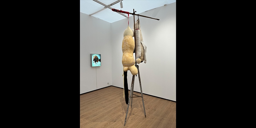
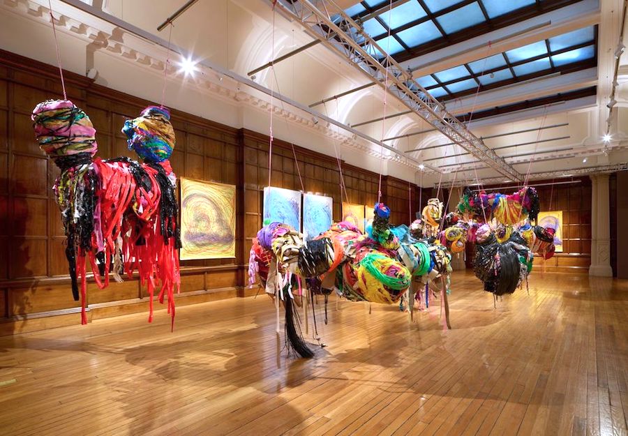
Les Abonnés du Téléphone, 2002

In Language and Silence, George Steiner talks of being a “kind of survivor”. There is a way that I, even born some years after the war, am still implicated by the might-have-beens that link me, as someone who was born Jewish, by an invisible thread to others who were less lucky. Like Boltanski, I do not really know anything of Judaism’s festivals, orthodoxies or theology but know that like him, for the Nazis, I would have been defined as such. And because of that label history places on us, I and he are inextricably united to that past.

Boltanski’s work is much more subtle than simply being about Jewish history, the Holocaust, or even guilt and survival. Yet it is the fact of this cataclysmic event that gives colour and shade to his work. As the French philosopher Jean-François Lyotard said, “We are all Jews after the Holocaust”. By this he meant that we are all capable of being caught up in atrocities, in the events of Bosnia and Rwanda, in the conflict in the Middle East. More than anything, Boltanski’s work is about the fact of dying. In his work, death becomes an aspect of life. When we meet he reminds me of Christ’s last words, “Father why have you forsaken me?… It is finished”. He finds it both incredible and beautiful that a whole religion should have been built on a moment of weakness and despair. Christian narratives are embedded in his work as much as Jewish history, he explains. If he had to choose a religion, it would be Christianity. This, I believe, is because his work is also about redemption and love.

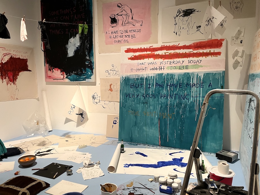
“I am nobody. The more I work, the more I disappear”, he reflects. We are sitting talking amid thousands of telephone directories in the South London Gallery, where he is installing his new show. With his shaved head and unshaven face, this small nervy Frenchman in a grubby black jumper, obsessively poking strands of tobacco into his pipe with stubby stained fingers, is the epitome of Gallic Existentialism – an escapee from a Camus novel. Boltanski is a bundle of paradoxes, a quintessentially 20th-century artist working in the 21st century, a Judeo-Christian artist who has no belief in God, a man who describes himself as a painter, yet who makes installations, a Communist sympathiser who was never a Communist but rather a romantic sceptic.

He first came to prominence with major exhibitions in the mid 80s and early 90s at the Georges Pompidou Centre, Paris and at The Whitechapel Gallery, where he created magical installations using personal objects presented as archival artefacts, which acquired an iconic status. His use of non-art materials – school photos, family albums, rusty archives and biscuit tins, along with piles of old clothes – memorialises the unnamed and unknown: the dead citizens of a Swiss town, the workers of a Halifax carpet factory, as well as the erased children of the Holocaust. These are the traces left by individual, yet anonymous, lives. Beneath flickering shadows and bare light bulbs, the spaces in which he works take on something of the hushed reverence of a church or theatre to generate poignant evocations of loss. He prefers factories and churches to galleries, and has made work in Grand Central Station, New York and La Chapelle de l’Hôpital de la Salpêtrière, Paris. He creates, he says, “small memories” that give substance to the unofficial histories of the ordinary. It is as if this collection of ephemera might ward off death, keep its final, all-encompassing anonymity at bay. Like the makeshift shrines at the site of a crash, these works ritualise grieving and create ways of coming to terms with the most modern of taboos, death.

All work, he claims, begins with a kind of trauma. Child psychotherapist Melanie Klein talks about art being a form of reparation for infantile rage at the abandoning mother. She describes how, out of the smithereens of anger, something new can be reconstructed. Born in France in 1944, the son of a Jewish father and a Catholic mother, Boltanski experienced a childhood that was coloured by experiences of anti-Semitism. His father had spent much of the war hiding in basements. His is the enduring angst of the outsider. Early on, he pretended to speak of his childhood, though the reality disappeared in a construct of false mythologising. He cannot now remember what was true and what a fabrication, having created a kind of universal childhood that binds him to the mass of humanity. This humanistic web is central to his vision.

Whilst he implicitly deals with big themes such as the Holocaust, his art can also be read as a psychoanalytic journey; a process of mourning, not only for the victims of the Shoa, but for the death of his own childhood or, maybe, for the lost child within us all. His is a search for self-forgiveness. It is no coincidence that Freud was also a Jew. Western culture is, for Boltanski, about stories. We create our own myths. Stories are attached to objects and to the small moments and memories that, like Marcel Proust’s madeleine, they yield. A photograph, an old dress – each detonates its hidden histories. These are traces not only of something lost, but also of something shed. This shedding implies transformation; a movement from state to state, from unconsciousness to some greater consciousness.

For Boltanski, who is not conventionally religious, art is the religion of our day. And art, like religion, is a form of ritual, a way of ordering and making sense of the world. It is, he says, about recognition. That’s why he uses familiar objects such as biscuit tins. There is always a moment when something clicks in the mind or the heart. What philosopher and writer Roland Barthes called the punctum, that “Ah yes, that’s it!” moment that pierces the consciousness. Boltanski also works within the tradition of Christian art using the icon, and the sense of mystery, theatre and kitsch so beloved by the Catholic Church. He has said he no longer knows what it means to be an artist. Since the collapse of the Berlin wall, we have lost all sense of utopias. For him, art either works or it doesn’t. Aesthetics no longer mean anything. It is not a question of good or bad. “What I make, is something different to art”, he says. He tells a story of setting up an installation in Santiago de Compostela when an old lady asked what he was doing. “Commemorating the dead Swiss”, he said, and she seemed quite happy. If he had told her he was making a piece of conceptual art, she might have felt he was defiling the place.

A child of the 60s, he was part of that decade’s radical zeitgeist, influenced by the magical, priestly rituals of Joseph Beuys and the mutely enigmatic silences of the Catholic Andy Warhol. In the late 1960s and early 70s, he made little balls of modelled clay, along with small makeshift knives and roughly carved lumps of sugar, which he exhibited with bits of recycled string. This essentially non-hierarchical and democratic art followed the anthropologist Claude Levi-Strauss’s model of bricolage: art made from the ad hoc. Art, he feels, has to struggle against what is established. For many years, he was a member of a lose network of Parisian artists that included his partner Annette Messager, for whom art was a form of resistance against the strictures of bourgeois society. In 1970, invited to illustrate the cover of an American poetry magazine, ‘Blue Pig’, devoted to the poet George Tysh, he supplied a photo of a single, bare, electric light bulb and a few balls of earth. Tysh gave the issue the title ‘Cheapness means forgiveness’, an apt epigram for Boltanski’s work. There is a lack of preciousness about what he does and the objects he uses. If he had been an Italian, he might easily have been part of the arte povera movement. In a way, he is a deeply unfashionable artist. Committed and involved, he believes in issues.

He has claimed that the displays of inconsequential little objects – their use and function now long forgotten – in the big metal cases of the Parisian anthropological Musée de l’Homme were a major influence on his work. In 1973, he began a 15-year series, ‘Inventories’, which involved displaying all the household objects of a deceased person, without any commentary. In another work, using the archives of Michel Durand-Dessert – Durand being the most common French surname – he placed photos from the family album in a plausible chronological order, which, of course, was different from the narrative attributed to them by their owners. Photographs, with their implicit associations with loss, absence and death, have become a potent vehicle in Boltanski’s work. For memory is fragile, dependent on the icon and the relic. We need evidence, such as The Mandylion of Byzantium or The Veronica of Rome, it seems: rational explanations for the mysterious. Boltanski never takes photographs himself, and claims to feel more like a recycler than a photographer.

In 1988, he was invited to make an installation in Toronto. He called it ‘Canada’. The name not only referred to the host country, but also to the euphemism used by the Nazis for the depot where the effects – clothes, shoes, spectacles, even hair – of their victims were deposited before recycling. The piece consisted of thousands of articles of clothing acquired in flea markets, and was followed, at the end of the 80s, by other works such as ‘Reserves: The Purim Holiday’. In the vocabulary of psychoanalysis, the word “phantom” describes the secret pain passed from generation to generation without ever being made explicit. Boltanski refutes Theodor Adorno’s claim that it is not possible to make art after Auschwitz. These works represent the slow labour of mourning, the coming to terms with guilt and the secrets buried, not only at the heart of nations, but of families.

His 1991 installation, using photographs of dead Swiss (a people who have never been involved in war), poses questions about the uniqueness of suffering. Photos of Nazis, photos of Jews, of dead Swiss, they are all, he claims, just people. As viewers, we cannot assess who is a victim, who a torturer. All of us have the capacity to be both. He photocopies the photographs again and again, so that they become reproductions of reproductions and individuality becomes lost in a sea of humanity. What these works force us to do is face the mechanisms that made the Holocaust possible – misanthropy, abstraction, self-loathing, objectification. These things do not just belong to history. They are with us every day: now. He claims that he finds it hard to accept that dying is part of life. He acknowledges that we are each unique, yet but a speck in the flow of history. He quotes Napoleon’s infamous remark as he looked down on the carnage of Austerlitz – both shocked at its cold-blooded callousness, whilst also acknowledging its truth – that “A night of love in Paris will replace everybody”.

When the Tate Gallery bought Dead Swiss on Shelves with White Cotton, they amused him by asking what they should do if the cotton went yellow after a few years. He told them to change it. When asked what to do if the photos faded, he replied that there were always more dead Swiss. Then when they complained that the shelves would not fit, as they had been made for a different room, he told them to get more shelves. When a slightly exasperated curator asked just what it was that the gallery had actually bought, Boltanski responded that they had bought photos of dead Swiss, and shelves with white cotton: an idea not an object.

When he first introduced biscuit tins into his work, he peed on them to make them rust. But he used so many tins that he had to switch to Coca Cola. When they were exhibited in Hamburg and Oslo, the curators unpacked them wearing white gloves. This was ridiculous as the gloves immediately became rusty and red. The biscuit tins weren’t precious and should never have been treated as such. They could easily have been replaced. Boltanski’s work is about relics. In fact, it shares a similarity with the art of other cultures, such as Africa, where religious or ritual masks have no financial or material value and, when no longer used ceremonially, are, often, left to rot.

He views his work as a musical score. Akin to a musical composition, the piece he creates has no real existence until it is brought into life by a new performance or installation. It is, in a way, about reincarnation. For when a pianist plays a work of Bach, it is always Bach, though it might be Bach interpreted by Artur Rubinstein or Daniel Barenboim, just as a Boltanski might be interpreted by curator “Mr. Jones”. His work is unlike, say, a Willem de Kooning or a Mark Rothko, where the autograph of the artist is paramount. He also sees himself as closer to the geometrical abstraction of Piet Mondrian and Kasimir Malevich than to the emptied Modernism of Donald Judd and Carl Andre. Like the 19th-century French writer Gabriel-Desire Laverdant, he believes that avant-garde art is an “attempt to lay bare… all the brutalities, the filth, which are at the base of our society”. It seems impossible now to imagine an artist of a younger generation having such a politically engaged response to art.

This new installation, Les Abonnés du Téléphone, transforms the space into a huge reference library with some 3000 telephone directories collected from around the world. Visitors can sit at tables and browse through the directories beneath the stark light bulbs, searching for lost friends abroad or trying to interpret the arcane listings in a language such as Japanese. Accompanying this is a sound piece in which the names of 12,000 registered voters living within a 10-minute radius of the gallery are emitted from shelves around the space. Central to this work are the implicit tensions between the global and the local, the individual and society, the included and the dispossessed. For, like all archives, this, by definition, is incomplete and flawed. How many of those whose names appear in the directories have died since their printing, and how many disappeared? In the theatrical semi-darkness a number of other more disturbing resonances are suggested: the efficient lists of the Nazi exterminators, of psychiatric patients and prisoners.

As Boltanski fiddles with his pipe, he emphasises that his work is a resistance to what he calls the “post-human”. I ask what he means, and he says cloning, genetic engineering, science that takes away our individuality and uniqueness. This piece, he says, nodding at the telephone directories, is a very Christian work. It is about community. These people are his brothers and sisters, just like the dead Swiss, the children of the Holocaust, and even the Nazis. He never, he says, suggests answers, only poses questions. Like Janus, he manages to look in two directions at once, turning to history whilst trying to make sense of the present.

Christian Boltanski Les Abonnés du Téléphone at the South London Gallery from 27 March to 5 May 2002
Content and Texts © Sue Hubbard 2002
Images © Christian Boltanski 2002

Published in The Independent

Christine Borland
Lisson Gallery

Published in 3 Quarks Daily

Art Criticism

It was the Victorians who were obsessed with classification. Flora and fauna, criminal personalities and sexual deviants; to categorise and collect was to tame and understand the world. This was the era of the great museums, of Kew Gardens, of the mapping of dark continents. For the 19th century thinker science provided the empirical means to do this, the rational discourse that stood in opposition to prevailing superstitions and orthodoxies – Darwin and evolution rather than the church and God. Science was modern, rational, ‘good’. It meant progress; the conquering and understanding of disease, the speeding up of travel, new methods of communication. At the beginning of the 20th century artists flirted with notions of modernity, exemplified most graphically by the Futurists love of technological science. Two World Wars dented such uncritical belief in its utopian benefits. By the turn of the century AIDS, BSE and genetic engineering have all done their bit to turn us into scientific sceptics. During the 20th century there had continued to be a division between art and science that had started in the Enlightenment. The argument basically went that artists would look after the soul and the imagination, whilst scientists would take care of the nitty-gritty, the nuts and bolts of the hows and whys.

Christine Borland Small Object Save Lives
Small Object Save Lives

Much of the Scottish artist Christine Borland’s work appropriates this 19th century obsession with collecting and classification. It is as if by accumulating enough bits and pieces she might be able to chart and make sense of this disparate modern world. Between 1991-99 she created an installation entitled Small Objects that Save Lives. These were items received by post after a letter sent out requesting a response to her project. The resulting objects: a packet of hair dye, a paper-back of W.B Yeats’s poetry, a finger stall and floppy disc, to name but a few, were the collected ephemera of modernity that told us in great detail about the specifics of contemporary life, without giving any sense of what it was actually like to live it. It is in these interstices between meaning and interpretation, between the organic and inorganic, fact and fiction that Christine Borland works.

Christine Borland Bison Bison 1997
Bison Bison 1997

In 1997 she re-examined a recipe taken from Gray’s Anatomy on how to reduce bones to their mineral components. By soaking them in a weak solution of nitric acid she extracted the compounds that made bone hard, leaving malleable yellowing objects that looked like dog-chews, which could then be bent into loops and knots. The bones were those of a bison, offered to her by the National History Museum in New York. Twisted and bent they were laid out in rows alongside the stone-like nuggets of vertebrae on trestle tables, in the manner that an archaeologist might lay out the remains of an excavated corpse. That they came from the nearly extinct bison, via a National History Museum, is a nicely ironic piece of synchronicity, which touches on essences, documentation and history. Arranged according to their size and colour, like the ephemera in Small Objects, the bones told us about the skeletal make-up of the bison (it might just have easily been a human being) without imparting any sense of what a bison is actually like. What we were left with was the trace of the bison, its mineral constituents, but nothing that could illuminate for us its essence. We could discern its physical make-up, but nothing of its ‘soul’. In this installation Borland created the perfect post-modern symbol; fragments that did not add up to an interpretable and perceivable whole, a work of poetic effect, rather than of simple observation, of philosophical discourse rather than of narrative explanation.

Her installation for the Turner Prize, 1998 continued this notion of the ‘trace’, the memory of the object rather than the thing itself. Two skeletons from the Huntarian Museum, one of a giant over eight foot long and one measuring only nineteen inches, were placed on glass shelves and then powdered with dust and removed, leaving only a ghostly imprint. Here again Borland’s concerns lay in the broken narratives that could be constructed between the normal and the freakish, between what is classified and unclassified, between fantasy, fact and fiction.

Much of her work over the years has been loosely collaborative, appropriating for her own ends the specialist knowledge of forensic and medical researchers. It has lead to many questioning whether what she does is really art, or whether it relies too heavily on its source material, not transforming it sufficiently into the realm of metaphor. But Christine Borland is an ‘investigative’ artist, the Sherlock Holmes of the art world. She looks for clues and signs to explain the complexity and fragility of human existence rather than presenting her audience with finite statements. For a number of years she has shot things; sheets of glass of roughly human height, crockery, tailor’s dummies dressed in homemade cotton-wool bullet-proof vests. (One that made reference to the assassination of the last Tsar’s family had jewels sown inside.) The exact meaning of these pieces is enigmatic, as is much of her work, but they construct discourses between such binaries as permanence and impermanence, fragility and solidity, life and death, subjects over which, at the beginning of the 21st century, we tend to hold rather slippery, fluid views. The bullet-pocked glass of Webs of Genetic Connectedness, 2000, for example, not only implies the vulnerability of the human body, but, with its fragile fractures and webs, creates a poetic map of apparent organic interconnectedness.

Christine Borland L'Homme Double 1997
L’Homme Double 1997

Genetics have been a long-running concern of Borland’s which have lead her to make works as disparate as L’Homme Double which included six sculpted busts of the Nazi doctor, Josef Mengele, infamous for his experiments on concentration camp victims in the name of science, and a piece based on the skeleton of a murdered Indian woman whose cadaver had been sold for medical research. In the late 1990’s she collaborated with the geneticists of Glasgow’s Yorkhill Hospital. One of the controversial works to result from this was Hela Hot, 1999. Here a TV monitor showed the division of cells on a slide mounted on a microscope. These were provided by the Wellcome Institute and were the cells of a black woman who had died of cancer in the American south in the 1950s. Doctors had extracted the tumour and kept it growing in a cell depository to provide material for medical research. The woman’s family then subsequently launched a legal battle for a share of the profits. Borland’s piece sets up an uncomfortable discourse around notions of exploitation both by art and science of the human subject and asks questions about appropriation and the rights and dignity of the dead. Another piece, made at the same time, Spirit Collection: Hippocrates, 1999 took the leaves from a sapling growing in the grounds of the genetic department at Yorkhill, a gift from the Greek government. The seeds came from a 2000-year-old tree on the island of Kos, beneath which Hippocrates is said to have taught medicine. The bleached leaves, from which the chlorophyll had been removed – Victorian botanists were keen on this process as a way of seeing the structure of the leaf and preserving them as curiosities – were suspended in alcohol in tear-shaped glass vessels covered with foil, each one entrapping the ghostly presence of its individual leaf. Hung from the ceiling they had the poignancy of memento mori or those little iconic hearts made as offerings against disease in Orthodox churches. When these were originally shown at Dundee Contemporary Arts in 1999 Borland also included a phial in the exhibition, retrieved from thousands at the hospital, which contained liquid taken during a routine test for Down’s Syndrome, which she underwent during her pregnancy with her daughter. It was then that it came home to her that work with genetics was something that affects us all and not just some arcane process confined to a laboratory. Working right at the edge of science she also made a video using moon jellyfish, having become fascinated with them on a visit to the zoo in Berlin. But it was the revolutionary biotechnology done with these creatures, whereby their dayglo green florescent protein can be spliced into other cells, that recently placed the little monkey with bright green finger-nails on the front pages of many morning newspapers, that really intrigued her.

Christine Borland A Treasury of Human Inheritance 2000
A Treasury of Human Inheritance, 2000

For her new one person show at the Lisson Christine Borland has made a number of new works. A Treasury of Human Inheritance is a mobile based on the idea of a family tree which she uses as an image to investigate inherited disorders, specifically those depicted in a series of volumes published by the Galton Institute in the 30s showing Mynotic Dystrophy and Huntington’s Disease. Many of the family pedigrees were done during the late nineteenth and early twentieth century in Denmark. Each person involved is represented by a slice of agate; the different coloured agates relating to the differing symptoms of the individuals concerned.

In the main gallery she is showing a video projection of the large golden orb weaver spider being ‘silked’. The silk thread produced by the spider is one of the strongest materials known and is now being genetically cloned by scientists who intend to use it in the production of new bullet-proof vests. The whole process has the clinical air of a surgical procedure. The piece is accompanied by a soundtrack of the Tarantella – a dance that legend has it evolved in the Dark Ages in response to the bite of a tarantula (in fact, is was probably the bite of the more lethal Black Widow Spider.) Alongside this is a companion piece, an installation of ‘bronchial trees’ that have been wrapped in silk thread. Not only does this suggest an image of congestion and suffocation but it also makes reference to the protective padding of the artist’s on-going ‘homemade bullet proof jacket’ series. Her other installation of the ‘ebolic garden’ (ebolic means ‘inducing abortion’) develops some of the ideas of Spirit Collection: Hippocrates. On examing the records of the sixteenth century Apothecaries Garden of Glasgow, which was closely associated with the Cathedral, it was discovered that a large proportion of the plants grown, such as wild parsnip, tongue savoury, forking larkspur and penny royal, had an ebolic effect and were probably sold to local prostitutes. Today many of the same herbs are used in homeopathy for quite different conditions. Borland has taken a leaf from each plant, placed it in a glass vessel with bleach and an alcohol solution, so that the colour has been drained away and only the skeletal structure of the leaf left like some sort of ghostly presence.

Christine Borland Ecbolic Garden 2001
Ecbolic Garden Winter, 2001

It might be argued that some of Borland’s work is rather arcane and too dependent on a knowledge of the scientific data that it appropriates, too heavily laden with complex references and unable to cut free from its original source material and ‘be’ in its own right. Whilst this is occasionally a failing, Borland – like a number of other artists such as Mona Hatoum and the late Helen Chadwick who also worked in a similar area – sees science and the body as valid sites for investigating not only the mechanics of how we function, but also as an arena for a new metaphysics. In this Brave New world of genetics and cloning huge ethical questions are raised that go way beyond mere scientific debate. We stand on the brink of being able to decode and deconstruct the very essence of human existence. Perhaps, therefore, it is entirely appropriate that these huge issues are not left entirely in the hands of the scientists but are reflected back to us through the eyes of artists and the debates of philosophers. In this commitment to social issues, Borland is unusual among artists of her generation more usually addicted to easy irony. If her work has value beyond its formal artistic concerns and merits, it is in its insistence on asking difficult questions and probing areas that many are all too happy to leave to the experts.

Christine Borland at the Lisson Gallery, London from 27 March to 5 May 2001

Content and Texts © Sue Hubbard 2001

Images © Christine Borland 2001. Courtesy of the Lisson Gallery

Louise Bourgeois
Beyond the Body

Published in 3 Quarks Daily

Art Criticism

Louise Bourgeois Arch of Hysteria 1993
Arch of Hysteria, 1993

“The mastering gaze [renders] the passive image of woman fragmented … dismembered, fetishised and above all silenced”, wrote Griselda Pollock in Vision and Difference in the eighties, while Angela Carter vigorously claimed that “Picasso liked cutting up women.”. In the seventies, the reclamation of the passive female body from the dominant male gaze became one of the major enterprises of feminist art. Artists such as Judy Chicago, Cindy Sherman and Helen Chadwick all identified the body as the site for self-exploration and self-definition. By laying claim to their own bodies – by ‘being in control’ – women turned the hitherto commodified female body into the active site of sexual discourse and gender politics. Ten years ago it was still a novelty to have ‘all women’ art shows. Now, a generation on, women artists from Mona Hatoum to Jenny Saville have grown up being identified with work on the body. The title of the classic seventies self-help health manual Our Bodies, Ourselves gives an historic insight into how control over our reproduction (the pill had only been in existence for a decade), our sexuality and, above all, over how women were viewed by men, was central to an emergent feminist identity.

Louise Bourgeois The Destruction of the Father 1974
The Destruction of the Father, 1974

In her short story Dans la maison de Louise, Louise Bourgeois describes her own body as a house of several storey. “I”, familiar with that body … I’ve lived in it”, she writes. Bourgeois, now in her eighties, has always been an artist’s artist. Her extraordinary work – inventive and fresh enough to be shown alongside any Turner prize artist – plunders body imagery as the starting point in an exploration of what Julia Kristeva calls “the braided horror [of] the abject.” re-appropriating traditional female skills such as needlework, Bourgeois investigates the webs we weave within the psychodynamics of relationships, particularly our primal Oedipal relationships. Her Red Room works of 1994 evoke the conjugal scene of the parental bedroom. Childhood trauma and its implications for adult sexuality are explored through the coupling of her freakish, headless figures, often fitted with prosthetic devises denoting psychic damage. The processes of ageing and decay in the female body are encoded in the presence of bare bones acting as macabre coat-hangers for sexualised and fetishised female underwear.

The complex primal relationship with the mother is signified by the recurring motif of the spider lodged at the centre of her web. The power, the subversive vision and raw paint that characterises Bourgeoi’s work has had its effect on numerous younger female artists/ Paula Rego may well have glimpsed Bourgeois’ early engraving of cat-woman (which combined femininity with the feline) before making her own Dog Woman works, and perhaps Jana Sterbak had seen Bourgeois’ sewn garments before making her Flesh Dress. The assemblages of Annette Messager and the prostheses and body extensions of Rebecca Horn all touch upon themes deal with in Bourgeois’ oeuvre.

Louise Bourgeois Red Room - Parents 1974
Red Room – Parents, 1974

Bourgeois’ work may yet come to exemplify the twentieth-century struggle for a coherent, autonomous female identity but, as we move into the twenty-first century, where do women turn now? It is perhaps time to move on, to engage in other discourses or there may be a danger that we corral ourselves into a new ghetto where autobiography is our only narrative. It was not always thus. A ‘transitional’ generation of women born in the thirties and making work ‘prefeminism’ – such as Bridget Riley, Gillian Ayres and Elizabeth Frink – felt that to make art as a woman required no special positioning. Whilst for most feminists autonomy the knowledge of who we are, is a prerequisite that enable them to engage in wider discourses, there is a growing number of women artists who are investigating philosophy, history, the sublime, memory etc., – exploring what it means simply to be human.

Content and Texts © Sue Hubbard 2001
Images © the Louise Bourgeois
Courtesy Cheim & Read, Galerie Karsten Greve, and Hauser and Wirth

The Boyle Family Scottish
National Gallery of Modern Art, Edinburgh

Published in The Independent

Art Criticism

The sixties according to Philip Larkin, did not really start until 1963 around the time of The Beatles first LP. Before that the world had been different; hierarchical, class ridden, culturally conservative and circumscribed. Slowly the old order had begun to crumble. Politicians were found sleeping with call girls who were considered a threat to national security, Kenneth Tynan said fuck on TV, censorship was abolished, Jimmy Porter got angry and respectable students at the LSE grew their hair long. Welcome to the permissive society.

Boyle Family Tidal Series
Tidal Series

In the mid-50s Mark Boyle, son of a Scottish lawyer, enrolled at the University of Glasgow to study law, leaving the following year to join the Scot’s Guards. Meanwhile Joan Hills had just left her course in architecture at Edinburgh College of Art to get married, set up a beauty parlour and paint on the side. When Joan and her husband split up she went to live in Harrogate in a small flat above a café, where the young Boyle, who organised supplies for the Ordnance Corps, went to write poetry. Thus was born an artistic collaboration that has lasted until the present day and now includes the couple’s two children, Sebastian and Georgia. In his first published statement in 1965 concerning his artistic practice, Mark Boyle said, “My ultimate object is to include everything in a single work…In the end the only medium in which it will be possible to say everything will be reality.”

In 1964 Boyle and Hill invited an audience to an event at a venue in London where they were led through an entrance marked “Theatre” and seated in front of a curtain. When the curtain was raised the audience found themselves looking through a shop window at passers by who, in turn, stared back at them. Thus the boundaries between viewer, actor and event were erased and the hierarchy of looking broken down. This ‘performance’ followed on the heels of the first Happening in Britain on the final day of the International Drama Conference at the Edinburgh Festival in September 1963 (they exhibited in Edinburgh on a number of occasions with Richard Demarco at the new Traverse Art Gallery). The conference had been turned into a spontaneously anarchic event during which, rather than ‘discuss’ drama, a drama had been ‘created’ and the ‘actual’ material of the world presented as ‘art’. Such subversive action grew out of the Dadaist philosophy that saw the world and humanity as nihilistic and without purpose – a position that accorded with the 60s zeitgeist and a desire to break down old taboos and constraints. This ‘total action’ was to become very much part of Boyle and Hill’s aesthetic. Art was to include everything, to avoid any form of preferential selection. The artist had to become as objective as the scientist in order to portray ‘reality’.

After spending time in Paris the Boyles returned to London where they had begun, in the summer of 1962, to make a series of assemblages. Without funds or conventional art training they pillaged the demolition sites – the results of bombing and slum clearance – that covered swathes of west London. This use of detritus fitted with their ‘inclusion of everything’ aesthetic. It also acted as a potent anti-art and anti-establishment metaphor. Assemblages that included bedsprings, doors from an old wardrobe, shoes and rusting paint cans needed no special skill or equipment to put together. This methodology owed much to Kurt Schwitters and paralleled the spirit of other artists working with non-art materials such as those within the arte povera movement in Italy and Rauschenberg and Jasper Johns in America.

Boyle Family Skin Series
Skin Series

When the Boyles chanced upon a discarded grey television surround, it was radically to alter their working methods. Throwing it like a dice they decided that whatever portion of a site it framed would became the subject of their next work, even if it fell on a patch of bare earth. Chance – which had so appealed both to the Dadaists and Surrealists – was to become a major component of their work. Resin was now used, onto which they pressed the collected surface material. But beyond saying that, it impossible to explain how they make their ‘paintings,’ for they resolutely refuse to discuss their working methods. It is probable that they make some sort of caste – so that the subject is at the same time both real and replicated. Their first experiments were made in Camber Sands, East Sussex in the late 60s where they recreated the tidal patterns left on the beach over seven days. Sites for subsequent works in London, around Notting Hill where they lived, were chosen by throwing darts into a map. The darts would select sites in a way that was entirely random. A carpenter’s right-angle was then thrown into the air to delineate the bottom edge. A series of printed cards claiming that they were members of the Institute of Contemporary Archaeology usually prevented any unnecessary official interference. In 1968 they took the project to its natural conclusion and invited friends to throw darts at a map of the world. The aim was to “take the actual surface coating of earth, dust, sand, mud, stone, pebbles, snow, grass or whatever. Hold it in the shape it was in on the site. Fix it. Make it permanent.” So huge was the project that it is still unfinished.

From their early childhood the Boyle offspring, Sebastian and Georgia, have been involved in the making of work, accompanying their parents on all their trips. It has taken the family to Norway to create snow pieces, to a German coal mine and to stony escarpments in Sardinia and to Israeli and Australian deserts. Unlike Christo, the wrapper of buildings and landscapes, who seeks the permission of officials and dignitaries, the Boyles tend to work in secret.

And what is it that they have ended up making? Are they paintings or sculptures? Well they are, in fact, closer to painting than sculpture, for primarily they are about surface; the surface as earth, the surface as skin, the surface of a mundane object that was once horizontal but which now hangs vertically on the wall as an art object. They have made work that replicates potato fields and paths – the sort that lead to countless London houses, complete with intricate Victorian mosaic – they have fabricated gutters and pavements where the yellow stripes painted on the road read like the zips in a Barnett Newman painting or the regular concrete slabs of a sidewalk like a minimalist Carl André. They have taken sections of Mark’s magnified skin and blown it up so that it looks like cracked mud or a lunar landscape. Like magicians they have produced a series of stunning tricks, illusions that ape reality. It is as if by collecting numerous specimens of the actual, material world, that like crazy Victorian fossil hunters or palaeontologists, they can make sense of it. Despite the fact that their work is composed of fragments it has little to do with post-modern sensibilities. There is no irony here, nor is their work a metaphor for anything, for it stands for nothing other than itself.

Boyle Family London Series
London Series

Art made by committee raises all sorts of questions and hackles. There are Gilbert and George, of course, that Derby and Jones of Brit Art, and Art and Language. But a family? Artistic endeavour is historically seen as male, heroic and the struggle of an individual psyche to create a unique aesthetic. The Boyles describe themselves as four argumentative individuals, but mostly it is Mark who talks on video about the work. So do they divvy out the tasks, do they all work on the same piece at the same time, do the younger Boyles have any life of their own? Didn’t they ever want to run away to become accountants? Perhaps these questions are not pertinent to the work but they are the ones everyone wants to know.

Mark and Joan are now in their seventies and this is largest show ever mounted of their work; a retrospective spanning 40 years. Comparisons have been made with photography, with that eternal frozen moment when the shutter closes. Yet somehow their work is more visceral than that; its physical presence, the memory of its previous state more insistent. What grew out of the alternative counterculture of the 60s – the ideology that nothing was of greater value than anything else, that chance was as good a ‘belief’ system as any other on which to base human destiny – has evolved into a unique way of seeing the world. Such a vision has its limitations. For it accepts as axiomatic that art is always amoral and objective. Yet despite this insistence on objectivity, something else happens – perhaps something over which they have no control – in the making of this work; a form of transformation of the mundane into the aesthetic. The ordinary suddenly becomes elevated to the extraordinary when our eyes are opened to the world, to a world we largely take for granted or ignore. As Francis Bacon said, a friend and a fan of the Boyles, “If only people were free enough to let everything in, something extraordinary might come of it.”

The Boyle Family at the Scottish National Gallery of Modern Art, Edinburgh from 14 August to 9 November 2003
Content and Texts © Sue Hubbard 2003
Images © The Boyle Family 2003

Published in The Independent

British Art Show 7
Hayward Gallery London

Published in 3 Quarks Daily

Art Criticism

The poster for the British Art Show 7 promises a naked young man poised on a metal bench tending a live flame. The day I went to the Hayward Gallery there was only Roger Hiorns’ empty bench – which was a bit of a disappointment. Young men in the nude are still something of a rarity even in the most outré of contemporary galleries. There wasn’t even a flame. Still there was the compensation of work by 38 other very diverse artists, three-quarters of which has not been seen before. Since its inception in 1979 the British Art Show has presented a five yearly snapshot of the UK art scene. Not a thematic exhibition, as such, the curators Lisa Le Feuvre and Tom Morton, have linked a disparate array of art forms created between 2005-2010 under the subtitle, In the Days of the Comet. This is taken from the title H.G. Wells’ 1906 novel in which Wells imagined the rarely seen comet releasing a green gas over Britain instigating a ‘Great Change’. As a result Mankind was deflected from war and exploitation towards rationalism and a heightened appreciation of beauty. The implication of this utopian vision is that the comet’s reoccurrence has the power to draw together past, present and future; thereby suggesting that Britain has always lived ‘in the days of the comet’.

Roger Hiorns Untitled, 2005-2010

Conceived as a ‘a dynamic shape-shifting exhibition that would renew itself as it travelled’ through four cities, 11 venues and more than 12 months of national touring there is no dominant house style. Boundaries are blurred between fine art and found object, between anarchy and formalism, between irony and a striving towards a more authentic aesthetic grammar. There are a lot of videos; some very long, and that makes it a difficult show to get round unless one has several days to spend. Anja Kirschner and David Panos’s new feature-length film The Empty Plan – made in German – juxtaposes Bertolt Brecht’s writings in exile with preparations for different productions of his play The Mother, staged in a variety of contrasting locations. In another arena this may have proved rewarding, but ,here, it is simply hard work. In contrast Duncan Campbell’s archive footage highlighting the 1970s Irish political campaigner Bernadette Devilin’s rocky relationship with the press, for whom she was at first a saint thena sinner, is highly evocative of those unsettled times.

Duncan Campbell Bernadette (Film Still), 2008

Elizabeth Price has made a wonderful tongue in cheek film, User Group Disco where text borrowed from corporate power-point presentations has been melded with dollops of French critical theory to materialise on screen as porcelain dolls and other kitsch ephemera rotate on an LP turntable to the music of a Norwegian band. It is a clever, iconoclastic dig at inflated institutional rhetorics.

But most captivating on the video front is Christian Marclay’s deftly constructed The Clock, (previously reviewed on this site here) a mesmeric work of thousands of fragments of found film of clocks and watches taken from a variety of movies that forms an actual time piece. Despite the array of arbitrary sources a new philosophical narrative is suggested, so that as viewers we inhabit two worlds: real time and the imagination.

Sarah Lucas NUD (3), 2009

Seasoned artists such as Sarah Lucas, who was one of the British artists to emerge in the early 1990s under the rubric of the YBAs, (Young British Artists) are working at the height of their powers. Though not a fan of her previous rather facile cigarette sculptures, here she is exhibiting an array of lumpy fleshy forms constructed from tan nylon tights stuffed with fluff. Isolated on breeze block plinths like something beached on a butcher’s block or a “patient etherised upon a table”, to coin T.S.Elliot’s phrase, they have a desolate poignancy that barely conceals their coiled emotional violence. Suggestive of bodies and entwined limbs their antecedents are Picasso’s sculpture of his lover Marie-Thérèse Walter, Head of a Woman, 1931, the Surrealist Hans Bellmer’s erotic dolls and Louise Bourgeois’ psychodynamic works. Perverse and uncomfortable they imply not only secret sexual shame but the psychological ‘knots’ that emotional relationships are apt to create. As the Scottish psychiatrist R. D. Laing, author of the book Knots, claimed: “We are effectively destroying ourselves by violence masquerading as love.”

Stretching along a section of wall is Wolfgang Tillmans’ Freischwimmer 155, 2010 a dense green abstract photograph that looks like a painting and conjures something of H. G. Wells’ green vapour cloud. Alongside this are nine display tables that present material gathered in Britain throughout 2010. Tillmans juxtapositions question received shibboleths and notions of truth, as articles on the Vatican’s attitude to homosexuality and paedophilia are placed next to shocking newspaper clips on teenage boys about to be hanged under Sharia Law in Iran for their ‘crime’ of homosexuality.

Milena Dragicevic Supplicant 77 2008
Milena Dragicevic Supplicant 77, 2008

The show is strong on painting. Milena Dragicevic’s uncanny portraits are both revelatory and a form of disguise. Often there is a prevailing sense of absence, as in Supplicant 13, 2000 where the face appears to have shrivelled to an unidentifiable husk or in Supplicant 77, 2008 where the opening of a red pillar box has replaced the mouth. That Dragicevic was born in a Serbian enclave in former Yugoslavia, which ceased to exist with the post-war reconfiguring of borders to become part of Croatia thus rendering her emotionally, if not actually stateless, informs these paintings with their language of doubles and mirrors.

Charles Avery’s graphic skills have been used to different effect to present an idiosyncratic parallel universe: the Lilliput de nos jours. His central character, the Hunter, searches for philosophical truth in strange lands. Avery’s texts, sculptures and drawings have long charted the topology and cosmology of an imaginary island and his intricate drawing of the Port of Onomatopoeia, 2009-2010 is populated not only by people but by curious Alephs, Avatars and One-Armed Snakes. These strange fantasy worlds that function as scenarios for examining western philosophical thought, are much more effective than the overblown vitrine that encases a life-sized mannequin of his fictional character Miss Miss.

Maaike Schoorel’s atmospheric paintings give up their secrets slowly. At first glance they appear to be minimalist abstract paintings in the vein of Robert Ryman’s white on white paintings. In fact, they contain ectoplasmic figures that emerge and float out from the picture surface the longer the viewer spends with the painting. Inviting us to slow down, they ask us to consider how we look at animage, how it is informed by memory and what it is we expect to see.

Spartacus Chetwynd The Folding House

It is perhaps hard to take too seriously someone who has chosen to market themselves under the nomenclature Spartacus Chetwynd. The Folding House, 2010, a Heath Robinson contraption made from discarded window frames and other recycled building debris not only provides a venue for her performance-workshop but gives a nod to the Dutch modernist architect Gerriot Rietveld. However a more interesting though, perhaps, unintentional reading is the reference to the slum dwellings built from recycled artefacts gleaned from the more wealthy sections of society, which can be found in so many third world slums.

That contemporary British art is still inventive, stretching from Brian Griffiths, literally, rather empty body of a carnival bear splayed on the gallery floor (the tent-like head having already been exhibited in Nottingham is not present) to Varda Caivano’s abstract explorations of colour, texture and mark-making, is made evident in this show. The diverse works pose questions about the nature of artifice and authenticity and, implicitly, ask what art is for in a period of flux and change. There are things here to annoy, others to enlighten, to ponder and reflect upon. There is work that will be forgotten in an instant and work that will linger in the mind long after leaving the gallery, proof that contemporary art can infinitely expand to reflect the diversities and complexities of modern life.

British Art Show 7 is on at the Hayward Gallery from 16 February to 17 April 2011
Content and Texts © Sue Hubbard 2011
1 Image © Roger Hiorns 2005-2010. Photography by Kieron McCarron
2 Image © Duncan Campbell 2008. Courtesy of the Hotel Gallery, London
3 Image © Sarah Lucas 2009. Courtesy the Artist and Sadie Coles
4 Image © Milena Dragicevic 2008. Courtesy Galerie Martin Janda, Vienna
5 Image © Spartacus Chetwynd

Published in 3 Quarks Daily

Edward Burra
Crane Kalman Gallery London

Published in The Independent

Art Criticism

Edward Burra was a true English upper-middle-class eccentric. He could be waspish, camp and difficult. In 1961, while painting at home, the Royal Academy rang to ask if he would consider becoming an associate. His acerbic response was to shout downstairs to his manservant, who was speaking to them: “Tell them I’m busy.”

Edward Burra Birdmen and Pots 1947
Birdmen and Pots, 1947

The eldest son of barrister Henry Curteis Burra and Ermentrude Anne Robertson-Luxford, he was born on 29 March 1905 in South Kensington. An attack, at the age of 13, of anaemia and rheumatic fever cut short his education and his parents, considering him too sickly for regular employment, encouraged his interest in art. After studying at home he went, in 1921, to Chelsea Polytechnic and then subsequently to the Royal College of Art.

Although not openly gay, he visited gay bars and had gay friends such as the dancer and theatrical director William Chappell, with whom he, reputedly, had an affair – though some accounts of his life suggest that he always remained celibate. He also had a camp sensibility and his copious writings have the astringent wit of an arty Kenneth Williams. A prodigious letter writer, he wrote to one friend that “I’m taking up my pen for Sunday venom, dearie, it relieves me.” A visit to London from his home in Rye, where he lived all his life, was referred to as a trip to “TinkerBell Towne”.

Best known for his paintings executed in the 1920s and 1930s of seedy urban scenes, he stands outside the modernist tradition, though among English painters there is an obvious affinity with Stanley Spencer and, to some extent, Paul Nash, who was his mentor. At a time when the avant-garde were obsessed with abstraction, Burra was more interested in painting people; whether big blondes in the local boozer, zoot-suited gangsters on Harlem streets, or musclebound sailors.

Today Burra is a rather neglected painter. His work has always been hard to define – perhaps because he worked not in oils but watercolour (it was easier on his arthritis) and because his credo was “always join the minority”.

Edward Burra Frogmen 1959-1961
Frogmen, 1959-1961

He had six paintings in London’s International Surrealist Exhibition in 1936, but was never formally a Surrealist, and for most of his life he was represented by the Lefevre Gallery. From his 1930s Harlem pictures to the late landscapes, Burra’s view of the world was unlike that of any of his contemporaries.

His vivid paintings of Harlem in the 1930s captured a moment in history epitomised by jazz and street life and have an affiliation with de Chirico and George Grosz. The current Tate exhibition The Life and Times of Edward Burra concentrates on this, his most celebrated period.

To coincide with this, and the publication of a recent biography, the Crane Kalman Gallery is showing 30 rarely seen watercolours, primarily on loan from private collections. They span every decade of the artist’s career, from the 1930s Burlesque performers in Harlem and Marseilles, to the Surrealist images painted on the brink of war, and the later rural scenes executed in the 1960s and 1970s, redolent of Nash, which presaged the decay and demise of traditional English rural life.

These works emphasise his idiosyncratic, often rather macabre, vision and his rich sense of colour. He was a painstaking draughtsman and a great traveller. Not only did he visit Harlem and Marseilles but also Barcelona, Seville and Morocco, where he painted scenes influenced by the Spanish civil war, as well as New York, Dublin and Paris. When he became too ill to travel abroad he concentrated on England.

His work during the late 1920s to the 1940s recorded, with a sharp eye and a trenchant satirical wit, the soft underbelly of a society of cabarets and music halls, tottering towards war. His later work never quite lived up to the early panache.

Edward Burra Crane at the Kalman Gallery, London from 10 April to 10 May 2008
Content and Texts © Sue Hubbard 2008
Images © the Estate of Edward Burra. Courtesy of the Crane Kalman Gallery

Published in The Independent

Sophie Calle Talking to Strangers
Whitechapel Gallery London

Published in 3 Quarks Daily

Art Criticism

Sophie Calle Take Care of Yourself 2007
Sophie Calle Take Care of Yourself, 2007

What do you do when your lover jilts you by email? Take to your bed and forget to wash, wander around in your pyjamas, cut up his suits or send him a poison pen letter? If you are an artist there is another option. You can shame him by turning his self-justifying text into a large scale conceptual art work using over 100 different women as allies. That is just what the French artist Sophie Calle does in her work Prenez Soin De Vous (Take Care of Yourself) where she has invited lawyers, actors, accountants, singers and psychologists to comment on her lover’s text though the lens of their professional vocabulary . A composer turns the letter into a musical score; a translator asks why her ex-partner uses the formal vous rather than tu, and what this says about their relationship, whilst a rifle shooter peppers the email with bullet holes.

From this single text Calle weaves a web of female support. Spinning out the threads of the painful missive in which her lover admits that he is again seeing the ‘others’, thereby breaking their contract in which he agreed not to make her the ‘fourth’, she creates a complex polyphony of female voices rather like that of a Greek chorus. Using photographs, text and video the result is a complex multi-layered narrative which arouses both distaste at her lover”s self-indulgent musings and a sneaking sympathy for his obvious inability to make any meaningful emotional commitment. As a clinical psychologist says: “He is an intelligent cultivated man from a good socio-cultural background, elegant, charming and seductive with a fine, fairly subtle rather abstract intelligence. He is proud, narcissistic and egotistical”.

Sophie Calle Talking to Strangers
Sophie Calle

Part photo-novella, part psychoanalytic text, fact and fiction, reality and artifice, here, are continually blurred. Like Cindy Sherman Sophie Calle is a mistress of disguise. Never actually present within her work she leads us to question the validity of the narrative ‘I’. Who knows whether there really was a lover and an email or if this is simply an intriguing artistic construct? The work treads a fine line between turning us into voyeurs, conspirators and dupes, never letting us settle into a single role. As with the novelist Paul Auster, who wrote one of the essays in the Whitechapel catalogue, she is concerned with how a subject sits within a constructed social and artistic framework, whilst always remaining very much the omniscient narrator. One of the underlying themes of her work is that of surveillance whereby she uses photographs and texts to create a body of reportage and apparent documentation.

The first work she made in 1979 was only shown in book form. Having come back to France after seven years travelling she felt lost in her own town and took to following people in the street because she didn’t know what else to do with herself. Choosing people at random she let them dictate the course of her actions and neither wrote anything nor took photos. Following a man to Venice, she shadowed him for two weeks. A photographer himself she tried to duplicate the kinds of images she imagined he might make and created a book, Suite Vénitienne, about the experience. In her next work The Sleepers she asked people she didn’t know to come and sleep in her bed for eight hours and then be woken by someone who would take their place. For the day shift she invited those such as bakers who would normally sleep in the day. Staying by the bedside she photographed these strangers every hour and wrote down what they said. This continued for eight days. The results are like the field notes and photographs of an ethnographer or anthropologist; objective rather than intimate.

Sophie Calle Talking to Strangers
Sophie Calle

This objective control is a central element of her work making her into both auteur and conductor. In L’Homme au carnet, 1983 (The Address Book) she reportedly finds a fancy red note book in a Parisian street and constructs the personality of the owner, Pierre D, through a series of meetings and interviews with those whose addresses she finds written in his book. Detailed descriptions were then published in the Libération during the August of 1983. When Monsieur D returned from Norway and recognised himself in the articles the result was outrage and distress. He claimed it was a callous invasion of his privacy and demanded the right of reply. This was printed in the paper beside a photo of Calle, naked in a domestic environment, her features masked like those of a criminal. Who then was the victim? Calle or Monsieur D? And is any of it true or do these Borgesian threads simply function as so many open ended possibilities in a postmodern narrative? Chance, so beloved by the surrealists, also plays its part in Calle’s piece When and Where? Berck, a creative game based on a journey of uncanny synchronicities dictated by her clairvoyant.

Her work is also about lack. About the lack of her central characters – her lover and herself in Take Care of Yourself, of Monsieur D in the address book piece – who are always off stage, hovering in the wings. It this void that Calle fills with her complex, allusive narrative threads, standing in the middle like the spider weaving her complex designs. The persona she gives us is the one she wants us to see rather than the ‘true’ Sophie Calle. But not all her work is so detached. The poignant tribute to her dead mother in Souci captures, in text and works of black pigment, sandblasted paper, lead and hair, her mother’s last hours. It records her final pedicure, the final book she read, the last music she heard and her last smile. But, try as she might, Sophie Calle could not record her last elusive breath, which occurred somewhere between 3.02 and 3.12, and proved impossible to capture: perhaps like truth itself.

Sophie Calle Talking to Strangers at the Whitechapel Gallery until 3 January 2010

John Baldessari
Tate Modern

John Baldessari Pure Beauty 1966-68
John Baldessari Pure Beauty, 1966-68

Language and text are also essential elements in the work of the Californian artist John Baldessari, who has been described as “a cross between Walt Whiteman and a redwood tree”. Born in 1931, an imposing figure of six feet seven inches tall, with a white beard and halo of prophet-like hair, he is widely regarded as the granddaddy of conceptual art. The current exhibition Pure Beauty at Tate Modern brings together more than 130 art works in this most extensive retrospective of his oeuvre in this country. With iconoclastic wit and irony, Baldessari deconstructs the shibboleths that underlie much contemporary artistic practice and questions the accepted rules of how art should be made. In the 60s he began to use words as most artists use images saying “a word can’t substitute for an image but is equal to it.” Beguiling his viewers with humour he aims to be as “disarming as possible.” Instructions from art manuals, quotes from celebrated art critics painted onto the surface of his canvases drew attention to the prevailing aesthetic attitudes of the period. By painting words on canvas he signalled that ‘text’ paintings were just as much a ‘work of art’ as a nude or a still life.

John Baldessari God Nose 1965
John Baldessari God Nose, 1965

It’s hard not to chortle at his 1960s Tips for Artists who want to Sell and the deliciously tongue in cheek canvas that simply says: Everything is purged from this painting but art, no ideas have entered this work. Baldessari has often said that semiotics and, in particular, Claude Lévi-Strauss’s structuralism, were major influences on his treating language as sign and on his deliberate play between word and image, though it’s not hard to imagine that he might easily have had an alternative career as a stand up comedian. From the 1970s he married his humorous pursuit of a new visual language to film. I Will Not Make Anymore Boring Art, 1971 sees him record himself on videotape repeatedly writing the lines over and over again in a notebook. In 1970 he stopped painting to focus on photography and film, but not before he had burned all his paintings in Cremation Project, which was accompanied by an affidavit, published in the San Diego Union. His approach to teaching was equally playful and unorthodox, promoting what he called “post-studio art” based on the idea that “there is a certain kind of work one could do that didn’t require a studio. It’s work that is done in one’s head.” In his 1972-73 set of photographs called The Artist Hitting Various Objects with a Golf Club he takes repeated swipes, in a form of intellectual crazy golf, at objects found in the city dump. There is also a set of photographs of him blowing cigar smoke to imitate a picture of a cloud, and another series Choosing (A Game for Two Players): Carrots, a sort of absurdist chess made up of arcane carrot moving rules. It is both mad and rather funny.

Baldessari’s work is full of paradox. It liberates, irritates, inspires and disarms and has been an enormous influence on a whole generation of younger artists. Like looking through a kaleidoscope, he presents us with what is familiar with an unfamiliar twist so that we are forced to think about things in a slightly different way. We are continually confronted by images that ask ‘is this art?’ and if so does such a definition matter as long as the work prods us and makes us look at the world afresh. Baldessari’s own disarming answer, given in an early painting that escaped the Cremation Project, is God Nose.

John Baldessari at Tate Modern until 10 January 2010
Content and Texts © Sue Hubbard 2011
Images © Sophie Calle. Courtesy of Whitechapel Gallery
Images © John Baldessari. Courtesy of Baldessari Studio and Glenstone

Published in 3 Quarks Daily

Helen Chadwick
Changing the Landscape of Sculpture

Published in 3 Quarks Daily

Art Criticism

It is said that those whom the gods favour die young. Sylvia Plath, Anne Sexton, Frida Kahlo, Jackson Pollock and James Dean have all achieved iconic status. But would this have been assured if we had had to witness their dull levelling into middle-age? Does untimely death – the erasure of the still nubile body, the restless imagination brimming with unfulfilled promise – ensure like some dreadful Faustian pact, certain artistic canonisation?

Helen Chadwick

It is only months since the artist Helen Chadwick died unexpectedly on Friday 15th March 1996, at the age of 42. The art world was reduced to a state of shock that one so apparently energetic and youthful, “with her smooth, light, bendy epicene body and her signature Louise Brooks haircut”, as her friend Marina Warner described her, should have been so tragically snatched from their midst. She was described in The Sunday Telegraph as “one of Britain’s leading modern artists”, in The Independent as “one of contemporary art’s most provocative and profound figures”. Though she appears to have had a heart attack or some rare virus, the notion is fermenting that she died of overwork, of dedication to her art. Friends were grief-stricken. Her funeral, according to Judy Collins, curator of twentieth century art at the Tate, and one of the organisers, had all the sense of occasion and theatre Helen would have wanted. “It was”, she says, “a bit like a Greek drama.”

To write about an artist’s work so soon after her death is a delicate affair. Those who loved her – and there were many, both men and women, talk of her generosity of spirit, and her influence as a teacher – naturally want to ensure her place within the pantheon of art history, and some have written passionately and eloquently about her work as a result. I hardly knew her. I met her only twice, briefly, at private views and was struck by her immaculate, boyish, Peter Pan elegance and her small stubby artisan’s hands bedecked with silver rings. But we only exchanged social niceties. So it is to her work that I must return in trying to evaluate this all too brief life.

Helen Chadwick Ego Geometria Sum 1982-84
Ego Geometria Sum, 1982-84

The first work of hers I saw and wrote about was Ego Geometria Sum, 1982-84. Titles were important to her. She valued erudition and read widely, sometimes in arcane and obscure realms. Here, as she was to do again and again, she confronted the mysteries of the life-cycle. The Pythagorean thesis that a number of regular geometric solids could account for all Nature’s constructions was the central tenet of this installation. Ten sculptural polyhedral treated with photo-emulsion bore the imprinted image of her naked body. Each object – an incubator, a font, a pram, boat, wigwam and bed – acted as a Proustian trigger, stimulating memories and sensations from her childhood. Around these hung ten photographs showing her as the naked Atlas bearing the heavy sculptural forms, while in Labours she appeared to be struggling with the weight of accumulated memory or, curled in a foetal shape, about to give birth to her own image. It was as if she was striving to find some mathematical formula to synthesise loss with her self-fashioning as an artist.

Her opus magnum was the ambitious installation created for the ICA, Of Mutability, 1984-86. Made of two parts, The Oval Court and Carcass, it extended her preoccupations with the body and mortality. The Oval Court consisted of twelve naked women – made from photocopies of her own body laid on a Canon photocopier – floating and twisting within a pool of amniotic blue. A marine version of an eighteen-century painted ceiling, it illustrated her fascination with the fantastical interiors of Austrian and German rococo churches. Where Ego Geometria Sum contained, these swimmers broke free from the remembered restrictions of childhood into the limpid waters of post-pubescent pleasure in an aqueous ‘Garden of Delights’. Literally bathing in a ‘stream of consciousness’, theirs was a dance of carnal desire, a cornucopia of forbidden pleasures. For floating beside the artist were the forms of a skate, a lamb, a goose, a crab and rabbit. Chadwick’s lost innocence and androgynous eroticism were high-lighted by a pair of white school-girl socks and frothy trails of ribbon and lace. Like some macabre Ophelia she floated, a string of pearls about her neck, bubbles billowing from her mouth, surrounded by animal forms representing her various alter egos. Having washed, groomed and cleaned these torpid carcasses with a lover’s attention, a necrophilic bond was created. She spoke lovingly of the monkfish’s mouth and the skate’s ample genitals. Her body cascading towards the lamb proffered it her lips, while the goose’s head reached towards her breast, its webbed feet brushing her stomach in a simulacrum of Leda and the Swan. In a virtual act of sympathetic magic she ate, after the completion of the work, those carcasses still fresh enough to be consumed. In the original installation photocopied images of undulating columns formed a colonnade around the periphery of the pool. At their apex was the artist’s weeping face. The apparent grief at being driven from this paradisal space is all the more poignant with the knowledge of her untimely death.

And, as if in counterpoint to the idealised body of The Oval Court, a large vitrine filled with fermenting waste matter stood in an adjacent room. The glass column of Carcass functioned as a metaphor for bodily process and acquired a strange beauty during the transformation from wholeness to putrefaction as the bubbling mulch slowly turned to a noxious pigment. Daily acquisitions of rubbish recorded, like the strata of rock, the unique history of the work within real time. Both pieces were heavily influenced by the Vanitas tradition of painting where morbidity is seen as the price of decadence and material desire.

Helen Chadwick Of Mutability 1984-86
Of Mutability, 1984-86

Whereas The Oval Court presented the playground of an autonomous, sexually potent goddess as an alternative to the predominantly patriarchal, Judaic-Christian myth of the Fall, Lofos Nymphon, 1987 used a more Kleinian schema. Here, in a series of photographic projections, Chadwick appeared on the balcony of the family home with her Greek mother set against a backdrop of Athens. Both women were naked; the small, boyish body of Chadwick clinging to her ageing mother’s sagging flesh in an apparent desire for reunification with the denied utopian space of the nursing breast.

Chadwick moved beyond the female body with Meat Abstract and Meat Lamps, 1989. Here she transcended gender to discuss inner and outer and the androgyny of sexuality which denied the western philosophical view, held from Aristotle to Freud, that woman is synonymous with nature. Within these works Chadwick rejected an Apollonian vision of beauty for the Dionysian. As Camille Paglia claims in Sexual Personae: Art and Decadence from Nefertiti to Emily Dickenson, “Dionysus was identified with liquids – blood, sap, milk, wine. The Dionysian is nature’s chthonian fluidity.” Essentially pagan the chthonic is where sex and sado-masochism meet. The hourglass form of The Philosopher’s Fear of Flesh, with its slippage between the human and animal – two tear-shaped pendants enclosing a male stomach and a plucked chicken’s breast – were reminiscent of a momento mori or reliquary enshrining the desiccated bones or foreskin of a saint. In Glossolai Chadwick created a cruelly revengeful, ‘below the belt’ attack on the linguistic dominance of patriarchy, spending two days stitching together fleshy lamb’s tongues, which she referred to as “a hundred tiny penises”; thus endorsing Nietzsche’s claimed in Beyond Good and Evil that “almost everything we call ‘higher culture’ is based on the spiritualization of cruelty”.

And no doubt she knew, when making Nostalgie de la Boue, 1990 with its hairy anal orifice and circle of entwined earthworms, of Bataille’s claim in The Solar Anus that “ the world is purely parodic, in other words, that each thing seen is the parody of another, or is the same thing in a deceptive form”. In Bad Blooms this imagery is extended, albeit more playfully, with her cibachrome photographs of floral wreaths and various viscous fluids. In these exotic nosegays – strange matings of buttercup and orchid, Swarfega and Germolene with their fleshy plum and oyster centres, their phallic stamens and cunts of white fur – she played games with traditional sexual signifiers, delighting in images of bisexuality.

Helen Chadwick Piss Flowers 1991-92
Piss Flowers, 1991-92

Chadwick’s most notorious work was her Piss Flowers made with her partner David Notarius during a residency in Alberta. Peeing in the snow the flow of her urine made, when caste, an erect penile shape, in antithesis to the softer pistillate forms created by Notarius: an inversion of human genitalia. But this game of icy sexual politics failed to produce objects with the equivalent impact of her earlier work. Whilst the literary and psychoanalytic associations of her chocolate fountain Cacao were fairly obvious – earth, shit, coprophilia – creating a suspicion that main role of these pieces was a desire to shock.

Last year Chadwick worked in the Hunterian Museum and the Wellcome Pathology Room at the Royal College of Surgeons. There, in an echo of the carnivalesque bestiary she’d employed in The Oval Court, she photographed medical specimens – infants and pickled foetuses beyond the outer reaches of what passes for normality – for her series Cameos. Selecting a Cyclops baby, chimpanzee and pygmy, she was, according to Marina Warner, in her element. “She found no revulsion to overcome, but found her imagination began instantly to play on [the Cyclops’] features with a kind of passionate sympathy like love.” For Chadwick these discards of human reproduction were reminiscent of the hybrids of myth – dragons or three-headed Chimera – onto which humanity projects its fear of difference and otherness. Like Beauty towards the Beast, she felt both moved and titillated by their difference, by the very qualities that made them repellent to others. These unformed faces with their soft spongy flesh, these ‘monsters’ to whom every mother fears giving birth, floated in their formaldehyde in a suspended state of becoming. Within these grotesque forms she touched upon the Darwinian paradigm of the survival of the fittest and on nineteenth-century fears of miscegenation, not to mention late twentieth-century debates surrounding abortion rights and our preoccupations with genetic manipulation and bodily perfection.

Helen Chadwick Self Portrait 1991
Self Portrait, 1991

There is a great irony that just before her death she was investigating the very beginning of life, having been given permission to work in King’s College Assisted Conception Unit where she was drawn by the parallels of ‘artificially’ creating in vitro eggs for fertility programmes and the manipulations involved in making art. This continued her preoccupation with mapping the self through the cartography of the body and echoed her use of internal organs in earlier works such as Self Portrait, 1991. There, her small stubby hands framed a human brain, echoing Hamlet holding Yorrick’s skull. Implicit were all those fundamental questions about the nature of individuality. What is the essence of me as opposed to you? Unnatural Selection pushes these questions back to the moment of conception. As she wrote in Lofos Nymphon, “as a modern, with no centre, no core of belief, it is possible to encounter the void of Origin, to give it form and a body, and so return to the site of beginning”. This was her preoccupation when she photographed human pre-embryos that would otherwise have been left to perish. Within these images the maternal body is ever absent, raising one of the most disquieting questions of our age about the cultivation of foetuses outside the womb.

Helen Chadwick Monstrance 1996
Monstrance, 1996

In these final works she created a vision of the pre-embryo’s interdependency, whilst presenting it as a valued jewel. The lozenge of Monstrance is reminiscent of a momento mori ring in which the plaited hair of the dead is set with tiny seed pearls beneath a dome of glass; the pearl string of Nebula and the cluster of Opal all make reference to the scientist’s grading and selection of viable cell clusters, done with the naked eye in the manner of a jeweller selecting flawless gems. In Christian ritual the ‘Monstrance’ is also the chalice in which the host – the body of Christ, present but not actual – is venerated. In Nebula the transparent beads, containing both cells and fragile dandelion heads, glimmer in the surrounding blue like the Pleiades floating in the emptiness of cosmic space. While the soap bubble forms recall the Vanitas tradition that emphasised the transience and fragility of earthly life, and stress, with a poignant irony that these last works, made just before Chadwick’s death, involved looking at the moment of creation.

Now that she has gone it is too soon to say how her work will stand up over time. Some of it was beautiful, intelligent, daring and iconoclastic; sometimes it seemed thinner, narcissistic, less sure of its intellectual footholds. As a woman artist, working and teaching over the last two decades, she has challenged the way we think and feel about the body and extended the boundaries in which it is described. Her charismatic presence was felt by all those she taught and with whom she came into contact giving permission to many younger women artists to be expansive, bold, dashing and brave.

Content and Texts © Sue Hubbard 1996
Images © the Estate of Helen Chadwick
Image 2: Photography Philip Stanley
Image 3: Courtesy V&A Museum, London
Photography Edward Woodman
Image 4: Photography Anti Kuivalainen
Image 5: Courtesy Zelda Cheatle Gallery
Image 6: Photography: Edward Woodman

Jake and Dinos Chapman
White Cube London

Published in 3 Quarks Daily

Art Criticism

They are the Tweedle-Dum and Tweedle-Dee of the YBAs (the now not so young British Artists) that brought Damien Hirst, Tracey Emin, Sarah Lucas et al to international fame, the minimes to those original Bad Boys of Britart for whom they worked as studio assistants, Gilbert and George. Insouciant, iconoclastic, fiercely intelligent, puerile and irritating in about equal measure, the Anglo-Greek siblings imbibed the importance of self-promotion with their mother’s milk. For the past year Jake and Dinos Chapman have been stirring up press interest by implying there has been a rift. Has it simply been a media-savvy hoax? Who knows? But for the current show at both the White Cube galleries in Piccadilly and Hoxton they have been working in separate studios to produce a series of works in isolation from each other. When I asked Dinos who had done what, he waved his arm proprietorially and claimed he had done the lot. As Jake was being interviewed by someone else at the time I was never able to get his version. Anyhow, the show is ambiguously entitled “Jake or Dinos Chapman,” leaving us guessing about the possibility of fraternal divorce; just as they like it.

Jake and Dinos Chapman

They have made a career out of épater la bourgeoisie. There were those naked penile-nosed children that upset the ladies who lunch at the Royal Academy show “Sensation” in 1997, and the gory dismembered figures à la Goya, hanging life-size from a fiberglass tree. Then there was Hell, which turned the Third Reich into a plastic theme park, featuring 5,000 hand-painted Nazi figurines, which was bought by Charles Saatchi for £500,000 before, ironically, being burnt to ash in the notorious MOMART warehouse fire.

At Mason’s Yard the viewer is lulled into a false sense of security by the 47 painted cardboard sculptures like something from Sesame Street arrayed on the ground floor. But walk downstairs and you are assaulted by a room full of larger-than-life mannequins in black Nazi uniforms, crisp white shirts and black ties, and a smiley face arm band where a swastika might have been expected. They stand around in conspiratorial groups. All their hands and faces are black – not African black, just black – and they have glass eyes and real teeth. One stands with his trousers round his ankles sodomizing another, others watch. Elsewhere a taxidermied pigeon splatters bird shit down the back of another guard. On the walls are hand-colored etchings from their “Human Rainbow” and 80 blackened etchings from the Goya series, and a series of dot-to-dot pencil drawings with arcane titles. Outside there is another mannequin dressed in a Technicolor Ku Klux Klan robe that covers a huge erection. He is standing in front of Oi Pieter, I can see your house from here! 1607-2010, a painting à la Breughel.

Jake and Dinos Chapman

Whizz across from the Piccadilly to the badlands of Hoxton and you will discover bronze sculptures like tacky tourist versions of primitive art. A series of oil paintings with titles such as Georg’s House, George Paints the Bunny, One Rabbit Contemplating the Moon cover the walls. These Disney-style cartoons seemed to have crossed with something out of a David Lynch movie so that when I first walked into the gallery I was shocked to see a class of small primary school girls in brown tracksuits absorbed in one of the paintings. But the laugh was on me. As I walked closer I saw that each one had an animal snout or duck beak protruding from her face and was wearing a Cub Scout badge bearing a swastika and the motto: “They teach us nothing.”

The top gallery has been designed – complete with peeling walls, old tiles, cheap lamps and battered furniture – like the sacristy of some rural French or Italian church. Religious paintings have been overlaid with what look like an incipient skin disease while the furniture is topped with religious reliquaries. A Madonna has had her lips stapled together, while the child in her arms spews out a mouthful of octopus-like bloody tendrils. Elsewhere a statue of Christ appears to have lost his nose to either amputation or leprosy. He has an elongated bloody animal tongue and a swastika engraved on his forehead.

What you make of all this will depend on what it is you want from art. If you believe in its transformative powers you won’t find much transformation here, but if it’s shock you’re after, well, against the odds, Jake and/or Dinos still come up with the goods. They are so media savvy that there’ll always be column inches written about them.

Jake or Dinos Chapman is at White Cube, London from 15 July to 17 September 2011
Content and Texts © Sue Hubbard 2011
Images © Jake and Dinos Chapman
Photo by Ben Westoby, Courtesy of White Cube.

Published in Artillery Magazine

Jake and Dinos Chapman
Bad Art for Bad People
Tate Liverpool

Published in New Statesman

Art Criticism

The art of the Chapman brothers is cynical and morally bankrupt

Like Laurel and Hardy, Flanagan and Alan, Gilbert and George, the artists Jake and Dinos Chapman have realised that being part of a duo is a good career move. The audience get two for the price of one and there is always someone around to act as a foil. The self-appointed bad boys of British art, they came to prominence as part of the notorious YBA generation. Now they have produced Bad Art for Bad People and the more they shock us, like pigs wallowing in their own muck, the happier they are. “We are sore-eyed scopophilliac oxymorons …our discourse offers a benevolent contingency of concepts, a discourse of end-of-sale remnants, a rationalistic hotbed of sober categories…” belligerently declares a mud spattered manifesto plastered on the gallery wall. But what are they really up to with their infantile penile-nosed manikins and their obsessive scenarios of death camp horror made from myriads of tiny plastic bodies like those used by small boys for air fix models?

Jake and Dino Chapman Great Deeds! Against the Dead 1994
Great Deeds! Against the Dead, 1994

For ‘nothing loses its effectiveness more quickly than shock’ wrote Peter Bürger, in his account of the avant-garde. Provocation cannot be repeated indefinitely without either losing its muscle or upping the anti. One generation’s shock – Impressionism, for example – becomes another’s tea towel decoration. Shock is nowadays, mostly, to a shock-hardened generation, not very shocking at all but it is all good PR and its a legacy stretches back from the Chapman’s copulating dolls via the Surrealists to medieval visions of hell. But does the Chapman’s work reveal or criticise anything or is it simply excreta emptied from the bowels of an impoverished society; sterile, commercial diarrhoea for profit and titillation? They may occasionally make us laugh but is it gallows humour, the jeers of the crowd at a gladiatorial contest through which, as spectators, we become complicit in their end-of-everything schadenforh humour? For theirs is a scornful, cruel, caustic wit that rejects all forms of enlightenment morality and humanist endeavour and where the viewer’s involvement and discomfort leaves the last laugh with them. For shock is part of their agenda, part of their manifesto, along with cynicism it forms the dual prongs of their credo. At the very end of postmodernism when God has been dead for more than a hundred years, these heirs of Nietzsche and Bataille play with the shards of a morally bankrupt society like children in a war zone picking over gruesome remains.

Jake and Dino Chapman Sex I 2003
Sex I, 2003

The Champman brothers are fully versed in the critical scaffolding that supports their position, one minute nodding in the direction of Walter Benjamin and his arguments about repetition and reproduction and the next towards critics such as Rosalind Krauss who have dismissed the notion of innovation or genius as a ‘modernist myth’. To create work (to use their own words) of ‘vertiginous obscenity’ they have repeatedly returned to Goya, particularly his series Disasters of War, in which he portrayed the atrocities he had witnessed in the Peninsular War between Spain and France (1808-14). Yet while Goya’s unflinching aesthetic was born out of moral anger at the politics of his time and his despair at man’s bestial treatment of man, the Chapman’s aesthetic grows not from outrage but out of post-moral ennui. Goya’s men, mutilated and bound to their tree like flayed versions of Christ may well have called out to a God whom they believed had forsaken them yet for the Chapman’s the image represents a celebration of the abject. For as Jake (the articulate one) has written ‘We’ve always argued that pornography is the perfect representation of twenty-first-century sexuality because it hints at sex through an act of reproduction and repetition’. Provocatively, he added, that Goya’s copper plates for this series are scarred ‘with indelible signs of auto-eroticism’.

Jake and Dino Chapman Token Pole 1997
Token Pole, 1997

They would, no doubt, argue that their work reveals the ruptures and hypocrisies within modern culture and that they are interrogating what we value as art and that their subversive strategies question the role of the artist within contemporary society. They may also add that at the end of history, as utopian modernist values crash around our ears, that their encrusted skeletons dangling from a tree in a pastiche of Goya’s image, but now crawling with luminous worms and putrid maggots, is the only possible response to this moment in history. For this vision of putrefying decomposition, rendered with painstaking detail, offers a disquietingly ambiguous response to the horrors of violence and the total loss of any belief system. For as Julia Kristeva has written: ‘Abjection is above all about ambiguity’. Here, through the pornography of violence and death, Eros transcends the abject horrors of Thanatos. As with the erotic violence of de Sade the visual pleasure the piece offers is in direct correlation to the pain it evokes.

Such sadism is evident in their investigations of evil, where a mass of squirming, uniformed and torturing figures made from tiny models has turned into a version of Dante’s Hell or a Nazi death camp. No other of their images so signals the failure of Enlightenment values. For this theatre of cruelty represents a world of perpetual torment where the title Arbeit McFries conflates the totalitarianism of Fascism with that of contemporary commerce. In another glass case a writhing mass of tiny soldiers decapitate one another and place the dismembered heads triumphantly on spikes in an evocation of Conrad’s Heart of Darkness, where the once benevolent Kurtz, corrupted and coarsened by the endless brutality in the Congo, cries out against his native workers, ‘Exterminate the brutes!’ Ill with “jungle fever” and almost dead, Marlow seizes Kurtz and endeavors to take him back down the river in his steam boat. As Kurtz dies he utters the immortal words, “The horror! The horror!” Examining ideas of the struggle between good and evil, light and dark, savagery and civilization, Conrad, nevertheless stresses through the novel the importance of restraint in balancing the destructive impulses of the Dionysian Id. For those who break its boundaries are doomed to an endless existential cycle of destruction. Whilst Conrad observes the collapse of a moral frame work and illuminates its dangers we do not know whether the Chapman’s are critics or advocates of the present state of society, or whether like bullies watching a victim being mugged, they are simply standing on the side lines laughing.

Jake and Dino Chapman Bad Art for Bad People is at Tate Liverpool until 4 March 2007
Content and Texts © Sue Hubbard 2007
Images © Jake and Dino Chapman 1984-2003
Courtesy of the Tate

Published in New Statesman

Francesco Clemente
Three Worlds
Royal Academy of Art

Published in New Statesman

Art Criticism

He is probably best known not as painter, but as the cropped head, with dark-lashed eyes and a three-day growth of designer stubble, staring soulfully from the ad for the designer wear of Comme des Garcons. Such a public and commercial act illustrates something of the ambiguity of the visionary artist Francesco Clemente.

Born in Naples in 1952, he has made his home in New York, with long spells spent in Madras. Clemente likes the buzz, the bustle, and the colour that these cities offer. Coming from a cultured family – his parents published a collection of his juvenile poetry when he was twelve – he trained as an architect, before turning to painting. Clemente has always claimed to be more influenced by poetry than by art. “I am a fan of poets,” he says. “I think of all art forms as voice. For me, man’s greatest moment must have come before painting, writing or music, when there was only the voice”.

For the young Clemente, the poets of the Beat Generation were living symbols of true artists. In the street, credibility and spirituality met. He was drawn to the Beats’ rejection of academic values and social structures in favour of the search for the self. Theirs was a path of exploration, the spiritual made flesh in daily repetitive acts.

Francesco Clemenete Pinxit

Clemente also warmed to Kerouac and Ginsberg’s interest in Eastern philosophy. Ginsberg, with whom Clemente has on several occasions collaborated, once described him as a “Blake-inspired painter”. For to enter into Clemente’s works is to enter into an esoteric cosmology of his own making: a world of symbols that appear to be archetypes, but which are wholly idiosyncratic, and unrelated to any historic imagery.

Clemente’s formative years were influenced by the Italian movement of the late 1960s and 1970s known as Arte Povera, which used unorthodox non-art materials borrowed from the scrap heap in its rejection of ‘high art’ and market demands. As a way out of the intellectual closure of much of the period’s art, he developed an affinity to the alchemical leanings of artists such as Janis Kounellis and the shamanistic possibilities suggested by Joseph Beuys. With his first trip to India in 1973, Clemente was to find not only “gods who left us a thousand years ago in Naples”, but a diversity of spiritual and visual images: temples, beggars, garish film posters and plaster gods – a sensory kaleidoscope that was to revitalise his imagination.

His time in India began a prolific period in which he drew on classical, as well as Indian mythology. He collaborated with local craftsmen, young miniature painters from Jaipur, Tamil board painters and paper makers from Pondicherry. He was drawn back to the ritualistic possibilities of art and also to the body, as if responding with his Italian sensibilities to the eroticism of Hinduism.

Clemenete has never been interested in a minimalist honing-down, but rather, like an exotic Walt Whitman, to opening himself up to whatever influences have fed him. One of the most extraordinary works from this period is the series of twenty-four miniatures Francesco Clemenete Pinxit, painted in gouache on pages from an antique Persian book from which the text has been eradicated. Although executed by Indian assistants, the ideograms are entirely Clemente’s. Esoteric and hard to read, he has produced a unique microcosm. Maimed and able-bodied youths cavort through formal Indian landscapes: a hermaphrodite lays an egg into a spoon, another excretes turds that turn to delicate decorative flowers, and there is the portentous symbol of the hand with the severed finger.

Francesco Clemenete Name 1983
Name, 1983

Insofar as Clemente is ever didactic, this severance serves to remind us of the psychic disasters that can ensue if we cut off from our physical nature. Clemente is not un-aware that the eroticism inherent in Tantric yoga is spiritual. The image of the hand is recurrent: elsewhere whole and inclusive, it rises like a great colossus from the oceans to hold a map of the world.

By contrast to the Indian paintings, those executed in New York are vibrant, edgy and colourfully expressionistic. Self-portraits abound, as if to paint, and paint again, one’s own image is to define existence. A body made of eyes sits on a bandaged head, emphasising that ‘seeing’ is not intellectual but visceral. There is a luminosity, a bringing together of fragments, emphasised in the numerous twins and doubles. Despite his geographical schizophrenia, Clemente knows that, as the poet Robert Creeley said, “The local is not a place but a place in a given man – what part of it he has been compelled or else brought by love to give witness to him own mind. And that is the form, that is the whole thing, as whole as it can get”.

Francesco Clemente Three Worlds at the Philadelphia Museum of Art from 21 October 1990 to 23 December 1990 and then the Royal Academy of Arts
Content and Texts © Sue Hubbard 1990
Images © Francesco Clemente

Published in New Statesman

Prunella Clough
50 Years of Making Art
Annely Juda Fine Art London

Published in New Statesman

Art Criticism

Prunella Clough’s thoroughly unflashy work recalls a quieter, more modest era in British art

Prunella Clough Array 1986
Array, 1986

The modernist American poet William Carlos Williams declared in his poem “A Sort of Song” that there were “no ideas but in things”. Such a phrase might well describe the output of the late Prunella Clough. She was essentially a painter of landscape and still life, and though in later life her work hovered close to abstraction it was always rooted in the minutiae of the observed world. In the 1940s, when she came of age as an artist, she painted streets, docksides and factories as symbols of modernity, as well as farmers, labourers and the fishermen of Lowestoft engaged in honest toil. These paintings were monochromatic and suffused with the sort of English romanticism associated with her immediate predecessors and peers: John Piper, Graham Sutherland, Paul Nash, Robert Colquhoun and Keith Vaughan.

Clough’s work was informed by the technical precision she learned from her wartime training as a mapping and engineering draughtsman. When I interviewed her just before her death, she explained how different the postwar London art world had been: hermetic, innocent and slightly xenophobic. There were, she said, few professional painters and even fewer galleries and magazines. London was a grey, bomb-damaged place where poets such as Louis MacNeice rubbed shoulders in down-at-heel Soho pubs with the likes of Francis Bacon. This was reflected in the muted tones of English painting and in the grey realities of Mass Observation.

Prunella Clough Ceramic Rose 1996
Ceramic Rose, 1996

A retrospective at the Annely Juda Fine Art gallery comprises more than 60 paintings, drawings and reliefs covering Clough’s career from the early 1940s until her death in 1999. It encompasses the most important shifts in modern British art from early modernism to conceptualism. Study for a Scene on Ruined Beach, 1944, a brooding seascape in muted colours, draws on the Romantic tradition. Man With Goggles and Man With Printing Press, painted in the 1950s, owe something to social realism.

Gradually, as Clough found her own artistic language, her imagery became more abstract. She was influenced by the small and the inci­dental, by urban detritus: a discarded plastic bag caught in a swirl of wind, a broken packing case dropped in a market skip, or a seep of oil that had leeched a dark stain on to a pavement. Splash, painted in the 1970s, shows a black leak that has bled into the ground of yellow pavement beneath. Often it is not until we read the title of a painting that it reveals its association with the real world, as in Mesh with Glove I, 1980, with its almost pointillist blobs of black delineating a wire fence seen close up, or the dark triangular slash placed centrally on the paper in another work, which turns out to be a dressing gown.

Clough spent a lifetime looking not so much at what was centre stage, but at what existed on the margins. “I am an ‘eye’ person, totally affected by visual facts,” she said. She believed the tonal basis for her work had as much to do with the English wind and weather as anything else. “I work from subject matter, things perceived, and the things that I see tend to be somewhat murky.” Although her palette was subdued (in this respect she had something in common with the modesty of Gwen John), there are electric moments. An arc of red, yellow and blue is placed among the scrubbed tones of Still Life to pull the eye towards the horizon. In Sweet Jar, 1992, a cluster of brightly coloured circles seems to have fallen to the bottom edge of an otherwise black and white canvas.

Prunella Clough Still Life 1986-89
Still Life, 1986-89

Once referred to as “the best-kept secret in British art”, Clough is often spoken of as “an artist’s artist”. Consistently acknowledged by her peers to be among the most distinguished painters of the postwar period, she was never widely celebrated in her life. When she won the Jerwood Prize just before her death, the Times referred rather patronisingly to “a little-known artist” of 80, as if she were some sort of parvenu, as opposed to someone who had been teaching and painting for half a century. This may partly be because Clough never sought the limelight. There is something quintessentially unflashy about her paintings. She was modest both in her demeanour and in the scale of her work – though never in her determination to capture something original, spare and true.

Her abstracted forms, underpinned by initial traces of drawing, insinuate themselves into the mind of the viewer. Although figures were absent from her later work, a recently departed presence is often suggested. Each canvas holds its own space with a quiet yet muscular rectitude. There is a quirky strangeness about them, a feel of something slightly odd and uncanny.

As she told Michael Middleton in an interview nearly 50 years ago, “I like paintings that say a small thing rather edgily.” Clough’s ability to draw our attention to the beauty and pathos in the ordinary is deliciously out of sync with times in which sound and fury often signify so little. Hers is an unobtrusive but unique voice.

Prunella Clough 50 Years of Making Art at Annely Juda Fine Art, London until 21 March 2009
Content and Texts © Sue Hubbard 2009
Images © Estate of Prunella Clough 2009. Courtesy of Annely Juda Fine Art, London

Published in New Statesman

Mat Collishaw
Shooting Stars
Haunch of Venison London

Published in The Independent

Art Criticism

Mat Collishaw Shooting Stars

After Freud, the world could never look the same, for we are all too aware of the worm in the apple. Myths and fairy tales cannot be read without the filter of psychology and psycho-analysis. Innocence, along with religion and belief, are dead; we are all knowing now. It is this territory Mat Collishaw has colonised, blurring the distinctions between reality and fantasy, innocence and profanity. Walking into hiss new exhibition is like trawling through the dark basements of the subconscious.

An animated video of the Swiss symbolist painter Arnold Böcldin’s The Island of the Dead sets the tone. Böcklin’s allegorical paintings, many based on mythical creatures, anticipated 20th-century surrealism, His early style consisted of idealised classical landscapes. In the 1870s he turned to German legends, inhabiting similar territory to Richard Wagner. His later works, such as The Island of the Dead, became increasingly dreamlike and nightmarish. Collishaw’s version is projected onto a two-way mirror in which the unsettling movement of shadows pass like an eclipse during a 24-hour period. Caught like some alienated figure in a Caspar David Friedrich painting, looking out into an existential void, is the reflected image of the viewer. The lone figure from Böcklin’s original painting which is absent here, has turned up in a recreated duguerreotype on an adjacent wall. Here the negative image of a girl only appears positive when passed over by the viewer’s shadow. The ectoplasmic nature of the work and the use of mirrors remind us of the tricks used in the 19th century by spiritualists and séance lovers.

Collishaw’s installation, Shooting Stars, has a disturbing dreamlike quality. Photographs found on the internet of Victorian child prostitutes in vulnerable, yet alluring poses, are projected on to the gallery walls and mingled with similar images re-staged by the art with an older model. Fired on phosphorescent paint, they flare briefly before slowly fading from view. The ghostly after-images suggest the children’s short, fragile lives, blighted by violence and sexual diseases. For many of these girls “their lives were not much longer than the fleeting exposure of the camera shutter,” comments Collishaw.

The top floor is dominated by a zoetrope, a cylindrical device that produces the illusion of motion from a rapid succession of static images. As it begins to spin in the eerie twilight, the small figurines of Throbbing Gristle – a minotaur ravaging a maiden, the Three Graces, a she-wolf and a wine-swigging cherub – begin magically to move, conjuring in flickering shadow the dark underbelly of Victorian life and its concerns about death and sex.

In 1917, two cousins, 10-year-old Frances Griffiths and 16-year-old Elsie Wright, presented two photographs they’d taken showing them in the company of fairies and gnomes in a nearby glen. Their mother gave the photos to Edward L Gardner of the then-popular Theosophical Society. The story reached Sir Arthur Conan Doyle, who had become obsessed with spiritualism after the death of his son. Conan Doyle encouraged Gardner to give cameras to the girls, in the hope they would come up with new fairy portraits.

The cousins produced three new photos, which were accepted as genuine by Conan Doyle, who wrote about them in The Strand Magazine. As claims about the pictures’ authenticity flew, they became the centre of one of the greatest science vs superstition controversies of the early 20th century. Collishaw’s series of backlit, ultraviolet light boxes make these fugitive images seem even more uncanny.

Playing on notions of the forbidden, Collishaw questions what defines personal and social morality. The Victorians veiled their transgressions behind a veneer of morality, while Collishaw reveals that we are all, largely, a mixture of the dark and the light.

Mat Collishaw Shooting Stars at the Haunch of Venison from 11 July to 31 August 2008
Content and Texts © Sue Hubbard 2008
Images © Ben Collishaw 2008. Courtesy of the Haunch of Venison

Published in The Independent

Dan Coombs
Visual Arts: Art for Sale
The Approach London

Published in The Independent

Art Criticism

Dan Coombs, a one-time Saatchi bratpacker, is the grunge guru of 3D bricolage. His past installations, which included objects that looked as though they had been found at a car-boot sale or the back of a toy cupboard, assembled with other randomly assorted kitsch elements, have given way to something more painterly. He has always used paint-bomb splutterings of colour, but these are now big paintings with bits stuck on to them, rather than installations splattered with paint.

Dan Coombs Princess M 2005
Princess M, 2005

Finding a subject for contemporary painting is always a problem. The Abstract Expressionists did the sublime and the heroic; the Minimalists did, well, minimal; and the Warhol generation did popular culture. Hockney bagged boys and swimming pools; Freud is big on modern “old masters”; and Saatchi’s kids claimed New Neurotic Realism – so the territory is pretty packed. Coombs makes a fairly good stab at doing something of his own with these strange juxtapositions of collage, construction and a nod at a formal painterly language.

His colours are synthetic, trippy acid yellows, pinks, mauves and oranges, sprayed, painted and dribbled on to the canvases. On these surfaces he adds plastic bric-a-brac and illustrations from papers and magazines of TV and film celebrities. It’s as though Rauschenberg or Oldenburg had run a workshop for pre-school tots who had been dropping Acid tabs.

Born in the 1970s, Coombs appropriates images from the pop culture of his salad days. In Princes M, a lurid flock of fluorescent budgie cutouts have been stuck on to the surface to accompany those of TV’s Buffy, the teen vampire slayer, and a plastic Incredible Hulk. Hidden within all this are a number of photocopies showing step-by-step images of a man performing the trick of taking off his waistcoat without removing his jacket.

There is nothing restful about these works, with their swirling lines and cacophony of colour. It’s rather like listening to techno music first thing in the morning, when stone-cold sober – it is spiky and jars – whereas the night before, in a dark, sweaty club under the influence of something mind-changing, it all made perfect sense.

Dan Coombs Butterfly 2005
Butterfly, 2005

One of the oddest paintings, Butterfly, is vaguely reminiscent of those Victorian fake photographs of fairies. The head and torso of a heavyweight boxer has been grafted on to the tutu and legs of a dancer to create a surreal image that is repeated several times across the canvas. On his back, he sports a pair of 3D butterfly wings, and trips through the lurid green landscape, bordered by a collaged picket fence. It makes for a striking, disturbing image.

It is hard to say what these works are about, because they defy any categorisation. What Coombs has managed to do with a certain deftness is to rearrange the elements of painting. He appropriates, mixes and matches whatever he chooses, stirs it around, shakes it up and spits it out as something comparatively new. In so doing, he keeps alive the possibility of painting.

Dan Coombs Visual Arts Art For Sale at The Approach, London until 13 March 2005
Content and Texts © Sue Hubbard 2005
Images © Dan Coombs 2005

Published in The Independent

Michael Craig-Martin
A is for Umbrella
Gagosian London

Published in The Independent

Art Criticism

To walk into Michael Craig-Martin’s new exhibition at the Gagosian Gallery is to be reminded of those children’s alphabet books full of bright primary colours, where each letter is accompanied by an image. Yet before we even enter the gallery, our expectations are confounded. The show’s title, A is for Umbrella, immediately alerts us to Craig-Martin’s ongoing concern with language, meaning and reality. For this is no nursery primer.

Michael Craig-Martin A is for Umbrella 2007
A is for Umbrella, 2007

Against flat backgrounds of vibrant colour, Craig-Martin reproduces the outlines of everyday objects such as a light bulb, a sandal or an umbrella, which function as signs for contemporary life. Over these, he has painted a single letter or combination of letters that spell words such as SEX, ART, GOD or WAR.

As a species, we are driven by a need to establish meaning. Instinctively, we create these through our interpretation of “signs”. Signs take the form of words, images, sounds, acts and objects, things that have no intrinsic meaning but become signs when we invest them with meaning. “Nothing is a sign unless it is interpreted as a sign,” declared Charles Sanders Peirce, the founder of American pragmatism.

Anything can be a sign, so as long as someone interprets it as “signifying” something and it refers to, or stands for, something other than itself. We interpret things as signs largely unconsciously by relating them to familiar systems. A perfect example is a Coca-Cola bottle that becomes emblematic of the American way of life, or Magritte’s Pipe or Jasper John’s Flag, which, though primarily common visual objects, have been moved a stage further and divorced from their symbolic connotations and reduced to something “in themselves”. It is this use of signs that is at the heart of semiotics, the philosophical system central to the work of Craig-Martin.

His highly stylised images of everyday objects imply the existence of a prototype, the “real thing” once seen and experienced. But in his paintings he dissolves the coherence of these objects so that the lines of one thing flow into those of another, and we are left struggling to make sense of the work before us. Colour is the major key used to delineate forms in these pictogram-like images layered with text. Objects are freed from their representational function and reduced to their formal characteristics so that there are just enough visual clues left for them to be universally read.

Michael Craig-Martin Untitled (WAR) 2007
Untitled (WAR), 2007

The form of one object a drinking glass, say intertwines with another such as a light bulb so that we are hardly able to tell them apart, just as we barely consciously distinguish most of the everyday objects in our lives. Our eye flows between these shapes, only partially making sense of them, a process of association that often occurs with reading and language. For the sort of seeing that occurs in front of these paintings is not seeing as “recognition”, but as understanding. Craig-Martin is continually asking us about the nature of perception.

Although born in Dublin, Craig-Martin grew up and was educated in the States, where he studied fine art and architecture. His involvement in the postgraduate course at Goldsmith’s College of Art, which produced the Frieze generation, along with his celebrated An Oak Tree (1973), a glass of water presented on a shelf that questioned the nature of reality, have ensured his prominence in the visual arts scene and influenced the way much contemporary art is read.

While there is no doubt that Craig-Martin’s work insightfully tracks not so much the movement of the eye but the processes of the alert mind, this is a vision of the world that looks through a rather narrow telescope, for where in this vision is “birth, copulation and death” the only subjects, according to the poet TS Eliot, worthy of art?

Michael Craig-Martin A is for Umbrella at the Gagosian Gallery, London until 31 January 2007
Content and Texts © Sue Hubbard 2007
Images © Michael Craig-Martin 2007. Courtesy of the Gagosian Gallery

Published in The Independent

Tacita Dean
Turbine Hall Tate Modern

Published in 3 Quarks Daily

Art Criticism

Dean claims that she is no Luddite and is not anti-digital technology

Tacita Dean Presents 'Film' at the Turbine Hall

It is a “big ask” of any artist to create a work for the Turbine Hall of Tate Modern, the onetime hub of the old power station with its cathedral like proportions. The Unilever Series was launched in 2000 with Louise Bourgeois’ I Do, I Undo, I Redo, a giant spider full of malignant, maternal intent. This was followed by one of the most successful installations of the series in 2001, Double Blind, by the late Juan Munoz. Other artists have had mixed success. Rachel Whiteread’s Embankment, (2005), a take on the Arctic created with piles of white boxes that might have been filched from the fish market, always felt like that – just a pile of boxes. While Olafur Eliasson’s 2006 Weather Project, with its vast sun was popular with both adults and children and last year, Ai Weiwei’s Sun Flower Seeds, with over 100 million hand-made porcelain black and white seeds, was given added poignancy by his disappearance and arrest.

Now the Turbine Hall has been plunged into darkness for the 12th commission by the artist Tacita Dean. Simply entitled Film it is a hommage to the dying art of filmmaking. Shot on 35mm and painstakingly edited by her alone, it is both an act of love and of mourning for the analogue, photochemical, non-digital medium of film that is slowly and painfully being put to death, in a Darwinian battle of the survival of the fittest, by digital filmmaking. For, according to Dean, the number of laboratories left in the world capable of printing film is now in single figures and “this beautiful medium, which was invented 125 years ago, is about to go.”

The fragility of film’s future was highlighted by a near disaster, just before the Tate opening, when an inexperienced Dutch laboratory technician cut the film incorrectly. This would have resulted in white spaces between the images. The project was saved at the eleventh hour by a British technician from Professional Negative Cutting, who drove through the night to Amsterdam to help rectify the mistake.

Tacita Dean Presents 'Film' at the Turbine Hall

Dean is an artist I have long admired, both for her seriousness and her poetic and metaphorical imagery, as in the beautiful Disappearance at Sea II (Voyage de Guèrison), 1997, filmed at two light houses on the Farne Islands, Fernsenhtrurm, 2000, taken from the top of Berlin’s rotating TV tower, and her portraits of Cy Twombly and the late choreographer Merce Cunnigham. Now using CinemaScope turned on its side, she has created a portrait of film itself – a memento mori to a dying art. And just as a painter might leave traces of the original drawing visible under the layers of paint to show the process of making, so she has left the sprocket holes clearly visible on the edge of the film.

By blocking out sections and running them back through the camera, she has created a visual discourse that juxtaposes history and modernity, romanticism and industrialization. Arcadian images: leaves on water, waterfalls, a snail, and a pink flower appear against the windows of the old power station. A cascade of soap bubbles suggests not only the vulnerability of the medium of film but of all art in a digital, postindustrial age. References to modernist painters such as Mondrian are conjured in the color grids and circles that appear and then disappear.

Dean claims that she is no Luddite and is not anti-digital technology. It is just that digital filmmaking relies on what happens post-production rather than in the moment. In that sense this is a lament that goes beyond being a paean to the survival of film to highlight the paucity of contemporary values. It poses the question: is everything that is slick, packaged, honed and manicured always preferable to that which is experienced in the here and now?

Tacita Deam Presents Film at the Tate Turbine Hall from 11 October 2011 to 11 March 2012

Content and Texts © Sue Hubbard 2011

Images © Tacita Dean. Photo Credit: Lucy Dawkins. Courtesy the artist, Frith Street Gallery, London; Marian Goodman Gallery, New York/Paris

Tacita Dean
Tate Britain

Published in The Independent

Art Criticism

Water, water everywhere … Tacita Dean draws her inspiration from the sea and the coastline. Sue Hubbard finds her works evoke deep longing and desire

Tacita Dean Banewl 1999
Banewl, 1999

As a metaphor for the unconscious the sea is hardly an original one but in Tacita Dean’s hands it becomes revitalised and transformed into a newly potent image. At art school in Falmouth its tides and rhythms entered her soul. It became, for her, a symbol of the edge, the place where inside and outside, wilderness and culture, fixity and movement meet. Her work is concerned with mapping both the actual physical wilderness and the internal space of unconscious desires. Her journeys, both inner and outer, are a quest for some sort of unnameable and, by definition in this fractured modern world, unobtainable Grail. Her work reaches towards the sublime and, indeed, is full of Caspar David Friedrich sunsets, of lighthouses blinking against dappled roseate skies, of endless expanses of blue sea. It also might be said, particularly in Banwel, 1999, shown on an anamorphic (film-format) screen, which frames a herd of gently munching Holsteins as the sky blackens above a Cornish field during the recent eclipse, that Dean is making reference to Constable and Turner and the whole tradition of English landscape painting. Yet other of her pieces highlight obsolescence, decay and dereliction. Objects – often architectural – and places are charged with the tristesse of a failed and abandoned vision. Her work is not in any usual sense ‘post-modern’ – lacking the brittle irony that has now become its hallmark- but its melancholia mirrors the unrealised hopes of the utopian modernist enterprise, reveals the actual and emotional detritus that those ideologies and dreams have left behind.

Tacita Dean Disappearance at Sea 1996
Disappearance at Sea, 1996

Dean first came to public prominence when, in 1998, she was short-listed for The Turner Prize. Trained as a painter, she now works in a variety of media, including drawing, photography and sound, but is probably best known for her seductive, meditative 16 mm films. That she should choose to work in film, whilst so many of her contemporaries work in video, is no accident. For Dean is obsessed by the nature of time – “Time present and time past/Are both perhaps present in time future/And time future contained in time past”, as Eliot wrote in Burnt Norton – and the linearity of film allows for an exploration of its historic and poetic properties. She has differentiated the use of digital video by describing it as a form of ‘looking’ and the use of film as ‘seeing’.

Tacita Dean Teignmouth Electron
Teignmouth Electron

Her pilgrimages have taken her as far a field as Rozel Point in a search for the lost site of Robert Smithson’s seminal, but now submerged Earth Work, Spiral Jetty, 1970, to the Caribbean, to a television tower in Berlin and to the Cornish coast. Her fascination with the sea has led to an abiding preoccupation with the story of the lone sailor, Donald Crowhurst, who disappeared in his fragile trimaran, the Teignmouth Electron, during the Golden Globe Race in 1968. A chancer, desperate to reinvent himself and create a distance from the events of his past life, Crowhurst soon ran into difficulties in his untested vessel. Unable to face failure and withdraw from the race, he faked his navigational records, finally throwing himself overboard with the ship’s chronometer, as if he had run out of metaphysical as well as actual time. Whilst afloat, Crowhurst retreated into a private world where conventional notions of time and space became blurred. In this liminal state a sort of madness set in. It was as if he had become pure Id, lost in an amniotic ocean of fantasy and desire. The Crowhurst story has proved the genesis for a number of Dean’s works including Teingmouth Electron, 1999, a photograph of Cayman Brac in the Caribbean, showing what is believed to be Crowhurst’s abandoned trimaran beached amid tropical vegetation next to the abandoned shell of a 1970s ‘bubble-house’; a failed futuristic structure that was supposed to withstand hurricanes. It also inspired Disappearance at Sea, 1996 and Disappearance at Sea II (Voyage de Guérison), 1997. Filmed at two light houses on St Abbs Head and Longstone Lighthouse on the Farne Islands, the beams of the lonely beacons – flashing a fixed number of times each minute – act as sirens calling lost sailors home across the empty reaches of the sea. Archetypal journeys such as those of Jason and the Argonauts or Tristan and Isolde are invoked. In fact, the subtitle Voyage de Guérison (journey of healing) refers to the near mortal wounding of Tristan, who relinquishing himself to the forces of the sea, was washed up on a magical island where supernatural forces healed him.

Tacita Dean Sound Mirror 1999
Sound Mirror, 1999

In Sound Mirrors, 1999 the sense of being on the edge has a particular resonance. The film is haunted by the presence of great concrete dishes that during the 20s and 30s formed part of our coastal defence system. An acoustic early warning system, their inaccuracy soon led to them being supplanted by radar. Left to crack and crumble on the mudflats of the Kent coastline, these lumbering architectural relics, their angles caught against the fading light in Dean’s grainy grey film, look like sculptural monoliths. Part Brancussi, part Easter Island heads, they slowly erode and decay, subjected to times remorseless melt, as they are absorbed back into the landscape rather like Smithson’s Spiral Jetty. The desolation of shingle and shale is interrupted only by the traces of human existence, the barely audible sound of a train, a light aircraft taking off from nearby Lydd airport. Timeless and anachronistic, the film might have been discovered among the archives of Mass Observation.

Tacita Dean Fernsehturm 2000
Fernsehturm, 2000

Dean’s most recent work Fernsehturm (Television Tower) was made in Berlin in October, 2000. Having spent time in the city as a student she remembered the tower on her return as a guest artist of the Berlin Artist’s art programme. Built at the height of the Cold War in 1969, the Fernsehturm has dominated the skyline above Alexanderplatz, achieving notoriety through Alfred Doblin’s novel Berlin Alexanderplatz. Dean was attracted by the modernist architecture that seemed to encapsulate a lost historic vision and an optimistic belief in a now defunct social system. She was drawn particularly to the tower’s restaurant poised on a circular revolving platform that turned 360 degrees every half hour, allowing the diners a panoramic view of the city during a full rotation. Using a static camera she filmed the interior, recording the comings and goings throughout the day. Bathed in daylight the restaurant gradually metamorphosises into a claustrophobic womb-like space as the evening draws in and the electric lights are switched on. The tower takes on a mythic quality, the divisions between the windows resembling, in silhouette, the columns of a Greek temple. Light has traditionally played a huge part in painting from Turner to the Impressionists, as, indeed, it does in photography and film. Here the changing light both emphasises the specificity of each moment – for on any other day the experience would be different – whilst also implying historic change. For this building, once enclosed in East Berlin, now finds itself in a newly democratic world looking both back to the past and forward to the future.

So much contemporary art is about art that ‘life’ seldom gets a look in. What Tacita Dean does is to restore us to the world, both natural and manmade, to the experiences of looking and being, reconnecting us to our deepest emotions of longing and desire.

Tacita Dean at Tate Britain from 15 February to 7 May 2001
Content and Texts © Sue Hubbard 2001
Images © Tacita Dean 1996-2000

Published in The Independent

Visiting De Chirico’s home

Published in 3 Quarks Daily

Art Criticism

de Chirico Le Muse Inquietanti 1974
Le Muse Inquietanti, 1974

It was the week after Easter in Rome and the sun was out. The Spanish steps were heaving with tourists and ice cream sellers. Algerian immigrants hawked cheap leather goods. For most the steps simply provided a place to rest; as one ample lady from Texas put it: “ok, so I’ve seen them now, is that it?” Clearly she wasn’t impressed. Relaxing with their maps and bottles of water wondering what to do next few seemed to realise that just yards away from where they were sitting the 26 year old Keats had died a horrible death from tuberculosis (the wonderful museum was practically empty when we visited) let alone that one of the 20th century’s most puzzling artists, Giorgio de Chirico had lived over the road.

The Giorgio and Isa de Chirico Foundation was founded in 1986 by Isabella Far de Chirico, the painter’s widow, who in 1987 donated 24 of her husband’s works to the Italian state. Upon her death, in November 1990, the Foundation inherited the painter’s apartment in the Piazza di Spagna – the 17th century Palazzetto dei Borgognoni – where he had lived and worked until his death in 1978. In November 1998 it opened as a museum filled with his late paintings, drawings, sculpture and lithographs, along with manuscripts and photographs.

It is a strange place,a haven of quiet above the crowded street below. I had expected something rather more bohemian from this ‘metaphysical’ painter, but found, instead, an airy bourgeois apartment full of antique furniture, comfortable sofas and rugs. Not what I had predicted from this one time friend of Apollinaire, Picasso, and that arch surrealist André Breton, who had hailed de Chirico’s early dream-like cityscapes as pivotal within the development of Surrealism. Most odd was the tiny monk-like bedroom, Spartan in its decor except for a few books, with its narrow childlike bed under a white cover, where the ‘maestro’ slept across the hall from his Polish second wife, the intellectually and emotionally powerful, Isabella Pakszxwer, whose rather large double bed sported a flamboyant red counterpane.

de Chirico Orfeo Trovatore Stanco 1970
Orfeo Trovatore Stanco, 1970

The enthusiastically hailed period – the pittura metafisica – on which de Chirico’s reputation is based, lasted until around 1918. Then his work changed. Why? The official version is that he was paying homage to the Old Masters of the Renaissance, pitting himself against the greats of art history by going to Florence and studying techniques of tempera and panel painting. As Robert Hughes wrote rather pithily, “he imaged himself to be the heir of Titian”.1 Denounced by the French avant-garde de Chirico counter-attacked with diatribes on modernist degeneracy signing his work Pictor Optimus (the best painter.) But why should an artist who had written: “It is necessary to discover the demon in all things…to discover the eye in all things – We are explorers ready for new departures,” turn his back on contemporary aesthetic discourses in favour of producing second rate paintings that would not, if it weren’t for the significance of his early work, get a look in within the annals of art history?

It was as if de Chirico was running away. But from what? Had he, simply dried up or lost inspiration? Did he genuinely believe in what he was doing when he pastiched and copied his own earlier Metaphysical paintings, signing them with false dates? Was it financial greed? He knew that there was a market for these self-forgeries and that his rare early works fetched many times the price of his later ones. Or was it, as his defenders would have us to believe, that he was playing some kind of early postmodern game with issues of authenticity? Robert Hughes tells the tale of how Italian art dealers used to claim that the Maestro’s bed was so far off the ground in order to accommodate all the ‘early work’ that he ‘discovered’ beneath it. What was the role of his wife in all this? His apartment speaks of convention rather than bohemian radicalism. Was he really searching for approval from the establishment? Whatever his motive Breton referred to him as a “lost genius” and he was expelled from the surrealist circle in 1926.

de Chirico Autoritratto nel parco 1959
Autoritratto nel parco, 1959

Guiseppe Maria Alberto Giorgio de Chirico was born on 10thJuly 1881, in Volosos, Thessaly, a seaside town, where legend has it, the Argonauts ship set sail. His Italian father, Evaristo de Chirico, worked as an engineer building the Thessaly railway. His mother, Gemma Cervetto, came from a noble Genoese family. In 1900 Giorgio, as he was known, did his first painting of lemons and was registered, in order to fulfil his obvious vocation for art, at the Athens Polytechnic. After the premature death of his father, at the age of 62, the family moved to Munich and he attended the Academy of Fine Arts where, along with his brother Andrea (who was later to paint under the pseudonym Alberto Savinio) he cultivated an interest in music. Fascinated by the neoclassical city he spent a good deal of time in its museums studying the work of Arnold Böcklin and Max Klinger. Nietzsche, Schopenhauer and Otto Weininger were among his favoured reading material. So what made him step from the vanguard into the relative safety and order of classism, leaving, as Robert Hughes claims: “Picasso and the rest behind in their “primitive” darkness and wilful modernist regression”? 2

Loss affects people differently. For some it makes them strike out, become rebels and do what they would never have dared to do previously. For others it makes them play safe, constantly guarding against life’s random disappointments. The loss of his father dominates de Chirico’s early work. Trains, stations, towers and cannons in frozen landscapes all pay testament to the absent father. They are not so much about nostalgia as about fixing time, forcing it to remain still. In La stazione di Montparnasse 1914 a phallic cannon, topped by two stone balls, points at a pair of desolate, unmistakably breast-like artichokes. In the background of this industrial dreamscape is a large clock. The scene is frozen, timeless in that it belongs to no time, as well as being outside the normal experiences of daily measurable time. Auden’s famous eulogistic lines spring to mind3:

Stop all the clocks, cut off the telephone,
Prevent the dog from barking with a juicy bone,
Silence the pianos and with muffled drum
Bring out the coffin, let the mourners come.
Let aeroplanes circle moaning overhead
Scribbling on the sky the message. He Is Dead.

I accept that it is speculation, but it is speculation suggested by the paintings themselves that de Chirco never got over the trauma of his father’s death. Perhaps he reached the point when he had had his fill of Freudian dreamlike introspection, of probing his psychic hurt in ossified, inert landscapes. The death of his father had been his main theme and it is possible that he took to Classicism, through the iconography of Greco-Roman archaeology and the Renaissance, with its emphasis on form, as a way of embracing the outer physical world rather than remaining trapped within a landscape of oedipal anger and grief. There is the sense in his early paintings of the boy in search of his father. Later he would give himself up to a marriage with a woman whom he painted obsessively. The Foundation is full of images of Isobella in the style of Renoir, Ingres and Titian. In a 1940 portrait she is glamorously attired in a leopard-skin coat and matching pill box hat like something from the pages of Vogue rather than the studio of a radical artist. Did de Chirico paint her like this because this was how she wanted to be seen? He said that “her intuition with issues of painting is always precious to me. There is nobody like her who succeeds in immediately judging both the quality and defects of a painting upon first sight.” Just how much influence did she have over his change of style? Not only was she his wife and companion until his death but she was also his manager and became the ‘voice’ through which de Chirico spoke to the outside world, even signing essays that he himself had written.

Ritratto di Isa, vestito rosa e nero, 1934

There is something deeply inward looking about de Chirico’s late work, as if he had turned away from the modern world, as if safety and comfort might be found within antiquity and history. In Anthony White’s essay4 White discusses Keala Jewell’s book The Art of Enigma: The Chirico Brothers and the Politics of the Modernand the theory that the de Chirico’s “qualities of multiplicity, ambiguity and mixedness” might be interpreted as “an attack on idealist concepts of unity and purity.” He argues that although “the brothers’ hostility to unity and purity can be interpreted as an aversion to fascist politics, the de Chiricos were not simply interested in destroying values; they had strong ideas of the Italian nation which they promoted in their work.” This is slippery ground leading White to argue “the peculiar strangeness and alienation at the heart of the Metaphysical project took the de Chirico brothers into terrain that was amenable to the ideologies of cultural legitimation and anti-Semitism favoured by European fascism.” The landscapes and architectural terrains favoured by de Chirico – alongside his bananas, horses and windows – are almost exclusively Italian; the piazza, the classical fragment, the tower. Italy is seen as a dreamscape, a place of cultural privilege, a space that accorded with contemporary ideas of utopian nationalism. Robert Hughes is quite right when he talks of de Chirico’s work as being “morbid, introspective and peevish.” The city is his therapist’s couch; it is here that he works out his feelings of alienation, of abandonment and death. No wonder he could not bear to inhabit this dreamscape for too long. No wonder he preferred to paint mediocre self-portraits of himself as a Renaissance noble or undemanding bowls of flowers that made a passing nod to Chardin.

Fiori 1960-1968
Fiori 1960-68

De Chirico’s late works have divided scholarly opinion. His detractors charge him with retrenchment, conservatism and fraud (though he won’t have been alone, Dali was another great self-forger), while his supporters offer his late works as evidence of a discerning modernist critique, a form of games playing. The trouble is that it is hard to read the works as ironic. They lack humour and take themselves too seriously and are just not self-consciously bad enough. Like a Sunday painter he seems to be trying too hard to ‘get it right’, to justify himself as the Pictor Optimus dressed in that rather silly, pompous red velvet fancy dress. But de Chirico’s self delusion does not make the paintings any less mediocre. Tied onto his easel behind an unfinished canvases in his very tidy studio, with its fascinating array of books and kitsch objects, is an old horseshoe and a good luck horn. Perhaps de Chirico knew that his moment of brilliance had passed and that only luck and a fair wind would restore his former inventiveness. Once hailed as an originator of avant-garde modernism, his later kitsch offerings were defined in the 80s as precursors of postmodernism. Yet despite these attempts to give these works gravitas they remain flat, irrelevant and rather sadly bombastic. In his brilliant early works de Chirico made visible the workings of the unconscious. Dreams according to Freud were the “royal road to the unconscious”. It was when de Chirico left this road to pursue the academic and the formulaic that he lost his way.

1 Giorgio de Chirico. Nothing if Not Critical, Robert Hughes.
2 Ibid.
3 Stop all the Clocks. W.H. Auden
4 Anthony White: Papers of Surrealism. Issue 4 winter 2005
Content and Texts © Sue Hubbard 2010
Images Courtesy of Fondazione Giorgio e Isa de Chirico

Published in 3 Quarks Daily

Marlene Dumas
Forsaken
Frith Street Gallery London

Published in 3 Quarks Daily

Art Criticism

Marlene Dumas Ecco Homo 2011
Ecco Homo, 2011

The Eurhythmics may not be considered the philosophical fount of all wisdom but the insistently recurring line that: “Everybody’s looking for something”, from their 1983 hit, Sweet Dreams, kept swirling round my head as I walked round the exhibition Forsaken, the first in the UK since 2004, by the controversial South African artist Marlene Dumas.

Better known for her provocative, eroticised images of woman painted in runny reds and watery blues that highlight the dichotomy between art and desire, pornography and more socially acceptable depictions of female beauty, Dumas’s work can be found in the Tate, the Pompidou Centre and the Museum of Modern Art in New York. Normally derived from Polaroids of friends and lovers, or borrowed from glossy magazines and porno pictures she has, here, used the words of Christ dying on the cross: “Eli, Eli, lama sabachtain?” “My God, why hast thou forsaken me?” to explore the feelings of existential despair so prevalent in this solipsistic, secular age. Although in Judaism and Islam God is considered both unknowable and too holy to be depicted in figurative form, within the Christian tradition the image of the crucified Christ soon became the icon onto which all human suffering, rejection and longing were projected. Marlene Dumas’ crucifixions are of a sober northerly bent; more Mattias Grunewäld than Rubens. Her emaciated Christ is depicted as utterly alone – there are no jeering crowds, no weeping women, no thieves or Roman soldiers – painted against very dark or bleached backgrounds. Ecco Homo, 2011 is a moving portrayal of total abjection, whilst the monochromatic Forsaken, 2011 has some of the ghostly luminescence of the Turin Shroud.

Marlene Dumas Forsaken 2011
Forsaken, 2011

Interspersed among these religious paintings are portraits of infamous celebrities. The musical impresario Phil Spector, known for his Wall of Sound and some of the most successful pop music of the 20th Century, peers furtively from beneath a shaggy wig. Now serving 19 years for murder, another small portrait in the down stairs gallery shows him stripped and unadorned of his pop world accoutrements. It is, in its way, a shocking painting, his small bald pink skull and his pinched, rat-like features are revealed as if a curtain has been pulled back on reality.

Amy Winehouse is, no doubt, being fast tracked at this very moment to that pantheon in the sky inhabited by torch song singers and ‘troubled’ stars such as Monroe, and Michael Jackson, who – forever young and forever suffering- are ensured the status of eternal martyrs. In two small, iconic portraits Winehouse is depicted with her trademark wings of eyeliner as a suffering saint, a frail victim to the voracious appetites of western culture. In the downstairs gallery is a paintings of Osama Bin Laden hung next to one of his son, who distanced himself from the deeds of his father in his book Growing Up Bin Laden, and two portraits of Lawrence of Arabia – one of the British army officer who convinced the sheikh of Mecca to fight on the British side against the German/Ottoman alliance in the Second World War and wrote the classic, Seven Pillars of Wisdom, and another of his celluloid, ironically more famous surrogate, Peter O’Toole

Marlene Dumas Amy - Pink 2011
Amy – Pink, 2011

These juxtapositions pose questions about belief, cults and charismatic leaders and what, in this post-Nietzscheian world, we do with what Lady Macbeth referred to as ‘immortal longings,’ when the pragmatism of western intellectuals such as Richard Dawkins leaves little room for any misty eyed ‘return to the sacred’. According to Henry Veatch 1 Nietzsche, rather surprisingly, believed that the conceptual death of God was actually a causal factor in the decline of European morality. He, and later Sartre, felt that “the loss of faith in a moral order is in fact consequent upon the loss of faith in God”. Modern thinkers undercut what they consider to be ‘irrational’ phenomena by suggesting that they are all traceable to a failure of reason. This exhibition shows that it is not only nature but also the human psyche that abhors a vacuum. God may have been declared dead but the need to fill the space he has left still persists, proving Voltaire right. Though, I rather doubt that the God Voltaire imaged humanity inventing for itself would take on the carnal form of Amy Winehouse. But her chaotic life and lack of moral compass seem to have proved both Nietzsche and Sartre right. There are consequences to getting rid of God. In one small oil and ink drawing of Winehouse tacked to the wall in the lower gallery, Dumas has hand written across it in pencil: ‘The main said ‘why do you think you are here?’ I said ‘I got no idea.'”

Marlene Dumas Phil Spector 2011
Phil Spector, 2011

The notion that the modernist self as ‘subject’ is, in fact, largely derived from ideas a transcendent God is not new. For like Pirendello’s Six Characters in Search of an Author we are constantly on the lookout for of another grand narrative to replace what we have discarded. With the disintegration of western religion and the collapse of that other great belief system, Marxism, there has been a fervent desire to construct other mythologies to stand in their stead. In the west the ‘God-shaped hole’ has been filled by the cult of celebrity and consumerism, while the east has seen the rise of fundamentalist Islam. The conundrum of poststructuralist pragmatism is that having deconstructed one ‘Truth’, it seems incapable of offering reasons as to why any other should be preferable. All we are left with by the pragmatists are reason and the mind – and they do not seem to explain human emotions such as love or a feeling for beauty.

Marlene Dumas does not claim to have any answers to these questions. Her pick and mix philosophy explains a certain lack of coherence to what, in many ways, is an interesting exhibition. Doubt is what drives her, which is, perhaps, understandable having grown up under the despotic certainties of Apartheid. Yet there is a sense that this show has been a bit thrown together so that the juxtapositions, though potentially moving, feel rather arbitrary, a little like a primary school class in humanism. Perhaps the answer is that painters stray into the quagmire of philosophy at their peril and should, largely, stick to making images.

On a practical level, these individually rather beautiful and delicate works are not shown to their best advantage in the cavernous space of the new(ish) Frith Street Gallery. These are fragile paintings that would be better seen in a more intimate setting, perhaps, ironically, something similar to the beautiful 18th house in Soho that the gallery previously inhabited. Bigger is not always better.

1 Veatch, Henry B. Rational Man. Indiana University Press, 1962.

Marlene Dumas Forsaken at the Frith Street Gallery London from 14 October to 26 November 2011
Content and Texts © Sue Hubbard 2011
Images © Marlene Dumas 2011. Courtesy of the Frith Street Gallery

Published in 3 Quarks Daily

Joan Eardley
National Gallery of Scotland

Published in The Independent

Art Criticism

Joan Eardley Street Kids 1949-51
Street Kids, 1949-51

Joan Eardley is not much known south of the border. As a gauche, young Scottish painter happier keeping company with street children in Glasgow or working on the north-east Scottish coast around Catterline than forging a place in the art world, her work has tended to be ignored outside Scotland.

Now there is a chance to re-assess her career, which was cut short in 1963 when she died of breast cancer at the age of 42. It’s a reassessment worth making, for if Eardley had not been a shy woman hidden away amid the squalor of post-war Glasgow, her work might have found greater favour.

Today, her place on the margins which is where she chose to work, as a social realist in the vein of the English Kitchen Sink School while also developing her own form of northern Abstract Expressionism in her messy, moody seascapes and landscapes is clearer. Being so cut off from the “art world”, she seemed unconcerned with the post-war battles between abstraction and realism. The poet Gerard Manley Hopkins talked of “inscape” as being the “essence” of a subject, and Eardley was similarly concerned with a true emotional translation of the world through paint on to canvas.

Joan Eardley Children and Chalked Wall 3 1962-63
Children and Chalked Wall 3, 1962-63

Eardley was born in Sussex in 1921, the daughter of an army captain who committed suicide as a result of depression brought on by the First World War. She was raised in an all-female household, where she was encouraged to take up painting. When the family moved back from London to Scotland, she enrolled at the Glasgow School of Art and in 1948 won a travelling scholarship that allowed her to spend time in Italy and France.

Her beautifully observed drawings of Italian peasants show her concern with the poor and marginalised. Other figurative paintings, such as The Mixer Men, 1944 and Back Street Bookie, 1952, share the identification with the labouring poor found in the early work of Prunella Clough or the wartime Port Glasgow paintings of Stanley Spencer, which had been a profound influence.

But Eardley will be best remembered for her tender, humane, often humorous paintings of Glasgow slum children, mostly from the large Samson family, who found their way into her dilapidated attic studio, and for the seascapes and storms painted in Catterline.

Of the two genres, it is possibly the Glasgow children that cause the most problems for the modern viewer. While they are raw, unsentimental and utterly authentic, our reading of them has been skewed by countless cheap Montmartre pastiches of large-eyed waifs tugging at our heartstrings.

Joan Eardley Catterline in Winter 1963
Catterline in Winter, 1963

So it is the landscapes and seascapes that hold up best. In these wild seas and storms, Turner is never far away. Eardley painted in situ, weighing down the boards on which she painted with rocks. The paint is scored, applied with a palette knife, dribbled across the surface. In some, grit, grass and seed heads have been included in works that might have been made by Anselm Kiefer a couple of decades later.

It is hard to know what she might have done had she lived longer. But there is no doubt that here is a painter who worked out of deep feeling and captured what a 1948 issue of Picture Post referred to as the “Forgotten Gorbals”. In that sense, she is closer to photographers such as Bert Hardy and Bill Brandt than to the works of, say, Lucian Freud.

Of her seascapes, she said: “When I’m painting in the North-east, I hardly ever move out of the village. I hardly move from one spot. I find the more I know the place, the more I know the particular spot… the more you can get out of it, the more it gives you…” And it is these paintings, with their fluid, muscular beauty and visceral truth, that I think will continue to demand attention.


Joan Eardley at the National Gallery of Scotland until 13 January 2008
Content and Texts © Sue Hubbard 2007
Images © The Estate of Joan Eardley

Published in The Independent

Edinburgh Festival 2007

Published in New Statesman

Art Criticism

Visual art once had only a walk-on part at the Edinburgh Festival.
With a fine selection of shows this year, it is now centre stage.

Picasso Amorous Minotaur with a Female Centaur (Minotaure amoureux d'une femme-centaure)
Picasso Amorous Minotaur with a Female Centaur (Minotaure amoureux d’une femme-centaure)

“The greatest artist of the 20th century” is the claim made for Picasso in the catalogue accompanying “Picasso on Paper” at the Dean Gallery in Edinburgh. Such statements inevitably tend towards inaccuracy and hyperbole. In this case, however, the 125 prints and drawings on display do reveal the extraordinary range of Picasso’s inventive genius. His achievements over 70 years range from a striking pastel and watercolour of a couple on a prancing horse, done when the artist was 17, to a dextrous ink drawing, made in 1971 when he was 89. For this obsessive draughtsman, printmaking was not simply a means of reproducing images from his paintings, but a creative process in its own right. He also embraced lithography, engraving and even linocuts.

Picasso Nude Woman with Necklace (Femme nue au collier) 1968

Picasso’s skills were precocious; he could, according to his biographer Roland Penrose, draw before he could speak. “Picasso: Fired with Passion”, at the National Museum of Scotland, explores his creativity between 1947 and 1961, when he lived in the south of France. The exhibition demonstrates his creative hunger, stylistic range and diverse use of materials, concentrating on ceramics and collected memorabilia. It is rather inelegantly installed – there are far too many information boards, creating a sense of clutter – but it provides a fascinating glimpse into his family life and friendships with contemporaries such as Jean Cocteau and Georges Braque.

A few years ago, visual art at the annual Edinburgh Festival was the poor relation of theatre and comedy. Now, with the fourth Edinburgh Art Festival co-ordinating a series of exhibitions and art-related events in galleries around the city, it is taking centre stage. The two Picasso shows are running alongside several other exhibitions of contemporary work, by local artists and international names. A quick tour of the shows in the Athens of the north gives a good sense of the varying strands in modern and contemporary art, proving that the festival’s art scene has become truly international.

Richard Long A line in Scotland 1981
Richard Long A line in Scotland, 1981

At the Scottish National Gallery of Modern Art is a major new exhibition, “Richard Long: Walking and Marking”. Since the late 1960s, Long has been investigating the relationship between the human trace and the natural world, principally by walking through landscapes and making art along the way. Working with mud, sticks and stones, he has created a visually spare, poetic language that has ancient roots as well as modern relevance. The photographs detailing journeys are not the most beautiful works here – that distinction goes to the untitled mud paintings on paper and the fingerprint drawings created on found objects such as a piece of African door or a Berber tent peg.

National Museum of Scotland

Back in town, the pillars of the National Gallery of Scotland have been transformed into giant cans of Campbell’s soup to mark the impending 80th anniversary of Andy Warhol’s birth and the 20th anniversary of his death. The gallery’s neoclassical pediments and dados supply an unlikely backdrop to the baroque kitsch of Warhol’s cow wallpaper and floating silver clouds. A highly skilled draughtsman and one-time shoe designer, Warhol displayed a patriotic enthusiasm for America’s rapidly growing postwar economy, which made products such as Coca-Cola, Campbell’s soup and even Brillo pads universally available. His cool, urbane sensibility was influenced by Marcel Duchamp’s concept of the found object, and marked a shift in fine art away from the existential struggles of abstract expressionism.

Consumer products, film stars and celebrities became Warhol’s endlessly repeated subjects. In 1962, however, his friend Henry Geldzahler suggested: “That’s enough affirmation of life. Maybe everything isn’t always so fabulous in America. It’s time for some death. This is what’s really happening.” The result was Warhol’s Death and Disaster series of paintings, depicting war and burning cars. Suicide (silver man jumping) (1963) shows a solitary figure leaping from a high-rise building, and feels eerie in today’s political landscape. Although Warhol remains best known for his multiple silk screen prints of Marilyn Monroe and Jackie Onassis, this comprehensive exhibition exposes the darker side of his world-view. It will help dispel the idea that he was a dumb-blonde celebrity babe: this is insightful social commentary.

Where Warhol’s serial portraits essentially presented the sitter’s public persona, nakedness is, intrinsically, a more private affair. “The Naked Portrait” at the Scottish National Portrait Gallery considers the use of this ubiquitous genre over the past hundred years.

The naked human body elicits an array of intense psychological responses and, to some extent, turns us all into voyeurs. The body can be viewed as both powerful and vulnerable when stripped of the clothes that provide it with a persona and facade. The naked portrait – the phrase is taken from Lucian Freud – becomes a way of understanding not only ourselves, but questions of gender and sexuality, as well as attitudes to the imperfect body. This insightful exhibition has some fine photographs by John Coplans, investigating the process of male ageing, by Diane Arbus and by Francesca Woodman. The paintings on show are by artists as diverse as Freud, Paula Modersohn-Becker and Alice Neel.

William McTaggart Wave, 1881

If you want something a little more indigenous, you could do worse than visit “Beyond Appearances” at the City Art Centre. Though there is a whiff of the municipal about the gallery itself, the show cleverly investigates the stylistic qualities and pure thematic concerns that might be considered to characterise Scottish painting from the late 19th century to the present day. There are works by Callum Innes and Boyle Family; the star of the show is William McTaggart’s beautiful Wave, 1881.

Jock McFadyen Tate Moss

The Paisley-born painter Jock McFadyen has become an aficionado of urban desolation, fav ouring London canals and petrol stations along bleak dual carriageways as his subjects. Now he has turned a searing eye on Orkney, painting landscapes and the abandoned hulks of cargo ships that lie submerged in offshore waters, like rusting Loch Ness Monsters. His exhibition captures something of the old make-do festival spirit, appropriating the Grey Gallery, a disused warehouse on Old Broughton.

Alex Hartley, Fruitmarket Gallery

If cutting-edge is more your style, you could visit the Fruitmarket Gallery, where Alex Hartley has clad the outside of the venue in an image of itself. Hartley is a conceptual artist who likes to confront our standard responses to both built and natural environments. He incorporates his interest in climbing and photography in his practice; his most resonant works are those where hazy photographs of architectural interiors have been trapped like flies in amber within columns of glass. The images of some of his architectural climbs seem rather contrived, but those of remote terrains on to which he has constructed physical fantasy dwellings are subversive, with a touch of utopian pathos.

Doggerfish, Nathan Coley

At Stills, on Cockburn Street, John Stezaker has breathed new life into photographs from forgotten film archives and obsolete magazines. He creates uncanny duos of wide-eyed children with furry cat features, and classic profiles interrupted by old postcards of landscapes. Such surreal interventions suggest the world of dream. At the trendy Doggerfisher contemporary gallery, also in the city centre, the photographer and sculptor Nathan Coley, shortlisted for this year’s Turner Prize, has produced a visually incoherent show. The most successful works are a series of confession boxes nearly obliterated with harsh spray enamel paint, hinting at the failure of religion. If, on the other hand, all this seems a bit heavyweight and you yearn for something playful, you could pop into the university’s Talbot Rice Gallery for the first major solo exhibition in Scotland of David Batchelor’s sculptural detritus. His multicoloured constructs, made from a forest of domestic clutter such as sieves, clothes pegs and feather dusters gleaned from pound shops, create a forest of colour that gleams like a collection of Argos jewels.

Talbot Rice Gallery, David Batchelor

Edinburgh Art Festival runs until 2 September 2007

Content and Texts © Sue Hubbard 2007
Image 1: Moma Collection
Image 2: Tate Collection
Image 3: © Richard Long
Image 5: Collection Kirkcaldy Museum and Art Gallery
Image 6: © Jock McFadyen
Image 8: © Nathan Coley
Image 9: Courtesy of Talbot Rice Gallery

Published in New Statesman

Tracey Emin
Love is What You Want
Hayward Gallery

Published in 3 Quarks Daily

Art Criticism

Tracey Emin Love is what you Want 2011
Love is what you Want, 2011

Full of iconoclastic verve they filled the Royal Academy for Charles Saatchi’s infamous 1977 exhibition Sensation with unmade beds , pickled sharks and an image of the serial killer Myra Hindley painted using children’s handprints. Now their waist lines are thickening and they face the slow decline from the excitement and glamour of being YBAS (Young British Artists) to MABAS (Middle Aged British Artists). In the case of the Queen of the Britart pack, Tracey Emin, she has also renounced her role as official enfant terrible by recently coming out in support of the Tories as “natural patrons” of the arts. There can be few artists in recent years in Britain, except Damien Hirst, who can be so readily identified in the public consciousness by a single work. Everyone has an opinion of her 1999 Turner Prize exhibit My Bed with its sex-tossed sheets, stained knickers, spent condoms and cigarette stubs. As with her igloo-like tent appliquéd with the names of all the people she has ever slept with, (lost in the MOMART fire), the subject is herself. It is her only subject. Her work chronicles the child abuse, the teenage rape, the broken relationships and her botched abortion. In this, her first London retrospective, the solipsism is evident in titles such as Conversation with my Mum, 2001, Details of Depression When you’re sad you only see sad things, 2003, The first time I was pregnant I started to crochet the baby a shawl, 1998-2004 and Those who suffer love, 2009.

I first met Tracey Emin when I went to interview her for Time Out at her audaciously named The Tracey Emin Museum on Waterloo Road in the mid 1990s. She was young, slightly cookie and evidently suffering from a bit of a hangover but there was something engaging about Mad Tracey from Margate with her Tammy Wynette sentimentality and her wonky teeth dancing around the space in her short skirt and bare feet amid pieces of unfinished art and scraps of confessional writing. Fresh from running a shop on Bethnal Green Road in East London with her fellow artist Sarah Lucas where they sold decorated key-rings, wire penises, T-shirts emblazoned with “I’m so fucky”, or “fucking useless”, her work seemed confrontational and challenging; shoving her dysfunctional private life in everyone’s faces. She wore her heart and her hangovers on her sleeve, hitting a wider public consciousness when, in an arguably brilliant (if unintentional) PR stunt, she mouthed off drunk on live TV. It was not that she was saying anything particularly original in her work but that she has had a genius for voicing the emotional concerns and obsessions of young women. This was Bridget Jones and Amy Winehouse made visual.

Tracey Emin Hotel International 1993
Hotel International, 1993

Emin’s work grew from the fertile cultural soil of 70s feminism that produced novels such as Marge Piercy’s Woman on the Edge of Time or Mary Kelly’s installations displaying soiled nappies. Other women responded to the work not because it was high art but because it reminded them of the emotional chaos of their own lives. Her early blankets made and stitched herself rather than, as now, by assistants – the first Hotel International 1993 was made in response to a request for a CV – have a genuine rawness. Like a teenage girl’s private diary they are full of self-pity, anger and poignancy as they assault the viewer with phrases in dyslexic script such as ‘youre good in bed’ or ‘at the age of 13 why the hell should I trust anyone. No fucking way.’ In Pysco slut, 1999, where she announces she hasn’t had sex for three days, a damaged psyche can be seen trying to make sense of an unforgiving world through the medium of art. While I do not expect, 2002 is a painful meditation on motherhood (Emin is childless) where she says “I do not expect to be a mother but I do expect to die alone.”

Further into the Hayward Gallery there is a case containing her used tampons. In an accompanying text she tells how she never bled much to begin with, and now bleeds even less. That’s because she is now 47 and verging on the menopause. But there is a queasy feeling that this is all just too much information. The truth is I don’t honestly care very much about Tracey’s waning menstrual cycle while other less privileged women (she is now very rich) of the same age are worrying about whether their kids are going to pass their exams or are smoking too much dope. At an age when it might become her to do otherwise Tracey is still fixated on Tracey.

In the early performance pieces Singing Sculpture and Underneath the Arches, made between 1969 and 1971, Gilbert and George appear as “living sculptures”, part Flanagan and Allen, part Vladimir and Estragon. This set their signature for the next 30 years, with drinking, violence, gay culture, racism and graffiti-scrawled streets forming a grubby backdrop. Photographs of a performance at a railway arch in Cable Street encapsulate certain themes running through the later work: an iconoclastic identification with the outcast, a linking with a specific locality of London and a particular take on Englishness. But, most of all, these pieces show how Gilbert and George became the subjects of their own art.

Tracey Emin Running Naked 2011
Running Naked, 2011

Her genius for self promotion is evident in the project when she sought financial support for her work by sending out 80 letters asking friends to invest £10 in her creative potential. In return subscribers received regular pieces of correspondence that along with other personal ephemera have become art works that are displayed here and are now, no doubt, worth a great deal of money. But it is the body that is her true territory as in the photograph of her shoving coins into her cunt like in an demented version of Titian’s Danaë and the Shower of Gold or the video of her masturbating, long legs splayed, like some animated Egon Schiele drawing. It is also her less sensational paintings that are the most resonate and serious works. She is, in fact, an interesting painter. In these small-scale subdued, yet expressionistic works, where the subject (herself) is often faceless, there is a subtlety and poetic ambivalence rarely achieved in her more ‘sensational’ installations.

Tony Blair once declared another brilliant self-publicist, who caught the imagination of the public with her maudlin self-pity, Princess Diana, the People’s Princess. I would now like to offer a similar title to Tracey Emin: stand up the People’s Princess of Art.

Tracey Emin Love is What You Want at the Hayward Gallery from 18 May to 29 August 2011
Content and Texts © Sue Hubbard 2011
Images © Tracey Emin 1993-2011
Image 1: Photography by Kerry Ryan

Published in 3 Quarks Daily

The Enlightenments
Dean Gallery Edinburgh

Published in The Independent

Art Criticism

You need the patience of a saint to sit through Tacita Dean’s film The Presentation Sisters. With its longuers and silences, some may feel it’s the aesthetic equivalent of watching paint dry. Others will see in its small acts of quiet devotion and ritual, which define these elderly Irish nuns’ lives, a poetic evocation of the Sisters’ spiritual existence.

Tacita Dean The Presentation Sisters
Tacita Dean
The Presentation Sisters

The Presentation Sisters is a teaching order and the sisters spent their working lives in far-flung places such as Africa and Alaska. The film opens with the sound of bird song. Early morning sunlight plays on the gravestones of the convent’s small cemetery:a reminder that the five women are approaching the end of their lives. Following the rhythm of their day, we witness the cycles of cooking, cleaning and praying, as they vacuum already spotless rooms, bake scones and make endless cups of tea. Dressed in neat blouses and skirts, with the same cropped grey hair and glasses, they have all come to resemble one another.

The predominant mode of the film is silence, which reverberates down the convent’s polished halls. Dean lingers on empty rooms filled with heavy mahogany furniture like something out of a dark Victorian painting, and on beams of light flooding through stained glass windows into stairwells to create pools of mulberry-coloured light.

Lee Mingwei Letter Writing Project
Lee Mingwei
Letter Writing Project

We see the sisters in a row at prayer in high-backed chairs, but more surprisingly find them enjoying a football match on TV. These are evidently worldly nuns, though even here their enthusiasm is decorous and muted. They joined the order when it was enclosed and when the garden inside the outer wall formed the perimeter to their physical world. Brides of Christ, they all wear wedding rings. Though they choose not to wear the veil, they are unable to recruit young novices in this secular age. Their life of devotion and ritual based around meals, domestic tasks and prayer is fast becoming an anachronism and it is this realisation that gives the film its poignancy.

Dean’s work forms part of a group show at the Dean Gallery that comes under the Edinburgh Festival visual arts programme’s umbrella title of The Enlightenments. Edinburgh epitomises the ideals of the 18th-century Scottish Enlightenment, and the theme offers contemporary observations on religion, philosophy, architecture and scepticism. This leads to a rather dry show, where the Turner prize-nominee Nathan Coley’s painted tree trunks strain unconvincingly to question belief systems and investigate architectural structures inhabited by faith, while Joshua Mosley’s digital film of animated clay figures, representing a fictional encounter between Rousseau and Pascal, seems like a version of The Magic Roundabout for philosophers.

But as well as The Presentation Sisters, there is a poignancy to Lee Mingwei’s Letter Writing Project. Visitors are invited to take off their shoes and enter a Shinto-looking shrine to write letters to whomever they choose. These are left for visitors to read. Some of the confessions and outpourings are full of regret for the remembrance of things past and genuinely moving.

The Enlightenments at the Dean Gallery, Edinburgh until 27 September 2009

Content and Texts © Sue Hubbard 2009
Image 1: © Tacita Dean
Image 2: © Lee Mingwei

Published in The Independent

Exposed Voyeurism, Surveillance and the Camera
Tate Modern London

Published in 3 Quarks Daily

Art Criticism

Harry Callahan Untitled (Atlanta) 1984

Little could the British inventor, William Henry Fox Talbot, have imagined, when in 1841 he developed the calotype, an early photographic process using paper coated with silver iodide, where this nascent technology would lead; the ethical and moral questions that photography would raise. From Fox Talbot’s point of view the camera was about producing ‘natural images’. But more than 150 years later we know that the photographer’s relationship with his subject is more complicated. As Susan Sontag perceptively put it in her seminal book On Photography: “like a pair of binoculars with no right or wrong end, the camera makes exotic things near, intimate; and familiar things small, abstract, strange, much further away. It offers, in one easy, habit-forming activity, both participation and alienation in our own lives and those of others – allowing us to participate, while confirming alienation.”

Walker Evans Street Scene New York 1928
Walker Evans Street Scene New York, 1928

Voyeurism and its cousin, surveillance, have been one of the unforeseen consequences of photography. We take it as a given of modern life that the celebrity is both hungry for photographic coverage, whilst feeling that the paparazzi (as in the case of the late Princess Diana) is constantly hounding them. One of the most complex questions raised by photography is what constitutes private space, provoking slippery questions about who is looking at whom and the degree of surreptitious pleasure and exploitation of power involved. Since its invention the camera has been used to make clandestine images and satisfy the desire to see what is normally hidden or taboo. No one knows exactly how many CCTV cameras are spying on us in the UK as we go about our day to day lives. A figure of 4.2 million cameras has been cited. That’s about one for every 14 citizens and means that most of us will pass an average of 300 cameras a day. Mobile phone and digital cameras are now ubiquitous, making voyeurs of us all.

This summer Tate Modern’s massive show Exposed: Voyeurism, Surveillance and the Camera, takes a look at photography’s voyeuristic role from the middle of the nineteenth century to the present day. Taking as its starting point the idea of the unseen photographer the exhibition includes a wide range of images, from the impromptu to the intimate, taken in a number of ingenious ways. For when the camera moved out of the photographic studio into the street – where originally no one expected to find it – it was easy to take a subject unawares. By around 1870 advances in technology meant that the gelatine dry-plate had virtually eliminated the cumbersome wet-plate process which had evolved from the daguerreotype and salt print. Movement became easier to record. With the dry plate’s increased sensitivity came the invention of the shutter, which regulated the passage of light into the lens to hundredths of seconds, allowing for a reduction in camera size. Soon cameras became small enough to hide and use covertly. These early portable examples known as ‘detectives’ were often more fanciful than useful. On display at Tate Modern is an (undated) pair of men’s black brogues with a camera hidden in the heel. It seems uni-bombers are not the only ones to favour shoes. Others were concealed in canes or umbrella heads. Among the most practical was the early ‘vest pocket’ camera designed to be worn on a man’s chest with the lens located in a cravat or tie, where a stick pin might have been, leaving the hands relatively free.

Shizuka Yokomizo Stranger No. 2 1999
Shizuka Yokomizo Stranger No. 2, 1999

By the 1880s George Eastman’s Kodak, which needed little or no focussing, allowed the man or woman in the street to shoot (note the violent terminology alluding to the stalking of prey) their own ‘snap’ shots. Walker Evans Street Scene The photographer became a potential violator of private space, snapping bathing young women like some latter-day version of Susannah spied upon by those biblical elders, and intruding on moments of public tragedy, as well as private grief. Divided into five areas the exhibition explores street photography, the sexually explicit or implicit – pictures we normally associate with voyeurism and pornography, celebrity stalking, death and violence, along with surveillance in its many forms. Some of the viewing is uncomfortable, turning us and not just the photographer into a voyeur. There is Auguste Belloc’s 1860s image of an unknown Victorian woman (covering her face with her hand, whilst lifting her voluminous petticoats to expose herself), Jacques-André Boiffard and Man Ray’s 1930 fetishised Seabrook, Justine in Mask with black stockings, high heels and a dildo, as well as more contemporary shots by Kohei Yoshiyuki of Japanese men, unaware that they are being photographed, gathering a dark park around copulating couples to indulge in their oniastic pleasures, and Robert Mapplethorpe’s deliberately provocative 1980 image of a Man in Polyester Suit exposing his amble manhood. But it is not images such as these, or the one of a group of fat bellied guys gathered in a tent in Presque Isle, Maine around a masturbating female on a platform, as if watching a performing circus dog, that are as disquieting as the images of extreme poverty: the bum sleeping on a sidewalk in the Bowery NYC or the appalling conditions suffered by lodgers in a crowded, filthy Bayard Street tenement in 1899, where it cost ‘Five Cents a Spot’ to share a louse ridden mattress and huddle round the solid fuel stove.

Photography is particularly good a catching fleeting moments of despair when the subject is unaware of the camera. Paul Strand’s Man, Five Points Square, New York taken in 1916, stares ahead from beneath his battered homburg, his face unshaven, and his eyes full of disappointment, like one of Beckett’s tramps. Perhaps it is all to do with the photographer’s intent. During the summer of 1936 Walker Evans worked with the writer James Agee on a project for Fortune magazine. The conflict between being intruders and compassionate artists was one of which they were constantly aware. Their photographs of the humble dwellings of the impoverished tenant farmers whom they befriended in Alabama are full of painful dignity, creating a sense of the sacramental from the modest lives of these ordinary people.

Georges Dudognon Greta Garbo in the Club St. Germain Paris c.1950s
Georges Dudognon Greta Garbo in the Club St. Germain Paris, c.1950s

But it is the images of violence that are the hardest to look at and raise most questions. What right does a photographer have to snap the last desperate moments of a woman jumping into the street to escape the fire that engulfed the Hotel Ambassador in 1959, or the brutality of a Viet Cong Officer executing a terrified civilian, or William Saunders’ 1860s picture of a Chinese Execution, which is made no less chilling through the lens of history? Two of the most unsettling pictures are Malcolm Browne’s Vietnamese monk immolating himself in 1963 before American TV cameras in protest against the government’s torture of priests, and the disquieting 1928 record of Ruth Snyder hooded and strapped ready for execution in the electric chair. Can the photographer justify intruding on these last desperate moments? Are we lessened by such images? Or do they become such a potent part of our moral landscape and cultural heritage that they are worth having at all costs?

Perhaps all subjects who are taken without their permission are, in some way, victims. Though as celebrities, willing engaged in a Faustian pact with the photographer, this makes the situation more ambiguous; the moral here might be, be careful what you wish for. The interest in Liz Taylor and Richard Burton was such that they could not enjoy a private canoodle as they sunbathed on the deck of a boat in 1962, without the intrusive lens of a long distant camera seeking them out. Greta Garbo famously wanted to be left alone as we can see from the hand raised in front of her face in a St. Germain night-club, while Andy Warhol was more than happy to reveal the scars of his near fatal stabbing by “Vox Superstar”, a mentally disturbed young woman by the name of Olga Kulbis, who developed an unhealthy obsession with Warhol and vampires whilst hanging around his studio, the Factory. His ease with celebrity is such that he simply colludes with the photographer to turn his wounds into art.

Ron Galella, What Makes Jackie Run?
Central Park, New York City, October 4, 1971

For those who have seen Florian Henckel von Donnersmarck’s film The Lives of Others, that charts an agent of the secret police in 1984 East Berlin conducting a surveillance on a writer and his lover, the emotional and ethical questions around spying are brilliantly played out. War has long fed the drive for new surveillance technologies to gain advantage over the enemy. But today such covert prying has become an ubiquitous part of everyday modern life, most often taken by unguided machines that simply watch over us like some omniscient deity. There are photographs, here, of Russian missiles sites in Cuba in 1962, built in a characteristic Star of David pattern, that made an irrefutable case when Adlai Stevenson, the U.S. Ambassador to the UN, presented them as evidence of Russian aggression in America’s backyard, and there is a threatening image of the Golf Five Zero watchtower (known to the British army as ‘Borucki Sanger’) in South Armagh, a potent symbol of the northern Irish troubles at the end of the twentieth century. There is also work by the contemporary French photographer Sophie Calle who has used the camera to explore how surveillance destabilises notions of public and private space.

This fascinating exhibition asks if we have unavoidably become a society of voyeurs. Images which were never intended to be seen by a wider audience that have now entered the collective public imagination such as that of the kidnap of the toddler James Bulger being lead away by two ten year old boys, who would later murder him, in an anonymous shopping mall, and the infamous pyramid of naked Iraqi prisoners at Abu Ghraib, watched over by two American soldiers in green rubber gloves, giving the thumbs up. Along with the proliferation of camera phones, reality TV, You Tube videos and photographs of private events plastered on public sites such as Facebook, go the debates about terrorism and personal safety. The ubiquitous security camera has, it seems, become an unintended icon of our age. Big Brother is alive and well.

Exposed Voyeurism, Surveillance and the Camera at Tate Modern from 28 May to 3 October 2010

Content and Texts © Sue Hubbard 2010

Image 1: © The Estate of Harry Callahan. Courtesy Pace/MacGill Gallery, New York
Image 2: © Walker Evans Archive. The Metropolitan Museum of Art
Image 3: © Shizuka Yokomizo
Image 4: © Estate of Georges Dudognon
Image 5: © Ron Galella, Ltd.

Published in 3 Quarks Daily

The Fifth Floor Ideas Taking Space
Tate Liverpool

Published in The Independent

Art Criticism

Peter Liversidge 120 Proposals
Peter Liversidge 120 Proposals for
‘The Fifth Floor: Ideas Taking Space’, 2008

Be careful what you wish for, the saying goes, because you might get it. Would Marcel Duchamp, submitting his urinal to an exhibition in 1917 in order to show that art is anything we want it to be if we know how to look, or Joseph Beuys’ insistence that everybody is an artist, be happy with where so much contemporary art has ended up? What once seemed so fresh and iconoclastic often now seems like a series of tired nostrums.

To mark the end of Liverpool’s year as European Capital of Culture, Tate Liverpool is presenting what it hails as “a groundbreaking exhibition inspired by ideas and proposals from people across the city”. The title, The Fifth Floor, refers to a level in the gallery that does not, in reality, exist. Through a series of artist-led workshops with local groups, Tate Liverpool asked what sort of exhibition the people of the city wanted. One wag suggested that they should “take away all the art and replace it with people, all kinds of people, eccentric people, to emulate what was there…”

Olivier Bardin Exhibition Continues 2008
Olivier Bardin Exhibition Continues, 2008

Instead, they bundled up a ragbag of proposals and invited a collection of international artists to “interpret” them. This sounds like art by committee, though Tate Liverpool would, no doubt, claim that The Fifth Floor provides an imaginary, democratic space for encounter, collaboration and creativity, where views can be exchanged, decisions and responsibilities shared, and where we can each rethink the role of artist, curator and audience, roles that much of this work suggests are interchangeable. No need for three years at art school, then.

Over and over again, work blurs the boundaries, as that old cliché goes, between artist and spectator, whether in Peter Liversidge’s neon “room” that frames the viewer; Olivier Bardin’s rows of nine leather armchairs, in which the gallery visitor can sit and become “part of the work”; or the Dutch artist Rineke Dijkstra’s photographs and videos made with Liverpool high-school pupils and in local nightclubs. It is as if the modern subject has become so self-obsessed and uncertain of his or her identity that only be uttering the mantra, “I observe myself, therefore I am”, can they apparently have any sense of self in this chaotic and uncertain world.

Art that in some way does not “mirror” or “reflect” the viewer hardly seems to exist here; it proliferates through everything, from tenantspin’s Community TV Channel interviews, to Paul Rooney’s film of aspiring comics telling each other stories in an old cinema, and Tino Sehgal’s tiresome exchange with a local person pretending to be a Tate Liverpool assistant (a rehash of a similar work shown recently at the ICA) about the current economic climate.

Paul Rooney Futurist

And however much fun the group of toddlers had in the baby disco in the interactive, modular “film-set” space created by the Swedish art collective International Festival, will this translate one day into any of them walking into a gallery to look seriously at a Titian, or even a Kiefer or Viola? The most satisfying piece here is by Xijing Men, a collective of three artists from China, Japan and South Korea. Inspired by the oral histories from their respective countries, they have produced a series of drawings that were used by a local youth theatre to create storyboards for performances reminiscent of a Javanese shadow-puppet show.

That public galleries have to appeal to a wide range of people and justify their funding goes without saying, but what a contrast this empty show makes when compared with the beautiful and, when I attended, almost empty William Blake exhibition, on the ground floor. There could not be a more graphic contrast between this and the spurious claims of The Fifth Floor to illustrate how far we have come from Blake’s belief in the importance of a spiritual art for a material age, an art potentially redemptive of humanity, where we can “see a world in a grain of sand/ And a heaven in a wild flower”.

The Fifth Floor Ideas Taking Space at the Tate Liverpool until 1 February 2009

Content and Texts © Sue Hubbard 2009

Image1: © Peter Liversidge
Image2: © Olivier Bardin
Image3: © Paul Rooney

Published in The Independent

Laura Ford
Days of Judgement
Roche Court Sculpture Park

Published in 3 Quarks Daily

Art Criticism

Roche Court is one of those well kept cultural secrets like Garsington Opera at Wormsley in the Chiltern Hills, or Charleston, the former home of the painter Vanessa Bell; loved and valued by those in the know as something unique and rather special. Just off the main A30, it is easy to miss the unassuming sign that directs you to the private sculpture park a few miles outside Salisbury. But as you turn into the driveway that leads through the idyllic Wiltshire countryside you are in for a surprise. In the middle of a field, at a height of more than 17 feet and measuring more than 25 feet across and 75 feet from end to end, stands a huge Cor-ten steel sculpture, Millbank Steps by Sir Anthony Caro, commissioned originally for Tate Britain in 2004, and comprising of four huge, stepped arches. This heroic form, like some great prehistoric henge, frames the clouds and sky, along with the surrounding fields, in a way that is quite magical, creating a dialogue between sculpture, architecture and even landscape painting, so that seeing the work here is a completely different experience to encountering it in a gallery. And that is the whole point of Roche Court; to experience contemporary sculpture within a rural setting.

Laura Ford Days of Judgement
Days of Judgement

Founded in 1958, the original New Art Centre was located in Sloane Street, London. Then in 1994 it relocated to Roche Court , a nineteenth-century house in rolling parkland, built in 1804 for Admiral Nelson, reputedly for trysts with his mistress Emma, though these were apparently cut short by his premature death at Trafalgar. Traces of Iron Age and Roman farms and two Saxon cemeteries have been located nearby on Roche Court Down. In the twenty acres or so of parkland and garden with its ha-ha and scenic views, sited amid the walled vegetable garden with its Victorian glass houses or dotted in wooded dells and hollows, are around 100 works by 20th and 21st century sculptors. From the terrace of the house a pair of huge bronze hares by Barry Flanagan can be seen leaping in the cleft of the valley. Roche Court also represents various artists’ estates including those of Barbara Hepworth, Kenneth Armitage and Ian Stephenson.

In the autumn of 1998 the architect, Stephen Marshall, added the new gallery that now joins the house and the Orangery which, along with the award-winning Artist’s House, has proved to be a perfect addition to the park and won six architectural awards including the RIBA Stephen Lawrence Prize for best small building. This allows for an ever-changing programme of exhibitions. The present show is by Laura Ford.

Laura Ford Days of Judgement - Cats 1-7
Days of Judgement – Cats 1-7

Ford is well known for her sculptures that appropriate childhood imagery and re-interpret it within a post-Freudian light. She has, in the past, made not quite life-size sculptures of small girls brandishing guns and trees with feet in little red shoes. There has been a badger dressed as an urban down-and-out, a Mrs. Tiggy Winkle hedgehog disguised as a bag lady and a malevolent black bird that, disturbingly, has a child’s legs clad in school shoes and baggy stockings. Ford’s territory is that of the nursery rhyme and fairy tale, to which she gives an idiosyncratic and slightly disturbing twist. Although not explicitly narrative her work captures something of the pre-cognitive emotions of the child: anger, jealousy and a desire for revenge. Her animals are never completely cosy, though they have an anthropomorphic quality; a reminder that behind the veneer of culture untamed passions still lurk, especially in the child. And there is dark humour. In her early Bang-Bang – a small gun-toting girl in a frilly dress of white plaster, with a hand-knitted head –appears full of gleeful murderous intent. Like Paula Rego, Ford understands the power of childhood passions and the darkness of the Id.

Trained originally at Bath Academy of Art in the 1970s she was included in the New Contemporaries, 1983, before taking up a place a Chelsea Art School when, whilst still a student, her work was included in The Sculpture Show at the Hayward and the Serpentine. For this current exhibition at Roche Court she has taken as her unlikely starting point Masaccio’s fresco, The Expulsion from the Garden of Eden, from which she has borrowed the pose and sense of abjection. Pacing the gallery floor that overlooks the garden are a group of larger than life skinny black cats with very long tails in various states of anxiety and distress. Part cat burglar, part cartoon characters they not only evoke Dr. Seuss’s absurdist Cat in a Hat illustrations but conjure something of T.S. Eliot’s anxious office workers in The Waste Land streaming over London Bridge wracked with existential angst or, possibly, today’s bankers ground down with the worry of financial and social collapse. Completely black there is also something of the malevolence of the witch’s companion about them. In medieval European superstition it was thought that one way to identify a woman as a witch was if she owned a cat. This was believed to be a demon or evil spirit in disguise that acted as her familiar and aid. Outside in the park, two further bronze cats stalk the grounds, their blank faces concerned only with their own thoughts and rituals as they appear to search out their potential prey in the surrounding fields and woods.

Laura Ford Days of Judgement - Limited Penguins
Days of Judgement – Limited Penguins

In the Orangery, Ford has installed a group of sculptures that look like a class of primary school children dressed up as penguins, for underneath their black costumes with their orange beaks like those of a medieval plague doctor, are pairs of small feet in black gym shoes. Ford has described these as sculptures dressed as people, dressed as animals, so that the incongruity and ambivalence seem to add to a sense of the uncanny. Whilst initially comical and cute there is something intrinsically disturbing about these small figures as if, like Gulliver in Lilliput, we, the viewer, are walking through a crowd of not too welcoming midgets. Clustered together and apparently marooned and displaced in the incongruous setting of a gallery they also seem to suggest our confused attitudes to global warming, whereby on one hand we Disneyfy and anthropomorphise wild animals, whilst allowing their real habitats to be destroyed.

Through humour, wit and a sense of play Laura Ford’s reconnects us to our lost childhoods. Not the saccharine, innocent childhood of the Victorian storybook or of modern advertising but that which was understood by story tellers such as The Brothers Grimm or that master of the fairy tale Charles Perrault, a childhood that reveals the dark, often complex emotions that remain embedded in the deep core of our psyches often well into adulthood and can here be seen in a cluster of apparently innocuous penguins or a group of sleek black cats.

Laura Ford Days of Judgement at the Roche Court Sculpture Park, Wiltshire from 24 November 2012 to 3 February 2013
Content and Texts © Sue Hubbard 2012
Images © Laura Ford and Roche Court Sculpture Park

Published in 3 Quarks Daily

Frieze Week 2011

Published in 3 Quarks Daily

Art Criticism

Recession? What recession? The collapse of the Euro-zone? Who’d have guessed? One in ten Londoners unemployed; never? It’s Frieze art week in London and the glitterati are out on the town. My email in box is awash with invitations to private views, post opening parties, and champagne brunches. Everyone is hurrying somewhere, being terribly, terribly busy and in demand. Apart from Frieze itself there is the Pavilion of Art and Design in Berkely Square, a sophisticated boutique fair that brings modern design and the decorative arts together and Multiplied at Christies, the only fair devoted to art in editions, as well as Sunday – young, cutting edge and more alternative than the main event. Lisson Gallery held a magnificent party at 1 Mayfair, in a deconsecrated church filled with strobe lighting, while Blain Southern’s do after Rachel Howard’s opening show, Folie A Deux in Derring Street, was in a beautiful 18thcentury town house just down the road. (Howard, who used to paint Damien Hirst’s spots, is a fine painter in her own right). There are dinners and receptions for collectors, art historians, journalists and pretty much anyone who can blag their way in. Getting into Frieze itself is made as difficult as possible to keep the tension high. Being there and being seen is the name of the game. This is a parallel universe to the one most mortals inhabit and light years away from the life of the young woman, interviewed on BBC Radio 4’s Today programme this week, who’d been made redundant, applied for 140 jobs without success, and was, now, with her daughter, living on job seekers allowance of £67.00 per week.

Rachel Howard Folie a Deux

Whatever the private qualms of the art world movers and shakers about the future prospects of the art market really are, they’re not letting on. From all the parties, the flowing champagne and the PR babes in their short, short skirts and high, high heels arriving at yet another opening, you might be forgiven for thinking that the ’90s had never ended; art is the new rock n’roll.

Since its launch in 2003 by Amanda Sharp and Matthew Slotover, the publishers of Frieze magazine, the fair, held each autumn in Regents Park, has gone from strength to strength to become the byword for edgy contemporary art. In fact, it’s been so successful that it’s about to spawn two new versions, Frieze New York and Frieze Masters (which will deal with traditional works), giving it, as Matthew Slotover suggests, “a contemporary view on historical art.”

Contemporary art has a way of changing the socio-economic structure of a city. It’s happened in New York and Berlin, as well as in London. The previously rundown area of Shoreditch, off Old Street roundabout, found a new lease of life when infiltrated by artists looking for cheap studios, to be given the seal of approval by the opening of Jay Joplin’s de luxe White Cube in Hoxton Square, the gallery that represents artists such as Jake and Dinos Chapman, Damien Hirst and Anslem Kieffer.

White Cube
Bermondsey


Not content with venues in Hoxton and St. James, Piccadilly, White Cube has now opened up in Bermondsey, in the badlands south of the river known for its ancient antique market, but now awash with little bars and designer boutiques. The private view resembled a Cup Final, with queues snaking down the narrow street. Anyone who lives there must be rubbing their hands at the instant increase in the value of their property. This new palace to art is extremely beautiful, with highly polished concrete floors and yards of ubiquitous glass and white walls. And it is huge, more like a museum than a commercial gallery. I asked one of the directors, Tim Marlow, if they were trying to give the Tate a run for their money. “No,” he smiled with enigmatic charm, “all of us in London are working together to ensure this remains the best city in the world for art.”

Kitty Kraus Untitled 2007
Kitty Kraus Untitled, 2007

Bermondsey will be the largest of White Cube’s three London sites. The building, which was primarily used as a warehouse before the current refurbishment by the architects Casper Mueller Kneer, now includes three principal exhibition spaces, substantial warehousing, private viewing rooms, an auditorium and a bookshop. The ‘South Galleries’ will provide the principal display area for significant exhibitions, while three smaller galleries, collectively known as the ‘North Galleries’, will feature an innovative new programme of exhibitions.

As a space it is perfect for strong conceptual work; work that is likely to be bought by blue chip businesses and collectors with private galleries. But it is not a place for the feint hearted artist; one who wants to explore the small, the poetic and the understated. Everything about the place says, ‘art is big business and don’t you forget it.’ The inaugural show ‘Structure & Absence’ is a group show that features the Chinese scholar’s rock as an organising device or motif and features work by, among others, Andreas Gursky, Damien Hirst, Gary Hume, Agnes Martin, Gabriel Orozco. While Kitty Kraus’s work looks spectacular, some of the painting looks a bit lost.

But back to Frieze. Frieze New York, scheduled for next May, will export the London model to the Big Apple. They already have an office in New York and 170 top flight international galleries will show contemporary work in a purpose built structure on Randall’s Island Park, overlooking the East River. With the downturn in the fortunes of the Armory Show, Frieze New York looks like an act of opportunistic artistic colonialism.

Michael Landy Credit Card Destroying Machine 2010
Michael Landy
Credit Card Destroying Machine, 2010

And this year’s Frieze in London? Well everyone is biting their nails to see what the sales figures will be like. This year’s fair is bigger than ever with 33 different countries participating and 173 galleries. And what is there to see? Well just about anything that you ever dreamt that art might be, including a pair of caged live Toucan birds at the Max Wigram Gallery to Ewan Gibbs subtle pencil drawings on paper of San Francisco at the Timothy Taylor Gallery. Gió Marconi have devoted a whole booth to Nathalie Djurberg, who currently has a show at Camden Arts Centre. Here she has a new video The Woods (2011)which is surrounded by her surreal puppets: goats and hippopotami, writhing crocodiles and beasts with large bollocks, all guaranteed to haunt your dreams. And in case you’re confused about the relationship between money and art, as part of Frieze Projects – a series of special commissions – the artist Christian Jankowski (of the Lisson Gallery) has joined forces with CRN and Riva, two luxury yachting brands of the Ferretti Group, to create The Finest Art on Water, a limited edition boat The Aquiriva Cento, a sort of floating penthouse with every luxury imaginable.

The fair is, as usual, full of the mad, the bad, as well as some extremely good work but, as always, it has to be searched for. Richard Ingleby’s stand from Edinburgh with works by Calum Innes and Ian Hamilton Finlay is a rare model of restraint and good taste amid the brouhaha, as is the elegant Frith Street stand that includes Tacita Dean (currently showing her new work at the Tate Turbine Hall) and Cornelia Parker’s 30 Pieces of Silver (With Reflection), 2003, where pairs of silver objects, one flattened, the other complete and whole, hover above the floor like yogic flyers. Pensive and reflective they encourage the viewer to consider notions of mortality and permanence.

But perhaps the last word should go to Michael Landy’s absurd Heath Robinson Credit Card Destroying Machine, 2010, which as its name implies chews up and spits out credit cards. Now presumably that is ironic. For what would the art world be without those all important little bits of plastic?

Content and Texts © Sue Hubbard 2011

Image 1 © Rachel Howard Courtesy BlainSouthern Photography: Peter Mallet
Image 2: © Kitty Kraus
Image 3: © Michael Landy

Published in 3 Quarks Daily

Anya Gallaccio and
Chantal Akerman
Camden Arts Centre

Published in The Independent

Art Criticism

Life, decay and death are the elemental subjects of Anya Gallaccio’s work. Her sculptures and installations, like traditional vanitas paintings, are metaphors for the transience and fragility of life. She has made works with apples and oranges, as well as flowers, that have been left to rot slowly in the Tate, showing how they turn from something beautiful into a fermenting mess.

Anya Gallaccio
Anya Gallaccio

Now she has filled one of the galleries at the Camden Arts Centre with the crown of a felled horse chestnut. Separated from the trunk it was cut into predetermined lengths before being transported to the gallery where, with steel pins and climbing ropes, it has been hoisted back together so that it now sits silent and forlorn, rigged up on pulleys, like a crash victim in a hospital ward, raising questions about how far we can push the boundaries of art before they collapse. A tree outside the gallery is, after all, just a tree, but, inside, it is a metaphor.

There is something both magnificent and pitiful about seeing this arboreal skeleton hemmed in in this white space. It is not just that the outside has been brought inside but that there is a sense of entrapment, of something free and natural having been tamed and diminished by culture.

The tree’s brittle, decaying branches spread from wall to wall, while its thick knobbly bark is reminiscent of the hide of some prehistoric creature. To be this large the tree must have been quite an age and there is a poignant sense of history coming to an end. Children must have climbed in its branches and lovers embraced beneath its boughs. Quite literally cut off from its roots, it sits in the gallery constrained by the walls it pushes against. A broken fragment of something once whole; it might almost be a metaphor for our age.

Influenced by Jean-Luc Godard’s Pierrot le fou, 1965 the French film-maker Chantal Akerman attended film school in Belgium but then abandoned her studies in 1968 to produce her first short, Saute ma ville. Here, in her first solo exhibition in this country, she is showing two large-scale video installations alongside a single screen film, Hotel Monterey, from 1972.

Chantal Akerman, Women from Antwerp in November (Femmes d'Anvers en Novembre) 2007
Chantal Akerman, Women from Antwerp in November (Femmes d’Anvers en Novembre), 2007

Entering the main gallery is a mesmeric and moving experience. Text flickers across two curved screens to the strains of melancholy classical music. Fragile and ephemeral, the French words blur, as the viewer walks between the screens, then enlarge and dissolve like ghosts to become barely legible in the flickering light. Inspired by Akerman’s family history, as a second generation Polish Jewish survivor of the Holocaust, the words come from the her maternal grandmother’s diary – miraculously discovered after she perished at Auschwitz.

In the next room, grainy black-and-white images show the artist talking to her mother about the diary. Lyrical, poignant and somehow very French, they discuss the mother’s experience of the camps and her methods of survival, as well as her unrealised dreams to run an haute couture business after the war.

In halting, half-forgotten Polish Akerman’s mother attempts to translate her own mother’s salvaged words. Not only is this a testimony to the amazing power of individual survival but it explores the legacy of three generations of women. Chantal Akerman’s mother, an elegant woman with an acquired French grace, tells how her own mother had been, before her death, a talented artist. Whilst the mother laments that she did nothing with her life except support Akerman’s father, she expresses the belief that her daughter has inherited her grandmother’s artistic legacy.

In contrast, the film Women from Antwerp in November (2007), uses two projections, a female face in close-up, and a cityscape. The highly evocative shots of women in dark streets, often lit only by a single light source waiting in solitary suspense amid curls of cigarette smoke, not only pay tribute to classics such as Hitchcock’s Vertigo, but also draw on the edgy angst and emotional longueurs that are the hallmark of so many French films.

Anya Gallaccio and Chantal Akerman at Camden Arts Centre from 11 July to 14 September 2008
Content and Texts © Sue Hubbard 2011
Images © Anya Gallaccio and Chantal Akerman

Published in The Independent

Ryan Gander
Locked Room Scenario
Artangel London

Published in 3 Quarks Daily

Art Criticism

I’m tempted, by way of a review, to leave this page blank. After all I don’t want to be too directive. I’d like to feel that you, the reader, are free to make whatever contribution you consider appropriate. All you need do is apply your imagination. Come on; I’m sure you can do it if you try. The possibilities are endless and as valid as anything I might come up with surely? What’s the point of bothering to spend all day putting a review together when you can write anything you want? Who needs critics? Who needs artists anyway? After all skill is so passé.

Ryan Gander Locked Room Scenario

Ryan Gander’s Artangel project is called Locked Room Scenario. The Chester born Ryan first grabbed art-world attention with his Loose Associations originally performed at the Rijksakdaemie in Amsterdam, when he was a student there in 2002. His talk took circuitous routes through “desire lines” (imaginary paths across public spaces) to imagining fake furniture and, even more esoteric, Christine Keeler’s Connection to Homer Simpson. His Alchemy Boxes contained models of work by other artists, as well as personal items including Truffaut DVD covers and books. His output has been, to say the least, eclectic and idiosyncratic: drawings, sculpture, films and customised sportswear, a chess set, jewellery and a children’s book have all been spawned by his copious imagination. He describes himself as a storyteller. His work is spun from the personal and the cultural in a complex web of narratives and subplots. It’s as if he is aiming to become the Jorge Luis Borges of the visual art world, leaving us clues where ever he goes. It’s not surprising to learn that he has a passion for Inspector Morse and Sherlock Holmes.

When I arrive at an unprepossessing modern industrial warehouse in the mean streets of Islington, London, just between fashionable Wharf Road – where the exclusive galleries Victoria Miro and Parasol Unit reside – and the canal, I’m met at the gate by an invigilator with a list of names and am checked in. I ask where the exhibition is and he waves his arm vaguely. I enter the building and find a young couple sitting on the stairs listening to their i-pod and wonder if they’re part of the exhibition. I ask, but they don’t reply.

Ryan Gander Locked Room Scenario

The smell of old office carpet permeates the building and it’s very dark. I turn right down a white painted corridor with a grey painted floor and encounter some blue cinema ropes, the sort that cordon off celebrities from the hoi polloi at film openings, and walk into more empty office space. The building has obviously been abandoned by its previous inhabitants for something more appealing. I wander, rather lost, through a maze of corridors and shabby rooms still expecting to come upon some art work. I poke through piles of abandoned junk mail and old post and I’m still looking for the exhibition when it dawns on me that this is it. I come to a door where the glass partition has been concealed with sheets of newspaper so I can’t see through it. There is a light on inside. I peer in. There is a gallery bench and I can hear a projector clicking away. The projector is throwing patches of white light onto the wall in the corridor. They might be anything: a vase or a breast, or they might just be patches of white light. Through another small internal window, the glass reinforced with wire, is a room I can’t reach lined with white tiles.

I make my way down another terribly dark corridor, worried I’ll trip over in the gloom, to find another locked door. I hope that I will be able to read my notes later as I can’t see anything I am writing. Beyond is an old office chair with a workman’s yellow waterproof slung on the back. Is this part of the exhibition or something I have just stumbled upon? On the seat are a newspaper and a pack of cigarettes. Painted in large letters on the wall above it says: London Newcastle Depot. I’ve no idea what this means. Is this location significant? Or simply the place where the caretaker goes for his tea break? I’m now completely lost both physically and aesthetically.

In another space there seems to be an exhibition of sorts but it’s hard to tell whether or not it’s over. The press release lying in a discarded pile on the floor tells me that Kimberling Gallery ‘is delighted to present the work of seven artists whose significance to the development of European Conceptualism has been hugely overlooked in recent years. Field of Meaning brings together key works by Spencer Anthony, Mary Aurory, Rose Duvall etc. etc.’ The supposed show includes lots of worthy looking text that I’m not inclined to read. By this stage I don’t really care very much and the artists have probably been invented anyway. And I’ve never heard of the curator, the androgynous sounding, Marsh Tinley. Offstage I can hear voices and the names Mike Nelson and Martin Creed whispered from somewhere I can’t identify and realise that I’m probably suppose to understand this whole thing as some sort of wry comment, full of arcane in-jokes, on contemporary art. I think of Martin Creed’s notorious light going on and off, and the pretentious theatrical pieces devised by Tinho Segal. On the whole this is territory – one full of clues, double meanings and non sequiturs – that is so much better covered by writers such as Paul Auster.

Ryan Gander Locked Room Scenario

I wander round some more and wonder if the fire extinguishers and array of plugs and power points on the wall are part of the work. After all there are plenty of metaphors I can think of for both extinguishers and plugs, so why not? And does it matter anyway? The boundaries between ‘art’ and ‘reality’ are blurred to the point of confusion. Should I care?

I wander outside and stand in the windblown yard among the weeds and bits of drifting paper. In one corner is a skip full of builders litter and old palettes. Only a rather incongruous, and strategically placed, hairy blue nylon rug makes me realise this, too, is art. Locked Room Scenario claims to invite the viewer to adopt a detective’s approach to the available clues, scrutinise detail, and imagine what cannot be seen. Now that I’m in the day light I find that my notes, written in the dark, have dribbled down the page like a drunken spider and are barely legible. But then if this is about telling stories, about false clues and hiatuses, it shouldn’t really matter should it? The fact that my notes are mostly illegible is just another consequence of the ‘work’.

As I leave it starts to rain and I’ve just missed the bus. It feels like a fitting end to a very down-beat morning. If art has become so insouciant, so minimal, so afraid of passion and engagement with difficult emotions and the real world does it really amount to more than a subculture for those in the know?

Ryan Gander Locked Room Scenario at Artangel from 30 August to 23 October 2011

Content and Texts © Sue Hubbard 2011

Images © Ryan Gander
Photography by Julian Abrams

Published in 3 Quarks Daily

Gauguin, Maker of Myth
Tate Modern
National Gallery of Art Washington

Published in 3 Quarks Daily

Art Criticism

There can be few artists who have been as lionised and lambasted as Gauguin. Condemned by many as a colonial pederast who bought the syphilitic worm into a South Seas heaven, an arrogant self-promoter who abandoned his wife and children for the life of a lotus eater, he represents for others the archetypal painter who gave up everything for his art, breaking away from the bourgeois strictures of a career as a stockbroker and the dab-dab of Impressionism to create paintings full of flat vibrant colour that pre-figured German Expressionists such as Nolde and Kirchner. For his champions he has long been held up as the hero of modernism, a painter who released art from the confines of the naturalistic world and liberated colour to create works of universal symbolism and mystery.

So much of the narrative that surrounds Gauguin is myth, often of his own making. He has been the subject of countless representations from Somerset Maugham’s The Moon and Sixpence to Mario Vargas Llosa’s historical novel The Way to Paradise. One of the first artists to have the media savvy to exploit the narrative of his own life, the Faustian pact he made with posterity finally came back to taunt him when, in 1902, isolated and ill, he dreamt of settling in the Pyrenees. “You are,” his friend Daniel de Monfreid wrote, ” at the moment that extraordinary, legendary artist who sends from the depths of Oceania his disconcerting, inimitable works, the definitive works of a great man who has disappeared, as it were, off the face of the earth… In short, you enjoy the immunity of the great dead; you belong now to the history of art.”

Gauguin Vision of the Sermon (Jacob Wrestling with the Angel) 1888
Vision of the Sermon (Jacob Wrestling with the Angel), 1888

That he had an extraordinary life is not in question. His father was a political journalist and his mother Aline the daughter of the writer and political activist, Flora Tristan, a pioneer of modern feminism. After the 1848 revolution his family left France for Peru and political exile, where his father died of a heart attack leaving Aline to bring up her two young sons in Lima at the residence of an elderly uncle. It was here that Gauguin spent the first five years of his life, which would later allow him to claim Peruvian heritage and caste himself in the role of a ‘savage’. “The Inca, according to legend,” he wrote in a letter to his friend Emile Schuffenecker in 1888, “came straight from the sun and that’s where I will return.” Yet his mythic, archetypal images of Polynesian women and his ‘essentialist’ stereotypes of Breton peasants have often proved problematic for contemporary audiences in these more politically correct times.

As a young man he enlisted as an Officer’s Candidate in the Merchant Marines where he served for six years, followed by military service in the French Navy from 1868 to 1871. “As you can see,” he wrote, “my life has always been very restless and uneven. In me, a great many mixtures. Coarse sailor. So be it. But there is also blue blood, or, to put it better, two kinds of blood, two races.” On release from military service he became a stockbroker and married the young Dane Mette Gad, settling in the 9ème arrondisment of Paris, which was then a hub of artistic activity, becoming a Sunday painter and gaining enough ground to show in the Paris Salon in May 1876. His time in Martinique after the breakup of his marriage, his stay in Pont-Aven, his infamous relationship with Van Gogh and his subsequent withdrawal to Tahiti have all been well documented.

Gauguin Teha 'amana has many Parents 1893
Teha ‘amana has many Parents, 1893

Yet to understand Gauguin’s life as a painter it is important to see him not simply as some devilish deviant but as a part of his times. The thinking that drove Gauguin to Tahiti, that lead Joseph Conrad to write about the Congo and D. H. Lawrence to become fascinated with Mexico was the same. The development of the idea of the ‘Orient’ as an unspecified local, an imaginative space fed by explorers’ tales and the visions of poets and artists, fitted very much with the mood of the late 19th century. Such ‘exotic’ locations stood in opposition to the restrictions and repressions of bourgeois (largely white) western society. Here the real and the imaginary, the civilised and the primitive could be woven together into a construct where erotic drives and sexual impulses, normally buried beneath a veneer of civilised behaviour, could be legitimised. Post-colonial studies have given the idea of the ‘primitive’ an understandably bad press. Yet for Gauguin the notion offered the possibility of breaking free from the constraints of naturalism and from the ubiquity of Impressionism. He had already been looking at Japanese prints and images d’Éoubak (i.e. popular 19th century prints depicting idealised scenes of French life) as well as absorbing the ‘authentic’ character of a people and place while staying in Brittany. There he had written: “I love Brittany. I find the wild and the primitive here. When my clogs resonate on this granite ground, I hear the muffled thud that I’m looking for in painting.” Whilst such views may seem rather naive, if not a little dubious in the 21st century, for Gauguin and other contemporary artists, as well as for the poet Victor Hugo who, in 1829 published his second book of poems Les Orientales, this ‘going away’ represented a voyage of discovery, not only into new ways of making art but also into the terrain of the unconscious.

In The Question of Lay Analysis Freud wrote in 1926 of women’s sexuality as a ‘dark continent’. The evocative phrase connotes a geographic space that is murky and deep, one that defies understanding. Freud borrowed the expression from the African explorer John Rowlands Stanley’s description of the exploration of a dark forest-virgin, hostile, impenetrable. This elision between sexuality, the unexplored and the primitive became a way of investigating instinctual drives that had no legitimate place within late 19th and early 20th century western society. For Gauguin the ‘dark continent’ – a mix of the sexual and the geographic – represented an escape from European civilisation, which he had begun to hate. In his writings and paintings he constructed a mythical vision of Tahiti as tropical paradise – an unspoilt utopia both savage and sexual – that was being destroyed by Western civilisation. “May the day come (and maybe soon)”, he wrote, somewhat tactlessly, to his wife Mette, “when I can run and escape into the woods of an Oceanic Island, living there on rapture, calm and art. Surrounded by a new family, far from this European struggle for money.” This rapture in the woods was, of course, largely an illusion. The ‘elsewhere’ that Gauguin was seeking did not exist. As he later wrote to Mette: “Tahiti is becoming entirely French.”

Yet such journeys were less about discovering geographical and anthropological truths than an opportunity to establish formal and aesthetic shifts away from a naturalistic European art based on the play and observations of light. “My artistic centre is in my mind”, he wrote, “what I desire is a corner of myself that is still unknown.” Whilst his first trip to Tahiti might be seen only as a journey, the second was a true exile, an escape from his lack of success, his financial problems and, to a large extent, from himself. His ‘dark continent’ can be viewed, therefore, as essentially an internal one, his journey a psychological voyage into the centre of himself where he sought to create a place of spiritual harmony through a sensual awareness of the colour and light of Polynesia. The deliberately exaggerated and simplified lines, colours and local religious cult objects – often of his own invention – aimed to produce a charged spirituality. Whilst he vehemently rejected Christianity, sacred themes permeate his art.

Gauguin Christ in the Garden of Olives 1889
Christ in the Garden of Olives, 1889

What Gauguin really discovered was that his study of the ‘primitive’ brought him back to himself and that by defining what was ‘other’ he could begin to unpick who he really was. This enduring quest for self-hood is emphasised in the single room at Tate modern that has been dedicated to his self portraits in the first major exhibition in London to be devoted to his work in over half a century. Here paintings such as Self-portrait as Christ in the Garden of Olives 1889 (Norton Museum of Art, Florida) and Self-portrait with Manau tu papau 1893 (Musée d’Orsay, Paris) dramatise his aptitude for solipsism, self invention and role-playing as he adopts the various guises of victim, saint, Christ-like martyr and sinner.

The Exhibition traces his approach to storytelling bringing together over 100 works from around the world in an attempt to challenge commonly held assumptions about his life, revealing his narrative strategies and exploring the myths and fables that were central to his creativity. Included are many of his iconic works such as Vision of the Sermon 1888 (National Gallery of Scotland), inspired by a prayer meeting of Breton women, and Teha’amana has Many Parents 1893 (Art Institute of Chicago). Watercolours, ceramics, decorated walking sticks and his very large carved clogs, alongside rarely-seen illustrated letters, sketchbooks, memoirs and journalism all provide an insight into his character, working practices and thinking.

Despite the fact that the curatorial hand lies rather heavily over this exhibition it goes a long way to re-contextualise Gauguin, allowing him to throw off some of the labels coloured by contemporary morals and thinking, that of colonialist, self-mythologizer wayward husband and painter who simply filtered his version of the ‘primitive’ through Western fantasy. That he was arrogant, opinionated and a useless husband is probably true but there is no moral obligation on an artist to be nice. By definition the self belief needed to continue against the odds can often make them very difficult human beings. Gauguin chose to turn his back on mainstream Impressionism, using the language of symbolism in his own unique way to investigate fables and myths, much as Freud was to do with Greek legends, in order to understand his deepest and darkest desires. As he stressed in Diverses choses ‘pure’ colour could “facilitate the flight of the imagination, decorating our dreams, opening a new door into the infinite and the mysterious.

“Gauguin Maker of Myth at Tate Modern, London from 30 September 2010 to 16 January 2011 and the National Gallery of Art, Washington from 27 February to 5 June 2011

Content and Texts © Sue Hubbard 2011

1 Courtesy of the National Gallery of Scotland, Edinburgh
2 Courtesy of The Art Institute of Chicago.
3 Courtesy of the National Gallery of Art

Published in 3 Quarks Daily

Gilbert and George
major exhibition
Tate Modern London

Published in New Statesman

Art Criticism

Gilbert and George’s work is seen to be gritty and provocative. But in fact it owes its international reputation to the sycophancy of the art world

Gilbert and George 'fates' 2005
‘fates’, 2005

Gilbert and George are well known for dressing in suits that make them look like a pair of tailor’s dummies from a Burton shop-window display, circa 1963 – the year, Philip Larkin claimed, that sexual intercourse was invented. (In fact, George looks rather like Larkin, and, with their shared love of Mrs T and all things scatological, they might have got on rather well.) They are also famous for being gay; for living in an 18th-century house in the East End of London that is now worth megabucks; for not having a kitchen and eating the same meals every day at local cafés; for being polite and charming to journalists; and for never saying what they really mean or meaning what they say. Most of all, they are known for taking relish in épatant le bourgeois. It is the armature on which their highly lucrative artistic careers have been built.

Gilbert and George Red Sculpture 1975
Red Sculpture, 1975

Those shocked by their vast photomontages littered with giant turds, sputum, spunk, blood and a smattering of pretty gay boys of various races have called them fascist, disgusting and many other things besides. Their supporters counter that they are misunderstood outsiders who make “art for all”. Their work, we are told, has nothing to do with the elitist, bourgeois art to be found in Cork Street or the Royal Academy. It can be appreciated by any Tom, Dick or Harry down at the spit-and-sawdust local.

However, with their recent South Bank Show visual arts award, and now a retrospective at Tate Modern, it is clear that the contemporary art world has, in fact, clutched them to its breast. We know this is a “major exhibition” because that is what the Tate has bombastically called it. (Surely it is up to us to decide?) British artists are meant to show at Tate Britain rather than its modern-art counterpart. But Gilbert and George wanted the cathedral halls of Tate Modern and, after a little argy-bargy, that is what Gilbert and George got – two whole wings of the place. The work goes on for miles.

The exhibition begins with a large, pastoral, five-part “charcoal on paper sculpture” (a large drawing to you and me), on which they have written: “WE BELIEVE THAT LOVE is the PATH for a Better WORLD of ART in which GOOD & BAD GIVE WAY for GILBERT and GEORGE TO BE.” As heirs to Andy Warhol, they understood from the beginning of their career that irony, enigma and self-promotion were to become the true obsessions of late 20th-century art. Their manifesto of 1969, The Laws of Sculptors, reads:

1. Always be smartly dressed, well groomed relaxed and friendly polite and in complete control.
2. Make the world to believe in you and to pay heavily for this privilege.
3. Never worry assess discuss or criticise but remain quiet respectful and calm.
4. The lord chisels still, so don’t leave your bench for long.

Gilbert and George 'england' 1980
‘england’, 1980

In the early performance pieces Singing Sculpture and Underneath the Arches, made between 1969 and 1971, Gilbert and George appear as “living sculptures”, part Flanagan and Allen, part Vladimir and Estragon. This set their signature for the next 30 years, with drinking, violence, gay culture, racism and graffiti-scrawled streets forming a grubby backdrop. Photographs of a performance at a railway arch in Cable Street encapsulate certain themes running through the later work: an iconoclastic identification with the outcast, a linking with a specific locality of London and a particular take on Englishness. But, most of all, these pieces show how Gilbert and George became the subjects of their own art.

They went on to use the building in which they lived, working to present themselves as characters from a Sunday-afternoon black-and-white B-movie with Dusty Corners, 1975. The piece is evocative, even poetic in an Old Curiosity Shop sort of way, but it was Coming, a 1975 series of nine black-and-white photos of the pair in insouciant poses amid pools of spilt beer (or spunk), fingers loosely held in a provocative V, that was to point the direction of their later work.

Since then, ordinary photographs have given way to slick, technicolour photomontages, hovering somewhere between cartoons and Gothic pastiche, about copulation, coprophilia and death. The run-down inner city becomes a sort of solipsistic, prelapsarian gay playground in which they feature as the main players. To an extent, they are the Joe Ortons of the art world, only without Orton’s wit. In works such as Shitty Naked Human World (1994), with its crucifix of four brown turds, and Spit Law (1997), which shows them bent over, baggy Y-fronts crumpled around their ankles to expose their bum holes, the artists are reminiscent of small boys behind the bike shed who think they are being ever so smutty when, in fact, they are simply being boring. Gilbert and George want us to be shocked, but would be rather less happy if they knew that the primary feeling they elicit is ennui.

Gilbert and George 'death hope life fear' 1984
‘death hope life fear’, 1984

Another of their obsessions is God and the kitschy trappings of religion. And yet, without a jot of religious doubt or philosophical questioning, religious signs and symbols – crucifixes, Masonic compasses, pseudo-Islamic lettering – are raided like a dressing-up box. Even their recent works about the London bombings, such as Terror and Bombs (2006), seem like cynical appropriations. Theirs is a solipsistic world where there are no women, old people, or even children – no one but them and their cast of beautiful boys. Yet an essay in the exhibition catalogue would have us believe that their art is a sort of expansive humanitarian enterprise, illustrating human frailty and involving a process of “unremitting self-exploration and self-exposure, not out of self-importance or vanity . . . but as an example to others of the necessity for a fully examined life”. The case is also made for their multiculturally inclusive approach, evidence of which is the number of black and brown youths they use for their photos. Yet even this smacks of essentialism and exoticisation. If these were images of women made by heterosexual men, would we react differently?

Gilbert and George’s work is not objectionable because it is crude, raw, or in-your-face: many paintings by Picasso are cruel and ugly, and surrealism relished the profane and degraded. But with this pair, there is the suspicion that their fat bank accounts and international reputations are supported by the sycophancy of much of the art world. There is nothing real behind these works – no vituperative anger, no despair, no existential doubt, no love or passion – nothing, in fact, that makes art a meaningful and important human activity. That we accept it as great work worthy of such huge space at Tate Modern shows how lacking in confidence we have become about insisting that art should actually show what is painful, true and meaningful. We should not be fobbed off by these ersatz, commodified visions. Oddly, it is the sealed, glossy, sanitised slickness of these works that makes them objectionable, and not their supposedly iconoclastic content.


“Gilbert and George: major exhibition” is at Tate Modern London until 7 May 2007.


Gilbert and George: the CV


1942
George Passmore is born in Devon
1943
Gilbert Proesch is born in a small village in South Tyrol, Italy
1967
Gilbert and George meet while studying sculpture at St Martin’s School of Art in London. Shortly afterwards, they move to Fournier Street in the (then) working-class East End neighbourhood of Spitalfields
1969-70
The duo begin a period working as performance artists with their student creation The Singing Sculpture, followed by a series of live-performance works involving their getting drunk
1986
Gilbert and George win the Turner Prize for their exhibition at the Guggenheim in New York and their major European touring show
1990
They start producing provocative large-scale photomontages, notably the Cosmological Pictures
1995
The series of photomontages Naked Shit Pictures prompts a media furore
2005
The artists are chosen to represent the UK at the Venice Biennale with a series called the Gingko Pictures. The presentation makes press headlines with a picture depicting the artists flashing the V-sign

Kylie Walker
Content and Texts © Sue Hubbard 2007
Images © Gilbert & George 1975-2005. Courtesy of the Tate

Published in New Statesman

The Glasgow Boys Pioneering Painters 1880-1900
Royal Academy London

Published in 3 Quarks Daily

Art Criticism

James Guthrie A Funeral Service in the Highlands 1881-2
James Guthrie A Funeral Service in the Highlands, 1881-2

The rather amorphous group of artists known as The Glasgow Boys emerged at the end of the 1870s to reject Victorian sentimentalism, staid academicism and the execution of idyllic Highland landscapes in favour of painting scenes taken from everyday life. The first significant group of British artists since the Pre-Raphaelite Brotherhood they consisted of twenty young artists, including twelve key painters who took their ideas largely from European artistic models. Whilst the French Impressionists may have seemed a little too outré for their taste, they were attracted by the naturalism and realism of Jean-Francois Millet and by James McNeill Whistler’s austere and limited palette. Now the Royal Academy has mounted a major show of their work, billing them as ‘Pioneering Painters’. The first large-scale survey of the work of ‘the Boys’ to have been staged in London for 40 years it reveals, to a largely new audience, the work of James Paterson, William York Macgregor, James Guthrie and George Henry, together with younger painters such as John Lavery and Thomas Millie Dow, who were among the group’s leading figures. Though, sadly, the Royal Academy has only 80 out of the 130 included in the original version of the exhibition, which had a hugely successful run at Glasgow’s Kelvingrove galleries earlier this year.

James Guthrie To Pastures New 1882-3
James Guthrie To Pastures New, 1882-3

Condemned by some critics for a lack of originality and plagiarism (The Observer newspaper accused James Guthrie’s opening painting A Funeral Service in the Highlands 1881-2 of being over reliant on Courbet’s A Burial at Ornans 1849-50, in fact, what is interesting about this work, is how much it reflects the political mood that was sweeping Europe at the time, one that portrayed peasants and farmers in a sympathetic but unsentimental light. In atmosphere and composition Guthrie’s funeral is very similar to Fritz Mackensen’s Sermon on the Moor 1895, which shows a group of German Lutheran peasants dressed in their Sunday best, listening to an outdoor sermon. It is unlikely that Mackensen would have known Guthrie or Guthrie Mackensen, who lived in an artist’s community in Worpswede on the north German moors that counted the poet Rilke and the painter Paula Modersohn-Becker among its participants. Guthrie’s work was actually inspired by a painting expedition to Brig o’ Turk in the Trossachs. The dark, almost monochromatic canvas is based on a tragic, real life incident, an outdoor Presbyterian service held for a young boy who had drowned in the river during the artist’s stay. The weight of the community’s grief can be felt in the stooped stature of the men who surround the coffin under the metal-grey sky.

James Guthrie A Hind's Daughter 1883
James Guthrie A Hind’s Daughter, 1883

By the beginning of the 1900s Glasgow was the fifth largest city in Europe and the second city of the British Empire after London. With its shipbuilding, smelting and heavy engineering it brought great wealth to a few and dire working conditions to many others. From the mid-19th century the avant-garde had been a primarily urban phenomenon but towards the end of the century that changed as artists looked for creative and intellectual credibility beyond the geographical peripheries of bourgeois society and began to explore, what they believed, were the more authentic and ‘primitive’ lives of those close to the land. Gauguin and his friends in Pont-Aven were one such example, while artists such as Van Gogh, and Modersohn-Becker claimed a spiritual identification with the poor and, in the case of Gauguin, with those disposed by Imperialism. Primitivism, therefore, became a central trope of modernism as the avant-garde sought to create a distance between what its participants saw as the gross materialism and artificiality of western bourgeois society and the manufacturing base that underpinned it and the ‘purity’ of peasant life; hence the Glasgow Boy’s penchant for rural scenes.

It is, therefore, all too easy for us as jaded moderns (or post-moderns) to dismiss a rustic scene such as James Guthrie’s Schoolmates 1884-85, in which three impoverished children make their way along a path, or the small girl guiding her flock of geese with a stick in To Pastures New 1882-3, as simply pleasing on the eye. There is no doubt that there was a middle-class market for sentimental fantasies about the countryside but Guthrie and his colleagues were influenced by the unvarnished depictions of rural labourers from mid-19th-century French painters such as Millet and Jules Bastien-Lepage. It would be hard, even for modern cynics, to condemn his The Hind’s Daughter as sentimental. Here a young girl stands cutting cabbages, her small frame obviously chilled to the bone by the harsh Scottish wind. These are not revolutionary pictures, they do not in their very execution, as do those of Van Gogh or Modersohn-Becker, create a new raw sort of art, but there is, here, a certain truth that stands in opposition to the bourgeois salon painting and portraiture of the time.

George Henry & E.A Hornel The Druids
George Henry & E.A Hornel
The Druids – Bringing in the Mistletoe, 1890

Less satisfactory are many of the sub-Impressionistic works executed when five members of the Glasgow Boys – Arthur Melville, John Lavery, William Kennedy, Thomas Millie Dow and Alexander Roach – travelled to France, where they spent time at the artists’ colony of Grez-sur-Loing, taking advantage of the weather to paint en plein air, enjoying the more vibrant southern colours and deep shadows created by the contrasting light and shade. George Henry and E.A Hornel went further afield to Japan where they painted enough geisha girls and silk markets to satisfy the fashionable tastes for anything Japanese or oriental. Arthur Melville also painted in Spain, Egypt and the Persian Gulf, producing vibrant coloured watercolours and oils that, although to the modern eye seem tainted with a certain Imperialistic vision, nonetheless employ astonishingly brilliant washes of colour to capture the Galician coast in The Sapphire Sea, Passages 1892. John Lavery chose not to return to France settling into painting scenes of middle class leisure – the novel sport of tennis that was popular because women could play and the new fangled mode of transport, cycling. These privileged scenarios stand in contrast to the more gritty urbanisation portrayed in George Henry’s Sundown 1887 that depicts the lights of warehouses and factories shimmering on the far banks of the River Clyde.

John Lavery The Tennis Party 1885
John Lavery The Tennis Party, 1885

George Henry and E. A. Hornel initially shared the Glasgow Boys’ commitment to naturalism but slowly abandoned this in favour of strong colour and an emphasis on pattern and heavy impasto. The decidedly odd painting The Druids – Bringing in the Mistletoe 1890 depicts Celtic priests in a sacred oak grove, their robes and head ornaments decorated with patterns of gold leaf that evoke the fashion for Japanese art and woodcuts. Its decorative style has an affinity with the highly ornate works of the Viennese Secessionists, especially Gustav Klimt.

The Glasgow Boys Pioneering Painters 1880-1900 at The Royal Academy from 30 October 2010 to 23 January 2011

Content and Texts © Sue Hubbard 2011

Images 1&4 Courtesy of Kelvingrove Art Gallery and Museums
Images 2&5 Courtesy of Aberdeen Art Gallery & Museums
Images 3 Courtesy of National Gallery of Scotland

Published in 3 Quarks Daily

Andy Goldsworthy
Yorkshire Sculpture Park

Published in New Statesman

Art Criticism

Best known for his beautiful coffee-table books, Andy Goldsworthy is now making art from blood and human hair.
Nature is brutal, he tells Sue Hubbard

Andy Goldsworthy Hanging Trees 2007
Hanging Trees, 2007

In Yorkshire, the landscape reveals a long history of human intervention. What the uninitiated eye of the urban visitor may see as merely picturesque has evolved through years of toil, of working and husbanding the land. Forestry has shaped the woodland, while the hooves of grazing sheep or those corralled for dipping and shearing have sculpted the contours. Drovers’ roads and footpaths criss-cross the dales and hills to leave their trace of historic activity.

The latest exhibition by Andy Goldsworthy – the largest and most ambitious ever mounted by Yorkshire Sculpture Park, to mark its 30th anniversary – could be seen as an extension or reflection of this tradition. Goldsworthy is best known for a series of beautiful coffee-table books containing photographs of his ephemeral constructs fashioned from snow, ice, leaves and twigs. The works in this new show, however, are constructed from mud, stone, wood, clay, hair and blood. They underline his profound relationship with the landscape, and speak of the violence of nature, of the cycles of death, putrefaction and renewal, with an uncompromisingly elemental beauty. Goldsworthy is to environmental art what Ted Hughes was to poetry.

I find him, when I visit, high on a platform in one of the sculpture park’s underground galleries. As I approach, his first comment is a ty pically earthy “Bollocks” – he and an assistant are in the middle of lifting a heavy wooden pole in order to finish the roof of his yurt-like structure Wood Room.

Andy Goldsworthy Wood Room 2007
Wood Room, 2007

Goldsworthy is as far removed as you can get from the polished, trendy metropolitan art world. A smallish, wiry man in his fifties, with thick grey hair and a tattoo on his arm, he looks more like a gardener than a powerful creative force. And indeed, although he studied art at Preston Polytechnic in the mid- to late 1970s, he also worked as a farm labourer from the age of 13.

Inside Wood Room, the sensation is of being in a dark womb where the smell of newly cut chestnut is all-pervasive. It forms part of a series of installations that move from darkness to light. On entering the galleries, the viewer has to squeeze past Stacked Oak, a cone-shaped pile made from branches that were felled locally, which have been interlaced so that the piece is held up by its own bulk. Next is Stone Room, filled with 11 Yorkshire sandstone domes (apart from chestnut, all materials for the exhibition were sourced locally). The low, beehive-like forms, constructed with the same method used to build dry stone walls, have had holes cut in the centre to expose dark, circular voids. To stand amid this stony hush is like being in a burial chamber for the ancient dead.

Andy Goldsworthy Clay Room 2007
Clay Room, 2007

After that comes Clay Room. For this, tonnes of clay were dug from the grounds of the park, then dried, sieved and mixed with human hair and applied to the walls by huge teams of volunteers. The fine filaments of hair, just visible in the cracks, peek out like the secrets of an archaeological dig and bind the mud as it splits to leave an intricate crazed pattern. There is a potent melancholy to the piece that is in complete contrast to the atmosphere of light and air in the final work, Leaf Stalk Room. Here, horse-chestnut leaf stalks gathered from trees around the park have been pinned together with blackthorns to create an ecclesiastical screen, seemingly made of air. The piece is constructed to form a central empty space – a recurring trope that tacitly poses philosophical and theological questions. The twigs seem to float in a weightless evocation of Zen calligraphy.

When Goldsworthy finally climbs off his platform to talk, we meet in the project room. He is charming, but intensely reluctant to engage in any interpretation of his work, which he insists should speak for itself. However, he does say one of the aims of this exhibition was to “reclaim the landscape from the sentimental and the pastoral”.

Andy Goldsworthy Stone Room 2007
Stone Room, 2007

We turn to the “blood drawings” Hare, Blood and Snow, which form a triptych. Goldsworthy tells me that, driving home one night, he hit a hare. Upset, he went back to collect it. “When I skinned it I was surprised by the amount of blood. After all, it’s the blood that gives the richness to that traditional dish of jugged hare.” Later, he mixed the blood with snow, which he stuffed into the hare’s stomach, hanging the animal up so that the melting liquid dripped from its mouth and nostrils on to sheets of paper.

Conceptually and visually, this is a compelling work, a modern-day version of 17th-century Dutch vanitas paintings, which remind viewers of man’s mortality. When I suggest that the piece resonates with religious references – blood, death and renewal – he does not demur.

The cycles and uses of a working landscape are reflected in the Sheep Paintings, some of which were made in Dumfriesshire, where Goldsworthy lives. The pieces look like classic minimalist works, although they were made entirely with hoof prints and sheep droppings, the animals moving across the surface of the spread canvas to reach a central salt lick which, on its removal, created a clear circular void.

Andy Goldsworthy Stacked Oak 2007
Stacked Oak, 2007

“A good piece of work has intense clarity and truth and somehow makes sense of why you are here,” says Goldsworthy. “You must never lose sight of that. The work is a journey, a reflection about your life and its connections. I think of Matisse in old age, with his brush on a stick, and Rembrandt’s late self-portraits.”

Goldsworthy’s work has its roots in “land art”, the genre which began in 1960s America in an attempt to challenge the supremacy of museums and galleries, as well as the prevailing hegemony of abstract expressionism. It was a riposte by exponents such as Robert Smithson and Nancy Holt to the anodyne decorum of the gallery and the growing commodification of art.

Goldsworthy has made a number of pieces in the grounds of the park that feel as if they are hardly “art” at all. In the centre of a newly constructed stone sheep pen is another enclosure containing a huge flat wedge of sandstone. Visitors are encouraged to lie on the block in the rain to create “rainshadows” – transitory imprints of the human form – which are then photographed. As with the new commission Hanging Trees, a triptych of walled enclosures created from the original ha-ha in the park’s landscaped gardens, in which three felled oaks stripped of their bark hang suspended like the bleached bones of skeletons, these works suggest burial chambers and the relationship of the human body to the landscape. Archaeology, local history and the work ethic are all implied in these powerful, yet surprisingly modest, interventions.

Andy Goldsworthy Cow Dung on Glass 2007
Cow Dung on Glass, 2007

For some years now British landscape artists such as Goldsworthy, David Nash and Richard Long have been looked down upon by many in the art establishment. They have been regarded, despite their wide appeal and international success, as latter-day 1960s renegades, too metaphysical, too intense, too lyrical and unapologetically moral. This is an age that is more comfortable with cynicism than with the stench of dung and death. Yet never has there been a time when these artists’ work was more resonant, as the planet warms and old landscapes are destroyed. There is something inspirational in Goldsworthy’s devotion to the skills of handling wood and stone, to the crafts of stonewalling and forestry that are rapidly dying out in rural life. He deals with the big questions: those of mortality, memory, history and our place in the fast-disappearing natural world.

Andy Goldsworthy is at the Yorkshire Sculpture Park from 31 March 2007 until 6 January 2008

Content and Texts © Sue Hubbard 2007

Images © Andy Goldsworthy, 2007. Courtesy of the Yorkshire Sculture Park

Published in New Statesman

Arshile Gorky
A Retrospective
Tate Modern

Published in New Statesman

Art Criticism

How one man’s traumatic youth revolutionised painting.

He was a bridge not only between surrealism and abstract expressionism, old Europe and a new American culture, but also between a vanished eastern world and the west. Like the Portuguese poet Fernando Pessoa, who wrote under a series of heteronyms, Arshile Gorky’s tragic past led him to reinvent himself according to the poet’s dictum that: “Life is whatever we conceive it to be.” Indeed, there are few painters for whom autobiography and artistic output are so intimately linked.

Arshile Gorky Artist and his Mother, c1926-36
Artist and his Mother, c1926-36

His adoption of the pseudonym “Gorky” was an attempt to link himself to his celebrated contemporary Maxim Gorky, and to disguise his Armenian origins. He was born Vostanik Manoog Adoyan in 1904 in a rural part of what was then the Turkish Ottoman empire. An attack on the city of Van by the Turks in 1915 had prompted virtually the whole of the population of western Armenia to walk a hundred miles to the east, in a desperate evacuation over the mountains.

Gorky’s father had already left in 1908 to work in Rhode Island, leaving mother and children behind (until the money could be raised for their passage). During the winter of 1919, as the Russian civil war raged, Gorky’s mother died of starvation before he and his sister, Vartoosh, finally began the long journey to join his father in New York. This tragedy was to colour Gorky’s relationship to his art. Issues of loss, nostalgia and belonging haunt these edgy, intense paintings.

Studying works in the museums of Boston and New York in the 1920s, Gorky became passionate about contemporary art. His early paintings show him somewhat overwhelmed by the painterly language of his heroes Picasso and Cézanne, to the extent that his self-portrait and still lifes of 1928 might actually have been done by the latter.

Arshile Gorky Waterfall, 1943
Waterfall, 1943

It took him a decade to complete his most celebrated works, two portraits of himself as a boy with his lost mother. In the first, the flat areas of earthy colour, his averted gaze and his mother’s firmness of mouth show an attempt to capture a lost reality. In the second painting, with its soft, pink tones, Gorky seems to be trying to regain a moment that he knows has long been lost. His mother has slipped down the canvas, her face ghostly and pale, while the young Gorky wears differently coloured shoes, as if having one foot rooted in the past and the other in the present.

Slowly, he began to find his own idiosyncratic visual language, influenced by de Chir­ico’s dreamlike sequences. In the 1930s, his style loosened as he shifted away from cubism to the more biomorphic forms of surrealists such as Jean Arp and Joan Miró. The experience of drawing in Connecticut and Virginia further transformed his technique, as is evident in the visceral and fluid Waterfall, 1943, which combines observation with buried memories of childhood.

A fire that destroyed his studio in 1946, followed by the diagnosis of cancer and a period of depression, led Gorky to take his own life in the summer of 1948. But his strange shapes and intense, saturated colours, born primarily out of lived and felt experience, opened doors to a new way of making art.

Arshile Gorky A Retrospective at Tate Modern until 3 May 2010

Content and Texts © Sue Hubbard 2010

Images © Arshile Gorky 2010. Courtesy of the Tate

Published in New Statesman

Antony Gormley
Blind Light
Hayward Gallery London

Published in New Statesman

Art Criticism

Sue Hubbard admires Antony Gormley’s ambition, but is curiously unmoved by his new show

I must confess I’ve never been a big fan of Antony Gormley’s art. The Angel of the North, 1995 has always seemed a rather bombastic affair to me, more authoritarian logo than resonant artwork, more populist than serious. It wasn’t until 1997’s Another Place, the group of figures looking out to sea from Crosby beach like a cluster of wistful emigrants, that I began to feel a sense of insightful vulnerability. So it was with mixed expectations that I visited Blind Light, the first major London show of Gormley’s work for 25 years.

Antony Gormley Blind Light

It is certainly an ambitious exhibition. The art extends from the confines of the gallery out into the streets, walkways and rooftops of the city. One of Gormley’s figures, a cast taken from the artist’s own body, stands naked and unashamed not far from the bus stop on Waterloo Bridge as if waiting for the number 4 bus; as I walked past some teenagers were standing in the rain making jokes about its willy. Others are poised like lookouts on both sides of the Thames on buildings from the Thistle Hotel at Charing Cross to the Union Jack Club. Gormley becomes ubiquitous and the effect is disquieting, like being watched by silent snipers or surveillance snoopers.

These foreign bodies sit on the city’s skyline, insinuating themselves into the landscape, so that it appears reduced to the scale of a model. They certainly make us look at London with fresh eyes. Yet there is something inert about them – they never quite achieve the existential vul nerability of the figures created by the late Juan Muñoz for his 2001 Tate Turbine Hall installation Double Bind, which must surely have been an influence on Gormley.

Antony Gormley Blind Light

Even before you enter the gallery, these sentinel forms signal his themes. Taking the body as his point of departure, he explores how we orientate ourselves within the built environment and architectural space. He also seems to be asking questions about who the audience is and who it is who’s doing the watching. He suggests that art is not simply to be observed by passive onlookers: it is dependent on the viewer who walks through it, navigates and negotiates the spaces around it. Gormley has said he prefers the word “body” to “figure” – wanting, no doubt, to distance himself from conventional figurative art. These featureless incarnations are not in dividuals, because, although their origins are unique, they can be endlessly reproduced.

Inside the Hayward, Gormley has mixed old works with new. Tilted precariously on its side is Space Station, a 27-tonne structure that looks like a gargantuan Meccano model, the sort boys made when Gormley was growing up. Full of peepholes into its interior void, it is a labyrin thine space evocative of the prisons etched by Giovanni Piranesi. It also looks like a giant colander. Only when you look at it from a higher level does it become obvious that its genesis was as a curled foetal figure. It set me thinking about the fashion for outsize sculpture – Anish Kapoor’s Marsyas or Louise Bourgeois’s Maman. In many cases, big now seems to equate with beautiful – or at least innovative. In fact, some of the most powerful sculptures I have ever experienced are Alberto Giacometti’s tiny, evocative postwar figures.

Antony Gormley Blind Light

Space Station is lit only by the glow from Blind Light, both pieces having been commissioned for this show. Brancusi said that “architecture is inhabited sculpture”, and Blind Light, 2007, a luminous glass room filled with dense cloud, seems to embody that. From the outside, those who enter the vaporous space are visible only as traces on the glass walls. On the inside, the discombobulated viewer is entirely enveloped by the bright light and cloud. Architecture is supposed to give a sense of security, to be a refuge from the elements. Within Blind Light, however, it feels like being lost in a thick mist at the top of a mountain. Thus immersed, the viewer becomes an integral part of the work.

In another gallery stands Allotment II, 1996, 300 sarcophagus-like, life-sized concrete blocks. Each one is derived from the actual dimensions of a citizen of Malmö in Sweden aged anything from one and a half to 80. Massed together, with apertures for the mouth, ears, anus and genitals (but no eyes), they form intimate and moving relational groups. The grid structure of the work also suggests a city’s high-rise buildings and, as I stood looking down their ranks, the graves of the dead from the Great War.

Antony Gormley Blind Light

Upstairs are examples of Gormley’s early work, such as a rather droll piece made from slices of bread with a central figure eaten into the middle. His “matrices” and “expansions” (2006-2007), bodies made of steel rods and tubes that seem like fluid drawings in space, are beautiful but somehow uninvolving. There is something calculated about them (literally, as they must have been generated on a computer) that creates a sense of distance. Hatch, 2007 is a small built room where a maze of aluminium rods of varying lengths creates the illusion of solid divisions. The body feels in constant peril of being spiked.

Do I like Gormley any better than before? Well, a bit. It is hard not to be impressed by his grand aspirations and the earnestness of his intentions; no one could accuse him of postmodern indifference or ennui. But to make and instal this work, with its ambitions of scale, must have cost a pretty penny, and ultimately I remained curiously unmoved. I kept thinking of the modesty and power of those Giacometti figures and how less, so very often, really is more.

Antony Gormley Blind Light at the Hayward Gallery, London until 19 August 2007

Content and Texts © Sue Hubbard 2007

Images © Antony Gormley 2007. Courtesy of the Hayward Gallery

Published in New Statesman

Michael Govan
Pacific Time in LA

Published in Apollo Magazine

Art Criticism

Extract from Apollo Magazine. The full article is available by subscription from Apollo Magazine

Michael Govan

But it is Pacific Standard Time that he is interested in talking about on this trip to London, a collaboration of more than sixty cultural institutions across Southern California that are coming together for six months in October 2011 to tell the story of the birth of the visual arts scene in Los Angeles in order for the city to claim its rightful place within the international art world. Getting out his i-pad he shows me photographs of LA in the 1920s when it still looked like a sleepy village. It was the introduction of the railroads, the discovery of oil and the emergence of Hollywood that changed the city’s fortunes. “Free of all that European history of war there was a huge investment in science, technology and education”, he explains. It was, he suggests, part of the American Dream, a rebirth of a modernist utopia where designers such as Charles Eames felt able to make their mark.

Now supported by the J. Paul Getty Trust, Pacific Standard Time aims to explore the cultural significance of the crucial years after World War II, through the tumultuous period of the 1960s and 70s. It will encompass Pop to post-minimalism, modernist architecture and design, as well as multi-media installations. There will be films from the African-American L.A. Rebellion and the feminist activities of the Woman’s Building, exhibitions of ceramics, Japanese-American design, Chicano performance art and the work of pioneering artist’s collectives. “There has never been a project like this, anywhere in the world, where virtually all of a major city’s institutions come together to tell a single story” Govan insists. Southern California gave birth to many of today’s most vital artistic trends, yet the story of how this came about through cultural innovation and social change is still largely unknown. By the 1950s the cultural and ethnic melting pot that was Los Angeles was developing its own art forms of assemblage, sculpture and hard-edged painting, throwing up names such as Ed Kienholz and Ed Ruscha who have since become art superstars.

Although concentrated in Greater Los Angeles, Pacific Standard Time will transform all of Southern California, extending as far as San Diego in the South, Santa Barbara in the north and Palm Springs in the east. It will involve institutions from the Getty Museum and LACMA to the Los Angeles Philharmonic and the UCLA Chicano Studies Research Center, as well as galleries, movie houses and restaurants. In the words of Govan’s colleague, Deborah Marrow, the interim President and CEO of the J. Paul Getty Trust, “What began as an effort to document the milestones in this region’s artistic history has expanded until it is now becoming a great creative landmark in itself.” With no government involvement, Pacific Standard Time is lead by the Getty Foundation and LA’s leading institutions. “This is about a city finding its identify. We’re making a little bit of history”, Govan insists before rushing off to his next meeting.

Content and Texts © Sue Hubbard 2011

Image maybe subject to copyright

Published in Apollo Magazine

Loris Gréaud
ICA London

Published in The Independent

Art Criticism

Loris Gréaud Cellar Door (Once is Always Twice)Loris Gréaud Cellar Door (Once is Always Twice)
Cellar Door (Once is Always Twice)

Loris Gréaud’s work is full of Gallic chic, a sort of stylish marriage between Eurotrash and Roland Barthes. Depending on your taste and point of view, it is either a web of complex ideas that fuses different fields of activity and knowledge, oriented around processes rather than finished forms; or it is a load of French intellectual cobblers.

Cellar Door is an “artistic” experiment made up of a range of manifestations, one of which is the current installation at the ICA, itself entitled Cellar Door (Once is Always Twice). Another is an exhibition at the Palais de Tokyo in Paris; a third is an opera scored by Thomas Roussel, with a libretto by Raimundas Malasauskas and Aaron Schuster, to be staged by the Paris Opera at the end of the year; and a fourth is an actual studio that Gréaud is building on the outskirts of Paris. The notion of an artist’s studio is fundamental to the project, both as a physical space and as the starting point in a perpetual cycle of activity.

For the ICA installation, Gréaud has created three identical rooms that reveal his preoccupation with doubling and repetition. His favourite book, it turns out, is Alice’s Adventures in Wonderland. Here, everything is black and white. The black carpet is covered with a white geometric pattern partly derived from the coordinates of stars, and partly from architectural geometry. The architect Buckminster Fuller – famous for his experiments with the geodesic dome and as forefather to the current debate on architecture and global economy – is an emblematic figure for Gréaud.

In the centre of each room are special light-emitting speakers (rather like giant illuminated profiteroles). The libretto of the opera being transmitted describes the multiplication of rooms. Triplets dressed as waiters (in black and white, of course) serve rather unpleasant black champagne, and on the walls of each room is a text created from mirrored lettering that reads: “When people tell me that I know how this story is going to end I usually tell them: wait till the end and you will see yourself…”

The final component is a series of high-speed automatic doors, which open like shutters (or, one fears, might close like guillotines) to separate the three rooms.

Loris Gréaud Celador a taste of illusion 2007Loris Gréaud Celador a taste of illusion 2007
Celador, a taste of illusion, 2007

The title Cellar Door is inspired by J R R Tolkien’s essay, English and Welsh (1955), in which the author and linguist remarked on the beauty of the words “cellar door”. This is given yet another, and some might feel tortuous, twist in Caladour. These are packets of sweets, complete with ad campaign, on sale from the vending machine in the ICA’s bar. Conceived by the artist, they are, of course, no ordinary sweets, for they have no taste, suggesting that the “sucker” can project whatever flavour he or she chooses on to the bland confection. This, according to Gréaud, reflects the open-ended and collaborative nature of the project.

He describes his body of work as “machines where things are transformed, distorted and displaced… In my works, the origin and production of a piece are not meant to coincide.” (Space does not permit analysis of this arcane statement.) The general effect is very theatrical and rather decadent. For the viewer/ participant, it is rather like being part of a fin de siècle Aubrey Beardsley drawing. One would hardly be surprised if Oscar Wilde and Bosie were to wander on to the set at any minute and stand languidly beside the Art Nouveau-style profiterole-speakers sipping the black champagne and wearing green carnations.

To that extent, it is all a rather playful and witty artifice. And if only we could read it as just an ironic spoof, it would be so much more fun than the claims that it is “a grand spectacle distended in time and space” that challenges “ideas of repetition and identity” and “uniqueness and perception”.

Loris Gréaud at the ICA London until 22 June 2008

Content and Texts © Sue Hubbard 2008

Images © Loris Gréaud 2008
Produced by DGZ Research (Dölger, Gréaud, Ziakovic)
Courtesy the Artist and Yvon Lambert, Paris & New York
Photograph by Steve White

Published in The Independent

Philip Guston
Works on Paper
Timothy Taylor Gallery London

Published in New Statesman

Art Criticism

In 1967, abstract painting collided with politics

Philip Guston Untitled (Cherries) 1980
Untitled (Cherries), 1980

The return of the American painter Philip Guston to figuration, in 1967, was seen as a betrayal by many of his contemporaries. At the time, they were championing abstraction, particularly abstract expressionism, with an almost religious, not to say nationalistic, fervour. With its emphasis on the flat surface, which differentiated it from the perspectival concerns of the Old Masters, abstraction was modern.

Above all, it was American: a break with the traditions of Europe, and a heroic art fit for a New World. The critic Clement Greenberg was its guru and Jackson Pollock his star. Guston accounted for his abandonment, saying: “My quarrel with modern painting … was that it was too easy to elicit a response. Painters could put down swatches of colour and still get a response.” As he argued: “Anything in life or art, any mark you make, has meaning – and the only question is: ‘What kind of meaning?'”

Philip Guston Untitled (Book Ball and Shoe) 1971
Untitled (Book Ball and Shoe), 1971

As an adolescent, Guston was obsessed with comic-book cartoons and had shown a talent for drawing. His early career was spent as a politically motivated muralist, using his study of Italian Renaissance painters and the Mexican muralist Diego Rivera to underpin his work. In the 1940s, influenced by his high-school friend Pollock and the composers Morton Feldman and John Cage, Guston became fascinated with Zen Buddhism and started to move his art towards a more abstract language. But by 1967 he had begun to feel that the vocabulary of abstraction was “too thin”.

The Timothy Taylor Gallery’s exhibition of his works on paper shows how the immediacy of drawing pulled him back into figuration. The shift was gradual, as can be seen from the economic marks of The Hill, 1965, with its ambiguous forms – two rectangles and a circle placed on a curve – that might just be read as standing stones or henges. Guston began to create a highly idiosyncratic, pictorial alphabet of tragicomic forms. There are piles of shoes and legs and sinister, hooded figures, whose occasional resemblance to raspberry blancmange is even more disquieting at the realisation that they allude to the Ku Klux Klan. Although this personal grammar is used to address the political upheavals and civil unrest of 1960s America, these images are, more than anything, metaphors and ideograms that give clues to Guston’s internal world.

Philip Guston Untitled (Book) 1968
Untitled (Book), 1968

The meaning of the objects is always ambivalent. On the simplest level, Shoes, 1976 might have grown from seeing a pile of shoes chucked in the corner of his studio, but there are other allusions – to the mounds of footwear left by exterminated Jews before they perished in the Nazi death camps, or the writhing figures falling from the boat in the right-hand corner of Michelangelo’s Last Judgement, their immortal “souls” in peril. (Who knows whether or not the pun was intended?)

Late in life, Guston repeatedly insisted that what he did was not art. He called himself a “laboratory scientist”, a “fire-and-brimstone preacher – a tortured Talmudist”. In his 1981 lithograph Painter, a figure appears smoking a cigarette in front of a canvas. His eyes and mouth are bound with Band-Aids. Deprived of both language and sight, the only things worth painting, Guston seems to be saying, come from within.

Philip Guston Works on Paper at Timothy Taylor Gallery London until 20 February 2010

Content and Texts © Sue Hubbard 2010

Images © Philip Guston. Courtesy of Timothy Taylor Gallery

Published in New Statesman

Gwen John
A Corner Of The Artist’s Room In Paris (With Open Window)

Published in The Independent

Art Criticism

Gwen John A Corner Of The Artist's Room In Paris (With Open Window), 1907-1909

Gwen John’s A Corner of the Artist’s Room in Paris (with Open Window) of 1907-9 shows a wicker chair set next to a small wooden table. It was painted in her attic room of an 18th-century house in the Rue du Cherche Midi. On the table is an open book and on the chair a discarded dress of luminous blue. Light floods in through the open window, and our gaze is drawn outside to soft flowery blues and greens, and beyond to a pale blue, probably, morning sky.

It is spring or early summer. All is fresh, clean and radiant. It is as close to a love poem as a painting can get. In 1904, the Welsh painter, sister of the flamboyant Augustus, came to Paris where she became a model for Auguste Rodin, with whom she fell obsessively in love. Setting her up in a room for which he paid the rent, she wrote to him: “My room is so delicious after a whole day outside, it seems to me that I am not myself except in my room.”

For a time, her affair with Rodin obliterated any interest in painting, but when he began to ignore her, she started painting the corner of her room, a placid scene, that belies her maelstrom of conflicted emotions. “It /is /me,” John told a friend. But it is also a representation of how the much the older Rodin counselled her, as he withdrew from their liaison, to be; a picture of: “contentment, peace, a life lived sweetly and quietly. No mess, no trouble, no agonizing”.

The room is striking for both her absence and his. Everything is spick and span – “fraiche et jolie” – as if permanently awaiting Rodin’s presence. The open window, the book, and the empty dress all denote her vulnerability, her longing and her availability. She has created perfection in this her little bit of Paris, but still he does not come. The painting is virtually a self-portrait. Beside herself with despair, she stayed in all day awaiting his visits, which more frequently did not happen. And while waiting she painted, to avoid what feminist scholars have termed “the madwoman in the attic” syndrome; a state of rejected despair that can be traced through the work of great 19th-century writers such as Emily Dickinson.

Yet there is also a contradiction at the painting’s heart. For despite her “scorching, exalting” passion for Rodin, John consciously avoided the “ultimate impediment” of domesticity, writing to a friend in 1910: “I think to do beautiful pictures we ought to be free from family conventions as ties … I think the family has had its day.” She was an ambitious painter who chose her art over domesticity and motherhood.

The calculated geometry of her compositions, the pale tones and subtle colouring all speak of formal concerns. She had a talent for obsession, but the repetition in her work (there is more than one version of this painting) speaks as much of a modernist engagement with the process of picture making, similar to that of Monet’s Haystacks, as it does her state of mind. Her room is a potential love nest, and a site of desire, but it is also, ironically, what Virginia Woolf called “a room of one’s own”, a tranquil space essential to the life and work of an independent woman artist.

Feminists have tended to claim John as their own. Yet, she was not particularly discriminated against, had, since childhood, enjoyed a good deal of freedom, and was the beneficiary of a generous patron. Nor did she align herself with nascent feminist ideas, but rather with the Catholic revival. Both her interiors and her female subjects are still and subdued, like convent rooms or holy sisters; “recueilli” as she liked to describe herself. Yet this was also the same woman who had walked unchaperoned from Bordeaux to Toulouse, lived independently, and posed naked for Rodin, making love with him on his studio floor.

For all their femininity John’s paintings have a determined strength about them. She wrote: “I don’t live when I spend time without thought”. The canvases she painted of her Parisian room show that process, pathos, and self-examination are all inextricably joined. The paintings’ power is in their conjunction.

About the Artist

Born in Pembrokeshire, in 1876, Gwen John had a sister and two brothers, one of which, Augustus, was to become a flamboyant and successful painter. In 1895 she went to the Slade, then to Paris. There she modelled for, and fell in love with Rodin who was a major influence on her work. Setting exacting standards she painted quiet, intense paintings mostly of women in rooms. Today she is considered a more significant and original painter than her brother.

Content and Texts © Sue Hubbard 2008

Image Courtesy of the National Museums of Wales

Published in The Independent

Hadrian
British Museum

Published in The Independent

Art Criticism

Hadrian British Museum

For many people, the thought of an exhibition full of white marble Roman statues might seem boring. But this promised blockbuster at the British Museum is anything but. It has sex, rebellions, wealth and intrigue, and best of all it has artefacts that have never been seen before.

At the opening of the exhibition is a real showstopper, the magnificent marble head, leg and foot with sandal from a colossal statue of Hadrian excavated at Sagalassos, south-west Turkey, only a year ago. This is the first time it has been seen. It is easy to think of Roman statues as idealised and generic, but this is thought definitely to be Hadrian, not only because of the hair and the beard, but because of deep characteristic creases in his earlobe that are the sign of heart disease. Another remarkable piece is a bronze head recovered from the Thames near the old London Bridge in 1834. This, too, has Hadrian’s characteristic earlobe creases and is a potent reminder that London was once a Roman city.

A complex and a gifted individual, Hadrian was intellectually talented and energetic, with a passion for Greek culture that earned him the nickname “graeculus”, or “little Greekling”. While he was a hardened military man, he was also gay and seemed to fall genuinely in love with the “shameless and scandalous boy”, the young Greek Antinous, for whom he built the city of Antinoopolis on the banks of the Nile, following his death by drowning in rather murky circumstances. One of the most beautiful exhibits is the magnificent head of Antinous from a villa near Friscati. With his strong nose, sensual mouth and ringlets it is easy to see why Hadrian fell for him.

Hadrian, Emperor from AD117 to 138, was not destined to rule. Born in Rome “on the ninth day before the kalends of February in the seventh consulship of Vesperian and the fifth of Titus”, he was, on the death of his father, adopted by a distant relative, Trajan, a successful general during a period of simmering conflict. Trajan had himself been adopted by the elderly and childless Emperor Nerva. When Nerva died, Hadrian’s succession was assured.

Hadrian was to transform the character of the Roman Empire, thus ensuring its survival for centuries. But his empire was characterised by revolts in many quarters.

One of the most infamous was in the province of Judea in AD132, when the Jewish population rose up.

The Bar Kokhba rebellion became known as “the first Holocaust”. The rebels and members of the Jewish civilian population fled to underground hideouts and caves in the Judaen desert. There the arid climate preserved a remarkble array of artefacts. On show here are everything from mirrors and house keys to a glass bowl that is so pristine it could have just been bought in John Lewis. But most important from an archaeological perspective, are the handwritten documents detailing the event that were found in the caves.

Hadrian built himself an extraordinary villa east of Rome. It is the largest known from the Roman world, a vast architectural playground with enough baths and theatres for a small town, a model of which can be seen in the exhibition. It was this passion for architecture that prompted contemporary historians to say “he built something in almost every city”.

He may have been a military dictator on a grand scale but it is his architectural legacy and contributions to buildings such as the Pantheon in Rome that are his continuing gift to the modern world. The remarkable peacocks made of gilded bronze from his mausoleum and then used by the Popes to decorate a fountain outside St Peter give some idea of his charisma.

This may not quite get the crowds that the Terracotta Army exhibition attracted; but it’s still one worth queuing for.

Hadrian at the British Museum from 24 July to 26 October 2008

Content and Texts © Sue Hubbard 2008

Image Courtesy of The British Museum

Published in The Independent

Nigel Hall
Sculpture and Drawing (1965-2008)
Yorkshire Sculpture Park

Published in New Statesman

Art Criticism

Nigel Hall’s sculptures are points of stillness in a chaotic world

Nigel Hall Slow Motion 2001
Slow Motion, 2001

The poetics of space and the articulation of its geometry are the essence of Nigel Hall’s work. Now, a major exhibition at Yorkshire Sculpture Park is reassessing his output over 40 years with an extensive survey of both his sculpture and his works on paper.

In his practice as a sculptor, Hall has been primarily concerned, through his execution of elegant and thoughtful lines, with enclosing and occupying space in order to reveal light and shadow. Although his language is abstract – the grammar consists of circles, cones and ellipses – he is a Romantic, in that his inspiration often begins in landscape.

“My work has always been about place,” he has said. “I am fascinated by the way geometry can be discerned in landscape.” Resident in London, he has nonetheless sketched in the open air since he was eight, when his family moved to the Gloucester countryside. Since then he has steadily created what he calls “portraits of places”. These are not literal representations, but distillations of his response to the rhythms of landscape, translations created with a vocabulary of abstraction.

Nigel Hall Kiss 2000
Kiss, 2000

He always carries a small notebook in which to record new sculptural ideas. These form a visual diary and include measurements, lists and evocative phrases. The notebooks fill two shelves in his studio, providing a continuous record of four decades of observation.

It would be easy to pigeonhole Hall with that phrase “an artist’s artist”, which denotes both respect and a certain rarefication. Yet such a definition is too restrictive. Certainly there is a quiet, metaphorical quality about his restrained artworks. Like the sparse words of a Japanese haiku, they are both simply what they are and so much more. It is not surprising, therefore, to find that the Japanese printmaker Hokusai has been a considerable influence.

Hall’s interest in poetry is also underlined by his series of “book drawings” based on the writings of Hart Crane, Walt Whitman and E E Cummings. A web of diagonal lines, created using carbon paper and a dried-up ballpoint pen, links the beginnings and ends of stanzas. Although he considers his drawing and sculpture as distinct practices, the finely poised and elegant sculptures often feel akin to drawings in space.

Nigel Hall The Now 2000
The Now, 2000

Unusually among contemporary artists, Hall is first and foremost a maker. He does not, even at the age of 64, have a posse of assistants, but takes pride in making the work himself. His grandfather was a stonemason, which has had a profound influence on his approach. The chisel cut, as he has said, “will, at one and the same time, make a mark in space, an edge and a shadow. [This] has resulted in a preoccupation with linearity, precision, light and shadow and spatial interval.”

Placed throughout the park, his sculptures have a natural sense of rightness and seem to sit organically within their allotted space, whether the work in question is one of the two monumental Crossing pieces (vertical and horizontal), made in 2006, in which the sky forms a natural backdrop to the comb-like fingers of Cor-Ten steel, or his elegant Views of the Interior, 1992, which acts as a frame or proscenium arch for the surrounding landscape.

Hall was born in Bristol in 1943 and was raised, a war baby, in an environment that encouraged creativity. His perceptions were profoundly influenced by his parents’ stories about bombing raids on the Bristol docks. Freeze I and Freeze II, student works of the mid-Sixties on display in the garden gallery, capture these anxieties, and spring from an incident, witnessed by his mother during a raid, when a bomb shattered a window and the curtains were sucked out and left flapping by the blast. In these early pieces Hall has attempted to encapsulate space and there is a potent sense of inner and outer, as well as an impression of the void hidden behind the walls of these surreal, Martello-like structures.

Nigel Hall Siglio VI 1996
Siglio VI, 1996

The music of Miles Davis and time spent in the Mojave Desert in southern California during the late Sixties had a lasting effect and provided Hall with a route into abstraction. That boundless, empty landscape, with only the occasional water tower or telegraph pole protruding against the horizon, provided a new lexicon of images. Soda Lake, 1968 was his initial response. It was a foretaste of a sparer, more minimal art, in which “space and its components determine how the space is channelled, trapped or disclosed”.

Since 1984, Hall’s sculptures have become more dense, solid and grounded. For his elegant birch veneer pieces of the early Nineties, in which the surface is covered in a white stain, then painted with a clear, water-based varnish and polished with wax, the language is still entirely abstract but the emotions precipitated are those of relationships: a subtle, tender pairing and doubling occurs in many of these forms.

These quietly meditative works, which evoke a sense of calm and order, are the distillation of careful thought and long practice. The sculptures convey feelings of fullness and emptiness, stillness and movement. As you walk around them, your viewpoint and mood are constantly subverted and challenged, your experience of them opening out and then closing in as planes and vistas change. In essence, it is the visitor that provides the dance and movement around these elegant and poetic still points of contemplation, in what T S Eliot referred to as this constantly “turning world”.

Nigel Hall Sculpture and Drawing (1965-2008) at Yorkshire Sculpture Park until 8 June 2008

Content and Texts © Sue Hubbard 2008

Images © Nigel Hall. Courtesy of the Yorkshire Sculpture Park

Published in New Statesman

Tom Hammick
Holding
Eagle Gallery London

Published in The Independent

Art Criticism

Tom Hammick Garden II 2009
Garden II, 2009

It is the colour one notices first in Tom Hammick’s new paintings: the midnight blues, the searing yellows and vibrant reds. The first painting in the show is tiny; an apparently felled or fallen pine lies darkly silhouetted against an inky evening sky, flushed by the blaze of a sinking red sun. It is a highly romantic work. The little pine, alone in the great wilderness of nature, seems to embody a sense of isolation, and evokes something of Caspar David Friedrich, that archetypal German Romantic painter, whose subjects stand on the edges of cliffs and mountains, their backs to the viewer, staring out into the empty void as if searching for meaning.

Hammick has always been a strong colourist but here his colours bear little relation to the natural world – less even than in his earlier work. His stormy purples and deep, slightly toxic oranges and saturated reds contribute to a sense of dreamlike otherworldliness, suggesting, as did the German Expressionists, a direct connection with the artist’s emotions translated onto canvas. As in the Fauvist paintings of André Derain, or Kirchner’s sickly yellow Bathers in a Room, painted in the early 1900s, Hammick uses colour to evoke states that are at once haunting and uncanny, ominous and tender.

Tom Hammick Path 2009
Path, 2009

Isolated figures in fields, a mother and child, or a single man digging a garden are recurring motifs. Marooned in flat plains of intense colour, these essentially lonely subjects seem to connect to something elemental and atavistic. Because often the newly dug vegetable and flower beds – painted in solid blacks and browns – look more like empty graves than fertile patches for growing flowers or food. An achingly lovely blue tree, sprinkled with pink almond blossom, spreads over these dark pits in Three Beds like a beacon of hope. To label these religious paintings would be an overstatement, yet implicit in this work, with its strange little figure lying in one of the black rectangles like an Indian widow in a red sari committing sati, is, I think, the notion of some sort of resurrection and an enduring relationship with the cycles of nature.

Pattern forms an important part of Hammick’s work. It is as if he is deliberately taking on that guru of Modernism, Clement Greenberg, who wrote in 1957: “Decoration is the spectre that haunts modernist painting, and part of the latter’s formal mission is to find ways of using the decorative against itself.”

Tom Hammick Two Beds 2009
Two Beds, 2009

As in Matisse, Hammick’s canvases are enhanced by the tension between the decorative surface and the figurative elements. A talented printmaker, he has been influenced by Japanese woodcuts and masters such as Hokusai. This fusion between the simplicity of the Japanese print and his symbolist colours evokes a similar sense, found in Rothko and Barnet Newman, of “secular spirituality”.

There is a quiet poetry in Hammick’s work that stands in opposition to much of the noise and brouhaha of the current art scene. He begins with what is local and known, depicting the land and seascapes around his home in East Sussex. Unafraid of being beautiful or emotional, or of speaking with authentic feeling, these paintings of lonely figures looking out across moonlit fields, or standing isolated, as in Path, on a green ground contemplating the narrow way ahead, seem to suggest the transience and fragility of human existence.

A small canvas, in blacks and deep blues, of a bend in a night-time road, shows the reflective chevrons pointing into the haunting darkness ahead. Everything is silent and still. There are no figures, no cars and, one feels, no noise. The painting evokes, with great pathos, what awaits us all. For as TS Eliot wrote in East Coker:

 
“O dark dark dark.
They all go into the dark,
The vacant interstellar spaces, the vacant into the vacant,
The captains, merchant bankers, eminent men of letters,
The generous patrons of art, the statesmen and the rulers,
Distinguished civil servants, chairmen of many committees,
Industrial lords and petty contractors, all go into the dark…

Tom Hammick Holding at the Eagle Gallery, London until 4 October 2008

Content and Texts © Sue Hubbard 2008

Images © Tom Hammick 2008. Courtesy of Emma Hill Fine Art Eagle Gallery

Published in The Independent

Mona Hatoum
Present Tense
Parasol Unit, Foundation for Contemporary Art

Published in The Independent

Art Criticism

Mona Hatoum Nature morte aux grenades, 2006-2007
Nature morte aux grenades, 2006-2007

Maps are an abiding motif for the artist Mona Hatoum. A small carpet, like a prayer mat, depicts a map of the world. Sections seem to have been eroded to leave a negative space in the form of Peter’s Projection, which reveals the true proportions of distributed land mass, as opposed to that which is shown on traditional Western maps.

Elsewhere, a grid of 2,400 blocks of olive oil soap from the town Nabus, north of Jerusalem, sits on the gallery floor in a Carl André-style grid. Its surface is embedded with tiny beads that depict the map of the 1933 Oslo peace agreement between Israel and Palestine. Also marked are the territories that should have been handed back to Palestine. Present Tense, as it is called, was originally made in 1966, in Jerusalem and was Hatoum’s response to her first visit to that city.

Born to Palestinian parents, her family fled Haifa in 1948 because of Israeli attitudes and settled in Beirut, where she was born in 1952. During a visit to London in 1975, civil war broke out in Lebanon and it became apparent that she would not be able to return. Instead, she enrolled at the Byam Shaw School of Art and then the Slade.

Mona Hatoum Keffieh II (Detail)
Keffieh II (Detail)

Hatoum stands outside the prevailing ironic mood of today’s art scene. Not having been to Goldsmiths and being slightly older than the YBAs that it spawned, she makes work that supports the old adage that the personal is political. In fact, her work has more in common with that of Seventies feminist artists such as Nancy Spiro, or Europeans such as Anselm Kiefer, or the French artist, Christian Boltanski, who also deals with memory and loss.

In 1989, I first saw her The Light at the End. This heavy metal gate, installed at the end of a corridor, with glowing elements arranged like vertical bars, was a simple, authoritative and potent metaphor that spoke eloquently of detention and confinement. Discarded hair has also played an important part in her work, evoking a multiplicity of associations, from Auschwitz and fairy tales to fetishist objects. Her continued fascination can be seen in her delicate etchings, Hair and There, in this new exhibition at Parasol Unit.

To call Hatoum a political artist would be to create too narrow a category, for her work extends beyond the boundaries of such a definition. Certainly there are works here – such as Keffieh II, a silk organza scarf reminiscent of those worn by Palestinians that has been embroidered with metal string to resemble barbed wire – which could be classified in that way, but other works have a more universal appeal. Mobile Home II, an installation at one end of the gallery, conjures feelings of displacement through the poignant arrangement of objects: a washing line, a child’s soft toy, a tin bowl and a battered suitcase that might belong to any refugee family from Bosnia to Zimbabwe.

Mona Hatoum Mobile Home II 2006
Mobile Home II, 2006

In other works, her meanings are more oblique. Undercurrent, a mat of woven, cloth-covered electric cables, speaks of many things, from day-to-day electricity shortages to a subliminal sense of ever-present threat. Her lattice-work steel ball, Globe, also evokes multiple meanings, suggesting not only entrapment and instability but the image of Sisyphus – a metaphor, perhaps, for endless failed peace negotiations.

Hatoum’s work is undoubtedly political in the sense that it forces us to reconsider our place in the modern world and our relationship to its continuing conflicts. Full of paradoxes, it makes us question notions of “them” and “us” and what it means to be an exile. On a deeper level, these questions cease simply to be political but become an investigation of the sexual, racial and psychological barriers that we erect to keep ourselves apart. An artist unafraid of exploring diverse media, she creates highly articulate symbols that are able to express oppression and power, as well as human frailty.

Mona Hatoum Present Tense at the Parasol Unit, Foundation for Contemporary Art, London until 8 August 2008

Content and Texts © Sue Hubbard 2008
Images © © Mona Hatoum 2008

Published in The Independent

Eva Hesse
Studioworks
Camden Arts Centre

Published in 3 Quarks Daily

Art Criticism

Eva Hesse Studioworks
Eva Hesse Studioworks Berkeley Art Museum

What is the purpose and function of art? The work of Eva Hesse challenges us to ask this question. Her history has been well documented. Born in Hamburg, in 1936, to a family of observant Jews, she was, at the age of two, put on a Kindertransport arriving first in Holland, then England and, finally, in America in 1939. A sense of tenuousness and the impermanence of things colours her work. The balls of screwed paper, the bits of flimsy gauze, mesh and cloth are like whispers rather than assertions, thought processes made physical, rather than finished objects. Her life was short. At the age of 34, when living in New York, she was diagnosed with a fatal brain tumour that cut short her career as a sculptor just as it was getting underway. The body of work she left was remarkable. Poetic, anxious and intense it made manifest her inner, often turbulent emotional life. A writer of diaries, autobiography was the base note of her work.

Eva Hesse No Title (s89)
No Title (s89), 1967

Like the poets Sylvia Plath and Anne Sexton the trauma of Hesse’s early childhood strongly affected her emotional development, as did her parents’ separation and divorce, and her mother’s subsequent suicide in 1945. These events left her insecure and anxious, so that in 1954 she made a decision to enter therapy. Her subsequent analysis had a profound effect on her work as she began to examine herself more closely. “I think art is a total thing. A total person giving a contribution. It is an essence, a soul… In my inner soul, art and life are inseparable.” It is, also, not implausible to consider that on some level she must also have been haunted by the ‘what might have beens’ that would surely have befallen her if she had failed to leave Hamburg in 1936 and faced the fate of many other Jews of her generation. The ghost of the holocaust, as well as her own family traumas, shadows her work.

Hesse’s creative talent had been evident since childhood. At the age of 16 she graduated from the New York School of Industrial Arts, later attending the Pratt Institute of Design. But by December 1953 she had dropped out to study figure drawing at the Art Students’ League, whilst also working as a layout artist for Seventeen magazine. Then, in 1957, she graduated from Cooper Union in New York, going on to study at Yale with the assistance of a Norfolk Fellowship.

Eva Hesse No Title (s171)
No Title (s171), 1970

There she worked as a painter, studying colour theory under Joseph Albers. Influenced by Abstract Expressionism her work, during the five years from 1960 to 1965, was mostly small, and intensely personal. Her powerful drawings, with their circular and container like shapes, anticipated her later sculptural configurations; her interest in the metaphors of inside and outside, of what is contained and what is left open ended.

In 1962 she married the sculptor Tom Doyle, from whom she was later to separate, and moved to Ketturg-Am-Ruhr, Germany, where for a year they were guests of the textile manufacturer and collector F. Amhard Scherdt. When they arrived for their 15 month residency in the summer of 1964, Hesse was a painter who identified with Abstract Expressionism and the work of Arshile Gorky and Willein de Kooning, while Doyle described himself an “Abstract Expressionist sculptor.” This visit proved crucial to Hesse’s development. Becoming frustrated with painting, she experimented with combining paint, collage and drawing. Her imagery became infused with the shapes of the machine parts she found in an abandoned factory. These machine drawings were the breakthrough for which she had been searching. According to Doyle, “she really had something, she’d found herself.” Often humorous and reminiscent of the “erotic machines” of Picabia and Marcel Duchamp, these drawings explored Dadaist notions of the absurd, which later Hesse was to incorporate into her sculpture. “If I can name the content, then … it’s the total absurdity of life… Absurdity is the key word. It is to do with contradictions and oppositions… I was always aware that I should take order versus chaos, stringy versus mass, huge versus small and I would try to find the most absurd opposites or extreme opposites.”

Eva Hesse Ringaround Arosie 1965
Ringaround Arosie, 1965

Ringaround Arosie, 1965, a pink breast-like protuberance of cloth and wire on a Masonite panel, was unashamedly sexual in nature, illustrating her growing interest in exploring definitions of the self in terms of the body and female experience. At the same time she was beginning to break artistic convention and push against the prevailing dominance of the heroic and masculine influences of Abstract Expressionism, exploring the use of non-traditional materials such as plastic and industrial wire, in a quest for a more personal, immediate and feminised visual language. “My idea now is to counteract everything I’ve ever learnt or been taught about those things – to find something inevitable that is my life, my thought, my feelings.”

Her work defies categorisation but Joseph Beuys, Claes Oldenburg, and Jean Dubuffet might all be considered to have had an input as Hesse became increasingly interested in ideas outside the conventions of sculpture, rejecting its ‘male’ rigidity and the emptied forms of Minimalism, to follow her growing interest in the ‘female’ and the internal. The critic Robert Hughes has described her as ‘the artist who did the most to humanize Minimalism without sentimentalizing it’. Too interested in debates about the essence and materiality of art to want simply to be categorized as a woman artist, she retorted to a list of questions sent to her by a journalist that ‘the best way to beat discrimination in art is by art’ adding that ‘excellence has no sex’.

Now the Camden Arts Centre in north London has put on an exhibition that explores Hesse’s little known ‘test pieces’. Throughout her career, she produced many small, experimental works alongside her large scale sculptures. Constructed from a wide range of materials including latex, wire-mesh, wax and cheesecloth, these simple objects are not just technical explorations but the physical embodiment of Hesse’s creative thought processes. Previously considered peripheral to her main output they have been renamed, by Professor Briony Fey, the curator of the show and a Hesse expert, as ‘studioworks.’

Eva Hesse No Title (s105)
No Title (s105), 1968

After her death they posed something of a problem. What was all this ‘stuff’ left in her studio? Her friend Sol Le Witt tried to make sense of it, calling what he discovered a series of ‘little experiments’ or ‘studio leavings.’ Sometimes he insisted that what he found was ‘definitely not a piece’ whilst on other occasions he would pronounce: ‘Yes, this is a piece’. Yet, despite his close friendship with Hesse, maybe he was asking the wrong questions. Hesse was attracted to the modest, the discarded and the forgotten. Not only do these slight objects explore the limits of sculptural practice but they resonate with compressed emotion and lost memories. They are less statements than expressions of feeling. Like Giacometti’s tiny post war figures they leak existential anxiety and doubt, which is hardly surprising given Hesse’s childhood and background. As in Sam Beckett’s novel The Unnameable, 1953, where the last line insists that against the odds and the empty absurdity of life ‘things must go on’ , we intuitively feel Hesse’s fragile grasp, overlaid by her determination to find a path through the bleak landscape of modernity and the raw, essential stuff of the human condition. These flimsy pieces are a philosophically visual encounter with nothingness.

Yet there is also something carnal, even scatological about the fragments on show in their glass cases. Over time the latex has darkened to the colour of tanned hide, other pieces look like trusses or prosthetic supports for repetitive strain injury. A latex, cheesecloth, plastic and metal stri p hangs from a hook on the gallery wall like a ribbon of flayed flesh. The possible interpretations are endless: a reference to Titian’s Flaying of MarsyasFlaying of Marsyas, the scourged body of Christ, or even Nazi lampshades made from Jewish skin. Meaning is never overt; the pieces entangle us in a web of questions and possible meanings about being and absence, art and non-art. Looking is an intense and uncomfortable experience. They make demands on the viewer. The pieces provoke, they needle, yet they resist interpretation. We can either see them as bits of junk or detritus, or if we look, really look and give our imaginations free reign, we can read them as potent metaphors for loss, memory and the tragedy of human existence. Like Melanie Klein’s part objects they seem to stand in for something else; though exactly what that else is is never made explicit. The fact that all the works have ‘no title’ – as opposed to that ubiquitous label of contemporary art ‘untitled’ – only adds to the feeling of uncertainty.

Eva Hesse No Title (s164)
No Title (s164), 1969

In one of the galleries husks of papier mâché lie like empty pods on a large central plinth. Made of brown paper they are dry and brittle; the apparent detritus of something left behind by a previous unnamed event, like shards of memory. Elsewhere two small pieces of stuffed canvas, covered with hair-like tendrils of string, lie hunkered in their glass case like some primitive copulating animal. Inside and outside, hard and soft; the pieces fold and collapse in on themselves. There are echoes of Louise Bourgeois’ small latex works from the early 1960’s, though it is uncertain whether or not Hesse saw Bourgeois’ work exhibited at the Stable Gallery in New York in 1964, but they both share the same sensual erotics of the abject, the same psychoanalytic undertow. The body is always implied. There are pieces that might be a string of coiled guts or turds, others made from latex, cotton and rubber look as though they could be used to administer an enema or for some other taboo bodily function. Bits are wrapped up in string, squashed and crumpled. Many look like objects from a 19th ethnographic museum, though it’s impossible not to think, also, of all those discarded leather suitcases and piles of shoes left at Auschwitz.

So what do these ephemeral objects, this body of ‘nearly but not quite art’, amount to? To try and make sense of them as individual objects is to misunderstand their purpose. They are like the working manuscript or notebooks of a poet. In them we can see Hesse’s concerns; her obsessions with the self, with the body, with material and the fragile metaphoric possibilities of art. Engaging with them is an intimate experience, like watching the process of an artist’s mind at work.

Eva Hesse Studioworks at the Camden Arts Centre from 11 December 2009 to 07 March 2010

Eva Hesse Studiowork is organised by The Fruitmarket Gallery, Edinburgh in collaboration with Camden Arts Centre, London; Fundacio Antoni Tapies, Barcelona; Art Gallery of Ontario, Toronto, Berkeley Art Museum and Pacific Film Archive.

The exhibition is supported by The Foyle Foundation, Columbia Foundation Fund of the Capital Community Foundation, Mike Davies Charitable Settlement, Brian Boylan and Cathy Wills.

Content and Texts © Sue Hubbard 2009

Images © The Estate of Eva Hesse. Courtesy Hauser and Wirth
Installation image: Courtesy of Berkeley Art Museum
Photography by Sibila Savage

Published in 3 Quarks Daily

Susan Hiller
Only in Dreams
Tate Britain

Published in New Statesman

Art Criticism

For four decades, Susan Hiller has investigated the spaces between dream and reality. Her main theme is how we absorb cultural and personal memories. Juxtaposing knowledge derived from her studies as an anthropologist with psychoanalysis and other scientific disciplines, she melds psychological, intellectual and visual concerns. And by investigating what is repressed, forgotten or pushed to the margins of society, her art confers legitimacy on that which lies beyond the bounds of conventional experience.

Hiller was born in Florida in 1940 but, since the early 1970s, she has lived and worked in Britain as an artist. Her extensive body of work, now the subject of a major survey at Tate Britain, has taken many forms, from installations of humdrum objects, placed like talismans in archaeological archive boxes at the Freud Museum, to multi-screen videos such as Psi Girls, 1999, in which adolescent girls perform telekinetic feats that offer subversive ideas about the potency of female desire and pubescent sexuality.

Susan Hiller Witness 2000
Witness, 2000

Ritual and the power of the human imagi­nation are subjects that Hiller has returned to frequently in works such as her 1970s “group investigation” Dream Mapping, in which participants met to discuss their dreams, and Sisters of Menon, 1972-79, created while she was engaged in another group experiment that explored telepathy. Here, mindless scribbles turn into a stream of words in a handwriting that is not the artist’s own; it is an investigation into individual identity within the collective.

The Tate exhibition, which focuses on her major works, is a powerful argument for Hiller’s status as one of the leading artists in Britain. At the heart of the exhibition is Belshazzar’s Feast, the Writing on Your Wall, 1983-84. In a mock-up living room, a fire glows on a tele­vision screen like a homely hearth, accompanied by a strange soundtrack. Issues of belief and faith are also explored in Witness, 2000, a forest of dangling speakers, which, when put to the ear, play out individual witness accounts of UFO sightings from around the world in a range of languages. In Hiller’s work, something elusive and uncanny lurks beneath the surface of what may, at first, seem familiar or easy to understand.

Her background in feminist politics has informed her work but, first and foremost, she is a visual artist whose practice was influenced by the tenets of minimalism and conceptualism, at a time when such thinking provided an alternative discourse to the grand, gestural statements of (mainly) male painters. Her debt to art history is acknowledged in her Homages, a series of tributes to the 20th-century artists Marcel Broodthaers, Marcel Duchamp, Joseph Beuys and Yves Klein.

Susan Hiller Monument 1980-81
Monument, 1980-81

Among her most potent works is The J Street Project, 2005, which charts every street sign in Germany bearing the prefix Juden (Jew). It speaks eloquently about the absence of a people who have been erased from the places that carry their name.

Another is her installation Monument, 1980-81, based on George Frederic Watt’s Memorial to Heroic Self-Sacrifice in Postman’s Park, London – a tribute to ordinary people who died saving the lives of others. Hiller’s version, made from a collage of photographs, supplies a park bench on which the viewer can sit and listen to a recording of the artist as she delivers a series of thoughts on death, heroism and the power of memory. The Last Silent Movie, 2007 gives voice to the last speakers of extinct or endangered languages, using recordings from sound archives. Accompanied only by a black screen and white subtitles in which the languages are transcribed, this moving work brings together Hiller’s explorations of language, memory and identity.

Susan Hiller at Tate Britain from 1 February to 15 May 2011

Content and Texts © Sue Hubbard 2011

Images © Susan Hiller 2011. Courtesy of the Tate

Published in New Statesman

Utagawa Hiroshige
The Moon Reflected
Ikon Gallery Birmingham

Published in The Independent

Art Criticism

Like the Japanese poetic form, the haiku, with its minimalist structure devoid of superfluous decoration, the Japanese woodcut is a synthesis of mood, skill, balance and line.

Utagawa Hiroshige Dawn Clouds at the Licensed Quarter
One Hundred Famous Views of Edo
Dawn Clouds at the Licensed Quarter

Now, in a break from the Ikon Gallery’s normal contemporary-art programme, the British artist Julian Opie has curated an exhibition of woodblock prints from the British Museum by the 19th-century Japanese artist Utagawa Hiroshige, demonstrating the continuing relevance that historical art practices can have on contemporary artists.

The role that Oriental and Japanese art had on European modernism has been well documented. Hiroshige’s Plum Estate, Kameido, with its white blossom against a pink evening sky, was famously copied by Van Gogh, and the Japanese influence can be seen in work from Gauguin to the Arts and Crafts movement. Opie’s preference is for the Japanese artist’s later work, which tends to accentuate aesthetic concerns over narrative. His interest is not surprising given that both he and Hiroshige focus on landscape and figures, refining them into stylised, flattened compositions that evolve into abstractions of everyday life.

Born in Tokyo (or, as it was then known, Edo) in 1797, the son of a fire-warden, Hiroshige studied printmaking and painting to became an illustrator of story books, as well as following briefly in his father’s footsteps. Concentrating on making landscape prints of well-known Japanese views, it was his publication of The Fifty-three Stations of the Rokaido Road, around 1833, that secured his reputation. His prints functioned as souvenirs for visitors, for Edo was, at the time, one of the biggest cities in the world.

Utagawa Hiroshige Misaka Pass in Kai Province
36 Views of Mount Fuji (1858)
Misaka Pass in Kai Province

The three series shown here, Famous Views of the Sixty-odd Provinces 1856, One Hundred Famous Views of Edo 1856–58 and Thirty-six Views of Fuji 1858, were made at the end of the artist’s career, and feature the novel, and for the time unconventional, vertical format, evoking both the Chinese hanging scroll and the print form known as tansaku, used for traditional poem cards. An astonishing luminescence of colour was achieved by the frequent occurrence of bokashi, a technique where the ink was only partially wiped off the block before printing to create extraordinary cross-fading effects that can be seen in the variations of light in the sky and the wonderful modulations of blue in the sea.

Hiroshige was a bit of an armchair traveller, relying on images from gazetteers known as meisho zue, or “picture-views of famous places”, but with consummate skill he transformed these small, black, map-like drawings into stupendous single-sheet multi-coloured “brocade prints”, nishikie-e, four times the printed area of a typical book page.

His lowered viewpoint and the establishment of a horizon line for greater immediacy, along with his experimentation with the vertical format that dramatically played with new angles and compositional styles, created something entirely his own; works that are both evocative and beguiling, that fuse the simplification of subject matter with the aesthetics of mood to create images that are at the same time poignant and redolent with meaning.

Also included are some fascinating earlier sketchbooks, and the exhibition concludes with three glorious triptychs known as Snow, Moon and Flower, which are breathtaking in their subtlety and scope. The flowers are actually the whirlpools and spirals of breaking waves of the Naruto Straits, while the other two works show a moonlight bay and the Mountain River on the Kiso Road blanketed by the great silence of falling snow.

Utagawa Hiroshige The Moon Reflected at the Ikon Gallery, Birmingham until 20 January 2008

Content and Texts © Sue Hubbard 2008

Image: 2: © Ashmolean Museum, University of Oxford

Published in The Independent

Damien Hirst
Tate Modern

Published in Artillery Magazine

Art Criticism

Damien Hirst The Physical Impossibility of Death in the Mind of Someone Living 1991
The Physical Impossibility of Death in the Mind of Someone Living, 1991

In 1966 John Lennon announced that The Beatles were more popular than Jesus. Damien Hirst may not yet have achieved this near divine status but ask the average person in the British high street to name two contemporary artists and they’ll come up with Hirst and “that” shark, and Tracy Emin and “that” bed. As Hirst says: “Art’s popular. That’s my generation. It wasn’t before… isn’t that an awesome thing?” But just what is it that’s popular and what does he mean by art? A recent article denouncing him as a con man set the cat among the critical pigeons. Critic wins, Hirst wins. There is, after all, no such thing as bad publicity. So what should we to make of this enormous retrospective at Tate Modern, with its pills and medicine cabinets, its spin and spot paintings, its live butterflies, stuffed sharks and outrageously valuable diamond skull?

Column inches have been spent arguing whether Hirst is a good artist. But that is to miss the point. It’s not even the right question. Hirst is a showman, a phenomenon of our times thrown up by a zeitgeist that values celebrity and glitz over intellectual depth and craft. He is a genius at spectacle. It is no coincidence that that other artistic barometer, Andy Warhol, was also a lapsed Catholic. Death, theater and the object as icon are common themes to both. Like Warhol, Hirst has not only permeated the cultural consciousness of our times, he mirrors, manipulates and is a product of it.

Born in 1965, he grew up in Leeds. Unemployed after school he decided to give art school a whirl. He wanted to be a painter but couldn’t hack it. Then he started collecting objects and making collage. Seeing Saatchi’s advertising campaigns on TV he decided: “I want to make art that does what that does.” Many have complained he is only in it for the money. “Money is important,” he says, “and money can sometimes obscure the art but ultimately the art has got to be more important than the money or I wouldn’t do it.” Yet in the shop, which has virtually been incorporated into the exhibition, you can buy rolls of wallpaper at £250 a throw, a £310 butterfly deckchair or a set of 12 bone china butterfly plates; yours at a snip for £10,500. And those with £36,800 to burn can go for a limited-edition plastic skull in “household gloss.” Art and money have always been bedfellows. The Medicis sponsored Brunelleschi and Michelangelo. So what’s the difference? Well the Medicis employed artists because of their extraordinary vision and skill, because they were the best; but without money Hirst’s work would simply not exist.

Damien Hirst A Thousand Years 1990
A Thousand Years, 1990

Yet he’s always wanted to make serious work. With A Thousand Years he momentarily succeeded. I remember seeing it for the first time in 1990. The vitrine with cow’s head, teeming with propagating flies, stank. Here was a living art object that embodied the cycle of life and death. It was disgusting, raw and shocking and still is. There is a directness, a repulsion and attraction that whether Hirst knew it or not plays with notions of the Kantian sublime. It is as iconic a piece as Duchamp’s 1917 urinal. But Duchamp had the wit to give up making art and take up chess, while Hirst has gone on making art that has become ever more vacuous. Having made one medicine cabinet why make so many more?

Less would definitely be more. Fragments of Paradise (2008) and Judgment Day (2009) with their heavy steel and gold plated frames and rows of cubic zirconia flashing like diamonds are simply crass and vulgar and that is not even to mention his zillion-pound diamond skull, For the Love of God (2007). Though that, of course, is the point. As Tom Wolfe wrote in his infamous The Painted Word, the rich who bought Jackson Pollock’s paintings were trading money for a little of his boho-spirit. The hedge-fund managers and corporate moguls who hang Hirst’s sparkly works on their walls want to be seen not only as achingly hip but to show the world how much money they have. Notions of the sublime have nothing to do with it. This is just money in a visual form.

At the end of the exhibition a single white dove hangs suspended in a glass vitrine of blue formaldehyde. It might be a metaphor for the Holy Ghost or the fugitive artistic imagination. It is called The Incomplete Truth (2006). It seems a fitting title for an artist who once dared look at what was important but who turned away, swapping the difficulties and emotional complexities of real art for the seduction of celebrity and money.

Damien Hirst through 2 September 2012 at Tate Modern, London,

18 June/July 2012 artillery


Content and Texts © Sue Hubbard 2012

Images © Damien Hirst

Published in Artillery Magazine

David Hockney
A Bigger Picture
The The Royal Academy of Arts

Published in Artillery Magazine

Art Criticism

David Hockney Woldgate Woods 21 23 and 29 November 2006
Woldgate Woods, 21, 23 and 29 November 2006

A path disappears beneath the arched boughs of tall beech into a distant tunnel of light. A farm track runs off into infinity between two fields. Paths in woods and forks in roads are ancient metaphors for the lifeline, its crises and decisions. Identical forks symbolize the complex interplay of free will and fate. We have free will, but we don’t really know what we are choosing between. In his essays On Late Style, the critic Edward Said explores the idea that late artistic works are not always serene and transcendent but sometimes unresolved and contradictory.

As in Robert Frost’s famous poem roads and tracks provide the central metaphor within David Hockney’s landscapes in this major new exhibition, which sees a return to his native Yorkshire. The soft greens, the woods and undulating hills show that we are in the heart of England. This is a love affair with the land of his birth: as tender in its Englishness as Elgar’s Enigma Variations or Ralph Vaughan Williams’ The Lark Ascending. There is not a blue splash of a Los Angeles swimming pool in sight. This huge exhibition is an engagement not with the self or the ego or with ironic modes of deconstruction but with the cycles of nature and how they can be translated into paint through a commitment to looking. These poignant and, at times, melancholy, yet also joyful paintings, are potent intimations of mortality. Hawthorn blooms in its fragile white glory for a few days beside a small country lane, felled logs lie in a wood like fallen soldiers. Death, decay and renewal are Hockney’s subjects. This is an artist who knows he is approaching his last decades.

In the first gallery the viewer is confronted by the Thixendale Trees. This quartet of paintings sets up many of the themes of the exhibition. The trees stand in a landscape devoid of human presence. Only the straight lines of the ploughed fields show that it has been cultivated. The upturned branches of the winter trees slowly become weighed down through the late spring to hang heavily beneath their summer green foliage before, again, shedding their leaves. Like Monet’s Haystacks these works explore the same location in different conditions of light and weather, observing the subtle seasonal shifts.

Hockney was born in Bradford in 1937 and his stellar reputation was established while still a student at The Royal College of Art when his work became synonymous with the birth of British Pop Art. Visiting Los Angeles in 1964, he was attracted by the life style and strong light and, escaping what he perceived to be an English greyness, decided to settle there. Now the enfant terrible of the gay lifestyle has, spurred like some lost prodigal son by friendship and devotion to family, returned to embrace a remote corner of the Yorkshire Wolds. Until his 60th birthday England had remained largely untouched as a subject.

It was in 2002 that he took up the unfashionable medium of watercolor. This allowed him to work fast outside and provided a different vehicle for looking to that of the ubiquitous gaze of the camera. Hockney spent nearly three years working in this difficult medium before returning to the “luxury” of oil paint. His work abounds in paradoxes, embracing references to art history, whilst remaining full of restless innovation. There are nods in the direction of Turner, Van Gogh and Paul Nash, and a series of playful works based on Claude’s The Sermon on the Mount in styles that draw on Philip Guston and Picasso. Whilst he embraces the Romanticism of the likes of Thomas Moran, he also uses the Paintbox software on an iPad in an update of the artist’s traditional practice of recording the natural world. Drawing with his finger on a digital screen is no more than an extension of his preoccupation with all forms of draftsmanship. Also included in the exhibition are many fine charcoal drawings that might have come from Constable’s sketchbook.

Since the death of Lucien Freud, Hockney has been labelled the ‘greatest living British painter’, a difficult mantle to take on. Both a traditionalist and an innovator he moves through the landscape looking, absorbing and drawing before returning to the studio to create monumental works of Fauvist colour that sing out with the verve of Beethoven’s Pastoral Symphony.

David Hockney A Bigger Picture at the The Royal Academy of Arts from 21 January to 9 April 2012

18 April/May 2012 artillery


Content and Texts © Sue Hubbard 2012

Image © David Hockney
Photo credit: Richard Schmidt

Published in Artillery Magazine

David Hockney
Retrospective Photoworks
National Museum of Cariff

Published in The Independent

Art Criticism

David Hockney Retrospective Photoworks

This formidably large exhibition can’t help begging the question of whether Hockney’s forays into photography are interesting in themselves, or only as an adjunct to his career.

It’s difficult to reach an opinion because the works themselves are so varied in quality. The recent laser-printed photos of the seafront at Bridlington are pitifully poor; unremarkable compositions made to look even worse by tacky colour and slapdash presentation. Elsewhere, things perk up, although the best shots are often those with the most gossip- value: portraits of Bigger Splash-era Peter Schlesinger; numerous prints of Henry Geldzahler looking melancholy; Christopher Isherwood and Don Bachardy or Billy and Audrey Wilder collaged; Hockney in a hotel bathroom with extravagantly jock-strapped friends.

The Polaroid collages of the 1970s and 1980s are often the most satisfying, if only because they wear their craft on their sleeves. Back then, it really looked as if Hockney had found a new form. A collage of Brooklyn Bridge from 1982, with the tips of the artist’s brogues peeking out at the bottom of the picture, is superb. After that, the technology gets more advanced but the art mostly doesn’t. For any Hockneyphile, however, the show is essential.

David Hockney Retrospective Photoworks at the National Museum Cardiff until 5 Jan 2000

Paul Fusco
RFK Funeral Train
Photographers Gallery, London

Paul Fusco RFK Funeral Train

Paul Fusco The Photographers Gallery There are many contenders for the moment when the utopian agenda of modernism collapsed and began its slide into the winner-takes-all state of postmodernism: the 1968 student riots in Paris, the fall of the Berlin Wall, the election of Thatcher. For Paul Fusco, the American photographer, it was the assassination of Bobby Kennedy. Many believed that when his brother had been elected President there would be a new inclusive brand of politics that upheld the rights of the have-nots rather than the privileged haves. When Kennedy was gunned down in Dallas, dying in a blood-spattered heap in Jackie’s lap, there was both the belief and hope that his brother Bobby would take on the mantle of reform. But tragedy struck again. Just past midnight, in the early hours of 5 June 1968, in the pantry of the Ambassador Hotel, Los Angeles, Bobby was gunned down and with his death something else died.

After his funeral in St Patrick’s Cathedral, New York, his body was taken by train to Arlington Cemetery, Washington, his coffin placed in the last of the 22 carriages, elevated on chairs so as to be visible through the windows. Paul Fusco was on the train and photographed the mourners waiting along the track gathered to pay their respects. Town bands, cub scouts, nuns, fat men in shorts and children in sneakers all gathered to bid farewell as the train passes. These are ordinary, working Americans. As the train passes though trailer parks and downtown suburbs an elderly black woman kneels in prayer while a solitary white matron stands in a field waving a white handkerchief clasping a bunch of hastily plucked daisies. The photographs are arranged round the room like the journey. One can almost feel the hope draining away.

Paul Fusco RFK Funeral Train at the Photographers Gallery until 5 Feb 2000

Jordan Baseman
The History of Existentialism
Wigmore Fine Art, London

Jordan Baseman Untitled (Hackney Hospital), 1995

Wanting to make the grand millennial statement must be tempting. But it’s probably better resisted. Jordan Baseman is an artist I’ve always rather enjoyed. I remember a piece, some years ago, made of black latex and huge dressmaker’s pins. It resembled a sado-masochist’s lavatory brush crossed with a fox’s tail. It was its witty ambiguity that made it appealing. Poignant, too, was a piece shown in 1995 at the abandoned psychiatric hospital in Hackney. A rack of children’s blue school shirts, each with a hallmark tuft of hair, stood in mute isolation. Neither work attempted “the big statement” and was all the better for it. Meaning was fluid and the viewer left to fill in the gaps. But “The History of Existentialism” aims at the big theme. (And what bigger than the end of a millennium?) But it comes across as rather contrived. Existentialism is a loaded word, conjuring intense Sixth Form debates on Sartre and the meaning of life while being cool in Juliette Greco black. Here Baseman leaves us in no doubt as to his theme with a single slide projecting the words “THE END” just above the skirting board. In the basement, three video monitors show a McDonald’s paper cup blowing in an anonymous industrial landscape (the evils of capitalism?), a mangy old crow pecking in a park (ecological devastation, perhaps?) and a defunct fountain in a run-down urban locality over which the words of a lullaby are played (urban decline and the collapse of rooted society?). Next to these is “a modified carbon dioxide dispenser, its tubes ready for insertion into the nostrils” – necessary, no doubt, as we gasp our last, hurtling towards the end of history, and a bottle of sulphuric acid, which sits ominously on a large wooden table, presumably in case we don’t think it’s worth it and want out.

Jordan Baseman The History of Existentialism at Wigmore Fine Art, London until 14 Jan 2000


João Penalva
336 PEK

Camden Arts Centre, London

João Penalva 336 PEK

The gallery has been turned into a cinema. A blurred image flickers. It seems to be a park of some sort. There are trees and grass. People, a dog, children pass to and fro like pale ghosts. A subdued voice, in Russian, breaks into the silence. “And his question was `What do you remember of your father?'” The monologue continues against the monochromatic backdrop, like someone speaking in a dream. “I remember the sound of his lighter, opening and closing.” The voice later states: “Had I been asked the same question one minute, one second earlier or later, I would have answered with another image”.

This is a mesmerising, riveting work by the London-based Portuguese-born Joao Penalva: an hour-long video, with 1,000 subtitles – the original English text of the Russian translation. The central image of 336 PEK is Lake Baikal, with its 336 tributaries. The folklore of the lake and the personal memories of the speaker (including the poignant story of an old couple who fill their tiny apartment with bin bags of refuse) are spun into an hypnotic meditation on the nature of truth, identity and narrative. Listening to the voice is like entering a trance; events and memories, true and false, are woven into a poetic palimpsest. The lake becomes a metaphor for the imagination. Dark, black and deep, it is a place where both noxious rubbish might be buried and from which fairytales of swan maidens, symbols of longing and desire, emerge. For the final 15 minutes the voice intones the names of all 336 rivers, only to state: “These are not the names of the 336 rivers I learned in school. Because now, we are told there are 460 and only 277 have been named.” With its poetic intensity and lack of easy irony, this extraordinary work has the poignancy of a Chekhov short story.

João Penalva 336 PEK at Camden Arts Centre, London until 23 Jan 2000

Content and Texts © Sue Hubbard 1999

Image1: © David Hockney
Image 2: © Paul Fusco
Image3: © Jordan Baseman
Image4: © João Penalva

Published in The Independent

Howard Hodgkin
Tate Britain

Published in New Statesman

Art Criticism

A memory, a place, a smell, a lover’s touch: Howard Hodgkin captures the emotion of a moment with spectacular intensity. Sue Hubbard explores the evocative world of Britain’s most sensual painter

Of all Baudelaire’s poems it is Corres-pondances, originally published in Les Fleurs du mal in 1857, that speaks most articulately of what he considered to be the task of the modern painter. It is a poem that particularly illuminates the work of Howard Hodgkin.

Like long-held echoes, blending somewhere else
into one deep and shadowy unison
as limitless as darkness and as day
the sounds, the scents, the colours correspond.
There are odours succulent as young flesh,
sweet as flutes, and green as any grass
while others – rich, corrupt and masterful –
possess the power of such infinite things
as incense, amber, benjamin and musk,
to praise the senses’ raptures and the mind’s.

I quote the poem at length because it will give those unfamiliar with Hodgkin’s paintings an accurate sensual image of his work. The world is both concealed and revealed in his colourful, swooping brush marks, and they show a synaesthetic correspondence between scents, colours, sounds, tastes and tactile sensations.

Howard Hodgkin Snapshot, 1984-93
Snapshot, 1984-93

Tate Britain’s landmark Hodgkin retrospective, which opens next month, brings together for the first time works spanning his entire career, from the 1950s to the present day. It traces the development of his distinctive visual vocabulary, from early portraits and interiors through to the gradual loosening of his style in recent years. The exhibition offers an insight into the development of his work over four decades, demonstrating the qualities that have made him one of the most popular painters of his time with cognoscenti and punters alike.

Hodgkin is a very poetic painter. I do not use the word to mean beautiful, though his paintings, rich in col-our as any stained-glass window, are indeed beautiful. He is poetic in that his paintings, like poems, conjure the emotions of a moment, a memory, a place, a smell, even a lover’s touch. He paints what eludes verbal expression, concentrating on feelings rather than facts.

Hodgkin’s paintings are not, however, cathartic outpourings. Only very occasionally in his later work, in a painting such as Italy, 1998-2002, does he come near to true expressionism. Rather, the residue of feelings is the stuff of his art. Emotion is his fuel but, as Wordsworth said of a good poem, it is “emotion recollected in tranquillity”.

Howard Hodgkin Lovers 1984-92
Lovers, 1984-92

There are other ways in which these paintings resemble poems. Hodgkin’s brush marks have a sense of their own weight and rhythm. His paintings are self-contained worlds. Like a poet, he creates framed spaces which are not narratives but where emotion, incident and meaning can occur. In Snapshot, 1984-93 a dark border, which functions like a proscenium arch, directs the eye to a space beyond the picture frame, one that is luminous, pastoral in its suggested forms, yet also inchoate and ecstatic. It conjures many things: a sacred space, a lost domain, a paradise out of reach, or even a mood. All this is articulated with a huge sensual and visual intelligence and an understanding of the materiality of paint. The green here is, as Baudelaire writes, as “green as any grass”, while the vibrant yellow orb and the red and purple zones imply the power of “infinite things”.

Colour is, of course, what characterises a Hodgkin painting. Seductive and jewel-like, it is never simply there for its own sake. In this he belongs to a distinctively European tradition, with the French post-impressionists Édouard Vuillard and Pierre Bonnard, and with Henri Matisse. As Susan Sontag pointed out, he is mindful of the ancient quarrel between Michelangelo’s preference for disegno over Titian’s for colore. It is as though he wants, she said, “to give colore its most sumptuous exclusive victory”.

Howard Hodgkin Undertones of War 2001-2003
Undertones of War, 2001-2003

Hodgkin’s paintings could not be mistaken for anybody else’s. He has created an immediately identifiable choreography of marks, spots and stripes. The harsher, more geometrical forms in his earlier work give way to looser, bravura curves and lyrical swirls, which allow him to occupy the border between figuration and abstraction. His titles – Haven’t We Met?, Counting the Days, In Central Park and Venice, Evening – read like song titles and remind us that all his paintings start as an emotional rather than an intellectual response to a situation. There is lovemaking, as depicted in the fecund curve and comma of Lovers, 1984-92; there are dinner parties, India, Italy, gardens and Venetian glass, as well as the small, the incidental and the commonplace, observed in the little grey painting Dirty Mirror, 2000. And there is war.

Undertones of War, 2001-2003, a canvas more than six feet high and eight feet wide, is different from anything else in the exhibition. Bare wood surrounds the painting, as if it had been stripped of all lyricism. The marks are urgent and tortured, truncated rather than flowing; the colours are muted, muddy blues, blacks and browns with a touch of red. There is enormous force behind the marks, as if Hodgkin had lost patience with his own visual language. In its looseness and determination to work against his natural virtuosity, it reminds me of late Picasso. It is a potent and tragic statement. There, amid all the brilliant colour, among the sweeping crescendos and diminuendos of red and blue, seems to be Howard Hodgkin’s Guernica.

Howard Hodgkin A Rainbow 2004
A Rainbow, 2004

Though Undertones of War suggests a more introverted, questioning and tragic “late” style, the trajectory of the painter’s career is not so clear. A Rainbow, 2004 returns us, with its raindrop splodges of green and yellow, to the joy of the sensual.

These paintings speak first to the eye, then to the heart, and finally to the mind. They stir memories of particular times and places, of smells and sounds and emotions. They conjure spring rain, or the partial view from the window of the sea; they suggest rooms where lovers have loved or friends have met. Like poems, they capture the intensity of a moment: what it is to be sentient, erotic, conscious and alive.

Howard Hodgkin opens at Tate Britain on 14 June 2006


Howard Hodgkin: a life

1932 Gordon Howard Eliot Hodgkin is born into an artistic Quaker family. Sent to Eton, where his teacher is Wilfrid Blunt (brother of the art historian Anthony). He hates it, and runs away. Later attends Bryanston, Camberwell School of Art and the Bath Academy of Art.

1940 Taken to America to live on Long Island with his mother and sister. On leaving Eton, he persuades his psychotherapist to recommend that he return to the States.

1955Marries Julia Lane, with whom he has two sons.

1962 First solo exhibition at Arthur Tooth & Sons, London.

1964 Visits India, which begins a lifelong obsession with art from the subcontinent. It is to have a profound influence on his work.

1976 First major exhibition of 45 paintings at the Museum of Modern Art, Oxford, and the Serpentine Gallery, London.

1983 Meets and falls in love with the musicologist Antony Peattie, who has been his partner ever since. Hodgkin has come out and separated from his wife several years earlier.

1984 Breakthrough year. Represents Britain at the XLI Venice Biennale, and is nominated for the first Turner Prize. Malcolm Morley wins, but Hodgkin claims the prize a year later.

1992 Awarded a knighthood.

Mary Fitzgerald

Content and Texts © Sue Hubbard 2011

Images © Howard Hodgkin 2006

Published in New Statesman

Howard Hodgkin
Time and Place
Modern Art Oxford

Published in 3 Quarks Daily

Art Criticism

Howard Hodgkin Home, Home on the Range 2001-2007
Home, Home on the Range 2001-2007

In his final collection of essays, On Late Style, the Palestinian critic, Edward Said, examined the idea that late artistic works are not always serene and transcendent but, on the contrary, often unresolved and contradictory. Not so much a pipe and slippers summing up, but a ‘raging against the dying of the light’. Said talked of the complexity of Beethoven’s late compositions and one only has to look at the raw innovation in Picasso’s late work to see what he means. Age, as Shakespeare said of Cleopatra, does not necessarily wither, nor custom stale infinite variety. Now 78, Howard Hodgkin is showing 25 paintings completed between 2001 and 2010 (the last only two weeks before the opening), and 11 which have never before been shown. The exhibition highlights Hodgkin’s desire for continuing and his Proustian relationship with time and place. He is essentially a poetic painter. Not because his works are lush and beautiful but because, like the poet, he understands that “The only way of expressing emotion in the form of art,” as T.S. Eliot wrote in his essay on Hamlet, “is by finding an “objective correlative”; in other words, a set of objects, a situation, a chain of events which shall be the formula of that particular emotion; such that when the external facts, which must terminate in sensory experience, are given, In this exhibition the claustrophobic, highly sensual evocations of domestic interiors have given way to an expression of place, weather and landscape. Two of the most potent in the first gallery are small and painted on board (both are owned by Julian Barnes.) Dirty Weather and Mud were among the first to signal this new departure explored by Hodgkin in his sixties. The bare wood emphasises the ‘objectness’ of the painting, while the fluid brush strokes evoke those of Turner. But instead of glorious sunsets, these marks allude to stormy weather and, in the latter painting, to mud – the chthonic as opposed to the Apollonian, the stolid instead of the sublime. There are two other wonderful small paintings in this gallery, The Deep (After Ryder) in which Hodgkin celebrates the thick impasto and dense turbulent colour of the painter Albert Pinkham Ryder (1847-1917) which is contrasted to the three rough strokes painted on the reverse of a small breadboard in After Ellsworth Kelly, 2001, in which Hodgkin pays homage to Kelly’s large scale, geometrically shaped canvases, while emphasising the difference with his pristine surfaces free of brush strokes.

Howard Hodgkin Where Seldom is Heard a Discouraging Word 2007-08
Where Seldom is Heard a Discouraging Word, 2007-08

Privacy and Self-Expression in the Bedroom, 2004-06, in contrast returns us to a domestic interior. Here a dark brown-black rectangular veil of paint has been thinly laid over the hot splodges of yellow, orange and red beneath as if pulling a curtain over a private sensual act. Over the past decades Hodgkin has moved away from multi -layered over-painting to a more restricted palette and fewer brush strokes. In his tiny painting Leaf, 2007-09, a fluid oily stroke of fern coloured paint on a wooden board surrounded by a dark frame, acts like a Japanese haiku, capturing, with the minimum of fuss, a sense of life’s vitality, urgency and ultimate fragility. The monotone orange waves In Red, Red, Red, 2007-08, might be read as a form of script and evoke the mark making of the French artist Henri Michaux, whilst the economy of the blue strokes in Rough Sea, 2009 suggests the influence of Japanese wood cuts. In contrast Saturday sets up a dialogue between the baroque grandeur of the frame and the simple repetitive brushstrokes. This is Monet revisited for the 21st century.

Although known for his jewel-like colour the lovely painting Damp Autumn, 2001-08, shows Hodgkin favouring a subdued, almost monochromatic palette to evoke the season’s decay and moist mists. Since the mid-1970s he has incorporated frames into his paintings to become part of their aesthetic language. The type of readymade frames and boards collected over the years has broadened from the crude rough board used for Mud to the ornate gilded oval frame of Sky, 2005-09.

To have held fast to the principals of painting of the last decades takes guts in a largely conceptual world. Hodgkin has worked independently of vogues and movements, continuing to present us with profound and sensual works that reveal a multiplicity of meaning to those prepared really to look.

Howard Hodgkin Time and Place at Modern Art Oxford until until 12th September 2010

Content and Texts © Sue Hubbard 2010

Images © Howard Hodgkin 2001-2008. Courtesy of Gagosian Gallery

Published in Saatchi

Jenny Holzer
Detained
Sprüth Magers, London

Published in The Independent

Art Criticism

The nature of any government can be judged by the records it keeps. Who keeps records on whom, and why? While in the modern world we expect basic data to be held by official agencies, the issue of record-keeping and its legitimacy has become increasingly sensitive, with the loss of information including Child Support Agency statistics and data pertaining to Iraq.

Jenny Holzer

Jenny Holzer is an American artist best known for her Truisms. Born in 1950, she began as an abstract artist who, in the 1970s, started to use text which she placed in unorthodox public spaces. Her street posters and hoardings bearing cryptic textual aphorisms could be found clandestinely pasted on walls or inside telephone booths.

More recently, she was commissioned to mark Samuel Beckett’s centenary by projecting light-poems onto London landmarks such as City Hall and Somerset House, and many will have seen her light-piece high above Piccadilly Circus without even realising that it was “art”. In 2007 her Venice Biennale project was devoted to a continuing series of declassified-document paintings. These have been made – thanks to Freedom of Information legislation – using declassified US government documents such as sworn statements, e-mails and other official material, which relate to the war in Iraq. Most of the information was found in the public domain by visiting the website for the American Civil Liberties Union, which believes that, “we must preserve the protections and the checks and balances in the Constitution against government abuses of power that violate our rights and values”.

In this new exhibition, Holzer’s large oil-on-linen paintings depict the official handprints of American soldiers accused of crimes, including detainee abuse and assault, and which, for reasons of secrecy or national security, have been censored so that the owner of the print can no longer be identified. Some have been subjected to total erasure by the censor’s black ink, while others have had skeletal black lines drawn through the palm and along each finger like the bones visible in an X-ray. Still others have been destroyed by a scribble or a lattice of lines which reveal the rather bizarre creativity of individual censors. All other official information has been obliterated and some of the documents have been stamped: “For official use only. Law Enforcement Sensitive”.

Jenny Holzer

Despite her source material Holzer does not offer an easy ideological reading, for the hands of those charged with serious abuse hang next to those of the wrongly accused. for this is the hazy netherworld of military combat where the murky is perpetrated in the name of “national security” and “democracy”. These handprints are stigmata generated by Abu Ghraib and Guantanamo, where the negative becomes positive and positive becomes an erased negative in a world of endless paradox.

Animating the front gallery and bleeding light out into the street is Holzer’s sculptural LED artwork built of 10 semi-circular rotating signs in red, white, blue and purple light, entitled Torso. The work appropriates and displays statements and extracts from the case-files of accused soldiers, layering these voices, without comment, blame or defence, to create a palimpsest that suggests complex levels of abuse, blame and culpability.

Jenny Holzer Detained at Sprüth Magers, London to 15 March 2008

Content and Texts © Sue Hubbard 2011

Images © Jenny Holzer

Published in The Independent

Shirazeh Houshiary
Lisson Gallery London

Published in The Independent

Art Criticism

Shirazeh Houshiary Black Light 2008
Black Light, 2008

In his rather gnomic text From the Book to the Book, the French mystic philosopher poet Edmond Jabès wrote: “Writing… is an act of silence directed against silence, the first positive act of death against death.” The art of Shirazeh Houshiary, the Iranian-born painter who was nominated for the Turner Prize in 1994 and who was responsible for the new East window recently created for St Martin-in-the-Fields church in central London, has always had a strong relationship with the word. Writing forms the basis of her elusive and beautiful paintings. Each work has been derived from a word unknown to the viewer, a word that has a relevance for the artist. Like clouds, they appear to hover insubstantially over the solid aquacryl backgrounds.

These canvases seem to ask questions. Is this a painting? If so, of what and what does it mean? But these are the wrong questions. For these are not paintings of objects, nor are they, in the conventional sense, abstract paintings; rather they are emotional states made manifest in paint. Like the whirling dervishes, for whom their twirling dance is one of the physical methods used to reach religious ecstasy, these paintings have a similar (though more secular) function. Their making can be considered a form of meditation and as in meditation concentration on the breath is paramount.

Shirazeh Houshiary Untitled 2008
Untitled, 2008

Breath, light, air and the prolonged act of attention are the hallmarks of these ethereal works. The blue and grey pencil marks littered across their surfaces have an otherwordly quality, while those in red and blue read like the colour of skin tinged with light. As in great religious paintings from the quattrocento, such as those by Fra Angelico, light implies a state beyond the quotidian. In Cypher, the blue and grey marks on a white ground suggest the blue of heaven. In Shroud, the screen is impregnated by a breathing presence that’s palpable yet invisible. The pink and blue marks look both like linen and flesh.

Also on show here are Houshiary’s new series of spiral towers. Made of anodised aluminium, the open bricks are held together by tension. There is a relationship both to the study for Brancusi’s Endless Column proposed for a site in Romania, as well as to the columns in Fra Angelico’s The Annunciation. They also suggest columns of light or, in their rhythmic movement, whirling dervishes.

These are sculptures and paintings that do not insist. They are dependent on the viewer taking time. As TS Eliot said in “Burnt Norton”:

At the still point of the turning world. Neither flesh nor fleshless;
Neither from nor towards; at the still point, there the dance is…

Shirazeh Houshiary at the Lisson Gallery, London until 26 July 2008

Content and Texts © Sue Hubbard 2008

Images © Shirazeh Houshiary 2008. Courtesy of the Lisson Gallery

Published in The Independent

Rachel Howard
How To Disappear Completely
Haunch of Venison London

Published in The Independent

Art Criticism

Rachel Howard Suicide Painting 2
Suicide Painting 2

“This is the silence of astounded souls,” wrote Sylvia Plath in “Crossing the Water”. She may well have been talking of suicide, for Plath, more than any other poet, knew about the landscape of despair. She would, I think, have appreciated Rachel Howard’s new paintings, have felt that they capture something of the psychological state and the lonely tragic fact of suicide.

A graduate of Goldsmith’s College, and Damien Hirst’s one-time assistant, Howard might be expected to take a fashionably ironic position. But, raised as she was in a Quaker household, art for her is a serious business, something she is committed to “for the long term”.

Howard is not afraid of the big subject; art that pulls at the guts rather than being clever and self-referential, too afraid to say boo in case it finds itself in the realm of the real rather than of the ersatz.

A series of small paintings on the ground floor of this, her first exhibition, How to Disappear Completely, sets the theme. A pair of scissors, a potential instrument of self-harm, is set next to a painting of a small black dog, a recurring image that speaks of vulnerability and neglect, melancholia and depression.

Ambiguous and disturbing in their quiet beauty, these small works are hung alongside the black silhouette of Halfway House, which, with its high pitched roof and blank façade, suggests not only the dosshouse of strained circumstances but the emotional limbo experienced by those in a suicidal state.

Rachel Howard Suicide Painting 3
Suicide Painting 3

Howard trawls newspapers and forensic sites on the internet to find her subject matter. She came to the subject through the suicide of a friend, which affected her deeply. Suicide is, she considers, one of the last taboos. A trussed figure hangs from a rope; a faceless boy looks blankly out at the viewer, while the body of a woman lying across an iron bedstead recalls the dark psychosexual claustrophobia of Walter Sickert. All are faceless because there is nothing to celebrate about loss and suffering, displacement and pain. These are images of the ultimate human crisis. For, unlike Beckett’s dictum that we all fail but tomorrow we will attempt to fail again better, here all hope has finally been extinguished.

Intrinsic to Howard’s work is a tension between process and subject. She uses household paint, which is poured and pulled by gravity to create shiny lacquered surfaces of great finesse, on to which her figures are painted with a loaded brush. These are executed very quickly in black paint, as if doing a watercolour in order to meld, as she puts it, the tragic beauty of Zola’s Nana with Capote’s In Cold Blood.

Howard trawls newspapers and forensic sites on the internet to find her subject matter. She came to the subject through the suicide of a friend, which affected her deeply. Suicide is, she considers, one of the last taboos. A trussed figure hangs from a rope; a faceless boy looks blankly out at the viewer, while the body of a woman lying across an iron bedstead recalls the dark psychosexual claustrophobia of Walter Sickert. All are faceless because there is nothing to celebrate about loss and suffering, displacement and pain. These are images of the ultimate human crisis. For, unlike Beckett’s dictum that we all fail but tomorrow we will attempt to fail again better, here all hope has finally been extinguished.

The results are powerful and troubling, as if our worst nightmares had been dredged from some murky subterranean place. Those she has conjured are the discarded, the forgotten and the lost for whom she has created a poignant requiem.

Rachel Howard Drawings

On the top floor of the gallery, her preliminary line drawings suggest the edgy pathos of Egon Schiele. There are also five important large-format abstract works – though she does not distinguish between abstraction and figuration; for her, it is all simply painting. Colour is built in layers and veils of paint, and the mood is transcendental. Unlike other painters of her generation, she not afraid to acknowledge her debt to the past – to Mondrian, Rothko and Barnett Newman – though the signature of the poured lacquered surfaces is her own. Light seeps through grids to suggest entrapment, or the alienation of urban spaces where the lit windows of high-rise buildings bleed on to deserted night streets.

Howard is a perfectionist and admits to many failures. The creation of these ambitious canvases is a psychological and physical battle, which demonstrates that there is still a role for emotionally articulate art that has something important to say about the poignancy and tragedy of the human condition.

Rachel Howard How To Disappear Completely at the Haunch of Venison from 11 Jan to 23 Feb 2008

Content and Texts © Sue Hubbard 2008

Images © Rachel Howard. Courtesy of the Haunch of Venison

Published in The Independent

Image and Idol Medieval Sculpture
Tate Britain

Published in New Statesman

Art Criticism

Sue Hubbard finds long-hidden medieval sculptures resting on new plinths at Tate Britain

Image and Idol Tree of Jesse
Tree of Jesse (Detail), St Mary’s Priory in Abergavenny

In the past few weeks, the church has pronounced the virtual death of Christianity as a force in this country. With multifaith religious instruction the norm in most schools, who, any longer, knows the Bible’s stories, let alone anything of the hierarchy of saints or the religious iconography so familiar to those who inhabited the medieval world? So what is a modern audience likely to make of a new exhibition of medieval sculpture at Tate Britain, curated by the medievalist Phillip Lindley and installed by the artist Richard Deacon? What readings and what relevance can such an exhibition have?

Image and Idol Installation

Many visitors to Tate Britain must have wondered what came before the ranks of po-faced 16th-century portraits and genre paintings that form the beginning of the gallery’s collection. In fact, the art that followed the Reformation resulted directly from the fierce battles that were fought over the role of religious imagery – particularly figure sculpture – between the Catholic Church and the new Protestantism. The clash of ideologies almost totally obliterated the religious images of the Middle Ages, and continued to have an effect on sculpture from the 16th until the 19th centuries.

Central to the debate was the exhortation from Exodus: “Thou shalt not make unto thee any graven image, or any likeness of any thing that is in heaven above, or that is in the earth beneath, or that is in the water under the earth.” Yet the highly skilled craftsmen of the 15th and 16th centuries produced increasingly naturalistic images for churches and cathedrals, often heavily painted and studded with gems. But it was their very skill, which often seemed to blur the line between the image and what it represented, that many believed encouraged the slide into superstition. Some, like the Virgin at Walsingham, were endowed with particular potency, as was St Wilgefortis of St Paul’s (a beautiful virgin given a beard to keep her chaste), and were prayed to by women to rid themselves of undesirable husbands. With the radical reform movements arriving from northern Europe and a return to the fundamentals of scriptural text made possible by the new processes of printing, the battle lines were drawn between word and image. The result was that, in English and Welsh churches between the early 1530s and roughly 1650, around 98 per cent of statuary was destroyed in a glut of Protestant iconoclasm.

Image and Idol St Christopher, Norton Priory
St Christopher, Norton Priory

The works for the Tate exhibition have been borrowed predominantly from churches and cathedrals across England and Wales. At the centre is the Tree of Jesse, the largest surviving wooden sculpture from the 15th century. Carved in oak, it has never been seen outside its home church, St Mary’s Priory in Abergavenny.

However, this is not simply an arcane display of rare items, but rather an exhibition that seeks, through the interventions of Richard Deacon, to create new historical perspectives and, inevitably, new ways of reading these artefacts. Inspired by the experience of seeing the huge hand of Ramses II being moved for the reinstallation of the British Museum’s Egyptian galleries in the 1970s, when the sculpture seemed to become dynamically alive, Deacon was concerned that the work shown here was enhanced by, at the same time as adding to, the architectural space of the long Duveen Gallery, so that the viewer has a sense of an object’s weight and its vulnerability. “New plinths for old sculptures”, is how he describes the style-breaking bases he has created, juxtaposing contemporary materials with medieval alabaster and limestone. In the centre of the gallery, 13th-century effigies of knights in full armour (somewhat reminiscent of Sidney Nolan’s Ned Kelly), with one open eye peeping through the slit in their helmets as they await the Resurrection, lie on mattresses of shiny aluminium tread plates on low plinths of grey MDF, while a finely preserved St George and Dragon (c1510), from Eton College, sits aloft a tall, black, painted steel column like some sort of medieval Nelson.

Image and Idol Installation

Even though one of the central aims of the exhibition is to bring historic sculpture to new audiences, this daring installation allows viewers to project their own interpretations on to the work, which, for most of us, consists of relics and fragments emptied of their original symbolic meanings. And yet, as Deacon says, “these objects are survivors” and “this rich imagery” provides the background against which British art was formed. Although these pieces would have looked very different, with their polychrome surfaces, to the pilgrims who visited them at Wells or Winchester cathedrals, there is something about their stripped, spare beauty, emphasised by this new display, that appeals to a modern sensibility. While we may not be able to relate to them by drawing immediately on the context of the biblical stories that they were originally created to illustrate, they seem now like silent witnesses to the process of history. Reformations, revolutions and regicide, world wars and the nuclear age, these sculptures have seen them all.

Image and Idol medieval sculpture at Tate Britain until 3 March 2002

Content and Texts © Sue Hubbard 2002
Images © God ad infinitum

Published in New Statesman

Invisible Art about the Unseen, 1957-2012
Hayward Gallery

Published in 3 Quarks Daily

Art Criticism

Bruno Jakob Breath floating in color as well as black and white (Venice) 2011
Bruno Jakob, Breath, floating in color as well as black and white (Venice), 2011

Art is not what you see, but what you make others see“, Edgar Degas wrote. In many ways predicating the role of art within modernism where the sensibility of the viewer’s reading of an art object is every bit as important as the object itself.

Invisible: Art about the Unseen 1957-2012, currently at the Hayward Gallery in London, is the sort of exhibition that gets up the nose of tabloid journalists. You can virtually hear them snorting that this isn’t art, just as they once expressed their philistine opposition to the purchase of Carl Andre’s ‘pile of bricks’, Equivalent VIII, 1966. After all why spend good money paying to go to a gallery to look at nothing when you could stay at home and watch paint dry? It was in 1957 at the Galerie Colette Allendy in Paris, that Yves Klein opened an exhibition in which he presented an apparently empty room. You can see how it might have annoyed, for he claimed that the entirely white walls were infused with a “pictorial sensibility in the raw state”, maintaining that the space was actually saturated with a force field so tangible that many were unable to enter the gallery ‘as if an invisible wall prevented them.’ Was this a sleight of hand, a clever publicity ploy or a visual treatise on the existential ideas of being and nothingness? Jean Paul Sartre eat your heart out; an empty room, it seems, can speak a thousand words.

Carsten Höller The Invisible 1998
Carsten Höller, The Invisible 1998

Klein was further to explore invisibility in a number of ways by collaborating with artists and architects and applying for a patent for his ‘air roof’. A mixture of subversive showmanship and utopianism he believed that a ‘constant awareness of space’would allow humanity the chance to live in a state of grace outside the framework of repressive social conventions. It was no accident that he’d been a devout Catholic and was later to receive a black belt in judo at the Kodokan Institute in Tokyo. Genuinely fascinated by mystical ideas, by notions of the infinite, the indefinable and the absolute, he even became a Rosicrucian. For what he understood was that what is of most value often cannot be seen – faith and hope, for example – to be rather Christian about it. For Klein belief was as necessary to the practice of art as it was to religion; for art, like religion and love, requires a leap of faith.

By the late 1960s a number of Conceptual artists were making art that challenged the notion of the art object as something that is simply made by an artist for the viewer to look at. In 1967 the British duo, Terry Atkinson and Michael Baldwin, working as Art & Language, published an article in Arts magazine entitled ‘Remarks on Air-conditioning: An Extravaganza of Blandness’. It proposed that a volume of air in an empty, air conditioned gallery was actually a work of art. This was accompanied by a difficult and arcane text, which given the empty gallery, was the thing that constituted the art work.

A whole range of other artists have also explored invisibility in various ways. Yoko Ono first exhibited her written Instructions for Paintings in conjunction with a concert that she gave in Japan in 1962. Her instruction paintings, as she pointed out, made “it possible to explore the invisible, the world beyond the concept of time and space … . In your head, a sunset can go on for days. You can eat up all the clouds in the sky …” To make the point that the instruction paintings were not simply graphic images in themselves, she had the instructions typed. Her Hand Piece, typed in the summer of 1961 on a blank white page reads:

Raise your hand in the evening light

and watch it until it becomes transparent

and you see the sky and the trees through it.

In contrast you can feel a bit spooked when you walk through the thick wall of curtains into the pitch black room, The Ghost of James Lee Byars created by Byars in 1969, and have no sense of where you are, except for the faint glimmer of light around the exit and entrance that tells you you’re not being buried alive. Unnerving, too, is Tom Friedman’s empty plinth: Untitled (A Curse), 1992. For this he hired a professional witch to curse the space just above the pedestal. It was interesting at the private view to see just how cautiously some people approached. Superstition and the power of suggestion are, it seems, alive and well in the London art world.

There are also some invisible paintings by the Swiss artist Bruno Jakob, and a drawing that although it fills one of the huge galleries is virtually impossible to see as the Taiwanese artist Lai Chih-Sheng has traced near-invisible lines along the floor and walls to make a drawing that insinuates like a ghostly echo of the place.

Tom Friedman Untitled (A Curse) 1992
Tom Friedman Untitled (A Curse), 1992

If art is not just a mimicking and slavish copying of the world, then there’s more art here than at many a commercial art fair. Certainly this exhibition will not be everyone’s cup of tea but what it reminds us is that with the exhaustion and ossification of established art vocabularies and styles, that ‘emptiness’ forces us to think; to project ideas and to ask questions. It is perhaps no coincidence that it should have been put on now when prices fetched by certain art works are reaching stratospheric levels and, over at the Tate, they are showing that ultimate piece of decadence, glistening with the very best diamonds that De Beers could supply, Damien Hirst’s skull, For the Love of God. In the exhibition’s catalogue essay, Ralph Rugoff, the director of the Hayward, wonders if these are not the very circumstances that really make art invisible when he writes that ‘under these conditions, art disappears as a mere backdrop for flamboyant displays of social capital’.

This show is not going to have people queuing round the block. It is not a block buster or a money spinner. Can you imagine the merchandise? Blank tea-towels and T-shirts with nothing on them? It probably won’t be a big draw unless you have a Beckett-style sense of humour. But it does give us pause for thought. For as George Steiner wrote about language – though he might also have said the same of art: ‘Language can only deal meaningfully with a special, restricted segment of reality. The rest, and it is presumably the much larger part, is silence’.

Invisible Art about the Unseen, 1957-2012 at Hayward Gallery, London from 12 June – 5 August 2012

Content and Texts © Sue Hubbard 2012

Image 1: © Bruno Jakob. Photo Linda Nylind
Image 2: © Carsten Höller. Photo Linda Nylind
Image 3: © Tom Friedman. Photo Linda Nylind

Published in 3 Quarks Daily

Henrik Plenge Jakobsen
J’Accuse
South London Gallery

Published in The Independent

Art Criticism

Henrik Plenge Jakobsen J'Accuse 2005
J’Accuse, 2005

The Dreyfus affair was one of the most disgraceful in French history. Alfred Dreyfus was an obscure captain in the French army who came from a Jewish family that had left its native Alsace for Paris when Germany annexed that province in 1871. In 1894, papers discovered in the office of a German military attache made it appear that a French military officer was providing secret information to the German government. Dreyfus came under suspicion, and the army authorities declared that his handwriting was similar to that on the papers. Despite his protestations of innocence, he was found guilty of treason in a secret court martial, during which Dreyfus was denied the right to examine the evidence. The army stripped him of his rank and he was sentenced to life imprisonment. By 1896, the generals involved knew Commandant Ferdinand Esterhazy was the culprit, but it took 12 years for Dreyfus’s conviction to be overturned.

The case underscored the bitter divisions in late 19th-century France between monarchists and republicans, the right and left, the Catholic Church and the army, and was tainted by the whiff of anti-Semitism. In 1898, the French novelist Emile Zola wrote J’Accuse in defence of Dreyfus. The article led to the author being tried for criminal libel. Public passion was aroused, as the political right and the leadership of the Catholic Church – both of which were openly hostile to the Republic – declared the Dreyfus case to be a conspiracy of Jews and Freemasons designed to damage the prestige of the army and, thereby, destroy France.

The Danish artist Henrik Plenge Jakobsen has used the case as the starting point for his installation at the South London Gallery, where he has transformed the space into a black-and-white mise-en-scene that melds something of Peter Greenaway’s film The Draughtsman’s Contract with the optical art of Bridget Riley.

Henrik Plenge Jakobsen Mineral Judges 2005
Mineral Judges, 2005

To make sure that we know we are in the 17th century, the sound of a harpsichord and an organ lend a period flavour. A court bench and a judge’s chair provide the seating to view The Mineral Judges, a video in which three fictional characters in legal gear and wellies search for “evidence” in the mud-flats of the Thames. Separate showcases house sculptural installations entitled The Bank of Evidence, The Bank of England, The European Central Bank and The Bank of Accusations, assembled from buckets of gravel, mud and detritus, euro coins, dollar bills and beer cans. Spades and a judge’s wig appear as other “exhibits”.

In the centre of the space is a large stage painted in black and white, with loudspeakers, keyboards, a turntable and an amplifier. On the opposite wall are rows of black-and-white vinyl EPs of music by Purcell and something by Jakobsen. Fixed in rows along the wall, the discs look like the blank faces of an impassive jury.

The press release urges us to believe that Jakobsen “draw[s] parallels between Zola’s letter and the current climate of fear and suspicion generated in an environment of political spin”. But without all the attendant commentary, the piece would not really be intelligible; it just does not deliver what it sets out to do and simply claims too much. Three guys dressed up as judges digging in the mud of the Thames and a pile of dollars bills do not make a political critique; and it is unclear who is being accused and of what. Any parallels between the Dreyfus affair and, say, the illegal incarcerations at Guantanamo Bay are just too wide and insufficiently signalled within the work itself.

While it is commendable in these times of cultural indifference towards politics that any artist should feel the need to become involved in current debates, Jakobsen’s offering adds up to little more than a critique of the funny wigs worn by the English judiciary and something vague about the pervasive power of the dollar.

Henrik Plenge Jakobsen J’Accuse at the South London Gallery from 14 January to 27 February 2005

Content and Texts © Sue Hubbard 2011

Images © Henrik Plenge Jakobsen 2005
J’Accuse Photo: Marcus Leith

Published in The Independent

Frida Kahlo
A Ribbon around a Bomb

Published in The Independent

Art Criticism

The personal is political. Thus went the credo of the 60s and 70s feminist movement. Feminists argued that sexual difference was produced through the interconnection of social practice and institution. The destabilising of traditional gender roles which saw women primarily as carers and mothers – financially disempowered, dependent domestic angels – was also part of the matrix that identified white male patriarchy as the root of both colonialism and world poverty. To explore the history of women in culture and art was to reveal how history itself was written; to expose it prejudices, its assumptions, its stubborn silences. Such investigations did not simply make visible the role of women in society but held up a mirror to the way society itself was constructed. Women, along with the poor, were its silent, disenfranchised victims. Neither group had a voice, neither had the power to determine the way their destinies unfolded. Women, before the age of contraception, were enslaved by their bodies to years of childbearing, miscarriages and abortions; the poor were enslaved to their landlords and bosses.

Frida Kahlo My Grandparents, My Parents and I 1936
My Grandparents, My Parents and I, 1936

Twenty years ago feminist art critics such as Griselda Pollock argued that a Marxist understanding of history was “extremely pertinent and necessary for producing a feminist paradigm for the study of what it is proper to rename as cultural production… a feminist historical materialism does not merely substitute gender for class but deciphers the intricate interdependence of class and gender, as well as race, in all forms of historical practice.” Many feminists suggested, as did the French critic Foucault, that ‘sexuality’ was fundamentally bourgeois in origin. “It was in the great middle classes that sexuality, albeit in a morally restricted and sharply defined form, first became of major ideological significance.”

The life and work of the Mexican artist Frida Kahlo has achieved near cult status and resulted in numerous books, a feature film and now a major new exhibition at the Tate. Her total output was small, no more than 150 paintings. Yet her exotic, provocative and colourful life has become the stuff of modern myth. Kahlo lived in remarkable times. Born in 1907 she witnessed profound political changes that occurred during the uprising that was to become the Mexican Revolution. So closely did she identify with the poor, the peasantry and the underdog, rather than with the bourgeois class into which she was born, that she changed the date of her birth to 1910 to coincide with the start of the Revolution. The mood of political freedom engendered a new pride in Mexican nationalism, fostering a renaissance in indigenous art, craft and native traditions known as ‘indiginism’. A bright young woman of mixed European and Mexican origin – her father was a German Jew and her mother half Mexican, half Indian – she was one of only thirty-five girls out of a total of two thousand students to enter the highly competitive Preparatory school. Her aim was to study medicine. She had a particular interest in social science, biology and botany. Culturally aware, her friends formed part of a radical intellectual and political elite that looked to Pre-Columbian Mexico rather than to the United States or Europe for their cultural roots.

Frida’s life was characterised by a series of dichotomies – the pull between Europe and Mexico, between the masculine and feminine, dark and light, ancient and modern, illness and health, the personal and the political. These conflicts led to her life-long investigations of female sexuality, sexual difference, marginality, cultural identity, power, passivity and pain. Her painting My Grandparents, My Parents and I of 1936 traces her ancestry and maps this sense of dualism. A small naked girl stands in the courtyard of the Blue House in Coyoacán (today the Frida Kahlo museum) holding a red ribbon. It reaches back to both sets of grandparents, encircling her parents and echoing the red umbilicus that connects her own growing foetus to her mother’s stomach.

Frida Kahlo Nurse and I 1937
Nurse and I, 1937

Frida Kahlo had a complicated childhood. Her mother was her father’s second wife and she grew up amid rivalry with her half-sisters. Although her father, a photographer, was cultivated and sensitive to his daughter’s needs, her mother (known by Frida as el Jefe – the Chief) was more inclined to effusive religious avowals than to displays of maternal affection. When her eldest daughter, Matilde, fled the household she refused to speak to her for twelve years. On the birth of Frida’s sister Cristina, born only eleven months after her own birth, she was placed with a wet nurse. Her sense of angry deprivation is graphically illustrated in My Nurse and I painted in 1937 where she depicts herself “with the face of a grown woman and the body of a little girl, in the arms of my nurse, milk dripping from her breasts as from the heavens.” The face of the nurse, who is naked from the waist up, has been replaced by a pre-Columbian Teotihuacan stone mask, conflating European Christian images of the Madonna and Child with those of an indigenous earth mother goddesses. Female sexuality, maternity, death and Mexico thus become intrinsically entwined.

At the age of six Frida caught polio. One leg became very thin and her foot deformed, cruelly resulting in the nickname “peg-leg Frida” at the German College in Mexico City to which she had been sent. It was her father’s idea for her to have a German education. A loving but fragile man, subject to epileptic fits, she helped him touch up his photographs in the studio and he encouraged her interest in art and reading. He had an extensive library of German classics: Goethe, Schiller and other philosophers and kept a photograph of Schopenhauer above his desk. As an adolescent she attempted to hide her deformity behind trousers – which appealed to her innate sense of androgyny – and later beneath exotic Mexican skirts. On 17th September 1925, on the way home from school with her then boyfriend, Alejandro Gómez Arias, the bus she was on collided with a tram. She suffered multiple injuries, particularly to her back and pelvis, lost her virginity and spent three months confined to bed in a plaster caste. During that time she read a good deal, everything from the Chinese poetry of Li Tai Po, to Proust and articles on the Russian Revolution. It was whilst she was immobilised that she started to paint self- portraits from a mirror fixed to a canopy over her bed. “I paint myself,” she wrote, “because I am so often alone and because I am the subject I know best.”

With her recovered health she resumed acquaintance with her political and radical friends. In 1928 she joined the Communist party, marching into the Ministry of Public Education where the already famous muralist and fellow Communist, Diego Rivera, was working, to demand an opinion on her work. In response Rivera included her in his fresco at the Secretariat of Public Education with a red star pinned to her breast. They soon, despite the twenty year age gap and their physical discrepancies – he was tall and fat, she tiny – were romantically involved. Their friends dubbed them the dove and the fat frog. Later she was to claim that she had had two accidents in her life; the tram crash and her meeting with Rivera. Despite numerous mutual infidelities – he with her sister Cristina, she with Trotsky to whom she and Rivera gave political asylum – they remained soul mates – with a brief divorce – for over 20 years.

Frida Kahlo Self-Portrait with Cropped Hair 1940
Self-Portrait with Cropped Hair, 1940

From 1930 to 1934 she and Rivera went to live in America where he had been commissioned to paint murals in New York and Detroit. He was to have his contract terminated when he gaave one of workers in his mural with the face of Lenin. Rivera thrived in America, but she Frida was lonely, missed Mexico and suffered a dramatic miscarriage. She had already had her first pregnancy terminated in 1930 owing to the incorrect position of the foetus. The couple’s relationship was beginning to break down.

The very personal images of her broken and battered body have become iconic, rather as the late poems of Sylvia Plath have done, attracting a body of women who identify Kahlo and Plath as victims – the used and abused casualties of their domineering male partners – Diego Rivera, in the case of Kahlo and the poet Ted Hughes in that of Plath. But whilst Frida Kahlo certainly developed a strongly autobiographical pictorial language to map the emotional events of her life, her message is neither so singular nor hermetic.

Certainly she suffered physical pain from her injuries, depression due to her miscarriage and her inability to carry a child to term, as well as despair at Diego’s constant affairs and these events contributed to the rich idiosyncratic language of her paintings. Her naked, bloodied body lies on an iron bedstead in Henry Ford Hospital recovering from her miscarriage linked by blood vessels to a snail, a pelvic bone, a female abdomen, a lock and an orchid. While in hospital she asked to see her lost foetus and also referred to illustrations in medical text books. The Two Fridas, painted shortly after her divorce portrays a duel self – part European, part Mexican, both the dutiful wife with a bleeding heart and a more autonomous woman in national costume. In Self-Portrait with Cropped Hair, painted in 1940 during her estrangement from Diego, she sits alone cutting off her long locks, the symbol of female beauty and sexuality, dressed asexually in a man’s suit. As I wrote of her sense of loss in my poem Frida:

You opened me like a door
onto a room of rose light,
now my shattered heart lies trussed in its
orthopaedic brace,
scar tissue puckered like the red zip of closed lips.
In the dark of my room
I sit in a man’s suit cutting my long hair,
watching each lock
as it falls, then lifts in the dawn wind like
a black-headed gull.
Frida Kahlo Henry Ford Hospital 1932
Henry Ford Hospital, 1932

Whilst her powerful imagery is strongly autobiographical and likely to touch any woman who has ever been betrayed in love, it also has its roots in retablos, the Mexican vernacular votive paintings of Christian saints and martyrs as well as in pre-Columbian myth. In Mexican folklore La Llorona is the archetypal ‘evil woman’; a sexually voracious predator who stands in contrast to the blessed wife and mother. Unwed and abandoned by her lover she commits, in a bout of deviant erotic energy, an act of Medea-like infanticide. The painting Henry Ford Hospital is, therefore, not simply a cry of personal despair. It is also breaks a number of taboos by portraying a woman for whom conception was obviously not immaculate, a woman who gives birth not to a holy child but to a pool of unclean uterine blood, a woman stigmatised and marginalised by both her sexual appetites and her infertility. Implicit also is the suggestion that a woman who cannot bring forth a child can make art. The very act of painting becomes a substitute for physical birth. With this rejection of the archetypal feminine role Kahlo engages with a broader political discourse about the place of women within Mexican society.

She has often been labelled a Surrealist. Whilst she certainly met André Breton on his visit to Mexico in 1938, and travelled to Paris in 1939 to exhibit in an exhibition he organised, this link has tended to blur her political ambition and led to her work being seen as exclusively about women’s experience. This is largely due to the (male) Surrealists belief that women were closer to the unconscious (like criminals and the insane) than men. For Breton there was “no art more exclusively feminine… by turns absolutely pure and absolutely pernicious.” But this male centred, essentialist view and obsession with Kahlo’s ‘otherness’ and ‘exoticism’, obscured the scope of her political engagement. For Breton could see only “what was alien to the rational world of the white European male – madness, women, the exotic.” The closest he got to understanding her real political vision was when he described her as “a ribbon around a bomb”. For it is easy to forget, amid the facts of her colourful love life, that Frida Kahlo was already a committed ‘Third World cultural nationalist’ with strong revolutionary leanings before she even met Diego Rivera. It was presumably these that led her to have an affair with Trotsky, who was not, after all, known for playboy good looks.

Frida Kahlo The Two Fridas 1939
The Two Fridas, 1939

Her ill health – she had further operations on her spine, spent time in an iron corset and eventually lost a foot to gangrene – her affairs with both men and woman, her passion for exotic Tehuana dress, all became absorbed into the vocabulary of her art. The dualistic principle, which characterises many of her paintings, can be traced back to pre-Columbian myth. It is evident in those self-portraits where she divides the ground into mirror opposites of dark and light, night and day. This bipartite view of the universe is also extended to herself as the wife and artist, the native Mexican and European, the lover of women and men. What makes her art so strongly ‘feminine’ is this use of autobiographical material. She increasingly employed it as a means of psychological exploration, as a way of making sense of her own psyche. But it was not totally solipsistic, for what is often overlooked is that in so doing she also formulated a language of art which questioned the values of neo-colonialism. As the writer Claudia Schaefer has claimed her paintings can be seen as “private allegories” of “the embattled situation of the public third-world culture and society.” Her political sensibility is clearly visible in her less flamboyant still lives of fruit and vegetables, which express a pride in Mexican identity, in the paintings that examine the imbalance of power between Mexico and the US, as well as in the images of her broken body which reflect the shattered dreams of the Mexican revolution. The personal is, in the case of Frida Kahlo, very definitely political.

So what is her legacy? How important is she as an artist? Her rather flatly painted canvases have little to do with ideas of gesture and surface being explored by mostly male artists within the modern art movements of Europe and America in the first half of the 20th century; borrowing, as they do, from popular and native Mexican art. But as in Sylvia Plath’s poetry there is something atavistic about her imagery that continues to speak directly to the most vulnerable and wounded parts of many women. By becoming her own subject she mirrored the current interest in Freud, psychoanalysis and the unconscious, as well as reflecting the changing role of women within contemporary society. Whilst her friend Georgia O’Keeffe painted flowers that made covert reference to female eroticism no woman had previously painted such personal and blatant images of their own sexuality as had Frida Kahlo. In so doing she opened the door for artists such Louise Bourgois, Paula Rego and Tracy Emin to mine their own psycho-sexual histories.

Describing her life and work in 1943, Diego said “Frida’s art is collective-individual. Her realism is so monumental that everything possesses universal dimensions, and, as a consequence, she paints the outside, the inside, and the very bottom of herself and the world.”

Sue Hubbard’s poem ‘Frida’ is available in her collection ‘Ghost Station’ published by Salt.

Content and Texts © Sue Hubbard 2005

Image 1&3: Collection MOMA
Image 2: Frida Kahlo Foundation
Image 4: Collection of Dolores Olmedo Mexico City, Mexico
Image 5: Collection Museum of Modern Art Mexico City, Mexico

Published in The Independent

Monumenta 2011
Anish Kapoor
Le Grand Palais Paris

Published in Artillery Magazine

Art Criticism

This column might be called London Calling, but this time around it’s more a case of Paris m’appelle. Recently I jumped onto the Eurostar at St. Pancras International for a lunchtime press trip to view Anish Kapoor’s extraordinarily ambitious new work, Leviathan, which has just been installed at Le Grand Palais. Le Grand Palais is a symphony of light, glass and soaring fin-desiècle architecture built in 1900 following the success of the Universal Exhibition held in Paris every 11 years from 1867. The 19th century saw the rise of the Great Exhibition — a showcase for all things modern — the first of which was held in London’s Crystal Palace in 1851.

Anish Kapoor Monumenta 2011 Installation

To work in such a space as Le Grand Palais, with its vast dimensions, translucent light and unique architecture, takes nerve. Kapoor has already proved that he can do big. In 2002 his Tate Turbine Hall installation Marsyas, which evoked the satyr flayed alive by the god Apollo in Greek mythology, was a feat of cutting-edge engineering. His installation at Le Grand Palais is the fourth in the series of MONUMENTA exhibitions that have introduced the French public to artworks by Anselm Kiefer, Richard Serra and Christian Boltanksi. Leviathan certainly has the wow factor, as if, somehow, it has been generated as a result of its own energy, produced not by an artist but by some force of nature. The scale is such that the viewer feels dwarfed and inconsequential, rather like those tiny figures beloved by Caspar David Friedrich, who tremble in the face of awesome nature. Romanticism and the sublime are never far away in Kapoor’s work.

Leviathan is vast; it took seven days to erect. Both its bulk and name remind us of the great biblical sea monster and, of course, of Hobbes’ famous metaphor for the all-powerful kind of state that he thought “necessary to solve the problem of social order.” From the outside it is impossible to see the entire thing. The dark skin resembles that of a peeled black grape though, on closer inspection, the carefully joined strips of PVC strain with tension, for the thing is actually inflatable, rather like those kids’ bouncy castles. But enter its roseate maw and suddenly you understand what it must have felt like to be Jonah in the stomach of that infamous whale. The space opens into three apertures or naves drenched in a visceral pink glow, and from the inside the skin appears semi-transparent so that the girders of the building create rib-like shadows. It is like entering a cathedral; or, alternatively, returning to the womb, that prelapsarian space to which both philosophers and psychoanalysts would have us believe we all long to return.

Anish Kapoor Monumenta 2011 Installation

This is art as theater, as total immersion. We are no longer “viewers” but participants in an osmotic relationship that shifts between the artist and the work, the site and us and which alters our psychological interpretation of reality to create a new emotional and philosophical drama. In many ways Leviathan is the physical embodiment of Merleau-Ponty’s argument about the “primacy of perception”. The body, he argued, had, within philosophical traditions, all too often been considered merely an object that a transcendent mind ordered to perform varying functions. Rather than rejecting scientific and analytic ways of knowing the world, he suggested that such knowledge is always derivative in relation to the more practical exigencies of the body’s exposure to the actual physical world. Kapoor’s work also deals with perception and the body, blurring boundaries between object and non-object as the piece merges with the environment and disappears, just as the viewer blends with and is absorbed by the work. Trapped inside, we establish a physical relationship with both its mass and its emptiness as we stand looking into the vast internal space that surrounds us.

There may be those who criticise the size and scope of work such as James Turrell’s or Anish Kapoor’s, bewailing the fact that it is impossible, now, for art to make a “statement” unless it is humungous. But Kapoor’s ambition is to create a spiritual work for a secular age, one in which the body is the intermediary between the sense of what exists inside and what outside. This universal body is the site where the transcendent mingles with the physical, where body and dreaming merge. Leviathan attempts the ultimate challenge open to contemporary art — to give form to that which is formless and impossible to articulate. The void functions as a call to another, non-material space. In a non-believing world this is as close as we are likely to get to the face of God.

Monumenta 2011: Anish Kapoor is at Le Grand Palais, Paris from 10 May to 23 June 2011

18 July/August 2011 artillery


Content and Texts © Sue Hubbard 2011

Images © Anish Kapoor

Published in Artillery Magazine

Anish Kapoor
Kensington Gardens London

Published in New Statesman

Art Criticism

The camera obscura (Latin for a darkened room) is an optical device that projects an image of its surroundings on to a screen and was one of the inventions that led to photography. Consisting of a box or room with a hole in one side, light from an external scene passes through the hole and strikes a surface inside where it is reproduced, upside-down, but with colour and perspective preserved.

Anish Kapoor C-Curve 2007
C-Curve, 2007

To come across Anish Kapoor’s startlingly beautiful C-Curve sculpture in the middle of Kensington Gardens is to experience the effects of the camera obscura but without the darkened room. Walk towards the highly polished concave surface of stainless steel and the surrounding lawns, autumn trees and people will appear upside down like a child’s vision of Australia, where everything is topsy-turvy. Move around to the bulging convex facade and the world will be the right way up again.

Clouds, dog-walkers, babies and bikers all pass across the silver screen in a filmic version of real life. The players in this pageant stroll on and off stage passing, only for a moment, like the shadows in Plato’s cave. “Life’s but a walking shadow, a poor player, That struts and frets his hour upon the stage, And then is heard no more,” Macbeth despaired. What is real? What is a chimera? asks Kapoor in these mirroring multiplications and inversions of our surroundings, which pose questions about our very existence.

Anish Kapoor Sky Mirror Red 2007
Sky Mirror Red, 2007

From the first encounter with these four stainless steel structures placed within Kensington Gardens, we are reminded that the world is rarely what it seems. As Alice discovered in the looking glass, reality is a slippery concept. The symbolism of the mirror is ancient; from Narcissus to Snow White, it is an image that has caught the human imagination.

Legend has it that in 212 BC Archimedes repelled the Roman fleet, laying siege to the island of Syracuse by using a multitude of flat mirrors that acted like a huge concave mirror to direct the sun’s rays to burn the attacking Roman fleet. In the 17th century, Newton realised that mirrors rather than lenses could solve a problem called chromatic aberration. By using curved mirrors in telescopes the integrity of light could be maintained rather than defracted. For 2,000 years geometry had been flat but by the 19th century mathematicians had overturned Euclid’s thesis that the angles of triangles had to add up to 180 degree and that parallel lines did not meet. Kapoor’s curved reflective surfaces reveal the universe as it really is, a place where light warps and bends and things are not what they seem.

Anish Kapoor Non-Object (Spire) 2007
Non-Object (Spire), 2007

Sitting in the Round Pond in front of Kensington Palace is a polished red dish like a vast setting sun, which reflects the movement of the clouds above. As with the human mind, images float across its surface, staying a while and then drifting away. Though Kapoor is, presumably, not responsible for the swans that swim around it, he must have been aware how their white forms sailing past are a perfect visual complement to his primary red.

The placing of Kapoor’s sculptures in the park is critical. The long vista leading down to Kensington Palace accentuates the sense of infinity within the works’ reflected surfaces. Elsewhere Non-Object (Spire), a reversed trumpet shape that echoes his Tate Marsyas, sits among the trees, its silver skin covered with rain drops: part religious icon and part futuristic form. As you walk towards it a second spire is reflected in the base of the larger. When you arrive up close it disappears like a mirage in an oasis. So much of Kapoor’s work is dependent on the involvement of the viewer.

Walk across to The Longwater and there you will come across another Sky Mirror, a vast sphere standing like some huge satellite dish where a Henry Moore sculpture once stood. On a grey day it looks inert but when the light plays across its surface, boundaries between sky, reflection, reality and dream are blurred.

From his early pigment sculptures that constructed deep voids, Kapoor has asked questions about the nature of existence and belief. He investigates what we hardly know, turning the world upside down and inside out to extract meaning. It gives us a glimpse at the mysteries both of the human imagination and the universe we inhabit.

Anish Kapoor at Kensington Gardens London until March 2011

Content and Texts © Sue Hubbard 2011

Images © Anish Kapoor
Photography by Dave Morgan

Published in New Statesman

Anish Kapoor
Royal Academy London

Published in 3 Quarks Daily

Art Criticism

Anish Kapoor Yellow 1999
Anish Kapoor Yellow, 1999

Proof that the Tuner prize does sometimes get it right can be seen at the Royal Academy where the 1991 Turner Prize winner, Anish Kapoor, has one of London’s most outstanding exhibitions. There have been those who have complained that is sensationalist, too male and too reliant on gadgets and props. I admit that I never much liked his Masaryas that filled Tate Modern’s turbine hall – too much bravura engineering and not enough poetry. But this is one of the most evocative exhibitions I’ve come across in a long time. Not only technically brilliant and thought provoking, its scale is heroic. It starts in the courtyard with a major new sculptor Tall Tree and the Eye, inspired, according to Kapoor, by the words of the German poet Rainer Maria Rilke. Made of, apparently, precariously balanced steel balls that reflect back the surrounding Palladian architecture, this signals that Kapoor is not afraid of beauty. An unfashionable component in much contemporary art, there is much to be found inside Burlington House.

In the first room is a group of early pigment sculptures from the 70s and 80s, strongly influenced by his Indian origins, and which reinforce his reputation as a colourist. The unmixed heaps, built into pyramids and ziggurats of bright blue, cinnamon yellow and cayenne red, resemble rather sophisticated sandcastles and evoke piles of Indian spices in a way that, although not particularly demanding, stir a remembrance of things past.

Move through the galleries and you will find a barely visible pregnant lump protruding from the white gallery wall, and another huge large yellow wall where the indentation is concave. The effect is like standing in front of some Aztec shrine where one is seductively sucked into the sun-like void, and invited to think of beginnings and endings, origins and destruction.

Anish Kapoor Svayambh 2007
Anish Kapoor Svayambh, 2007

Then there is Shooting into the Corner, a new work where gobbets of red wax are fired from a canon through one of the Royal Academy’s elegant 18th century doorways. This happens three times an hour. Many visitors seem simply to have been taken up by the drama in a man-fired-from-cannon sort of way. But I found it very disturbing. A gallery assistant dressed in black stands with military bearing stuffing cartridges into the canon. The explosion, when it comes, is deafening. In this palatial setting, as the red wax splatters the white walls and the surrounding Adams style doorway, like the visceral effluvia of executed bodies, I kept thinking of the final moments of the last Tsar and his family or Manet’s Execution of Maximilian.

A multiplicity of readings can also be applied to the monumental work Svayambh, 2007. Already shown in previous locations this is probably its most dramatic setting. Svayambh means ‘self-generated’ in Sanskrit and the piece reinforces Kapoor’s interest in sculpture that actively explores this process. Again many viewers were taken with the theatre of the moving mechanism, running between galleries to watch as the vast block of red wax was slowly squeezed, like a great juggernaut, through the doorways of Burlington House. And certainly one is reminded of those huge Indian carts from which the name juggernaut comes, and of the annual procession at Puri in east-central India where worshipers throw themselves under the wheels of the huge wagon on which the idol of Krishna is carried. But for anyone with a poetic imagination, this red gash of an object, moving relentlessly along the rail tracks like a piece of raw meat, covering the doorways along the way with coagulated red carnage, must have historical resonances, evoking the trains that took thousands to their death in the Nazi transports or those who gave their life’s blood in acts of enforced labour to build railways in the Far East during the last world war. Huge and monumental, its movement almost imperceptible, it marks, as it slowly lumbers its way through the gallery like a slow birthing of the building itself, the passing of time. And yet despite all the layers of meaning that it invites, it is, ultimately, an abstract work of art, an act of the imagination and an exploration of the possibility of materials.

The exhibition is huge. There are beguiling sculptural mirrors that reflect the gold leafed ceiling and the self back to the self, blurring the lines between perceived and actual experience; and piles of coiled cement, which suggest the history of pot making and the touch of the human hand, but which, in fact, have been arrived at by a rough sketch being fed into a computer and attached to a cement-mixer, which, in turn, has been attached to a machine adapted from the food industry to excrete the cement like icing; and a vast, rusted steel Richard Serra-like sculpture Hive, an enormous pod, splayed open at one end to reveal a deep central void, which is at once both erotic and chthonic.

Kapoor is not a philosopher, nor does he claim to have anything, as a visual artist, particular to say. The power of this work lies in its ability to provoke questions about origins, perception, belief and self definition. Comparison can be made with the spiritual leanings of Yves Klein (homage is surely paid in Kapoor’s early blue pigment works) but where Klein’s spirituality was derived from the arcane complexities of alchemy and Rosicrucianism, Kapoor’s work is never didactic. There is an openness about his quest which is not wedded to a single belief system, but reminds us, as Keats once did, that there is, indeed, truth in beauty.

This year’s Turner short listed artists still have some way to go.

Anish Kapoor is at the Royal Academy from 26 September to 11 December 2009

The Turner Prize
Tate Britain

Many factors have lead to London’s pre-eminence in the contemporary art world: the importance of Goldsmith’s College to the Hirst generation of YBAs, Saatchi’s ubiquitous influence as a collector, Jay Joplin’s White Cube gallery, the founding of the annual Frieze art fair, and of course, the Turner Prize, that annual award set up in 1984 to celebrate new developments in contemporary art presented each year to a British artist under fifty for an outstanding exhibition in the preceding twelve months. It has always been a controversial affair. There was, of course, that bed (it didn’t win) and Martin Creed’s minimal light bulbs that simply went on and off. Last year, the shortlist was universally derided as opaque and pretentious. But looking back over its history, love it or hate it, The Turner Prize has become a barometer of the British art scene. Those nominated, often previously unknown outside the art world, usually end up as household names.

Lucy Skaer Thames and Hudson 2009
Lucy Skaer Thames and Hudson, 2009
including Leviathan Edge, 2009

This year the short list feels subtly different, not only is there an absence of videos (accident not design, it is claimed) but the work is thoughtful, complex, crafted and, in several cases, rather beautiful. There is little irony. Seriousness, it seems, is this season’s new black.

Glaswegian artist Lucy Skaer (the only woman) has named her installation Thames and Hudson, a reference to both those mighty rivers as well as to the celebrated art publisher. Yet, somehow, the whole feels made up of rather too many disparate parts. A dismantled chair has been used to make some rather obtuse prints, while her Black Alphabet is a version of Brancusi’s 1923 sculpture Bird in Space, caste 26 times in compressed coal dust – though her purpose and message remain rather a mystery. Her pièce de résistance, however, is the skull of an adult male sperm whale (a comparison with Damien Hirst’s formaldehyde shark is unavoidable) on loan from a Scottish museum. Suspended so that it is only partially visible through a series of screens, its sad bony hulk is reminiscent of those Victorian curiosities peered at through fairground peep holes.

Enter the second gallery and, at first, it seems to be mostly white. Yet, at the far end, a baroque style design made of gold leaf has been applied straight onto the wall. Standing in front of it patterns begin to emerge: a pelvis, a spine and even female genitals. Elsewhere the gold bursts into a sunray, which made me think of Louis XIV, The Sun King, which then started me musing about the transient nature of power and provoked the thought that this rather beautiful piece would last only as long as the exhibition, before being painted over and returned to being just another gallery wall. It could, therefore, be seen as a sort of contemporary vanitas painting. All this beauty, we are subtly reminded, will be erased to become so much white wash. Just as we, too, will eventually be erased. This is decorative art with a serious twist.

Enrico David Absuction Cardigan

The next gallery comes as a complete contrast. Enrico David’s installation, titled Absuction Cardigan is fun, annoying and serious in about equal measure. I did not go much for his humpty dumpty black figures set on skis but his mis en scène, raised on a sort of stage, is deeply unnerving. A huge black, stuffed doll-of-a-creature, with a neck and tail the length of the room, lies draped over a variety disquieting props. Its face, a flat wooden mask, is comprised of nothing but bore holes. Part floppy toy, part dead animal and sexual playmate, it draws on Louise Bourgeois and Annette Messager’s transgressive figures, and on Hans Bellmer’s erotic dolls.

Roger Hiorn’s work inhabits the final space. Here lumpy sculptures of cast plastic have been injected with bovine brain matter, so that what was once sentient has been rendered inert and mummified. Metaphors of death are also strong in his beautiful, evocative landscape, in subtle shades of grey and black, made from an atomised passenger jet engine and scattered on the floor to resemble the Himalayas or the surface of the moon. Ashes to ashes, dust to dust; like all good art it evokes a number of readings that range from the disaster of 9/11 to a globally warmed and violated earth.

The Turner Prize Exhibition is at Tate Britain from 6 October 2009 to 3 January 2010.

Content and Texts © Sue Hubbard 2011

Images © Anish Kapoor. Courtesy of the Tate and the Lisson Gallery
Image © Lucy Skaer 2009. Courtesy of the Trustees of the National Museums of ScotlandPhotography by Sam Drake and Gabrielle Johnson, Tate Photography
Image © Enrico David 2009
Photography by David Parker

Published in 3 Quarks Daily

Sam Keller
Apollo Personality of the Year

Published in Apollo Magazine

Art Criticism

Extract from Apollo Magazine. The full article is available by subscription from Apollo Magazine

Sam Keller

From the Medicis through to Peggy Guggenheim and Charles Saatchi, larger-than-life characters-patrons, collectors, dealers and the like – have long exerted a profound influence on the direction of art. One such is the dynamic Sam Keller, former director of Art Basel and its offspring, Art Basel Miami Beach. Born and raised in Basel, Switzerland, where he studied art history and philosophy, Mr Keller has spent most of his working life involved with art fairs. So it came as a surprise when he announced, in June 2006, not just his resignation from Art Basel but also his plan to take over, in 2008, as director of the Fondation Beyeler, one of the world’s finest private museums of 20th-century paintings and sculpture, situated just outside Basel on the edge of open countryside.

Built up over five decades by Hildy and Ernst Beyeler, the art dealer son of a Swiss Railway employee, this impressive collection was transferred to a foundation in 1982 to make it permanently accessible to the public; nonetheless, it was not until 1989 that the collection was publicly exhibited in its entirety, at the Museo Reina Sofia in Madrid. The Fondation Beyeler, designed by Renzo Piano, finally opened in 1997. Nowadays comprising some 200 works of late-19th- and 20th-century art, the collection reflects not only the artistic tastes of the Beyelers but also Ernst’s keen eye for a neglected Picasso or an undervalued Impressionist – a talent that helped establish him, up until his death in February this year, as perhaps the greatest art dealer of the post-war age. Underlying this talent, of course, was a deep sensitivity: ‘Art must touch you and leave a strong visual and mental impression on you,’ he once said.

Taking over the collection at the age of just 41, Sam Keller certainly had a hard act to follow. What, I wonder, attracted him to art in the first place? His family was of modest means, and not especially interested in art. Nonetheless, the young Sam Keller, constantly curious and eager to experience the world through his own eyes, proved immediately responsive to art, guarding ‘like a treasure’ the first example that he came across, a portfolio of reproductions by Vincent van Gogh. Moreover, an abundance of great art was virtually at his doorstep, Basel being home to Europe’s oldest public art collection along with many other fine museums, architectural landmarks and public sculptures, not to mention the world’s leading modern and contemporary art fair. Epiphany struck at the age of 11, during a school excursion to a contemporary art exhibition being staged in an old factory and featuring installation artists associated with the Nouveau Realist movement. He was fascinated in particular by the kinetic machines of Jean Tinguely. (Tinguely’s Carnival Fountain, 1977, in Basel’s Theater-platz, remains one of Mr Keller’s favourite pieces of public art.) As a student he worked for various art magazines and galleries at the Basel art fair. In 1994, by then a graduate, he began working for Art Basel itself; this was his gateway into the international art world.

I ask Mr Keller what he feels he has gained from running art fairs. ‘Many things – different things from different art fairs,’ he replies. ‘It’s important to have a passion for art and people, as well as a high level of curiosity and creativity. At Art Basel we were convinced that focusing on quality was key: there was a strict selection procedure for galleries. We also believed that art is both universal and attached to its cultural context. So it was important to go where the art you were showing originated from in order to fully understand it. Our goal was always to offer the best in contemporary art and to present it in the best possible way. This sometimes meant creating platforms for new forms such as video and film, installations and performance. The involvement of artists was crucial. We also introduced an educational element by collecting experts together and setting up round table discussions. The aim was to make Art Basel a forum that brought together the commercial and cultural aspects of art in order to promote and sell the work of particular artists and provide an atmosphere in which networking and cultural and professional exchange could take place in ways that were both educative and enjoyable. When running an art fair it’s crucial to listen to your clients – not only the galleries but also artists, collectors, curators and even the critics.’

Content and Texts © Sue Hubbard 2010

Image maybe subject to copyright

Published in Apollo Magazine

William Kentridge
Fragile Identities

Published in The Independent

Art Criticism

William Kentridge is South Africa’s most famous artist. Born in Johannesburg in 1955, he studied politics and African studies before doing fine arts at the Johannesburg Art Foundation, and studying mime at the famous Ecole Jacques Lecoq in Paris. Originally he had hoped to become an actor; however, he was, he says, so bad that he was reduced to becoming an artist. Since then he has worked in theatre and in television as an art director. In 1999 he won the Carnegie International Medal.

William Kentridge Zeno Writing, 2002
Zeno Writing, 2002

Best known for his animated films, these evocative, powerful and disturbing works are constructed by a process of filming and drawing. A charcoal drawing is filmed, erasures and changes are made, and then it is shot again. A single drawing is altered and filmed this way until the end of a scene.

Unlike a film, where each frame is painted or digitally created, there is something about this process of cons-tant erasure that is akin to dreaming. Things emerge and transform to reveal something of Kentridge’s personal odyssey through the fraught landscape of apartheid and colonialism. Although a political artist, he says he is primarily interested in “an art of ambiguity, contradiction, uncompleted gestures and uncertain ending an art (and a politics) in which optimism is kept in check, and nihilism at bay.” Meaning is reached towards, stumbled upon and suggested. Philosophical of bent, his work is essentially existential, rooted in surrealism and the theatre of the absurd.

William Kentridge Ubu Tells the Truth, 1996-7
Ubu Tells the Truth, 1996-7

This new show, split between the University of Brighton Gallery and a partially restored Regency townhouse, presents animated and anamorphic films, stereoscopic photogravures, prints and drawings. The work in the university gallery includes a number of Kentridge’s print series such as Ubu Tells the Truth (1996-7), a collaborative celebration with artists Deborah Bell and Robert Hodgins on the centenary of Alfred Jarry’s Ubu Roi that surrealist invective against the casual power of tyrants and Zeno Writing (2002), inspired by Italo Svevo’s 1923 novel Confessions of Zeno, about a man socially, politically and personally paralysed by inaction set against the background of a Europe trudging inexorably towards war.

Kentridge’s production of Mozart’s The Magic Flute was premiered at La Monnaie in Brussels in 2005. His series of prints, shown here, suggests a renewed emphasis on the opera’s themes that deal with the struggle of Enlightenment values against the forces of superstition and self-interest.

William Kentridge Stereoscopic Photogravures, 2007
Stereoscopic Photogravures, 2007

The nature of perception is a question that is of fundamental concern and is explored in the Stereoscopic Photogravures (2007). Here, dual images are brought together so the viewer perceives a depth of field previously not present in the separate prints.

This is not simply some perceptual trick but underlines Kentridge’s point that “the activity of seeing, or the work that we do in seeing… is a philosophical point about epistemology… it is about not understanding ourselves as merely passive receivers, or objects of manipulation, but people who are actively involved in constructing our world the whole time…” The nature of free will is the discourse that fuels Kentridge’s work.

William Kentridge What Will Come (has already come), 2007 Series
What Will Come (has already come), 2007 Series

While the prints are, without doubt, interesting, it is his animated work that has the most impact. Back-projected onto the street and turned on at dusk to the delight of passers-by, seven films in honour of the early cinmateur Georges Mlis have been framed in the gallery windows.

Up the road, in the distressed beauty of a partially renovated Regency house in Brunswick Square, is the centrepiece of the exhibition, the mesmeric and provocative anamorphic film What Will Come (Has Already Come) (2006), which uses the Italian assault on Abyssinia to highlight the universal misery of wars fought by those with superior technology against those who cannot adequately defend themselves. This powerful, intelligent work, which grows out of the tradition of European Expressionism and the work of painters such as George Grosz and Otto Dix, reminds us of the fact that all life is in some way political.

William Kentridge Fragile Identities at the University of Brighton Gallery and The Regency Town House, Brighton until 31 December 2007

Content and Texts © Sue Hubbard 2007

Images © William Kentridge

Published in The Independent

Anselm Kiefer
Margarete 1981

Published in The Independent

Art Criticism

Anselm Kiefer Margarete 1981

The Romanian poet Paul Celan was the only member of his family to survive incarceration in a concentration camp during the Holocaust, but committed suicide in 1970, at the age of 49, after producing a body of work that included the searingly painful poem, “Death Fugue”. In it he talks of the inhabitants of the camp drinking black milk and digging graves in the sky. Two figures are contrasted in the poem and act as the central metaphor: Margarete, with her cascade of blonde Aryan hair, and Shulamite, a Jewish woman whose black hair denotes her Semitic origins, but which is also ashen from burning.

The theme of Celan’s poem has been a preoccupation of the German artist Anselm Kiefer, for whom Margarete and Shulamite have become the metaphoric protagonists in a series of paintings, of which Margarete (1981) is the concluding work. Art and history have a complex and uncomfortable relationship within Kiefer’s work. In the Seventies, he was concerned with depicting the land where historic events might have occurred. An archetypal landscape began to dominate where the earth was burnt or blackened, and the high horizon line seemed to prevent escape.

As Kiefer’s 1980s series on Margarete and Shulamite evolved, like Celan, he developed a series of visual tropes to characterise the two women. Shulamite’s black hair is usually painted, while Margarete’s is depicted in straw embedded in the paint. Mirror images of each other, Kiefer implies that the destinies and cultures of these women were inextricably linked. Straw added to a painting of Shulamite suggests Margarete’s golden tresses, while black lines or tangled areas of black paint in Margarete imply the silent, erased presence of Shulamite. For Kiefer, Germany had maimed itself by the Holocaust. By pairing these two women in paint, he attempts a restoration of wholeness.

Having exploited the metaphoric resonances of lead and sand, Kiefer first used straw in the early Eighties. With its potential to be burnt and turn to ash, it not only implied a landscape scarred and formed by history, war and fire, but also the possibility of alchemical transformation. Margarete, indicated by straw, symbolises the German love of land, and the nobility of the German soul, allowing Kiefer to play with complex notions of racial purity. The image of Margarete owes much to the vision of German womanhood created by Goethe. In Faust, Margarete (also known as Gretchen) exhibits a pure, innocent love for Faust. But love leads to a series of deceits and the killing of her own baby. While lying in prison on a bed of straw, Faust murders her brother. Thus Margarete’s innocence is tainted. Goethe depicts women as sacred preservers of moral values, undone by male power, yet able to be both saved and redeemed. This is a model to which Kiefer often refers, though, for him, there’s an ambivalence about the implied purity of such women.

In Margarete (1981), the name is scrawled in black across the surface like graffiti, part-prayer, part-memorial. Tendrils of straw curl upwards like smoke from death-camp chimneys, ending in candle-like flames. Meaning is ambiguous. For this flourishing crop might imply resurrection, yet the soil from which it grows is charred, while the tangles of black paint evoke the shorn piles of hair found at Auschwitz. Of his limited palette, Kiefer has said that only the French traditionally use a range of colours; as a German, he’s less familiar with the practice.

Kiefer abandoned law in 1966 for art. His intellectual and artistic evolution mirrored the concerns of other German artists. He rejected the American influence of Abstract Expressionism, Pop and Minimalism to search for a German viewpoint to reflect the upheavals of the war-torn past. Moving from art for art’s sake, he explored the past to learn lessons for the future. Influenced by Beuys, he saw art as a healing, spiritual process, and adopted myth and metaphor to investigate the “recent terror of history”.

This impetus for examining the Nazi era may have partly derived from the 1960s spirit of revolt against the legacy of previous generations. Sensing the unaddressed presence of the Second World War everywhere within contemporary Germany, he felt compelled to confront the silent taboos of post-war German society.

These straw paintings are among the most powerful of Kiefer’s works, and echo Rilke’s words: “For /beauty/ is nothing but the beginning of /terror/, which we are still just able to endure.” In Margarete, straw acts as a symbol for emotions stirred by the idea of land within German history. There is, Kiefer seems to imply, a dark blemish on the soul of the German nation that it will still take generations to erase.

About the artist

Anselm Kiefer was born in Donaueschingen in 1945. He studied law at Freiburg University, giving it up, in 1966, to study art. He is best known for huge paintings that deal ironically with 20th-century German history. He has developed an array of visual symbols commenting on the tragic aspects of German history, particularly the Nazi period. In the Seventies, he painted a series of landscapes that captured the sombre German countryside. In the Eighties his paintings became more physical, and featured unusual textures and materials.

Content and Texts © Sue Hubbard 2008

Image © Anselm Kiefer 1981. Courtesy of the Saatchi Collection

Published in The Independent

Anselm Kiefer
Des Meeres Und Der Liebe Welle
White Cube Hoxton

Published in 3 Quarks Daily

Art Criticism

In 1969 the German artist Anselm Kiefer compiled a book, Unfruchtbare Landschaften that brought together two disparate elements: landscapes and the pages of a medical textbook dealing with contraception. Placing the IUDs out of context on top of the landscapes seemed to imply sterility. Wrenched from their purpose and context these now alien objects brought with them not only traces of their own history but took on new metaphorical meanings. The beauty of the gesture of these juxtapositions lay in the attempt to say something beyond language.

Kiefer is one of the most significant and serious artists of the post war generation. Born in Donaueschinger in South Germany in 1945, in 1966 he left his law studies at the University of Freiburg to study art. A student of Joseph Beuys in the early 1970s he began to explore the fraught territory of German history and identity in a muscular visual language. His paintings, oversized books and performance art draw from literature, art and music, philosophy and folklore. Borrowing from Teutonic myth he has conducted investigations into the recent past, particularly the era of the Third Reich, exploring a post Nietzschian desire to establish meaning in a brutal Godless world. His painted landscapes of the ploughed and rutted German countryside, incorporating straw, ash, clay, lead and shellac, have become metaphors for the tragedy of recent European history. Engaged in an endless interrogation of the devastation and horror that his country wrought, he implies that the tragedy was a product of Germany’s intellectual and cultural heritage, a view endorsed in Michael Haneke’s superb yet disturbing film, The White Ribbon, based on life in pre-first world war Germany.

Anselm Kiefer Des Meeres und der Liebe Wellen 2011
Des Meeres und der Liebe Wellen, 2011

Kiefer has been accused of being that which he criticises: monumental, aggrandising, grand, even bombastic but to read his work in this way is to fail completely to understand that to enter the heart of darkness is not to embrace its legacy. As a student in the late 1960s he travelled round France, Switzerland and Italy where he was photographed giving the Nazi salute outside prominent buildings. His degree show, Bezetzung (Occupations), provoked both incomprehension and anger for daring to confront the taboos that had disfigured Europe.

Characterised by a monochromatic palette, stressed, depressive surfaces and monumental formats Kiefer’s explorations can be interpreted as a form of archaeological excavation. He digs deep into the collective unconscious of a nation, into the sub strata of fears that have all too often been concealed, as in his great painting Margarethe (oil and straw on canvas) inspired by Paul Celan’s extraordinary poem Todesfuge (Death Fugue), which highlights the fate of the blonde Aryan Margarethe and the dark-haired Semitic Shulamith. Poetry, along with the language of alchemy, the Hebrew Kabbalah and Egyptian history, has been a central catalyst.

Anselm Kiefer Des Meeres und der Liebe Wellen 2011
Des Meeres und der Liebe Wellen, 2011

Now Kiefer has a new show at White Cube, London and there is an uncanny synchronicity about the images. The turbulent waves and apocalyptic mass of water seem horribly familiar to those who recently watched the unfolding horror of the Japanese tsunami on their TV screens. The title Des Meeres und der Liebe Wellen (The Waves of Sea and Love), taken from a play by the nineteenth-century Austrian writer and poet Franz Grilparzer, re-tells the Greek myth of Hero and her lover, Leander, who swam the Hellespont for nightly trysts, before eventually drowning. It is a tale that has inspired writers and artists from Marlowe and Keats to Rubens and Turner, but for Kiefer the meaning is somewhat elusive. The vastness and ubiquity of the ocean seems to suggest not only timelessness but an inchoate element in which man is searching for meaning.

Twenty-four panoramic seascapes have been hung three deep like an ancient frieze on the walls of the main gallery. The huge scale evokes the sublimity of the ocean; the subject of many paintings such as Théodore Géricault’s Raft of Medusa, where human life is shown abandoned to its fate on a sea that is both terrifying, as well as a thing of great beauty. For Kiefer the ocean suggests a primal, amniotic, pre-linguistic space, something without beginning or end, where time and space take on cosmological and existential meanings familiar from quantum physics. Based on photographs – which have been subjected to various forms of transformation, including electrolysis – each work is an attempt at a moment of fixity in the continuous flux of the ocean. Gynaecological instruments superimposed on the surface of the works disrupt traditional Romantic readings and imply a desire for human intervention in the timeless cycles of birth and death.

Anselm Kiefer I hold all the Indias in my hand 2011
I hold all the Indias in my hand, 2011

Many of the works include hand written texts, often the title of the poem scrawled like a repeated mantra across the surface. Kiefer has said that poems are “like buoys on the high seas. I swim from one to another, and with them I would be lost in the middle of the ocean. Poems are moorings in the infinite void where something emerges from the accumulation of interstellar dust: a bit of matter in an abyss of anti-matter.” His oceans are infinite spaces where numerous meanings intersect. Elsewhere sketchbooks have been laid out in glass vitrines. Covered in Euclidean geometrical forms, like the workings of some desperate alchemist, they seem to be attempting to impose meaning on what is random and chaotic.

Upstairs is a separate but connected series of small scale works that takes its title I hold all the Indias in my hand from the seventeenth-century poet Spanish poet Fransisco de Quevedo, in which the poet writes of a man holding a ring that contains the portrait of his lover. Here Kiefer places himself centre stage and can be seen a lone bobbing figure cast adrift in a vast expanse of ocean as if liberated from any moral or spiritual limits. It is as if he is literally ‘at sea’, the centre of his own perceived universe, but of little more importance than a single atom or a grain of sand. Borders have been swept away leaving only an eternal void. In the most poignant work we see his arm disappearing below the surface of the waves as if in a final supplication.

Anselm Kiefer I hold all the Indias in my hand 2011
I hold all the Indias in my hand, 2011

In The Work of Art in an Age of Mechanical Reproduction Walter Benjamin explored how artistic reproduction simulates industrial production. The fabricated work of art does not merely mimic the mass-produced object but actually becomes a commercial product whose worth resides in its exchange value as in Warhol’s silk-screened photographs or Damien Hirst’s multi-editions of spot paintings. Here all is surface and no depth. There are no shadows, no darkness; meaning is contained in commercial power rather than in metaphorical depth.

Kiefer has said that: “in all the pictures in my mind, not even the most expert analyst could discover anything like a general idea or the God of living things. And without that, there is nothing.” He has been criticised for being theatrical – and it is a dangerous line that he walks – for there is always the possibility of falling into bombast and bathos. Yet in this increasingly frightening and unfettered world we need artists like Kiefer; artists with a seriousness of intent and vision who dare to look at the dark undercurrents of the human psyche, who are prepared to face what is tragic rather than endlessly celebrating what is glib, slick and ephemeral. In his essay Reframing Postmodernisms (1) Mark C. Taylor argues that abstraction in art, following Greenberg’s dictates on painterly purity, gradually became empty formalism, which through Pop art and other commercialised movements lead to ‘the death of God’, or to put it in a more secular way, the erasure of the Sublime from art. It is this territory that Kiefer investigates. Yet it is as if, in this postmodern, ironic world, we are all too often embarrassed by his earnestness.

Anselm Kiefer Des Meeres Und Der Liebe Wellen at White Cube from 11 March to 8 April 2011

(1)  Reframing Postmodernisms. Mark C. Taylor from Shadow of Spirit Postmodernism and Religion, Routledge London and New York, 1992

Published in 3 Quarks Daily

Gustav Klimt
Painting Design and Modern Life in Vienna 1900
Tate Liverpool

Published in New Statesman

Art Criticism

The lavish, decorative works of Gustav Klimt and his associates provided the rich and privileged few with a retreat from the problems of the Industrial Age

Gustav Klimt Judith II, 1909
Judith II, 1909

For those of a certain age, Klimt’s The Kiss was the must-have student poster. All that lan guor ous passion, all those Technicolour Dream coats. It went along with loons and long hair, and looked down silently on countless messy college copulations. It became so ubiquitous that it stopped being a painting and became simply an inexpensive way to cheer up grotty digs.

Now Tate Liverpool is mounting Gustav Klimt: Painting, Design and Modern Life in Vienna 1900, the first major exhibition of his work in this country. But before all you Klimt lovers jump on a train to Lime Street, I should point out that the title is a bit misleading. It is Klimt’s influence on the design and modern life of Vienna in 1900 that is the real focus; anyone going in search of the opulent glory of his gold paintings, including The Kiss, 1907-08 and the almost equally infamous Portrait of Adele Bloch-Bauer I, 1907, will be disappointed, for these are not in the show. In fact, there are only 23 of Klimt’s paintings on display. Perhaps they were simply too costly to borrow. After all, Portrait of Adele Bloch-Bauer fetched a mind-boggling $135m (£73m) in 2006, becoming one of the most expensive paintings ever sold. “Mehr Blech als Bloch” (more brass than Bloch), sniped one wag at the original unveiling of this painting, encased like a Greek Orthodox icon in its coat of gold or like a woman rendered inert by Midas’s insidious touch.

Gustav Klimt Water Nymphs, 1899
Water Nymphs, 1899

Seductive and easy on the eye, Klimt’s painting makes few demands on the viewer. What began as an avant-garde movement has, ironically, ended up as art for those not really interested in the challenges of art. What once seemed fresh and new quickly became moribund, epitomising the decadence of fin de siècle Vienna. Chthonic, brilliant, darkly sexual, excessively decorative, the work of Klimt and his associates presents a vision of the collective id of a nation on the verge of disaster. If Sigmund Freud had not existed, the Viennese of the 1900s would certainly have needed to invent him.

Among the important paintings on show in Liverpool is the superbly crafted 1902 picture of Klimt’s companion Emilie Flöge, dressed in a symphony of blue swirls and golden rectangles, and the Munch-like Nuda Veritas, 1899. There are also the ghoulish symbolist heads of his Water Nymphs, c.1899, their dark, flowing locks echoing the cadaverous, snake-clad nudes of the unfinished Beethoven Frieze. And there is Judith II (Salome), with her exposed breasts, pale face, black hair and parted cherry lips. It takes a moment to notice that her eyes are hooded in an orgasmic trance as her hands claw at the locks of John the Baptist’s severed head. This is a vision of a vagina dentata disguised in a swath of op-art gilded swirls. As for Portrait of Eugenia Prima vesi, 1913-14, if it were not for her realistically painted face and hands, the dissolving floral patterns that surround her might almost be by Monet. And amid the landscapes, if you take away the realism of the tree trunks in The Park, 1909-10, for example, you are left with pure Seurat.

Gustav Klimt Portrait of Eugenia Primavesi, 1913-14
Portrait of Eugenia Primavesi, 1913-14

One of the surprises of this exhibition is the person of Klimt himself – bearded, stocky and dressed in a mock-peasant smock. The contemporary photographs show him looking more like a balding, dishevelled farmer than a rarefied aesthete in the Aubrey Beardsley mould. It all began with high ideals: the founding of the Viennese Secession in 1897 is generally regarded as the birth of Viennese modernism. “To the Age its Art; To Art its Freedom” was the group’s credo. Reinforced by its connections with the British Arts and Crafts movement, the aims were wide-ranging. The Wiener Werkstätte (“Viennese workshops”), started by the architect Josef Hoffmann, the designer Koloman Moser and the financier Fritz Wärndorfer, under the influence of Klimt, wanted to set up “a productive co-operative society of artist-craftsmen”. Yet despite lip service to the ideals of William Morris and the Arts and Crafts movement, there was no political agenda here, no agonising over the destiny of mankind. Art may have been regarded as a surrogate religion in a secular society, but it was a church that only the rich could afford to join. Mass production was, after all, for the masses.

The Wiener Werkstätte was elitist from the start, believing that it was “better to spend ten days on one thing than to produce ten things in one day”. It was a reaction against the new industrialised processes that were churning out factory-made household goods and was, from the first, a movement that embraced only the few. An early marketing ploy by the fine Scottish craftsman Charles Rennie Mackintosh, to whom the founders turned for advice, was to encourage his Viennese colleagues to think in terms of “a brand” that would be known for “its individuality, beauty and precision”. Every piece would be produced for a “specific purpose and place”.

Gustav Klimt The Park, 1909-10
The Park, 1909-10

Just as much as Conran is today, this was art as a lifestyle choice. The meticulously designed interiors, with their matching cabinets and chairs, sugar bowls, light fittings, gorgeous cutlery and crafted loo-paper holders, all spoke of informed good taste. Even Klimt’s tiepin and cufflinks, along with the jewellery he gave Emilie for Christmas, were made by the Wiener Werkstätte. But slowly this utopian vision of an aesthetic wholeness began to turn inward, away from any notion that this art might really be for general consumption by the Volk. In 1901 Hoffmann wrote that it was “no longer possible to convert the masses. Thus it is all the more urgent to satisfy the few who appeal to us.” His talk of “a sense of priestly dignity” smacked of solipsism.

In his essay The Metropolis and Mental Life, Georg Simmel, one of Germany’s first generation of sociologists, argued that, as a society becomes ever more impersonal, people feel the need to assert their idiosyncratic individuality in the face of the dehumanising effects of the modern world. Gradually these highly ornate interiors of the rich became citadels against a different calibre of modernism that had been unleashed by the Machine Age and mass production. They provided retreats away from the messy problems of the public realm, places to disappear into the apparent luxury and safety of the private sphere. Rooms were so carefully co-ordinated, in colour, texture and form, as to resemble stage sets. “Even the electric chimes,” the architect Adolf Loos remarked witheringly, “played motifs from Beethoven and Wagner.”

Gustav Klimt The Beethoven Frieze (Detail), 1901-2
The Beethoven Frieze (Detail), 1901-2

Everything had its rightful place in this frozen perfectionism. No wonder Freud had a field day; it was as if all emotional, sexual and political disorder could be held down with the strictures of good design. Throughout the 19th century there had been utopian movements, particularly in fine art, which had sought to heal the prevailing social and political fissures through synthesis. The composer Richard Wagner espoused such ideas, along with the unification of German culture, with his concept of the Gesamtkunstwerk, described in his 1849 essays “The Artwork of the Future” and “Art and Revolution”. It would not be too long until an altogether different synthesis would be proposed: the totalitarian state

That so many of the Wiener Werkstätte’s collectors were Jewish, including the wealthy industrialist father of the philosopher Ludwig Wittgenstein, is an interesting conundrum. It would be absurd to claim that either Klimt or the Secessionists in general were in any direct way precursors to Nazism, yet it is not too far-fetched to suggest that the deeply controlling aesthetics of the Secessionist drawing room set an aesthetic tone that would find an echo in the synchronised and highly staged rallies at Nuremberg, designed by that supremo of architectural synthesis, Albert Speer. Modernism had two possible roads to take through the wood of the first half of the 20th century. One road led towards totalitarian unity and synthesis, the other towards inevit able utopian collapse and the fragmented shards of postmodernism.

Gustav Klimt Painting, Design and Modern Life in Vienna 1900 at Tate Liverpool until 31 August 2008

Content and Texts © Sue Hubbard 2008

Images maybe subject to copyright

Published in New Statesman

Yayoi Kusama
Tate Modern

Published in Artillery Magazine

Art Criticism

Yayoi Kusama Tate Modern

A “ROSE IS A ROSE IS A ROSE IS A ROSE,” wrote Gertrude Stein in her poem “Sacred Emily” in 1913. Could the same be said of a dot? When is a polka dot not just a dot? When used in the hands of the Japanese artist Yayoi Kusama to form the signature style of her distinctive paintings, sculptures and installations. Central to Kasuma’s work since the late 1950s has been the circular motif—either a polka dot or the negative space within a looped mark. First experienced during childhood hallucinations, they have been her obsessions ever since. This has led her to create psychedelic works that include fantastic biomorphic forms and a dazzling array of optical effects. Like many other women artists of her generation—Eva Hesse, Louise Bourgeois and Nancy Spiro—Kasuma, now in her 80s, has had to wait a while for full recognition. This exhibition at Tate Modern establishes her importance not only as an artistic conduit between Orient and Occident but also throws up a multitude of questions about the relationship between mental health and the production of art.

Kasuma left her native Japan—and the mental health hospital where she resides—for the first time in 12 years to attend the opening of this show. Unlike her last retrospective in Los Angeles which focused solely on her production during her time in the U.S., this one encompasses her entire oeuvre as a painter, sculptor, filmmaker and writer. Confined to a wheelchair and dressed in a red wig, with matching lipstick and a polka-dot dress, she obviously relishes the attention. As well as her signature dots, her soft Oldenburg-like sculptures incorporating umpteen phalli, her naked interventions and a spectacular new mirrored installation with colored lights conceived especially for this show, the Tate exhibition also includes early watercolors such as the surreal and visceral Lingering Dream (1949).

Yayoi Kusama Lingering Dream 1949
Lingering Dream 1949

But Kusama’s work cannot be disentangled from her mental health problems and early childhood trauma. Admitting herself to a psychiatric hospital on her return to Tokyo from America in the early 1970s, she has lived voluntarily on an open ward since 1977, commuting back and forth on a daily basis to the studio she has built across the street. Her doctors have suggested that it’s by channelling her “illness” in this way she has kept it in check. As psychoanalyst Juliet Mitchell suggests in her catalog essay: “To become a beautiful flower (an experience Kusama had when young) instead of a miserable child involves psychically eradicating the child.” Kusama’s work abounds in images of unconscious eradication; her white Ryman-like “Infinity Nets” imply not just a void but a protection from that void, and her mirrors reflect both a sense of otherness and emptiness. Highly original and idiosyncratic, her paintings and objects follow in the tradition of other outsider artists such as Adolf Wölfli and the work of patients collected by German psychiatrist Hans Prinzhorn, which had a significant effect on the language of the Surrealists. For Kasuma the very act of making art is an emancipation from her hallucinations; her compulsive repetitions transform the psychotic into the abundant and the wondrous.

Despite her apparent interest in the body (expressed in her naked hippie happenings of the 1960s and her Self-Obliteration, an orgiastic film of the same period that depicts her dabbing a naked male torso with polka dots), her “accumulations”—sofas, chairs and other objects covered with hundreds of handmade and white-painted phallic protuberances— don’t only speak of a fear of sexuality but, with their turd-like forms, imply an obsession with the abject. More recently she has produced a large body of acrylic paintings on canvas in a limited range of brilliantly unmixed hues that incorporate iconographic motifs and tap into the sort of archetypal images more often found in aboriginal art. All the work is done herself without the aid of assistants, which is why, she says, she is in a wheelchair. “I’ve been doing it physically—it’s hard labor—throughout my life.”

Perhaps the fact that she’s not better known in
the West says a good deal about how artists
here achieve recognition. As an outsider,
she has never embedded herself in the
necessary artistic hierarchies, never
hung out in one place long enough
to become a superstar. Instead
she has used her obsessions to
create an art that-while rooted
in various traditions from
minimal cool to manga kitsch-is
authentic and original, as well
as proving a salvation through
her own personal Calvary.

This show ended on June 5 at the Tate Modern, but 

travels to New York at the Whitney Museum
of American Art, 12 July to 30 Sept 2012

14 Summer 2012 artillery


Content and Texts © Sue Hubbard 2012

Images © Yayoi Kusama
© Yayoi Kusama Studios Inc.

Published in Artillery Magazine

Maria Lassnig
Serpentine Gallery London

Published in New Statesman

Art Criticism

The art world has suddenly “discovered” Maria Lassnig at the venerable age of almost 90

Surviving into old age is a good career move for a creative woman. Even if she has been ignored during her middle years, she might be “discovered” if she hangs on in there. Never mind that she has been there all along just getting on with it. Suddenly the world will be amazed that she is not only not dribbling in a corner, but actually making new and challenging work. Think of Louise Bourgeois or the novelist Mary Wesley, both of whom entered the public consciousness well into pensionable age. Now the Serpentine has put on the first solo UK show for the Austrian artist Maria Lassnig, who is in her 90th year.

Maria Lassnig You or Me 2008
You or Me, 2008

As you enter the gallery, you meet her naked self-portrait. Her green eyes pierce like bullets and her ageing body displays a bald, childlike pudendum. With one hand she holds a gun to her own head, while aiming another point-blank at us, the viewers. It is quite a greeting, as if she is saying we must accept these paintings on her terms or one of us will cop it.

Arriving to meet her, I get a feisty message that she is in the middle of something and that I will have to wait. I hang around, keeping an eye out for a little old lady, and fail to identify her in her polo shirt and trainers. She looks a good 20 years younger than she is. It is hard to believe she was born in Carinthia, Austria, in 1919 and has been producing these edgy, confrontational paintings – bleak, full of cruelty and implicit self-loathing – for 60 years. She appears in them over and over again. There are stumpy women without arms, like the torsos of thalidomide victims, as well as strangely morphed bodies with snub noses and piglike tails set against an acid yellow ground.

The figures are reminiscent of Paula Rego’s early paintings of angry cabbages and murderous monkeys. In one self-portrait from 1995, Lassnig appears, Bacon-like, with open mouth and crooked teeth, blinded by a cooking pot that she wears on her head like a soldier’s tin helmet, as if implying that she has seen more than her fair share of psychological battles. There is so much pain here that, if it were not for their flashes of humour and tenderness, these paintings would seem pathological.

Maria Lassnig The Illegitimate Bride 2007
The Illegitimate Bride, 2007

Lassnig has coined the phrase “body-awareness paintings” to describe her visual language, which illustrates the sensations experienced from within; though it is hard to discern where physical sensation and psychological effect begin and end. “There are too few words,” she has said, “and that is why I draw.” When I ask if she ever suffered from an eating disorder – there is a large painting entitled Madonna of the Pastries, 2002 in which the subject sits, a saggy nude, in front of an array of creamy gateaux – she dismisses the question. Yet these uncomfortable images seem to embody the raw anxiety and trauma that so many women project on to their bodies.

Lassnig has had an interesting life. Trained in Vienna, she went on a scholarship in 1951 to Paris, where she met Paul Celan and André Breton, which brought her into contact with surrealism. Between 1968 and 1980 she lived in New York, where she made inventive, wacky animations on the complexities of relationships and her experience of being a female artist, a number of which are on display in the current show. On her return to Austria in 1980 she became the first female professor of painting in a German-speaking country.

I saw the exhibition just after hearing of the disturbing case of Josef Fritzl, which made the painting of a fat man crouched naked over a prostrate rag doll of a child take on a particularly disturbing resonance. The Illegitimate Bride (2007), with her blank, backlit face and pendulous breasts, half hidden beneath a veil of stiff plastic, also suggests something potentially awful. Spell, 2006 and The Power of Fate, 2006, for which Lassnig painted models messing around in the cellar of her house wrapping themselves in clear plastic, imply something tainted and subterranean. Stark and often set in the middle of an empty canvas, her figures seem to float in their own space without reference to any wider world. “Background,” she has said, “creates mood and atmosphere, and I don’t need that.”

Maria Lassnig Spell 2005
Spell, 2005

Her models are from rural Carinthia. Adam and Eve in Underwear, 2004 – in which the couple might be embracing or about to strangle each other – are her local priest and his girlfriend. Often, when painting herself, she lies on the floor beside the canvas as if looking into a mirror. Brides are a constant theme; most look sad, veiled and cut off from the world, separated from the connection sought in the act of marriage.

In many ways, Lassnig’s paintings are totally idiosyncratic: a personal mix of dark humour and vulnerability. There are, however, links to the work of the German painter Wols, with their childlike influences and curious metamorphoses, as well as to the transmutations of Dorothea Tanning and Leonora Carrington. Alice Neel’s expressionist palette and Marlene Dumas’s vulnerable exhibitionism also come to mind. With consummate skill, Lassnig – expressive, raw and crude – uses bravura colour to construct her virtuoso figures.

Like Bourgeois and Frida Kahlo, and like the poets Sylvia Plath and Anne Sexton, Lassnig has mined the depths of her vulnerability to make art. There is nothing false, nothing done here for mere effect. Her paintings are raw and real. You can almost hear them scream.

Maria Lassnig at the Serpentine Gallery, London until 8 June 2008

Content and Texts © Sue Hubbard 2008

Images © Maria Lassnig. Courtesy of the Artist, Hauser & Wirth Zürich London; Friedrich Petzel Gallery, New York

Published in New Statesman

Liliane Lijn
Stardust
Riflemaker London

Published in The Independent

Art Criticism

In the semi-darkness of the small upstairs gallery at Riflemaker in London’s Beak Street there are a number of show cases filled with a strange, beautiful and fragile substance. It has an ethereal, otherworldly quality, like spun air.

Liliane Lijn Stardust

It is Aerogel, a substance used by Nasa in its Stardust project to collect both cometary and interstellar dust. Attached to a spacecraft, it has been exposed to a stream of interstellar particles flowing from outer space, far beyond the planet Mars, into the solar system.

During her 2005 ACE and Nasa-funded residency at the Space Sciences Laboratory in California, the artist Liliane Lijn worked with the scientist Andrew Westphal, director of the Stardust project, to explore her interest in light. One of the pioneers of the transformation of scientific thought into art, Lijn has been fascinated not only with the properties of light, sound and movement, but has also expanded her work into the fields of performance and video.

In the 1960s she experimented with her Poem Machines and Poemcons that used kinetic texts to explore movement and stillness, solidity and opacity, transparency and emptiness. Inspired by Milarepa, an 11th-century Buddhist teacher and poet, she took from his teachings the notion that all was void and light, and that it was “the business of art to find the patterns in the noise”.

Liliane Lijn Stardust

Now she has used this strange and delicate material, Aerogel, to make discs and cones. Cones have been part of her aesthetic vocabulary since the Sixties. An ubiquitous form, they were everywhere she looked, from traffic cones to women’s skirts, from church spires to rocket parts.

Always interested in the language of diverse materials, she began to explore the properties of Aerogel, which is used as a thermal insulator for delicate instruments in space. On receiving packages from the Jet Propulsion Laboratories, Pasadena, she realised how vulnerable it was to shattering and fragmentation. These ruins, she felt, equated with the fragments of our material history, with buildings, cities and the traces left by past civilisations.

History is comprised of memories of human experience, while video is memory encoded in light. Because of its essentially empty nature, video projected on to Aerogel was only partly reflected and mostly passed through filtered in layers. In Lijn’s work, footage of ancient temples, markets, people from different cultures dancing, all dissolve in a constant flux of fragile light and colour to blur preconceived and constructed meanings. Order, she suggests, is precarious, and the limits of our known world simply what we have learnt to perceive.

Liliane Lijn Stardust

Born in New York in 1939, Liliane Lijn studied at the Sorbonne, where she came into contact with writers such Gregory Corso and William Burroughs. Arriving in London in 1967 for a solo exhibition, she found that the gallery had unexpectedly closed. Offered a debut instead at the newly opened Indica in Masons Yard, her international career took off from there. Her explorations have included early light sculptures and Poem Machines, artists’ books such as Crossing Map 1983, her performing Goddesses and large-scale public sculpture.

Also on show here, alongside the Aerogel works and early kinetic Koans and conical forms in wood, plastic, acrylic, ceramic and aluminium, is the video Solar Hills, which grew out of her residency at the Space Sciences Laboratory at the University of California, and was a collaboration with John Vallerga. A large-scale installation in the landscape, it fills the horizon with natural solar light that draws people’s attention to the line between heaven and earth in a poetic evocation of the natural world.

The exuberant diversity of form of Lijn’s work has both excited and perplexed the art world since she burst on to London’s art scene in the mid-1960s. Forty years on she still manages to keep alive the spirit of the avant-garde that was such a hallmark of that era.

Liliane Lijn Stardust at Riflemaker, London until 5 July 2008

Content and Texts © Sue Hubbard 2008

Images © Liliane Lijn 2008

Published in The Independent

Richard Long
Heaven and Earth
Tate Britain

Published in New Statesman

Art Criticism

In The Songlines, his remarkable book about the ancient, invisible pathways criss-crossing Australia that carry hymns to the land’s creation, the late Bruce Chatwin wrote that by “singing the word into existence … the Ancestors had been poets in the original sense of poiesis, meaning ‘creation’.

No Aboriginal could conceive that the created world was in any way imperfect. His religious life had a single aim: to keep the land the way it was and should be. The man who went ‘walkabout’ was making a ritual journey.”

Richard Long
A Line and Tracks, Bolivia, 1981 / Midday Muezzin Line, Siwa Egpyt, 2006 / Karoo Crossing, South Africa, 2004

The artist Richard Long has found new ways to make and use walks which not only connect him to these ancient wanderings, but also have their own, particular purpose. He likes common materials: stones, sticks, mud and water, with which he creates symmetrical patterns that link time and place, the wilderness and the gallery. His talent as an artist, he says, “is to walk across a moor, or place a stone on the ground”.

It all started in 1967, when, at the age of 22, Long conceived A Line Made by Walking, and in so doing changed our understanding of sculpture. A student at St Martin’s, he took a train from Waterloo, got off at the nearest station and found a suitable field, where he walked back and forth until the flattened grass became visible as a line in the sunlight, whereupon he took a photograph. There were no materials involved, no welding, and no “making”. The piece simply involved an idea, a minimal physical act and a photograph. A Line Made by Walking has been likened in its impact to Kasimir Malevich’s Black Square of 1915, changing the face of sculpture much as Malevich’s work cancelled previous concepts of what constituted a painting.

Richard Long An Eleven Day Winter Walk
An Eleven Day Winter Walk

The previous year, Long had gone to a performance in London by the experimental composer John Cage. Cage’s theories about the interchangeability of art and life, and his interest in Zen Buddhism and Taoism, were to have a profound effect. This abiding interest is apparent in the opening room of Long’s first major survey exhibition in London for 18 years, where the visitor is greeted by two hexagrams from the I Ching running from floor to ceiling. But it is his solitary walks, whether through the Dorset landscape or further afield on the plains of Canada, Mongolia and Bolivia, that are the backbone of his practice. Long’s interventions are always minimal – a ring of stones arranged in the middle of the Gobi Desert, a line of small standing stones on Cul Mor, Scotland, or a zigzag of campfire ash left by Lake Titicaca. He understands the human longing for wilderness, and through his modest interventions forces us to evaluate the marks and traces we leave behind in the landscape. Unusually for a contemporary artist, there is no cynicism in his work, and even less ego. He simply disappears off into the wild, creates his resonant, archetypal forms and then photographs them. Other work is made specifically with the gallery in mind, and at Tate Britain the large central room is devoted to six major stone sculptures, including Norfolk Flint Circle, 1990, an eight-metre stone circle placed on the floor, and the beautiful Red Slate Circle, 1988.

Richard Long Tate Britain
Richard Long Heaven and Earth Installation

Long’s explorations of the relationship between time, distance and movement are also mapped in text works fixed to the gallery walls. These are verbal traces of his walks, in which Long simply chronicles what he has seen. In the din of modern life, there is something deeply refreshing about these still points in an endlessly turning world.

Richard Long Heaven and Earth at Tate Britain until 6 September 2009

Content and Texts © Sue Hubbard 2009

Images © Richard Long 2009. Courtesy of the Tate

Published in New Statesman

Federico García Lorca
Huerta de San Vicente Granada

Published in New Statesman

Art Criticism

An exhibition inspired by Federico García Lorca’s beloved country house sheds new light on the poet

Roni Horn
Roni Horn

It is said that those whom the gods favour die young. Federico García Lorca, along with Keats and James Dean, is one of that select band. His brooding matinee-idol good looks (a cross between Dirk Bogarde and Antonio Banderas), his homosexuality, his friendships with Luis Buñuel and Salvador Dalí, who exposed the young poet to surrealism, and the mystery surrounding his untimely death have all contributed to the legend. Arguably the most important Spanish poet and dramatist of the 20th century, he was born on 5 June 1898 in Fuente Vaqueros, a village near Granada, the son of a liberal landowner and a pianist/former schoolteacher mother. As a child, he showed a talent for language and is said to have held conversations with inanimate objects, which he imbued with their own personalities.

While Lorca was still a schoolboy the family moved to Granada. Summers were spent at the Huerta de San Vicente, a country house on the edge of the city, which became a sanctuary where he could “write … with the greatest serenity”. Now the Huerta de San Vicente has been turned into the Lorca Foundation, which is run by his niece Laura García-Lorca de los Rios. Inside, the Swiss curator Hans Ulrich Obrist, normally resident at the Serpentine Gallery in London, has created the first part of an innovative three-part exhibition for which he has invited international artists to interact with the house and Lorca’s work in a spirit of “curiosity and freedom”.

Rivane Neuenschwander

Driven by an interest in the crossover between literature and the visual arts, Obrist wanted to enable artists to connect with what Lorca called that momentary burst of inspiration found in “duende”. And what is duende? In Andalusia, people speak of it as containing what is dark and atavistic. Goethe referred to duende when he described Paganini’s playing as “a mysterious power that all may feel and no philosophy can explain”. At the centre of this passion is a point of stillness, found both in flamenco and in Lorca’s poetry, which provided the catalyst for the show’s title, Everstill/Siempretodavía.

In a development that Lorca would surely have enjoyed (the poet himself drew), art punctuates the stillness of the house, with its traditional tiles and wooden furniture. The spiritual affiliation between Lorca and the city of Granada, with its Arab influences, its gypsy music, its searing summer heat and deep Andalusian shadows, reverberates throughout his work like the refrains within flamenco. In 1922 Lorca organised the first “cante jondo” festival, in which Spain’s most celebrated guitarists and singers of “deep song” participated. After the success of Romancero gitano (The Gypsy Ballads) in 1928, he went on a trip to New York. Although he took neither to Anglo-Saxon culture and the dehumanising life of the modern city nor to the crowds holidaying on Coney Beach, he was entranced by Harlem, where the African-American spirituals reminded him of his native “deep songs”. Most evocative of the newly sited works, therefore, is the soundtrack of Granada’s haunting church bells, interwoven with flamenco rhythms by the great singer Enrique Morente. This emanates from the kitchen, with its iron range and stone sink, like the heartbeat of the house.

Tacita Dean Lorca Olive
Tacita Dean, Lorca Olive

Also in the kitchen, spouted clay water jugs decorated with text by Pedro Reyes stand in rows inside the kitchen cupboards, and a dish of oranges and lemons inscribed with the letters of the alphabet by the Brazilian artist Rivane Neuenschwander sits on the table.

In the main living room, Cy Twombly melds text and image in a delicate pencil drawing with the famed quotation from Lorca: “Verde que te quiero verde” (“Green because I want you green”). Observant visitors might notice on the dining table a single postcard, sent from Dalí’s home near Cadaqués, in Catalonia. Tacita Dean has organised for a new card to be sent every day from the Dalí Foundation, thus emphasising the early bond between artist and poet. The Viennese artist Franz West has created a small sculptural work in a vitrine in the corner of the room that is accompanied by a rather arcane text about Lorca and the unconscious.

Gilbert and George
Gilbert and George

To enter his bedroom is a bit like entering a monk’s cell. Small, with a large desk, single bed and tiled floor, this is where a number of artists have chosen to work. They include Gilbert and George, who have photographed themselves lying side by side and fully dressed on Lorca’s narrow bed, like stone effigies on a tomb. Wickedly, they’ve entitled the image In Bed With Lorca. Beneath the foot of the bed, the young Spanish duo Bestué e Vives have created a drama of small animated insects inspired by a little-known early Lorca play on the same subject. The bed is covered with a counterpane embroidered with local birds by Rivane Neuenschwander, who has also placed an old Olivetti typewriter on the desk next to a couple of green ceramic jars by Roni Horn.

Across the narrow hallway, Cristina Iglesias has filled a narrow alcove with tendrils of green bramble that echo the view through the bedroom door and out of the window into the garden, reminding us that the forest is synonymous with the unconscious, the site of creativity. On the stairs, the Albanian photographer Anri Sala has produced a moody, black-and-white photo of a tree, not inspired directly by Lorca’s writings, but evocative of his lonely ending.

Other works are fairly minimal interventions – for instance, Philippe Parreno’s repainting of the window grilles in the original silver grey and Dominique Gonzalez-Foerster’s blue carpet in the piano room, surrounded by her favourite books, which link, rather enigmatically, to her feelings about Lorca. The poet’s suit has been altered to fit the small Korean artist Koo Jeong-a, and hangs in the cupboard under the stairs. Sarah Morris has produced the only painting based on the tile motif in Lorca’s bedroom, while in the garden the American poet and performance artist John Giorno, a one-time friend of Andy Warhol, has created texts inscribed on ceramic tiles in the traditional blue and white, which he has placed in the shallow water of the fountains.

Philippe Parreno
Philippe Parreno

In the turbulent days preceding the Spanish civil war, Lorca, who was living in Madrid, was uncertain whether or not to return home to Granada as he did each summer, unclear where he would be safest in the event of a Nationalist coup. In the end, he took refuge in the home of a fellow poet, Luis Rosales, whose family had connections with the local Falangist party. Another guest, the civil governor of Granada, ordered Lorca’s arrest; he was executed by firing squad three days later on a hill above his beloved city. For many years, his death was a forbidden topic in Spain. Not only was it an embarrassment to the Franco regime, but there were rumours that it had as much to do with a homosexual liaison and his association with flamboyant bohemian artists as it did with politics.

This exhibition is evidence that Lorca’s work continues to influence new generations of artists and writers. Although some of the works feel rather slight individually, as a total installation they puncture the static history of the house, detonating bursts of inspiration that revitalise our relationship with the great Spanish poet.

The Lorca exhibitions continue throughout 2008

Content and Texts © Sue Hubbard 2008

Image 1: © Roni Horn
Image 2: © Rivane Neuenschwander
Image 3: Tacita Dean
Image 4: © Gilbert and George
Image 5: © Philippe Parreno

Published in New Statesman

Anthony McCall
Vertical Works
Ambika P3 / Sprüth Magers

Published in Artillery Magazine

Art Criticism

As you enter Ambika P3, the subterranean 14,000 square-foot space in central London converted from the vast former concrete construction hall of the University of Westminster’s School of Engineering, it’s so dark that it’s like entering Hades. Erected in the 1960s, the building’s impressive scale and brute industrialism provides a spacious venue for innovative art and architecture. Blundering through the blackness is, however, well worth the effort to encounter Anthony McCall’s poetic, ghostly and technically audacious cones of light. These four works, You and I (II), 2005-11, Breath III, 2005, Skirt I, 2010 and Meeting You Halfway, 2009 are presented as a single work on show in the UK for the first time.

Anthony McCall Installation of vertical works at Ambika P3, 2011
Installation of Vertical Works at Ambika P3, 2011

To mingle with these shapeshifting columns is like walking through drawings made by the finger of God. Projected downwards from the ceiling to form 10-metre tall, conical tents of light, the beams form line drawings on the floor that move and shift like slow dancers, while the three-dimensional body rises up narrowing to a point at the lens of the projector, set high above the viewer’s head.

These ephemeral planes extending through space suggest not only 19th-century spiritualist miasmas and ghostly apparitions but also contemporary explorations into quantum physics and the architecture of space. A key figure in the avant-garde London Film-Makers’ Cooperative in the 1970s, the British born McCall’s cross-disciplinary work has drawn on film, sculpture, drawing and performance. His “solid-light” installations began in 1973 with his seminal Line Describing a Cone in which a volumetric form composed of projected light slowly emerged in three-dimensional space.

As with Olafur Eliasson’s “The Weather Project“, the highly successful intervention that formed part of The Unilever Series in the massive Turbine Hall of Tate Modern, where hoards of visitors lay on the floor basking in its solar glow, or James Turrell’s recent celestial light works shown at Gagosian, King’s Cross, McCall has created an environment where the viewer becomes part of the work. This is art as total immersion, art that arrests both body and soul.

Some of his earliest films documented outdoor performances such as his 1972 Landscape for Fire 11 – where groups of geometrically aligned fires were lit according to a strict temporal progression following a series of diagrams that functioned both as instructions and a score. After a move to New York in 1973 he withdrew, at the end of the ’70s, from making art for 20 years. His newer work has now moved from ostensibly filmic concerns (with time and duration) to an interest in sculptural space where forms move continuously through a cycle of changes. Despite their apparently abstract nature, the titles of his light cones suggest a relationship to the body and with mortality.

Anthony McCall Installation of vertical works at Ambika P3, 2011
Installation of Vertical Works at Ambika P3, 2011

Since October 2009, McCall has been working on the logistics of an ambitious installation Column that combines both art and science. A spinning twister of cloud will rise from Wirral Waters in Merseyside, across from Liverpool’s landmark Liver Building — one of 12 public art commissions commissioned by the Arts Council of England’s Artists Taking the Lead for the London 2012 Cultural Olympiad. The £500,000 artwork is planned to appear first on New Year’s Eve, and then remain in place throughout 2012 as a focal point for the North West’s Olympic involvement. Column beat four other short-listed entries, which in turn had been whittled down from 172 contenders to take the award. It may look magical but its movement is based on the principal of convection, where warm moist air is displaced by denser air, a phenomenon that occurs in nature as thermals and dust devils. The rotating warm, moist streams, combined with extra heat will cause it to lift off the water’s surface to ascend, if not quite like an angel, then in a miraculous spinning column. Responsive to natural light and weather Column will appear as a slender white line against blue skies, or a darker line against overcast skies. The ambition of this is audacious. It will bend with the winds, appearing and disappearing in structured sequences. Several kilometers tall, and subject to the vagaries of local atmospherics, it will potentially be seen from as far afield as Blackpool, Bradford and Manchester, a reminder that there’s more to the up-and-coming Olympics than simply huff and puff, and a huge budget deficit. A work of art more and more comes to resemble a high budget, high octane Hollywood movie. Whether it is Anthony Gormley’s vast Angel of the North or Anish Kapoor’s colossal Marsyas in Tate Modern’s Turbine Hall, it is dependent on teams of engineers and computers to bring it to fruition, making simple paint on canvas look like another activity all together.

Anthony McCall Vertical Works is at Ambika P3 / Sprüth Magers University of Westminster until 27 Mar 2011

20 May/June 2011 artillery


Content and Texts © Sue Hubbard 2011

Image © Anthony McCall. Courtesy of Sprüth Magers Berlin London
Photo: Stephen White

Published in Artillery Magazine

Caroline McCarthy
Arrangements
Green On Red Gallery Dublin

Published in 3 Quarks Daily

Art Criticism

There once existed a specific class of objects that were allegorical, and even a bit diabolical, such as mirrors, images, works of art (and concepts?)…but they were transparent and manifest…they had their own style and characteristic savoir faire. In these objects, pleasure consisted more in discovering something ‘natural’ in what was artificial and counterfeit. Today, the real and the imaginary are confounded in the same operational totality, and aesthetic fascination is simply everywhere“.

Jean Baudrillard: The Hyper-realism of Simulation
Caroline McCarthy Floral Still Life 2007
Floral Still Life, 2007

According to the French philosopher Baudrillard, “there is no longer a fiction that life can confront…reality has passed over into the play of reality; radically disenchanted, the ‘cool’ cybernetic phase [has supplanted] the ‘hot’ and phantasmatic…” In layman’s language this seems to suggest that art no longer has a privileged status; that it is whatever we choose it to be. To borrow John Berger’s phrase, art is a way of seeing rather than a form of making. From Duchamp’s urinal, through to John Baldessari’s word-games, non-art objects have become a familiar part of the language of art because the artist presents them as such. As the American critic, Hal Foster, has suggested the primary concern in much contemporary art is not with traditional aesthetics. The artist becomes a manipulator of signs rather than a producer of ‘original’ artefacts, while the viewer, no longer simply a passive voyeur, becomes actively engaged in decoding those objects’ messages.

This is the territory of the young Irish artist, Caroline McCarthy, winner of the 2001 AIB Art Prize, whose work is in constant dialogue with the world around her. It was during her MA at Goldsmith’s that she abandoned her training as a painter to experiment with new materials. Rooms filled with leopard skin covered objects, installations made from swimming-pool blue cut-outs taken from holiday brochures paired with potato crisps, and still lives constructed from lavatory paper have all formed part of her repertoire. Floral Still Life, 2007 a work of meticulous craftsmanship, used 20,000 dots punched from blue, orange, yellow and black bin bags to create a gem-like flower ‘painting’ inspired by the 17th century Dutch painter, van der Ast. Displayed alongside the original bin liners the piece suggests an illusionist’s sleight of hand. One minute there are four bin bags, the next a ‘painting’. In McCarthy’s work ordinary things, the inconsequential ephemera of everyday life, escape their familiar constraints in a constant flux of aesthetic translation.

Caroline McCarthy Escape 2002
Escape, 2002

Re-aestheticising the banal is fundamental to her practice. It is as if she is turning Walter Benjamin’s theory on The Art of Mechanical Reproduction on its head. Here the specialised art object is not transformed into a multiple for mass production but rather, as in Shelf Arrangement, 2011 a set of B&Q shelves produced in their thousands, is reconfigured as something unique. Placing the full range of white, brown and toffee veneered planks in a biscuit-like arrangement on especially cast bronze brackets renders these ubiquitous objects of the DIY store visible so that we are forced to question their function and our response. As with Duchamp or Michael Craig Martin’s An Oak Tree, 1973 – a glass of water set on a shelf that the artist stated was an oak tree – the work addresses fundamental questions about what we understand to be art and our faith in the transformative powers of the artist.

Group Co-ordination, a work in progress when I visited her Hackney studio, extends the idea of Escape, McCarthy’s 2002 leopard skin room, to create a total environment of found red objects. Here a sun lounger, a brush and pan, a CD shelving unit and a wire waste bin act as supports for a ‘drawing’ made from a scribble of interconnected drinking straws that never touches the floor, thereby addressing the relationship between the objects and the negative space between them.

Caroline McCarthy Arrangements 2011
Arrangements, 2011

Straws are also a fertile source of inspiration for another ongoing work, Broken Head. Having traced generic profiles from magazines McCarthy follows the outline with 12 coloured straws, which she then paints very carefully using acrylic ink, pencil and masking tape. This is then paired with a second drawing, where the same straws are scattered across the paper to create a shattered image where any semblance of personality is erased.

These generic objects – rugs from IKEA, shelves from B&Q, straws from the supermarket – are so ubiquitous that their value within our consumerist society is only fleeting. Through their re-casting Caroline McCarthy invites us to look at the world afresh, transforming the banal and the abject into artworks prompting both phenomenological discourse and the re-appraisal of the marginalized and familiar.

Caroline McCarthy Arrangements at Green On Red Gallery, Dublin until 6 August 2011

Content and Texts © Sue Hubbard 2011

Images © Caroline McCarthy 2002-2011

Elizabeth Magill
Green Light Wanes
Kerlin Gallery, Dublin

Published in 3 Quarks Daily

Art Criticism

But when from a long-long distant past nothing subsists, after the people are dead, after things are broken and scattered, taste and smell alone, more fragile but more enduring, more immaterial, more persistent, more faithful, remain poised a long time, like souls, remembering, waiting, hoping, amid the ruins of all the rest; and bear unflinchingly, in the tiny and almost impalpable drop of their essence, the vast structure of recollection.

Swann’s Way: Marcel Proust.

Elizabeth Magill Turn 2010
Turn, 2010

‘The vast structure of recollection’ forms the subject of Elizabeth Magill’s paintings, though unlike Proust, what is broken and scattered is not recalled by taste and smell but through her dreamlike visual memory, through a non-verbal language that equates not so much with a specific event but with an emotion or a mood, not with the facts of the past but with its essence. In her intense, jewel-like paintings meanings are suggested and memories stirred as if seen through a glass darkly. Each thinly diluted veil of poured paint creates yet another layer of the palimpsest, the dense ground that provides the screen onto which she can project her thoughts. Images are discovered and found rather than preordained. Although she has lived in London for more than twenty years it is the glens and coastline of County Antrim where she spent most of her childhood that constitute the landscape of her mind. Her paintings are, therefore, constructs, formed through an amalgamation of memory, photographs and a poetic imagination. She has said that in recent years she has become interested in bringing things back to what she knows, to the mulch of childhood; those images that were unconsciously absorbed before adult interpretations were placed upon them.

Thought is not sequential. Joyce, Proust and Virginia Woolf all attempted to articulate the process of thinking and remembrance by giving texture to the looping, fractured nature of consciousness, to the series of images and ideas that run through the mind of an individual. Memories and half memories float up from the unconscious like stains of oil on water; shadowy, dark and often ill-defined. Forests have traditionally stood as symbols of the unconsciousness. Their bleakness in winter, their lushness in the spring, followed by autumn’s brilliant display, renders them apt metaphors of renewal and change. As J.C. Cooper wrote in An Illustrated Encyclopaedia Of Traditional Symbols: “Entering the Dark Forest or the Enchanted Forest is a threshold symbol; the soul entering the perils of the unknown; the realm of death; the secrets of nature, or the spiritual world which man must penetrate to find the meaning.”

Elizabeth Magill Pencilled Love 2010
Pencilled Love, 2010

In The Uses of Enchantment: the Meaning and Importance of Fairy Tales, Bruno Bettelheim argues that “Since ancient times the near impenetrable forest in which we get lost has symbolized the dark, hidden, near-impenetrable world of our unconscious. If we have lost the framework which gave structure to our past life and must now find our way to become ourselves, and have entered this wilderness with an as yet undeveloped personality, when we succeed in finding our way out we shall emerge with a much more highly developed humanity.” Dante, he notes, wrote in The Divine Comedy that: “In the middle of the journey of our life I found myself in a dark wood where the straight way was lost.” The forest, therefore, becomes a metaphor for a psychic death allowing for the possibility of rebirth.

Forests and trees feature heavily in Magill’s work. A solitary pine stands broken and windswept in her painting Tinged. With its twisted trunk and branches like arms it suggests a desolate, bowed human form. Blobs of orange and green paint on the picture surface act as counter points to the figurative image pushing it further back into the depths of the picture space, creating both a physical and emotional distance between the viewer and the tree, thus increasing the sense of isolation. There is an intense feeling, here, of something being put to the test, of unknown perils and a dark loneliness. The universal religious significance of the tree is subtly conjured: the baobab under which the Buddha received enlightenment, and that used to construct the cross for the crucifixion of Christ.

In Mending Wall a crop of lonely blue pines thinly stains the canvas. Ghostly and evocative they seem unreachable, something far off in the distance and evoke Robert Frost’s famous lines from Stopping by Woods on a Snowy Evening:

The woods are lovely, dark and deep,
But I have promises to keep,
And miles to go before I sleep,
And miles to go before I sleep.

The poem, of course, refers to the final big sleep, while the woods beckon seductively promising oblivion.

Elizabeth Magill Bully Mule 2010
Bully Mule, 2010

A small figure emerges from the richly coloured paint, half hidden by dark, tangled boughs in Sylvan Man. He has a beard and wears a Victorian bowler hat. His likeness to Freud is uncanny, though Magill tells me, when we speak in her Hackney studio, that she had not thought of Freud but, rather, of Roger Casement and the isolation which surrounded him at the end of his life. In a companion portrait entitled Casement, (Magill talks of him as a great humanitarian) we see his shadowy profile lost in thought. A controversial figure who testified against human rights abuses in the Congo, a gay Irish nationalist executed prior to the First World War for his association with Germany, he takes on the mantle of the wanderer or outsider.

Surfacing out of an ethereal green light, like ectoplasm at a Victorian séance, The Ghost of Stephen evokes Joyce’s Stephen Dedalus as a young man. Here the phantom of his own youth seems to float up through the mists of memory to suggest that there is no such thing as a true or single recollection, only multifarious distortions that come to us from that other country, the past. These new paintings of Elizabeth Magill’s are more populated than her larger canvases, which explored something of the sublime wilderness evoked by Caspar David Friedrich or the great 19th century American Hudson River School painters such as Thomas Cole and Frederic Edwin Church. To place a figure within a large picture space, she feels, attracts the eye too directly. In these smaller works they become integral to the whole surface of a painting. Though mostly rudimentary and featureless, these figures seem to suggest the trace of human presence rather than an actual person, what it is we remember of an individual’s essence rather than their precise characteristics. In Pencilled Love an embracing couple, scratched in rough graphite marks beneath a row of pink raked blobs dotting the surface like Chinese lanterns, emerges from the movement suggested by the paint. Magill is interested in the enigmas that make a painting work, what it is that is suggested to the artist by the process of laying down paint on the canvas. In this sense her works become an ongoing internal dialogue, voyages of discovery to destinations unknown rather than precisely mapped journeys.

Elizabeth Magill Magic Car Pet 2010
Magic Car Pet, 2010

The sense of reaching towards something not quite known is further explored in Horsehoop, where a white steed stands in an indeterminate landscape tentatively framed by a large hoop of spectrum hues; part rainbow and part victory arch. Ghostly against the dark splattered paint the horse appears insubstantial and otherworldly, like some magical apparition conjured in a dream. Another horse makes an appearance in the humorously titled Ballymule. Here a pack-horse weighed down by saddlebags, its bowed frame recalling that of the statue of the forlorn nag outside the Basilica de San Francesco in Assisi that carried St. Francis, is bearing a pert ballerina. With her leg extended in pirouette she is not quite real but reminiscent of those little dolls that twirl on top of musical boxes beloved by small girls. The image conveys something of the ‘unbearable lightness of being’, suggesting the dualities of despair and euphoria involved in the creative process. Sam Beckett’s artistic credo about failing again, yet failing better comes to mind. As the horse trudges on accepting the difficulties of daily life the imagination still manages to soar free.

There is a mantra beloved in the creative writing class about ‘showing’ and not ‘telling’. Good fiction, it is argued, does not report but creates a scene through close observation and the capturing of mood; so too with Elizabeth Magill’s paintings. The scenarios she shows us are not a slice of the real but evocations of darker, more complex responses. Pushing her paintings to the point of collapse she investigates, the half-remembered, the repressed that flickers on the inside of the mind like the movements of a Javanese shadow puppet. Like all good modernist painters she is not so much interested in perfection as in ‘some sort of tarnished beauty’ that mirror the vulnerabilities of the human condition. In a painting such as Many Moons Ago the single stilled figure stands forlornly in the landscape beneath a sky dotted with five moons. Not only do these moons work formally, giving balance to the picture surface, but they seem to suggest the very mechanism of memory itself. Was the moon there, or there or there, we ask ourselves when trying to remember a particular scene on a distant occasion. In Vessel a boatman emerges from the Turneresque swirl of colours. The painting is of Venice but this Venice is no more real than that of Calvino’s Invisible Cities. Like the proverbial ferryman Charon, who rowed the souls of the newly deceased across the river Styx that divided the world of the living from the world of the dead, Magill’s figure surfaces from the mess of painted gloom hovering just out of focus like a memory we can’t quite retrieve. It is this insubstantial, shadowy terrain that Magill makes so entirely her own.

Elizabeth Magill Green Light Wanes at the Kerlin Gallery, Dublin from 26 November to 23 December 2010

Content and Texts © Sue Hubbard 2010

Images © Elizabeth Magill 2010. Courtesy of the Kirlen Gallery

Marisol Malatesta
I’m not pregnant!, Meals & SUVs

Published in The Independent

Art Criticism

Beyond the established West End galleries and slick architectural spaces such as Victoria Miro or White Cube, with their stable of blue chip artists that tend to get written about in these pages, there exists a whole other art world. Not just the hip galleries in the industrial wastes of Vyner Street, the East End’s answer to Cork Street, but small artist project spaces where the young and unknown show their work. One such space is Meals & SUVs, a small gallery complex on the first floor of a dilapidated building in Haggerston Road, Dalston. It is here that a young Peruvian artist, Marisol Malatesta, has a one-person show.

Born in Peru, Malatesta completed her fine art MA at Byam Shaw in 2003. Since then her work has been shown in a number of group exhibitions, including the arcanely named Did You Feed the Duck? at the former Nylon Gallery. Her rather engaging abstract paintings were based on architectonic structures such as Tatlin’s famous unbuilt tower.

Marisol Malatesta There's a bitch in everyone of us 2007
There’s a bitch in everyone of us, 2007

The blurb for this show suggests her work “references the disciplines of architecture and archaeology in its incorporation of the monumental and the mythic…” Big claims. She better describes her collection of figurative drawings shown here as “cheerful characters in weird scenarios”.

Working as a gallery attendant at the Undercover Surrealism show at the Hayward she came across George Bataille. Attracted to his notion that the beautiful, the subversive and the seductive are close bedfellows she began to explore Peruvian Pre-Inca vases and artefacts, which she has drawn using children’s marker pens and crayons.

Marisol Malatesta Miss Fortune 2007
Miss Fortune, 2007

Malatesta claims that it was through the rediscovery of Pre-Raphaelite painters such as Millais and artists such as Goya, Hogarth and Brueghel that she came to explore human physiognomy in an attempt to “understand” the psychology of facial expressions.

In an anteroom inspired by museum archival “black rooms”, where objects are hidden from public view, are a series of drawings based on erotic Peruvian artefacts. The tensions of being a young South American female artist, are, according to Malatesta, what fuel her work and there is an implicit assumption that the whole somehow creates an overarching narrative, which, quite frankly, it doesn’t. For the theoretical underpinnings and references don’t really make up for the rather unresolved ideas. It’s still a long way to those blue chip galleries.

Marisol Malatesta I’m not pregnant!, Meals & SUVs at Londontwostar until 9 March 2008

Content and Texts © Sue Hubbard 2008

Images © Marisol Malatesta 2007-08

Published in The Independent

Martin Maloney
Actress Slash Model
Timothy Taylor Gallery London

Published in New Statesman

Art Criticism

Martin Maloney’s paintings take the temperature of tabloid culture. Just don’t look to them to inspire

Martin Maloney Actress Model 9 Paris and Roma 2007
Actress Model 9 Paris and Roma, 2007

If it’s deep and meaningful that pushes your button, Martin Maloney’s work won’t be for you. But, of course, that’s not what he’s after. Surface, not depth, is what attracts this one-time Goldsmiths student and member of the Britart pack. Popular culture, advertising and soaps are what turn him on. It was through Charles Saatchi’s 1997 Sensation, which showcased the work of the Young British Artists, and New Neurotic Realism (1999) that Maloney’s faux naïfs paintings of the London club scene and fuck-rooms, where boys did more than wiggle their willies behind a bike shed, really came to prominence.

He painted with the sort of insouciance that seemed to claim good painting was for wimps. Arms looked like logs, fingers like bananas and faces like an accident waiting to happen. Careful was not a word in his vocabulary. The paint was slapped on and pushed around with a studied attitude of cool indifference. “Childishly sweet and banal figure paintings” was how the critic Julian Stallabrass described them, arguing that it was not “that the work comments on the media, but that the media has made the work and its author what they are”. Maloney, always one to own up to his own shallowness, joked to a friend that he painted “men I wanted to fuck and girls I wanted to be. The more I paint, the more I am learning about my fantasies …”

Martin Maloney Actress Model 1 Aphrodite 2007
Actress Model 1 Aphrodite, 2007

He has talked of working with an “expressive painted language”. He is a fan of Willem de Kooning. He has also given nods in the direction of Vermeer and Baselitz, Francis Bacon and Kandinsky, placing himself firmly up there in the pantheon. More recently he decided that sticky-backed plastic was an easier medium than slopping about with paint and started to make collages out of the sort of vinyl used for signage in galleries. Of his “Pastoral Paintings” at the Delfina Project Space in 2001, he said: “This is a painting of a group of people having a lunch-time break in a London square … The figures were randomly taken from photographs and then projected on to the canvas and arranged to form the composition. The characters and colour relationships come from intuition, invention and my imagination. I stuck down one colour and then responded to that by adding another, to create subtle tonal variation or a clash of complementaries. I wanted to make a painting that is both a believable representation of a real-life scene and that reconsiders abstraction’s decoration and patterns. I try in the characters to make figures that are clear types but have an individual psychology. Sometimes when I have invented a character someone I know stares back at me; at other times it is a composite of several people.”

Martin Maloney Actress Model 3 Ruby Green 2007
Actress Model 3 Ruby Green, 2007

Now he is making collages again. This time Maloney is using his old canvases, which have been chopped up and reassembled into new forms. All this has plenty of respectable art- historical precedent: Matisse’s paper cut-outs, Kurt Schwitters’s Merz collages and the Fauves’ wild colour. Maloney may be shallow but he certainly isn’t ignorant. And his theme this time? Maybe these are the girls he once said he would like to be. For he has taken that old chestnut, the page-three pin-up, along with other skimpily clad nymphets, and reconstructed their come-hither poses in large-scale collages/paintings and works on paper. Here models with names such as Kali, Ruby and Kitten, wearing little more than itsy-bitsy, teenie-weenie polka-dot bikinis and toothpaste smiles, pose and preen like those girls on the phone booth cards. Their fractured faces lack all expression. Fragile, brittle, their images have been pieced together with a bit of this and a bit of that. Flaunting their walnut-whip breasts topped with glacé cherry nipples, these are the Barbies of the collage world. In fact, in their plastic girliness they look more like ladyboys than real women, however much Maloney insists that they are inspired by nudes from art history.

Martin Maloney Actress Model 10 Lolita 2007
Actress Model 10 Lolita, 2007

He has said that collage is “a substitute for a variety of brushstrokes, which, if I was doing a painting, I wouldn’t be able to make”. Collage allows for resounding clashes of colour: he likes to make unlikely pairings, whether tonal or textured, abstract or figurative. In this, he is a true postmodernist, constructing a whole from old fragments and plundering the past to make it his own. In a lecture given last year he spoke of a work by Poussin that he had transformed into a painting of a teenage rave. That these works have a presence, and that Maloney can handle colour, is not in doubt. And the pencil drawings, which rely on techniques such as frottage, do have an unmistakable originality.

But should we consider him a poseur who simply flirts with the rude, the vulgar and the aggressive, or a Poussin or Picasso de nos jours? Well, it all depends what you think the function and purpose of art is in a modern society. If you are of the “barometer” school – of the opinion that art takes the collective temperature of a culture – Maloney’s empty, facile, but accomplished and knowing images mirror the celeb-hungry sexfest that fills our screens and tabloids daily. If, on the other hand, in a world where church and politics inhabit a moral vacuum, you want art to inspire and raise (if not answer) difficult philosophical questions, Maloney’s work is not what you are looking for.

Martin Maloney Actress Slash Model at Timothy Taylor Gallery, London until 17 May 2008

Content and Texts © Sue Hubbard 2008

Images © Martin Maloney 2007. Courtesy of Timothy Taylor Gallery

Published in New Statesman

Edouard Manet
Impressions of the Sea
Van Gogh Museum Amsterdam

Published in The Independent

Art Criticism

Edouard Manet is famed for his studies of Parisian life. What’s less well-known is his obsession with the sea. Sue Hubbard was granted a sneak preview of the first ever exhibition of his maritime paintings

When he was only sixteen, the painter, Edouard Manet sailed on a round trip from Le Havre to Rio de Janeiro. His father, Auguste, a judge, had expected his son to follow in his footsteps and enter the law, but Edouard was both a disinterested and inadequate student. He did, however, persuade his father that he wanted to become a sailor and in July 1848 took (and failed) the entrance exam for the French naval officers’ school. The exam was only held once a year but a newly enacted law allowed candidates to re-sit the examination if they had served on a French navy or merchant ship whose course crossed the equator. It was thus that the young Manet set sail on a small three mast ship, on what was, in fact, a floating crammer. On board his naval studies did not fare much better than they had on land but, as he wrote to his mother in 1849, he had “developed a reputation during the crossing. All the ship’s officers and all the instructors asked me to make caricatures of them. Even the Captain asked for one, as his Christmas present.” Years later, as a mature painter, he was to write:” I learnt a lot on my trip to Brazil. I spent countless nights watching the play of light and shadow in the ship’s wake.”

Edouard Manet Battle of the Kearsarge and the Alabama 1864
Battle of the Kearsarge and the Alabama. 1864

The sea and the lure of the deep have, since ancient times, exercised a strong hold over the human imagination. Images of seafaring appear on Egyptian tomb paintings, Minoan frescoes and Greek ceramics. From Jason and the Argonauts to Moby Dick the sea has stood as a potent symbol of human struggle, one which embodies the desire for adventure, mastery and conquest. An awesome natural force, the sea was perceived as an essentially feminine entity from which all life evolved. An arena for both discovery and trade it has also loomed large in the unconscious as a place of mystery and terror representing all that was powerful, fathomless and essentially unknowable. Mediaeval maps illustrated a world surrounded by ocean where mythical monsters lurked, while the marine genre of painting that emerged in Europe during the Renaissance expressed an essentially Christian view-point, depicting the world from on high and integrating human activity into God’s cosmos. The sea remained a relatively unexplored motif in European art before the seventeenth and eighteenth centuries, appearing as little more than a backdrop for battle scenes. In England, Nelson’s naval victories inspired a generation of sea painters, while for the mercantile Dutch, seascapes expressed their national pride in the prosperity acquired through trade. But for France, Catholic, aristocratic and without an extensive sea trade, the sea remained a comparatively undeveloped theme. The paintings that were produced were historic, patriotic accounts of naval battles, though, the plight of doomed sailors clinging to a fragile craft adrift on a boiling, murderous sea in Théodore Géricault’s Raft of the “Medusa” of 1819, appealed to a burgeoning Romantic sensibility. And with this growth of Romanticism the sea began to take on ever more complex meanings. For Jean-Jacques Rousseau it was something ‘exotic’ and ‘untamed’, while for other artists and intellectuals it came to represent the mystical and stood as a symbol of personal freedom. For Manet and his contemporaries it provided a new aesthetic challenge, for unlike landscape, the sea was in constant flux; an ever-changing phenomenon that needed its own unique descriptive language.

Edouard Manet Steamboat Leaving Boulogne, 1864
Steamboat Leaving Boulogne, 1864

By the mid-1860s certain critics felt that the tradition of official marine painting was already in decline, just as the young Eduoard Manet was about to begin his investigations into the form, though this had as much to do with nineteenth century social changes as it did with aesthetic ones. For with the development of the railways middle-class Parisians, who may never before have seen the sea, were able to leave behind the soot-chocked cities and within a few hours stroll along the new promenades and indulge in the previously English vogue of sea bathing in the new resorts that were springing up along the Channel coast. The colonisation of villages such as Etretat and Honfleur by painters like the English Richard Parkes Bonington and Louis-Gabriel-Eugène Isabey, who had gone there as early as the 1820s to produce illustrated books and travel guides, gave rise to a new genre of painting, the Picturesque, which depicted the workaday life of fishing villages and encouraged tourists to seek out these previously remote locations. All along the Normandy coast the destructive force of the sea, from which man had previously had no protection, was being tamed by architecture; by lighthouses and jetties and the transposed trappings of urban life – hotels, casinos and beach clubs. The tight social rituals and cultural strictures of city life were also being loosened along with women’s stays and the adoption of bathing gear. The beach and the seashore were becoming newly democratic spaces.

Edouard Manet Moonlight over the Port of Bologne 1869
Moonlight over the Port of Bologne, 1869

In fact, there was something of an explosion of marine painting in the 1860s, though not by artists necessarily connected with the Academy or bound by official commissions. For these ‘unofficial’ artists, working en plein air, colour and tone were used to express the sentiment of the place. Manet’s embrace of sea-painting in the summer of 1864 began against this changing social background and coincided with the historic US Civil War naval battle that had recently taken place off the coast of France near Cherbourg. His imaginative re-inaction of the encounter between the U.S.S Kearsarge and the C.S.S. Alabama was, within a few weeks of its execution, on view to the Parisian public in Alfred Cadart’s fashionable gallery. In this powerful monochromatic painting Manet conjures all the immediacy of the battle. By the 1860s writers such as Jules Michelet, Baudelaire, Hugo and Jules Verne were using the sea as a metaphor for both self-awareness and freedom. Soon artists began to follow suit. Having claimed the landscape as an arena for experiment, the watery deep was now to provide fertile territory. Manet and his writer friend, Baudelaire, have often been described as the pioneers of modernity. Both possessed a somewhat Romantic sensibility combined with the dispassionate scepticism that we have now come to associate with modernity. When the Symbolist poet Mallarmé visited Manet’s studio he said of his seascapes: “Each time he begins a picture… he plunges headlong into it, and feels like a man who knows that his surest plan to learn to swim, is, dangerous as it may seem, to throw himself into the water.” For Manet’s work was never formulaic. He realised that he had to begin afresh with each canvas he painted. After his Civil War canvas his interest developed in a new painterly approach; how to show the fluidity and shifting quality of water, air and light. How could he depict comparatively static forms (boats) amid an ever-changing natural environment? Using wet-on-wet applications for both water and sky, the liquidity of Manet’s medium intuitively reflected the transient quality of his subject matter. There also emerged a newly confident ‘lack of finish’, along with the adaptation of a higher horizon line which stemmed from his interest in the new fashion for Japanese prints that was also to influence other artists of his generation. In the calm transparency of his of 1864, Steamboat Leaving Boulogne, the black sailed boats running before the wind have been placed like calligraphic marks against the flat surface of the turquoise sea that rises high into the picture plane, indicating the artist’s journey towards a greater compositional abstraction. It is both a perfectly balanced and an astonishingly modern work.

On his travels and family holidays Manet sketched. From his visit to Bolougne in 1868 two sketchbooks survive. The studies and small paintings of ships, of people on the beach, of the crowds of passengers on the deck of the ferry leaving Folkstone, all became the subjects of paintings that he was later to execute back in his studio, giving a sense of distance between observed reality and the finished work as in the magical painting Moonlight, Boulogne, with its pale moon illuminating the white bonnets of the huddled group of Brittany women on the quay,which he regarded as one of his most ‘honest’ works. Though whether this was painted direct from life or was reliant on the drawing of the crescent moon washed quickly across a double page in his sketchbook, it is hard to say.

Edouard Manet Croquet at Boulogne 1871-72
Croquet at Boulogne, 1871-72

One of the characteristics that makes Manet seem so modern is his dispassionate observation of social ritual, for there is something of the flâneur about his witty watchful, non-participatory study of, say, Croquet in Boulogne, with its players of the newly fashionable game imported from England and the south west breeze flattening the stream of smoke from a distant steamer as the women hold onto their hats and flags whip in the wind.

Remarkable for their freshness and immediacy Manet was, in his marine paintings, to develop his own inimitable style. Using interwoven brush-strokes and a limited palette, he was to combine painting and drawing – for it is the essentially abstracted shapes, forms and volume defined by the play of light and shadow of his ships and jetties rather than an Impressionistic capturing of the moment dependent on colour – that today still seems so incredibly modern. Within the exhibition Manet’s work is framed by works from the history of marine painting, dating back as far as the seventeenth-century Dutch masters Willem van de Velde the Younger and Lieve Verschuier and continuing with the revival of the genre in France in the first half of the nineteenth century by Eugène Delacroix, Paul Huet and Louis-Gabriel-Eugène Isabey among others. And, although at times, this approach can feel over didactic, as if every painting can only be looked at in comparison with another rather than on its own merits, the curators have also tracked the interplay of Manet’s seascapes with those of his contemporaries; Gustave Courbet, the expatriate American artist James McNeill Whistler, Eugène Boudin and the Dutch painter Johan Barthold Jongkind. Also included are lesser known works by Berthe Morisot, who married Manet’s brother Eugène, and placed herself firmly in the avant-garde by her participation in the Impressionist exhibitions, along with a single work by Eve Gonzalès, Manet’s only pupil, who first took lessons with him in 1869 and whose artistic career was truncated by her untimely death in 1883. But it is in the work of succeeding generations that we see the debt owed to Manet, by painters such as Monet and Renoir, who were to push the abstraction of their subject to new heights. For in their painterly seascapes, where the subject dissolves in a rendering of swirling brush marks and complex manipulation of colour which describes the physical energy of the sea, we can see how a concern with paint and the picture surface began to dominate rather than a desire for a ‘true’ depiction of the actual world. The value of this exhibition is not only that it examines a great painter in a new light but that it also reveals the connections between artists working in France at a remarkable moment of artistic discovery, so that we are able to identify the growing concerns that would come to dominate the painterly preoccupations of the 20th century.

Edouard Manet Impressions of the Sea at Van Gogh Museum, Amsterdam from 18th June to 26th September 2004

Content and Texts © Sue Hubbard 2011

Image 1: The John G. Johnson Art Collection
Image 2: Potter Palmer Collection
Image 3: Collection Musée d’Orsay, Paris
Image 4: Private Collection

Published in The Independent

Christian Marclay
The Clock
White Cube Mason’s Yard

Published in 3 Quarks Daily

Art Criticism

Down at White Cube in Mason’s Yard, the artist Christian Marclay, who was born in California but now lives in London, has also been involved in a major new project The Clock, which investigates how we experience and understand time. Constructed from myriads of cinematic clips that feature clocks, someone looking at a watch or simply a clue such as a meal to indicate a particular time of day, Marclay has ingeniously edited thousands of filmic fragments so that they flow in real time. The experience of sitting in the gallery, which has been turned into a cinema, is both destabilizing and, surprisingly, absorbing. Scenes change so that disrupted narratives flow off in different directions.

Christian Marclay The Clock
The Clock

And yet, somehow, there seems to be a real narrative tension to the piece. Each snippet pulls us in to its individual drama, which we glimpse, only in part, rather like a view out of the window of a moving train. Nazis from a 1950’s war film are juxtaposed with modern American movies, a snippet of French film or a sequence from James Bond, black-and-white comedies are spliced with continental art-house films, sci-fi and horror movies. As characters check their watches and clocks tick anxiety mounts and waiting becomes the overarching theme, underlain with frustration, anxiety, trepidation and disappointment. Time passes and there is nothing we can do about it. Relentless and unforgiving, it is indifferent to the lives that unfold within it.

Not only does The Clock create a history of film but it functions as an actual timepiece. It is as if all these collaged, multifarious celluloid lives reflect the world as it actually is: a palimpsest of stories and parallel existences that happen simultaneously, weaving in and out of each other, to create the onward flow of history. We are also reminded that time is a human construct. There is, of course, ‘measurable’ time marked by clocks, but time can collapse or elongate in those moments when we receive bad news, have to make a snap decision or are forced to wait anxiously for some crucial information that might change our lives. Time is not just a continuous chain of events or a temporal sequence. It has the potential to shrink and to expand, particularly in dreams where whole lives can flash before us in a matter of seconds.

Christian Marclay The Clock
The Clock

The film also mirrors how we remember events – as collages, outside time. Facts are abridged and re-written as we replay past scenarios in our heads and piece together lost fragments. Marclay’s clock is synchronised to the time zone in which it is being exhibited so that as we sit through the ‘performance’ we are made highly conscious of the real time: of how much we have left before our next meeting or until lunch. To ease the filmic flow he uses a variety of devices to move from one scene to another, so that a sense of cinematic reality is built up. If a character opens a door the next scene may begin with someone entering a room. Phone calls, rain, the sound of a ticking clock all link scenes, so that although we know they come from different movies the viewer makes connections between events. Sound, according to Marclay is the glue that sticks the images together, that supplies the linking thread.

We often talk of ‘becoming lost in time’ and The Clock allows for that sense of suspension whilst also making us acutely aware of actual time passing. Watching it is rather like standing still in the centre of a busy station concourse as events unfold around us without us ever knowing their conclusion. As T. S. Eliot wrote in Burnt Norton:

Time present and time past
Are both perhaps present in time future,
And time future contained in time past.
If all time is eternally present
All time is unredeemable.
What might have been is an abstraction
Remaining a perpetual possibility
Only in a world of speculation.

Christian Marclay The Clock at White Cube, Mason’s Yard from 14 October to 13 November 2010


James Turrell
Light and Time

Gagosian London

This morning I had what felt like a near-death experience. I also underwent something that possibly resembled a re-birthing. No I was not on LSD, nor have I joined a hippy-dippy cult. I was looking at or, rather, was totally immersed in the art of James Turrell. After walking up the steps to a spherical chamber in the Gagosian Gallery in Kings Cross, a young woman in a white coat invited me to I lie on a bed and put on a set of earphones. I was then trundled inside the machine like a patient about to have an MRT scan. As the door closed l felt like a mummy in sarcophagus. I tensed, my breathing became quick and shallow, and I experienced a wave of panic. Clasping the escape button close to my chest I had been told that on no account must I sit up. Although I had signed a disclaimer that I didn’t have epilepsy, the white coated young woman suggested that, as I suffer from migraines, I should opt for the soft, rather than the hard version, which had less intense flashing lights. As ambient sound played through the head phones I tried to relax despite the sense of claustrophobia.

James Turrell Bindu Shards 2010
Bindu Shards, 2010

Then, opening my eyes I was surrounded by a heavenly blue light. No, not surrounded, enveloped; for I had no sense of space or scale. There was no horizon. The blue seemed infinite. As I lay there I felt as though I was floating – in space, in water, even in amniotic fluid. Then the lights changed, pulsing from a central nebula. I couldn’t watch as I couldn’t bear the intensity of the flashing – what, I wondered would the hard version have been like? – and had to shut my eyes, though I could still see the lights through my closed lids. I half opened my eyes and was bathed in a deep red. It was like being in the womb. Then things went dark and the bright lights pulsed again. Sometimes it felt as if I was hurtling through space or deep under the sea. Was this what it had felt like to be born? I knew that I was in the capsule for fifteen minutes so tried to estimate how much time had passed in order not to panic. Towards the end the light turned blue again, then slowly faded and darkened leaving me feeling strangely calm. So this, I thought, is what death will feel like.

Bindu Shards, 2010, was developed from the Ganzfeld sphere entitled Gasworks built in 1993 at the Henry Moore Institute in Leeds. The phenomenon experienced will be familiar to any mountaineer who has ever been caught in a snowstorm whiteout unable to distinguish whether what they are seeing is real or in the mind. This, of course, poses huge questions about the nature of perception and, even, religious or spiritual experience. What does it mean to see something or to ‘know’ that you have seen something? Is this what a vision is?

James Turrell Dhatu 2010
Dhātu, 2010

Next I took off my shoes and queued for Dhātu 2010. Climbing the steps I entered a room where the curved walls and hazy atmosphere made it impossible to estimate the dimensions of the space. Ahead was a screen size aperture of blue light. It felt as if I was standing at the gateway to heaven and might fall into the rectangle of light in front of me and disappear into another dimension. As the colour changed, so did my emotions. Born in California in 1943, James Turrell has been working with light and optical phenomena since the 1960s. With a degree in experimental psychology and a masters in art, he explores the extremes of human perception. Both these works at Gagosian feed back into his body of work Roden Crater, one of the most ambitious landworks of contemporary art and an ongoing project. In the late 1970s Turrell purchased a three mile chunk of desert near the Grand Canyon and, through a feat of engineering wizardry worthy of the ancient Egyptians, aligned the movement of the sun and the moon, allowing viewers to experience solar and celestial phenomena. He has claimed that: “Two thousand years from now it will be perfectly aligned and 4,000 years from now it will be as accurate as it is today but from the other side”. For everything, he says, is moving: the earth from the North Star, even the terrestrial plate on which the volcano sits.

Turrell’s investigations of the sensations of space and perception, what he calls ‘the architecture of thought’, fit into a new kind of art by the likes of Anish Kapoor and Olafur Eliasson that meld science, art and theatre in order to pose questions about the nature of existence and ask who we are and where we fit in this material universe.

James Turrell Light and Time at Gagosian London from 13 October to 10 December 2010

Content and Texts © Sue Hubbard 2011

Images © Christian Marclay. Courtesy of White Cube
Images © James Turrell. Courtesy of Gagosian Gallery

Published in 3 Quarks Daily

Jason Martin
Day Paintings
Lisson Gallery, London

Published in The Independent

Art Criticism

“To make visible that there is something which can be conceived and which can neither be seen nor made visible: this is what is at stake in modern painting,” suggests the French philosopher Jean-François Lyotard. He proposes two distinctions in contemporary art; those forms which cater to the nostalgia for an unattainable ‘wholeness’ and those ‘ingenious’ forms – to which he gives the name ‘postmodern’ – through which the very impossibility of this attachment is what is presented by the artist. It is this dialectic – rather than the easy acceptance of one position over the other – that Jason Martin makes his territory. For in the light of such thinking it is it is well-neigh impossible for the young painter today, any longer, to make the romantic, heroic gesture. Perhaps the American Expressionists – Rothko with his sublime saturated canvases, Pollock with his visceral viscous lines – were the last for whom this was possible with any degree of certainty or innocence. Now the postmodern artist (and it might be argued because of the accidents of history we are all postmoderns now) is in the position of the philosopher. The work he makes is not governed by pre-established rules and cannot be judged by familiar categories, for it is these very rules and categories for which the art is searching.

Jason Martin Day Paintings

Jason Martin, a one time graduate of Goldsmith’s, has limited the possibility of the ‘gesture’ within his painting to create a level of detachment and objectivity, though he has not erased it completely. Each painting begins as an entirely zinc white surface over which he lays subtle layers of pigment to create ‘a floating transparent veil of colour’ which he then ‘rakes’ with either a section of draft excluder or a comb-like piece of metal or board. This is an act of faith, a journey across the panorama of the surface in which the history of the painting’s making, the trace left by his chosen implement are integral to its ‘meaning’ and ‘interpretation’. For these are not the cathartic, expressive, calligraphic marks of the modernist, rather they seem to be asking, where now with painting? What is still possible within its narrow confines?

Martin’s work commands the gallery space. It is architectural – painting as sculpture – and has a self-confident, even arrogant sense of its own presence, opening up the volume of the surface to the viewer. While his language is entirely abstract, his work is made in the world and, therefore, refers, obliquely, to it; to the body, to the movement of light, to organic forms, to the processes of making which can still be seen retained at the painting’s edges, where the history of the layers that have gone into constructing the surface are still visible like striations in rock.

Jason Martin Day Paintings

And there is, of course, colour; monochromatic colour that is at once subtle and complex, fan-like arcs and loops of black on black, organic feathers of ox-blood in Fecund and shifting tones of white that undulate across the surface of the large horizontal panorama Untitled 2004, slashed by two diagonal flashes of creamy yellow that run from top to bottom, attracting and refracting light in balletic shafts that shimmer and glimmer and move. In the front gallery are two works that have been made in situe. A large tondo and a third of a circle covered in, what looks like, molten gold which has dripped and collected on the floor. Abstract they may be but they appropriate some of the drama and dynamism, some of the luxury and self-assertion of Aztec images of the sun. Within all these works Martin acknowledges a dichotomy: the desire to find a reductive purely painterly language alongside the human imperative to make work that ‘speaks’ on a more visceral level. But these paintings insist that there is no going back to the discredited utopianism of modernism. For as Jürgen Habermas wrote in ‘Modernity – An Incomplete Project’, “the avant-garde must find a direction in a landscape into which no one seems to have yet ventured.”

Jason Martin Day Paintings at the Lisson Gallery, London from 21 April to 22 May 2004

Content and Texts © Sue Hubbard 2004

Images © Jason Martin 2004. Courtesy of the Lisson Gallery

Published in The Independent

Jonas Mekas
Serpentine Gallery

Published in 3 Quarks Daily

Art Criticism

Jona Mekas
Jona Mekas

How do we remember? Before the invention of the camera most people never possessed a likeness of themselves or those they loved – a lock of hair, a letter, were the heart’s most treasured possessions, the artefacts that conjured the past. Photography democratised the ownership of images. A portrait need no longer be in watercolour or oils, it could be an informal snap taken on a box Brownie: a casual moment sealed in the proverbial amber of memory. With the technological advances of the 20thand 21st centuries, with film, video and digital technology and the predominance of surveillance equipment it might, theoretically, be possible to record a whole life from the moment of birth till the second of death. It was only a decade or so ago that the French Postmodernist social theorist Jean Baudrillard argued that the images which assault us – on our TVs, in film and advertising – are not copies of the real, but become truth in their own right: the hyperral. Where Plato had spoken of two kinds of image-making: the first a faithful reproduction of reality, the second intentionally distorted in order to make a copy appear correct to viewers (such as a in a painting) Baudrillard saw four: the basic reflection of reality; the perversion of reality; the pretence of reality, and the simulacrum, which “bears no relation to any reality whatsoever”. Baudrillard’s simulacra were, basically, perceived as negative, but another modern French philosopher, Gilles Deleuze, has described simulacra as the vehicle by which accepted ideals or a “privileged position” can be “challenged and overturned”. Reality has become a complex issue.

Jonas Mekas was 90 on Christmas Eve, which means that the film-maker, artist and poet, often referred to as the godfather of avant garde cinema, has lived through a lot of history. Born in Lithuania he spent part of the war in a forced labour camp, then after the hostilities ended, another four years in various displaced person’s camps such as Flensburg, Hamburg, Wiesbaden, Kassel – first in the British Zone, then in the American. With nothing much to do and a lot of time he read, he wrote and went to the movies, which were shown free in the camps by the Americans. So began his long relationship with film. Later, when he commuted to the French Zone to study at the University of Mainz, he met André Gide who told him to “work only for yourself,” and watched a lot of French cinema. After arriving in America he bought his first Bolex camera in 1950, which he used to film everyday scenes in Williamsburg, Brooklyn, and the Lithuanian immigrants who lived there. Describing himself and his brother as “two shabby, naïve Lithuanian boys, just out of forced labour camp”, it was not until some 10 years later that he decided to assemble the footage into a film.

Jona Mekas World Trade Center Haikus 2010
Jona Mekas World Trade Center Haikus, 2010

His has been a radical vision. He has said he wanted “to celebrate the small forms of cinema, the lyrical forms, the poem, the watercolour, etude, sketch, portrait, arabesque, bagatelle and little 8mm songs. I am standing”, he went on, “in the middle of the information highway and laughing, because a butterfly on a little flower somewhere just fluttered its wings, and I know that the whole course of history will drastically change because of that flutter. A super-8 camera just made a little soft buzz somewhere on New York’s Lower East Side and the world will never be the same”. In his ‘first draft’ of the Brooklyn material, Diaries, Notes and Sketches (Walden), he was already employing his signature documentary style: using intersecting time-planes, and linking memories associated with the loss of his home, alongside current footage of NYC, making associations between images that he overlaid with a palimpsest of poetic observations and direct emotional commentary. His fist script, written in 1949, entitled Lost Lost Lost Lost (as opposed to 3 Losts3 Losts in the title of the 1979 remake) was an angry piece that drew attention to the fact that Estonia, Latvia and Lithuania had, after the war, been sacrificed by the West to the Soviet Union. Captured simply and directly, all the footage was taken with just one or two flood lamps with no attempt to be ‘artistic’.

As a published poet he has brought a particular sensibility to his films; a sense of loss and homelessness experienced when driving through snowy city streets or Central Park or, as in his more recent 365 Day Project, 2007, a lament to a Brooklyn tree felled by a storm. Such points of view have become his hallmark. His poetry is written in Lithuanian – for he believes that one can only write poetry in the language in which one grew up – so that his films have become a more expansive and direct ‘Esperanto’ expression than his writing. Very quickly after arriving in America he became a key player in the bohemian arts community of his adopted city, alongside those who would become his friends and collaborators, including Andy Warhol, John Lennon, Allen Ginsberg and film-makers Kenneth Anger and Maya Deren.

Jona Mekas Lavender Piece 2012
Jona Mekas Lavender Piece, 2012

His diary format is more than simply an art form. Not only does it unite art and life but life becomes art and not just reportage though a process of recording, selection, editing and framing. His work constantly asks ‘what do we remember?’, ‘what do we forget?’ Returning to the displaced persons’camp, he discovers the factory he worked in is still there – but like our memories – it has been transformed. The mundane and everyday become art by virtue of their preservation and framing. It is as if he has redrawn Descartes principal about perception to become: I record, therefore, I am, as if it is the very act of witnessing and remembering that makes us human. To record becomes not only a facet of memory and history, but a process of metamorphosis and transformation.

Mekas’s work at the Serpentine represents a broad range of his activities. It covers his passion for film, his relationship with artists and cinematographers, his involvement as co-founder of Film Culture magazine in 1955, and his commitment to avant-garde and underground film, as well as his activities as a writer, with his manifesto-style texts and collections of poems. As early as 1968 he had radical ideas about screening films in places other than cinemas, where viewers could decide how long they wanted to watch a particular film, making it an interactive, democratic affair between viewer and film-maker. “We cannot,” he has said, “judge the length of a film today at all […] because we go by imposed length conventions, we are conditioned to lengths …we walk into a theatre, and we are supposed to sit for an hour and a half […]we still insist on a ‘one sitting’ movie”.

In this sense Mekas is a true postmodern. He understands, exactly, the fragmented, impressionistic, and conditional nature of the world in which we live. In Birth of a Nation, 1997/2007, which documents portraits of friends and acquaintances – both famous and less well known – to his 365 Day Project, 2007, he shows us that art is less about ‘a subject’than about ‘a sensibility’ and a way of seeing the world. The everyday, the ordinary become art through a process of framing and selection. Time and history do the rest.

Jonas Mekas at the Serpentine Gallery, London until 27 January 2013

Content and Texts © Sue Hubbard 2013
Image 1: Photograph: Liz Wendelbo
Images © Jonas Mekas and Jerry Hardman-Jones 2012

Published in 3 Quarks Daily

Annette Messager
the Messengers
Hayward Gallery London

Published in New Statesman

Art Criticism

Annette Messager subverts the stereotype of women as nurturing creatures

In the late 1960s the American fine art critic Harold Rosenberg coined the term “anxious object” to describe works that deliberately seemed to undermine their own status as art – such as Andy Warhol’s pictures of soup tins and Brillo boxes. Ambiguity by its nature unsettles, which explains its appeal both to the Romantics and the avant-garde. Freed from any functional use, objects become unstable – instead of anchoring us in the world, they disrupt our accepted ways of seeing.

Annette Messager Them and Us, Us and Them, 2000
Them and Us, Us and Them, 2000

The French artist Annette Messager uses this technique to disturbing ends. Born in 1943, she is little known in Britain, but in 2005 she became the first female artist to represent France at the Venice Biennale. Her installations use photo­graphy, drawing, knitting, embroidery and text, along with objects she has collected, to challenge fixed definitions of art and the culturally assigned roles of women. Her work deals with sexual and physical abuse, sin, obsession and fairy tales, by means of “female” materials and techniques such as sewing. Now, an exhibition at the Hayward Gallery in London – Messager’s first major retrospective in the UK – ranges through her work since the 1970s.

Fragments, particularly of the body, are used to explore small, obsessive, everyday rituals. Messager’s investigations revolve around the nature of identity, desire and cruelty. In The Borders, 1971-72, rows of dead sparrows are dressed in doll-sized, hand-knitted pink and lemon jackets and lined up in a row in a glass case, like stuffed objects of Victorian taxidermy. Others have been tied on to little iron bars in a way that recalls the often sadistic behaviour of children’s play. Looking at the tiny, feathery corpses, I kept thinking of those last, terrible minutes of James Bulger’s life. That some of the birds have batteries and clockwork motors attached, presumably to make them jump, is even more disquieting.

Stuffed toys are another constant, but there is nothing very cuddly about them lying discarded in funereal piles on the gallery floor, or skewered on the ends of pikes like guillotined heads from the French Revolution. A disembowelled toy elephant, a flayed lion, a fluffy lime green paw and a pink ear are just some of the animals and disembodied parts nailed to the wall in a way that implies properties similar to those objects used in black magic or voodoo. Without wanting to get too psychoanalytical about it all, these “part objects” speak, as Melanie Klein might have done, of the lost mother and childhood rage.

Annette Messager Inflated , Deflated, 2006
Inflated , Deflated, 2006

Early on in her career, Messager played with issues of identity, creating two personalities to mirror the division in the activities carried out by her in her small Paris apartment: “Annette Messager the Collector” and “Annette Messager the Artist”. The Secret Room, a small sealed section of the gallery which, frustratingly, we cannot enter, is full of diary notes, images cut from magazines, misogynistic terms for women embroidered on to fabric, and black-and-white photos from the early 1970s showing barbaric forms of beauty treatment. Elsewhere there is a display of her “best” signatures, written over and over, in the manner of an adolescent schoolgirl practising her name in the back of a textbook.

Further on in the exhibition, My Vows, 1989 includes a large number of small photographic close-ups of body parts – a pair of breasts, a penis, a mouth – all framed in black and hung unisex-style from bits of string in a circle, like those votive offerings found in Catholic churches. It is in this work, more than any of the others, that we can hear echoes of Messager’s partner, the great French artist Christian Boltanski.

This tendency to break up, catalogue and name is everywhere. Many of the works on show incorporate text. In Lines of the Hand, 1988-90, photographs of decorated female hands have been placed above a column of writing done directly on the wall, in which a word has been repeated over and over like a prayer or mantra. It is very much a visual mirror to the writings of the French feminist thinkers Hélène Cixous and Luce Irigaray, who attempt to construct a uniquely feminine form of speech, and of Julia Kristeva, who has written about the abject. Their presence lurks behind all Messager’s work.

Annette Messager Articulated Disarticulated, 2001-02
Articulated Disarticulated, 2001-02

Many of her recent pieces are more ambitious, as well as, at times, absurdly humorous. Inflated-Deflated, 2006 is a kinetic display of intestines and other internal body organs that sigh and deflate in an erotic, writhing mass. In Articulated-Disarticulated, 2001-2002, numerous heaving mannequins lie in a variety of positions while the carcass of a stuffed cow is pulled by a small motor around the edge of the installation – a reference to the mass slaughter during the mad cow epidemic. Yet these larger, more theatrical works are less successful. It is the domestic scale and sense of personal transgression in the smaller installations that continues to resonate after you leave the exhibition.

At her most powerful, Messager subverts stereotypes of the nurturing woman to hint at secret eroticism and abuse. Like some surreal femme fatale, she weaves webs of entrapment to create her own theatre of cruelty. Her justi­fication for this is unflinching: “Vulnerability is so much greater in the world than in any artwork that it is impossible today to create anything more obscene than reality.”

Annette Messager the Messengers at the Hayward Gallery, London from 4 March to 25 May 2009

Content and Texts © Sue Hubbard 2009

Images © Annette Messager 2000-06

Published in New Statesman

Boris Mikhailov
Case History
Saatchi Gallery London

Published in New Statesman

Art Criticism

He pays his subjects to strip, then exposes their naked dereliction to the chattering classes of the west. Sue Hubbard asks the controversial Russian photographer Boris Mikhailov if he’s just a voyeur?

Boris Mikhailov Case History

Boris Mikhailov is 63, has dyed black hair, a white moustache and a young wife. He was born in Kharkov in Ukraine. He has recently exhibited at the Photographers’ Gallery in central London, has just been awarded the Citibank Photography Prize, and the Saatchi Gallery is now showing his work Case History, which consists of more than 400 photographs taken in Ukraine. Anyone with a taste for postmodern irony will find plenty of it here. Mikhailov takes pictures of the bomzhes, the homeless down-and-outs, victims of the economic and social collapse in the former USSR. But Mikhailov is no Bill Brandt or Don McCullin, capturing life’s gritty realities with a clear humanist agenda, nor is he an objective eye simply documenting what he sees from behind the lens. Rather, he is a director, a creator of mises en scene, who seeks out the alcoholic, the drug addict, the ill and the dispossessed and then pays them not only to pose for him, but to expose themselves – genitals, scars, menstrual blood and hernias – to his scrutinising gaze. This is the ultimate market exchange: the sale, for a few kopeks, of these people’s only resource, their bodies. Like all capitalists and entrepreneurs, they sell what they have for the best offer, in this case to a photographer who takes their pictures, which will then be consumed by the international art world. The irony is brought full circle, in a game of signifiers and signs, with Saatchi, the advertising guru who gave us 18 years of Thatcherism, who is playing host to these photos showing some of the world’s most abject people. What, I kept wondering, would these subjects make of the private view, where the likes of Tracey Emin quaffed champagne in the latest Agnes B while surrounded by their exposed and blistered penises, black eyes and filthy bodies? And what does it say about us who look at them?

Boris Mikhailov Case History

When I met Mikhailov, he insisted that his aim was to act as a witness to a particular moment in history, that he wanted to show the bomzhes as “normal” people, as a “class”, a “clan”, with its own structures and psychology, before its members became what he called “hardened”. But unlike the work of, say, Diane Arbus, who came upon her subjects in all their weird and idiosyncratic individuality, Mikhailov encourages (though he would probably argue that he “facilitates”) those he photographs to act in ways that turn them into objects. Arbus’s “freaks” were simply being themselves – however odd – and did not act for the camera. The same is true of the work of the British photographer Richard Billingham, who takes pictures of his tattooed and drunken parents in the domestic squalor of their northern tower block. Billingham documents what he actually sees and, although it’s often shocking, there’s a sense that it has been recorded with a sort of love. But one cannot escape how many of Mikhailov’s subjects seem to be “performing”. Perhaps for a new coat, a few coins, for their 15 minutes of fame – who knows? He claimed, when I asked, that he had their consent, but just what they thought they were consenting to is impossible to know. Tom Wolfe once famously wrote of the symbiosis between the glitterati of New York and Jackson Pollock. Cash was exchanged, not just for a painting, but also for an appropriated slice of life in the fast lane. Pollock had the street cred and they had the money, and the contract allowed the well-fed and the well-bred to go back to their bourgeois apartments, their maids and their offices in Wall Street feeling oh-so-very hip for having purchased the work of such a cutting-edge artist.

Boris Mikhailov Case History

And yet, it’s too simple to dismiss all of Mikhailov’s work as opportunistic or voyeuristic, because there’s a huge charge to many of these life-sized colour photographs, an unsentimental pathos. The images of street children glue-sniffing have a raw and terrible beauty. The inflated pink plastic bags from which they inhale noxious fumes echo, with a shocking aestheticism, the pink of one of the young girls’ T-shirts. Many of the children are blond and beautiful, if somewhat scruffy, and pose and smile, half out of their minds, with their bottles and cigarettes. As with so many street children around the world, the pathos and the pity lie in the hope and innocence still visible behind their world-weary, brutalised faces. These children sleep, eat and rob in gangs, which is the nearest many of them will ever know to a family. Their early sexual activity is not only a way of earning cash, but all too often a substitute for other forms of communication and warmth. The images of crumbling, rusting factories; of a newly installed Coca-Cola sign poking incongruously out of a drift of dirty snow in front of an old Soviet building; of men carting filthy animal ribs, flapping with a few ribbons of meat, through the potholed streets; of the broken and bruised faces of the drunks and the drugged – all speak of social disintegration, anarchy and decay.

And perhaps it is this that provides a clue as to how we might read the seemingly “amoral” positioning of Mikhailov towards his subjects. When I tried to push him on the issue of ethics, he was evasive and talked only of making work that was new, of showing things in a way that had not been seen before. For him, ethics were “not special”; anything that was legal was “OK”. Although he did claim to be concerned about what his subjects felt, it was hard to establish – as he hid, somewhat disingenuously, behind his lack of English – whether this stemmed from compassion or from a desire to create a photographic charge. Yet maybe it is this lack of empathy, this “amorality”, that most truly reflects the condition of social breakdown that has resulted from the break-up of the Soviet Union. Perhaps it is this harsh vision – of life as cheap and expendable, and of how individuals can rely only on themselves and their wits – that mirrors a reality which for us, in the west, is more shocking than the poxy penises of Mikhailov’s subjects displayed like pastiche Mapplethorpes. Whatever we feel about the injustices of the old structures and systems, this exchange between the have-nots and the photographer-who-has is a product of capitalism, not communism. The shocking truth implied by these photographs is that compassion itself is a liberal luxury.

Boris Mikhailov Case History at the Saatchi Gallery, London from 13 September to 25 November 2001

Content and Texts © Sue Hubbard 1999

Images © Boris Mikhailov

Published in New Statesman

Jonathan Miller
Metal Wood and Paper Constructions
Boundary Gallery, London

Published in The Independent

Art Criticism

When Jonathan Miller’s tall figure loomed into view he began talking straight away as though resuming a previous conversation. His wife had been bagging leaves in the garden when I arrived. Go in, she said, he’s expecting you. He had, after all, phoned several times to check I was coming. I had expected to be bulldozered by his formidable intellect but this was obviously not going to be a formal interview, we simply wandered chatting into the garden to take a look at the metal constructions that would form part of his show at the Boundary Gallery. He had been taught to weld in Santa Fe, he said, where he had been directing opera. He’d toured the local junk yards in a pick up truck then stripped to the waist and got down to work; a touch of Chillida here, a smidgen of David Smith there. Of course, as you can see, he insisted, I’m a Formalist, an old fashioned modernist. I don’t have much sympathy with postmodernism. Some people would probably say that what I make is derivative but all great artists – not that I would call myself an artist, more a putter together of this and that – are influenced by others.

Jonathan Miller Metal Constructions
Metal Constructions

Miller, despite his ageless appearance, is now pushing 70 and much less manic and more modest than I had expected. Yet his enthusiasm for all things philosophical, aesthetic and scientific is as intense as ever. Please don’t call me a Renaissance man, he said. It’s such a contemporary view to think it odd if one is interested in wide range of subjects. Yet his conversation is littered with verbal ‘foot notes’ as his mind races tirelessly from topic to topic; from Shakespeare to opera, from the unconscious and psychiatry to anthropology and his dislike of contemporary French philosophy – “Foucault fucking around”, he is an admirer of the Anglo-American school – stringing them all together as an accomplished composer might handle a complex melody or a conductor the different instruments in an orchestra. He still has the same intellectual curiosity that lead him, as a young boy, to discover the delights of biological symmetry which set him on the course to study medicine.

It was Beyond the Fringe, of course – that glittering revue of irreverent satire in the early 60s – that brought him to public notice. Since then he has directed theatre, TV and opera from New York to Florence, written and presented a series on the history of medicine and was executive producer of twelve of the BBC Shakespeare series and there was his delightful film of Alice in Wonderland. So why the art? Wasn’t all that more than enough for one man? Well, he has always made art. His father, a psychiatrist, was also a very competent sculptor, his mother a writer. He was brought up surrounded by books and paintings, many of which still fill, to bulging point, the Camden house he has lived in for years. The walls of the narrow staircase are crammed with prints and etchings: Piranesi, Greco-Roman columns and pediments, Muybridge’s photographs on the analysis of movement. You see, I just like form, he says as we climb another flight to look at paintings in the bedroom, photographs in the loo.

Jonathan Miller Collage Constructions
Collage Constructions

He also makes collages from bits of detritus. Mostly shreds of advertising posters scrapped off walls in NY or Italy. During rehearsing, say Tosca, he might be found during the siesta hour peeling choice samples from local hoardings. What he is interested in is the incidental, what is passed by. His art, if it is about anything, is about making the negligible visible. What Constable confessed to as a love of “old rotten banks, slimy posts and brickwork.” He talks of the pleasures of fiddling with bits and pieces, though his is, of course, a highly informed aesthetic. Whilst at Cambridge, amid the Footlight reviews and the medical exams, he found time to take in a good deal of art history. He draws on Kurt Schwitters, on Joseph Cornell and Braque. But the results are also very much Jonathan Miller; eclectic, idiosyncratic like that of a highly visual and literate magpie.

He is in the middle of filming a programme for television on atheism. Did he then, consider art to be the thing that filled the God-shaped hole in contemporary society? Did it perhaps provide the only possible route by which, in a post-Nietzschian world, we might momentarily encounter the metaphysical or the sublime? And then he was off again like a fox-hound that had sniffed its quarry. It was all to do with the expression of human co-operation rather than anything mystical. Co-operation leads us to have empathy with each other. Or to use the word he prefers, the word used by the philosopher Adam Smith, sympathy. But wasn’t that just too mechanistic a view to explain how we feel when we hear Beethoven’s Eroica or Bach’s St. Matthew passion or a speech by Shakespeare? And he starts to talk of his love of Lear, which he has directed many times, and as we sit in his homely kitchen drinking coffee at his long kitchen table next to the wall covered with children’s’ drawings, photographs of him with the young Alan Bennet et al, his children and grandchildren, he quotes Lear, who, when half out of his mind on the heath, turns to his daughter and says “I think this lady to be my child Cordelia,” and breaks down in tears. It is a moving moment. He is genuinely affected and takes time to compose himself. Now this is a man with an enormous mind. Yet at this minute, I can’t but help feel that he is wrong. That what he had just experienced is more than a highly sophisticated evolutionary response.

Jonathan Miller Collage Constructions
Collage Constructions

So we have another go at a definition, after he asks, with great curtsey considering it’s his kitchen, if I mind if he smokes. Is what he has just felt equivalent to what the poet Wilfred Owen called ‘pity’? Yes, that’s something like it. But it is a human pity. I ask if he accepts Melanie Klein’s notion of art as a form of ‘reparation’. This is a theory he rather likes, and later, as I am leaving, he tells me a funny story about an interview he did with Hanna Segal, the Kleinian psychoanalyst, on TV – it is easy to forget in all this cultural chat that he has a great sense of humour – though he doesn’t think much of Freud. Freud just got the unconscious wrong, he says. He prefers the views of the cognitive behaviourists; the unconscious not as a dark vault full of secrets but as an ‘enabling unconscious’, like a computer, where the desktop is too small to keep everything needed on it, so thoughts and information are stored in files and folders which can be accessed when necessary.

I try and bring him back again to art. Really it is shape and form that please him. He pops upstairs to bring down an antique cobbler’s last and an antique wooden beret stretcher and takes great pleasure in showing me how form has followed function. He talks of the delight of making, how we deeply underestimate the pleasure of doodling, and play. That’s what artists are good at, and through play they are able to take time to notice what is incidental and place it for a moment central frame. Think of Auden’s great poem Musée des Beaux Arts. How Brueghel places Icarus, falling from the sky, at the edge of his picture when the main thrust of life, the ploughman ploughing, the ship sailing seems to be going on elsewhere. Breughel makes us aware of the previously overlooked. Art can do something like that.

Jonathan Miller Metal, Wood and Paper Constructions at the Boundary Gallery from 26 September to 1 November 2003

Content and Texts © Sue Hubbard 2003

Images © Jonathan Miller 2003

Published in The Independent

Paula Modersohn-Becker
Self-Portrait on her
Sixth Wedding Anniversary

Published in The Independent

Art Criticism

Paula Modersohn-Becker Self-Portrait on her Sixth Wedding Anniversary, 1906

She stands there, naked to the waist, a young woman with big cow-brown eyes meeting the viewer’s gaze. Her auburn hair is parted in the centre and swept up into a chignon, while her head is held on one side like that of a quizzical blackbird listening. Her eyes are level with those of the viewer, for the artist has portrayed herself life-size, as if painting her reflection in a mirror. Her smile is restrained and confident, yet knowing. A skirt of white cloth is tied loosely around her hips as she clutches her, apparently, pregnant stomach with raw, workman-like hands. Her right arm frames her upper body in a protective curve, while the left seems to protect her lower abdomen. Together they form an “S” that breaks the S-shaped stance of the otherwise static, slightly monumental pose. Around her neck she wears a necklace of lozenge-shaped yellow amber beads that glows warmly against her bare skin and falls between her breasts, close to her heart.

Her face has something of the land about it. The nose is broad, the cheeks rosy, the lips full and red. Yet for a pregnant woman, her breasts are still small and pert, the nipples and surrounding areola not darkened or swollen. The top of the cloth around her hips is level with her lower hand. Ethereal and white, yet with a tinge of blue, it is reminiscent of the loincloth that covers Christ in countless paintings of the Crucifixion, and seems to suggest some sort of spiritual sacrifice on the part of the artist.

The young German painter Paula Modersohn-Becker painted this, one of her most subtle and emotionally complex self-portraits, on the occasion of her sixth wedding anniversary, as she has written in olive-green paint in the lower right-hand corner of the canvas. She has signed it “PB”, for Paula Becker, her maiden name, leaving out the Modersohn, which she had acquired on marriage.

Paula Modersohn-Becker was 30 when she painted this self-portrait on 25 May 1906. She had recently left her native Germany to live and work in Paris. What was extraordinary about this move was that, at the time, she was married to Otto Modersohn, an academic painter some 10 years her senior, whom she had met when she lived in an artist’s colony at Worpswede, on the moors in northern Germany, near Bremen. There, her fellow-artists, encouraged by Julius Langbehn’s eccentric and now notorious book, Rembrandt as Educator, along with their interest in Nietzsche, Zola, Rembrandt and Drer, idealistically embraced nature, the purity of youth and the simplicity of peasant life.

In Worpswede, Paula not only came under Modersohn’s influence but also fell in love with the dark moors and the peasants who inhabited them, making their modest living from cutting peat. Yet she was soon to realise, rather like Nora in Ibsen’s A Doll’s House, that she had to break free of the shackles of conventional matrimony in order to develop as a serious painter. So, very unusually for a young, well-bred woman of that period, she abandoned her husband, much against his wishes, to go to Paris to paint. There she joined her close friend, the sculptor Clara Westhoff, with whom she shared a complex relationship with the German poet Rainer Maria Rilke.

This painting, then, is not simply a nude self-portrait but a declaration of liberation. Not only from the ties and duties of marriage, but also from the constraints and expectations of Paula’s time and class. As she wrote in a letter to Rilke before leaving for Paris: “I am myself…” For she has painted herself as blooming and quietly exhalant, set against a dappled surround of spring leaf-green. Here she is her own woman, on the brink of fulfilling her true potential, at one with herself. When she arrived in Paris, she wrote: “Now I have left Otto Modersohn, I stand between my old life and my new one. What will happen in my new life? And how shall I develop in my new life? Everything must happen now.”

In fact, Paula was not pregnant in this painting. Only the previous month she had written that she did not want to have a child yet, particularly with Otto. The painting, then, is a metaphor for how she felt about herself as a young artist: fecund, ripe, able for the first time in her life to create and paint freely in the manner that she wished. What she is about to give birth to is not a child but her mature, independent, artistic self. Traditionally, nude portraits of women had been painted for the delectation of the male gaze, but here Paula creates a new construct: a woman who is able to nurture herself outside the trappings of marriage, who does not need a man to be fulfilled.

For there had always been an unequal relationship between the male painter (however radical and avant-garde) and his model and muse. Women were sex objects, and models were purchased in a financial exchange that, by definition, privileged the male painter. In this portrait, Modersohn-Becker confounded this norm simply by painting herself.

Her nudity is confident and unabashed. Implicit is a level of self- awareness, for Paula would not have been unfamiliar with the debates about the unconscious that were raging in Vienna around Freud, and beginning to infiltrate both art and literature. The solid monumentality of the pose, the flattened forms and stripping away of detail indicate her awareness of both Gauguin and Czanne, whose work she discovered in Paris between 1899 and 1906. Both of these artists had a huge effect on their peers. The mask-like features and Paula’s easy, natural sexuality show not only a familiarity with their work but also an awareness of the “primitive” art that had so inspired them and other painters of the time, from Nolde to Picasso. She stands there in her amber necklace, just as Gauguin might have portrayed one of his Tahitian girls garlanded with tropical flowers. For, like Gauguin, she was seeking the expression of some primordial power in the natural world.

Yet, for Paula Modersohn-Becker, in this self-portrait and its companion painting, Self-Portrait with Amber Necklace (1906), there is no subtext of violence or the sexual exploitation and appropriation that can be read into some of Gauguin’s colonised Tahitian nudes with their blank expressions or downcast eyes. What she portrays is the solid dignity of the earth-mother, the liberated woman painted with a direct and fearless gaze.

She gives birth to the expression of her new fearless, artistic self. She was among the very first women painters to explore these concerns. That she collapsed with an embolism and died just weeks after the birth of her daughter, a mere year later, in 1907, gives the painting a haunting poignancy.


About the Artist

Born in Dresden in 1876, Paula Modersohn-Becker was 12 when her family moved to Bremen. In 1892, she received her first drawing instruction, and a year later came to England to learn English. In 1877, she saw an exhibition at Bremen’s Kunsthalle by the members of the “Worpsweders” commune, artists who lived on the moors outside Bremen and took the French Barbizon school as their model, rejecting city life.

In 1896, she studied at the Society of Berlin Women Artists. She became close friends with the poet Rainer Maria Rilke, but married Otto Modersohn and settled in Worpswede. She later left him to live and work in Paris, where she immersed herself in French art. A reconciliation of sorts led her back to Worpswede, where, in 1907, aged 31, she died of an embolism after the birth of her daughter.

Content and Texts © Sue Hubbard 2007

Image Courtesy of the Paula Modersohn-Becker Museum, Bremen

Published in The Independent

Re-opening of Moderna Museet Stockholm

Published in The Independent

Art Criticism

Moderna Museet Stockholm

Those of us who live in London or New York tend to think the confines of the contemporary art world begin and end in Hoxton, downtown Chelsea or SoHo. It is a narrow view. The Moderna Museet in Stockholm dates back to 1958 when it was housed in an old naval drill hall. In 1998 it moved to a new building on the island of Skeppsholmen only to be closed when serious damp was discovered. The interior has now been largely re-vamped and when I visited it was packed. Situated on an island the building is to Stockholm what Tate modern is to London. On the cold grey day ducks bobbed on sheets of ice outside the large plate glass windows between the moored ferries.

For a country with a small population the museum has a remarkable permanent collection, thanks largely to one if its first directors, Pontus Hultén, whose discerning eye and friendships with artists such as Niki de Saint Phalle, Sam Francis, Rauschenberg and Andy Warhol meant he acquired their work long before it achieved international acclaimed. It is this private collection which forms the heart of the museum. The museum’s own collection is displayed in reverse chronological order from contemporary works by international artists such as Zarina Bhimji, with her evocative film installation Out of the Blue, through Pop and Minimalism back to the earliest movements of the 20th century. There are some fine examples by Picasso, Braque, de Chirico and Kirchner, an excellent collection of Duchamp and the museum has just received a unique donation of seven beautiful Paul Klees. But for the British visitor it is, perhaps, the discovery of works by Swedish artists, not necessarily known here, that is most interesting, to see how they responded to the major art movements of the 20th century, including those who chose to turn their backs on European Modernism to concentrate on domestic motifs influenced by folk art. This group that included Hilding Linnqvist, Eric Hallström, Gideon Börje and Axel Nilsson were interested in how the pre-industrial world met modernity and in the peripheral spaces between city and country. They painted the little turreted houses with their fenced gardens, the parks where families can be seen enjoying the short Scandinavian summer. In the 1930s there emerged a group known as the ‘Gothenburg colourists’. Carl Kylberg was the dominant figure, something of a colour mystic who wanted to express a spiritual dimension in his art through reference to theosophy and Christian and Indian mysticism. The evocations of loneliness and the strong emotions he expresses through paint run parallel to the work of the better known German painter, Nolde.

One of the most interesting of the Swedish painters is Dick Bengtsson, a self-taught painter born in 1935, who made his living as a postman. His ambiguous works critique modernity’s requirement for purity and are charged with a strong sense of social commentary. His paintings, with their infamous hallmark of a black swastika, allude to the work of Edward Hopper, Clifford Still and Malevich. Öyvind Fahlström dreamed of creating an art that would, in true 60s style, fuse playfulness with social and political insight. Making interactive versions of Dominoes and Monopoly, he wanted to mass produce work that would reach beyond the narrow clique of the art world and strike a blow at the commercial market.

The downstairs gallery currently houses an exhibition by Anna Riwkin, the Swedish photographer who died in the 1970s, famous not only for her children’s books, collaborations with authors and her portraits of famous Swedish dancers, choreographers, artists and writers but also for her compassionate, insightful studies that mirrored life on the margins of the mainstream European (largely Aryan) world. These include photographs of Swedish Roma taken in the 1950s where she has captured, neither with sentimentality nor condescension, their hard yet colourful way of life. In the early 60s she photographed Jewish settlers and Bedouin in the desert and children in Korea. But, perhaps, her most potent images are those of the Sami of Lapland dressed in national costumes, driving their vast reindeer herds across the empty tundra and using woodworking and building skills that have now been all but forgotten.

Content and Texts © Sue Hubbard 2001

Images maybe subject to copyright

Published in The Independent

Monet
The Seine and The Sea
National Galleries of Scotland

Published in The Independent

Art Criticism

If you say the name Monet, what do you think of? Water lilies dissolving in light, a garden at Giverny basking beneath a soft French summer sun, huge queues at the Royal Academy of ladies- who-lunch and paintings circles up from Surrey for the day walking away with Monet carrier bags full of posters and place mats covered with shimmering haystacks and How-to-paint books. For Monet is the quintessential Impressionist. What was once considered so radical that it was rejected by academic artists and hostile critics alike – along with the work of other painters who were then exhibiting at the Impressionist exhibitions – as the possible results of Daltonism (the inability to distinguish between red and green) has now become the best loved and most accessible of all art movements. It is, therefore, hard to experience Impressionism now as it was experienced in the late 19th century, as radical, disturbing and new. To imagine what a stir it caused. To see how revolutionary it was to understand light and colour as form and the small villages and orchards, the costal fishing ports that formed the subject matter of these artists as workaday and not simply as mirrored through the soft-tinted glow of nostalgia.

Monet Gare Saint Lazare 1877
Gare Saint Lazare, 1877

In 1878 Monet left Paris for the village of Vétheuil, where, for largely economic reasons, he decided to settle with his own and the Hoschedé family with whom the Monets had become close. Fresh from painting the modernity of the capital – the station of Gare St-Lazare with its railways engines and billowing clouds of smoke – he was to embark, over the next few years, on reworking the older traditions of French landscape as represented by a previous generation of French painters such as Corot, Courbet and Millet. In many ways it was a retrograde step. From the excitement, the gritty urbanity of the modern city, Monet seems to have been content to paint what was comparatively safe in the rural backwater of Vétheuil with its slow curling river, it medieval church, its orchards and tapestry of poppies dotting the surrounding fields in mid-summer, which are so much an emblem of traditional French landscapes. After the Franco-Prussian War, the fratricide of the Paris Commune and the humiliating cession of Alsace-Lorraine to Germany the abiding cultural atmosphere in France was conservative. The state’s purchases from the annual Salons favoured, in the field of painting, images of a timeless French countryside, a place of peace and tranquillity not a country under the threat of invasion, civil war and rural depopulation. Painting tended to be formulaic with little room for personal expression. And as the prosperous 1870s gave way to the more uncertain economy of the 1880s, Monet’s career, like that of other painters was affected financially. When he moved to Vétheuil Monet not only had two children and an invalid wife to support, but it seems his fortunes, in ways that are not quite clear, became linked with the Hoschedé family. (He was later to marry Alice after her estrangement from Ernest Hoschedé and the death of his own wife, Camille.) To some extent Monet was, therefore, forced to paint what the market demanded.

The years between 1878 and 1883 roughly divide into two periods, the first in Vétheuil where the river and village landscapes painted between 1879 and 1880 seem to result in a period of retrenchment and the bolder more experimental work of the seascapes and costal motifs he painted in 1881 through to early 1883. Always keen on maintaining and establishing his individuality as an artist this period necessitated degrees of both contradiction and compromise. When he moved to Vétheuil he was thirty-eight. The 1860s had been characterised by the ambitions and false starts of a talented young artist trying to find his voice. It was his fellow Norman Eugène Boudin and the Dutch Johan-Barthold Jongkind who had introduced him to working en plein air, encouraging him to become aware of the changes in weather and its ‘effets’, while Manet’s influence persuaded him of the importance of personal expression that was to become a hallmark of modernity. The view that Monet, himself, encouraged, of an artist who worked primarily out of doors, was to a large extent a myth and a deceit as his canvases were increasingly reworked and retouched away from the subject. In essence this exhibition asks, as no doubt Monet asked himself, what was the essence of landscape painting, how could one order paint in a manner that was both descriptive yet invigorating, describe weather in a way that felt as if one was actually experiencing it?

Monet Poppy Field near Vetheuil 1879
Poppy Field near Vetheuil, 1879

The paintings that Monet mostly produced at Vétheuil are what we think of as the quintessence of Impressionism; apple trees in blossom, poppy fields shimmering in the late afternoon heat, light on water; the summer idyll. But more often than not it is his winter paintings, the village covered with snow or the brown tones of slush in The Road into Vétheuil, Winter 1879, that are among the most interesting works; less gorgeous, less seductive and predictable than those of summer. His habit of painting the same views both in summer and winter was to be developed in his more famous series of haystacks and Rouen Cathedral executed in different lights.

After the death of Camille the bleakness of his own life was reflected in one of the harshest winters on record when the Seine froze and great blocks of ice crashed down the river which such force that it woke the Monet family from sleep. The limited palette of cool blues, greys and soft green he uses to convey the ice floes creates a sombre chilling effect that moves away from faithful representation towards the greater abstraction achieved in later years. For Monet the need to cultivate his own sense of looking was paramount and when he pushed it to its limits the commercial results were often disastrous. He never sold, perhaps his finest painting of this period, Vétheuil in the Fog, 1879, where the ghostly bleached church seen from across the river seems to dissolve in the pearly light.

Although Monet would not have used the word, it is this sublime quality that he is reaching towards, a way of expressing something of the nature of human feebleness in the face of nature. This can be seen most dramatically in the paintings of sunsets over the rocky coastline of Etretat when the world has been reduced to its primal elements of rock, water and fiery sun, more Expressionistic in mode than Impressionistic. One of his most dramatic paintings is The Manneporte, Etretat, 1883, a great arch of rock surrounded by a boiling dark green and pearly sea, where two tiny figures such as those beloved by the German Romantics, appear dwarfed by the elements as they stare out to the distant horizon. During his stay at Fécamp, on the coast between March and April 1881, he painted three canvases of heavy breakers crashing onto the beach. Of these Rough Sea, 1881, is the most dramatic in its shift from representation to virtual abstract expressionism. Here the whole painting is filled with nothing but the curled strokes of blue, white and green waves beneath a heavy slate grey sky. It is these paintings that point the direction that Monet would eventually take, where paint and vision would seem to meld into one experience. It is these works that prefigure the shifts of light, that dissolution of looking which reaches it apotheosis in the later water lilies and are the paintings that elevate Monet from simply being a painter of 19th century pastoral scenes to a true precursor of modernism.

Monet Rough Sea 1881
Rough Sea, 1881

This is possibly the most prestigious exhibition ever held in Scotland. It is a large show, in many ways, perhaps, too big, including a number of extraneous paintings. The title is The Seine and The Sea, so it seems unnecessary to confuse and dilute these themes with paintings of still lives or vases of flowers just because they happen to have been painted during this period. Over explanatory, also, is the inclusion of the occasional work by precursors such as Courbet or Corot. It is also lacks aesthetic sensibility to hang information boards among the paintings rather than at the beginning of the galleries, for they interfere with the coherent flow of ideas and themes suggested by the work itself. For the paintings, both the weak and the strong, are enough for anyone with eyes and a catalogue in hand to understand something of the struggles and shifts through which Monet passed. This relatively short period has been largely overshadowed by the rest of Monet’s creative life at Giverny. This exhibition places as centrally important these transitional years in Vétheuil. Here Monet pitted himself against his immediate precursors in a way that enabled him to break through the problems thrown up in the execution of this relatively traditional body of landscape paintings to create the truly innovative works produced at Giverny and establish himself as one of the great modern masters.

Monet The Seine and The Sea at the National Galleries of Scotland from 6 August 2003 to 26 October 2003

Content and Texts © Sue Hubbard 2011

Image 1: National Gallery, London
Image 2: Foundation Collection E.G. Bührle
Image 3: National Gallery of Canada

Published in The Independent

Henry Moore
Sculpture and Drawings
Tate Britain

Published in 3 Quarks Daily

Art Criticism

Henry Moore Stringed Figure, 1938
Stringed Figure, 1938

When Henry Moore’s sculptures were first displayed, they were considered so shocking, says the art historian Hilary Spurling that opponents not only daubed them with paint but decapitated them. Yet during the 20th century Moore’s work became so ubiquitous within the public domain that familiarity bred a benign contempt. From Harlow New Town to Hampstead Heath, from the UNESCO building to the Lincoln Centre every new ‘modern’ public building had to have its signature Moore. Nowadays there is a tendency to see him as an avuncular Yorkshire man, with an ee-by-gum accent, who made sculptures with holes in the middle that became the easy and acceptable face of modern art, much lampooned in the cartoons of the late lamented satirical magazine Punch. How did this shift from earthy radical to the country’s artistic maiden aunt come about? A revaluation of Moore’s work at Tate Britain attempts to redress this balance.

It is hard for those born in the last 30 years, who have lived through the technological change and economic prosperity of the Thatcher and Blair years, to imagine a post war Britain; grey and ground down by bombing and rationing, a mono-cultural society where white skins predominated, the class system prevailed and poverty was, for many, a daily reality. Divorce was rare, sex outside marriage kept secret and homosexuality a criminal offence. After all, according to Philip Larkin, who was then a young poet:

Sexual intercourse began
In nineteen sixty-three
(Which was rather late for me) —
Between the end of the Chatterley ban
And the Beatles’ first LP.” (1)
Henry Moore Recumbent Figure 1938
Recumbent Figure, 1938

This was a country where the food was bad, central heating unknown and, as the wonderful painter the late Prunella Clough once told me, no one was much interested in ‘modern art’, so that a black and white photograph of a Korean pot on the front of The Studio magazine was considered rather bold. Moore’s gently rounded female forms; his family groups, mothers and children abstracted from natural shapes – rocks, pebbles and bones – can all too easily seem to us, now, as they sit in their city centres and sculpture parks, as easy, undemanding and quintessentially English. Pastiche examples of his work abound in every little St. Ives craft shop and gallery. And yet this exhibition reveals a Moore who is darker, edgier and altogether more radical than these seemingly familiar images would suggest.

Henry Moore Mother and Child 1924-25
Mother and Child, 1924-25

It has become the norm in this depoliticised, postmodern world to assume an urbane insouciance towards both politics and culture, a wearily sophisticated ennui where, at best, things are seen as ironically amusing, a little shocking (if, indeed, shock is still possible) or simply not relevant to our immediate pragmatic or consumerist concerns. Yet in the 1920s and 1930s, when Moore began to make his mark, the world was very different. After the nadir of the Great War civilization appeared to be in crisis and a sense of trauma and shock prevailed. “Paralysed force, gesture without motion” as T. Eliot wrote in The Hollow Men. Not only had worst war in human history just ended, but another lurked on the horizon. The mood was anxious, philosophical and inward looking; psychoanalysis was in vogue, as was ‘primitive’ art. The writings of Joseph Conrad and D. H. Lawrence had created associations between the female, the primitive, sexuality and death. A study of the ‘primitive’ was to enter, as Picasso found when trawling through the exhibits in the Musée d’Éthnographie at the Trocadéro in Paris, into dark, liberating realms. ‘Primitives’, as Marianna Torgovinick writes (2) were equated with “our untamed selves, our id forces – libidinous, irrational, violent, dangerous.” Whilst for those of us born since the war and touched by the awareness of post colonial studies, such views might seem a little essentialist, at the time they were radical; a reaching towards freer connections with the body and sexuality outside the dictates of constrained social mores. The primitive equated not only with subterranean Freudian drives, but also with Jungian ideas of the timeless archetype.

Henry Moore Mother and Child 1932
Mother and Child, 1932

Moore claimed not to be particularly interested in psychoanalysis, only getting half-way through the first chapter of The Archetypal World of Henry Moore, Eric Neumann’s 1959 Jungian study of his work. But he did understand his own obsessions and that “there is no doubt a deep psychological exploration of the fascination of the hole”, not just because of it obvious erotic connotations but because of it its return to the atavistic and the chthonic. As the critic John Berger observed of Moore’s work in the 1950s, “one can’t go back further than he has”. Whilst Moore said of his figures “I suppose [they] could be explained as a ‘Mother complex’. In fact, what he seems to have been doing is discovering new ways to illustrate what it meant to experience a body from the ‘inside’ – its urges, its desires, its vulnerabilities and pre-linguistic memories – rather than as something simply observed from the outside by another. In Moore’s hands the body becomes less an object and more of a site for psychological investigation. In his Suckling Child, 1930, the mother’s body has been reduced – abstracted – to a pair of Kleinian ‘good’ and ‘bad’ breasts. The featureless maternal shape is simply a mammary site to fulfil the child’s libidinous demands. Moore’s mothers and children return us not only to a Rousseau-like sense of origins, but become catalysts for self-exploration. Mother and Child images represent something like a quarter of Moore’s work. He saw it as “a universal theme from the beginning of time”, addressed in Western art by the Madonna and Child, as well as in carvings from other cultures such as Africa and North America.

Henry Moore Two Sleepers Underground 1941
Two Sleepers Underground, 1941

Before he became known as an artist revered for his grand (and some might argue of the later work, grandiose) archetypal human forms that graced such places as Lucio Costa’s 1960s modernist utopia, Brasilia, Moore produced some of his most outstanding work in the form of prints and drawings. The pivotal moments that shaped this work were the Spanish Civil War (1936-9) and the Luftwaffe’s bombing raid on London in 1940-1 when he was moved by “an extreme experience of peril”. On the way home to Belsize Park, Moore and his wife witnessed, from the interior of a Northern Line underground train, the crowds seeking shelter on the platforms from the mayhem above ground. Huddled beneath blankets, these reduced forms inspired a series of drawings and sketches that would embody a sense of British resilience against Nazi aggression, as well as, intuitively, prefiguring the abject figures to be found during the Liberation at death camps such as Auschwitz. Like a vision of Dante’s Inferno, Moore portrays the odoriferous slum dwellers, the small shop keepers and the bewildered children of the London poor like ghosts; ectoplasmic images of death and putrefaction that seem to have been reduced to little more than x-rays. In a 1983 interview in The Washington Post he recalled the spectacle on the tube platforms: “they bathed and undressed their children as though they were in private. And, oh! The stench – very unsanitary conditions. It struck with me – the sight of it.”

Henry Moore Tube Shelter Perspective 1941
Tube Shelter Perspective, 1941

Born on the 30th July in Castleford, Yorkshire, the son of a miner and the youngest of seven, when his mother “was no longer so very young,” Moore was always political and his views can be seen as the key to much of his art. Against the backdrop of the First World War he read Thomas Hardy, Dostoevsky and D.H. Lawrenece. Between 1917-18, he enlisted and served on the Western front, where he was gassed during the battle of Cambrai. In 1921 he became a student at the Royal College of Art. He travelled to Paris and Italy and met T.S. Eliot and E. M.Forster. But he remained true to his roots, solidly on the left; some even claim a communist sympathiser. More likely he was a humanitarian, galvanised in his political beliefs by the plight of the urban poor and the rise of totalitarian Fascism in Spain and Germany. In the 1950s the existential anxiety generated by the nuclear threat of the Cold War lead to him to create works such as Helmet Head No 1. 1950. A founding member of the Campaign for Nuclear Disarmament in 1958, his Falling Warrior was proposed by the writer and critic John Berger as the organisation’s emblem. Like Giacometti, Moore wanted to create figures that embodied fragmentation and anxiety, that were not part of the classical tradition but symbols of eroticism, irrationality and disharmony. As with Giacometti his ideas were linked to those of Georges Bataille and to the surrealist movement, and he was to add his name to various political tracts issued by the British Surrealist Group.

Henry Moore Helmet Head 1 1950
Helmet Head 1, 1950

For us, a generation so used to post 60s freedoms, where sexual imagery seeps from every hoarding, computer and TV screen, it is hard to appreciate that Moore’s figures were a reversal of Enlightenment ideas of progress, a reframing of the Cartesian split between the mind and body, where new attitudes towards bodily urges and sexuality were placed back centre stage. In his works the body, as well as the psyche, are reconnected to the mystical, the irrational and the largely repressed. Many of his sculptures – especially those that use string or wire to create tension between revealed and enclosed spaces – exhibit the sense of anxiety and entrapment associated with the troubled 1930s and the Cold War, as well as a personal existential angst. In such works as Head and Ball, 1934 or the Fourpiece Composition Reclining Figure, 1934 in Cumberland alabaster, the fragmented forms speak implicitly of dismembered war torn bodies, metaphors that embody the anxiety of yet another global conflict.

Henry Moore Four-piece Composition Reclining Figure 1934
Four-piece Composition Reclining Figure, 1934

In many ways Moore has suffered from his own success. His later works became de rigour for so many new public spaces, and lost, in their capacity as official ‘modern art’, much of their early edginess and physicality, which owed a good deal to the investigations of Freud and Jung, as well as anthropologists such Margaret Mead and Malinowski. This Tate exhibition ends around the middle of the 1960s, when it might be argued that Moore’s work began to lose touch with its roots, and become increasingly self-referential. For many it became the ‘acceptable face’ of 20th century art that would soon be supplanted by the anarchy of Pop, performance and conceptual art. Yet if we bother to look at Moore’s early work with an historic eye, rather than through a postmodern lens, where glittering surfaces have replaced troubling depths, and understand something of the atmosphere of those grim and tragic times in which he worked, his oeuvre begins to look like a challenge to reason; a celebration of the uncanny, the unconscious and the absurd. His figures of the human body became sites to explore the loosening of rigid social ties and generations of strict repression. From now on it would mean that from Doctor Spock’s liberal ideas on potty training, to the Beat generation’s embrace of easy sexuality, art and society would never be the same again.

1 Philip Larkin (1922-1986), British poet. (Written June 16, 1967). Annus Mirabilis, st. 1, High Windows (1974)
2 Marianna Torgovnick. Gone Primitive: Savage Intellects, Modern Lives (The Uinversity of Chicago Press) 1990

Henry Moore at Tate Britain from 24 February to 8 August 2010


Content and Texts © Sue Hubbard 2010

Images: 1 & 7 Courtesy of the Henry Moore Foundation
Images: 2 5 6 8 Courtesy of the Tate
3 Courtesy of the Manchester City Galleries
4 Courtesy of the Sainsbury Collection, University of East Anglia. Photo: James Austin.
The All images reproduced by permission of The Henry Moore Foundation.

Published in 3 Quarks Daily

Juan Muñoz Retrospective
Tate Modern

Published in New Statesman

Art Criticism

The sculptor Juan Muñoz was keenly aware of the difficulties we face in expressing ourselves

A small, stooped, grey figure stands absorbed by his own reflection in a mirror at the gallery’s edge. It’s as if he’s trying to reassure himself he exists. As observers, we can only watch, fascinated and excluded by this alienating act. For the sculptor, Juan Muñoz, philosophical questions about the nature of the self, time and slippages between fact and fiction run through his diverse works.

Juan Muñoz Two Seated on the Wall 2000
Two Seated on the Wall, 2000

Muñoz was the most significant sculptor to emerge from Spain after Franco’s death in 1975, though much of his artistic education was actually acquired in New York and London, where, for a time, he worked as a dishwasher. Best known for his powerful dystopian cityscape Double Bind, created for the Tate’s Turbine Hall in 2001, Muñoz had just begun a sculptural career when it was brought to an end by his death at the age of 48, that same year. Double Bind, with its false floors, its ambiguous levels and its shadowy grey men who seemed at once boringly bureaucratic and redolent of malice, was the high point of his short but substantial life as a sculptor.

It was an appropriate swansong for Muñoz, whose work was always concerned with architecture and the illusions of space. Details such as lifts or handrails litter the gallery. Lilliputian metal staircases lead nowhere, while typically Spanish balconies are set high on the gallery wall beside a metal sign that reads “Hotel”: this is one that manifestly has no rooms and no guests.

Muñoz was significant among his generation of sculptors, who tended to be concerned predominantly with the language of art and materials. Although never interested in “representational” art, he happily reintroduced the human figure to act as both cipher and philosophical sign. He was as much influenced by the literature of Joseph Conrad, Günter Grass and T S Eliot as he was by Velézquez, Picasso, Francis Bacon, Robert Smithson or Thomas Schütte.

Theatre was also an abiding influence, particularly the work of Samuel Beckett and Pirandello. In his Raincoat Drawings, he created large chalk images of rooms, often formally furnished, that look like storyboards for old Hollywood films. All are devoid of human presence. A squashed sofa cushion, a door half open into a long, lit hall – they evoke the absence of people who only moments earlier had inhabited these spaces.

Juan Muñoz Conversation Piece 1996
Conversation Piece, 1996

Like Pirandello’s famous characters in search of an author, these are locations in search of characters. Rooms become stage sets in which the Beckett-like failures of human life are played out. The silence becomes an existential hell arising from the impossibility of speech and meaning. Muñoz’s series of drawings of disembodied mouths evokes Beckett’s Not I – in which just a mouth, illuminated by a single beam of light, speaks but says nothing – as well as the silent screams of Bacon’s popes.

Acrobats, shop mannequins, ballerinas without legs, dwarfs and ventriloquists’ dummies provided Muñoz with his cast of characters: outsiders all, rendered mute or impotent in this Borgesian game of life. The dwarf, influenced by the Infanta Margarita’s young maid of honour in Velézquez’s Las Meninas, is a constant figure. It not only recalls the protagonist of Grass’s The Tin Drum, but the jester, the fool and the savant of Shakespeare.

In The Wasteland (the title is taken from Eliot’s poem), a tiny ventriloquist’s dummy sits on a metal shelf above a floor covered in a sea of complex marquetry. He looks as if he is waiting for his master to come and give him a voice – a master whom we, with our modern sensibilities, know is no more likely to come than the one for whom Godot’s Estragon and Vladimir wait. In The Prompter, 1988, a male dwarf made of papier mâché stands in a box in front of an empty stage of black and white geometric tiles, which create an optical illusion reminiscent of the floors of great baroque houses. At the far end is a drum. If we peer into the prompter’s box we see that not only does the dwarf have no eyes, but he possesses no text. Drum and prompter alike are mute, the drum waiting for a drummer, the prompter waiting for actors or a script.

Juan Muñoz Many Times 1999
Many Times, 1999

Both these works reflect Beckett’s sentiments that human beings have the urge and imperative to express thoughts and emotions but struggle to find the means. The same idea is played out in the large group of not quite life-size Chinese figures, all of whom gesture and beam the same enigmatic smile, frozen as the timeless characters on Keats’s celebrated Grecian urn.

Muñoz died suddenly on 28 August 2001, just months after the installation in the Tate of Double Bind. Without his existential and humanistic vision, the contemporary art world seems just that bit more glib and self-satisfied. Who knows what he would have gone on to make if he had reached his full maturity? But here was an artist unafraid of the big questions, of what it means to strive to remain an individual in this complex, modern world.

Juan Muñoz Retrospective at Tate Modern, London until 27 April 2008

Content and Texts © Sue Hubbard 2008

Images © the Estate of Juan Muñoz. Courtesy of the Tate Modern

Published in New Statesman

Eadweard Muybridge
Tate Britain

Published in Apollo Magazine

Art Criticism

Eadweard Muybridge Galloping Horse

For a nobody from Kingston upon Thames Edward James Muggeridge reinvented himself as a remarkable somebody, the photographer Eadweard Muybridge. His life reads like a nineteen century thriller full of derring-do, exotic travel, narcissism, showmanship, technical brilliance, trickery (he painted moons and clouds onto his photographs) and even murder (he shot dead his much younger wife’s lover, though was acquitted by the jury of mostly middle-aged married men). Born in 1830, the son of a grain and coal merchant, he left London in the early 1850s in search of a new identity in America. There he worked as a sales agent for the London Printing and Publishing Company that produced books, maps and engravings. An inveterate adventurer, he sold sheet music, lithographs, photographs and, for a spell, was a money lender. He even invented a prototype for an early washing machine. Now Tate Britain has brought together over 150 of his works to demonstrate his pivotal role in the emergence of the art of photography.

The name change was gradual. Edward mutated to Eadweard, taken from the Coronation Stone of a Saxon King that stands on the High Street near his childhood home. Muybridge wanted to be famous and photography was his chosen medium. Readiness was all, for in the 1870s and 1880s the United States was evolving from a remote, provincial nation, slowly pushing forward its western frontiers with the help of the railroad, to embrace the rapid shifts in science, technology, economics and art. Nature, in all its raw sublimity, was about to be tamed. Muybridge’s career took place on the cusp of this revolution. Through his spectacular landscapes of the American wilderness and his motion pictures that revealed what had, hitherto, not been visible to the naked eye, he was responsible for changing visual perception. His time-stopping, interval-based studies of movement made a conceptual leap from working with a third dimension in space to a fourth in time, thus becoming precursors to the modern cinema.

Eadweard Muybridge Wrestling

Following the success of Louis-Jacques-Mandé Daguerre’s daguerreotypes and Fox Talbot’s photographs in the early 1800s there was a significant public interest in photography. The Impressionists had largely left the recording of objects to the photographers, whilst attempted to capture the feeling of light. Though as photography matured it, too, became capable of translating both reality and illusion.

Muybridge’s photographic experiments would turn him into a hero for the modern age. Duchamp credited him as the inspiration for his Nude Descending a Staircase, while the Italian Futurists, along with Francis Bacon and Philip Glass all appropriated aspects of his work. His emphasis on process would, in the late 1960s, be taken up by American and European minimalists and conceptualists, as well as filmmakers. After Muybridge the world would never quite look the same.

Eadweard Muybridge Stairs

The nineteen century was the age of taxonomy. By cataloguing and naming the world’s constituent parts, rather as a colonial explorer might conquer a new land, it was believed that it might be controlled and understood. Darwin, with his barnacles and finches, was probably the greatest exemplar, though the inclination to create categories ran through the portraits of the French neurologist Duchenne de Boulogne, who charted human expressions simulated with the use of an electrical probe, and Alphonse Bertillon’s mug-shots of Parisian criminals that, supposedly, allowed for the identification of ‘criminal types.’ This was the defeat of the ‘primitive’ and the chthonic by the ‘rational’. It was against this backdrop that Muybridge worked.

Time and motion were his passions and his studies sit somewhere between objective science, visual poetry and voyeuristic inclination. Hollis Frampton has described his vast catalogue of human and animal motions as an “encyclopaedic enormity.”(1) Without doubt Muybridge made visible ordinary events that had previously gone unobserved such as the movement of an arc of water thrown from a bucket or the exact sequence of a horse’s legs when galloping. Yet from a twenty-first century perspective there is something disturbing and uncanny about his images. The Victorian obsession with classification also had its dark side. Apart from animals Muybridge photographed athletes, labourers, boxers, middle class and working class women, nudes and those with physical disabilities, including an amputee and a child walking on all fours, in order to study their movements. By the early twentieth century such scholarly voyeurism would be taken up in the anthropological studies of Bronislaw Malinowski with his publication in 1929 of The Sexual Lives of Savages. Malinowski, like Freud and, indeed, Muybridge, saw himself as a pioneer into the unknown territory of human behaviour. Yet to a modern sensibility there is something slightly salacious, prurient even, about this vision. Why, for example, did Muybridge’s water-throwing woman or those doing the ironing have to be photographed nude? Why were his images of women always accompanied by titles such as ‘spanking a child’ ‘throwing self on a heap of hay’ or ‘getting into bed’, while men, in contrast, were shown as virile athletes and labourers? That Francis Bacon picked up on the homoeroticism of Muyerbridge’s images was not simply due to his particular sexual preferences but because homoeroticism is implicit in the presentation of Muybridge’s sinewy blacksmiths hammering at the anvil or in the photograph of a muscular, well endowed black man climbing a flight of stairs naked. Muybridge also liked, given the opportunity, to shed his kit and strike heroic manly poses. As Marta Braun has claimed “The photographs objectify erotic impulses and extend voyeuristic curiosity in language we now recognise as taken from the standard pornographic vocabulary.” (2)

Eadweard Muybridge Blow

Ordered hierarchically from nude males to nude females, through semi-nude males and females to children and those with physical handicaps who are observed displaying ‘abnormal’ movements, to horses, domestic and wild animals and birds, it is difficult not to see this as a possible model (conscious or unconscious) for the popular nineteenth century ‘science’ of eugenics. Muybridge’s figures are photographed from too far away for them to have individual identity. They are types, often placed in front of a grid, a tool used for anthropological categorisation and measurement.

Since 1887 his Animal Locomotion has never been out of print in one form or another and The Human Figure in Motion has been reprinted many times. Yet for all his idiosyncratic brilliance Muybridge’s photographs sought to categorise the world through the establishment of a hierarchy in which women were subordinate to men, the working to the upper class, blacks to whites and animals to humans. It is a vision that would come to have disastrous consequences during the first half of the following century.

Eadweard Muybridge at Tate Britain 8 September 2010 to 16 January 2011

1  Frampton, Edweard Muybridge: Fragments of a Tesseract, Artforum, 11 March 1973
2  Braun, Picturing Time: The Work of Étienne-Jules Marey (1830-1904), University of Chicago Press, 1992

Content and Texts © Sue Hubbard 2011

Images maybe subject to copyright

Published in Apollo Magazine

David Nash
Making and Placing Abstract Sculpture 1978-2004
Tate St Ives

Published in The Independent

Art Criticism

Years ago, when writing another piece on the sculptor, David Nash, I went to visit him at Capel Rhiw, his home and studio in a converted Methodist Chapel in Blaenau Ffestiniog, a dour village set high in the Welsh hills surrounded by slag heaps of slate. It has been his home since 1968 when he left, what he felt to be, the materialistic south-east where he had been born and bred. He had fallen in love with the valley after spending holidays there as a boy, roaming with his brother. The place is very important to him and to his work. It takes a long time to get there. On the last lap you have to take a tiny train that winds up through the folded hills where streams tumble into the valleys. But the slowing of pace, the sense of going on a journey is an appropriate mindset through which to view David Nash’s work.

David Nash Boulder
Boulder by Pete Telfer

One of the first things he did was to take me to a stream in the Cynfal Valley where he had pushed a rough hewn wooden boulder over a waterfall into a stream. Black and water-logged, it had become stuck below a bridge and had been there for months. It looked just like another dark rock. From 1978-2004 Nash visited his wooden boulder regularly, documenting its progress. It has been covered in snow and ice, has remained in one place for years at a time washed by the icy stream and baked in the occasional sun, until one day it was swept away by floods to rest on a sand bank in the Dwyryd Estuary. In 2003 the tide floated it out to a salt marsh where it lurked like some dark lake monster in the shallows until, suddenly, it disappeared, no doubt washed out into the Irish Sea. Nash does not consider his boulder lost. “It is wherever it is,” he says, philosophically, though he still hunts for it. “My search is part of the work.”

The film Boulder by Pete Telfer forms the centre piece to this exhibition of Nash’s work at Tate, St. Ives and includes documentary footage that charts the progress of this large wooden sphere over twenty years. It encapsulates many of Nash’s most important themes: the notion of time, of evolution and life’s natural cycles, the nature of transformation, change and chance that evoke the Greek philosopher, Heraklitus’s, famous remark that we cannot step into the same river twice; that life is, in essence, a continuing journey.

David Nash Pyramid, Sphere and Cube 1997-98
Pyramid, Sphere and Cube 1997-98

David Nash has been working in wood for thirty years, mainly with broadleaf trees such as oak, beach, ash, lime, cherry, elm and birch, choosing each for its unique properties. Birch, for example, he describes as benign, feminine, yielding, a loving wood, while oak is a keos, very male, hard and resistant. When he hits it with an axe, it answers back, like carving stone. The sound of the blow keeps him attuned to the correctness of the cut. Lime is one of the best carving woods. It is slow growing with a purity of whiteness, it also has fantastic warping and cracking potential – processes of chance that are intrinsic tools in Nash’s sculptural repertoire.

For Nash context is all. He has made work especially to be sited outside – as can be seen in many of the sculpture parks around the country – as well as work for public and commercial spaces where he has to take into account the immediate architectural environment. Here he has found a sympathetic milieu among the St. Ives Modernists whose work is on show in a new hang in the first gallery. When Ben Nicholson and Barbara Hepworth moved to Cornwall they were exploring the possibilities of non-representational art. By the thirties it had been stripped of all unnecessary decorative accretions. Hepworth described herself as “absorbed in the relationship in space, in size and texture and weight, as well as in the tension between forms”. Such sentiments could well describe David Nash’s work nearly eighty years later. He returns to the pared purity of the pyramid, the cube and the sphere again and again; universal forms that belong to all cultures and are owned by no one. His large charred and blackened Three Forms, Cube, Sphere, Pyramid, 2003/4 has an atavistic presence that dominates the small gallery and contains echoes of the ancient henges scattered across the surrounding Cornish landscape.

David Nash Three Charred Panels (Detail)
Three Charred Panels (Detail)

Three Charred Panels of beech have been hung like a triptych. The cuts in each are vertical, diagonal and horizontal. Against the white wall they have a severe minimalist beauty, for black absorbs light rather than giving it back. Scorching has long been an important process for Nash. It has a practical as well as a semi-mystical purpose. Fire both cauterises and purifies. For despite the earthy muscularity of his work he has, over the years, been much influenced by the philosophy of Rudolph Steiner, by Plato’s vision of reincarnation and Tao Tai Ching, a form of Buddhism. Charring removes the narrative history of the living wood, erasing what he considers to be the aesthetic distraction of the grain. As carbon, the sculptural form can be viewed with greater clarity. Charring is also associated with the transformations that occurred in mediaeval alchemy when two opposing elements are heated in a crucible to produce a new synthesis. The phoenix rising from the ashes is an alchemical symbol of renewal and rebirth; themes that occur subtly but insistently throughout Nash’s work. For as the French philosopher Gaston Bachelard wrote in The Psychoanalysis of Fire, “Fire is the ultra-living element. It is intimate and it is universal … Among all phenomena, it is really the only one to which there can be so definitely attributed the opposing values of good and evil”.

The cuts and tools used are also crucial. Nash’s preferred implement is the electric chain saw, which he wields with the fluency of the painter’s brush. The scores he leaves on the raw wood evoke the painter’s marks. In his totemic Crack and Warp Column, 2003 he has very nearly sliced through the thick trunk of lime to form thin leaves or sheets, which as they dry buckle and warp. The splits, knots and cracks in the unseasoned wood and the slips of the saw are all left visible. As a young man Nash was deeply influenced by the simplicity of Brancussi’s forms. He likes to quote one of his aphorisms that in art the “simple” is very “complex”. He also has a respect for his peers who work within the environment: Richard Long, Hamish Fulton and Andy Goldsworthy; artists who in another age might have become landscape painters, but who wanted to be absorbed in the actual physical world.

David Nash Rising Crack and Warp Column
Rising Crack and Warp Column, Tilleul/Lime tree, 2003

In the seventies Nash saw how David Smith had developed a fluency of language using metal and wanted to do the same with wood. He insists, though, he is not a wood ‘craftsman,’ though a ‘truth to materials’ is essential. He likes his wood raw, unpolished and pure. It is the poetry and geometry of movement that is of interest. “Geometry represents an order in nature or path for me,” he has said, “like my line of cut”. It is both human order and a process of understanding. Works such as Capped Block, 1998 and Extended Cube, 1996 expand our concept and understanding of universal forms. The wood is cut away and the cubes dismantled and extended into space, rather like the segments of a telescope. Volume is dramatically increased. He is, he says, very satisfied – as Moore and Hepworth discovered – when he can see through, in and around a form. Beauty exists in that simple rightness, the truth of it. Although such a sentiment smacks of a Keatsian Romanticism, Nash somehow manages to meld this vision with the more conceptual elements of a work like Wooden Boulder. That is his skill. He may be a Romantic at heart, but his head is that of a Modernist.

Even though the sculptures in the curved, sea-facing gallery – which includes the vertical Sheaves; Elm Frame, Fourteen Cuts and the powerful yet maternally enfolding Coil – seem a little squashed in the comparatively small space, there is also a certain rightness to their placement in relationship to the sea; like great logs of driftwood or planks from wrecked ships, they feel as if they could have recently been washed up on Porthmeor Beach just outside the window. Earth, air, fire and water. All these four basic elements exist in Nash’s work.

Working away from the metropolis, in his remote Welsh chapel amid the slate slag heaps of the Ffestiniog Valley, David Nash has been able to hold onto that rare commodity, integrity. It may be desperately unfashionable, but he believes that there is a moral requirement involved in the practice of art, a necessary level of consciousness as to how what an artist makes affects the world. He speaks of his own feelings when he came across Richard Serra’s great big torque pieces for the first time. The tenderness he felt. In the end that is what he wants to transmit through these great chunks of hacked, sawn, cut and burnt wood, wood that, like us, has lived and died; a certain tenderness.

David Nash Making and Placing Abstract Sculpture 1978-2004 at the Tate St Ives from 20 May to 26 September 2004


Content and Texts © Sue Hubbard 2004

Boulder by Pete Telfer.
Images © David Nash 2004

Published in The Independent

Alice Neel
Painted Truths
Whitechapel Gallery London

Published in New Statesman

Art Criticism

Alice Neel’s emotional intelligence and her commitment to figurative painting during the heyday of American abstract expressionism marked her out as a maverick. A painter of social movements, historic events and cultural trends, she could be described as the Diane Arbus of painting. But whereas Arbus exposed “freaks”, Neel revealed human vulnerability in all its rawness and tenderness.

Alice Neel Andy Warhol, 1970
Andy Warhol, 1970

Though her career stretched from the 1920s to the early 1980s, Neel was an isolated figure. A woman painting during a period when realist art – dependent on narrative and pictorial illusion – was seen in modernist circles as retrograde, she had her work drowned under a welter of high-minded, essentially male, abstraction. Portraiture of the kind she liked was regarded as bourgeois, subjective, tied to traditional techniques.Now, for the first time in Europe, the White­chapel is presenting 60 major works that span her career. The exhibition includes portraits of children, pregnant nudes, the elderly and cityscapes, along with two films that show Neel’s paintings.

From Picasso, who distorted and fragmented the body, to the gestural simplifications of Willem de Kooning, the portrait in the postwar period had become anti-individualistic: a generalised signifier for existential disquiet, rather than a disclosure of individual character. While some of Neel’s works share the unforgiving vision of Otto Dix or Max Beckmann, she saw herself as committed to a “combination of realism and expressionism”. Like Balzac, whom she greatly admired, she used her talents to depict ordinary lives, exposing oppression and hardship wherever she found it.

Motherhood preoccupied Neel. Wide-eyed mothers and babies cling to each other, haunted by exhaustion and anxiety. A painting of her Haitian cleaning woman, Carmen, whose beatific face contrasts with the wraithlike body of her disabled child lying in her lap, unable to locate her nipple, is enough to bring a lump to the throat. That is the power of Alice Neel’s work and a reminder of what great art can do.

Alice Neel Painted Truths at the Whitechapel Gallery from 8 July to 17 September 2010

Content and Texts © Sue Hubbard 2011

Images © Alice Neel. Courtesy Whitney Museum of American Art, New York

Published in New Statesman

Alice Neel
Works of Paper
Victoria Miro London

Published in The Independent

Art Criticism

“Drawing”, wrote the American painter, Alice Neel, “is the discipline of art.” One of the great painters of the twentieth century, she was a pioneer among women artists; a representational painter of people, landscape and still life in an era dominated by the essentially masculine language of Abstract Expressionism.

Alice Neel Young Man, 1930
Young Man 1930

Clement Greenberg, the high priest of formalism, had insisted that the canvas be freed of all personal narrative, autobiography and literary content. Influenced by Expressionism and Realism, Neel overtly disobeyed this mantra of Modernism. Against this background of heroic male art she made sense of the world through an essentially female gaze that encompassed the body and personal emotion. She was not, she said, against abstraction, but could not stand that the Abstractionists had “pushed all the other pushcarts off the streets.”

What she produced were images of friends and lovers, poets, celebrities and the poor – Hispanics, blacks and the elderly – from Spanish Harlem where she chose to live in line with her strong social conscience and left-wing beliefs. Her cast of characters was portrayed with an incisiveness that was never clouded by sentimentality or illusion. Through the body’s idiosyncrasies and vulnerabilities she revealed, with searing honesty, the psyche and soul of her sitters, their suffering, endurance, courage and insecurities hidden behind carefully constructed facades. What she captured, in a form of “internal portraiture”, was the inner texture of their lives. “Every person,” she said, “is a new universe, unique with its own laws emphasising some belief, a phase of life immersed in time and rapidly passing by.”

Alice Neel Two Puerto Rican Girls 1956
Two Puerto Rican Girls, 1956

Now there is a chance to see the first exhibition in this country of her works on paper. Her pencil, ink and gouache compositions from the 1930s to the 1960s include both individual portraits and closely observed scenes of daily urban life. “I love you Harlem,” she wrote in her diary, “your life, your pregnant women, your relief lines outside the bank full of women who no dress in Saks Fifth Avenue would fit.”

Her stark graphic drawings include a row of old women with dishevelled hair and beaky profiles waiting patiently in line, no doubt, for hand-outs, and another of three black women on a bus. With its acute observation it is a prize example both of her compassion and honesty. Executed in soft pencil on paper it shows them in their veiled church hats and gloves staring out at the viewer, isolated, proud, dignified and afraid. Fundamental to her expression is her use of line, which at first glance appears casual but is, in fact, the product of great awareness. In these drawings we are allowed to see a record of her creative process in its most immediate and intimate form.

Alice Neel Cora Kaye 1958
Cora Kaye, 1958

There is also an intense life-sized drawing of the American feminist poet Adrienne Rich with her awkward face and two ink-on-paper portrayals of Walter Gutman, the New York stock- market analyst and patron of underground art films that are almost caricatures, showing him as a squat impresario dressed in a tight raincoat holding his homburg, with a lid of lank hair flipped over his balding patch.

She also has great sensitivity to children. Her pencil drawing of a young girl done in 1930 not only evokes the finesse of Picasso’s early drawings but reveals the vulnerability of this short moment just before puberty. With her hair in plaits, and dressed in a polka- dot swimsuit that reveals her still flat nipples, the girl in this little drawing is a study in poignancy, while the children in the park, executed in pen and ink, have the blank stares and empty eyes that evoke the existential alienation of Munch and emphasise Neel’s belief that “Death, the great void of life, hangs over everyone.”


Alice Neel Works on Paper at Victoria Miro London until 14 May 2009

Content and Texts © Sue Hubbard 2011

Images © Alice Neel. Courtesy Victoria Miro, London

Published in The Independent

Rivane Neuenschwander
Suspension Point
South London Gallery

Published in The Independent

Art Criticism

Rivane Neuenschwander Suspension Point 2008
Suspension Point, 2008

Built in the 19th century to show large Victorian paintings, the South London Gallery has been completely transformed by the Brazilian artist Rivane Neuenschwander. Using the building’s features, she has followed the picture-rail to divide the space in two by the insertion of a wooden floor. This not only transforms the gallery but creates two new environments, each with its own character: the dark lower space with its struts forming the skeleton of the structure, and the light, airy upper space.

Within the darkly claustrophobic lower space, two flickering films are projected on to the walls. The only other light sources are a bulb and the light pouring down from the stairs. In this disorientating atmosphere, inchoate sounds emanate from different points. There are bangs and taps and the sound of water dripping. It’s hard to say what it all means, but it’s like being in a leaky warehouse full of evocative noises with a poetic life of their own.

Looking up, the eye spies a microphone, which amplifies the drips falling into a metal basin embedded in the upper floor. The idea of It’s raining out there (La fora esta chovendo), created this year with the artist O Grivo, is to link, by an association of ideas and sounds, the upper and lower spaces.

Rivane Neuenschwander Continent-Cloud 2008
Continent-Cloud, 2008

The downstairs “gallery” provides the context for the two films. The silent black-and-white Inventory of small deaths (Blow), made with Cao Guimaraes in 2000, depicts a huge soap bubble floating seductively across a tropical terrain. Dreamy and hypnotic, its changing shape implies transformation, but it’s never realised: the bubble never bursts. Arabian Nights 2008 depicts a circular area of flickering light, a moonlike image created by punching 1,001 holes in a 16mm strip of film.

The light of the upper space provides a complete contrast. The glass roof suggests elevation and connection to the sky, and running round the white walls is a frieze-like series of “tear here” perforations. Forming a tentative horizon line, they imply a microcosmic landscape, an idea further developed by the little mountain of residue dust from the drilled holes, and the “lake” suggested by the aforementioned bowl. There is an implied merger of internal and external landscapes, dreamscapes and reality, as though the outside has somehow been brought inside.

Neuenschwander’s work is certainly evocative, though what exactly is being evoked is harder to say.

Rivane Neuenschwander Suspension Point at the South London Gallery until 30 November 2008

Content and Texts © Sue Hubbard 2008

Images © Rivane Neuenschwander. Courtesy of South London Gallery

Published in The Independent

Newspeak: British Art Now Part II
Saatchi Gallery

Published in Artillery Magazine

Art Criticism

Tessa Farmer Swarm (detail) 2004
Tessa Farmer Swarm (detail), 2004

Rather like the Christian calendar, which codifies events as occurring before and after the birth of Christ, so the British art scene can be understood as that which existed before the arrival of Charles Saatchi and after his hallmark exhibition Sensation (was it really 1997?). From his background in advertising he promoted work that was hard-hitting, ironic and had a desire to shock, so that the language of art seemed to shrink in direct proportion to his interest in it. Transformation, the sublime and social discourse all went out the window in favor of a fashionable insouciance. But love or hate Jake and Dinos Chapman’s penile-nosed dolls or Marcus Harvey’s portrait of the moors murderer Myra Hindley, no one can doubt the effect that Charles Saatchi has had on British art.

Since then he seems to have been looking for the “next big thing.” We had New Neurotic Realism, whatever that is – you can tell Saatchi is an advertising guru; it’s just such a great title. But what did it add up to? Not much, really, other than being a rather pale version of Sensation. Then there was Triumph of Painting, the gallery’s 20th anniversary show, at London’s County Hall, which never made a very successful gallery. After having been largely absent from the gallery scene as a result of being forced from his Thames side home in 2005, Saatchi came back fighting in 2009 with The Revolution Continues: New Chinese Art, housed in his swish new Chelsea exhibition space, with its white walls and de rigueur acres of glass, in the Duke of York’s prestigious former headquarters.

Maurizio Anzeri Rebecca 2009
Maurizio Anzeri Rebecca, 2009

Now George Orwell’s dystopian classic Nineteen Eighty-Four, in which Newspeak is the only language in the world whose vocabulary is getting smaller every year”, provides the title for his latest exhibition. To be included in such a survey show is tantamount to artistic canonization. So has Saatchi come up with anything fresh that will take art off in new directions in the manner of Sensation? Well, yes and no.

That he refuses to include video work might be a reason to claim that he is out of step with what is really going on. Yet on the other hand there would be many who would welcome his focus on the traditional arts of painting and sculpture. And is it any good? Well again, yes and no; though it’s hard to see any overarching themes emerging, other than to say that there seems to be a blessed reduction in ubiquitous irony, which has come to look as tired as a pair of 1980s shoulder pads.

Clarisse d'Arcimoles In The Bath (My Mother And My Sister) 2009
Clarisse d’Arcimoles
In The Bath (My Mother And My Sister), 2009

Much of the painting is of the sloshy-boshy abstract school and Luke Gottelier’s desire to consider “Englishness” is not aided by the clichéd inclusion of old school and club ties in his paint. Whereas Arif Ozakca’s work, which creates an interplay between his own Anglo-Turkish-Cypriot heritage by setting aspects of Ottoman tiles and miniature painting within East-End London streets, is genuinely arresting. So, too, are Maurizio Anseri’s portraits made by sewing directly onto vintage photographs. His embroidered patterns not only act as strangely surreal costumes but also suggest disquieting psychological masks and veils. Idris Khan’s ghostly ectoplasmic photographic prints of gas reservoirs and water towers have a poetic subtlety and could easily be mistaken for graphite drawings, while Tom Elli’s black-and-white painting of copulating dogs in acrylic on canvas not only plays with Walter Benjamin ideas of the mechanisms of cultural production but also evokes something of Francis Bacon’s 1952 Study of a Dog.

Clarisse d’Arcimoles’ photographs, in which a past scene is then reproduced exactly at a later date, such as her sister sharing a bath with her mother as a small child and then, as an adult, provoke very human thoughts about the passing time, while Tessa Farmer’s vitrine Swarm was always going to be a hit. A sort of miniature Damien Hirst ensemble, she has used the desiccated remains of insects and other organic ephemera to create a veritable cabinet of curiosities that evokes the Victorian fascination with magic and fairies that battled alongside a more rational Darwinian approach to science. Big, baggy and at times overblown there are, nevertheless, things well worth seeing in this exhibition. Ending with Des Hughes’ Endless Endless (2010), based on the effigies of stone knights found in medieval English churches, this ragged figure seems to link long-forgotten history with the tragedies and atrocities of modernity

Newspeak: British Art Now Part II at the Saatchi Gallery until 17 April 2011

20 Jan/Feb 2011 artillery


Content and Texts © Sue Hubbard 2011

Image 1: © Tessa Farmer 2004
Image 2: © Maurizio Anzeri 2009
Image 3: © Clarisse d’Arcimoles 2009

Published in Artillery Magazine

A Continuous Line
Ben Nicholson in England
Abbot Hall Kendal

Published in The Independent

Art Criticism

The first wife of the painter Ben Nicholson, Winifred Nicholson, summed up the utopian beliefs of British modernism when she wrote: “To say a thing was modern was to say it was ‘good’, sweeping away Victorian, Edwardian, Old Theology, Old Tory views. In the new world there would be no slums, no unnecessary palm trees, no false ornament – but clarity, white walls, simplicity.”

Ben Nicholson Cold Fell 1922
Cold Fell 1922

Ben Nicholson has long been recognised as one of the leading exponents of British modernism, and this delightful exhibition underlines the importance of his role. The son of the celebrated Edwardian painter William Nicholson, Ben made his reputation by absorbing what was essentially a European abstraction – influenced by artists such as Piet Mondrian and Naum Gabo – into English art. His white reliefs, first produced in 1934 and continued into the Forties, represent the high point. Emptied of all extraneous detail and colour, whiteness stood for what was pure, modern and spiritual. In a period of political turmoil, they offered a new way of thinking about the world and Englishness.

Of particular interest in this exhibition is the emphasis on the lesser-known periods of Nicholson’s art, which reveal the fluidity between his faux-naïf representation and abstraction. British abstraction was never as intellectually assertive as its European counterpart, or as muscular as it was to become in America. Here, it had a good deal to do with throwing off the constraints and dark palette of 19th-century academic painting. It embraced light and freedom in opposition to Victorian constraints with its obvious class values.

Many of the early works on show here were painted in Cumbria, and these small landscapes have a whimsical, idealised Englishness. Nicholson was attracted to peripheral places – such as Cumbria and later Cornwall – that had an undiluted poetic intimacy. Simplicity was what mattered to him. This was, no doubt, a reaction against the Edwardian art of his father, but also an expression of his own Christian Science beliefs – the mind, body, spirit philosophy of his day. There is a sweetness to his rolling hills with their whitewashed farms and clunky horses that float within the picture plane without any sense of scale or perspective.

Ben Nicholson 1945 (still life)
1945 (still life)

Much of this apparent innocence was the result of his meeting with the self- taught painter-fisherman Alfred Wallis, whose “untrained and innocent depictions” of Cornish fishing life, along with his use of “lovely dark browns, shiny blacks, fierce greys and strange whites, and a particularly pungent Cornish green”, had a profound effect on Nicholson and other British modernists. Nicholson’s white horses in Cumbrian fields were soon to be replaced by plucky little barques seen from cottage windows in Mousehole or St Ives. Where Picasso turned to the African mask to find primitive authenticity, Nicholson looked to a Cornish fisherman.

Nicholson’s work changed when he left Winifred for the sculptor Barbara Hepworth. The three-dimensional object became more important, and culminated in his first carved reliefs, whose textured surfaces evoked something of simple rural craftsmanship.

During the war, he and Hepworth settled in St Ives. In the Thirties, he had appropriated a more Cubist approach, perhaps due to his relationship with Hepworth, but by the Forties he was again making still lifes based on objects placed in windows. These suggested the tension between two places: between outside and inside, and between the domestic and nature. Less to do with the early Cubism of Picasso and Braque, and more to do with the liberty of appropriation, Nicholson developed his own version of Cubism. The jugs and mugs with question-mark handles on window ledges remained, but set within new spatial frameworks.

Not only does this exhibition emphasise the lyrical nature of British abstraction, but it charts its gradual shift away from representation to reveal something of the new spirit of the early post-war years.

A Continuous Line Ben Nicholson in England Abbot Hall, Kendal until 20 September 2008

Content and Texts © Sue Hubbard 2008

Images © The Estate of Ben Nicholson

Published in The Independent

No Logo

Published in New Statesman

Art Criticism

Public art does not have to be grand and bombastic.
It is sometimes more effective when it is modest and reflective

Mark Wallinger Angel of the SouthAngel of the South Mark Wallinger

What is the point and purpose of public art? Once, it was clear: you were a general or an admiral and if you won a big enough victory you got a bronze statue stuck on a plinth. Or, if it was a very big victory against those dastardly neighbours, the French, you would even get a 151-foot granite column in Trafalgar Square. Nationalism was the point, or, in the case of Charles Sargeant Jagger’s Royal Artillery Memorial at Hyde Park Corner or Great Western Railway War Memorial in Paddington railway station, a dignified commemoration of the dead was.

Angel of the South Daniel Buren

Today, in a democratic age, everyone has an opinion to voice on public art, from the cogno scenti to Joe Bloggs complaining about the waste of public money. Anyone who “knows” about art is likely to take the long route to avoid the horrendously kitsch and overblown Meeting Place at St Pancras Station, but who is to say that hundreds of ordinary people don’t love it and use it as north London’s version of Waterloo’s celebrated clock?

And what about those ubiquitous Antony Gormleys that filled the skyline over the South Bank recently or which stare wistfully out to sea from Crosby Beach in Liverpool? Do you love them or hate them? As if there weren’t enough “Gorms” around already, there is Angel of the North, and everyone has an opinion on that; from fascistic and bombastic to imaginative symbol of place. Take your pick.

Now we are to get what has been called Angel of the South, a £2m project sited on the new Ebbsfleet development in Kent. The towns of Dartford and Gravesham in the Thames Gateway are the scene for Britain’s most ambitious attempt to establish pioneering sustainable communities around Britain’s new international Eurostar station.

Angel of the South Richard Deacon

More than 20,000 new jobs and 10,000 homes are planned. This area of deprivation, which is neither city nor country, has until now largely been forgotten. Art is seen as a symbol of regeneration. Everywhere wants its own version of Frank Gehry’s Guggenheim that changed the fortunes of Bilbao. The shortlist here is comprised of five artists: Rachel Whiteread, Christopher Le Brun, Richard Deacon, Mark Wallinger (the favourite) and a token Frenchman, Daniel Buren.

And what is each artist proposing? Daniel Buren’s idea is probably the most ambitious – a signal tower of five stacked cubes through which a single laser beam of light reaches indefinitely into the sky. The work does not seem quite right for this rather ordinary site adjacent to the A2, even though it would look wonderful on a hill or in an empty plain with a long approach. Richard Deacon’s painted steel latticework, a “stack” of differently shaped polyhedrons, certainly echoes the skeletal frames of the nearby electricity pylons, bringing notions of engineering and geometry to a rural location, but seems a bit intellectual to sit in a field.

Angel of the South Christopher Le Brun

Christopher Le Brun has always made work that refers to myth. His disc and giant wing are symbolic of flight, reminding those who mind about such things that the winged Mercury was the god of both travellers and commerce. Made from concrete – one of the principal products of this part of north Kent – it would be made by first carving the shape into the chalk landscape and then casting the negative spaces in the chalk in concrete; the piece would create a giant grassed amphitheatre. Rachel Whiteread’s proposal is rather disappointing, from a usually imaginative artist known for casting the interior spaces of domestic objects and places. Her life-size cast in terior of a house placed on a craggy “recycled mountain” is, in many ways, just a reiteration of the house she made in the East End of London in 1993, and seems too dour for this site.

So that leaves Mark Wallinger’s enormous white horse, which probably presses all the right buttons. Witty enough to appeal to the cogno scenti and redolent with associations of Anglo-Saxon chalk white horses, it is also easy enough on the eye for the average person not to have to ask: “Is that art?” Thirty-three times life size, it will certainly function as a landmark and provide the logo that the developers of the site probably want. In the interests of democracy, those attending the nearby Bluewater shopping mall will be given the chance to comment on the selection (though they won’t have any real power to influence the outcome).

Angel of the South Rachel Whiteread

But the real question is: Does public art always have to be monumental and so expensive? Some of its most effective uses have been modest – in hospitals and schools, for example. Andy Goldsworthy, with his Lower Manhattan memorial to victims of the Holocaust, worked eloquently with nature’s most elemental materials – stone, trees, soil – to create a garden that is a metaphor for the tenacity and fragility of life. The work of Peter Randall-Page integrates people with their surroundings and nature in order to convey a strong sense of place. Always precisely and quietly sited, it provides a deep connection to a locality through the use of organic forms.

I was commissioned during a residency as the Poetry Society’s Public Art Poet to create a poem in the underpass at Waterloo Station that leads to the Imax cinema. The purpose of this piece was simply to make people feel comfortable walking through a urine-soaked, subterranean tunnel. Mark Wallinger’s work, if it wins the Ebbsfleet competition, will provide a focus, a logo, a brand. But public art at its most effective can be both more modest and more reflective. At its best, it changes our relationship to a space and our feelings about how we inhabit it.

Content and Texts © Sue Hubbard 2008

Images maybe subject to copyright

Published in New Statesman

Nought to Sixty
ICA

Published in The Independent

Art Criticism

Seamus Harahan Valley of Jehosephat
Seamus Harahan
Valley of Jehosephat/Version – In Your Mind, 2007

Established in 1947 by a collective of artists, poets and writers to champion contemporary culture, the ICA has been a haven for the avant-garde, showing experimental work by numerous artists, performers and writers, and engendering debates on a range of contemporary topics.

According to its current director, Ekow Eshun, it is “the home to the best new art and culture from Britain and around the world… the ICA is not so much a place as a principle. A belief in the new. An enduring faith in the creativity of tomorrow.”

Brave words. But in 1947 there was an establishment to rebel against, and a cultural orthodoxy that needed to be shaken. Since the late Eighties the art world has become dominated by commercial values. What is new is absorbed into the mainstream quicker than you can say “pickled shark”. This leaves the modernist quest, to make things new, in a predicament. The result has been that many of the ICA’s recent shows have seemed pretentious rather than radical.

Eileen Campbell
Eileen Campbell

Now, Nought to Sixty is celebrating 60 years of artistic activity. The season of exhibitions and events aims to have a communal and discursive aspect, emphasising the ICA’s founding role as a club for artists and a laboratory for experimentation. Most of the artists are under 35 and few have had significant commercial exposure. In some cases this is their first opportunity to mount a solo project in a major public space. In this, the second stage of the programme, there is a documentary video by Seamus Harahan, Alastair MacKinven’s Escher-like paintings, a voice-work by Aileen Campbell and lighting interventions by Matthew Darbyshire.

Born in Belfast in 1968, Harahan uses a video camera to take hand-held, seemingly amateur, footage. In Valley of Jehosephat/Version – In Your Mind, images of the Bloody Sunday commemoration in Derry are projected onto two screens. These are accompanied by a late-Seventies roots reggae track by Max Romeo, which refers to a biblical valley of judgement, and by Brian Ferry’s 1977 song, In Your Mind, which suggests some sort of personal philosophical quest. Set against this insistent musical backdrop, Harahan’s shaky camera shots of murals and tribal banners, of uniformed bandsmen and drummers marching through the derelict estates of Derry, have a nostalgic and mythic quality. The bleached light suggests something dreamlike and timeless so that this march becomes an archetypal image of all such political protests.

Alastair MacKinven Et Sick In Infinitum Again 2007
Alastair MacKinven Et Sick In Infinitum Again, 2007

Born in 1971, Alastair MacKinven is a performance artist and painter with an obsession about the body. In this series of paintings entitled Et Sick In Infinitum Again, he uses the so-called “Penrose stairs”, familiar from MC Escher’s 1960s lithograph Ascending and Descending, which appear to connect in an infinite loop. Echoing something of the romanticism of Robert Smithson’s Spiral Jetty, MacKinven also destabilises notions of the grid so beloved by modernist painters from Mondrian to Sean Scully. The hospital-style handrails, used by the infirm and the elderly, which surround these paintings, give them a corporeal, sculptural dimension. But MacKinven’s odd and edgy paintings are interesting enough without the inclusion of the rather awkward sculpture based on an inverted metal walkway that has been plonked in the middle of the gallery.

Alongside these two artists is the work of Scottish sound artist Eileen Campbell, who explores sound-making through the female voice – often employing odd guttural and bodily sounds – while using performance to play with the visual expectations of her audience; and Darbyshire’s lighting adaptations in the public spaces around the building that appropriate lighting schemes and colours more associated with commercial companies such as Orange and BP.

Through its exhibition programmes and monthly salon discussions the ICA is aiming to create a wider audience for the contemporary arts, but to do so it may need to drop the tired mantra of the “new”. Now may be the time to go for something really radical: the visceral and the authentic.

Nought to Sixty at the ICA London until 2 November 2008

Content and Texts © Sue Hubbard 2008

Image 1: © Seamus Harahan
Image 2: © Eileen Campbell
Image 3: © Alastair MacKinven

Published in The Independent

Object Gesture Grid
Tate St Ives

Published in New Statesman

Art Criticism

How did a fishing village become an avant-garde haven?

Margaret Mellis Number Thirty Five 1983
Margaret Mellis Number Thirty Five, 1983

Many artists we now label “modern” in fact reacted against the forces of modernity that led during the first half of the 20th century to two world wars, political and social unrest and spiritual disillusionment. With the outbreak of war in 1939, Barbara Hepworth and Ben Nicholson, along with the psychoanalytically inclined critic Adrian Stokes and his wife, the artist Margaret Mellis, sought refuge in St Ives, Cornwall.

Leaving the “centre” for the periphery was nothing new. Attracted by the seaside town’s superb light, Whistler and Walter Sickert had made the long journey west to St Ives in the winter of 1883-84. Gauguin had gone to Brittany to paint peasants, believing they exemplified a sort of spiritual purity in contrast to the urban. The end of the 19th century had brought the rise of utopian communities such as the French Barbizon school, which painted en plein air, and the Worpswede group on the north German moors. These far-flung locations provided artists with a kind of primitive essence, a sense of timeless authenticity amid great social and political change.

Ben Nicholson Untitled c1936
Ben Nicholson, Untitled c1936

With connections to Picasso, Braque, Brancusi and Jean Arp, Nicholson’s and Hepworth’s studio in Hampstead had already become part of the avant-garde European art scene. It was a magnet for growing numbers of British and European artists, many of them cultural émigrés fleeing the political chaos sweeping Europe. These included the Dutch abstract painter Piet Mondrian and the Russian constructivist Naum Gabo, who followed Nicholson and Hepworth to Cornwall. The sense of displacement brought about by the war had a profound effect on a generation of British artists.

The centre of the art world was already shifting from Paris to New York. The utopian vision of art as a form of spiritual renewal and social advancement, which had been the ideal of many modernists before the war, became less sustainable in its aftermath. Fresh tensions arose between reality and imagination, figuration and abstraction, elements of narrative and formalistic purity. A new exhibition, sourced from the Tate’s collection, explores the shared visual language of artists working in Europe and America from the 1930s to the late 1970s. Far from being a parochial corner of the British Isles where artists simply sought shelter from the Blitz, St Ives became pivotal in the development of modern art – a hothouse of ideas from both the New World and old Europe.

The exhibition is divided into three sections: object, gesture and grid. The first section highlights the connections between artists such as Hepworth and Brancusi, Braque and Picasso. Here, the painted image is no longer presented simply as a window on the world, but rather, in the case of Nicholson’s “constructed” and painted boards, as an object. The biomorphic, sexualised forms of Hepworth draw heavily on the psychoanalytic imagery of surrealism, while the fragmented still lifes of Braque and Margaret Mellis’s driftwood assemblages show the influence of cubism.

Eva Hesse Untitled (Detail) 1967
Eva Hesse, Untitled (Detail) 1967

Gesture considers the materiality and expressionist possibilities of paint, linking European movements such as tachism and art informel with American abstract expressionism. Many of the St Ives artists had connections and friendships with the Americans. These dialogues are highlighted in paintings by Roger Hilton, Patrick Heron, Peter Lanyon and Sandra Blow, which are shown next to works by Jackson Pollock and Willem de Kooning.

Grid takes a more austere, geometric path, in contrast to the gestural mark. A sign of rational thinking, harmony and space, the grid represented a universal – as opposed to personal – language. For modernists seeking a new form of expression after the First World War, it became synonymous with their egalitarian social, political and philosophical agendas. In works by Josef Albers, Donald Judd, Robert Ryman, Mary Martin and Eva Hesse, the viewer is drawn both psychologically and physically into the artwork.

So what has been the importance of St Ives? The concentration of artists’ studios there and the gathering of international art-world figures, leading to the arrival of the Tate in 1993, have generated aesthetic debates and produced new work that have given a very distinct flavour to British modernism.

Object Gesture and Grid at Tate St Ives until 26 September 2010


Content and Texts © Sue Hubbard 2010

Image1: © The Estate of Margaret Mellis
Image 2: © The Estate of Ben Nicholson
Image 3: © the Estate of Eva Hesse

Published in New Statesman

Hughie O’Donoghue
The Geometry of Paths
James Hyman Fine Arts London

Published in The Independent

Art Criticism

Hughie O'Donoghue The Yellow Man I 2008
The Yellow Man I, 2008

In a culture that values solipsistic irony over the heroic and the mythic, Hughie O’Donoghue’s intensely serious paintings rather stand alone. Because the contemporary art world is so highly commodified, artists tend to produce work that conforms to a recognisable “brand”, with the result that any serious questions about the human condition often seem secondary.

O’Donoghue is an artist deeply embedded in the history of painting and the work of masters such as Titian and Géricault. Yet to be a painter today is to employ a language that has, in many ways, been sidelined by photography, film and video, where the veracity of an image can easily be blurred.

For O’Donoghue, every mark and brushstroke of his sensuous canvases is significant. History and memory inform his work, and war – or, to use Wilfred Owen’s phrase, “the pity of war” – is a theme to which he continually returns, as if to understand the past is somehow a way to make sense of the present. Inhabiting much of his previous work, like the ghostly presence of the Unknown Soldier, is the shadow of his father, Daniel O’Donoghue, whose war campaigns in Italy have been the subject of many of O’Donoghue’s previous paintings.

Hughie O'Donoghue No.22 Bourg Leopold
No.22 Bourg Leopold 3 Hours 40 Minutes, 2008

Now a different presence has infiltrated the work, that of Van Gogh. Inspired by Van Gogh’s The Painter on the Road to Tarascon, which was lost in a Second World War bombing raid and now only survives in photos, O’Donoghue has created a potent, if complex, synergy between this lost work, the series of paintings by Francis Bacon based on the same image, and the seemingly unrelated event of an RAF plane en route to bomb Cologne in 1944.

The title of the exhibition, The Geometry of Paths, suggests that diverse events are in fact linked, and that history is cyclical in nature. These richly resonant paintings, which consist of many layers and films of oil pigment, have been worked and reworked so that their making becomes mimetic of the processes and understanding of history itself.

Photographs are embedded in O’Donoghue’s paintings, adding another layer of imagery and metaphor. His Yellow Man series signifies a new departure and a greater realism. In these extraordinarily intense works, he not only pays homage to Van Gogh but also seems to evoke the spirits of Everyman and Piers Plowman. A central figure, with what appears to be a bandaged head, looms like a wraith through the fog of paint, while in another canvas the phantom of Joseph Beuys in his famous hat is conjured. All seem to carry intimations of mortality.

Hughie O'Donoghue No.37 Stuttgart
No.37 Stuttgart 7 Hours 20 Minutes 24.7.44 (Red Letter Days), 2008

The complementary sequence Red Letter Days depicts the nocturnal journeys of a pathfinder bomber over the devastated German cities. The oranges and reds evoke both the horror of fire and the elemental grandiosity of Turner.

In the 12 paintings that form The Geometry of Paths, photography evokes a place between fact and memory. Starry Night on the Rhine and The City of Cologne give aerial views of targets below. These have been reduced to their abstract elements. The areas partly erased by paint feel like the process of struggling to remember real events through the haze and trauma of shell shock.

The thesis of this exhibition feels a little strained, yet the viewer who does not strive to make logical connections can simply feel the potent, visceral lyricism.

Hughie O’Donoghue The Geometry of Paths at James Hyman Fine Arts, London until 19 April 2008

Content and Texts © Sue Hubbard 2008

Images © Hughie O’Donoghue. Courtesy of James Hyman Fine Arts

Published in The Independent

Hughie O’Donoghue
Painting Caserta Red
Imperial War Museum

Published in The Independent

Art Criticism

Hughie O’Donoghue paints very big paintings. During the opening of his exhibition at The Imperial War Museum one critic was heard to mutter “bombast” and “hubris” – but that is completely to miss the point of these brave, expansive works that deal with memory and myth, the epic and the personal. Complex, forceful and profoundly moving these ambitious paintings – in oil on linen canvas, often incorporating inkjet on gampi tissue to entrap a photographic image beneath – attempt to grapple with birth, life, death and redemption in a way that few contemporary artists – except perhaps the German painter Kiefer – would dare. Homer, Titian, Goya, even Michelangelo are the sources that inspire and against whom O’Donoghue pits himself. Despite an MA at Goldsmiths in the early 80s, you won’t find any fashionable irony here or discourses on art about art. For early on O’Donoghue eschewed formalism for the supremacy of the image and its metaphorical resonance. War, in this exhibition, is his theme, but one that runs like a subterranean river leaving behind mineral traces of its existence rather than advertising itself with shock and gore. He draws parallels with the “classic epic poem with the individual pictures functioning like chapters, verses or lines.”

As did the poets, Owen and Sassoon, he universalises from the particular. The particular, here, is his father, Daniel O’Donoghue, born in Manchester of Irish descent, who served as an infantryman in WWII and chronicled his experiences in letters home to his wife. It is these eye witness accounts, along with the artefacts Daniel carried with him: his flute, goggles, sheet music, a camera and books, plus material Hughie O’Donoghue has gleaned from the archives of the museum, that acted as catalysts for the son’s visual meditation on what Owen called “the pity of war”. Yet this exhibition is not a sentimental homage to a father by a son – “we disapproved of each other for most of our lives”. Rather it acts as “passing-bells for these who die[d] as cattle”, as Owen described the invisible young men; the Unknown Soldiers sent from every corner of Suffolk and Somerset, Cornwall and Co. Durham to fight in the Great War. Or for that matter for all those sent since to the front lines in Kosovo or Iraq, who have ever been sold: “The old lie” of “dulce et decorum est pro patria mori”.

O’Donoghue has built this body of work around these found images in order to describe the wanderings of a soldier in retreat during the Fall of France in 1940 and the experience of ‘Crossing the Rapido’ in southern Italy in 1944. Among Daniel’s effects were snapshots and postcards sent from Italy and Greece, including a photo of a 1930s bronze diver and a postcard of the ancient Greek sculpture of Marsyas – the satyr flayed for challenging Apollo to a musical contest, famously painted by Titian. O’Donoghue has long admired Titian’s late, edgy work and its many sculptural variants. When Marsyas, who played the pipes, lost the contest, he was not only brutally flayed, but also silenced. O’ Donoghue draws a poetic parallel with his father, Daniel, who lost his flute while he and his fellow soldiers were crossing the Rapido. These imaginative coincidences are further woven into the paintings, for among Daniel’s papers were the widely reproduced images of the executed corpses of Mussolini and his collaborators hanging by their ankles from the roof of a Milanese garage in 1945. The parallels between this gruesome image and the Marsyas are unmistakable. During the painting process the appropriated photograph has become buried in Rapido VI, while in Rapido IV it is juxtaposed with a photograph of a German soldier whose skin has been badly burnt. Thus ancient and modern are fused; echoes of mythic cruelty and modern brutality intertwining and reverberating like the lost notes of Marsyas’s pipes.

Photographs of Grauballe and Tollund Man, discovered during the 1970s excavations of Danish peat bogs, and a shocking newspaper clip, pinned to his studio wall, of a figure falling headfirst from the sky in New York City on 9/11, also contribute to the palimpsest of O’Donoghue’s imagery. The central motif of a falling or diving figure has haunted his large canvases with its raw physical presence for many years. The Sleeper series of the 1980s and the later Red Earth paintings are precursors to his recent Diver paintings where the central figure, in its naked vulnerability, makes implicit reference to the Crucifixion. These often S-bend bodies also relate to the ancient mummified ‘bog figures’, preserved in the peat of Ireland, which have inspired the gritty poetry of Seamus Heaney, with whom O’Donoghue has worked, on occasion, since moving from Britain to Kilkenny. A deep sense of melancholy for something unnameable, for something that has been lost, permeates these paintings. Like suppressed memories – both collective and individual – of famine and war, of trauma and decimation, these shadowy figures act as signs for what is buried deep in the bog of the unconscious, whilst also giving expression to the regenerative power of nature and the ancient cyclical myths of birth, death and Resurrection. As Heaney wrote in his evocative poem, Kinship: “Quagmire, swampland, morass: …Ground that will strip/its dark side,/nesting ground,/outback of the mind.”

Hughie O'Donoghue German Tanks Forges-les-Eaux 1996-99
German Tanks, Forges-les-Eaux, 1996-99

It is these expressions of suffering and journeys, of half submerged memories that O’Donoghue weaves into his courageous paintings to form complex psychological maps. At once both gorgeous and lush – with their deep blues, ochres and ox-blood reds, their glazed surfaces – they are also, in the true sense, awe inspiring. There is no postmodern amorality here, no hedging of bets but an unapologetic view as to both the pain and the value of life, and the enormity, yet prosaic nature, of death. Images rise to the surface like his divers slipping through dark water, like ghosts, like memories, like photographs finding form in developing solution.

There has always been something inescapably tragic in O’Donoghue’s work, a sense of the fatality of history. His paintings of the late 1980s, Fires, showed a brooding awareness of the ruthlessness of nature and the fragility of human endeavour. He has never been attracted to making coded or elitist work full of in-jokes, but has sought to create visual equivalents for sensations and emotions which have the directly visceral appeal of, say, music.

Born in 1953, too young to remember the war and the urbane voices of BBC announcers, echoing from the mesh grids of bakelite wireless sets in the corner of front rooms across the land, announcing yet another Allied defeat or victory, these works are not drawn from reclaimed memories. Rather they are an imaginative leap; an emotional and psychological re-enactment of what it must have been like for his father, and those other bewildered young men of his generation, to be sent off to war. Perhaps they could best be described as aesthetic acts of empathy. For empathy, like all serious art, is a creative act, requiring not only humanity but imagination. It is this quality that prevents the grandiosity of these paintings from becoming, as that misguided critic at the private view suggested, hubristic. The scale of O’Donoghue’s work has long placed him firmly in the Grand Tradition. Whilst the turbulent surfaces suggest the influence of Abstract Expressionism, these are by no means, either in their conception or their making, gestural paintings but rely on Old Masterly patience. For O’Donoghue builds up his surfaces in thin layers of paint and varnish, a technique that owes a great more to the traditional craft of painting than is met with in most modern painters. This is work that speaks to all those who believe in art and its regenerative power, who believe that its important themes remain the universal ones that T.S.Eliot once described as, birth, copulation and death. In a secular age, O’Donoghue dares to make art which deals with the bits of the psyche that religion once nurtured and are, so often, now left out in the cold.

These are paintings that assert that art matters, that life matters, that history is not dead and that we are part of its continuing warp and weft. War and its devastation are likened to archaeological fragments. Only through a gradual sifting, through a voyage into our own depths, and into those of the past, can we begin to fathom something of the complexity of human nature. “History and painting,” O’ Donoghue asserts, unfashionably and with faith, “have the same goal … truth.”

Hughie O’Donoghue Painting Caserta Red at Imperial War Museum from 19th June to 7th September 2003 and Imperial War Museum North from 27th September 2003 to 18th January 2004

Hughie O’Donoghue, Painting, Memory, Myth (ISBN:18584 204 7) by James Hamilton is published by Merrell. £29.95, hardback.

Content and Texts © Sue Hubbard 2004

Images © Hughie O’Donoghue. Courtesy of Imperial War Museum

Published in The Independent

Gabriel Orozco
Tate Modern

Published in Apollo Magazine

Art Criticism

While Europe and America have been suffering the trauma of recession and the euro has become as unreliable as the weather, Latin American art is on a role. Recently the Pompidou Centre created a Latin American acquisitions committee, while the Lyon Biennale appointed an Argentinean curator, Victoria Noorthoorn, for 2011. The Istanbul Biennale is to be co-curated by a Brazilian, Adriano Pedrosa and the Arco art fair in Madrid has a three-year focus on Latin America. Even, here, in London, where we do not have obvious Latin American links, seven Latin American galleries took part in this year’s Frieze and Latin American artists were visible at every turn. Marian Goodman heavily promoted Gabriel Orozco and the Deutsche Bank lounge had a dedicated display of his work.

Gabriel Orozco
Mobile Matrix, 2006

More democratic politics have helped, of course. Latin America has always had a tradition of producing art, but political turmoil did not encourage it to flourish. Now more established governments and a degree of economic security are changing that. Brazil is one of the most thriving economies, predicted to grow 7% this year. With a more globalised art community, Latin American curators and critics are being appointed to key positions in museums, biennials and galleries in global art capitals.

The term ‘Latin American Art’ is, though, somewhat contentious. It seems to refer to pre-Colonial, Colonial, and Independence period art along with twentieth-century muralists, as well as emerging new talent. The label has been spurned by a number of contemporary artists keen to emphasize more local developments within their own countries. The term is, therefore, complex and covers many different regions so that it is not really possible to speak of a homogenous style. But an interest in South American art in this country is not without historical precedent. There was a surge in the 1960s when many artists were forced into political exile and, as a result, opened up new dialogues and debates.

Gabriel Orozco Four Bicycles
Four Bicycles (There is Always One Direction). 1994

The Tate has proved to be one of the biggest catalysts of this renewed interest. A quarter of all works in the Tate collection made by artists born after 1985 are from Latin America. Now in its eighth year, the Tate’s Latin American acquisitions committee is one of the world’s largest, numbering over 40 members. In 2008 the Tate staged a show by Cildo Meireles and their Gabriel Orozco exhibition, on tour from MoMA, opens this January.

Gabriel Orozco was born in 1962 in Jalapa, the state of Veracruz, Mexico, to Cristina Félix Romandía, a student of classical piano, and Mario Orozco Rivera, a mural painter and art professor at the Universidad Veracruzana. When Gabriel was six, the family relocated to the San Ángel neighbourhood of Mexican City so that his father could work with the artist David Alfaro Siqueiros. This included assisting on his final and largest mural The March of Humanity on Earth toward the Cosmos, 1964-71. A third generation muralist Orozco elder belonged to the grand tradition that spawned Siqueiros, José Clemente Orozco, and Diego Rivera. Art and the breaking of received shibboleths, therefore, formed the backdrop to Gabriel’s childhood in his intellectual left-wing family, where he was encouraged to eschew all forms of Americanism, including the English language. As a teenager his summers were spent in the Soviet Union and Cuba and, as a student in the late 1980s, he led a group of radical young artists in rejecting the predominance of Neo-Mexicanismo, art that dealt in gaudy commercial neo-expressionism and cultural stereotypes of a nationalistic sub Kalho-esque nature.

Gabriel Orozco Empty Shoebox 1993
Empty Shoebox, 1993

Since 1991 he has lived a largely peripatetic life, eschewing the studio as his primary work place, for the street, the beach, even his apartment. This has meant much less separation between his everyday life and art. Orozco positions his art on the boundaries where the two arenas haphazardly meet. Robert Rauschenberg is, arguably, one of his most important precursors. It is in Rauschenberg’s early photographs that striking parallels can be seen. Orozco’s abandonment of the studio grew not just out of financial necessity but also from an ideological position. Rejecting the vision of the studio as, variously, a laboratory, office or factory, he preferred to make work from ‘a common place’, which was wherever he happened to be living. What he produced emphasised his nomadic existence: the drawings made on train tickets and the, now, extinct carbon-paper of airline tickets, traced the artist’s journeys employing the bricolage and ephemera beloved by Kurt Schwitters, Joseph Beuys and the arte povera movement, for whom such materials emphasised a democratisation of art. The implication was not, simply, as Joseph Beuys claimed that ‘everyone is an artist’ but that all materials, however base, or incidental, could be used to make art that mirrored a rich heterogeneity of object and material. The provisional unmonumental, unheroic nature of the works, many of which may or may not have been finished, perfectly fitted with Orozco’s emotional, political and aesthetic predilections.

If you are keen on cryptic crosswords, playing chess or the oriental game of Go, or are a fan of Borges’ labyrinthine short stories, you will enjoy his work. Orozco is a conceptualist, what one might call a ‘visual philosopher’ who employs whatever medium seems appropriate to a particular work – paint, photography, sculpture, collage – to explore his obsessions. As with Arte Povera skill is not the point. Rather Orozco conducts a Duchampian investigation into the nature of the physical universe – its oddness, randomness and idiosyncrasies – with whatever materials happen to be at hand and take his fancy. Though he seems less interested in searching for ‘the meaning of life’ than trying to establish a series of self-constructed systems to impose on the random chaos of the material world, incidentally highlighting its synchronicities and discrepancies, its small beauties and banalities.

Gabriel Orozco Yielding Stone 1992
Yielding Stone, 1992

The work in his 2004 Serpentine show appeared rather arbitrary, inchoate even; a bit of painting here, a collage or sculpture there, until one realised that there was a conceptual and intellectual thread running through all his work. Grids and formal structures were obviously important and if one paid attention – for Orozco is an intellectual artist who demands the involvement of his viewer – it became apparent that there was an interplay between the rational and organic, the structured and the intuitive, between the Cartesian mind and the sentient body; though it seems that in Orozco’s universe the mind usually wins. His is not so much a world of poetics but a laboratory of optical and phenomenological experimentation.

His Yielding Stone, 1992, a plasticine sphere embedded with dirt, grit and other detritus acquired from rolling it through New York Streets demonstrated the importance of the process, not only of making, but of time. This surrogate body, standing in for the artist’s own, was continually subjected to change, wear and tear. Thus every speck of dirt that adhered to it became a part of the work. He has made drawings of dried spit and toothpaste, and in the Venice Biennale showed Empty Shoe Box, 1993 – an object that has gained something of the iconic authority of Duchamp’s urinal. The emptiness, of course, was the point. Both as metaphor and physical object it forced the viewer to ask questions not only about the gallery space and what it does or does not contain and why, but about absence, about what it is that is missing from art and culture and what we would want to place in that vacuum.

Gabriel Orozco Black Kites 1997
Black Kites, 1997

Black Kites, 1997, has also become iconic. Over a period of six months he worked out how to create a seamless graphite grid across the surface of a human skull. Here the organic object – the skull – is overlaid with a geometric pattern which metaphorically suggests the structures of logical thought. The mark-making also implies the rituals of body decoration and tattooing that for many ‘primitive’ peoples have a spiritual and religious significance. Orozco’s skull looks as if it might have been dug up from some ancient Aztec site. This would be appropriate, for the found object or ‘ready made’ is a dominant motif in his work. The skull is, also, a very Mexican symbol in a society where death carries so much cultural weight and is, therefore, embedded within ritual and custom in a way that Damien Hirst’s diamond encrusted version could never be. The ideas explored in Black Kites were extended in his Mobile Matrix, 2006. Extracting a grey whale skeleton from the Isla Arena in Baja California Sur the bones were fitted to a metal armature on which it was to be suspended. Orozco then drew a series of concentric rings on the bones that collide and overlap each other. Six thousand mechanical pencils leads were used in the drawing and the finished piece was displayed in the Bibliotheca Vasconcelos, Mexico City. Later that year he created Dark Wave, which was shown at White Cube. Here the drawing was much darker implying not only the element of water, but evoking sailors’ tattoos and map making – elements in the infamous whaling industry, particularly in the 19th century.

Gabriel Orozco Mixiotes 1999
Mixiotes, 1999

Mixiotes, 1999 (the term refers to a traditional Mexican dish in which rabbit is cooked wrapped in cactus leaves) are at the other end of his creative spectrum from Black Kites. Small coloured rubber balls, clear plastic bags and dried transparent cactus leaves – suspended from the ceiling float like sea birds or fish, the flimsy ephemera of leaf and plastic held in place by the weight of the rubber balls. Among his oddest objects are Lintels. Swaths of fluffy grey lint collected from New York laundromats were strung on wires across the gallery, like lines of surreal washing. Joseph Beuys comes to mind, but Orozco’s lint was not imbued with magical or mystical properties. Rather with this human detritus – the skin and hair that form the lint – Orozco invited us to see its possibilities as sculptural material, and to note, what we might very well not otherwise see, its varying textures and subtle vestigial colour. The verbal word play around something as insubstantial as washing machine effluvia is typical of his games playing inclinations. The soft ground etchings made from pressing the lint onto printing plates in Polvo Impreso (Lint Book), 2002 were surprisingly beautiful; with their subtle grey-black tones they might have been describing the surface of the moon or the bark of a tree, whilst demonstrating Orozco’s predisposition for non-art materials.

Since 1994 he has been dividing circles and ovals into two and four quadrants with perpendicular lines, and then filling in the sections with primary colours. The placing of the colour and their relationships is based on the moves made by the knight on the chess board. The results look like molecular structures – 3D models of DNA or proteins – depicted on a flat surface. He has used this same intersecting devise with collected ephemera – from airline tickets to paper currency – to create works influenced by that master of detritus, Kurt Schwitters.

Gabriel Orozco Penske Project
Penske Project

Games are at the heart of much of Orozco’s work. Often they are displayed on ‘working tables’, a field of action that functions rather like a blank sheet of paper on which new scenarios can occur. His Game Boxes, 1998, are constructed of plasticine ‘pieces’ – balls and ‘submarine-like’ shapes – fitted into ‘found’ boxes that once contained educational film material and, therefore, dictate the shape and size of the plasticine objects placed in them. The games invite the viewer to pick up the pieces and engage in a match without any apparent rules, where the system and methodology can be constructed by the players and either brought to an abrupt end or continued indefinitely. These were made around the same time as the Penske Work Project when Orozco drove round SoHo and the West Village in New York collecting whatever detritus turned up, arranging and photographing it on the street, and then transporting it to the next site in a removal truck rented from the Penske company. The vehicle thus became a sort of mobile studio, allowing serendipity to play its part within the tightly constructed framework that defined the ‘rules’ of the project.

Orozco might be described as something of a ‘postmodern surrealist’ – for in his work chance, beloved by the surrealists, meets the mood of eclecticism that is so much a feature of postmodernism. He is an artist who not only lets happenstance have a free rein, but one who knowingly sets up well-defined systems only to allow them to be subverted by accident and chance. For him art can be anything – a photograph of a mosque made from sacking and timber poles set up in the scrubland of Timbuktu, Mali, which seems to have attracted his attention because of the pattern of circles cut into the fabric to let in light, or a series of found yoghurt carton lids pinned to the gallery wall, or the endless lines drawn on a scroll of paper with a ruler, where an ‘accidental’ bulge has developed because his projecting finger disrupted the flow.

It is almost impossible to think of Orozco’s works as single units, for what he has created is an idiosyncratic schema of the world, one which poses questions about the nature of art, about how we see the everyday and the marginalised, and the differing values we place on what is ‘found’, compared to what is manufactured or simply discovered. But he is not some neo-Romantic making a new organic whole out of the detritus of postmodernism; rather he is an artist who simply re-arranges that detritus in order to see and experience it from a different and new perspective.

Gabriel Orozco at Tate Modern from 19 January to 25 April 2011

Content and Texts © Sue Hubbard 2011

Images © Gabriel Orozco 1993-2006. Courtesy the Tate

Published in Apollo Magazine

Outlines
Gimpel Fils

Published in The Independent

Art Criticism

Julian Opie Flocked Painting 19 (Medium) 2007
Julian Opie
Flocked Painting 19 (Medium), 2007

In 1995, Michael Craig-Martin curated an excellent exhibition, Drawing the Line, which brought together drawings from prehistory to the present, placing them in unusual juxtapositions that encouraged the viewer to reappraise many of the works. Craig-Martin claimed that drawings are “the great secret of art: vast in number, mostly unknown, often thought of as secondary, rarely reproduced, and, because of their sensitivity to light, seldom seen”.

Part of what attracted him to drawings was their characteristics of modesty and intimacy, qualities that accord with modern sensibilities. Drawings also have a spontaneity that is essentially different from the worked, formal composition of a painting.

The outline has a double role. It marks the surface of the paper or canvas, while establishing a structure that allows the viewer to contemplate a particular object. Within the drawing, there is a sense of experimentation and directness, as well as a certain rawness, which appeals to the contemporary mindset. For the drawing functions as a mental map; it delineates the passage of creativity, revealing the artist’s processes, vulnerabilities and fragilities. Within the drawing there is no place to hide; hiatuses, erasures and doubts are all visible. It is as close as possible to getting inside the artist’s head.

Patrick Caulfield Paris Separates 1973
Patrick Caulfield
Paris Separates, 1973

Now Gimpel Fils has come up with its own version of the idea, bringing together art works made since the late 1940s. But, being a commercial exhibition, the range of work is rather more restricted and, unlike the original Craig-Martin show, there aren’t the same interesting pairings and juxtapositions that encourage comparison between very disparate drawings, the old and the new.

Robert Adams’s Figure Studies of 1949 reveal the figure in movement and have the quality of Eadweard Muybridge photographs. The viewer is able to follow the development of his marks and shapes as his sketches become increasingly abstract, while Claude Heath’s drawings, images of Ben Nevis (contact prints on fibre paper, made in 2006) look like black and white diagrams of internal circuitry or neural pathways.

By contrast, the layered black ink drawings on tracing paper by Hannah Maybank have the quality of architectural or draughtsman’s plans and mark the intersection between the initial idea and its completion as final painting.

It takes a bit of looking to realise that the outline of Julian Opie’s black “flocked” painting reveals the human figure through a minimum of graphic lines that have removed all extraneous detail, while Andrew McDonald’s DVD John and the Machine, with its scratchy animated lines, conveys something of the quality of William Kentridge’s surreal animations but without his sociopolitical subtext.

Patrick Caulfield’s 1973 Paris Separates, a black and white striped awning above a shop front painted with meticulous care in oil on board, is a witty melding of text and visuals and still looks surprisingly modern.

Michael Craig-Martin Untitled (Self Portrait No.6) 2005
Michael Craig-Martin
Untitled (Self Portrait No.6), 2005

But it is Ben Nicholson’s etchings, with their economy of line and their meditations of form and balance, that are among the most satisfying works in the show. And Craig-Martin himself makes a guest appearance with his Untitled (Self Portrait No 6) of 2005, which demonstrates that, for him, the outline is an essential artistic tool. Through the linking of disparate everyday objects, such as a shoe, a camera, a pair of sun glasses and a table, he invites us to reconsider how we perceive our ordinary, daily world, which, through familiarity, we hardly see.

Drawings have a tendency to feel fresh and modern whatever period they come from. This is largely because of the quality of economy that we have come to value and associate with 20th- and 21st-century art. Yet all too often they are seen as an afterthought, modest “secondary” works that are merely the preparations to the finale of the painting. An artist who practises or works in drawing is often dismissed as a mere draughtsman. This exhibition reminds us that that is certainly not the case.

Outlines at Gimpel Fils, London until 5 April 2008

Content and Texts © Sue Hubbard 2008

Image 1: © Julian Opie 2007
Image 2: © Patrick Caulfield 1993
Image 3: © Michael Craig-Martin 2005

Published in The Independent

Panamarenko
Hayward Gallery London

Published in The Independent

Art Criticism

All aboard for a flight of fancy The Belgian sculptor-engineer Panamarenko is a poet and a dreamer. But are his rickety flying machines and ironic inventions visionary art or just kids’ stuff?

Flight has, since we crawled out of caves, been one of man’s most abiding fantasies. The image of Icarus falling from the sky, after his father, Daedalus’s D-I-Y disaster, has fascinated artists and writers from Bruegel the Elder to W.H. Auden. Leonardo da Vinci was intrigued with the mechanics of aviation. As both an artist and inventor, he was, no doubt, as much attracted to the metaphorical implications of flight, as he was with sorting out the mechanics. The desire for weightlessness, to soar free unbounded by the earth’s gravitational pull, is atavistic. Dreams of flying are, as we all know, extremely common.

Panamarenko Aeromodeller 1969-71
Aeromodeller, 1969-71

The Belgium artist, Panamarenko, is a man with a life-long obsession with flight. Like the Portuguese poet, Fernando Pessoa, he has, from the first, adopted a pseudonym to hide from the public gaze. It is not apparent why. But in Pessoa’s case it enabled him to live out a creative and emotional Jekyll and Hyde existence, to strive for psychological consolidation and completeness. No one seems sure of the genesis of Panamarenko’s name. It’s been suggested it’s a reference to the now defunct Pan Am Airways, and that the Russian-sounding suffix is a whimsical take on the cold war that was at its height when he emerged onto the Antwerp art scene in the 1960s. Panamarenko is the Walter Mity of the art world, a utopian dreamer, an ‘artist-technologist’ who has spent thirty years constructing Heath Robinson contraptions from an assortment of bicycle peddles, sprockets, rubber bands, wheels, balsa wood (the stuff small boys use to build model aeroplanes) and thingamajigs. What’s more, he believes he can make them fly. Looking at some of his machines I was reminded of those go-carts kids used to drag around the streets made from old pram chassises – bound with tape and string – before the emergence of skateboards. Peter Pan, you will remember, also had a thing about flying. And he never wanted to grow up.

Panamarenko Kepi 1997
Kepi, 1997

In the 60s, Antwerp, like Amsterdam, was a haven for alternative life-styles: American draft-dodgers, hippie dropouts, drifters, would-be artists and poets. It was during this period of social flux that Anny De Decker and the young German artist, Bernd Lohaus – a student and friend of Joseph Beuys – opened the doors of their new Wide White Space Gallery with an evening of ‘Happenings’. This included Panamarenko who had recently graduated from Antwerp’s Royal Academy. Within a year the gallery was showing a heady mix of avant-garde artists such as Marcel Broodthaers, Beuys, Fontana and Manzoni. Suspicious of the slick reductivism of much conceptualism, these young artists wanted to create a more fluid art that was open to new inclusive forms and ideas, one that was concerned with deeper issues than mere style. It was in this atmosphere of artistic licence that Panamarenko flourished. Like Beuys, he had always been interested in the natural sciences. Though while the mystical and the Gnostic were, with his predilection towards romanticism, to seduce Beuys, Panamarenko claims he remained closer to the tradition of hard science. Yet both men shared a common desire to expand the definition of what could constitute a work of art. For each had begun to see the limitations of an art that had been split off from science where the rigours of Descartian methodology had become more concerned with the mechanistic ‘hows’, than the metaphysical ‘whys’. In this sense Panamarenko is a very European artist, standing apart from the macho heroics of American Expressionism and pop culture that dominated at the time.

Panamarenko Das Flugzeug 1967
Das Flugzeug, 1967

At the 1968 Dussoldorf exhibition his Das Flugzeug – a phantasmagoric pedal-powered helicopter-cum-aeroplane, made from racing-bike parts, rubber driving belts, Styropor wings and occupying a space of 16 by 7 meters – formed the central focus of the show. Its zany inventiveness was to set the tone for Panamarenko’s later work: flying saucers, gismos with propellers that can be strapped to the human body and Meganeudons – small flying machines that replicate the wing beats of insects. Panamarenko sets great store by the notion of ‘invention’. The word, for him, resonates with ideas of adventure and discovery. He eschews the prosaic and actual in preference for the ‘hardly probable’ or ‘merely possible’. As with Voltaire’s God, because his artefacts did not already exist, he needed to invent them. His work is, as much as anything, about an act of faith. But a faith in what is not always clear. A clue might found, whatever his claims about ‘real’ science, in a work made in 1970, entitled The Teachings of Don Juan, based on the utterances of that peyote drinking hippie guru, Carlos Casteneda. Casteneda, and his shamanistic hero Don Juan were, of course, committed to a voyage of mood enhancement and to fantastic transports of transcendental delight.

Panamarenko Meganeudon 1 1972
Meganeudon 1, 1972

Panamarenko has created his own bizarre version of the Theory of Relativity Toymodel of Space (A Mechanical Model Behind Quantum Mechanics), 1992. “In the art world,” he says, “nobody understands it. In the world of science everybody thinks it is silly, even before they read it.” Looking at his Aeromodeller, 1969-71 – a huge rattan, picnic-basket-of-a-contraption held together with ropy looking bolts and suspended beneath a large hot-air balloon – one is inclined to believe that this man is more Jules Verne than a latter-day Einstein. The limp, woolly space suits lying on the floor of the craft seem like something from a child’s fancy dress box rather than equipment that would prevent oxygen starvation and weightlessness. Panamarenko also does a good line in ironic Ruritanian peaked caps. Kepi, 1997, an army hat topped with a fish, is ‘designed to withstand environmental conditions and people’.

So should we be flocking to see the work of this obscure 60s throwback? And is what Panamarenko makes even art? Well yes. For however Boys Own some of it may appear, there is something rather touching about the obsessive enterprise of this mad visionary and dreamer, this poet-inventor. For unlike so much art that was made during the last years of the 20th century, and will presumably go on being made well into the 21st, this has nothing to do with either the market, money, investment or exchange or even with notions of celebrity. There is no material gain to be had from this work. It is simply the culmination of one man’s dreams and reveries. A mad utopian bid for some sort of transcendence. Like Carlos Casteneda, Timothy Leary, R.D.Laing, love-ins, and hippie bells it all seems to belong to another, more innocent age. Yet I can’t help but feel, that in this mitigated, self-promoting world, we need all the visionaries and dreamers we can get.

Panamarenko at the Hayward Gallery from 10 February to 2 April 2000

Content and Texts © Sue Hubbard 2011

Images © Panamarenko 1969-1997

Published in The Independent

Panic Attack! Art in the Punk Years
Barbican Art Gallery London

Published in New Statesman

Art Criticism

Punk art exploded into the decay and collapse of the 1970s, bringing a message of racial and sexual empowerment. A new exhibition struggles to capture its raw spirit

Robert Mapplethorpe Patti Smith
Robert Mapplethorpe, Patti Smith

I will admit that punk largely passed me by; I was a young single parent, and the only safety pins I was familiar with were the ones I was sticking into nappies. I associate that period with flares, stacked heels, big hair and everything being covered in horrible orange and brown flowers. For me, the 1970s were more Abba than anarchy.

I do recall, of course, that Britain was in crisis. The oil crises of 1973 and 1979 created a severe fuel shortage; there were power cuts, strikes, rocketing inflation and unemployment; rat-infested rubbish lay uncollected in the streets. An odour of decay and collapse hung in the air during the “winter of discontent” of 1978-79. Then Margaret Thatcher swept to power, and began her systematic vandalisation of the welfare state, public services and the mining industry, with the attendant destruction of its close-knit working-class culture. On the other side of the pond, New York was crime-ridden, bankrupt and experiencing the bitter aftermath of the Vietnam War, while Watergate had exposed a president prepared to lie to his country to save his skin.

The punk counterculture was both a symbol of and an angry riposte to those ravaged times. Intentionally or otherwise, it set about dismantling the white, male, straight, middle-class hegemony, replacing it with a do-it-yourself culture in which the predominant discourses were gay, feminist and working-class. The oil crisis highlighted the social and economic inequalities in both Britain and the United States, and the art scene became increasingly politicised. Many artists addressed issues of economic injustice and later turned their attention to racial and sexual empowerment.

Andy Warhol Mick Jagger
Andy Warhol, Mick Jagger

The music scene in Britain was flooded with art-school graduates and dropouts. For the postwar generation, art school provided opportunities to those whose access to education was limited either by class or little conventional academic success. In the 1960s, musicians such as John Lennon, Pete Townshend, Eric Clapton and Pink Floyd had emerged from this niche; in the 1970s it spawned punk, which has been called the ultimate art-school music movement.

Punk is usually associated with music and fashion, but the primary focus of Panic Attack! Art in the Punk Years, a major retrospective at the Barbican in London, is visual art. It is a surprisingly tame show; without the sounds and the clothes, it is hard-pressed to capture the raw, in-your-face-spirit of the movement. This is punk with its rotten teeth pulled.

The genesis of punk as a musical phenomenon was in the States, where a scene formed in New York around bands such as Television and the Ramones, but also involved visual and performance artists who congregated in the same downtown spaces. In Britain, the Sex Pistols and their influential manager, Malcolm McLaren, brought the movement into the public consciousness. McLaren had been inspired by a trip to New York in 1974.

God Save the Queen
God Save the Queen

The most iconic image on show is Jamie Reid’s cover for the Pistols’ infamous 45-inch single God Save the Queen, which was released to coincide with Elizabeth II’s Silver Jubilee. Reid had met McLaren when they were both studying at Croydon Art College. Taking Cecil Beaton’s celebrated photograph of the monarch, he blindfolded and gagged her with strips of collaged lettering that spelled out the song title and the band’s name. It provided a suitably angry graphic accompaniment to the Pistols’ music and lyrics.

Collage already had a long radical history, having been used by the Dadaists and the surrealists as a hallmark of dissent. Punk was the obvious heir to these trends. The anarchic, amateur nature of collage fitted the mood of punk, which turned the tear or rent into a signifier of protest and the safety pin into the fetishised symbol of the movement. Bricolage (literally “tinkering”) and making objects out of rubbish also became synonymous with the punk aesthetic. The work of the young sculptors who transformed urban detritus into art fed into the “new British sculpture” of the early 1980s, which produced stars such as Bill Woodrow and Tony Cragg.

Victor Burgin Today Is The Tomorrow You Were Promised Yesterday
Victor Burgin, Today Is The Tomorrow You Were Promised Yesterday

The moral panic that punk generated pushed many fine artists and musicians outside the mainstream. Victor Burgin, a pioneer of conceptual art, wrote that “no activity is to be understood apart from the codes and practices of the society which contains it”. He sought, with others such as Martha Rosler, Stephen Willats and David Lamelas, to expand photographic practice to incorporate advertising imagery that then acted as a critique of the culture it mimicked. In Burgin’s UK76, a Tudor cottage stands as a sign of privileged middle-class life; another photograph in the same series depicts a migrant Indian worker, revealing the realities of sweated labour.

London in the 1970s still bore signs of bomb damage from the Second World War, and these wasted spaces and dilapidated warehouses were colonised by groups of drug-takers, artists and drag queens. The street became an experimental playground for subversion and resistance with a flowering of performance art that involved the body. In America, a masked and naked Paul McCarthy made his video Rocky (1976), in which he obsessively punches his head and smears his genitals with ketchup. Cindy Sherman adopted a variety of disguises that evoked stereotyped female characters from B-movies. And London’s Institute of Contemporary Arts hosted “Prostitution”, one of the most incendiary exhibitions in the ICA’s history. It lasted just eight days and featured used tampons, among other things.

In 1974 the artist Andrew Logan and the film-maker Derek Jarman had moved into Butler’s Wharf, where Logan and his bohemian pals held the drag Alternative Miss World extravaganza. Jarman made a Super-8 film of the punk icon Jordan, dressed in a white tutu and dancing around a bonfire in a wasted industrial landscape – like a character from A Clockwork Orange turning up in Swan Lake. Many artists were involved in gay and feminist subcultures, and sexual limits were pushed to the extreme. Robert Mapplethorpe photographed Patti Smith for her debut album, Horses, looking subversively androgynous, and tested the boundaries of acceptable represen tation with his “sex pictures” depicting sadomasochistic practices on New York’s gay scene.

Jenny Holzer Inflammatory Essays

The street became the theatre for other artists. Jenny Holzer plastered her installation series Inflammatory Essays and Truisms on the walls of cities in the US, and Keith Haring made chalk drawings on empty New York subway advert ising panels. Jean-Michel Basquiat also merged elements of graffiti with neo-expressionism to create a unique, black street style.

With its interest in the fragment and its habit of appropriation, punk segued easily with the discourses around postmodernism. Marxism, psychoanalysis, feminism and queer politics all provided alternative critiques of mainstream society. This exhibition graphically shows how punk, with its nihilistic and anarchic ethos, offered a means of dissent and a different way of being in a culture where many felt silenced, marginalised and dispossessed.

Panic Attack! Art in the Punk Years at the Barbican Art Gallery, London until 9 September 2007

Content and Texts © Sue Hubbard 2007

Image 1: © Robert Mapplethorpe
Image 2: © The Andy Warhol Foundation for the Visual Arts
Image 3: Sex Pistols Cover designed by Jamie Reid
Image 4: © Victor Burgin
Image 5: © Jenny Holzer

Published in New Statesman

Lygia Pape
Magnetized Space
Serpentine Gallery

Published in 3 Quarks Daily

Art Criticism

Lygia Pape Livro do tempo 1961-63
Livro do tempo 1961-63

‘All truths,’ the philosopher Alain Badiou writes, as quoted by the psychoanalyst, Adam Philips in his Five Short Talks on Excess, ‘are woven from extreme consequences1‘. Philips then goes on to quote the dramatist Mark Ravenhill: “art that isn’t driven by this basic impulse to create an unbalanced view of the world is probably bad or weak2.” ‘Extreme consequences’ then, in an artistic context, might be considered to be both a drive and a passion; the very qualities that stimulate artists to make new and iconoclastic work.

Lygia Pape Eat Me 1975
Eat Me 1975

Breaking moulds, disturbing structures of thought and established relationships between North and South, the New World and the Old in order to create an ‘unbalanced view of the world’ and discover who we are and what we think are the hallmarks that were brought to the burgeoning Brazilian art scene in the nineteen-fifties and sixties by the Brazilian artist, Lygia Pape (1927-2004). Through their re-reading of, and reaction to European abstraction, a group of young Brazilian artists pushed aside the boundaries of the Old World and colonial art to create an indigenous, pluralistic and democratic body of work. Neo- Concretism (as it was dubbed) is often seen as the beginning of contemporary art in Brazil and Lygia Pape’s oeuvre, with its rich mix of aesthetic, ethical and political ideas helped to form Brazil’s nascent artistic identity. This expansion from Old to New World was not only geographical. The territories that were now being explored and exploited were no longer simply the exotic terrains and lands described by the great nineteenth century travellers and writers but also those closer to home, as the relatively new ‘art’of psychoanalysis was showing. The area of exploration had become not only a physical terrain but the geography of our own psyches and internal worlds. Art was mapping a new relationship between body and mind.

Writing of the Latin American avant-garde novel, the scholar, Vicky Unruh, has suggested that a frequent characteristic has been “the artist’s lament, calling to mind once again the stresses between cosmic aspirations and the pulls of a contingent world.” This dichotomy, this switching between states is also a characteristic of Lygia Pape’s practice and “is linked with her insistence on the freedom to experiment, driven by her rebellious spirit3.”

Lygia Pape Trio do embalo maluco (Crazy Rocking Trio) 1968
Trio do embalo maluco (Crazy Rocking Trio), 1968

Pape’s was a utopian project and the truths she wove ‘from extreme consequences’ were a refusal to classify fine art according to its forms of drawing, painting, performance or sculpture. The Neo-Concrete revolution, in tune with the zeitgeist and spirit of the revolutionary mid-20th century, overturned categories and taxonomies. Art stepped from the rarefied gallery to become inclusive, democratic and, by implication, political. Borders between disciplines, between intellect and intuition, between body and mind, male and female, were traversed. Popular culture, political life, film, street theatre; all became ripe for inclusion. For decades Latin America had been synonymous in the European psyche with the chthonic and the primitive, a continent of exotic magical realism. But Latin American artists were not isolated from events in Europe and the US, and geometric abstraction was to provide them with an alternative, vibrant language with which to explore new social and political freedoms. The Brazilian Neo-Concrete movement was not the result of: “deforming anything gleaned from the real world. Our objective was to create from three basic forms: the circle, the square and the triangle4.” These archetypal shapes acted as signifiers for the origins of the universe and the evolution of life on earth, which are the subject of Pape’s Livro da criaçâo (Book of Creation) 1959, and of time, in her Livro do tempo (Book Time) 1961-63.

Now The Serpentine Gallery has mounted the first major exhibition of Pape’s work to be shown in the UK, Magnetized Space, that brings together an array of known and previously unseen works, including sculpture, performance, paintings, films, poems, engraving and collages, and includes early drawings and poems such as her Neo-Concrete Livros (Books), and performances like Divisor (Divider) and O ovo (The Egg).

Lygia Pape Livro da criaçâo (Book of Creation) 1959
Livro da criaçâo (Book of Creation), 1959

The nature of Pape’s trajectory has somewhat defied categorisation. She has talked of her work as being circular rather than having stages. There is an almost Japanese economy of form about the Desenhos (Drawings) which she produced in the nineteen-fifties. Between 1953 and 1959 she created a series of remarkably beautiful woodcuts, Tecelares that invoked Stephane Mallarmé’s connection between whiteness and silence. (According to Mallarmé, meaning is always the effect of a play between words. The white of the page is thus charged with meaning; and the white silence is a precondition of any meaning that might emerge.) A tender, almost anthropomorphic relationship exists between the shapes in these works that speak of both absence and presence, male and female, inside and outside. These were followed by the creation of various books: Livro do Tempoand Livro da criação that expanded the idea of a book, opening it up to architecture and the silent spaces and possibilities suggested by Mallarmé.

Painting, poetry, the sculptural object and film sit in a non-hierarchical relationship within Pape’s work to create (in her words) a “magnetized space” between artist and viewer, that is open ended, fragmentary and in a state of perpetual flux. Her work is not didactic but a fluid exploration. By removing the status of ‘them’ and ‘us’ and of artist and viewer, she claims a new democracy for art, which fitted exactly with the mood of those iconoclastic times The aim among those in her circle in the 1940s and 50s was to break with severely cerebral categories such as geometric abstraction, which reduced colour and line to elements of science, and to make paintings and works of art that were barometers of the actual modern world. Pape had studied philosophy and favoured Heraclitus’s notions of movement and flux over Platonic perfection.

Lygia Pape Divisor 1968-85
Divisor (Divider) 1968-85

By the 1960s as the Neo-Concrete group began to break up Pape turned her attention to film. What was important was that these should communicate ideas “through the skin, in an essentially sensorial way… and not by formal discourse5.” The Serpentine exhibition begins with a series of performances filmed on Super 8 and more recently transferred to DVD. The video has become such a ubiquitous tool within contemporary art that it comes as a shock to realise that some of these date back to 1967/8. Here the formal exercises of the drawings have given way to excess and transgression. The heavily moustachioed female mouth in Eat Me, mimics the desire and movement of female genitalia, whilst also playing with notions of patriarchy, while the body bursting from the white cube in O ovo (The Egg) 1967 implies, not only a personal and political rebirth, but a movement away from restrictive geometric forms to something more participatory, anarchic and felt. In Divisor 1968 a 30 x 30 metres white sheet yolks together a crowd of people whose heads poke through evenly spaced holes in the fabric. Reminiscent of the wrapped buildings of Christo that negate irregularities to create a unified whole, the metaphors created here are ambivalent. They might refer to collective endeavour where individuals strive towards a common, collective goal, or they might imply the loss of autonomy felt under the blanket of political repression. Blood is also a recurring symbol both in Roda dos prazeres (Wheel of Pleasures) 1968 and Wampirou (Vampire) 1974 where it seems to imply not only female desire (and menstrual blood) but also to be a transgressive form of secular transubstantiation. “To be a devourer or to devour is the process of mutual incorporation,” Pape wrote in her notes Sobre o canibalismo (On Cannibalism), adding that “the womb is the poetic shelter of all matter involving fetus and form6.”

The pièce de résistance at The Serpentine show is a version of Ttéia 1, C (Web) first made in 1976. Created from copper wires, wood and nails, and shown in a blacked-out room lit to magical effect, nowadays it would almost certainly be achieved with the aid of a computer.

Lygia Pape Ttéia 1 C (Web) 1976
Ttéia 1, C (Web), 1976

Pape’s oeuvre is remarkably diverse and hard to categorise and can best understood through her abiding passions. In her life time she was concerned with both pure abstraction and the pressing problems of the politics of contemporary Brazil. The military coup of 1964 had been a major setback for twentieth-century Brazilian society and its project of modernity. Her work mirrors the utopian aspirations of the times in which she lived; the loosening of established frameworks and the desire to establish a de-centred world free of nationalistic domination. Art for her involved a multiplicity of ideas – that was its strength. It allowed for a dialogue between the cerebral, the sensual and the world of objects. Anything and everything could be art. Art was a process rather than an achieved state. It was simply a question of being open and prepared to look. “ As you can see, all is connected. The artwork does not exist as a finished and resolved object, but as something that is always present, permanent within people7.” Her passionate ‘unbalanced view of the world’ rejected the notion that art was something that simply belonged to the academy or to professionals. As for Joseph Beuys, who famously declared that ‘Everyone is an artist’, it was about inclusion. The artist Hélio Oiticica described Pape as a “permanently open seed,” whose work did not abandon the sensual, the chthonic and the tactile for the rarefied and the cerebral.

Not widely known in the UK but she was part of a generation of artists who helped to change the way that we both see and interact with art. Her work is political, extreme, and iconoclastic and belongs to a period when art was far less about making an object of desire for exchange or consumption than creating a form of visual thinking. Her participatory works such as Divisor and O ovo are ephemeral. They exist in the moment. At the height of the military regime in Brazil, she commented: “I note that the problem today is ethical8.” It is a phrase that one is unlikely to hear on the lips of many artists today.

Lygia Pape Magnetized Space at the Serpentine Gallery from 7 December 2011 to 19 February 2012

1 Five Short Talks on Excess. On Balance. Adam Phillips. Penguin 2010
2 Ibid.
3 Vicky Unruth,Latin American Vanguards: the Art of Contentious Encounters, Berkeley: University of California Press, referenced in Guy Brett’s catalogue essay, A Permanently Open Seed. Museo Nacional Centro de Arte Reina Sofia, Madrid. Serpentine Gallery, London and Pinacoteca do Estado de São Paulo, 2011
4 Lygia Pape, interview with Angélica de Moraes, O Estado de Sâo Paulo, April 22, 1995, quoted by Guy Brett.
5 Quoted in Denise Mattar, Lygia Pape: Instinsecamente Anarquiesta, Rio de Janeiro, 2003. From Guy Brett’s essay.
6 Lygia Pape, On Cannibalism, São Paulo: São Paula International Biennial, volume 1, p.46
7 Lygia Pape, Ascanio MMM, Rio de Janeriro: Galeria do Grup, B, 1972, n.p.
8 Lygia Pape, Ascanio, MMM, Rio de Janerio: Quoted by Paula Herkenhoff in The Art of Passage. Serpentine catalogue. 2011.

Content and Texts © Sue Hubbard 2012

Images © Projeto Lygia Pape

Published in 3 Quarks Daily

Jorge Pardo
Haunch of Venison London

Published in The Independent

Art Criticism

In a recent interview, the artist Jorge Pardo, responded, when asked about the effect on his work of growing up under the political and economic system in Cuba, which formed the backdrop to his youth, that he was a “post-Marxist” who didn’t “believe in any of that shit”.

Jorge Pardo

Born in Havana, he moved with his family to Chicago in 1969 and studied biology before turning to art. During his time at the Art Center College of Design in Los Angeles, there was significant debate as to what constituted art and its practices. Pardo’s work, which has been widely exhibited in museums and galleries since the 1980s, grew out of such discussions. But it remains hard to define.

Usually described as crossing boundaries between art, design and architecture, he incorporates recognisable everyday objects such as furniture, paintings and even actual houses into his “installations”. To walk into this current show is a bit like wandering into the lighting department of Ikea and being told that it is really a gallery. So is this art as set design or is it something more?

The very question: “is it art?”, ubiquitous in the experience of much innovative art of the last century, places ambiguity centre-stage in the appreciation of modern and contemporary art. The critic Harold Rosenberg coined the phrase “the anxious object” to describe this situation. Ambiguity can, of course, equally be the hallmark of very good or very bad art.

Jorge Pardo

This awareness can, itself, breed a certain ambivalence. What I am looking at could either be very fine or equally it could be very poor. Ambiguity, so beloved by the Romantics and the Surrealists, by its very nature unsettles so that responses are, themselves, destabilised. The aim of all this, of course, is to disrupt preordained ways of seeing and experiencing the world and ambiguity remains one of the main weapons in the armoury of the avant-garde. Collages, montage, the found object, painting from photographs all exploit the gaps and discrepancies in exploded certainties. All challenge the boundaries of cognition.

For his second show at the Haunch of Venison, Pardo has created a series of works inspired by his project Mérida House – a dilapidated building bought by the gallery in the Mexican city of Mérida, which is being “restructured and reworked” by the artist using influences derived from the local culture and landscape. In fact, the house is undergoing a complete reconstruction, from the interior to the landscaping of the garden and swimming pool.

The idea is that it should function as a sculpture as well as a residence and that the furniture, objects, wallpaper, tiles, lamps and paintings should cross boundaries between the disciplines of art, design and architecture. But whether this adds up to more than an intellectual version of one of those TV home improvement makeovers is hard to say.

Jorge Pardo

The exhibition is a rather odd affair. All the walls of the gallery have been covered with life-size photographic murals of the Mérida House, which looks like expensive designer wall paper. Digitally created, multifaceted objects that obviously take their genesis from native South American masks – they look vaguely leopard or fish-like – hang on the walls between what Pardo refers to as “paintings”; sculptural objects not, in fact, made of paint but digitally constructed using the decorative elements and patterns of tiles and floors. Between these are five sets of eight intricate lamps constructed from transparent recycled plastic that look like big dandelion clocks.

Recently, Phaidon has published a new monograph on Pardo’s work and for his last exhibition the gallery produced a glossy catalogue with an almost unintelligible essay by the artist Liam Gillick insisting on the importance and gravitas of this work. Yet, try as I might to feel real enthusiasm, all this “ambiguity” and “crossing boundaries” just seemed like so many rather dull and well-worn paths and this did feel more Ikea than art.


Jorge Pardo at the Haunch of Venison, London until 19 April 2008

Content and Texts © Sue Hubbard 2008

Images © © Jorge Pardo 2008. Courtesy of The Haunch of Venison

Published in The Independent

João Penalva 336 PEK
Camden Arts Centre, London

Art Criticism

João Penalva 336 PEK

The gallery has been turned into a cinema. A blurred image flickers. It seems to be a park of some sort. There are trees and grass. People, a dog, children pass to and fro like pale ghosts. A subdued voice, in Russian, breaks into the silence. “And his question was `What do you remember of your father?'” The monologue continues against the monochromatic backdrop, like someone speaking in a dream. “I remember the sound of his lighter, opening and closing.” The voice later states: “Had I been asked the same question one minute, one second earlier or later, I would have answered with another image”.

This is a mesmerising, riveting work by the London-based Portuguese-born João Penalva: an hour-long video, with 1,000 subtitles – the original English text of the Russian translation. The central image of 336 PEK is Lake Baikal, with its 336 tributaries. The folklore of the lake and the personal memories of the speaker (including the poignant story of an old couple who fill their tiny apartment with bin bags of refuse) are spun into an hypnotic meditation on the nature of truth, identity and narrative. Listening to the voice is like entering a trance; events and memories, true and false, are woven into a poetic palimpsest. The lake becomes a metaphor for the imagination. Dark, black and deep, it is a place where both noxious rubbish might be buried and from which fairytales of swan maidens, symbols of longing and desire, emerge. For the final 15 minutes the voice intones the names of all 336 rivers, only to state: “These are not the names of the 336 rivers I learned in school. Because now, we are told there are 460 and only 277 have been named.” With its poetic intensity and lack of easy irony, this extraordinary work has the poignancy of a Chekhov short story.

João Penalva 336 PEK at Camden Arts Centre, London until 23 Jan 2005


David Hockney
Retrospective Photoworks


National Museum Cardiff 

>David Hockney Retrospective Photoworks” width=”300″ height=”213″><br>
<span class=David Hockney Retrospective Photoworks

This formidably large exhibition can’t help begging the question of whether Hockney’s forays into photography are interesting in themselves, or only as an adjunct to his career.

It’s difficult to reach an opinion because the works themselves are so varied in quality. The recent laser-printed photos of the seafront at Bridlington are pitifully poor; unremarkable compositions made to look even worse by tacky colour and slapdash presentation. Elsewhere, things perk up, although the best shots are often those with the most gossip- value: portraits of Bigger Splash-era Peter Schlesinger; numerous prints of Henry Geldzahler looking melancholy; Christopher Isherwood and Don Bachardy or Billy and Audrey Wilder collaged; Hockney in a hotel bathroom with extravagantly jock-strapped friends.

The Polaroid collages of the 1970s and 1980s are often the most satisfying, if only because they wear their craft on their sleeves. Back then, it really looked as if Hockney had found a new form. A collage of Brooklyn Bridge from 1982, with the tips of the artist’s brogues peeking out at the bottom of the picture, is superb. After that, the technology gets more advanced but the art mostly doesn’t. For any Hockneyphile, however, the show is essential.

David Hockney Retrospective Photoworks at the National Museum Cardiff until 5 Jan 2000


Paul Fusco
RFK Funeral Train

Photographers Gallery, London

Paul Fusco RFK Funeral Train

Paul Fusco The Photographers Gallery There are many contenders for the moment when the utopian agenda of modernism collapsed and began its slide into the winner-takes-all state of postmodernism: the 1968 student riots in Paris, the fall of the Berlin Wall, the election of Thatcher. For Paul Fusco, the American photographer, it was the assassination of Bobby Kennedy. Many believed that when his brother had been elected President there would be a new inclusive brand of politics that upheld the rights of the have-nots rather than the privileged haves. When Kennedy was gunned down in Dallas, dying in a blood-spattered heap in Jackie’s lap, there was both the belief and hope that his brother Bobby would take on the mantle of reform. But tragedy struck again. Just past midnight, in the early hours of 5 June 1968, in the pantry of the Ambassador Hotel, Los Angeles, Bobby was gunned down and with his death something else died.

After his funeral in St Patrick’s Cathedral, New York, his body was taken by train to Arlington Cemetery, Washington, his coffin placed in the last of the 22 carriages, elevated on chairs so as to be visible through the windows. Paul Fusco was on the train and photographed the mourners waiting along the track gathered to pay their respects. Town bands, cub scouts, nuns, fat men in shorts and children in sneakers all gathered to bid farewell as the train passes. These are ordinary, working Americans. As the train passes though trailer parks and downtown suburbs an elderly black woman kneels in prayer while a solitary white matron stands in a field waving a white handkerchief clasping a bunch of hastily plucked daisies. The photographs are arranged round the room like the journey. One can almost feel the hope draining away.

Paul Fusco RFK Funeral Train at the Photographers Gallery until 5 Feb 2000


Jordan Baseman
The History of Existentialism

Wigmore Fine Art, London

Jordan Baseman, Untitled (Hackney Hospital), 1995
Jordan Baseman, Untitled, Hackney Hospital, 1995

Wanting to make the grand millennial statement must be tempting. But it’s probably better resisted. Jordan Baseman is an artist I’ve always rather enjoyed. I remember a piece, some years ago, made of black latex and huge dressmaker’s pins. It resembled a sado-masochist’s lavatory brush crossed with a fox’s tail. It was its witty ambiguity that made it appealing. Poignant, too, was a piece shown in 1995 at the abandoned psychiatric hospital in Hackney. A rack of children’s blue school shirts, each with a hallmark tuft of hair, stood in mute isolation. Neither work attempted “the big statement” and was all the better for it. Meaning was fluid and the viewer left to fill in the gaps. But “The History of Existentialism” aims at the big theme. (And what bigger than the end of a millennium?) But it comes across as rather contrived. Existentialism is a loaded word, conjuring intense Sixth Form debates on Sartre and the meaning of life while being cool in Juliette Greco black. Here Baseman leaves us in no doubt as to his theme with a single slide projecting the words “THE END” just above the skirting board. In the basement, three video monitors show a McDonald’s paper cup blowing in an anonymous industrial landscape (the evils of capitalism?), a mangy old crow pecking in a park (ecological devastation, perhaps?) and a defunct fountain in a run-down urban locality over which the words of a lullaby are played (urban decline and the collapse of rooted society?). Next to these is “a modified carbon dioxide dispenser, its tubes ready for insertion into the nostrils” – necessary, no doubt, as we gasp our last, hurtling towards the end of history, and a bottle of sulphuric acid, which sits ominously on a large wooden table, presumably in case we don’t think it’s worth it and want out.

Jordan Baseman The History of Existentialism at Wigmore Fine Art, London until 14 Jan 2000

Content and Texts © Sue Hubbard 1999

Image1: © João Penalva
Image2: © David Hockney
Image 3: © Paul Fusco
Image4: © Jordan Baseman

Published in The Independent on Sunday

Grayson Perry
Tomb of the Unknown Craftsman
British Museum

Published in Artillery Magazine

Art Criticism

He is best known as the bloke who accepted the 2003 Turner Prize in a dress. Now Grayson Perry, potter, artist, writer and transvestite, with a singular line in Bo Peep dresses, has created an extraordinary show in the British Museum, a large scale “cabinet of curiosities.”

Grayson Perry Rosetta Vase 2011
Rosetta Vase, 2011

The first such “cabinets” were personal collections of, usually, wealthy individuals. Also known as Wunderkammer (“wonder cabinets”), they contained the weird and the wonderful: natural and man-made objects that provoked a sense of curiosity in the viewer. These cabinets reached a peak of popularity in the 17th century and were attempts—before formal systems of taxonomy—to create, if not scientific, then narrative structures of the world.

Perry first visited the British Museum as a 6-year-old boy with his mother, aunt and sister, soon after his father had left their Essex home. As had an old edition of Arthur Mee’s 1920s Children’s Encyclopaedia, its moldy pages peppered with Greek monasteries and medieval German cities, the visit acted as a catalyst in the formation of an imaginary world that would dominate his childhood and his life as a potter and artist. For two-and-a-half years, Perry was allowed to raid the vaults of the museum to handpick gems from the vast collection. The result is a dreamlike exhibition of his own work juxtaposed with museum exhibits — an idiosyncratic Wunderkammer.

The Tomb of the Unknown Craftsman is “a memorial to makers and builders, all those countless un-named skilled individuals who have made the beautiful man-made wonders of history. The Unknown Craftsman is an artist in the service of his religion, his master, his tribe, his traditions.” In Perry’s personal cosmology, the craftsman is also the mythical handyman, the absent father who fixed the house and dug the garden. In many ways, the whole exhibition is a meditation on nostalgia and loss.

“Do not look too hard for meaning,” a placard tells the visitor at the entrance. “I am not a historian, I am an artist. That is all you need to know.” Joseph Beuys, one of Perry’s heroes, saw himself as a shaman and was a great mythologizer of his own life. Perry also describes himself as a shaman, a trickster and a sorcerer who tells stories, dresses up and gives things meaning. Cross-dressing allows him to express both the masculine and feminine elements in his character.

Grayson Perry Frivalous Now 2011
Frivalous Now, 2011

On many levels this exhibition is a pilgrimage, a pilgrimage through the museum’s collection as well as through Perry’s psyche. His trip to Germany—accompanied by his boyhood teddy bear Alan Measles who, during childhood, became a projection of Perry’s idealized characteristics of maleness, acting as surrogate father, rebel leader and fighter pilot – was undertaken because “we wanted to make peace.” The “bad Nazis” had, during boyhood, been Perry’s default image for all negative experience. In his moth-eaten little jump suit, Alan Measles sits in his case near a Egyptian wood carving of the household god Bes. “If Alan Measles had been around in ancient Egypt,” says Perry, “he would have hung out with Bes.”

The exhibition is full of charms, talismans and shrines, objects imbued with spiritual or mystical power in much the same way as a contemporary art object. His Tomb Guardian, a glazed green-and-white ceramic from 2011, squats in its glass case near a tapestry doll from Peru (circa 900-1430). The puppet-doll, though it has seen better days, still stares bug-eyed at the viewer. Perry’s guardian also has bulging eyes, plus a downturned mouth, a rotund stomach and an enormous erect phallus, the tip of which becomes a grotesque horned face.

The Frivolous Now, 2011 is an example of how Perry weaves his concerns about contemporary life and issues into his work. At first glance his glazed ceramics have an archaic quality. But a closer look reveals that they are incised with graffiti, along with images related to child abuse, and cyber-bullying.

Perry has a great feel for the Jungian archetype and the symbol. The exhibition is a psychoanalytic journey, a modern day Pilgrim’s Progress full of demons, dreams and myths. This is the collective unconscious, which stretches back in time and forward to the present, where it is made visible. In the final room we come to the tomb itself—an iron Ship of Fools sailing into the afterlife. The ship is also a pun, a craft for the craftsman, decked with the fruits of his labor and laden with a cargo of blood, sweat and tears.

Grayson Perry Tomb of the Unknown Craftsman is at The British Museum from 6 October 2011 to 8 January 2012


24 Feb/March 2012 artillery


Content and Texts © Sue Hubbard 2012
Images © Perry Grayson 2011

Published in Artillery Magazine

Grayson Perry Interview
Elephant Magazine

Published in Elephant Magazine

Art Criticism

Grayson Perry Interview

There isn’t a bow-peep frock in sight when I meet Grayson Perry at the Victoria Miro Gallery. Instead he’s dressed in the standard gear of the successful artist: ubiquitous white T-shirt, jeans and some rather snazzy tortoise shell glasses. Known to many as that bloke in a dress who won the Turner prize for his outré pots with their explicit scenes of sadomasochism, bondage and transvestism, in his day-to-day male persona without the glitter eye shadow and lipstick, he has a strong, nearly[ good looking face. It is only the longish hair that gives any clue to his alternative life as Clare, when he then styles it into a blond bob.

After his successful show at the British Museum, The Tomb of the Unknown Craftsman, for which he raided the museum’s archives extracting rare treasures that he then juxtaposed with his own artwork to create not only a personal take on world history, but what he calls “a journey through my mind”, he has recently acquired a wider audience, beyond the confines of the art world, with his witty, insightful series for Channel 4: All in the Best Possible Taste. In this he examined the British class system, along with the subtle complexities of signs and signifiers that define them. These included a torch song singer in a working men’s club, aspirational yummy mummy cup cakes and stolid middle class William Morris wall paper. A night out in drag, drenched in spray tan, with the girls of Sunderland was followed by a social bash among the ‘nobs’.


Content and Texts © Sue Hubbard 2012

Images © Perry Grayson 2012

Published in Elephant Magazine

Picasso Peace and Freedom
Tate Liverpool

Published in New Statesman

Art Criticism

The Politics of the 20th Century’s Greatest Artist
Picasso The Charnel House, 1945
The Charnel House, 1945

This fascinating exhibition attempts to present Picasso as a politically engaged artist. Until now, his political commitments have been one of the most underexplored areas of his life and work, but new scholarship, based on a little-studied file labelled “Political Correspondence sent to Picasso” held at the Musée National Picasso in Paris, has yielded a rich vein of material. Revealed are his generous donations to African, Muslim and Jewish causes, as well as his support for the refugees of the 1956 Hungarian uprising, striking miners in northern France, and Ethel and Julius Rosenberg, executed in the US for passing on atomic secrets to the USSR.

It was the Spanish civil war that politicised Picasso. In the 1920s, his close friend and dealer Daniel-Henry Kahnweiler described him as “the most apolitical man I have ever known”, but by 1944 he had joined the French Communist Party and remained a member until his death in 1973.

Picasso Dove (La Colombe), 1949
Dove (La Colombe), 1949

At Tate Liverpool, Picasso is reframed as a “history painter”. After the success of Guernica in 1937 came The Charnel House, 1945, based on a short documentary film about a Spanish Republican family slaughtered in their kitchen. The austere use of grisaille (monochromatic tones of grey, black and white) emulates the grainy newsreel and newspaper photographs of the period. Still lifes executed during the last years of the Second World War are filled with animal skulls and that harbinger of death, the owl, to evoke traditional forms of vanitas and memento mori paintings.

Other series, such as the War and Peace murals, reflect Picasso’s attitude to the cold war. His Las Meninas series (1957) viciously satirises – in the tradition of Goya – the Spanish monarchy and Franco’s bid to instal the young exiled prince Don Juan as his puppet.

The critic Robert Hughes once chastised Picasso for his political affiliations, claiming that he “gave enthusiastic endorsement to Joseph Stalin … and scarcely received a word of criticism for it, even in cold war America”. Politically naive, an idealist or simply a pragmatist? It’s hard to say. But then mixing politics and art is a tricky business.

Picasso Peace and Freedom at Tate Liverpool until 30 August 2010


Content and Texts © Sue Hubbard 2010

Image 1&2: Collection MOMA

Published in New Statesman

Pictures of Innocence Children
in 18th Century Portraiture

Published in The Independent

Art Criticism

The past, it has been said, is another country. Every childhood is, by definition, ‘lost’. It is a land that we have all known but to which, as healthy adults, we can never return. ‘Childish’ and ‘childlike’ are not compliments; think Michael Jackson. In contemporary society the child is largely perceived as in need of protection from the harsh realities of the adult world. The sex abuser is considered transgressive because he besmirches the purity of the child’s existence. Such attitudes were not always the case. For the role of the child is as much socially constructed as it is biological and has changed through the ages.

The eighteen century witnessed a revolution in the fundamental attitudes toward the nature of childhood. In previous ages children had been seen as miniature and immature adults tainted, at birth, by original sin. Until the 18th century, portraits of children had been painted according to conventions that had been established in the Renaissance. Boys were portrayed as future leaders, girls as brides and potential breeding stock. By the 18th century the offspring of the nobility and the growing middle classes were beginning to play a more prominent role in family life. The age of enlightenment saw the birth of the ‘nuclear’ family. In 1692 the English philosopher John Locke published his thesis Some Thoughts Concerning Education which had a huge influence on the upbringing of those children lucky enough to receive education. Locke saw the child’s mind as a tabula rasa ‘white paper, or wax, to be moulded or fashioned as one pleases’.

Among the moneyed classes parents and their children engaged in more ‘permissive’, loving relationships which engendered mutual affection and respect, shifts in child rearing and educational attitudes included new interests in sport, games and play. It was no longer considered necessary that all ‘childish’ activities should be dispensed with, sometimes as young as the age of seven, in order to concentrate on studies that would produce conduct appropriate to a future role in society. The wealthy began to treat their children as objects on whom they were prepared to spend large sums of money not only for their education, but also for their entertainment and amusement. These attitudes were reflected in the images of children presented within painting, particularly the portrait.

Pictures of Innocence: Children in 18th-century Portraiture is a smaller version of an exhibition previously shown at the Holburne Museum, Bath, which has been aimed at a more general, less specialised audience and tailored to fit Abbot Hall, itself built in the 18th century. By showing much of the work in a domestic setting amid the Adams style interiors with their damask lined walls and contemporary furniture and by providing an interactive room for children it is hoped to attract a wider, more family orientated audience; though whether this really is an exhibition to attract and interest children I rather doubt.

William Hogarth The House of Cards 1730William Hogarth The House of Cards 1730

With the advent of the cult of sensibility that dominated art and aesthetics in the second half of the eighteenth century human affection rather than reason or judgement became increasingly valued as the basis of moral life and was considered among those of a liberal and enlightened bent to be more virtuous. It was William Hogarth who, arguably, was the first European artist to develop the child portrait as a genre in its own right. In 1730 he painted the first of his portraits focusing exclusively on children, a pair of small-scale works known as ‘conversation pieces’ The House of Cards and The Tea Party, which are shown here. Although the children are seen doing childish things these portraits are laden with symbolic references and can be interpreted as allegories. The children themselves are decidedly odd, with large heads, bulging eyes and small doll-like bodies. Hogarth had no children of his own but his fondness for them can be seen in his more realistic, fresh faced portraits of Hannah and George Osborne, offspring of Dr. John Ranby, surgeon to George II.

Whilst paintings such as Francis Cotes’ Lewis Cage (The Young Cricketer) of Milgate Park, Maidstone, Kent, painted in 1768 aimed to show their subjects in an ostensibly informal light with unbuttoned waistcoat and collapsed stocking, enjoying the increasingly popular game of cricket, the pose – leaning on a cricket bat – is borrowed from antique sculpture and the paintings of Van Dyck. The young Lewis Cage is thus established, at only five years old, as master of all he surveys.

Thomas Gainsborough The Painter's Daughters chasing a Butterfly 1759
Thomas Gainsborough The Painter’s Daughters chasing a Butterfly, 1759

In contrast Thomas Gainsborough’s portraits of children are among the first to show their unique physical and psychological characteristics. In his late career he had enormous success with his ‘fancy pictures’, sentimentalised images of rustic peasant children in poetic landscapes often at a cottage door. But it is his lovely painting of his two daughters chasing a butterfly that shows real affection and a sensitive awareness towards his subject. More naturalistic than any of his commissioned portraits the little girls are portrayed as individual, quizzical and intelligent in their pursuit of a white butterfly – image of the transience of childhood – against the backdrop of a dark wood, itself symbolic of the dangers of the wider adult world.

Ideas of empathy were very much part of the ‘cult of sensibility’ and their development was seen as central to a moral life. This was an important factor in the treatment of children and their subsequent representation within art. In an era of shockingly high infant mortality this sentiment is apparent in the portraits commissioned to commemorate dead children. It is quite chilling how many of those portrayed in this exhibition died before reaching maturity. Pompeo Batoni’s Thomas and Mrs Barrett-Lennard with their daughter Barbara show the couple united in grief by their posthumously painted child, struck down by a fever whilst they were travelling in Italy. The poignant oil sketch by the Scottish painter, Allan Ramsay, of his fourteen month old son on his deathbed was executed as a way of dealing with his grief.

Johan Zoffany Three Sons of John, 3rd Earl of Bute / Three Daughters of John, 3rd Earl of Bute c1763-4Johan Zoffany Three Sons of John, 3rd Earl of Bute / Three Daughters of John, 3rd Earl of Bute c1763-4

Following on from the publication of Jean-Jacques Rousseau’s Emile, ou de l’education in 1762 childhood was seen as a ‘pure’ state that stood in contrast to the detrimental effects of civilisation. In Johan Zoffany’s paintings of the Bute family, the two groups of children are not portrayed as miniature adults but shown playing with a pet squirrel and looking for a bird’s nest. Though the rather arch arrangement of figures and the luxury of their fashionable dress leave us in no doubt that these were essentially social portraits.

Among the most modern and psychologically profound paintings on show is Joshua Reynolds A Boy Reading painted in 1777. In this tender, brooding, introspective portrait, with its Rembrandtesque tonalities, the young sitter is shown lost in concentration reading a book. At the end of the dark, enclosed room where he sits is a small window – an image, perhaps, of the power of the imagination to open up new vistas. The irony of this penetrating portrait, painted by a man who had no children, is that the model was known to Reynolds only at ‘Net Boy’ for he made a living making and repairing nets and was almost certainly illiterate.

Sir Thomas Lawrence Lady Georgiana Fane

After Reynolds death in 1792, Sir Thomas Lawrence became the most fashionable painter of the child portrait. Often painted outside his children are shown enjoying the extremes of landscape as in the depiction of Lady Georgiana Fane. Here the little girl is seen barefoot, dressed in ragged clothes against a wild and rugged backdrop. The image reflects the new spirit of Romanticism exemplified by Wordsworth’s poetry, while the unusual setting and choice of clothes is likely to have been that of her fashionable socialite mother, the second wife of the 10th Earl of Westmorland, the heiress Jane Saunders, eccentric for her humour and wit. Nowadays she may well have been called Peaches or Fifi Trixibell.

By the 1790s the child portrait was fully established as a branch of portraiture with its own rules, codes and etiquette, children were also for the first time dressed in clothes especially designed for children. As the 18th century turned to the 19th images of children became increasingly mawkish and sentimental. The portrait of Penelope Boothby, by Joshua Reynolds, the only child of Sir Brooke Boothby, friend and publisher of Rousseau, is depicted as a sweet little blonde in a white lawn dress and big floppy hat. Shortly before her sixth birthday she died suddenly. Her parents had been arguing over which doctor to call and parted at her grave to remain tragically permanently estranged. Not exhibited until 1871 it became one of Reynolds’ most celebrated works influencing Sir John Everett Millais’s Cherry Ripe where the small girl is dressed similarly to Penelope only with pink ribbons adorning her attire rather than blue. The painting earned Millais 1,000 guineas. The child portrait had been transformed into a sentimental marketing object which would come to grace the lid of a thousand of biscuit tins. The Edwardian era was filled with idealised pictures of childhood from Peter Pan to Alice in Wonderland. It was not until the advent of Freud that the image of childhood would change once more. More recently Nabokov and Ian McEwen in literature, Paula Rego and Balthus in art all attest to the way adults re-invent images of childhood. After them it can never be seen as quite so innocent again.

Pictures of Innocence Children in 18th Century Portraiture at Abbot Hall Art Gallery Kendal from 12 July to 8 October 2005

Content and Texts © Sue Hubbard 2005

Image 1: Collection National Museum Wales
Image 2: The National Portrait Gallery
Image 3,4&5: Tate Collection

Published in The Independent

Pre-Raphaelites: Victorian Avant-Garde
Tate Britain

Published in 3 Quarks Daily

Art Criticism

Collected by Andrew Lloyd Webber, and the inspiration for a number of rumpy-pumpy TV costume dramas, it’s hard to think beyond the flowing hair, the luxurious silk dresses and the rich nostalgia of the Pre-Raphaelites to see them as anything other than the acceptable face of establishment art. Having missed the opening of the current show at Tate Britain, I paid a visit to the exhibition during the week and was hardly able to move for the throng. The Pre-Raphaelites, it seems, have lost none of their popular allure. But their works were not always a subject for tea towels and art shop merchandise but constituted an inventive avant-garde that not only tells us a good deal about the Victorian fear of modernity and industrialisation, but about the social order, attitudes to sexuality and the role of women in the mid-19th century.

Founded in 1848 the Pre-Raphaelite Brotherhood was a reaction to a recognisably modern world of dramatic technological and social change. In many ways there are parallels with our own times: the newly globalised communications, the rapid industrialisation and turbulent financial markets and the hitherto unprecedented growth in the expansion of cities that threatened old agrarian ways of life and the natural world. London, like now, was the centre of a world economic system. Traditional patterns were changing; the social order was in flux, feudal belief systems were crumbling. There was the rise of a new middle class, who were making their money from trade, as well as a decline in old religious certainties. This was the era that spawned Darwin and Nietzsche.

William Holman Hunt The Awakening Conscience 1853
William Holman Hunt
The Awakening Conscience 1853

It was in this shifting terrain that the young John Everett Millais, Dante Gabriel Rossetti and William Homan Hunt joined forces, along with the slightly older Ford Madox Brown, who was never formally a part of their group but shared many of its aims. Looking back what characterises the Pre-Raphaelite movement is a desire to create an alternative future based on ideals gleaned from the past. The medieval world was seen as providing a set of values based on beauty and spirituality, which contrasted with what appeared to be the coarsening and debasement of life created by the new industrial cities. The Pre-Raphaelites turned to the past, to what was seen as ‘a golden age’, to find alternatives to the moral, political, social and aesthetic problems thrown up by modernity. The dignity of the ‘workman who struck the stone’, as John Ruskin described the medieval craftsman in The Stones of Venice , contrasted with the brutalisation of industrialised faceless labour and the mass market products that it was beginning to produce. Despite the apparent familiarity of their imagery today, through a thousand posters and cheap reproductions, the Pre-Raphaelite’s radicalism lay in a refusal to accept society and its established conventions. They held the belief that they could sow the seeds of social reform through attitudes to art and design and, that by returning to the uncorrupted art found in Italy and Northern Europe in the 15th century before the painter, Raphael (1483-1520), they could re-establish something pure and untainted. Both the Aesthetic Movement of the 1860s and the Art and Crafts movement have their roots embedded in Pre-Raphaelitism.

The very name of the Brotherhood declared a link with the distant past (distant enough that the inconvenient realities of disease, feudalism and poverty didn’t impinge too much on the imagination) to produce radically revivalist strains of writing, design and art that scandalised the Victorian world. Inspired in part by photography the Pre-Raphaelites developed a new language of pictorial meaning. In the forensic detail of the claustrophobic parlour in Holman Hunt’s The Awakening of Conscience, a ‘kept woman’ sees the error of her ways. Although the painting suggests an acknowledgement of the sexual exploitation and double standards of the times, it’s significant that it is the young woman who ‘sees the light’ and and the error of her ways, who is the one considered in need of saving, while the young roué remains apparently completely unreconstructed.

Women were essentially objects of display for most Victorians. They had little autonomy and their style of dress and passive mode all played a part in defining them as objects that would advertise their father’s or husband’s social status. They were depicted as static; sitting, reclining or standing pensively. Thus they became emblematic assertions of the idea that a woman’s ‘natural’ role was passive rather than active. It was a woman’s ability to be decorative that made her worthy of the attentions of the painter. The psychology of a woman who was only able to see herself through the eyes of others as an object of display is the wonderfully described character of Lily Bart in Edith Wharton’s dark novel, The House of Mirth.

John Everett Millais Ophelia 1851-2

A largely a male invention, Pre-Raphaelitism was initially premised on the exclusion of women. It was a movement where the image of the women as the seductress and femme fatale became central. Whilst the unconventional personal lives of many of the Pre-Raphaelites gave a whole new meaning to the word bohemian, women were, in fact, in a very subordinate role. Lizzie Siddal, known for her luxuriant red hair and pale skin, was the model for Millais’s immensely popular, Ophelia. Here, her necrophiliac beauty has something of the demure countenance of a Raphael Madonna. While posing she lay in a bathtub full of water. Millais painted her daily into the winter, filling in the blank space he had left on the canvas afteralready painting the surrounding landscape. Although he put lamps under the tub to warm the water they went out and the water slowly chilled. Millais didn’t seem to notice and Lizzie didn’t complain. Afterwards she became very ill, possibly with pneumonia, and her father held Millais responsible, forcing him to pay compensation for her doctor’s bills.

Though an accomplished artist in her own right Siddal’s life was to end tragically at the age of 32 with an overdose of laudanum,. Like the other Pre-Raphaelite muse, Jane Burden, who married William Morris, she came from a working-class family and Rossetti feared introducing her to his parents, while she was the victim of harsh criticism from his sisters. The knowledge that his family would never approve their marriage contributed to his continuing postponement of their nuptials. Siddal also believed, with some justification, that Rossetti would always look to replace her with a younger muse, which contributed to her depressive periods and ill health.

John Everett Millais Christ in the House of His Parents (The Carpenter's Shop) 1849-50
John Everett Millais Christ in the House of His Parents (The Carpenter’s Shop) 1849-50

A strongly narrative movement, many Pre-Raphaelite paintings recast old stories in a new light. Millais’s Christ in the House of His Parents created a rumpus by showing the Holy Family as everyday and working class amid the paraphernalia of the carpenter’s workshop. Such views followed current ideas of Christian socialism, where the poor could be redeemed not only through faith but by education or the dignity achieved by manual labour and honest toil. It’s no surprise that Rossetti and Brown, as well as Ruskin, taught art classes at the Working Men’s College and that Ruskin College in Oxford should owe its existence to this legacy.

Encouraged by Ruskin the Pre-Raphaelites looked to nature and natural history, which coincided with the Victorian enthusiasm for geology and botany, as a way of comprehending the present. “All things bright and beautiful, all creatures great and small, All things wise and wonderful: The Lord God made them all,” wrote C.F. Alexander in his famous hymn of 1848. Many paintings such as Dyce’s Pegwell Bay underline humanity’s place in the natural order of things. In the foreground the painter’s family collects fossils and shells. The painting seems to show the pull between the old certainties of religious belief and the order of God’s universe, and the new insights brought about by science, taxonomy and collecting.

William Dyce Pegwell Bay, Kent - a Recollection of October 5th, 1858 1858-60
William Dyce Pegwell Bay, Kent – a Recollection of October 5th, 1858 1858-60

Looking again of these extraordinarily familiar paintings in this exhibition at Tate Britain, with their ‘shrill colours’, as the art historian Ernst Gombrich once described them, their rich interiors that defined class and social order, their pageantry and nostalgia, I was struck by the contradictions inherent within Pre-Raphaelitism that here was a movement that was trying to find radical answers to the problems of modernity, social upheaval and the role of women by returning to a highly romanticised notion of the past. In many ways it was not until the grim realities of the 1914-18 war impinged that the dream was finally over.

Pre-Raphaelites: Victorian Avant-Garde, Tate Britain until 13 January 2013


Content and Texts © Sue Hubbard 2012
Images: © the Tate

Published in 3 Quarks Daily

The Pre-Raphaelites and Italy
Ashmolean Museum Oxford

Published in New Statesman

Art Criticism

John William Inchbold On the Lagoon, Venice, 1863-4
John William Inchbold (1830-1888)
On the Lagoon, Venice, 1863-4

The BBC2 bonk-buster Desperate Romantics presented the Pre-Raphaelite brotherhood as a story of sex, drugs and seduction. Arrogant, young and full of laudanum, it was a wonder that amid all the bodice ripping anyone had any time to paint at all.

The Pre-Raphaelites have suffered from their popularity. Teenage girls of a romantic persuasion tend to identify with the beautiful dresses and the copious hair of the female models, whilst Andrew Lloyd Webber is a collector. Now the Ashmolean has launched, as its first major exhibition in its new temporary exhibitions centre, The Pre-Raphaelites and Italy. It brings together over 140 pictures from the Ashmolean’s own Pre-Raphaelite collection, along with international loans. The serious scholarship goes a long way to reclaim the Pre-Raphaelites from the lid of the chocolate box and to remind us that, in their day, their art was radical, vital and, yes, beautiful.

Edward Burne-Jones Music, 1877
Edward Burne-Jones (1833-1898)
Music, 1877

Italy’s culture and landscape was a source of inspiration to the group, who met at the London home of John Everett Millais in September 1848, with the intention of altering the course of British art. The close study of nature was their credo. Their champion, John Ruskin, had written in Modern Painters, published in 1846, that artists “should go to Nature in all singleness of heart…rejecting nothing, selecting nothing, and scorning nothing.” The name Pre-Raphaelite was chosen to exalt Italian work before Raphael, who was considered the epitome of the classical style by the Academy, and in order to signal their determination to defy convention and the supremacy of history painting. In fact, if they had been better informed about early Italian art they would probably never have chosen the label, for an interest in the Italian primitives had become almost conventional by 1848.

In the early years the Brotherhood chose Italian subjects for their paintings. Yet apart from Dante Gabriel Rossetti, who grew up in an Italian speaking household, their knowledge of Italy and its literature amounted to little more than a faux medievalism acquired from English poets such as Keats and Browning. Unlike many of their continental contemporaries the members of the brotherhood did not spend time in Italy. There were no mechanisms to study there and most did not have parents who could fund a Grand Tour.

Dante Gabriel Rossetti Monna Vanna, also known as Belcolore, 1866
Dante Gabriel Rossetti (1828-1882
Monna Vanna, also known as Belcolore, 1866

Rossetti, arguably the most influential member and the most ardently Italian of them all, never actually went there, perhaps afraid that the real country would fall short of the one he had constructed in his imagination. Millais and his wife did visit in 1865 as tourists, while Holman Hunt ended washed up in Florence and Naples on his way to the Holy Land because quarantine restrictions put pay to his travel plans. Ruskin, on the other hand, visited Italy when he was 14, and over the next fifty years no fewer than fifteen times.

Ruskin was a passionate conservationist who believed that Europe’s architectural heritage was being irretrievably destroyed by inappropriate “restoration”. The exhibition includes many of his painstaking studies of the buildings at risk. Also included are the little known and rather wonderful designs by Burne-Jones for the American Episcopalian church in Rome, an invitation that was the culmination of a dream he had had for much of his life.

John Brett Val d'Aosta, 1858
John Brett (1831-1902)
Val d’Aosta, 1858

It is also strong on the associates of the Brotherhood. Holman Hunt’s pupil, Edward Lear, lived in Rome and painted landscapes, while Frederic Leighton, another sometime resident of Rome, learnt the art of landscape painting from Giovanni “Nino” Costa, an ardent patriot who founded a new school that become known as the Etruscans.

Gradually the term Pre-Raphaelite was to evolve from meaning a Ruskinian “truth to nature” to a more sensual celebration of the Venetian masters of the High Renaissance, such as Titian and Veronese. During my visit, it was the wall of Rossetti’s women – his Aurelia and Monna Vanna and his languid study for La Pia de’Tolomei, based on the model Jane Morris – that attracted the most attention. Full of emotional and sexual suggestion these voluptuous, eroticised images will always be what, for most people, define the Pre-Raphaelites.


The Pre-Raphaelites and Italy at the Ashmolean Museum, Oxford until 5 December 2010

Content and Texts © Sue Hubbard 2010

Image 1: © Leeds Museums & Galleries
Image 2: © Ashmolean Museum, University of Oxford
Image 3: © Tate, London
Image 4: © Private Collection

Published in New Statesman

Richard Prince
Continuation
Serpentine Gallery London

Published in The Independent

Art Criticism

Richard Prince Continuation 7
Continuation 7

When Richard Prince was growing up on the outskirts of Boston, the posters on his bedroom wall were not of The Beach Boys or his local baseball heroes but of Franz Kline and Jackson Pollock. The images did not show the artists actually painting. Prince was not particularly interested in their art. What attracted him were the artists themselves, with their machismo cool and insouciant self-confidence. He wanted to be like them. That is why he became an artist.

The press release for this new show Continuation, his first major British exhibition, suggests that Prince is “one of the world’s most celebrated artists and one of its greatest innovators”. It is a huge claim and not one that’s always substantiated by this exhibition.

Prince’s subject is the American dream: cars, girls, motorbikes, cowboys and empty landscapes. His passion for cars means that right beside his painting and photography studios in upstate New York is a “body shop”, where his collection of car bonnets are turned into art. Bonnets as both sculptures and painting abound here, painted in pale greys and greens. His pièce de résistance is a Buick called Covering Hannah (1987 Grand National). Here he’s wrapped a car in a vinyl print of naked girls, turning a car into the ultimate object of male desire.

Richard Prince Continuation 3
Continuation 3

Born in 1949, Prince is a child of the Sixties. He took part in the 1968 anti-Vietnam marches in Washington, and resistance and rebellion have coloured his life. What he has succeeded in doing is making a virtue out of a lack of originality through the act of appropriation. Spoken of as being iconoclastic and redefining authorship, as well as raising questions about authenticity and the uniqueness of an art work, his appropriated images taken from magazines, popular culture and pulp fiction follow in the wake of Andy Warhol’s Brillo boxes. Yet it is hard to tell whether they are, in fact, a critique of consumerist culture or simply a symptom of it.

It all began in the late Seventies when Prince started to re-photograph commercial photos, passing them off as “original” works. In 2005 he achieved a degree of notoriety when his image Untitled (Cowboy), lifted from the Marlboro Man commercials, became the first photograph to fetch more than $1m (£500,000) at auction. What Prince does is to unsettle our sense of reality, by selecting and representing what already exists. His cowboy image reminds us that the concept of the Wild West is simply a construct and a fiction, and that his appropriations are in themselves fictions, distorting mirrors reflecting the consumerist society from which they are culled back at itself.

Richard Prince Continuation 2004-05
Continuation 2004-05

The relationship between image and language, which has been a key investigation for many conceptual artists, is played out in his Monochrome Joke series, begun in 1987. These silk-screened popular jokes, produced as an ironic dig at the art market, have since been appropriated by that very market. For they have sold rather well, raising further tricky questions about authenticity and value.

His eye for women is largely pornographic. Semi-nude girl bikers in his Gang series pose provocatively on large machines, while his Nurse paintings are culled from the front covers of trashy paperbacks. One, entitled Washington Nurse, shows a well-endowed woman in a white uniform being embraced in front of the White House by someone who looks alarmingly like Ronald Reagan.


Richard Prince Continuation at the Sepentine Gallery until 7 September 2008

Content and Texts © Sue Hubbard 2008

Images © Richard Prince

Published in The Independent

Print The Legend
The Fruitmarket Gallery Edinburgh

Published in The Independent

Art Criticism

Print The Legend The Myth Of The West
 

For the Victorians it was the “exotic” East, as the late Edward Said pointed out in Orientalism, which revealed how fiction so often seems preferable to fact, and how we have a need to construct a mythological place on which to project our secret dreams and fantasies.

And so with the Wild West, argues Print the Legend: The myth of the West. That, too, was just as much a construct and the Western a celluloid vision of a prelapsarian playground where men were men and women knew their place. This idealisation, argues the curator, Patricia Bickers, goes back to Bishop Berkeley’s 18th-century imperialist musings, when he claimed that, from Europe, “Westward the course of empire takes its way”. The visionary American poet Walt Whitman also spoke of America’s “manifest destiny”, writing “for these states tend inland, and towards the Western sea, and I will also” (though he never travelled further west than the Mississippi.)

The Wild West has continued to exert a powerful influence both as image and metaphor on the American psyche and on Europeans who have never visited the continent, but grew up with cowboys riding across their Sunday-afternoon TVs.

How many of us remember the mythic heroes from our youths such as The Lone Ranger with his sidekick, Tonto, or the strong silent Raw Hide, who just kept those wagons rollin’ rollin’ rollin’? But how does all this work as an exhibition and, as with so many ideas-led shows, is the theory more interesting than the event?

Print The Legend The Myth Of The West

In John Ford’s late Western The Man Who Shot Liberty Valance, the editor of the local paper proclaims “when the legend becomes fact, print the legend”. It is this line that gives the show its title. Longing and desire meld in Isaac Julien’s three-screen projection about two gay cowboys meeting in a cattle market. This draws on the homoerotic backdrop that colours so many Westerns where the “true” relationships – as in Butch Cassidy and the Sundance Kid – are between men.

Adam Chodzko’s photographic diptych also plays with fact and fantasy by placing hoardings describing a north London car park and Flagstaff, Arizona in their opposite locations and Peter Granser’s ersatz “cowboys” never look more than their Teutonic, role-playing selves located among neat suburban German streets.

In Gillian Wearing’s video we, the viewers, watch Western enthusiasts as they sit drinking and watching themselves acting a “shoot out” in the Hayward Gallery.

The white screen sited on waste ground opposite the gallery appears to be a blank canvas – on to which we might project anything – until the sun goes down over Edinburgh and an image of John Wayne comes up. Slowed to one frame every 23 minutes and running 24 hours a day, the length of Douglas Gordon’s work corresponds in real time to the five-year search that is the subject of John Ford’s classic 1956 Western The Searchers. Images of longing weave through other works, such as Salla Tykka’s adolescent rite of passage choreographed to the swelling score of Ennio Morricone’s music from Once Upon a Time in the West, while Mike Nelson’s underground scarlet cavern of desire, hidden like something illicit in the basement, references Clint Eastwood “painting the town red” in High Plains Drifter.

Print The Legend The Myth Of The West

Simon Patterson’s hand-painted installation that reflects shades of Kodak grey takes its structure from the shoot-out in The Man Who Shot Liberty Valance, but unless you knew that it wouldn’t make a lot of sense; Cornelia Parker’s Embryo Firearms: Colt 45 guns in the earliest stages of production, is redolent of the West’s violent past.

So does the show work? Well such heavy conceptual underpinnings are always tricky, but it does emphasise the myth of the American West as a land fit for heroes, a myth that seems to be as potent and as politically and culturally charged today as ever.

Print The Legend at the Fruitmarket Gallery until 5 July 2008

Content and Texts © Sue Hubbard 2008

Images maybe subject to copyright

Published in The Independent

Marc Quinn
Tate Liverpool

Published in New Statesman

Art Criticism

Sue Hubbard on a man who takes apart conventional models of beauty and humanity

Marc Quinn Kiss 2001
Kiss, 2001

For a member of the brat pack of Young British Artists, someone who uses blood, shit and his baby son’s placenta to make art, Marc Quinn is surprisingly quiet and serious when we meet on a rain-lashed day at Tate Liverpool for the opening of his new exhibition. Outside the gallery window, the Mersey forms a grey backdrop of storm-tossed waves. It’s an image he likes: a vast amniotic soup slurping around as we talk about what he calls the age-old themes of art – life, birth and death. Indeed, Quinn might be a junior philosophy lecturer at some former polytechnic, rather than an artist. So it is no surprise to learn that he never went to art school, but studied art history at Cambridge. He can’t be naive, then, I suggest, to the references that abound in his work. The blood, the pregnant women, the family must draw, intentionally, on traditional Christian iconography. “Of course,” he mutters enigmatically.

Quinn first gained recognition in 1991 with his provocative sculpture Self, a life-size caste of his head made from his own frozen blood. This was followed in 1998 by the flayed bodies at the South London Gallery – part torture victims, part saints hanging from the ceiling, their skins peeled back like unzipped bananas. I kept thinking of a small boy looking inside a torch and taking it to bits to see how it works. Quinn’s interest in science, in how things are made, in their intrinsic nature, is a legacy, no doubt, of having a physicist father. Although the work in the Liverpool show includes a wide range of media – drawing, sculpture, painting, photographs and installation – it is all concerned with exploring issues of procreation, perfection, decay and mortality. When his son Lucas was born, Quinn pureed the frozen placenta and poured it into a mould he had modelled of the baby’s head. It sits in its refrigerated unit like a religious reliquary or a grizzled pope’s head by Francis Bacon.

Marc Quinn DNA Garden 2001
DNA Garden 2001

Genetic and generational bonds are also explored in the photograph of Quinn’s son and his own grandmother, but less conventionally in DNA Garden and Family Portrait. Here, apparently empty stainless-steel frames (which conjure those Byzantine icons embedded in silver, or Christian Boltanski’s photographic installations) actually hold polycarbonate agar jelly, bacteria colonies and cloned DNA (both plant and human). Virtually invisible, they act like biological photos (or rather negatives), as portraits of possibilities. Quinn tells me that he is really interested in matter and in the material world, as we are the first generation to be able to see the instructions for making ourselves.

He also freezes flowers. Eternal Spring (Lilies) I consists of a bunch of frozen blossoms. These draw on the tradition of 17th-century Dutch flower painting, in which loss of perfection and subsequent decay are reminders of our mortality, but they also make oblique reference to the work of the late Helen Chadwick, who explored similar territory. Quinn likes it that these pieces can exist only in a society with an infrastructure where refrigeration is possible – also true of that wish-fulfilment technology, cryogenics, which allows the rich and batty to be frozen after death “just in case”.

Marc Quinn Alison Lapper and Parys 2000
Alison Lapper and Parys, 2000

One day, when in the British Museum, it suddenly occurred to Quinn that visitors looking at fragmented, limbless sculptures – ideals of classical beauty – would react very differently if they were looking at real people who were thus “disfigured”. Both traditional and contemporary ideals of perfection are explored in his works made of white marble. Using disabled models as subjects, his sculptures challenge viewers’ preconceived notions of what constitutes beauty and “appropriate” eroticism. Approaching the athletic male figure of his marble Kiss from behind, the torso looks like an example of heroic perfection. But his arms, in fact, have been deformed by thalidomide and his female partner has also lost one of hers. This is Rodin for a postmodern age.

The piece that will probably provoke the most predictable outcry is Quinn’s Shit Painting, made from his own excrement. Actually, it looks like an American abstract expressionist painting of the 1950s. Quinn is not the first artist to use his faeces to make art. Piero Manzoni displayed his shit in small paint tins in the 1960s. Bodily fluids, for Manzoni as for Quinn, are metaphors for our humanity, our materiality and flux. It is our material make-up, the physical components that make us unique, which fascinate Quinn. His most enigmatic piece is Mirror Self-Portrait 2000, a looking glass in which he looked every day for 12 months. A mirror is, he says, “the ultimate indifferent object. It celebrates you while you are there and then when you are gone it forgets you immediately.” No traditional vanitas painting could illuminate the fleeting nature of our material existence with greater potency.


Marc Quinn at Tate Liverpool from 1 February to 28 April 2002


Content and Texts © Sue Hubbard 2002

Images © Marc Quinn 2000-01. Courtesy the Tate

Published in New Statesman

Peter Randall-Page
Yorkshire Sculpture Park

Published in New Statesman

Art Criticism

Primal patterns of a seemingly chaotic world come to the surface in sculpture

Peter Randall-Page In the Mind of Monk 1994

In the Mind of Monk, 1994

In his essay “Carving and Modelling”, the now rather unfashionable, psychoanalytically inclined art critic Adrian Stokes wrote: “Carving creates a face for the stone, as agriculture for the earth, as man for woman. Modelling is more purely plastic creation: it makes things, it does not disclose, as a face, the significance of what already exists.” Stone, he suggests, “is the symbol of the outwardness, of the hoarded store of meaning that comes to the surface”. Carving, therefore, acts as a form of disclosure, a means of revealing “deep” harmonies, not only within the stone itself, but within the human psyche.

Peter Randall-Page Secret Life IV, 1994
Secret Life IV, 1994

The sculpture of Peter Randall-Page, perhaps best known for his contribution to the Millennium Seed Bank at the Eden Project in Cornwall, can easily be understood in relation to Stokes’s description. This summer Yorkshire Sculpture Park presents an extensive exhibition of his work, with more than 50 pieces showcased in the gallery and the park. This display features ambitious new and recent works, including two monumental sculptures made especially for YSP from Kilkenny limestone, each weighing more than 13 tonnes and standing over two metres high.

Influenced by organic forms and scientific structures, his ambiguous sculptures refuse to be defined as either figurative or abstract, biomorphic or mathematical, but disclose something of what it means to be human within the natural world. The possibilities they reveal are multiple, for, like a poet, Randall-Page uses metaphor to suggest meaning. His interests in Euclidean geometry, botany, philosophy, music, patterns and structures form a constant refrain that runs through his massive Kilkenny limestones with their black-grey surfaces, as silky as the skin of a whale, his gritty flint and granite works, his fired-clay pieces and the painted bronzes.

Yet Randall-Page describes himself as “an absolute rationalist”. He does not believe in a collective unconscious in the Jungian sense. Rather, he says, “plants, in common with the rest of the world, enter our consciousness as subjective feeling as well as … information; we recognise them as an aspect of the biological system of which we ourselves are part; they nourish our spirits”.

Peter Randall-Page Shapes in the Clouds (Plato Dreaming of Artemis) 2005
Shapes in the Clouds (Plato Dreaming of Artemis), 2005

His concern with patterns of order in an apparently chaotic universe is central to his practice. He explores symmetry, camouflage and how systems of geometry break down and adapt themselves within the natural world, much like natural selection itself.

These binaries are apparent from the first room in the Underground Gallery. Here cloud-like pieces, made of Rosso Luana marble from Carrara, are based on four of the five Platonic solids, and share their internal geometry. Yet despite their theoretical underpinning, the sensuality of Shapes in the Clouds (Plato Dreaming of Artemis), made in 2005, is reflected in the voluptuous curves and coloured veining of the stone, reminding us that Artemis was the Greek goddess of fertility. Within the same gallery is the older piece Mother Tongue, 1998. The intestinal curves of the dark Kilkenny limestone, suggestive of both tongue and gut, are based on a mouse’s gall bladder discarded by Randall-Page’s cat.

Peter Randall-Page Corpus and Fructus 2009
Corpus and Fructus, 2009

The sculptural vocabulary of Corpus, 2009 and Fructus, 2009 is bodily and botanical. Corpus is divided into two lobes, so that the internal coiled gut seems to push against the taut outer membrane like an embryo inside a yolk sack; while in Fructus, the weighty lobes suggest not only overripe fruit but also the pendulous multiple breasts of the Ephesian goddess Diana.

Order and chaos are further explored in the harsh geometric patterning incised into the coarse-grained boulders of Finnish glacial murrain. Here, geometry must adapt to the natural form of these huge stones, so large elastic nets are stretched over the surfaces in order that they can be mapped and subdivided into sections. There is something very powerful about the boulders, which are thousands of years old and silent witnesses to the world’s history. Their monumentality stands in contrast to the innovative series of wall works made of fired clay and based on the memory of patterns created by raindrops or the delicate symmetry of an insect’s wing.

Randall-Page’s work is informed by a lifelong study of organic form. Nature’s myriad complexities provide the catalyst for his work; from the underlying mathematical principles that drive life and growth to the intricate patterns of the natural world.

Peter Randall-Page at the Yorkshire Sculpture Park until January 2010


Content and Texts © Sue Hubbard 2009

Images © Peter Randall-Page. Courtesy of the Yorkshire Sculpture Park

Published in New Statesman

Rebels and Martyrs
The National Gallery

Published in New Statesman

Art Criticism

Damien Hirst learned his bad-boy posturing from the Romantics, finds Sue Hubbard

Gustave Courbet Self-Portrait
The Despairing Man, 1843-45

The image of the artist as a tormented genius and outsider is a persistent archetype. From Van Gogh cutting off his ear and Jackson Pollock allegedly peeing in Peggy Guggenheim’s fireplace to Tracey Emin drunkenly mouthing expletives on TV, we have come to expect artists to be passionate, iconoclastic, temperamental. But where does the idea of the rebel artist come from?

There have always been bold and individualistic artists – the drunken, bellicose Caravaggio and the towering Michelangelo, for instance – but, before the 19th century, artists were largely regarded as craftsmen and artisans. It was during the social and political upheavals in Europe at the end of the 18th century that artists, in keeping with a general disenchantment with neoclassicism and the decline in conventional religion, began to adopt personae driven by Romantic notions of the self, individuality and creativity. It is this development that is charted in Rebels and Martyrs at the National Gallery in London.

The artist was seen and saw himself (Roman ticism was, with a few exceptions, essentially a male position) as the heroic, misunderstood outsider: a seer and prophet battling against the strictures of philistine society, one who had a special hotline to essential truths not understood by mere bourgeois mortals. Madame de Staël coined the term “vulgarity” to describe debased middle-class taste, satirised in an 1846 lithograph by Honoré Daumier, in which a would-be picture buyer can be seen measuring a painting – no doubt to fit into his newly decorated salon – with his cane. The business of art had taken off with the rise of the new class of merchants and entrepreneurs. Yet the demands of these very markets, and the increase in exhibitions as a method of selling, were viewed with dismay by artists who did not want to pander to bourgeois taste. This brought about a split between easy populism and the avant-garde, and the image of the rebel artist was born.

Henry Wallis Chatterton 1856
Henry Wallis
Chatterton, 1856

The exhibition opens with a self-portrait of Sir Joshua Reynolds, first president of the Royal Academy of Art – an establishment created to raise the status of the artist – resplendent in the scarlet robes of a doctor of civil law, with a bust of Michelangelo behind him. It is an image of confidence and authority that suggests a long line of artistic precursors. Compare this to the haunted gaze of the boyish Samuel Palmer in his Self-Portrait, painted around 1825, or to Self-Portrait at the Easel by the German Victor Emil Janssen, painted about 1828, which shows a sickly young man stripped to the waist, with tousled hair and draped shirt suggestive of a loincloth. The allusion to Christ’s Passion is inescapable, along with the implication that the artist must suffer for his art, misunderstood and alone on the margins of society. But it was Courbet above all who came to represent the defiant and independent bohemian. “In our oh-so-civilised society,” he said, “it is necessary for me to lead the life of a savage …” In The Meeting (Bonjour Monsieur Courbet!) he depicts himself on a country road, staff in hand and bearded like a prophet or 19th-century Jack Kerouac, in a secular reworking of Christ meeting his disciples.

This redefinition of the artist from artisan to prophet had complex causes. Perhaps most important was the reaction to the excessive rationalism of the Enlightenment; there were also the effects of the French revolution, which loosened conventional hierarchies. Nietzsche then came off his mountain and announced that God was dead, leaving a void at the centre of human existence that could be filled, many believed, by these new secular prophets: artists and poets.

incent van Gogh Pieta after Delacroix 1889
Vincent van Gogh
Pieta after Delacroix, 1889

Creativity, imagination and suffering were their tools. Such ideas found early expression in the paintings of Caspar David Friedrich, whose solitary heroes stare from rocky peaks, surveying the wilderness and contemplating the ether beyond. For many, this was a period of youth- ful optimism – one akin in spirit, perhaps, to the 1960s. As Wordsworth recalled, “Bliss was it in that dawn to be alive,/But to be young was very heaven!” The vision of the young artist or poet, inspired, impoverished and standing alone against a corrupt and uncaring world, is encapsulated in Henry Wallis’s 1856 painting of Thomas Chatterton. The boy poet and forger, spurned by society, lies white as marble on his deathbed, having taken his life by swallowing arsenic.

So deeply rooted is the image of the tortured genius in the popular imagination that such posturing has almost become de rigueur for “celebrities”, affecting not only the Britart generation of Damien Hirst and Sarah Lucas but footballers (and their wives) as well as pop stars. For the Romantics, however, placing themselves outside 19th-century society with its strict hierarchies, rigid class structures and moral codes was a way of embracing real artistic and political freedom. For Elstir in Marcel Proust’s À la recherche du temps perdu, his studio was “the laboratory of a sort of new creation of the world”. Now, when the japes of artists are reported in the social diaries of tabloid dailies and their work is routinely appropriated into advertising imagery, the role of the artiste maudit has run its course to become simply the new orthodoxy: empty, vacuous, self-indulgent and pointless.

Rebels and Martyrs the image of the artist in the 19th century at the National Gallery, London until 28 August 2006

Content and Texts © Sue Hubbard 2006

Images 1: Private Collection
Images 2: Tate Collection
Image 3: van Gogh Museum

Published in New Statesman

Paula Rego
Jane Eyre and Other Stories
Marlborough Fine Arts London

Published in The Independent

Art Criticism

Paula Rego is a teller of tales, a discloser of secrets. Her Portuguese childhood was filled with stories. As an only child, she would while away the hours alone in her nursery, drawing. Hers was a strict upbringing in which many things were forbidden. Fears lurked in the dark corners of the house as well as in the world outside. The Catholic Church was, in late 1930s and 1940s Portugal, very repressive, with good and evil an ever present reality, as was the strict code of manners that ruled the bourgeois society in which she grew up.

Stories were provided by female relatives, by aunts and grandmothers. Often, she would have to dress up for them in her party best. And clothes have always had an important function in Paula Rego’s paintings, as if to create costumes for her models and characters was an allowable form of adult dressing-up. Girls and women fill her work. The smell of domination and rebellion, freedom and repression, suffocation and escape permeates her imagery. Early on she painted knife-wielding monkeys and tearful cabbages that acted as projections for her fears. Fear, she once said, has to have a face.

Fairy tales and children’s stories have provided fertile soil for her vivid imagination. She has illustrated nursery rhymes, created ink and watercolour drawings to illustrate Peter Pan, and a series of etchings for the poet Blake Morrison’s Pendle Witches. More recently, at Dulwich Picture Gallery, she worked on a group of paintings influenced by the 17th-century Spanish artist Murillo, and the 19th-century story The Sin of Father Amero, by the Portuguese writer, Ece de Queiros.

Paula Rego Dancing for Mr Rochester 2002
Dancing for Mr Rochester, 2002

Now, she has found another perfect subject to express her themes of frustration, fear and repressed eroticism – Jane Eyre. For almost a year, from the summer of 2001, she worked obsessively to produce a series of pastels and her first major suite of lithographs. The result is that electrifying Rego mix of the edgy and the uncanny. As in Jean Rhys’s novel Wide Sargasso Sea, the former Mrs Rochester, Bertha, normally safely under lock and key in her attic, is brought centre stage in this series of theatrical scenes. We see her in petticoat and stays, biting the arm of Rochester in an image full of violent eroticism, or sitting, skirt around her thighs, on the ground like a fractious, angry child. Part maniacal-harridan, part-vulnerable, sexually precocious girl, she is presented in Rego’s large pastel as a mulatto beauty lying on her bed in skimpy shift and black platform fuck-me shoes, a toy monkey placed strategically between her thighs.

Paula Rego Bertha's Monkey 2002
Bertha’s Monkey, 2002

This monkey returns again in the disturbing 6ft triptych of Jane, Edward and Bertha’s Monkey. Here the strange dishevelled cloth creature seems to act as a metonym for Bertha; dressed in a strait jacket-like white robe, its cloth arms tied together, it sits perched, a picture of both threat and dejection, on the edge of a ladder. Jane, by contrast, with her down-turned mouth, dressed in plain governess satin, lurks distrustfully behind a damask awning, a brooding jealous presence.

Among the pastels is a series commissioned on the theme of La Fete, and a number of works that grew from a commission by Modern Painters magazine to create images for a colouring book to raise money for Unicef. It was then that Rego’s white rabbits reappeared, not having featured in her work for a number of years. Feeling the need to respond to the war in Iraq, she has created a searing painting based on masks and mannequins that she has arranged in the studio. A blank-eyed rabbit cradles another rabbit, with a bloody and tattered face, and wearing a pink dress, in her arms. The look of anguish, dread and despair speaks eloquently of the horror of war, with some of the force of Goya.

Paula Rego’s visual tales give voice to all that is transgressive, furtive, punitive, and just a little afraid in our natures. It seems that we can all recognise something of that.

Paula Rego Jane Eyre and Other Stories at Marlborough Fine Arts London from 14 Oct to 22 Nov 2003

Content and Texts © Sue Hubbard 2003

Images © Paula Rego 2003. Courtesy of Marlborough Fine Arts

Published in The Independent

Dodi Reifenberg
See how you Feel
Maddox Arts London

Published in The Independent

Art Criticism

No single item has come to represent our wastefulness like the plastic bag, scudding down wind-blown streets and country lanes, the enemy of landfill sites and wildlife. Dodi Reifenberg, an Israeli-born artist living in Berlin, takes the plastic bag as his starting point and his medium.

Dodi Reifenberg B.H. Obama 2008
B.H. Obama, 2008

He has three main genres: portraits, stitched works and sculpture. He cuts the bags into slivers of micro-mosaic, which he sticks down to build his meticulous portraits based on photographs. The result is like a marriage between Kurt Schwitters and Roman tessellated tiling. His sombre portrait of Barack Obama shows the new President emerging from the left-hand side of the picture space into an inert field of empty black plastic, eyes downcast as if contemplating the enormity of his task. The muted tonalities of his portrait of Virginia Woolf reveal her introversion; in contrast, his portrait of Dr Wangari Maathai, the activist who, in 2004, became the first African woman to receive the Nobel Peace Prize, is colourful and flamboyant.

Dodi Reifenberg Aung San Suu Kyi 2008
Aung San Suu Kyi, 2008

Most potent is the large portrait of Walter Benjamin, the quintessential Berlin Jew, who stares out at the viewer from one lens of his glasses, the other half of his face seemingly obliterated. Benjamin’s own Arcades project (a montage of reflections on the commodification of things and the fragmentation of modern life) renders him the perfect subject to be fashioned from the discards of consumerism.

Plaiting and weaving provide the methodology for works such as SCAN (2008), where the coloured areas of the woven surface reflect those taken from a brain scan of someone in love. Elsewhere, weaving and plaiting have been used to create sculptural works with art-historical references, such as Soutine Schinken (2003), which acknowledges Chaim Soutine’s painting of a side of beef, and Bacon’s Bacon (2007), conjuring a similar meaty quotation.

Reifenberg collects plastic bags wherever he can, even asking friends to help. One work, a chicken wire and wooden container, stands in the gallery holding discarded plastic bags, to which the visitor is invited to contribute. Collage and the appropriation of non-art materials is not new, but Reifenberg’s clever use of the most disdained object of modern consumption gives it a 21st-century context.

Dodi Reifenberg See how you Feel at Maddox Arts, London until 7 March 2009

Content and Texts © Sue Hubbard 2009

Images © Dodi Reifenberg 2008. Courtesy of Maddox Arts, London

Published in The Independent

Martin Richman
Come To Light
Rhodes & Mann, London
Dominic Berning, London

Published in Art Review

Art Criticism

Sue Hubbard travls back in time to the funfairs and lights of Martin Richman’s coastal home – the inspiration of the new light show of glittering installations and architectural watercolours.

When Martin Richman was a small boy in the 50s, growing up in Southsea, Portsmouth, his mother would check to see if the weather was going to be fine enough for a picnic on the beach by the quality of light over the Isle of Wight. If it was too crystal clear or too misty it was not a good sign, but the right sort of soft light meant they could look forward to a good day. Light and space are themes that recur in Richman’s installations, sculptures and paintings. There were other important images, too, the funfair with its thrills and spills and cool Teddy Boys who spun girls around in dodgems as the lights flashed and Johnny Kid and The Pirates belted out Shaking All Over. And there was also the synagogue. For Richman’s father and grandfather were both tailors to the Navy and his aunt was a fruitier in the dockyard, part of the small but tight-knit orthodox Jewish community of Portsmouth. Recently his father died and the family home had to be sold. For Richman it felt important to incorporate all these disparate memories, as the house was cleared and old photographs sorted, into a body of work so the past could be laid to rest.

Martin Richman Blooming Sand
Blooming Sand

Transitional spaces. Dreaming spaces. The places betwixt and between reality and imagination, these are the loci of Martin Richman’s work. Outside and inside, that geometry of binaries that Gaston Bacherlard called “the sharpness of the dialectics of yes and no” are what define the intellectual, as well as the emotional force of his work. For Richman’s sculptures and installations suggest more than their material existence. They act as Proustian triggers, connecting the physicality of our phenomenological existence with the poetic and fluid internal spaces determined by memory and imagination. For this new exhibition at Rhodes and Mann he has created a number of installations. One is a flight of steps, 3 meters by 1 meter wide. When Richman was a child in Southsea the steps from the promenade to the sands were about 12 feet high and led from what he saw as the prosaic reality of the town to the ‘stage’ of the beach. Now they have almost been erased by shingle. He remembers, also, how the promenade was lit with ribbons of bobbing lights. The translucent acrylic from which the steps are constructed glows internally beside windows covered with radiant light film. These seem to dissolve from pink to soft green or mauve through the day like the changing light of sky and sea. In a recent installation made for Jesolo Beach, Venice Richman upended 49 translucent white plastic buckets, placing flagstones between them and using UV tubes and fluorescent powder to create a glowing work that evoked childhood memories of both sandcastles and the seaside town twinkling at night.

Martin Richman Whirligig
Whirligig

Whirligig – a spiral of flashing fairy lights – conjures something of the illicit excitement and tacky eroticism of that unreal space of fantasy and desire, the funfair. While in a quiet back room of the gallery he has ‘boxed in’ a stream of natural light so that it spills onto the floor from the overhead skylight to create a void space, of silence and implicit loss. Nearby a section of film is projected and bounced off a mirror, which is then read on a translucent material screen. This is an oblique reference to the custom of orthodox Jews, who when they die cover mirrors during the period of mourning. For the film consists of a series of photographic stills, old photographs of Richman’s immediate family. Grandparents, aunts, uncles, parents have all been overlaid by filmed images of cherry blossom – an emblem of renewal – so that the figurative elements blur into hazy abstraction and the faces are barely retrievable, resonating in the memory like the fading features of the dead. Embedded, too, in these images is the emblematic silhouette of a swan making its nest on a canal in Hackney. There is something profoundly moving about the swan continuing to build under duress in the adverse conditions of an urban wasteland. It is as if life, for the living, must go on regardless, even after the death of loved ones.

Unusually for Richman he will be showing a whole room of watercolours. Some of these are abstracted architectural and city spaces where the grids are disrupted to give a sense of movement and flickering light like headlamps of traffic blurred in rain or the boxes of lit windows glowing across the dark city from a tower block. Others are illustrated proposals for public art projects such as a sculpture for the side of Denby Playhouse or the South Shields Ferry Terminal, 1999. This later collaboration, which included working with the architect, involved the colouring of the pontoon and bridge. The parapet was pierced with holes so the light came through and the arms or bascule were delineated with blue neon and the counterweight with orange, turning it into a modern, physical version of Van Gogh’s famous bridge; a flooded beacon that acted as a landmark for South Shields. At Swiss Cottage his interventions around an ugly gas substation will form part of the whole refurbishment of the library, Hampstead Theatre, the sports hall and public gardens. A screen of sandblasted and acid etched translucent glass will be backlit, immediately changing a busy interchange into a place of dreaming and reflection.

Martin Richman Bethnal Green Bridge
Bethnal Green Bridge

The feeling for both architectural space – and of internal space – in Richman’s work is very strong, for physical space approximates that of the unconscious and memory. It is as if through the experience of actual tactile environments we revisit and colour our perceptions of the current spaces we inhabit, just as our past emotional experiences colour the essence of who we are and who we have become. Richman creates what Bachelard has called sites for daydreaming. Milieus and art works that connect us back to our lost selves through the power of memory. His spaces glimmer, inviting us in, yet fending us off. We can, as the philosopher Herakleitos once implied, never step into the same river twice. Equally we can never return to the exact place of our memories. Through art they are ‘translated’, transformed and transfigured; given new life.

Martin Richman Come To Light simultaneously at Rhodes & Mann and Dominic Berning St Ives until 14 November 2001 and from 11 January 2002 the Aspects Gallery, Portsmouth then The Custom House, South Shields Gallery

Content and Texts © Sue Hubbard 2002

Images © Martin Richman 2002

Published in Art Review

Gerhard Richter
Panorama
Tate Modern

Published in Artillery Magazine

Art Criticism

The death of painting has been predicted so often that it’s surprising anyone should still nail their colors to that particular mast. Yet this first major retrospective, since 1991, by the German painter Gerhard Richter, shows his ongoing preoccupation with the possibilities of painting, and his belief that, like dancing or singing, it is “one of the most basic human capacities.” As its title, “Panorama,” suggests, the exhibition takes an overviewof his oeuvre. This is presented, not as a thesis, but as a debate. Ongoing possibilities and new beginnings are characterized by the oppositions that occur between abstraction and figuration, painting and photography, the poignant and the banal. No definitive readings are offered. Rather questions are posed which examine painting’s responses to the disasters of history and the tension between skepticism and ideology. Richter is reluctant to speak of what he does, quoting the composer, John Cage: “I have nothing to say and I am saying it.”

Gerhard Richter Demo 1977
Demo, 1977

Each room at Tate Modern is devoted to a particular moment in Richter’s career from the photopaintings of the 1960s to his monumental Cage paintings, completed in 2006 and shown at the Venice Biennale in 2007, where the surfaces have been animated by the application of a squeegee. While focused on painting, the exhibition also includes glass constructions, mirrors, drawings and photographs that all, in some way, refer to and extend his practice as a painter. The relevance of Richter’s early years in the East – he was born in Dresden — and his “relocation” in 1961 to the West where he studied in Düsseldorf and encountered the spawning of new avant-gardes such as Fluxus and Pop, is at the root of these oppositions.

In the ’60s he began to use readymade photographs as the basis for his paintings. This was both a rejection of the current overarching dominance of abstraction, and a response to the plethora of Western media that assaulted him. The profound impact of Duchamp resulted in paintings such as the beautifully sensitive Ema (Nude on a Staircase), 1966. Richter also began to confront Germany’s largely unacknowledged Nazi past, painting family members who had been both supporters, as well as victims, of National Socialism. His Uncle Rudi (1965), dressed in his Wehrmacht uniform, executed in monochromatic grays, has the potency of old newsprint. This blurring of imagery, like a still from a grainy black-and-white TV, is used again in his “October, 18, 1977” series of the Baader Meinhof: a radical group active in West Germany in the late ’60s and ’70s, who were motivated into direct action by the belief that many former Nazis still held power. These hazy images seem to exist somewhere between actuality and dream. Like the narratives of the German writer W.G. Sebald, Richter invites us to look through a glass darkly, so that images float into our consciousness like lost memories.

Gerhard Richter Aunt Marianne [Tante Marianne] 1965
Aunt Marianne [Tante Marianne] 1965

His “damaged landscapes” of the late ’60s employ a heavier impasto so that his cities and landscapes appear to disintegrate into abstraction as the viewer approaches. Many of these seascapes and mountains look back toward the German Romanticism of Caspar David Friedrich, but Richter’s work is imbued with a sense of melancholy that the chasm of modernity separates from the Romantic vision. It is as though — like Rothko — he’s fundamentally attracted to the idea of the transcendental, while acknowledging the impossibility of such a position: “If you grow up first in a Nazi system and then under a Communist system … that’s enough to make anyone skeptical,” he has said. Yet, despite this skepticism, he acknowledges “that we can’t exist without some form of belief in things. We need it … even as an atheist, I believe. We’re just built that way.”

Yet, for all his life experience and the diversity of his artistic approach, Richter eschews irony and cynicism. At times his work is highly charged, at others more banal, functioning as two sides of an argument. Monochromatic gray paintings sit alongside multicolored grids. Some works are meticulously planned, while others are the result more of chance. What this powerful exhibition shows is a subtle sensibility grappling with what it means to be alive during the 20th and early 21st centuries. Theodor Adorno claimed it was not possible to create lyric poetry (or art) after the Holocaust. But Richter makes a case for attempting to do so. When asked what the purpose of art is, he answers: “For surviving the world. One of many, many … like bread, like love.”

Gerhard Richter Panorama is at Tate Modern from 6 October 2011 to 8 January 2012

22 Nov/Dec 2011 artillery


Content and Texts © Sue Hubbard 2011
Images © Gerhard Richter

Published in Artillery Magazine

Bridget Riley
Paintings and Related Work
The National Gallery

Published in Artillery Magazine

Art Criticism

In the 1960s the use of her black and white Op Art images became so ubiquitous that Bridget Riley was forced to take legal action against their commercial exploitation. Her stark abstract patterns, adopted by fashion designers and graphic artists, became the iconography that defined Swinging London. But Riley has always been clear about her seriousness of purpose, distinguishing high art from decoration and illustration, saying that “I think abstract art should try to be as resourceful and as expressive as the great figurative art of the past.” It may come as some surprise to learn that for her admission in 1947 to London’s Goldsmith’s College, Britain’s leading abstract painter made a copy of Jan van Eyck’s Portrait of a man (Self Portrait?) (1433) because she was taken by the “beautifully constructed head,” with its distinct planes. Looking and copying – what she calls “the old way of learning” – have always been central to her work.

It was in 1961, at the age of 30, that she made the first abstract painting that launched her career. The appeal of her work cuts across generations, seducing both cognoscenti and public alike. Now the National Gallery has mounted a show that focuses on her most recent paintings while stressing the influence of and connection to particular old masters from the National Gallery collection by including works by Raphael, Mantegna and Seurat alongside her own. The serpentine forms of Raphael’s St. Catherine of Alexandra (circa 1507) and the flowing rhythms of the procession in Mantegna’s Introduction of the Cult of Cybele to Rome, (1505-6) provide a visual and historic key to Riley’s recent large-scale works.

Bridget Riley Red With Red 1, 2007
Red With Red 1, 2007

Riley is an articulate exponent of her own practice. Listening to her on film at The National Gallery reveals the importance, not only of the process of looking, but of the optical experiments and surprises inherent in her work. She does not deny art history but has stripped away narrative to reveal the rhythmic movement within the traditions of western painting. Although she began by making work in black, whites and grays, color soon became integrated into her structures, giving them a unique coherence. The image pulsates, expands and contracts. Colors merge, interact and make new colors, fusing and separating to build a kind of kinetic web so that they float, sink and emerge as one continues looking at a painting.

She insists that the experience of looking cannot be known, only discovered through the process of making. When looking at her paintings the eye does not know where to rest. With their repeated abstract marks and optical sensations they seem to release visual energy, to bring something into being through a process of trial and error. She works from what she knows in order to discover what she does not. “You cannot deal with thought directly outside practice as a painter,” she says, “doing is essential in order to find out what form your thought takes.”

Bridget Riley Man with a Red Turban (After van Eyck), 1946
Man with a Red Turban (After van Eyck), 1946

For the National Gallery exhibition she has made two works directly on the walls. Composition with Circles 7 is a wall-drawing created by her and her assistants on the Sunley Gallery’s longest wall. Here the overlapping, interlocking circles create shifts in perspective, distance and depth. While a version of her painting Arcadia, last seen at her 2008 retrospective at the Musée de l’art Moderne in Paris, has been recreated here on a larger scale. This reveals how shapes move over the edges of the containing rectangle, pushing out to become free and dynamic from its solid enclosure. “When I start I don’t have an aim or an image in mind for how the painting is going to look,” she has said. “When I started to do studies at the beginning of the 1960s, few other artists made preparatory works. Most people felt that they were not spontaneous or sufficiently informal … but I felt that – I didn’t just feel, I knew … that drawing and preparatory work has always played a large part in an artist’s practice.” To this end collage holds a central role in her preparations.

Bridget Riley has been committed to abstract painting for more than 40 years. She believes that painting was an abstract art long before abstract art became a style and a theory. As Maurice Denis famously said in his quote that seemed to anticipate 20th-century abstraction: “It should be remembered that a picture – before being a warhorse, a nude, or an anecdote of some sort – is essentially a flat surface covered with colors assembled in a certain order.”

Bridget Riley Paintings and Related Work is at the National Gallery from 24 November 2010 to 22 May 2011

20 March/April 2011 artillery


Content and Texts © Sue Hubbard 2011

Images © Bridget Riley. Courtesy Karsten Schubert, London

Published in Artillery Magazine

Alexander Rodchenko
Revolution in Photography
Hayward Gallery London

Published in New Statesman

Art Criticism

Alexander Rodchenko’s photographs captured the idealism and pioneering spirit of the early Soviet Union

Alexander Rodchenko Revolution in Photography

“Bliss was it in that dawn to be alive,/But to be young was very heaven!” wrote Wordsworth about the French Revolution. Those words might equally have belonged to the Russian photographer Alexander Rodchenko. He created a photographic vocabulary that mirrored the social and political upheavals of the former Soviet Union during a period that extended from the intellectually adventurous Lenin years to Stalin’s cultural oppression. He used bold camera angles, aggressive perspectival foreshortening and intimate close-ups, and pioneered the use of photo montage, a process that we now take for granted but which, at the time, must have seemed incredibly radical and modern.

Having already gained an international reputation as a painter, sculptor and graphic designer, Rodchenko took up photography in the 1920s, believing it to be the medium of the future. Together with other members of the avant-garde, he supported the Bolshevik cause, and in 1918 had joined the newly founded visual arts department of the People’s Commissariat for Enlightenment. Abandoning “pure” art for a medium through which he could address a mass audience, he applied himself, using photomontage, to designing and producing posters, magazines and book covers, as well as advertisements for state-owned grocery and department stores.

The new “Rodchenko method” spread rapidly. “New forms in art”, claimed the philosopher and critic Viktor Shklovsky, “are created by the canonisation of peripheral forms.” Photography became not only a means of reflecting reality but also a vehicle for representing novel intellectual ideas and socio-political change. Joining forces with other avant-gardists – poets, writers, critics and architects – Rodchenko worked on the magazine LEF (Levyi Front Isskustv, or “Left Front of the Arts”), dedicated to defining “a Communist direction for all forms of art”. His aim was to make “completely believable photos, the kind that never existed before, pictures that are so true to life that they are life itself”.

Alexander Rodchenko Revolution in Photography

Rodchenko’s vision of a brave new world full of electrical pylons, car gears and camshafts, a world of light bulbs being produced en masse, coupled with his photographs of choreographed parades in Red Square, not to mention his highly evocative images of bright-eyed and bushy-tailed Young Pioneers smiling optimistically into the future, helped to build the collective dream of an ordered Soviet utopia. It had been as a student at the Kazan Art School, in what is now the Russian Republic of Tatarstan, that he had first come into contact with the Russian futurists and the poet Vladimir Mayakovsky, with whom he later collaborated. It was also there that he met his future wife, Varvara Stepanova.

One of his first subjects was Mayakovsky, a brooding, good-looking man who seemed never to smile. Among the others were fellow members of the LEF group, such as the poet Nikolai Aseyev, the writer and critic Osip Brik and the architect Alexander Vesnin. These portraits, like a psychologically-charged shot of Rodchenko’s mother now on show in London and his experimental photo graphs of Stepanova and the painter Alexander Shevchenko, form an unusual archive of a tumultuous period in history.

Cinema, rather than fine-art portraiture, influenced these compositions. Rodchenko was interested in capturing an individual’s essence and felt it necessary to “record a person’s life not just with one ‘synthetic’ portrait, but in a mass of momentary photos”. He worked systematically with angled viewpoints, which he considered to be one of the most important factors in establishing a new photographic language. Many of his experimental photos were taken with a Kodak Vest Pocket roll-film camera.

It was this stylised approach that was to get Rodchenko into trouble. In 1931, he was accused of plagiarising western photographers, of being a formalist and of advocating bourgeois ideas through his innovative foreshortening. He was accused of misrepresenting and distorting the Soviet ideal in his Pioneer series. Soviet photography had polarised into two camps: the Russian Association of Proletarian Photographers, which represented the ideologically correct (and often sentimental) proletarian path, and the avant-garde October Group, of which Rodchenko was one of the leaders, that the political powers that be considered to be made up of petty bourgeois formalists far removed from the class struggle.

Alexander Rodchenko Revolution in Photography

Stalin’s first five-year plan had been accompanied by a cultural revolution in the arts which insisted on realism. Eventually expelled by the October Group, Rodchenko turned to reportage (for which he needed a permit) and produced a series of stunning images that, despite state censorship, showed the construction in 1933 of the White Sea-Baltic Canal, which was being built with forced labour. He also began to experiment with photographs of movement. His images of athletes not only reveal rhythm and grace, but seem to be paeans to Soviet sporting prowess.

Official parades, the theatre and the circus also became themes. The circus allowed him both to express his love of geometric form and to indulge in nostalgia and Romanticism. It is not far-fetched to imagine that, ill and continually harassed by the state, Rodchenko saw the circus as a metaphor for life. Communism may be dead, but its spirit of optimism, and the belief that a social revolution can be choreographed visually, live on in these extraordinary photographs.

Alexander Rodchenko Revolution in Photography at the Hayward Gallery, London until 27 April 2008

Content and Texts © Sue Hubbard 2008

Images © Alexander Rodchenko

Published in New Statesman

Rothko
Tate Modern

Published in New Statesman

Art Criticism

Mark Rothko’s paintings are spaces within which we can contemplate the stillness at the core of who we are – a space to daydream

The sea-reach of the Thames stretched before us like the beginning of an interminable waterway. In the offing the sea and the sky were welded together without a joint … the very mist on the Essex marshes was like a gauzy and radiant fabric, hung from the wooded rises inland, and draping the low shores in diaphanous folds.

Rothko Red on Maroon 1959
Red on Maroon, 1959

This famed description from the beginning of Conrad’s Heart of Darkness, of the yawl Nellie waiting to set sail on the Thames, is as close an analogy for Mark Rothko’s Brown and Grey paintings (1968-69) as literature provides. Conrad (unknowingly, of course) gives us a literary equivalent, expressing what it feels like to stand in the presence of these paintings even if, for Rothko, the images were remorselessly abstract. The sky welded to the sea and the gauzy mist might describe these sombre late works. Divided into two parts, each work has its upper section painted in a blackish brown acrylic, while the lower half – though the ratios differ from painting to painting – is made up of scrubbed, mudflat greys. What has been removed is the ingredient that made up Rothko’s classic works of the 1950s: deep veils of colour. Everything has been reduced to subtle and barely visible variations of tone and brushstroke.

There has been a tendency to see these late paintings as intimations of Rothko’s suicide (he slit open his veins at his New York studio in February 1970), but the powerful new retrospective of his work at Tate Modern reveals a more universal concern. As Rothko stated, “The exhilarated tragic experience is for me the only source of art.” Elsewhere he wrote: “I’m not interested in the relationship of colour or form or anything else. I’m interested only in expressing basic human emotions: tragedy, ecstasy, doom …”

As in Conrad’s novel, these late paintings suggest a psychological journey, a voyage into the unknown. Life and art are stripped to the bone as we, the viewers, are left staring into the inky void. Seeing is what all great art demands, but none more so than these late Rothkos – not a cursory “look”, but a fully engaged relationship from the viewer. The artist appears to be saying that these dark washes are all there is; God is, indeed, dead.

Rothko Mural for End of Wall 1959
Mural for End of Wall, 1959

Yet the paintings also seem to suggest a dualistic relationship between light and dark at the centre of the human psyche. Adopting the strategy of repetition and variation, not unlike that employed in Monet’s 1890s haystacks, Rothko illustrates his belief that “if a thing is worth doing once, it is worth doing over and over again – exploring it, probing it, demanding by its repetition that the public look at it”. If we stand long enough and strive to look until we see, we might ultimately come to know this place as though for the first time.

Rothko was born Marcus Rothkowitz in 1903 in Dvinsk, an important commercial town in the Russian Empire (now Daugavpils, Latvia) with a large Jewish population. His father, Jacob, was a pharmacist and socialist intellectual who provided his children with a secular upbringing. As a child, Rothko suffered anti-Semitism and witnessed some of the occasional attacks on Jews by Cossacks. In 1913, he emigrated to America, where he won a scholarship to Yale; he then abandoned his general studies and took up fine art. He was taught by the painter Max Weber, who helped introduce cubism to the States, and was a contemporary of Barnett Newman, another exemplar of abstract expressionism. Both Weber and Newman were also eastern European Jewish émigrés. Rothko has been called a spiritual and a religious painter, but he is a religious painter for a secular age, providing what the French philosopher Gaston Bachelard called “a space to daydream”. It is a space in which we can contemplate not only the natural grandeur of the world, but the silence and stillness at the core of who we are.

The convoluted history of Rothko’s Seagram murals has become one of the abiding myths of 20th-century art. In 1961, New York’s Museum of Modern Art honoured the then 57-year-old Rothko with his first major retrospective. At the centre of it were the paintings that form the core of the Tate exhibition: ox-blood, melancholic yet muscular, originally commissioned to decorate the Four Seasons dining room of Mies van der Rohe’s Seagram Building in New York. At first, Rothko seized on the project with enthusiasm, renting a former gymnasium that allowed him to simulate the restaurant’s proportions, and completing the work by the summer of 1959, when, with his family, he set sail for Europe. Speculation has long been rife as to why, on his return, he withdrew the paintings. Some ascribe it to his liberal background (like his father, he was passionate about workers’ rights) and to his apparently vituperative remark that he hoped “to paint something that will ruin the appetite of every son of a bitch who ever eats in that room”.

Rothko Black on Maroon 1959
Black on Maroon, 1959

The truth, more likely, is that he felt a mismatch between his client’s wishes to decorate an upmarket dining room and his own desire to achieve much more. There is also evidence that he was exasperated with the general misinterpretation of his earlier, more lyrical and colourful works as decorative. Tragic grandeur was what mattered. His paintings had to create a “miraculous” psychological and spiritual empathy between artist and viewer.

In this new exhibition, for the first time, eight of the Tate’s nine Seagram murals – Rothko bequeathed them to the gallery in November 1969 after years of negotiation, on condition that the gallery devote a room to them – are shown with a selection of those from the Kawamura Memorial Museum of Art in Sakura, Japan, and from the National Gallery of Art, Washington. Though a final scheme for the Four Seasons was never devised and the building could accommodate only seven paintings, Rothko made 30. The resonant surfaces resulted from his application of overlapping translucent and opaque paints. These were applied without ever losing the distinction between the various layers.

Rothko Sketch for Mural 4 1958
Sketch for Mural 4, 1958

With their floating frames and portals, they have something atavistic about them. Rothko likened the effect they create to the claustrophobic atmosphere of Michelangelo’s Laurentian Library in Florence. But, walking around the Tate, I kept thinking of Stonehenge, or the megalithic gateway at Mycenae. Even the colours, the deep maroons and blacks, conjure something ancient: the burnt pigments of cave painting.

Architecture was to play an important role in his next commission. After making the Seagram murals, Rothko was invited by the art patron Dominique de Ménil to create a set of paintings for a non-denominational, purpose-designed, octagonal chapel in Houston. These hard-edged, stripped-down compositions, which are not in the exhibition, share something of the qualities found in Rothko’s 1964 series of so-called Black-Form paintings, which, with their lack of hovering fields and feathered edges, mark a complete break with his colour-field works of the 1950s.

At first glance, they seem totally black, and again, it is only through the process of engaged looking that the gradations of tone and texture are slowly revealed. Perceptions are challenged by complex layers that, rather than annihilating light, appear to radiate with an intense luminosity. Like some dark baptism, they surround the viewer, so that the experience becomes a form of sensual immersion. As with the Brown and Grey works on paper, they are a heroic re-evaluation of everything that Rothko had done.

Rothko Untitled 1969
Untitled, 1969

In his final essay, published posthumously in On Late Style (2006), Edward Said considers late work by writers and musicians as examples of not “harmony and resolution but … intransigence, difficulty and contradiction”, suggesting that they can reopen questions supposed to have been long resolved. At a point when an artist is fully in command of his medium he may choose to abandon communication with his established audience in a form of self-imposed exile. This, I would suggest, is exactly the territory of Rothko’s late works.

Rothko formed a bridge between the Old and the New worlds, between the tragedies of war and genocide that had so recently coloured Europe and the optimism of mid-20th-century America. The next generation of American artists would abandon spiritual concerns and deconstruct the uniqueness of the art object: if a work of art could be reproduced endlessly, it no longer had a value as a “sacred” object (think of Andy Warhol’s silk screens). Rothko was one of the last, great philosophical painters to put aesthetics before money and to believe in the redemptive power of art.

Rothko Retrospective at Tate Modern until 1 February 2009

Content and Texts © Sue Hubbard 2008

Images © Kate Rothko Prizel and Christopher Rothko

Published in New Statesman

Thomas Ruff
Gagosian London

Published in 3 Quarks Daily

Art Criticism

When is a painting not a painting? When it’s a photograph. Many of Thomas Ruff’s images might, at first glance, be paintings by an American abstract expressionist. There is an irony that while so much contemporary painting aims to look hyperreal much current photography has the gestural appearance of painting. The old chestnut that the camera never lies is stood on its head by Ruff’s work. “A photo journalist has to be really honest. The artist does not”, he says. “The difference between my predecessors and me is that they believed to have captured reality and I believe to have created a picture.”

Ruff has been taking photographs for more than thirty years and is one of those responsible for photography’s enhanced status; its shift from the twilight zone of the art world to high priced commodity. His studies at the Düsseldorf Kunstakademie in the 1970s coincided with the political terrorism waged by the anarchic Red Army Faction and his ensuing Portraits made during this period reflect a preoccupation with surveillance. It is as if his subjects had been shot by Big Brother’s camera. No emotion is shown, no flicker of a thought is revealed.

He has always had a passion for technology, for both cameras and telescopes. His fascination with astronomy started young though, as a boy, he was always rather disappointed by how little he could see through his own small telescope compared to what was visible in the professional photographs taken at observatories such as Mount Wilson in Pasadena. In 1989 he presented Sterne, his first images of the night sky based on archival photographs acquired from the European Southern Observatory in Chile. Almost twenty years later he has again returned to contemplate the mysteries of the universe. In his Cassini Series, 2008, in which he caught Saturn’s hazy moons and rings, he enlarged the images to breaking point, so that they collapsed pixel by pixel as if disappearing into a vast black hole. He works, he claims, like a scientist, beginning with research and creating a thesis or concept that he has to prove. As he can’t prove anything with just one photograph he makes groups and series in order to explore his ideas.

Thomas Ruff ma.r.s.15 I, 2011
ma.r.s.15 I, 2011

A regular visitor to the NASA home page, this was the inspiration for his recent series ma.r.s. Here he has created monumental photographs, manipulating the raw black and white scientific images taken from their website, digitally altering their angles and adding saturated colour so that they resemble abstract paintings. Textures and surfaces become ambiguous. In one we might be looking at sand dunes in a desert, a planetary mountain range or a crumpled cloth stretched taut. In another the black splodges on a yellow ground could be the pitted indentations on a rock face or mutating cellular forms. What is already strange becomes stranger, as science mutates into art.

In addition to these large C-prints he has experimented, in the smaller side gallery, with photos of Mars that can be viewed with cheap red and green 3D glasses. This technique of 3-D imaging is actually quite old, resulting in an anaglyph image where flat surfaces suddenly become precipitous rocky terrains and steep ledges hang over plunging crevasses. Starting with the raw scientific data he creates worlds that are at once fictional and realistic, flights of fancy as well as enhancements of the truth.

Ruff has had an enormous effect on a generation of artists who have turned to the internet as a source of inspiration. In his Jpeg series he created pixilated images of subjects ranging from fake landscapes to war. In the Britannia Street gallery a large photograph of white blossom – the flowers and branches blur to become a grid of form and colour – formalises nature making it into an artificial construct, while in another image – a pool of dirty water lying on waste ground and surrounded by electricity pylons – becomes a reflective lake of purples, greens and blues, proving the mendacity of the camera.

Thomas Ruff nudes dr02, 2011
nudes dr02, 2011

Over in Davies Street, Gagosian’s other gallery, there are series of his large nudes culled from pornographic sites. These are enlarged to the point where the women’s bodies are veiled in a gauzy haze of pixels curbing the images more blatant in-your-face sexuality. The nude is hardly a new subject for art and turning titillation into culture, whether in Courbet’s the Origins of the World (1866) or the Pre-Raphaelite, John Collier’s Lilith (1892), – simply an excuse for a bit of snake bondage given respectability by a biblical title – is what male artists have always done. But Ruff’s blurred distortions, while distinguishing the images as ‘art’, also rob the women of their individuality so that they become mere screens (as is always the case in pornography but is not always the case in art) onto which all male fantasy can be projected. Unlike the work of other artists who work with photos, such as his compatriot Gerhard Richter, the images are not transformed or taken to another plane by his interventions. Blurry they may be but they still remain, essentially, what they started as – porn – and are a reminder of John Berger’s perceptive statement that: “A man’s presence suggests what he is capable of doing to you or for you. By contrast, a woman’s presence … defines what can and cannot be done to her.” The postmodern insouciance and ironic knowingness of these buffed and polished, no doubt consenting and highly paid, models somehow doesn’t alter that fundamental fact.

Thomas Ruff MA.R.S. is at Gagosian Gallery, Davies Street, London from 8 March to 21 April 2012

Thomas Ruff Nudes is at Gagosian Gallery, Britannia Street, London from 8 March to 21 April 2012

Content and Texts © Sue Hubbard 2012

Images © Thomas Ruff 2011. Courtesy of the Gagosian Gallery

Published in 3 Quarks Daily

Ed Ruscha
Fifty Years of Painting
Hayward Gallery London

Published in New Statesman

Art Criticism

Ed Ruscha’s paintings play with the typography of the US

Ed Ruscha Back of Hollywood 1977
Back of Hollywood, 1977

If Jack Kerouac had been a painter, he might have painted like the American artist Ed Ruscha. Like Kerouac, for whom the road became a metaphor of freedom, Ruscha has made the landscape of mass American culture the subject of his art. “I’m into the iconography of the country – street stuff and word stuff and highways and ribbons of asphalt,” he said

Ruscha’s work, which encompasses drawings, prints, artist’s books, films and photography as well as painting, has plundered the signs and signifiers of American culture – the graphic lettering of its advertisements and street names, its typography and print media – to redefine our relationship with words and images in a way that is at once playful and profoundly disorientating.

This retrospective at the Hayward, which focuses exclusively on his paintings, assembles seminal works from across the US and Europe to survey each phase of Ruscha’s career. Born in 1937, he has been based for all his working life in Los Angeles, a city that he has called “the ultimate cardboard cut-out town” and which has fed his passion for “the raw power of things that make no sense”. He has been described as a pop artist, and certainly his 1962 painting Large Trademark With Eight Spotlights, with its red, iconic letters that read “20th Century Fox”, suggests an affinity with Warhol, as well as with conceptual art, Dada and surrealism.

Ed Ruscha Large Trademark With Eight Spotlights 1962

Ruscha treats words as objects and forms of still-life; ultimately abstract shapes that suggest as much through their shape, context and typographic use as through their apparent meaning. Light and dark are constant refrains, as are the intimations of mortality suggested in paintings such as Exit, 1990 and The End, 1991, which reflect his religious upbringing.

Among his most evocative works are the dark silhouettes, which Ruscha describes as “smoky and difficult to see”, in which archetypal American symbols – a howling coyote, for instance – show an older, fast-disappearing America. Blank, horizontal bands suggest the erasure of words or the censor’s obliterating strip, hinting at the loss of history, roots and collective memories.

Ed Ruscha Fifty Years of Painting at the Hayward Gallery, London until 10 January 2010

Published in New Statesman

Thomas Schütte
Serpentine Gallery

Published in 3 Quarks Daily

Art Criticism

What is a portrait for? What does it tell us? Before the camera it was the only way of recording human presence. All other images of the human face were transient: a reflection caught in a pool of water or a pane of glass. To put paint on canvas was to render a person immortal and, in many cases, it gave the sitter authority, status and power. For women it was often a passport to marriage (though the perils of lying paint were demonstrated when Hans Holbein’s portrait of the dumpy Anne of Cleeves beautified the princess so that on her arrival in England in 1539, Henry VIII, already in his late 40s, sick and ageing and married three times, rejected his prospective bride as not attractive enough.)

But with the invention of the camera ‘truth’ became the domain of photography, while painting was left to ‘express’ the soul of the sitter though, as John Berger points out in his essay The Changing View of Man in the Portrait, town halls and provincial museums are full of lifeless, boring likenesses that reveal little skill and even less about the human soul. Berger asks whether you would rather have a photo of someone you love or a painting. Go on, be honest, you’re not really going to keep an oil painting propped up on the pillow beside you when yearning for an absent love, are you? This suggests, then, that the average painted portrait was traditionally – with honourable exceptions such as Rembrandt or Van Gogh – about something else: status, aggrandizement, a legacy to history. Each year the BP Portrait Award is full of achingly skilful works that say little about the sitter and even less about contemporary painting. Those that do manage to do so stand out like diamonds. So what is the point of the contemporary portrait and why has an artist such as Thomas Schütte returned to concentrate on figures and faces?

Thomas Schütte Vater Staat (Father State) 2010
Thomas Schütte Vater Staat (Father State), 2010

At 57, Schulte is one of Germany’s most visible artists, a product of the Dusseldorf Kunstakademie and nearly as famous as his former teacher Gerhard Richter. The black and white self-portrait in photo realist style at the beginning of the exhibition is a direct reference to Ritchter’s tutelage. But Schütte soon went on to embrace all sorts of other media – models, sculptures, banners, architectural installations, ceramics – and is generally lauded for his versatility. For the last two decades he has created a vast array of eclectic work but, here, at the Serpentine, the emphasis is on the figure and the portrait. The exhibition includes watercolours and drawings of friends and acquaintances, along with a series of self-portraits. Schütte is a difficult artist to categorise, one of a generation who, under Richter’s influence, returned to figuration after being absorbed by minimalism, His work is quirky, strange and, at times, outright odd.

As you enter the first gallery you are greeted by the bust of a bearded man. He has slightly crazy eyes and tangled hair and stares from the top of a steel plinth, his arms raised at the side of his head. Schütte has called the work Memorial for Unknown Artist, saying he that it reminds him of a Leonardo-like archetype. Though, personally, I think he looks more like Moses. There is something in his inscrutable expression that reminds me of the celebrated Michelangelo that so obsessed Freud and I wonder if there might be some connection. In the central gallery there is a towering figure, Vater Staat (Father State), in rusted steel, a sort of postmodern colossus that dominates the proceedings, casting a shadow of slightly malevolent authority of the whole space. Yet, at the same time, there’s something vulnerable and isolated about him – like God, himself, perhaps. Again Freudian notions about patriarchy and paternal domination creep in. With his chiselled features, his little cap and flowing robes it is not hard to see him as some Slavic potentate, an authoritarian father-figure of absolutism. Outside on the grass are two monumental bronze sculptures with two heads and torsos bound together like Siamese twins on wooden supports. They are part grotesque, part ridiculous and look as though they are taking part in some absurd three-legged race. They are from the Untitled Enemies series of 2011 and reminded me of T.S. Eliot’s Hollow Men. They, too, can be understood in psychological terms, as two parts of the same whole, the split personality that is within us all, the Janus who cannot make up his mind which way to face.

Thomas Schütte Memorial for unknown artist 2011 / Walser’s wife 2011

A reference to Janus brings us to Schütte’s interest in classical sculpture, including the busts of Roman emperors housed in the Capitoline Museum. He was, he says, in Rome in 1992, the year there was this peaceful revolution in Italy where the heads of State and a lot of prominent people were being exposed and discredited and sent to jail “so the caricature and the satire (were) a reality.” Installed in the second gallery are a series of disturbing busts in blackened bronze. Placed high on the wall, as if in a museum, they seem to form part of the architecture. Some have bushy eyebrows, others hooked- noses or flattened brows. They have been poked, pummeled and gouged like a child’s play dough heads and manage, at one and the same time, to create and air of authoritarian threat as well that sense of paranoid aloofness that so often surrounds authoritarian leaders. It is a reminder of how many German artists are, so long after the war and the collapse of the Berlin wall, still obsessed with authority.

These monumental works are in direct contrast to his delicate and often very subtle water colours. Using Monet’s trick of painting in series he is able to capture different moods and attitudes. He takes a similar approach in his Mirror Drawings where he observes his own face in a round mirror or lens so that the viewer has a strong sense of the artist’s presence both as subject and object. Schütte is a skilled draftsman as is evident in his Luise series from the mid-Nineties, The fragile washes and graphite and ink lines display sensibility and a lightness of touch.

In Britain he is best known for his sculpture on the empty fourth plinth, Hotel for Birds, a playful absurd, yet rather beautiful structure. Absurdity seems to play an important role in Schütte’s thinking. It appears to be a way of diluting impotency in the face of absolute power as in the satirical water colour of Adolf duck, a rubber duck complete with Hitler’s moustache and a swastika.

Thomas Schütte United enemies 2011
Thomas Schütte United enemies, 2011

Schütte is not an artist who is necessarily easy on the eye and, at times, the exhibition at The Serpentine can feel a bit confused so that it takes a while to work out the themes. Yet his constant reassessment of the figurative tradition and his willingness not to flinch from the unpalatable role that authority and power play in the modern world render him a significant player.

Thomas Schütte Faces & Figures at the Serpentine Gallery from 25 September to 18 November 2012


A solo exhibition of Thomas Schütte’s work can also be seen at Frith Street Gallery, 18 Golden Square, W.1 until 18th November.


Content and Texts © Sue Hubbard 2012

Images © the Thomas Schütte 2012
United enemies Photography © 2012 Gautier Deblonde

Published in 3 Quarks Daily

Thomas Schütte
Forth Plinth Fake/Function

Published in New Statesman

Art Criticism

Thomas Schütte’s sculpture for Trafalgar Square’s fourth plinth is a genuinely public work

Thomas Schütte Forth Plinth

It is a dull morning and the heavy November sky seems to press down on the grey stone of the National Gallery in Trafalgar Square, as assorted press and a few stray tourists gather for the unveiling of Thomas Schütte’s new sculpture for the fourth plinth, Model for a Hotel. Veiled in silky white covers, the breeze tugs at the hem, lifting it up like a Victorian lady’s skirts to reveal, not ankles, but flashes of red, yellow and blue glass. The Mayor of London, Ken Livingstone, makes a speech and threatens any pigeons, audacious enough to dirty the sculpture, with his infamous hawk. Schütte, though, has expressed more tolerance of the birds’ presence. For him the sculpture provides a real hotel for the birds and his original maquette, first shown in 2003, was called Hotel for the Birds. “I don’t want to interfere,” he has said. “The droppings will inevitably be there, along with the wind and rain and the buildings around the square.”

And then the covers are pulled off, floating away in the breeze like a giant hot air balloon, to reveal a gem-like structure in flat glass sections that might have been influenced as much by a boy’s Meccano kit as by modernist architecture or Russian constructivism.

And what is it like? Beautiful, actually. As you walk round it seems different from every angle. The colour looks particularly rich against the monochromatic stone, and the sharp angles created by the sheets of glass seem to incorporate the flat areas of grey sky into the structure itself. It is as if someone has picked up a paintbrush and filled in a black-and-white painting by numbers with bold primary colour. Model for a Hotel is constructed in the shape of an architectural model composed of three blocks, a building with 21 storeys, a big lobby, and a horizontal block of eight storeys, extending over the edge of the plinth. Each part is attached to the other, so that it reaches a total height of 5 metres and is about the same size as the plinth.

Located in the north-west corner of Trafalgar Square, opposite the Sainsbury Wing of the National Gallery, the fourth plinth was originally designed by Sir Charles Barry and built in 1841 to display an equestrian statue, but insufficient funds meant the plinth remained empty until in 1998 the Royal Society for the Encouragement of Arts, Manufactures and Commerce commissioned a series of three works by Mark Wallinger, Bill Woodrow and Rachel Whiteread for temporary display. The project was such a success that the plinth has continued to be used for an on ongoing series of temporary works by leading artists.

Thomas Schütte Fake / Function, Henry Moore Institute
Fake / Function, Henry Moore Institute

Thomas Schütte, unusually for a contemporary artist, does not seek the limelight. This project came out of his series of architectural models for imaginary buildings begun in 1980. At the age of 53, and as a past student of the painter Gerhard Richter at the Düsseldorf Academy, he has always been a bit of a maverick who has taken his ideas as much from set design and architecture as conceptual art. Presently on show at the Henry Moore Institute in Leeds, his early work investigates the nature of art and illusion. His website lists a plethora of enterprises from architectural models to ceramics, from watercolours, drawings and installations, to sculptures in which he has used a baffling array of materials and styles.

Model for a Hotel is, in every way, a contrast to Marc Quinn’s white, armless figure of Alison Lapper Pregnant, the most recent occupant of the plinth. Hotel is much more likely to become a popular landmark. You can imagine it being used as a contemporary version of the clock at Waterloo Station and becoming a recognised meeting point. It will appeal to revellers on their way home after a late night, who will stand and watch its coloured sheets being lit up by the early morning sun like the stained glass in a church window, or those hurrying to work who, passing it on a daily basis, find that each time it looks different due to the changing conditions of the light. And that is, of course, what good public art should do; become a landmark for private reflection. Iconic, yet unexpected, Model for a Hotel quietly insists that the viewer stop and think about the city and his or her role in it. It is, of course, also quietly ironic, playing with notions of kitsch and monumentality; aware, in its DayGlo party colours, that it is usurping, here in Trafalgar Square, the monumental tradition of the General on his Horse and a certain naval dignitary lording it over the populace below.

While it looks utilitarian, it also appears to suggest the possibility of sustenance, shelter, companionship and civic involvement. It obliquely nods at all sorts of utopian enterprises and their dystopian counterparts.

Using colour, steel and glass to explore ideas about outside and inside (and by definition what is included and what excluded), Model for a Hotel asks fundamental questions about the artist and society. It may also provide protection for those unwitting pigeons from Ken’s hawk.

Thomas Schütte Fake/Function at the Henry Moore Institute, Leeds until 6 January 2008

Content and Texts © Sue Hubbard 2008

Images © the Thomas Schütte

Published in New Statesman

Sean Scully
Wall of Light Desert Night 1999

Published in 3 Quarks Daily

Art Criticism

Sean Scully Wall of Light Desert Night 1999

In the Nineties, Sean Scully began his Wall of Light series. Among the most lyrically potent is Wall of Light Desert Night (1999). The inspiration for this painting came from a night-time drive into the Nevada desert. Having been invited with his partner, the painter Liliane Tomasko, to watch the boxing in Las Vegas, he began to feel trapped by the architecture of the hotels, which are built in a sort of wheel, all leading to the casino. Finding himself in Egypt one minute and in medieval England the next, he needed to escape from this discombobulating experience.

So they drove out into the desert, to the Valley of Fire. As they drove back in the dusk the colours seemed extraordinary. The shadows cast on the desert floor by the rocks appeared to be made of sand, dust and light. Scully held these – the blues, the greys and pinks, the blacks and blue-blacks – in his mind’s eye until he returned to the studio. There, a large canvas just happened to be waiting and he painted the work virtually in one hit.

Scully’s bricks of colour are connected to people and places. Though an abstract painter, his paintings convey the real world. Deceptively simple, they seem to have been laid down quickly, with great ease, while, in fact, their relationships are complex, unsettling and full of potent emotion. Scully is a Romantic in Modernist clothing, a painter who is profoundly connected to the tradition of European painting while being wedded to the expansion of painting’s contemporary vocabulary.

What he has captured in Wall of Light Desert Night is that unique atmosphere in the wilderness when the shadows grow long and the air suddenly cools so that, for a moment, one feels connected to something ineffable. It is a painterly translation of an epiphany. There are no figures and no ground – nothing is set behind anything else. It is an intensely democratic work for there is no visual hierarchy; each element holds its own weight. In the mid-Eighties and early-Nineties Scully’s paintings told stories, mostly about love and failed relationships. But here he moves out from the self to reaffirm his relationship to the painterly tradition.

In 1983, while in Mexico, he was taken by the abandoned architecture of the Yucatan and the play of light on the walls and made a small watercolour called Wall of Light that was to become the genesis of this series. Usually the paintings from this group are associated with specific places and times in Scully’s life, such as Chelsea Wall I, 1999, which was made in his Manhattan studio and captures something of the shabby urban grime of Chelsea, while Wall of Light, 1999 takes its pinks and cream blues from a De Kooning painting, whose source was Picasso’s Les Demoiselles d’Avignon. In Wall of Light Desert Night the monochromatic tonalities seem almost bled of colour like those in a photo taken as the sun is beginning to set.

As a young man Scully travelled to Morocco and Mexico, which changed his visual thinking. Photography, urban topography and the practice of karate added to his aesthetic lexicon. In the Seventies his work was very austere. The formal arrangement of lines was based on the Modernist grid created by using masking tape within a restricted palette. The perfect Zen beauty excluded the viewer and seemed to veil the artist’s emotions. In Wall of Light Desert Night, by contrast, there is a strong sense of the artist’s presence, and a robust sensuality.

The silver-greys abutted with areas of black speak of creeping twilight shadows. There is a sense of things both illuminated by the fading light, of being hidden by the encroaching dark and buried beneath a blanket of night sky where the only trace of colour left is that of the pale sand. In the end the darkness wins out over the sand so that we are left with a sense of the desert’s infinity, the weight of its silence and the mystery of the night.

For many religions the desert represents a place in which to confront the self. Christ spent 40 days and 40 nights there wrestling with his demons. The purity of the desert, untouched by the human ego, provides a place detached from the self and from desire, or, as Mondrian sought, an environment in which to search for the mystical Absolute.

In this painting, both artist and viewer come face to face with the human spirit, with love, despair, beauty and death but most of all with what is mysterious and unknowable. For the experience of travelling through the desert at night is, in fact, very much like that of the journey made by the Romantic painter. All these elements combine in Wall of Light Desert Night to give it its lyrical force.

The work is full of pathos. Like the Old Masters, Scully is concerned with the brush stroke and the touch of the human hand that reveals the artist’s hesitations, his thought processes and vulnerabilities. The desire to make marks is connected to man’s atavistic need to record his presence. Both potent with hope and, because it is the result of human activity, riddled with doubt and potential failure, such a painting is an act of faith.

Yet it affirms the struggle of the human spirit in a world overloaded with technology and mechanisation for it has been painted with the body and heart and not just the head. As with Mondrian, who spoke of his restricted forms as a mystical pursuit of the Absolute, which he justified in terms of his theosophical beliefs, Scully’s painting has its own profound spirituality. To paint a painting such as this is a way of discovering how to be in the world. It is an affirmation of life. Cogito ergo sum. I paint therefore I am. As Mondrian wrote of Mark Rothko, “a great abstract painting offers one the possibility to travel without having to endure the tedium of a journey.”

Although apparently completely abstract, like a Chardin still life, Scully’s Wall of Light Desert Night evokes the experience of mood and touch. But instead of the tactile experience of a bowl of fruit or the glint of silver tableware, it suggests, not only the physical presence of an actual wall, but also of being enveloped by moonlight in an empty landscape. As with Rothko we are presented with a sensation of awe and a confrontation with the Sublime. Scully has said that he paints to reassure himself that he is not alone in the universe. With this painting he has produced a religious masterwork for a secular age.

About the Artist
Sean Scully was born in Dublin on 30 June 1945. In 1949 his family moved to London, where in the early 1960s he worked as a messenger in a graphic design studio and as a plasterer’s labourer. He then became apprenticed to a typesetter and attended evening classes at Central School of Art, London. From there he went on to Croydon College of Art and Newcastle University.

In 1971 he won the John Moore’s. He taught at Chelsea School of Art and moved to the US, where he received the Harkness Fellowship. He became Visiting Arts Professor at Princeton and Professor at Parsons School NY. He received a Guggenheim Fellowship in 1983 and became a US citizen. He was nominated for the Turner Prize in 1989. He lives in New York, Barcelona and Munich.

Content and Texts © Sue Hubbard 2007

Image © Sean Scully

Published in The Independent

Sean Scully
Paintings of the 70s
Timothy Taylor Gallery London

Published in The Independent

Art Criticism

Sean Scully Blue 1979
Blue, 1979

It must have felt insulting at the time but now Sean Scully must surely be grateful that he got away. For he was one of the artists unceremoniously offloaded by Saatchi when he sold off his collection before homing in on the yBAs. It is almost impossible to imagine this humanistic work, this lyrical, painterly painting sitting amidst some of the slosh and tosh, the glib solipsistic daubings owned by Saatchi. For Scully is not a fashionable or postmodern painter in the sense that he puts ego, theory, irony, systems, pastiche or even language before the poetic mystery of being a painter. What is more his abstract paintings, with their vertical and horizontal rectangles of complex colour and nervy ‘bled’ edges express a deep sense of both morality and human frailty. As well as being physical objects they are quests, in an age of deconstruction, to find and construct an affirmative, even spiritual voice in the etiolated grammar of so much contemporary culture.

Born in Dublin in 1945, his family left, taking a boat across the Irish Sea still filled with wartime mines, to find work in England. His childhood memories are of being Irish in the impoverished Irish community of South London rather than in Ireland. His boyhood experiences of the Catholic Church left him with a deep ambivalence for organised religion but, nevertheless, a hunger for something to fill its place. Early on he looked at Cézanne, who also came from a humble background, and identified with the technique and structure of his paintings that convey both a deep commitment to the problems of paintings along with strong emotion. The London in which Scully grew up was full of post war mess and filth; some of the streets were still lit by gas lamp so that the urban landscape often seemed to resemble a Turner painting. His was a wild youth. He worked as a messenger, a plasterer, ran a discotheque, sang in a band with his brother and got into trouble with the police for brawling and burglary before going to Croydon College and then on to art school in Newcastle.

Scully was deeply marked by the 60s, for as Wordsworth might have said: bliss was it that dawn to be alive but to be young was very heaven. Something of that youthful idealism and romanticism has stayed with him ever since. He is, in a way, an expressionist; his paintings a means of creating visual metaphors for human emotion and experience. He often works in diptychs. It is as if this pairing, this coupling reflects an obsession with the relational – both with the interior self and the other. He unashamedly follows in the wake of painters such as Newman and Rothko in whose work there is an existential acknowledgement that both pain and pathos lie in close proximity to beauty at the heart of the human condition. In 1969 after a summer of travelling he made his first true stripe painting, Morocco, from glued blue, black and yellow stripes of dyed cloth cut to hang down against the white wall. This ‘window’ was to be the precursor to the inserted panels found in many of his later paintings. In other works from this period, such as Blackcloth, 1970 or Red Light, 1971, he used masking tape to create taut grids, cages of horizontal and vertical lines that created tight spatial fields of woven colour and complex depths of field that owed something to Mondrian, as well as, no doubt, to the endlessly repeated patterns of the Moroccan rugs and carpets he must recently have seen on his travels. Soon, though, he began to feel isolated in the artistic provincialism of London and moved to New York. For him America was about defining the future. It may have produced crackpot extremists but it also allowed for experiments in living and searching that didn’t, he felt, exist elsewhere.

He took some time to come to terms with the “gridded jungle of stones whose deeply radiant colour is so dark” but soon became enamoured by going out into the night- time city. He wanted to make something deeper, less decorative than the complex tartan webs which had been preoccupying him. So, as he puts it, “he burnt down his own house” and what was left was the colour of ash. It was like beginning again. As a natural colourist the restraint was hard. The paintings that resulted during the 70s, which are now on show at Timothy Taylor’s gallery, were in the strictest sense classical minimalism, reminiscent in their stillness and spiritual quietitude of the work of Agnes Martin. All that was extraneous had been swept away. The basic motif in these paintings is a stripe of pigment. Using masking tape he painted flat and raised bars of, say, black on black, to create subtly luminous surfaces that vibrate with a meditative intensity that owes something to the spirituality and aestheticism of Zen Buddhism. This reductionism was very much a characteristic of American painting of the time; of the Minimalism of Ryman and Reinhardt. There was, too, about the grid, an implicit lack of hierarchy that must have appealed to this old Communist. The absence of narrative and lack of possibility for the projection of language into the visual domain resulted in a space of aesthetic purity. The predominant mode of these works is one of attentive silence. It is as if the peeling back of all representation, this return to ground zero, to the ‘spiritual’ essence of the act of painting allowed for a process of discovery, a journey, a ‘coming into being’. The very act of repetition involved in the making of these paintings was what was important. The aesthetic economy mirrored the repetitive physical acts of, say, breathing or washing; which when done with due awareness have long been the basis of spiritual exercises and the rituals of meditation. To stand in front of Blue, 1979 or Blue Blue, 1980 is to be forced to slow down, to look with real attention at the interrelationships between the blue, ochres and blacks, the subtle monochromatic shifts, almost like the minute changes that occur in the sound of wind or within a phrase of music. Thin bands of matt pigment highlight the weave of the linen beneath the paint, to create both spatial planes and as well as veils. Stripped back to the essence, it was from this space that things could be built anew.

Sean Scully Untitled, 1978
Untitled, 1978

But eventually Scully was to reject these constraints. For it no longer felt as if he was working within a transformative space but rather was trapped in one that was too empty, controlled, elegant and remote for his engaged nature, rather like the confines of orthodox religion. Moving away from pure minimalism must have seemed like his childhood rejection of Catholicism all over again. It was at that point that he reconnected to the form of abstraction that had come immediately before what he saw as a “formulaic decline”. That point was Abstract Expressionism. It is ironic, that perhaps the last exponent of this great American movement should be an Englishman.

Working on converting loft spaces in New York and understanding how the space could be divided architecturally, along with an exclusive use of oils, encouraged him to experiment with the structure of his paintings. The volatility of oil paint allowed for a fluidity, a mysterious alchemy. A new roughness, a new physicality and sensuousness was about to enter his work. Colour was to return. It was as if he had turned up the volume on all that silence. His paintings became more expressive. Impatient with all that minimalist perfection, he began to paint panels freehand, enjoying the ensuing collisions, erasures, mistakes and imperfections. He realised that he wanted to paint human paintings; those that expressed vulnerability and the pathos of relationships. Where the surfaces had been smooth they now became rough, inserts of horizontal lines sat against fields of broader bands of rich earthen colours. He began to let the world around him into his paintings to echo the relationships between doorways and windows in buildings, the colour of walls, the rhythms of jazz. Time spent in Europe, in Barcelona and Munich, also fed into his work. Colours suggested locations or seasons. As a student he had been struck by Gauguin’s notion that you can make colour that is equivalent to nature. Like good songs his colours and ragged rectangles create harmonies and counterpoints; what they sing of is a lust for life, an erotic sensibility that acknowledges the impossibility of attaining perfection, yet understands the human need and compulsion to connect and express.

The minimal work of the 70s shown in this exhibition marks a turning point in Scully’s work. From this place of restraint he goes on to close the classic Cartesian gap between mind and body. Whilst appropriating the language of minimalism and abstraction and turning it to his own ends, he makes paintings as sensuous as skin, yet his work is also an attempt to release the spirit through formal strength and very direct painting. These are not fashionable ideas in an age when fracture, surface, ironic reference all form a barrier to shield both viewer and artist from the authentic. But what Scully seems to have understood is that important art is not achieved simply by making something which is perfect, something which is beautiful; but in making that which is true.

A monograph on the work of Sean Scully by David Carrier, published by Thames and Hudson, price £39.95 has just been published.

Sean Scully Paintings from the 70s at Timothy Taylor Gallery, London from 30 March to 8 April 2004

Content and Texts © Sue Hubbard 2004

Images © Sean Scully 2004. Coutesy of Timothy Taylor Gallery

Published in The Independent

Tino Sehgal, ICA

Published in The Independent

Art Criticism

Tino Sehgal ICA

As I walked up the staircase towards the upper gallery at the ICA, I encountered a man at the top standing with his back to me. When I entered the gallery, it was empty except for four people standing facing the walls. They seemed to be mumbling. Slowly, the mumbles became louder, and I could decipher phrases such as: “The object of this work is to become the object of a discussion, to create some sort of reaction.” Questions were posed and reactions bounced backwards and forwards between the two women and two men. At all times, they stood with their backs to the centre of the room, so I couldn’t see their faces.

Another man entered the gallery. He seemed to be a punter. I wondered if he was wondering if I was part of the work. He went up to one of the mumbling men and stood in front of him. The man turned away to face the wall. The proposals and counterproposals between the four continued. Then it was suddenly over.

In the lower gallery, a man rolled very slowly across the floor. His eyes were closed. As he rolled, he pulled his knees up into a foetal position or put his arm over his face as if hiding some inner torment. I crouched beside him. He continued his movements, ignoring me

This is the first of three solo exhibitions at the ICA over a three- year period by the London-born artist Tino Sehgal. Sehgal, who lives in Berlin, has a background in choreography and economics, both of which inform his work. Born in 1976, he has shown throughout Europe and been selected to participate in the German pavilion at this year’s Venice Biennale.

His belief that art and society are inextricably related, that both are reliant on the production and exchange of goods and commodities, imbues his work. The scenarios he orchestrates concern the transformation of acts and the production and exchange of ideas and meaning. Without producing anything tangible or creating objects of any sort, these transitory situations investigate fundamental philosophical issues.

Yet all that exists is a series of gestures and words that have been worked around a skeletal theme. Sehgal’s only materials are the human body and the voice. The results are deeply affecting, disrupting and thought- provoking. The roles of viewer and performer become blurred, as do questions about where meaning resides, and who creates and who interprets it.

In such a materialistic age, this is a revisitation of the political interventions of the Sixties, then known as “happenings”. There is something refreshing about this work that is both modest and yet far-reaching. Without glitz and spurious clutter, Sehgal stakes out a radical position within the tradition of sculpture and installation. In so doing, he returns art from the arena of the marketplace to one of aesthetic debate and humanistic questioning, where it most readily belongs.

Tino Sehgal at the ICA London until 3 March 2005

Content and Texts © Sue Hubbard 2005

Images © Tino Sehgal 2005

Published in The Independent

Richard Serra
Greenpoint Rounds
Gagosian, Rome

Published in 3 Quarks Daily

Art Criticism

Richard Serra Greenpoint Rounds

Richard Serra is known for his gargantuan minimalist sculptures such as Snake, a trio of sinuous steel sheets creating a curving path, permanently located in the largest gallery of the Guggenheim Museum, Bilbao. One of the pre-eminent sculptors of his generation, Richard Serra has long been acclaimed for his challenging and innovative work, with its emphasis on materiality and engagement between the viewer, site, and work. In the early 1960s, Serra and other Minimalist artists turned to industrial materials not conventionally used in art in order to accentuate the physical properties of their work and explore the spatial and the temporal. The results were monumental, philosophical, architectural and yet lyrical. This exhibition is exclusively showing his drawings. Serra has made drawings, not as precursors to sculptural works, but as separate and immediate forms of expression in their own right, throughout his career. As with his mammoth metal works they are forms of investigation, philosophical intentions translated into marks and visual surfaces.

Serra began working on Greenpoint Rounds in the last spring of 2009. In these large-scale works, which each measures 80 inches square, he has embedded a big black circle in the surface of the heavy paper. Using black paint-sticks, which he heats, sometimes to the point of fluidity, he builds up dense, irregular forms to create structures each with a unique surface. The name given to each is that of a writer: Melville, Primo Levi, Calvino, and Cormac McCarthy etc., those who, no doubt, have influenced Serra’s thinking. Yet walking round the gallery I thought immediately of Barnett Newman’s Stations of the Cross, for these works have the same transformative intensity. Here the very origins of life are being explored. Time, materiality, beginnings and ends create an Eliot-like circularity. It is not possible to read these marks without thinking of planetary explosions, matter and atoms. The scattered black pigment speaks of process, of time, the accretions of history, of space and the infinite. If one looks carefully there are footprints embedded in the thick visceral surfaces like Neil Armstrong’s first footsteps on the moon.

As in mediaeval alchemy these drawings are a mixture of science, philosophy, art and mysticism. Medieval alchemists approached their craft with a holistic attitude believing that purity of mind, body and spirit was necessary to pursue the alchemical quest and that all matter was composed of four elements: earth, air, fire and water. With the right combination of elements, it was believed that any substance might be transmuted into another. This included precious metals as well as elixirs to cure disease and prolong life.

Dark and light, ying and yang, being and non-being – Richard Serra’s powerful, minimal carbon-like surfaces are meditations on existence, visual haiku on dissolution and rebirth. Here art, science and philosophy meld in a powerful visual debate of meanings and origins.

Richard Serra Greenpoint Rounds at Gagosian, Rome from 9 April to 15 May 2010

Content and Texts © Sue Hubbard 2010

Image © Richard Serra 2010. Courtesy of Gagosian

Published in 3 Quarks Daily

Shadow Catchers Camera-Less Photography
V&A Museum London

Published in 3 Quarks Daily

Art Criticism

In his Allegory of the Cave, Plato’s chained prisoners, trapped in their subterranean world, mistook shadows cast on the wall for reality. When they spoke of the objects seen what was it they were speaking of; the object itself or its shadow? Such conundrums lie not only at the heart of western philosophical debate about the nature of reality but, also, of photography. The essence of photography involves an apparent magical ability to fix shadows on light sensitive surfaces. As far back as the second half of the eighth century, the Arab alchemist Jabir ibn Hayyan (c.721-c.815) recorded that silver nitrate – the significant element of the light-sensitive emulsion of photographs – darkened in the light. In the eighteenth century Thomas Wedgwood experimented with painting on glass placed in contact with paper and leather made chemically sensitive to the effects of light. Sadly the results remain unknown as Wedgwood lacked the know-how to fix his images.

William Henry Fox Talbot (1800-1877)

From 1834 William Henry Fox Talbot (1800-1877) created ‘sciagraphs’ (the depiction of shadows) and ‘photogenic drawings’ using botanical specimens and lace placed on sensitized paper. These spectral images implicitly posed questions about the nature of reality. The term for all such works is a ‘photogram’, though strictly speaking they do not depict shadows as they are caused by the blocking of light rather than by a cast shadow. The photogram was later usurped by the process of projecting negatives through an enlarger lens. In an increasingly mechanist age this new technology proved more seductive to the scientifically minded Victorians than camera-less photography, which became the idiosyncratic realm of those interested in exploring the subconscious and the so-called spirit world. The playwright August Strindberg took to leaving sheets of photographic paper in developer exposed to the night sky, believing that his resulting ‘celestographs’ were caused by this exposure to the heavens rather than to the more prosaic explanation of dust collecting on the surface of the paper. In 1895 the previously unwitnessed interior of the human body was revealed by Wilhelm Konrad von Röntgen’s newly discovered x-rays, mirroring a growing interest in the unconscious and the revelation of that which could not be seen by the naked eye.

During the 1920s the photogram was rediscovered by a number of modern artists, particularly the Dadaists. Man Ray and László Moholy-Nagy were both attracted by its automatic qualities and the possible patterns of light that could be developed on sensitised paper without the use of any apparatus. László Moholy-Nagy wrote: “The photogram opens up perspectives of a hitherto wholly unknown morphosis governed by optical laws peculiar to itself. It is the most completely dematerialized medium which the new vision commands”. In 1937 his move to Chicago, to teach at the New Bauhaus, ensured that an interest in camera-less photography was transported across the Atlantic.

During the Second World War the role of documentary photography, with its ability to act as a witness to unpalatable truths and humanitarian concerns, became ever more important. In 1947 Robert Capa, Henri Cartier-Bresson, George Rodger and David “Chim” Seymour – photographers who had all been very much affected by what they had witnessed during the conflict – began the photographic agency Magnum, leaving the more experimental practice of camera-less techniques to the fringes of fine art practice. Now the V&A have mounted an intriguing exhibition entitled Shadow Catchers , the first UK museum exhibition of the work by contemporary camera-less photographers that includes Pierre Cordier (Belgium), Floris Neusüss (Germany), Susan Derges and Garry Fabian Miller (UK) and Adam Fuss (UK/USA).

Pierre Cordier Chemigram 25/1/66 V 1966
Pierre Cordier
Chemigram 25/1/66 V, 1966

Pierre Cordier discovered the chemigram over 50 years ago, on the 10th November 1956, to be exact. With his puffed grey hair and whimsical sense of humour – exemplified by his allegorical tale The Life and Times of Chemigram, or The Tale of Mr. Painting-Physics and Mrs. Photo-Chemistry’s Illicit Love, 1987 he exudes the air of a slightly dotty alchemist. Yet his rectangular labyrinthine works evoke not only the minimal paintings of Joseph Albers and Agnes Martin, along with the esoteric calligraphy of Henri Michaux, but the philosophical games of writers such as Jorge Luis Borges and Umberto Eco. Seen as an oddity – neither as pure science nor quite art – his work has rather languished in an aesthetic backwater despite the fact that his way of working has many similarities to that of the painter and the printmaker. On seeing his work the photographer Brassäi said; “The result of your process is diabolical – and very beautiful. Whatever you do, don’t divulge it!”

Wax, glue, oil, egg and even honey are applied to the photographic emulsion in which Cordier makes incisions or marks. Repeated dipping into the photographic developer and fixer creates a variety of chemical and physical reactions that are both eerie and slightly wondrous. Like the rings of a cut tree the number of lines flowing from the original mark indicates the frequency of the dipping. The resulting images might be Islamic texts or Buddhist mandala. Given his fascination with both randomness and control it is not surprising that his Chemigram 31/7/01 is a Hommage à Georges Perec, that experimental Jewish French writer whose novels were often constructed around chess-based mathematical problems and challenged language’s absolute authority. Yet beyond the element of games playing there is a strange spiritual beauty to Cordier’s work. The labyrinth at the Abbey of St. Bertin in St. Omer, France, as well as the one on Crete that housed the Minotaur, are all alluded to.

Floris Neusüss Untitled (Körperfotogramm) Berlin 1962
Floris Neusüss
Untitled,
(Körperfotogramm), Berlin, 1962

The German artist Floris Neusüss pioneered the use of life models in his photograms after abandoning a career as a muralist. Using the simple technique of laying a model directly on the photographic paper he has created white figures on black ground and, using auto-reversal paper, black figures on white. The parts of the body in closest contact with the paper register more clearly than those further away, creating a ghostly effect. In their suspended state his silhouettes seem to fly or tumble through space as in a dream. His shadowy female archetypes they might be read as figures in a frieze or as psychic muse. There is a theatricality to his work which evokes the cut-paper silhouettes popular in the eighteenth century or the art of Javanese shadow puppets. His debt to photographic history is played out in his Hommage à William Henry Fox Talbot: Sein ‘Latticed Window’ in Lacock Abbey als Fotogramm, Lacock Abbey, 2010. Elsewhere he has allowed natural forces to produce mysterious and abstract works. The first, Gewitterbilder, was made by placing photographic paper in a garden at night during a thunderstorm and letting lightening expose the paper to painterly and expressionistic effect.

Susan Derges Arch 4 (Summer) 2007-08
Susan Derges
Arch 4 (Summer), 2007-08

The natural world also plays a big part in Susan Derges’s work, best known for her evocative, metaphorical images of water. Despite her original training as a Constructivist painter at the Chelsea School of Art in the 1970s her work has strongly naturalistic and Romantic associations. These she melded with an interest in Japanese minimalism to create her first major work Chladni, inspired by the research of the German physicist Ernst Chladni (1756-1827) into the visualisation of sound waves. Sprinkling powder onto photographic paper that was exposed to sound waves of different frequencies she was left with a variety of geometric patterns, making what had previously been invisible visible.

Throughout 1992 Derges made a cycle of photogram works Full Circle, Spawn and Streamlines that charted the transformation of clouds of frogspawn and chains of toad spawn into tadpoles, frogs and toads. Vessel No.3, 1995, a series of nine photographs also explores the life cycle of these amphibians. Water becomes the element of birth, of dissolution and change. A move to Dartmoor in the southwest of England lead her to study the River Taw and to making a series of delicate abstract images of the frozen and defrosting river that suggest flow and fixity, transience and depth. For Dergis the river becomes a stream of consciousness, a circulatory system within the landscape that sustains and connects everything. In her recent series Arch she has created four dreamlike landscapes that represent the seasons. These pantheistic images evoke a prelapsarian domain, like something unobtainable just out of reach. In autumn the golden ferns create a luxuriant bower, while in winter the scene is bleached and spectral.

Garry Fabian Miller The Night Cell Winter 2009-10
Garry Fabian Miller
The Night Cell, Winter, 2009-10

Gary Fabian Miller has also lived on Dartmoor for many years. It must have been back in the late eighties that I visited his remote cottage to write about his work. Essentially over the years his approach has not changed. He still uses the essential photographic elements of time and light to create stark, minimal and very beautiful imagery. This is ‘slow’ art that explores the cycles of the days, months and seasons. At the centre of his practice is his vision of the contemplative life of the artist inspired by being a Quaker. An extreme sense of calm and stillness flows from his work that may at times, as in the series Reed with Eight Cuts, 1985, with its trinity of spear-like forms that highlight the changes that occur in the plants from summer through autumn and winter, suggest religious symbolism.

Gradually he has abandoned the use of leaves and plants to make works in the dark room with beams of light, cut-paper forms and glass vessels full of liquid. A sense of distillation characterises this work. Becoming Magma, 2004-05 not only makes implicit reference to the landscape around his Dartmoor home but the circular shapes evoke planets and space as well as minimalist abstract painting. Influenced by Joseph Albers Interaction of Color, 1963 that advocated practical experimentation and personal observation over theory, Gary Fabian Miller has spent more than twenty-five years working with camera-less photography. Full of ecstasy and wonder his displays of incandescent light appeal equally to the heart and the head. His images contemplate the universe and its processes and are at once secular yet spiritual, visionary yet based in natural science.

Adam Fuss, Invocation 1992
Adam Fuss
Invocation, 1992

Adam Fuss grew up between rural Sussex and Australia before moving to New York in 1982. Originally a commercial photographer it was when working on a job taking photographs of old Master prints for a scholarly encyclopaedia that his subject matter began to have an influence and he started to make his own work, breaking into and photographing the inside of abandoned New York warehouses. It was by accident that he discovered camera-less photography but once discovered it appealed to his desire not to document what he could see but to discover what he could not. Drawing on childhood memories and personal experience his work, which has a strong element of composition and formal elegance, deals with an array of metaphorical themes. Using recurring symbols such as the serpent he alerts us to our inner shadows and to the possible redemption of light. He has created a richly emblematic lexicon that includes spirals, snakes, ladders and birds in flight to illuminate the ephemeral nature of life and to ask questions about death. “The darkness is me, my being,” he has said. “Why am I here? What am I here for? What is this experience that I am having? This is darkness. This is a question I ask, and when I ask it, it’s like looking into a black space. Light provides an understanding.”

In this digital age the rising interest in camera-less photography can perhaps be understood as a desire to return to fundamentals, a way of reaching back to experience that is unmediated by technology, to the smear of breath on glass, the fingerprint on a walnut table or bird tracks left in the snow. Icons and relics such as the Turin shroud that seem to have been made from nothing but light suggest the miraculous and the alchemical. They like all camera-less images speak of essences, of the mysterious, of making visible that which is invisible, in a way that still seems, even to modern minds, somewhat magical.

Shadow Catchers Camera-less Photography at the V&A Museum, London from 13 October 2010 to 20 February 2011

Content and Texts © Sue Hubbard 2011

2 Image © Pierre Cordier
3 Image © Collection Chistian Diener, Berlin. Courtesy of Floris Neusüss
4 Image © 2007/08 Susan Derges
5 Image © Garry Fabian Miller. Courtesy of HackelBury Fine Art London
6 Image © Adam Fuss, 1992. Courtesy of Adam Fuss/V&A Images

Published in 3 Quarks Daily

The Shape Of Things To Come
Saatchi Gallery

Published in 3 Quarks Daily

Art Criticism

What, I wonder, would a visitor from the future make of the sculpture show The Shape of Things to Come at the Saatchi Gallery if they were to visit it, say, in a couple of hundred years time? What would it tell them of the state of the society that had made this artwork? Seen from such a distance those coming back from the future might be forgiven for thinking that this was an era of extreme distress, one that lacked confidence, dreams, vision and hope. Smashed cars wrapped around pillars, sexual orgies of faceless participants, horses in a state of destitution and collapse, and fragments everywhere speak of a community that has lost faith in itself and the future. Compared to the thrusting optimism of Modernism with its utopian faith in the benefits of technology and scientific progress, the world presented here is one of post-technological ruin, distortion and despair.

Roger Hiorns Copper Sulphate Chartres & Copper Sulphate Notre Dame, 1996
Roger Hiorns
Copper Sulphate Chartres & Copper Sulphate Notre Dame, 1996

Previous shows put on by Saatchi have been packed full of irony, a cheeky in-your- face insouciance that when it first arrived in the brazen 80s and 90s was iconoclastic, witty and fun. But over the passing decades it has all too often become the default position of many young artists eager to make their mark. Form has dominated over content, while meaning and metaphor have often been subsumed to novelty for its own sake.

In contrast this show, rather ominously, opens with a gallery full of megalithic boulders. Kris Martin’s found stone slabs look like pre-historic monoliths from some lost pagan religion. Each is topped with a fragile, almost invisible paper cross. In its monumentality the piece is reminiscent of Joseph Beuys’s The End of the Twentieth Century. Its meaning is fluid. Man’s success in conquering the limits of awesome nature, the ruins of war and the collapse of civilisations are all implied. The tiny crosses equally suggest the shrinkage of faith in a late capitalist age or, depending on your point of view, act as tiny beacons of hope. “Dreams are what keep people going.” Martin says.

Dirk Skreber Untitled (Crash 1) & Untitled (Crash 2)

In the next gallery we come across Dirk Skreber’s crashed cars wrapped around supporting metal pillars. It is hard not to think of J.G. Ballard’s Crash, his novel in which a group of alienated people, all of them former crash-victims, re-enact the crashes of celebrities, and experience what the narrator calls “a new sexuality, born from a perverse technology” that explores the effects of technology on human psychology. Dust, earth, papier mâché, fur, plaster, rock, Styrofoam, copper sulphate, Victorian tiles and neon tubes have all been used in various of these art works, as if the artists had been scavenging through the streets to search among the detritus left by a failing consumerist society. Peter Buggenhout’s large lumps of ‘stuff’ look as though have just been dug from the foundations of a building site, while the charred concrete rubble, from which traces of steel beams jut, suggest the chaos and damage left after a nuclear attack, earthquake or tsunami.

Rebecca Warren She (Untitled) 2003
Rebecca Warren She (Untitled), 2003

Mostly the human subject in this exhibition is rendered as incomplete, as if it were impossible for a contemporary psyche to be presented undamaged and whole. Mathew Mohan shows the human figure in a state of corruption. Influenced by the archaeological remnants of classical statuary, as well as futuristic cyborgs, his dark cast of broken and distorted characters include the mythical Green Man as an evil golem. In David Altmejd’s The Healers, 2008 a group of faceless figures and figurative parts – hands, spines and genitalia – mingle in a symphony of endless sexual debauchery like something from Dante’s Inferno, while Thomas Houseago’s Joanne, 2005, a semi-figurative form made in plaster, hemp, steel and graphite, suggests abjection and defeat despite the art historical allusions to Michelangelo and Picasso’s cubist figures. Similarly, the previous Turner prize nominee, Rebecca Warren, positions herself within the lineage of the western sculptural tradition reworking and intentionally misappropriating existing images by accepted masters. Here she has created bold new female part nudes: a pair of legs teeters on high heels and a single breast explodes from the amorphous clay. Many of her figures were inspired by Picasso’s Les Demoiselles d’Avignon, while others allude to Robert Crumb, and 1970s rock culture. Taking as its starting point the composer’s deafness John Baldessari’s Beethoven’s Trumpet (With Ear) Opus # 133, 2007, isolates a single ear to stand in for the whole person and highlight how meaning can be arrived at through all the senses.

Folkert de Jong Seht der Mensch: The Shooting Lesson 2007
Folkert de Jong
Seht der Mensch: The Shooting Lesson, 2007

Folkert de Jong’s creates more recognisable human forms in Seht der Mensch: The Shooting Lesson, 2007. These desolate, powerless figures have been recreated from Picasso’s Les Saltimbangues. Other characters, made from a single mould, are based on a composite of a 16th-17th century trader melded from the likes of Pedro de Alvarado and Hernand Cortes, with a touch of Rembrandt’s Nightwatch. All have a sense of disquieting melancholy. In contrast Martin Honert’s meticulously rendered Riesen (Giants) based on childhood memories drawn from photographs and schoolbooks are like Brobdingnagian outsiders who have wandered by chance into the gallery from a post-apocalyptic world. But the most unsettling figures are those by Berlinde De Bruckere, where human and equine forms set on plinths or inside cabinets, speak of emotional, physical and psychological collapse in a way that is both poignant and nightmarish. The profound human need for shamanic totems and ritual objects, in a world where most conventional religion is in decline, is made evident in Joanna Malinowska’s Boli, 2009, a huge primitive sculptural form of an elephant based on a traditional talisman from the Bamana culture in West Mali.

Found objects are an essential feature of much of the work here. There is Oscar Tuazon’s bleak, unwelcoming DIY Bed that has all the allure of a squatter’s sleeping arrangements and David Batchelor’s Brick Lane Remix 1, 2003, a stacked grid of coloured light boxes that makes use of the leftovers of modern life. Light is also the central motif in Björn Dahlem’s The Milky Way, 2007, a room sized sculpture of neon lamps that alludes to cosmic theories and genetic models, and of Anselm Reyele’s collapsed pile of neon tubes that suggests the Piccadilly Circus illuminations after some Armageddon. The use of bricolage in contemporary sculpture is nothing new, but within this exhibition it is extended not only to make connections with classical and modernist sculpture and architecture, but also to open up debates around appropriation.

Björn Dahlem The Milky Way 2007
Björn Dahlem The Milky Way, 2007

Feelings of dystopia seep through the work of the ambiguously named Sterling Ruby, who conducts an assault on a wide range of materials that suggest marginalised societies such as prisons and rundown estates. While Matthew Brannon’s Nevertheless, 2009 – art as stage-set – reads like a hotel room where ideas of artificiality and simulacra are suggested by the impotence of the objects: the clock without hands and a bed that cannot be slept in. David Thorp, on the other hand, borrows motifs from the Victorian Art and Crafts movement to make modernist cubes and grids, while process and change are the intrinsic elements of Roger Hiorn’s Copper Sulphate Chartres and Copper Sulphate Notre Dame, 1996, where model cathedrals slowly transmute into enchanted castles of blue crystal.

I have to admit that I’ve never been much of a fan of this latest Saatchi Gallery, a former military barracks off the King’s Road in Chelsea. There is something bland about it, with its white walls, strong lighting and wooden floors. It is a bit soulless and tends to draw the life out of much of the work on display. Yet this exhibition, which takes its name from a work of science fiction by H.G. Wells published in 1933, which speculates on future events between 1933 and 2106, not only demonstrates the breadth of what might now be considered sculpture, but provides an array of metaphorical interpretations and bleak prophesies as to what the future might hold: The Shape of Things to Come.

The Shape Of Things To Come at the Saatchi Gallery, London from 27th May to 16th October 2011

Content and Texts © Sue Hubbard 2011

Images © the Artists. Courtesy of the Saatchi Gallery

Published in 3 Quarks Daily

George Shaw
What I did this Summer
Ikon Gallery Birmingham

Published in The Independent

Art Criticism

George Shaw Scenes from the Passion: Blossomiest Blossom 2001
Scenes from the Passion: Blossomiest Blossom 2001

In George Shaw’s world it is always late afternoon, a wet afternoon on a small provincial English housing estate; November, perhaps, or February. Everywhere there is a smell of damp. In the small rain-soaked gardens of the hunkered bungalows that line the silent streets, in the empty blue bus shelter outside the run down flats. The tarmac glistens; green mould stains walls and concrete. There is no one about. Children are home from school sprawled in front of the TV, the dog lies by the grate snoring. Dampness seems to seep from the fabric of things. This is the landscape of a lived life. If Edward Hopper were English this is what he might have painted; these suburban streets, the windows blanked by net curtains, the dripping back gardens divided by a grid of fences and corrugated garden sheds, the rundown breeze block garages where weeds sprout through the cracks of concrete among the wind strewn litter of greasy chip papers and photos torn from pornographic magazines.

This is a world where it is always twilight and teatime. “Four o’clock: wedge-shadowed gardens lie/Under a cavernous, a wind-picked sky”, as Philip Larkin once wrote. The trees are bare. The pigeon-coloured skies lour with rain clouds. At any minute there might be another downpour. It is a world that is quintessentially provincial, lower middle class and English, where the slow erasure of the pastoral dream has gone almost unnoticed as new council estates have encroached on what must once have been open fields and woods. Now it is scrub, waste land, a hinterland between two forms of existence – then and now – where children ride bikes and make camps away from adult eyes, people walk their dogs and men expose themselves to the unwary. In the summer children might even pick a few blackberries from among the tangled brambles staining their mouths purple in remembrance, as it were, of some lost rural rite.

George Shaw Scenes from the Passion: A Few Days before Christmas 2002-03
Scenes from the Passion: A Few Days before Christmas 2002-03

Then and now. Loss. These are the themes that underlie George Shaw’s work. Not a soft focused nostalgia but a mirror held up to the quiet smallness of most lives. Though this is not quite despair, for it is redeemed by love; a love of the actual and the real, of a life remembered and lived. This has nothing to do with the oversaturated technicolour of American suburbia, of the well watered lawns of Blue Velvet. You will find no ears lurking in the long grass here. The deserted municipal play grounds with their empty slides and swings streaked with rain contain nothing more than the remembrance of summer games and scrapped knees, a first kiss, a bullying pinch. The church brings back memories of weddings, full of Larkinesque girls in lilacs and yellows, of an ill fitting suit and tie borrowed for the day, of an elderly neighbour’s funeral or the Cub Scouts’ Christmas concert. And the war memorial? Remember the war memorial? That’s where you hung around when you bunked off school, a can of illicit beer and a cheap packet of fags in your pocket.

George Shaw Scenes from the Passion: Late 2002
Scenes from the Passion: Late 2002

This is a world of margins, of perimeters, of places in between. In between then and now; here and there. Where a path that runs across scrubland is known as ‘behind the shops’ or forms a short cut through the new estate, once known as Ten Shilling Wood, that now leads, from nowhere particular to nowhere particular, perhaps from the new surgery to the bus stop into town. Every corner reverberates with the lost sounds of childhood; the Action Man fort hidden among the dock leaves down behind the swings, the secret gang that met in the abandoned garage. And now, seen again through different, adult eyes, eyes that have taken in a wider world, what is there? The smallness of home and a tree; a cherry tree extravagant as a bridal gown, with the “bloomiest blossom” that shimmers like a small epiphany in the fading evening light, bright against the house that looks pretty much like all the others houses in the street. That is what happens when you go back. What once seemed like the whole world looks tiny, run down, dowdy. What must once have felt like a smart new pub, a forbidden adult zone, The New Star – the very name is redolent with a touching optimism – now looks drearily dilapidated with all the conviviality of a DHSS office.

George Shaw Scenes from the Passion: The First Day of the Year 2003
Scenes from the Passion: The First Day of the Year 2003

This is George Shaw’s past. Born in 1966, he grew up on a council housing estate in Tile Hill, Coventry before leaving for an MA at the Royal College of Art via Sheffield Poly. This is the land of his childhood with its empty playing fields, peeling comprehensives and run down housing estates. Where mothers marry young and many of the men are unemployed. The title of the show What I did this summer reads like the essay subject given to young children on return to school in the autumn term. Implicit in it is a Wordsworthian remembrance of childhood, that moment “of splendour in the grass”, which despite the actual, mundane reality seems, on reflection, like an endless summer; a lost land on the other side of adulthood. Shaw has written that “for me, time has…become diagrammatic around certain points in my childhood.” So he makes paintings – always devoid of people – that function as archetypal scenes rather than being located in specific moments or memories. To this end he takes long rambling walks around Tile Hill, taking hundreds of photographs along the route. There is nothing aestheticised about these photos, they are simply snaps, developed at the local chemist. But among them may be one with that special quality he is looking for – some mood, some trigger of a memory. Then he makes a drawing which he describes as being similar to something copied from a ‘How To Draw’ textbook. The drawing is coated on the reverse with charcoal dust, then pinned to a piece of previously primed white MDF onto which he traces the outline with a fine pencil before beginning to block in areas of colour. All his paintings are made with Humbrol enamel paints – the kind used by small boys to paint airfix models – which he builds layer upon painstaking layer, so that the specificity of the trees, say, resembles the fine detail of early Dutch landscapes or the highly polished finish of the Pre-Raphaelites. It is a lengthy painstaking process. The model paint is important, forming a bridge between his boyhood and his later, adult awareness of art history. For his influences are broad, from the chiaroscuro of the Victorian painter John Atkinson Grimshaw to an awareness of modernist architecture. Many of his earlier drawings and installations rely on the dark figures of popular culture, such as Peter Sutcliffe, mythologised in the sensational pages of the tabloids. Photographs in the catalogue of his studio show books ranging from the poems of T.S.Eliot and the complete verse of Belloc, to those on Caspar David Friedrich, Picasso and the Look-In Television Annual. Interspersed with these are the photos he has taken of Tile Hill with ones of Tony Hancock, astronaughts and clutch of museum postcards of paintings.

George Shaw Scenes from the Passion: The Middle of the Week 2002
Scenes from the Passion: The Middle of the Week 2002

There is a strong desire to create narratives from Shaw’s work. Each painting conjures a poetic atmosphere, a possible story, so it is not surprising to learn that he is also interested in writing. But most of all what these paintings evoke is an overwhelming remembrance of things past, a tenderness towards something lost that can never quite be regained because what is being portrayed can no longer be experienced from the inside but is now seen with the eyes of some one who has left, someone who has been changed by a wider perspective. Perhaps the melancholy is due not only to a loss of the past, but to the loss of a certain uncomplicated innocence. Yet there is nothing haughty or patronising about these works. In the shadows of these wet gardens and quiet streets, these recreational grounds and community halls, these hinterlands of suburban banality Shaw discovers meaning and a kind of love. Larkin said of this encroaching suburbanisation “And that will be England gone,/The shadows, the meadows, the lanes,/The guildhalls, the carved choirs.” “There’ll be books”, he wrote. And also, one might add, paintings that capture that indefinable moment between then and now, here and there, the past and the present, paintings that show us who we are, where we have come from. In the microcosm of these slumbering estates, lies a whole world.

George Shaw What I did this summer at the Ikon Gallery, Birmingham from 30 July to 14 September 2003

Content and Texts © Sue Hubbard 2003

Images © George Shaw 2001-2003

Published in The Independent

David Shrigley
Brain Activity
Hayward Gallery London

Published in 3 Quarks Daily

Art Criticism

The term black humour was first coined by the Surrealist Andr´ Breton in his 1940 anthology of texts, which traces the literary history of the satire of death. In 1896 Alfred Jarry’s Absurdist play Ubu Roi ushered in Surrealism which created a platform for political and psychological disruption against the events of the early 20thcentury, particularly the atrocities of the First World War. Satire provided a way of facing death as well as subverting authoritarian thinking.

David Shrigley River for Sale
River for Sale

Absurdist humour forms the basis of David Shrigley’s art practice. His drawings with their dead-pan one line jokes, his videos and taxidermy have created a whole new category that sits somewhere between popular culture and fine art. It’s as if the jottings of a nerdy comic loving teenager had been plastered round the Hayward Gallery. Some of his drawings are very funny indeed: the pair of feet that says ‘clap your hands’, the wall painting of a man where his ankle has been labelled ‘tooth’, and his penis ‘chimney’. Or the sign high on the gallery wall that simply reads: Hanging Sign. Yet as I write this down something is stripped away. It just doesn’t sound so funny – but it is. Often it is simply the tension between the object, the context and the text, the stating of the obvious in a way that’s never quite obvious until Shrigley does it, that creates the humour. There is also something very English about it. His are the sort of jokes you might find in those old school boy comics the Dandy and the Beano or in Monty Python.

David Shrigley Leisure Center
Leisure Center

A course in Environmental Art at the Glasgow School of Art in the late 1980s and early 1990s seems an unlikely springboard for such zany work. Yet it appears to have provided a sense of context for his absurdist interventions. Leisure Centre, 1992 depicts a white flimsy cardboard box with a cut-out door on which he has written LEISURE CENTRE. Placed in the middle of a muddy building plot it implicitly comments on the paucity of local authority services. Another placard stuck in dry ground announces RIVER FOR SALE, whilst a sheet of paper pinned to a tree simply reads: LOST. GREY+WHITE PIDGEON WITH BLACK BITS. NORMAL SIZE. A BIT MANGY-LOOKING. DOES NOT HAVE A NAME. CALL 2571964. The bathos and pathos of this little narrative are almost worthy of Sam Beckett.

All Shrigley’s drawings – however intuitive and seemingly slap-dash – are made in a disciplined manner in his organised studio. Their casual appearance belies the fact that he does many dozen in one stretch and, like any good writer, will then leave them for a period to be subjected to the editing process of his‘artistic distance box’, before destroying the majority. As a student he’d spend time looking for new words in his much used thesaurus, learn them and then set them to work. Although drawing is central to his practice his sculptures, with their exaggerated scale and sense of the uncanny, form a large part of this exhibition. The squashed aluminium ladder at the entrance recalls the soft sculptures of Claes Oldenburg, whilst the row of big black ceramic boots suggests not only the paintings of Philip Guston but also, rather uncomfortably, marching jackboots and a faceless army. Then there is Ceramic Ear, 2010 that lies on its low plinth like a piece of pink ceramic bacon or something out of Blue Velvet, and his ridiculously big white ceramic eggs each painted with the word EGG and his Very Large Cup of Tea, 2012 complete with cold brew that made me think of Meret Oppenheim’s teacup without the fur or the sexual innuendo. Shrigley is not afraid of art history. Duchamp is an obvious precursor as is the whimsy of René Magritte.

David Shrigley Nutless
Nutless

Yet for all its off-the-wall humour he is not afraid to take on the subject of death treating it with a shoulder-shrugging indifference. The obsession is there in his The dead and the dying, 2010, a vitrine of 40 miniature clay figures in various states of demise, and the granite gravestone inscribed with a shopping list that includes baked beans and Aspirin. It is there, too, in his taxidermy; in the headless ostrich that greats you at the entrance to the gallery (a headless ostrich, head in the sand, get it??) and the squirrel, entitled Nutless, 2002 that sits on a log disconcertingly holding its own head in its paws, and the small stuffed terrier that has become the poster pin-up for the show, which stands on his hind legs holding a placard that says “I’m dead”. Shrigley’s friend the artist Jonathan Monk, with whom he once shared a house, compares the piece to On Kawara’s early telegraphed work: I am still alive. It is an interesting point, but this is a stuffed dog announcing that it’s dead and not a disappeared Japanese artist claiming to be alive, so I’m not sure he’s right. Still there’s something both sad and funny about this little Jack Russell. He reminded me of the man who used to walk up and down Oxford Street carrying a placard proclaiming that the end of the world was nigh and insisting that we should all renounce protein because it enflamed lust. Perhaps, on second thoughts, this might actually be his dog. You never know.

David Shrigley Brain Activity
Brain Activity Installation

Headlessness is something of a favoured theme in Shrigley’s work explored in his new animation the Headless Drummer, 2012.The frenzied sound track can be heard throughout the gallery as you walk round making everything seem just that bit more mad. This is shown alongside other films including Light Switch, 2007, his take on Turner Prize winner Martin Creed’s conceptual The Lights Going on and Off, 2008, and Sleep, 2008, a series of drawings of a little man breathing whilst tucked up in bed. What is clear is that for Shrigley life is absurd, simply a prequel to endless oblivion. All we can do is wile away the time and we might as well distract ourselves while we do. As Vladimir says in Beckett’s Waiting for Godot “Well that helped to pass the time.” “It would have passed anyway,” replies his companion Estragon.

I first came across Shrigley’s work in his self-published books from his own The Armpit Press. These were cheaply printed and to be found in alternative shops under titles such as Merry Eczema, 1992 and Blanket of Filth, 1994. Their reputation was largely spread by word of mouth and lead to his first gallery exhibition at Glasgow’s Transmission Gallery in 1995. Now he has published 30 books and created drawings for The Independent, The New Statesman and The Guardian. “I started to draw,” he says, “in the way that I do as an attempt to reduce my ideas to their barest form; to communicate as simply and directly as possible.” In so doing he has defined his own aesthetic that bridges fine art, graffiti and popular culture. The seductive, childlike appearance reveals the absurdities and mini psychodramas of daily life. Like Shakespeare’s clowns and fools Shrigley holds up a mirror to the uncanny, to violence and death with dead-pan humour and a straight face.

David Shrigley Brain Activity
Brain Activity Installation Photo: Linda Nylind

And the show at the Hayward? Well it seems a misjudged. Clowns and fools are, by definition, outsiders. Shrigley’s natural habitat is the alternative bookshop and the small gallery where he can observe, poke fun and be as wacky as he likes. This show turns him into an establishment artist; and that’s a pity.

David Shrigley Brain Activity at the Hayward Gallery from 1 February to the 13 May 2012

Content and Texts © Sue Hubbard 2012

Images © David Shrigley 2012

Published in 3 Quarks Daily

Santiago Sierra
New Works
Lisson Gallery

Published in The Independent

Art Criticism

Feeling stuffed? Got a hangover? At this time of year many of us will not only be reaching for the Alka Selza but possibly also be feeling a little ethically challenged as we muddle through the season’s festivities assuaging our guilty indulgence, perhaps, by popping a cheque in the post to a favourite charity. For this is the age of the moral fudge. We know what we should be doing in terms of global warming, world poverty and pollution but mostly we don’t act, for on the whole it’s all we can do to keep afloat as we’re swept along on the tide of late modernity.

“Progress and doom”, wrote the philosopher Hannah Ardent, “are two sides of the same coin” and it is this coin that the Spanish artist Santiago Sierra, who in recent years has gained international recognition with shows in Berlin, New York and Mexico and as Spain’s representative in the 50th Venice Bienniale, picks up and examines. His is not protest art that makes claims for utopian alternatives to advanced capitalism of which both he and we are part; rather it is art that holds up a mirror to the world and reflects it back to us as it is.

Santiago Sierra 21 Anthropomentric Modules Made of Human Faeces by the People of Sulabh International, India21 Anthropomentric Modules Made of Human Faeces by the People of Sulabh International, India

The gallery at 52-54 Bell Street is dedicated to just one work. What look like classic minimal rectangles, à la Carl Andre, are displayed on the gallery floor in open packing cases. Propped on their protective blankets they conjure the 70s felt installations of Joseph Beuys. In fact the work is shit. The 21 modules, which each measure 215 x 75 x 20cm have, quite literally, been made from human faeces. The faecal matter was collected in New Delhi and Jaipur. After having rested for three years so that it composted to the equivalent of earth it was then mixed with Fevicol, an agglutinative plastic, and dried in wooden moulds. Workers of the sanitary movement Sulabh International of India, who were responsible for its collection, are mostly scavengers who, by virtue of birth, have to undertake the physically and psychologically painful task of collecting human faecal matter as part of the karmic cycle in which they repay moral debts accrued in a previous life. But Santiago Sierra’s piece does not simply reflect their degradation. For workers of the Sulabh International, an organisation that aims to improve their lot, worked for free to make these ‘anthropometric modules’ now being sold in a chic London gallery for a small fortune. Not only were they not paid but there is no documentation or photographic record of their labours. They have quite simply been erased and rendered invisible. The installation is uncomfortable for it provides neither high minded moral comment nor humanistic catharsis but simply exposes the capitalist system and the art market for what it is.

Among the five projects presented at 29 Bell Street is Economical Study of the Skin of Caracans, 2006, which consists of 35 black and white photographs. Whilst these vulnerable and rather beautiful images of naked backs that recall Matisse’s famous sculptures were taken with the agreement of the individuals photographed all the participants remain anonymous. Their economic circumstances have been ‘calculated’ according to ‘political monochromes’, different gradation of greys ranging from black to white based on skin colour, which articulate issues of power and social division into disquieting formal equations.

Santiago Sierra Palabra de Fuego (Word of Fire), 2007Palabra de Fuego (Word of Fire), 2007

Submission is a work of monumental scale realised in Anapra, a semi-desert area on the Mexican side of the border with the United States, which pays homage to land artists such as Robert Smithson. Created on a piece of land where the US government is planning to build a huge wall along the border it encountered numerous difficulties with the authorities as it attempted to reflect something of the socio and economic displacement of migrants who cross the border to seek better life chances. Extending the boundaries of sculptural and artistic language Santiago Sierra debates the possible moral and ethical roles for art within late modernism, whilst acknowledging that we are all ensnared within the system on which it currently depends.


Santiago Sierra New Works at the Lisson Gallery, London until 19 January 2008

Content and Texts © Sue Hubbard 2007

Images © Santiago Sierra. Courtesy of the Lisson Gallery

Published in The Independent

Small is Beautiful XXVI
Flowers, London

Published in The Independent

Art Criticism

Diamond skulls and pickled sharks – who needs them now? They are so last year, so boom before the bust. In these credit-crunch times, it doesn’t look so cool any more to be surrounded by over-hyped, over-priced stuff that simply announces the size of one’s executive bonus. After all, no one wants to look like a postmodern Marie Antoinette hanging out in their architect-designed glass loft extension with 1,000 ecologically unfriendly halogen light bulbs burning away to illuminate that very expensive dot painting executed by one of Damien Hirst’s assistants. Frankly, it doesn’t look hip, just cheesy.

Patrick Hughes Box of Love
Patrick Hughes
Box of Love

Now is the time for real art. By that, I mean paintings and sculptures where the artists have got their own hands dirty, not stuff that comes off a studio production line. So for those looking for a little affordable art to bring them some winter cheer, they could do worse than visit Flowers East’s annual exhibition, Small is Beautiful, in which a group of invited artists have made work in a variety of media within a size limit of 9×7 inches. And to bring a seasonal glow to the face, and a feel-good factor to the heart, the theme this year is “Love”. Eminent figures of the British art world such as Sir Anthony Caro, with his small steel Love Box, and Albert Irvin have been joined by an array of respected mid-career artists including Trevor Sutton, Carol Robertson and John Bellany to show alongside newcomers and selected recent graduates. Prices start as low as £58.

Right at the beginning of the exhibition, we get into romantic mood with Love in New York, a small painting by Daniel Preece, and A Symbol of Love (Pomegranate) by Susan Wilson. Elsewhere, Sam Mundy’s exuberantly abstract Je t’aime, executed in delicious sweetie colours, echoes Les Coleman’s Sweetheart further on in the exhibition, made from a collection of those sherbet love hearts with messages on them that we used to suck on the way home from school.

There is figurative painting, abstract painting and sculpture, and among the best of the figurative paintings on offer is Zara Matthews’s The Lovers’ Room. Painted in monochromatic shades of grey and white, this little work, showing a tousled bed of crumpled sheets and pillows, is both technically adept and evocative in mood. Claerwen James’s tiny portrait of a young girl, Who Did He Really Love?, is also redolent with understated emotion, as is the powerful little head by Freya Payne. The glowing lights from Tom Hammick’s caravan set under a starry sky in Off Pear Tree Lane evokes something lonely and uncanny. If, on the other hand, it’s a little humour you are after, there is always Glen Baxter’s small drawing of a man and a crocodile both wearing paper hats, and sitting under a paper chain, with a caption that reads: “It looked like another quiet family Christmas.” Not quite art, perhaps, but it will certainly raise a smile.

Vicky Hawkins The Result of a Passionate Love Affair Between Ethel & Adam
Vicky Hawkins
The Result of a Passionate Love Affair Between Ethel & Adam

Among the abstract works, there is John McLean’s colour ladder Avanti and Tess Jaray’s very cool, spare Pale Blue Drop, a small grid-like work on a turquoise green ground. Gary Wragg’s Vyner Street, Web Return 2 encapsulates something of the urban grittiness of this East End street known for its cutting-edge galleries. It is also good to see a lovely little painting, with its characteristic grid of colours (which is not for sale) by the late Noel Forster.

Of the sculptures, Philip King is showing a small table piece of classic modernist shapes in painted steel, wood and mixed media, which contrasts with Neil Jefferies’s quirky little curly-haired figure in painted aluminium and Nicola Hicks’s baby bronze elephant, collapsed on its knees, entitled Love.

With such a wide range of artists, there is something for everybody here. Some of the participants, such as Patrick Hughes, are very obviously populist and commercial, while others, such as Basil Beattie, are showing demanding, serious works. For less than the price of a designer handbag, or that bean-to-cup espresso maker, which will only ever be used a couple of times over the holiday period before being left to languish in its box, these small works of art are the perfect token of love.

Small is Beautiful XXVI at the London, London until Jan 3 2009

Content and Texts © Sue Hubbard 2009

Image: 1 © Patrick Hughes
Image 2: © Vicky Hawkins
Images Courtesy of Flowers Galleries

Published in The Independent

Gregory Smart
Eye Blood You
Empire Gallery, London

Published in The Independent

Art Criticism

Many adolescents fantasise about escaping parental constraints and running away to the circus. That was never an option for Gregory Smart who was born into a famous circus family.

Gregory Smart Eye Blood You
Eye Blood You

His upbringing was somewhat schizophrenic. Sent off to Bryanston public school, he returned to spend his holidays looking after baby elephants and chimpanzees at the Royal Windsor Safari Park, which had been built by his great grandfather Ronnie Smart.

He performed even after receiving his BA from Farnham, and toured with the family’s New World Circus both as a clown and junior ring master. Then in 2002 he was awarded a scholarship to study for an MA at the Prince’s Drawing School in Shoreditch, where he now works and lives. This is his debut show.

Gregory Smart Yellow Fever 2008
Yellow Fever, 2008

Drawing is the basis of his practice whether he is making etchings, which form a large part of this show, or paintings. Although much of his imagery appears to be abstract, his visceral serpentine shapes make oblique reference to the body. These labyrinthine coils not only suggest lymphatic systems or rivers of blood but Celtic knots and the metalwork structures of cloisonné enamel or stained glass.

His sinuous lines belie the controlled process involved in making the etching plates, and their intuitive muscularity is offset by the underlining grid, an image drawn from the sparking overhead cables that electrify fairground dodgems.

Other fairground imagery, including arcade games and machines, also informs his work, though Smart’s translation is not literal but suggested in enmeshed lines or the rows of smudged blue circles. All incidental marks are retained so his prints have the raw touch of images drawn by hand, which gives them an immediacy in this age of digital printing.

Gregory Smart Painter on the Edge of Town Rudi II 2009
Painter on the Edge of Town Rudi II, 2009

His watercolours are disquieting. The paint is edgy and the mood uncomfortable. His colours bleed and dissolve, implying ambiguous sexual conflict. The female figures sitting on the laps of their male partners look like blow-up dolls or even dead bodies, and echo something of the erotomania of Hans Bellmer. The tone, though less explicit, is not dissimilar to that found in Marlene Dumas’s subversive paintings.

There are a number of larger oils. Blue is a favoured colour. He says it reminds him of the circus. In Self as Success the style is loose and expressionistic. A blue figure lies in a louche bacchanalian pose eating grapes.

Also on show are a number of polished etching plates and the impregnated rags used to wipe the coloured ink from those plates, which have been poked into barbed wire in a colourful display that evokes the carnivalesque.

Smart is a young artist who is still finding his aesthetic voice but with his idiosyncratic imagery, his strong sense of colour and his exotic circus background he might be one to watch.


Gregory Smart Eye Blood You at the Empire Gallery, London until 6 April 2009

Content and Texts © Sue Hubbard 2009
Images © Gregory Smart

Published in The Independent

Surreal Things surrealism and design
V&A Museum, London

Published in New Statesman

Art Criticism

The surrealist enterprise has been absorbed into our sensually overloaded world

Giorgio de Chirico Costumes and set designs for Diaghilev's Le Bal Dalí's Venus de Milo aux tiroirs
Giorgio de Chirico
Costumes and set designs for Diaghilev’s Le Bal
Dalí’s Venus de Milo aux tiroirs

From the absurd linguistic jokes of the Goons to Madonna’s conical bras, from Monty Python sketches and the animations in The South Bank Show’s opening credits to the Chapman brothers’ penile-nosed mannequins, surrealism has affected the way we experience the world. “Surreal” has become a woolly and rather debased term, a byword for anything bizarre, odd or uncanny. In the popular imagination it conjures up little more than Salvador Dalí’s melting watches or Magritte’s oddly discombobulating images. It was, in fact, a complex movement that had its genesis in radical literature and political protest, and which evolved from iconoclastic practice into commodified chic.

The movement for which the term was coined by Guillaume Apollinaire in 1917 and then taken up by André Breton, the acknowledged leader of the surrealist group, was born out of the political ideology of Karl Marx and the psychoanalytic investigations of Sigmund Freud. After the publication of the First Surrealist Manifesto in 1924, the group explored the unconscious through automatic writing, drawing and painting techniques. Unconscious desires and drives, closely allied with “the primitive”, were seen as an antithesis to the legacies and constraints of 19th-century bourgeois society. The cat of repression, so to speak, was let out of the bag, and the ero ticised, the fetishised and the profane – all of which had previously been taboo – were suddenly made highly visible. Dreams were important currency revealing (or so it was supposed) all that was chthonic and elemental in the land of the Id: heady stuff that stood in opposition to the prevailing tastes and modes of the bourgeoisie.

Max Ernst Pétale et Jardin de la nymphe Ancolie, 1934
Max Ernst
Pétale et Jardin de la nymphe Ancolie, 1934

In many ways, surrealist design stood at the opposite end of the spectrum to the “pure” reductive aesthetics of modernist architects such as Le Corbusier. The modernists sought efficient, rational ways to house large numbers of people and raise quality of life for the lower classes. Surrealist objects, on the other hand, were one-offs, whether it was Dalí’s Venus de Milo With Drawers, complete with little compartments carved into her torso and decorated with pompons, or Elsa Schiaparelli’s “skeleton” evening dress. Dalí summed up this philosophy by saying: “I try to create fantastic things, magical things, things like in a dream. The world needs more fantasy. Our civilisation is too mechanical. We can make the fantastic real and then it is more real than that which actually exists.” Surrealism, it might be argued, was the irrational, dark underbelly of the clean-cut utopian modernist enterprise. “Surreal Things: surrealism and design” – the new blockbuster show at the Victoria and Albert Museum in London – investigates the surrealist movement’s influence on architecture, fashion, jewellery, theatre and interior design. It shows the undeniable effect that these objects had on the contemporary aesthetic landscape.

From the outset, the relationship between surrealism and commerce was tense. Man Ray was left to exploit the commercial opportunities of fashion photography apparently without reprimand. But, for a purist and sometime communist such as Breton or the artist Louis Aragon – who later became a Stalinist – it was anathema that Max Ernst and Joan Miró should sully their hands to produce painted backdrops for Serge Diaghilev’s Ballets Russes production of Romeo and Juliet. Breton called Dalí “Avida Dollars” (a piquant acronym of his name) because of his evident delight in engaging with the commercial world. At least Dalí, unlike his rather more hypocritical compatriot Pablo Picasso, made no bones about it, exclaiming flamboyantly: “Picasso is a genius! Me too! Picasso is a Spaniard! Me too! Picasso is a communist! Me neither!”

Salvador Dalí Mae West Sofa
Salvador Dalí, Mae West Sofa

It was in collaboration with his friend the English eccentric and millionaire Edward James that Dalí set about designing surrealist objects such as his lobster telephones. James’s home, originally a shooting lodge designed by Sir Edwin Lut yens, became an idiosyncratic, surreal fantasy covered with purple stucco and filled with an uncanny juxtaposition of objects. It is perhaps a small blessing that Dalí failed in his desire to realise a room that pulsated “like the stomach of a sick dog”. One of his most famous pieces, the Mae West Lips Sofa, had appeared in a design for an apartment based on the actress’s face: a feminised interior in stark contrast to minimal modernist design. This gradual shift away from text and image towards the constructed object, which was driven by a desire to engage directly with the commercial world, is perfectly exemplified early in the exhibition by Man Ray’s photograph of a glamorous blonde model lying in a red-satin-lined wheelbarrow designed by Óscar Domínguez.

The approach to the first room at the V&A, through a pair of voluminous red drapes, feels like entering a dream. The womb-like space is altogether appropriate, because fantasy and sex were big with the surrealists, whether in the fetishised photographs of Hans Bellman’s disturbing doll constructs, Leonor Fini’s Corset Chair or Meret Oppenheim’s infamous 1936 fur-covered teacup, Object: le déjeuner en fourrure. (Sadly this is not in the exhibition, though her original beaver fur-and-metal bracelet, which prompted Picasso to remark that she could cover anything in fur, even a coffee cup, is on display.)

Elsa Schiaparelli Skeleton Dress
Elsa Schiaparelli, Skeleton Dress

Perhaps the idea that women were closer to “irrational” nature (something later much derided by feminists) led to this obsession with the female body. Paris shop window displays were a favourite source of surrealist imagery. So, too, was the mannequin, which embodied many of the contradictions of modern life, blurring the boundaries between the animate and inanimate, the human and the machine, the male and the female, the sexualised and the androgynous. Mannequins also existed on the interface between the body and fashion, where they could be manipulated and fetishised. The body united the physical and psychological spheres, allowing for sexual explorations of a kind that was considered completely modern. Without the surrealists, there surely would have been no Ziggy Stardust, no Boy George or Madonna.

Among the most disturbing objects on show at the V&A, displayed amid the more desirable fashion items such as Dalí and Schiaparelli’s shoe hat or Schiaparelli’s black suede gloves with red snakeskin nails, are her pair of suede boots and a coat trimmed with long black tresses of monkey fur that muddy the distinction between the human and the bestial, thinly disguising the (racist?) fascination with miscegenation made so popular through the Tarzan novels, first published in 1912.

A century on, it all looks interesting but oddly dated. Once upon a time, this arena of unfettered dreams and sexual desire must have seemed shocking, but it has been thoroughly absorbed into our sensually overloaded world. Only a couple of decades later, the surreal became available to any Tom, Dick or Harry, in the form of yellow submarines and girls in the sky with diamonds – for the next stop would be the drug culture.

Surreal Things surrealism and design at the V&A Museum, London until 22 July 2007

Content and Texts © Sue Hubbard 2007

Image 2: The Menil Collection
Image 3: Gala Salvadore Dali Foundation
Image 4: Collection V&A

Published in New Statesman

Sam Taylor-Wood, Yes | No
White Cube London

Published in New Statesman

Art Criticism

A new show by Sam Taylor-Wood hints that there may yet be a serious artist
hiding behind the celebrity and glamour

Sam Taylor Wood Escape Artist
Escape Artist

Sam Taylor-Wood, now a fixture at glamorous London art-world parties, came from humble beginnings. She grew up on a Peabody estate and then a hippie commune in Crowborough, East Sussex, where the inhabitants wore orange robes and the cats ate out of the chip pan. Her biker father abandoned her mother, who disappeared shortly afterwards; Taylor-Wood glimpsed her in a house down the road, and only then realised she had moved in with another man. She was sucked into the whirlwind of the Young British Artists’ movement, when she fell in love with Jake Chapman (one half of the notorious Chapman brothers art duo, then a fellow student at Goldsmiths), and later married the old Etonian owner of the White Cube gallery, Jay Jopling, from whom she recently separated after 11 years. The opening of her current exhibition, Yes I No, was attended by an inevitable array of celebrities, including Guy Ritchie and Daniel Craig.

Her art draws on a powerful sense of loss, no doubt engendered by her fraught early years and her more recent struggles with cancer (which she has said made her want to “do everything, try everything, be everywhere”). But straddled across two sites, Yes I No also illustrates a tension at the centre of Taylor-Wood’s work: on the one hand, the shallow, glitzy world of fame, and on the other, the serious business of making art.

The first part, displayed in the Piazza in London’s Covent Garden, consists of two series of photographs: The Escape Artist and After Dark. The first shows the artist herself, her yoga-toned body in stylish Agent Provocateur vest and knickers and manicured toenails, suspended rag-doll-like from a bunch of coloured helium balloons. It is a trick, of course; she employed the expertise of an S&M specialist known as Mr Rope Knot, whose ties leave no marks, and whose ropes were digitally removed from the final prints.

In the second series a clown, complete with the obligatory grease paint, big nose and baggy trousers, looks melancholy in a variety of abandoned industrial buildings and under dripping railway arches. Even knowing that these works are in many ways autobiographical – the artist, we understand, is an escapologist refusing to be pinned down, and a sad entertainer – one feels manipulated by them rather than moved. They might have been shot for a Benetton ad; they deliver more style than substance.

This is not the first time such a charge has been levelled at Taylor-Wood. She has played into her reputation as a talented networker and self-promoter with works such as the Crying Men series, 2004, which featured celebrities weeping, and a video of a sleeping David Beckham that drew crowds of adoring women to the National Portrait Gallery. When she is not gazing at the stars, she often places her own body centre stage, with her trousers down in Fuck, Suck, Spank, Wank (1993), and wearing an expensive black trouser suit and holding a dead hare (Self-Portrait in a Single Breasted Suit with Hare, 2001).

Sam Taylor Wood Sigh
Sigh

The second part of the exhibition, at the White Cube gallery in Mason’s Yard, St James’s, gives us a glimpse of quite a different kind of artist. Upstairs is Ghosts, a series of photographs taken around Haworth on the Yorkshire moors and inspired by Taylor-Wood’s reading of Wuthering Heights. She has caught the spirit of the novel in this wild, unpeopled landscape, where a solitary sheep shelters from the buffeting wind in a hollow by a stone wall. Not only that, but she has captured something of the brutality and awe that is the essence of romanticism. In a leafless tree, bent by the wind on the top of a hill, she has found an image that speaks eloquently not only of the destructive passions of Cathy and Heathcliff, but also communicates her own intimations of mortality.

The piàce de r´sistance, however, is Sigh, which had visitors clapping after each performance. In a darkened room, a circle of eight video screens show a conductor conducting an orchestra with no instruments. The music surrounds the viewers, inviting them to feel part of the performance. The eye is drawn to the bowing hands of the violinists and their accurate, sensitive fingering, to the pursed lips of the flautist whose every breath and swallow can be observed. We are reminded that it is not the instruments that make music, but the people who play them. This is a poignant warning that we cannot simply be defined by our outward trappings.

Sam Taylor-Wood Yes | No at White Cube and the Piazza London until 29 November 2008

Content and Texts © Sue Hubbard 2008

Images © Sam Taylor-Wood 2008. Courtesy of White Cube.

Published in New Statesman

Diana Thater, Chernobyl
Hauser and Wirth London

Published in 3 Quarks Daily

Art Criticism

Diana Thater Chernobyl

At 1:23 am on April 26, 1986 two explosions ripped through the Unit 4 reactor of the Chernobyl Nuclear Power Plant in the Ukraine. The reactor block and adjacent structure were wrecked by the initial explosion as a direct result of a flawed Soviet design, coupled with serious mistakes made by the plant operators. The resulting steam explosion and the subsequent fires released at least 5% of the radioactive reactor core into the atmosphere, though it was not until 2 p.m. on April 27th that workers were evacuated. By then 2 people were dead and 52 in hospital. Nearby buildings were ignited by burning graphite projectiles. Radioactive particles swept across the Ukraine, Belarus, and the western portion of Russia, eventually spreading across Europe and the whole Northern Hemisphere.

The graphite fires continued to burn for several days despite the fact that thousands of tons of boron carbide, lead, sand and clay were dumped over the core reactor by helicopter. The fire eventually extinguished itself when the core melted, flowing into the lower part of the building and solidifying, sealing off the entry. About 71% of the radioactive fuel in the core (about 135 metric tons) remained uncovered for about 10 days until cooling and solidification took place. 135,000 people were evacuated from a 30-km radius exclusion zone and some 800,000 people were involved in the clean up. The radioactivity released was about two hundred times that of the combined releases at Hiroshima and Nagasaki. Millions were exposed to the radiation.

The large proportion of childhood thyroid cancers diagnosed since the accident are likely to have been caused by the fallout from radioactive iodine. Vast expanses of Belarus, Ukraine, Russia and beyond were contaminated. Two days after the explosion workers at the Forsmark Nuclear Power Plant in Sweden (680 miles away) found radioactive particles on their clothing, while, the prevalence of Down’s syndrome in West Berlin peaked nine months after the catastrophe.

The actual death toll is hard to determine. Greenpeace Ukraine estimates the total number to be about 32,000. The rate of thyroid cancer in children up to the age of 15 has increased 200 fold in Gomel Oblast, Belarus since the accident. The incidences of birth defects have also increased in heavily contaminated areas. Most genetic mutations resulting from exposure to radiation are recessive and, therefore, not likely to appear until those affected have grandchildren.

Millions of people have suffered from mental and emotional illnesses; from digestive disorders, high blood pressure, heart conditions, sleeplessness and alcoholism. Living conditions in the three affected republics are substandard, while the economy is deteriorating and health services are in total collapse. People are malnourished and diseases, such as tuberculosis, are on the increase.

Chernobyl was cataclysmic; the biggest man-made disaster of all time according to the International Nuclear Event Scale. Nuclear rain from the Chernobyl fell as far away as Ireland. Following the explosion of Reactor No. 4 the complex was buried in a massive concrete tomb known as “The Sarcophagus.” This hastily constructed structure was supposed to be replaced but a quarter of a century later it is still there and showing serious signs of wear. According to the Polish newspaper Zycie Warszawy, the surface is cracked and riddled with fissures large enough for rats to pass through. Inside it is full of mosquitoes, which are said to be ‘larger than normal.’ It has been suggested that the entire structure would collapse if there was earthquake, sending clouds of radioactive dust across Europe for a second time. The billions of dollars needed to improve the structure are considered to be prohibitive.

It is against this background that the Los Angeles artist Diana Thater made ‘Chernobyl’, a powerful video installation that catalogues the devastation left behind in the wake of the disaster. Thater spent time filming in the existentially named ‘Zone of Alienation’, the abandoned 100 mile radius that surrounds the site of the accident. Filling the interior of Hauser and Wirth’s Piccadilly gallery her multiple screen video charts, in a series of filmic palimpsests, the eerie stillness of the eroded and crumbling architecture and the invasion of wildlife into an area now completely abandoned by humans.

The haunting, dreamlike footage of this post-apocalyptic landscape depicts the desolate remains of Prypait, the purpose-built town constructed to house the plant’s workers. Here we see abandoned class rooms and the collapsed carcass of the movie theatre where, amid the detritus, a grand piano stands as if still awaiting a pianist. What is particularly uncanny is that because of the way the projectors are installed the viewer’s silhouetted shadow becomes superimposed on the landscape like the trace of a radiated victim. This may not have been intentional but it is powerful incidental intervention in the work.

Chernobyl is the only post-human landscape on earth, the only test tube example of what the world might be like after a global nuclear holocaust. Although the city is in ruins it is still recognizably a city, a perfectly preserved 1970s Soviet town where, only minutes before the explosion, people had been getting on with their lives. There is something of the feel of the concentration camp about the place. Rusted beds in an abandoned maternity ward and piles of children#s shoes speak of a once vital community, a calendar for 1986 flaps on a peeling wall, a memorial to a single tragic moment. Electricity pylons stride through the landscape like ghosts. Autumn leaves blow in the wind reminding of cycles of decay and renewal. In the absence of humans wild animals – foxes, swans and most significantly a sub-species of the rare and endangered Przewalski Horse that once faced extinction in its native habitat in central Asia – now roam freely in this cityscape turned wilderness.

For over two decades Thater has explored the precarious relationship between culture and nature. Through her complex layering of filmic and physical space she juxtaposes prelapsarian images of nature with the shards of a collapsed civilisation, thereby contrasting man’s successes with his abject failures. The work highlights many things – a falling out of love with science, the disintigration of a political system and a way of life. With the Chernobyl explosion a man-made catastrophe abruptly halted conventional notions of time and progress. Yet it seems that, even when man overreaches himself, the urgent imperative of nature to go forth and multiply cannot be completely quelled. This starkly beautiful work is both a cause for despair at man’s hubris and optimism at life’s tenacious hold.

Diana Thater Chernoby at Hauser and Wirth, London from 28 January to 5 March 2011

Content and Texts © Sue Hubbard 2011

Images © Diana Thater 2011, Photography: Peter Mallet. Courtesy of Diana Thater and Hauser and Wirth.

Published in 3 Quarks Daily

Wolfgang Tillmans
If one thing matters, everything matters
Tate Britain

Published in The Independent

Art Criticism

In the second half of the 19th century the great American poet, Walt Whitman, wrote his huge poem Leaves of Grass. People never before associated with poetry made their debut into literature: drovers, peddlers, brides, opium-eaters, prostitutes were all jumbled up pell-mell. It was as if this inclusiveness echoed something of the structure of the idealised democratic society, released from the hierarchies and restraints of the Old World, which Whitman dreamt of for the new America. The poem is an anthem-song of early Modernism; value-laden, forward-looking, Utopian.

Wolfgang Tillmans Wake 2001
Wake, 2001

Fast forward a century and a half to Tate Britain to the exhibition of the young German artist, Wolfgans Tillmans, born in 1968 in Remscheid, Germany, educated and living in England and a former Turner prize winner. His first one person show in Britain, if one thing matters, everything matters, is also a highly inclusive affair. Shot to fame in the late eighties and early nineties at an early age by his photographs for magazines, such as i-D and The Face, of gay pride activists, eco-warriors and clubbers, Tillmans was dubbed, by some, a chronicler of his generation. Seven rooms of the Tate are filled with his photographs, many of them reflecting his relationship to London. None have labels (there is a map for those who insist on titles) and they are grouped together in no apparent thematic order. His friends Alex and Lutz sitting naked, except for raincoats, in the branches of a tree, jostle for space with a classic still-life shot of a vase of pink roses or a mess of roadworks in some undisclosed location. There are lots of friends, lots of parties, a lot of erect penises and masturbation. All the works are pinned to the wall, none are framed. The effect is that of a student bedroom collaged with posters, photos of friends and reminders of nights on the razzle. A beautiful Rothko-like sunset – a brooding black sea beneath an orange horizon-line and navy sky – is placed next to a photograph of a pile of black rubbish sacks being investigated by a rat. An overhead source of light illuminates the surfaces of the sacks so that they appear as luminous as the sunset. There is no hierarchy to these images. All are presented as having equal value. But unlike Whitman in the 19th century there is no Utopian vision here, no sense of democratic inclusivity. This is a postmodern matrix. If one thing matters, everything matters. Or alternatively nothing really matters very much so why select, why choose? And anyway on what basis could any rational choice be made? What belief system could be employed in such an editing process? As in the newly published book of Tillmans’ work, the exhibition comprises a personal choice, containing most of the images that he has released to date and many others which he feels “are or were at some point in the past of relevance to me.”

Wolfgang Tillmans Rachel Auburn & son 1995
Rachel Auburn & Son, 1995

Tillmans claims he wanted to avoid being seen as overly art historical, of relying on ‘worthy’ categories such as ‘portraiture’ and ‘still life’. For they are, he claims, not part of the way we live our lives. “When we see a person, we don’t think ‘portrait’; when I look at my window-sill I see fruit in a bowl and light and respond to them, I don’t first see ‘still life’. That’s how I want to convey my subject matter to the viewer, not through the recognition of predetermined art historical/image categories but through enabling them to see with the immediacy that I felt in that situation.”

It has been argued that he subverts our ideas of conventional beauty, and who is to say that his painterly colour-field photographs of the Arctic or of blush-like ‘skin’ are any more beautiful than the semi-erect cock held in the hand of one young breakfaster, which seems to be intruding into the fast-food tray on his lap like a pink German sausage? Is it only outdated Kantian notions of the Sublime that lead us to believe that one is a more beautiful, more uplifting image than the other? In a world where we have been told ad nauseam that history is dead, that ideology crumbled along with the Berlin wall and the collapse of that last belief system, Marxism; where all is now fracture and surface, is not Tillmans’ anarchic view of beauty as valid as any other? And if we don’t like it, if we regret the passing of art that uplifts and vivifies, should we perhaps be careful not to shoot the messenger for delivering, what to some of us may seem like, an unpalatable message?

Wolfgang Tillmans

Although some of the photographs such as the gnarled trunk of Shaker Tree, 1995 or the Conquistador sunsets have a slick, crafted quality and are obviously the work of a professional photographer, many of the smaller images are not any different to the snaps you and I might take on holiday or at a friend’s birthday party. So why then are they art? Because Tillmans has decided they are, because they are in the Tate, because they are grouped together for public display. Because they are of as much value as anything else we might term art in a society that no longer wishes its artists to edify and instruct, even to anger or deconstruct but rather to entertain, to shock on the ersatz level of Big Brother. Why bother to make choices, to spoil the fun, the night out clubbing with the gang when it’s easier to shrug nonchalantly when asked for an opinion, and answer: whatever. This is a world of single issue politics – gay-pride marches and eco-conflicts – where spectacle is as important as vision. Being seen is the new caring.

Wolfgang Tillmans Arctic 6, 2002
Arctic 6, 2002

Yet the fact that this work is photography means that by its very nature it is about the passing of time, about nostalgia and memory. In ten or twenty years time we may look back on these images and say of the computerised base-line amplifier lying in the grass, how funny, how old fashioned, did we really use such stone-age equipment? Or: my god, did people really dress like that? By photographing everything – the down-and-out lying on the pavement that has special bumps to prevent him sleeping on the hot air ducts, the concrete pylons of Macau Bridge that have not yet been joined together, an ashtray of fag ends, or a supermarket shelf rowed with soap powder – Tillmans, consciously or otherwise, does become a chronicler of contemporary life. These images, whether we like it or not, reflect something of our 21st century world. In 1995 Tillmans took a photograph of a young man approaching a deer on a beach. It is impossible to tell whether this deer, which looks so out of place, has been imported especially for the photograph, whether it is actually alive or stuffed. How are we meant to read this image and does it matter anyway if it succeeds in perplexing us or making us smile? Who cares about messages and truths?

Image 35 shows his studio after a party. All that can be seen are two big mirrors leaning against the wall like a diptych. They reflect back the studio, empty now except for the detritus of beer cans, fag ends, paper cups and bottles. These fragments are all that are left when everyone has packed up and gone home. The overriding feeling is one of satiated despondency and emptiness. But there is also another photograph of his studio. A close up of the window and sill. On it are a carefully arranged collection of postcards, paintings by Caravaggio. Perhaps as in Animal Farm when all the animals were declared equal but some were actually rather more equal than others, Tillmans is (unconsciously?) acknowledging that even in a culture where image appears to be the great homogeniser and equaliser and surface is all ; if one thing matters, there will always another thing that matter just that bit more.

Wolfgang Tillmans If one thing matters, everything matters is at Tate Britain from 6 June to 14 September 2003

Content and Texts © Sue Hubbard 2011
Images © Wolfgang Tillmans 1995-2002

Published in The Independent

Titian Danaë
The National Gallery London

Published in Tate Magazine

Art Criticism

Titian's Danaë

Fearing the oracle’s forecast that one-day his daughter would bring forth a son who would slay him, Acrisius, King of Argos, imprisoned his beautiful daughter Danaë in a tower of bronze to keep her pure. But Jupiter, hearing of her legendary beauty, wanted to possess her and metamorphosed himself into a shower of gold in order to gain entry to her chamber. The result of their union was Perseus, later famed for his slaughter of the stony-faced Medusa. When Tiziano Vecellio, perhaps the greatest painter of the Venetian school, was commissioned by Cardinal Farnese to paint Danaë, his papal nuncio Giovanni della Casa, archbishop of Benevento informed him that in comparison to Danaë, Titian’s earlier Venus of Ubrino looked like “a Theatine nun”. Danaë, he claimed, would cause the very “devil to jump on the back” and arouse even the famously austere reforming Dominican Tommaso Badia, Cardinal of Silvestro to lust. That her features resemble those of Farnese’s mistress, Angela, is no mere accident. The miniaturist and illuminator Giulio Clovio had supplied Titian with a likeness of Angela. His bespoke heroine was designed to flatter and ingratiate, to win the artist praise and future commissions. Titian was keen to secure a benefice for his eldest son Pomponio, who had become a priest and there was also his lavish lifestyle to maintain, for he lived in seigniorial style and was known to be both musical and a brilliant conversationalist. It was said that Charles V so enjoyed his excellent company that he had his apartment placed near his own in Augsburg in order to facilitate secret meetings.

In the Farnese version Danaë lies relaxed against the crumbled linen and plumped pillows, while her eyes look up in eager anticipation towards the coins that rain down in a shaft of honey-coloured light towards her open thighs. As befits a royal princess she wears a ring set with a blue gemstone. A precious bracelet encircles her wrist and pearl earrings flash beneath her coiled hair. This is no rape. But a woman awaiting her lover, anticipating the transportation of his Midas touch. Not only did Titian paint his patron’s mistress but, the painting implies, that patron must have been something of a stud for Danaë to look so enraptured. Perhaps the Cardinal was flattered at being likened to the amorous god. For his great wealth, like the god’s gilded semen, gave him the power to possess whatever he desired. Beauty, a woman, a painting by the master. Yet Danaë’‘s face is half-turned away. Presumably the Cardinal would not wish his courtesan to be too easily recognised and the mythological cover story endowed the erotic painting with an air of historic respectability even if it was destined only for the privacy of his camera propria. Describing Venus and Adonis, Titian’s contemporary, Lodovico Dolce, spoke of the painter’s ability to arouse his viewer. There is, he claimed, “no one so chilled by age or so hard in his makeup that he does not feel himself growing warm and tender, and the whole of his blood stirring in his veins.” That Michelangelo was less susceptible to Danaë’s charms was made clear on a visit to Titian’s studio when he lamented the lack of disegno and the overemphasis of colorito. After all hadn’t Aristotle defined everything in the world as being constructed of form and matter, including humans? Matter was female and physical and, therefore, only given shape by masculine form, which related to the soul. Titian may well have intended Danaë to compete with his visitor’s Leda but where Leda lowers her eyes, Danaë blushes in anticipation, the foot of her raised leg supported in amorous readiness by the edge of the couch. Michelangelo’s churlish remark may simply have been due to professional rivalry or perhaps he had little sympathy with such an overt display of heterosexual eroticism. He did, after all, prefer boys.

In 1554, five years after the Cardinal’s commission, Titian painted another version of Danaë for Philip II to be hung in the Royal Palace in Madrid. Here a nurse who catches the shower of golden coins in her apron has replaced the bedside cupid, symbol of love. Was Titian making a smutty pun by painting a bunch of keys (chiavi) at the nurse’s waist, knowing that chiavare, ‘to imprison’ also meant to fuck? Did he now see Danaë, as both Horace and Boccacio had done before him, as a harlot who had sold herself to Jupiter for profit or was he simply responding to the King’s penchant for erotica? For Philip’s version is both more openly alluring and ominous than the Cardinal’s. The painting throbs with heat. The previously golden shower now bursts from a thunderous sky. The drapery and trim decorating Danaë’s pillow are red and her skin is tinged with reddish rather than golden hues. A sheet no longer conceals her thighs and her left hand rests between her legs, while her lips are parted in an orgasmic sigh. By her side a small dog dozes curled among the rumpled sheets. How silent Jupiter must have been during his amorous escapade, for in all the commotion the little dog never stirs. Sight dominates over sound. In these visual poetics Titian reaffirms the primacy of vision as the language of love.

In his third version painted in the mid 1550s, Jupiter is just visible in shadowy profile among the clouds. A rose, that age-old symbol of love, has been placed on Danaë’s bed while the nurse now catches the coins on a golden salver. The clattering noise of profit is thus contrasted to the silent shower of gold spilling into Danaë’s lap highlighting her virtue compared to the nurse’s veniality.

Neoplatonic notions filled the air Titian breathed, seductive as those of psychoanalysis today. Idealised images of Love and Beauty dominated the thoughts of the intellectual and cultural elite that surrounded him. The soul was seen as inflamed by divine splendour, which glowed in humans like beauty in a mirror. But Titian identified with real women in a way no painter had before. His empathy, his love of colour over form, his emotional perception and psychological fusion with the female subject emphasized that creativity was something deep, chthonic, elemental. Danaë’s erotic rapture embodies the very painterly passions of Titian himself.

Content and Texts © Sue Hubbard 2011

Image Courtesy of the National Gallery

Published in Tate Magazine

Towards A New Utopia
Public and Land Art

Published in The Independent

Art Criticism

The 4th November was the Saturday before the UN Climate Talks (COP 12/ MOP 2) in Nairobi (6th-17th November). There were demonstrations demanding urgent action on climate change all around the globe. Those taking part believe that only coordinated international action can avert the massive threat posed by climate change and that the failure of world leaders to act – especially the US under George Bush who failed to sign the Kyoto Protocol agreement – is threatening the very existence of life on earth.

Amy Balkin Public Smog

Can art do anything to change the mindset of politicians or entrepreneurs who seem to care more about the status quo and making big bucks than carbon emissions? Or does it merely provide an impotent side show producing sanctimonious truisms for a middle-class audience not prepared to change their lifestyles? It’s one thing to nod approvingly at a work in the Tate, quite another to forgo that cheap airfare. To look at art seriously means a willingness to be changed but such epiphanies tend to be personal. Is Jerry Saltz, critic of the Village Voice, right when he says “Art can opine about hierarchy and demagogy, it can be a critic of the state of the world and the human condition. It can ask political questions… however it cannot …turn back global warming; it cannot change the world except incrementally and by osmosis.”?

The solipsistic theories of late modernism now appear to lie exhausted as a beached whale, while the tired irony of the YBAs – a largely metropolitan group with concerns that really only refer to a very narrow arena of artists – appears to be running out of steam. For as the American artist Peter Halley wrote in his essay Notes on Abstraction “… the 70s represented not the last flowering of a new consciousness but rather the last incandescent expression of the old idealism of autonomy. After this no cultural expression would be outside the commodity system…capital is, in fact, a universe of stasis…governed by immutable self-perpetuating principles… The world of essences turns out to be dominated not by spirit, but by commodity.” And so, it seems, that the problem for contemporary art is the very same as that faced by the environment – vested interest.

The idea of art as the beleaguered vehicle of spiritual value in a secular age is not something that should be left examined by contemporary critics and artists. At the end of the last war the theorist George Steiner said that art had failed because it had not been able to civilise enough to prevent the holocaust. Even camp commandants, he reminded us, had listened to Bach. Perhaps that was the beginning of the loss of faith in high culture. For there has quite simply been a death of high culture in favour of a one that promotes celebrity over seriousness, ease and surface over complexity and depth; the agenda of success overrides any moral agenda. Who now reads writers such as Simone Weil or even Sartre? It is as though nothing existed before notions of deconstruction. There is no sense of history, of how culture fits together, how it is a continual reaction and debate to what has gone before. I have taught students who do not know the difference between Romanticism and Rationalism between the Gothic and the Baroque. It is high time that art was reclaimed as an arena of seriousness.

Heather Ackroyd and Dan Harvey Cape Farewell Project Ice Lens

The 60s, when I grew up, is seen now as a Utopian decade. But the loosening of the reigns of old structures and the celebration the contemporary weren’t meant to detract from the canon that had gone before; happenings did not mean that we no longer had to look at Rembrandt or read Shakespeare. There is a difference between high and low culture between Big Brother and Bach. We have lost a sense of history, of what has gone before and culture’s importance in the order of things. We no longer know what art is for. And that is what, after I have finished speaking, I want us to debate. As Susan Sontag wrote in her collection of essays Where the Stress Falls, ‘there are two poles of distinctively modern sentiment – nostalgia and Utopia. The interesting thing about what we now label the sixties is, she said that there was so little nostalgia. In that sense it was indeed a utopian moment. But the world that we attempted to create then no longer exists and the age we are living in now feels like the end of something. The end of idealism, the end of altruism, of morality, of political systems, of history, even if, global warming continues, of the planet or at least life organised within culture as we know it. This is an age of endless endings and very little becoming. Sontag also suggested that there could be no true culture without altruism and that is what I also want us to discuss. What does it mean for you today to be artists? Why have you chosen to become artists rather than estate agents or restaurateurs? In the sixties we believed we were on the threshold of a huge transformation of culture and society. We believed in liberty but that liberty has simply become licence, and those freed from the confines of repressive regimes such as communism, have not in any true sense become free but simply fallen prey to the demands of the free market. Everything has its price or to paraphrase Oscar Wilde, we live in an age where we know the price of everything but the value of nothing. The sixties have been relegated to an object of nostalgia as the triumphant values of consumer capitalism continue to promote a travesty of what was being fought for then. There has been a sea-change in the culture, what Sontag calls a ‘tansvaluation’ of values – for which there are many names. One, she suggested was Barbarism, another, to use Nietzsche’s term, is nihilism. Though, I would say that we are in danger of entering an age of post-morality and that artists are every bit as culpable as everyone else.

For when I have been teaching, all too often the question that young artists ask is how can I get Saatchi to visit my studio, while the real question they should be posing is what do I care about, what do I know, what do I want to say? Art does not always have to be about self expression. This is something that we have come to accept from Romanticism onwards and reached it apotheosis in Modernism. In earlier epochs the role of art was mostly religious or perhaps a commission to paint a portrait of someone else, a simple act of craftsmanship and commercial transaction. It wasn’t though essentially about the artist or how she or he felt.

Mine is not a fashionable notion. It is one as I have said that owes more to the romantics than to the post modernists. The romantics saw the artist and poet as a seer, one who has a sensibility that allows him to see what others can not. Modernism also saw the artist as a form of hero but one concerned with the arguments, forms and structures of the things he (and it was usually a he) that he was making, rather than an engagement with social issues. (Joseph Beuys is, perhaps, here an exception as was the whole movement of arte povera) There are many things that art can be about and we currently live in a world of political instability, where there is a threat to the very fabric of our existence through global warming, where we need artists to care and to take a stand. So what now is the role of the poet and artist as the world hots up and religious fundamentalism stalks all corners of the globe?

Joseph Beuys 7,000 Oaks

There are artists working on the peripheries blurring the boundaries between art, science and practical engagement often doing very small and practical things as in the case of the American Brandon Ballengée who, collaborating with The Gia Institute and The New York State Museum, has worked to populate waste water management sites with native amphibians that will control mosquito populations and act as health monitors for the wetlands. While in this country Jeremy Deller, recent Turner prize winner, is working with the Arts Council and the Bat Conservation Trust to design a bat house at the London Wetlands and Wildfowl Centre. Heather Ackroyd & Dan Harvey are two artists who have been collaborating since the 1990s and have recently been involved with Cape Farwell, when scientists, writers, artists and filmmakers spent a week on board an old Dutch schooner in the High Artic in order to make work that draws attention to rising CO2 levels. Working closely with the Cetacean Stranding Programme at the Natural History Museum, they removed the skeleton from a minke whale washed up in Skegness, cleaned and immersed the bones in a highly saturated alum solution, encrusting the skeleton with a chemical growth of ice-like crystals. As the work progressed so did their understanding of how the ocean absorbs carbon dioxide entering the atmosphere through the burning of fossil fuel and how in the last two hundred years the chemistry of the ocean has changed for the first time in millions of years.

Their current project, Fly Tower, which involves covering the North and West face of the Lyttleton Theatre on the South Bank with clay and grass seed, has had to be temporarily halted due to potential problems from hose pipe bans and droughts. On discovering excess ground water in the car park they are now laying pipes to use this forgotten source to irrigate their installation. “We have often worked with grass in the past,” Heather Ackroyd says “to investigate processes of growth and decay but these are difficult times and we need to ask serious questions about what we are doing, how we are doing it and who we are doing it for. This has lead to reframing the way we work. Now we have to think where the water comes from.”

The feminist critique of land and environmental art of the 1970s significantly contributed to new approaches in sustainable art practices. In addition to criticising the effects of patriarchal thinking in art and society, the first generation of eco-feminists set out to establish relationships based not on traditional hierarchies but on a sense of respect, awareness and interconnection. Renata Poljak’s film Great Expectations, suggests through a story of overbuilding on the Dalmatian coast and the resulting disruption to the local, organic architecture, the existence of a link between patriarchy and environmental degradation. Social critique and cross disciplinary research are also the catalysts for American conceptual artist Amy Balkin. Her work asks “how people can live together and share common resources”. Her project Invisible-5, an audio tour of the highway corridor between San Francisco Bay and Los Angeles, articulates how historic geopolitics impacts on the health and welfare of local people through the distribution of toxic risks. This is the Public Domain, 2003 involved the purchase of a parcel of land in Tehachapi, California, to be held in common for public use; “we are,” she says, “still trying to find a judicial framework for its public handover”. Existing in a space between art and activism hers is an attempt to construct new narratives that allow the ecologically disenfranchised a voice. With Public Smog, she has been buying and withholding carbon gas emission credits from international markets to create a temporary clean-air park and intends to submit an application to qualify the entire atmosphere as a UNESCO World Heritage Site.

Walter De Maria Lightning Field 1977
Walter De Maria Lightning Field, 1977

A quick search on the web reveals a host of sites where artists and scientists come together to work across disciplines. The greenmuseum.org. aims through artistic and educational outreach activities to increase awareness of ecological issues, while the RSA is working in partnership with the Arts Council to create a programme of events involving artists, ecologists and scientists. And for over 20 years PLATFORM has brought together environmentalists, artists and human rights campaigners to create innovative projects driven by the need for social and environmental justice.

For artists in the 1960s working with the land symbolised a separation from the spatial autocracy of the white cube, a breaking free from strict modernist aesthetics along with the financial hegemony of the fine art market, which fitted in with the iconoclastic mood of the times; for this was a utopian moment when students and artists believed the world was on course to a better future and working outside the gallery gave a chance to experiment in democratic non hierarchical spaces. Joseph Beuys, the founder of Germany’s Green Party and the creator of that seminal work 7000 Oaks, a project begun at Documenta in 1982, is usually cited as the catalyst. In America artists such as Robert Smithson, who built Spiral Jetty, 1970, an earthwork that juts into the shallows off the shore of Utah’s Great Salt Lake and his partner Nancy Holt, along with Agnes Denes, Betty Beaumont and Walter De Maria, best known for his Lightning Field, 1977 built in New Mexico, were all engaged in opening up this field.

In this country Richard Long and Hamish Fulton have turned the walk into an art form, while Andy Goldsworthy’s ephemeral constructs (which are then photographed) have been described by fellow sculptor, David Nash, as a bridge between the public and art’s more “astringent practitioners”. In 1967 Nash, himself, moved to North Wales where he has worked with that most natural of elements, wood; hacking, splitting and charring it into Pythagorean forms, the harmony of which echoes something of his anthroposophical concerns. His ring of 22 ash trees, tended over a thirty year period to form a natural domed cathedral, is typical of the ongoing nature of his work. By contrast Peter Randall Page’s recent piece for the Eden project, a hewn Cornish granite slab, is set not within the wilderness but surrounded by the possibilities of eco-technology. While Chris Drury looks at the body as landscape, finding equivalents with ecological systems in the workings of the heart in his Systems in the Body and Systems in the Landscape and Planet.

David Nash Ash Dome
David Nash Ash Dome

Although this ‘first’ generation of land artists would probably not consider themselves eco-warriors, their work within the natural world and outside the galley space (though not always beyond its monetary reach) has created a climate for younger artists to experiment across the boundaries between science, research and activism.

So what power can art have as a catalyst for change? A turning away from the metropolis (and the gallery/museum/investor matrix) to work on the ecological margins is for many artists a statement that not all art has to be driven by the market and vested interest. An aesthetic response to the natural world is, in the end, a barometer of a society’s sense of universal connectedness and directly related to the future strategies it chooses to take for the planet’s environmental sustainability. It is often said that forests are the lungs of the earth; perhaps artists, may, yet, become the keepers of its soul.


Amy Balkin’s project curated by MA Curating Contemporary Art students at the Royal College of Art at Peer, Hoxton, London until 7 November 2006

Content and Texts © Sue Hubbard 2006

Image 1: © Amy Balkin
Image 2: © Heather Ackroyd and Dan Harvey
Image 3: © Joseph Beuys
Image 4: © Walter De Maria
Image 5: © David Nash

Published in The Independent

Triumph of Painting
Saatchi Gallery

Published in The Independent

Art Criticism

Charles Saatchi has done an about-turn from the frivolity of Britart. As Sue Hubbard finds, ‘deep and meaningful’ is back.

Contemporary critics, art historians, and artists alike must often seem to those outside the art world, when talking about painting like family members gathered around the bed of a terminally ill relative, discussing them as if they had already kicked the bucket.

But, if painting is in its death throes, it’s refusing to go quietly. For down on the South Bank of London, at the Saatchi Gallery, just when everyone had got used to dead sharks and things in formaldehyde, Triumph of Painting Part 2 follows on from the recent Part 1. You have to hand it to Saatchi. Whatever you think about him, he keeps us on our toes, for who would have thought he would move so seamlessly from Britart flippancy to German angst? Suddenly, “deep and meaningful” is back.

Dirk Skreber It Rocks Us So Hard - Ho, Ho, Ho No.2, 2002
Dirk Skreber It Rocks Us So Hard – Ho, Ho, Ho No.2, 2002

So, what is this new painting about? Well, it seems, just about “the end” of everything: the end of history, the end of painting, the end of ideology. Take the paintings by Dirk Skreber, born in Lübeck in 1961, working in Düsseldorf and New York, which are the first you see as you walk into the gallery. Skreber is keen on car crashes. There are smashed VWs wrapped around posts, and another vehicle that has collided with a motorbike, lying across a desolate stretch of motorway like a piece of roadkill.

There is something of the necrophilia of J G Ballard’s Crash here. Skreber’s canvases are well painted, in a detached sort of way, and have an alluring, sterile beauty. He seems to be portraying the end of some not clearly definable road, a space where hope, ethics, emotion, even technology appears to have run out of steam and ended up as so much scrap.

It is, perhaps, no coincidence that for those arch-Modernists the Italian Futurists, the car was a metaphor for everything that was positive about the modern world: speed, technology, a forging of new horizons. In his book on America, the French critic Jean Baudrillard claimed, “All you need to know about American society can be gleaned from an anthropology of its driving behaviour.” America is unthinkable without the car. So that’s, perhaps, another end highlighted in these mutilated car carcasses: capitalism on the skids.

Albert Oehlen Piece, 2003

There is something bombastic about the work of Albert Oehlen, the oldest of the artists, who was born in 1954 in Krefeld, Germany, and now lives and works in Spain. Oehlen studied with Sigmar Polke in Hamburg in the Seventies and emerged in the Eighties, along with Martin Kippenberger, who featured in Triumph of Painting Part 1, as part of a newly iconoclastic generation.

His canvases are large, insisting that we take them seriously and that they have something to say. There are plenty of visual tropes that make reference to recent art history, to the Abstract Expressionists, to Picasso, to Philip Guston. It’s all rather navel-gazing stuff, very concerned with the “consequence of painting in a post-painterly era” rather than anything in the real world such as politics, injustice, love or death. Although he has a prominent space in the gallery’s rotunda, none of his images adhere to the retina, none lingers in the mind or touches the heart, for they all seem unstable, in a state of flux. The rather pretentious blurb talks of “raw confrontation with the deficiencies of visual language”. So that’s presumably another “end”: the inability of paint to evoke authentic emotion.

Wilhelm Sasnal Airplanes, 2001

Wilhelm Sasnal is the only Pole in this predominantly German group. Born in 1972, he lives and works in Tarnow. Factory, taken from a famous propaganda image, depicts two white-coated women on the production line, though detail of the original photograph has been erased, leaving them stranded, as it were, in history – an irrelevance from a bygone age. Sasnal is one of the more interesting painters in the batch and is particularly good at spare, emptied images. In Portrait of Rodchenko, Lady, he resurrects a vision of utopian socialism, though the face of the young pioneer looking out into the future has been reconstituted in dark black and white shadows like some sort of death mask. So that’s another “end”, then; the end of Communism.

Thomas Scheibitz Skilift, 1999

Thomas Scheibitz, born in Radeberg in 1968, and Franz Ackermann, who was born in Neumarkt St Veit in 1963, both live and work in Berlin and combine the language of figuration and abstraction with oblique architectural references. Ackermann is described as something of a perpetual tourist. He searches out 21st century exotica in Asia, the Middle East and South America to exemplify cultural difference and describes his paintings as “mental maps”. Each kaleidoscopic canvas depicts his experience of a place. Appropriating imagery from pop and mixing it with brash colour and package-holiday poster promise, he creates psychedelic models of collapsed utopias that have become non-places, triumphs of marketing and consumerism over the real.

Scheibitz blurs the boundaries between painting and sculpture and has often been described as a “post-cubist”. Taking images he collects from a variety of media, he uses them to construct recognisable elements of landscape, architecture, and still life within his abstract canvases. His subjects are recognisable locations – bland suburban houses, a ski lift. His Cézanne-like mountain in Skilift looks as if it has just landed from cyberspace. Framed by the glass entrance to the lift, nature seems to have been boxed, commodified and pushed to a safe, sanitised distance. This is the architecture of illusion. With his geometric shapes and flat, colourful planes Scheibitz deconstructs the language of abstract painting and reconfigures it to create edgy visions empty of all feeling and of any form of personal engagement.

cccc Christ and the Repentant Sinner
Kai Althoff Christ and the Repentant Sinner

The most accomplished and interesting painter of the lot is Kai Althoff. Althoff engages with the history of German painting, appropriating the language of Egon Schiele, Georg Grosz, Otto Dix and Georg Baselitz to explore the dark underbelly of German Romanticism. On top of that, he can actually draw. Male domination and the sensuality of violence are played out against backdrops of war and male ritual. Prussian soldiers attack another soldier within a barely veiled homoerotic subtext that suggests secret societies, blood-brothers and other transgressive activities. Althoff reminds us of the potency of nationalistic ideas and their dangerously seductive appeal of “blood and soil”.

Central to his enterprise is a longing for reconciliation with German history. From historic war-zones to clubland raves, he explores the essence of masculine experience; the pack-mentality of the soldier and heroic youth. He touches on the longing, the romanticism, the guilt and desire for some sort of redemption. The line of his drawings and the application of oil paint display a provocative sensuality. His work is a mix of tender eroticism and carnal cruelty.

Perhaps the most surprising image is a collage of Christ and a repentant sinner. Here, German Catholicism, Thirties-style fascism and homosexual taboos are elided on translucent paper, suggesting, perhaps, that repentance is often only paper-thin.

What the exhibition does, I think, is reveal a world fraught with anxiety, where image and sign matter more than ethics, where style, form and theoretical dogma count for more than emotional eloquence or engagement. If art is a barometer of the psychological health of an age, then this exhibition suggests not so much the end of painting as a practice, but more of the humanistic agenda that has largely informed it since the Renaissance. Painting may still be alive; it is the human spirit that I am worried about.

The Triumph of Painting Part 2 at the Saatchi Gallery, London until 30 October 2005

Content and Texts © Sue Hubbard 2011Image 1: © Dirk Skreber

image 2 : © Albert Oehlen
Image 3: © Wilhelm Sasnal
Image 4: © Thomas Scheibitz
Image 5: © Kai Althoff, Courtesy of the Saatchi Gallery

Published in The Independent

Turner and the Masters
Tate Britain

Published in New Statesman

Art Criticism

As arguably Britain’s greatest painter Joseph Mallord William Turner’s humble beginnings were not auspicious. His father, William Turner, was a barber, originally from Devon. His mother, Mary Marshall, came from a family of butchers and ended her life in the madhouse. Their home was Maiden Lane, a dark alley between the Strand and Covent Garden. Filled with muck from the market and the backwash from rudimentary sewers, its name was derived from the fact that it was a favoured hunt of prostitutes.

Turner Crossing the Brook 1851
Turner Crossing the Brook, 1851

The young Turner showed a precocious talent for drawing and his father was soon buttonholing his customers, claiming “my son, sir, is going to be a painter.” Displaying the boy’s drawings in his shop, he sold them for three shillings each. By the time Turner was twelve, he was well aware of his talent, was making money from his work, and spending much of his time down by the river studying boats and their rigging. From the beginning he was ambitious, extremely tidy and a hard worker. When one of Turner senior’s clients died leaving him a small legacy, he apprenticed his son to an architectural draughtsman. Short of stature, with a rough London accent that he never lost, and rather unprepossessing looks, Turner managed, nevertheless, to be accepted in 1789, at the age of fourteen, into the Royal Academy Schools, then at Somerset House. It was to be the beginning of a life-long association with the Academy where, in 1802, he would become an RA and, in 1807, Professor of Perspective.

There is a tendency to see Turner as a unique genius, the first great “modern” painter, which, indeed, in many ways he was, and to interpret much of what happened later in painting as his legacy. But from the first he was determined to pit himself against the greats of the past by entering into direct competition with artists he considered talented enough to be worthy rivals to his growing fame. He set out to build his reputation as an oil painter by throwing down a gauntlet to the old masters and producing works that could be displayed alongside theirs. There was something defiantly pugilistic in his approach. He quite simply wanted to be the best. He considered his main inspiration and rival to be the seventeenth-century landscape French painter Claude Lorraine. “Pure as Italian air, calm, beautiful and serene springs forward the works”, he once said admiringly, “and with them the name of Claude Lorraine”. Asked why he had burst into tears in front of Claude’s The Embarkation of the Queen of Sheba he answered: “Because I shall never be able to paint anything like that picture”.

Poussin The Deluge 1660-64 / Turner The Deluge, 1605
Poussin The Deluge, 1660-64 / Turner The Deluge, 1605
 

Turner was consciously staking a claim among the immortals. He did not simply want to be as good as them, he wanted to surpass them. He understood that the problem of modern art lay in the deepening of self-consciousness and the weight of the intimidating legacy of the past; a baton that would, later, be taken up again by Picasso and Francis Bacon in his re-workings of Vel´zquez.

Turner Regulas 1828
Turner Regulas, 1828

This exhibition gives an unprecedented opportunity to see Turner’s works alongside an array of masterpieces not only by Claude, but Canaletto, Titian, Aelbert Cuyp, Poussin, Rembrandt, Reubens, Jacob van Ruisdeal, Willem van de Velde, Veronsese, Watteau, Constable and R.P. Bonnington, and to understand his paintings as both acts of homage to these great masters, as well as a sophisticated form of art criticism. As one walks around there is a tendency to award points. Seven, say, to Poussin’s Winter or The Deluge, 1660-4 but nine to Turner’s dynamic painting of 1805, with its sweeping diagonals and bravura energy, on the same subject. Whereas when it comes to Turner’s 1803 painting of the Holy Family modelled on Titian’s The Virgin and Child in a Landscape with Tobias and the Angel, 1535-40 with its luminous Venetian reds and blues, one contemporary critic said of Turner’s murky brown version that he had “spoilt a very fine landscape by very bad figures”, whilst another simply dismissed it as “unworthy of his talents”.

It could be argued that when it comes to the figure, Turner comes off worst. His painting Jessica 1830, possibly inspired by Rembrandt’s tender and beautiful Girl at a Window, 1645, was described in the Morning Chronicle, 3 May 1830, as “a lady getting out of a large mustard-pot” because of the insistent passages of brilliant yellow. While William Wordsworth commented that “It looks to me as if the painter had indulged in raw liver until he was very unwell”.

Turner Depositing of John Bellini Three Pictures in La Chiesa Redentore, Venice 1841
Turner Depositing of John Bellini’s
Three Pictures in La Chiesa Redentore, Venice 1841

But turn to Turner’s seascapes and views of Venice and they are, in the true meaning of the word, sublime. Where Canaletto describes Venice in all its precise architectural detail, Turner, in his Depositing of John Bellini’s Three Pictures in La Chiesa Redentore, Venice 1841, renders it as a shimmering dream, closer to the magical visions conjured in Calvino’s Invisible Cities. While Claude gives us a sense of an important imperial trading hub in Seaport at Sunset, 1639, Turner, in his brazen borrowing for his own Regulus, 1828, creates, with his smeared white, blinding sun, something other worldly and pantheistic.

Turner also pitted himself against his contemporaries such as Thomas Girtin and Richard Parkes Bonnington. His answer to Bonnington’s French Coast with Fishermen, 1826, was Calais Sands, Low Water, Poissards Collecting Bait, 1830. With its fisherwomen, their skirts tucked up around their knees, working on the wide wet sands beneath a setting sun, it is, quite simply, sublime and secures Turner’s reputation as one of the greatest landscape painters of all time.

Turner and the Masters at Tate Britain until 31 January 2010

Content and Texts © Sue Hubbard 2009Images © Courtesy of the Tate

Published in New Statesman

Turner Contemporary Margate: Art Regenerate a Community?

Published in 3 Quarks Daily

Art Criticism

Can art regenerate a community? Can building an architect designed gallery in a socially deprived area change its fortunes? Everyone wants a Bilbao Guggenheim. Almost overnight Bilbao was transformed from a culturally moribund commercial centre in an unfashionable corner of Spain’s Basque region to a must-see destination. After its opening in 1997 hundreds of thousands of tourists began to pour into the city just to visit Frank Ghery’s new building. Then came the knock- on effects: the new hotels, the expanding of the airport, the upgrading of facilities and extra employment and, hey-presto, Bilbao was changed forever.

Architect David Chipperfield<
Architect David Chipperfield

It was a far sighted decision by the local burghers even though there was, at the time, much opposition. But the result is one of the most extraordinary and beautiful modern buildings you will see anywhere. Tate St. Ives, above Porthmeor beach, has also been a success. But here the project was built on an historic legacy, for St. Ives has, due to its especial clarity of light, had a thriving artistic community since the 19th century. The tiny fishing village, a popular middle-class holiday destination, already attracted people who might be expected to visit a gallery.

But the opening of Turner Contemporary this week, in the rundown seaside resort of Margate, most famous in recent years as the childhood home of the artist Tracey Emin, has a bigger challenge on its hands.

Margate, within the Thanet district of East Kent, is an hour and a half’s train journey from St. Pancras International. Its history is closely tied to the sea. It was a “limb” of Dover in the ancient confederation of the Cinque Ports. A traditional holiday destination since Victorian times for Londoners drawn to its sandy beaches, it slipped down the social scale in the 1960s and 70s when working families were able to take cheap package holidays to the continent where the sun shone and cheap alcohol was guaranteed. As with resorts such as Brighton and Southend, Margate became infamous in the ’60s for gang violence between mods and rockers, while its once elegant 18th and 19th century facades were ripped out and replaced by tattoo parlours, amusement arcades and fish and chip booths. Unemployment soared.

Daniel Burenm, Borrowing and Multiplying the Landscape

Now Margate has its own brand new art space, the Turner Contemporary designed by the internationally acclaimed architect, David Chipperfield, winner of the 2007 RIBA Stirling Prize and RIBA Gold Medal for Architecture. Established in 2001, Turner Contemporary has already been using a number of temporary exhibition spaces while the new gallery was in the process of being built. In 2005 it undertook, with Modern Art Oxford, a two year collaboration to introduce works of art from the expanded European Union. A far reaching education programme is also at the heart of its programme.

Cashing in on its association with Britain’s best-known painter, JMW Turner, a regular visitor to Margate, the gallery has been built on the seafront on the site of the guesthouse frequented by the artist, who enjoyed a clandestine relationship with its landlady, Mrs Booth. Flooded with natural light, the double height gallery provides a dramatic space in which to showcase art work, and takes maximum advantage of the dramatic setting with its panoramic views of both sea and town. An external terrace will be used for everything from film screenings to corporate events and weddings. It is a beautiful building, but it is not the Guggenheim Bilbao. Tasteful, full of light and ubiquitous glass it is a great showcase for contemporary art but doesn’t quite have the wow factor of the Gehry that might make people jump on a train from London and travel the 90 minutes simply to see the building. It also does not have a permanent collection. Unlike that other new Chipperfield gallery, The Hepworth, Wakefield, which opens later this spring in Yorkshire and will house a unique collection of Barbara Hepworth sculpture, the nation’s Turners will not be housed here but remain at the Clore Gallery, Tate Britain; though Margate is to have at least one in permanent residence. A member of the Plus Tate partnership, a UK-wide network of 18 partner galleries, Turner Contemporary aims to become part of the innovative art scene that has burgeoned in the UK in the last twenty years.

Douglas Gordon Afterturner 2000
Douglas Gordon Afterturner, 2000

But can artistic and economic change be imposed as a top down initiative? After all Hoxton in London, SoHo in New York, and even Montmartre in Paris grew, organically, as cultural sites of activity because they were cheap and attracted artists to live and work there, not because of the initiative of some cultural quango. So can this work? Can a new gallery really rejuvenate a economically depressed area?

Well it will depend on a difficult balancing act. The gallery aims to put on exhibitions of international significance, but these may not feel relevant to a local population less versed in the language and aesthetics of contemporary art than those who mount them. Revealed: Turner Contemporary Opens, the inaugural exhibition, is centred on Turner’s magnificent painting The Eruption of the Soufrier Mountains, in the Island of St. Vincent, at Midnight, on the 30th April, 1812, from a Sketch Taken at the Time by Hugh P. Keane, Esqre, 1815; an event not actually witnessed by the artist. The painting stands as a testimony to the power of the imagination and the curiosity engendered by new places and natural phenomena that contributed to the zeitgeist of the late eighteenth and early nineteenth centuries; an era of discovery and innovation when artists and scientists worked in close dialogue. Featured alongside Tuner’s extraordinary painting is the work of six international contemporary artists: Daniel Buren, Russell Crotty, Teresita Fernández, Douglas Gordon, Ellen Harvey and Conrad Shawcross, including four new commissions. Michael Craig Martin has also created a new version of a big neon book, Turning Pages, originally displayed outside Margate Library.

Teresita Fernández Sfumato (September 18) 2009
Teresita Fernández Sfumato (September 18), 2009

Less a group show and more an individual response to the location with its associations and history, its play of light and ever-changing vistas of sea and sky, these artists each present works for a separate space within the building. The French artist Daniel Buren has made a dramatic piece for the two-storey Sunley Gallery on Turner Contemporary’s ground floor. Attention is drawn to the view outside by the large empty circle, which functions like a picture frame or tondo painting, within the pattern of vertical translucent white and transparent yellow vinyl overlaid on the glass. Placed on either side are large mirrors that display an infinite series of repeated reflections. Echoing the economic purity of the architecture the piece acts as a porthole framing the natural drama outside.

During the final weeks of his life, Turner’s mistress, Sophie Booth, reportedly spoke of him struggling to climb out of bed to see the sun. On one occasion he was heard to utter ‘the sun is God’. Whether the words meant something more devout, ‘the Son is God’, is impossible to know. The artist Douglas Gordon has played on this ambiguity to create a text work that has been installed on the risers of the stairway.

Daniel Crotty The Cape, 2010

Minimalism is also the hallmark of the American artist Teresita Fernández. Eruption (Small) is a roughly ovoid aluminium plate covered in an abstract image of orange, red and yellow, with a dark purplish centre, overlaid with glass beads to suggest the mouth of a volcano. An accompanying wall piece, made in 2009, Sfumato (September 18) alludes, tangentially, to Turner’s volcanic reconstruction. Sfumato in Italian means ‘to evaporate like smoke’. It also makes oblique reference to the Renaissance painting convention, in which artists often presented their subjects in a veil of smoke.

The Californian Russell Crotty has created an installation of three large globes suspended from the ceiling to the precise height of 54 inches from the ground to their ‘equators’. An amateur astronomer, Crotty is used to the view through a traditional telescope where everything is observed through a circular eye piece. This is reflected in his fragile globes constructed of fibreglass, covered with rigid layers of paper and then painted with gouache and ink and covered with hand written text, that create pictorial landscapes. Taken from notes and jottings these ‘narratives’ form a continuous thread-like a walk through the landscape.

Ellen Harvey Arcadia 2011
Ellen Harvey Arcadia, 2011

Ellen Harvey, a Kent-born American artist, has created a nostalgic relationship with both Margate and Turner. A shack made from plywood sits in the gallery alluding to Turner’s studio. Leaning against the outer wall, lit with the sort of light bulbs used to decorate fairground rides, is the word ARCADIA. This is a reference to classical notions of the pastoral idyll and the way in which traditional British seaside holidays, with their side shows and slot machines, their candy floss and amusement arcades, function as an escapist fantasy from the humdrum. Inside the shack forty four frameless pictures hang salon-style, in the sort of chaotic disarray that was found in Turner’s London studio after his death. Engraved with diamond point – like lino-cuts on the reverse side of cheap Plexiglas that has been back-lit – Harvey has created an installation that is both nostalgic, with its picture post-card views of Margate frozen in time, and addresses Romantic notions of the Sublime. The tradition of the “Wish you were here,” picture- postcard, along with those crazy distorting mirrors found in seafront amusement arcades are also suggested by her highly skilled artworks.

Conrad Shawcross Limit of Everything (5.4) 2011 Harmonic Manifold (5.4) 2011
Conrad Shawcross
Limit of Everything (5.4) 2011
Harmonic Manifold (5.4) 2011

A concern with the nature of knowledge underlies the work of Conrad Shawcross, whose love of constructing eccentric ‘Heath Robinson’ machines illustrates an interest in the utopian views that drove the technological inventions of the Industrial Revolution. Shawcross’s whimsical structures have no practical use. The blades on a suspended oak and metal tripod move in a rhythmic sequence, at a ratio of 5:4, which in musical terms constitutes a ‘perfect third’ casting light onto a vertical structure in the centre of the room, which is the physical manifestation of a musical cord. Elsewhere are a series of drawings made with an adapted drawing machine based on a ‘harmonograph’, an instrument originally made in the 1890s to create geometric images of sound.

The opening of Turner Contemporary has required a huge leap of faith in these difficult financial times. There is a great will to make it succeed both aesthetically and in terms of its socio-economic impact on the town. Maybe in a few years Margate will have made it onto the list of destinations favoured by cultural weekenders tired of Paris and Rome. Bilbao may have its Gerhy building and be close to the delightful San Sebastian, home of the great sculpture Chillida, but Margate has ‘our Tracey’ and offers, not only the opportunity to see new art in a dramatic setting, but something as uniquely English as a stick of rock.

So make mine a cod and chips, please, and I’ll just nip down to the beach and watch the tide go out and the children on the bouncy castle on the golden sands, before making my way back up to the new landmark to see some more art.

1 Image Courtesy of Richard Bryant/Arcaidimages.com. Photography by David Grandorge
3 Image © Douglas Gordon. Courtesy of the Artist. Photography by David Grandorge
4 Image © Teresita Fernández. Courtesy the artist and Lehmann Maupin Gallery, New York.
5 Image © Daniel Crotty. Courtesy the Hosfelt Gallery. Image David Grandorge.
6 Image © Ellen Harvey. Courtesy the Artist and Galerie Gebruder Lehmann, Locks Gallery and Meessen de Clercq. Image David Grandorge
7 Image © Conrad Shawcross. Courtesy the Artist and Victoria Miro Gallery. Image David Grandorge.

Published in 3 Quarks Daily

The Turner Prize 2010
Tate Britain

Published in 3 Quarks Daily

Art Criticism

The trees are turning and London is awash with art. It’s Frieze week and there are openings everywhere. Down at Tate Modern the Turbine Hall looks as if it’s mutated into a giant granary with millions of handcrafted porcelain “seed husks” that form Ai Weiwei’s new seductive installation. Then at Tate Britain there is the annual Turner Prize. Past winners have included Damien Hirst, Gilbert and George and Anish Kapoor. This year there is a figurative painter, a painter whose work could be read as sculpture, a group of video makers and a sound artist.

Dexter Dalwood Burroughs in Tangiers 2005
Dexter Dalwood Burroughs in Tangiers, 2005

Dexter Dalwood’s paintings give pictorial form to events that have shaped history and culture. Though the main protagonist is absent from the canvas, clues are given in the titles. Using layers of collage Dalwood builds fantasy interiors and landscapes. Writers are a source of fascination: Oscar Wilde, Herman Melville, William Burroughs. With its retro feel Burroughs in Tangiers (2005) borrows something from Richard Hamilton’s, Just What Is It that Makes Today’s Homes So Different, So Appealing? 1956. Appropriating Robert Rauschenberg’s Rebus 1955 (painted around the time Burroughs was writing Naked Lunch), along with Botticelli’s Birth of Venus, Dalwood has set them alongside flat areas of dripped paint. A collaged typewriter and a painted four-poster bed (which introduces a hint of the Matisse foliage) conjure the chaos the poet Allen Ginsberg found in Tangiers when he visited Burroughs who was high on Eukodol. In Greenham Common, 2008 and Death of David Kelly, 2008, Dalwood deals with recent British political events. In the latter a bone-white moon hangs behind a solitary pine. Set against a deep blue sky it evokes the lonely tragedy of the British UN weapons inspector who mysteriously committed suicide in 2003.

Angela de la Cruz Deflated IX 2010
Angela de la Cruz Deflated IX, 2010

When is a painting not a painting? Angela de la Cruz interrogates this conundrum in her minimalist single tone paintings, which she then violates. Ripped, smashed and broken they are pulled from their stretchers like skin from the bone to flop on the floor, hang in corners and ripple in doorways. This is a post-modern denial of the painting as “sacred” object, a liberation of the canvas from the constraints of classic Modernism. De la Cruz’s vocabulary is highly charged. She sees the stretcher as an extension of the body. These wounded forms, not without a touch of absurdist humor, speak of human vulnerability and physical frailty. Born in Spain in 1956 de la Cruz has always been a larger-than-life figure on the London art scene. Her recent stroke makes these works all the more poignant. The shiny yellow skin of Deflated IX, 2010 hangs on the wall like a pair of collapsed lungs. Other work is concerned with volume, mass and gravity. Using containers that reproduce the exact measurements of her body, she has, in Untitled (Hold no.1), 2005, precariously fixed a metal filing cabinet to the wall twinned with a second coffin-like metal container. The effect is both slapstick and somehow uncanny.

The Otolith Group at Turner Prize 2010

The Otolith Group was founded by Kodwo Eschun and Anjalika Sagar in 2001 to explore “the capacity of the essayist to exploit the seductive power of the moving image, whilst concurrently questioning and destabilizing it, in order to re-imagine notions of truth and history.” Well that may be so if you have several lifetimes to sit in front of the multifarious screens of Inner Time of Television, 2007-2010 that reconfigure the 13-part television series The Owl Legacy about Ancient Greek heritage made with the French filmmaker Chris Marker. Or Otolith III, in which a young boy from a remote Bengali village befriends a visiting extra-terrestrial. Polyvocal in its narration, the fact that this work draws on Pasolini and other film directors does not make it any less tedious to watch and proves that intellectually driven concepts alone are not enough to make engaging art.

Susan Philipsz Lowlands 2008/10
Susan Philipsz Lowlands, 2008/10

In stark contrast, Susan Philipsz has presented Lowlands, 2008/2010, a 3-channel sound installation of the 16th-century Scottish lament Lowlands Away. Her hauntingly evocative voice fills the empty gallery with a veil of sound that is nostalgic, mournful and original. There is the sense that one is listening to something very intimate, eavesdropping on something culled deep from the collective memory of generations. Modified for the gallery, one can only imagine how affecting this must have been when installed outdoors on Glasgow’s River Clyde, reverberating back and forth across the water under the city’s three bridges.

And who should win? Well it depends what you want art to do. It would be good to see it going to a painter, but either de la Cruz’s vulnerable forms or Susan Philipsz ghostly Scottish lament would do it for me.

Turner Prize Exhibition is at Tate Britain until 3 January 2011
The Turner Prize is announced on 6 December 2010.

20 Nov/Dec 2010 artillery


Content and Texts © Sue Hubbard 2011

Image 1: © Dexter Dalwood, Courtesy of Gagosian Gallery. Photography by Prudence Cuming Associates
Image 2: © Angela de la Cruz, Courtesy of the Lisson Gallery
Image 3: © Otolith Group
Image: 4: © Susan Philipsz

The Turner Prize 2009
Tate Britain

Published in 3 Quarks Daily

Art Criticism

Many factors have lead to London’s pre-eminence in the contemporary art world: the importance of Goldsmith’s College to the Hirst generation of YBAs, Saatchi’s ubiquitous influence as a collector, Jay Joplin’s White Cube gallery, the founding of the annual Frieze art fair, and of course, the Turner Prize, that annual award set up in 1984 to celebrate new developments in contemporary art presented each year to a British artist under fifty for an outstanding exhibition in the preceding twelve months. It has always been a controversial affair. There was, of course, that bed (it didn’t win) and Martin Creed’s minimal light bulbs that simply went on and off. Last year, the shortlist was universally derided as opaque and pretentious. But looking back over its history, love it or hate it, The Turner Prize has become a barometer of the British art scene. Those nominated, often previously unknown outside the art world, usually end up as household names.

Lucy Skaer, Thames and Hudson  2009
Lucy Skaer, Thames and Hudson, 2009
including Leviathan Edge, 2009

This year the short list feels subtly different, not only is there an absence of videos (accident not design, it is claimed) but the work is thoughtful, complex, crafted and, in several cases, rather beautiful. There is little irony. Seriousness, it seems, is this season’s new black.

Glaswegian artist Lucy Skaer (the only woman) has named her installation Thames and Hudson, a reference to both those mighty rivers as well as to the celebrated art publisher. Yet, somehow, the whole feels made up of rather too many disparate parts. A dismantled chair has been used to make some rather obtuse prints, while her Black Alphabet is a version of Brancusi’s 1923 sculpture Bird in Space, caste 26 times in compressed coal dust – though her purpose and message remain rather a mystery. Her pièce de résistance, however, is the skull of an adult male sperm whale (a comparison with Damien Hirst’s formaldehyde shark is unavoidable) on loan from a Scottish museum. Suspended so that it is only partially visible through a series of screens, its sad bony hulk is reminiscent of those Victorian curiosities peered at through fairground peep holes.

Enter the second gallery and, at first, it seems to be mostly white. Yet, at the far end, a baroque style design made of gold leaf has been applied straight onto the wall. Standing in front of it patterns begin to emerge: a pelvis, a spine and even female genitals. Elsewhere the gold bursts into a sunray, which made me think of Louis XIV, The Sun King, which then started me musing about the transient nature of power and provoked the thought that this rather beautiful piece would last only as long as the exhibition, before being painted over and returned to being just another gallery wall. It could, therefore, be seen as a sort of contemporary vanitas painting. All this beauty, we are subtly reminded, will be erased to become so much white wash. Just as we, too, will eventually be erased. This is decorative art with a serious twist.

Enrico David Absuction Cardigan
Enrico David, Absuction Cardigan

The next gallery comes as a complete contrast. Enrico David’s installation, titled Absuction Cardigan is fun, annoying and serious in about equal measure. I did not go much for his humpty dumpty black figures set on skis but his mis en scène, raised on a sort of stage, is deeply unnerving. A huge black, stuffed doll-of-a-creature, with a neck and tail the length of the room, lies draped over a variety disquieting props. Its face, a flat wooden mask, is comprised of nothing but bore holes. Part floppy toy, part dead animal and sexual playmate, it draws on Louise Bourgeois and Annette Messager’s transgressive figures, and on Hans Bellmer’s erotic dolls.

Roger Hiorn’s work inhabits the final space. Here lumpy sculptures of cast plastic have been injected with bovine brain matter, so that what was once sentient has been rendered inert and mummified. Metaphors of death are also strong in his beautiful, evocative landscape, in subtle shades of grey and black, made from an atomised passenger jet engine and scattered on the floor to resemble the Himalayas or the surface of the moon. Ashes to ashes, dust to dust; like all good art it evokes a number of readings that range from the disaster of 9/11 to a globally warmed and violated earth.

This year’s Turner short listed artists still have some way to go.

The Turner Prize Exhibition is at Tate Britain from 6 October 2009 to 3 January 2010.

Anish Kapoor

The Royal Academy

Anish Kapoor Yellow 1999
Anish Kapoor Yellow, 1999

Proof that the Tuner prize does sometimes get it right can be seen at the Royal Academy where the 1991 Turner Prize winner, Anish Kapoor, has one of London’s most outstanding exhibitions. There have been those who have complained that is sensationalist, too male and too reliant on gadgets and props. I admit that I never much liked his Masaryas that filled Tate Modern’s turbine hall – too much bravura engineering and not enough poetry. But this is one of the most evocative exhibitions I’ve come across in a long time. Not only technically brilliant and thought provoking, its scale is heroic. It starts in the courtyard with a major new sculptor Tall Tree and the Eye, inspired, according to Kapoor, by the words of the German poet Rainer Maria Rilke. Made of, apparently, precariously balanced steel balls that reflect back the surrounding Palladian architecture, this signals that Kapoor is not afraid of beauty. An unfashionable component in much contemporary art, there is much to be found inside Burlington House.

In the first room is a group of early pigment sculptures from the 70s and 80s, strongly influenced by his Indian origins, and which reinforce his reputation as a colourist. The unmixed heaps, built into pyramids and ziggurats of bright blue, cinnamon yellow and cayenne red, resemble rather sophisticated sandcastles and evoke piles of Indian spices in a way that, although not particularly demanding, stir a remembrance of things past.

Move through the galleries and you will find a barely visible pregnant lump protruding from the white gallery wall, and another huge large yellow wall where the indentation is concave. The effect is like standing in front of some Aztec shrine where one is seductively sucked into the sun-like void, and invited to think of beginnings and endings, origins and destruction.

Anish Kapoor Svayambh 2007
Anish Kapoor Svayambh, 2007

Then there is Shooting into the Corner, a new work where gobbets of red wax are fired from a canon through one of the Royal Academy’s elegant 18th century doorways. This happens three times an hour. Many visitors seem simply to have been taken up by the drama in a man-fired-from-cannon sort of way. But I found it very disturbing. A gallery assistant dressed in black stands with military bearing stuffing cartridges into the canon. The explosion, when it comes, is deafening. In this palatial setting, as the red wax splatters the white walls and the surrounding Adams style doorway, like the visceral effluvia of executed bodies, I kept thinking of the final moments of the last Tsar and his family or Manet’s Execution of Maximilian.

A multiplicity of readings can also be applied to the monumental work Svayambh, 2007. Already shown in previous locations this is probably its most dramatic setting. Svayambh means ‘self-generated’ in Sanskrit and the piece reinforces Kapoor’s interest in sculpture that actively explores this process. Again many viewers were taken with the theatre of the moving mechanism, running between galleries to watch as the vast block of red wax was slowly squeezed, like a great juggernaut, through the doorways of Burlington House. And certainly one is reminded of those huge Indian carts from which the name juggernaut comes, and of the annual procession at Puri in east-central India where worshipers throw themselves under the wheels of the huge wagon on which the idol of Krishna is carried. But for anyone with a poetic imagination, this red gash of an object, moving relentlessly along the rail tracks like a piece of raw meat, covering the doorways along the way with coagulated red carnage, must have historical resonances, evoking the trains that took thousands to their death in the Nazi transports or those who gave their life’s blood in acts of enforced labour to build railways in the Far East during the last world war. Huge and monumental, its movement almost imperceptible, it marks, as it slowly lumbers its way through the gallery like a slow birthing of the building itself, the passing of time. And yet despite all the layers of meaning that it invites, it is, ultimately, an abstract work of art, an act of the imagination and an exploration of the possibility of materials.

The exhibition is huge. There are beguiling sculptural mirrors that reflect the gold leafed ceiling and the self back to the self, blurring the lines between perceived and actual experience; and piles of coiled cement, which suggest the history of pot making and the touch of the human hand, but which, in fact, have been arrived at by a rough sketch being fed into a computer and attached to a cement-mixer, which, in turn, has been attached to a machine adapted from the food industry to excrete the cement like icing; and a vast, rusted steel Richard Serra-like sculpture Hive, an enormous pod, splayed open at one end to reveal a deep central void, which is at once both erotic and chthonic.

Kapoor is not a philosopher, nor does he claim to have anything, as a visual artist, particular to say. The power of this work lies in its ability to provoke questions about origins, perception, belief and self definition. Comparison can be made with the spiritual leanings of Yves Klein (homage is surely paid in Kapoor’s early blue pigment works) but where Klein’s spirituality was derived from the arcane complexities of alchemy and Rosicrucianism, Kapoor’s work is never didactic. There is an openness about his quest which is not wedded to a single belief system, but reminds us, as Keats once did, that there is, indeed, truth in beauty.

Anish Kapoor is at the Royal Academy from 26 September to 11 December 2009

Content and Texts © Sue Hubbard 2009Image © Lucy Skaer 2009

Courtesy of the Trustees of the National Museums of Scotland
Photography by Sam Drake and Gabrielle Johnson, Tate Photography
Image © Enrico David 2009
Photography by David Parker
Images © Anish Kapoor, Courtesy of the Tate and the Lisson Gallery

Published in 3 Quarks Daily

The Turner Prize 2007
Tate Britain

Published in New Statesman

Art Criticism

With its emphasis on the “young” and the “fresh”, the Turner Prize has pandered to disposable celebrity culture. It’s time to change the rules

Turner Prize 1984 - Malcolm Morley
Turner Prize 1984 – Malcolm Morley

Being asked to write about the Turner Prize is a bit of a poisoned chalice. To criticise Britain’s biggest prize for modern art is to risk aligning one self with the Daily Mail’s “call that art?” brigade. To defend it, on the other hand, is to endorse the shallow theoretical tosh that is served up to give the prize its supposed gravitas. With the short list for 2007 due to be announced in the coming week, it’s that time of year again, and the media machine is cranking into action. The Turner has become a triumph of publicity over substance; like contestants in the Big Brother house, it has become famous simply for being famous.

This year, the awards ceremony will be held in Liverpool for the first time, to coincide with the city’s European Capital of Culture celebrations for 2007-2008. It is hoped that the new location will give the tired prize a fillip by association. Perhaps the idea is also to escape the criticism that the Turner is stitched up by the metropolitan art mafia – though one suspects that they will all simply be despatched from the capital to Lime Street, with the principle of public input remaining just a charade. Being a judge has its own problems: last year, the journalist and jury member Lynn Barber revealed her misgivings about both the quality of the work and the judging process. And when that high priest of art criticism, the writer Robert Hughes, was asked if he would ever consider being a judge, his succinct “I’d rather fuck newts underwater” said all there was to say about his attitude to the prize (it might also have marked him out as a latecomer to the realms of performance art).

Turner Prize 1993 - Rachel Whiteread
Turner Prize 1993 – Rachel Whiteread

The problem with the Turner is embedded in its rules, which state that no artist can be nominated twice, and that the prize must go to an artist under the age of 50. According to the website for Channel 4, the former sponsor of the prize, the main criteria for judging are “freshness and originality”. This raises the question: Are freshness and originality virtues in their own right? Or do they need to be put to some good use? And why only artists under 50? Do the brain cells rot and ideas stop flowing on one’s 50th birthday? The truth is that the Turner Prize, and conceptual art in general, have become means for getting the visual arts into the news pages. Elephant dung, transvestite potters in pretty party dresses and sheds that turn into boats provide good copy for journalists and, therefore, encourage sponsors and ensure continued funding for the organiser of the prize, the Tate.

As such, judges have been hand-picked because they won’t rock the boat or challenge the bland consensus (the choice of Barber being an accidental exception). Looking back over some of the winners, who include Martin Creed, Simon Starling, Gillian Wearing and Steve McQueen, one wonders if this rather dreary list really represents the best British art of its day. Press, critics and curators all scurry to endorse each winner, fearful of pointing out that the new emperor is really stark bollock-naked.

Turner Prize 2003 - Grayson Perry
Turner Prize 2003 – Grayson Perry

The problem is that the whole circus endorses what Hughes calls “the modernist myth of continual renewal. You can’t just expect terrific artists to pop up on cue.” Most years, the Turner offers the mediocre masquerading as the significant. Which is not to say that there have been no serious winners in the past – Howard Hodgkin and Rachel Whiteread are two notable exceptions – but since the inception of the competition in 1984, it has lost aesthetic and philosophical credence by pandering to the next morning’s headlines.

Its most vociferous critics, the rather silly Stuckists, have cornered the market in Turner criticism. I have some sympathy with their call for “renewal of spiritual values for art, culture and society to replace the emptiness of postmodernism”. It’s just a shame that the alternative they offer is second-rate figurative painting. Such critics have their eyes tightly shut to any creative possibilities offered by the best conceptual art. The argument should not be about form, or the merits of painting versus conceptual art. Good art, real art, can be any of these things. What matters is passion and content, and the ideas behind much conceptual art are all too often intellectually half-baked.

In a world where global warming, the arming of new nuclear powers and the mass migration of economically impoverished cultures dominate the agenda, cynicism and indifference are no longer options. Somewhere in the 1980s, art lost its high-minded postwar moral agenda. It grew tired of seriousness. Feeling was too complicated and too demanding; being famous, as Andy Warhol testified, was so much more hip. With our senses dulled, the only art that could touch us was art that could shock, so along came portraits of Myra Hindley, sharks in formaldehyde and unmade beds. But shock has a narrow emotional range. Human society and the human psyche are diverse and complex; if art is to continue to have any meaning, it has to reflect this.

As long ago as 1966, the late Susan Sontag set out her stall in Against Interpretation, stating what she considered to be the function and purpose of art. She wrote that “what is important now is to recover our senses. We must learn to see more, to hear more, to feel more … In place of a hermeneutics we need an erotics of art.” We have had decades of cynicism and irony, but art cannot survive on a diet of celebrity and solipsism. The time has come for a new seriousness.

Content and Texts © Sue Hubbard 2007
Images maye subject to copyright

Published in New Statesman

James Turrell
Light and Time
Gagosian London

Published in 3 Quarks Daily

Art Criticism

This morning I had what felt like a near-death experience. I also underwent something that possibly resembled a re-birthing. No I was not on LSD, nor have I joined a hippy-dippy cult. I was looking at or, rather, was totally immersed in the art of James Turrell. After walking up the steps to a spherical chamber in the Gagosian Gallery in Kings Cross, a young woman in a white coat invited me to I lie on a bed and put on a set of earphones. I was then trundled inside the machine like a patient about to have an MRT scan. As the door closed l felt like a mummy in sarcophagus. I tensed, my breathing became quick and shallow, and I experienced a wave of panic. Clasping the escape button close to my chest I had been told that on no account must I sit up. Although I had signed a disclaimer that I didn’t have epilepsy, the white coated young woman suggested that, as I suffer from migraines, I should opt for the soft, rather than the hard version, which had less intense flashing lights. As ambient sound played through the head phones I tried to relax despite the sense of claustrophobia.

James Turrell Bindu Shards 2010
Bindu Shards, 2010

Then, opening my eyes I was surrounded by a heavenly blue light. No, not surrounded, enveloped; for I had no sense of space or scale. There was no horizon. The blue seemed infinite. As I lay there I felt as though I was floating – in space, in water, even in amniotic fluid. Then the lights changed, pulsing from a central nebula. I couldn’t watch as I couldn’t bear the intensity of the flashing – what, I wondered would the hard version have been like? – and had to shut my eyes, though I could still see the lights through my closed lids. I half opened my eyes and was bathed in a deep red. It was like being in the womb. Then things went dark and the bright lights pulsed again. Sometimes it felt as if I was hurtling through space or deep under the sea. Was this what it had felt like to be born? I knew that I was in the capsule for fifteen minutes so tried to estimate how much time had passed in order not to panic. Towards the end the light turned blue again, then slowly faded and darkened leaving me feeling strangely calm. So this, I thought, is what death will feel like.

Bindu Shards, 2010, was developed from the Ganzfeld sphere entitled Gasworks built in 1993 at the Henry Moore Institute in Leeds. The phenomenon experienced will be familiar to any mountaineer who has ever been caught in a snowstorm whiteout unable to distinguish whether what they are seeing is real or in the mind. This, of course, poses huge questions about the nature of perception and, even, religious or spiritual experience. What does it mean to see something or to ‘know’ that you have seen something? Is this what a vision is?

James Turrell Dhatu 2010
Dhātu, 2010

Next I took off my shoes and queued for Dhātu 2010. Climbing the steps I entered a room where the curved walls and hazy atmosphere made it impossible to estimate the dimensions of the space. Ahead was a screen size aperture of blue light. It felt as if I was standing at the gateway to heaven and might fall into the rectangle of light in front of me and disappear into another dimension. As the colour changed, so did my emotions. Born in California in 1943, James Turrell has been working with light and optical phenomena since the 1960s. With a degree in experimental psychology and a masters in art, he explores the extremes of human perception. Both these works at Gagosian feed back into his body of work Roden Crater, one of the most ambitious landworks of contemporary art and an ongoing project. In the late 1970s Turrell purchased a three mile chunk of desert near the Grand Canyon and, through a feat of engineering wizardry worthy of the ancient Egyptians, aligned the movement of the sun and the moon, allowing viewers to experience solar and celestial phenomena. He has claimed that: “Two thousand years from now it will be perfectly aligned and 4,000 years from now it will be as accurate as it is today but from the other side”. For everything, he says, is moving: the earth from the North Star, even the terrestrial plate on which the volcano sits.

Turrell’s investigations of the sensations of space and perception, what he calls ‘the architecture of thought’, fit into a new kind of art by the likes of Anish Kapoor and Olafur Eliasson that meld science, art and theatre in order to pose questions about the nature of existence and ask who we are and where we fit in this material universe.

James Turrell Light and Time at Gagosian London from 13 October to 10 December 2010


Christian Marclay
The Clock
White Cube, Mason’s Yard

Down at White Cube in Mason’s Yard, the artist Christian Marclay, who was born in California but now lives in London, has also been involved in a major new project The Clock, which investigates how we experience and understand time. Constructed from myriads of cinematic clips that feature clocks, someone looking at a watch or simply a clue such as a meal to indicate a particular time of day, Marclay has ingeniously edited thousands of filmic fragments so that they flow in real time. The experience of sitting in the gallery, which has been turned into a cinema, is both destabilizing and, surprisingly, absorbing. Scenes change so that disrupted narratives flow off in different directions.

Christian Marclay The Clock
The Clock

And yet, somehow, there seems to be a real narrative tension to the piece. Each snippet pulls us in to its individual drama, which we glimpse, only in part, rather like a view out of the window of a moving train. Nazis from a 1950’s war film are juxtaposed with modern American movies, a snippet of French film or a sequence from James Bond, black-and-white comedies are spliced with continental art-house films, sci-fi and horror movies. As characters check their watches and clocks tick anxiety mounts and waiting becomes the overarching theme, underlain with frustration, anxiety, trepidation and disappointment. Time passes and there is nothing we can do about it. Relentless and unforgiving, it is indifferent to the lives that unfold within it.

Not only does The Clock create a history of film but it functions as an actual timepiece. It is as if all these collaged, multifarious celluloid lives reflect the world as it actually is: a palimpsest of stories and parallel existences that happen simultaneously, weaving in and out of each other, to create the onward flow of history. We are also reminded that time is a human construct. There is, of course, ‘measurable’ time marked by clocks, but time can collapse or elongate in those moments when we receive bad news, have to make a snap decision or are forced to wait anxiously for some crucial information that might change our lives. Time is not just a continuous chain of events or a temporal sequence. It has the potential to shrink and to expand, particularly in dreams where whole lives can flash before us in a matter of seconds.

Christian Marclay The Clock
The Clock

The film also mirrors how we remember events – as collages, outside time. Facts are abridged and re-written as we replay past scenarios in our heads and piece together lost fragments. Marclay’s clock is synchronised to the time zone in which it is being exhibited so that as we sit through the ‘performance’ we are made highly conscious of the real time: of how much we have left before our next meeting or until lunch. To ease the filmic flow he uses a variety of devices to move from one scene to another, so that a sense of cinematic reality is built up. If a character opens a door the next scene may begin with someone entering a room. Phone calls, rain, the sound of a ticking clock all link scenes, so that although we know they come from different movies the viewer makes connections between events. Sound, according to Marclay is the glue that sticks the images together, that supplies the linking thread.

We often talk of ‘becoming lost in time’ and The Clock allows for that sense of suspension whilst also making us acutely aware of actual time passing. Watching it is rather like standing still in the centre of a busy station concourse as events unfold around us without us ever knowing their conclusion. As T. S. Eliot wrote in Burnt Norton:

Time present and time past
Are both perhaps present in time future,
And time future contained in time past.
If all time is eternally present
All time is unredeemable.
What might have been is an abstraction
Remaining a perpetual possibility
Only in a world of speculation.

Christian Marclay The Clock at White Cube, Mason’s Yard from 14 October to 13 November 2010


Content and Texts © Sue Hubbard 2011


Images © James Turrell
Courtesy of Gagosian Gallery
Images © Christian MarclayCourtesy of White Cube

Published in 3 Quarks Daily

Cy Twombly Tate Modern

Published in New Statesman

Art Criticism

Cy Twombly has been described as a graffiti artist, but that is to belittle his intuitive exploration of intellectual and emotional experience

In a recent article in the London Review of Books, Terry Eagleton wrote about the linguistic similarity between Samuel Beckett and Theodor Adorno. “What is most drastically impoverished in Beckett is language itself,” he wrote. “Adorno’s style reveals a similar austerity as each phrase is forced to work overtime to earn its keep … Like Beckett’s, Adorno’s is a language rammed up against silence, a set of guerrilla raids on the inarticulable.” For both these writers, the deficiencies and untruths of language had been revealed in the “crazed assurances of fascism and Stalinism”. Language itself had become discredited. Only what was indeterminate could in any way approach the truth. It was this that led to Beckett’s much-quoted remark about trying to fail better. His favourite word, apparently, was “perhaps”.

Cy Twombly Bacchus 2006
Bacchus, 2006

“Perhaps” might also be the favourite word of the American painter Cy Twombly, whose marks and expletives, handwritten quotations and dissolving textural pencil lines stutter across the surface of his paintings like signs in search of meaning. A form of visual poetry, reminiscent in its arcane mark-making of that of the Franco-Belgian artist Henri Michaux, his appropriation of calligraphy – a point where art and writing become indi visible – creates something new in the interstices between both. Twombly never asserts; rather, his paintings are an intuitive exploration. He is frequently described as a “graffiti” artist, but that is too narrow and speaks simply of a style rather than philosophical content. Language, and its inherent inability to articulate, are what concern him, as much as experiments in the application of paint.

For Twombly, just as for Beckett, there is a great compulsion to find a means of expression, but an awareness of the near impossibility of doing so. He once said of his work: “It’s not described, it’s happening … The line is the feeling.” Twombly’s paintings are essentially about pro cess, investigation and discovery, hesitant diagrams that attempt to chart intellectual and emotional experience.

Cy Twombly Empire of Flora 1961
Empire of Flora, 1961

“And what is it you do?” Jackson Pollock asked the younger painter on each of the four occasions that they met in 1956, when Pollock was considered to be the high priest of modern American painting. Twombly’s enormous body of work, with its scratches, scribbles and frenetic lines, can now be seen as a subversion of the dominance of abstract expressionism and Pollock’s macho loops and swirls of paint. Here was the artist not so much as hero, but as errant schoolboy, scribbling in lessons and writing “fuck” on the schoolyard wall. Twombly understood that in the modern world there can be no dogmatic certainty, just as Adorno had asserted the impossibility of lyrical poetry after the Holocaust.

Born in Lexington, Virginia in 1928, Twombly studied in Boston, Washington, Lexington and then New York. It was there that he met Robert Rauschenberg at the Art Students League in 1950. Later he attended the influential Black Mountain College in North Carolina, where he studied under Franz Kline and Robert Motherwell. A number of things led to his interest in calligraphy: the influence of Motherwell, and that of the surrealists, with their investigations into automatic writing and the nature of chance, along with his conscription as a cryptographer into the US army, where he studied and deciphered code.

Influenced by his travels in North Africa, the early paintings in this major retrospective of Twombly’s work at Tate Modern, such as Min-Oe, emphasise a fascination with architectonic forms as well as classical, archaeological and tribal artefacts. They recall the work of artists such as Jean Dubuffet and Alberto Giacometti. His untitled sculptures – makeshift bits of wood lashed together with strips of dirty cloth and string – look like African fetishes, but show the influence of Rauschenberg, that guru of detritus, with whom he travelled during 1952-53.

Cy Twombly Tiznit 1953
Tiznit, 1953

In the spring of 1957, Twombly left America and set sail once again for Italy, leaving the citadel of modernist painting for a world steeped in ancient mythology and struggling with the aftermath of war. White and bleached, his paintings from this period are full of the effects of the harsh Mediterranean light. His Poems to the Sea series, executed in a single day in 1959, is crammed with classical and poetic references. “Whiteness,” said Twombly of these spare, lyrical works that elide calligraphy, poetry and painting, “can be the classic state of the intellect, or a neo-Romantic area of remembrance.” There is an austere purity to all this classical whiteness as his snaking pencil lines, erased by the smears of white paint, unravel into a syntax of approximate meaning.

Later, as he worked from a studio in the hot summer streets of Rome, in a part of the city frequented by prostitutes and petty thieves, his paintings became more scatological and transgressive, with scribbled genitals and orgasmic ejaculations of paint. His 1961 Ferragosto series, named after a Roman fertility festival, seems to leak with putrefaction and overripeness, the canvases smeared with the blood and faeces of some ancient Dionysian rite. As Roland Barthes observed of Twombly, he injected an aspect of the aberrant by “deranging the morality of the body”. In contrast, the Bolsena paintings (1969), with their manic scribble of apparently symbolic signs, their scattered vectors and meaningless measurements, look like the crazed workings of some mad scientist who is determined to find order in chaos. Embedded in these works is the feeling that the struggle between opposing forces – reason and experience, Eros and Thana tos – is never far away.

The frantic sense of working out becomes ever more pared down in his Treatise on the Veil, 1970. The initial influence for these huge paintings came from an Eadweard Muybridge photograph that Rauschenberg gave Twombly, which apparently showed a bride passing in front of a train. Finding in the mid-1960s that he was being dismissed as outmoded by the cognoscenti of the New York art world, he violently changed trajectory to embrace the grid, that archetypal emblem of modernist painting, along with more stringent minimalist forms. These works look like enormous blackboards covered with sparse diagrammatic rectangles, and imply some sort of geometric calculation, or even the storyboards for a film.

Cy Twombly Treatise on the Veil (Second Version) 1970
Treatise on the Veil (Second Version), 1970

A graffito mark, according to the critic Rosland Krauss, is “a registration of absence”. It is the trace that remains as imprint and aftermath. What is left by the presence of the person who has done the tracing is a residue, or, as Beckett might have implied, a pregnant silence. In the beautiful and melancholy Nini’s Paintings, 1971, an elegy to the wife of Twombly’s gallerist, his tumbling seascapes of swirling marks stutter towards articulation only to dissolve into the incoherence of grief. In contrast, the rich reds and dark blues and greens, the thick impasto and rolling brush marks of his 1980s paintings of the sea, based on the legend of Hero and Leander, seem to return to Turneresque experimentation with the expressive possibilities of paint. This watery theme is taken up in the astonishing suite of nine green paintings produced for the 1988 Italian Pavilion at the Venice Biennale that seem to fuse Monet, abstract expressionism and the baroque, in an almost mimetic evocation of the watery canals of Venice, with their deep, dark shadows cast by the crumbling Renaissance palaces.

Cy Twombly Quattro Stagioni
Quattro Stagioni

The cycles The Four Seasons, 1993-95, painted in Twombly’s mid-sixties, come at the end of the exhibition. They explode with intensity, like a great choral work, assaulting the senses with their sensual colour and scribbled fragments from the poets Rainer Maria Rilke and Giorgos Seferis. The two series, one from New York’s Museum of Modern Art (1993-94) and one from the Tate collection (1994-95), each comprising four great paintings, have been reunited here for the first time. But nothing quite prepares one for the shock of the last room, with its orgiastic swirls of red paint that loop and ooze across the canvas, like the blood from some debauched, bacchanalian sac rifice. From the near silences of Cy Twombly’s early monochromatic works, where marks stutter towards meaning and articulation, the exhibition ends with a great crescendo of euphoric, orgiastic and frenzied release.

With his pimento-shaped face, reminiscent of an overstuffed hamster, Francis Bacon appears in photos taken by his contemporaries and in a famous portrait by his friend Lucian Freud – stolen in 1988 never to be seen again – as one of the most recognisable artists of the 20th century. Doyen of Soho drinking clubs, he led a reprobate life that has been well documented, from an Anglo-Irish childhood, with a repressive father who threw him out for showing an overdeveloped penchant for stable grooms and for his mother’s underwear, to his sadomasochistic love affairs with numerous men of the demi-monde.

Cy Twombly at Tate Modern until 14 September 2008

Content and Texts © Sue Hubbard 2008
Images © Cy Twombly. Courtesy of the Tate

Published in New Statesman

Unfolding the Aryan Paper
BFI Southbank Gallery

Published in New Statesman

Art Criticism

Can you treat the Holocaust as an appropriate subject for contemporary art?
Not if you use it to give weight to an otherwise thin idea.

In 1976, the late film-maker Stanley Kubrick travelled to New York to try to interest the Jewish novelist Isaac Bashevis Singer in writing an original screenplay for a project on which he was working, about the Holocaust. Not a Holocaust survivor himself, Singer declined, saying he did not know the first thing about it.

Unfolding the Aryan Papers

The project was shelved until Kubrick read Louis Begley’s short novel Wartime Lies, about a young Jewish boy and his aunt who manage to escape from Poland by pretending to be Catholics. In 1993, Kubrick made a deal with Warner Brothers to make a film called Aryan Papers (a reference to the documentation required to fend off deportation to the concentration camps). The film was developed and went into pre-production. Sets were located, costumes were designed, and Julia Roberts and Uma Thurman were considered for the main role of the aunt, Tanya. Eventually Kubrick settled on the Dutch actress Johanna ter Steege. Yet the film was never made.

Being of Jewish-European origin, Kubrick had been fascinated by the Holocaust his whole life, but was extremely sceptical as to whether any film could do it justice. When Frederic Raphael, who worked with him on the script of Eyes Wide Shut, suggested the subject of Thomas Keneally’s Schindler’s List, Kubrick’s acerbic response was: “Think that’s about the Holocaust? That was about success, wasn’t it? The Holocaust is about six million people who get killed. Schindler’s List is about 600 who don’t. Anything else?”

Kubrick, like many Jewish thinkers and artists of his generation, had a very real anxiety about how to represent the horror of mass extermination artistically, echoing the German critic Theo­dor Adorno’s belief that to write poetry after the Holocaust was barbaric. Kubrick, according to his widow, sank into a depression while working on Aryan Papers. He also learned that Steven Spielberg had started working on Schindler’s List. He therefore shelved the project and concentrated instead on Eyes Wide Shut.

Unfolding the Aryan Papers

Now the British duo of Jane and Louise Wilson, who were nominated for the Turner Prize in 1999, have made a new work – Unfolding the Aryan Papers – based on research they conducted during a residency at University of the Arts London’s Stanley Kubrick Archive. The Wilson twins have worked together for more than 20 years on research-based projects that have focused on, among other subjects, the dilapidated former Stasi headquarters in Berlin, Greenham Common and, in their “New Brutalists” exhibition, the murky waters of colonialism. Using film, photography and sculpture, they have created theatrical and atmospheric installations that investigate the darker side of human experience.

This gallery installation concentrates on newly shot footage of Johanna ter Steege and stills from period images of the Warsaw Ghetto and other Holocaust images drawn from the pre-production period of Aryan Papers. The film opens with a shot of the back of ter Steege’s blonde head. The voice-over relates her experience of working with Kubrick, of how he made a point of observing the way she stood and her gestures, especially those of her hands. She recounts how he seemed to have something definite in mind and was looking for not just an actress, but “a human being”.

Shot in the faded 1930s grandeur of Hornsey Town Hall, with its marble main staircase, brass banisters, heavy wooden panelling and deco glass lamps, the Wilson twins’ film concentrates on shots of ter Steege standing in the empty corridors and offices of this rather austere bureaucratic building, either in her petticoat or dressed in period costume.

Unfolding the Aryan PapersUnfolding the Aryan Papers

But what does the piece amount to, beyond the pleasure of the elegant cinematography and watching an attractive older woman standing around in some nice clothes in an interesting building? The Wilson twins say that it is not really about the Holocaust, as they are “not qualified to make a film about something so dark”, but rather the story of a woman and an actress, and the narrative of a film that was never made.

Yet there is something uncomfortable about this work, as if the Holocaust could be reduced to a period backdrop against which to make a piece of contemporary art. Although Kubrick’s motivation for dropping the original film is not completely clear, it is obvious that he took the ethical problems concerning this historical subject very seriously. Johanna ter Steege may have been resurrected from relative obscurity by the project, but the ghosts of millions of women lost to the gas chambers hover in the wings of the film, unacknowledged and unseen.

Adorno worried that attempting to condense the incomprehensible suffering of the Holocaust into a few lines of poetry would “violate the inner incoherence of the event, casting it into a mould too pleasing or too formal”, and considered silence as the only appropriate response to the tragedy. The Holocaust is one of the darkest failings of the human imagination. In Unfolding the Aryan Papers, a fairly thin idea is, with postmodern insouciance, given gravitas by association, diminishing this livid stain on our history to a stage set for a fashion show, and betraying those voiceless dead.

Unfolding the Aryan Paper at the BFI Southbank Gallery, London 15 June to 5 September 2010
Content and Texts © Sue Hubbard 2010
Images © Jane and Louise Wilson

Published in New Statesman

Vincent Van Gogh and Expressionism Van Gogh Museum Amsterdam

Published in The Independent

Art Criticism

After Vincent ; A new show reveals how Van Gogh’s transgressive art and life inspired the early Impressionists. Sue Hubbard wants to know why such an important exhibition isn’t coming to Britain?

You will have to go to Amsterdam or New York if you want to see it as it is not coming to London. But it’s worth making the effort for the paintings in this exhibition are stunning and a constellation such as this is not very likely to be put together again in a hurry. For this is the first show to highlight the impact of Vincent Van Gogh on the German and Austrian Expressionists. There are almost a hundred paintings, prints and drawings from the Van Gogh Museum and Neue Galierie in New York, as well as loans from international museums and private collections, some of which have not been seen in the public domain for a long time.

Van Gogh Self-Portrait With a Straw Hat and Artist's Smock 1887
Van Gogh
Self-Portrait With a Straw Hat and Artist’s Smock, 1887

For many, Van Gogh is the quintessential bohemian artist who cut off his ear and painted swirling sun flowers but here we see, through the juxtaposition of his impassioned paintings with those of the younger generation of German Expressionists, the influence he had on that early 20th century movement and, as a result, later on the American abstract expressionists and artists such as Pollock and de Kooning. As the art historian Werner Haftmann remarks, Van Gogh was “forever on the brink of the abyss, courting disaster” so that his example became “a hidden force behind the whole outlook of modern artists”.

For in his audacious high-wire paintings he demonstrated that art was not simply a study of the visible world but an expression of the artist’s internal emotional response to what he saw. It was his departure from the slavish copying of nature to penetrate the deeper underlying truths of existence that created the break with the nineteenth century shackles of realism. In the words of the Expressionist poet Ernst Blass “…Van Gogh stood for expression and experience as opposed to Impressionism and Naturalism. Flaming concentration, youthful, sincerity, immediacy, depth, exhibition and hallucination.” He was, as Max Pechstein claimed, “Father of us All.”

Karl Schmidt-Rottluff Self-Portrait 1906
Karl Schmidt-Rottluff
Self-Portrait, 1906

After his death it took some ten years for Van Gogh’s paintings to emerge from obscurity, particularly as his greatest champion, his brother Theo, was also dead. While in France the Fauves, such as Matisse, André Derain and Maurice de Vlaminck responded to Van Gogh’s vibrant palette, it was in Germany and Austria that Expressionism took hold like a whirlwind in both art and literature. Here young artists were seduced not only by his mark making and colour but also by the dramatic and unconventional story of Van Gogh’s life. A dedicated network of dealers and critics promoted his work, despite the chauvinistic opposition of some of the conservative art establishment who saw it as un-German. His vibrant colours and animated brushwork spoke directly to the young Brücke (Bridge) artists in Dresden and the Austrian Expressionists in Vienna as they tried to break free both from the constraints of the bourgeois salon and from Impressionism. Whether Van Gogh would have accepted this role of guru is uncertain. For his distortions of line and energetic brush marks were his own passionate response to the world and nature, and he always saw himself as a realist.

The exhibition is divided into four parts: Van Gogh and Die Brücke, Van Gogh and Der Blaue Reiter, Van Gogh and Vienna and Van Gogh and (self) portraiture. The artists who founded the Brücke group in June 1905 – Erich Heckel, Ernst Ludwig Kirchner, Karl Schmidt-Rottluff and Fritz Bleyl – came from a background of the decorative arts and met while studying architecture at the Technical College in Dresden. Deeply influenced by Jugendstil (the German equivalent of Art Nouveau.) they took their name – the bridge – from a passage in Nietzsche’s seminal text, Thus Spoke Zarathustra – “what is great in man is that he is a bridge and not a goal”. These young artists wanted to affect both a renewal of art and life in order to break the stifling conventions of their age. A contemporary photograph at the opening of the exhibition shows one of them dancing naked in his studio, while others depict nude sea bathing and a youthful Kirchner with Erna Schilling lounging in his studio under tented drapes. It was all very bohemian but as the painter Erich Heckel claimed, “what we needed to get away from was clear to us…where we were heading for was not so clear”.

Otto Dix Sunrise 1913
Otto Dix
Sunrise, 1913

What Van Gogh showed the Brücke artists was how it was possible to move away from an Impressionist perception of nature and reveal the underlying life force that mirrored their interest in Nietzsche’s vitalist philosophy. A number of them also felt a strong identification with Van Gogh’s ‘outsider’ life story as can be seen in Kirchner’s edgy Self-Portrait with a Pipe, based on Van Gogh’s Self-Portrait with Straw Hat, which is shown here for the first time since disappearing into private hands. For Max Pechstein it was not the agitated brush work, but Van Gogh’s palette that he appropriated. In his wonderfully insouciant portrait, Young Woman with a Red Fan, he echoes (and transposes) the bright green and reds of her dress and hat, which Van Gogh used in his portrait The Zouave, turning them into flat areas of complimentary colour.

Van Gogh’s influence was also felt in Munich by the looser group of painters known as the Blaue Reiter that gathered round Wassily Kandinsky and Franz Marc, editors of the Blaue Reiter Almanach, an ambitious publication of art theory and writing. Though unlike the Brücke group, who remained more faithful to figuration, the Blaue Reiter group tended to move towards abstraction and never really developed a collective style. It was their quest, as Kandinsky said, for ‘inner’ compulsion and an anti-materialism that held them together, though direct echoes of Van Gogh can clearly be seen in their use of colour and in the psychological intensity of their paintings.

Wassily Kandinsky Murnau Street with Women 1908
Wassily Kandinsky
Murnau Street with Women, 1908

When Van Gogh’s work was discovered at the turn of the century Vienna was the dazzling capital of the Austro-Hungarian Empire. Despite being rigid with tradition it had a strong avant-garde that emerged in the fine arts, literature, philosophy and, of course, in the writings of Freud. Van Gogh’s paintings were a huge influence on the generation of artists, who like their German contemporaries, were turning their backs on naturalism. Even the decorative Gustav Klimt was affected by seeing Van Gogh’s work in 1906; while Van Gogh played a seminal role in the development of the visual language of Oskar Kokoschka and the nervy lines of Egon Schiele.

At the beginning of the twentieth century Van Gogh gave the Expressionists a new painterly language which enabled them to go beyond surface appearance and penetrate deeper essential truths. It is no coincidence that at this very moment Freud was also mining the depths of that essentially modern domain -the subconscious. This beautiful and intelligent exhibition places Van Gogh where he firmly belongs; as the trailblazer of modern art.

Vincent Van Gogh and Expressionism is at Van Gogh Museum, Amsterdam from 24 November 2006 to 4 March 2007

Content and Texts © Sue Hubbard 2007
 
Image 1: Collection Van Gogh Museum, Amsterdam (Vincent van Gogh Foundation)
Image 2: Collection Stiftung Seebüll Ada und Emil Nolde, Seebüll
Image 3: Private Collection
Image 4: Private Collection Courtesy Neue Galerie New York

Published in The Independent

Bernar Venet A Collection of Friends

Published in Apollo Magazine

Art Criticism

Extract from Apollo Magazine. The full article is available by subscription from Apollo Magazine

Bernar Venet

Bernar Venet’s remarkable collection of modern masters grew out of his friendship with some of the leading artists of his generation. The conceptual artist is in the process of creating a foundation, which will safeguard his extraordinary home and collection for the future

The French conceptual artist Bernar Venet doesn’t quite move mountains but he is in the process of changing the course of a river; the Nartuby in Le Muy, Provence, with its cascade of waterfalls that once powered the old sawmill that he has made his home. During a recent flood much was damaged and swept away. Now bulldozers are creating dams, while the banks are being reinforced with tree trunks and sacking and planted with hundreds of shrubs and trees. It’s not quite the building of Versailles, but it is a major project. Set back from the road in the sleepy French village, a hive of activity goes on unseen behind the property’s satin steel gates, in the four and a half hectares of sweeping lawns, minimalist buildings and displays of contemporary sculpture.

M. Venet spent many of his formative years in New York and has an unconventional background. Born in 1941 in the village of Château-Arnoux-Saint-Auban in Haute-Provence, he moved to Nice in 1963 where he met Arman and the artists involved in the New Realist movement. ‘I came from a very poor family that hardly knew what art was,’ he says, yet by the age of 11 he was displaying a precocious talent for drawing, and by 14 was already selling his work. So it came as a blow when he failed to get into art school. However, a stint as a scene painter at the Opéra de Nice when he was 17, before his military service in Algeria, thrust him into a new cultural milieu and taught him not to fear working on a grand scale.

But it was New York that was to cement his aesthetic preferences. ‘My taste is very sober, very Zen,’ he says. ‘I don’t much like old things. I like things that are new and different, which is why I design my own furniture.’ In New York, in the 1960s, when he didn’t have much money, he made lightweight geometric furniture from plywood. At Le Muy he has fabricated it all from sheets of steel. Each chair weighs 60kg, he says, as I struggle to move one. ‘They don’t come to you – you go to them.’ It was in New York that he became friends with Sol LeWitt, Frank Stella and Donald Judd, excited by an art which, unlike that of Europe, was not based on intuitive compositions but on concepts. He tells me, when I visit his extraordinary home, which is part gallery, part sculpture park and part artistic laboratory, that whilst his thinking is very philosophical and ‘French’, it was the power and physicality of the Americans that attracted him.

Content and Texts © Sue Hubbard 2012
Image maybe subject to copyright.

Published in Apollo Magazine

The Vorticists Manifesto For A Modern World Tate Britain

Published in 3 Quarks Daily

Art Criticism

Blast No. 1: Review of the Great English Vortex, 1914
Blast No. 1: Review of the Great English Vortex, June 20, 1914 (Edited by Wyndham Lewis)

It was the modern art movement that brought London, if not quite kicking and screaming, then rather reluctantly out of its Edwardian gentility into the 20thcentury. Most people had never seen a Cézanne or a Van Gogh. The continental ‘isms’ of Cubism, Futurism and Expressionism were more likely thought of, if they were thought of at all, in the manner of foreign food. Something best kept ‘over there’, safely on the other side of the Channel. Vorticism with its continental influences was to change all that.

Jacob Epstein Rock Drill 1913-15 recreated 1973-74
Jacob Epstein
Rock Drill, 1913-15, recreated 1973-74

During the Edwardian period (1901-10) mainstream British culture was vehemently isolationist and the modern art scene tiny. There was a small avant-garde that revolved, on the one hand, around the Bloomsbury Group – Vanessa Bell, Duncan Grant, Roger Fry and the artists of the Omega Workshops with their French inspired aestheticism and there was the gritty, more socially conscious Camden Town Group that collected around Walter Richard Sickert. But mostly the art establishment, dominated by the Royal Academy, was inward looking and mildly xenophobic.

Between November 1910 and January 1911, the exhibition Manet and the Post-Impressionists, organised by Fry at the Grafton Galleries introduced an incredulous British public to painting by Cézanne, Gauguin and Van Gogh. It caused a massive rumpus. Two years later Fry organized the Second-Post Impressionistic Exhibition: British, French and Russian Artists that included Picasso and Matisse. These exhibitions were to mark the gradual acceptance of European art within these islands. But it was during the summer of 1914, when the Archduke Franz Ferdinand was assassinated in Sarajevo and Europe plunged into war, that Vorticism stormed into London with a whiff of Italian Futurism smoking at its heels. Waving its manifestos it punctured the genteel upper class experiments of the Bloomsbury group, whose own artistic and sexual boundaries were being tested by Lytton Strachey on a more microcosmic level when, on noticing a stain on Virginia Woolf’s dress, he enquired rather peremptorily whether it might be semen.

Now, with its heady mix of militarism, arrogance, bombastic slogans and phrasemaking, its jagged angles, excitement and love of speed, Vorticism is the subject of a major new exhibition at Tate Britain. Brought together by the belligerent ego of Wyndham Lewis the movement became the focus of major (and diverse talents) such as Jacob Epstein, the poet Ezra Pound who gave it its name, T.S. Eliot and Henri Gaudier-Brezeska – one of the great talents lost to the First World War who died in the trenches at the age of 23. Documenting this period has proved problematic when artists such as Edward Wadsworth and William Roberts went off to fight only to discover, on their return from the Great War, that many of their paintings had been either lost or destroyed.

David Bomberg The Mud Bath 1914
David Bomberg The Mud Bath, 1914

Although Wyndham Lewis initially worked with Fry’s Omega Workshops to create Modernist home furnishings to introduce the moneyed classes to Modern art and design, he fell out with Fry over Fry’s apparent dishonesty concerning a commission form the Daily Mail to create a Post-Impressionist room at the annual Ideal Home Exhibition. Lewis took his damaged amour propre and the artists Cuthbert Hamilton, Jessie Etchells and Edward Wadsworth and set up a rival avant-garde group, the Rebel Art Centre. In so doing he dammed the Omega Workshops and the Bloomsbury set: “As to its tendencies in Art, they alone would be sufficient to make it very difficult for any vigorous art-instinct to long remain under its roof. The idol is still Prettiness, with its mid-Victorian languish of the neck, and its skin is ‘greenery-yallery’, despite the Post-What-Not fashionableness of its draperies” adding, for good measure, on another occasion that “Post Impressionism is an insipid and pointless name invented by a journalist [Fry], which has been naturally ousted by the better word “Futurism” in public debate on modern art.”

This new avant-garde, an uneasy alliance between the Lewis and the Sickert groups, was to be confirmed in the Cubist Room of a mixed show in the Brighton Public Art Galleries under the snappy title: An Exhibition of the work of English Post-Impressionists, Cubists and others. The magazine Blast was its mouthpiece where, in the first issue, Pound claimed: ‘The vortex is the point of maximum energy. It represents, in mechanics, the greatest efficiency.’ This was the era of the manifesto and Blast borrowed from the propagandist style of the Italian Futurist F. T. Marinetti, whose manifesto was launched in 1909, and from Apollinaire’s L’Antitradtion futurist. Manifeste-synthèse (Futurist Anti-Tradition Manifesto) published in Italian in 1913 in the Futurist newspaper Lacerba.

Henri Gaudier-Brzeska Hieratic Head of Ezra Pound 1914
Henri Gaudier-Brzeska
Hieratic Head of Ezra Pound, 1914

From 1909 to 1918 Wyndham Lewis and his associates struggled to establish a distinct identity for their art within modernism. Blast with its futurist typography and its surreal polemic veered between blasts and blessings: “Blast the years 1837 to 1900! Blast the abysmal inexcusable middle class!” “Bless Bridget Berrwolf Bearline Cranmer Byng Frieder Graham The Pope Maria de Tomaso…”. Published as a response to Marinetti’s attempt to assume leadership of the Rebel Art Centre the young French sculpture Gaudier-Brzeska was a signatory, though Jacob Epstein, whose Rock Drill is often seen as the quintessential Vorticist work, was not and his involvement with the group remained altogether more tenuous. Yet Blast’s legacy has been enduring; it has been an influence on everything from contemporary text-based artists such as Ian Hamilton Finlay to concrete poets and punk magazines.

Yet the quarrel with Marinetti and Futurism has tended to obscure the fact that Vorticism was a genuinely groundbreaking British avant-garde movement. The ‘masculine’ machine aesthetic was to ‘blast away’ the decadent ‘feminine’ culture of Edwardian England in favour of a purifying hardness. This thinking was encapsulated in a lecture given by the philosopher T.E Hulme on ‘Modern Art and Its Philosophy’ in January 1914 where he spoke of what was ‘austere, mechanical, clear cut, and bare.’

This exhibition at Tate Modern brings together over 100 works, including David Bomberg’s painting The Mud Bath, 1914 with its bold zigzags and sculptures such as Henri Gaudier-Brzeska’s monumental and priapic Hieratic Head of Ezra Pound, 1914 – a fusion of Easter Island primitivism and the sort of phallic power that was to be embraced by both Pound and Lewis in their subsequent espousal of Fascism. This is the dark side of Vorticism and one not sufficiently explored here. For despite the remark by the art critic Richard Cork (who was instrumental in the movement’s rediscovery in the early seventies) that neither Pound nor Lewis “could be considered Right-wing at the time. They were simply saying that the old Victorian culture no longer worked, that art had to come to terms with the age of the machine,” this ignores Lewis’s puerile Nietzscheanism, his casual fascism and misogynist thinking that blares from every page of his war mongering, yet brilliantly experimental novel, Tarr.

Helen Saunders Canon, c1915
Helen Saunders, Canon, c1915

Yet despite this political amnesia the exhibition is excellent on the importance of the previously ignored transatlantic exchange of ideas that influenced the Vorticists and highlights new research that examines the only two Vorticist exhibitions mounted during the lifetime of the group: one in London at the Doré Gallery in 1915 and the other at The Penguin Club New York in 1917 facilitated, with the help of Ezra Pound, by the visionary collector John Quinn. The Tate is also showing the rarely seen Vorticist photography of Avin Langdon Corbon, claimed as the first ever abstract photographs, and a number of newly revealed works by key women Vorticists such as Jessica Dismorr, Dorothy Shakespeare and Helen Saunders.

But the main success of The Vorticists: Manifesto for a Modern World is that it underlies the electrifying force and vitality of this movement and the profound effect that it had on the modernisation of the visual arts in this country. It was one of Britain’s most exciting and genuinely radical moments in art that swept away cosy Edwardian assumptions of drawing room prettiness. Yet by the time the first Vorticist exhibition took place in June 1915, the slaughter of the First World War was well under way and the idealisation of the machine simply looked, at best , naive; an apology for boy’s toys. Technology, it seemed, was not going to provide the western world with some bright Utopian future but leave millions of dead on the battlefields of Europe.

The Vorticists Manifesto For A Modern World at Tate Britain until 4th September 2011

Content and Texts © Sue Hubbard 2011 
Blast Image: The Poetry Collection, State University of New York at Buffalo
© Wyndham Lewis and the estate of Mrs G A Wyndham Lewis
by kind permission of the Wyndham Lewis Memorial Trust
Image 2 Birmingham City Art Gallery © The estate of Sir Jacob Epstein Tate Photography
Image 3 Courtesy of the Tate
Image 4 Courtesy of National Gallery of Art, Washington
Image 5 © Estate of Helen Saunders
Courtesy The David and Alfred Smart Museum of Art, The University of Chicago

Published in 3 Quarks Daily

Mark Wallinger Interview

Published in Artillery Magazine

Art Criticism

YOU CAN TELL A GOOD DEAL ABOUT AN ARTIST FROM his studio. After I arrive at Mark Wallinger’s, in the buzzing heart of London’s Soho district, he pops out to buy a couple of cappuccinos before we settle down to do the interview, giving me a chance to nose around. His bookshelves contain an erudite mix, with the poems of John Ashbery wedged between James Joyce’s Ulysses and Jonathan Franzen’s Freedom. Pinned to the walls are a couple of photographs of ears (left and right) and Rilke’s famous quote from the Duino ElegiesDuino Elegies: For beauty is nothing but the beginning of terror which we are barely able to endure.” There are photocopies of Velázquez’ scarlet-clad Portrait of Pope Innocent X (1650) that Wallinger used for his piece, I am Innocent (2010) – an investigation into religious authority.

Mark Wallinger

Reproductions of Titian’s Diana and Callisto and The Death of Actaeon (based on Ovid’s Metamorphoses) reference his most recent project at The National Gallery, part of an exhibition of contemporary responses to the master, Metamorphosis: Titian 2012. This exhibition reunites those two paintings for the first time since the 18th century. We also see works by leading British artists Chris Ofili, (up for the Turner Prize) and Conrad Shawcross, along with those by Wallinger for designs they created for newly commissioned Titian-inspired ballets at the Royal Opera House. These, in turn, generated scores by some of the country’s leading composers, as well as a collection of Titian-inspired poetry, with contributions from Seamus Heaney, Tony Harrison and Poet Laureate Carol Anne Duffy. At the National Gallery Wallinger built a sealed room where the viewer was turned into a voyeur, a veritable Peeping Tom, encouraged to peer through broken glass panes and keyholes to catch a glimpse of a woman washing. There were fears it might encourage the heavy-breathing brigade. How long did his “Diana” have to be confined in this sealed gallery room, I ask. “Oh, there were several of them working two-hour shifts,” he volunteers. Apart from Metamorphosis it’s been a hectic year; he has had recent shows at the Baltic in Gateshead and at the new Turner Contemporary in Margate.

Mark Wallinger DianaMark Wallinger Diana

Since leaving his MA course at Goldsmiths College in 1985, his career has been on an upward trajectory. In 2004 he spent 10 nights in the Berlin contemporary, the Neue Nationalgalerie (he was living in the city at the time), dressed in a bear costume (the symbol of the city is a bear). After that he went on to produce a series of technically adroit oil paintings of the homeless and race horses (racing is a passion) and created the only religious public statue to appear in England since the Reformation, his life-sized Ecce Homo, a proletarian Christ created as part of the ongoing series of sculptures for the empty fourth plinth in Trafalgar Square. Then in 2007, he won the Turner Prize for his audacious recreation of the protest camp erected against the Iraq war outside the Houses of Parliament by the British peace campaigner, Brian Haw. Wallinger had been photographing Haw for a year before he made the piece and enjoys the irony that what was seen as an eyesore and an embarrassment in Parliament Square was worthy of a prize and serious critical analysis when placed in the marble Duveen Hall of Tate Britain. I mention Duchamp and how the gallery context defines a piece as a work of art. “Yes, there is a similarity,” he agrees, “but Duchamp used readymades and this was a reconstruction.” In 2008 he went on to win the prestigious competition to erect Britain’s biggest figurative artwork, a giant white horse to welcome visitors on the Eurostar in Kent. But, for the moment, with the recession, it has been put on ice. And then there was a major monograph simply titled >Mark, published by Thames and Hudson.

Mark Wallinger State Britain / Brian HawMark Wallinger State Britain / Brian Haw

As we settle down with our coffee I ask if he always wanted to be an artist. Ever since I was a kid,” he says. That’s really all I wanted to do. I spent a lot of time drawing. It was something of my own.” Did he have any idea what contemporary grown-up” artists did? Probably not. I just did what I was good at, what absorbed me, though as a child my parents took me to the National Gallery and the Tate.” Born in semi-rural Essex (just outside London) he came from a politically aware, left-wing family. His father protested in 1939 against Oswald Mosley’s British Union of Fascists in Cable Street, a Jewish quarter of the London’s East End. Not moneyed, his parents nonetheless valued education. A clever kid, he got top grades at school and could easily have gone on to university. Instead he did an Art Foundation course at his local technical college. It was hard living at home when all my mates had started university.” But by 1986, at the age of just 26, he was having his first solo show in London, Hearts of Oak, at the Anthony Reynolds Gallery (Reynolds remains his dealer). There, under the title Where There’s Muck There’s Brass (an old Yorkshire expression eliding the notions of shit and money), he showed a painting that appropriated Thomas Gainsborough’s 1750s double portrait Mr. and Mrs. Andrews, which he executed on plywood sheets appropriated from Collet’s, the leftist bookshop on Charing Cross Road where he worked, in order to explore issues of the English class system during the Thatcher years.

Mark Wallinger Where There's Muck There's BrassMark Wallinger Where There’s Muck There’s Brass

Although he attended Goldsmiths, the college that under the tutelage of Michael Craig Martin produced most of the YBAs, Wallinger’s work sits outside the ironic posturing of much of that group. Older by a number of years, his attitudes were minted in the hardcore political years of the 1970s. At college he came across a number of books that would be seminal to his intellectual and artistic development: Joyce’s Ulysses, on which he wrote his thesis, E.P. Thompson’s The Making of the English Working Class (1963) and John Barrell’s The Dark Side of the Landscape: The Rural Poor in English Painting 1730-1840 (1980). Always interested in issues of social injustice, he didn’t, he says, get along well with authority. Does he, I ask, see himself as an issue-based artist who reaches for metaphors rather than playing with ironic conceits? For me art has to have a certain ambiguity that keeps it alive. One of the reasons I stopped painting was because I was using painting rather than making paintings. As a painter there was no place to go. It’s easy to get trapped by your own facilities and the weight of art history. History has got painting by the throat. The work was becoming too arch. I wanted to make work about being in the real world. There’s something a bit antediluvian about spending one’s time stretching canvases and squeezing paint. I like art that’s democratic, that suggests you, too, can do this.”

Myth and religion seem to have an important role in his work, I suggest. Well,” he says, I had the idea for Ecce Homo whilst on the phone. It was almost instant. It was, after all, the millennium and no one was mentioning Christ, which seemed a bit odd. I wanted to know how much residual connection there still was in this country with the Christian tradition. I liked the idea of the vulnerability of the piece standing alone on its plinth in Trafalgar Square, a place that has seen many political protests.”

Mark Wallinger Ecco HomoMark Wallinger Ecco Homo

I wondered if age and success have changed the way he makes art. You build up a body of work by following your nose and gravitate towards certain themes and intellectual ideas and just hope that you’re not getting worse!” he answers. I’m in the business of asking questions. I am not interested in being didactic. I don’t bring a signature style to what I make. As to success, well, I spent two years working on Metamorphosis and was paid £5,000. So it’s not riches.

So what is important to him? That a work has impact, beauty, poetry, truth.” That sounds a bit like an old-fashioned romantic, I suggest. He laughs. But I also have to enjoy the function and rigor of the piece.” Having abandoned painting he has made an incredibly varied array of work, but what underpins it all is a questioning humanity. In 2008 he created Folk Stones for the Folkestone Triennial on the East Kent coast. Set in concrete were 19,240 numbered stones on the town’s clifftop overlooking the English Channel. It was from here that millions of soldiers left for a certain death on the battlefields of France during the First World War. Each numbered stone corresponds with a soldier who died on the first day of the Battle of the Somme on July 1, 1916. It is a powerful, moving monument, but one that does not aggrandize.

Mark Wallinger Folk StonesMark Wallinger Folk Stones

While being fully aware of the relationship between signifier and the signified it ultimately puts human compassion center stage. Here, then, is a rare artist who is unafraid of the big questions, who relishes ambiguity and whose work is open to multiple readings. In 2008 he was commissioned to place a Y-shaped painted steel sculpture resembling a tree in the idyllic Bat Willow Meadow of Magdalen College, Oxford. This poignant piece could stand as a logo for much of Wallinger’s work in that it encourages the viewer to ask the question, Why?” and then listen for the varying answers that bounce back.

november/december 2012 artillery


Content and Texts © Sue Hubbard 2012 
Image 1: Photography Charlie Hopkinson
Image 2: © Mark Wallinger. Photography Mark Wallinger
Image 3: © Mark Wallinger
Image 4: © Mark Wallinger. Courtesy of the Tate.
Image 5&6: © Mark Wallinger.

Published in Artillery Magazine

Gillian Wearing Whitechapel Gallery

Published in 3 Quarks Daily

Art Criticism

“Happy families are all alike”, claimed Tolstoy, while “every unhappy family is unhappy in its own way.” The same could be said of individuals. Happiness, a sense of well being, involves a feeling of rightness with the world, of belonging in one’s own skin, while unhappiness and dysfunction have their own infinite variety. The mind’s response to emotional pain is ever inventive. Self-destruction is a creative business. In many cases it turns out to be a life’s work, as those who give their true confessions to the artist Gillian Wearing attest.

In his book I’m Ok, You’re Ok (1969), Eric Berne’s post-Freudian model of transactional analysis, the relationships between internal adult, parent and child are explored so that the maladaptations embedded in old childhood scripts can be confronted in order for an individual to become free of inappropriate emotions that are not a true reflection of the here-and-now. Because people decide their stories and their destinies, attitudes, it is argued, can be changed. That is the ideal anyway. Yet for many of those who chose to answer a small ad placed in Time Out in 1994, which read: ‘Confess all on video. Don’t worry, you will be in disguise. Intrigued? Call Gillian’, they may have felt that they had little choice when it came to addictive, sad or compulsive behaviour.

It was this act that set in motion the artist Gillian Wearing’s work with strangers. Whilst she explores cultural notions of production versus the finished work such technical niceties are much less interesting than the stories that her sitters have to tell and the apparent compulsion that they have to share their pain, on record, with whoever happens to be listening. Wearing first began to use masks, along with joke shop wigs and false beards, in this 1994 video in which variously disguised figures speak straight into the camera. Confess All on Video… consists of ten voices edited into a continuous 30 minute piece. There is an array of confessions from the admission of a first visit to a brothel to an incredibly sad narrative from a nervous man disguised as George Bush who tells of an incestuous relationship with his siblings that has quite literally ruined his life. Protected by their anonymity and free of any judgmental response the participants are remarkably candid. This seems to connect back to the use of masks in ancient Greek drama. The mask, then, was a significant element in the worship of Dionysus and is known to have been used since the time of Aeschyluss by members of the chorus, who were there to help the audience know what a character was thinking. Illustrations from 5th century display helmet-like masks, covering the entire face and head of the actors, with holes for the eyes and a small aperture for the mouth, as well as an integrated wig. It is interesting to note that these ancient paintings never show actual masks on the actors in performance; they are mostly shown being handled by the actors before or after a performance, emphasising the liminal space between the audience and the stage, between myth and reality. The mask melted into the face allowing the actor to vanish into a role. Research suggests that the mask served as a resonator for the head, thus enhancing vocal acoustics and altering its quality leading to an increased energy and presence that allowed for the more complete metamorphosis of the actor into his character. Many of these aspects remain true in Gillian Wearing’s work.

Gillian Wearing Trauma 2000
Trauma, 2000

The use of the video camera and the mask, which confers anonymity, occurs again in two later works, Trauma (2000) in which the participant wears a mask that reflects the age at which they suffered their pertinent trauma. Often too small for the adult wearer’s face the smooth mask barely covers a grey beard or wrinkled neck, poignantly reminding us that both child and adult are the same person. In Secret and Lies (2009) the Alan Bennett style ‘talking heads’ appear in inside a specially made video screening box that evokes images both the confessional and the police cell.

It is an early video work from 1995, Homage to the woman with the bandaged face who I saw yesterday down the Walworth Road that provides evidence for Wearing’s early fascination with masks. After videoing a woman with a bandaged face she saw in the Walworth Road, Wearing decided to bandage her own face and go out into the street to record the reactions of those passing by with the aid of a hidden video camera. In so doing she set about subverting the relationship between the observer and the observed. The following year she made 10-16, which remains one of her most affecting projects. Here she recorded children between the ages of 10 and 16 talking about their lives, their fears and dreams. These voices were then lip-cinched on video by adults so that they appear to be talking with children’s voices. The effect is disturbing, affecting and often very sad, reminding us, yet again, that trauma and dysfunction in childhood remain evident within the adult personality.

Gillian Wearing Self-Portrait of Me Now in a Mask 2011
Self-Portrait of Me Now in a Mask, 2011

The adaptation of different personae in order to explore aspects of the self is familiar device from the work of artists such as Claude Cahun and Cindy Sherman. In her series Album (2003-6) Wearing takes on and inhabits the members of her family, including her parents and brother. In this apparently conventional set of family portraits she explores not only aspects of herself but also the dynamic social roles within the family group.

I will admit to a certain coolness on my part towards Wearing’s Turner prize entry, Sixty Minute Silence, 1996, where actors were dressed as police and to her 1994 Dancing in Peckham, which seemed both self-conscious and contrived. But Wearing has matured as an artist and this exhibition at the Whitechapel charts her progress from the clever one liner to a body of work that explores the way in which we construct social roles and images of ourselves. Self-Portrait of Me Now in a Mask (2011) is her most recent self-portrait of herself wearing a mask of her own face. In it she poses questions about the multi personae that go to make up any one individual personality. For we all wear masks and construct versions of the self to fit different circumstances. Behind one mask there is often another. Wearing questions the assumption that there is such a thing as an ‘essential essence’. Hers is a landscape of shifting mirrors and partial truths.


Gillian Wearing at Whitechapel Gallery, London from 28 March to 17 June 2012
Kunst Sammlung Nordrhein-Westfalen, Düsseldorf from 8 September 2012 to 6 January 2013
Pinakothek der Moderne, Munich from 1 March to 9 June 2013


Images © Gillian Wearing
Courtesy of the The Whitechapel Gallery

Published in 3 Quarks Daily

White Cube Bermondsey

Published in 3 Quarks Daily

Art Criticism

Not content with venues in Hoxton and St. James, Piccadilly, White Cube has now opened up in Bermondsey, in the badlands south of the river known for its ancient antique market, but now awash with little bars and designer boutiques. The private view resembled a Cup Final, with queues snaking down the narrow street. Anyone who lives there must be rubbing their hands at the instant increase in the value of their property. This new palace to art is extremely beautiful, with highly polished concrete floors and yards of ubiquitous glass and white walls. And it is huge, more like a museum than a commercial gallery. I asked one of the directors, Tim Marlow, if they were trying to give the Tate a run for their money. “No,” he smiled with enigmatic charm, “all of us in London are working together to ensure this remains the best city in the world for art.”

Kitty Krause
Kitty Krause

Bermondsey will be the largest of White Cube’s three London sites. The building, which was primarily used as a warehouse before the current refurbishment by the architects Casper Mueller Kneer, now includes three principal exhibition spaces, substantial warehousing, private viewing rooms, an auditorium and a bookshop. The ‘South Galleries’ will provide the principal display area for significant exhibitions, while three smaller galleries, collectively known as the ‘North Galleries’, will feature an innovative new programme of exhibitions.

As a space it is perfect for strong conceptual work; work that is likely to be bought by blue chip businesses and collectors with private galleries. But it is not a place for the feint hearted artist; one who wants to explore the small, the poetic and the understated. Everything about the place says, ‘art is big business and don’t you forget it.’ The inaugural show ‘Structure & Absence’ is a group show that features the Chinese scholar’s rock as an organising device or motif and features work by, among others, Andreas Gursky, Damien Hirst, Gary Hume, Agnes Martin, Gabriel Orozco. While Kitty Kraus’s work looks spectacular, some of the painting looks a bit lost.

But back to Frieze. Frieze New York, scheduled for next May, will export the London model to the Big Apple. They already have an office in New York and 170 top flight international galleries will show contemporary work in a purpose built structure on Randall’s Island Park, overlooking the East River. With the downturn in the fortunes of the Armory Show, Frieze New York looks like an act of opportunistic artistic colonialism.

Michael Landy Credit Card Destroying Machine 2010
Michael Landy
Credit Card Destroying Machine 2010

And this year’s Frieze in London? Well everyone is biting their nails to see what the sales figures will be like. This year’s fair is bigger than ever with 33 different countries participating and 173 galleries. And what is there to see? Well just about anything that you ever dreamt that art might be, including a pair of caged live Toucan birds at the Max Wigram Gallery to Ewan Gibbs subtle pencil drawings on paper of San Francisco at the Timothy Taylor Gallery. Gió Marconi have devoted a whole booth to Nathalie Djurberg, who currently has a show at Camden Arts Centre. Here she has a new video The Woods (2011)which is surrounded by her surreal puppets: goats and hippopotami, writhing crocodiles and beasts with large bollocks, all guaranteed to haunt your dreams. And in case you’re confused about the relationship between money and art, as part of Frieze Projects – a series of special commissions – the artist Christian Jankowski (of the Lisson Gallery) has joined forces with CRN and Riva, two luxury yachting brands of the Ferretti Group, to create The Finest Art on Water, a limited edition boat The Aquiriva Cento, a sort of floating penthouse with every luxury imaginable.

The fair is, as usual, full of the mad, the bad, as well as some extremely good work but, as always, it has to be searched for. Richard Ingleby’s stand from Edinburgh with works by Calum Innes and Ian Hamilton Finlay is a rare model of restraint and good taste amid the brouhaha, as is the elegant Frith Street stand that includes Tacita Dean (currently showing her new work at the Tate Turbine Hall) and Cornelia Parker’s 30 Pieces of Silver (With Reflection), 2003, where pairs of silver objects, one flattened, the other complete and whole, hover above the floor like yogic flyers. Pensive and reflective they encourage the viewer to consider notions of mortality and permanence.

But perhaps the last word should go to Michael Landy’s absurd Heath Robinson Credit Card Destroying Machine, 2010, which as its name implies chews up and spits out credit cards. Now presumably that is ironic. For what would the art world be without those all important little bits of plastic?

Frieze Week
London

Recession? What recession? The collapse of the Euro-zone? Who’d have guessed? One in ten Londoners unemployed; never? It’s Frieze art week in London and the glitterati are out on the town. My email in box is awash with invitations to private views, post opening parties, and champagne brunches. Everyone is hurrying somewhere, being terribly, terribly busy and in demand. Apart from Frieze itself there is the Pavilion of Art and Design in Berkely Square, a sophisticated boutique fair that brings modern design and the decorative arts together and Multiplied at Christies, the only fair devoted to art in editions, as well as Sunday – young, cutting edge and more alternative than the main event. Lisson Gallery held a magnificent party at 1 Mayfair, in a deconsecrated church filled with strobe lighting, while Blain Southern’s do after Rachel Howard’s opening show, Folie A Deux in Derring Street, was in a beautiful 18thcentury town house just down the road. (Howard, who used to paint Damien Hirst’s spots, is a fine painter in her own right). There are dinners and receptions for collectors, art historians, journalists and pretty much anyone who can blag their way in. Getting into Frieze itself is made as difficult as possible to keep the tension high. Being there and being seen is the name of the game. This is a parallel universe to the one most mortals inhabit and light years away from the life of the young woman, interviewed on BBC Radio 4’s Today programme this week, who’d been made redundant, applied for 140 jobs without success, and was, now, with her daughter, living on job seekers allowance of £67.00 per week.

Rachel Howard Folie a Deux

Whatever the private qualms of the art world movers and shakers about the future prospects of the art market really are, they’re not letting on. From all the parties, the flowing champagne and the PR babes in their short, short skirts and high, high heels arriving at yet another opening, you might be forgiven for thinking that the ’90s had never ended; art is the new rock n’roll.

Since its launch in 2003 by Amanda Sharp and Matthew Slotover, the publishers of Frieze magazine, the fair, held each autumn in Regents Park, has gone from strength to strength to become the byword for edgy contemporary art. In fact, it’s been so successful that it’s about to spawn two new versions, Frieze New York and Frieze Masters (which will deal with traditional works), giving it, as Matthew Slotover suggests, “a contemporary view on historical art.”

Contemporary art has a way of changing the socio-economic structure of a city. It’s happened in New York and Berlin, as well as in London. The previously rundown area of Shoreditch, off Old Street roundabout, found a new lease of life when infiltrated by artists looking for cheap studios, to be given the seal of approval by the opening of Jay Joplin’s de luxe White Cube in Hoxton Square, the gallery that represents artists such as Jake and Dinos Chapman, Damien Hirst and Anslem Kieffer.

Credits:
Image 1: © Kitty Kraus
Image 2: © Michael Landy
Image 1 © Rachel Howard Courtesy BlainSouthern Photography: Peter Mallet

Published in 3 Quarks Daily

Mexico: A Revolution in Art 1910-1940, Royal Academy

Published in The Art Desk

Art Criticism

Hugo Brehme, Untitled (Nacional de México, No.739), c.1911–17

For many European artists Mexico seemed like a primitive (if somewhat fictional) Nirvana

Artists love a good revolution. The social upheaval, the bubbling up of new ideas and the breaking down of old ones, attracts them like flies to fly paper. The Mexican revolution was no exception. During the years 1910-1940, Mexico attracted large numbers of international intellectuals and artists, seduced by the political maelstrom and apparent freedoms that beckoned in this culturally diverse and varied land.

For many European artists Mexico seemed like a primitive (if somewhat fictional) Nirvana, with its stunning scenery, indigenous culture and mysticism that fed the modernist appetite for authenticity and new experiences. Anyone who was anyone wanted to be part of the action. Josef Albers, Edward Burra, Philip Guston (pictured below right: Gladiators, 1940; Museum of Modern Art, New York), and the photographers Cartier-Bresson, Tina Modotti, Edward Weston and Paul Strand, along with writers such as Somerset Maugham and D. H. Lawrence, all came to feed at this table of violence and exotic otherness, alongside native Mexican born artists, in an unabashed display of cultural appropriation. “How beautiful the revolution is, even in its savagery,” chirped the Mexican writer, Mariano Azuela.

Many fine photographs reveal the extent of death and destruction that beset the country

The beginning of the 20th century was an era of political ferment. The Russian Revolution and the Spanish Civil War saw the rise of the masses against the privileged few. The 1910 outbreak of the Mexican Revolution brought to an end the 26-year reign of Porfirio Diaz, known as the “Porfiriato”, during which a small landowning class dominated the country both economically and politically, living a luxurious lifestyle that imitated the Belle Époque in France and the East Coast of the United States. That year Halley’s Comet was clearly visible in the Mexican skies. Taken as an auspicious sign, it was later seen, as it had been in 1517 by the Mexica (Aztecs) with the arrival of Hernán Cortés and his plundering Spanish conquistadores, as a portent of violent change.

Mexico: A Revolution in Art, 1910-1940 examines how the Revolution shaped not only contemporary Mexico but brought it in from the cultural peripheries to place it centre-stage within the modernist debate.

Philip Guston, Gladiators, 1940, The Museum of Modern Art, New York.

The Mexican Revolution was, in fact, many things. Brutal and fragmented, it nonetheless brought about an artistic renaissance within the country. This was largely made possible by the technical advances in film and photography that allowed the disasters of war to be laid bare in visceral-style of reportage. That the Revolution received more news coverage than any conflict before the Second World War was, no doubt, in part due to the fear of invasion from the neighbouring Americans, who displayed an insatiable, and perhaps anxious, appetite for news. The “most famous bandit-rebel of the Revolution”, Francisco “Pancho” Villa – with his cartoon sombrero, bullet belts and Zapata moustache – even struck a highly advantageous financial deal with the Mutual Film Corporation to fight battles during the day, so that they could be caught on camera.

This exhibition has many fine photographs that reveal the extent of death and destruction that beset the country. The newspaper office in Mexico City, a banner declaring El Heraldo Independiente draped across the peppering of bullet holes and broken windows and the smashed apartments of the rich with their shattered chandeliers, captured in sepia-tones by Manuel Ramos, show the wide-ranging damage.

Jose Chavez Morado, Carnival in Huejotzingo, 1939, Phoenix Art Museum

Although the Revolution’s aspirations may have originally been idealistic, the day-to -day reality was very different. Summary executions by hanging and firing squad and piles of battle-dead were recorded by the American Walter Horne. Seeing the chance of a business opportunity, he was to establish the Mexican War Photo Postcard Company for those hungry to see events first hand. Meanwhile, the iconic (and posed) photograph of the notorious Emiliano Zapata, by the German-born Hugo Brehme, was turned into an engraving by José Guadalupe Posada to illustrate cheap broadsheets for the mass market. Pofriro Diaz hadn’t much liked photography. It was too real and too gritty and he had insisted only on images that showed the Mexican people in a positive light. But for the revolutionaries photography was a way to show the world what they were suffering. (Pictured above left: Jose Chavez Morado, Carnival in Huejotzingo, 1939; Phoenix Art Museum.)

Most Mexicans were illiterate and the Catholic Church had traditionally used murals as an educative tool. The newly formed revolutionary government needed ways to promote their ideals and took a leaf from Church’s book and in 1920 sent Diego Rivera to look at Italian frescos. On his return he was commissioned to paint murals that told the story of Mexico through the eyes of its indigenous people. This did much to reinstate the mural as a valid modernist form. Rivera, José Clemente Orozco, along with his rival, the painter David Alfaro Siqueiros were to became known as los tres grandes, though their brand of proselytizing public works were not to everyone’s taste. It’s interesting that in these less politically committed, more narcissistic, times their names have been somewhat eclipsed by the solipsistic works of Diego’s wife, Frida Kahlo, so it’s strange that she is so under represented here, with only one miniature self-portrait.

The years between 1910-1940 were extraordinary times, attracting extraordinary people from around the world, from Leon Tolstoy to André Breton, from Graham Green to Evelyn Waugh, each seeking his or her own “version” of Mexico. It is hard to imagine a war ever having that cultural pull again. But this unique matrix of indigenous and European, modern, pre-Columbian and Catholic art was, as this incisive exhibition shows, to have a lasting impact on the imagery of the 20th century.

Jonathan Miller: The polite polymath

Published in The Independent

Art Criticism

He’s a writer, a director and an artist – and his intellect is formidable. Yet Sue Hubbard finds Jonathan Miller charmingly unassuming. Just don’t call him a Renaissance man

When Jonathan Miller’s tall figure looms into view he begins talking straight away, as though resuming a previous conversation. His wife has been bagging leaves in the garden when I arrive. Go in, she says – he’s expecting you. He has, after all, phoned several times to check that I am coming. I was expecting to be bulldozered by his formidable intellect, but this is obviously not going to be a formal interview: we simply wander, chatting, into the garden to take a look at the metal constructions that will form part of his show at the Boundary Gallery. He was taught to weld in Santa Fe, he says, where he was directing opera. He toured the local junkyards in a pick-up truck, then stripped to the waist and got down to work: a touch of Chillida here, a smidgen of David Smith there. “Of course, as you can see,” he insists, “I’m a formalist, an old-fashioned modernist. I don’t have much sympathy with postmodernism. Some people would probably say that what I make is derivative but all great artists – not that I would call myself an artist, more a putter-together of this and that – are influenced by others.”

Miller, despite his ageless appearance, is now pushing 70 and much less manic and more modest than I had expected. Yet his enthusiasm for all things philosophical, aesthetic and scientific is as intense as ever. “Please don’t call me a Renaissance man,” he says. It’s such a contemporary view to think it odd if one is passionate about a wide range of subjects. Yet his conversation is littered with verbal “footnotes” as his mind races tirelessly from topic to topic; from Shakespeare to opera, from the unconscious and psychiatry to anthropology and his dislike of contemporary French philosophy (he is an admirer of the Anglo-American school), stringing them all together as an accomplished composer might handle a complex melody or a conductor the different instruments in an orchestra. He still has the same intellectual curiosity that led him, as a young boy, to discover the delights of biological symmetry, which set him on the course to study medicine.

It was Beyond the Fringe, of course – that glittering revue of irreverent satire in the early Sixties – that brought him to public notice. Since then he has directed theatre, TV and opera from New York to Florence, written and presented a series on the history of medicine and was the executive producer of 12 of the BBC Shakespeare series. There was also his delightful film of Alice in Wonderland. Wasn’t all that more than enough for one man? Why the art? Well, he has always made art. His father, a psychiatrist, was also a sculptor, his mother a writer. He was brought up surrounded by books and paintings, many of which still fill, to bulging point, the Camden house that he has lived in for years. The walls of the narrow staircase are crammed with prints and etchings: Piranesi, Greco-Roman columns and pediments, Muybridge’s photographs on the analysis of movement. “You see, I just like form,” he says, as we climb another flight to look at paintings in the bedroom, photographs in the loo.

He also makes collages from bits of detritus. Mostly shreds of advertising posters scraped off walls in New York or Italy. When rehearsing, say, Tosca, he might be found during the siesta hour peeling choice samples from local hoardings. What he is interested in is the incidental, what is passed by. His art, if it is about anything, is about making the negligible visible. What Constable confessed to as a love of “old rotten banks, slimy posts and brickwork”. He talks of the pleasures of fiddling with bits and pieces, though his is a highly informed aesthetic. While at Cambridge, amid the Footlights reviews and the medical exams, he found time to take in a good deal of art history. He draws on Kurt Schwitters, on Joseph Cornell and Braque. But the results are very much Jonathan Miller; eclectic, idiosyncratic, like those of a highly visual and literate magpie.

He is in the middle of filming a programme for television on atheism. Did he, then, consider art to be the thing that filled the God-shaped hole in contemporary society? Did it perhaps provide the only possible route by which, in a post-Nietzschean world, we might momentarily encounter the metaphysical or the sublime? And then he was off again like a foxhound that had sniffed its quarry. It was all to do with the expression of human co-operation rather than anything mystical. Co-operation leads us to have empathy with one another. Or to use the word he prefers, the word used by the philosopher Adam Smith, sympathy. But wasn’t that just too mechanistic a view to explain how we feel when we hear Beethoven’s “Eroica” or Bach’s St Matthew Passion or a speech by Shakespeare? And he starts to talk of his love of King Lear, which he has directed many times, and as we sit in his homely kitchen drinking coffee at his long kitchen table, next to the wall covered with children’s drawings, photographs of him with the young Alan Bennett et al, his children and grandchildren, he quotes Lear, who, when half out of his mind, turns to his daughter and says, “I think this lady to be my child Cordelia,” and breaks down in tears. It is a moving moment. He is genuinely affected and takes time to compose himself. This is a man with an enormous mind. Yet at this minute, I can’t help feeling that he is wrong – that what he had just experienced is more than a highly sophisticated evolutionary response.

So we have another go at a definition, after he asks, with great courtesy, if I mind if he smokes. Is what he has just felt equivalent to what the poet Wilfred Owen called “pity”? Yes, that’s something like it. But it is a human pity. I ask if he accepts Melanie Klein’s notion of art as a form of “reparation”. This is a theory he rather likes, and later, as I am leaving, he tells me a funny story about an interview he did with Hanna Segal, the Kleinian psychoanalyst, on TV – it is easy to forget in all this cultural chat that he has a great sense of humour – though he doesn’t think much of Freud. Freud just got the unconscious wrong, he says. He prefers the views of the cognitive behaviourists; the unconscious not as a dark vault full of secrets, but as an “enabling unconscious”, like a computer, where the desktop is too small to keep everything needed on it, so thoughts and information are stored in files and folders that can be accessed when necessary.

I try to bring him back again to art. Really it is shape and form that please him. He pops upstairs to bring down an antique cobbler’s last and an antique wooden beret stretcher and takes great pleasure in showing me how form has followed function. He talks of the delight of making, how we deeply underestimate the pleasure of doodling, and play. That’s what artists are good at, and through play they are able to take time to notice what is incidental and place it for a moment in the centre of the frame. Think of Auden’s great poem “Musée des Beaux Arts”. How Brueghel places Icarus, falling from the sky, at the edge of his picture when the main thrust of life, the ploughman ploughing, the ship sailing, seems to be going on elsewhere. Breughel makes us aware of the previously overlooked. Art can do something like that.

Metal, wood and paper constructions, Boundary Gallery, 98 Boundary Road, London NW8 (020-7624 1126), 26 September-1 November